After you live in a space for awhile it can become difficult to see it with fresh eyes. An outside perspective is always helpful. So when Olga Naiman, jane of all interior design trades, who once styled the pages of Domino Magazine (the OG version!), offered to share some of her expert advice with me, I jumped at the chance to take it.
If you need even more bonafides, before working as a Domino stylist, Olga got her start as a stylist for House Beautiful (1996-2000) and then worked as a Contributing Editor at Veranda. Her clients include Real Simple, Wall Street Journal, Target, CB2, Schumacher, Starbucks, West Elm, Disney and Oscar de la Renta, along with some of my favorite interior designers including Darryl Carter and Vincete Wolf. Naiman has run her own creative agency since 2003. She has a background in theatrical set design (MA from Central St. Martin’s, London), which makes her keenly aware of how art, interior design, light and sculpture can coalesce into something extraordinary. Be prepared to take notes.
When you’re pulling together your interior, its all about the mix. The key is weaving your personality into a timeless space. My go-to styling method is to pull opposing elements together for some visual tension. I love to layer contrasting materials, handmade elements and items that have unusual scale. I say, just go for it. Mix wood with ceramic, metal, textured fabrics and that strangely tall table lamp. I find that when the color palette is limited, you can be bold with every other element. And why not be bold?
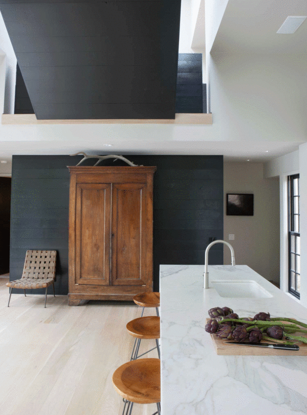
Case in point, the kitchen above. When the architecture is so modern and dramatic, the key is to play up the warmth. Hello, weathered wood furniture! If anything can add insta-warmth, it’s a gorgeous wood armoire that conceals a well-stocked bar. Soften up a room’s hard angles with an organic element, like the antlers that sit atop the armoire.
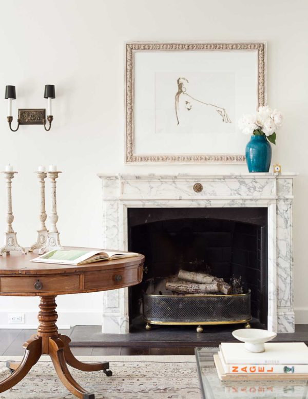
This minimal space is all about elegant simplicity. The challenge was how to keep it from getting too stiff and formal. When minimalism is your thing, strategic shots of color and asymmetry pull in some contrast. Play with putting your accessories at the edges of tables or mantel rather than smack dab in the middle. The result feels more unique and personal, less prim-and- proper. In this room the surprise element is the round pedestal table that replaces the more expected low coffee table. I love that it’s big, bold and sculptural. Perfect. It also adds curves to a room full of hard angles.
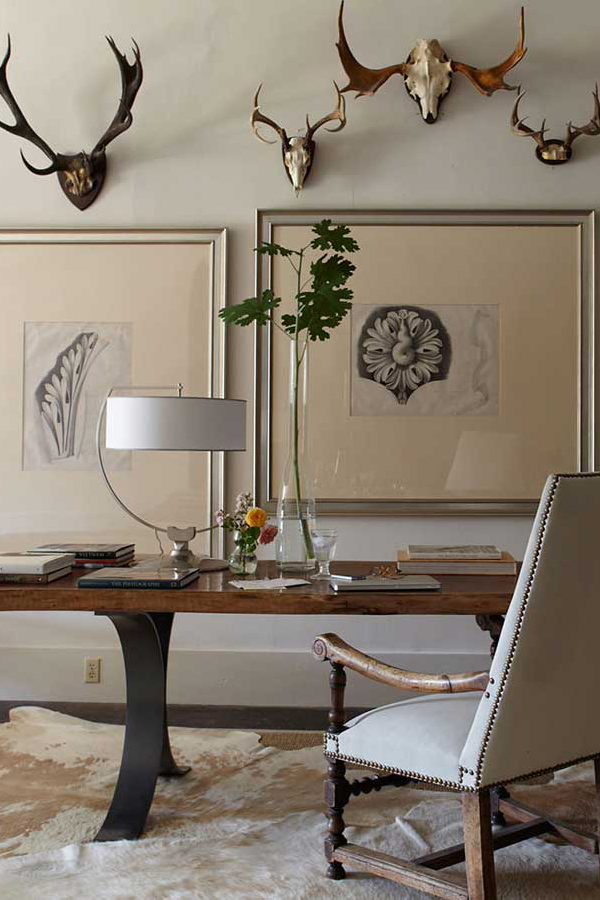
Have a collection? Put it on your wall and enjoy it everyday. You can’t go wrong if the rest of your space has a tight color palette and classic lines. Keep other tchochkies minimal to really make your collection sing. This room is the perfect lesson in how to hang items with style by varying height and scale. Stacks of books are perfect for filling a large space without creating lots of visual noise.
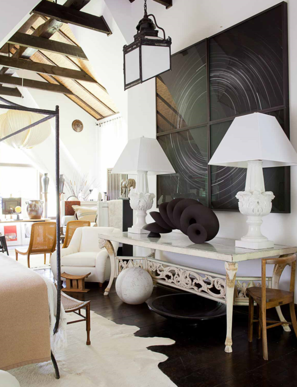
There are lots of layers here: vases on columns, screens, and art galore. Not only that, but the unique furniture arrangement breaks convention with a floating daybed, an unusual chair arrangement and art leaning against a table. Yet somehow it all works. This space breaks all the rules to perfection and the tight color palette keeps it chic and contained. There are no patterns here, only limited solid colors, which are the glue that keeps the room feeling unified. Another trick when you love the layered look is to accessorize at varying heights to draw the eye both up and down. Weave in screens, potted trees and statement floor lamps for height. Short sculptural stools, art leaning on the floor and magazine stands balance out a tall ceiling and add interest to the lower third of the room.
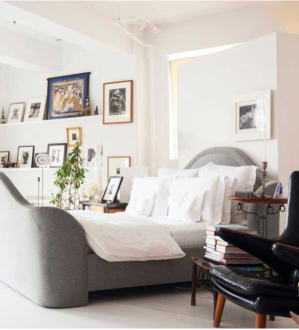
It’s a bold move to put a bed on a diagonal in the middle of a bedroom. It definitely makes a statement and works in this massive bedroom. The floating wall has storage on its other side and breaks up the squareness of the room and the windows. A hallmark of design mastery is that despite the strong diagonal, the room still feels light. The trick is to forgo the rug and avoid large dark furniture items. All storage is relegated to closets, no blocky chests anywhere. The art layered on thin shelves visually balances the boldness of the bed while not feeling heavy. I love that all the plants are on rollers, and can move around the entire apartment. (Great for getting just the right sun exposure!)
These spaces are filled with unique ideas and crazy character and yet still retain a classic, timeless appeal. Otherwise known as design goals. I’m excited to walk around our house with some new ideas to finally finish this remodel once and for all!
For more gorgeous interiors, CLICK HERE.
PS: Don’t forget to check out Instagram today for details on my $1000 GIVEAWAY with Anthropologie.
Image 1: Kitchen in Upstate New York, shot by @melanieacevedophoto, styled by @olganaiman and published in House Beautiful Magazine. Architecture by Gray Davis of Meyer Davis and Interior Design by Gray Davis and Chase Booth, @mrgraydavis and @mrchasebooth
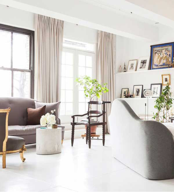
Image 2: Living Room, shot by @maxkimbee, styled and produced by @olganaiman for Veranda Magazine. Interior Design by Darryl Carter, @darrylcarterdesign
Image 3: Office in the Alabama countryside, shot by @wabranowicz, styled and produced by @olganaiman for House Beautiful Magazine. Interior Design by Betsy Brown, @betsybrowninc
Image 4: Guest House in Upstate NY, shot by @maxkimbee, styled and produced by @olganaiman for Veranda Magazine. Interior Design by Juan Montoya, @juanmontoyadesign
Image 5: NYC loft bedroom, shot by @allenunruh and styled by @olganaiman for One Kings Lane house tours. Interior Design by Vicente Wolf, @vicentewolfdesigns
What do you think?