Oh hi friend, just popping up for air between homeschooling and well, I guess I’m not getting air because the entire west coast is on fire and the air quality is some of the worst in the world. Did you hear that the presidential election is now less than 50 days away. Have you registered to vote? Ensured you’ll receive your mail-in ballot? Have a voting plan? CLICK HERE if not.

Idea to Steal: Wall-to-Wall Headboards

But I digress. As you might have seen last week, I have new project that is distracting me from impending doom – the Hood Canal Coastal Cottage and I have been diving deeeeep in design this past week as our timeline to get this baby done is mega short. Like six weeks short. But I’ll dig into all those details once we actually close and I can walk you through everything.

For now, let’s have a convo about bedrooms, shall we? We spend a lot of time in them right? I tend to work from mine late into the wee hours. One of the biggest trouble spots I’m running into with the Coastal Cottage are the bedrooms. I think bedrooms are my achilles heel (as was evidenced by our guest room in This Old Victorian. And the main bedroom. But who’s counting.) It just feels impossible to come up with something that seems interesting (without resorting to majorly expensive finishes or design elements and we are on a budget here people! More on that discussion to come as well).

Living spaces are my jam. I can walk into any type of living space and visualize what it needs almost instantly. Maybe it’s because bedrooms are usually just a box, and often a pretty small one that limits my thinking. I just have the hardest time coming up with innovative solutions for bedroom design. But one idea has been catching my eye in all my late-night scrolling – so much so that I just had to whip up this post for you.

My latest Idea to Steal (and the one I’m trying to convince the husband to let me do in the Coastal Cottage) is wall-to-wall headboards.

Idea to Steal: Wall-to-Wall Headboards on Apartment34Idea to Steal: Wall-to-Wall Headboards on Apartment34Idea to Steal: Wall-to-Wall Headboards on Apartment34Idea to Steal: Wall-to-Wall Headboards on Apartment34

You might also call this look a bed ledge. The utility of wall-to-wall headboards are endless. It’s an easy way to inject another color, wood tone or texture to your bedroom. You can also use the wall-to-wall headboard to house bedside tables and lighting, saving floor space and keeping things minimal.

But I also love that the bed ledge offers the perfect spot to display pieces you love. From artwork to plants, vases or ceramics – you have a spot to add life and personality to your space without adding additional furniture to your room.

The challenge is with the wall-to-wall headboard is actually creating one. This isn’t an off the shelf solution. You’ll likely need to employ a carpenter or be very industrious with your DIYs to create something that works. I’ve seen very simple pine and even particle board versions that don’t seem too intimidating. But slatted wall-to-wall headboards or versions with more design detail could require a pro. I would argue the investment is worth it.

How about you? Maybe if this post gets enough comments, my husband will be convinced!

For our entire Idea to Steal archive CLICK HERE.

images the local project / leibalstudiomk27 / barnabylane, cultiver

I feel like I’ve been mighty quiet about the status of our house for quite some time now, but it’s because I’ve actually been a rather busy bee, determined to finish This Old Victorian once and for all (you can catch up on what turned into a nearly five-year process right here).

After attempting to problem solve my biggest design challenges over and over again, I’ve realized there are some design conundrums that are simply beyond my experience level. Or perhaps I’ve just been staring at this house for too dang long. Quite likely. Enter culprit number one; my master bedroom. Here is its current state again, should you need a reminder. Not much has changed….yet.

The current status of my master is lovely but a tad…plain. While it’s clean and calm, there isn’t really any wow moment. This house deserves some wow. I deserve some too dammit! As of now, my bedroom houses a bed, a sad Ikea dresser and….that’s about it. After being in our house for a good bit now, I’ve realized I’m really in need of a haven from the rest of the world. I’m looking for something with more layers, texture, and a good dose of sophistication. But this room is just really dang hard to figure out. All of its layout quirks has managed to stump me.

Enter my friend and interior designer extraordinaire Lauren Nelson. I’ve collaborated with Lauren to help create the magic this master bedroom needs to get to the next level and today I’m giving you a sneak peek into where we’re headed!

Our moodboard features a color palette of warm woods, dusty, earthy hues and lots of natural texture. I’m really love the vibe. But my biggest aha in trying to figure out this space was the realization that it requires custom solutions. Tricky dimensions, oversized windows, a fireplace (I know, rough life) mean off the shelf furniture just don’t make this room functional. This is why I needed to call in a true pro. Lauren created a custom bed design that will tuck perfectly beneath my extra low window casings. Built-in side tables will provide me with the functionality and the rich warm tones I’m craving. Lauren has added in little custom details will make it a truly one of a kind piece. I can.not.wait.

The other big aha was the need to amp up the room’s lighting. Being blessed with extra high ceilings, it’s was a shame not make sure your eye is drawn up. Enter YLighting – my absolute favorite lighting resource. My dining room pendant, media room pendant and so many of my flush mounts are from YLighting. They have options that fit literally every style and every budget.

I’ve set my sights on the Marset Ginger Pendant for our bedroom. Its unique shape features a mix of materials including an oak canopy and blackened aluminum frame. Its gorgeously oversized, making it impossible to miss and it will contrast with the walls and drapery so well. I’ll also be upping the ante in my master bathroom with a set of extended sconces made of bent wood and brass with marble backplate also from YLighting. Because sometimes you just cannot resist. They are going to be next level good. Here’s a little schematic of the pendant with my future bed!

While we’re still midway through the design process and I won’t be able to share the final reveal for quite some time, I couldn’t help but give you at least a sense of where we’re headed so…here’s a major sneak peek of the final design rendering with you!

In addition to the stunning lighting and awesome custom bed, we’re going to add a vintage Moroccan rug for a pop of print. I’m obsessed with the rug. Floor to ceiling drapes will add softness and a refinished vintage dresser will give me the storage I so desperately need and the style I crave (sorry Ikea, you’re just not cuttin’ it). We’re currently working on a dream mantel for the room’s fireplace and I have a few ideas for eye-catching art up my sleeve. It’s always fun when you get to dig into the details phase of a project like this.

Well, it’s not quite as fun install day – I’m counting down to the moment when the master bedroom of my dreams is actually mine.

Stay tuned!

To catch up on all things This Old Victorian (do you remember what it looked like when we started??), CLICK HERE.

this post is in partnership with YLighting. all thoughts and opinions are 100% my own. thanks for supporting partnerships that have kept apartment 34’s doors open

Ok, this post’s title may be a tad dramatic, but after more than four years since since we purchased our historic home, more than two years since we broke ground on our gut renovation and more than a year since moving in, I’ve had the time to see the mistakes I’ve made along the way.

And while I’m certainly a fountain of advice about renovations and even design now, one of the biggest things I’ve learned is what I still don’t know. What my limits are. Or where I simply run of out of creative solutions. So I thought rather than flounder behind the scenes, trying to problem solve my trouble spots or correct my poor decisions all by my lonesome, I ought to take you behind the curtain!

So welcome to my new series, How I F-upped My House! Over the next few months I’m going to be taking you into the spaces that have been plaguing me. They’re basically the reason you haven’t seen a full before and after house tour to this day. And we’re going to start with….the master bedroom!

Now, this room certainly doesn’t look like I’ve really f*d anything up. It’s kind hard for it to look bad when I have the blessing of 11 foot ceilings, beautiful (original!) crown molding and lovely floors (not original). The bones I have to work with in here are great. When I manage to keep it clean and make the bed (obsessed with my classic and chic Rough Linen bedding) it can feel like a lovely retreat. For a day.

But what you can’t see is that the only things currently in the the bedroom are this bed, a lamp and a sad Ikea dresser. And that’s it. This room has been the poor neglected stepchild of this old victorian. This room is the dumping ground for stuff when we have guests coming over. It’s the place where my closet explodes. It’s probably the room we spend the least amount of time in, yet as everyone says, your bedroom should be your refuge from the stress of your day. Right now, this room is the cause of my stress!

There are three main problems I’ve had a really hard time solving.

The first is layout. The bedroom is actually not a huge space but it is very challenging to configure. The room has three large windows (as you can see). There’s also a fireplace to the right of the bed as you face it (that we’ve yet to finish – so right now it’s just a gaping hole in the wall), and a double-doored closet. All of these obstacles make the room lovely but make furniture placement a real challenge. I recently moved to the bed from the south wall to the sit in front of the windows and that has been a huge improvement. But I’m not sure this is the best bed to optimize the room. Sigh.

My second struggle as been settling on a look and feel. I can’t seem to figure out if I should go really modern to juxtapose the room’s historic elements or perhaps air on the more traditional side. Or maybe go really eclectic. For some reason (though likely just pure renovation fatigue) I cannot land on a look that I really really love.

And finally I’ve been struggling with how to add a wow factor to this room. While I love minimal spaces, I really want my bedroom to have a moment that takes my breath away every time I step through the door. I’m thinking I need to layer more bedding colors. I’ve spent literally years working on what is meant to be my dream house so I ought to have my dream master bedroom, don’t you think.

Over the next few months I’m going to be working hard to transform this space. Albeit a really nice room, but I’m ready for a truly grown up master bedroom that both I but really this house deserves.

Are you excited? Are you ready to help me?? I truly hope so. It kinda feels like Apt34 is coming full circle!

current room design: williams-sonoma home bed (currently 20% off) / rough linen bedding / stool, chair, table lamp via big daddy’s antiques / overstock rug / bel occhio pendant / art vintage & minted / wall color white whisp by benjamin moore

For the complete backstory on This Old Victorian, CLICK HERE.

photography for apartment34 by andrea posadas

And we’re back! You guys, it’s September. Holy s***. We’ve blinked and summer is gone. But it’s not all doom and gloom. Fall is my favorite season for oh so many reasons – one of which is all the cozy updates you get to make to your house. That is kinda my speciality these days. To kick off the new month, I’ve got a super quick easy way to refresh your bedroom for fall. You’re going to want to keep scrolling btw – there’s a big giveaway at the end of this post!

To get ready for fall, I decided our guest room needed (another!) refresh. I wanted to both simplify and add a layer of sophistication to the space. Thankfully, with the help of The Citizenry, my transformation was fairly easy.

an easy way to update your bedroom on apartment 34

I actually only changed a few simple things in this but the effect is rather dramatic. I love the crispness of the black and white color palette in this space (diy alert – I changed the bed’s headboard by simply tacking a bolt of black cotton to it!). The bedside tables are sharp and angular. The framed art by Mia Carameros is both tailored but also organic with its botanic print. A mid-century style table lamp adds a modern touch. Soft linen bedding, a cashmere throw, an amber vase and a bit of pampas grass warm up the look.

an easy way to update your bedroom on apartment 34

But the star of the show is the Monochromatic Luxe pillow bundle I’ve curated for The Citizenry. The set starts with a pair of mudcloth pillows as your base. I love their graphic punch. To soften things a bit I then added a Beso pillow, handmade in Peru, featuring rows of soft knit knots. It’s got gorgeous texture. A lovely striped lumbar pillow with a few hints of pink adds just enough femininity to make the bed extra inviting. A chunky knit round pillow offers a touch of extra of softness to the room.

an easy way to update your bedroom on apartment 34

If you check out the before of this space – I really do love this more bold, high contrast new look. Now, I must report there are only four sets of the Monochrome Luxe Pillow Bundle left so if you want one, I recommend you act quickly.

That said, I do have two bonuses for you. First off, two other very talented designers, Anita Yokota and Natalie Meyers also curated equally delicious bundle options for you. I really do want one of each. You can see them right here.

Or you can ENTER TO WIN a Monochrome Luxe bundle of your own – a $655 value! All you need to do is sign up for the Apartment 34 newsletter RIGHT HERE. Don’t worry, I won’t spam you. The newsletter is meant to help you get ready for each new season, or perhaps a special occasion or share some of my latest projects. Our fall edition will be coming at you soon.

If you’re already a newsletter subscriber, simply leave a comment on this post and you’ll be entered to win! A winner will be chosen at random at 12:00PM PST Friday, September 7.

Good luck.

And I must say it feels good to be back!

This post in partnership with The Citizenry. All thoughts and opinions are my own. Thanks for supporting collaborations that keep our doors open!

Earlier this week, you got a full tour of the living room and dining room in the Sunset Bungalow. Today we’d like to invite you into the master bedroom. You may have spied the sneak peek we shared when discussing the room’s paint job, but now you get to see the complete picture.

Chloe’s bedroom makes me feel like I’m sleeping on a cloud. We stuck to a purely neutral color palette that feels airy and open. The bed just seems to float against that soft blue-gray backdrop of our wall color. All of the texture in the room, from the linen bedding by Primary Goods to the custom weaving created by Bay Area artist Meghan Shimek, to the cashmere throw feels fluffy and light.

And while I’m usually a big proponent to mixing up the pieces in a bedroom (bedroom sets are so 1986), we kept all of the wood tones in this space very similar. The custom-made bed created by Oakland-based wood worker Ben Winslow is oak, the bedside tables are ash while the gorgeous Room & Board dresser is maple. The cohesiveness of the look maintains that serene, soothing feel.

All of the materials in the bedroom are natural – matte ceramic lamps from Room & Board feel clean and modern. We replaced the horrid boob flush mount with a timeless paper lantern pendant. The ceramic planter and woven laundry hamper from Overstock offer additional texture. The oversized Room & Board round mirror helps reflect even more light around the space. iI also love how it reflects the half-wall adding to that floating in sky (or ocean) effect.

Chloe needed a lot of clothes storage as closets in 1940’s homes are teeny tiny, so a second, smaller dresser offers more room and a home for more of her beautiful original art we had framed by Framebridge along with a few more pieces from her vintage collection. The full length mirror is a must-have in any master bedroom. You gotta be able to assess a full outfit!

I’m obsessed with Chloe’s lamp – it’s an original mid-century piece with a cork base that she scored at an estate sale! Also be treasure hunting friends. Always be treasure hunting. The addition of vintage pieces keeps the space from feeling too shiny and new.


As a creative director, Chloe looks at color and busy images all day everyday, so I really wanted her bedroom to be a respite from the noise. In this space she can completely unplug, relax and enjoy the view out to the Pacific Ocean that she’s lucky enough to have from her bedroom window. I wonder if she’d ever need a house sitter.

SHOP THE ROOM: Ben Winslow Design custom bed / Room & Board bedside lamps / Room & Board dressers / Room & Board table lamp / Room & Board round mirror / Room & Board full length mirror  / Capsule Home nightstandsMeghan Shimek weaving / Maxim pendant light / Primary Goods bedding / Overstock ceramic planter / Overstock hamper / Creativity Explored art / throw pillow / throw blanket / Behr 2018 Color Trend paint color in Quiet Time 


original photography for apartment 34 by andrea posadas

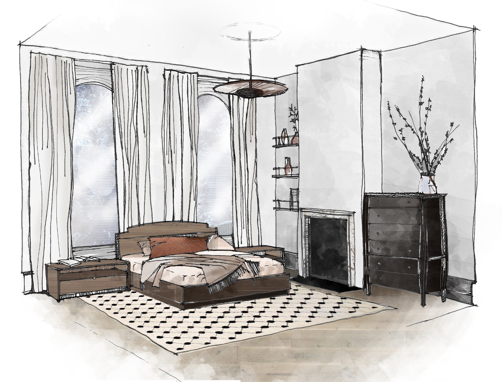
Sound the horns, strike the drums, or do whatever you do to attract a ton of attention because today is the day – today you get to see the AFTER of our 6-week One Room Challenge. Are you excited? I’m excited. But to quickly recap for anyone who might be new here, I decided to transform my son’s nursery into a toddler room for this ORC – since he is three, going on ten now. I’ve summarized the room’s before look for you quickly below.

one room challenge toddler room on apartment 34one room challenge toddler room on apartment 34

And without further ado, here’s our after!

one room challenge toddler room on apartment 34

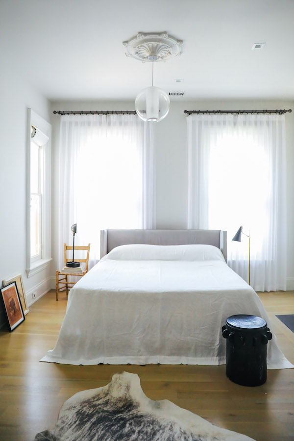
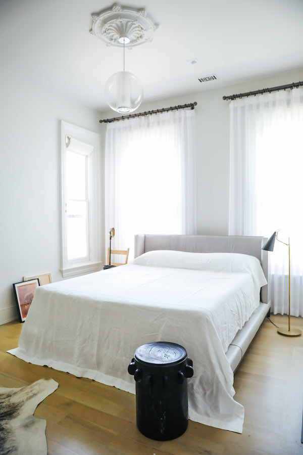
Ta-da! Do you love?! I love. I’m seriously so happy. But where to begin, where to begin?! Well, let’s dive into room layout first. I essentially mimicked the very same layout I used for the nursery design. As I’ve mentioned, this room is shoebox-shaped, and not particularly spacious. There’s only one solid wall. All the other walls are broken up by either windows or doors. So I stuck with what I knew.

Bed on the far wall to the left of the central window. Bookcase to the window’s right. Reading chair floating next to (the dreaded!) curved wall. Dresser moved into the closet. Thankfully, I was able to use an amazing new moving and storage service called Trove to remove and store all of my nursery furniture so I could move all the new pieces in all in just a couple of hours. Phew.

And just like that, it suddenly feels as if the amount of space has doubled. I accomplished this by getting rid of all things oversized. The 8×10 area rug, the floor-skimming drapes, the oversized glider – they are all gone (and I ain’t sad about it). Now the space has room to breathe. But it makes sense. The nursery was about being cozy and nesting. The new version of this room is about making space for energy, fun, and play.

one room challenge toddler room on apartment 34

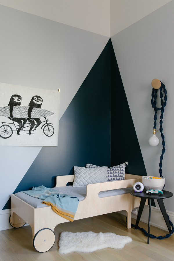
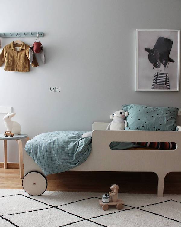
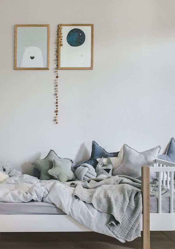
Shall we talk color scheme next?? I hinted at my paint inspiration in previous weeks’ posts, but did you guess what I would do? I really didn’t want to fully repaint the room as I still love its original light gray hue, but the transformation did require a little refresh – something to make the room feel more mature. Well, I went with the triangle around the toddler bed idea and I’m obsessed with how it turned out. The paint color is a gorgeous deep teal/blue/green called Hague Blue from Farrow & Ball. It became the inspiration for all the other deep blue accents in the room.

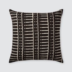
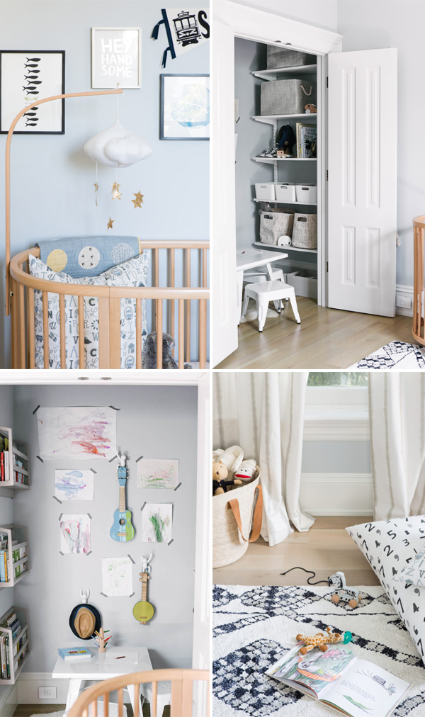
I love how the triangle corner cocoons the bed and offers a graphic punch. I decided to go with a toddler bed because, well look at it, it’s just too dang cute. My son thinks its a car. I’m also hoping that the nest effect will entice him to actually sleep in his new big boy bed because right now he continues to opt for the crib (any and all parental advice on this one def welcome!). I kept the bedding nice and simple and added just a little playful touch with a block print pillow from Pom Pom at Home.

Since we live in earthquake-prone San Francisco, art over beds is generally frowned upon and so I needed to come up with an innovative way to hang art. I did that in two ways – first, I simply decided not to frame my art find –  Sloths Riding a Tandem Bike with a Surfboard (love!). I then decided to hang the print using simple clips. It feels both more young and more casual that way. Bonus, using clips also doesn’t damage my 150 yr old plaster walls (more to come on the challenges of plaster – keep scrolling).

one room challenge toddler room on apartment 34

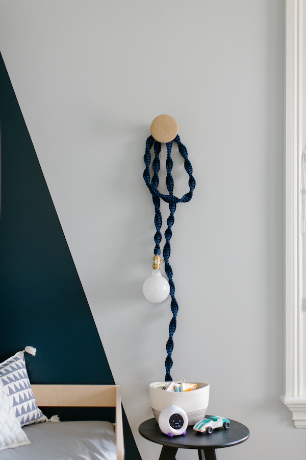
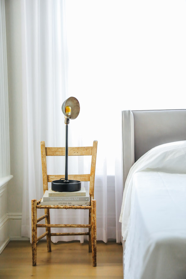
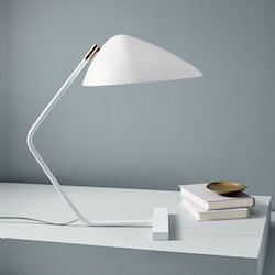
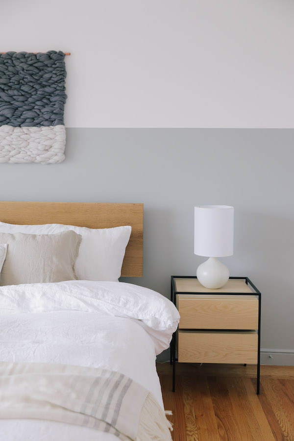
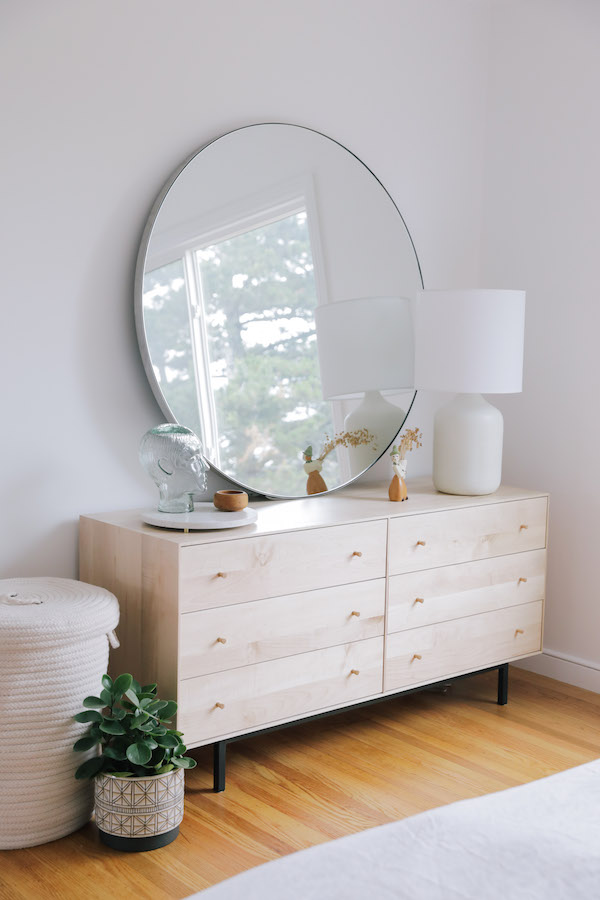
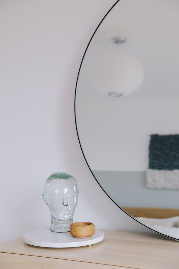
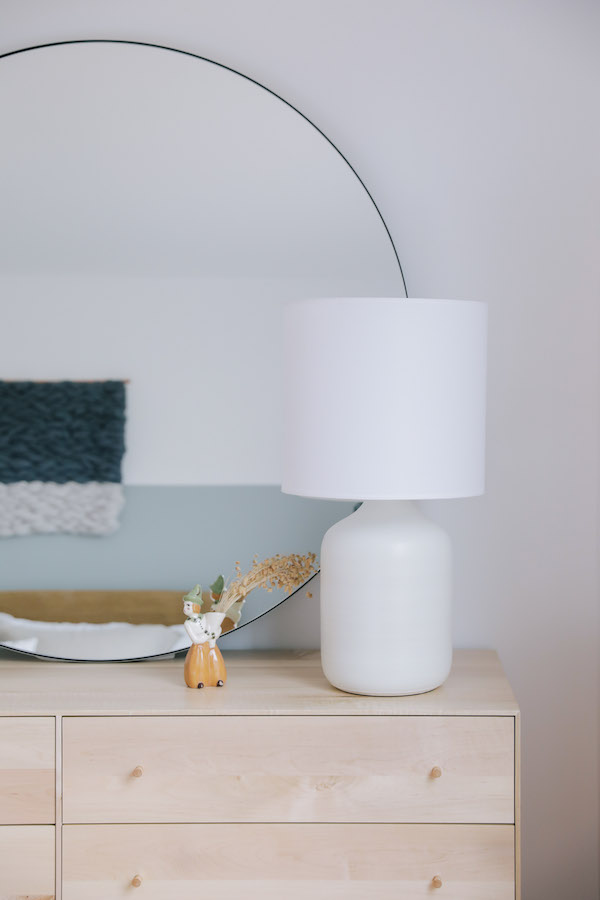
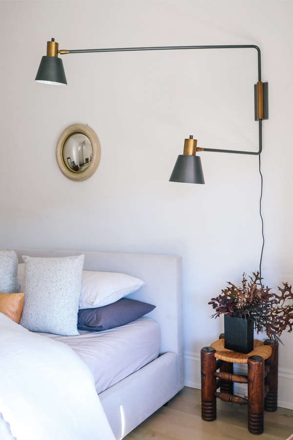
A simple, modern Nova End Table from Room & Board in black offers a landing spot for books, my husband’s childhood pinewood derby car and my latest favorite parenting invention – the Stay in Bed clock. These things turn from yellow to green telling your child when its ok to get up. Genius. A gorgeous Helix Light in deep navy created by my friend and rope artist Windy Chien serves as a gorgeous bedside light.

one room challenge toddler room on apartment 34

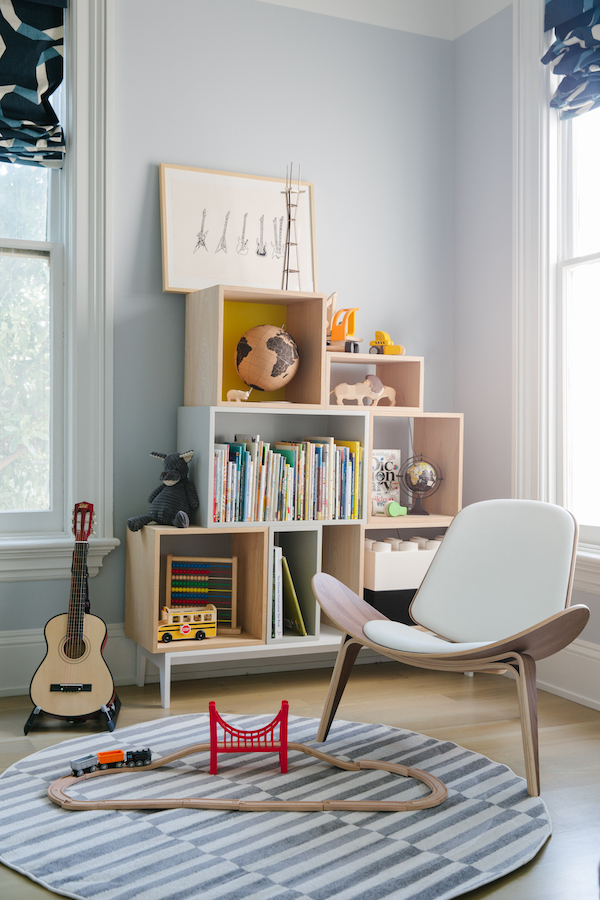
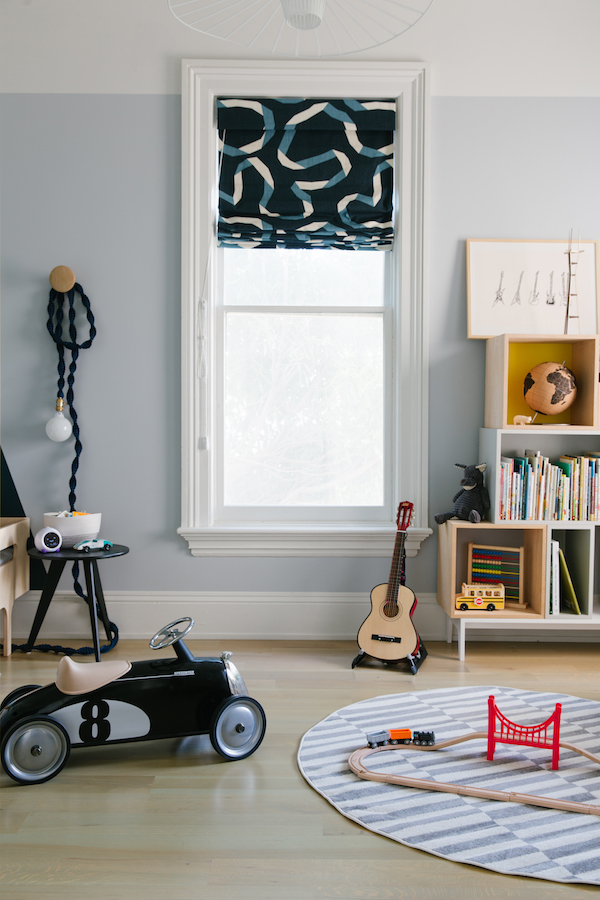
Opposite the toddler bed sits the room’s new play/reading corner. I love the open, modern vibe. It’s now super easy for my son to pick from his ever-growing book collection or pull out his legos for a major building session. On the upper shelves, I added an homage to his current interests including a guitar print by another friend, artist Jennifer Ament custom framed with Framed & Mated as well as a replica of Sutro Tower, a San Francisco landmark that we can see from our neighborhood.

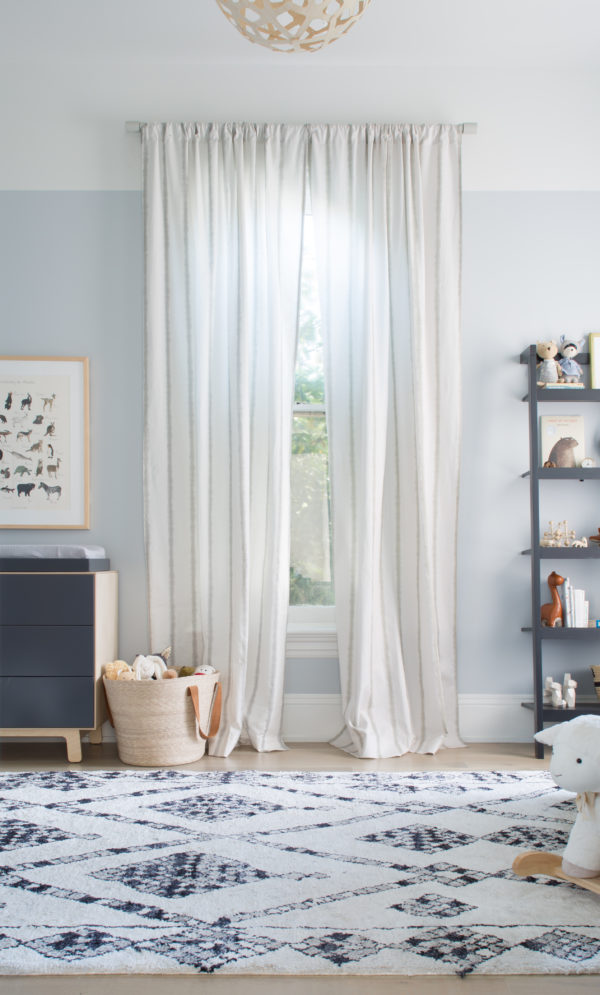
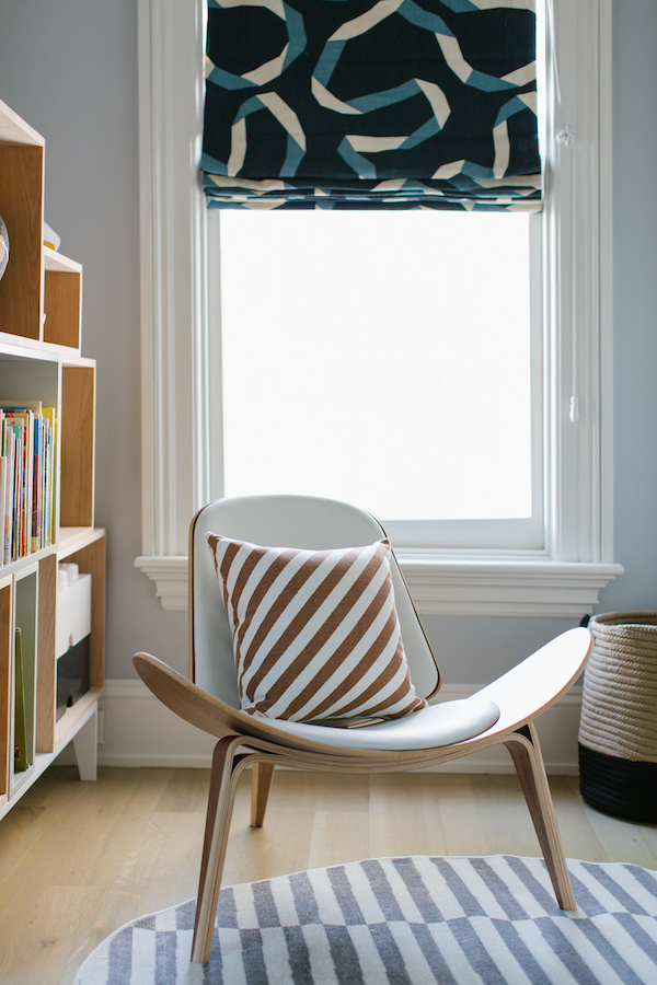
The Wing Chair from Overstock offers a comfy seat to read. I love the low profile. It’s also really comfortable for humans of all sizes – my three-footer and my six-footer both really like it. A striped round rug from eSale Rugs offers the perfect little padded play space. And I continued to pull in my blue accent color through the custom roman shades I had made with Dwell Studio fabric at Calico Corners. I love the road-like ribbon pattern. Blackout shades are must for those tiny humans. They make bedtime so much easier!

one room challenge toddler room on apartment 34one room challenge toddler room on apartment 34

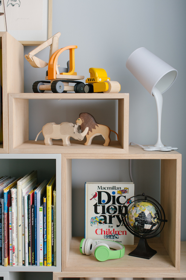
The Woopsy Desk Lamp from LampsPlus offers a little whimsy. The Children’s Dictionary also comes from my husband’s childhood room. Some prized construction vehicles and jungle friends from my favorite online kid’s shop Bitte take pride of place.

And now to my curved wall challenge…

one room challenge toddler room on apartment 34

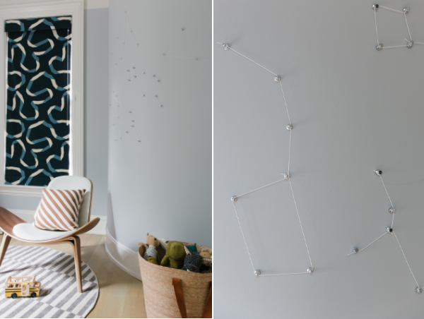
To accentuate the wall, I added three-dimensional constellations! Now I can’t take total claim for the idea. I spied something similar in a room by J&J Design Group. I’d been hoping to incorporate something star themed for a couple of reasons. Carter had a print of his astrological sign hanging over his crib since birth so I wanted to keep the theme going. We also sing Twinkle Twinkle Star every night. He immediately understood these were stars.

But perhaps most importantly, the way I conceived of the solution solved both my curved wall and my plaster problems. If you’ve never worked with plaster – don’t. It is SUCH a pain. It is highly ill-advised to put holes into plaster as it can make the entire wall crack. And once you do poke a hole there really isn’t any changing your mind. You can’t simply patch and repaint. It’s a process. So rather than deal with that headache, I used magnetic paint (per many a commenter’s suggestion) on the wall! Then to create the constellations, I simply used sets of magnets to create each constellation shape.

Truthfully, I’m a little disappointed with how the constellations look in photos. These images don’t really do them justice. The design would have photoed much better if I had used black cord, but I found glow-in-the-dark cord that turns his wall into a personal starry night. You’ll just have to trust me that it’s very cool in person.

one room challenge toddler room on apartment 34

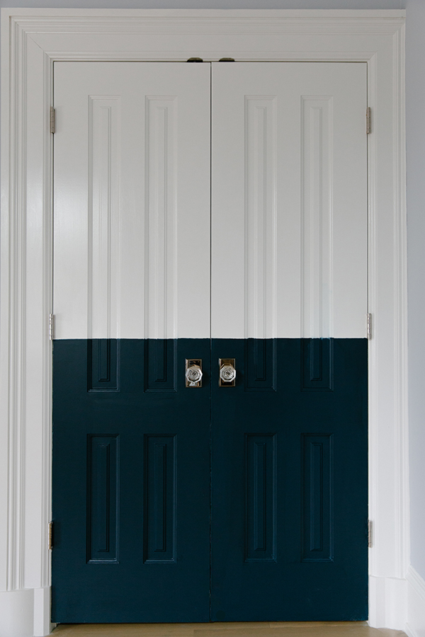
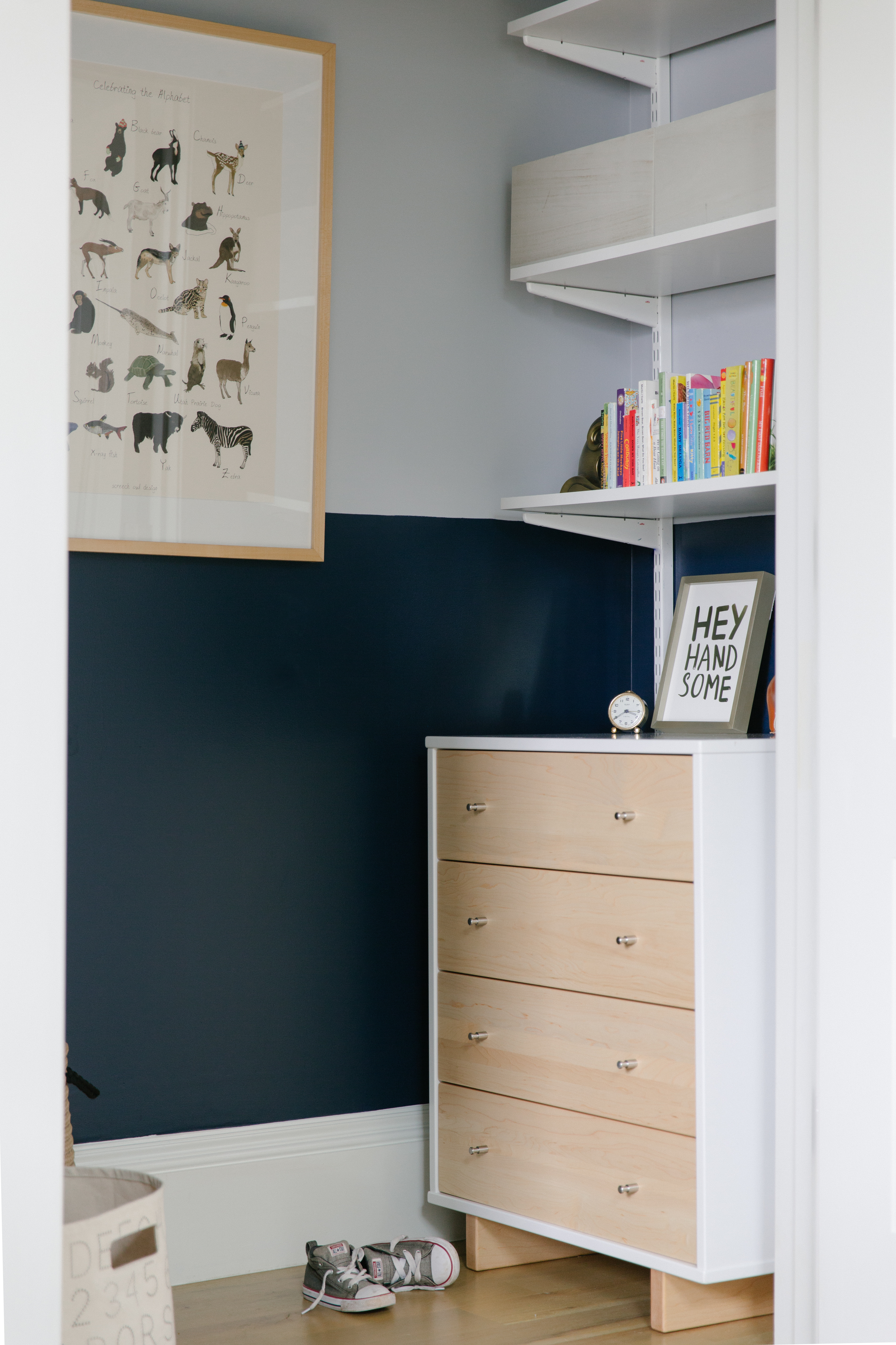
Now, I couldn’t only use the Hague Blue around the toddler bed. I needed that color elsewhere in the room – and so to the closet I went! I painted both the exterior french doors and a half wall around the interior in that nice rich color.

one room challenge toddler room on apartment 34

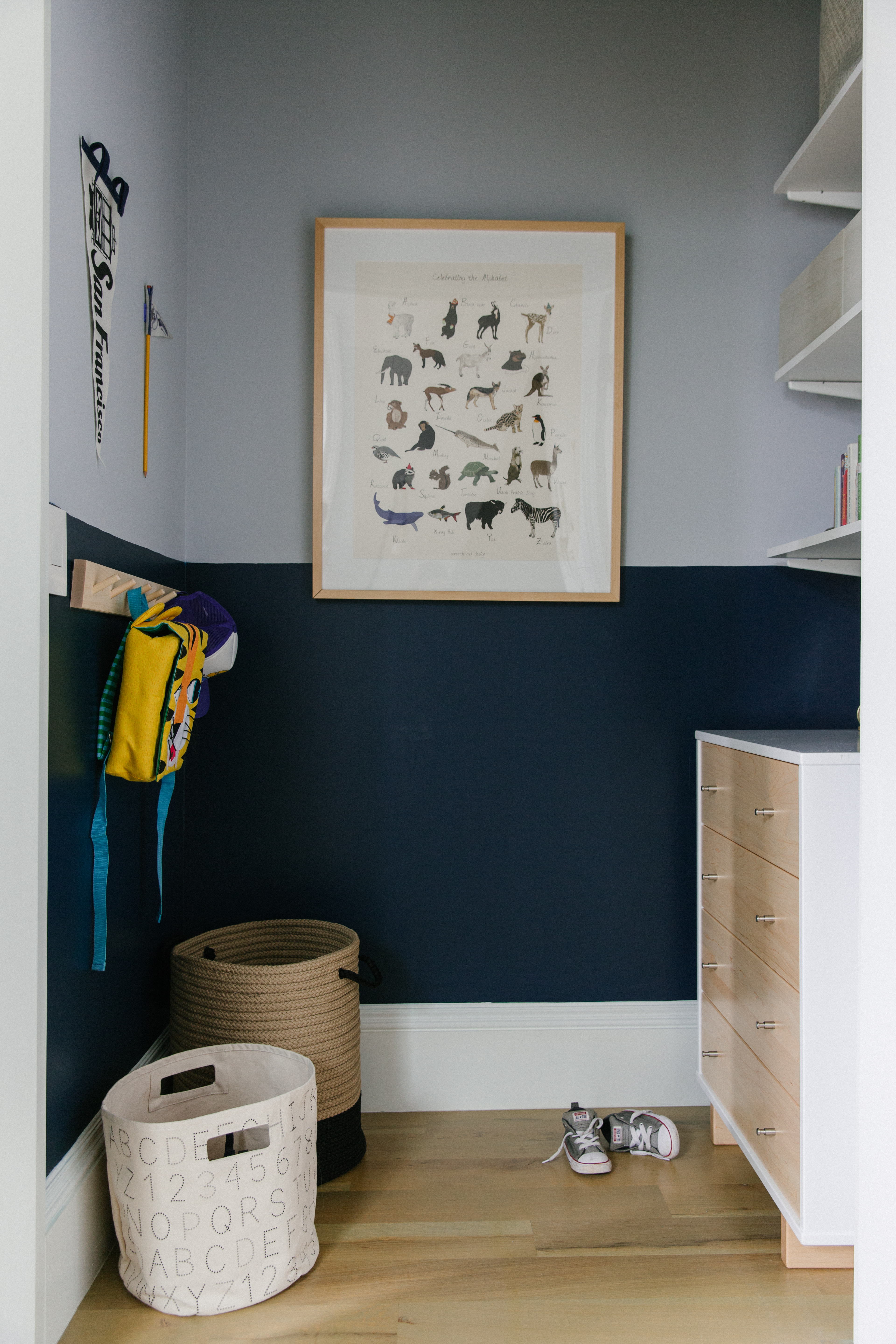
I also transformed the closet back from a mini play area into the storage space I know we’re going to need long-term. Thankfully I could find a stylish dresser that fit into this relatively small space at Room & Board. They have such a great variety of sizes, styles and finishes. I knew I would find the perfect piece. And it actually holds a ton of clothes.

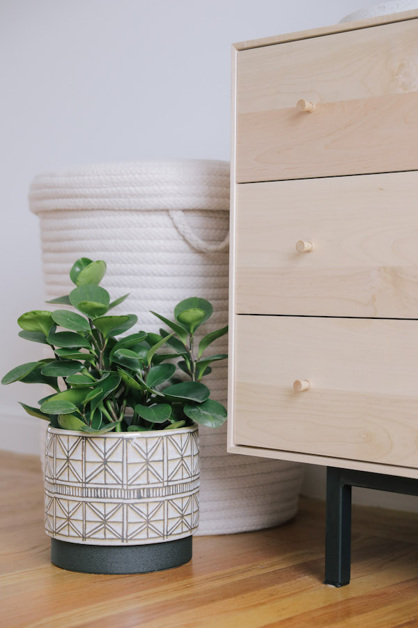
A sturdy two-toned basket from Overstock serves as a new laundry bin and I added a simple coat rack for jackets, hats and backpacks. It’s never too early to teach a kid that there’s a place for everything and everything should go back in its place! We’ll see how that goes of course.

I couldn’t bear to part with the animal alphabet print I got before I was ever pregnant so it now adorns the back closet wall. A Hey Handsome print from Minted is another nursery holdover. I couldn’t help myself – it’s too cute.

one room challenge toddler room on apartment 34

So there you have it. I’m pleased to report that my kiddo is totally into his new room. He’s already spending more time playing in there then he had before (mission accomplished!).

I so hope you enjoyed following along over the last six weeks. I’ve truly appreciated everyone’s comments, ideas and suggestions.

one room challenge toddler room on apartment 34

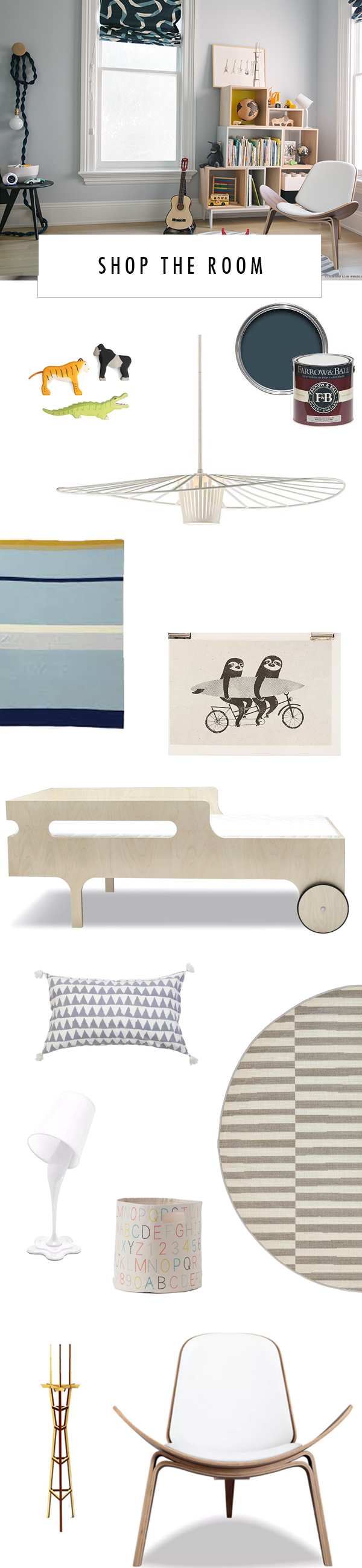
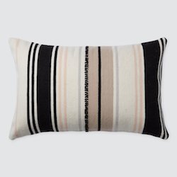
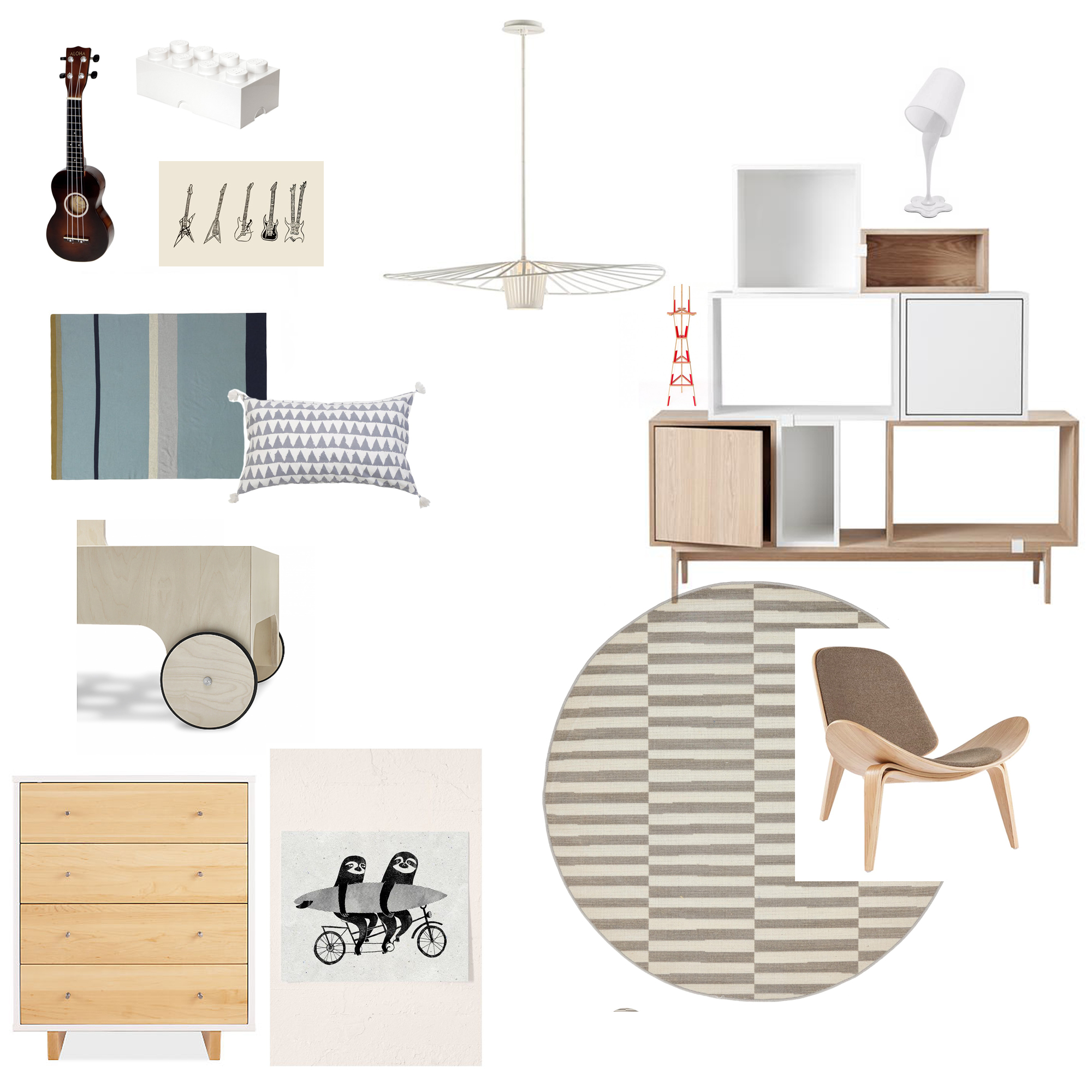
SHOP THE ROOM LampsPlus Tides Pendant / Bitte Wooden Toys / Farrow & Ball Hague Blue PaintPomPom at Home Pillow / Ferm Living blanket / Toddler BedSloth print / eSale Striped Rug /  Woopsy Desk Lamp from LampsPlus / Pehr Designs Alphabet Bin / Overstock Wing Chair / Sutro Tower / Overstock Woven BasketRoom & Board dresser / Room & Board end table / Calico Corners Roman Shades  / Minted Art PrintStacked Bookcase from Sourced By Good / Birch Coat Rack / Jennifer Ament print / custom framing Framed & MattedWindy Chien Helix Light / Cork Globe / Throw Pillow / Lego Storage

Be sure to check out everyone’s reveals by clicking on the links below! I can’t wait to see them all.


ONE ROOM CHALLENGE 

Beginning in the Middle | Coco & Jack | The English Room | The Gold Hive

Gray Malin | Jenna Sue Design | Jojotastic | Kelly Rogers Int. | Linda Holt | Marcus Design

Michelle Gage | Natasha Habermann | The Painted House | Rambling Renovators

Sacramento Street | Shannon Claire | Sketch 42 | Stephanie Kraus | Bisou Style

Media Partner House Beautiful | TM by ORC


To catch up on the entire ORC, click the following links Week 1Week 2, Week 3Week 4, Week 5

original photography for apartment 34 by bess friday

Guys, I can hardly believe it, but we’re only one week away from the conclusion of the One Room Challenge and the big reveal of my son’s brand new big-boy room. I have to thank everyone for their recommendations on my curved wall dilemma last week. I think I’ve finalized my solution and design idea and I’m rurl excited about it…but I’m not gonna tell! Not yet anyway. You’re going to have to wait to see the finished product until our finale next week.

For now, I thought I’d update you on the goings-on. Over the past week, I’ve been frantically working to finalize all the details; things like toy storage solutions, all the little design accents and finalizing art and lighting. It’s always a little hard to know when enough is enough, but I think I’m getting close. So today I thought I’d give you a little sneak preview of the final design.

Remember when I described my design vibe as “CA + Scandi, aka California laid-back casual mashed together with a Danish modern edge? Here’s the mood board again to remind you.

one room challenge on apartment 34

Well, I think I’ve zeroed on my vibe… but really, you should tell me if I’m on the right track. Whatta think?

This is my furniture plan! To bring the Scandi feel into the space all of the furniture I selected is made of light woods and features clean lines. Sure, I could have used color in a kid’s room, but I feel like all the white oak will age better. Case in point, the clean, modern Moda dresser from Room & Board. I’d like that to stick around for quite some time.

Our dilapidated glider is finally getting ditched for a modern shell-style chair I found on Overstock. I firmly believe that you don’t need to put kid furniture in a kid’s room but the pieces you do pick should still feel playful. The slim silhouette of the shell-style chair should also open up more space in the room. I’m also ditching the too-big area rug that’s in there now for a smaller round rug in a graphic stripe to add the illusion of even more space. (if you need a reminder of before images, click here).

The lighting in the room is going to get a little upgrade too. I love the Tides pendant from LampsPlus. It’ll accentuate the 11′ ceilings nicely. A cheeky Woopsy Table Lamp will be a fun discussion point for a three-year-old.

I’m keeping all the art and accessories in muted tones so that all his toys, his art creations, and imagination will bring the color to the space. And of course I have a few surprises up my sleeve as well but you’ll just have to come back next week to see those. For now, I’m frantically painting, assembling, organizing and prepping – all around nap times. Working on a child’s room is much harder to schedule than I realized. Oy. But I’m confident it’s all going to come together beautifully. Well fairly confident (just kidding!). I can’t wait to see the look on my son’s face when he sees the final product.

To catch up on the first four weeks ORC, click the following links Week 1Week 2, Week 3Week 4.

Everyone else is probably in the same boat as I am (aka biting their nails wondering how they’re going to get in all done in time!) so be sure to check out their updates below.


ONE ROOM CHALLENGE 

 Beginning in the Middle | Coco & Jack | The English Room | The Gold Hive

Gray Malin | Jenna Sue Design | Jojotastic | Kelly Rogers Int. | Linda Holt | Marcus Design

Michelle Gage | Natasha Habermann | The Painted House | Rambling Renovators

Sacramento Street | Shannon Claire | Sketch 42 | Stephanie Kraus | Bisou Style

Media Partner House Beautiful | TM by ORC

Week two of the One Room Challenge is upon us. Today I have my moodboard to share with you all. When working on a design project, I find it’s always helpful to create a moodboard to set clear boundaries – it helps in the decision-making process so much! A moodboard enables you to zero in and make all those difficult choices; overarching design style, color palette, perhaps a creative design element or two. Otherwise, there are just too many options out there to choose from. I always get distracted by the newest fun thought. Or I just can’t commit. Or I second guess myself. But eventually, you have to tune out all the distractions so you can actually get something done!

one room challenge on apartment 34one room challenge on apartment 34one room challenge on apartment 34one room challenge on apartment 34

So I’m declaring this my official design direction. And since I only have four more weeks to make it happen, I really can’t back out now. I’m calling my look “CA + Scandi.” Think California laid back casual mashed together with a danish modern edge.

I want to accomplish three key things with this CA + Scandi design plan. The first is injecting a modern, slightly minimal Scandinavian influence. Think less is more. Kids accumulate so much stuff. The room design doesn’t need to add too much. That’ll come. I also want to create a space that I enjoy being in too. I firmly believe my kid’s room can fit within the vibe of the rest of our house while still being a room that is unique to him. And finally, I do want to ensure the room is fun and childlike. It should be a space that fosters creativity and play.

one room challenge on apartment 34

I hope to accomplish those goals by sticking with a pretty neutral color palette – black, white and natural oak with the injection of an accent color here or there (tbd on what color that will be). I definitely plan to have a little fun with paint to add an eye-catching design element (or two). And I know I will lean on the modern side when it comes to furnishings. That’s where I’ll really be injecting that Scandi feel. Accessories and accents are where I’ll get to add the bit of whimsy I’m looking for.

So what do you think?? You like? With my direction set, I’m off to pick my paint colors, source all my furnishings and work on one big design dilemma that I’ll wait to discuss until our next check-in. I’m curious – what are you most interested in about this process? Let me know in the comments so I can be sure to answer any questions and share what you really want to see.

I also can’t wait to check out everyone else’s progress. Click the links below to see where their projects are headed.

To catch up on Week One of the challenge, CLICK HERE.

ONE ROOM CHALLENGE

Beginning in the Middle | Coco & Jack | The English Room | The Gold Hive

Gray Malin | Jenna Sue Design | Jojotastic | Kelly Rogers Int. | Linda Holt | Marcus Design

Michelle Gage | Natasha Habermann | The Painted House | Rambling Renovators

Sacramento Street | Shannon Claire | Sketch 42 | Stephanie Kraus | Style Me Pretty Living

Media Partner House Beautiful | TM by ORC

If you caught yesterday’s post, I mentioned I’m up to my eyeballs getting my house in shape for the holidays. Well thankfully, I’ve checked the guest room off my list! My guest room has actually been one of my more pulled together spaces since  apparently people really like visiting San Francisco, but a I did want to give the room a bit of cozification for the holidays (yup, just said holidays). With help from The Citizenry, (whom I adore  – remember this post), I was able to do just that.

If you click here you can see the the current evolution of my guest room. The room is always flooded with amazing light, but I wanted to ground it with texture, add more contrast with pops of black, and a layer of sophistication with marble and leather accents. I still need a guest give it a test run, but I think I’ve got a cozy little retreat on my hands. I’d love to hear your thoughts.

a cozy guest bedroom on apartment 34a cozy guest bedroom on apartment 34a cozy guest bedroom on apartment 34a cozy guest bedroom on apartment 34

sources: tweed accent pillows / leather lumbar pillow / beni ourain rug / throw / marble tray / marble candle holders / vintage mirror / wall sconce / vintage french stools / upholstered bed  

I love the tonal feel of the room now. The consistent color palette is soft and soothing. Mismatched vintage french stools add character and warmth. But it’s the details from The Citizenry’s newest collection that add the yummy texture I was looking for. Tweed and leather accent pillows, a nubby knit throw, a super thick beni ourain rug and gorgeous marble accent pieces offer the hotel-like touch I like to create for guests. Because no one wants to travel and be surrounded by someone else’s crap. That I’ve managed to shove in closets so at this room is a respite. I might want to sleep in here myself from time to time!

If you need more tips to get your guest room up to snuff be sure to head over to The Citizenry’s blog today. I’m sharing my top tips for making your guests feel extra special and you can see even more pics of this space!

Now I promise, I won’t show this space again. At least not until spring anyway!


original photography for apartment 34 by andrea posadas

this post is in partnership with The Citizenry. All thoughts and opinions are 100% my own. Thanks for supporting collaborations that I’m excited about and that have kept apartment 34’s doors open

Older posts
Gimme More