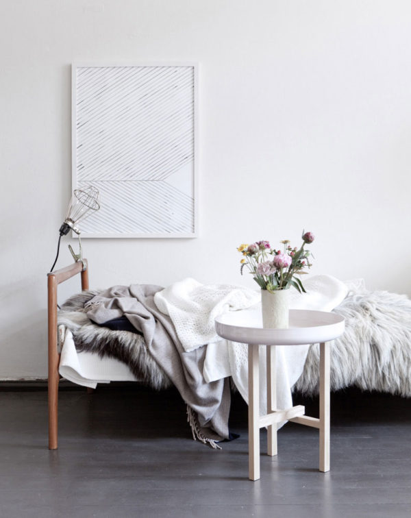
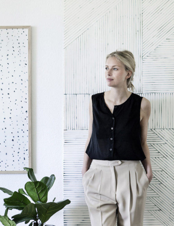
As we settle more and more into our house, all of the blank walls are starting to stare at me. I think I’m ready to commit to some art. But when you’re in your forever home (and most of your walls are 150 yr old plaster which means they don’t like holes), there’s a lot of pressure to make the right choices. And while I’d love to run out and invest in some original art, I do still have things like sofas and fireplaces to pay for so I’ve got to find a balance. That’s why I’m currently obsessed with Silke Bonde.

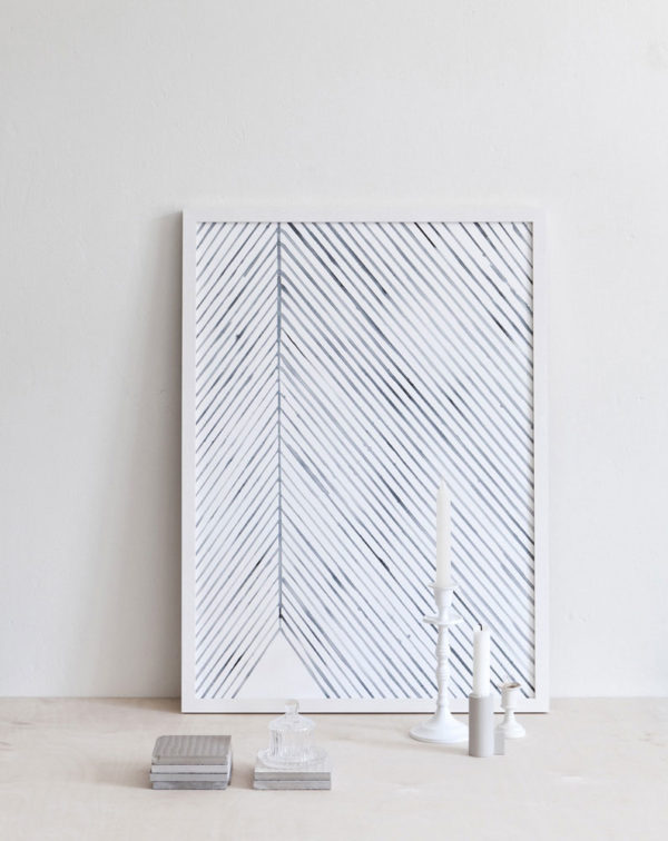
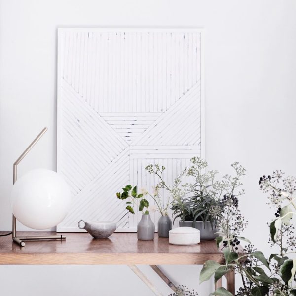
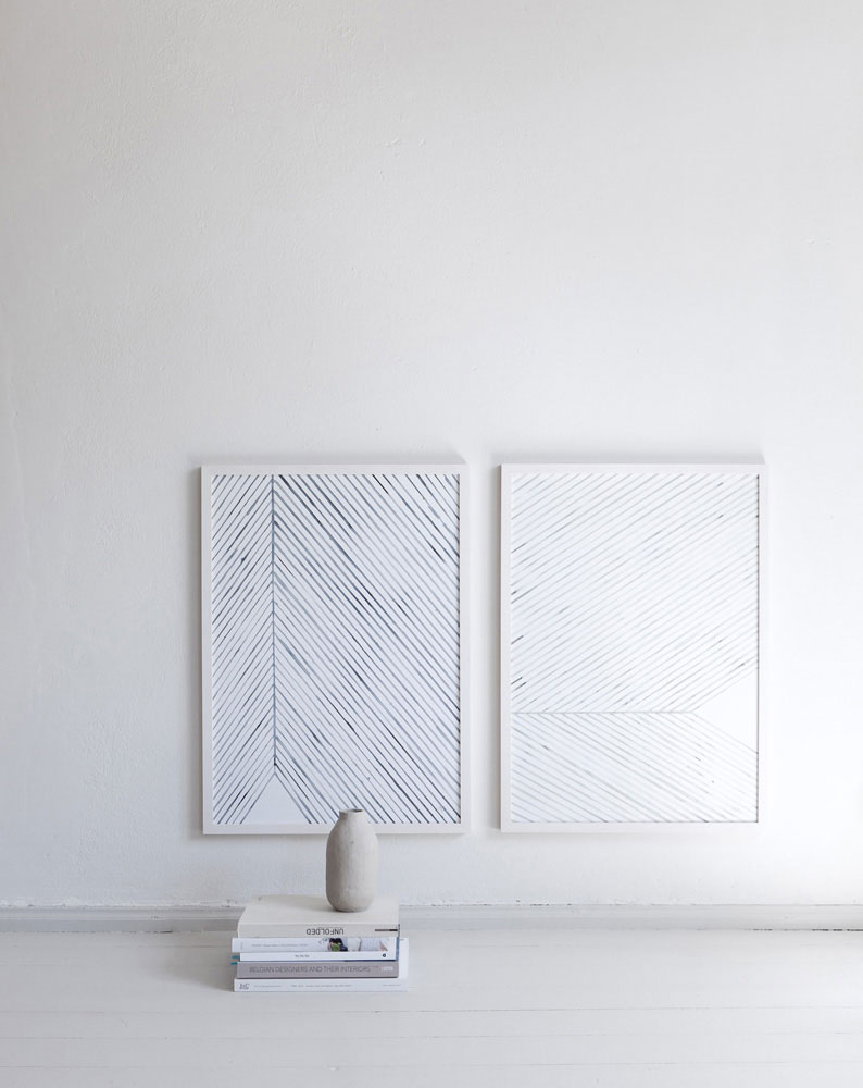
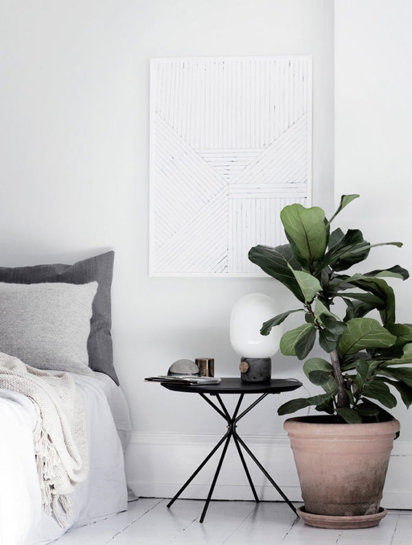
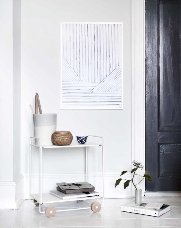
Silke Bonde is a Copenhagen-based artist who is using watercolors to create soft but strikingly modern prints. I am particularly smitten with her “Looking Closer” collection.

cove_silkebonde2cove_silkebonde1leaflines_blue_silkebonde615101646_1164134477000145_7248413737621651456_nleaflines_blue_silkebonde2silke-bonde-2leaflines_silkebonde

Inspired by leaves and elements of nature, Silke explains ” “Zooming in on the lines and patterns you will find in a leaf. Each leaf is a unique piece of art created by nature. The organic watercolor shapes combined with the straight lines gives a minimalistic and natural expression.” 

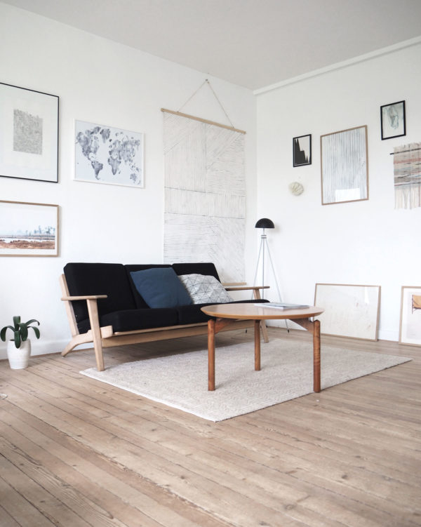
silkebondeSilke+Bonde+home+www.silkebonde

Silke’s own home is a study of a perfect mix of minimalism. I love how she intermingles soft colors punctuated with hits of black. Just like her work, her home feels soothing, yet inviting, leaving you wanting to know more. I think a couple of her prints could look lovely in our media room. Or dining room. Or really anywhere! I’m definitely going to snatch a couple up.

For our archive of Designer Files, CLICK HERE.

photography via silke bonde 

I know what you’re thinking. Didn’t we JUST see this living room? Certainly seems that way, doesn’t it?? I did make some upgrades that I shared at the beginning of the year {refresher here}, but as I put together our new master bedroom/nursery, {did you catch the reveal??} I realized I couldn’t confine all things baby to our bedroom. Our entire space needed to evolve, but that’s ok. I just read this great quote in Lonny: “The clothes you wear constantly reflect where you are in life, how much you make, what geographical area you live in, what your style is. That is what your home should be. Your home should be constantly be evolving.” Well, we just experienced one of the biggest evolutions life can can through out at you so it only made sense that we let a few baby things invade our living space. Can you spot them??

Apt34-LoftRedesign-71Apt34-LoftRedesign-72

I’m truly hoping your answer is no! We made very subtle updates to our living room in the attempt to make it more homey, but a little more sophisticated at the same time. It all started with the large-scale art over our fireplace. I’d been hunting for a piece that would work with our 20ft ceilings ever since we moved in here, but framed art that large is very difficult to find – let alone afford. That’s why I was thrilled to learn that Minted.com is now offering over-sized art! I jumped at the chance to showcase this piece by fellow blogger and crazy-good painter Emily Jeffords. I’ve long admired Emily’s work so it’s pretty fab to have her print in our loft. And at 40″ x 54″ it definitely fills the space!

We also had to say so long to our lovely but impractical modern accent chairs to make for…a glider! Yes, I am now the proud owner of a glider, but I love that no one notices we have one until I actually start to make the chair rock! Mission accomplished You can snag this gem right here.

Apt34-LoftRedesign-75apt34details

I’ll also take any excuse to refresh my accessories game so we added some sophisticated pillows in linen and deep shades of gray {those textured ones were hand-knotted in Argentina!}. I also brought out all my design books – I want to be able to enjoy them before they have to be out of reach of little sticky fingers!

The gallery wall running up our stairs also got a little refresh. I was thrilled to add some new family images – and I’m loving the monochromatic color palette, of course.

Apt34-LoftRedesign-85Apt34-LoftRedesign-83

While the changes in our living room are subtle, I just the love the way the space feels these days. Warm and inviting, relaxed but also curated. And I really do take pains in keeping it this way. All baby accoutrements are put away every night before bed. Incognito baskets are now my best friend. Sinking into our couch, wine glass in hand, to survey our seemingly adult space is very satisfying indeed!

living room resources: room & board wells leather sofa // loloi rug // vintage coffee table, similar // west elm glider // jessie black knit throw // jessie black accent pillows // rebecca atwood pillow // leather stool, similar // framed photography c/o framed & matted // favorite design books

original photography for apartment 34 by aubrie pick

This post is in partnership with Minted.com. All thoughts and opinions are 100% my own. Thanks for supporting collaborations we’re excited about and that keep Apartment 34’s doors open! 

Have you ever been shopping and seen two completely opposite pieces of clothing that you were sure would never go together, but when you tried them on it’s as if they were made for each other?? That’s kind of the inspiration for this post. Too often we’re restricted to operate within “rules” of what “works.” But it’s so important to just let loose every once in a while and let your artistic eye run wild. Because that’s how the most genius ideas to come together!

That’s why we’re loving the work our graphic design intern, Brittany, recently put together. We’re constantly inspired by her eye. She has a knack for seeing things from a totally different creative perspective and we’re kind of ob-sessed {and slightly jealous!}. Today Brittany is sharing some insight on how to get your artistic eye goin’ too!

art-and-fashion-3art-and-fashion

Brittany: I’ve always been drawn to design that surprises me; design composed of unlikely elements that somehow work together. To me, creating something is about achieving a certain harmony – whether combining typefaces or mixing patterns in your wardrobe, when it comes to finding harmony between unlikely pairs it’s no different for graphic design. With some practice, you can train your eye to remove yourself from knowing things by their definition and only acknowledging them by their shape. It’s as simple as that. Yet I realize it may not be as easy as it seems!

art-and-fashion-2

The secret? Step away from what an object is and see it for what it could be – then you really start having fun! Why can’t a grapefruit be a perfectly good substitute for a head? Why not a pendant light as a makeshift hat? It’s similar to laying in the grass during your childhood and spotting animals in the clouds. You just have to sit back and let your imagination run a little wild!

art-and-fashion-5art-and-fashion-4

Then you simply start experimenting. With this type of creativity there are no mistakes – only happy accidents! And remember, letting your imagination run wild doesn’t have to mean completely reinventing the wheel. That’s where people begin to feel the pressure. You just have to think about reinventing the way the ol’ wheel is interpreted and you’re bound to come up with something fun!

We couldn’t agree with Brittany more. Are you dying over her killer collages as much as we are? How cool would they look framed and hanging on a wall?!  When you give yourself the space to play, you just might be surprised by what surfaces. We hope you can carve a few minutes out of your week to do just that – we certainly will be!

Sources:

collage 1: image 1 via James Tolich // 2 via Maiken Winther // 3 via Saintemaria

collage 2: image 1 via West Elm // 2 via Donald Gjoka // 3 via Esra Roise

collage 3: image 1 via Leta Sobierajski // 2 via Jason Kibbler // 3 via Mats Gustafson

collage 4: image 1 via Daikoku Design Institute // 2 via Studio Nicholson // 3 via Alex Proba

collage 5: image 1 via Society 6 // 2 via EetuElmeri Sihvonen // 3 via Gary Didsbury

There’s no arguing gallery walls have been having a moment that’s lasted for what feels like centuries now. As long as you have a great collection of art, the look seriously never tires. However, we ALWAYS love to see a refreshing take on this tried and true trend—and this little gallery nook is the perfect example!

a80f7e2b340cd2e99179c14223a7f281

Why not make the most of those funky little nooks and crannies with a gallery wall? These small and wonky spaces often stump us when it comes to design, but filling them with artwork allows you to choose pieces of varying sizes and orientation to custom fit the wall {We’d start with something like this and then build out the wall with smaller muted pieces like this}.

Plus, this layout shakes up the look of a traditional gallery wall and adds some visual interest to an otherwise overlooked area {Insider Tip: Use butcher paper to serve as a template prior to hanging your art}. And perhaps most importantly, this makes for the perfect opportunity to peruse sites like Minted, Tappan Collective, and One Kings Lane for killer pieces of all types of art! Any excuse to do a little shopping, right?!

image via Yellows

There must be something in the water because we’ve been gravitating towards all things a little out of the ordinary lately. It could just be that we’re feeling ready for a little color ourselves these days {baby. coming. any. day now!}, but we have set our adoration for minimal white interiors aside. These over-the-top energy filled rooms are just feeling so right, right now. With statement pieces of art and in equally statement-making design decisions have our hearts beating double time – they’re exciting, adventurous! When going for a statement, there’s only one rule: go bold or go home, right?!

interiors

We love how the colorful modern piece above inspires you to have a strong point of view! The piece adds the perfect touch of playfulness to this masculine study.

A statement wall isn’t complete without statement art. One large piece on a striped wall would have been ballsy, but four fashionable portraits is even ballsier, and we like it!

bold-interiors

We love how the art does all the talking in this otherwise muted space. We love it’s low horizon line and unusual off-centered placement.

oversized-art

Speaking of, this oversized piece looks like it barely fits between the molding. And we’re sure that somewhere there’s a design rule that says this “doesn’t work.” But we like it’s rebellious, pushing the boundaries {or in this case, molding!} placement!

bold-art-interior

The exaggerated doorway and bold colors below are the perfect match for this jumbo “5.” It makes us re-think where art should live – the answer is everywhere! – and for that we give this design choice a score of 10!

art-interior

So why not applya bit more fearlessness and grandeur in your decor decisions moving forward? If you have a blank wall that could use a little, or in this case, BIG pick-me-up we say go for – make the big move! You can check out more boundry-pushing decor ideas here!

image 1 via Est Magazine // 2 via Greg Natale // 3 via // 4 via Interior Design// 5 via Red Architecture

While I’ve long been an art fan, it’s rare to have the opportunity to call an admired artist a dear friend. That’s why I feel both lucky and constantly inspired by watching photographer Emily Johnston evolve her craft and chase her passions by transitioning from a wedding photographer to focus on her fine art full time. We’ve certainly had some fun shoots in the past {I think this one is my fave}. Now Emily is breaking boundaries with prints of her Instagrams, creating innovative collage work and photo documentary series.  Ethereal, haunting, inquisitive – those are just a few of the adjectives that describe the quiet moments Emily captures.

emily-johnston-headshot

We’re so fascinated by what Emily sees in everyday life that allows her to find grace in ordinary things. We love how her lens interprets the world. We could sit and pick her brain for hours. Thankfully, she let us!

emily-johnston-nyc-photographer

From Emily: “What’s essential to me about travel is the sense of disorientation it procures. That feeling of not knowing where I am, or exactly who I am in a new context allows me to look at everything around me with fresh eyes. It’s something that doesn’t come easily in familiar environments, but even when I’m not traveling, I think of the words of the bedridden Marcel Proust, “The real voyage of discovery is not in seeking new landscapes, but in having new eyes.” So whatever it is that allows you to find that feeling….”

emily-johnston-photography

“About the images in our Holiday Pop-Up Shop: “When I see this image I made in Rome, I think about a different image that I didn’t make. It’s funny how one image can remind you of a moment, not just itself…the power of association! Anyway, inside this chapel there was the most insane 12 foot fresco with a sort of strange blue crest shaped form with these two eyes floating in it. I’m sure there’s some specific historical art context for it, but it’s not one I ever learned about in school and I loved the feeling of discovering new weird spiritual imagery.

The second image is from a simple quiet moment waking up with a cup of coffee at my parents’ place in Paris. It’s always nice to be home in that city, and I seem to find a new connection to it every time. I don’t ever remember such dramatic sunlight like this growing up, but there it was.”

emily-johnston-printsemily-johnston-photography-1

“I share images that move me and that I want to remember. The ones that inscribe themselves in a personal or shared narrative. I’m always looking for ways to connect things or people. I don’t think diptychs are a trademark of my work, but I like the way individual images interact, when placed together in groups. There’s both an aesthetic and narrative synergy that can happen. That’s what I try to stay receptive to.”

Emily has an undeniable talent of making even the smallest dot of light flickering on a wall captivating. So there’s no question that these limited edition {individually numbered!} travel prints would conjure up endless inspiration gracing your walls! Shop them RIGHT HERE.

headshot c/o Emily Johnston // images via @emily__johnston 

As summer says its final good-byes, we’re also saying farewell to our class of summer interns! We’re desperately sad to see them go. Their fresh energy, enthusiasm and creative ideas were such a fabulous injection of Team Apartment 34 mojo. But they aren’t going quietly! We’re thrilled to be sharing some fun posts with you over the next few days. First up, a very observant evalution of art’s inspiration on fashion – and perhaps vice versa – from our editorial intern June

We love monochromatic minimal looks as much as the next girl, but we have to ask… have we been a little afraid of color lately?! You know our mantra: be daring and confident with your style – and don’t ever be afraid to push the boundaries! That said, the boundary between art and fashion has never been totally clear- it seems like one is always “taking inspiration from” the other- but that’s what is so inspiring. You can literally watch art as it comes to life down the runway in that structured Celine top or those Philip Lim pants. But why only gaze at art from afar when you can be incorporating the movement, form, lines and beauty into your own wardrobe?

So today, we’re taking inspiration from brilliant pieces of art and going further than merely enjoying it on a wall- we’re marrying it to together with fashion!

art-and-fashion-4-apartment-34

1. We had to pay homage to Hockney {who recently had a huge exhibit at the De Young museum here in SF!}. His painting of palms in simple strokes and bold hues just pull you into this summer scene. Bring in a pop of purple against a similar green and sky blue color pallet, and instantly channel Hockney in your daily sartorialisms!

art-and-fashion-3-apartment-34

2. Here’s a black and gold inspired pairing that even Sam Sparro would approve! We love how the understated elegance of the gold speckles against a darker palette light up the scene. In the style inspiration, the gold snakeskin sleeves on the Lanvin top are glam without being overbearing when paired with the same pattern in black.

art-and-fashion-6-apartment-34

3. Bold brushstrokes that bring movement to a strong silhouette can be seen through energetic waves of black fringe in this Harper’s Bazaar editorial – they’re the perfect amount of understated drama, whether you’re wearing them or enjoying them on your walls!

art-and-fashion-5-apartment-34

4. Shades of blues, pops of green, and a dash of black inspired by the fluidity and freshness of nature adorned on a white coat makes for such a clean yet artistic look! We’d love a similarly abstract piece for a shot of color along a hall or in a bedroom.

art-and-fashion-2-apartment-34

5. Who said watercolors are just for kids? Here’s a fun way to break out of the boring everyday black and white pairing- add a splatter of paint et voila!- a look that shouts playful without losing its mature edge. We see an art DIY in our future! We’ll leave the fashion to Phillip Lim.

art-and-fashion-apartment-34

6. Rich hues of vibrant pinks, greens, blues and gold all mixed together in an outfit- sound like a recipe for disaster. But artfully applied, like on the legs of a chicly tailored pair of pants, it adds an unexpected and creative element to an outfit! It’d also be a lovely way to add a pop of color to a neutral living room.

Sometimes an artistic risk adds a the shot of pizzazz to an everyday routine that we could all need. So it’s time to play with dynamic, statement making pieces because after all, as Oscar Wilde so wisely said, “one should either BE a work of art or WEAR a work of art.” How about aiming to do both! — June


image 1 via // 2 via Flair Italia // 3 via Vogue // 4 via Satsuki Shibuya // 5 via Sasha Pichuskin // 6 via Harper’s Bazaar // 7 via Style.com // 8 via // 9 via Du9 // 10 via Style.com // 11 via // 12 via The Tappan Collective 

Having the office done is Such. A. Relief. From day one, I set out to create a space that would really help get the team’s creative juices flowing. I wanted ideas to literally bounce off the white walls. But trying to stay minimal can be a bit tricky – design is very much in the details when every piece counts. And when you’re working on a budget making the perfect choices definitely took more time than expected!

But as promised, we’re breaking down some of those details today {and over the next couple of weeks!}, first focusing on the upgrades to the walls. We found affordable, simple and most importantly fun ways to really make the space feel brand new!

apartment-34-office-inspiration-boardinspiration-board

We spend the vast majority of our time glued to screens, so I really wanted to capture wall space for old school inspiration. I used to have boxes and boxes of magazine tears, people – that I moved cross country…twice!  As we worked on the redesign, we always kept our eyes peeled for new and interesting ways to display pieces of tangible, physical inspiration. That hunt became the source for our most economical DIY yet! Can you guess what it was??

office-mood-board

We’d been seeing metal grates pop up all over our fave Scandinavian blogs, so we decided to try and make one ourselves! A simple trip to the hardware store yielded the perfect large scale wire grating for $7! To take it a little beyond junk yard chic, we simply laid it down on some cardboard and spray painted it white. Now it simply hangs from picture hooks. We call it our modern pin board and we’re all obsessed.

The grate is the perfect solution for an awkward wall space that needs some visual interest {it hangs on this weird blank spot right before you enter the bathroom!}. It adds texture and interest all on its own, but we use it to hang styling ideas for upcoming shoots, odd knick knacks and our favorite art for a seriously cool 3-D statement!

apartment-34-team-officeinspiration-rack-apartment-34

Since half of the team is facing a wall when sitting at our new co-working desk {the now iconic Strut Table from Blu Dot, btw!}, we needed something inspiring to look at there too. Instead of doing a typical gallery wall, we loved the idea of creating a rotating inspiration shelf. With acrylic clipboards from Muji {they proved more economical than these gorgeous ones from Russel & Hazel!} and a simple picture rail, we have a chic and quickly interchangeable moodboard to display our most recent magazine musings!

apartment-34-office-paintingoffice-light-apartment-34

In our book, no office is complete without a bar and we wanted ours to be a highlight of the space! We started out by creating a black statement wall {painted with Flat Silhouette by Martha Stewart Living for The Home Depot}. Keeping with the minimal style, we floated a clean-lined Ikea console with white lacquer doors and Ikea-hacked it with a customized black surface {aka $10 black contact paper purchased on Amazon!} Then we brought in one major piece of artwork. This is an especially meaningful piece, as we commissioned our very own Editorial Director to make it! Bianca recently discovered this stunning hidden talent {you may remember the piece she did in her own living room here!} and her gorgeous abstract ink on canvas really brought the wall to life {inquire about your own piece here!}.

When it came to lighting, we didn’t have the luxury of installing a “major moment” over our new desk due to a concrete ceiling, so we figured out how to work with the tracking lighting that was already there. We used a simple custom brass pendant {made by studioPGRB!} to make a stunning, singular statement. We also added a monochromatic black wall sconce by OneFortyThree to instantly upgrade our lighting game!

apartment-34-office-art

Finally, we created a mini-gallery moment in our “creativity corner.” Still wanting to keep things as uncluttered as possible, we focused on four art pieces all with a similar color palette and gold frames. The two new ones are original works by fave artist Jennifer Ament and the last little detail is simply a hand-painted watercolor card that we slapped up, unframed, but it totally rounded out the moment. The fresh combo made us fall in love with our favorite art piece from the original design all over again – our Life Magazine image of Vegas showgirls playing chess backstage! J’adore.

That’s detail on just a few of our favorite mini moments around the office. We hope you can see how the simplest changes can have the biggest impact on a room. Next week we’ll break down the creativity corner, the supply closet {remember our most popular DIY to date!} and what’s on our prop shelves! Stay tuned.

__________________________________________________________________________

SHOP the Office Makeover Sources

> Strut Table, Blu Dot

> Slope Chairs, Dot & Bo

> Black & White Rug, Lulu & Georgia

> Pendant light, studioPGRB

> Wall sconce, OneFortyThree

> Throw pillows, Designer Fluff

> Dipped natural wood tray, The Vintage Vogue


original photography for apartment 34 by Aubrie Pick // moodboard image 1 via Lotta Agaton // 2 via Design Sponge // 3 via Style At Home // 4 via Trendenser // 5 via Stylizimo // 6 via Rebecca Centren
As we celebrate the unofficial start to the summer season, we’re really hoping the coming months are filled with moments exactly like this.

josepmoncada2apt34-memorial-day-josep-moncada4josepmoncada1

Sweet sips of lemonade, lazy afternoons in the hot sun, followed by cool dips in the pool…I think the painter Josep Moncada captures the feeling of the season rather perfectly, don’t you?

I hope you have a wet and wild {or wet and mild! if you prefer} day off! We’ll be back to our regular posting schedule tomorrow!

art by josep moncada

Older posts
Gimme More