If I didn’t know, I would never believe this home sits on a university campus. This elevated, classic space features a beautiful mix of mid-century design icons, modern updates on traditional shapes and subtle art, all in a creamy neutral color palette that makes my heart melt.

This oversized living room is the perfect spot for large intellectual debates. This space also perfectly exemplifies how natural materials and a variety textiles can play oh so nicely together. Leather, stone, steel, linen, wool and wood all play harmoniously to create a tranquil, sophisticated seating area.

Eva chairs by Bruno Matthson add a cool vintage vibe to a seating area. The vintage elements also help balance out the modern gas fireplace.

Traditional elements, like a rolled arm sofa with caster feet, feels fresh when paired with the clean-lined set of four coffee tables and a minimalist leather bench.

Simple wood and leather hooks create a great landing place for coats.

The kitchen offers lovely contrast with a bleached oak table and pops of black accents.

I love a kitchen with a bit of open shelving. It’s your opportunity to inject personality into what can be a kind of ubiquitous space.

I don’t know if I’ve ever seen such lovely hidden storage. It’s almost a shame its behind a closed door!

Is that another black coffee table I spy? I’m telling you friends, this is a great way to make a bold statement. That BDDW credenza is also major goals.

The simplicity in this guest bedroom is pure genius. The tufted mattress and simple walnut bed frame are showstoppers in and of themselves. The art is bold and geometric but its cream and blush tones keep it from overwhelming the room.

More vintage and BDDW goodness elevate all the functional elements of a bedroom.

I spy an iconic Fritz Hansen Series 7 chair amidst an office full of found vintage treasures.

This bedroom features a traditional American craftsman pieces in a calm, minimal style.

This home is a perfect example of making wise investments. You don’t need to overwhelm a home with a ton of stuff. If you make the commitment to bring in timeless style, you won’t feel the need to swap things out nearly as often.

Ok, I’m off to go edit all the cheap sh** out of my house now. How about you?

For more inspirational home tours, CLICK HERE.

design by thea home, inc. , photography tessa neustadt 

I may be back in the office this week, but an overabundance of jet lag, emails, photos to edit and a general denial that my summer in Italy is over has made it a bit tough to get back on my blogging game. For that, I apologize. I’m determined to chip away and get eager to share all my Italy travel guides, the myriad of design updates I’m working away on and so much more. Sadly my brain works faster than fingers on the keyboard. So for now, I’m just going to keep chipping away, but then I spied this bright and cheery kitchen that stopped me in my tracks and made me smile, so I had to share immediately as I thought it might brighten your week too.

A Peach Kitchen on apartment 34

It just so happens that this lovely space belong to my amazingly talented friend Rosy, so it’s no wonder the design is picture perfect. I actually shared this kitchen in this post after I hosted this event in Rosy’s beautiful home. The change from this kitchen’s previous look is rather dramatic. As someone who very publicly eschews the use of color, I don’t know that I would ever think to paint my kitchen peach, but after seeing the affect of this amazing makeover I’m all for it.

A Peach Kitchen on apartment 34

The secret to success when using a hue like this, is to use it as a pop of color. I actually did something similar, albeit with a dark hue, in the Sunset Bungalow project. Using color as an accent gives a room an extra dimension and a jolt of interest. Imagine if the kitchen niche was simply white. You’d hardly even notice it at all. I also love the addition of shelf, painted in the same peach hueIt adds another layer of texture and it quite practical in a kitchen. You always want a (good looking) kitchen tool or two at the ready.

A Peach Kitchen on apartment 34

While certainly a touch feminine, the dark woods and mix of terracotta tones keep things from tipping too girlie.

 A Peach Kitchen on apartment 34

I spy the perfect amount of terrazzo with that nicely placed tray.

A Peach Kitchen on apartment 34A Peach Kitchen on apartment 34

I don’t know about you, but this is the midweek pick-me-up that I needed!

For more color inspo, CLICK HERE.

photography by seth smoot for domino magazine

While this time of year is usually about all things red, green or at least metallic, today’s home tour is filled with warm color palette, filled to the brim with chocolatey brown goodness that still feels equally cozy and inviting – and I would argue appropriately seasonal.

Home Tour: A Warm Color Palette to Ward off the Winter ChillHome Tour: A Warm Color Palette to Ward off the Winter Chill

The delicious chocolate brown floors that stretch throughout the home anchor the minimal white walls without the stark contrast of black (as you see here). Pops of golden-mustard, be it in pillows or throws, combined with candles being dotted throughout are the perfect understated nod to the celebratory season.

Home Tour: A Warm Color Palette to Ward off the Winter Chill

The mix of textures keep the use dark brown hues from becoming one note. I spy woods, leather, velvet and wool all mix to a very inviting effect.

Home Tour: A Warm Color Palette to Ward off the Winter Chill

If you’ve ever shopped for a vintage oil jug, you’re used to seeing the clear versions. You might be lucky enough to happen upon a green one. But an amber jug is particularly stunning. It has me scrambling for an amber accessory or two to add to my Christmas decor.

Home Tour: A Warm Color Palette to Ward off the Winter Chill

The checkered floor in this space could feel too retro, but instead it offers a bold contrast to the modern, minimalist kitchen. Golden amber glassware helps further soften the look.

Home Tour: A Warm Color Palette to Ward off the Winter Chill

The caramel-y wood dining chairs pop off the black dining table.

Home Tour: A Warm Color Palette to Ward off the Winter ChillHome Tour: A Warm Color Palette to Ward off the Winter ChillHome Tour: A Warm Color Palette to Ward off the Winter Chill

If you swapped out this bunch of pampas grass for a sprig of pine, you’d immediately feel the holiday mood.

I think I need to add a milk-chocolate brown throw on my bed for winter! Are you loving this color palette as much as I am??

For our home tour archive, CLICK HERE.

images via fantastic frank

While all-white interiors are a stalwart of Scandinavian design, as I sit in 20-something degree weather in Seattle, I’m finding myself drawn to cozier, more rustic versions of winter whites on white on white on white. I’m curious to see if you’re feeling this look too.

Color Coded: Winter Whites on apartment 34Color Coded: Winter Whites on apartment 34Color Coded: Winter Whites on apartment 34Color Coded: Winter Whites on apartment 34

While there’s a bit of wabi-sabi to this look, key decisions keep the look from going to shabby chic. Modern light fixtures make a ton of difference. A classic Nelson saucer pendant lamp or maybe a vintage Noguchi (investment alert!) help keep the look current.

Color Coded: Winter Whites on apartment 34Color Coded: Winter Whites on apartment 34

Clean modern lines juxtaposed with more traditional pieces mix for the perfect cozy, rather than sterile feel.

Color Coded: Winter Whites on apartment 34

And all kinds of texture – knits, wools, linens, woods, hides, paneling, painted brick, exposed beams, they all combine to give you that nest-like feel.

Color Coded: Winter Whites on apartment 34Color Coded: Winter Whites on apartment 34

People often lament that white furniture is highly impractical, but I actually beg to differ. With the invention of Oxyclean, you can get rid of just about any spill quickly and keep your whites bright for the long term.

For more color inspiration, CLICK HERE.

interiors by leanne ford / fantastic frank / the design villa

When looking at bathroom design, things can start to feel a little same same. Lots of marble. Check. Recently it’s been a lot of black hardware and vertical tile. A lot of vertical tile. And I get it. All of that always looks good. But then a stunning space flips all the current design trends on their head and it’s oh so good.

award-winning bathroom on apartment 34

This beautifully rosy bathroom is a quite the show stopper. In fact, it’s awarding winning. Its creator, Decus Interiors just won the Belle Coco Republic Interior Design Award for best bathroom design in Australia. It’s pretty easy to see why. I’m not sure I’ve ever seen anything quite like this.

Created for a client who wanted a stunning feminine yet bold retreat dedicated to the ritual of bathing. I think this room succeeds in spades.

The bath is clad in an incredible rosy-hued onyx slab. The movement and texture in that stone is insanely good. It is simply show-stopping. The concrete floor was tinted a matte pink to match.

award-winning bathroom on apartment 34award-winning bathroom on apartment 34

Staying true to the color scheme, all of the fixtures are rose gold – even the base of the unique sink. Things were kept from getting too overtly girly by painting the walls a light gray and adding the subtle pops of black – the art piece, the wall sconce. It’s hard to tell, it appears it’s an Apparatus Studio trapeze sconce (or something very similar). I also love the unique somewhat organic shape steel encased mirror.

Because this room is only for taking baths (must be nice) there’s no need for excessive storage. Hence the ability to create a single shelf along the backsplash for flowers and a few bath accoutrements.

award-winning bathroom on apartment 34

This amazing little space is impressive for its simplicity as much as it for its striking impact. Would I want to take a bath in a predominantly pinks space all the time? I’m not so sure. But it is so refreshing to see something completely out of the ordinary.

Are you feeling this trend-bucking bathroom?

For more bath-related inspiration, CLICK HERE.

design by decus interiors / photography by felix forrest

As we dive into summer, (I mean, we’re close enough) I realized I’d yet to throw a party this year. Not really sure how that happened. Oh wait, I have a three-nager. That might be why. But I recently decided that had to change (not the having a toddler part – the party part). I’ve learned you really shouldn’t wait for a reason to get friends together. They take too long to materialize. Instead, just make one up! A brunch to welcome summer seemed like as good of a reason as any. But as a busy mama I’m in no mood to spend hours pulling a party together.

So I pulled out all my tricks to host a beautiful summer brunch without losing my mind. And today I’m spilling the beans in the hopes it might inspire you.

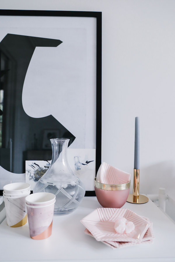
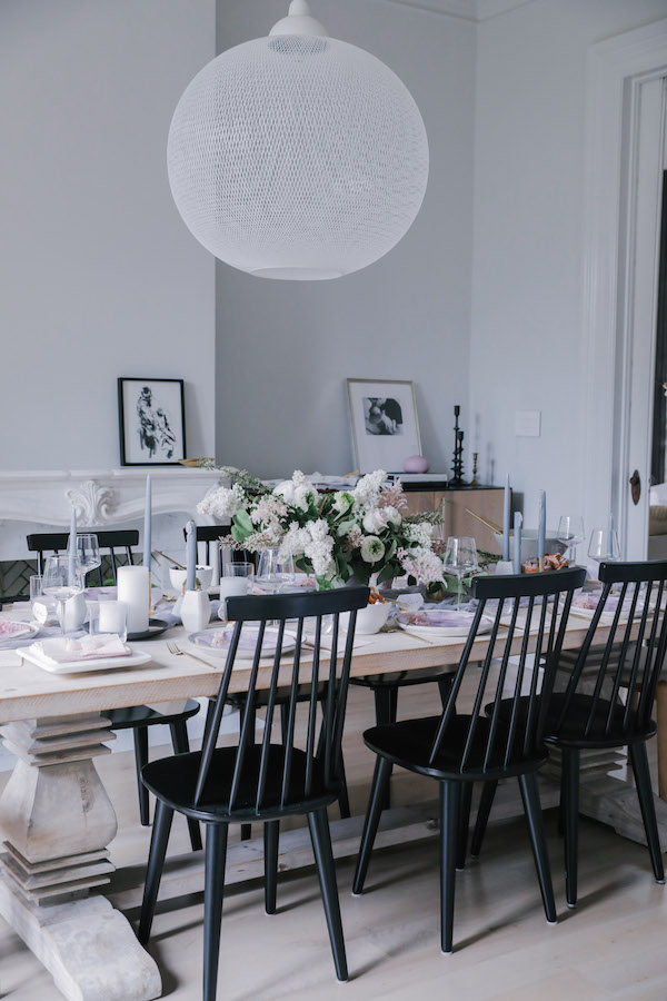
TRICK 1: Amp up your tabletop. A gorgeous tabletop is a bit of a ubiquitous requirement for a brunch, but who can manage to stock multiple set of dishes to switch up a look? That is where the first trick comes in. Take your classic set of white dishes next level with Harlow & Grey. If you haven’t discovered Harlow & Grey yet, I’m about to blow your mind.

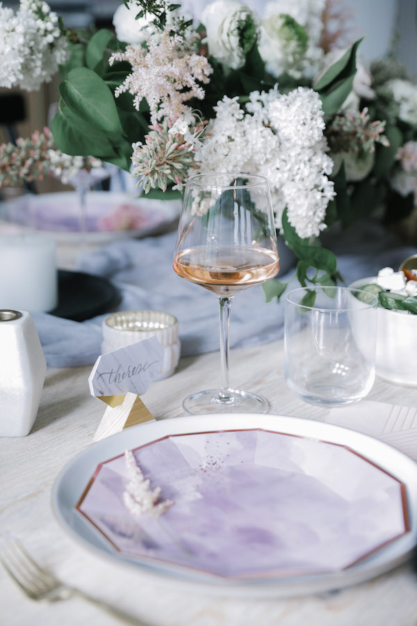
This line of modern party goods is absolutely stunning. This is way more than a disposable plate. Harlow & Grey’s artful collections (think black, gold, even marble!) feature modern designs and amazing attention to detail like gold-foil edges and of the moment colors. Hello, amethyst, color of the year. Harlow & Grey’s coordinated pieces offer plates, cups, dinner & cocktail napkins to transform all your tabletop staples. I’m obsessed with the light and lovely look we created for this party.

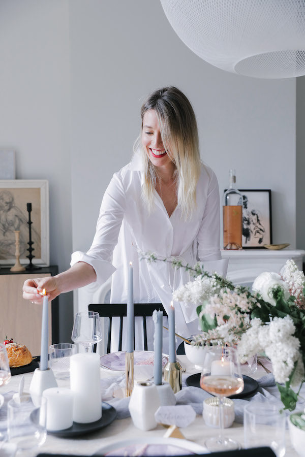
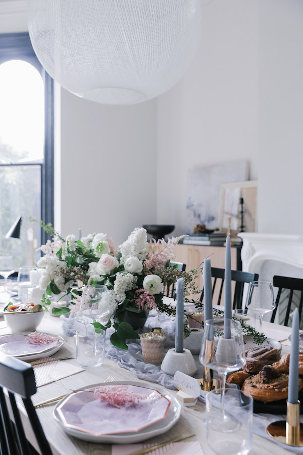
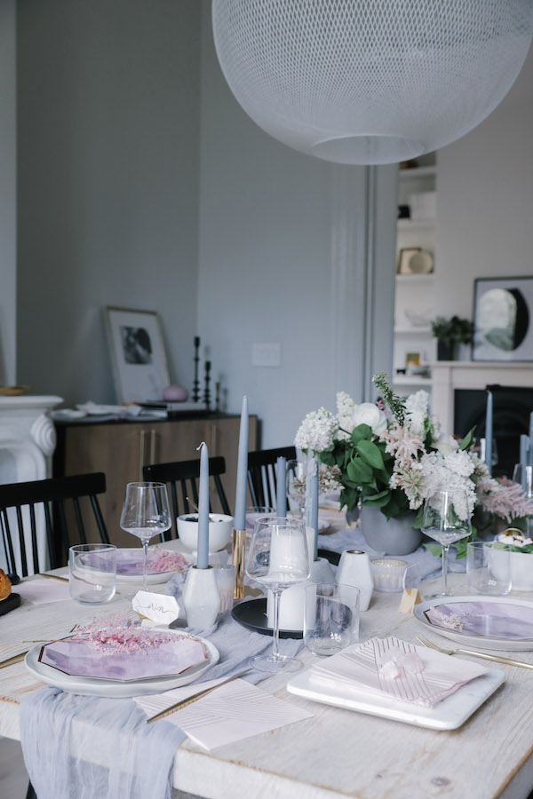
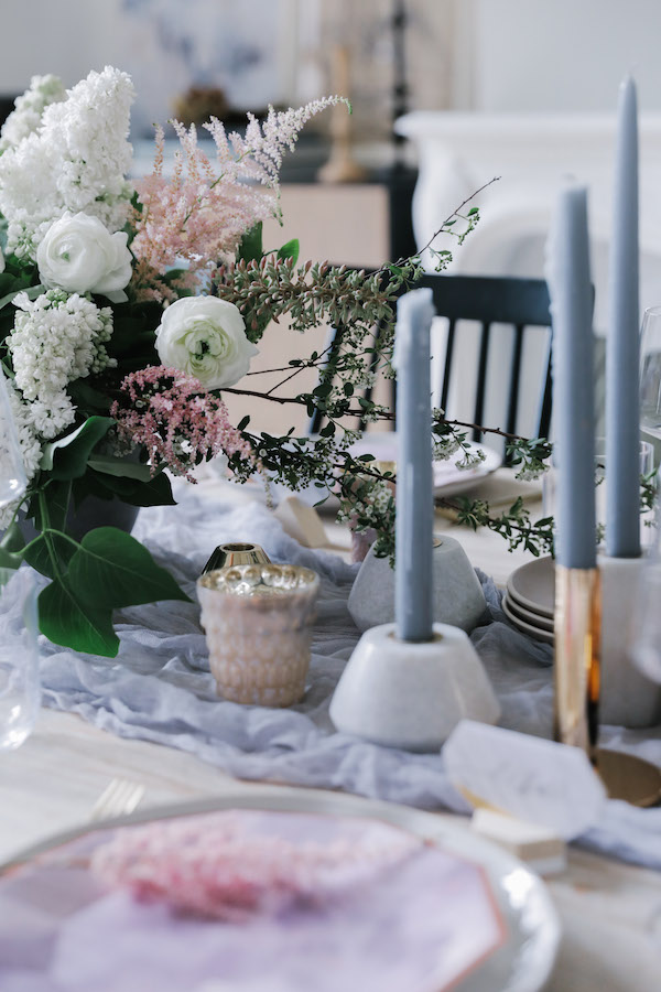
To celebrate the transition from spring to summer, we layered my dining room table in a sea of pale lavender, white, and subtle pinks A mix of gray and white candles in marble and brass holders added ambiance. Hits of black kept things from getting overly saccharin. To make things feel extra personal and little more special we added Harlow & Grey place cards and a flower sprig on each plate. It’s those little tiny (easy!) details that take a table next level.

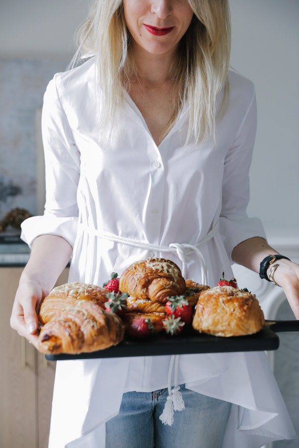
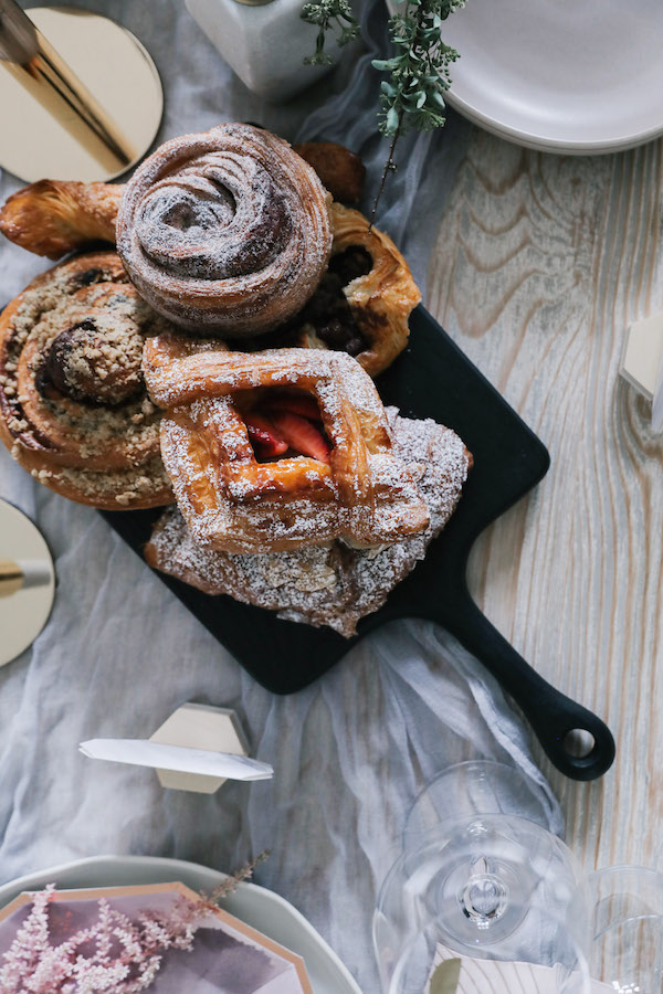
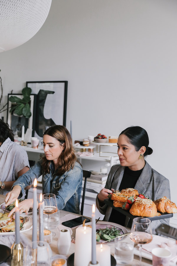
TIP 2: Don’t sweat the food. While I’m all for some good home-cookin’, when you’re hosting why take on the unnecessary burden? Especially for something like brunch. I strongly advise hitting up your favorite bakery or cafe for a bevy of treats. Things like quiche can be purchased the day before and reheated. Salads are simple and easy.

I turned to Le Marais Bakery, my go-to spot in San Francisco for an amazing treat. Supplement with fresh berries, mixed nuts & dried fruit and everyone will go home quite satisfied. And you won’t have spent hours slaving in the kitchen. Win win.

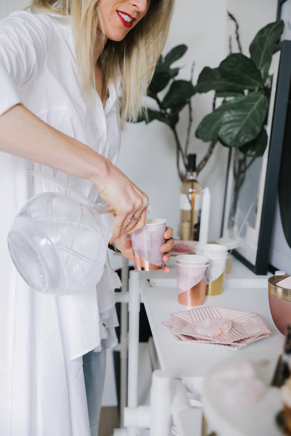
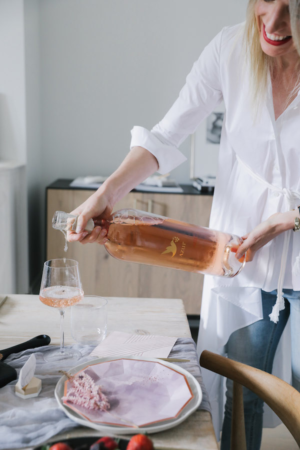
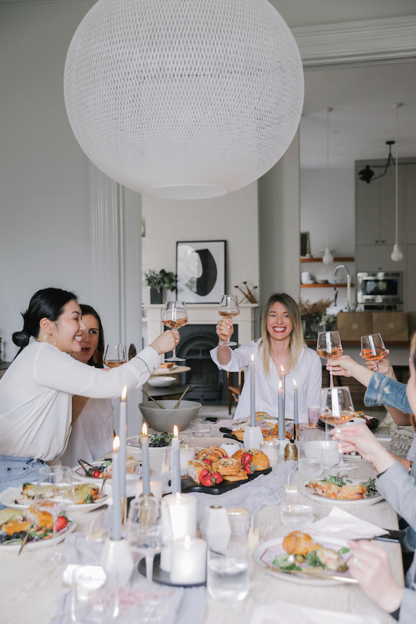
TIP 3: Rosé all day every day. Enough said. Except if you want to make a really dramatic moment serve up your rosé in a magnum. Just be sure you know how to open the bottle. (check Instagram stories today to see my poor attempt to open my favorite Azur Rosé).

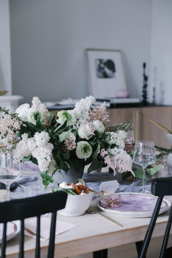
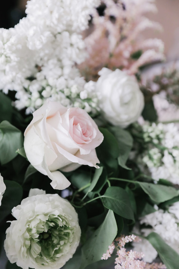
TIP 4: Take your flowers next level. You can break the grocery store bouquet habit. Thankfully now there are some really great sources for beautiful blooms that you can arrange at home. We’re lucky in the Bay Area as we often get to test out new services before they go national. Case in point, Matilda’s Magnolias.

Matilda Magnolias buys fresh cut flowers from Bay Area farmers, changing the weekly arrangements to make sure they’re using the best of what’s in season. Then Matilda’s delivers a “bloom box” of stems to your door and you get to do the arranging! Each box comes with a beautifully illustrated tip sheet on how to make the best bouquet. Matilda’s introduced me to Astilbe which might be my new favorite bloom.

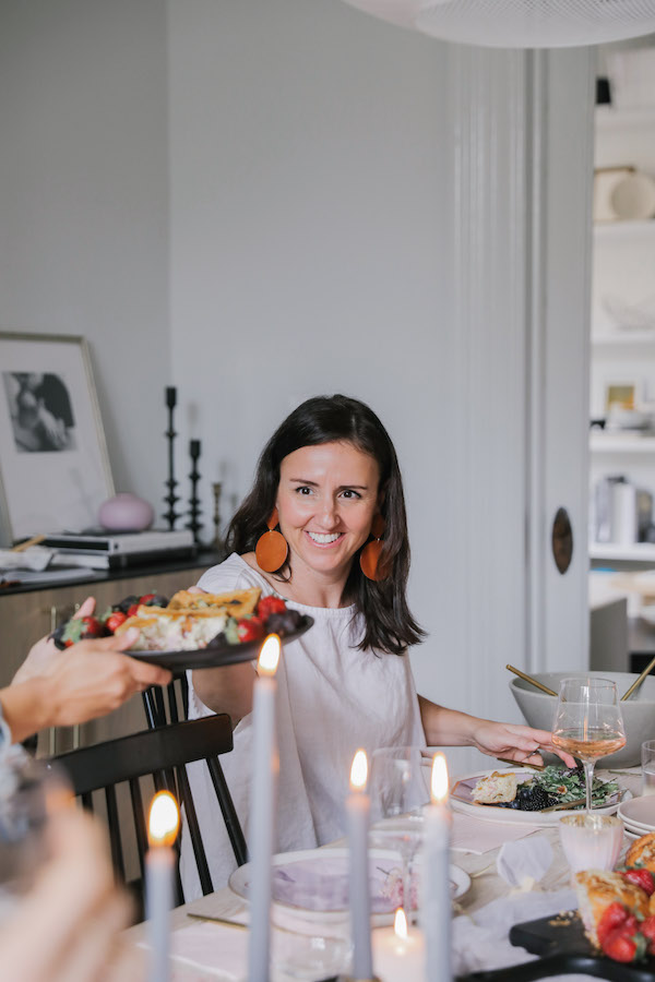
And so you see – there was really hardly any work that went into pulling this pretty setting together. I sent the invite out via email. Easy. Almost everything on the table could go in the compost or recycling bin. Clean up was a breeze.

I want this brunch to serve as the model for your gathering this season. Because you can create a stunning atmosphere, have delicious treats, a table full of people you love and not make yourself crazy. You just have to remember you don’t have to do everything yourself. There are amazing, beautiful things created by amazingly talented people who can help you. And there’s no shame in that!

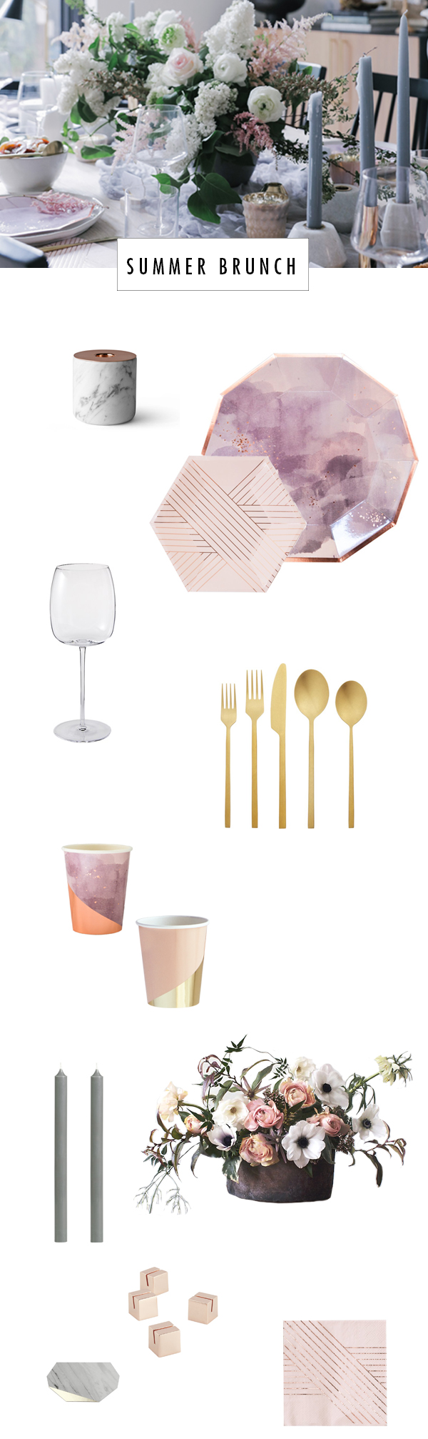
SHOP THE TABLE: harlow & grey plates / marble candle holder / wine glasses / gold flatware / harlow & grey cups / gray taper candles / matilda’s magnolias blooms / harlow & grey place cards / copper place card holders / harlow & grey napkins

This brunch was a such a special treat and shared with such lovely friends that we had to go and make a beautiful video to capture the day. I hope it inspires you to gather your girls and spend some time together for no other reason  than the fact that you can.


For even more summer party inspiration, CLICK HERE.


original photography & video direction by andrea posada creative
amethyst collection tableware by Harlow & Grey
wooden place card holders from Esselle 
calligraphy by Joy + Confetti
floral arrangements by Matilda’s Magnolias
brunch spread by Le Marais Bakery
rosé via Azur wines
gifts by saje wellness / lilah b beauty / karuna skin 

This post is in partnership with Behr. All thoughts are 100% my own. Thanks for supporting posts that have kept Apartment 34’s doors open.

how to have fun with paint color on apartment 34

Guys, I’m super excited to share an update about the #thesunsetbungalow with you today. In case you’ve forgotten (or in case you missed it), I’ve been helping my friend Chloe (if you don’t follow her on Instagram, you should!), do some updates to her recently purchased bungalow in San Francisco’s Outer Sunset. A few weeks back I was polling you, dear readers, on paint color inspiration from BEHR’s 2018 Color Trends. I so appreciate everyone who weighed in.

We’ve gone ahead and made our final paint choices and the big reveal is currently on Domino!

how to have fun with paint color on apartment 34how to have fun with paint color on apartment 34

These are only a couple of juicy sneak peeks at how Chloe’s home turned out. Head over to Domino right here to see the rest! And don’t worry, more details about the makeover will be headed your way next week.


photography by andrea posadas creative 

If you checked in on our Sunset Bungalow update last week, you saw our first paint color dilemma in the bathroom. The overwhelming majority of you voiced your support for painting the back wall of Chloe’s bath with the color Positively Pink T18-01 from my partner Behr paint’s 2018 Color Trend palette. While we’re going to wait to reveal our final design decisions until the entire house is complete, the vote went so well we wanted to get your opinion yet again! Today we’re talking fireplaces.

Chloe is lucky enough to have a fireplace with a gorgeous deco-inspired mantel in her living room. I’m obsessed. But the fireplace is also a bit of a difficult design element. It sits on an odd angled wall tucked into the corner of the living room’s west side. You can’t center furniture around it. You wouldn’t put a TV over it. Instead, it has to be treated more like an art installation rather than a place to congregate. So we’re going to run with that.

As I worked on the living room design, I realized this was another great opportunity to insert innovative use of paint. When we fell in love with Behr’s 2018 Color Trend hue Equilibrium T18-20, we immediately wanted to add the deep, rich green to this spot. The image below is our current design inspiration.

Since Chloe’s fireplace isn’t functional, we decided it’s the perfect place to showcase her love of plants, as in the image above. Grounding the fireplace in Behr’s deep, sophisticated green will make a perfect backdrop for a mini urban jungle. But we would love your thoughts on one key choice.

OPTION ONE

Our first option is to simply highlight the chimney chase with Equilibrium T18-20. This options feels a bit more traditional and classic.

OPTION TWO

However, we’re seriously considering the idea of turning the corner with the paint color. By adding a second wall (per your questions in the comments, this wall is actually about 3 feet wide and abuts a doorframe), the effect is more graphic. It feels influenced by modern cubism. And like the inspiration image, it will create a little corner that can house both plants and possibly a little chair or stool.

So what say you? Are you feeling the bolder look of Option Two? Or are you more drawn to the traditional look option one. Please weigh in by commenting on this post as we would love to know!

For all the details about the Sunset Bungalow Project RIGHT HERE.

This post is in partnership with Behr. All thoughts are 100% my own. Thanks for supporting posts that have kept apartment 34’s doors open.

If you missed last week’s announcement, I’ve been working with my friend Chloe to whip her recently-purchased San Francisco bungalow into shape. It’s a charming classic San Franciscan home, but was left with the…shall we say “less-informed” design decisions of its previous octogenarian owner. We’re on a mission to unearth the coolness that this home could embody.

One of the quickest and easiest ways to do that is with your paint color. It doesn’t require breaking into walls or a crazy financial investment. If an industrious mood strikes, you can in fact do it yourself! If there’s one thing that will immediately improve a place (even if you rent!), it’s paint.

In case you didn’t catch our design board for Chloe’s home, we’re going in a northern-California inspired direction with her color palette. Think bright and airy white mixed with pops of earthy greens, a bit of ocean-inspired blue and sandy neutrals. Thankfully, Behr Paint is helping us to bring our paint color vision to life. Behr’s collection of 2018 Color Trends offer a gorgeous palette that makes injecting a little color into your home so easy.

picking paint color on apartment 34

While we have the bulk of our paint colors selected, we also have a couple out of the box ideas in our back pocket. We want to have a little fun with unexpected color placement. Ideas like half walls, solid blocks of color and painting unusual places.  Here’s a quick inspiration board to give you a better sense of our vision:

picking paint color on apartment 34

And while we have most of our color palette picked, we did want to get your thoughts on one of our more creative ideas! Keep scrolling for a major sneak preview and please weigh in with your opinion.

BEFORE

picking paint color on apartment 34

Chloe’s home features a charming bathroom. While small, it’s flooded with natural light thanks to an amazing skylight. But the piece de reistancé is the cutest little nook for Chole’s bathtub. The space feature’s the bathroom’s original 194o’s pink and white tile (which both Chloe and I still love). It also has an amazing archway over the tub that just cocoons you. This is where we want to highlight a major pop of color.

OPTION 1

picking paint color on apartment 34

Our first option is Behr’s 2018 Color Trend hue, Positively Pink T18-01. This is a sweet, virtually matching option. It would amplify the room’s feminine vibe.

OPTION 2

picking paint color on apartment 34

Option two is a really bold moment featuring Behr’s 2018 Color Trend hue Life is Good T18-05. The orange-gold adds some major warmth and would be a bright and sunny addition to the space.

What say you? Are you feeling the pink? Or are you into the bold gold? We’d love for you to weigh in! And do stay tuned as the final design will be revealed in the coming weeks!

This post is in partnership with Behr. All thoughts are 100% my own. Thanks for supporting posts that have kept apartment 34’s doors open.

Older posts
Gimme More