In 2012 I furnished our first loft in San Francisco. I was so proud of it then – a tad embarrassed by it now, but I thought it’d be fun to walk down memory lane with you! This is a reminder that your style is ever evolving (and hopefully in my case improving!!). So keep at it until you create the space you love (case in point).

I can’t believe it: the loft is on Design*Sponge today! Grace kindly featured our little ole’ loft as part of her Home Tour series and I’ve been overwhelmed by the kind responses. In all honesty,  I was really dang nervous to invite the masses to see what I still consider a work in progress, but it’s been really uplifting to hear what you think!

loft life throwback on apartment 34

I know the kind words are due to the stunning photography of Bonnie Tsang. I feel incredibly lucky to have had the opportunity to work with her. A dream come true, really.  And there was just so much good stuff that didn’t make the Design*Sponge cut, I couldn’t help but share a few more of my favorite images!

loft life throwback on apartment 34loft life throwback on apartment 34loft life throwback on apartment 34loft life throwback on apartment 34loft life throwback on apartment 34loft life throwback on apartment 34

Creating a home in San Francisco has been such a satisfying experience. I’m also so excited to tell you all about the process. I’ve got big plans, with things like before and afters, how-to’s, favorite resources and more in-depth looks at the decor details we’re really loving right now.  Those posts are all on the way!

In the meantime, I just have to give a quick shout out to some of my favorite resources that have help me make our loft a home! They include HD Buttercup, West Elm, LampsPlus and Rugs USA and amazing small shops and artists including, Pip and Estella, Stone Textile, Designer Fluff, the GRQP, Jennifer Ament Art, Birch SF and that’s just to start!

Thanks again for all the support luvies. This blogging community…there are no words to explain what it means to me!

xx,

When you’re working with tight spaces, you gotta make evert inch count. A perfect, often overlooked spot? Under the stairs! When we were living in our first San Francisco loft and its cozy 700 sq feet, our under the stair space was used for our pups (if you want to see how you can evolve your style in 5 years look at this – oy). But our under-the-stairs space was the perfect little doggie bedroom. But you can get incredibly creative and make an oft forgotten spot super usable and super gorgeous. Check out the examples below for proof.

How to Make the Most of Every Corner on apartment 34

How about an impromptu art gallery and a little wall mounted storage? It’s the perfect place to tuck away treasures that make you smile every time you walk by.

How to Make the Most of Every Corner on apartment 34

I love everything about this sophisticated use of under the stairs space. An oversized piece of a art, a beautiful side chair and low coffee table makes a perfect little space to hide away along with a perfect vignette to enjoy as your pass.

How to Make the Most of Every Corner on apartment 34

Tucking a cozy seat under the stairwell is a great spot to curl up with a good book.

How to Make the Most of Every Corner on apartment 34

How about a mini home office? If you pick some eye candy like that vintage desk and classic chair and can can keep your piles in check, it’s the perfect place to get work done. It could almost feel like you’re in an entirely separate room.

How to Make the Most of Every Corner on apartment 34

To optimize space, try a little custom stair-stepped shelving. The closed storage is a genius move for everyone with kids (or something to hide!).

How to Make the Most of Every Corner on apartment 34

Why not use your under the stair space for a mini garden? This shelving unit is just genius. Sliding brass shelves let your plants grow to their hearts’ content.

Any other creative ways you’ve used seemingly unusable space? I’m always looking for more good looking solutions.

For all our most creative design ideas, CLICK HERE.

images 1 // 2  // 3 // 4 // 5 kelli murray // 6 design chaser

Today we’ve got our second installment of Designer’s Take, our latest series where our favorite designers and stylists share what they would do if they could ge their hands on our new/old house {reminder: I’m calling it that since the house is 140 years old!}. In this edition, our very own spring intern Ali Hartwell is offering her take on the perfect dining room. To jog your memory, here is what the dining room looked like! 

14_800px-e1427065388156 (1)

Definitely scary on the surface, but here’s what we’ll have to work with when construction is done!

Screen Shot 2015-06-05 at 4.10.23 PM

We’re really not changing too much – everything we do in this room will be cosmetic. {What? You think we should leave the raspberry pink ceiling??} The dining room is a pretty large space with a fireplace centered on the far left wall. There are also the original pocket doors that separate the dining room from the adjacent living room. A large set of bay windows sits on the opposite wall. You can see what they look like from the exterior here. It’s definitely going to be a fun space to play with! But here’s what Ali would do.

Ali’s Designer Take: I think I’ve developed such a fondness for dining areas probably because a solid chunk of my life has been spent sitting within them. So many of my favorite memories are tied to laughing and connecting with family and friends over home-cooked meals and MANY a bottle of wine. That’s why when it comes to dining room decor, I always try to create a look that’s going to invite people to sit down and stay awhile.

e0c1bd9129b61d54db2f7ce17c3bae28

If the space allows, I love defining a dining area with a piece of statement art to serve as the backdrop to the actual table setting. And what better way to compliment said artwork than with a completely badass lighting fixture?! Since there’s not really much to a dining area, I say go big or go home.

1e6b0d2451306b21ada54642b90ae3d5 home-tour-fall-out-boy-10

I imagine an Erin’s old San Franciscan Victorian to be the perfect setting for a killer dining room—high ceilings, crown molding, hardwood floors and plenty of natural light streaming in from oversized windows make for an already inviting space and the perfect blank canvas.

Here’s a look I think would play nicely in Erin’s dining room:

designer-take-ali

GET YOUR SHOP ON:

  1. Table
  2. > Light
  3. Chairs
  4. Art
  5. Pitcher
  6. Dishware
  7. Planter
  8. > Rug


I think Ali has the right idea when it comes to our dining room. I see a statement chandelier in my future and I’m very excited about that. And a eye-catching piece of art over the fireplace would be quite nice too. The search for the perfect dining table is likely to be the ultimate treasure hunt but only time will tell. Once our walls are closed up and we’re moving on to finish work I think it’ll be much easier for a design direction to take shape.

Where do you think it should head??

To see more of Ali’s design work, you can visit her website or follow her visual musings via Instagram @athartwell.

For our first Designer’s Take on what we should do in our kitchen, CLICK HERE! And for even more inspiration for our renovations you can check out my remodel Pinterest board and our Tumblr!


image 1 via The Design Files // image 2 via arper // image 3 via My Domaine

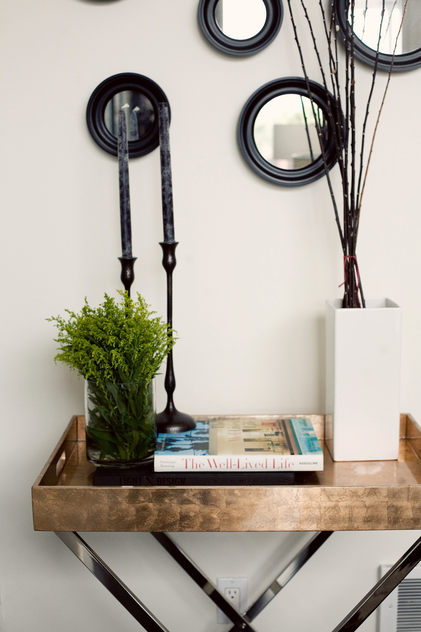
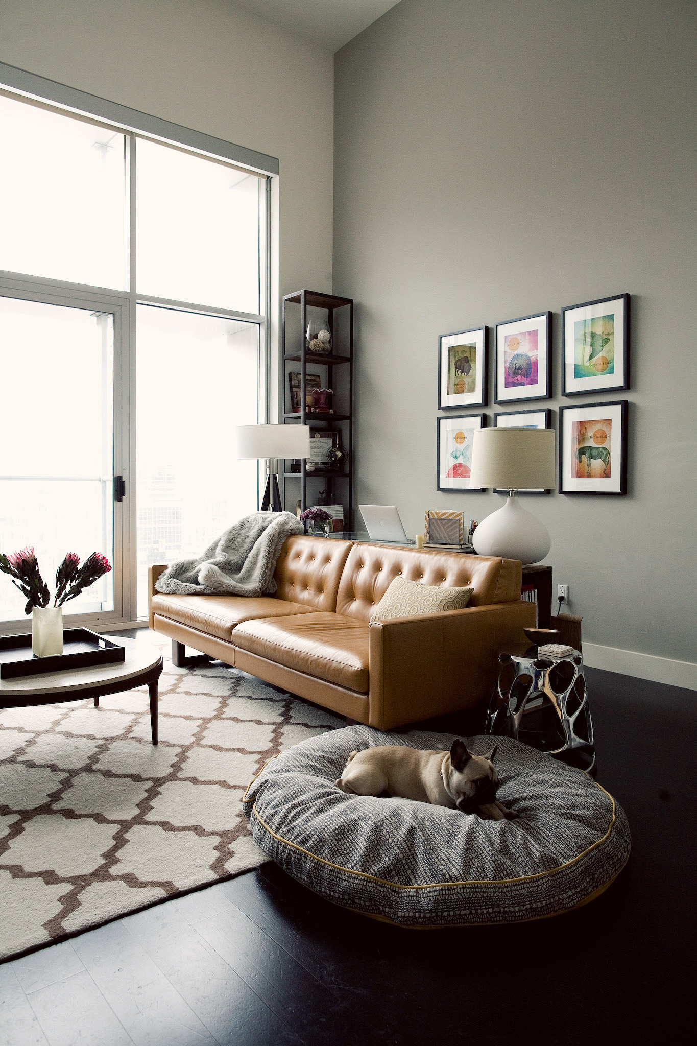
Don’t worry – I almost did too! But after months {and months!} we finally have enough progress to offer you an update! You saw the original state of the house here. But if you need a little refresher – this sums up what we got ourselves into.

Gorgeous on the outside…

apartment34_victorian1 (1)14_800px

Super scary on the inside! To remind, the house is a 140 year old historic San Francisco Italianate that was updated by the previous owner circa 1970…and left that way since! But the bones – oh the bones. They’re what got us. WIth four bedrooms, a classic dining room, 14-foot ceilings and crown molding for days, we immediately saw the potential! But man oh man has it taken sweet time for the potential to be realized. Remember I told you about the house in SEPTEMBER! But I’m pleased to report that things are finally underway. I can start to see my dream slowly, slowly peeking through. It looks a little like this:

346a301b97b329e8b6c8fad16e82b807

But we still have a looooooong way to go before we’re there of course. For now, walls are open, framing has gone up, there’s new wiring and plumbing everywhere and things a generally a big ole mess, but I can see our vision starting to take shape. It’s a pretty incredible feeling. Here’s a little sneak peek!

Photo Mar 22, 12 40 45 PM


Those redwood beams are 140 years old! So crazy.

Photo Mar 22, 12 40 30 PM

Now you can see all the way from the back of the house, straight through to the front window!

Photo Mar 22, 1 07 18 PM

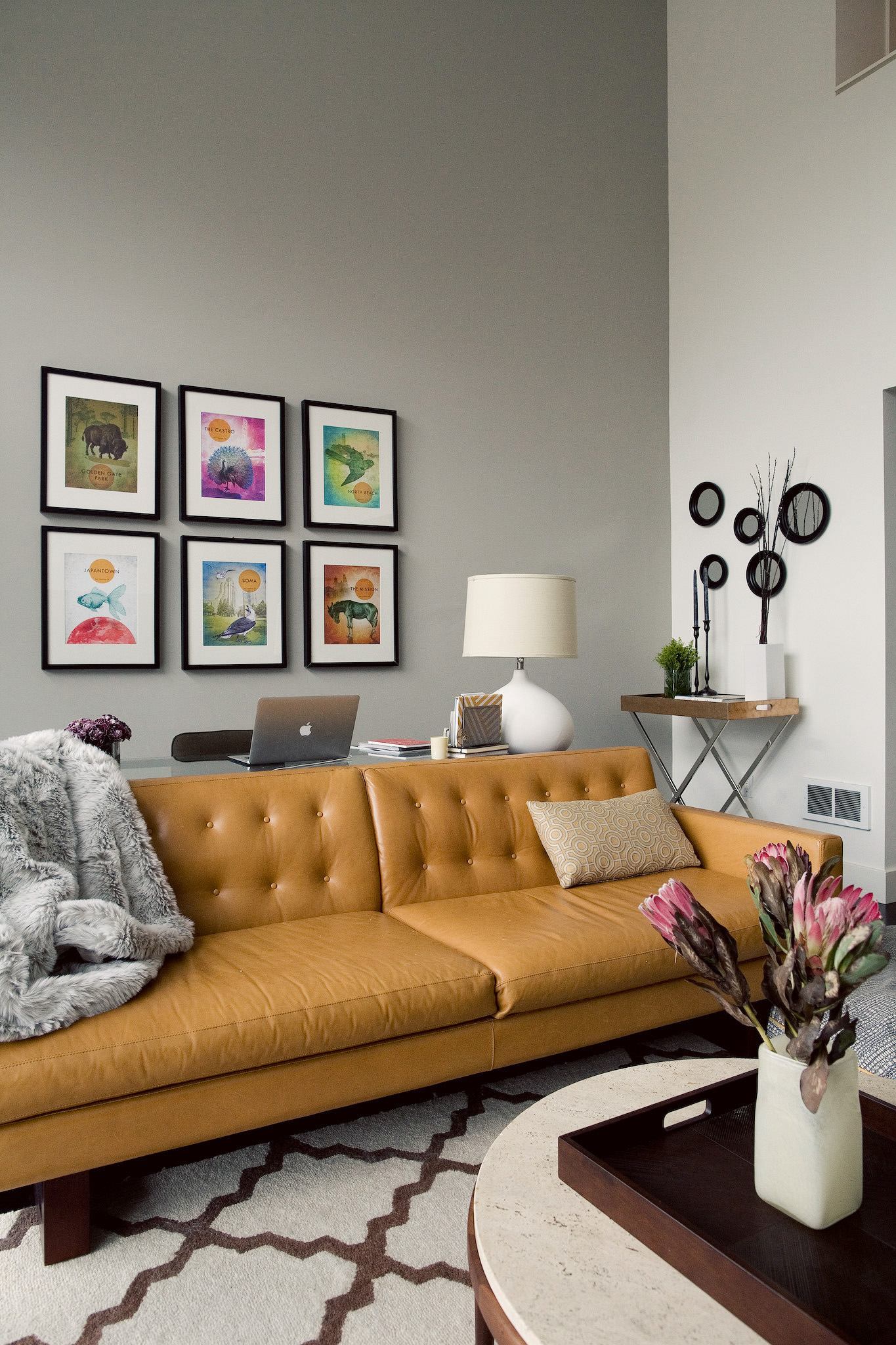
There were fascinating color decisions throughout the house, yet I’m still a little sad to see the raspberry red textured velvet wallpaper go!

Photo Mar 22, 12 36 40 PM

Of course – a TON of work went into getting us to this point. Our best decision on the project thus far? Hiring an exceptional design-build architect. While we thought we had brilliant ideas on how to make the most of our new space, Seth Brookshire brought us a design I’m 100% confident we never would have thought on our own. It maximizes the space perfectly, gives us all the modern amenenities we were hoping for and is just generally gorgeous. We’re definitely doing a bit more than repainting. Here’s what we’re tackling in a nutshell:

> Opening walls between the kitchen and living area to modernize the space
> Adding a pantry and a laundry room
> Adding bathrooms (three in total) – the house originally only had one
> Creating a true master suite

And that’s just the sexy stuff. Then there’s much less glamorous details like electrical, plumbing, fixing the roof and the like. But as we’ve moved through the project to-date I’ve been taking notes on things I’ve learned, what I wish I’d known and what I’d highly recommend keeping in mind so that I could pass them along to you. Here’s what I’ve got so far: my Top Five Virtues of Renovation.

1. Expertise. Get a dream team together and get them fast. Having a very experienced architect on our project has provided more benefits than I could have imagined. Not only are we overjoyed with the creative design, but we also reaped the benefits of understanding the systems we have to deal with. Regulations, city and county rules – everything from how to handle documents to how to properly mark a energy efficient light fixture on our plans. We could have waited as long as six months or more to get construction permits on our project, but with our architect’s experience and know-how it only took six weeks {the only thing that was actually fast!}. There are so many elements that go into a large scale project and too often you don’t know what you don’t know. It’s a great feeling to be good hands.

2. Patience. Pretty much everything takes twice as long as you expect it to. Sometimes three or four times as long. Just go with the flow or your nerves will be shot in the first month. If something does go quickly do a little happy dance!

3. Detail-Obsession. There are SO many details to keep track of, use all the tools availalble to you to stay organized. Google Docs have become my best friend. Create spreadsheets to track all of your design decisions. Scan all your documents so you have electronic copies you can access anywhere. Use Pinterest like a boss. Anything you can do to help yourself stay ahead of the game – do it!

4. Curiosity. Unless you’re on your 10th renovation project, there is SO much to learn about design, construction and the building process. Don’t be afraid to ask questions. Your team may think you’re a pest – but this is your project – you should know any little detail you want! I’ve had a ball asking what seem like the stupidest questions on the planet.

5. Patience. Wait, did I already list patience? Well double up – you’re going to need way more than you ever could imagine.

If you keep these virtues in mind, you can keep yourself sane throughout a very daunting process. Well, at least I hope you can – we’ve only just begun! I’m planning monthly updates for you from here on out so I’ll let you know if this all still holds true next month.

By the way, I started a Tumblr – This Old Victorian San Francisco – to track both our contstruction progress and our design inspiration! I’ll likely be posting pictures there more frequently than here so be sure to follow along. I also have a Pinterset Board where I’m constantly banking design, decor and general renovation inspiration. You can check that out here!

But if there are certain things you’d like to know more about; our design process, inspirations, resources, please ask!

So, I’m not quite sure how this all happened, but in approximately eight {short!} weeks, there’s going to be a very small human in the loft! And I’m kinda freaking out about it. After soaking up every one of the 72 glorious babymoon hours over the weekend, reality is now crashing down around me. It’s officially time to turn our attention to the to-do list. Diapers, bottles, something for the little thing to wear, maybe something for it to sleep in…yeah, I’ve really gotta get on all that.

But of course, rather than concern myself with practical issues like what a breast pump actually does, I’d rather focus on the aesthetics of it all! On the tippy top of my list is figuring out how to incorporate a baby into our physical space. There’s certainly no room for a nursery where all baby-related items can live behind a closed door. It’ll be a good long while before our new house will be done and I can have a space like this:

ed49348949894687af20cf97fc9eb25e

For the time being, I’m going to have to make due with everything being out in the open. And while I really don’t want all things infant to invade our space, I also don’t want to completely ignore the fact there will be a wee-one in our presence. So I’ve started hunting for subtle ways to incorporate baby-related decor. My starting place is this cool alphabet poster we happened to pick up a few years back {originally intended as a baby present for someone else – whoops!}.

20141229_121627

It already fits into our very neutral color scheme perfectly and feels like something I won’t get sick of looking at! Thankfully, the new online framing company Framebridge was able to help me design a custom frame for it. I simply sent them the print in the mail and their framing experts emailed me back mock-ups of mat and frame suggestions. I just selected the final style and the print showed back up on my doorstep – ready for its spot on the wall! Can you guess which framing option I picked…

Screen Shot 2015-01-28 at 9.02.49 PMIMG_3758

I decided to go with the classic modern style of the Marin frame with the white mat to really make the lighter tones in the poster pop. While I haven’t quite figured out where we’ll be hanging this lovely guy just yet, the print is currently the anchor piece for my baby-decor moodboard!

Think yummy warm browns from light natural wood to camel and touches of black with a minimalist undertone. I’m also really loving the anchor motif and mixing in a touch of metallic. I’m open to a few sweet accessories like that crazy adorable stuffed bunny hanging around too! Even I’m a sucker for something that cute and cuddly.

IMG_3752IMG_3759IMG_3753IMG_3757

I’m not sure where or how I’ll incorporate these little baby-themed moments into the loft yet. Maybe I’ll create a little gallery wall around the bassinet. Or perhaps we’ll carve out a little play corner that can have our baby-themed art and some fun accessories. Or maybe I’ll just scatter a few aesthetically pleasing kid-friendly things here and there. Plans are now starting to form, so I’ll be able to share what we finally decide with you soon!

Even gathering just these few small inspiration items does get me excited to incorporate le bebe into our world! I’m thinking some instagram mini-frames will definitely be in my near future!

Right now Framebridge is also offering you a great opportunity to get your frame on. Simply enter the code APARTMENT34 at check out and enjoy 20% off 2 or more items!


nursery image via live loud girl // photography for apartment 34 by bianca sotelo

This post is in partnership with Framebridge. All thoughts, opinions and styling are 100% our own. Thanks for supporting collaborations we’re excited about and that help keep Apartment 34’s doors open! 


I rarely suffer from house wanderlust. The Loft has come together well, if I do say so myself. But when I spied this ah-mazing industrial loft on Remodelista I couldn’t keep my eyes from glowing a little green. And then I realized it’s owned by Joan, proprietress of my {only} fave LA haunt Joan’s on Third no less! That officially made it ten times cooler.

Joan-McNamara-LA-loft-kitchen-counter-ljoliet-RemodelistaJoan-McNamara-LA-loft-ljoliet Joan-McNamara-LA-loft-kitchen-sink-ljoliet-RemodelistaJoan-McNamara-LA-Loft-Cherner-chairs-ljoliet-RemodelistaJoan-McNamara-LA-loft-bedroom-ljoliet-Remodelista Joan-McNamara-LA-loft-living-area-ljoliet-RemodelistaJoan-McNamara-LA-loft-Eames-lounge-chair-ljoliet-Remodelista

The polished concrete floors, the rolling garage door window, the super cool ceilings….And do not even get me started on that picture perfect kitchen island. My dream come true. I also love that this space isn’t occupied by the stereotypical loft dweller – you know the profile. Upwardly mobile hipster with the too cool for school tech job and a disgusting collection of mid-century modern furniture. It just goes to show that you can live by your own style guidelines your whole life.

Sure, it’ll be awhile until we finally find a spot in San Francisco that will be our permanent home, but I definitely plan to live in a space this rad even into my golden years! For now, I’m just going to keep banking decor inspiration until our dream home emerges from the abyss {ps that’s all currently housed on my Loft Ideas and Interior Styling Pinterest boards!}.


images by Laure Joliet for Remodelista