At first glance, you might not immediately realize today’s home tour is nearly 220 years old. The beautiful mix of contemporary furniture, elevated vintage and exquisitely unique pieces are likely to capture your eye first. Because it is all crazy good.

But has you look a little closer, you’ll notice how the historic details of the home – a cottage originally built in 1790 by a Revolutionary War veteran – are an integral part of the home’s overall aesthetic. To stunning effect. Scroll to see how you can can make something old wondrously new again.

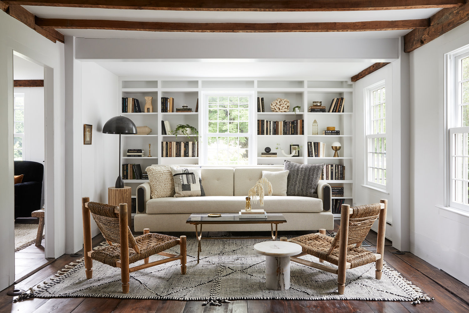
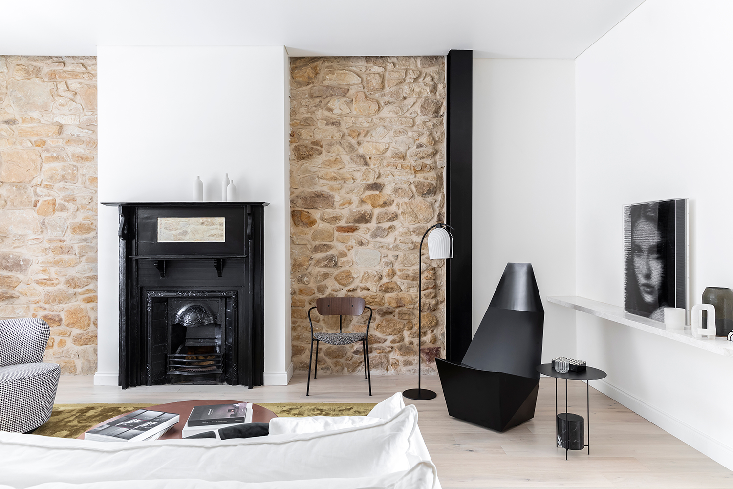
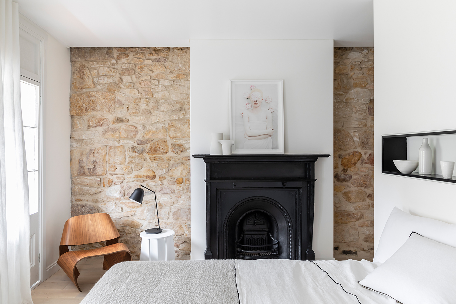
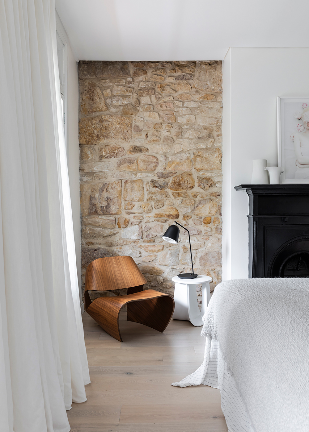
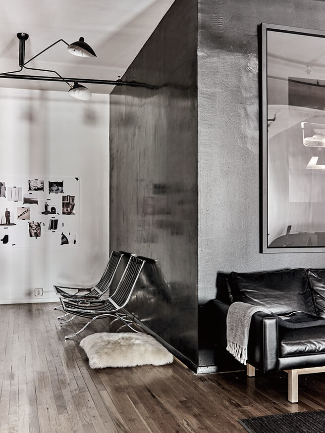
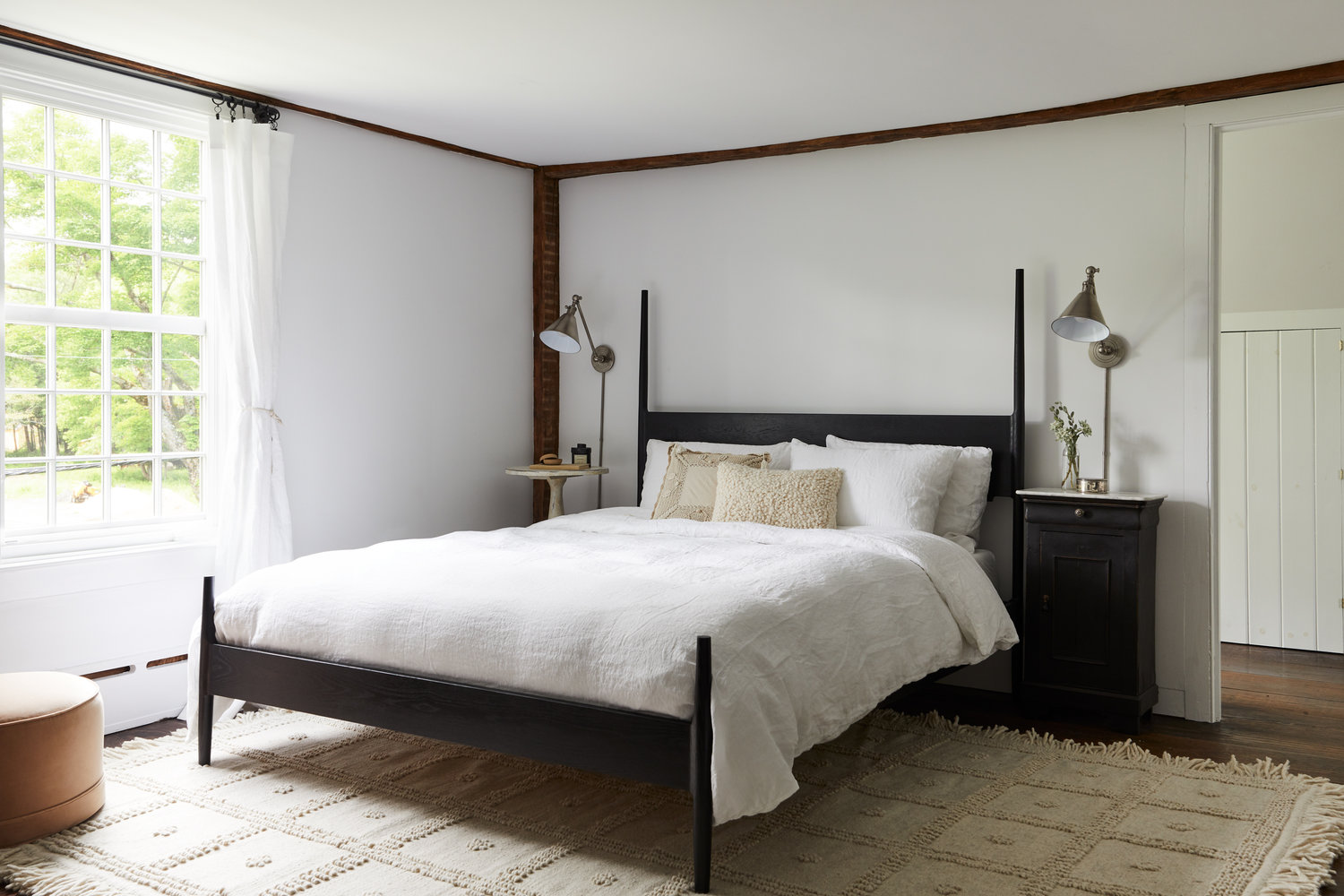
After five years of renovating This Old Victorian, I’m sucker for any home that highlights its historic architectural features. In restoring this cottage, the design team took great pains to refurbish the raw wood beams that originally graced the walls and ceilings. That age and patina are the perfect foil to the the contemporary feel of furnishings.

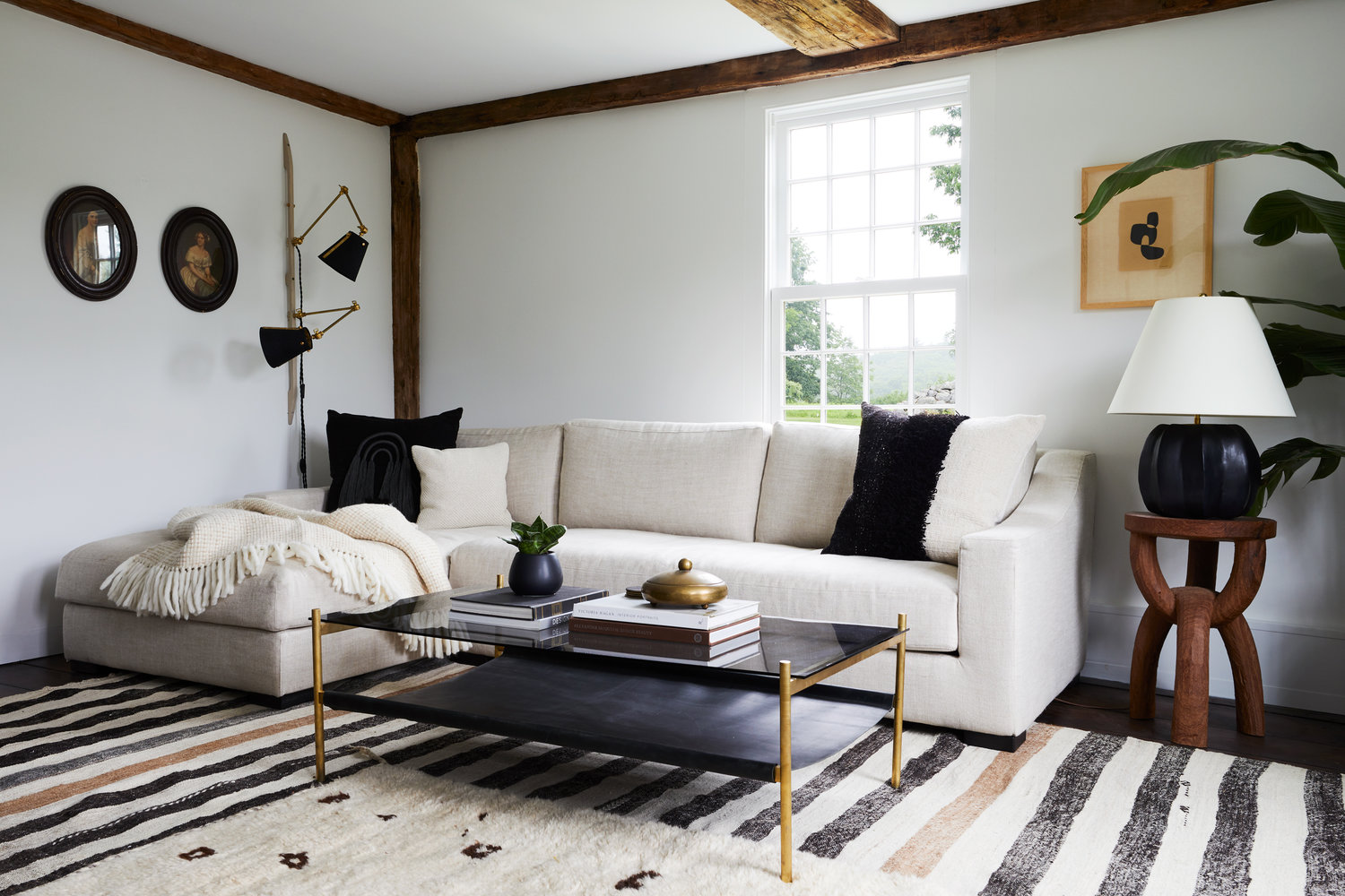
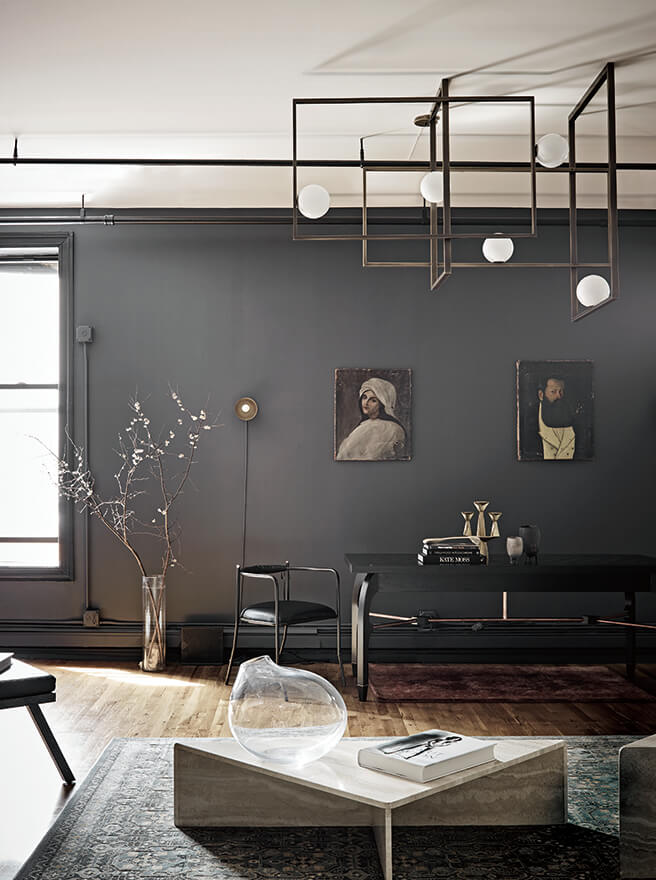
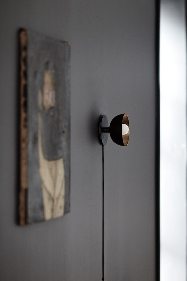
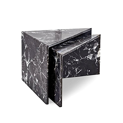
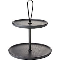
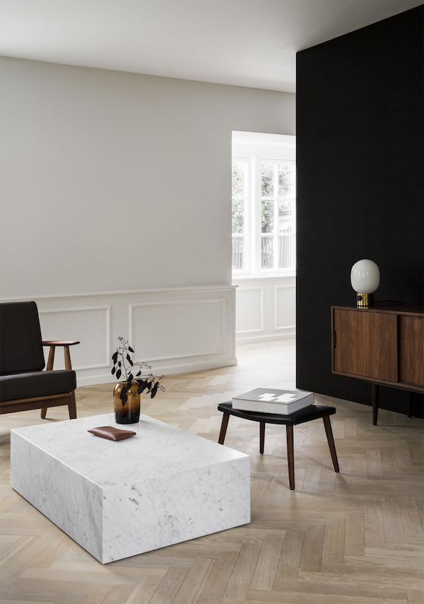
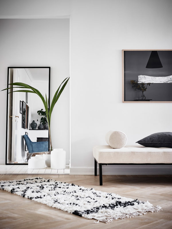
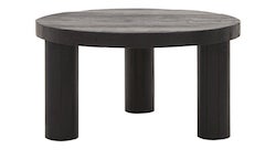
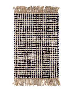
I also love that there’s also a sense of ease and comfort in this home. The chaise sofa and simple two-tiered coffee table above are relaxed, while the side table, vintage wall-mounted sconces and those stunning layered rugs add major interest. The warm palette of neutrals offer high contrast without in your face color.

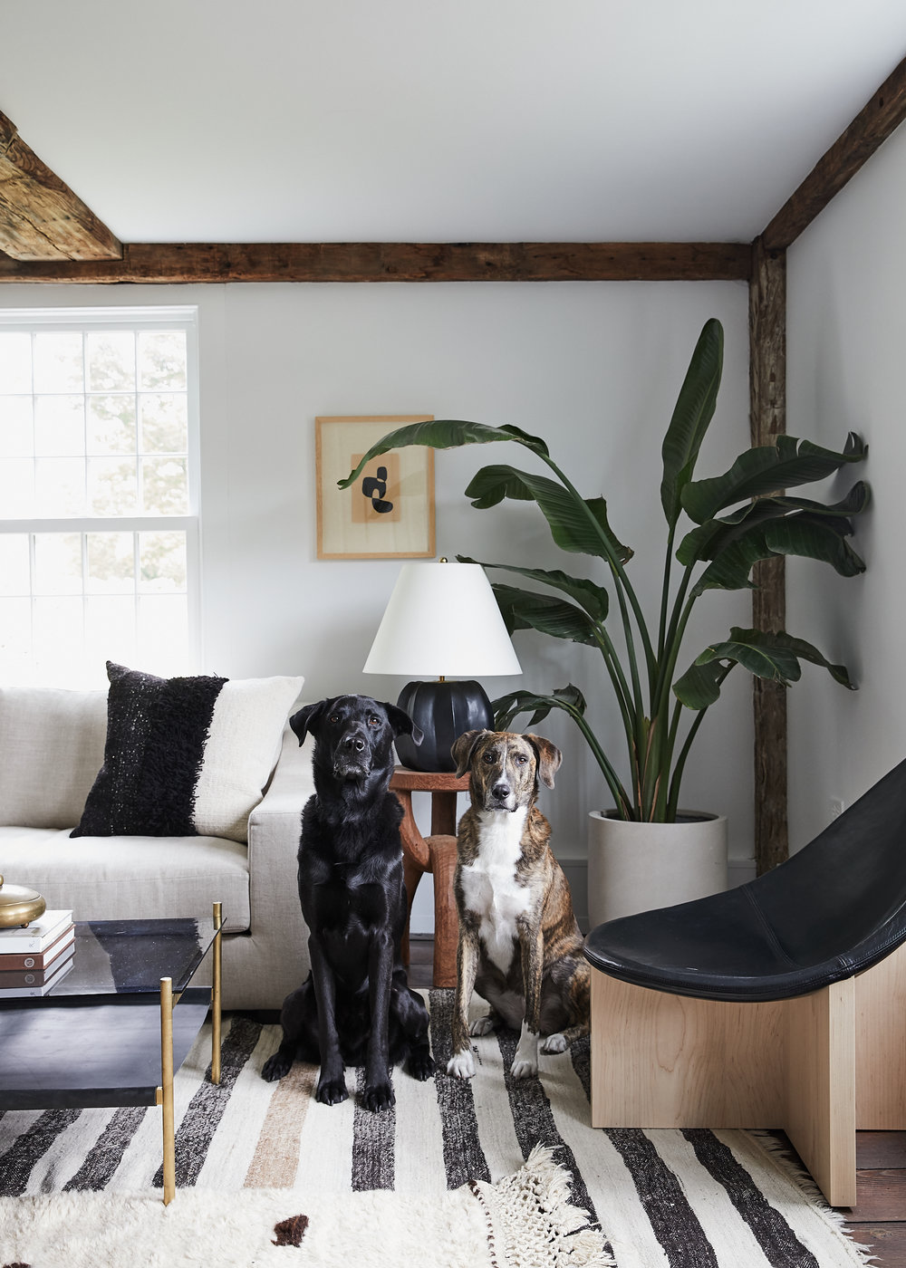
All dogs should be color-coded to your house if you ask me.

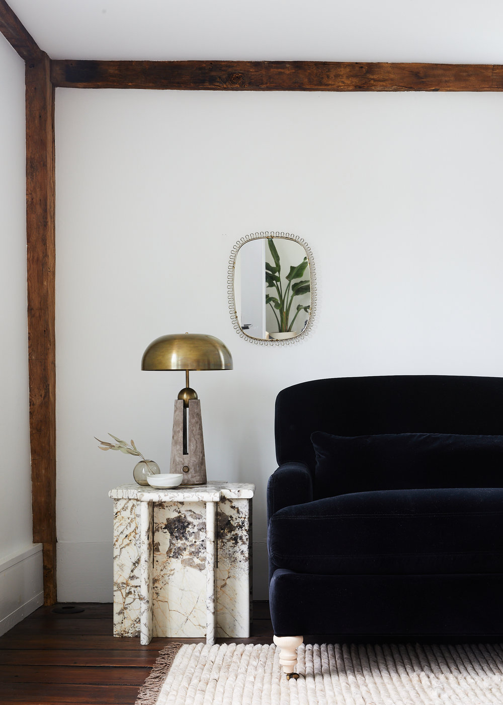
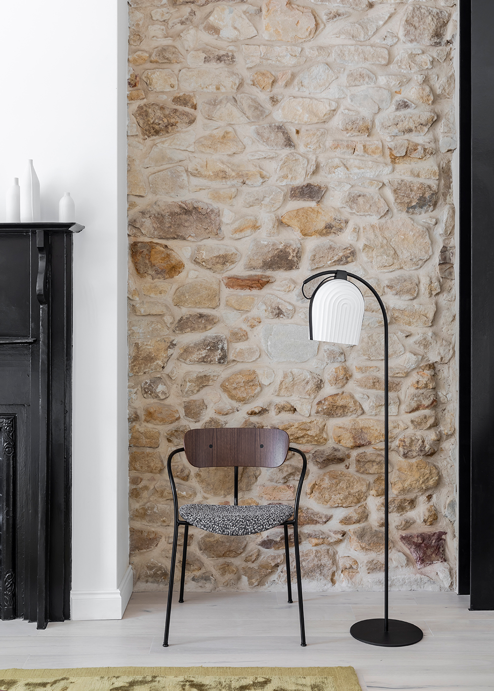
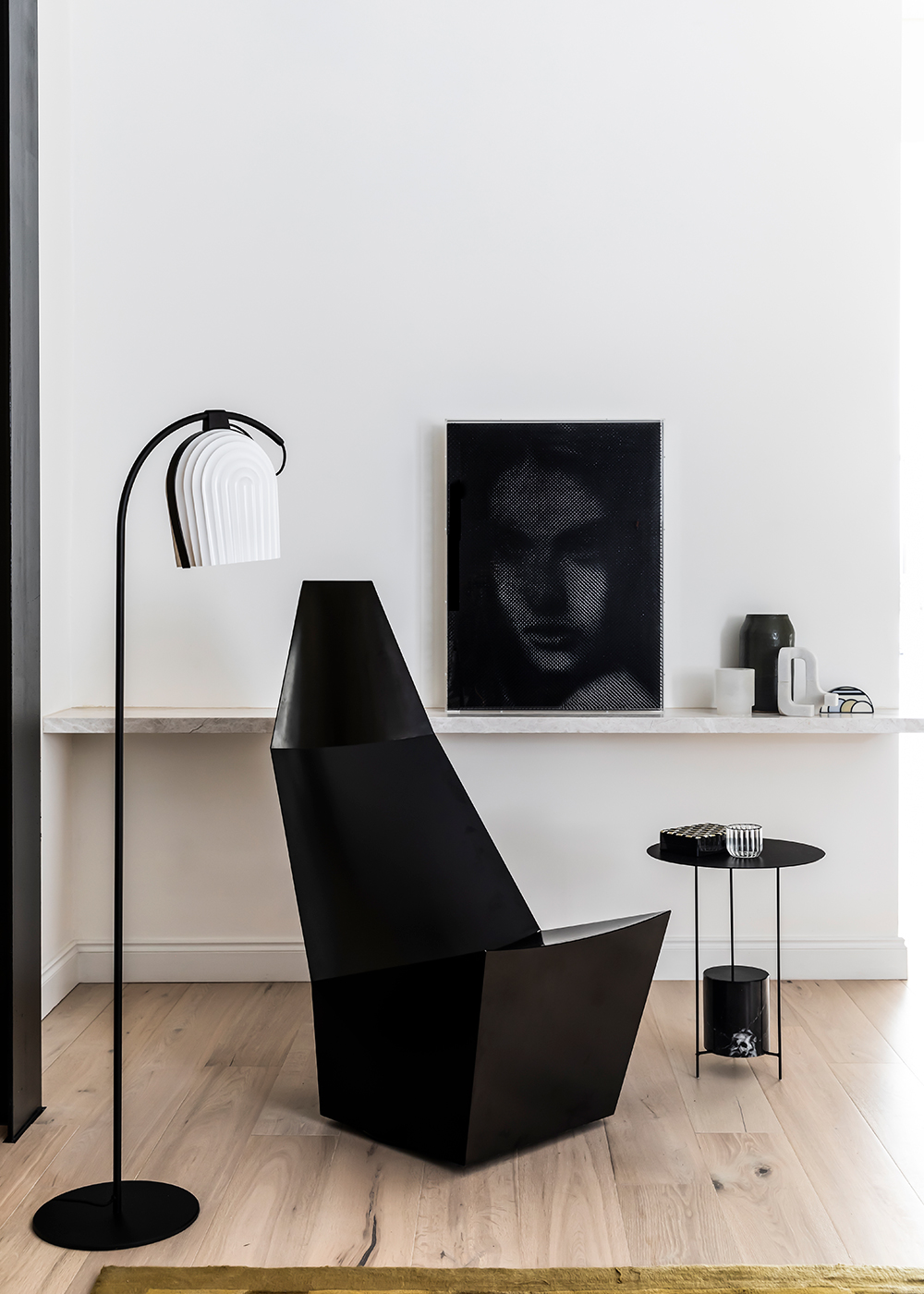
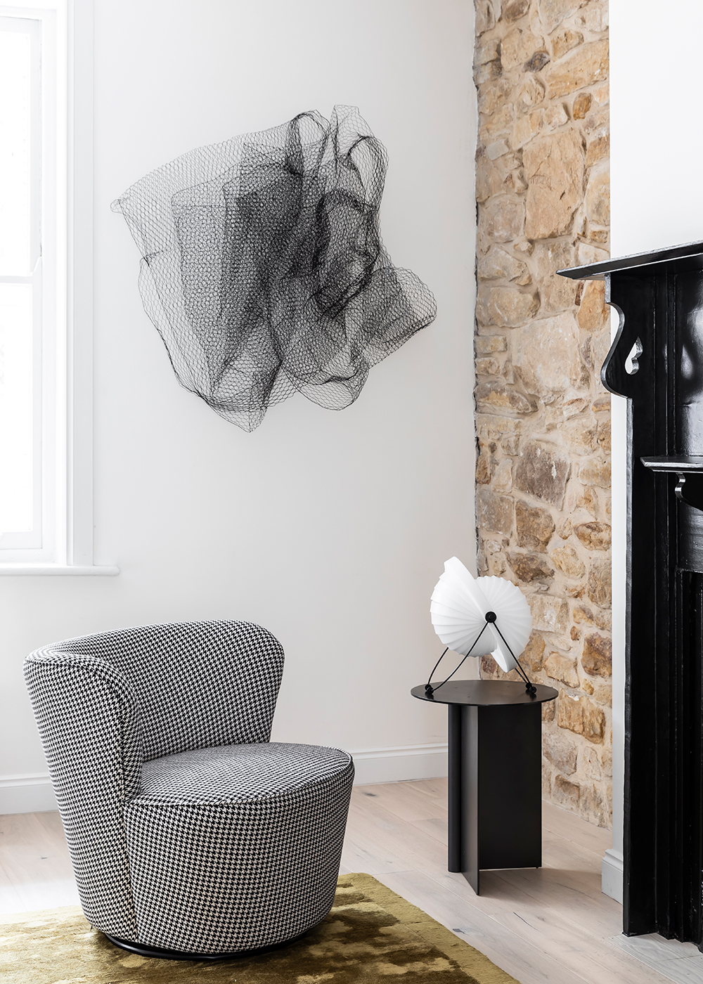
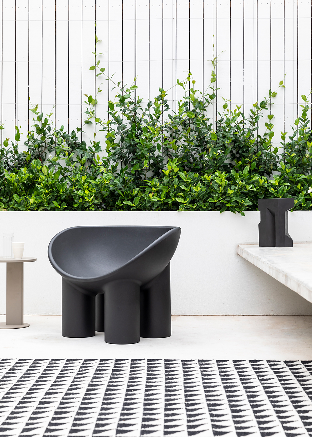
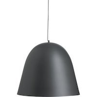
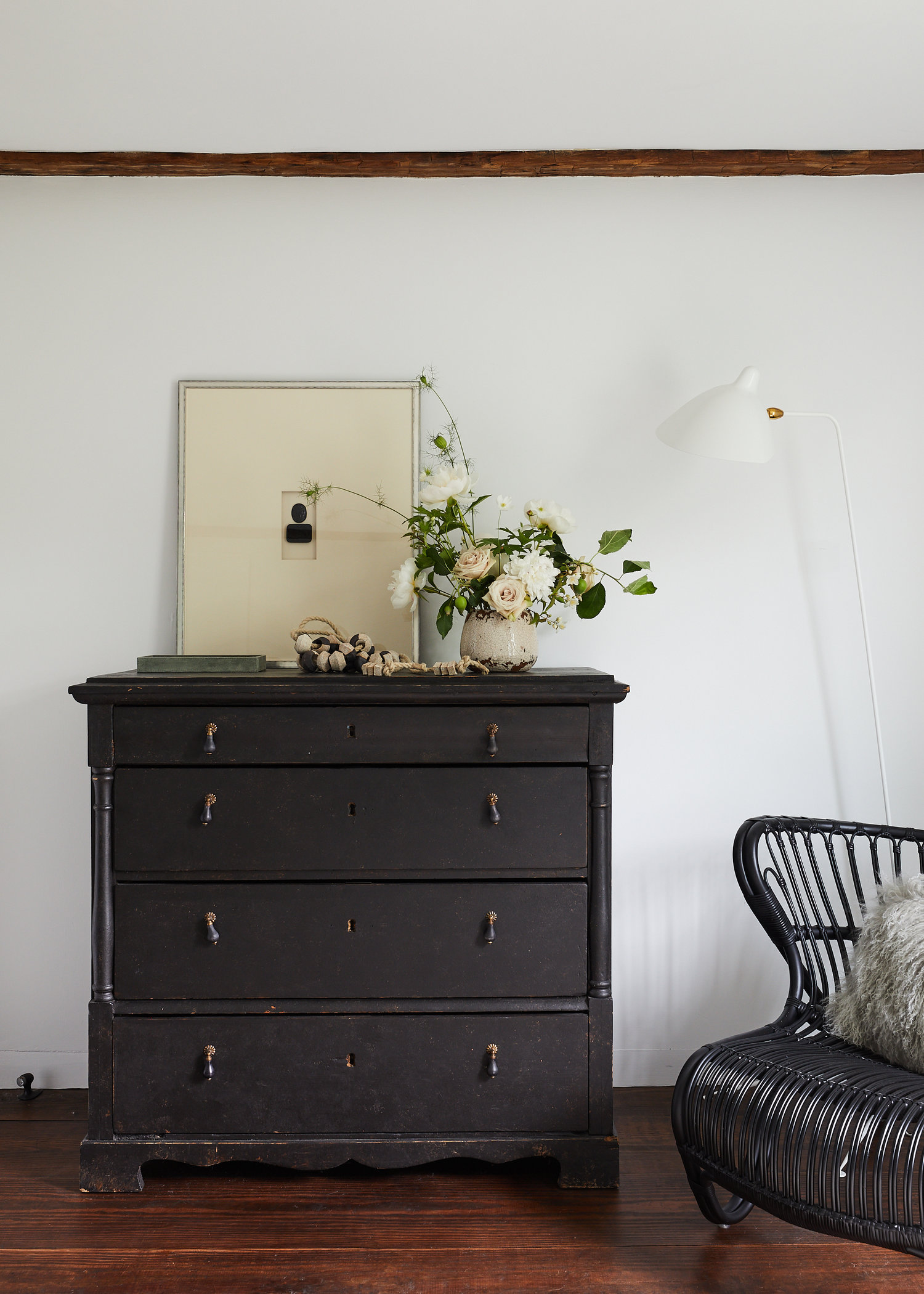
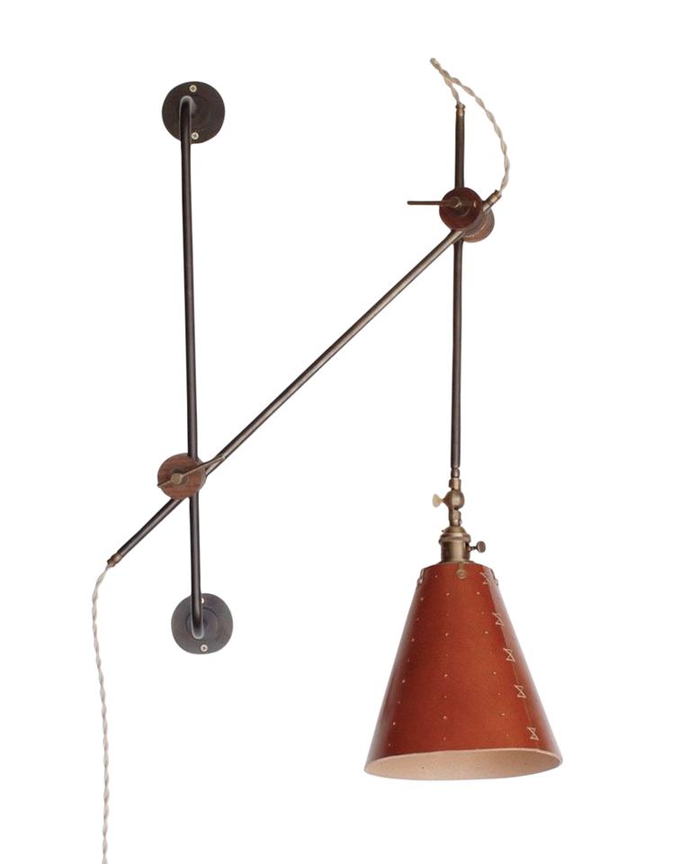
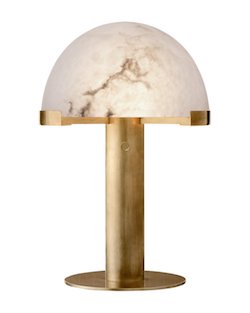
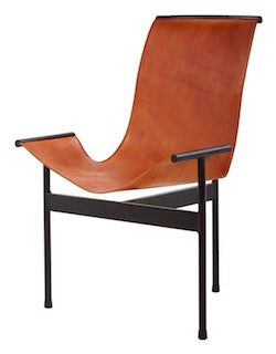
My head keeps turning at tall the incredible details in this house! Do you spy those incredible feet on that sofa? Or your perhaps you can’t pull your eyes off that marble side table. Or that exceptional lamp? The yummy rug? It’s hard to decide what is the most pitch perfect choice.

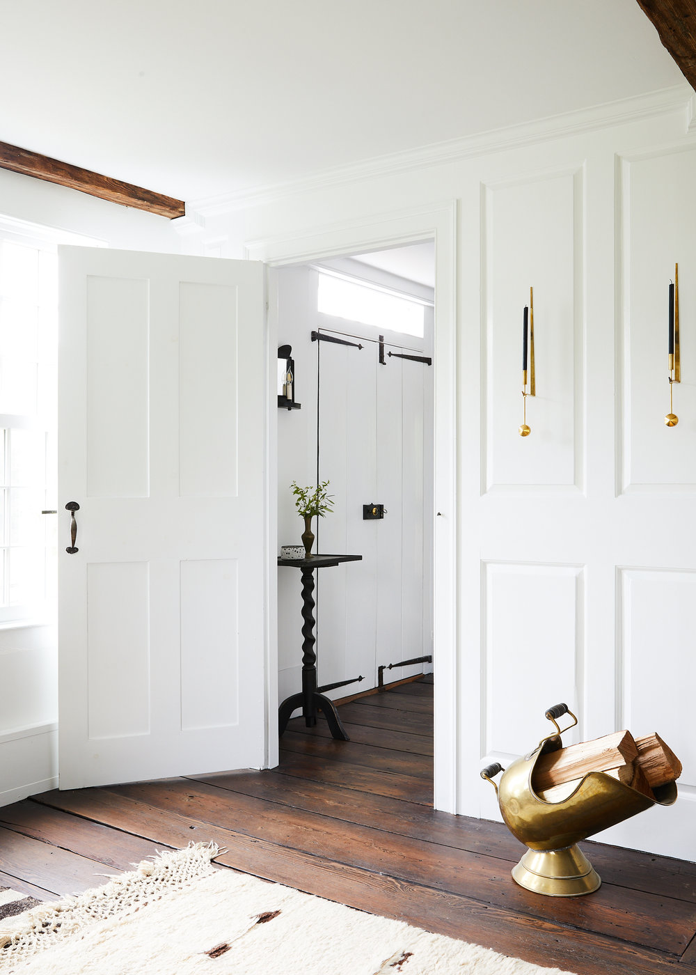
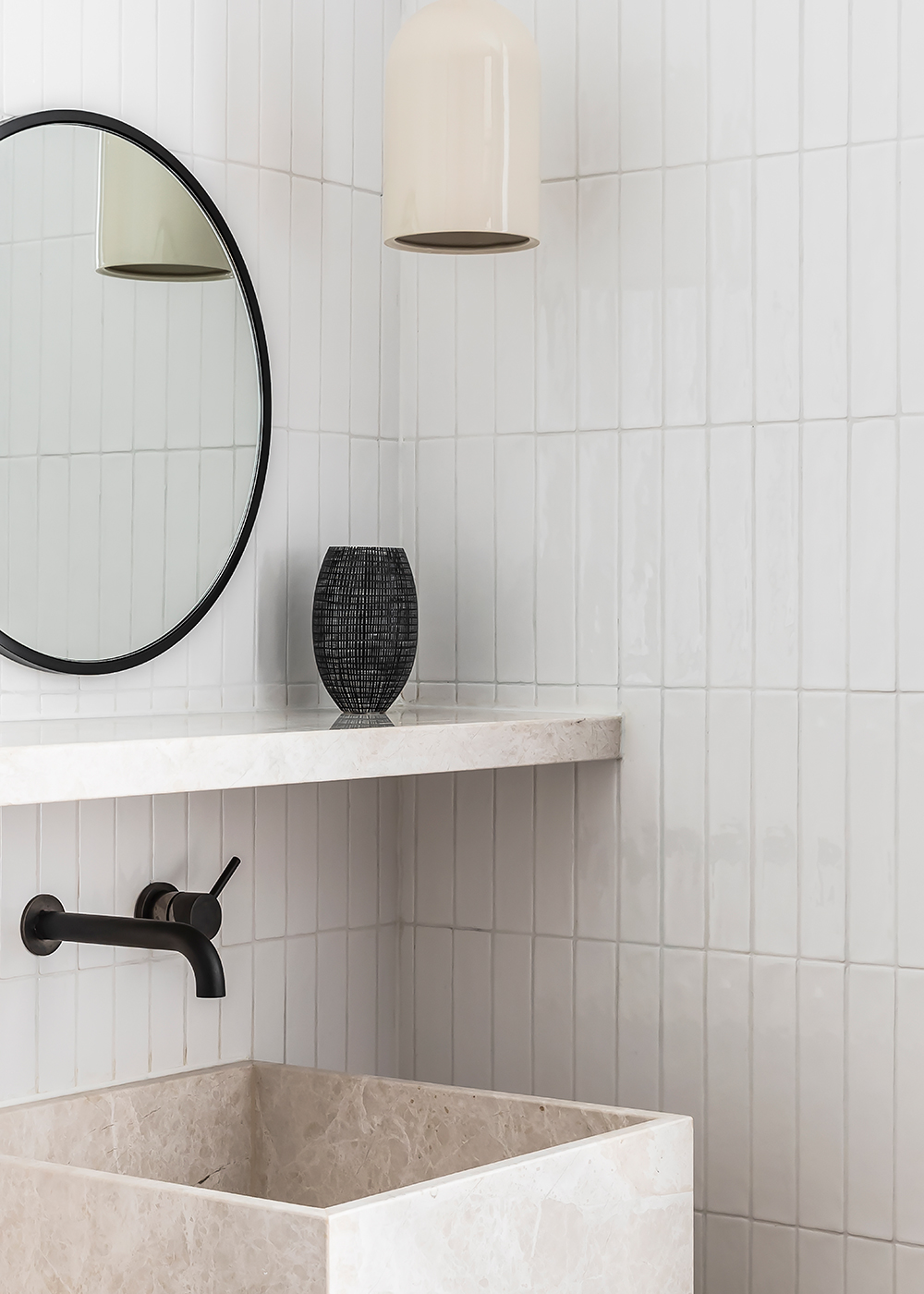
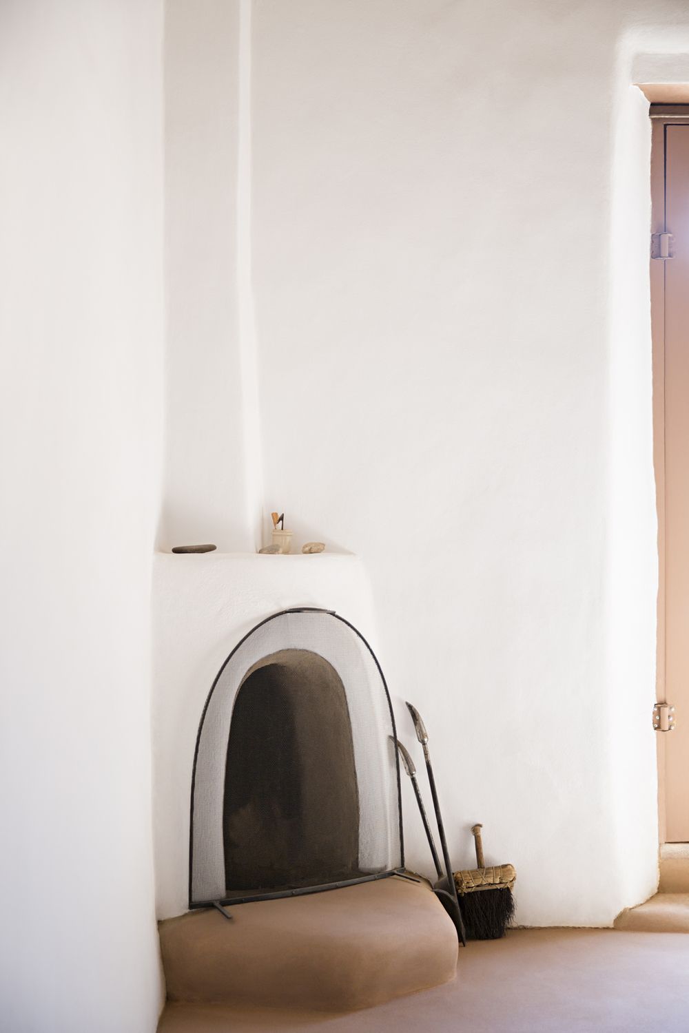
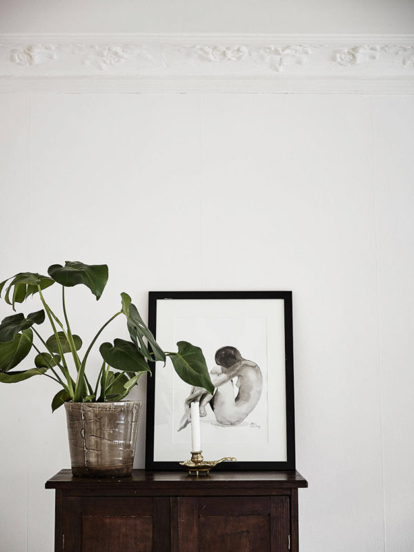
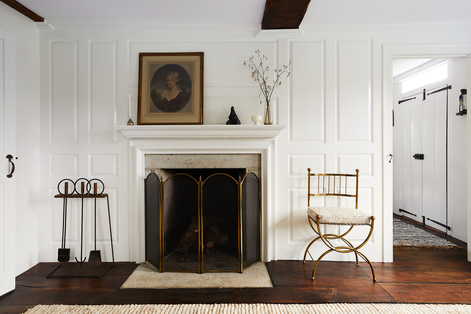
Vintage moments add to the cottage’s charm – from that amazing firewood box to the lovely candles and door hardware – these are the details that truly honor the home’s restoration.

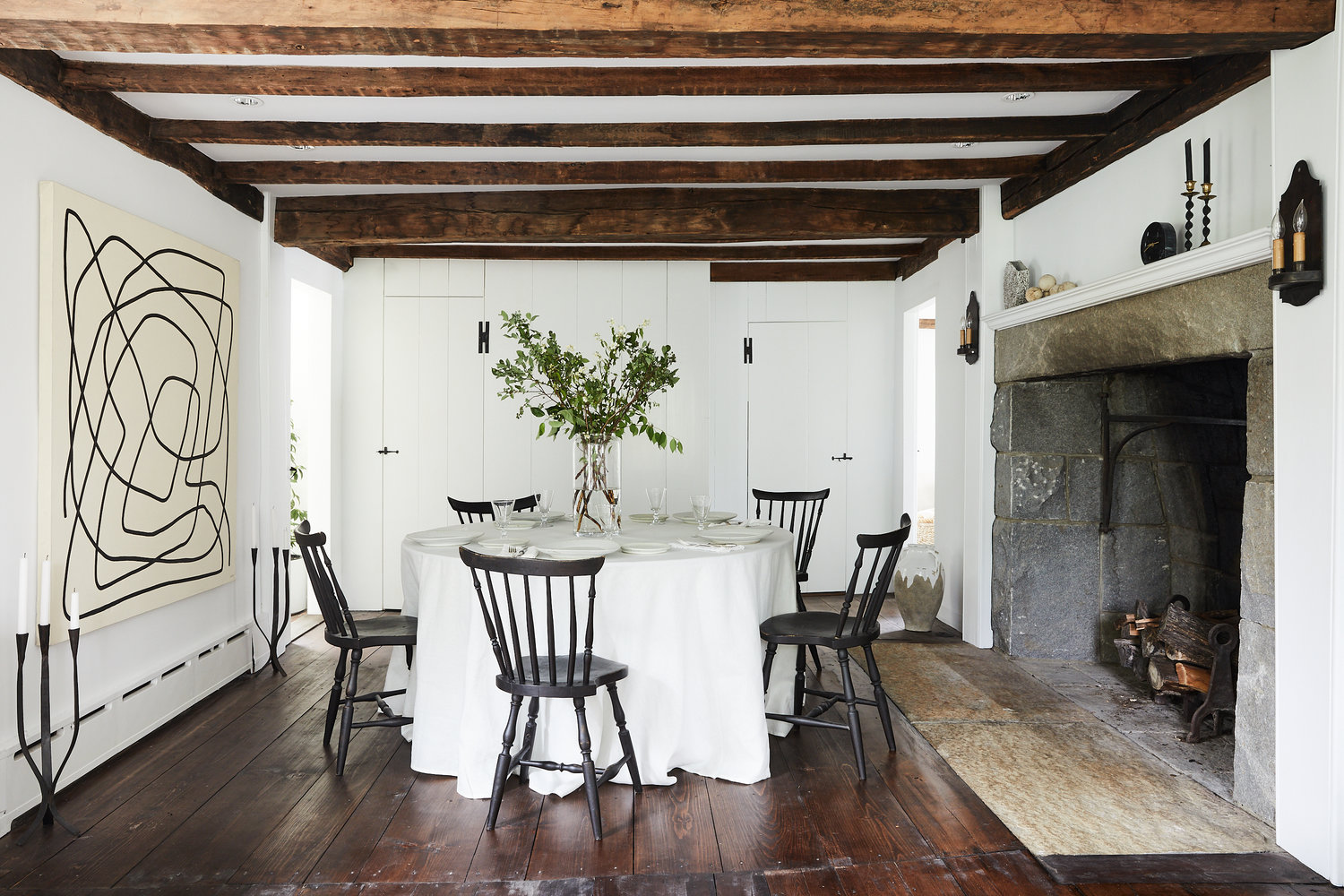
The dining room mixes styles to a tee. The massive fireplace, skirted dining table and shaker chairs all speak to the traditional east coast roots of this home, while the oversized art both mirrors the fireplace but also offers a modern touch.

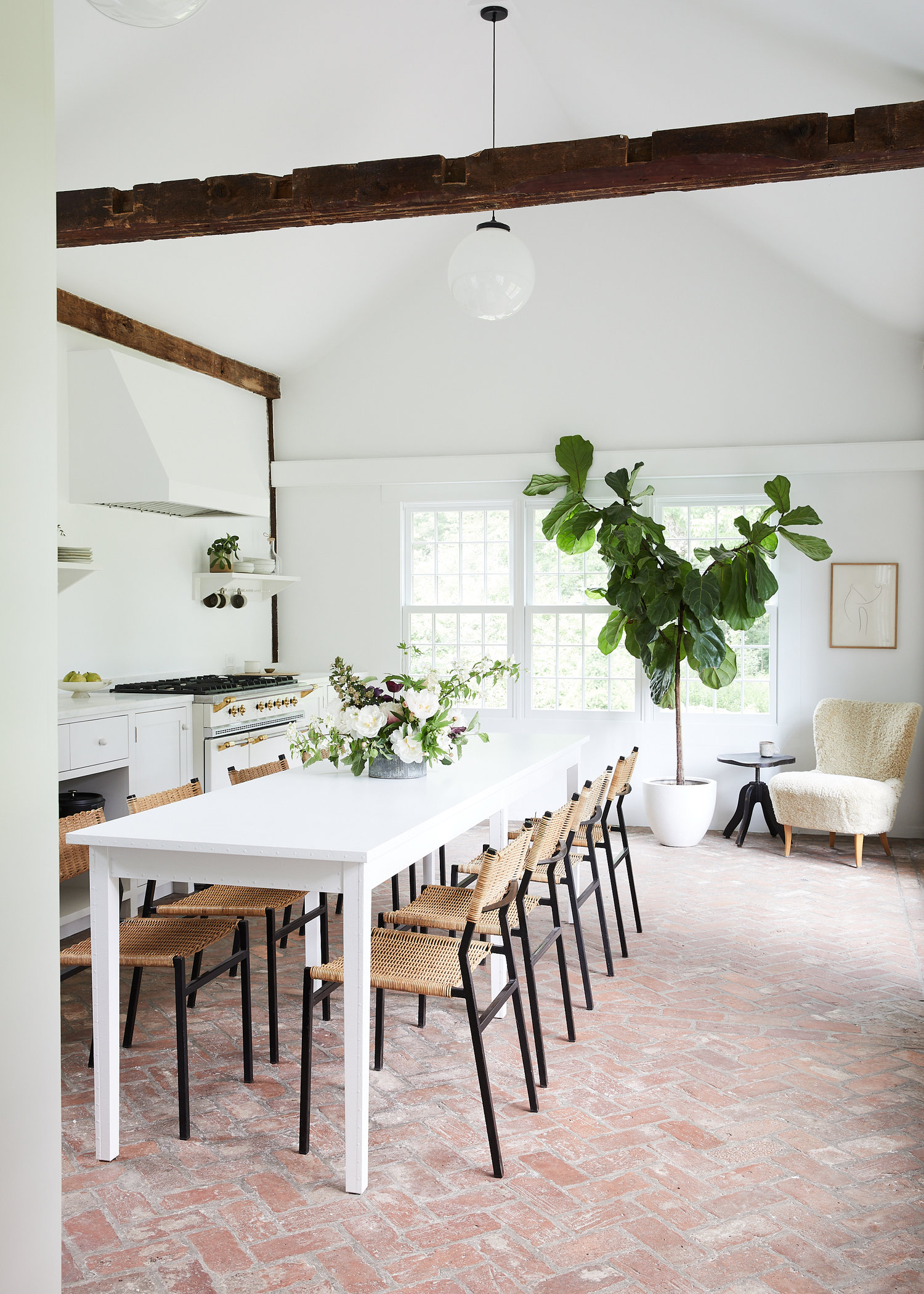
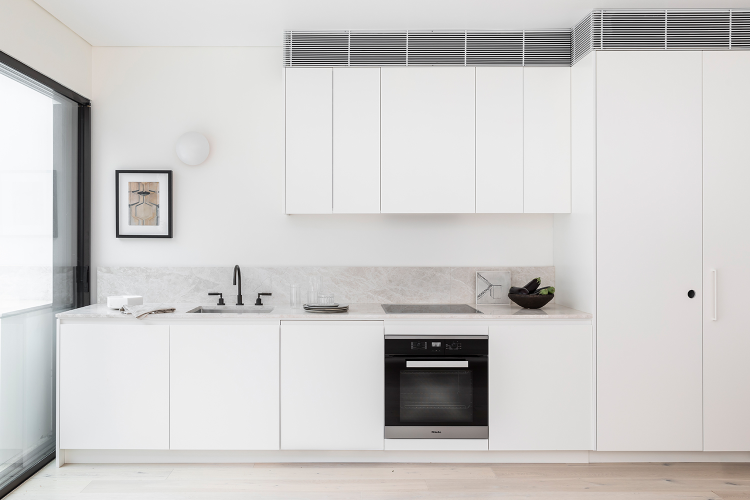
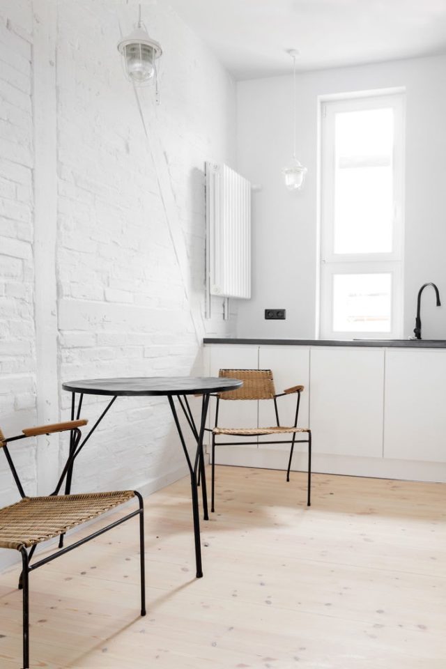
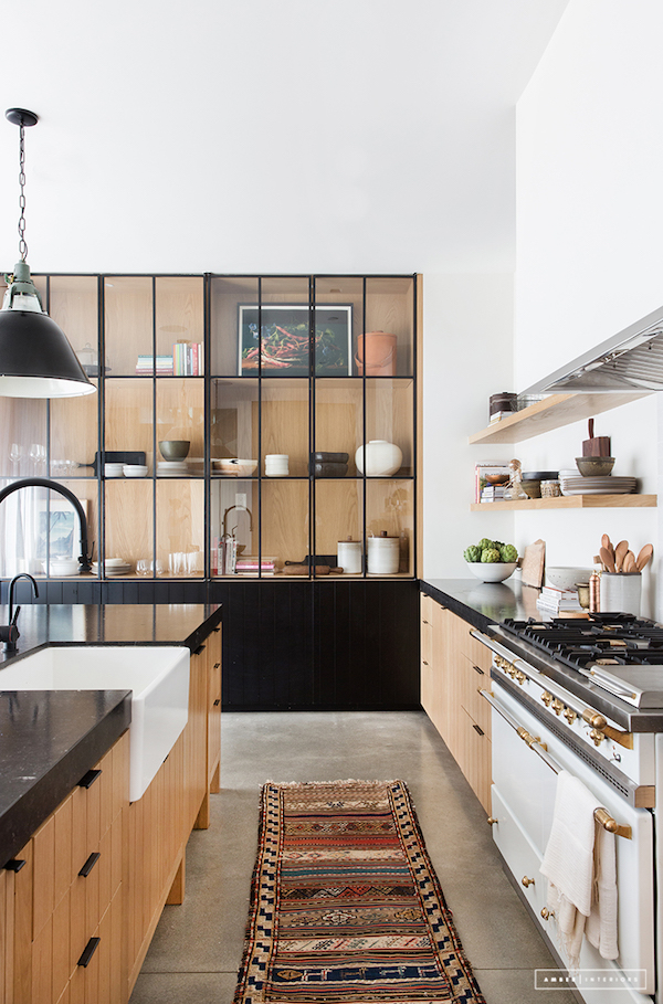
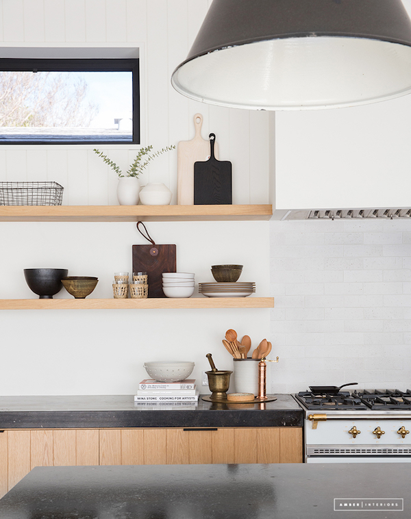
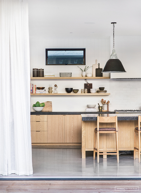
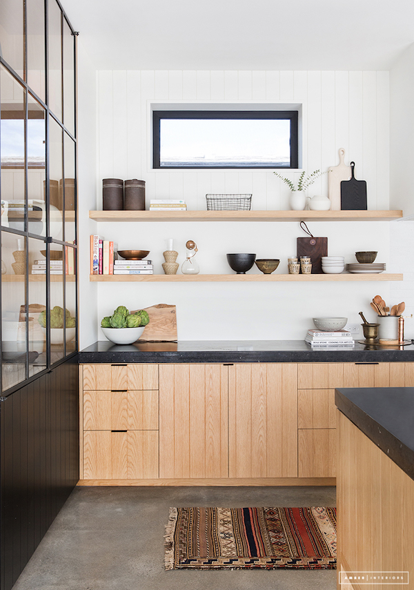
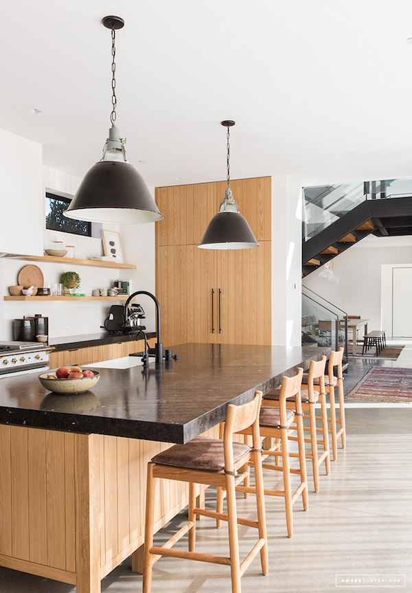
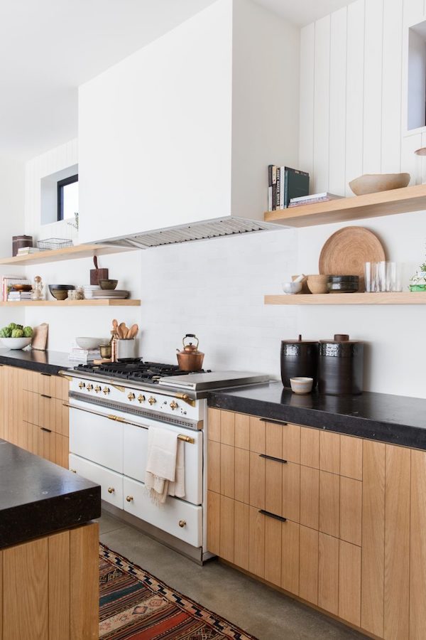
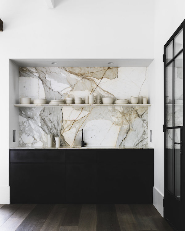
A herringbone brick floor is a textural rustic moment in the otherwise sleek white kitchen.

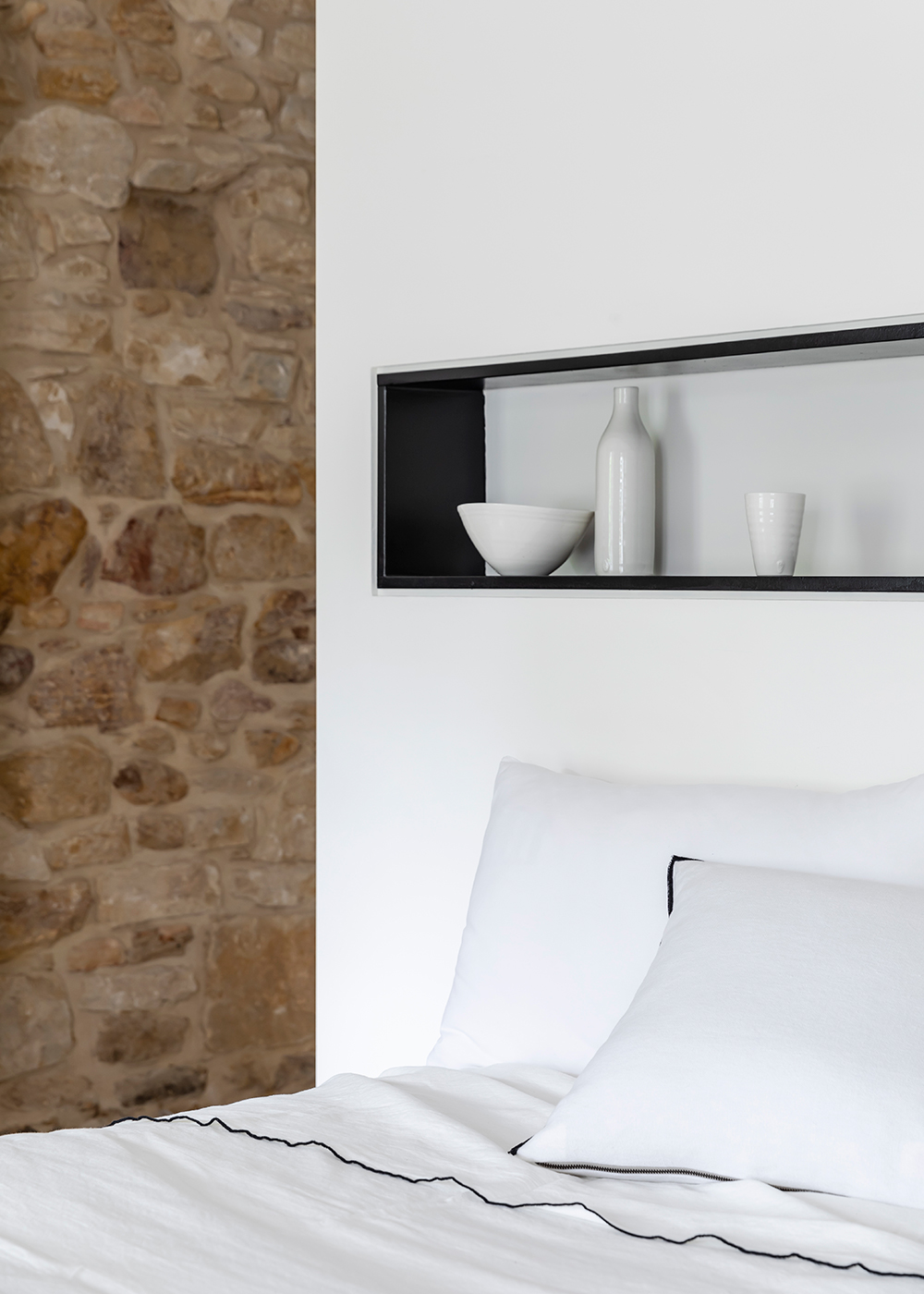
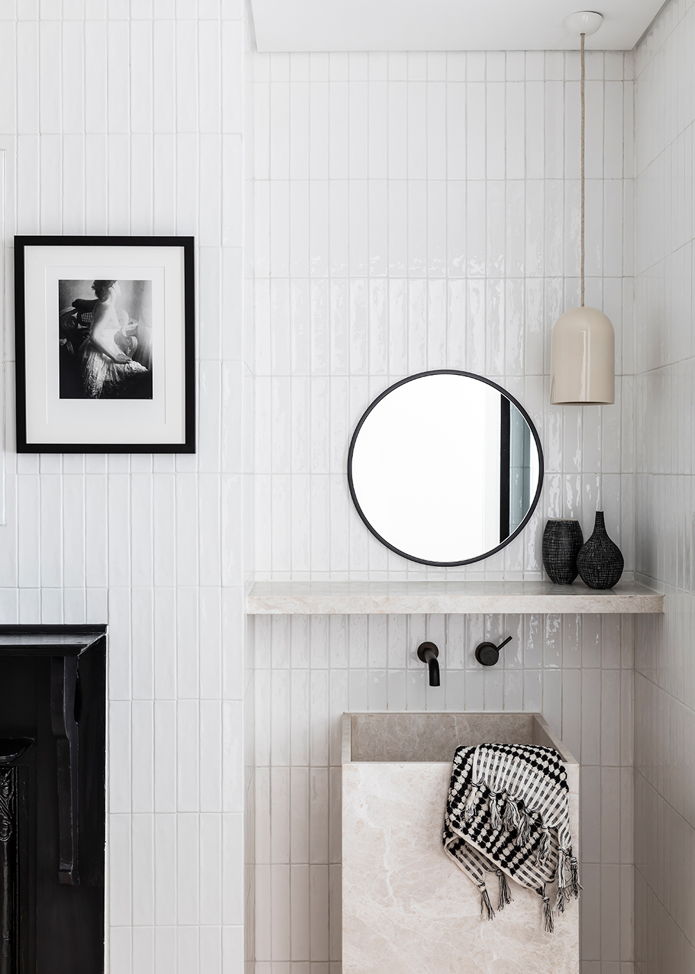
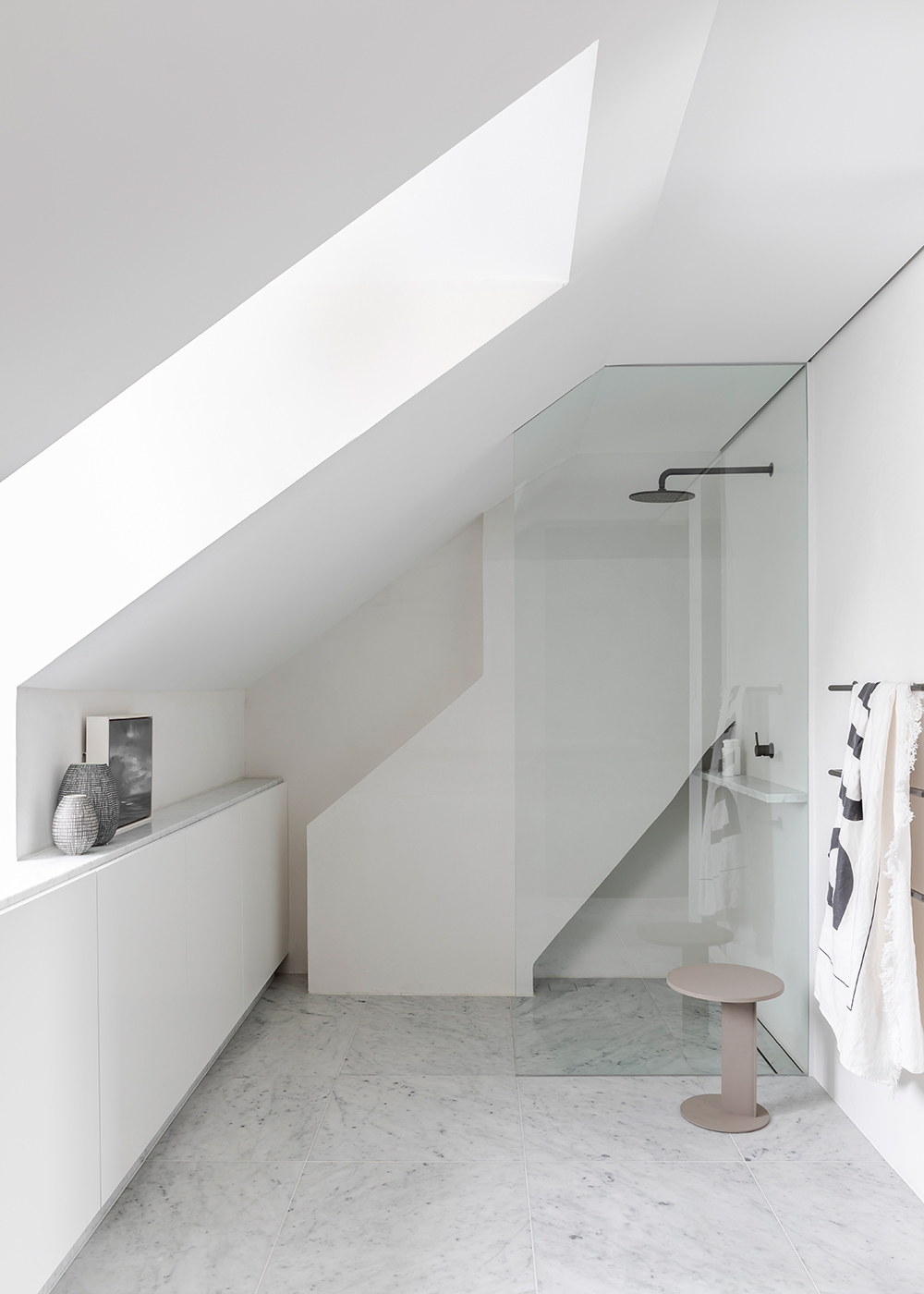
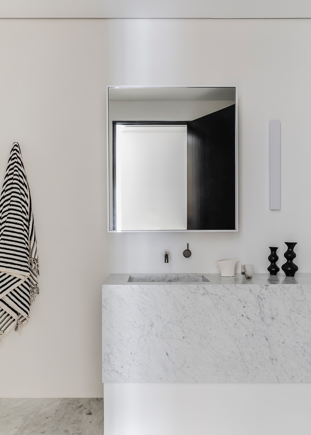
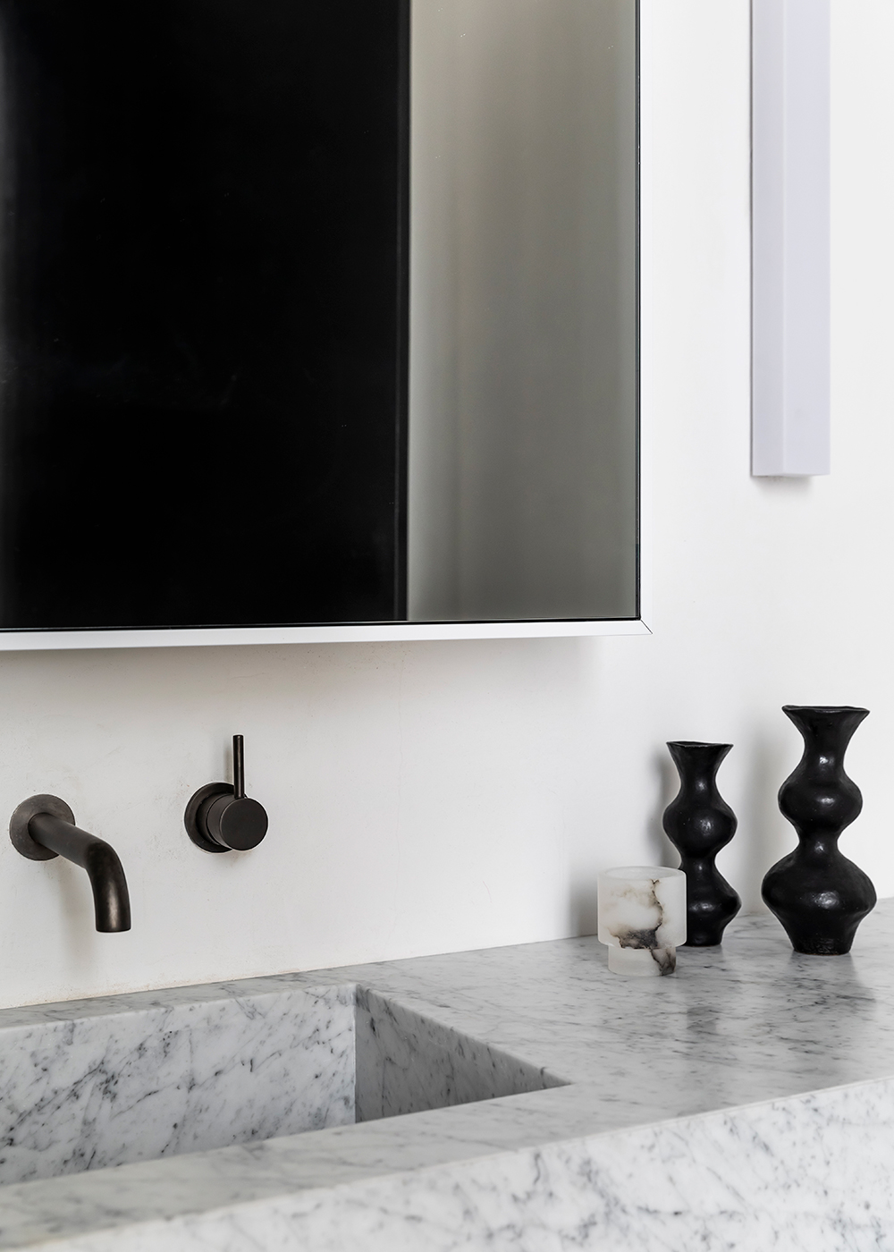
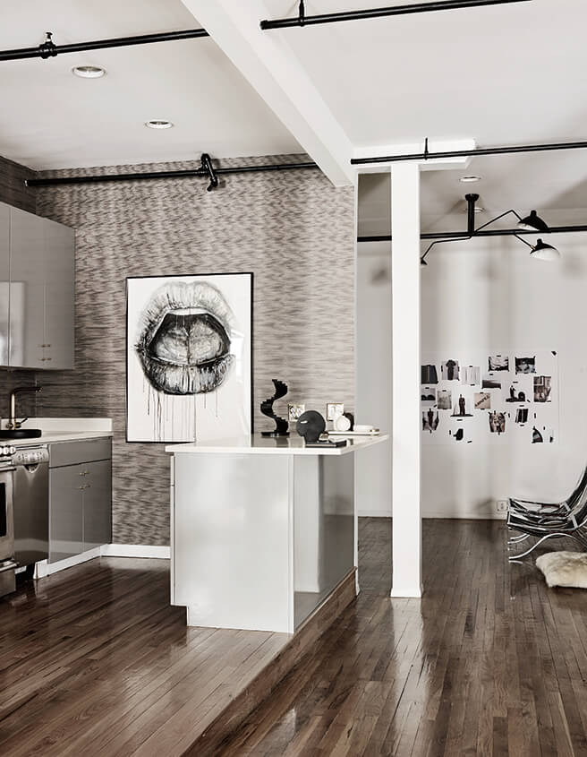
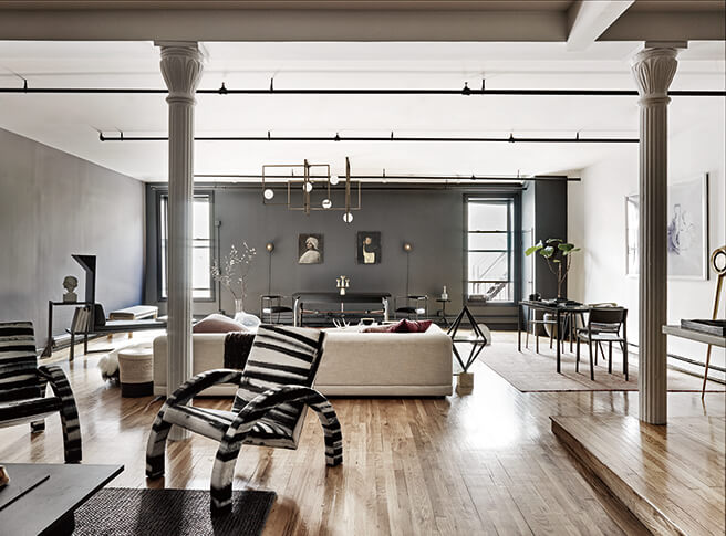
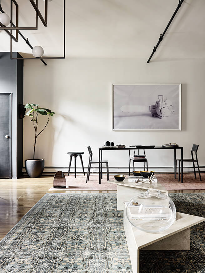
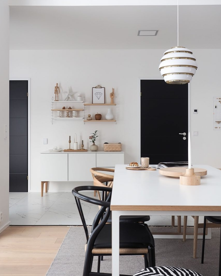
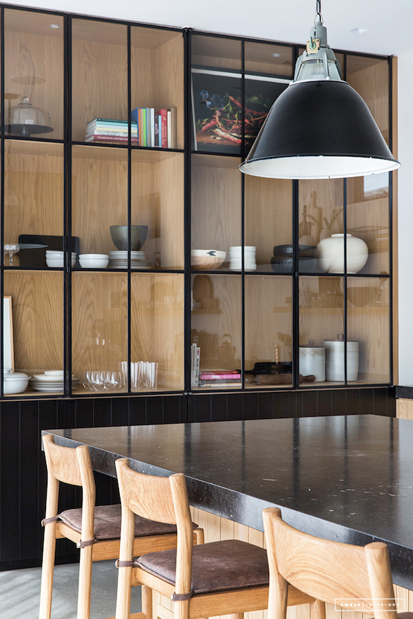
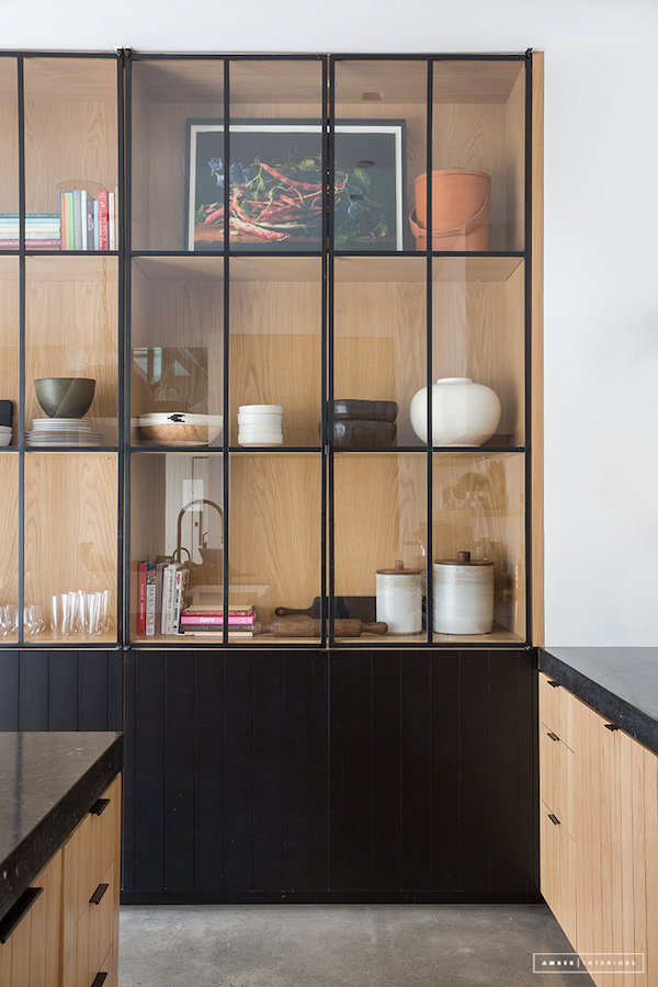
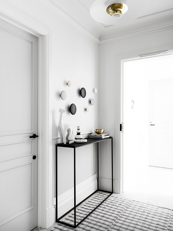
Mixing textures, print and materials offer visual interest everywhere you turn.

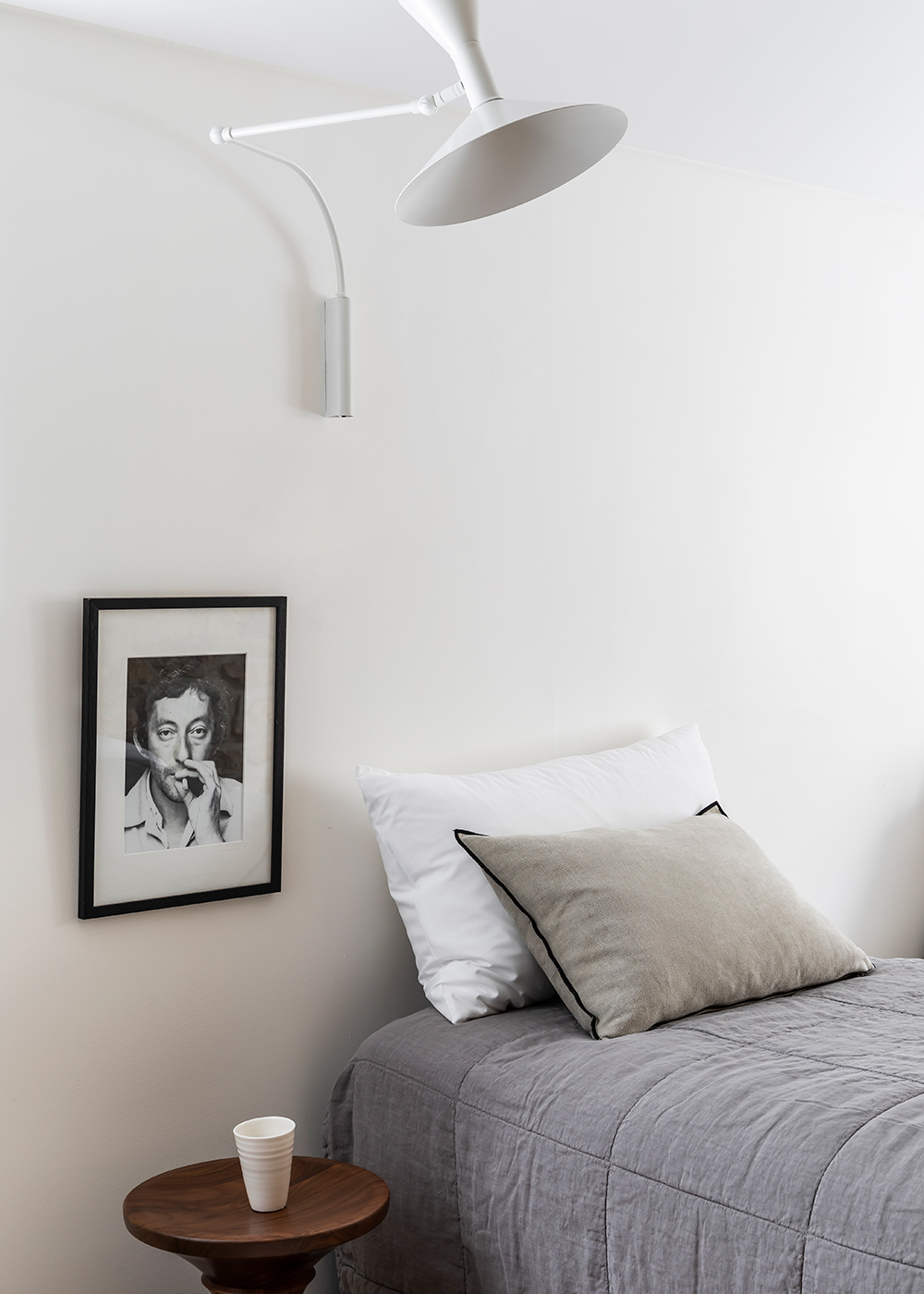
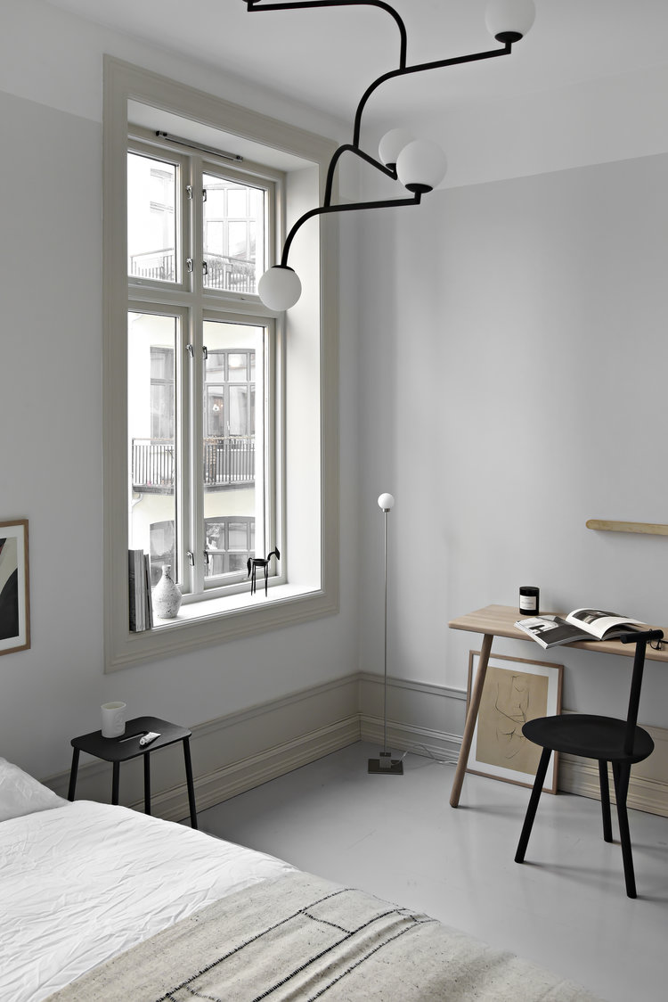
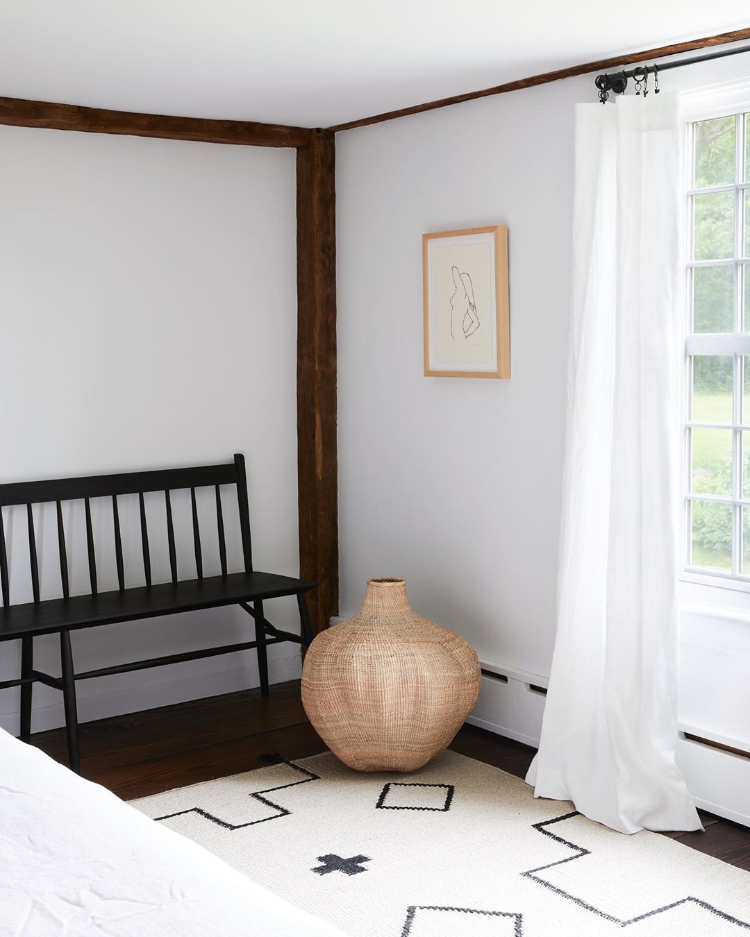
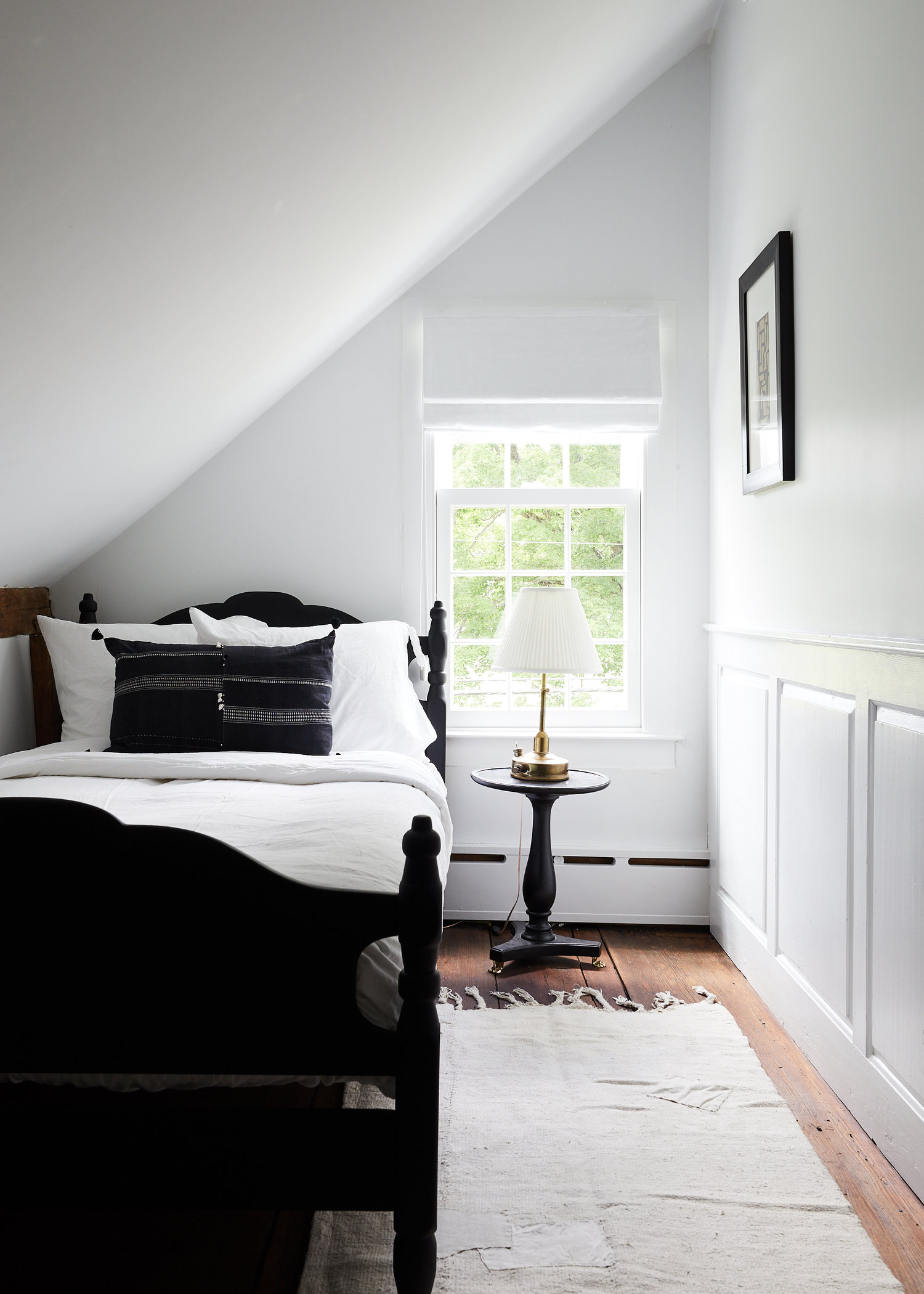
A wicker chair painted black modernizes the vintage vibe in a bedroom. A sophisticated modern lamp further balances this vignette.

This home is a clinic in honoring a home’s historic bones while breathing in new life that meets the needs of how we live today. My friend Sheena, the founder of Nune Studio is behind all these beautiful choices while Branca & Co managed the restoration. I should have reached out to both five years ago!
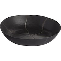
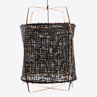
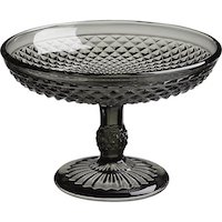
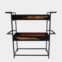
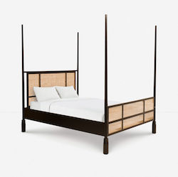
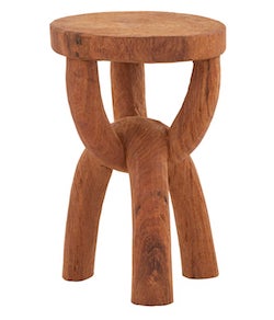
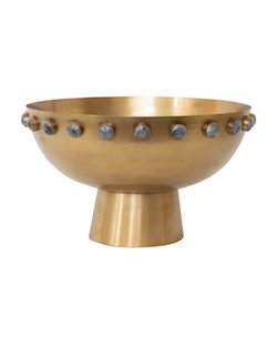
photography by nicole franzen, interior design by nune studio, restoration by branca & co

Happy Monday friends! Today I have a home tour for you that helps put last week’s black and white inspiration in context. While the color palette of this Australian home (I just can’t quit design from down under right now) is timeless, the design is bold, dramatic and thoroughly modern. It’s no wonder this apartment is nominated for the 2019 Australian Interior Design Awards. Scroll and you’ll see why.

This three-story townhouse located in Sydney’s Darlinghurst neighborhood was stripped down to expose the building’s original stone walls which were transformed into the primary design feature. As designer Tom Mark Henry explains this house focuses on “the interplay of texture, combining hard and soft finishes, contrasting matt and gloss surfaces, and light and dark to create intrigue and depth in an otherwise monochromatic palette. These quiet juxtapositions are an exercise in restraint, and the ultimate pursuit of balance and simplicity.”

Nothing in this house is generic. Every piece is selected as its own individual statement maker, but the uniform color palette keep the modern edge from feeling overdone.

Unique lines, dramatic angles, bold fabrics and one of kind art add continual interest in what is actually a sparsely decorated home.

This dining table, with its mix of a built-in bench and Thonet chairs is major goals.

As is this gorgeous pendant light!

The outdoor area connects with the kitchen and dining room seamlessly.

The kitchen is clean, minimal and understated, punctuated with simple, hardware free cabinetry. Black accents are brought in with the hardware, oven and countertop accessories.

I love the rich, muted texture of this stone.

The stunning stone walls carry through into the master bedroom. A unique piece of art adds a little whimsy to to the space while the curved lines of the side chair and side table, as well as all the textiles soften the room.

I shared this bathroom a few weeks ago for its square sink, but I also love this room’s vertical stacked tile, the gorgeous stonework and unique lighting. And do I spy a fireplace in the bathroom?? Swoon!

I spy another square sink in the second bathroom.

This home might be a little more sparse than I’m actually capable of pulling off, but it’s certainly something to aspire to. It’s also a reminder to look for pieces for your home that are filled with personality. Life is too short to be surrounded the generic.

For our home tour archive CLICK HERE.

design by tom mark henry

While my love of all black interiors certainly is not Halloween related, I’m happy to take another excuse to celebrate all things noir. The dramatic loft in New York featured today showcases sultry black highlights everywhere you turn and I’m loving it. I feel pretty confident you’re going to love it too, but take a scroll and let me know what you think!

Home Tour: An Exercise in Noir Chic in New York City on apartment 34Home Tour: An Exercise in Noir Chic in New York City on apartment 34Home Tour: An Exercise in Noir Chic in New York City on apartment 34Home Tour: An Exercise in Noir Chic in New York City on apartment 34

This loft is a study in how to incorporate unique, unusual and eye-catching pieces to define your style. While the bones of this apartment offer that urban, downtown feel, the mix of masculine and feminine, industrial and vintage, high design and found objects helps the loft defy cliched design troupes. But one of it’s defining elements is the various uses of black. What would have been a simple, white box (albeit really lovely hardwood floors) has been transformed through ingenious uses of the hue. Everything from dramatic black accent walls, to black pieces of furniture, dramatic black accessories and even black sprinkler pipes give the space depth and dimension.

Home Tour: An Exercise in Noir Chic in New York City on apartment 34Home Tour: An Exercise in Noir Chic in New York City on apartment 34Home Tour: An Exercise in Noir Chic in New York City on apartment 34

It helps that the owners of this picture perfect space are the founders of NES Creative, a marketing studio known for representing design stars including Apparatus, Workstead and Egg Collective. They regularly use their space both for creative salons and as a living showroom for their clients newest work. Must be nice. I’d like to casually display a few Workstead sconces in my house.

While not all of us have access to hand-painted chairs by Alex White, there are some easy design ideas incorporated into this apartment that you can replicate – no matter what your budget might be.

Home Tour: An Exercise in Noir Chic in New York City on apartment 34

I love how this space layers different tones of black. From wool carpets and leather sofas to steel side tables and vintage portraits, this home features a myriad of yummy textures. This keeps the use of black from feeling monotone or overwhelming.

It’s also an interesting idea to paint two walls black and then leave two walls as well as the ceiling white. Two black walls connecting at the space’s far corner draws you in as you enter the loft, while the white wall beautifully bounces the natural light from the loft’s two large windows.

While there are certainly design treasures costing thousands of dollars in this home, the white sofa is also from CB2. Never forget you can mix high and low as long as you pick pieces with timeless style and classic lines.

Home Tour: An Exercise in Noir Chic in New York City on apartment 34

While I’m going to continue to save for my dream Workstead sconce, there are plenty of really compelling black pieces out there that are crazy affordable. I’ve taken the liberty to pick a few of my favorites that you can shop below. Don’t worry, these will still look incredibly cool long after Halloween season is over.

For our entire home tour archive, CLICK HERE.

images via rum magazine & vogue living

Friends, the terrazzo trend. Can we talk about it? I am very (very) on the fence about this design choice. I’m actually leaning over into the “what are they thinking” camp. Because terrazzo is a state.ment. And one I suspect will feel very 2018 in about 2019. Terrazzo is on airport floors. I don’t think it should be in kitchens or bathrooms or anything built after 1974. But… then I spied this kitchen that features a creamy, soft, super neutral terrazzo. And now the terrazzo jury is out.

idea to steal: understated terrazzo on apartment 34

This version of terrazzo feels elegant. I realize I’m drawn to describe this kitchen as elegant because of all the other elegant elements in this space. The warm oak cabinetry is very stately and grounding. I love the joinery – it feels very architectural. The beautiful brass hardware elevates the cabinets to feel more urban and modern. And even the accessories dotted throughout the space – in black, white oak or silky cream tones all have sultry curved lines and sculptural shapes. Each element plays really well with the counters. The entire look feels very modern but organic at the same time.

idea to steal: understated terrazzo on apartment 34idea to steal: understated terrazzo on apartment 34

While I love the soft grays, blues and even hints of blush pink mixed in these counters, the look is still not for the faint of heart. I mean that island is a very dramatic moment in this room. Even with the toned-down color palette, it is still a very bold choice.

idea to steal: understated terrazzo on apartment 34idea to steal: understated terrazzo on apartment 34idea to steal: understated terrazzo on apartment 34idea to steal: understated terrazzo on apartment 34

So I remain undecided. Well, correction. I can decisively say I really like the look of this kitchen. And yet could I ever actually live with terrazzo? I’m not 100% sold yet.

How about you? Are you into this look? Are down with this trend – even the bold styles – in general?

If you need more interesting design ideas, CLICK HERE.


kitchen design and images by nordiskakok

I know this is supposed to be the year of big bold color. I’ve even espoused being brave with color a couple of times myself. I’ve been pinning a ton of color too. But as much as I love a courageous design decision, there’s something about a timeless palette that will always look of the moment. Case in point, the combination of black, white and wood that I just cannot quit.

timeless color palette on apartment 34timeless color palette on apartment 34timeless color palette on apartment 34timeless color palette on apartment 34timeless color palette on apartment 34timeless color palette on apartment 34

This classic color palette is a calm, cool and refreshing respite from life’s noise. It offers the space for your day-to-day to add the color rather than objects that surround you. But this palette isn’t one note. There’s actually a ton of variety to play with.

You can decide between cool whites or warm. You can mix and match a huge range of wood tones. For example, walnuts feel rich and sophisticated. Light maple feels airy and bright. Wood floors add warmth to all white walls. I’m obsessed with the patterned floor above although herringbone is always a good choice too. It’s a lovely old world look. But I also love the modern vibe of a white floor too.

It’s the hits of black that modernize – a black focal wall adds drama, pops of black like a light fixture or faucet offer places for your eye to land and black furniture feels chic. Black will always elevate with its sleek edginess. I recommend putting something black in virtually any room.

So while I try to conduct a bit of a spring purge, I’m looking to both pare back the colorful clutter, and instead, add just a few subtle layers to my world. Any of the 18 black, white or wood objects below would definitely do the trick!

shop a black, white and wood color palette on apartment 34

SHOP: 1 / 2 / 3 / 4 / 5 / 6 / 7 / 8 / 9 / 10 / 11 / 12 / 13 / 14 / 15 / 16 /17 /18


What do you think? Do these subtle yet striking rooms speak to you as much as they do to me?

For more color palette ideas, CLICK HERE.


SHOP THE POST

[show_shopthepost_widget id=”3102451″]


images 1 / 2 / 3 / 4 / 5 / 6

There are a lot of trends in kitchen design. All white. Open shelving. No uppers at all. Black. Gray. The list can get a little long. But I think it all may stop right here, right now with this stunningly cool kitchen. I have found my new mecca. It is traditional. It is modern. It is classic. It is timeless. It’s fresh and feels like something I haven’t seen before. And it’s really making me want to take my kitchen apart and start from scratch (don’t tell the hubby!).

crazy sexy cool kitchen on apartment 34crazy sexy cool kitchen on apartment 34

Designed by Amber Interiors, already a standard barrier of California Design, this kitchen has officially set the bar for timeless kitchen design.

It is a little hard to know where to begin since I’m mostly just staring, jaw agape, but as you dig into the details you notice all the amazing design decisions tucked into one room. Amber brilliantly combined quite the variety of materials to great effect; warm woods, industrial concrete floors, vintage pendants, leather topped barstools, quartz counters with an oversized edge – they all mix and meld seamlessly to create a space that is warm, open and inviting but also modern, refined and damn sexy if you ask me.

crazy sexy cool kitchen on apartment 34crazy sexy cool kitchen on apartment 34crazy sexy cool kitchen on apartment 34

The use of bead board cabinets and white bead board backsplash soften what could become a very modern, almost stark room. Bead board is not a choice I would think to make (no matter how many episodes of Fixer Upper I watch), yet I really appreciate it in this space. But what really had me at hello is that stunning all black storage cabinet. It’s a genius idea to reverse the color scheme, with a black exterior and a white oak back panel. It anchors the kitchen and creates a gorgeous feature wall.

crazy sexy cool kitchen on apartment 34crazy sexy cool kitchen on apartment 34crazy sexy cool kitchen on apartment 34crazy sexy cool kitchen on apartment 34crazy sexy cool kitchen on apartment 34

Did I mention the kitchen opens up entirely to the home’s backyard? Like I said, the bar has been raised.

crazy sexy cool kitchen on apartment 34crazy sexy cool kitchen on apartment 34

This kitchen really is something quite extraordinary. The neutral color palette is just pitch perfect. The styling is impeccable. But if you like this, then you really should see the whole house! Amber describe it as modern Scandinavian cottage meets LA style – and she nailed it. If you want to inject a bit of this vibe into your home scroll below to see how. I know I’m going to!

crazy sexy cool kitchen on apartment 34

SHOP THE POST: pendant light  / round cutting board / mortar & pestle / bar stools / art print / decanter  / rugcutting board / colander / plant / 

For more gorgeous kitchen ideas, CLICK HERE.

For all our favorite home tours, CLICK HERE.

images via amber interiors

When the craze of Mondays are a little too much to take, some zen-like design can help soothe. These spaces are sophisticated in their simplicity. Each detail is meticulously chosen. As the inbox overflows and the to-do’s pile up, just mentally step into any one of these rooms featuring calming, cool clean design – 1o deep breaths later you’ll feel much better, I promise.

  clean design on apartment 34clean design on apartment 34clean design on apartment 34clean design on apartment 34  clean design on apartment 34 clean design on apartment 34

For more design zen, CLICK HERE


image 1 / 2 / 3 / 4 / 5 / 6 / 7

If, like me, you’re a huge fan of picture rail shelves (I’ve used them repeatedly over the years, like here and here and here), but are hesitant to drill permanent holes in your wall, you’re going to love this Idea to Steal. It offers a super creative away to display your treasures.

idea to steal: innovative displayidea to steal: innovative display

This is literally an Ikea hack. Rather than drill into your wall, you can create your own leaning picture rail display. Simply screw some picture rails into a run of black marble patterned Ikea countertops and you’ve got a flexible, moveable display case.

Books, art, magazines and odds and ends suddenly become an eye catching focal point – especially if you style everything in a monochromatic color palette. And I’m always a sucker for black (case in point, my new dining room). You can use this leaning display to create a still life in just about any space – a living room, bedroom, office. Even a hallway. And the best part? You can change the look whenever the mood strikes.

I smell a spring project coming on! What do you think? Are you into this idea?


For our entire Idea to Steal archive, CLICK HERE.


design by Pella Hedeby for IKEA | Photo by Karl Anderson

In case you’ve been living under a giant pile of work lately {raise hands!} and happened to miss it, our uber-talented Editorial Director, Bianca, was just featured in the latest issue of Rue Magazine! And not just any ole’ issue, it’s the Anniversary Issue – the biggest of the year! I couldn’t be more excited to show you some snaps of her crazy hot home office space — it’s just the right amount of moody glamour and much-needed function; proof positive that you don’t even need a “real office” to achieve a similar look. Bianca’s going to take it away! Just own the envy and take notes! – Erin

bianca-office-7-apartment-34

Not everyone has the luxury of having a dedicated room for an office, right? Myself included. My office is actually my living room and admittedly, it was tricky trying to figure out how much “office” to incorporate into the space I veg out the most. You may remember the previous layout of the room here. The “office” was tucked away in a corner on purpose. I didn’t want it to be a focal point because really, who wants to stare at their desk more than they have to??

It worked for a while, but it really wasn’t ideal for me being shoved in front of a closet.  So I moved the desk against my main gallery wall and boom, the room changed- for the better! The white desk popped off the dark wall and by clearing the paperwork, leaning some artwork and placing pretty objects on my desk, it camouflaged it enough- making it a highlight of the space without taking away from the purpose of the room.

bianca-office-8-apartment-34bianca-office-3-apartment-34bianca-office-6-apartment-34

Objects and magazines are always rotating on the surfaces of things. My coffee table already doesn’t look like this- in fact, a lot of things are different! I’m always picking up something new to add to my home. I think it’s so necessary for my sanity- to change things around. It keeps things from getting stale. I just bought this crystal candle that I’m obsessed with, this decor book called The Chamber of Curiosity and this throw– like I need ANOTHER one!

bianca-office-5-apartment-34bianca-office-2-apartment-34bianca-office-4-apartment-34

One of my favorite areas of the room is the bar area. It sits atop a dresser that holds dvd’s and computer cables. I added drawer pulls from West Elm to make it look a little more fancy! It’s a real mix of high and low. I’ve found all of my barware at thrift stores and painted the framed piece myself. Everything sits pretty next to my favorite pair of Regina Andrew alabaster lamps- my ultimate splurge! And just in case you were wondering, here are the most common questions that I get regarding my space:

> Dark paint color? Benjamin Moore Nightfall, 3 coats

> Art piece above my sofa? I painted it! Email me for commission prices and look out for prints coming soon!

> Are the black chairs velvet? Linen? They’re wool and pinstripe and ever-ee-thing!!

Be sure to read the full story in Rue’s Anniversary Issue here and another behind-the-scenes interview on what my day really looks like – including my fave music, artists, must-haves and go-to websites- here.


original photography for Rue Magazine by Aubrie Pick 


Older posts
Gimme More