I’ve been chugging along on the Hood Canal Cottage design – I know I am SO overdue for an update for you, but when you’re in the throes of design deadlines it can be really hard to find a moment to pause and recap everything. But I swear, it’s coming slowly. In recent weeks I’ve moved on from major architectural design and finish decisions into the interior design side of things. It’s been a tad overwhelming, as I haven’t decorated a space from scratch since we moved to San Francisco nearly 10 years ago (did you ever catch the tour of my first place in SF? I’m almost embarrassed to share it, but I was SO proud of it at the time).

Designing the Hood Canal Cottage is a unique situation to be in for a hobby designer like me. Usually, you move and take pieces with you, but since the cottage won’t serve as a full-time residence, I’m starting from a literal blank slate.

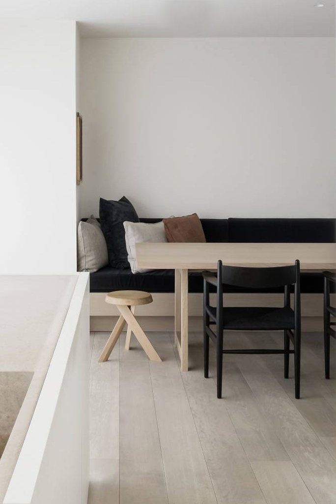
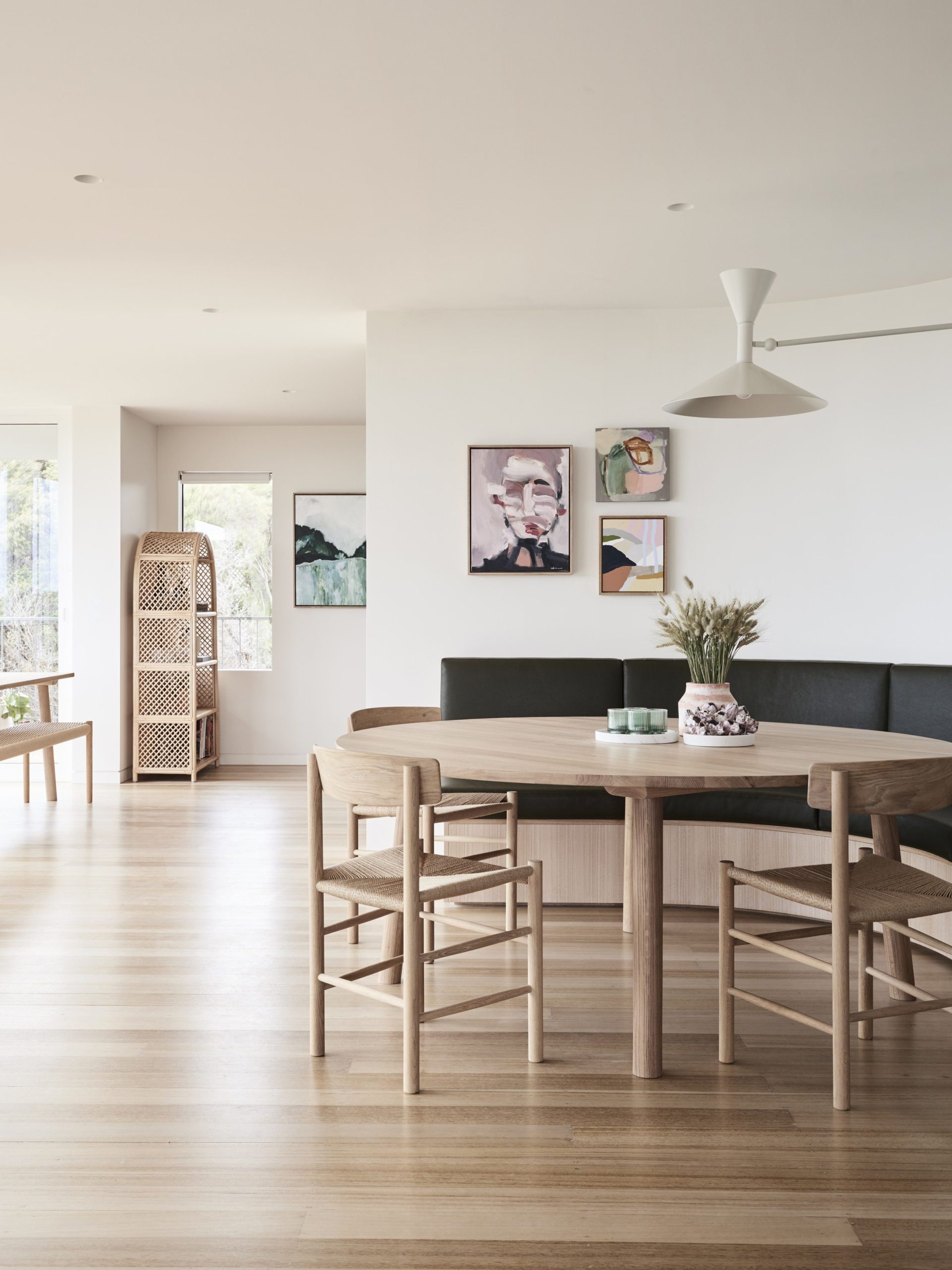
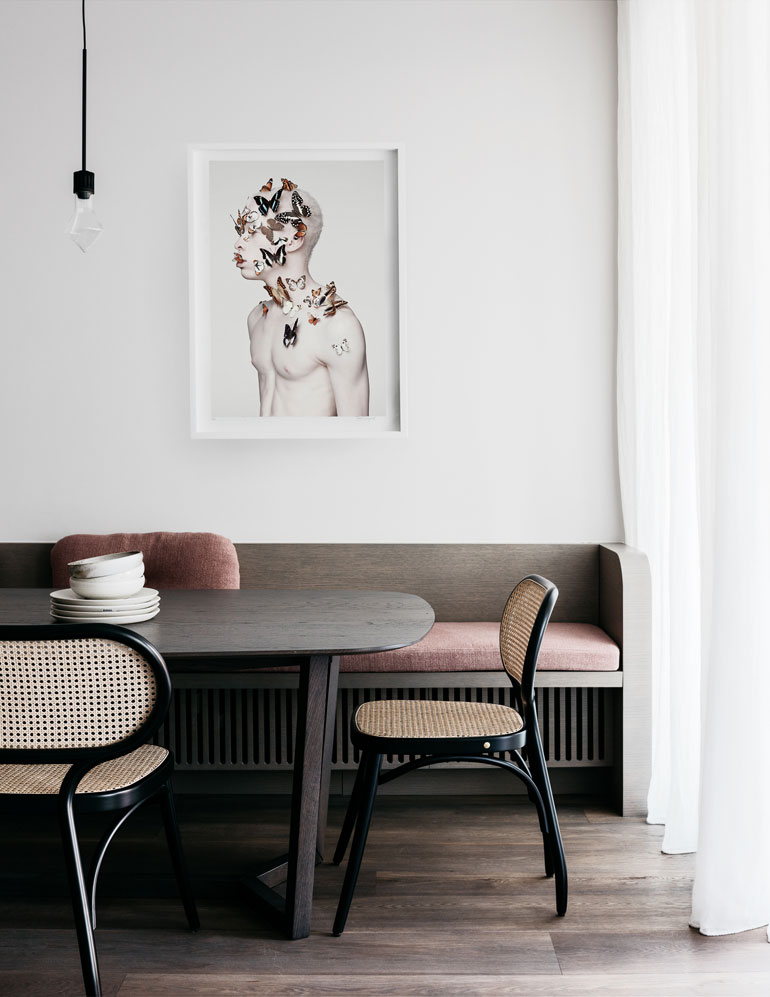
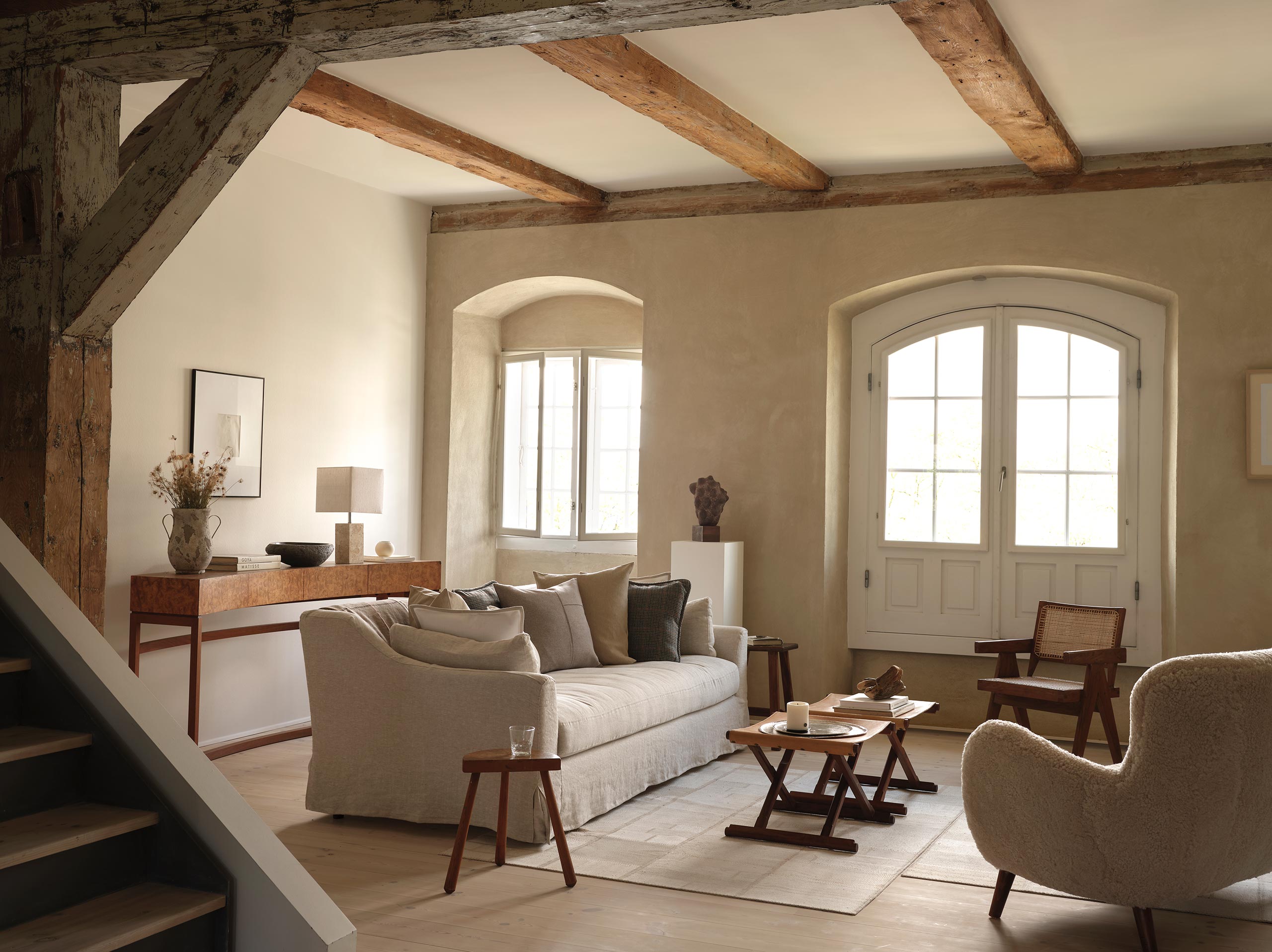
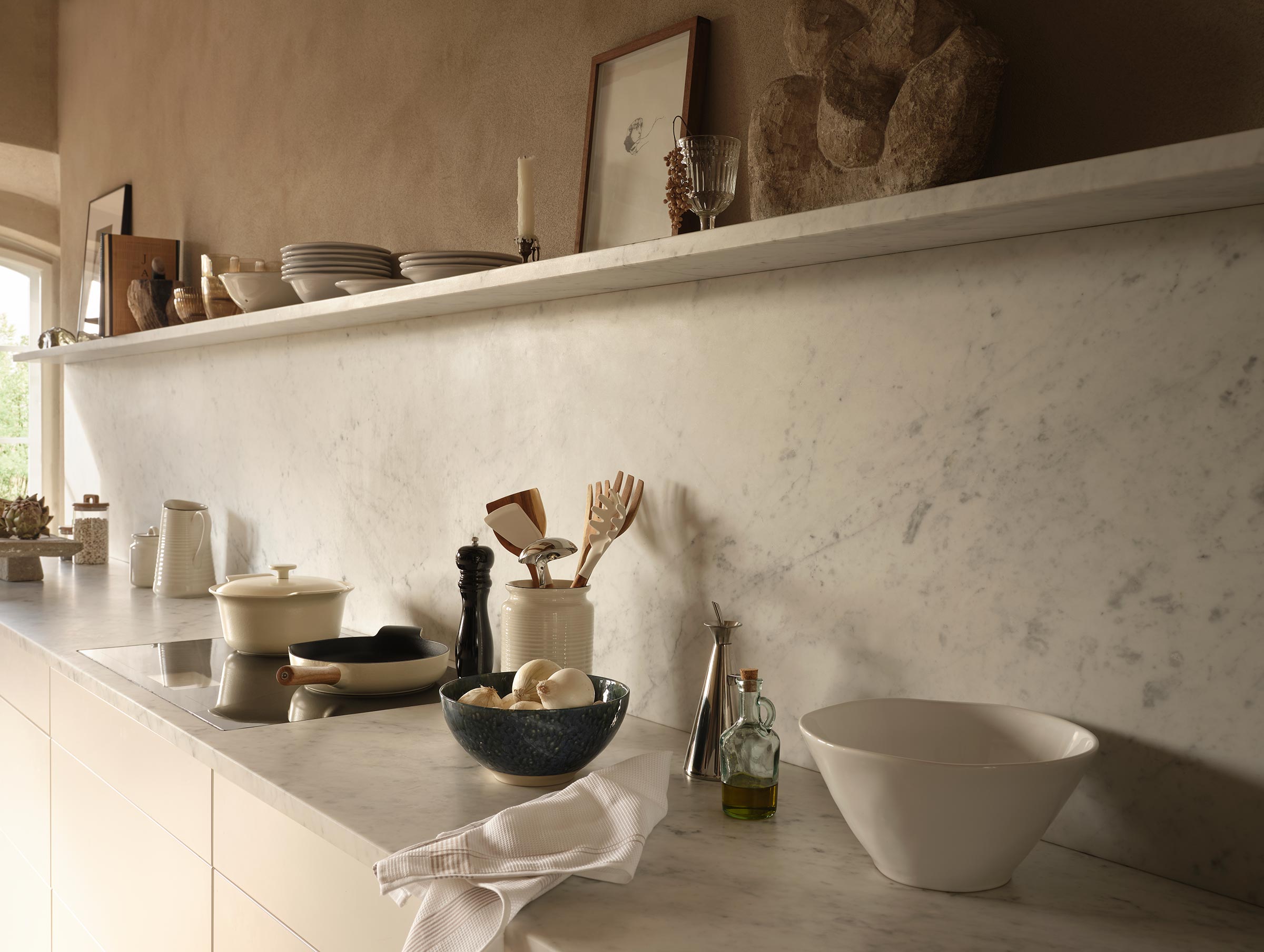
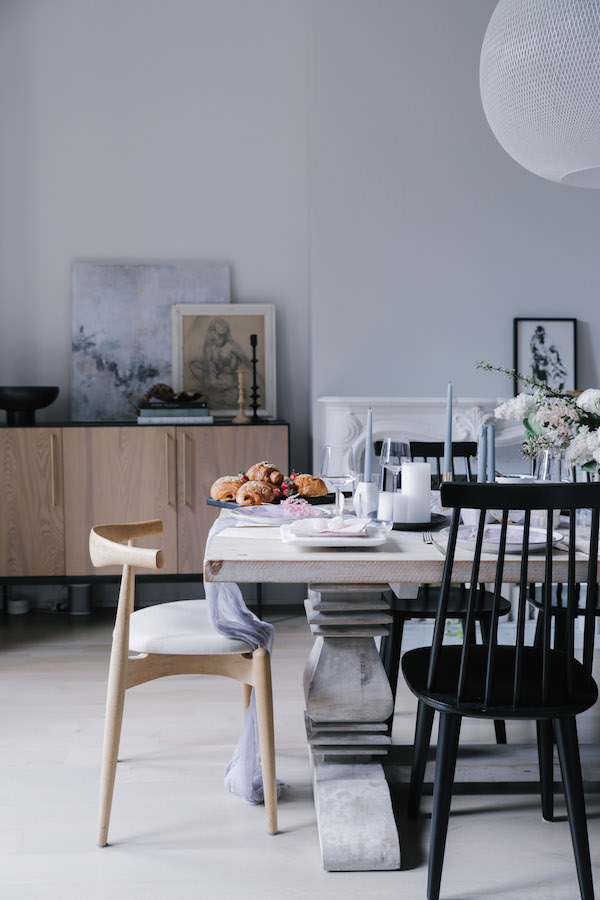
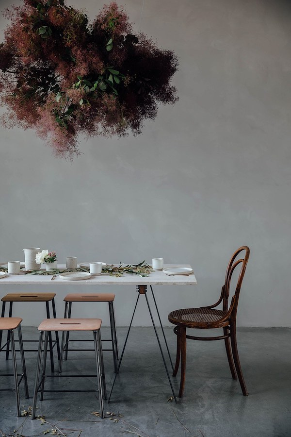
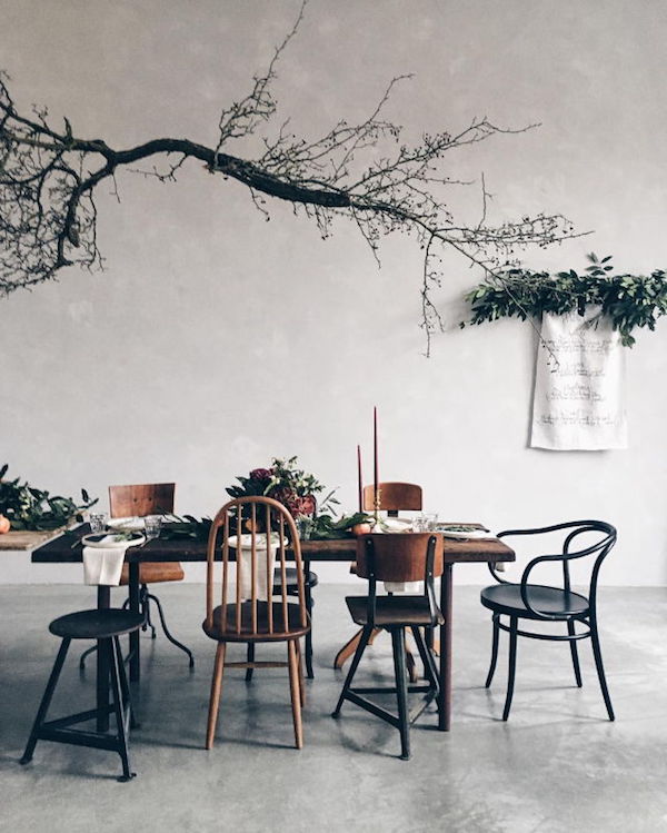
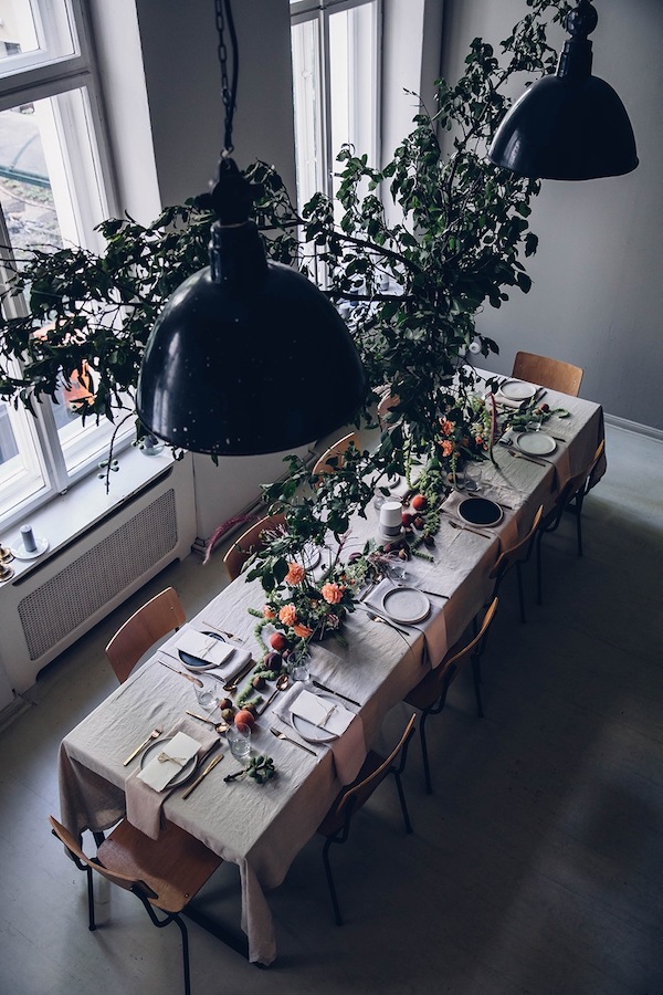
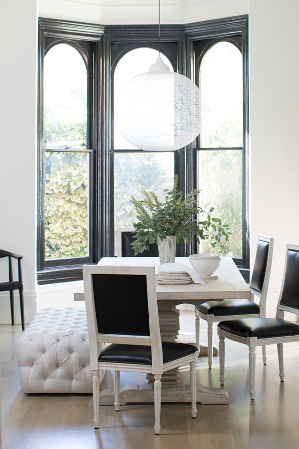
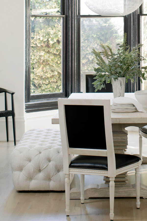
My focus this week has been on the dining room – or in this case dining space as the dining area sits within a great room that also houses the kitchen and living room. I’ve been shopping around like a madwoman trying to hone in on the look and feel I want to bring to life in the dining area. I want it to feel distinct and anchored – its own little zone within the larger room. And the idea I keep coming back to again and again is banquette seating.

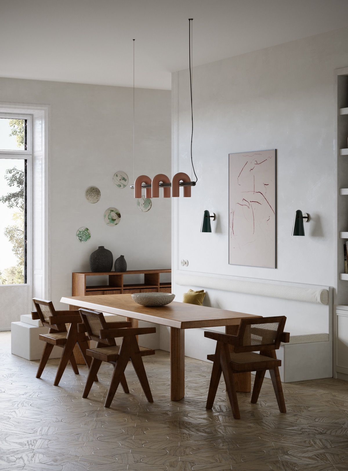
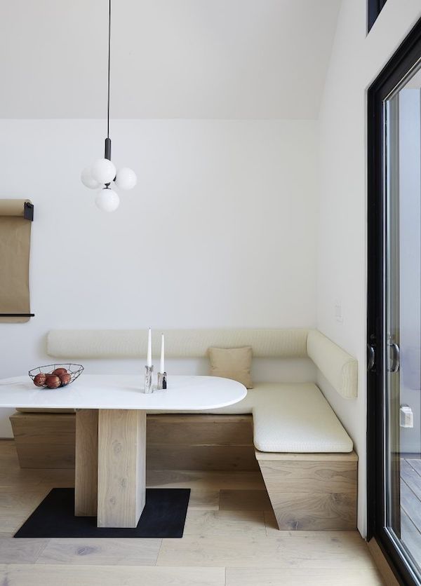
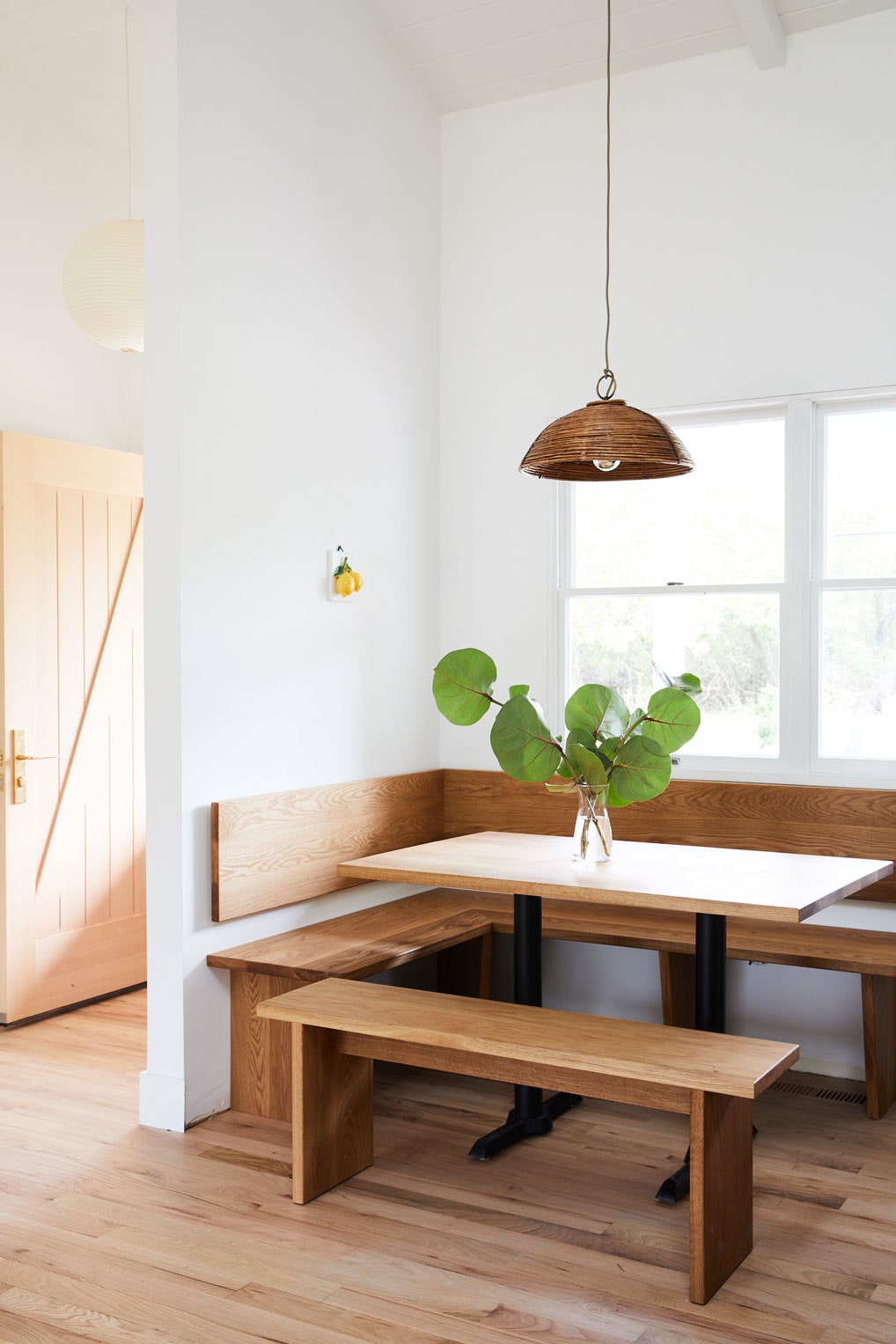
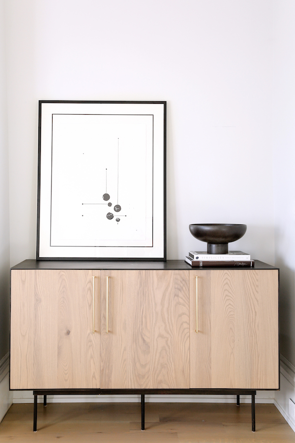
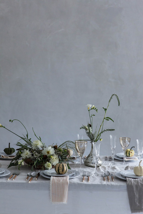
Banquettes and built-ins have been having a moment for a while now, but I would argue for very good reason. A built-in banquette is a great space saver in a smaller space and increases the capacity around a dining table. Since I envision the Hood Canal Cottage as our hub for future Thanksgiving dinners and holiday gatherings, I definitely want to be able to cram as many people around the table as possible.

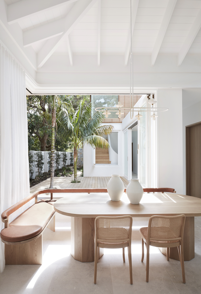
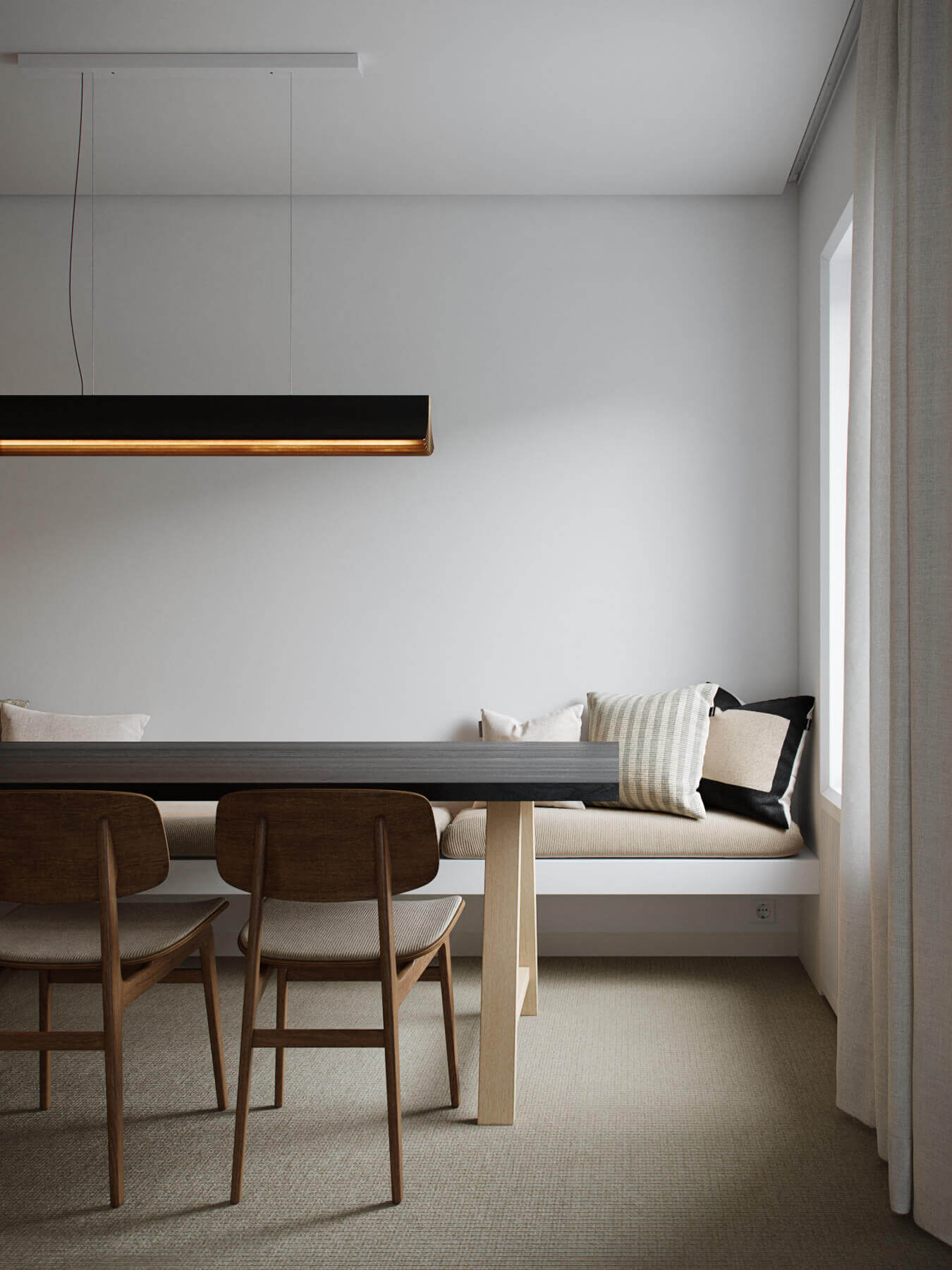
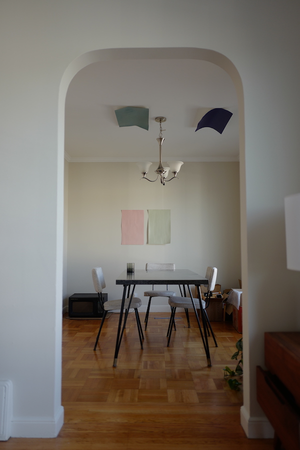
Like many of the examples you see here in this post, our dining table will also run parallel to a long wall, rather than float in the middle of the room. This actually limits the ability to pull back a dining chair. I would probably have to use a bench on that side of the table, but a banquette will allow the table to sit a little closer to the wall and not have legs you have to work around, saving precious floor space.

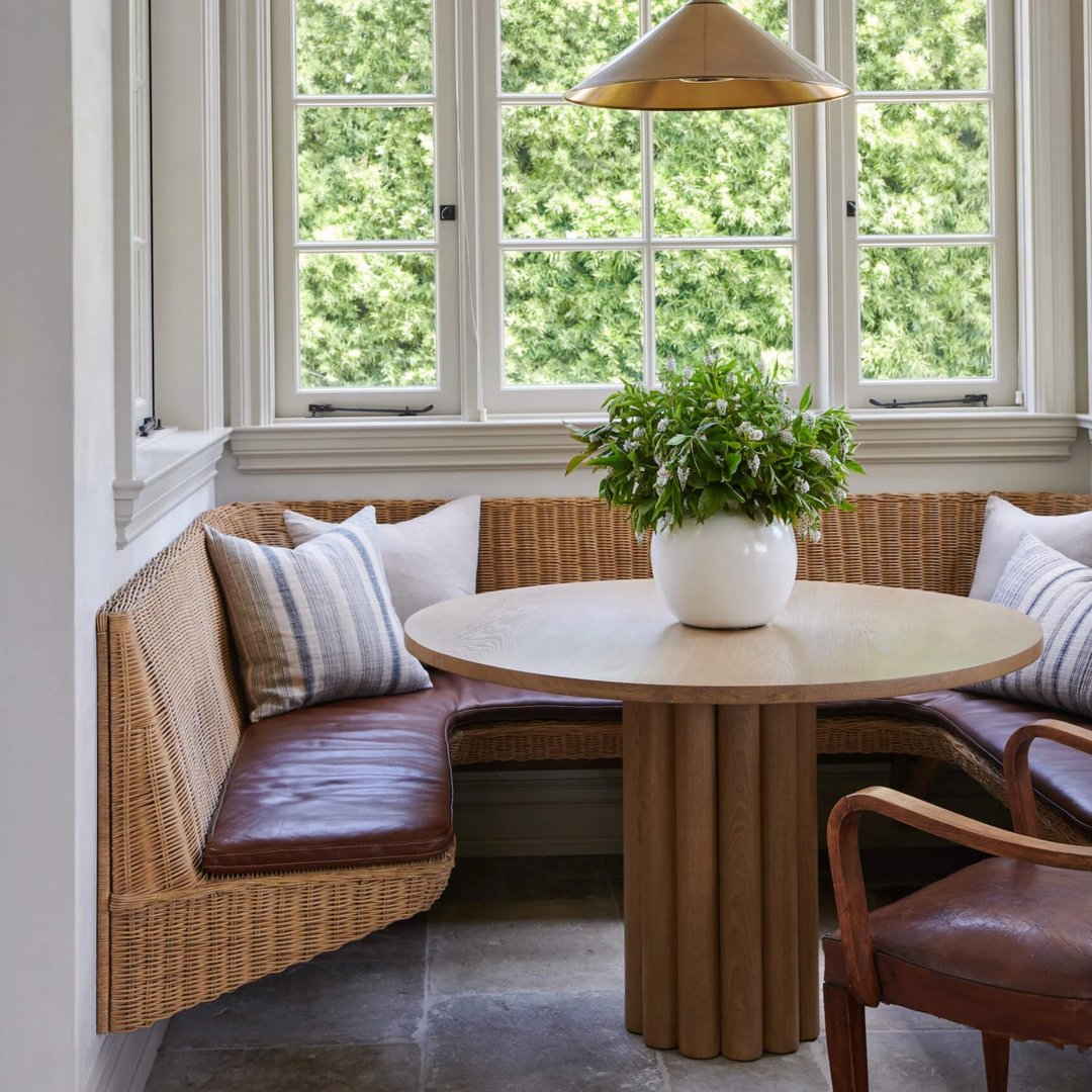
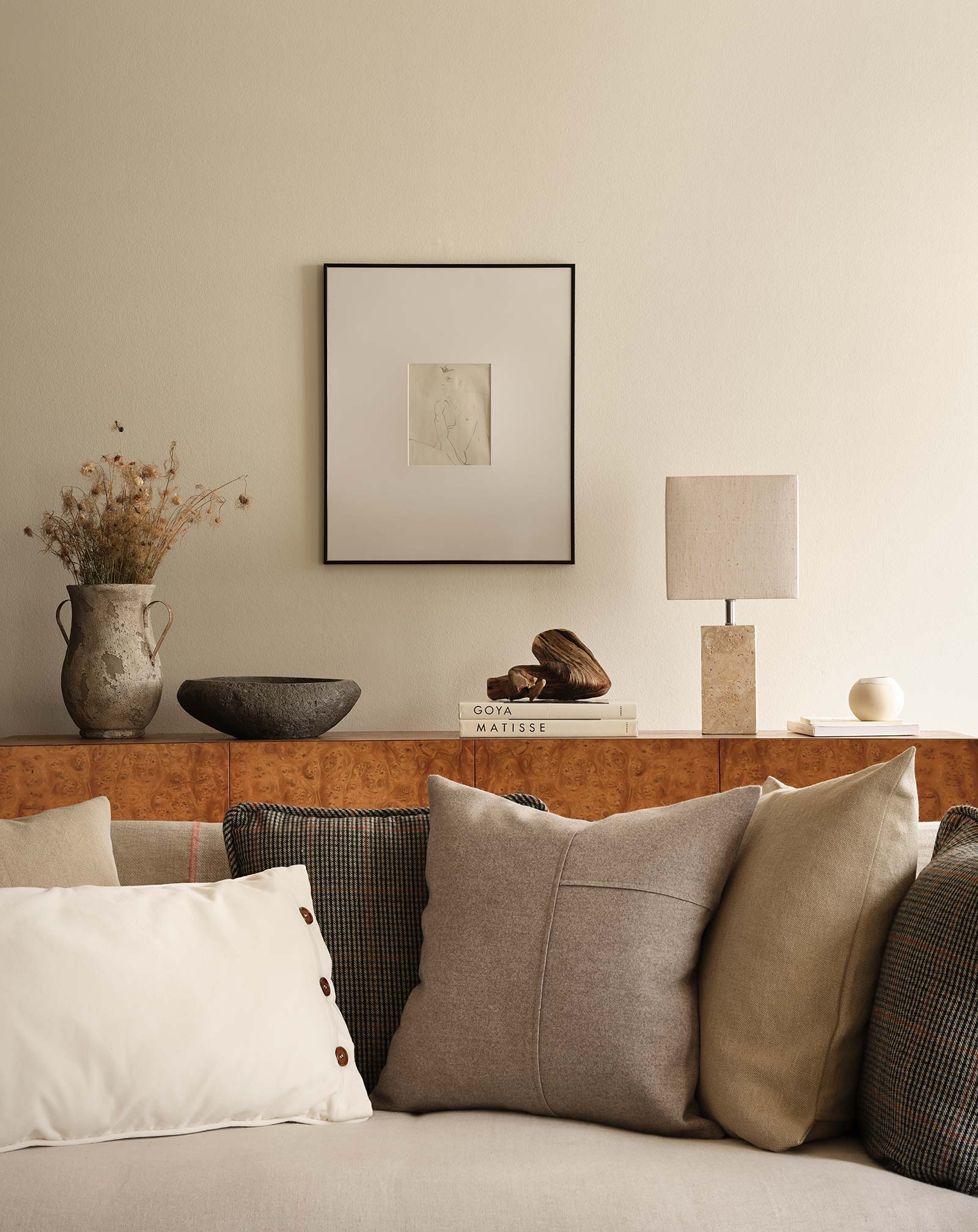
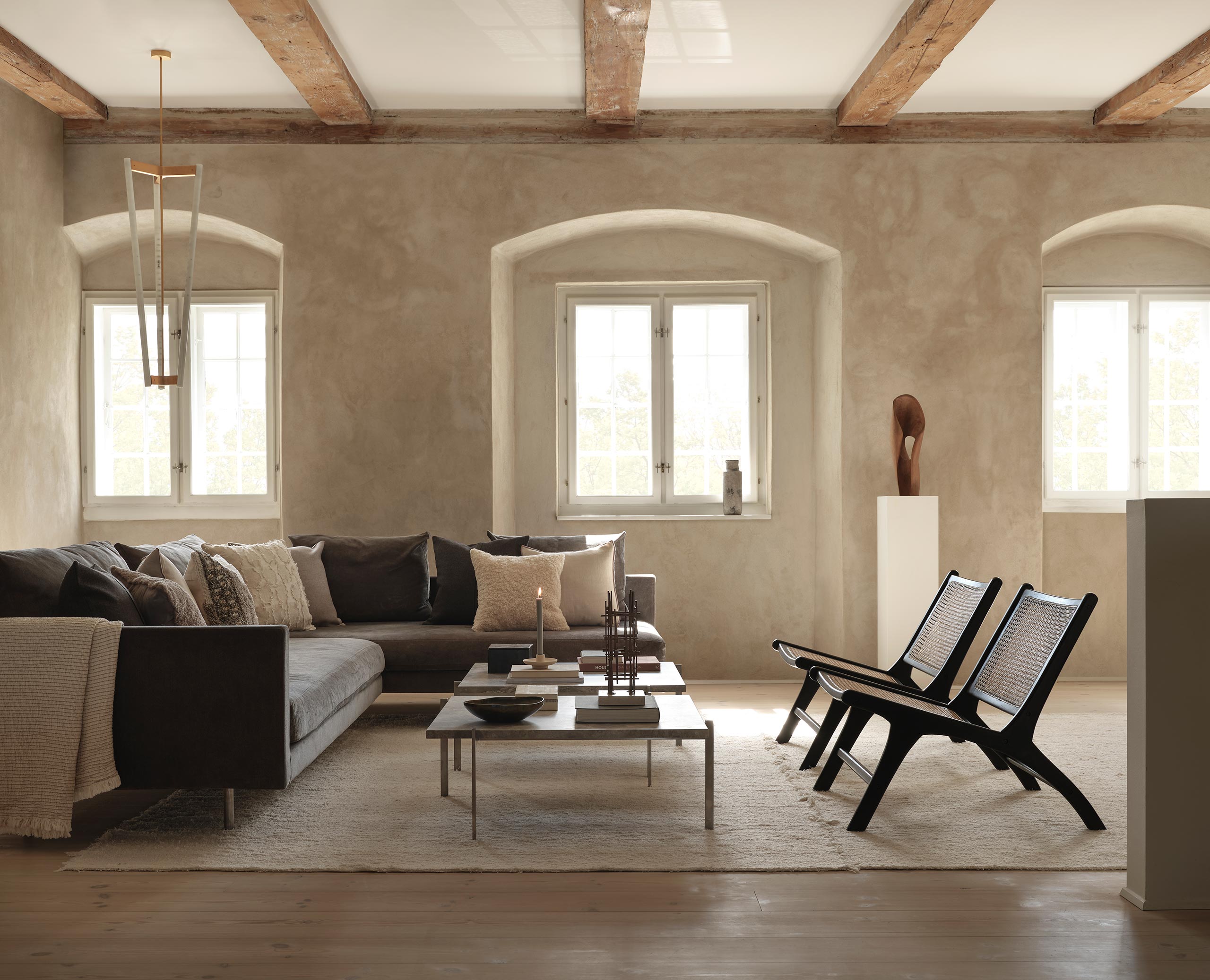
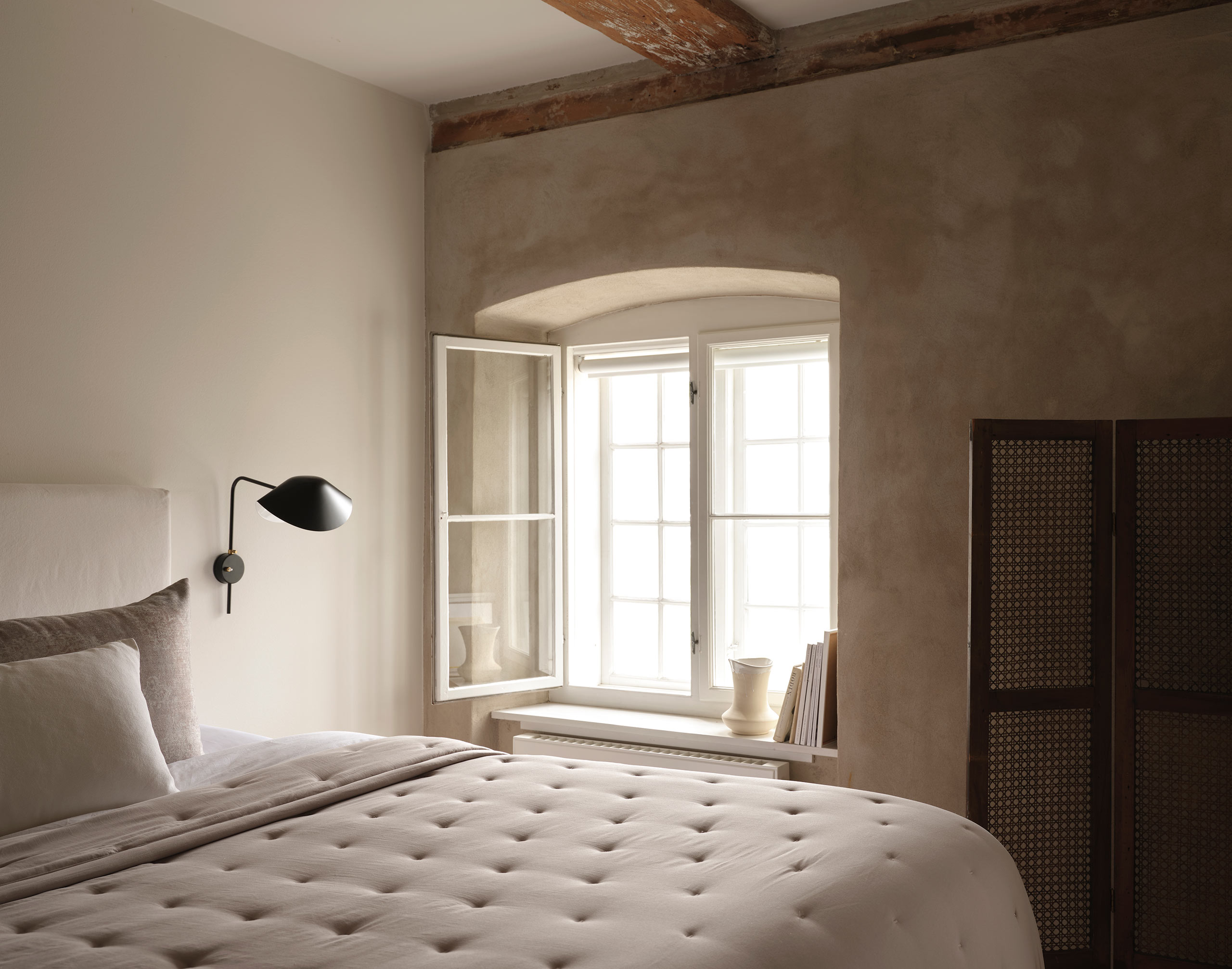
I also love how a banquette offers the opportunity to add big long seat cushions, back pillows, or both! Adding cushy upholstery to a dining space softens areas often dominated by hard surfaces. I love how that brings a sense of coziness, inviting you to sit and linger over your morning coffee, or pour that last little bit of wine and stay up talking. I want this home to encourage anyone who stays there to slow down and enjoy the little moments. Kinda like you’re living on vacation. That is the goal.

Adding a major upholstered piece at the dining table will also help me bridge the living room space and kitchen.

While I am obviously leaning toward jumping on the banquette bandwagon, I do have some convincing to do. Not everyone in my household is into the idea of a banquette. To add to that resistance, I’m not finding any good off-the-shelf options so it’s likely I’d have to go custom to create my vision. Custom is certainly not the most affordable of options.

So what say you? Do you happen to have a banquette in your home?? Do you like it? Have you found it comfy? Useful? Are there downsides you’ve dealt with? I think I’m pretty committed to this design choice at this point, but I would love to hear what you think! Please share in the comments section.

Catch up on the Hood Canal Cottage HERE.

Check out more design ideas HERE.


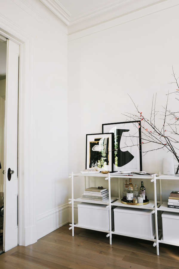
images vincent van duysen | home designing | mr & mrs whitedanthree | amber interiors shoppe / larritt-evans design | poppy talk | nicole franzen | decus interiors

When you close your eyes and imagine your dream home, what do you see? If you said a mix between Oliver Gustav and Vincent Van Duysen, where elevated simplicity meets luxurious texture and pitch perfect restraint, then we’re meant to be design BFFs. If said I found such serenity, would you believe me?

Apparently, I want to live in the world of Zara Home’s new A/W 2019 campaign – A Life of Simplicity – because everything here is harmonious, soothing and when you stop to think about it, really oh so simple.. Be gone over-crammed shelfies and overloads of color – or stuff. What if you lived only with what you needed, but everything you have has to be beautiful. Intentional. This is where I want to call home.

This gorgeousness is no surprise given that this campaign was created in Copenhagen by some of my online faves including stylist extraordinaire Colin King and designer Rosie Seabrook. I love how pared back spaces like these force you to focus on the details – the texture of the plaster walls, the curves of the vases atop the dining table, the golden glow of the amber-hued glassware on the kitchen shelf. You miss nothing because it’s all meant to be seen – be experienced.

Hello dream kitchen, how you doing? You’re really making me want to redo mine right now.

Of course it helps that Zara’s new collection of tabletop, textiles and kitchenware have been paired with old world design classics (hello Jeanneret, Poulsen and Fritz Hansen), all in a timeless and soothing neutral color palette within a next level Scandinavian apartment. But all to perfect effect. I am sucked into this world and want to know how I can make any part of it my own (I currently have my eye on this vase and this bowl).

While of course I know a zen-like bedroom won’t calm the nerves of an overtired parent living in an insane world, I can hope that a perfect lounge chair or minimalist mirror might help. Or maybe I’ll just continue to look at these pictures. and deep breathe. Until the end of time.

What say you? Does this inspire you to up your style?

For more elevated design inspiration, CLICK HERE.

photography by frederik vercruysse, styling by colin king for Zara Home

Does anyone else out there hem and haw over decorating decisions for months on end only to suddenly feel like everything must be finished and perfect in time for the holiday season?? Oh phew – you too? Well, I’m glad to know I’m not in this alone.

I’ve been frantically looking at my barren master bedroom, my forever work in progress guest room, my still unfinished master bath with the sudden pang that everything in #thisoldvictoriansf must be completed – now!

An Easy Way to Upgrade Your Space with Framed Art on apartment 34

Thankfully I’ve learned from my past mistakes, so no, I’m not taking on a massive project just before the holidays hit. This year, I decided to keep it simple. Rather than stress myself to the core, I chose to add the perfect finishing touch to our dining room with Framed & Matted instead.

The dining room has gone through many an iteration (like this one and this one and this one) as I’ve slowly worked to create my dream space, but I’ve honed in on my (near!) final look. Adding art to this room is certainly a great way to make it feel more “done.” But framing art can be a rather intimidating prospect.

An Easy Way to Upgrade Your Space with Framed Art on apartment 34

But let’s start with the art itself. I recently stumbled upon the awesome work of Skye Schuchman. While primarily a digital artist, Skye also creates these beautiful line & dot block prints on stunning thick raw-edged french paper. They speak to my minimalism-loving soul.

To showcase the scale of our house, I selected two oversized pieces of Skye’s work – each measuring 30 inches. Framing something of this size could be prohibitively expensive and challenging. Thankfully, Framed & Matted has simplified the framing process immensely.

Started by a fellow Bay Area mom with an education in art history and a background of working in art galleries, it’s nice to know that Framed & Matted was created by someone with real experience in the art world. It’s especially helpful because Framed & Matted is quick to dispense advice for the framing-phobes out there such as myself! I never quite know what type of mat to pick or how to determine the correct sizing.

And the best part? I didn’t have to schlep anywhere. I didn’t have to worry about shipping my art in for framing and having to wait on its return.. I simply made my selections and in three days Framed & Matted shipped my frames to me.

An Easy Way to Upgrade Your Space with Framed Art on apartment 34An Easy Way to Upgrade Your Space with Framed Art on apartment 34An Easy Way to Upgrade Your Space with Framed Art on apartment 34

I decided to float frame Skye’s work – aka not cover the paper’s edges with mats – to keep that gorgeous raw paper exposed. I also selected a double mat. A thin black mat sits below a larger white one to further highlight the work’s grid pattern. Laying it all out, taping it down and putting the layers back together was quick and simple.

An Easy Way to Upgrade Your Space with Framed Art on apartment 34An Easy Way to Upgrade Your Space with Framed Art on apartment 34

The two pieces now mirror one another on either side of the dining room (did you catch our florals on the dining room mantel yesterday??). I’m currently letting them marinate in there before we commit to hanging them. With 100 year old original plaster walls you only get to put in a nail in once. But I’m thrilled with how they turned out. I love their scale. I love their simplicity. Now the room feels like it’s all coming together – rather than just a space with a bunch of furniture in it.

So as you’re putting the finishing touches on your house, I would definitely recommend adding some framed art to finish off a space. A Framed & Matted gift card would also make a great gift for an art-lover in your life!

And of course I had to give you, dear readers, a little bonus. Use the code APT34 at check out and receive $15 off any Framed & Matted purchase through December 14. But make note – if you want frames you need to order them by December 9 to ensure holiday arrival.


photography for apartment 34 by spotted sf

This post is a paid partnership with framed & matted. All thoughts and opinions are 100% my own. Thanks supporting collaborations I’m excited about and that have kept Apt34’s doors open.

As we dive into summer, (I mean, we’re close enough) I realized I’d yet to throw a party this year. Not really sure how that happened. Oh wait, I have a three-nager. That might be why. But I recently decided that had to change (not the having a toddler part – the party part). I’ve learned you really shouldn’t wait for a reason to get friends together. They take too long to materialize. Instead, just make one up! A brunch to welcome summer seemed like as good of a reason as any. But as a busy mama I’m in no mood to spend hours pulling a party together.

So I pulled out all my tricks to host a beautiful summer brunch without losing my mind. And today I’m spilling the beans in the hopes it might inspire you.

TRICK 1: Amp up your tabletop. A gorgeous tabletop is a bit of a ubiquitous requirement for a brunch, but who can manage to stock multiple set of dishes to switch up a look? That is where the first trick comes in. Take your classic set of white dishes next level with Harlow & Grey. If you haven’t discovered Harlow & Grey yet, I’m about to blow your mind.

This line of modern party goods is absolutely stunning. This is way more than a disposable plate. Harlow & Grey’s artful collections (think black, gold, even marble!) feature modern designs and amazing attention to detail like gold-foil edges and of the moment colors. Hello, amethyst, color of the year. Harlow & Grey’s coordinated pieces offer plates, cups, dinner & cocktail napkins to transform all your tabletop staples. I’m obsessed with the light and lovely look we created for this party.

To celebrate the transition from spring to summer, we layered my dining room table in a sea of pale lavender, white, and subtle pinks A mix of gray and white candles in marble and brass holders added ambiance. Hits of black kept things from getting overly saccharin. To make things feel extra personal and little more special we added Harlow & Grey place cards and a flower sprig on each plate. It’s those little tiny (easy!) details that take a table next level.

TIP 2: Don’t sweat the food. While I’m all for some good home-cookin’, when you’re hosting why take on the unnecessary burden? Especially for something like brunch. I strongly advise hitting up your favorite bakery or cafe for a bevy of treats. Things like quiche can be purchased the day before and reheated. Salads are simple and easy.

I turned to Le Marais Bakery, my go-to spot in San Francisco for an amazing treat. Supplement with fresh berries, mixed nuts & dried fruit and everyone will go home quite satisfied. And you won’t have spent hours slaving in the kitchen. Win win.

TIP 3: Rosé all day every day. Enough said. Except if you want to make a really dramatic moment serve up your rosé in a magnum. Just be sure you know how to open the bottle. (check Instagram stories today to see my poor attempt to open my favorite Azur Rosé).

TIP 4: Take your flowers next level. You can break the grocery store bouquet habit. Thankfully now there are some really great sources for beautiful blooms that you can arrange at home. We’re lucky in the Bay Area as we often get to test out new services before they go national. Case in point, Matilda’s Magnolias.

Matilda Magnolias buys fresh cut flowers from Bay Area farmers, changing the weekly arrangements to make sure they’re using the best of what’s in season. Then Matilda’s delivers a “bloom box” of stems to your door and you get to do the arranging! Each box comes with a beautifully illustrated tip sheet on how to make the best bouquet. Matilda’s introduced me to Astilbe which might be my new favorite bloom.

And so you see – there was really hardly any work that went into pulling this pretty setting together. I sent the invite out via email. Easy. Almost everything on the table could go in the compost or recycling bin. Clean up was a breeze.

I want this brunch to serve as the model for your gathering this season. Because you can create a stunning atmosphere, have delicious treats, a table full of people you love and not make yourself crazy. You just have to remember you don’t have to do everything yourself. There are amazing, beautiful things created by amazingly talented people who can help you. And there’s no shame in that!

SHOP THE TABLE: harlow & grey plates / marble candle holder / wine glasses / gold flatware / harlow & grey cups / gray taper candles / matilda’s magnolias blooms / harlow & grey place cards / copper place card holders / harlow & grey napkins

This brunch was a such a special treat and shared with such lovely friends that we had to go and make a beautiful video to capture the day. I hope it inspires you to gather your girls and spend some time together for no other reason  than the fact that you can.


For even more summer party inspiration, CLICK HERE.


original photography & video direction by andrea posada creative
amethyst collection tableware by Harlow & Grey
wooden place card holders from Esselle 
calligraphy by Joy + Confetti
floral arrangements by Matilda’s Magnolias
brunch spread by Le Marais Bakery
rosé via Azur wines
gifts by saje wellness / lilah b beauty / karuna skin 

For my home tour fans out there, this is your week. You’ve gotten a little taste of our makeover of the sunset bungalow my friend Chloe’s house here in San Francisco, but this week we’re bringing you the full tour! We’re kicking things off today with the living and dining rooms. It is very hard for me to pick a favorite out of our made-over spaces, but these two rooms are making a very strong case. I’m eager to hear if you agree.

Above are before shots. Chloe’s living room started out very bland and a little dull. We wanted to brighten and enliven the room. And while we did consider painting her small-ish dining room a bold color to really make it pop, we went in a very different direction and I couldn’t be happier with the final result. Check it out below.

sunset bungalow dining room on apartment 34

The after is just a breath of fresh air, don’t you think?! I’m really not sure if I could love Chloe’s dining room more. We wanted to create a beautiful, modern, yet beach inspired space. Hence all the woven materials. Our entire inspiration was born by Chloe and my shared obsession with Cesca chairs. There really is nothing better, but vintage ones are gonna cost ya. Thankfully, we found brand new, beautiful Cesca chairs at Oversock and they became the jumping off point for the rest of the room.

This room was another primary inspiration for Chloe’s space – we just needed to work on a smaller scale. We totally achieved our desired effect by adding a woven pendant above the dining table and placing a clean, modern credenza in an ash finish against the back wall. It really anchors the room. A credenza is great for offering much-needed storage and serves as the perfect display area – or spot to serve food or drinks when you’re hosting a dinner party! A classic Saarinen-style tulip table was perfect for the petite space.

sunset bungalow dining room on apartment 34

A sweet trio of an Atollo-inspired lamp and a mix of ceramics hold court on one of the credenza’s corners.

sunset bungalow dining room on apartment 34

While Chloe has many a collection, we kept the accessorizing of her dining space really minimal. I love the white on white effect with the clean modern ceramic bowls on her dining table. Her only job is to keep both the credenza and table from getting piled high with stuff, bu all the storage in there should help with that.

sunset bungalow dining room on apartment 34sunset bungalow dining room on apartment 34

The stunning original artwork by local Bay Area art studio Mineral Workshop really draws you into this room and invites you to stay awhile. The diptych is actually made of hand-dyed fabric stretched over the frames. Swoon.

sunset bungalow living room on apartment 34

And then there’s the living room. You saw our feature fireplace wall in this post, but today I wanted to share the rest of the room! While not particularly large, Chloe’s living room needed to be able to accommodate friends, offer a cozy place to chill out and let’s be real – as any freelancer knows, you’ll be working from your couch more often than not.

The Noah Sectional from Rove Concepts helps us accomplish all of that beautifully. There’s plenty of room to spread out on that thing. We balanced the oversized sofa with more clean-lined, mid-century inspired accent pieces, including the glass and wood coffee table and swing arm wall lamp. They offer a refined counterpoint to the sectional.

The big bold moment in the room is the oversized original painting we commissioned from artist Nicole Mueller. Our studio tour with Nicole will be coming soon, but you can check out pieces she has for sale from this series right here. We pulled the colors from Nicole’s piece down onto the couch and added some cozy texture with a set of woolen pillows.

sunset bungalow living room on apartment 34sunset bungalow living room on apartment 34

To offer a little more seating, a wing chair and grasshopper lamp sit aside our living wall, aka the fireplace. Another of the many pieces of Chloe’s personal art collection brings the blue tone of the couch across to this corner of the room.

sunset bungalow living room on apartment 34

To pull color across the whole room we created a place to display more art against the wall directly across from the couch (with a peek-a-boo view into the dining room). I love the effect of leaning and layering art. It adds dimension and texture. It also lets you swap out pieces to your heart’s content.

The white storage bench offered a neutral base for our display. We used a more mellow, pastel-inspired color palette for this collection. I couldn’t help but add that bold yellow and little pop of pink though! Chloe really does embrace color and I got into playing out of my comfort zone. The plants offer height and add more life throughout the room. We got all of ours from Leon & George in San Francisco.

sunset bungalow living room on apartment 34

You can find cool woven baskets to house large plants right here.

sunset bungalow living room on apartment 34

I love the acrylic plant stand from Overstock. It doesn’t take up more visual space and is quite cool.

sunset bungalow living room on apartment 34

I would gladly hang out in Chloe’s living and dining rooms. Combined they create the perfect space to entertain and the succeed in helping her 1940’s bungalow feel more young, modern and fun. Stay tuned as later this week you’re going to get the full tour of the master bedroom. She’s a beaut.

SHOP THE POST: dining chairs / credenza / pendant light / dining table / table lamp / sectional / throw pillowsNicole Mueller art / Mineral Workshop art / acrylic plant stand / woven basket / coffee table / wall lamp / grasshopper lamp / wing chair / storage bench / reclaimed wood side tableceramic bowls /  / Creativity Explored art

To see how we used color throughout #TheSunsetBungalow CLICK HERE.

original photography for Apt34 by Andrea Posadas

When we first bought our 150-year-old house, sure, I was intimidated about designing a space from top to bottom – let alone a historic one. I was certainly worried about picking the right floors, the perfect tile and creating the right lighting layout. Sure I wondered if the perfect shade of white actually does exist (I would claim it does and I found it – more here). But it was upon demolition when the walls were opened and the trials and tribulations of renovating a century-old structure were revealed that I fully grasped what I was in for. Today, I’m partnering with NETGEAR to share a bit of what I’ve learned about modernizing a historic home.

how to modernize an old home on apartment 34

While an old home’s details may be charming and give you warm, fuzzy, nostalgic feels, they mask all the nasty that lurks just below the surface. Things like ancient pipes, hardly functioning nob and tube wiring and narrow insulation-less framing all hide beneath lovely plaster walls and charming antique archways. These hidden problems are just a handful of the discoveries we made upon embarking on our remodel – a few pics above for the proof (did you remember my dining room started out raspberry pink? Ironically, the same color as the original Apt34. Coincidence? I think not). Yes, I awe-struck by the 15-foot tall cedar 2x4s that have held up our home since the 19th century, but at the same time, we also discovered dry rot and termite damage, asbestos, and lead. If you’ve watched any HGTV show of late, you are familiar with the budget busters of which I speak. No wonder this house is the project that never ends.

how to modernize an old home on apartment 34

But I was determined to take the opportunity we had to preserve the home’s historic details while building a fully functional modern space from the inside out. So that meant all new wiring and all new plumbing, all new lighting and all new floors. It also meant installing solid core CAT-6 with RJ45 connectors for standard ethernet with a gigabit transfer. Or in real people speak; we installed nice fat internet pipes directly into the house. But once the walls are all closed up, painted and pretty, you still have to get the internet throughout the entire home.

how to modernize an old home on apartment 34how to modernize an old home on apartment 34

That’s where aesthetics come back into play. Throughout the design process, I worked to ensure we paid homage to my home’s amazing history by maintaining all of the crown molding, ceiling medallions and even the original hardware and glass doorknobs on our dining room’s French doors (swoon). I recently had the dining room fireplace reconstructed to replicate would have been there at the turn of the 20th century. It’s my current crowning achievement. I also love juxtaposing really modern elements against these historic details. Hence things like my new favorite shelving unit in the dining room. I can now display treasured pieces, have a place for both a mini-bar and my design book collection all while hiding some of my kid’s toys (#winning).

NETGEAR was also kind enough to supply their Orbi Whole Home WiFi System to ensure the house has modern function. The Orbi Wifi System has created such better connectivity throughout the house. The bonus? Orbi also comes with a much better design than your typical tech. Our house’s far corners (places like bathrooms – don’t lie – you know you bring your phone in there!) are no longer black holes and I haven’t had to sacrifice my design sensibility. There’s nothing I hate more than a lot of wires and cables running every which way, so I truly appreciate that Orbi Whole Home WiFi System has just one single plug-in. Did you even spy the wifi router sitting in my dining room?

If you’re planning on modernizing your home this spring you can update your look and modernize your connectivity without having to compromise on aesthetics. You’re going to really love having reliable wifi that gives whole home coverage yet is designed to look clean and simple.

how to modernize an old home on apartment 34how to modernize an old home on apartment 34how to modernize an old home on apartment 34

dining room sources: shelving / dining table / pendant light / art / design book / design book / design book / paint color

this post is in partnership with NETGEAR. All words and opinions are 100% my own. thanks for supporting collaboration that we are excited about and that have kept apt34’s doors open. to learn more about Orbi, visit NETGEAR’s website.

thanksgiving table ideas on apartment 34

I can hardly believe that tomorrow is Thanksgiving! It is pretty much my favorite holiday as it combines all my loves – cooking, wine, setting a gorgeous table, eating all day. You know, the good stuff in life. I’m hosting in our house for first time and while things are coming together a bit last minute (like furniture getting delivered today friends. TODAY), I still want to create something with a bit of the extraordinary for my family to enjoy. You can follow along on Insta-stories and see my table come to life in real time today.

But, even if I pull off the perfect centerpiece or if I manage to get our turkey to come out golden brown none of that matters as much as sharing this time with people you care about most. Because I am eternally grateful for them. And for you. Thank you to each and everyone one of you who have ever stopped by this site in the last (nearly) ten years. The only reason Apartment 34 still exists is because of you. Happy Thanksgiving.

And now, gorgeous tabletop inspiration to spark all your Thanksgiving table dreams.

thanksgiving table ideas on apartment 34thanksgiving table ideas on apartment 34thanksgiving table ideas on apartment 34thanksgiving table ideas on apartment 34thanksgiving table ideas on apartment 34thanksgiving table ideas on apartment 34

For Thanksgiving recipe ideas CLICK HERE.

For our most popular table of all time, CLICK HERE

For the most epic cheese board idea, CLICK HERE

images frama / sunday suppers / image / ilaria fatone / local milk blog / our food stories / sunday suppers 

I know I’m not the first to jump on the rattan bandwagon, but I’m partial to a modern (rather than vintage-y) spin on the trend.

modern rattan trend on apartment 34

This dining room is a prime example! The round dining table is made of mixed materials giving off a chic, contemporary vibe. The oversized pendant adds serious modern drama. The neutral color palette is punctuated with all the black accents. And the variety of natural materials – stone, metal, wood and ceramics creates a ton of texture. This room feels global and summery. It could just as easily be beachside as it could be in an urban loft, but the design would be a breath of fresh air all year round. I’m officially looking to add a cool piece of rattan in our house somewhere. Consider this idea stolen.

Here are a few of my favorite modern rattan pieces.

modern rattan on apartment 34

pendant / swing / basket chair /snug chair / venice chair


For the entire Idea to Steal archive, CLICK HERE

SHOP THE POST

[show_shopthepost_widget id=”2693831″]

photography casa cook via est living 

I have a particularly exciting home tour for you today – because it’s a tour of another room in our house! You’ve seen sneak peeks of this space (here & here) when my design was still in process, but over the past couple of months, I worked with One Kings Lane to finally bring the whole room together. The final result is exactly what I was looking for: a classic, timeless space with a modern touch.

apt34_diningroom11

I’ve waited a long time to have a formal dining space. Years of apartment living and 4-person dinner parties definitely put a cramp in my entertaining style. Finally having a dining room gives me what I’ve longed for – a spaced dedicated to bringing people together over good food. I had a strong vision for the room and was thrilled to learn One Kings Lane had a Design Studio and in-house designers who could help bring my dream room to life. I met my designer, Chelsea Conrad at the San Francisco Studio at One Kings Lane. I came armed with my reams of pins – mostly of Parisian pre-war apartments – and Chelsea immediately got my vibe. Witha firm design plan crafted, I was able to set Chelsea out to source the perfect pieces – and she was certainly successful.

apt34_shops_004apt34_oklstudio

Her first find, and possibly my favorite piece in the whole room, is the dining table. It’s an eight-foot long beauty made of reclaimed pine in a soft ash stain. The lighter hue and ornate trestle base keep the table from looking too rustic.

apt34_dining4apt34_diningroom2

Such a stately table required equally substantial chairs. We tried a variety of options but many dining chairs felt dwarfed by the dining table’s heft. The traditional Louis XVI-style chairs,  that were ultimately selected as our final winners, are stately with nice tall backs that help balance the room’s proportions. I also love how the chairs juxtapose classic detailing with chic black leather upholstery, adding an unexpected edge to the room. The black gives the chairs a glamorous update, while the weathered wood brings the formality back down a notch. And perhaps most importantly, they’re really comfortable.

apt34_diningroom

The dining room is long, rectangular and relatively narrow, but there are little nooks on either side of the fireplace – perfect spots for having a little fun. To the left of the fireplace, I repurposed shelving I used in my old Apt34 studio to house a selection of my tableware collection. After years in this blogging business I have quite a lot. I intentionally kept the color palette neutral and muted. I didn’t want the bookcase to feel too busy. A few of art books and a vintage portrait add some additional texture. I’m also a sucker for a good occasional chair and the high-backed piece placed next to the shelving spoke to me immediately. Right now a shot of my husband holding our son when he was just days old takes prominence of place against the chair-back. I love leaning art rather than hanging it on the walls. It gives a space a more relaxed, undone feel. It also lets you play as your mood and decorating whims change!

apt34_diningroom14apt34_diningroom

When it comes to setting the table, my love of contrast continues. I like a mix of natural organic elements like woven placemats, bouquets of eucalyptus and natural edged dishes, all paired with my modern black flatware. Did you spy the marbleized vases, both on the table and on my bookshelf? Obsessed!

apt34_diningroom15

I wanted to bring in some bench seating to both soften the room and break up the formality of the table. I fell in love with the texture and rounded corners of the linen tufted bench immediately. By matching tones in different finishes you can create depth and interest in a room without having to bring in color. The bench also the perfect soft spot for my toddler to scramble up and sit at the table. He loves to “talk” with the rest of the adults.

apt34_diningroom13

One of the biggest challenges with this room is proportion. The 12-foot ceilings seem to dwarf things so finding furnishings with just the right scale became key. I firmly that is where you can benefit from outside design expertise the most. You can probably pull together color palettes or identify the style of things that you like with relative ease, but if the scale of your furnishing don’t work together, the whole room is thrown off. To help deal with our crazy ceiling height Chelsea chose a sideboard with tall, narrow legs and a surface that sits higher than the dining table. It draws the eye up. I also love that the sideboard has ample closed storage, allowing me to keep even more of my serveware in the dining room without adding clutter or breaking up all the clean lines. An étagère likewise adds lift to an empty corner.

apt34_diningroom12

I firmly believe that you cannot entertain without a proper bar area. On the opposite side of the fireplace from my book shelf, we leaned a floor mirror (which adds depth to the narrow room and also bounces around even more light) and then placed a vintage-inspired – fully stocked bar cart. I love the mixed metallic finishes and the nod to the historic elements of the house.

All told, I couldn’t be happier with how this room came togehter. It’s now a place we not only gather for parties but for nightly family dinners and I often take up refuge for a power blogging session! Because the dining room is connected to the rest of the house it is a key part of the heart of our home.

For a peek at the dramatic before of this room CLICK HERE

For the entire feature on the room’s design CLICK HERE

To shop this space on One Kings Lane CLICK HERE

And if you want to get a really personal view of how the space came together check out the One Kings Lane instagram account at 11:00 AM PST TODAY! I’m going to be doing a live tour of the room – eek!!

photography courtesy of one kings lane, photography of The Studio by OKL delbarr moradi 

Older posts
Gimme More