I know last week I was opining about the mystique of all-white monochromatic spaces, so I figured why not flip the script today and share a multifaceted space without a hint of white in sight. And I’m quite positive you’re going to love it because this room is just.so.good!
Home Tour: Gorgeous Kitchen in Gray Scale on apartment 34Home Tour: Gorgeous Kitchen in Gray Scale on apartment 34

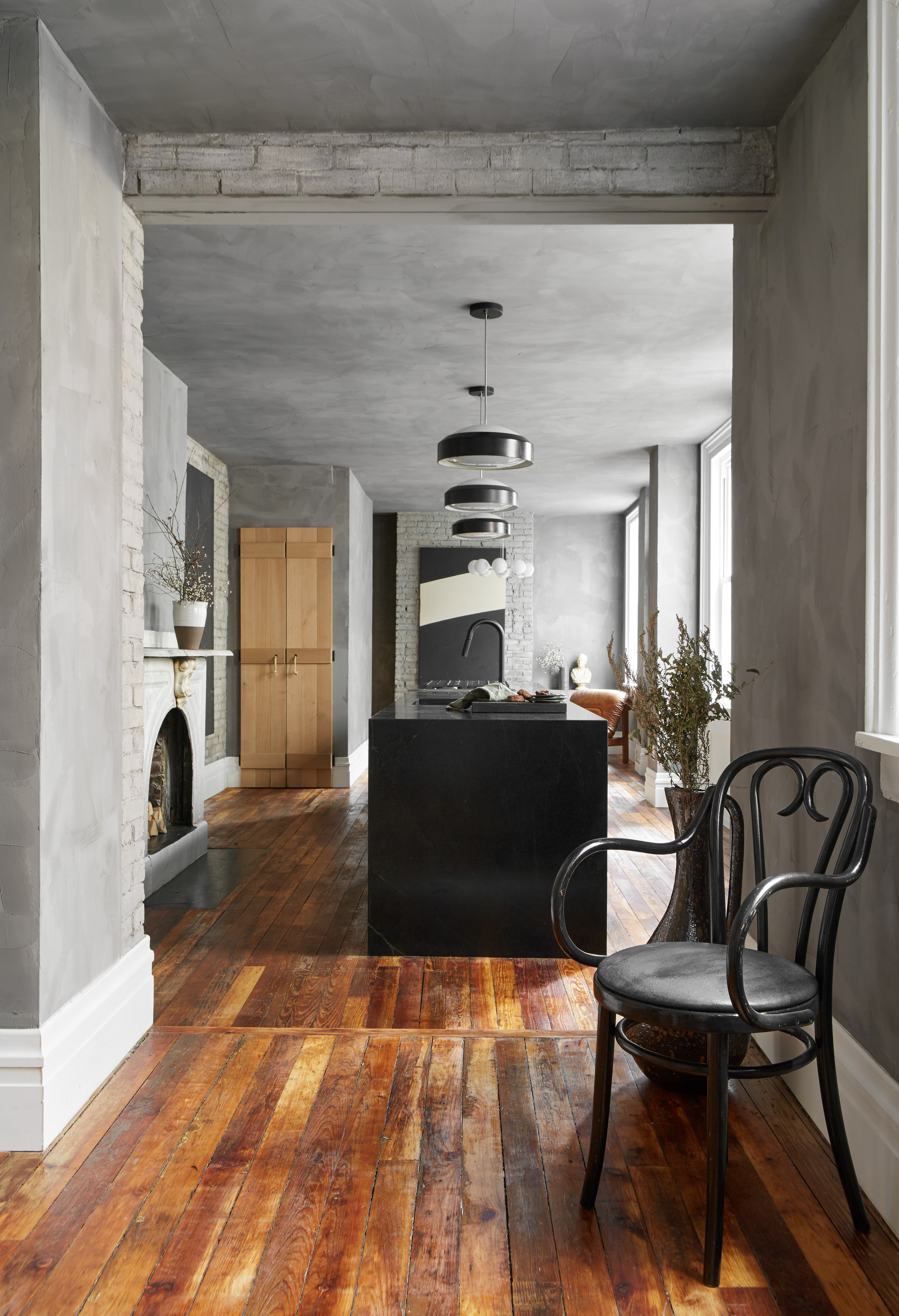
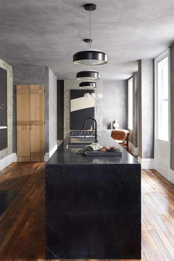
Designed by my girl-of-the-moment, Leanne Ford, this all gray kitchen resides in an 19th century row house in Pittsburg, but it takes a totally fresh take on the concept of a kitchen (it’s like she was reading my mind). Ford gutted a back addition of the house to extend the kitchen down the middle of the first floor and I am drunk in love!

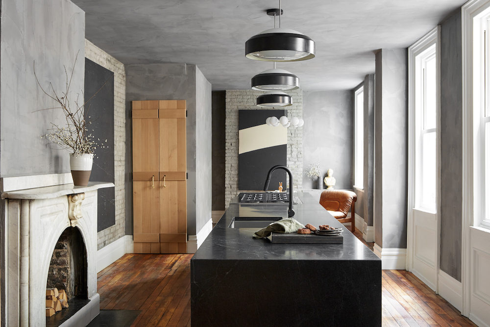
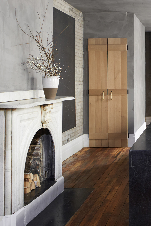
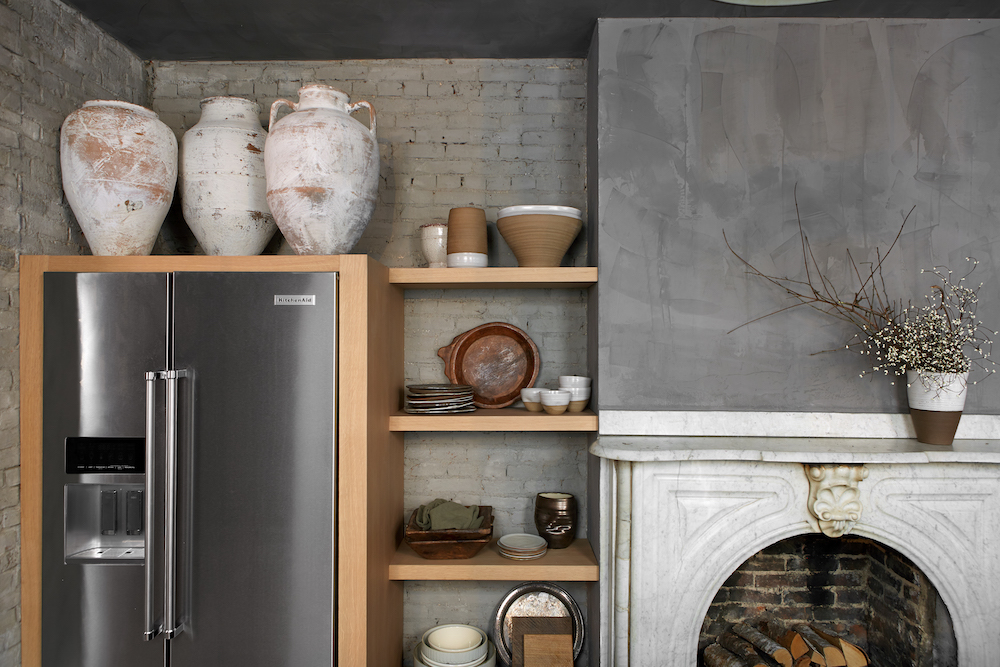
Reason number one: a fireplace in the kitchen! Swoon. You know how I love a good fireplace. The only other timeI think I’ve seen that is the Nancy Meyers set of Anne Hathaway’s in the movie The Intern. Google it – it’s a seriously good kitchen too.

But of course the second reason I love this space is all the gray! Ford applied Portola Paint’s Roman Clay in Sasha to the walls and ceilings to give the space a really textured plateresque look (taking notes for a project I’ll be revealing to you later this week!). To ensure the room felt cohesive, Ford lime washed all the brick in a lighter gray to meld the two surfaces together. All of the oversized windows flood the space with natural light keeping it from feeling too cave-like.

The third thing I really love about this kitchen is that epic island. Clad in cascading soap stone it houses all the kitchen’s essentials – sink, range and oven are all nicely tucked in there with ample counter space to spare. Vintage pendants with black accents draw the eye up.
Home Tour: Gorgeous Kitchen in Gray Scale on apartment 34Home Tour: Gorgeous Kitchen in Gray Scale on apartment 34

Wood elements dotted throughout the room soften and warm up all that gray. Salvage wood floors, oak shelving and even the logs styled in the fireplace add light, fresh accents.
Home Tour: Gorgeous Kitchen in Gray Scale on apartment 34Home Tour: Gorgeous Kitchen in Gray Scale on apartment 34

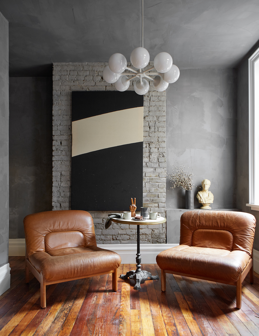
Since this kitchen was designed for couple who love to entertain, at the back of the kitchen Ford added a seating area rather than an eating took. It’s the perfect spot to enjoy a morning cup of coffee or hang out during a dinner party You know the action is always in the kitchen.

To play homage to the original structure’s age, all of the accent pieces from the club chairs to the art and accents are all vintage.
Home Tour: Gorgeous Kitchen in Gray Scale on apartment 34

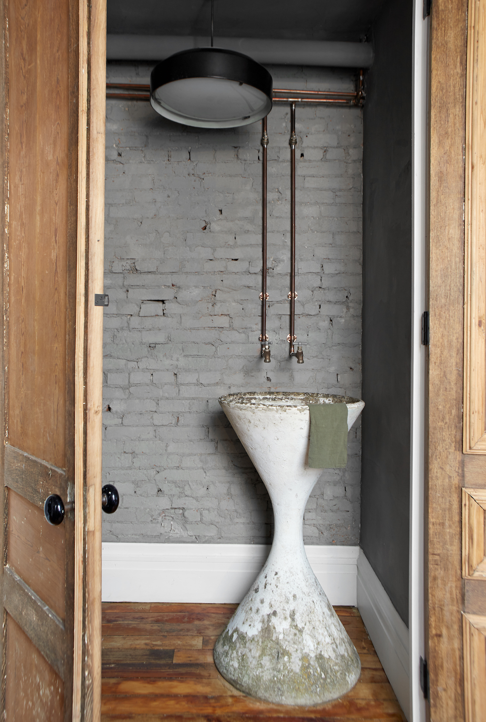
Another favorite moment, while technically not in the kitchen, is the powder room Ford created. She used a Willy Guhl Planter to create the coolest looking sink. To amp up the rustic vibe, the water source pipes were left exposed. I’m obsessed.

This kitchen is the ultimate example of something completely custom, personal and truly special. I’m very tempted to move to Pittsburg right now.

For more inventive kitchen ideas, CLICK HERE.

photography by reid rolls for leanne ford

Gray kitchens have been having a moment, well…for much longer than a moment now. It’s about time some new kids come to town. And this is coming from someone who painted her dream kitchen gray. While black kitchens have been gaining ground and bright white kitchens remain the super safe bet, there’s a softer option for the color-phobes among us: I give you the clay kitchen.

clay is the new gray on apartment 34

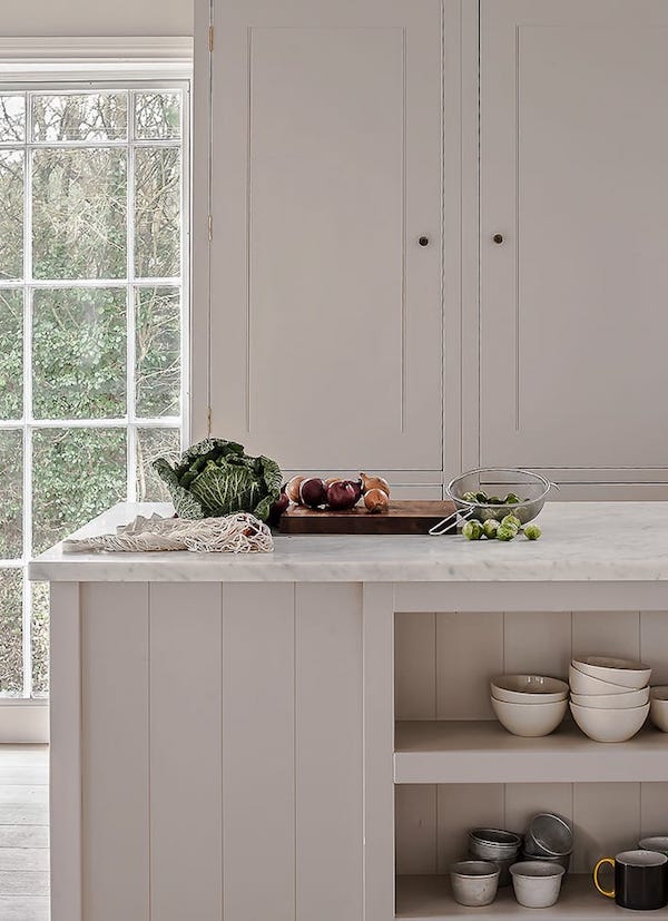
Think of clay as gray’s softer, warmer cousin. It creates a beautiful, neutral backdrop that envelopes you like a hug of an old friend, but the hue still feels sophisticated and refined.

clay is the new gray on apartment 34

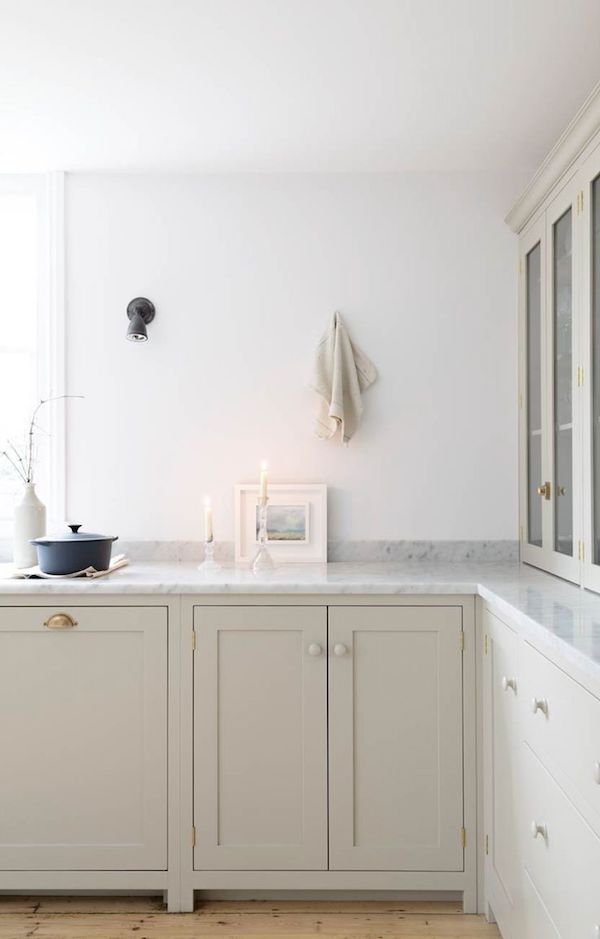
One of the great things about this color is its versatility. It can feel right at home in more rustic, country kitchens but also feels right at home in modern spaces. I love the look of clay lower cabinets contrasted against a lovely carrara counter and bright white walls in the kitchen above. The classic shaker style lends to a traditional feel, while the no-uppers is incredibly current. Little hits of dark in the sconce and staub pot are like drops of paint on a creamy canvas. It’s a gorgeous example of a kitchen design that will stand the test of time.

clay is the new gray on apartment 34

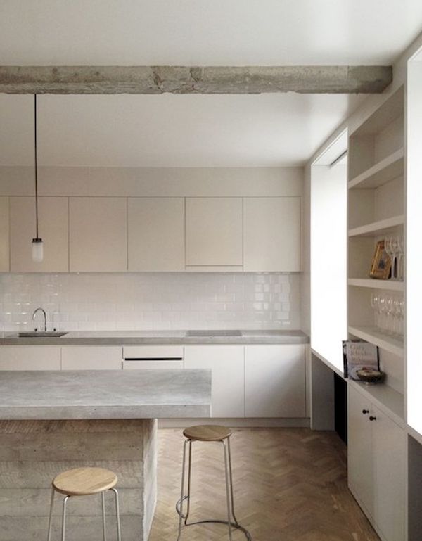
Clay looks just as gorgeous in an ultra modern setting. The tone on tone look of this kitchen is gorge. A concrete island and counters offer a cool contrast to the cabinets, warm wood floors and bar stools. A glossy white backsplash adds a little shine.

clay is the new gray on apartment 34

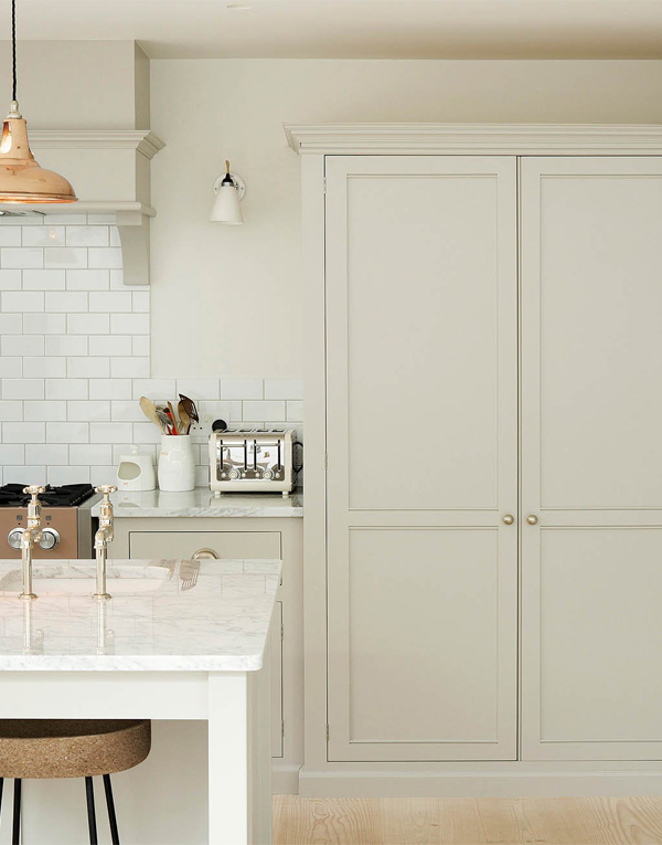
Floor to ceiling clay cabinets help the large scale of the piece blend in rather than feel overbearing.

clay is the new gray on apartment 34

This house carries the warm clay from the kitchen to its entry with beautiful effect. While this could look very Scandi if it were all bright white, this color offers a soothing alternative.

clay is the new gray on apartment 34clay is the new gray on apartment 34

While I’m never going to stop loving gray kitchens, I’m certainly developing a new kitchen crush. What say you? Are you feeling the clay? I’d love to know your thoughts.

For even more kitchen design ideas, CLICK HERE.

image 1 / 2 / 3 / 4 / 5 / 6

As we dive headlong into fall, I know the season is all about warm tones and tons of pumpkins, but this year I’m looking to create fall vibes without a gourd in sight (anyone else want to jump on this bandwagon? Just me??). Anywho, I will always, always come to back to gray interiors. They just make me happy. This is especially true in kitchens. Continue to scroll to see why.

gray kitchen on apartment 34  gray kitchen on apartment 34gray kitchen on apartment 34gray kitchen on apartment 34

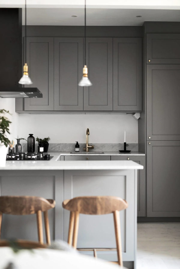
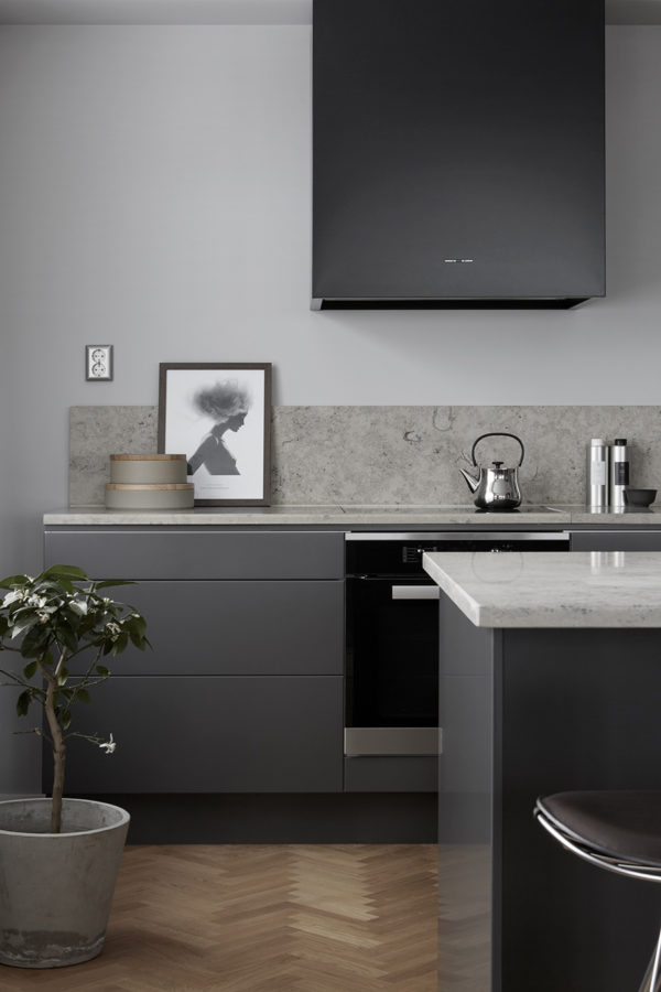
We all want our kitchens to be stunning, fabulous spaces so we actually love spending all that time in them, right? If we spend a third of our lives asleep, we must spend at least a quarter in the kitchen. Or at least moms do. Regardless, while utilitarian in function, gray puts the sexy back in kitchen design. The examples above are proof positive gray is the way to go (sorry not sorry white kitchens).

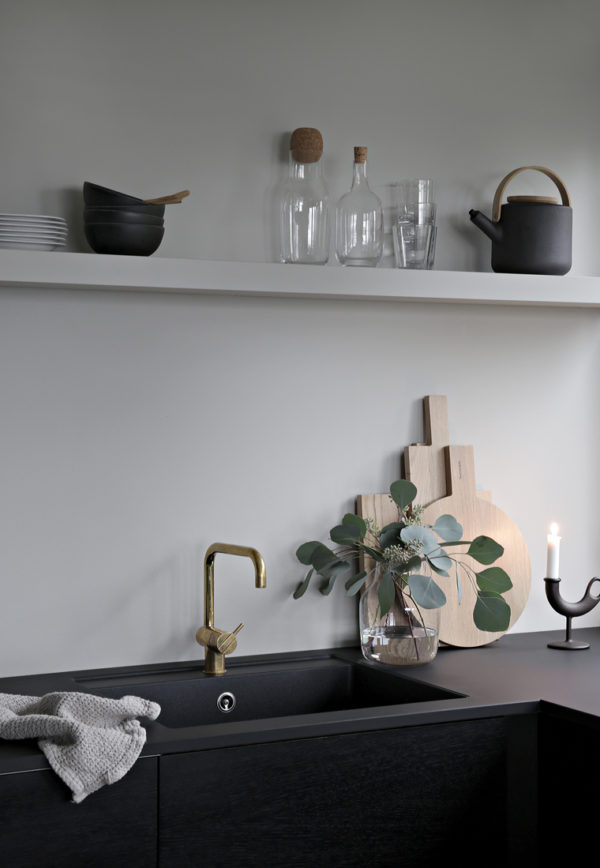
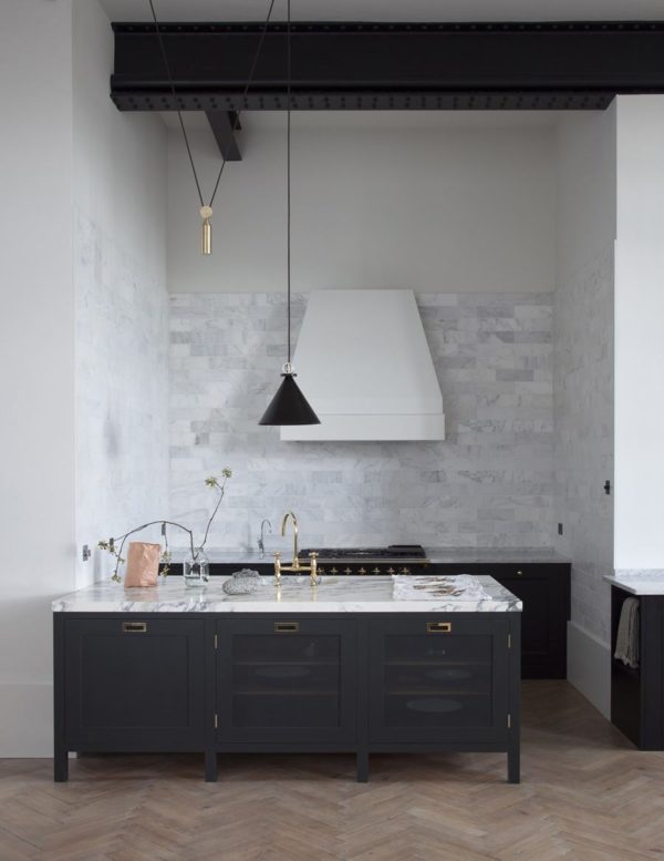
Can kitchens be sexy? I dare say they can! A dark charcoal gray color creates a sober, yet glamorous chicness in a kitchen that I just love. That uber-dark gray is warmed up with brass hardware and fixtures, while lighter gray walls and marble counters further soften the look and keep the space from feeling too cave-like. If you really want to get in the mood add those herringbone floors. You’re sure to swoon every time you step on them.

gray kitchen on apartment 34gray kitchen on apartment 34

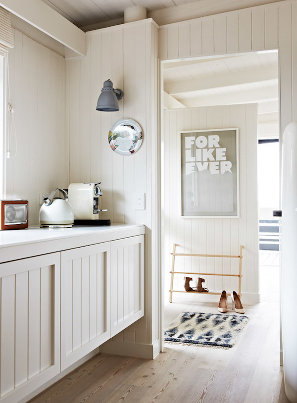
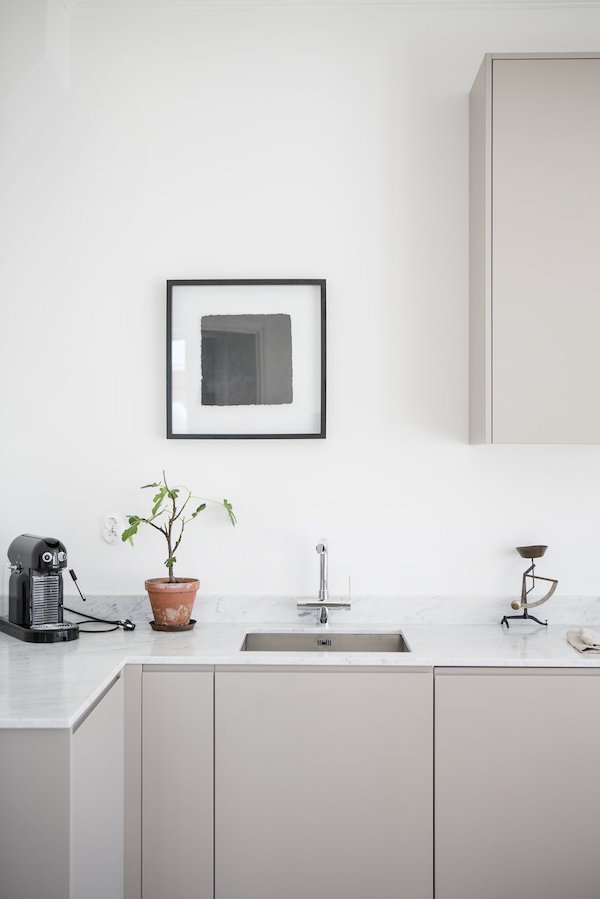
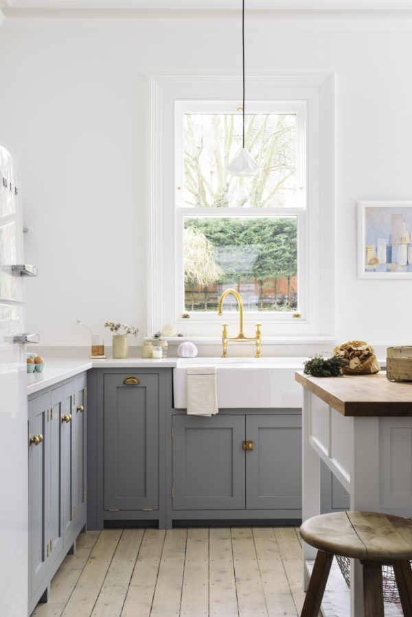
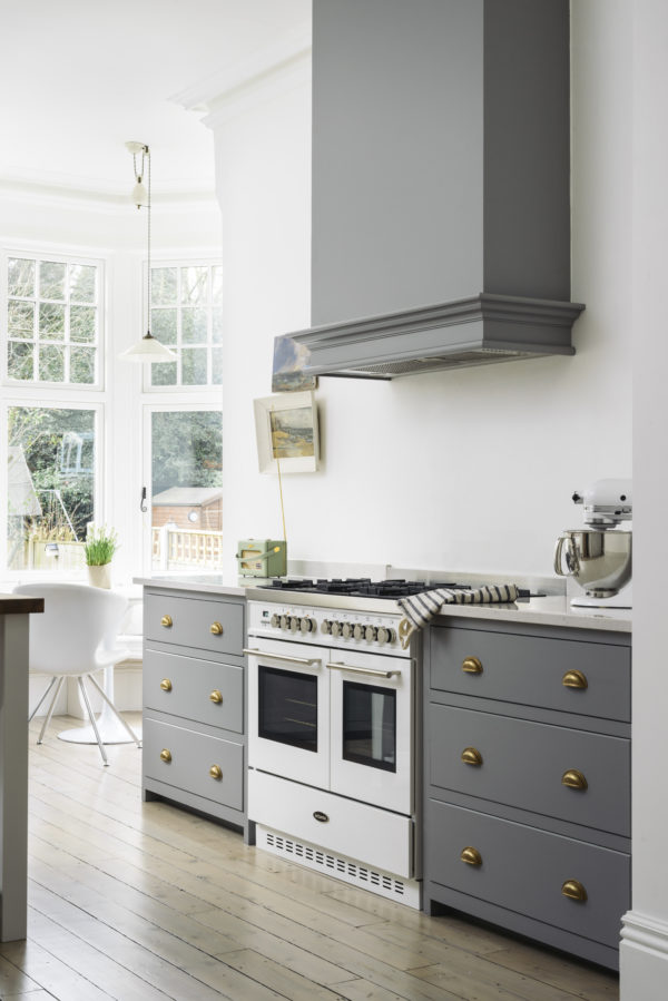
Now, if you feel like you only want to dip your toe into the gray kitchen pool, a lighter warmer gray on your cabinets is a good first step. When paired with bright white walls and soft wood floors you still maintain a light, bright feeling. You’re living near the edge – just not quite teetering over it.

What say you? You down to go gray this fall?

For more kitchen design ideas, CLICK HERE.

kitchens 1 // 2 // 3 // 4 // 5 // 6

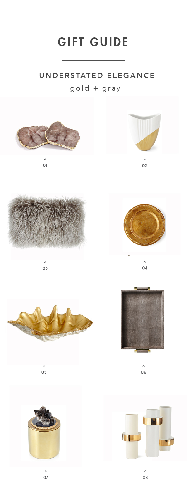
I’m kicking off my first gift guide of the season with the design lover in mind. Self-serving perhaps? I call it strategic. I’m feeling a fresh, refined color palette for the holidays. Instead of decking your halls with the standard red and green, what if you tried a mix of white, gold and touches of warm gray instead?

2207001999_4_1_1colonial-living-room2307002999_4_1_1

The look is sophisticated, luxurious and refined. Using lots of white helps spaces feel open and airy – rather than overstuffed and cluttered. Touches of gold feel celebratory and festive. And warm gray tones add a bit of gravitas without being harsh.

I recently scoured Horchow and discovered a treasure trove of goodies at crazy good deals. The site features home decor, tableware, even gifts from some of my favorite lines, like Aerin, Palacek and of course Neiman Marcus (they’re part of the Neiman Marcus family of brands.) Starting tomorrow, you can save up to 40% off during their Finders Savers event.

I’d be thrilled if Santa put any of these pieces in his cart for me!

apt34_giftguide_goldgray

SHOP THE POST: 1 coasters / 2 vase / 3 pillow / 4 charger / 5 bowl / 6 tray / 7 candle / 8 vases

image 1 / image 2 / image 3

This post is in collaboration with Horchow. All thoughts and opinions are 100% my own. thanks for supporting partnerships I’m excited about and that have kept our doors open.

This monochromatic Parisian apartment brings new meaning to the idea that your home should be your oasis. Decked in various shades of the same custom gray hue dubbed “craie,” is gorgeously soothing, sophisticated and full of fluidity and detail. This balance of making a modern space look cozy and inviting has been on the top of our must-master list for a long time. So when we got the chance to pick the designer, Guillaume Alan’s brain about transforming this apartment into a work of art – poetry even – we jumped on it. There are some great pointers in our interview, so get ready to take notes!

designer-files-1-apartment-34designer-files-apartment-34designer-files-4-apartment-34

About The Space 

For this particular project, it was really a meeting between the uniqueness and perfection of the homeowners and of the place and me, both trying to reach excellence while sharing a common passion for Asia. Two apartments were joined together and we did a complete renovation of the space to follow the light and sun during the day. Everything has been designed with a calm and relaxing [mood in mind] according to the owners’ needs.

Purity is a way of life. I think this is exactly what this project embodies. This space can be summed up in three words: luxurious, calm and poetic. It has a feeling of great simplicity and absolute purity. It’s austere yet there is no coldness, as we know how to add softness with a discreet range of tones and monochromatic shades. The architecture, as well as the decor, gives birth to a calm, pure space where luxury and rigor coexist without being ostentatious.

designer-files-2-apartment-34designer-files-3-apartment-34

His Favorite Element

I think [my favorite piece is] the Tamon ensemble. It’s a long dining table that has a monastic and very pure aspect about it and you can see that from several points of view. I was inspired by calligraphy drawings, so we started from a calligraphy piece – drawings with a fine brush that are very gentle and convey movement – and actually incorporated it by cutting it into the material. The result was that we managed to give this specific piece a nobility that is both vibrant and sophisticated though the use of the calligraphy, through the proportions of the table and through the mat satin finish. 

On Monochromatic Decor

The tone in the whole space is a very light grey, we call “craie”, our very own bespoke color, which is represented in the entire apartment on different materials and textures (walls, ash wood, corian, silk curtains, wool, pattern fabric in wool and silk, linen rugs). It gives a very harmonious feeling to the space and a certain depth as each surface captures the light differently.

For example, the way the very “crunchy” curtains in silk capture the light creates a beautiful contrast in texture with the very modern Corian material of the dining table. The silk curtains are totally bespoke, handmade by a parisian seamstress who follows the same rules as Haute Couture manufacturing.

designer-files-5-apartment-34designer-files-6-apartment-34designer-files-7-apartment-34guillaume-interiors

Design Advice 

Remember 5 words:

Timeless: I am very attached to the tradition of French classicism, but I am trying to rewrite it using pure lines. When I launched my first collection, it was 18th century architecture and furniture with a 21st century style. I choose this aesthetic because I know it will never go out of style, it’s timeless.

Serenity: In a very quick world and when lives are very busy, it is so important to have havens of peace that are calming and pure. Think soft monochrome color palettes and degraded shades.

Elegance: This is fundamental to a beautiful home or apartment. I use it in all aspects of the design process: in lighting, in materials, in shapes, in colors. When decorating your home, always have elegance as your main focus.

Precision: Although in many ways simplicity is very hard to achieve, precise simplicity is what makes a stunning interior. Perfect and simple lines executed with precision. Incorporating hard-to-find pieces and working hand in hand with the most advanced craftsmen to select the wood and perfect finishes all tie back to a passion of precision.

Poetry: Just because forms are pure and structured and austere, doesn’t mean a space has to feel cold. It’s always about balance, alchemy. Try to bring softness and poetry in to arouse emotions. I think this is this stamp of our work and interiors.

So what do you think?? So good, right?! We’re literally keeping bits of Guillaume’s interview in plain view as daily decorating reminders. The idea that elegance should be a main focus in design really resonated with us. Personal style evolves and after going through more room facelifts that one wants to admit, I’ve noticed that the pieces that I keep all have a special and timeless quality to them. And while it can be really difficult to execute, curating with the precision Guillaume talks about is something we all could be more aware of when choosing a new piece for a space. It sure would save a lot of money over the years and help to create the oasis we’re all looking to come home to!

images c/o Guillaume Alan

Here in San Francisco, our dear friend Karl the Fog isn’t shy when it comes to making his appearance this time of year. Just as the months are getting warmer he arrives in full force. It’s a rare thing to look at the horizon and not see an ominous gray blanket slowly creeping through the streets. It’s similar to the way gray hairs are tending to creep out of nowhere on my head – hence, why most people tend to associate the color with BUZZKILL! In spite of all that, we still happen to love the color gray. In fact, as the spaces below illustrate, we’re here to prove goin’ gray has never looked better!

gray-room-inspo-apartment34TDC.Sleepyhead_5307-02grey-inspiration_apartment34 color-coded-grey-apartment34lotta-agaton-interiors_01

We’re obsessed with the moody yet calming look that gray can offer. Whether it be a dark charcoal on walls, soft heather gray on furniture or monochromatic artwork – the spectrum of “gray” is one of the most versatile and inoffensive palettes out there.

By layering your gray tones and mixing your textures you can add lusicious depth and interest to any room. The living room above with its variety of gray textiles and black & white artwork feels cozy and inviting rather than cold. A pop of natural wood also helps warm things up. The bathroom above is a great example of that. The wood vanity, divan and wall mirror contrast with the slate tones beautifully. Are you swooning over it as much as we are??

Whether you apply gray with a light touch or fully commit to the singular color palette, it’s a softer way to play on classic black & white. We say gray, you’re welcome inside of our homes annnytimeee {just stay out of our skies and hair!}.

Do you agree??

image 1 greg cox for elle decoration uk // 2 the design chaser // 4 carolina bak for loft // 5 est magazine // 6 lotta agaton