Oh hey there everyone. I know it’s been a hot second. Trust me, I’ve been missing posting here, missing sharing with you and feeling rather guilty about not having more to give at the moment.

Between sagas with our new Coastal Cottage (can’t wait for the moment when I can share about what’s been going on), putting the finishing touches on my home studio, navigating Covid Zoom school and doom-scrolling Twitter (btw – I’m sure you know the election deadline is less two weeks away, but you can vote right now! Click here to make your voting plan – because I PROMISE you your vote makes a difference), the days slip away.

But I did stumble on a project so good I had to jump on here and share it immediately. It is the design inspiration I think we all need right now.

After more than a decade of thinking about all things design as a blogger, I think I finally found my dream job – a home stager! It seems ideal. You get to go into other people’s homes and place beautiful pieces without actually having to incorporate a client’s opinion. You don’t have to worry about the budget because all the pieces are going to come back to you anyway! And you don’t have to fret about electrical plans, replacing plumbing or the like. It’s pretty genius – especially if you’re doing it as well as Brooklyn-based home-staging and interior styling firm Hovey Design.

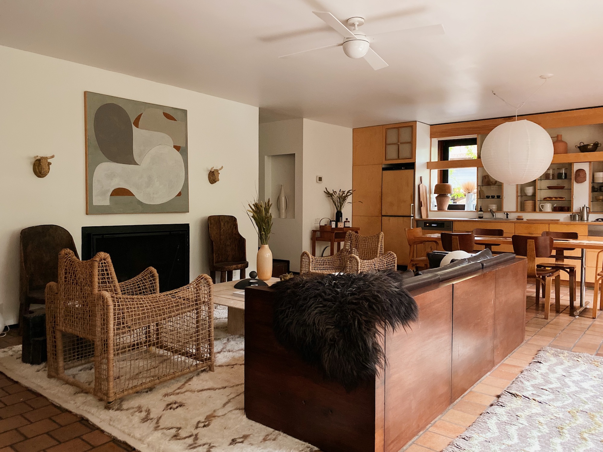
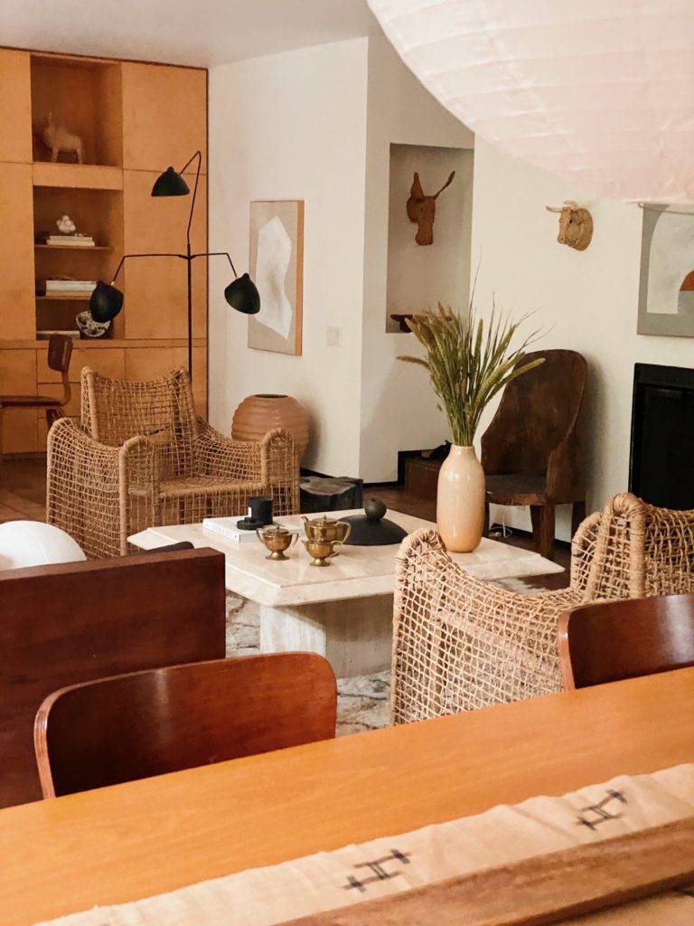
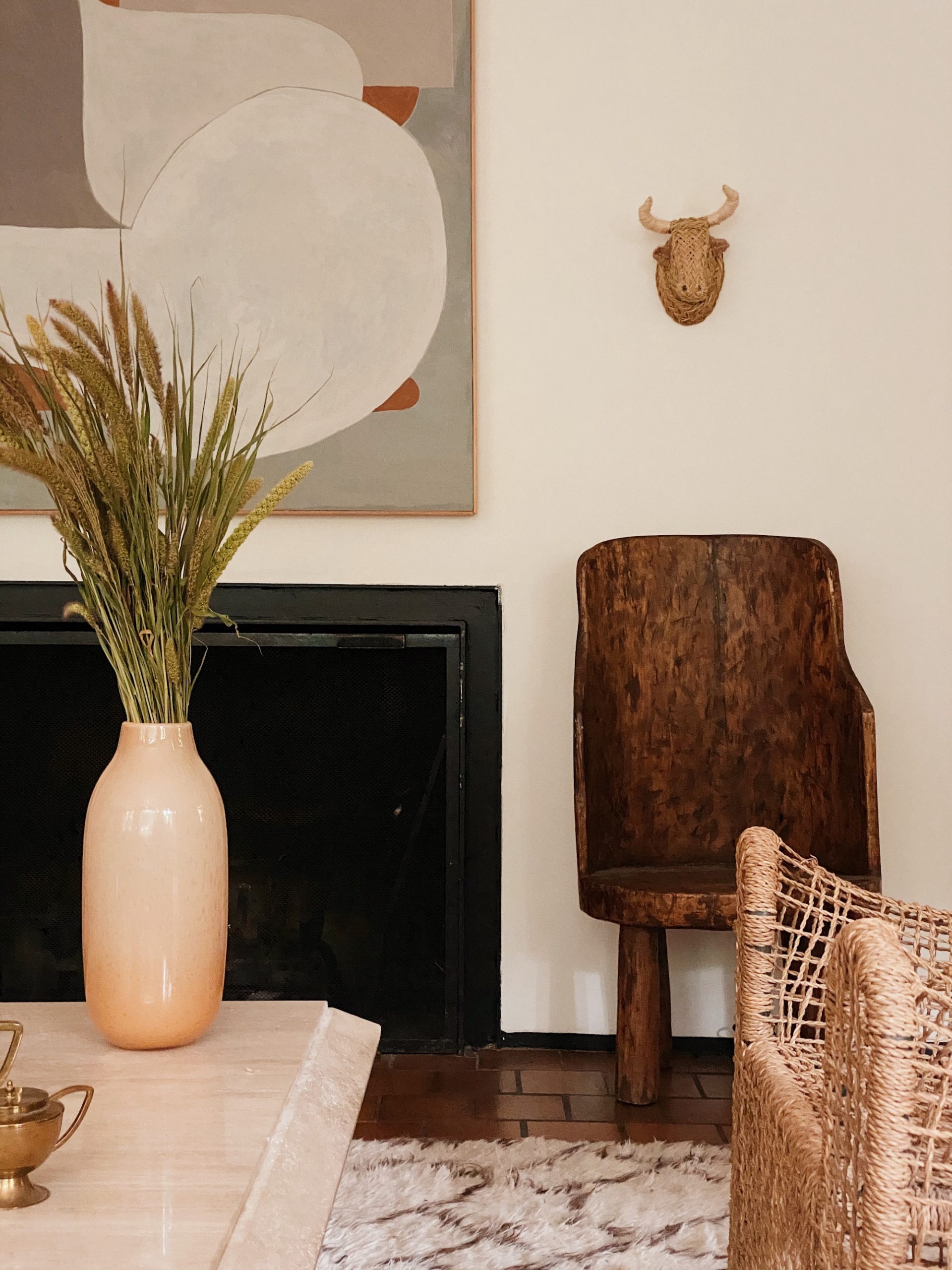
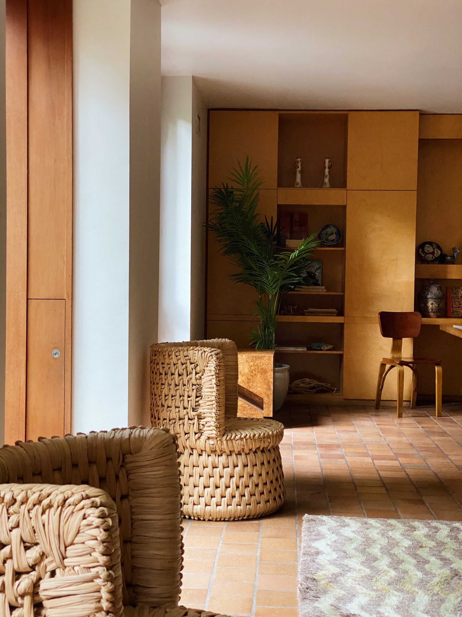
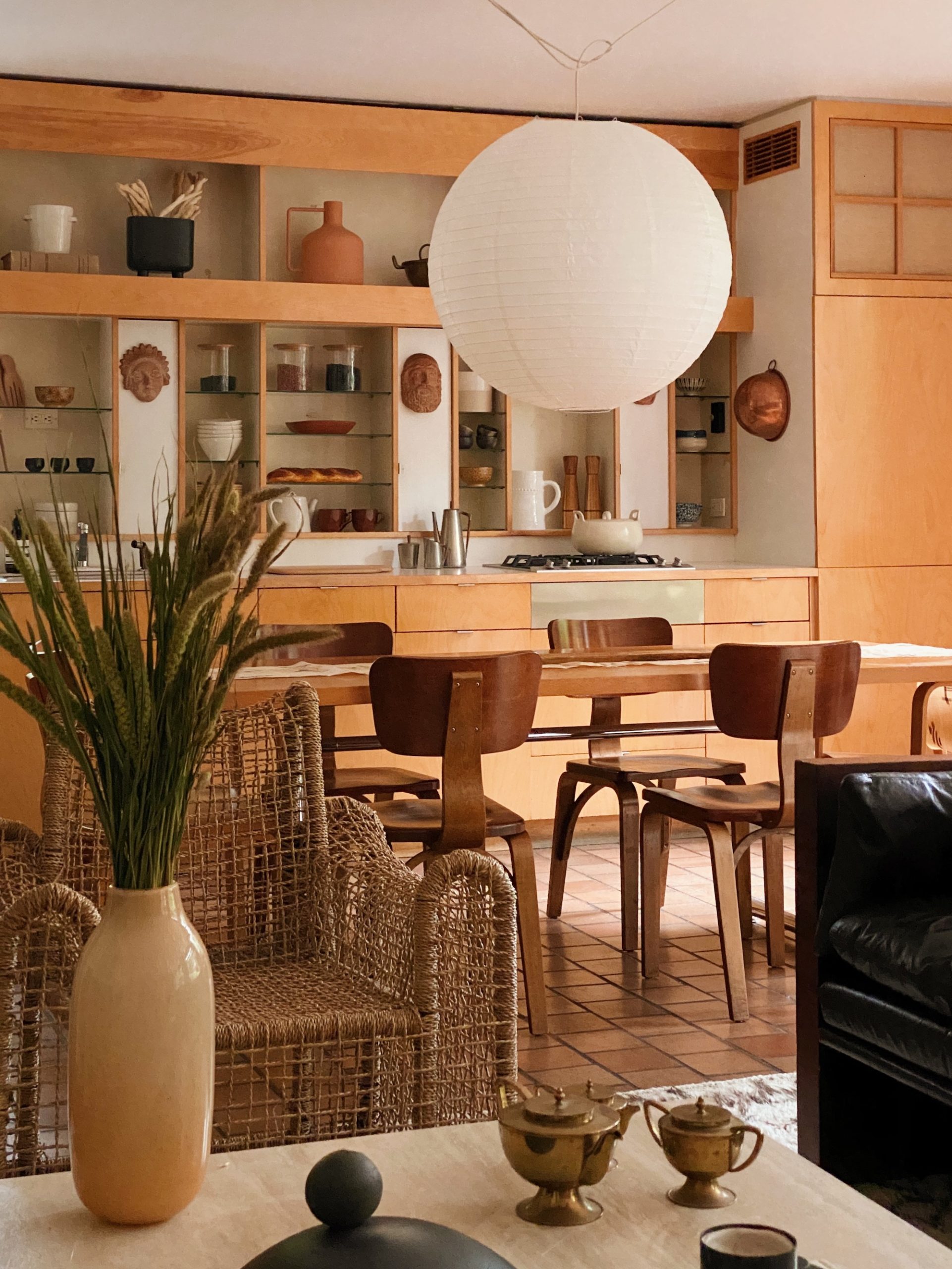
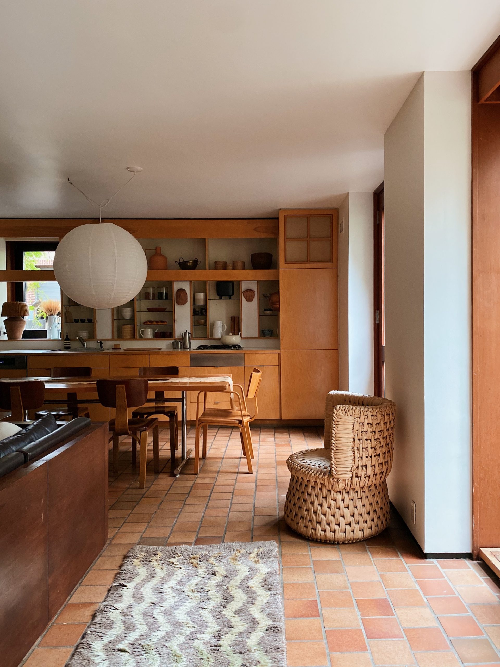
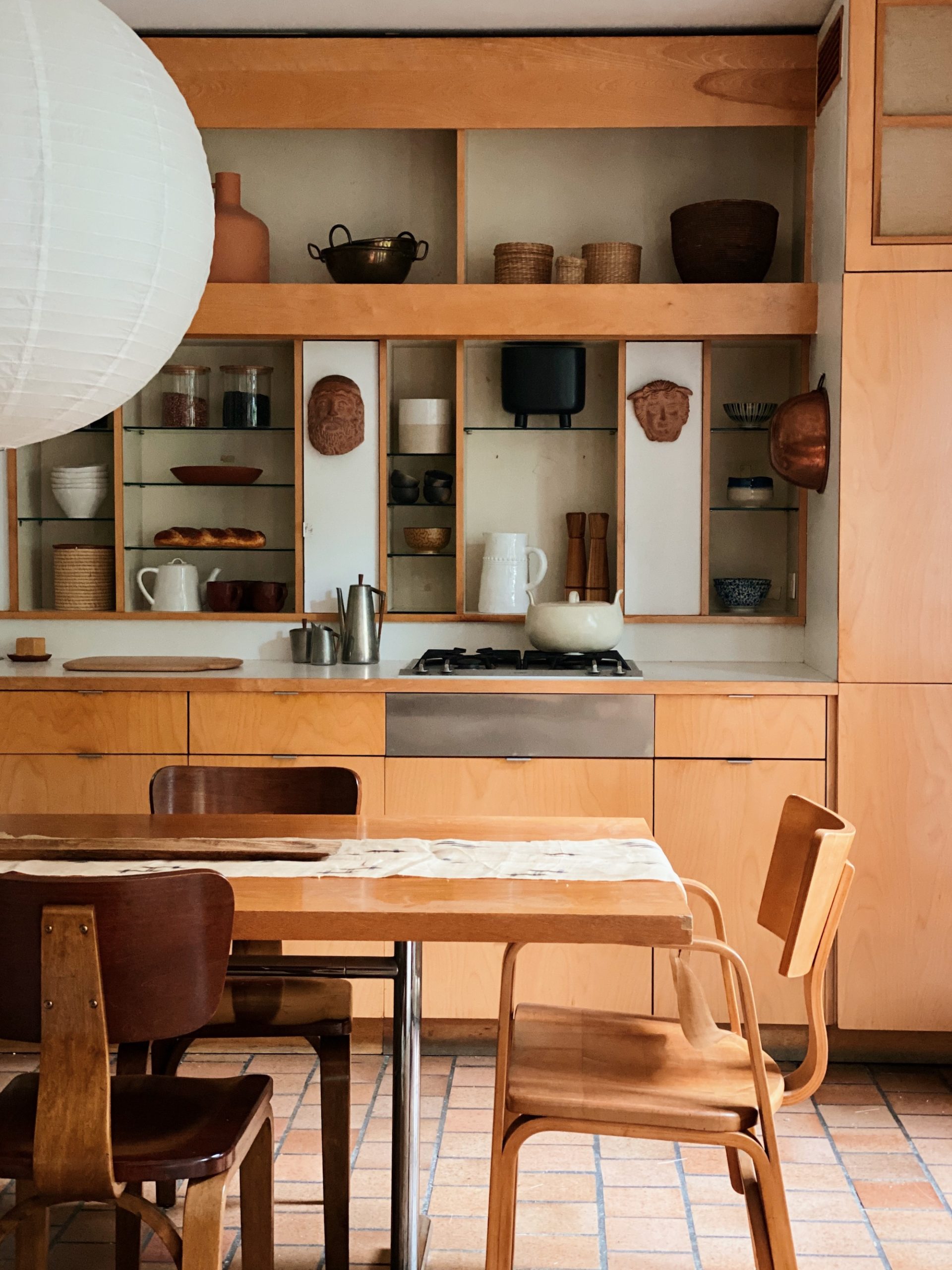
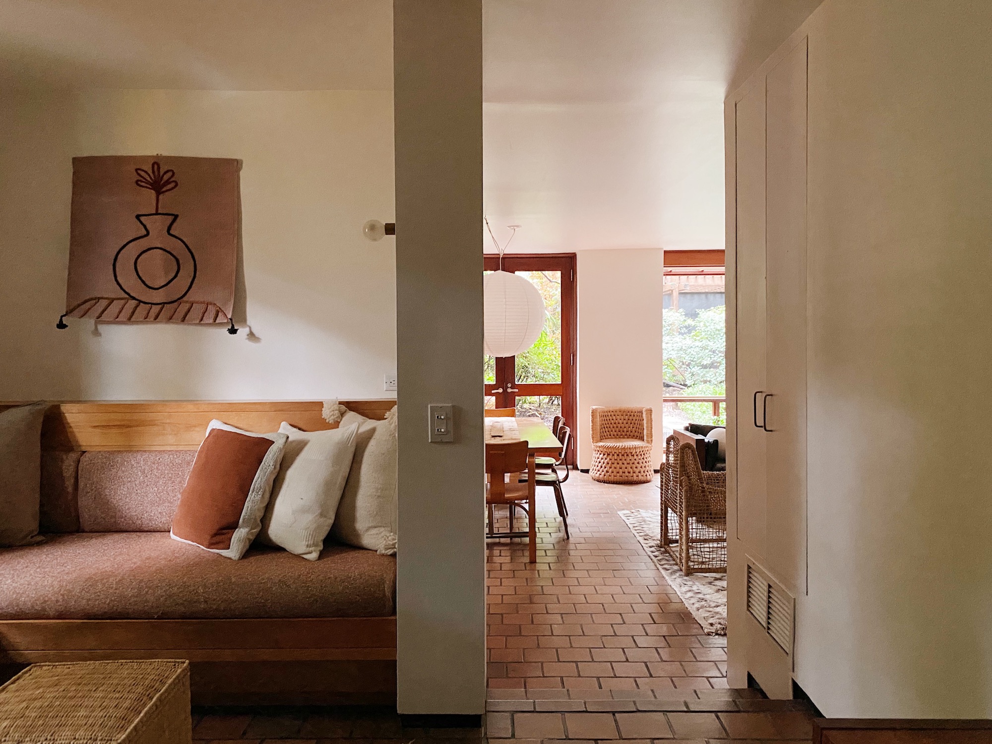
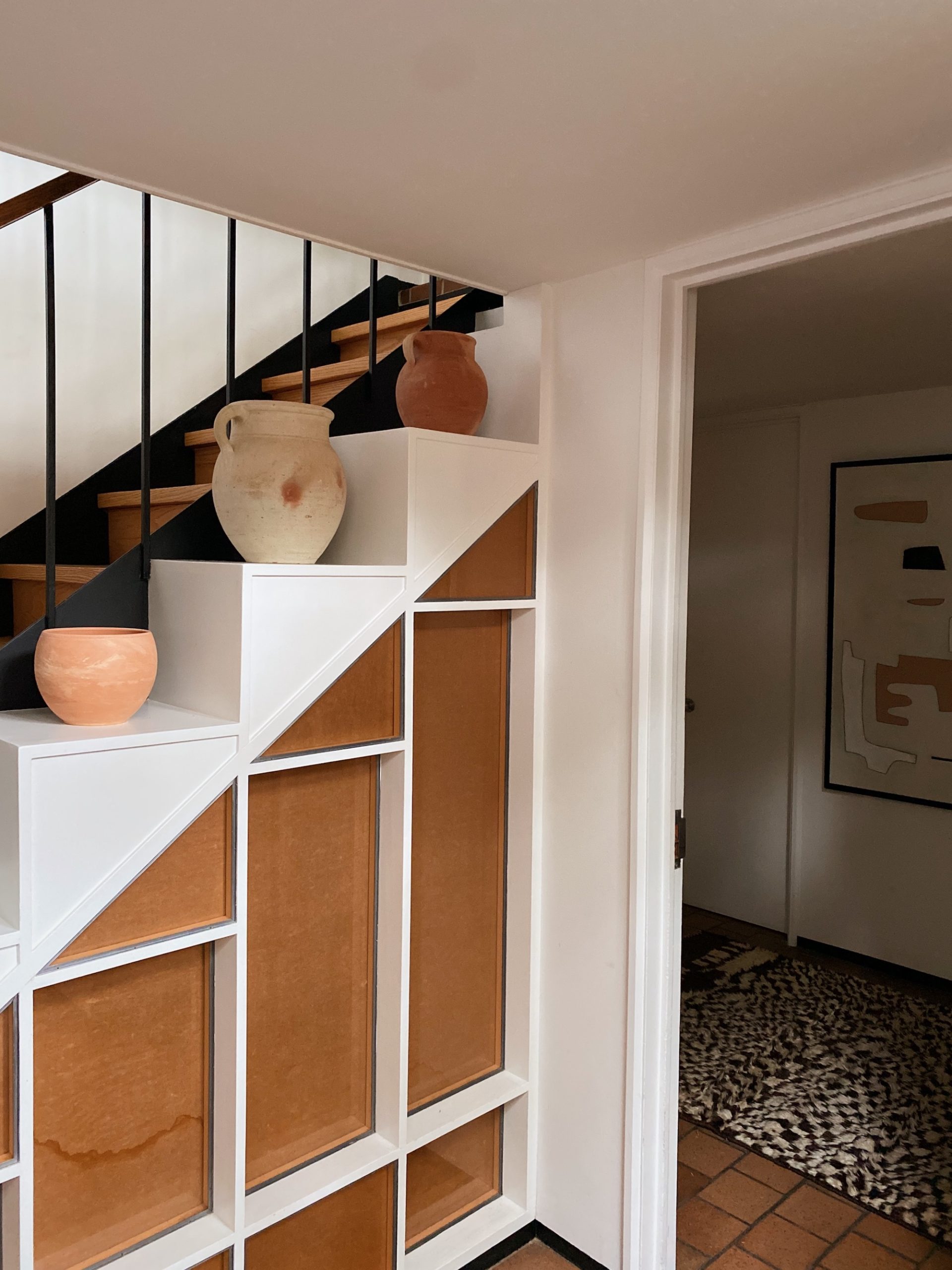
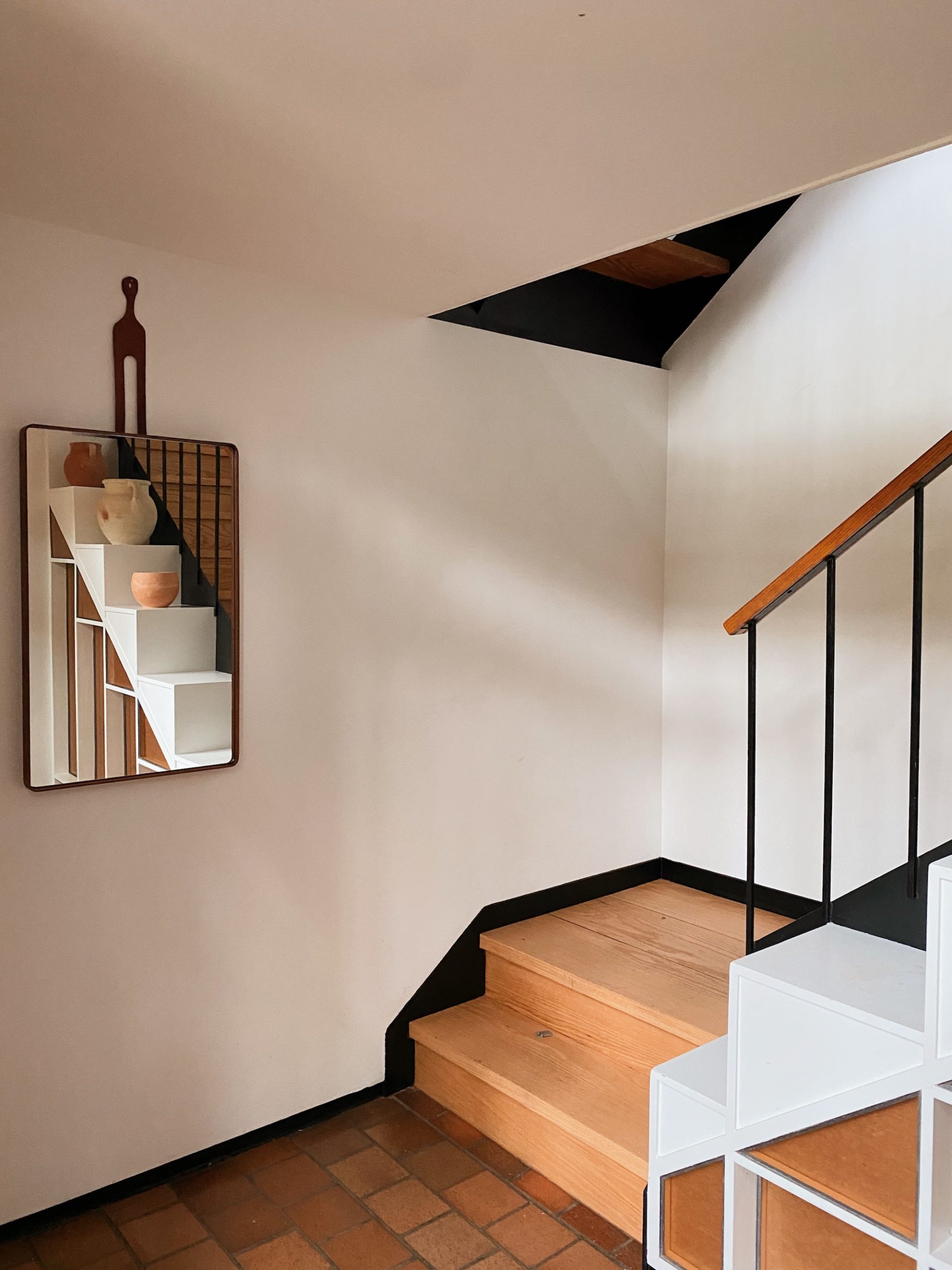
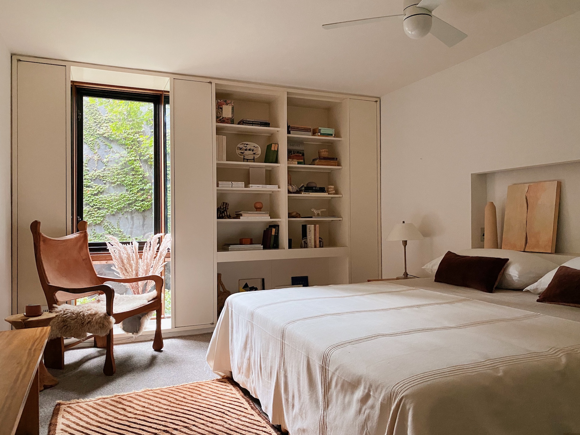
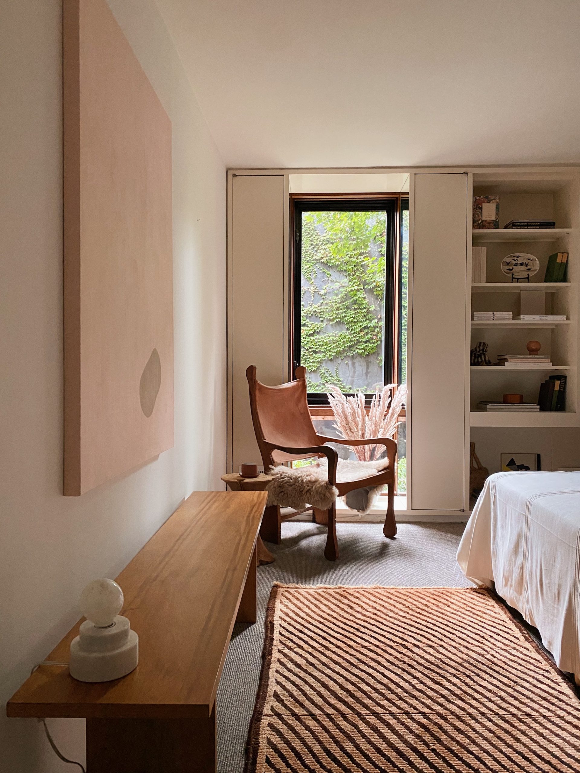
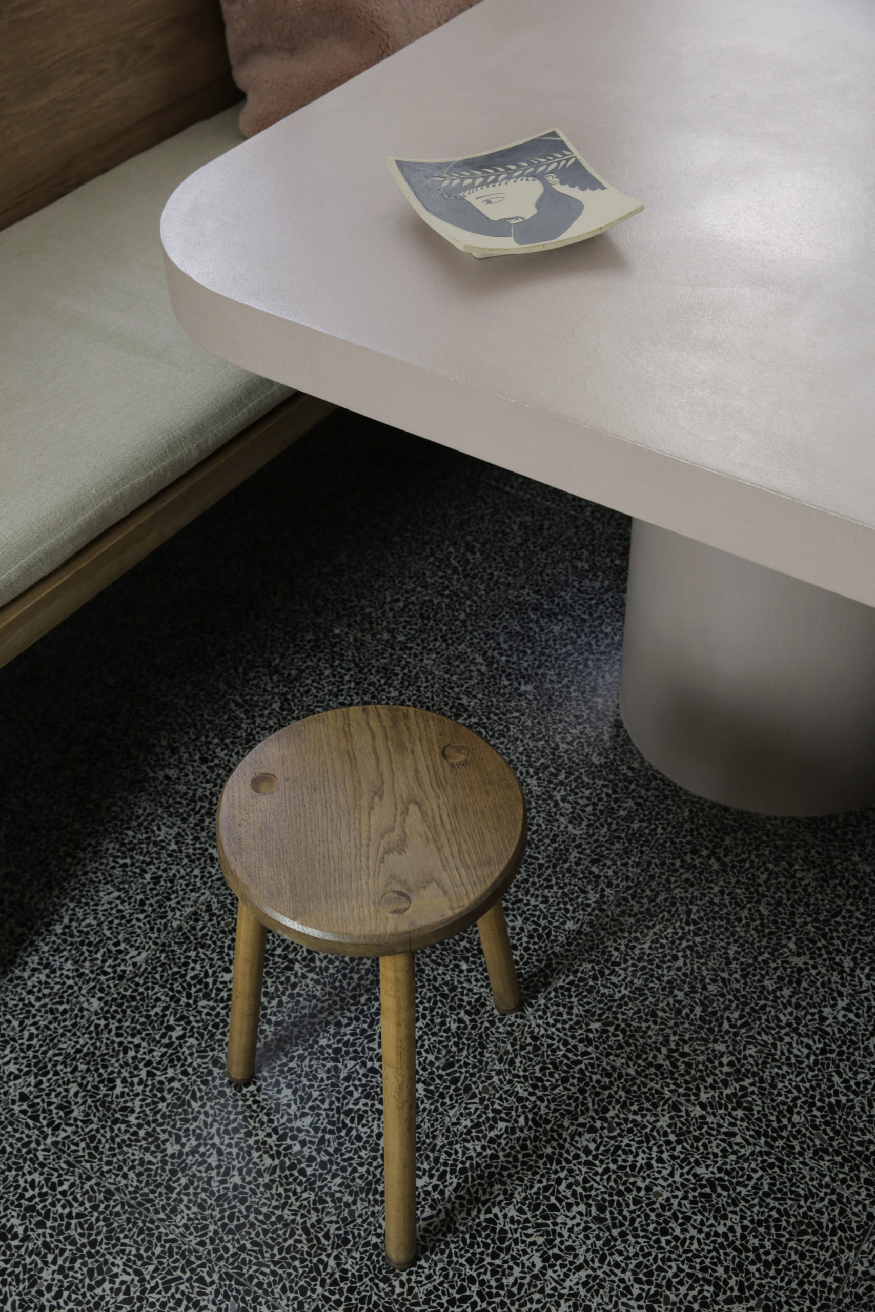
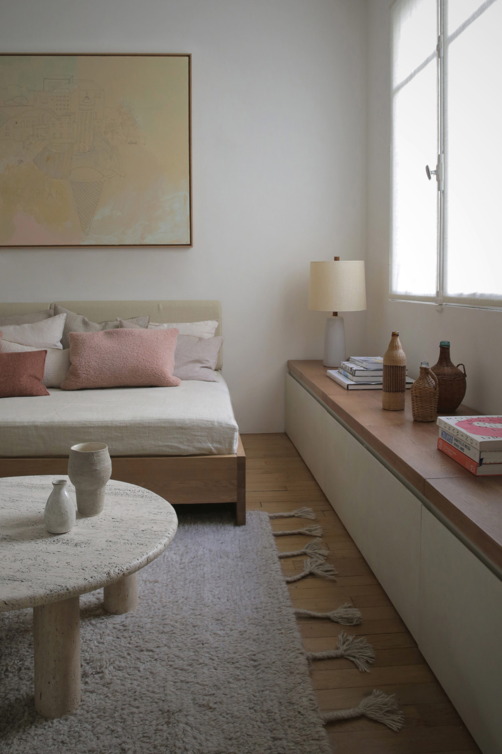
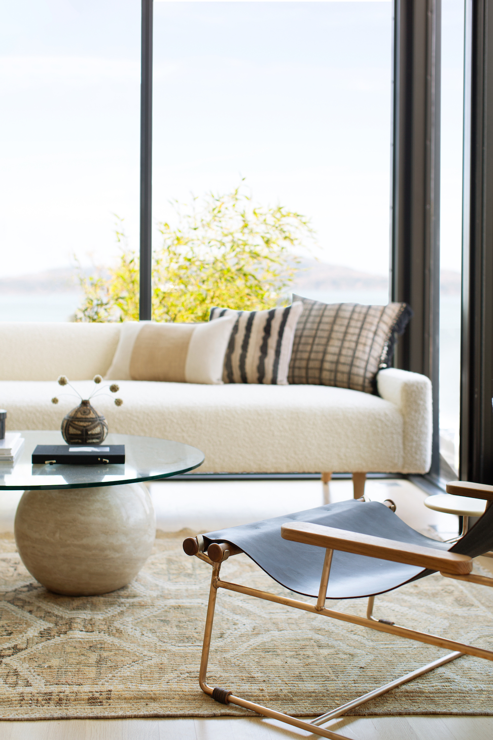
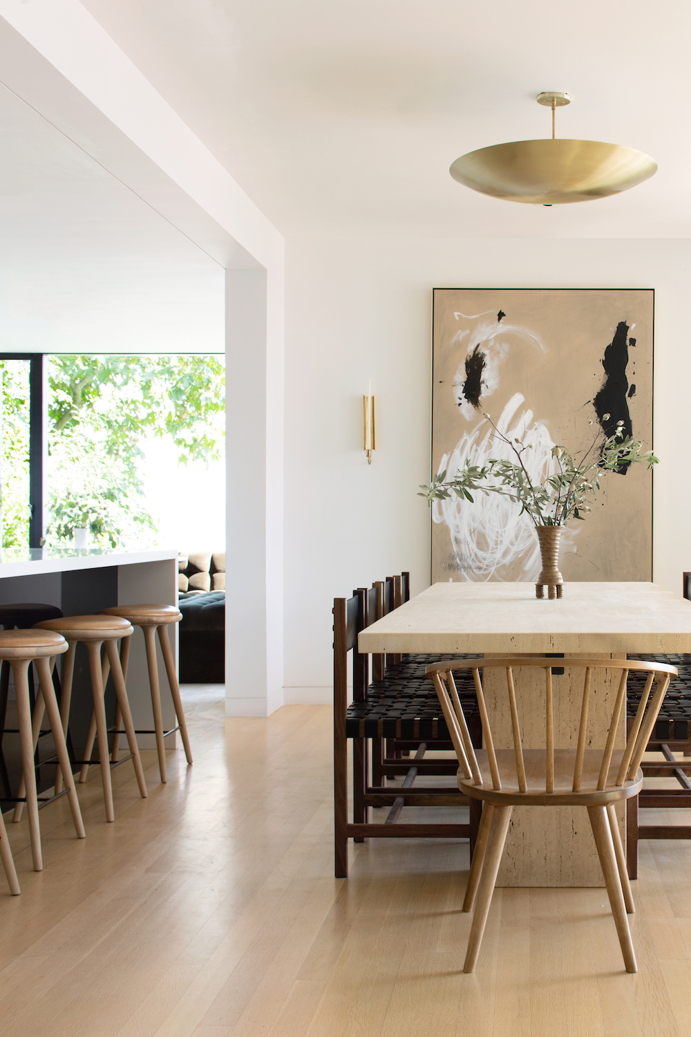
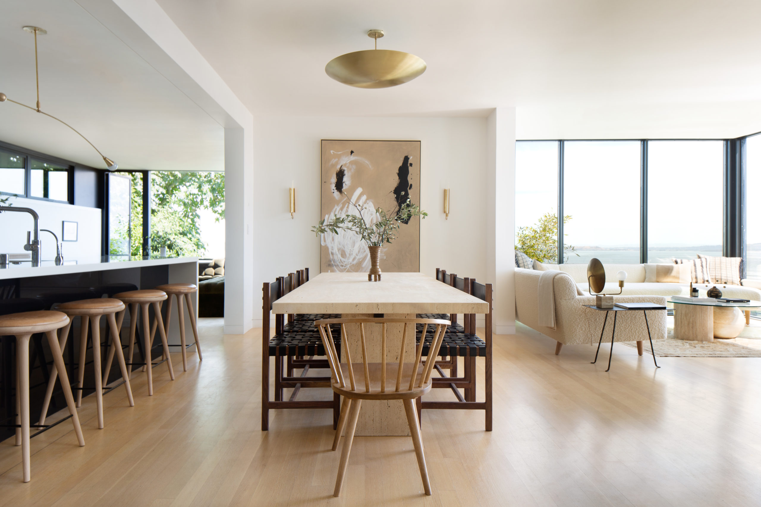
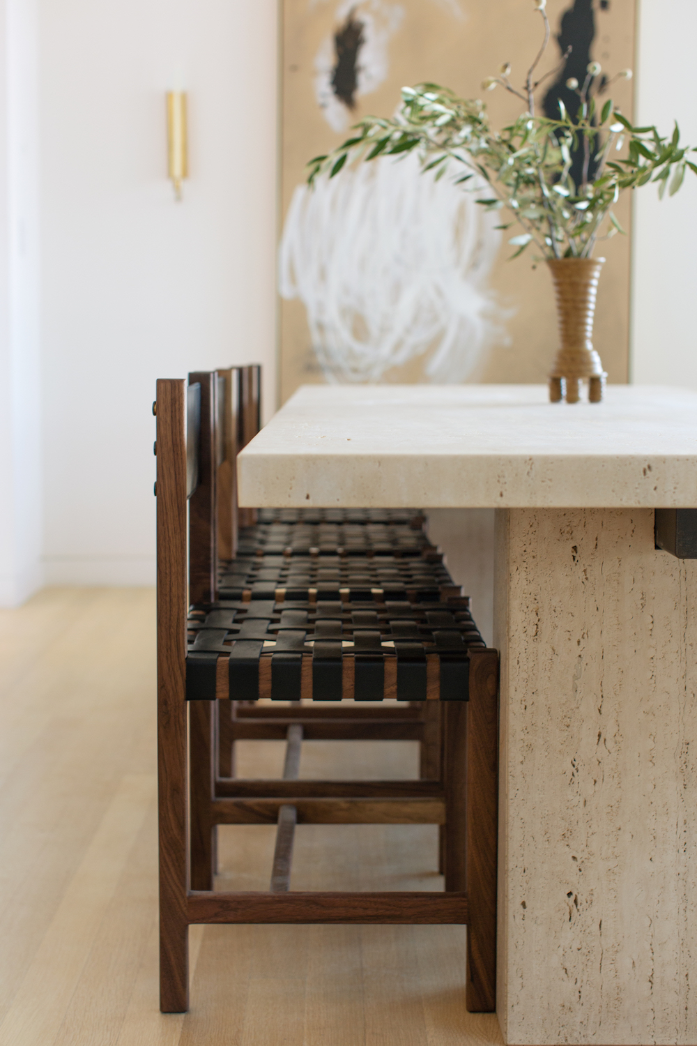
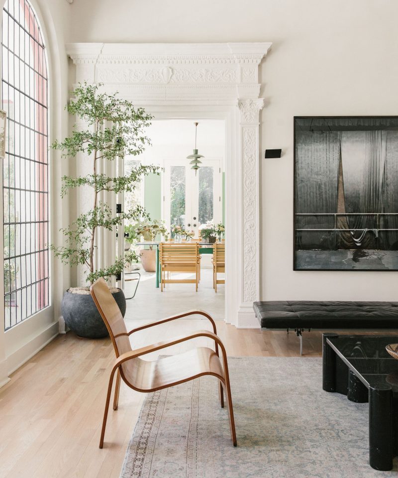
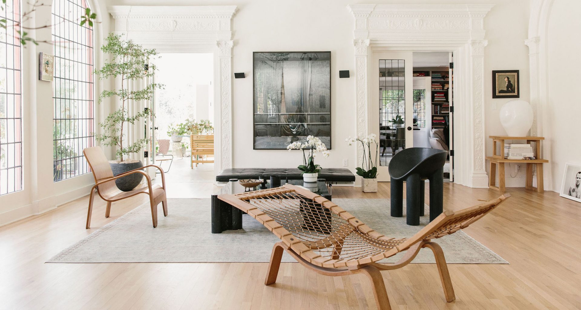
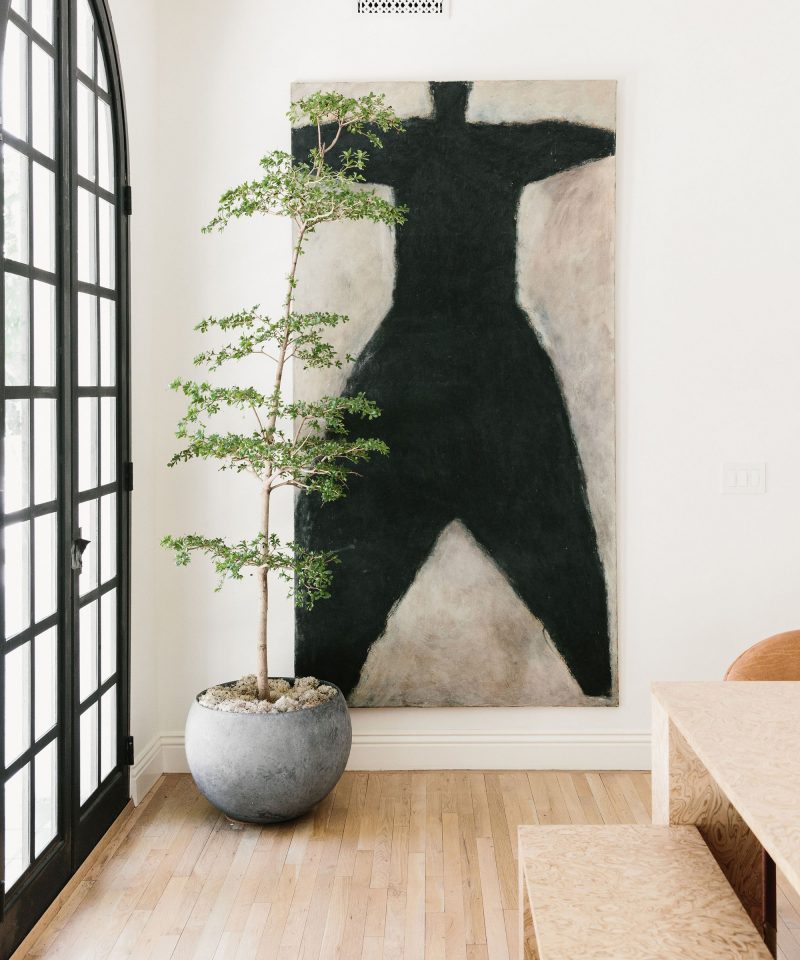
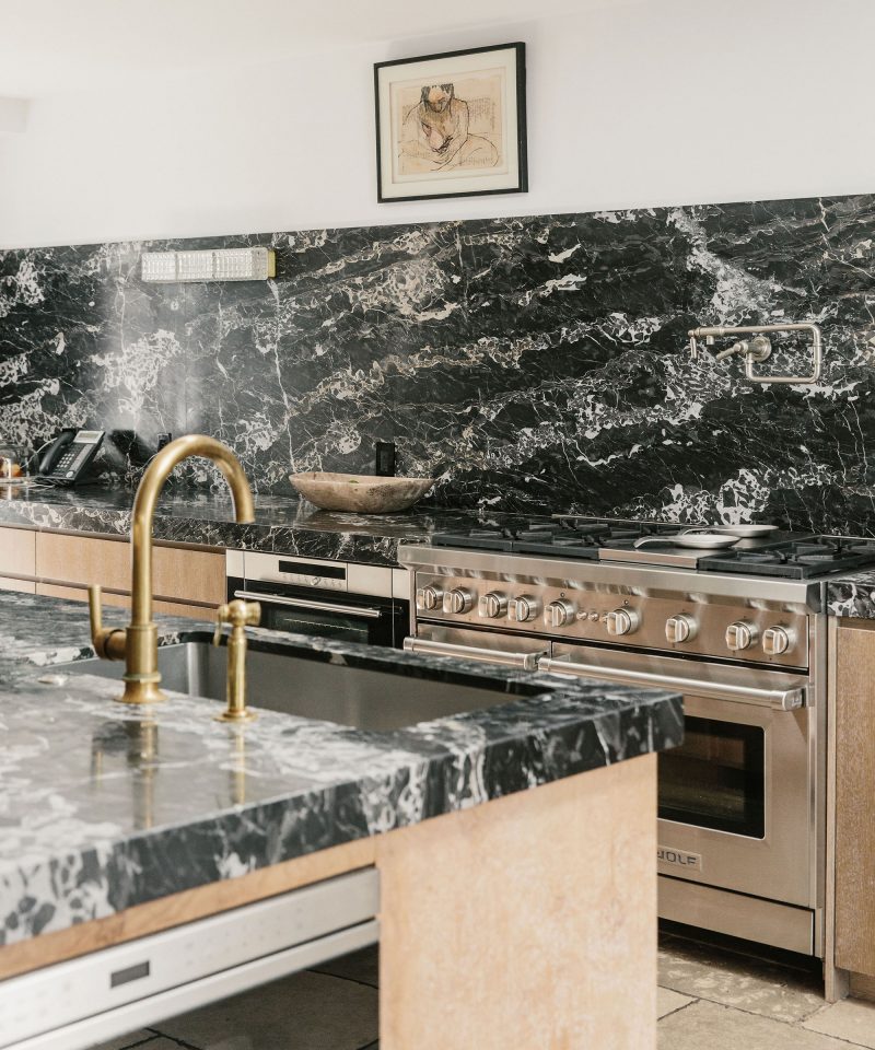
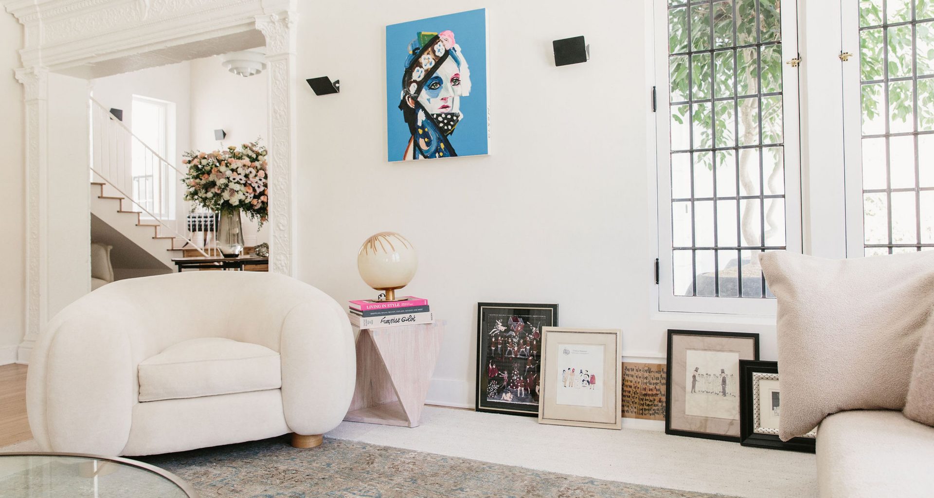
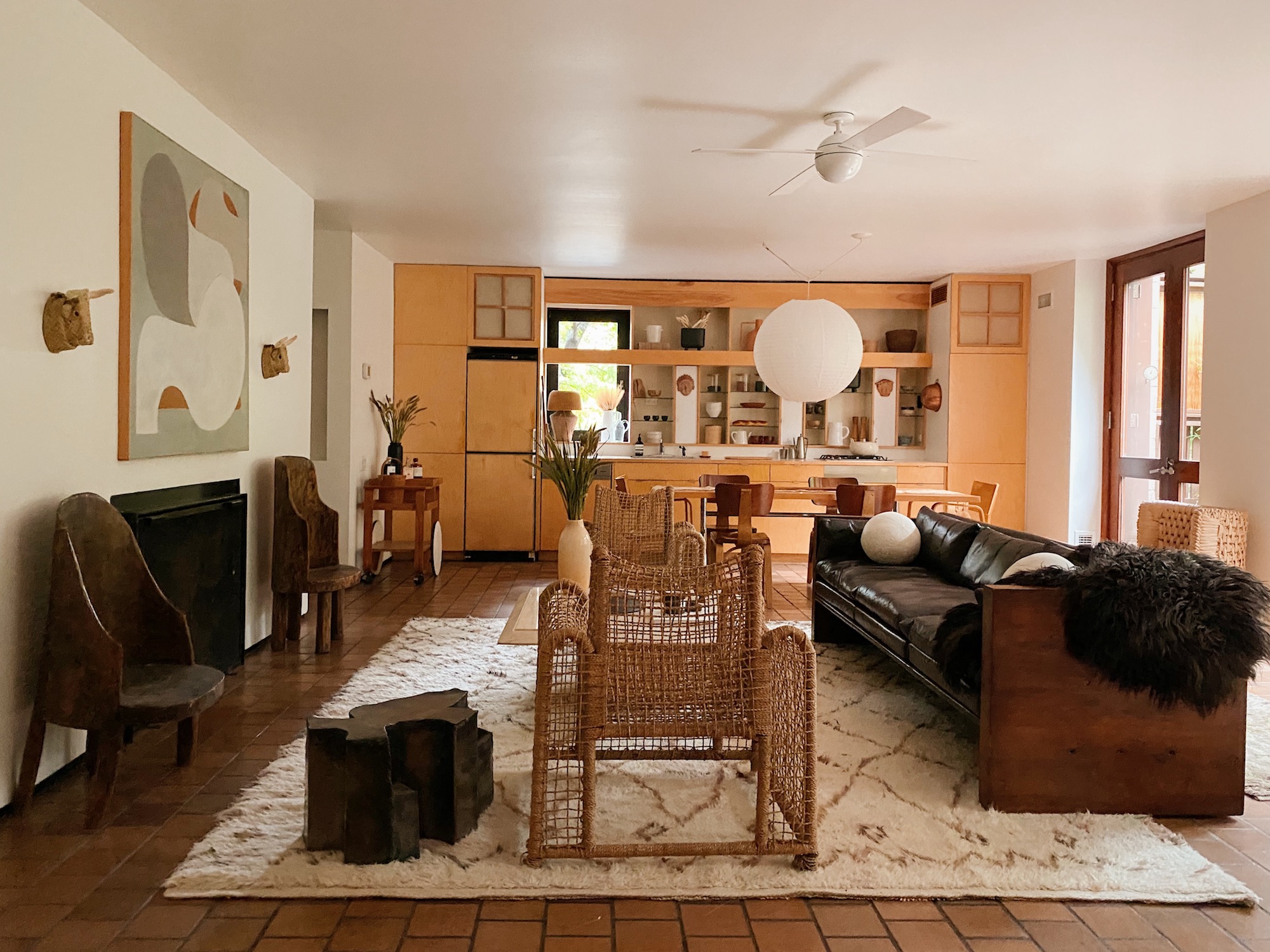
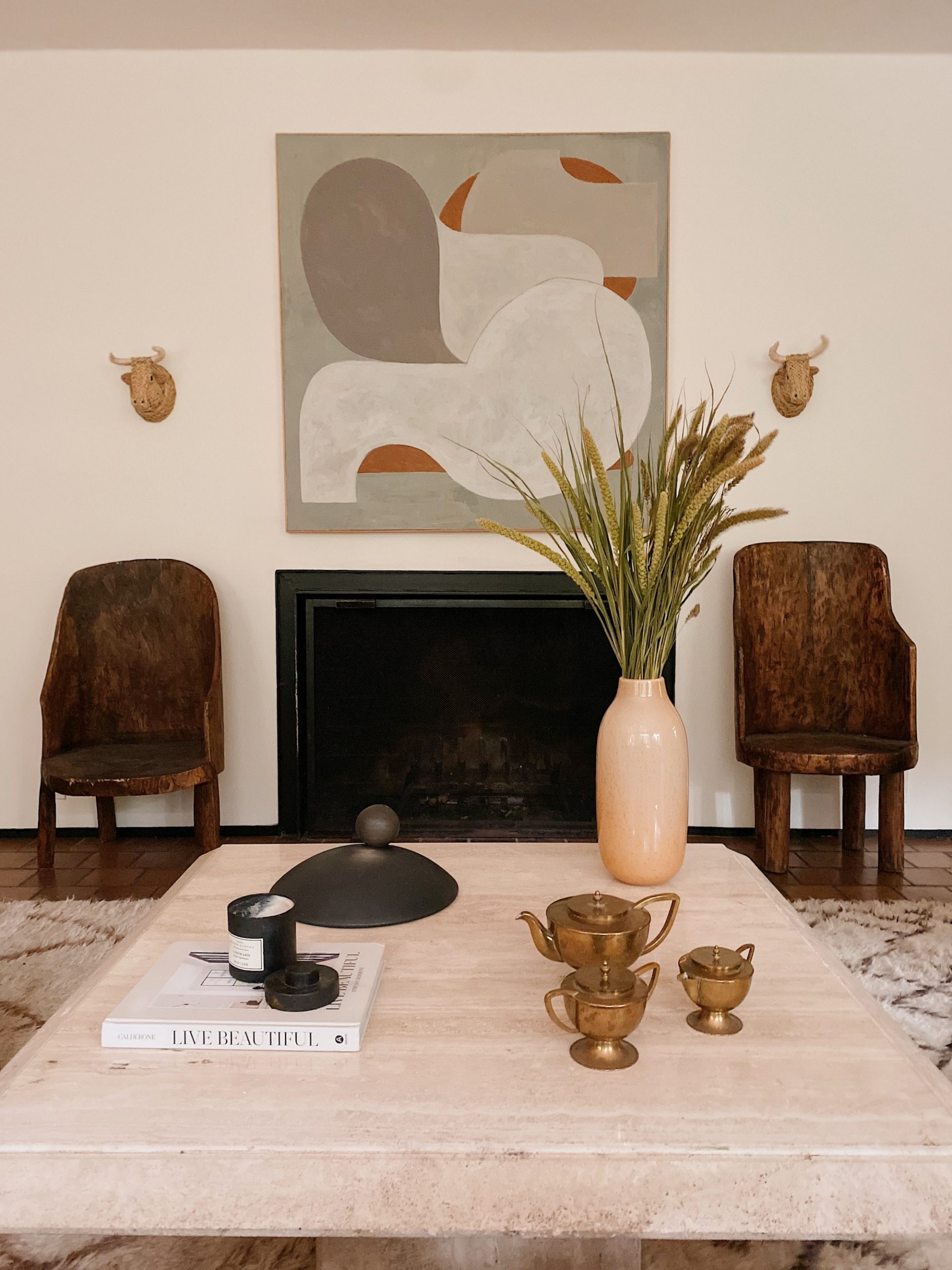
Hovey recently put their magic touch on an iconic property in Brooklyn Heights, 48 Willow Place – a mid-century marvel currently for sale for the first time since it was built (for a cool $6.9M). Designed by famed architects Joseph and Mary Merz in 1965, this beautiful home is certainly a departure from the typical Brooklyn brownstone. Hovey took full advantage of all the original design features, staging the space with a trove of unique vintage pieces – many sourced on trips to Mexico City – creating a delicious sea of honey tones and a gorgeous variety of luxe textures.

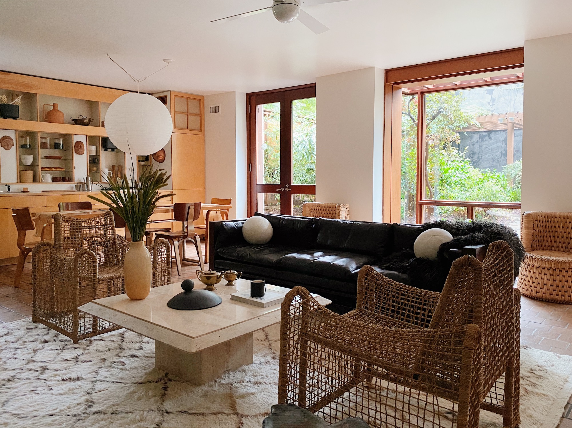
I’m considering a trip to Brooklyn Heights just to see those woven rope armchairs in person!

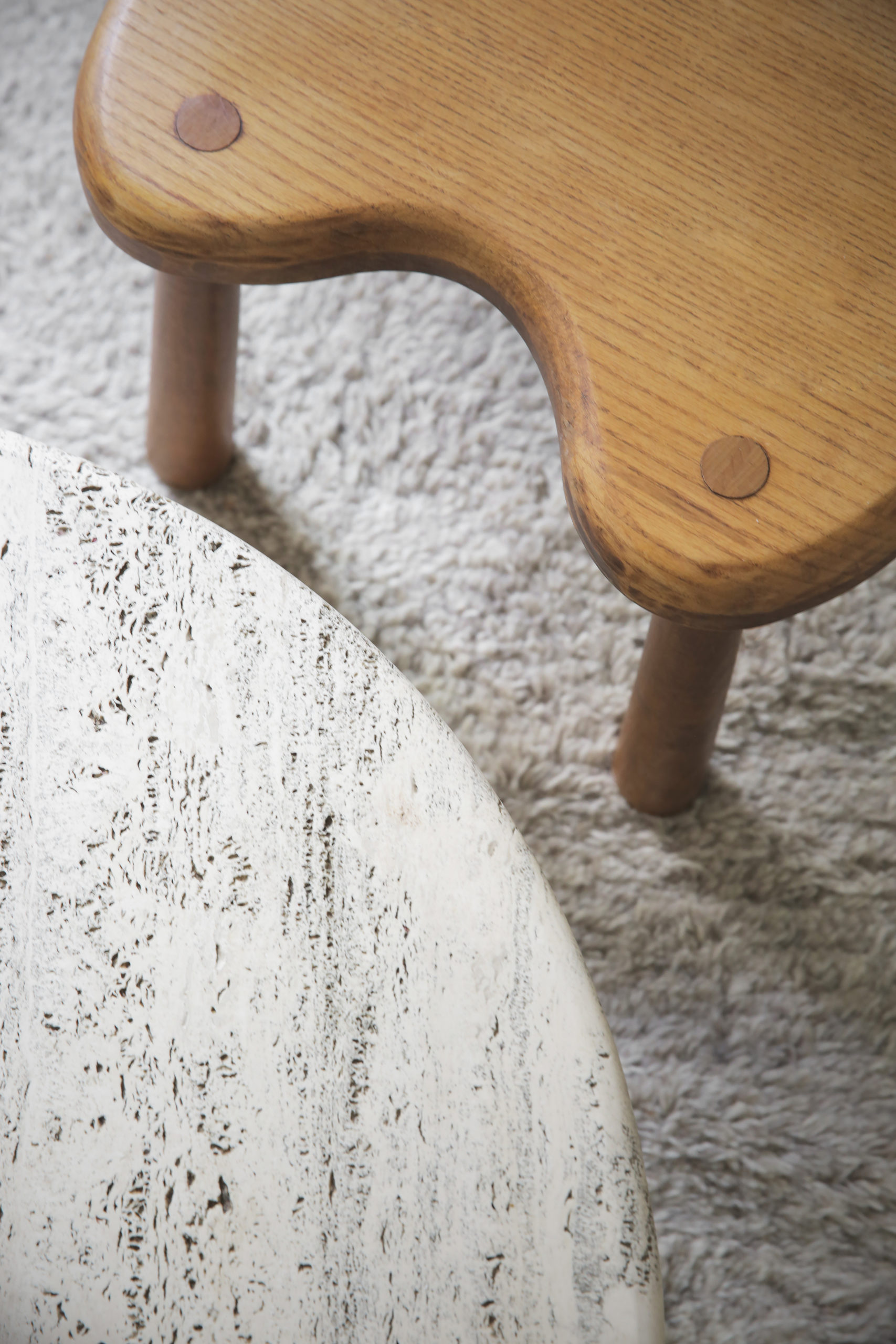
The room is a master class in mixing materials, from wool rugs and sheepskins, to leather, travertine, Japanese linen and rattan – combined they create a major mood.

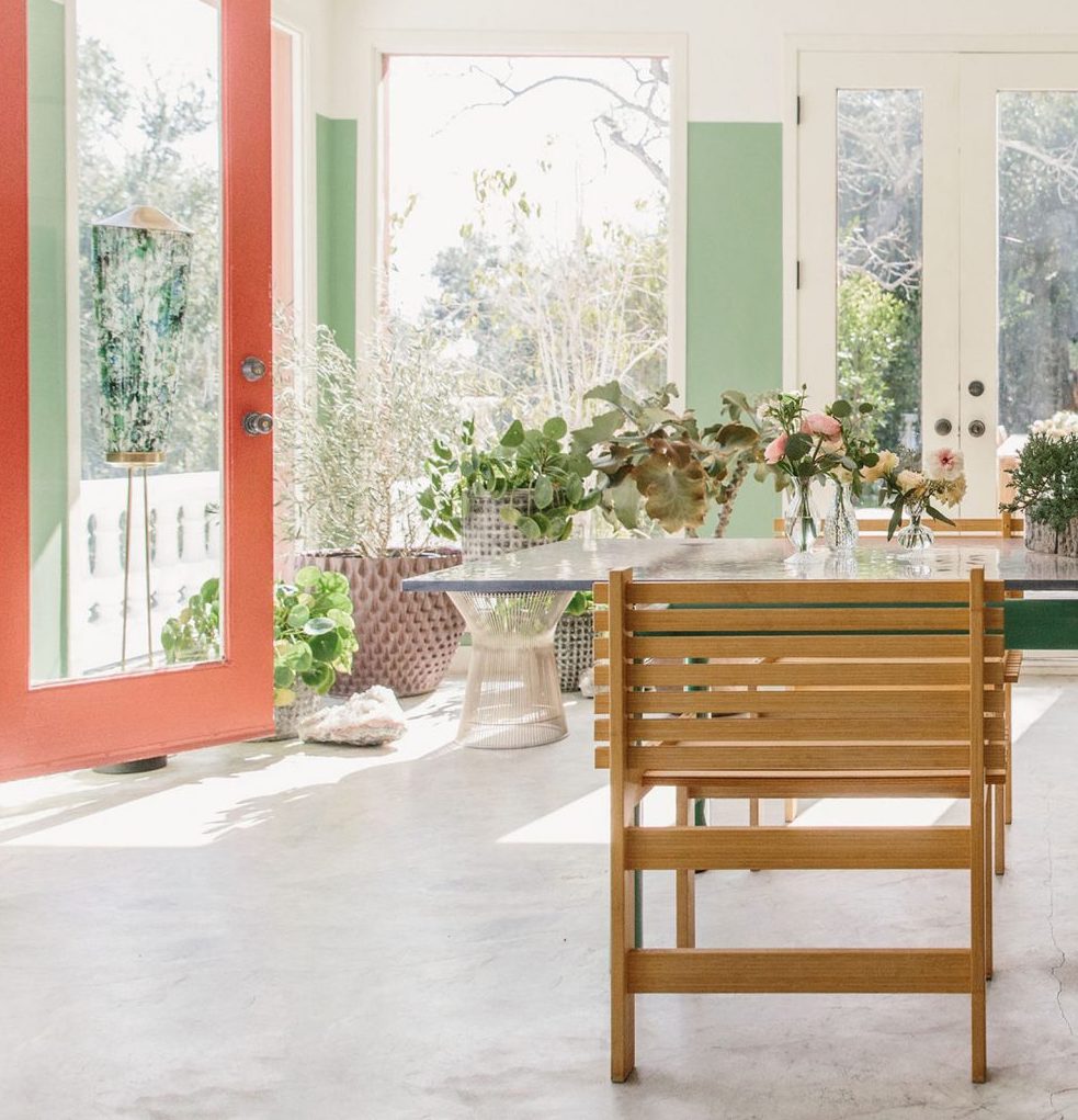
This home’s open concept kitchen, dining and living room was certainly before its time – but feels exactly like where I’d love to be right now.

This home completely transports you out of New York in the best way.

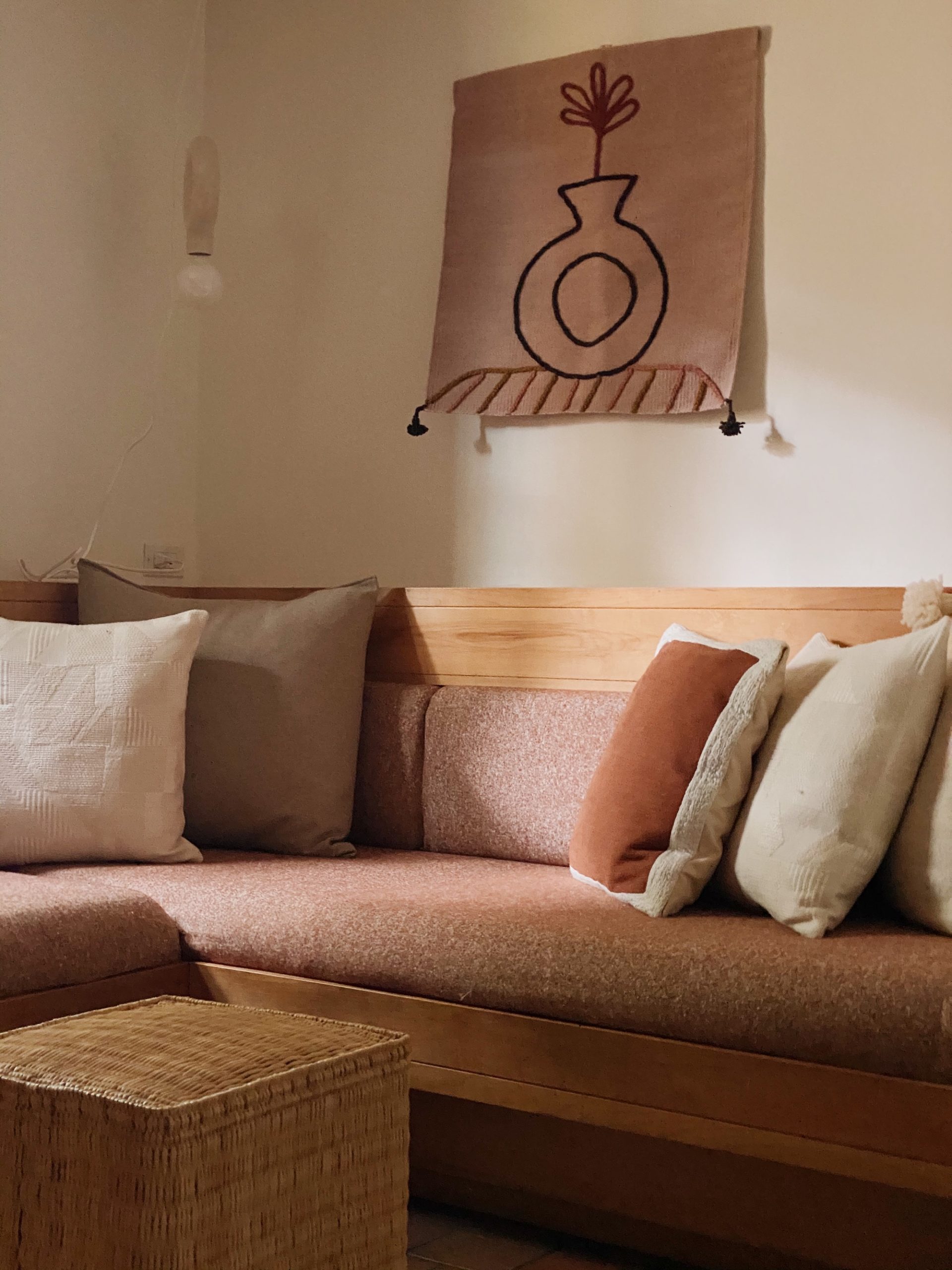
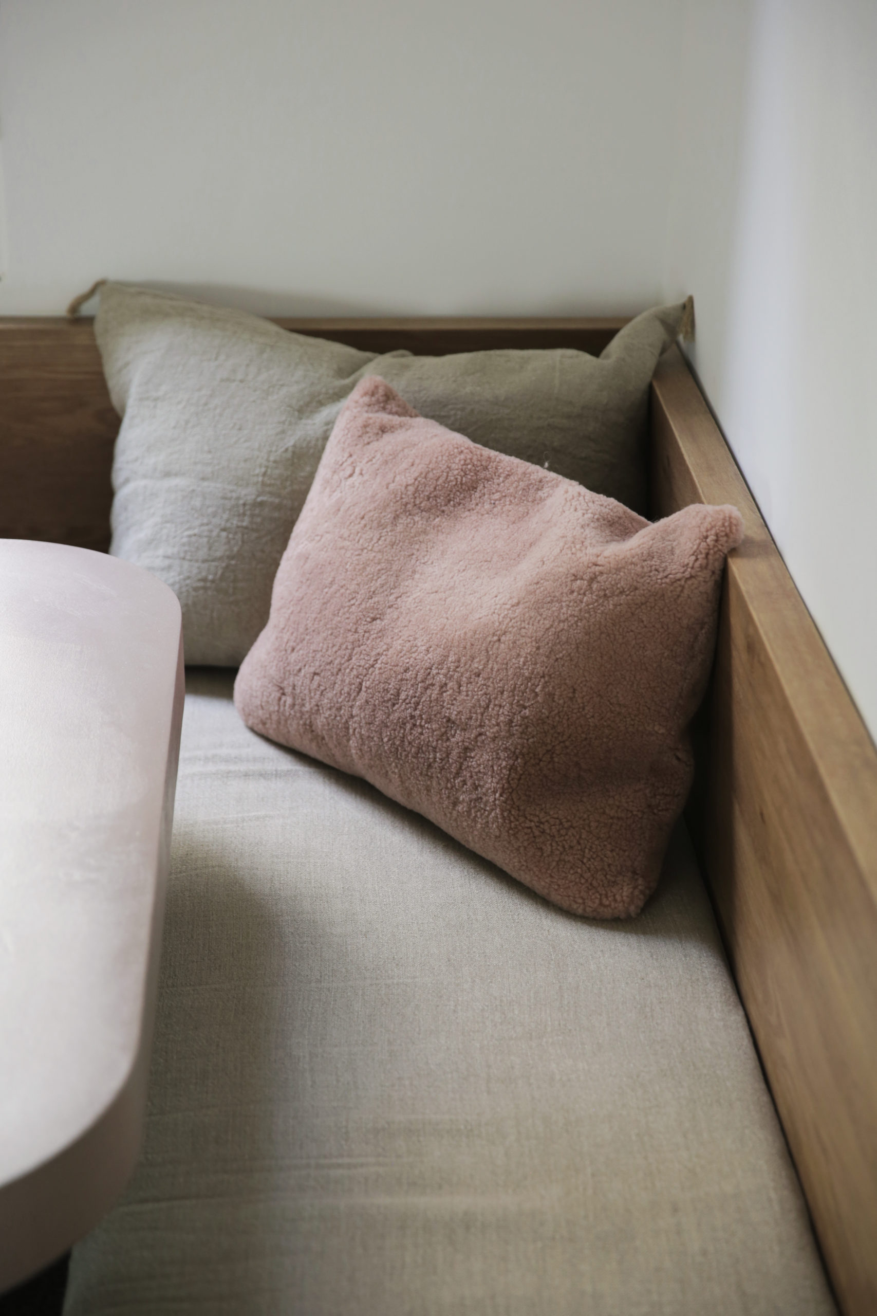
Hovey pays attention to every detail in their projects – down to slipcovering this built-in banquette in a sumptuous pinky brown Ungaro bouclé fabric.

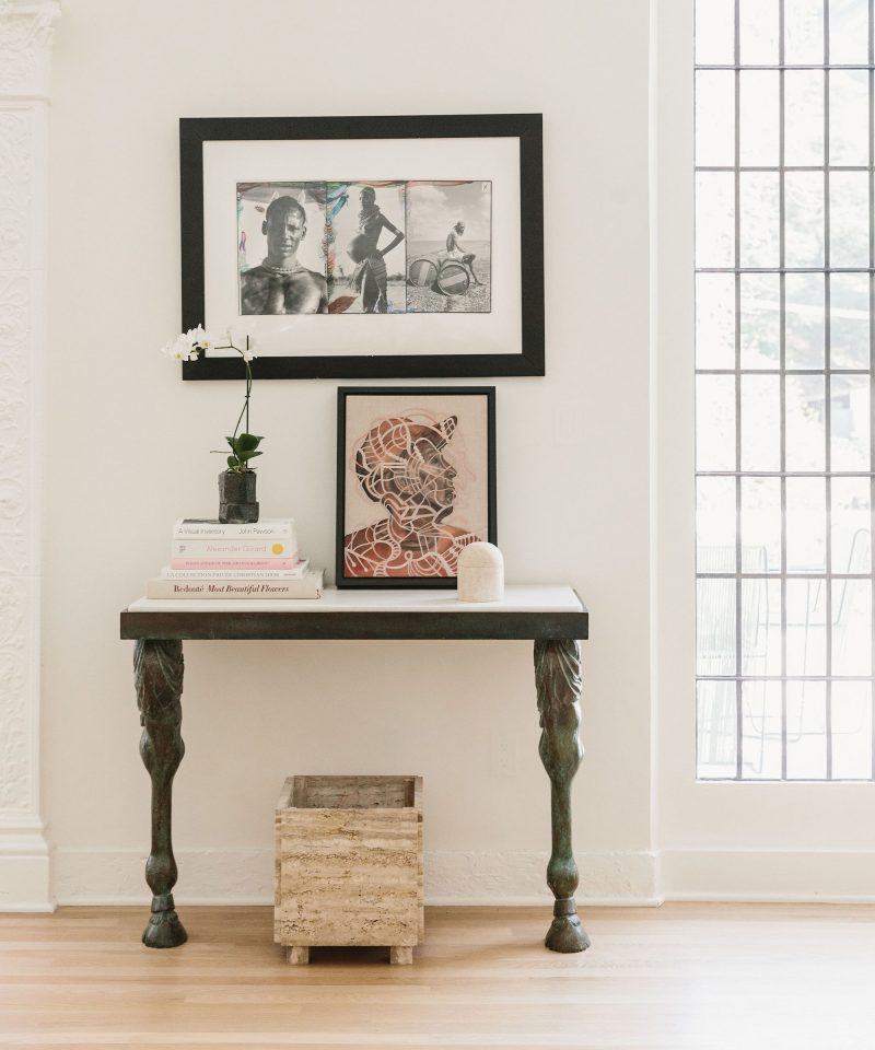
From textiles to pottery, rugs to art, Hovey has cultivated a collected vibe makes this feel like the home of a world traveler with a great eye. It makes me want to be that person too.

I can only imagine the warehouse of treasures have at their disposal. Luckily for you, they were willing to share a few of their favorite sources.

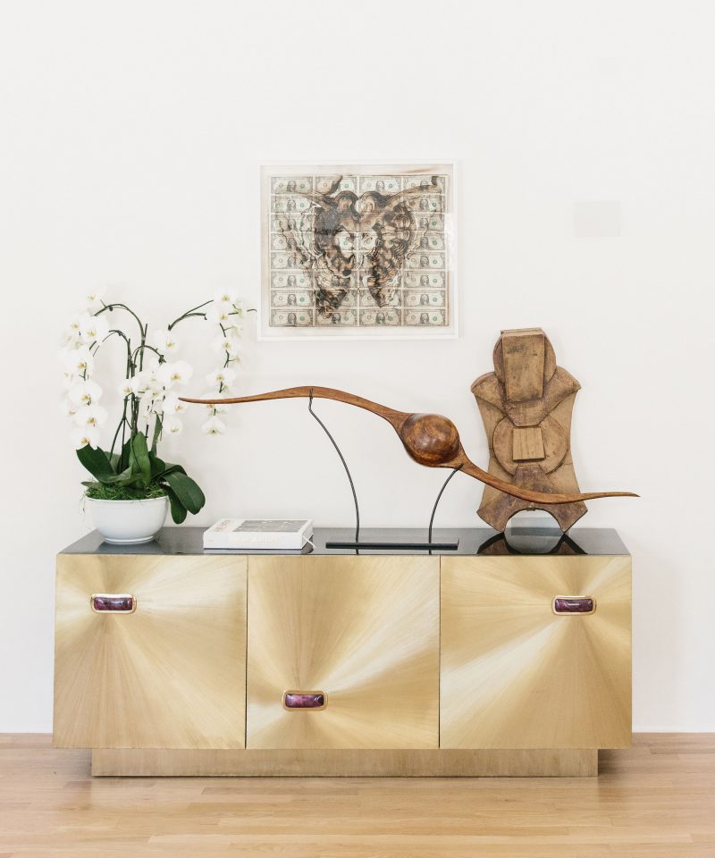
For example, those amazing woven bulls heads in the living room? They are designed by Spanish artist Javier S. Medina. Some of Hovey’s other favorite international gems include Cocol, Onora and Lago DF. I’m most excited about the-new-me site Smallable – it’s got a bevy of some of my favorite international lines and according to Hovey ships fast. I officially have a new rabbit hole to lose myself in! Although the Hovey Design site is also a great place to get lost.


photography courtesy of Hovey Design

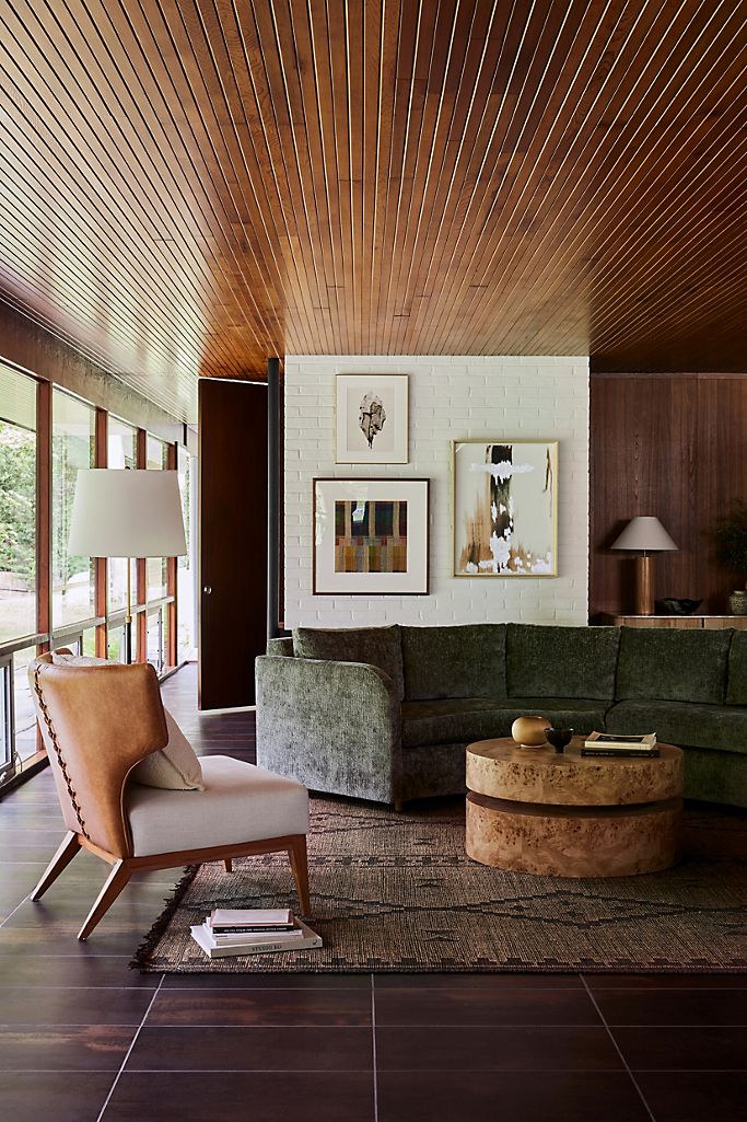
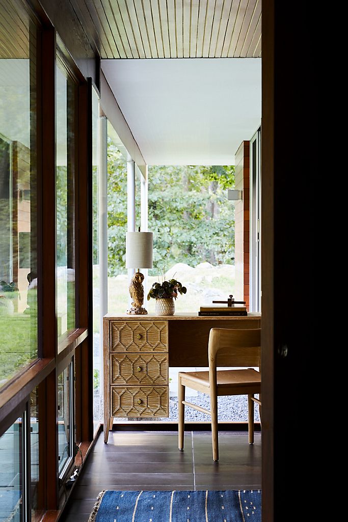
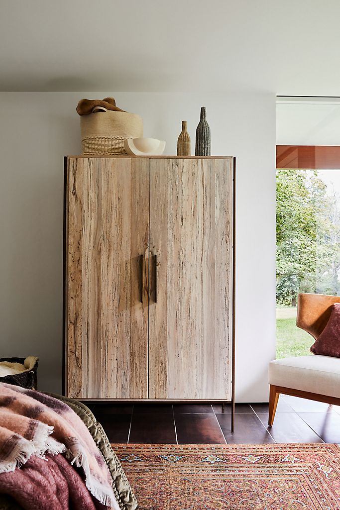
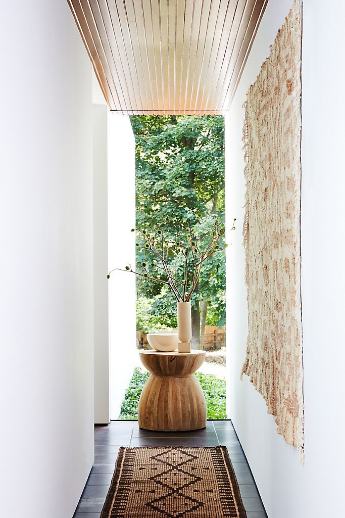
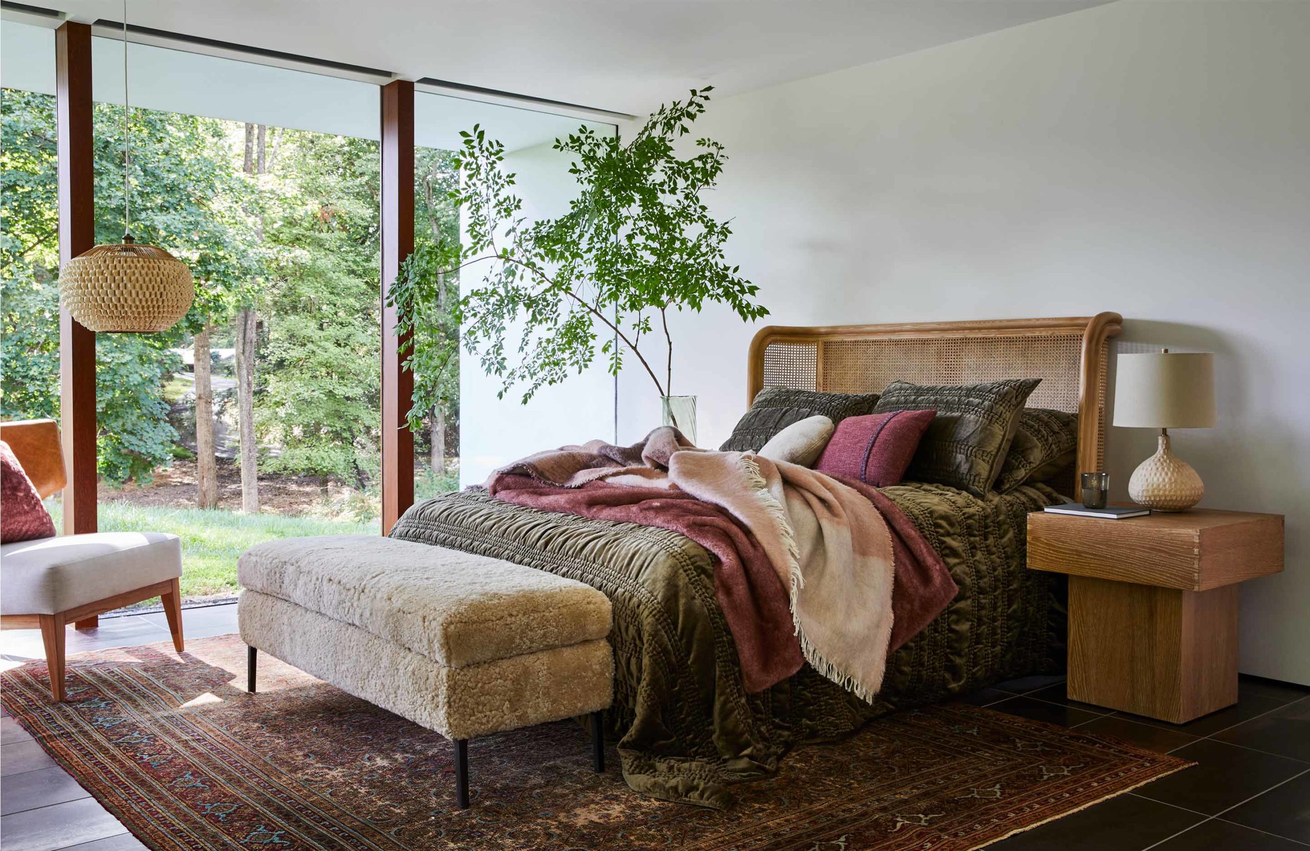
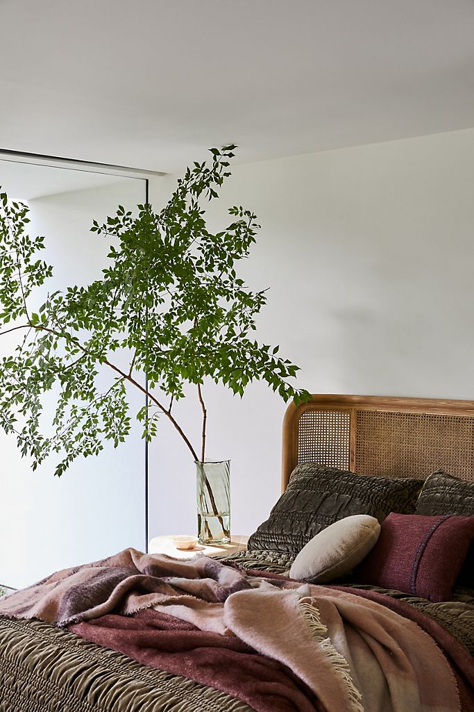
I know many espouse shopping vintage as the only way to inject “authentic personality” into your home. I wouldn’t say I disagree. I enjoy the vintage scavenger hunt as much as anyone, but sometimes you need more expedient options. And if those options look as good as these fall pieces from Anthropologie do, I’m totally ok with that.

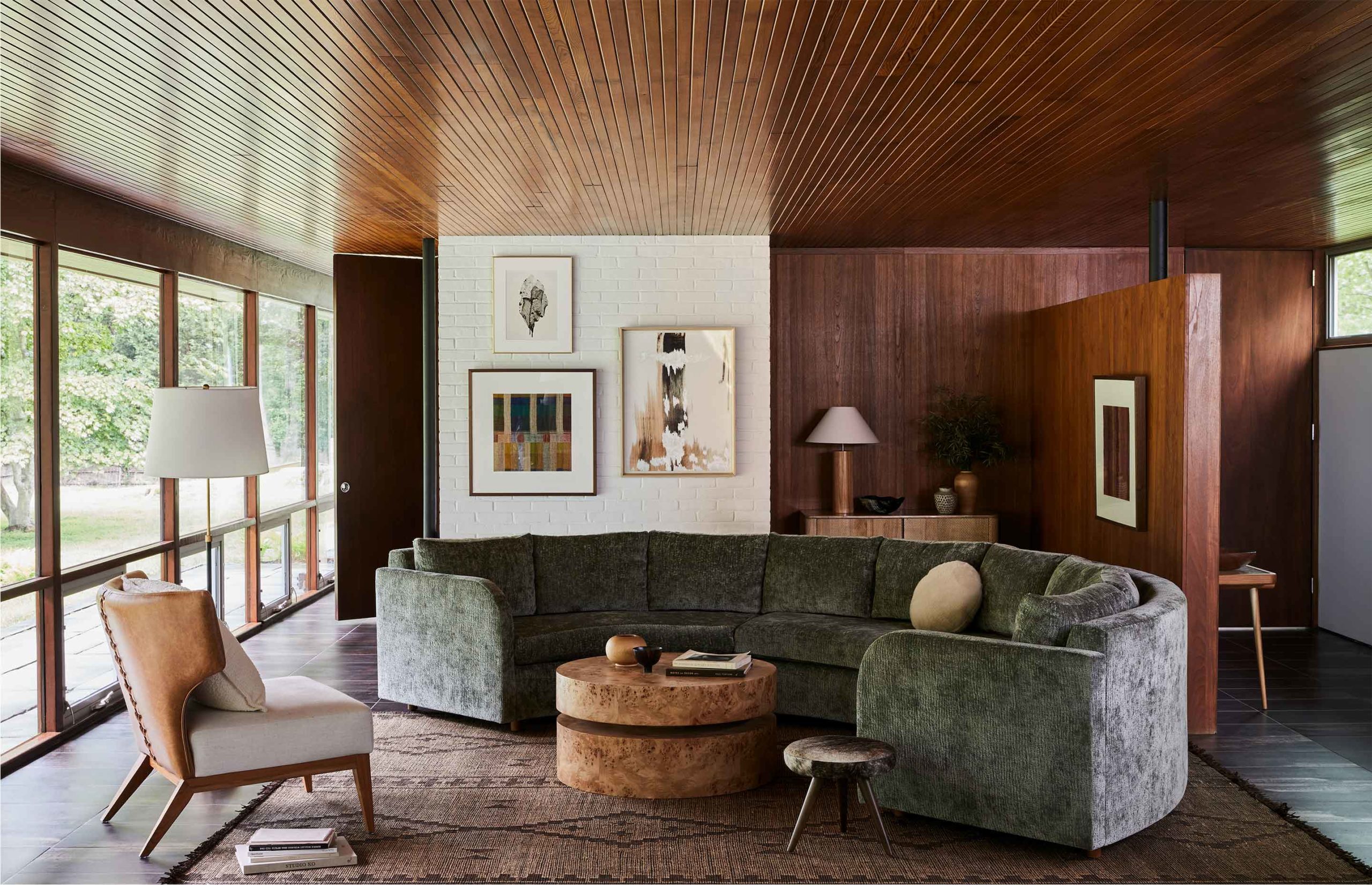
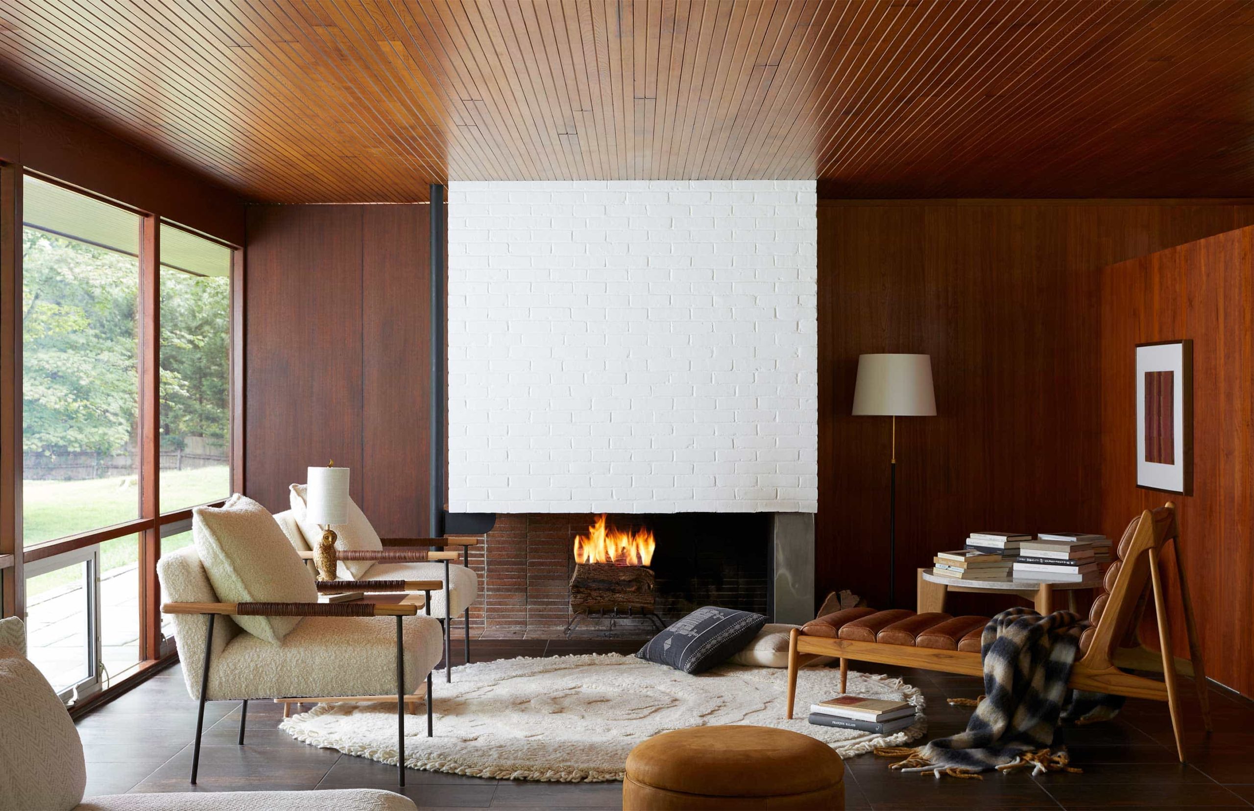
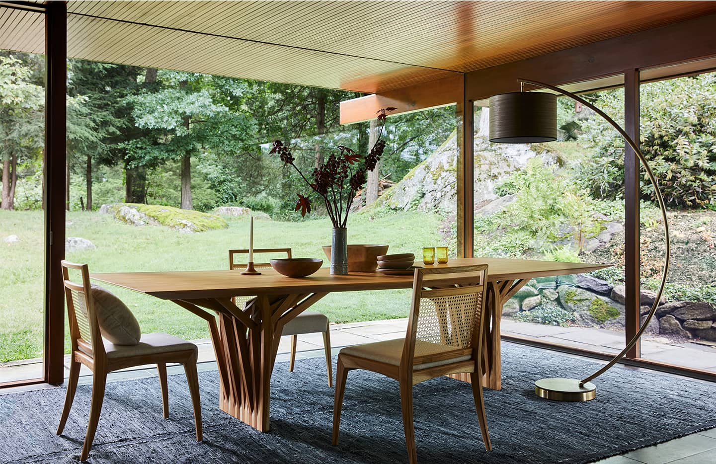
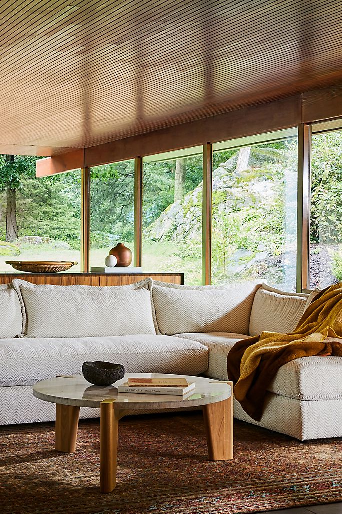
I posted about Anthro’s latest collaboration last month and their hits just keep on coming. I’m the first to admit I’ve often thought of Anthro pieces as overly whimsical, feminine and a touch too cottage chic, but this new editorial shows that it all depends on your context. A beautiful home designed by famed architect Richard Neutra certainly helps. This one is for sale FYI!

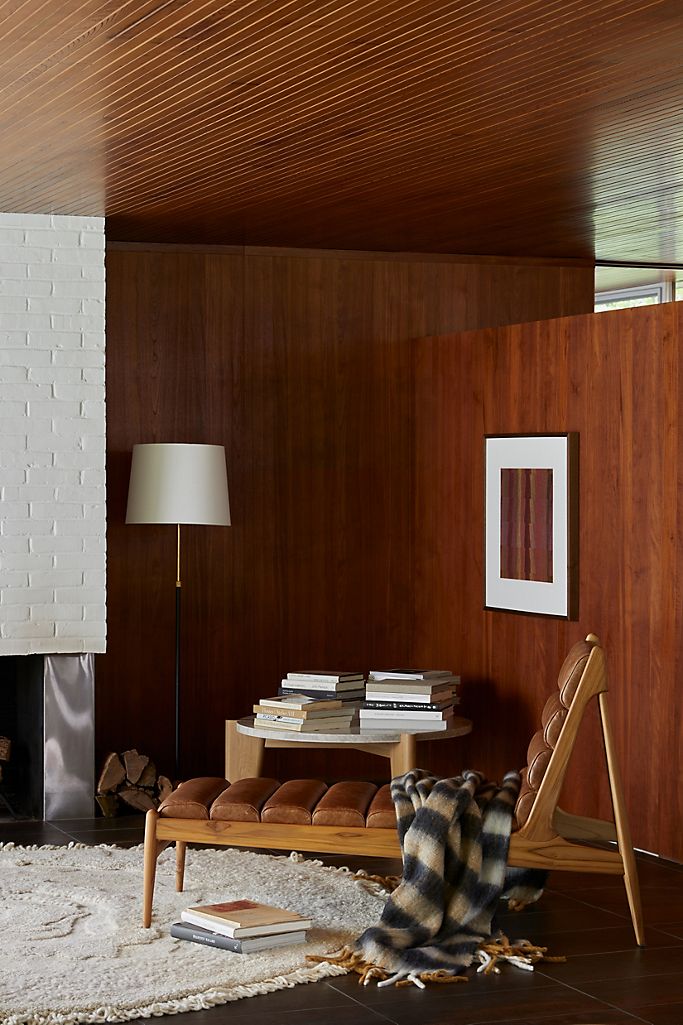
But what this home tour really illustrates is that a piece can take on a totally different personality in a different environment – so really you shouldn’t rule an option out at first glance. Really think about how something will look and feel in your space regardless if it’s modern or bohemian-inspired.

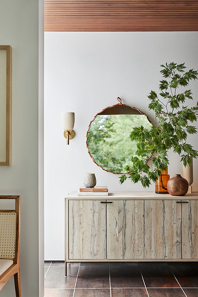
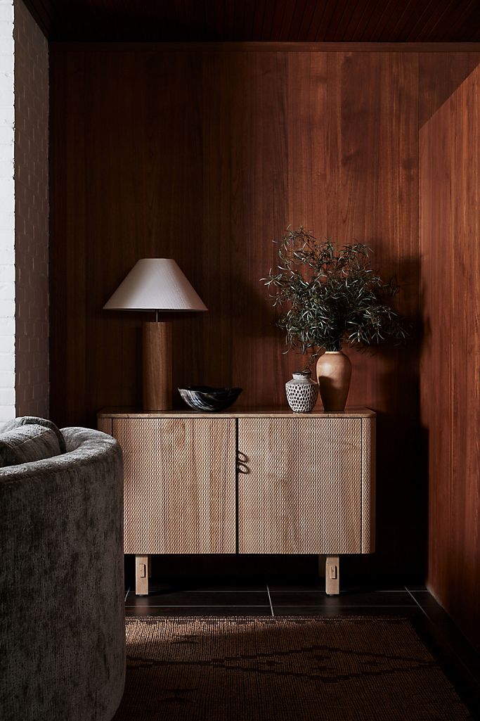
I could not be more obsessed with this wood cabinet. It has a really unique a mesh overlay, a travertine top an gorgeous rounded corners.

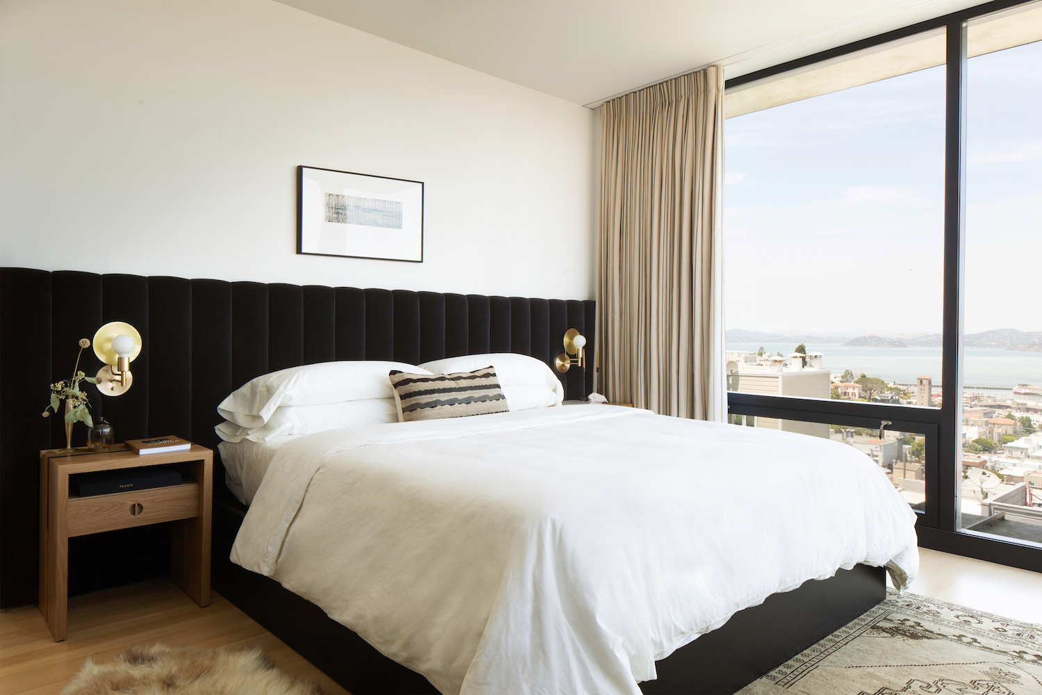
Also I have to mention that this mix of wood tones is giving me all kinds of inspiration for our new cottage. And since I only have about 10 weeks to renovate and furnish the entire house, I’m fully ok with unearthing some gems – big box store or not.

This entire home is a beautiful study in mixing soothing neutrals, a variety of texture and a feeling of pieces being collected over time. But you didn’t have to wait years to stumble across the perfect treasure. And there’s no shame in that!

As we shift into the new season and really think about making our homes our sanctuary from both the colder temperatures and from Covid, you can think out of the box while still shopping within one.

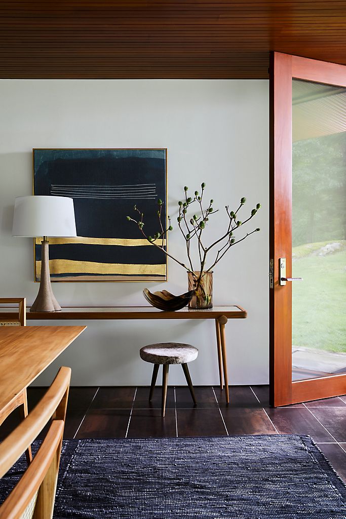
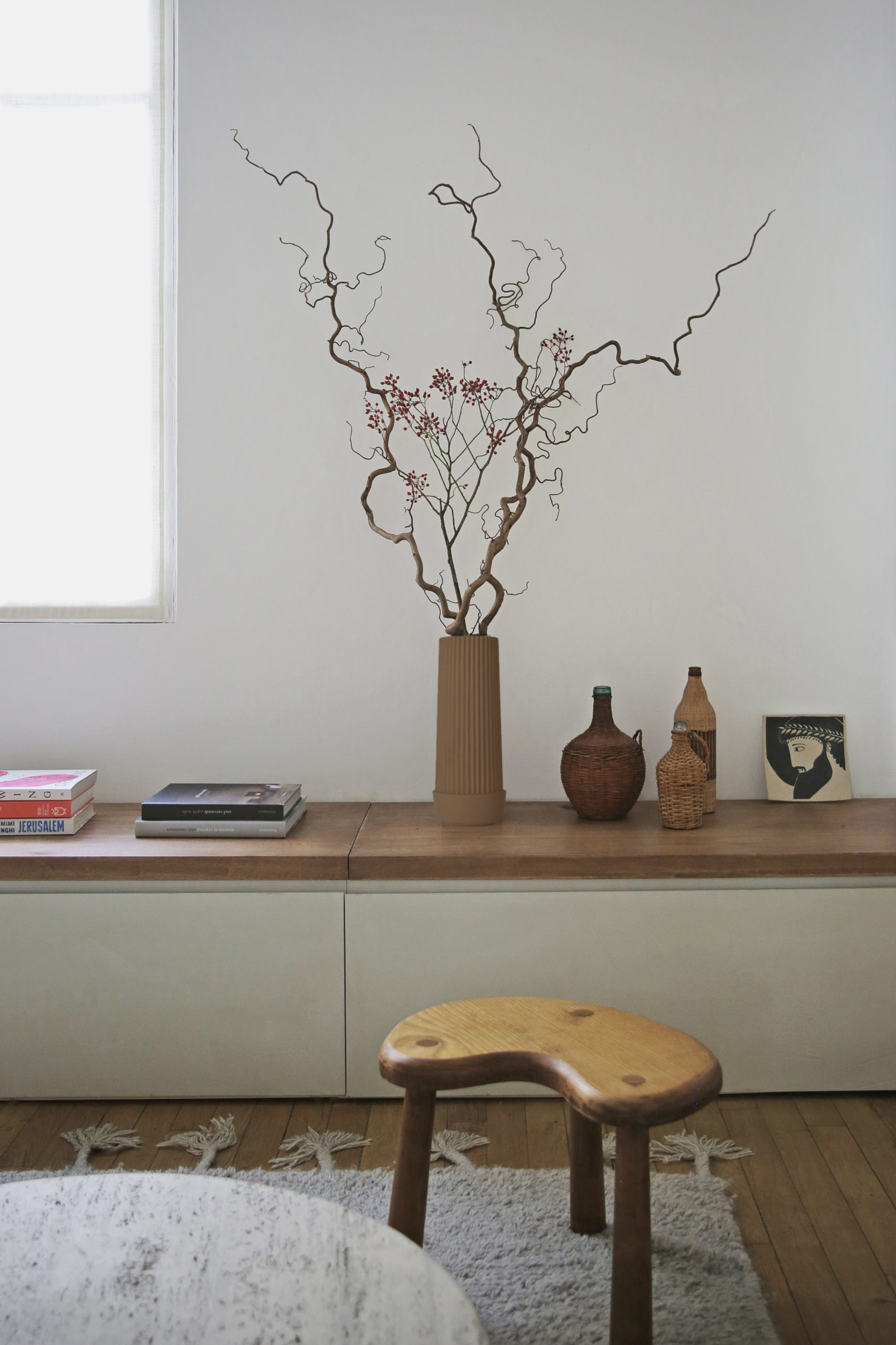
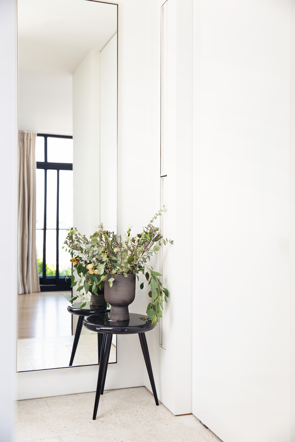
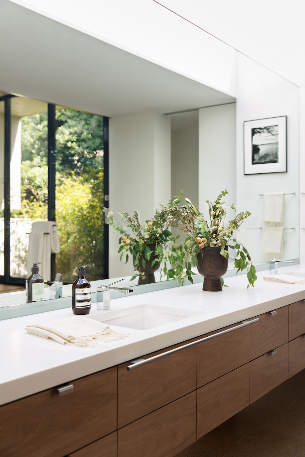
I spy the gorgeous foraged branch work of Colin King.

photography by Nicole Franzen, styling by Colin King for Anthropologie.

Emmanuelle Simon Designs a Stunning Mini-Apartment in Paris on Apartment 34

As we sit at home most days, one of my favorite pastimes is looking at other people’s spaces! I highly suspect it’s one of your favorite activities as well. That’s why I had to share this eye-catching petite Paris apartment with you.

Emmanuelle Simon Designs a Stunning Mini-Apartment in Paris on Apartment 34

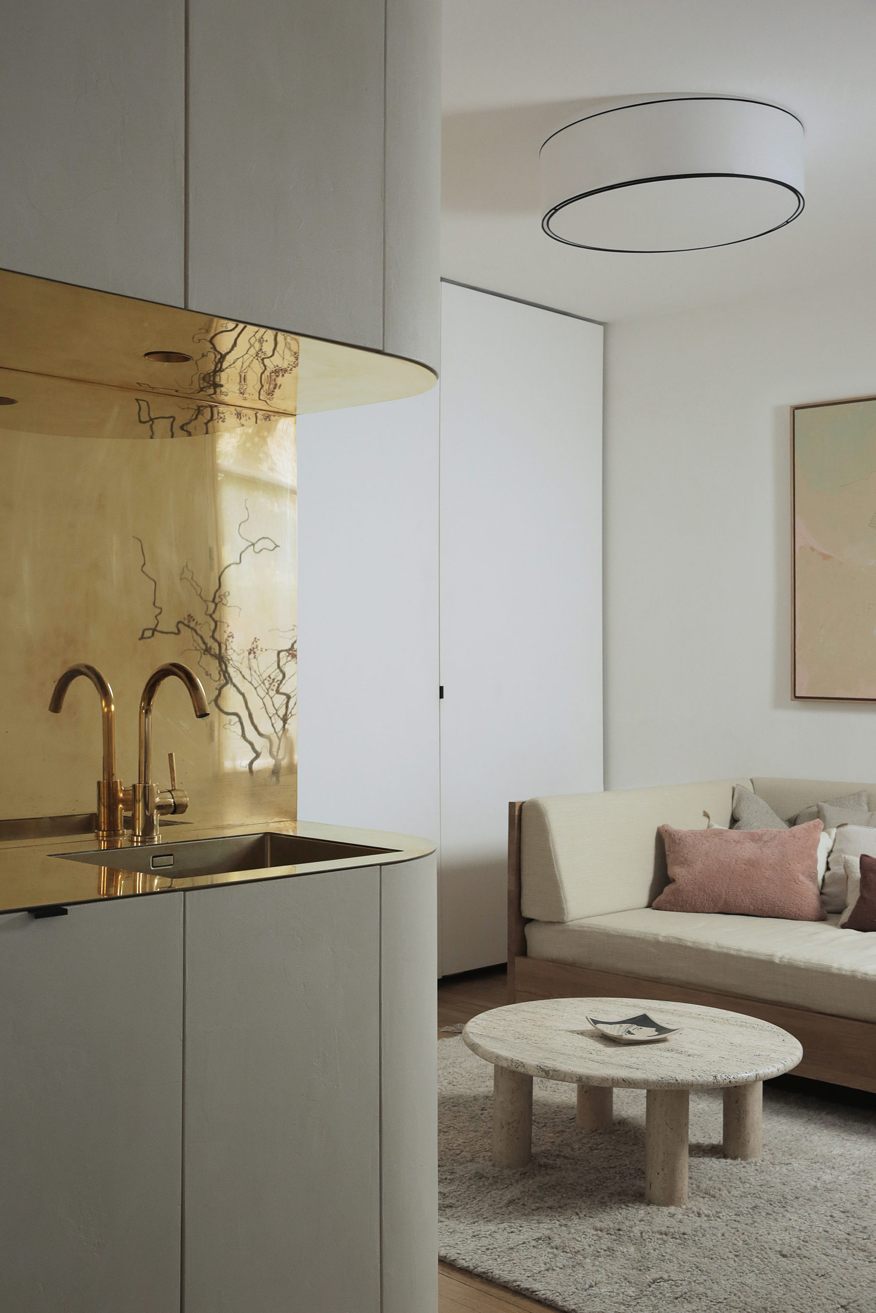
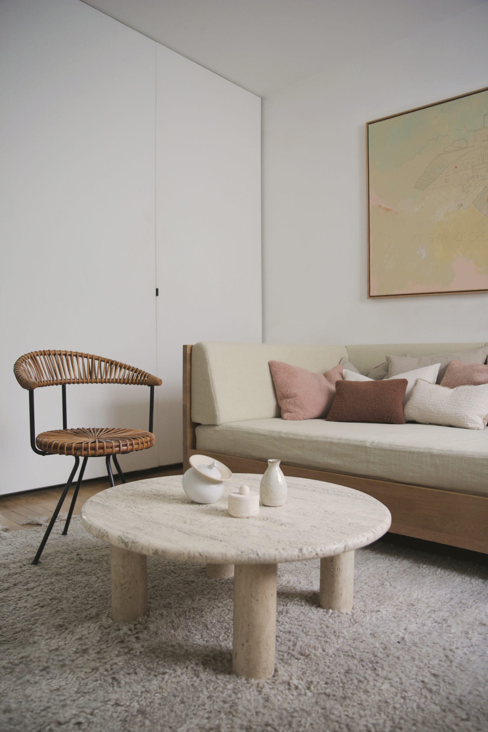
This apartment might be tiny – it comes in at just 300sq ft, but it packs some major design punches. The space evokes the feeling of an idyllic hotel suite, but one you never have to check out of. Interior designer Emmanuelle Simon set out to optimize livable space and create a soothing respite from the outside world, without sacrificing functionality or beauty.

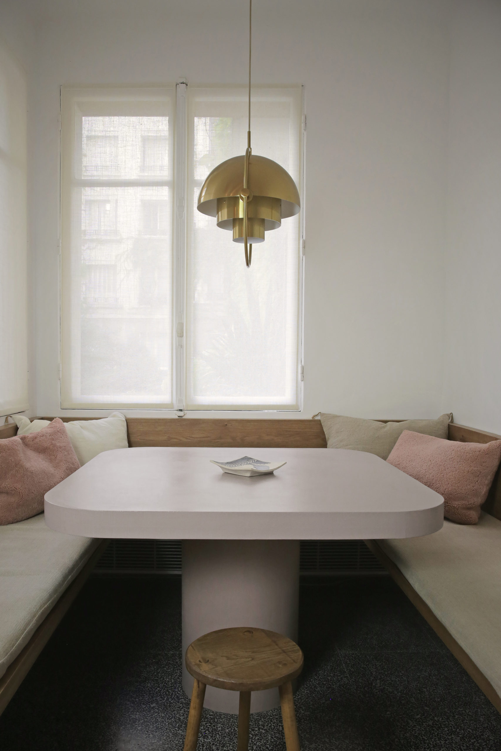
Simon outfitted the apartment with custom limestone colored waxed-concrete cabinetry that tucks away all essentials, creating a sleek, clean effect. Oak was used to create a custom banquette and sits atop a window seat that wraps one entire wall of the apartment, offering both seating, more storage and a place to display objet.

Emmanuelle Simon Designs a Stunning Mini-Apartment in Paris on Apartment 34 Emmanuelle Simon Designs a Stunning Mini-Apartment in Paris on Apartment 34 Emmanuelle Simon Designs a Stunning Mini-Apartment in Paris on Apartment 34

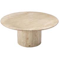
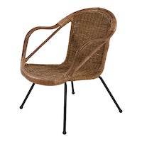
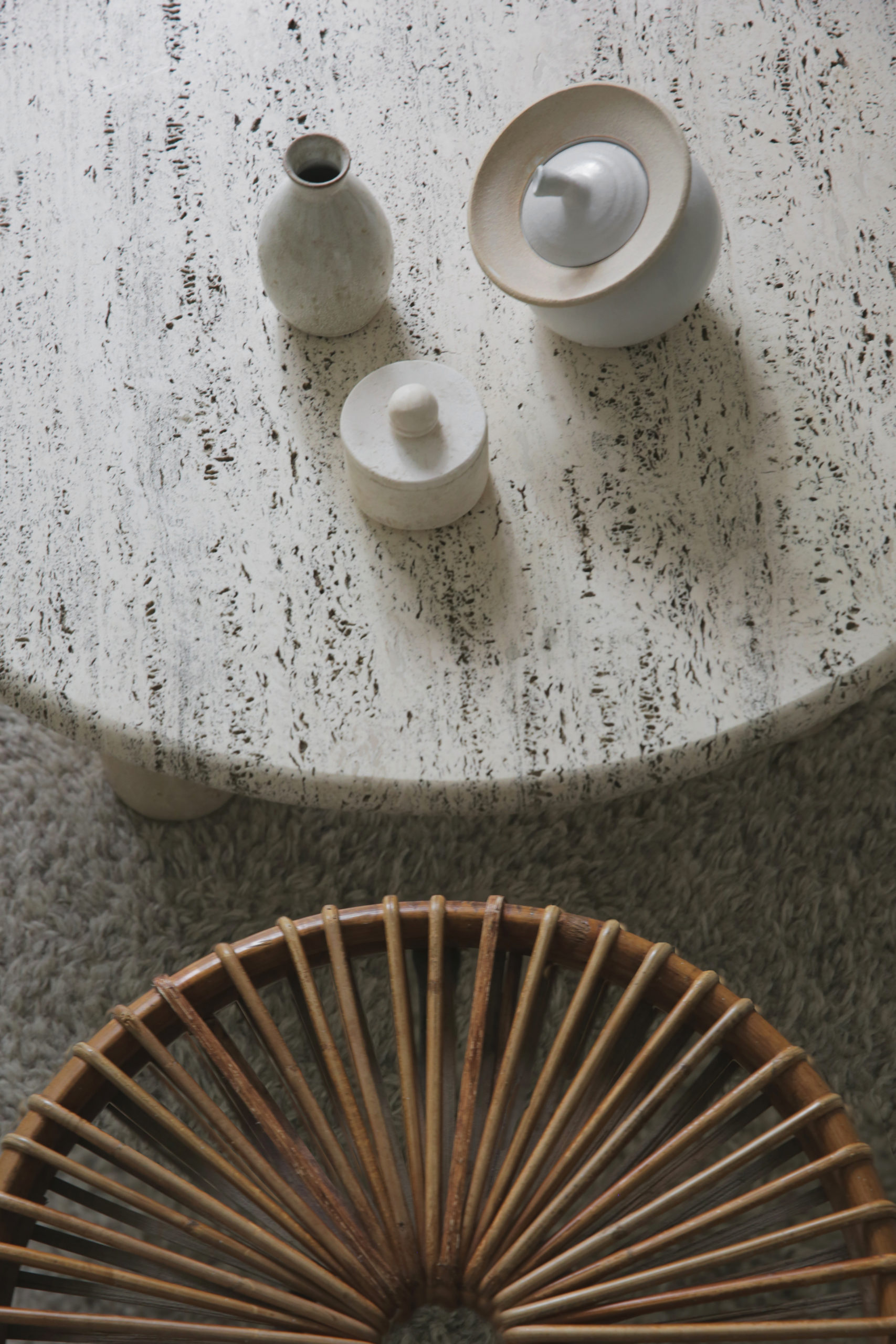
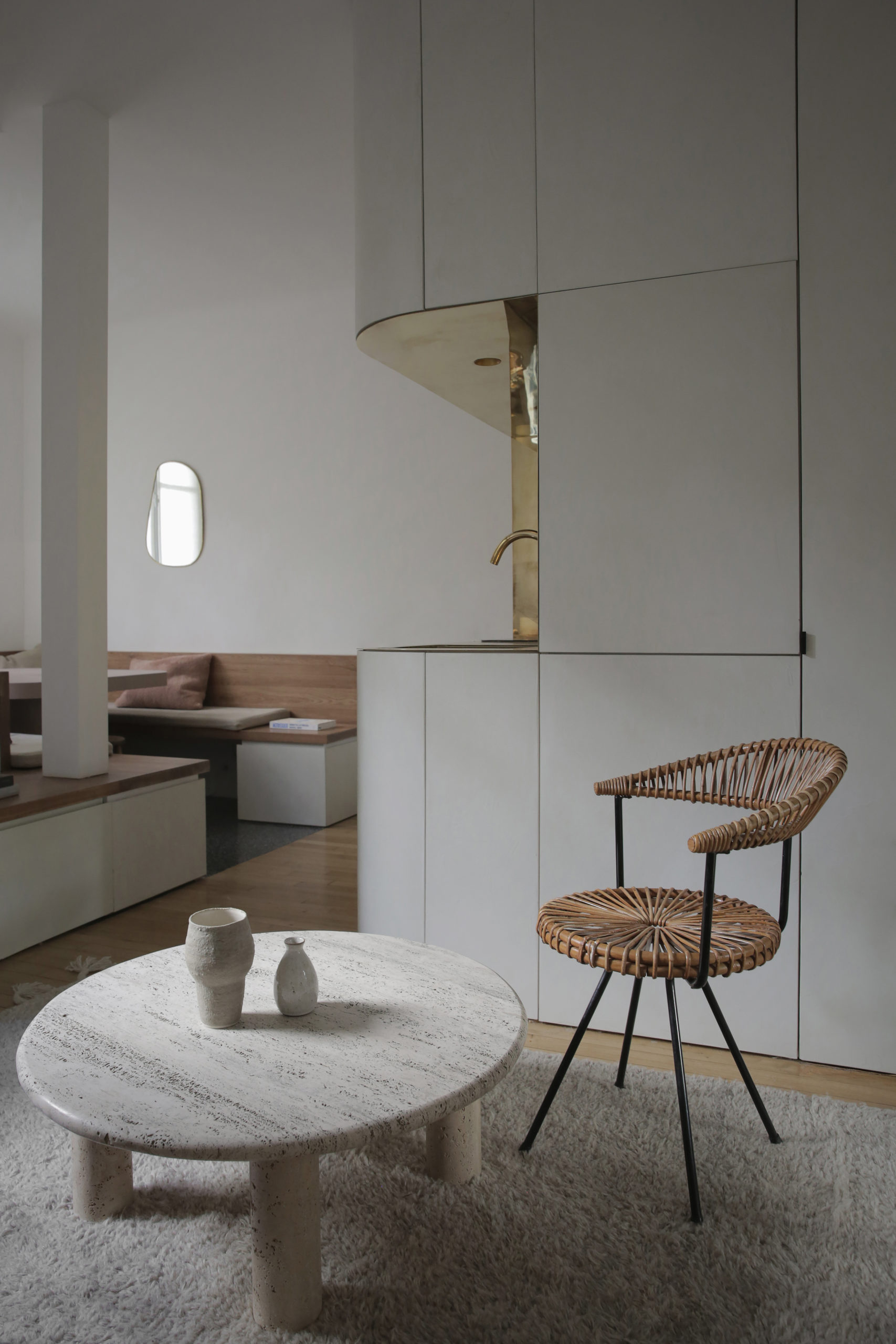
The varied texture between the wooly morrocan rug, travertine coffee table, small ceramic accessories and vintage Dutch rattan chair in the image above is a master class in mixing materials.

Emmanuelle Simon Designs a Stunning Mini-Apartment in Paris on Apartment 34

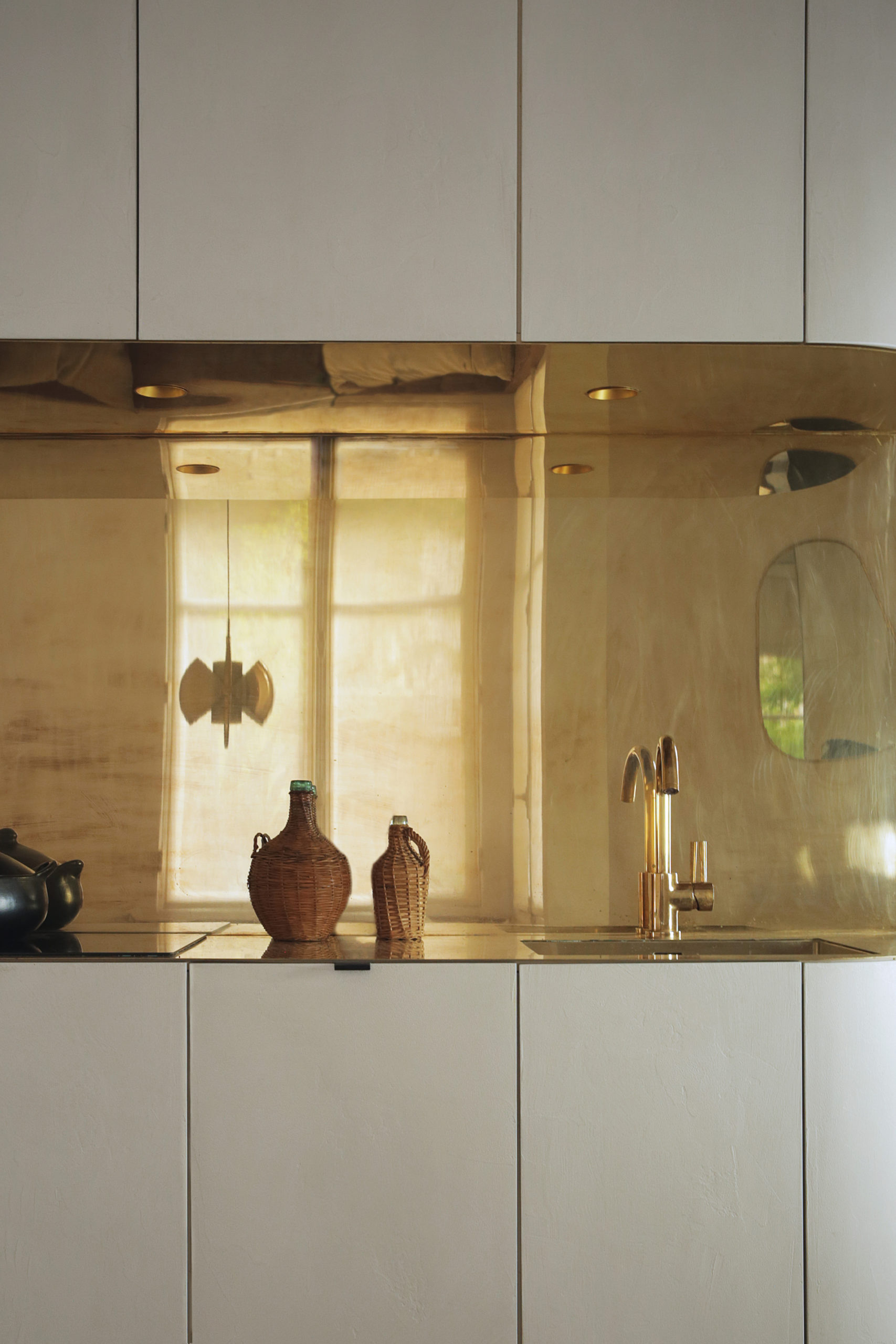
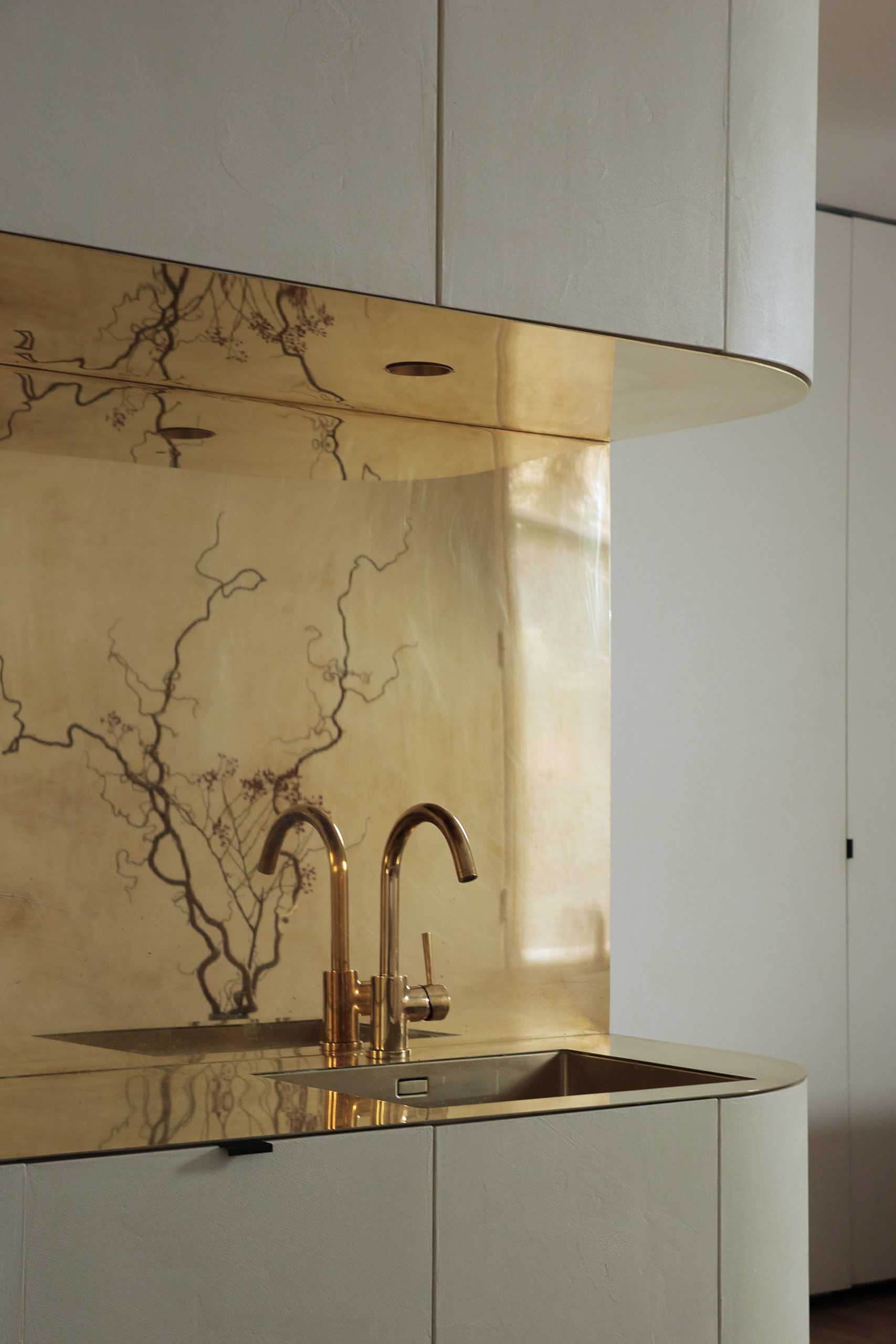
Of course, the pièce de résistance of the apartment is the beautiful mirror-polished brass counter and backsplash in the exposed area of the kitchen. The brass surface reflects not only light but also subtle reflections of the space itself, creating a unique illusion of additional depth.

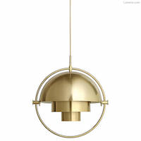
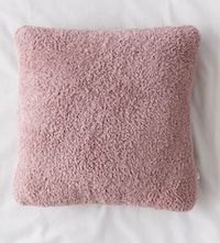
The apartment’s clean, minimal look is further balanced and warmed with choice vintage pieces such as glass vessels clad in wicker, fuzzy throw pillows in soft creams and dusty rose, a large 1960’s ceramic table lamp from famed Marshall Studios, and a classic Gubi Multi-Lite Pendant.

I love how this apartment illustrates that you can pack elevated taste into even the tiniest of spaces. You just need to make smart, impactful design decisions to optimize every square inch you have. This apartment offers thoughtful details – I would certainly love to have a little piece of Paris like this to call my own!


For more inspiring home tours, CLICK HERE.

photography courtesy of Emmanuelle Simon

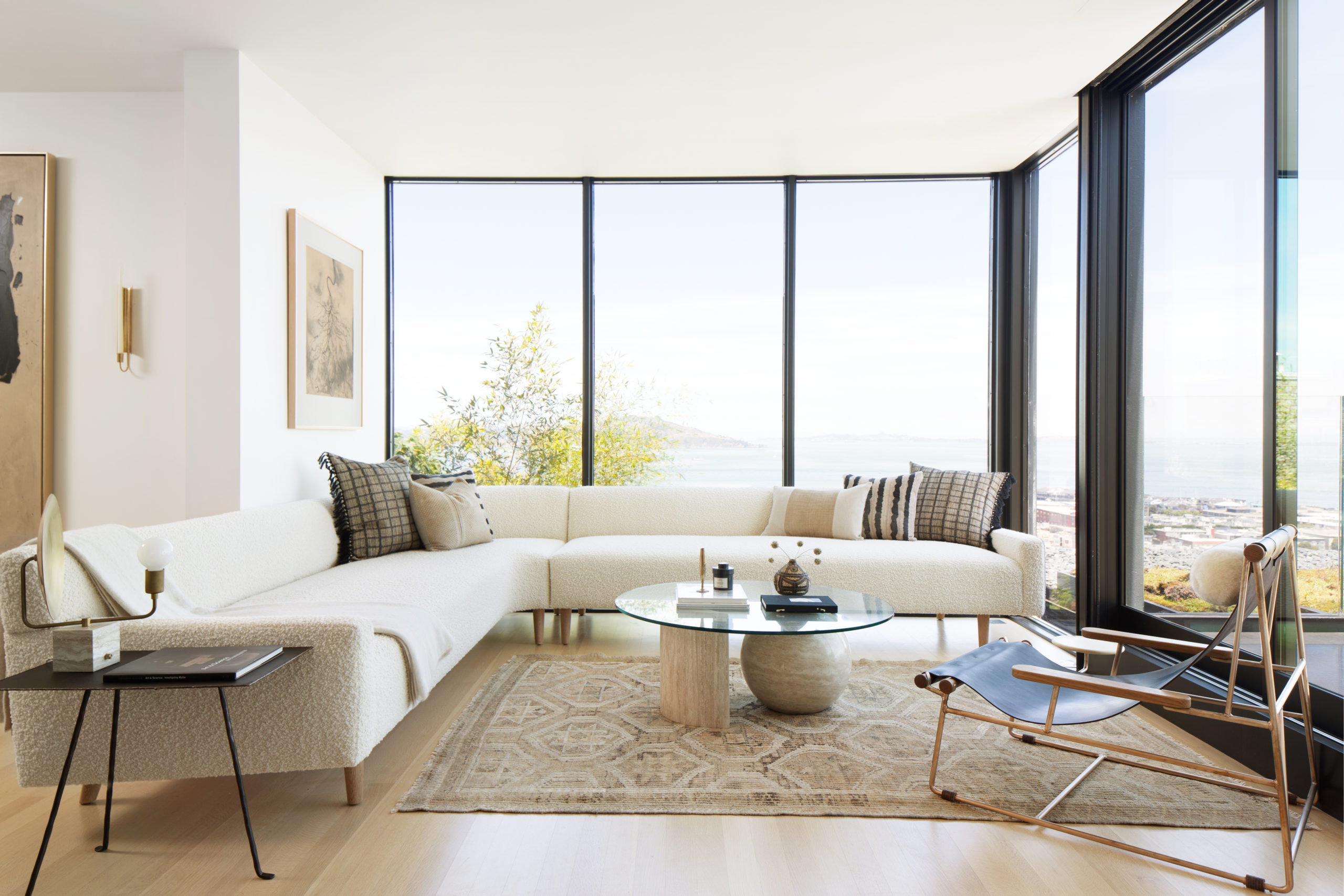
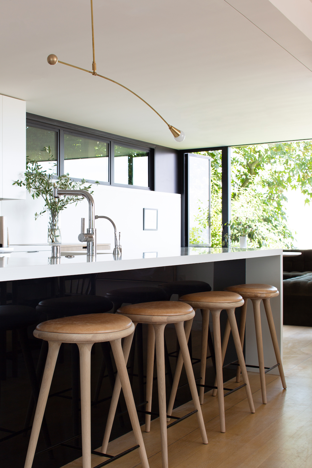
I would certainly never call myself a traditionalist, but I would say there’s an influx of modern style that will redefine what traditional looks like in 20 years. This San Francisco home designed by JDP Interiors is the perfect example – timelessness, classic, elevated but approachable. I’m all in.

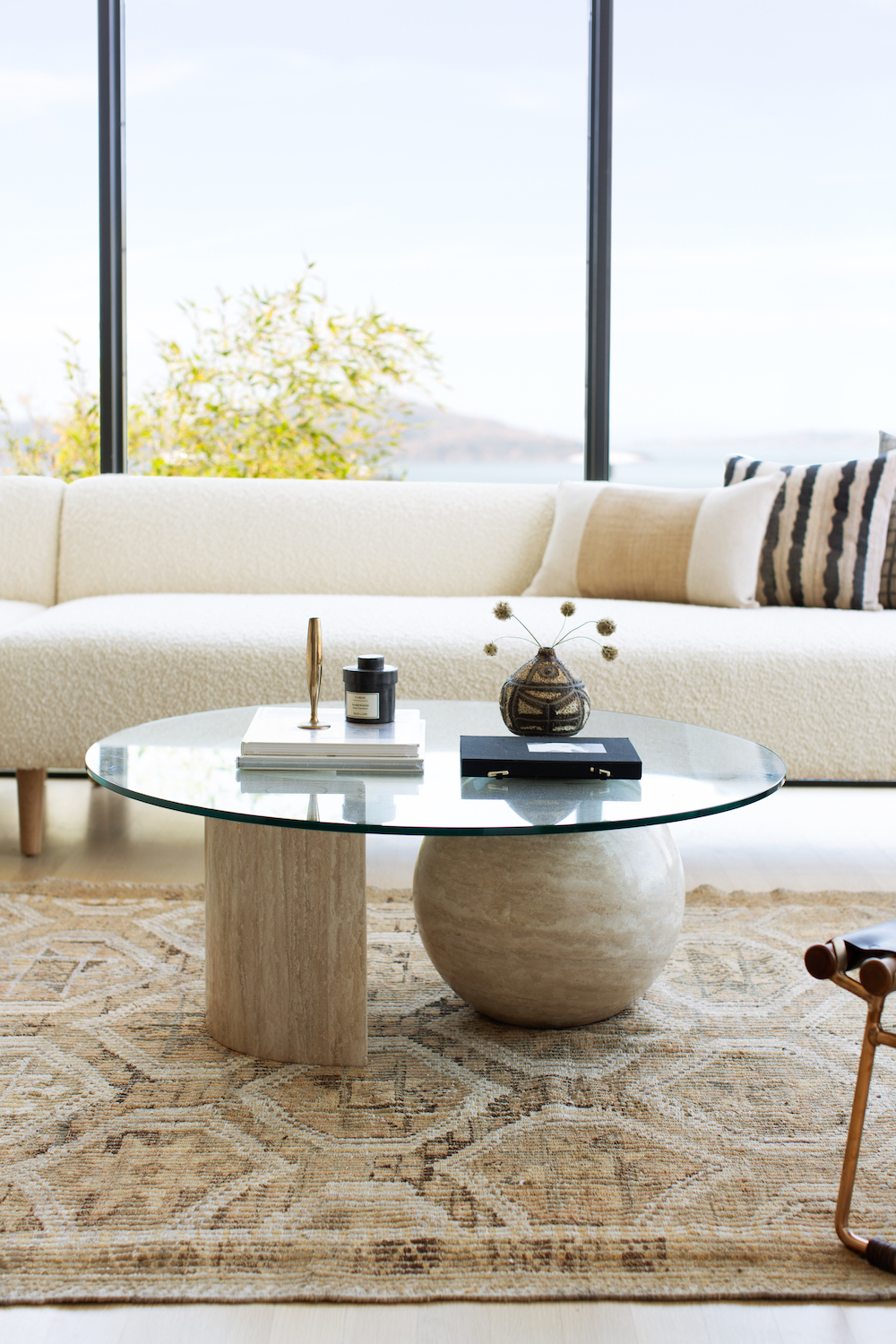
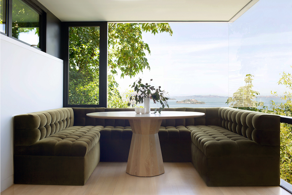
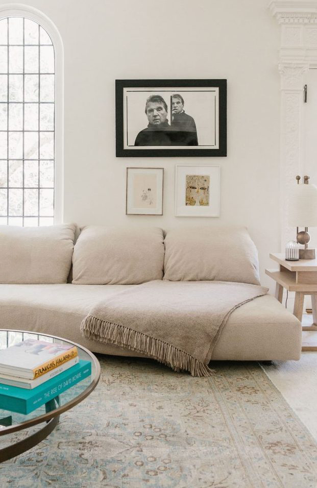
This family home sits atop San Francisco’s iconic Russian Hill neighborhood, affording the space sweeping views of the Bay, the Golden Gate Bridge and Alcatraz. The goal was to focus the design around this spectacular view. A custom sectional upholstered in a luxe nubby wool dominates the living spaces. Everything is kept low profile to maximize the view. The muted yet warm color palette is right in my wheelhouse.

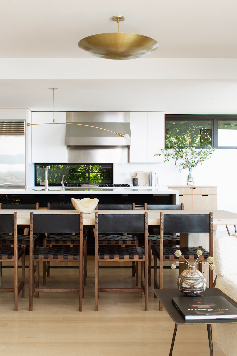
The open concept plan maximizes the views from the kitchen straight through to the living area. The stunning travertine dining room table is a custom design by Bananas & Hammocks, the genius designers behind my custom steel doors!

I love how this home’s kitchen blends seamlessly with the rest of the decor. It’s mix of black, white and bleached oak adds interest and keeps thing from being too one note. Brass pendants from Lawson-Fenning & Workstead.

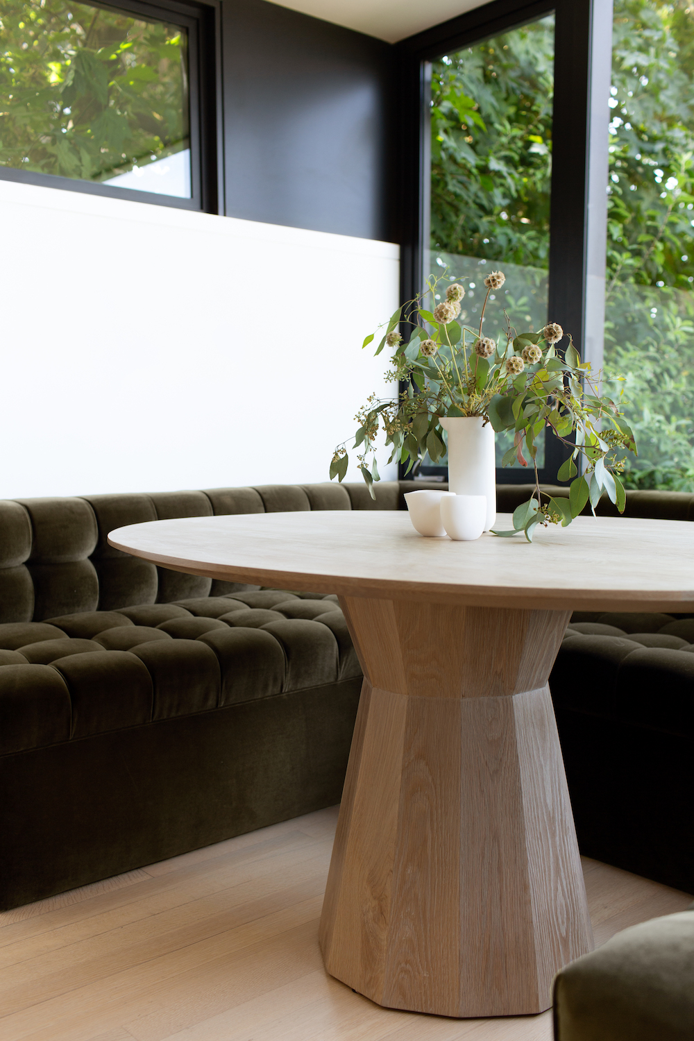
The built-in banquet seating trend is not going anywhere anytime soon and I’m not sad about it. Especially when it involves cushy velvet.

The main suite echos the dining area with a plush built-in headboard and maximization of the epic views. All of the choices in this home are elegant, refined and what I hope traditional will look like for years to come.

For more home tours, CLICK HERE.

design by jdp interiors / photography by bess friday

Tour this house filled with Hollywood history on apartment 34

I remember bookmarking Brigette Romanek’s house after I spied the climbing wall she built in her daughters’ room in Arch Digest. Thankfully, I never showed it to my son because I know that’s all he’d beg for till the end of time. While Brigette’s home is actually a piece of major Hollywood rock n’ roll history (apparently it was a recording studio at one point and every musician you could possibly name has once partied here), it’s the first place Romanek put her unique design perspective to work and it launched her business, Romanek Design Studio.

That’s why it doesn’t surprise me that this self-taught designer’s business is flourishing. In less than two years, Romanek has been name to the AD100 List and is currently juggling more than a dozen projects across residential, commercial and hospitality. She designed the first LA boutique for clothing brand The Great and Chef Ludo’s restaurant Petit Trois and even a home for Queen Bey and JayZ, among many other projects.

Tour this house filled with Hollywood history on apartment 34

But I’m particularly enamored with Brigette’s own abode. It’s another amazing example of how you don’t have to let your space’s architecture limit your style. You might think a house this grand has to be traditional, formal and stuffy. Instead, Romanek has created a perfect mix of vintage and contemporary design pieces – think Jean Royère, Apparatus Studio, Pierre Jeannert, Knoll, Faye Toogoode and more all mashed together with modern art and functional pieces that can really be lived in.

The sunroom is a beautiful bright space to enjoy breakfast.

Tour this house filled with Hollywood history on apartment 34 

A relaxed sectional, vintage rug and Apparatus table lamp are a great mix of casual and elevated styles.

Tour this house filled with Hollywood history on apartment 34

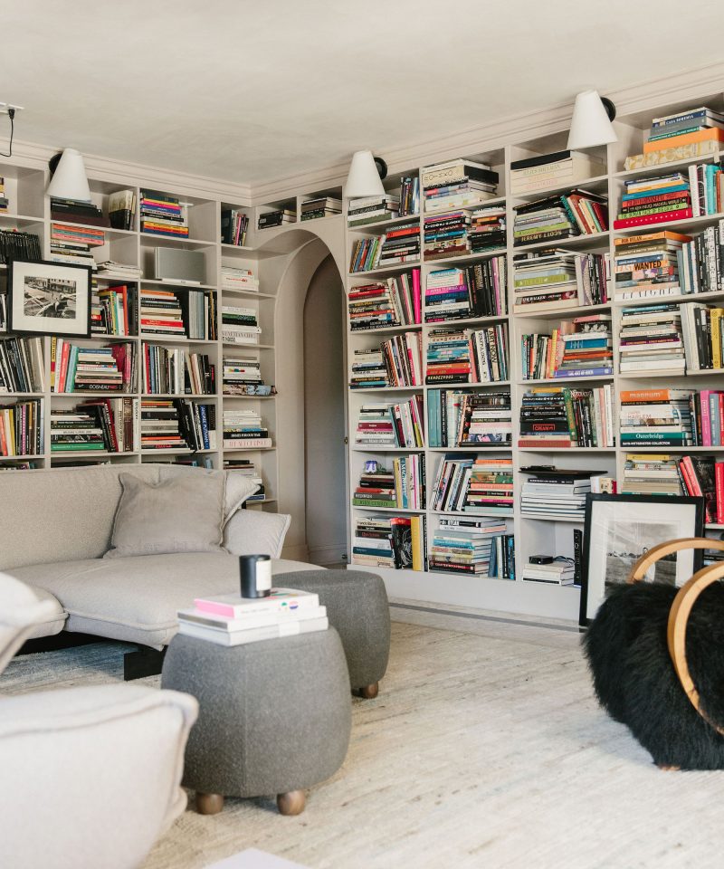
I also love how Romanek uses color in subtle, yet striking ways. Her book collection is the means to add vibrancy to this otherwise neutral library. The pops of blue and pink mimic the colors you see in the artwork dotted throughout the rest of the house.

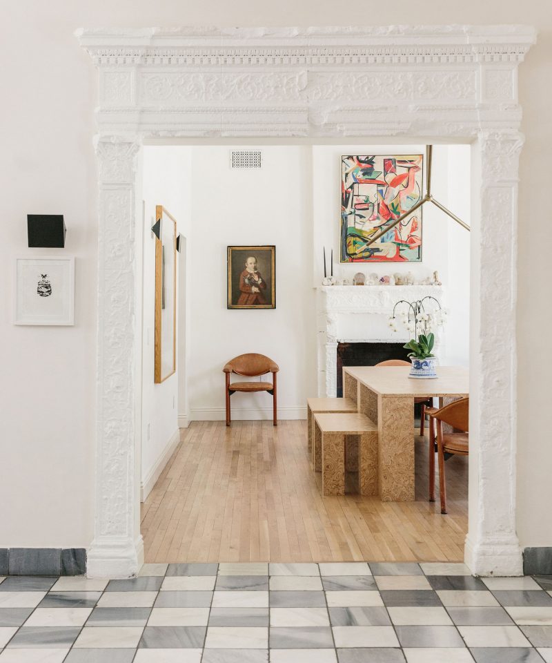
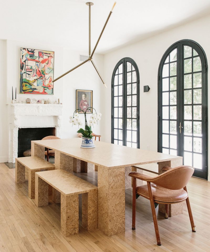
Like the colorful vintage abstract painting serving as the focal point in her formal dining room.

Tour this house filled with Hollywood history on apartment 34

There’s an art to Romanek’s mixing that could end up jumbled and too disconnected in the wrong hands, but she does an amazing job connecting tones, lines and textures that pull disparate pieces together.

Tour this house filled with Hollywood history on apartment 34

But what I really love about Romanek is that she’s self-taught. Less than 7% of all interior design degrees are going to Black Americans, but Romanek did not let that stop her. Instead, she pursued a passion and champions constant learning and self-improvement. Too often women use a lack of experience or formal education hold them back from starting their own businesses – a concern that doesn’t seem to hinder men nearly as much. Brigette is a wonderful example of simply jumping in and trying – obviously to great success. This is a great article about her journey.

Tour this house filled with Hollywood history on apartment 34

I’m certainly getting a ton of inspiration from this house – from wanting to add a more eclectic mix of art to This Old Victorian, coveting an impressive indoor tree and considering starting my own jumbo crystal collection!

I’m excited to watch where Romanek Design Studio goes from here.

For out entire Home Tour archive, CLICK HERE.


images by nicki sebastian for jenni kayne

I have always loved finding gorgeous homes to share with you. Someone’s home tour, ie how others are actually living, is always one of the best ways to find inspiration for your own space. However, I’ve come to realize that I have done a terrible job taking conscious action to share work by BIPOC designers, makers and artists. This stops today.

As I’ve been listening and learning these past few weeks, I’ve discovered a bevy of designers whose work is speaking to me – and I think they’d speak to you too. For the next week I’m going to sharing some of my favorite finds. Today, I am thrilled to introduce you to Kelly-Ann Baptiste of Pure Collected Living. Her vibe; calm, restrained and elevated is so soothing and exactly what I’m gravitating to at the moment.

Pure Collected Living

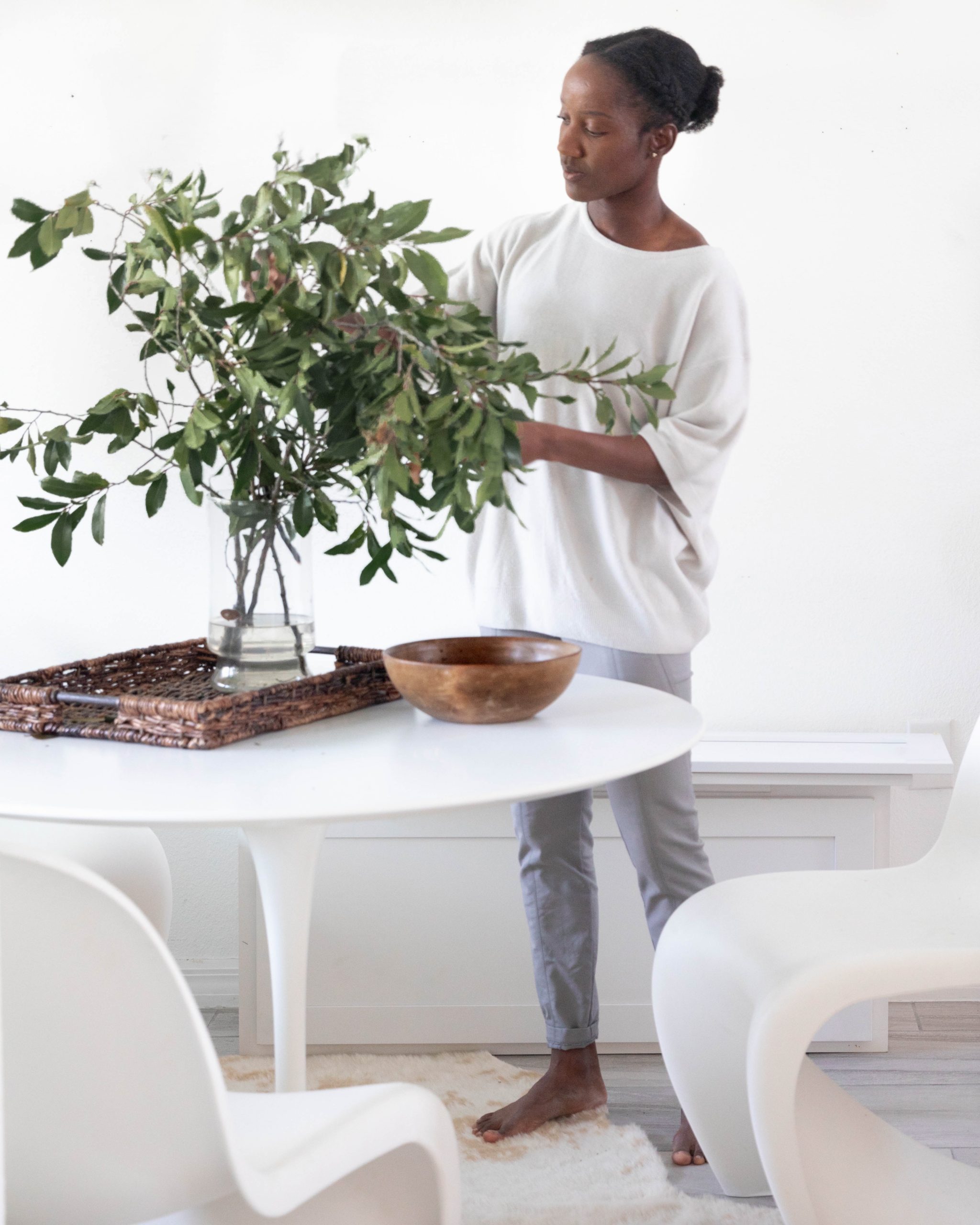
Fun fact about Kelly, she’s a four-time Olympic athlete for her native country of Tobago! While she now resides in Florida, you can see how her global travels competing all around the world influenced her style, creating an appreciate for the perfect balance of modern and vintage. In fact, Kelly has sourced a vast majority of the pieces in her own home from thrift stores!

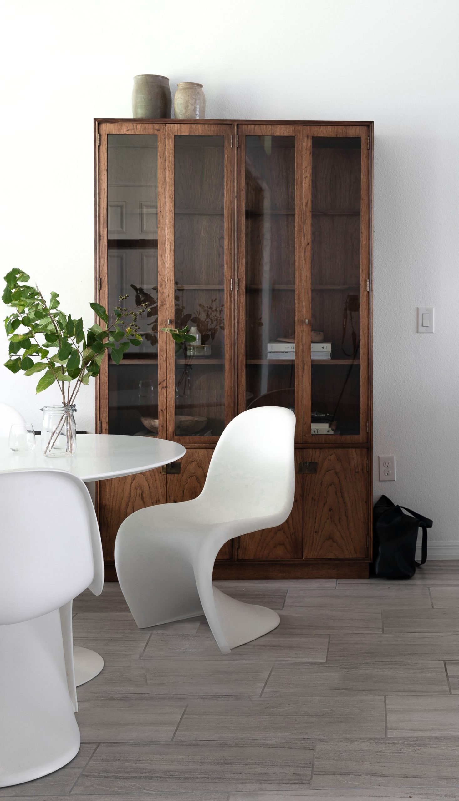
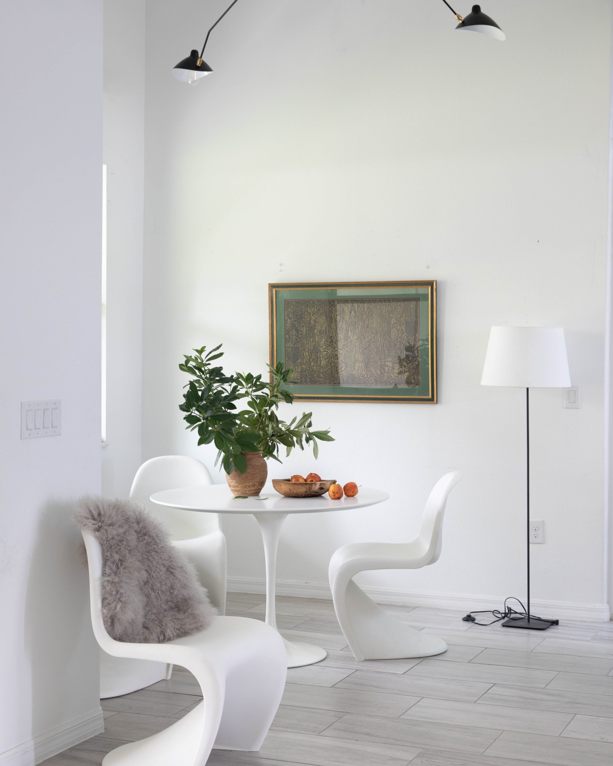
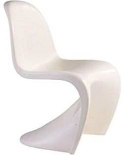
Kelly uses one of my favorite juxtaposition techniques, combing a classic Saarinen-style table and chairs with a traditional hutch. The effect is warm but minimal at the same time.

Pure Collected LivingPure Collected Living

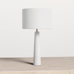
I spy more foraging! You really can never go wrong with a lovely branch in an equally striking vessel. I’m also obsessed with Kelly’s pleated lampshade. I’ve been searching for options for our bedroom, but I strongly suspect this one was thrifted along with that amazing lamp.

Kelly’s consistent color palette brings cohesiveness to her whole house. It’s her mix of natural materials, wools, ceramics, linen, glass, wood and metal that keep everything from feeling too monotone.

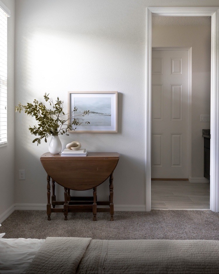
Styling tip: do you notice how Kelly’s art is off-center above her console table? This asymmetrical design allows her to create balance with the vase of branches. I also love how the round side of the folding table mimics the round shape of the rings that sit atop it.

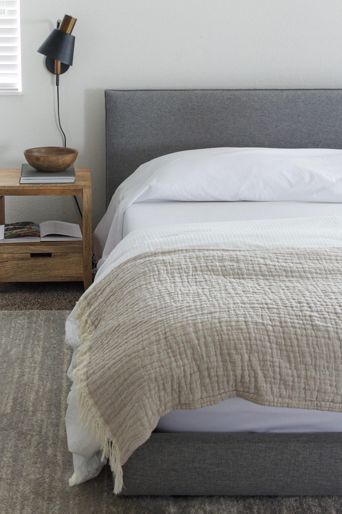
You know I’m obsessed with different ways to make a bed. I love the Euro look Kelly used here. The duvet folded back and the simple crisp sheet is so inviting. But what I really love about Kelly is her insightful advice she’s sharing on her site Pure Collected Home. Her posts include great tips, inspiration images and round ups of her go-to products. She regularly champions the mix of high and low, traditional and modern, vintage and new. I think she’s created the perfect combo of all of the above in her own space. I highly recommend you give her a follow!

For years, our Gotta Getaway series has been a staple on this blog. Travel is one of my main forms of therapy. I use it to clear my head, get perspective and be re-inspired. Even during the times when I didn’t travel much, like when I’d just had a baby, I was constantly thinking about travel, planning it, wishing for it. While we might all watch our 2020 travel plans slip away and wonder when we might get to enjoy safe travel again, I do think it’s important to continue to dream, wish and plan – even if it’s for an unknown future.

So at the risk of torturing you (and myself!) I’m starting a new series – Daydream Destinations, basically as a way to bank a list of all the places that will be atop my travel wishlist once the world comes out the other side of this pandemic.

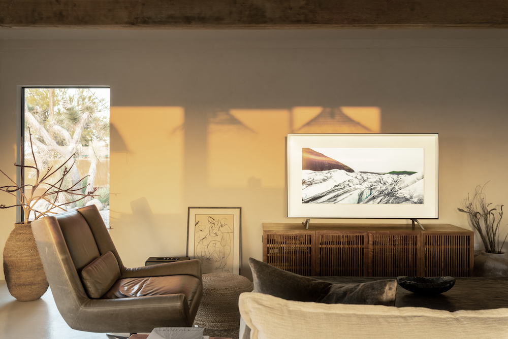
And I’m starting with a relatively attainable option – a stunning Airbnb tucked away in Joshua Tree – Villa Kuro.

Villa Kuro on apartment 34Villa Kuro on apartment 34

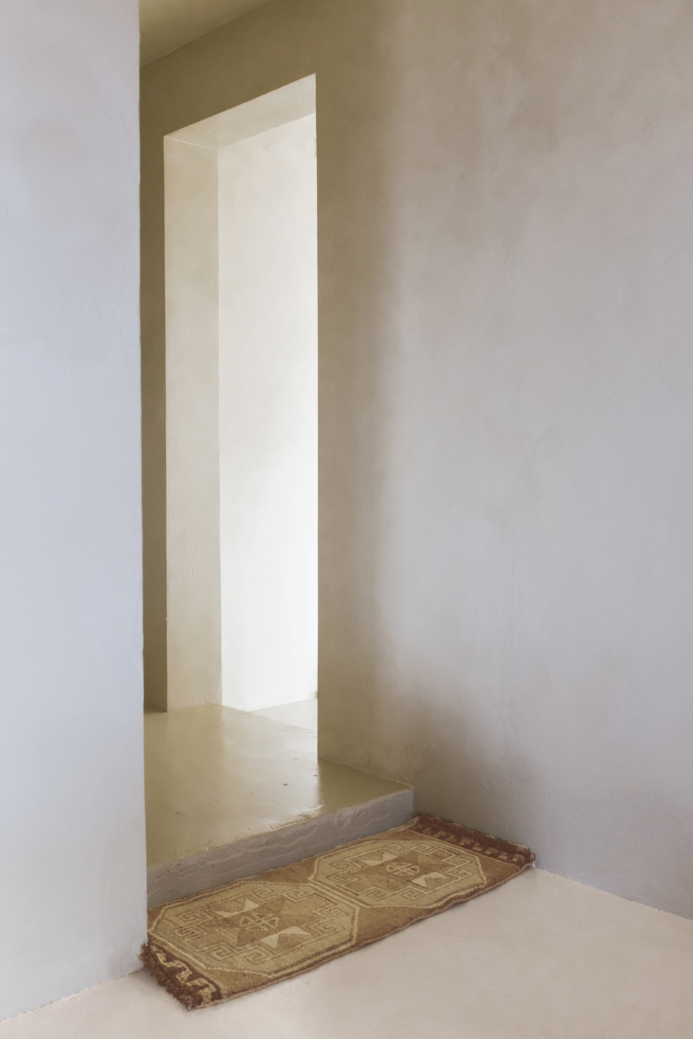
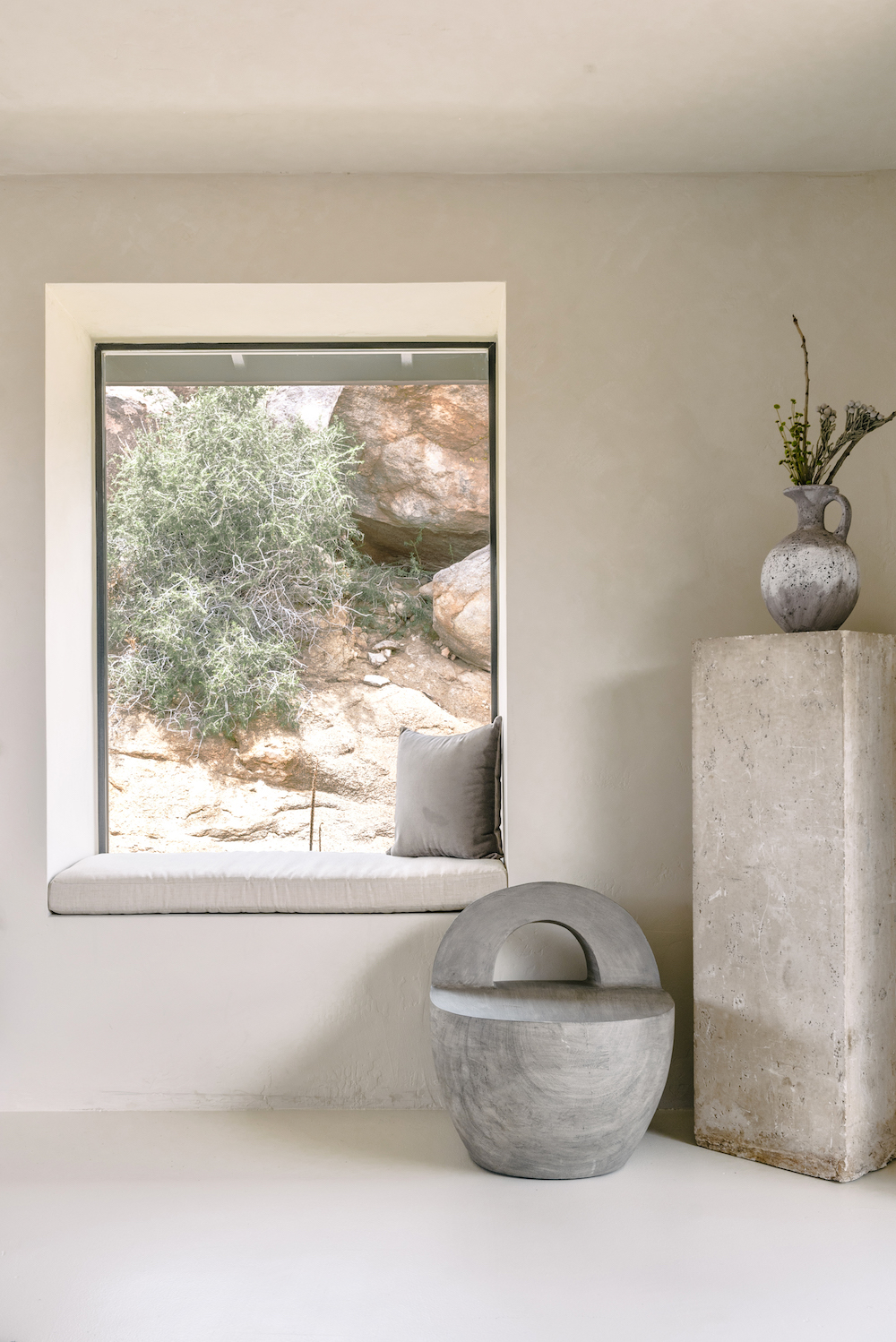
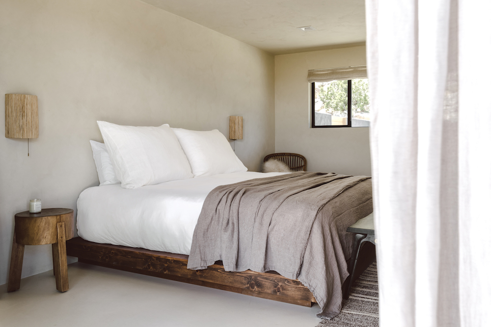
Set in the beautifully remote hills of Joshua Tree National Park, Villa Kuro is a much needed reprieve from your typical Palm Springs vacation rental. No swinging 60’s decor, no bright colors, no manicured lawns. Instead, this space is subdued. It is serene. It feels like you’ve been completely transported. Oh what I wouldn’t give to be transported right about now.

This stunning, tranquil space was actually on my radar before this all started. I’m kicking myself for not getting there when I had the opportunity last fall.

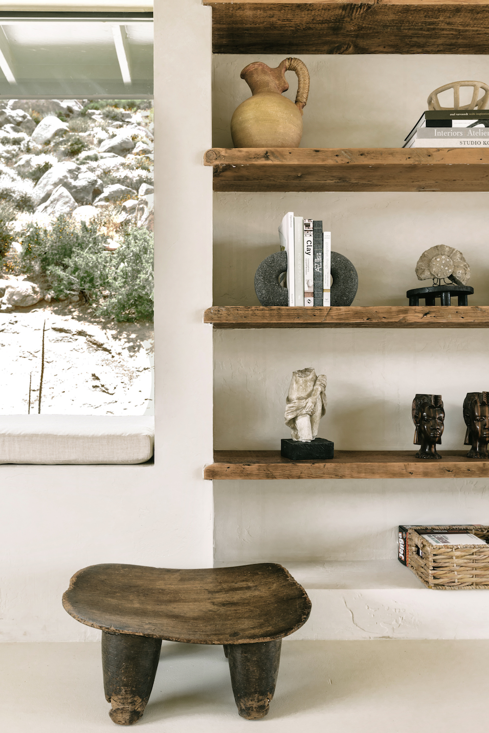
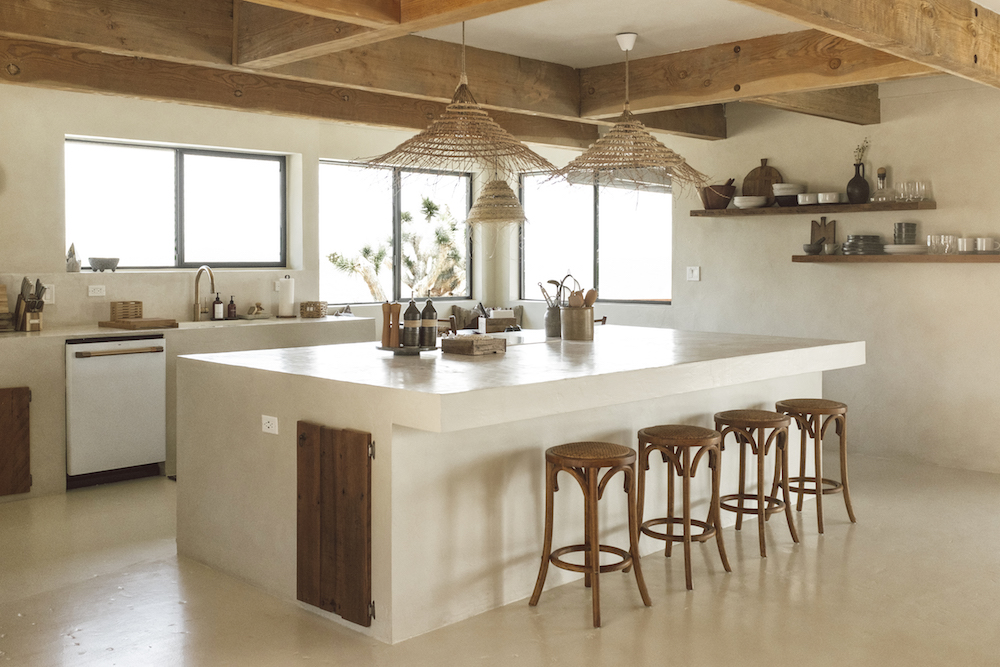
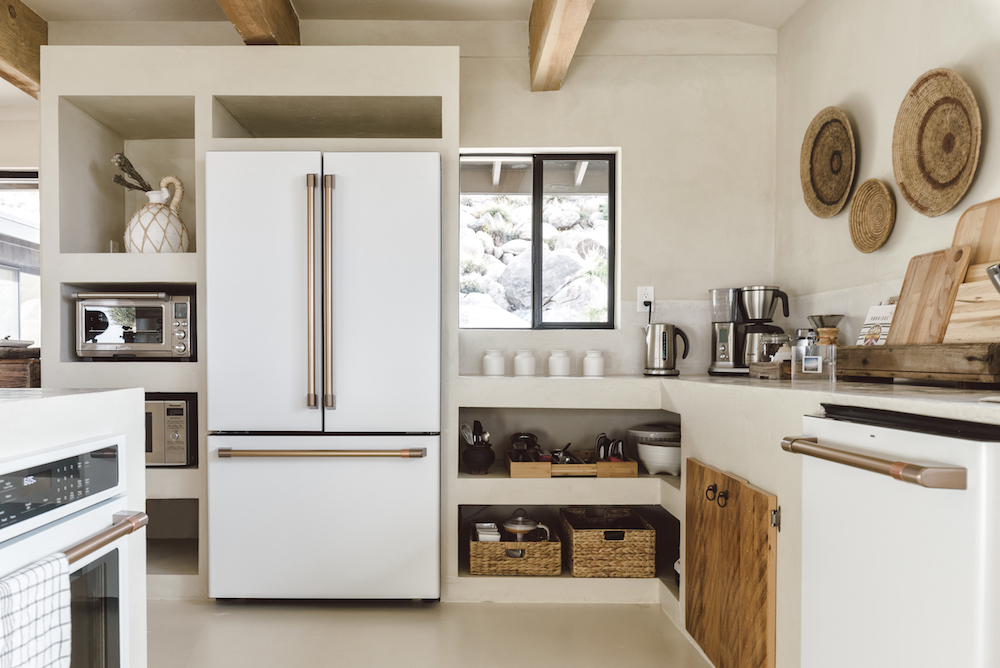
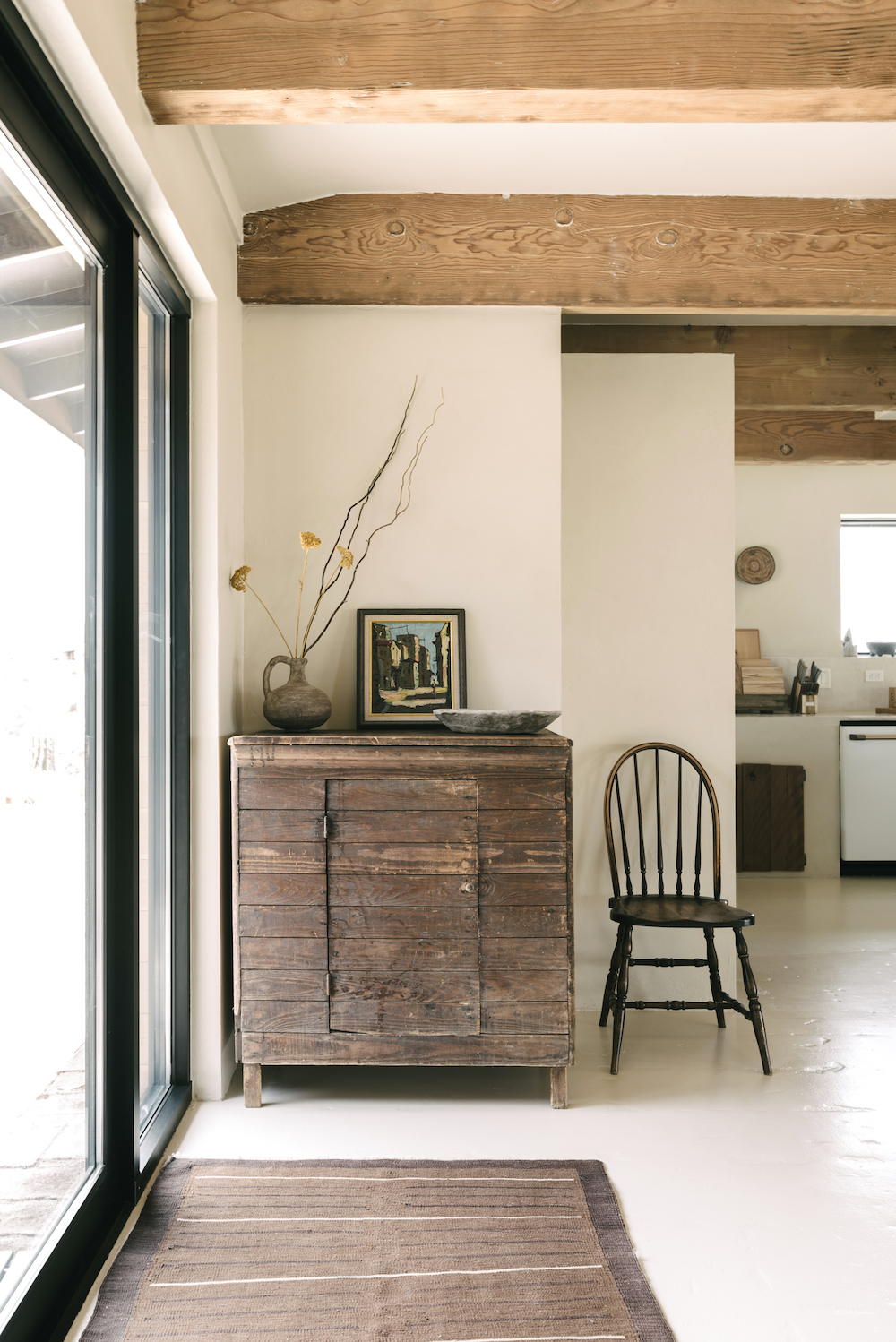
I love the white appliances in this kitchen – I think they’re making a comeback! The built-in niches also offer a laid-back, yet architectural storage solution. Wood beams in the ceiling warm up all of the hard surfaces.

Villa Kuro on apartment 34

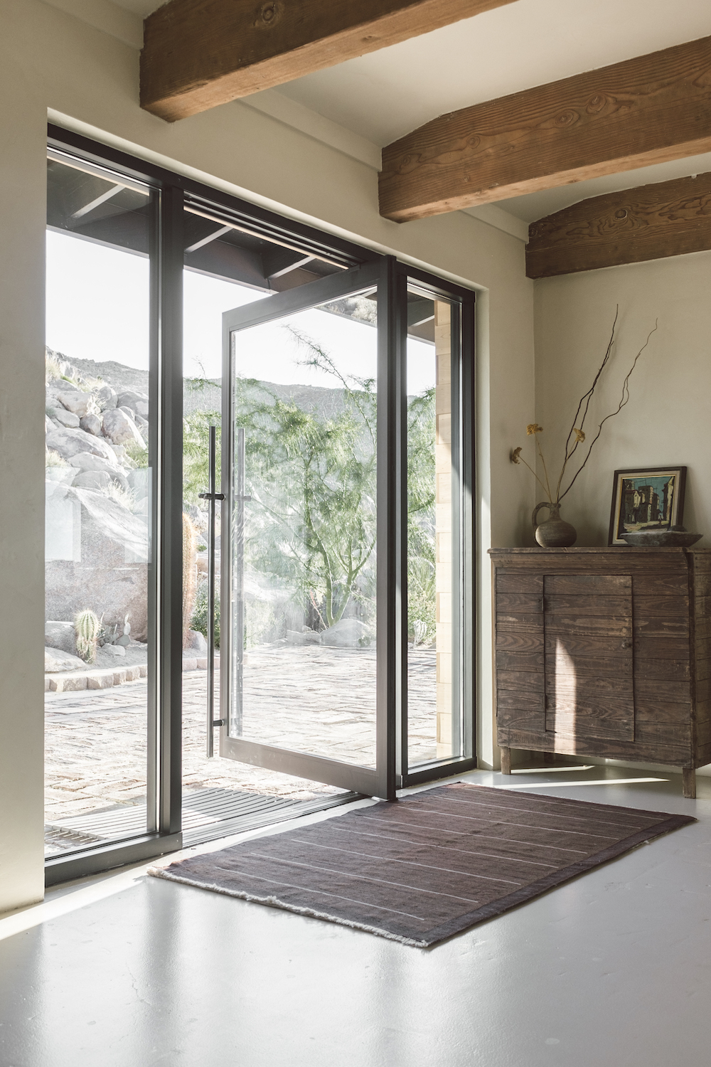
Renovated with a nod to wabi-sabi, what was a 60’s ranch style house now features natural materials and textures, highlighted by oodles of natural light flooding through the oversized doors that connect you directly the desert landscape beyond.

Villa Kuro on apartment 34

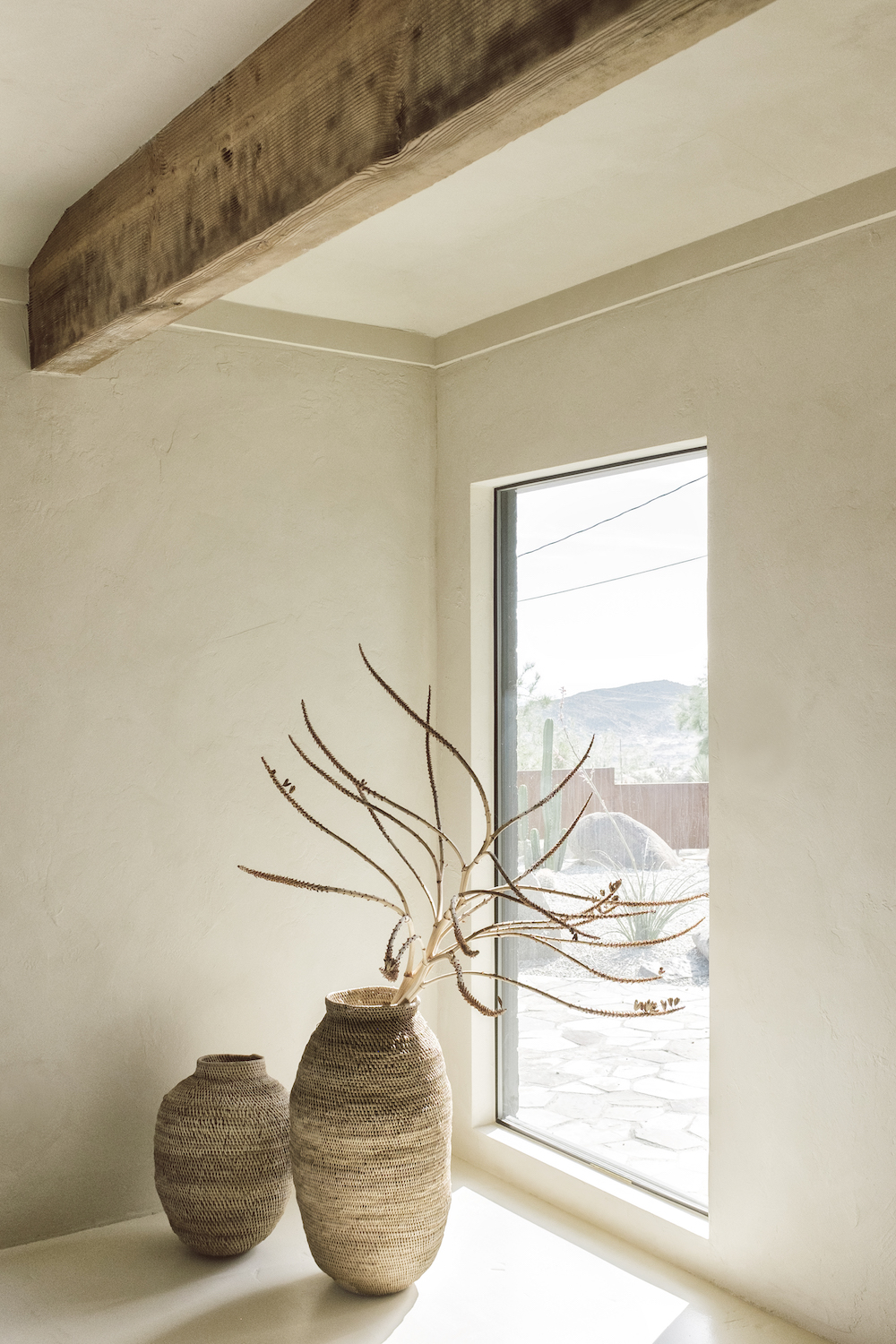
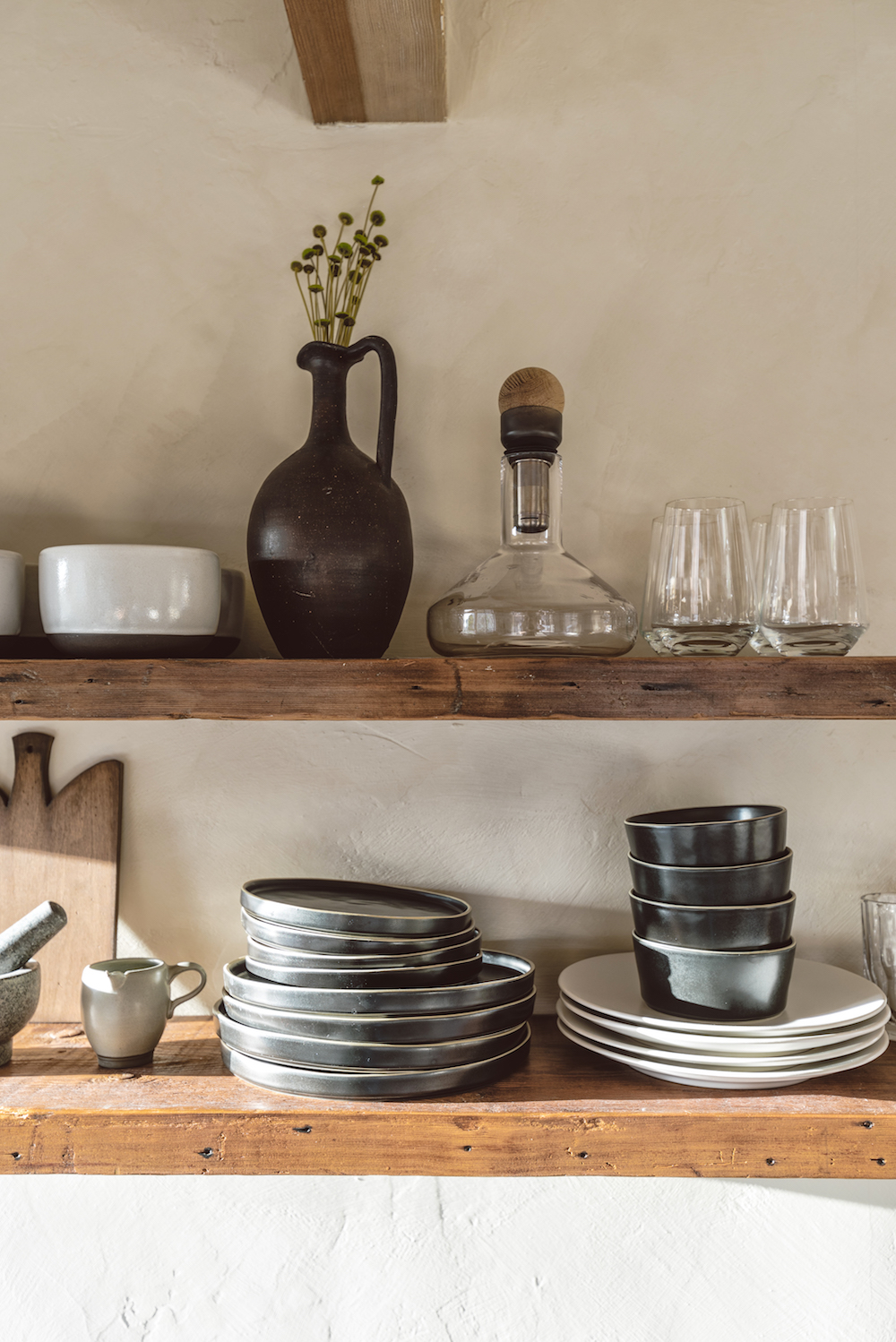
I spy foraged branches! You see – the trend really does work no matter where you are.

Villa Kuro on apartment 34 Villa Kuro on apartment 34

A perfect mix of both custom, collected and vintage furniture add to the highly curated vibe of the home (the TV also comes pre-packaged with all your Netflix binging needs – but we may have watched everything that’s ever existed by the time we get here).

Villa Kuro on apartment 34Villa Kuro on apartment 34

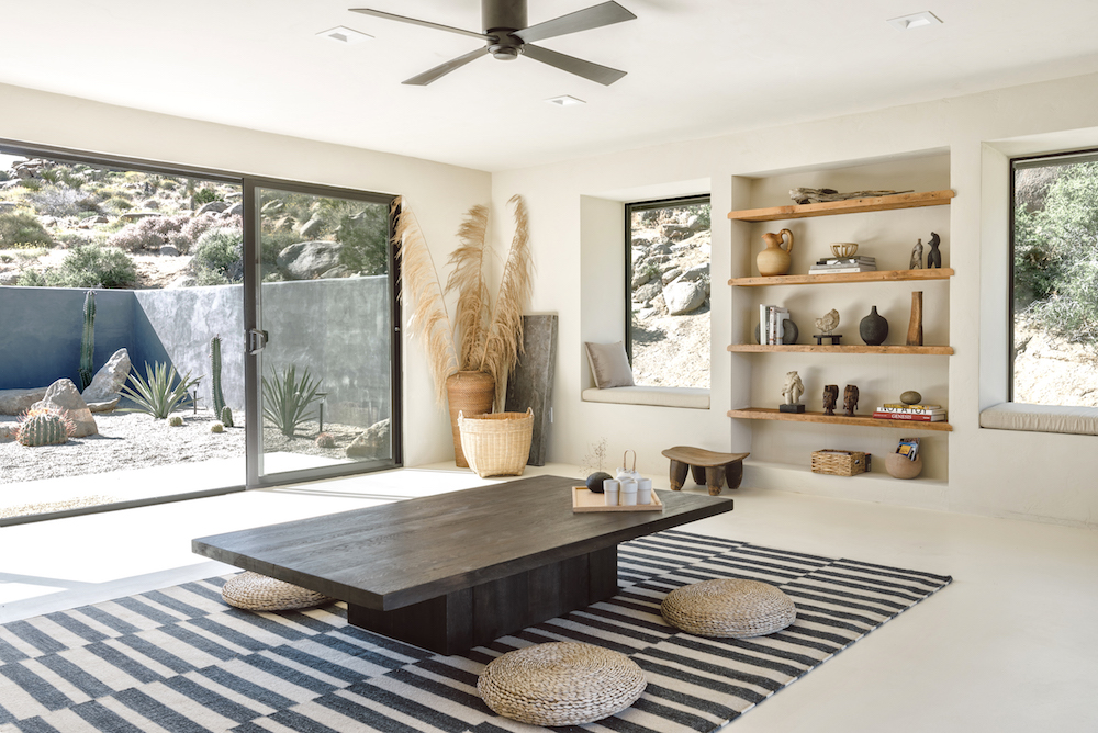
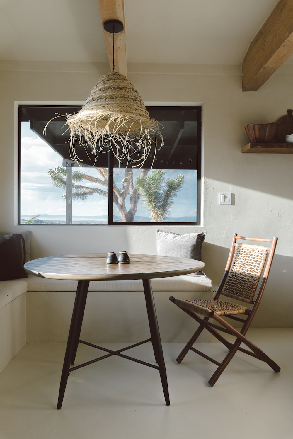
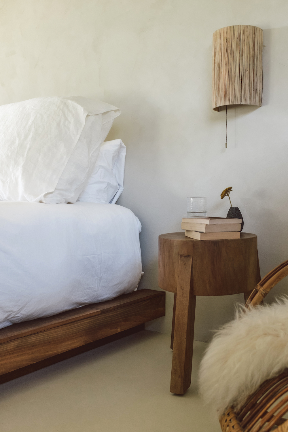
But the piece de resistance of this vacation rental has to be the tea room – seen in the first image in this post. The designers realized the original garage had the property’s best views so they converted it into a tea room / meditation space, complete with a low slung table, woven mats for sitting and a desert zen garden. What I wouldn’t give for a little more zen right now.

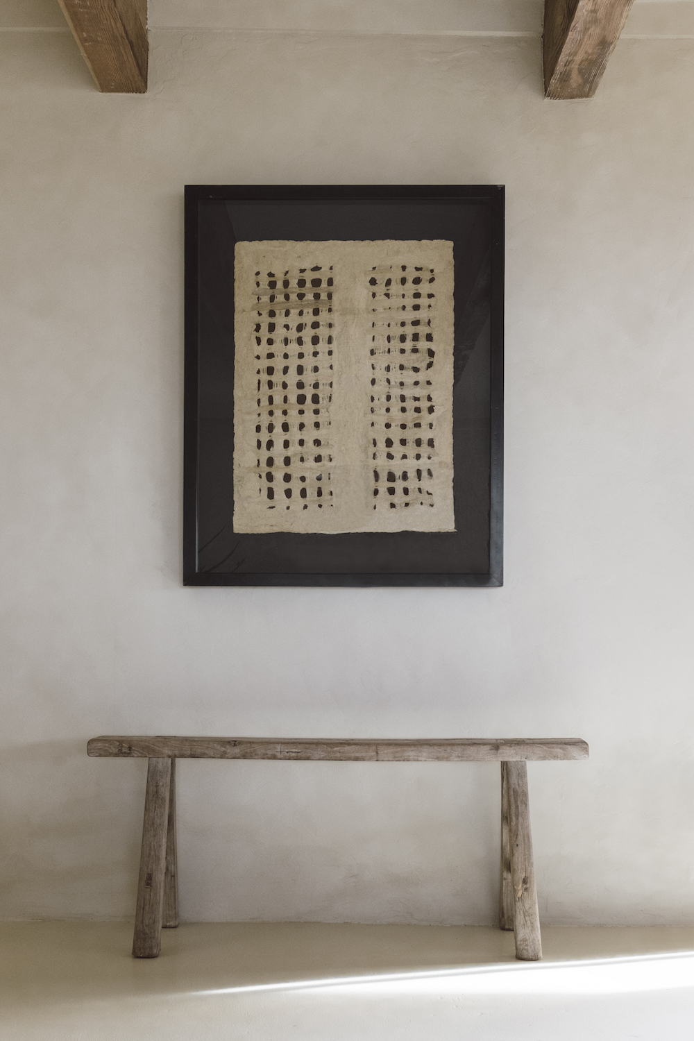
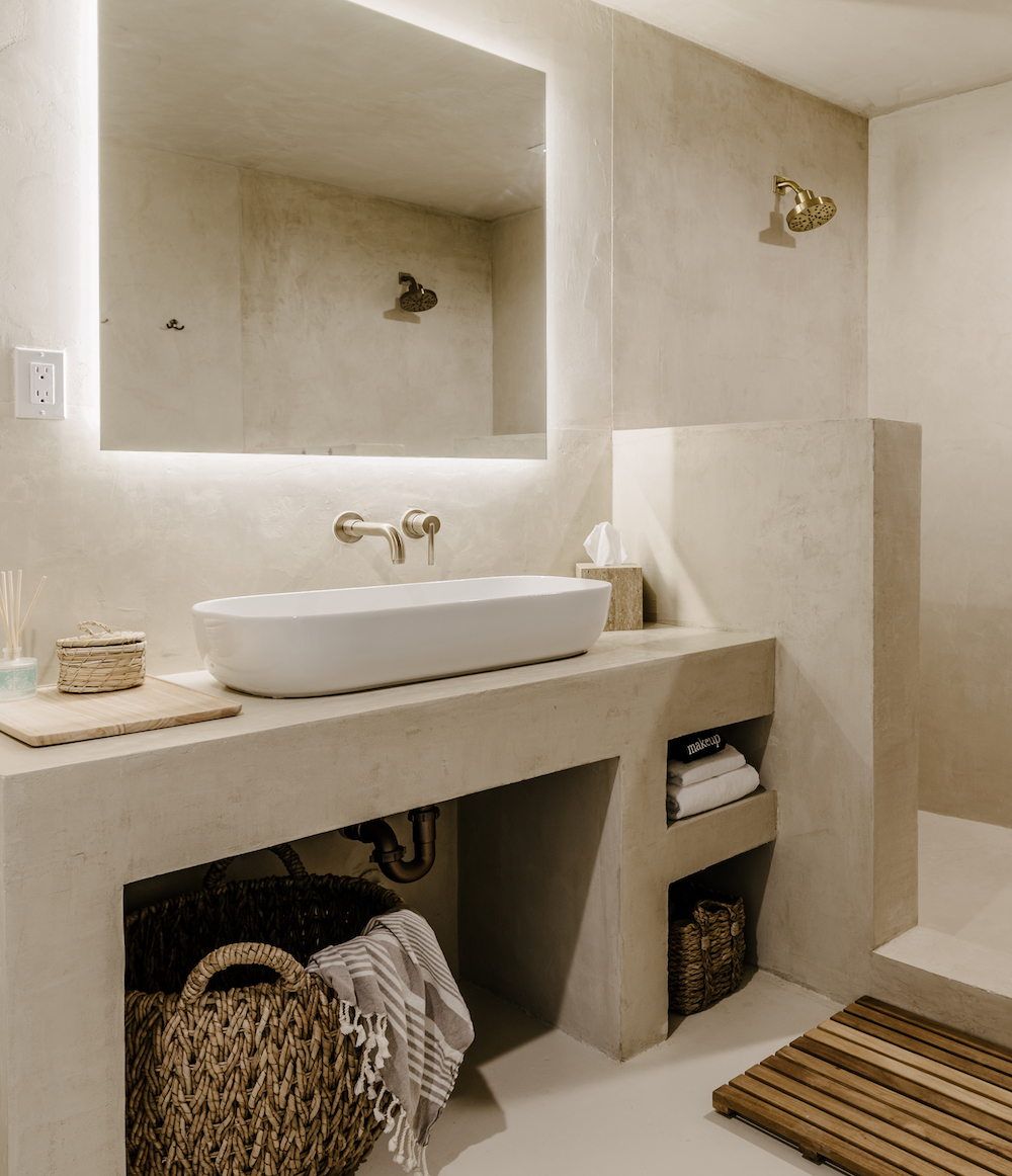
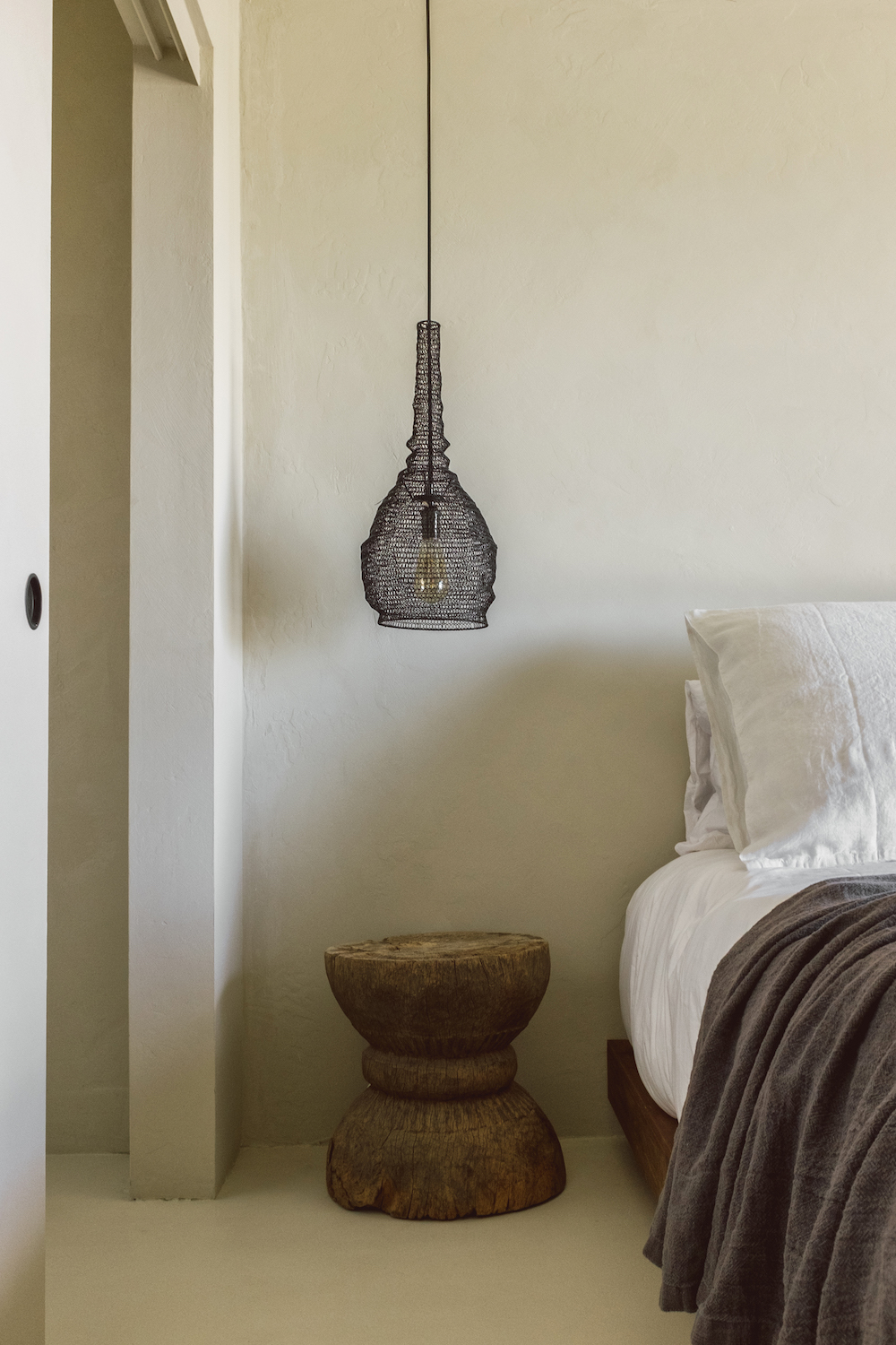
I love the mix of woven elements  used throughout this house – lampshades, baskets, rugs – they juxtapose with the smooth plaster walls so beautifully. Also is anyone else noticing that backlight mirror in this bathroom? Genius move.

Being home is showing us how little we truly need to survive – food, family, a comforting environment – but I do think stepping outside the confines of our world offers points of view you really can’t acquire from your couch.

And I love Villa Kuro’s point of view.

While I’m certainly no medical expert, I’m beginning to consider staying in a vacation rental sometime over the summer. Vacation rentals in California are starting to become available again now. Maybe we won’t have to leave Villa Kuro in the day-dream category for too long.

images courtesy of villa kuro

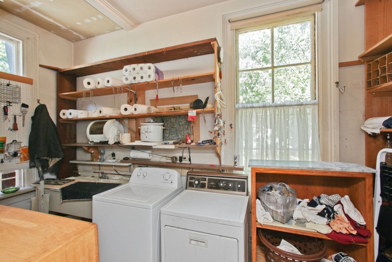
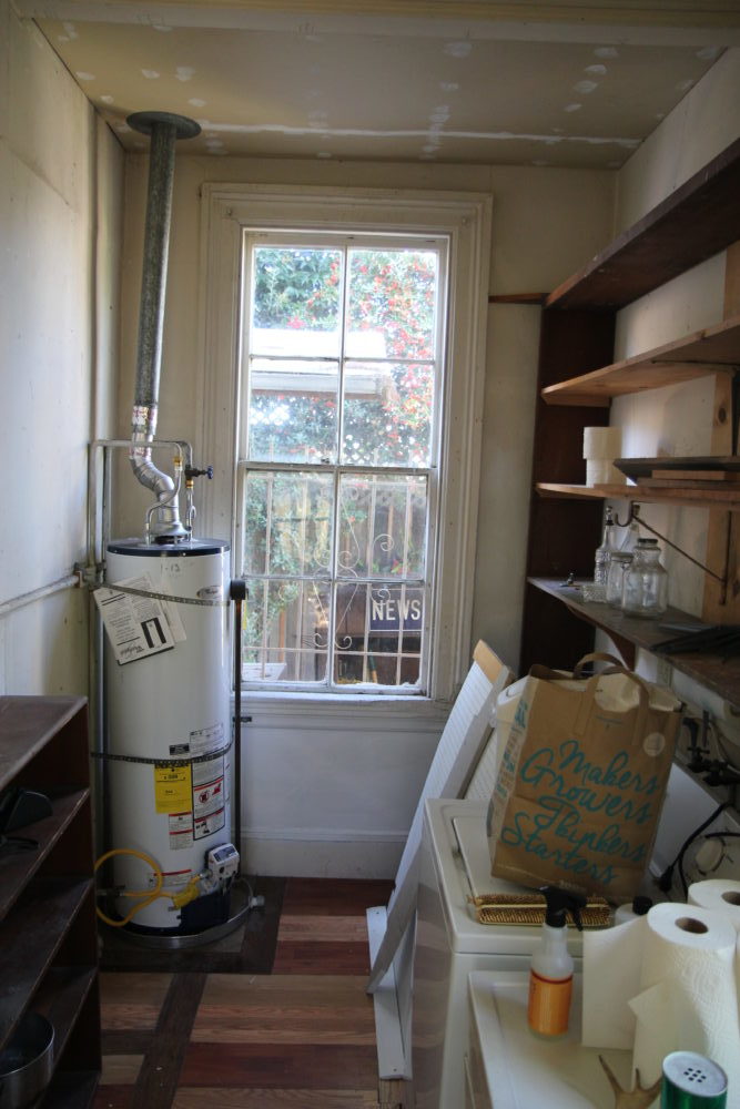
I have been waiting so long to finally get to “tour” you through This Old Victorian. However, doing said tour in blog post form is a bit more challenging than I thought. Hence it’s taken me more than a week to get this all together! Remember Instagram was barely a thing and Stories, Snapchat and TikTok didn’t exist when we bought our house in 2014 so I have ZERO videos of our reno. Seems crazy, right? Therefore, I feel an Instagram video tour series coming on! For now, I want to  share the dramatic before and afters of each space, give you a bit of a behind the scenes peek at our renovation and share a few (of the million!) things I learned about tackling a renovation of this scale.
This Old Victorian Reveal: 1st Floor Before, Design & After

To recap for those who haven’t followed since day one, we purchased a Victorian in San Francisco – an Italianate to be exact – five years ago. It was an exhaustive two year search, but finally found a gem. It just happened to be a diamond in the rough. It estimated build date is the 1850’s, but the exact year is unknown. The home is on the national historic register and the previous owner, who was approaching 90 years of age, had owned the home for more than 45 years.

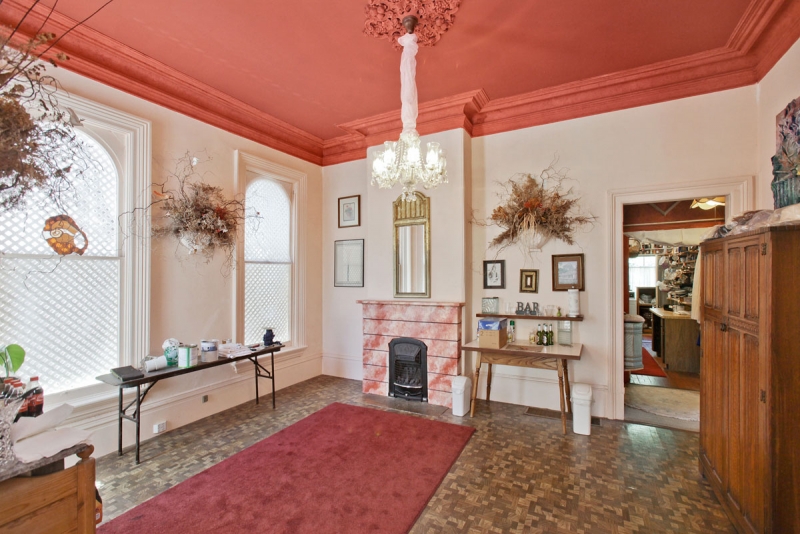
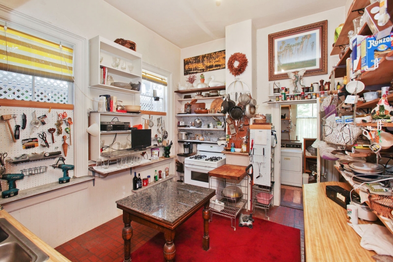
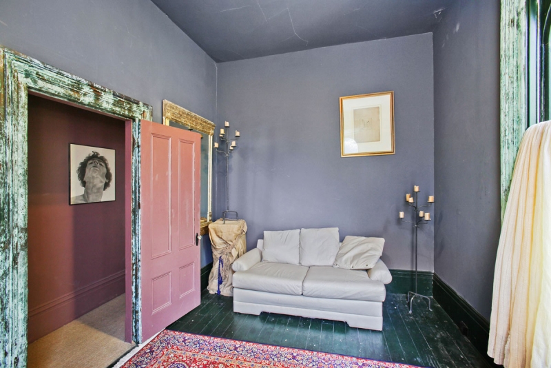
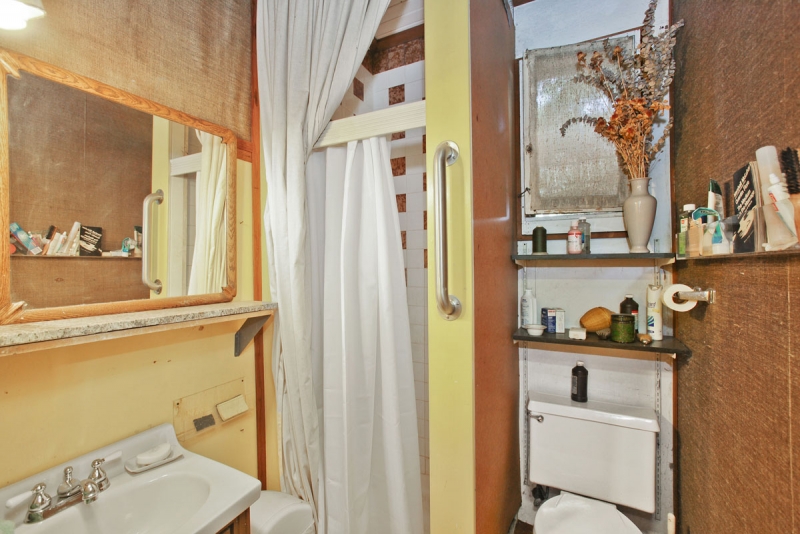
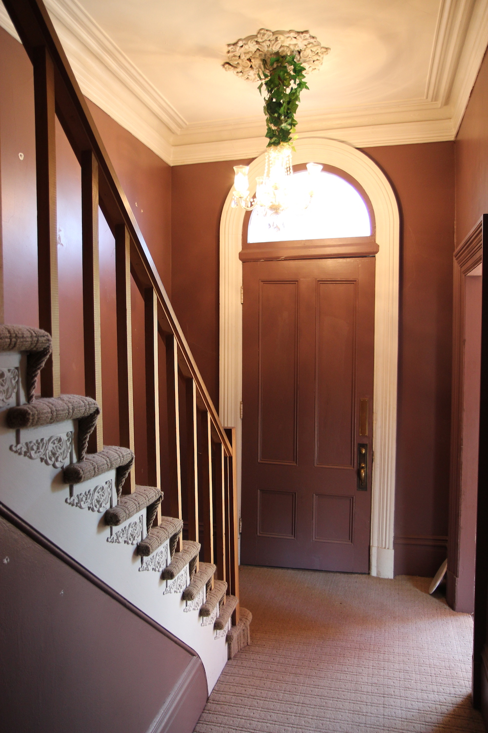
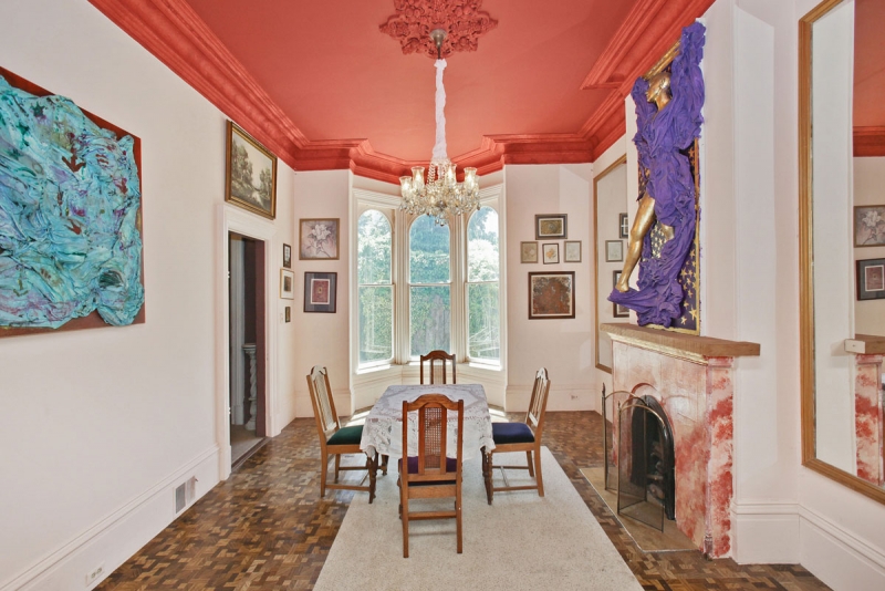
Let’s take a tour of the first floor before we touched it, shall we? You needed a little vision to see its potential.
This Old Victorian Reveal: 1st Floor Before, Design & AfterThis Old Victorian Reveal: 1st Floor Before, Design & AfterThis Old Victorian Reveal: 1st Floor Before, Design & AfterThis Old Victorian Reveal: 1st Floor Before, Design & AfterThis Old Victorian Reveal: 1st Floor Before, Design & After This Old Victorian Reveal: 1st Floor Before, Design & AfterThis Old Victorian Reveal: 1st Floor Before, Design & AfterThis Old Victorian Reveal: 1st Floor Before, Design & After

I knew as soon as we got the house (and looked past all the garish colors, the wall to wall carpeting and reams and reams of…stuff oh and the smell!), that I wanted to preserve the home’s amazing original historic details – original windows, crown molding, arched doorways, plaster walls and transoms to name just a few.

I was also clear that Victorian-era design – ie small closed-off rooms, no closets, zero storage, tiny bathrooms – was not conducive to modern day family life. I knew from the start that if we were going to create our forever home, we were going to have to make major layout changes. Enter our amazing architect Seth BrookshireWhile I thought I had tons of crazy amazing ideas to optimize our space, he had much better ones – and they were also structurally sound – ha!

Renovation lesson one: surround yourself with very talented experts.

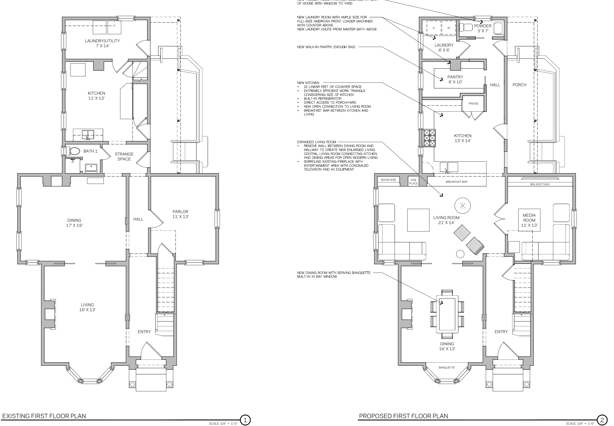
Here is a peek into how Seth proposed we rearrange the ground floor’s layout.
This Old Victorian Reveal: 1st Floor Before, Design & After

We actually changed very little structure at the front of the house. The entry and dining room retain all their original elements. We simply did our best to restore them. But as we moved deeper, the changes got much more substantial.

Our biggest structural change was the choice to remove two major walls to create an open concept living room and kitchen. This choice eliminated the long dark hallway and allowed the natural light from our 8′ tall windows to spill from one side of the house to the other. It also ensures that each room flows from one to the next.

Another significant architectural change was the elimination of an unnecessary back staircase. Removing the stairs allowed us to connect the house straight from the front door all the way back and made way for a large custom kitchen, adding a walk-in pantry, building out a dedicated laundry room and adding a powder room.

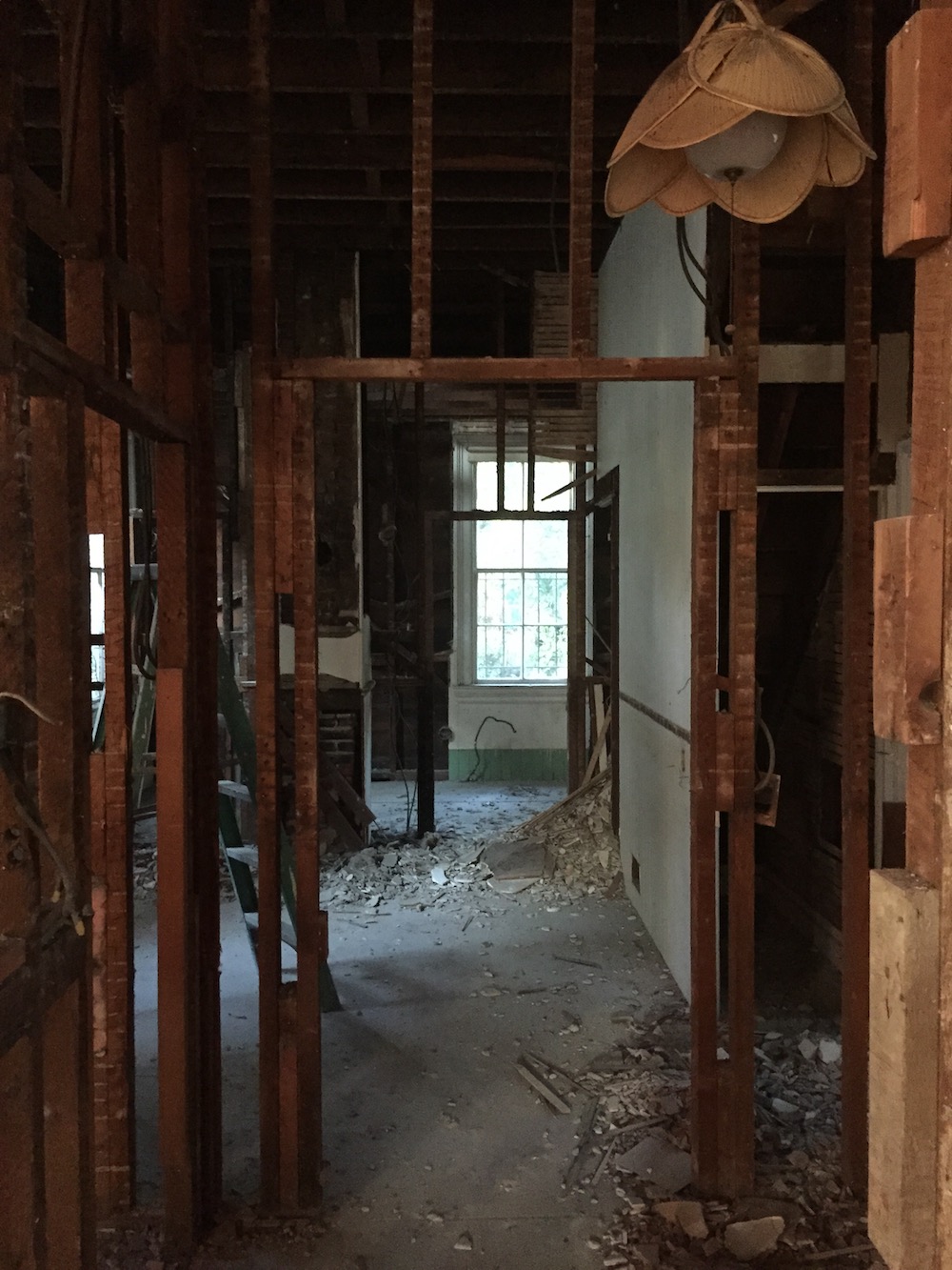
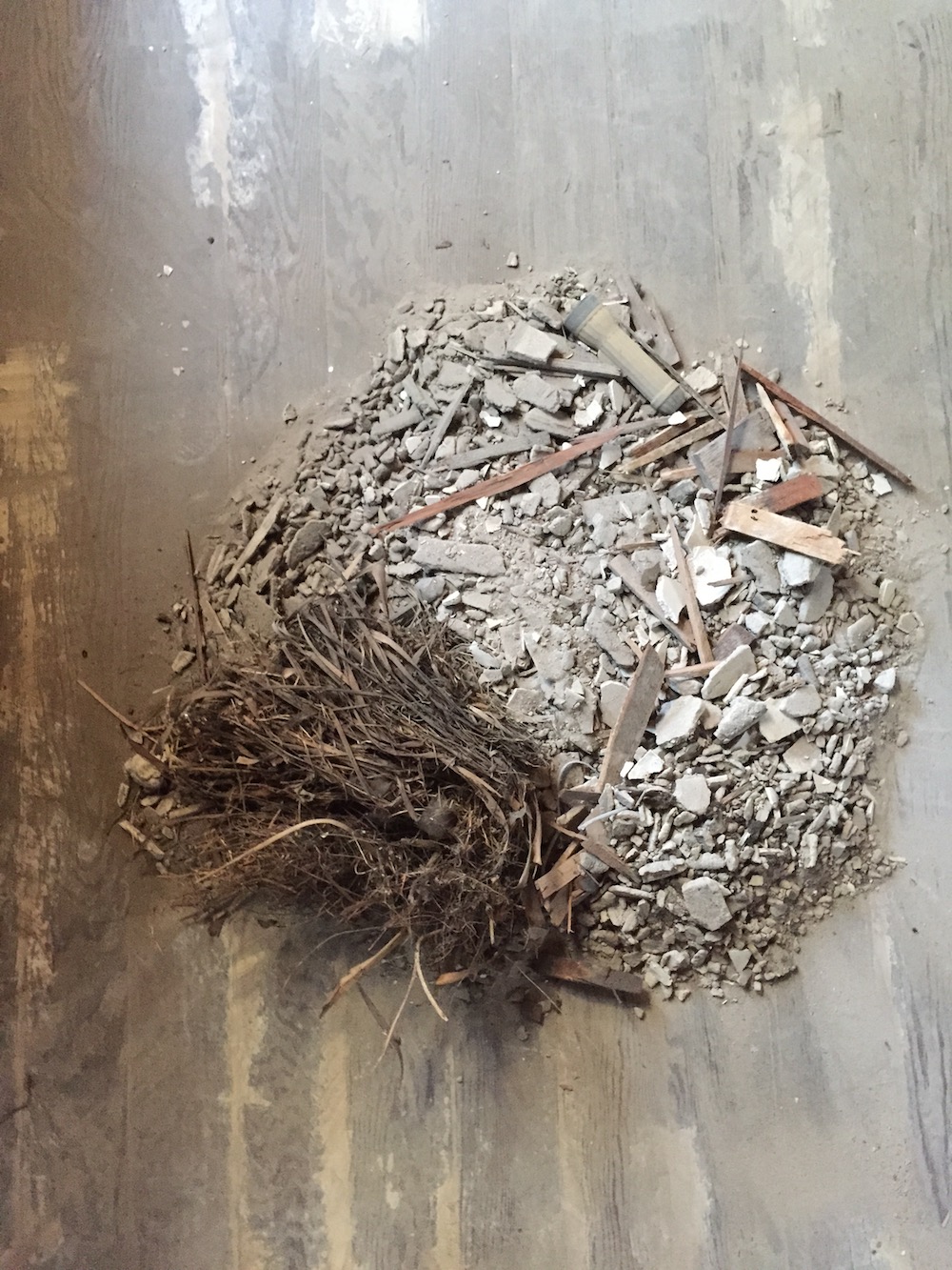
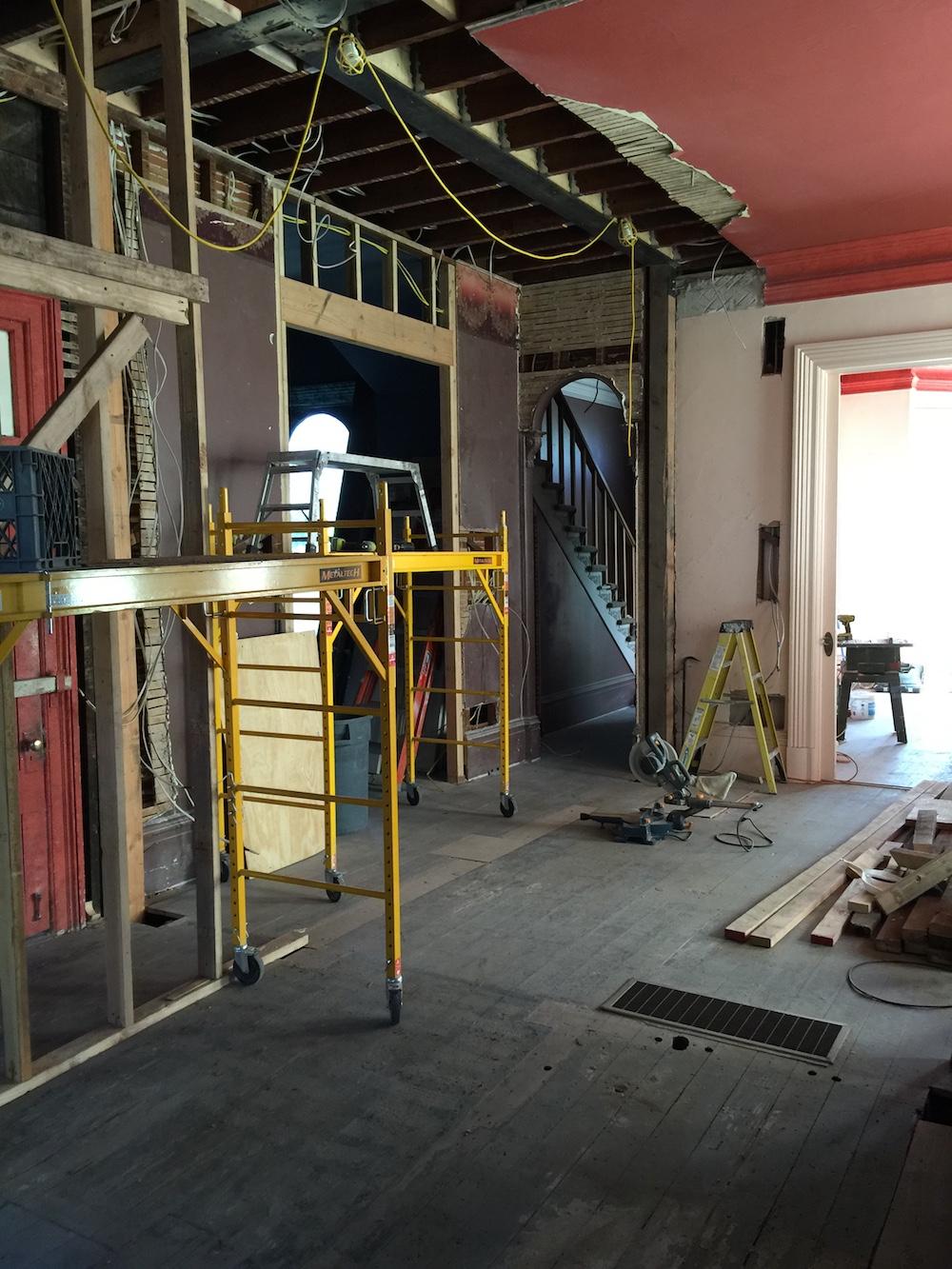
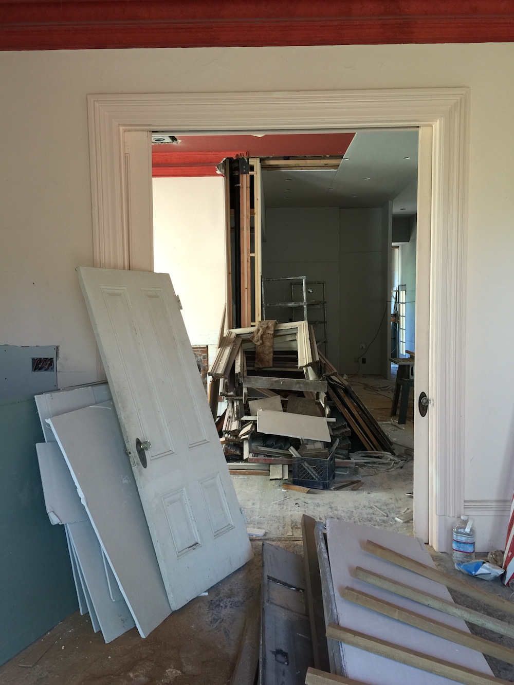
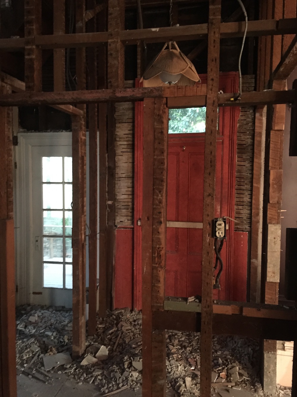
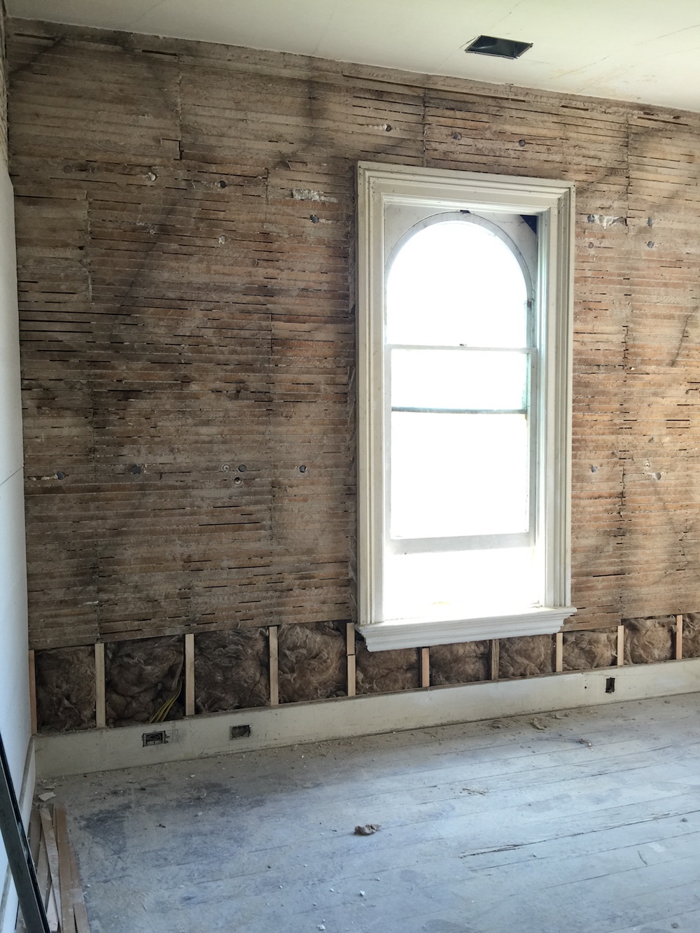
While it’s easy to summarize all this in writing, it certainly undersells the time, effort and insane amount of work and this reno required. Here’s a glimpse.
This Old Victorian Reveal: 1st Floor Before, Design & AfterThis Old Victorian Reveal: 1st Floor Before, Design & AfterThis Old Victorian Reveal: 1st Floor Before, Design & AfterThis Old Victorian Reveal: 1st Floor Before, Design & AfterThis Old Victorian Reveal: 1st Floor Before, Design & AfterThis Old Victorian Reveal: 1st Floor Before, Design & AfterThis Old Victorian Reveal: 1st Floor Before, Design & AfterThis Old Victorian Reveal: 1st Floor Before, Design & After

As the pictures above illustrate, nothing about our renovation was small. A sampling of the renovation and restoration punch list included:

  • Replacing all electrical
  • Replacing all plumbing
  • Insulating whole house
  • Repairing rot and and leaks
  • New roof
  • New floors
  • New windows
  • New heating and hot water systems
  • Restoring plaster
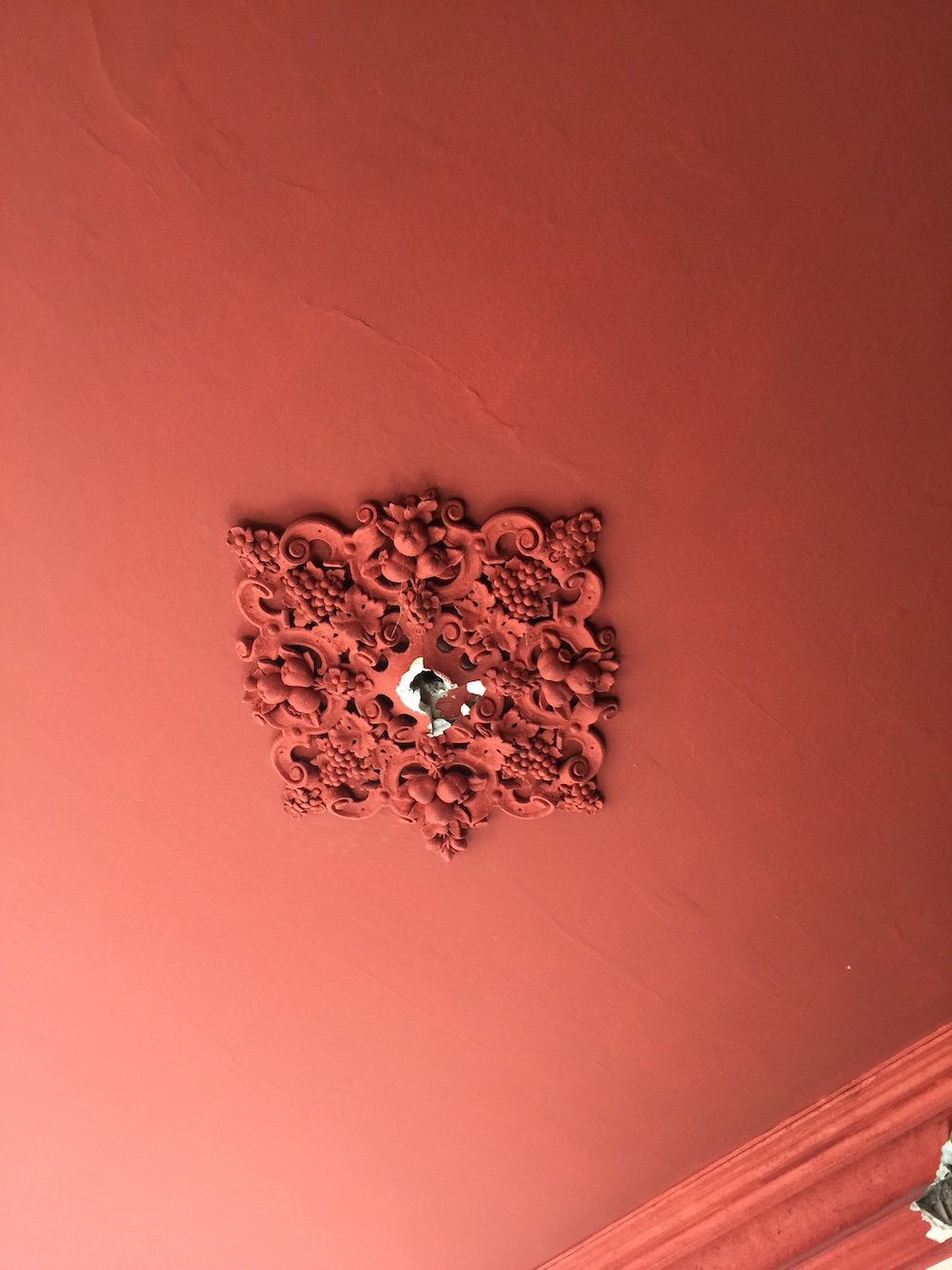
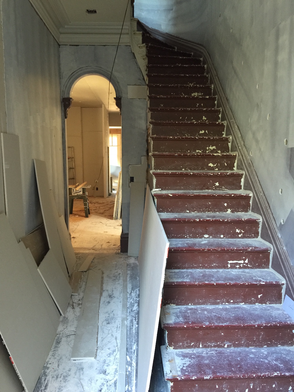
  • Restoring staircase, four fireplaces, ceiling medallions

And then there were the actual major structural changes! We added three bathrooms, opened up the ground floor and created a kitchen from scratch. And while we had an amazing architect and builder, we did not have have a general contractor, leaving the procurement of materials, the management of schedules and the coordination of trades up to us. Having never undertaken a renovation of this scale, that was definitely a steep learning curve. And did I mention that I had a baby right in the middle of all this? I had to pick every single light fixture and outlet placement six weeks postpartum. I do not recommend this.

When it was all said and done, renovations took 20 months to get the house to a point where we could move in. But don’t mistake livable for done! We moved in with maybe 80% of the work complete. We quickly learned that the old adage is indeed true. Once you move in, the work slows down to a snails pace. Life gets in the way of construction.

While on the one hand the slow down was maddening, it also gave me time to take decorating deliberately. Intentionally. And with a lot of thoughtful consideration. When we moved in I made the commitment to hold out for the right thing, not just the expedient thing. Because when you put in a placeholder, be it a sofa, dresser or even a light fixture, it’s likely to stay for years. I’m sure this has happened to you too. I did not way to fall prey to that trap. Instead, rooms sat nearly empty for months (to years!) on end while I slowly but surely figured out what both the home and we really needed.

I would like to say my patience paid off. I hope you think it did too. Here is the official after tour of our ground floor!

This Old Victorian Reveal: 1st Floor Before, Design & After

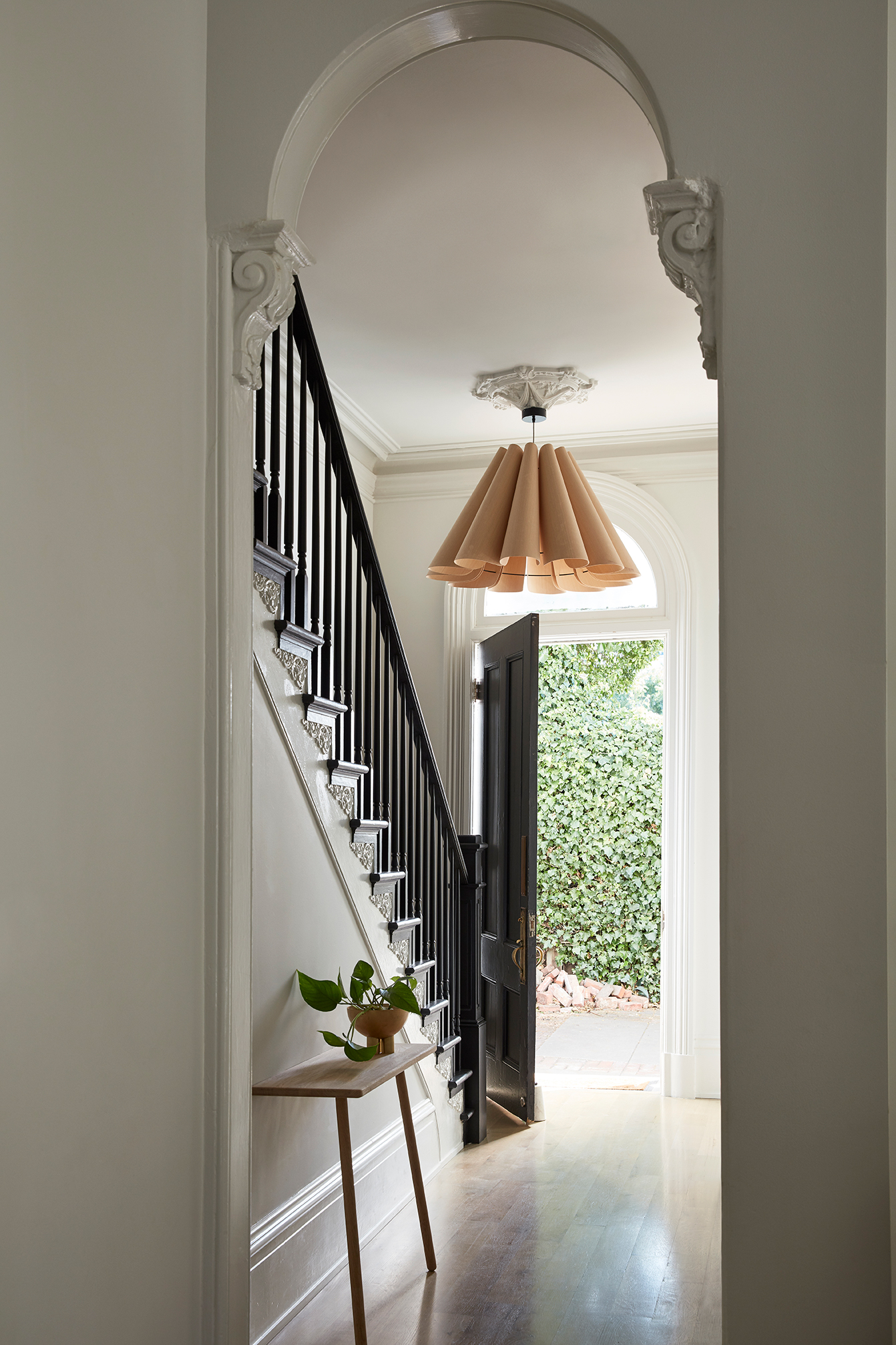
A clean black and white palette greets you as you as the enter the front door. We had to restore the staircase, recreating a period appropriate newel post and bannister as well as recreating a historically accurate plaster ceiling medallion. The oversized pendant by WEP (which I stalked for years after seeing it in an 2012 issue of LivingEtc) offers the air of grandeur this house demands. The leaning console by Skagerak creates the perfect unobtrusive place to drop keys and mail. The arched transition is original and one of my favorite details.

This Old Victorian Reveal: 1st Floor Before, Design & After This Old Victorian Reveal: 1st Floor Before, Design & After

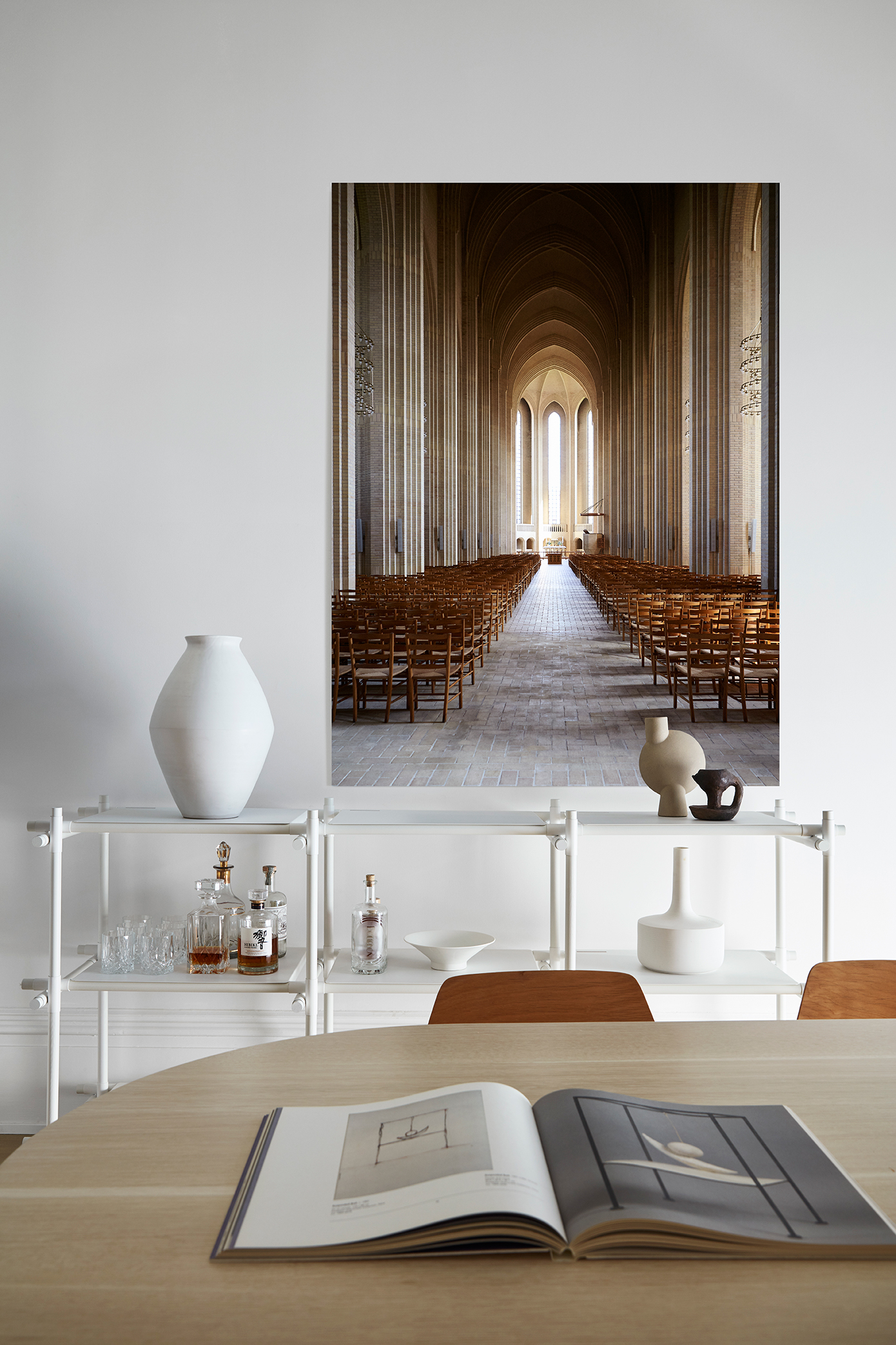
The dining room really showcases some of the home’s original architectural gems that makes my design loving heart smile. The layers of crown, the ceiling medallions, the fireplace and bank of bay windows are all built in design elements I’m lucky enough to get to play with. I wanted to create a design aesthetic that both matched that grandeur of the house’s scale, but was also allowed for comfortable family life. I would describe my final design for this house as old world European meets easy California living. The lines and details are refined and pared back, but also warm, inviting and livable. The dining room really embodies the old world European feel.

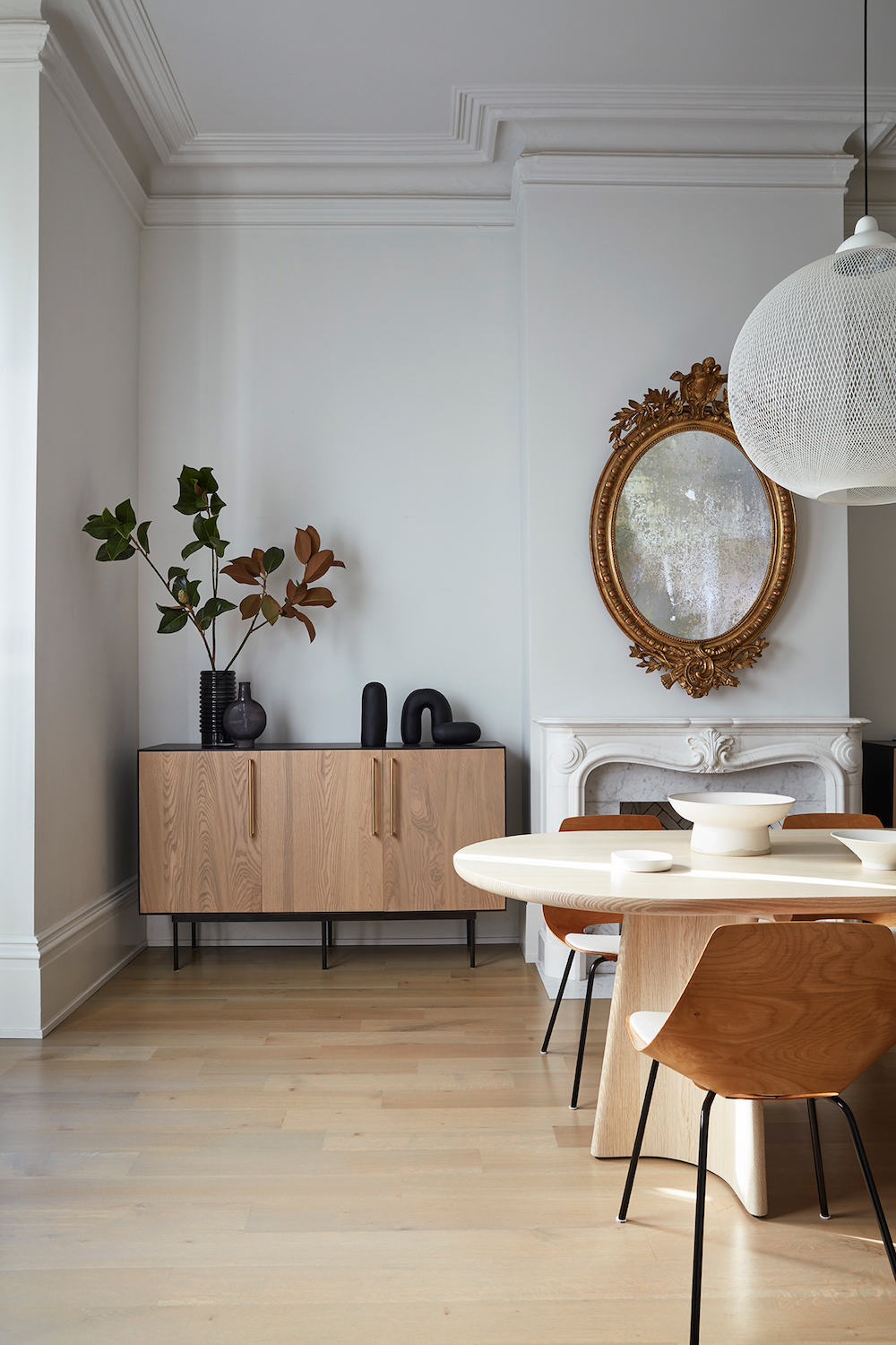
Custom credenzas by Lauren Nelson Design flank the fireplace and offer the storage and functionality I needed, with beautiful modern design I love. It took some time, but I finally realized that the dining room’s dimensions required a custom dining table. Thanks to Instagram, I found a local woodworker with whom I worked to design a custom racetrack table in a stunning bleached oak. It took over two years of scouring 1stdibs to find the oval antique mirror that now resides over the fireplace (which we restored to a historically accurate Victorian style using a Chesneys mantel).

This room may appear elegant and formal, but because it connects directly to the living room it is in fact fully integrated into the rest of the house and we eat dinner here nightly.
This Old Victorian Reveal: 1st Floor Before, Design & After

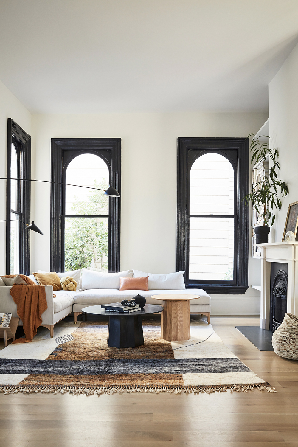
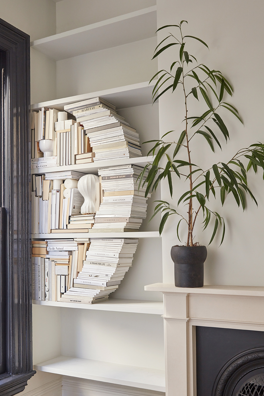
The easy California living side of my aesthetic couldn’t be more evident in our living room. While the original windows and restored fireplace are the architectural stars of the show, I finally figured out that I needed a custom seating area that allowed us to maximize the use of this room. That’s where I abutted my design limits. Thankfully, I turned to my friend, and design spirit animal Lauren Nelson to help me by designing more custom pieces that address the scale and spacing challenges of this room. She designed both the sectional and the stunning fluted coffee tables. Do you spy the brass feet on that sofa?? So much goodness.

Renovation lesson two: Don’t try to force a round peg in a square hole. Sometimes investing in a custom design that is made specifically for your home’s needs is going to last you much longer and make you much happier than any off-the-shelf option that only leaves you disappointed.

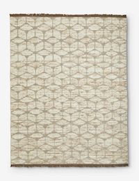
The one-of-a-kind Moroccan berber rug from Mehraban’s Atlas collection pulls everything together in an easy, cosy way. There’s nothing I love more than curling on that sofa which a good book (or let’s be real, Instagram) in hand.
This Old Victorian Reveal: 1st Floor Before, Design & AfterThis Old Victorian Reveal: 1st Floor Before, Design & After

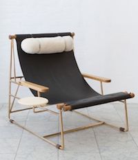
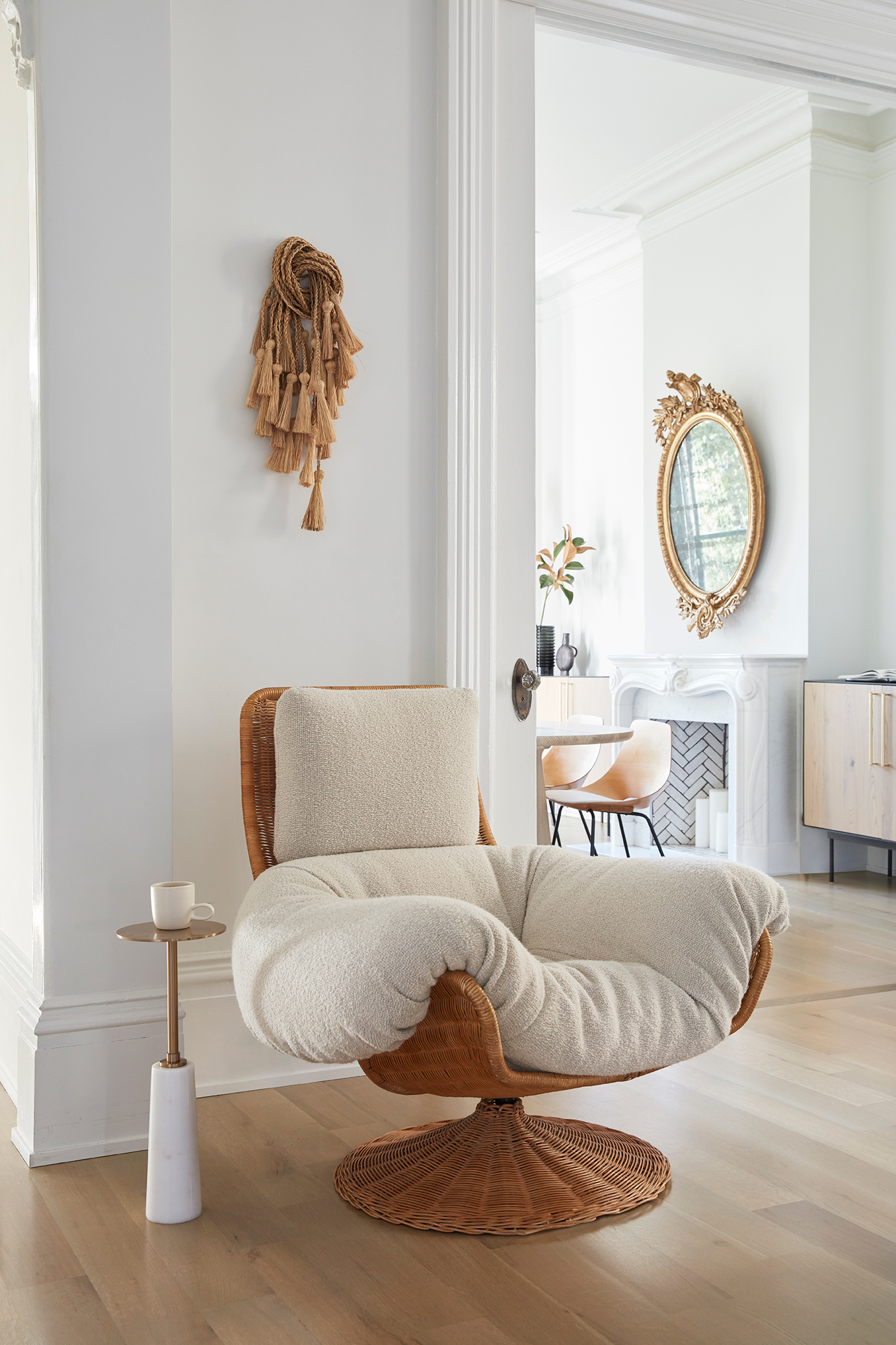
One of the best ways to help a newly decorated space feel lived in is to use vintage pieces to add patina and history. I spied this dramatic woven lounge chair on Pinterest and finally tracked it down at Amsterdam Modern. Lauren helped me get custom cushions made to mimic the chair’s original design, but in a more of-the-moment nubby fabric. It’s my happy place.
This Old Victorian Reveal: 1st Floor Before, Design & AfterThis Old Victorian Reveal: 1st Floor Before, Design & After

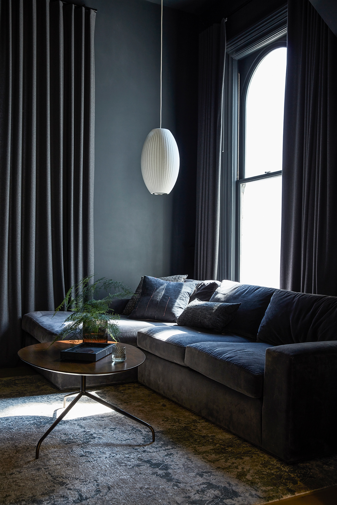
Directly across from the living room sits the opening to our den. I probably had the most specific vision for this room, which is why I was able to “complete” it before many of the others. I always wanted this room to envelop you in a dark, cozy vibe with tone on tone walls and furniture. The pièce de résistance of this space however, took nearly three years to complete.

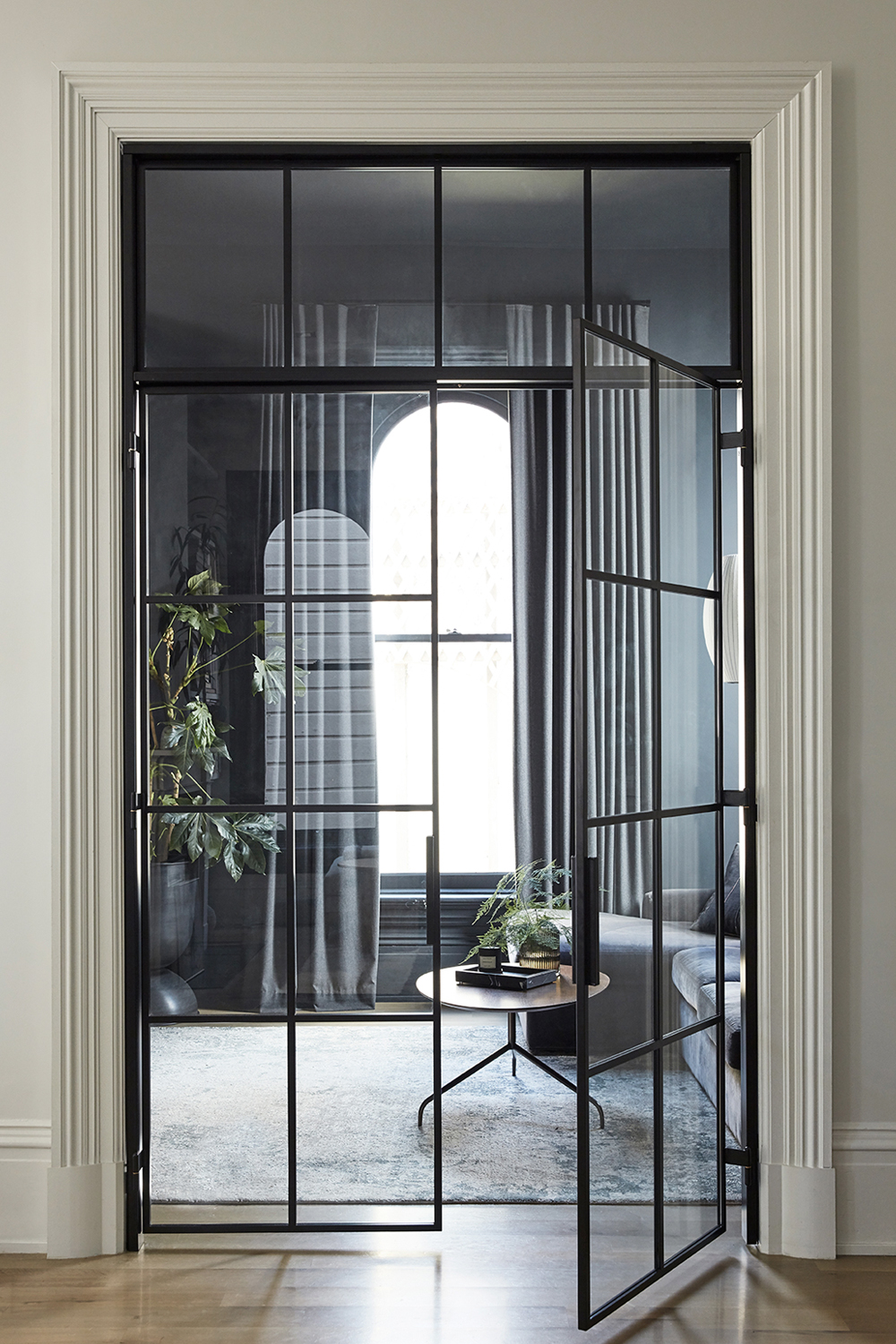
I knew from the get go that I wanted steel and glass french doors to enclose this room from the rest of our living spaces. This room houses our TV and so I wanted to create a separate space for movie nights and Marvelous Mrs. Maisel binge sessions with doors to buffer the sound. But I also envisioned these french doors as the perfect book end to the black framed windows that sit exactly opposite.

Yet the oversized opening we cut during the renovation sat vacant as we saved up the budget and I hunted endlessly for perfect partner to design this custom piece. I finally found Bananas and Hammocks (on Instagram of course!). The husband and wife design and fabricator duo based in Ventura, CA fashioned an amazing set of custom doors with a matching transom. Even the brass inlayed hinges are one of a kind. When those doors finally went in this summer, I finally felt like my original vision for the house was realized.
This Old Victorian Reveal: 1st Floor Before, Design & After

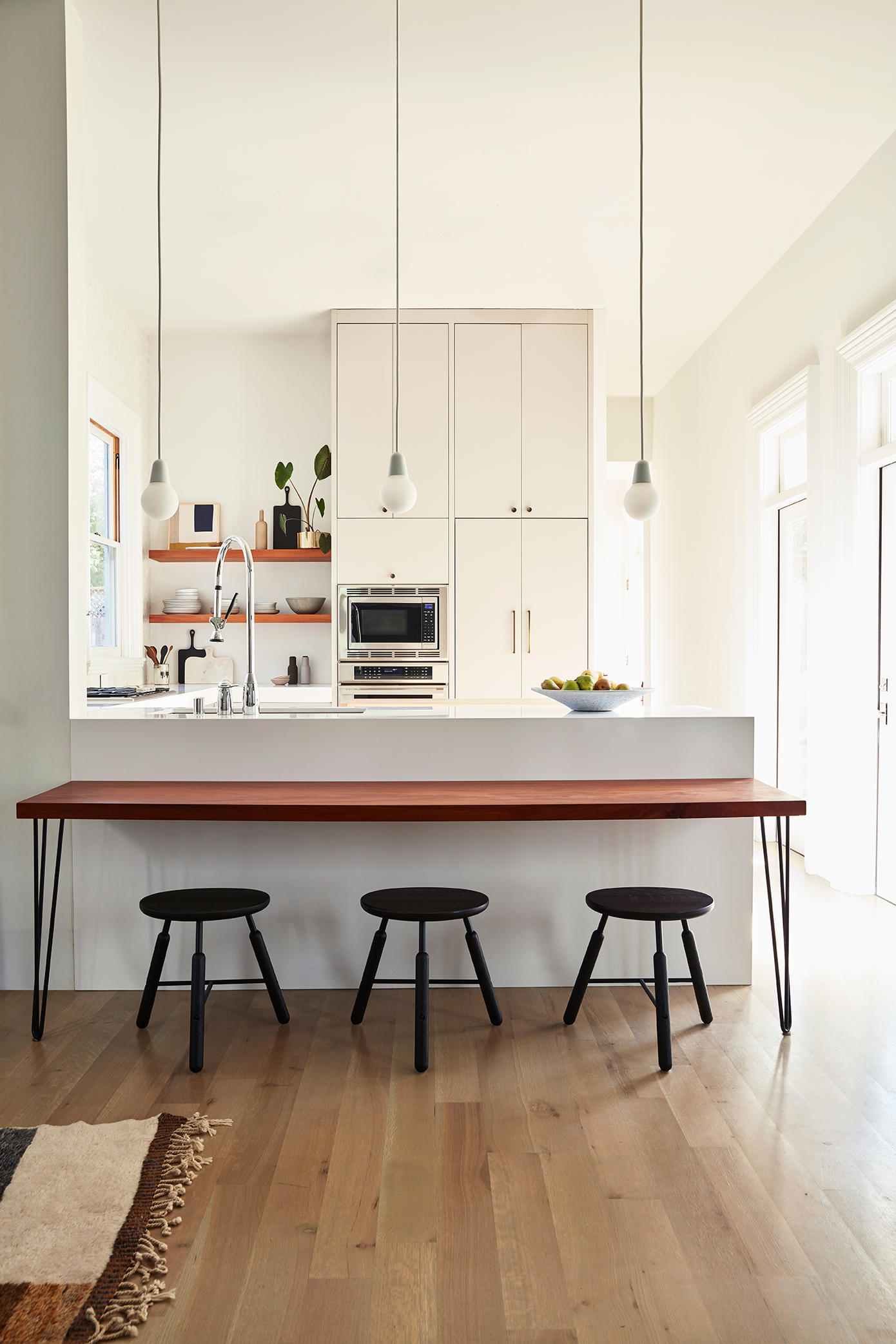
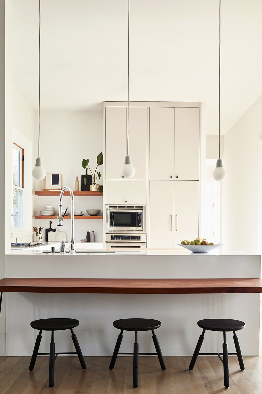
Our kitchen reflects my more modern design inclinations. I wanted to create a clean, relatively clutter free space. We have almost no upper cabinets. A single stack houses both my oven suite from Theramdor as well as our hidden refrigerator. I love incognito appliances. I couldn’t resist open shelving at the time, but as I look back now (by nearly four years) if I had to do it over again, I might even eliminate those. Sadly you can’t see my big drama moment in this pic, but we installed a stone wall from counter to ceiling behind the range. It offers subtle texture and movement.

A desk height “breakfast bar” connects the kitchen to the living room and offers a great spot for our son to do crafts or someday homework while I’m in the kitchen. If the counters look odd, that is because we chose to make them 39″ high. We come from a line of very tall people!

To complete the tour of our first floor, you move down the hall past the kitchen, and there you’ll find our walk-in pantry (which is quite dreamy if I do say so myself), our laundry room and a powder room. I’m happy to report that we make use of every single space on this floor every single day.

I hope this 2000 world monologue has helped shed light into our renovation at least a little. If I were to impart one point, it would be this – creating a dream home isn’t necessarily quick, cheap and easy as much as HGTV and the like would lead us to believe. While sometimes a fixer can be tackled slowly, project by project and in DIY fashion, some home’s needs are so large scale that they take on a life of their own. Our house certainly resides in that latter category. Did I make many a design mistake that likely cost us both time and budget? For sure. Would I do somethings differently if I had to do it over? You bet. Did I learn so much along the way? Absolutely.

Does our house make me smile everyday? Yes. Is it a great home for my son? Most definitely. And that is really the point.

Hope you’re excited for my next 2,000 words touring our second floor! Hopefully I’ll have that done before Christmas.

If you can’t wait for that though, be sure to check out Domino’s online feature HERE! Have you picked up Domino’s winter Renovation issue yet?? There are SO many good home tours in there.

photography by seth smoot for domino magazine 
produced by kate berry
styled by rosy fridman

RESOURCES

Entry
lora pendant lamp by wep lights ylighting / georg console table skagerak / steven bukowski planter

Dining Room
custom credenzas lauren nelson design / custom dining table godar furniture / paint white wisp, black 01 by benajmin moore / antiqued french crested mirror 1stdibs / ceramic vessel by ANK spartan shop / arch totem and seed sculptures by tina frey designs / la rochelle mantel chesneys new york / tonneau chiars by pierre guariche via almond & co / stick shelving system menu design / art print by seth smoot / large white vase march sf /  bubl vase 101cph / vintage vessel elsie green

Living Room
custom sectional lauren nelson design / custom coffee tables lauren nelson design / serge mouille two arm wall sconce dwr / knot pillow dwr / crinkled cotton throw h&m / pampas lumbar pillow the citizenry / moroccan middle atlas tribe berber rug / fireplace chesneys / basket zara home / vintage portrait elsie green / bow marble candle holder ferm living / upholstered swivel lounge chair by gerard van den berg amsterdam modern / straw rope hanging by sarah simon / paint white wisp & black 01 benjamin moore

Den
custom french doors bananas & hammocks / sectional room & board / george nelson cigar bubble pendant / paint gravel gray benjamin moore / wool curtains the shade store / coffee table west elm / black marble tray the citizenry / fluted glass vase h&m 

Kitchen
bulb fiction pendant lamps fritz hansen / norm na3 stools by &Tradition / promaster faucet kohler / silestone countertop in ariel / mid-century knobs and pulls school house / appliances thermador / art tappan collective
While I’d usually be regaling you with gift guides, party ideas and more holiday decor then you can handle right now, I’ve got a different kind of gift for you this year. After nearly five full years since our demo day, the official before and after reveal of This Old Victorian is here! I’m thrilled to announce that our home has been published in the first-ever Renovation Issue of Domino Magazine and it hits newsstands & stores today!

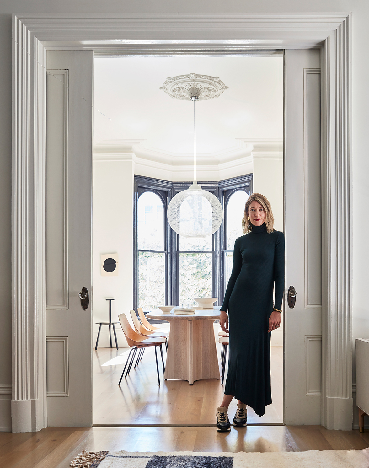
non random light by moooi from ylighting | custom dining table godar furniture | tonneau dining chairs by Pierre Guariche almond & company | tableware carole neilson ceramics | footed bowl march sf | faye toogood rubber spade chair from march sf | art untitled by vanha lam from tappan collective | dress kamperett | sneakers by malene birger / atlas rug mehraban rugs 

It feels almost surreal – I wonder if any of you reading this actually read the post about when we bought the house?? Don’t worry – if you missed it, it was 2014!

Over the next few days, I’m going to take you behind the scenes of our renovation saga, fill you in on all my decor dilemmas and share every before and after that I’ve had to hold back for SO many years now. I hope I can impart a few helpful lessons, a little design inspiration, but mostly, I want to raise the curtain on what it really takes to create your dream home. Everything from HGTV, to this blog right here leads one to believe that design and decorating should be quick, easy and cheap, but most of the time that is so far from the truth.

I’m sure you’re asking, why oh why has this house taken you SO long? Well trust, I’ve asked myself that question a million times too. But there are actually a few very legitimate reasons this process was painstakingly slow.

The first is that we bought a historic home. As in, the house can be found on the historic register and therefore has a number of restrictions on what you can and cannot do in a remodel. Those hoops can take quite a while to jump through.

non random light by moooi from ylighting | custom dining table godar furniture | tonneau dining chairs by Pierre Guariche almond & company | tableware carole neilson ceramics | footed bowl march sf | vintage mirror 1stdibs | custom credenza lauren nelson design / ceramic vessel by ank from spartan shop | arch, totem and seed sculptures by tina frey designs / chesneys la rochelle mantel / paint white wisp by benjamin moore 

We also wanted to do more than simply remodel the home – just tearing everything down to start with a blank slate would have been easy. Instead, we really wanted restore the house to its original grandeur. A historic Victorian is such a gem. I just happened upon a diamond in the rough. Our house had not been well cared for over the years. In fact, it stood abandoned for a good chunk of the 70’s! Lath and plaster from the 1860’s, leaking windows, rotted out framing, falling down chimneys, original plumbing and nob & tube electrical – we had it all. Don’t worry, as we dig into all the befores you’ll understand the hot mess with which we started.

While our focus was on restoration of the home, we did make major architectural changes. The house was originally four bedrooms, one bath and is now three bedrooms, two and a quarter baths. There wasn’t actually a real kitchen of any kind, so we had to build one from scratch. I also wanted to open up the postage stamp sized rooms to create a more modern, open living concept. That required removing load baring walls, taking out a second staircase – we basically reshuffled the entire layout of both floors. All that to say, renovating required major focus on everything that you’ll never actually see – plumbing, electrical, architectural structure – you know, the extra sexy stuff (that tends to be rather spendy).

bulb fiction pendant lamps by kibisi for fritz hansen ylighting / norm na3 stools by &tradition / promaster faucet kohler / range, oven, hidden fridge, dishwasher thermador / silestone countertop in ariel / concrete saucer the vintage rug shop / cabinet hardware school house / custom cabinetry / art tappan collective / dishware heath ceramics / atlas rug mehraban rugs 
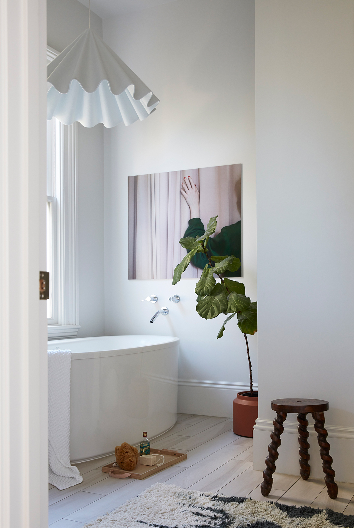
bath tub kohler / hardware kohler / art cristina coral / dancing pendant by menu via ylighting / norr tray skagerak / vintage stool elsie green / rug anthropologie / paint white wisp benjamin moore 

Oh, and did I forget to mention that I had a baby less than three months after demo started? I’d be the first to warn that first-time motherhood and major renovations don’t mix particularly well.

But in the end, it was all more than worth it, because 12 years after I started this site to chronicle the remodel of 250sq ft condo I thought was going to be my dream house (oh hello 27 year old self), I’m thrilled to have a dream home for my son to grow up in.
I do hope you’ll pick up the new issue of Domino to see the full tour. If you need a few more sneak peeks and just cannot wait until you get your issue, you can see the online story here.
But come back tomorrow – I’ll be digging into how we figured out our new floor plans and the full reveal of the first floor!

To catch up on the This Old Victorian journey, CLICK HERE.

photography by seth smoot for domino magazine | produced by kate berry | styling by rosy friedman 

Older posts
Gimme More