Now that all the holiday trimmings are packed away, it’s like a breath of fresh air. This is the perfect time to around at your home and get a little picky. Every January I love to walk around my spaces and ask myself: what am I loving? What am I just sick of? What could I do to give this room a facelift? Thankfully, you don’t have to completely ditch everything you already have or bring in all new furniture to make a room feel fresh. Simply focusing on a few small details can make a really big difference.
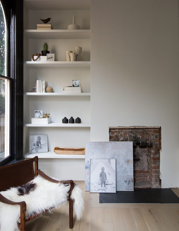
Case in point: a bookshelf. A bookshelf is the perfect place to express your current design personality in a snap. Think of it like your hairstyle – you can continually switch it up depending on your mood. After the holiday hustle, I really wanted to create a calming zen-like feel with the built-ins in my living room. To ease visual clutter, I decided to stick with a singular color palette; black, white and warm wood tones. But now that we’re getting settled into our house, I also wanted to get some family photos out and about. I am a mom after all. But of course, I also refused to compromise my design. To keep my look consistent I turned to Mpix for help.
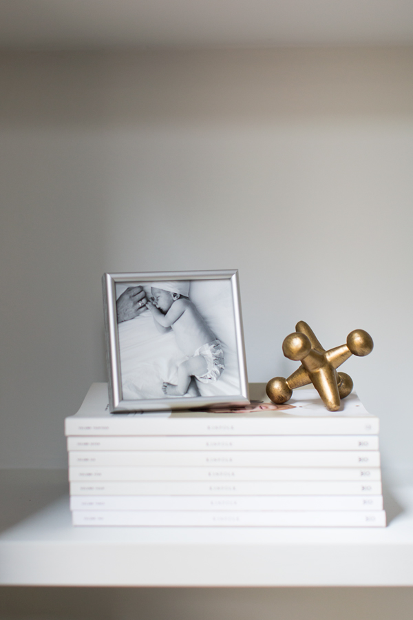
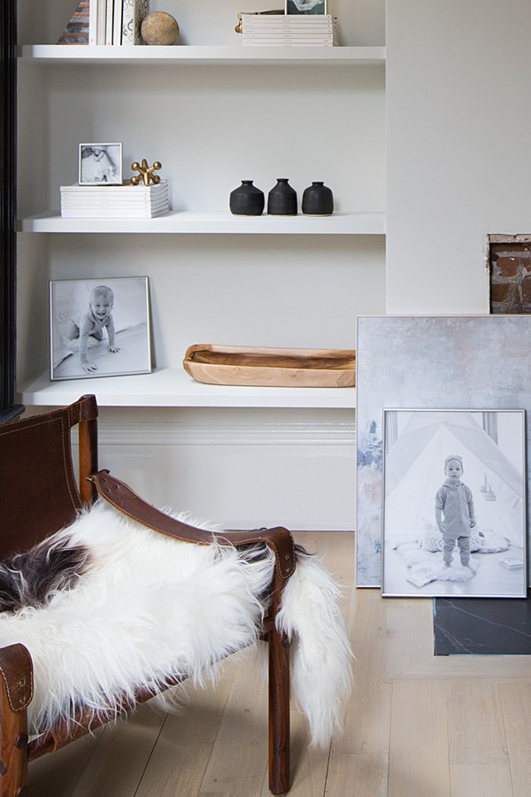
Mpix is an online photography printing service that lets you create your own cards, gifts, photobooks and framed wall art. I simply went onto the Mpix website and uploaded a collection of professional photos of my kiddo that we’ve had taken since he was born. There, I was able to turn all the images black and white to make them consistent with my bookcase color scheme. I choose different sizes for the images ranging from 4″x 4″ to as big as 16″x 20″, but for consistency I framed them all in a timeless silver metal. As I discussed in the reveal of my dining room, I’m obsessed with the informal look of leaning art, and layering an abstract piece with a large scale photo softens the look even more. It also helps keep a toddler out of my unfinished fireplace. Bonus.
I was so impressed with how the frame pictures turned out. First of all, they arrived in what was nearly fortress-like packaging. I think this is the first time I’ve received mail-order framed prints with zero scratching, cracking or any gaps in the frame. The quality is truly exceptional. The photos also printed extremely crisp, printed on high quality black & white photo paper. I also selected a non-glare glass which really elevates the look.
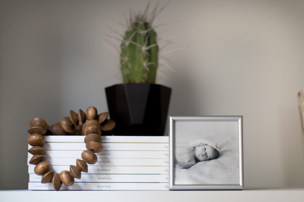
With the fabulous framed photos in hand, I could then get down to it. When it came to styling these shelves, I wanted to take as minimalist of an approach as I can muster. I do like my collections – ask my husband. But everything in life feels so crowded these days, I really like my house to feel open. I’ve been working very hard to purge and pare down and I think this endeavor was successful. I limited the amount of things on each shelf, allowing for a lot of spacing between groupings. I finally had a spot to put my Kinfolk Magazine collection on display, which also helped me stick with my monochromatic look. A few special pieces, my trio of Gerhard Ceramics bud vases, a few vintage treasures and gifts from friends (or gifts to myself!) add texture. A brass jack paperweight adds a warm metallic touch – always nice.
While there’s no one-size-fits-all formula for perfecting your bookshelf look, compiling a collection of curated items requires a little patience and perhaps a little practice. But no matter where you are in your shelfie game, remember these three rules and you’ll have a perfectly styled bookshelf every time.
#1: Horizontal x Vertical Books. Shelves should start with books, but mix up the way you display them. Try piling them horizontally or flipping the spines to face inward as well as keeping some standing vertical.
#2: Remember the 1:1 Ratio. For every stack of books, add an object. It could be anything: a candle, brass box, pretty collection of rocks, that awesome “thing” you couldn’t not buy at last month’s flea market. This is the best way to break up the ‘boxy library look’
#3: Vary Your Heights. You want to keep the eye traveling all the up your shelving, so vary the heights of your groupings, be it of your book-stacks or your objects.
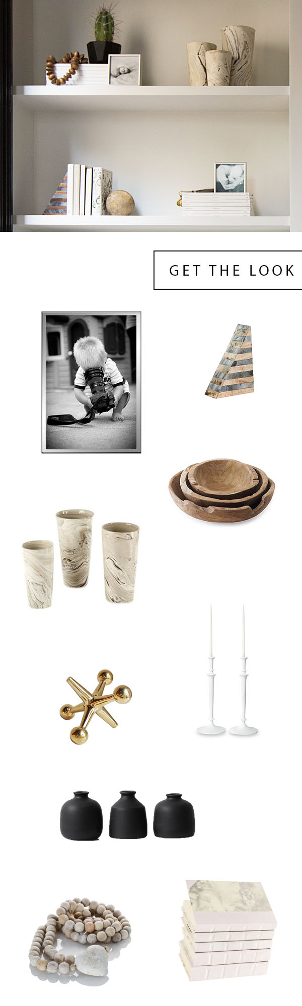
SHOP THE POST Mpix wall art / bookend / marbleized vases / vintage wood bowls / brass jack paperweight / candle sticks / bud vases / wood beads / white books
original photography for apartment 34 by michelle drewes
This is post is in partnership with Mpix. all thoughts and opinions are 100% my own. thanks for supporting collaborations we’re excited about and that have kept apartment34’s doors open.
These are all awesome tips! Our house needs a little fresh life in it for the new year!
Paige Flamm
The Happy Flammily
http://bit.ly/2jEd6V2
Thank you for the tips! My shelfie game needs practice! All of the natural pieces make a minimalistic shelf look warm and homey. It’s wonderful!
Thanks Grace! Thrilled to hear you found the post helpful and truly appreciate your kind words.
Some wonderful bookshelf inspo here!
Thank you so much – glad you find it helpful!
Just a change of color makes a huge improvement. Thanks for the inspirational article
I love the chair with the fur lying on it – where is this chair from? Thank you!
It’s a vintage safari chair I found on 1Dibs!