I never really paid much attention to tile until I had to make so many decisions about it. I think we have seven different types of tile in This Old Victorian. Sure, you can go with your standard grade white subway tile and do ok, but why not grab the opportunity to do something really special in your space. Enter the newly launched collaboration between cult tile favorite Clé and Zio & Sons.
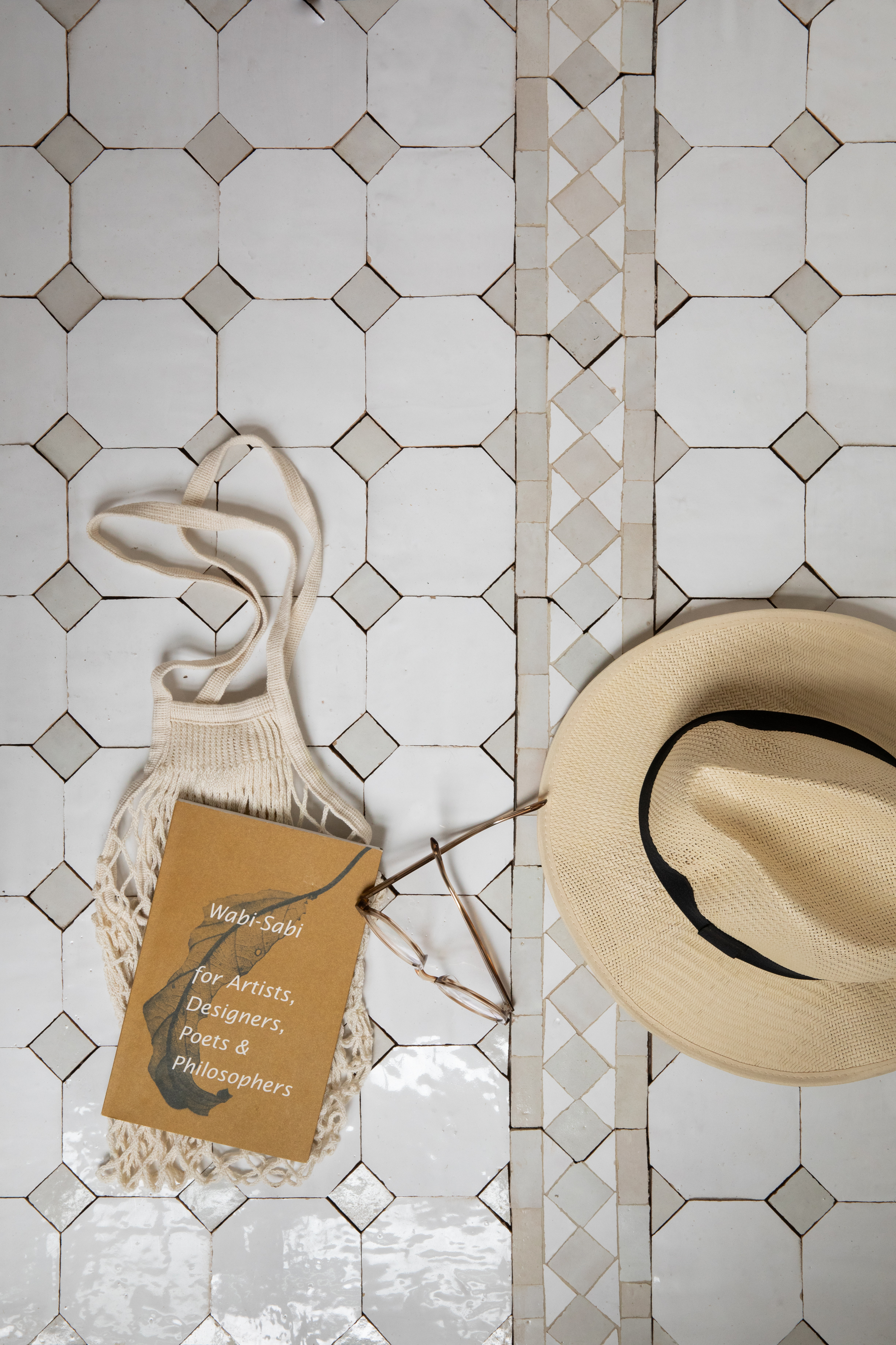
If you don’t know Clé, here’s a primer. What started as one of the first online tile shops in 2012, Clé has helped transform tile from being a functional backdrop to a more artful, provocative facet of our surroundings. Clé seeks out heirloom quality tiles from across the globe. Their inventory extends from classic moroccan zellige, glazed raku-fired tiles from Vietnam, rustic Italian terra cotta and carrara stone to thin clay bricks domestically sourced. I used Clé tile on my fireplace surround and couldn’t be happier with the result.
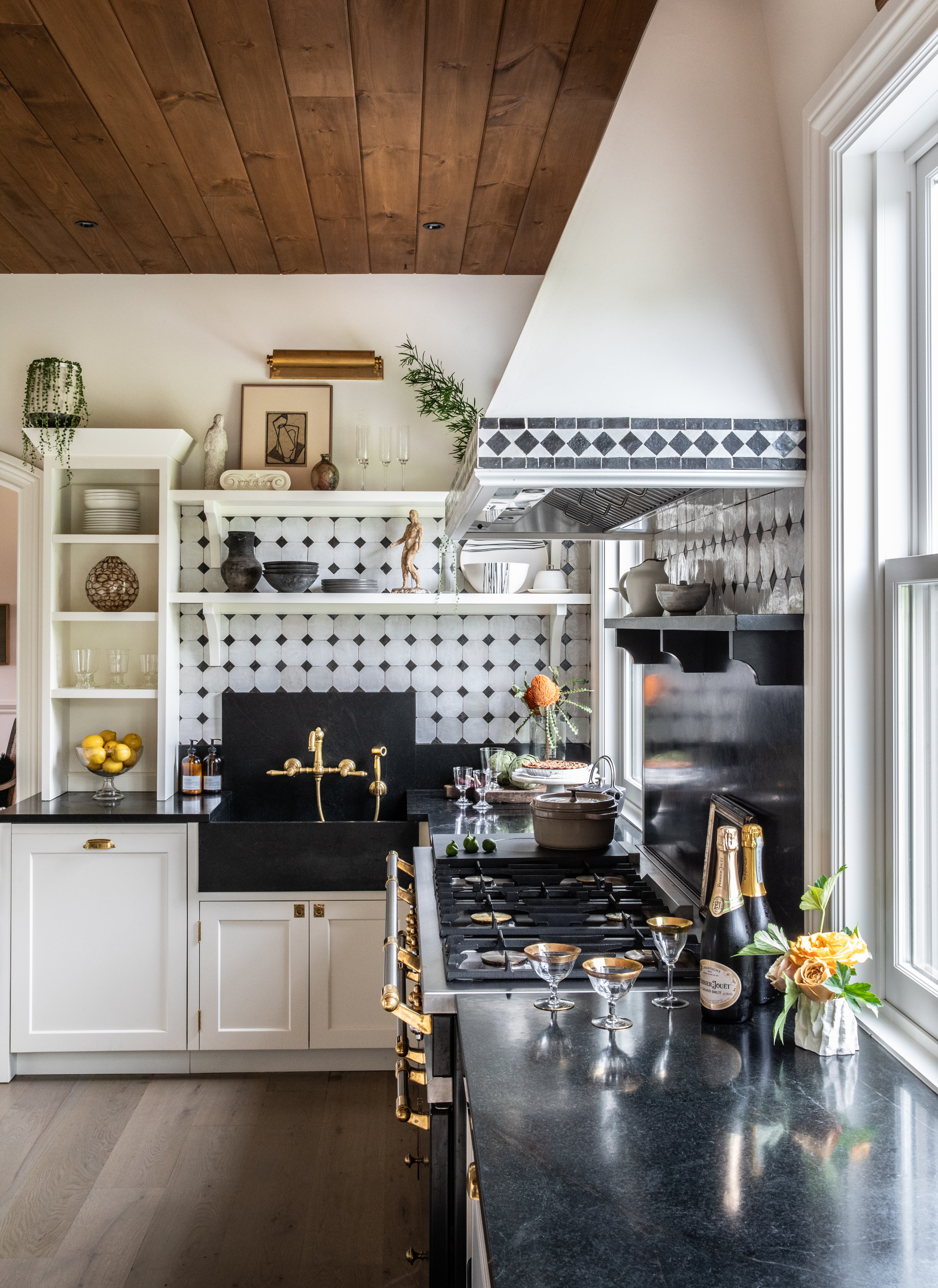
And if you don’t know Zio & Sons then you best get on Instagram stat. Everything Anthony Dargenzio touches turns to gorgeous. Anthony connected directly with Clé after he debuted his collection of rental apartments in New York’s Hudson Valley. When Anthony used Clé Tile’s Zellige design in the kitchens of This Old Hudson, the spaces just blew up on Instagram and a match in design heaven was made.
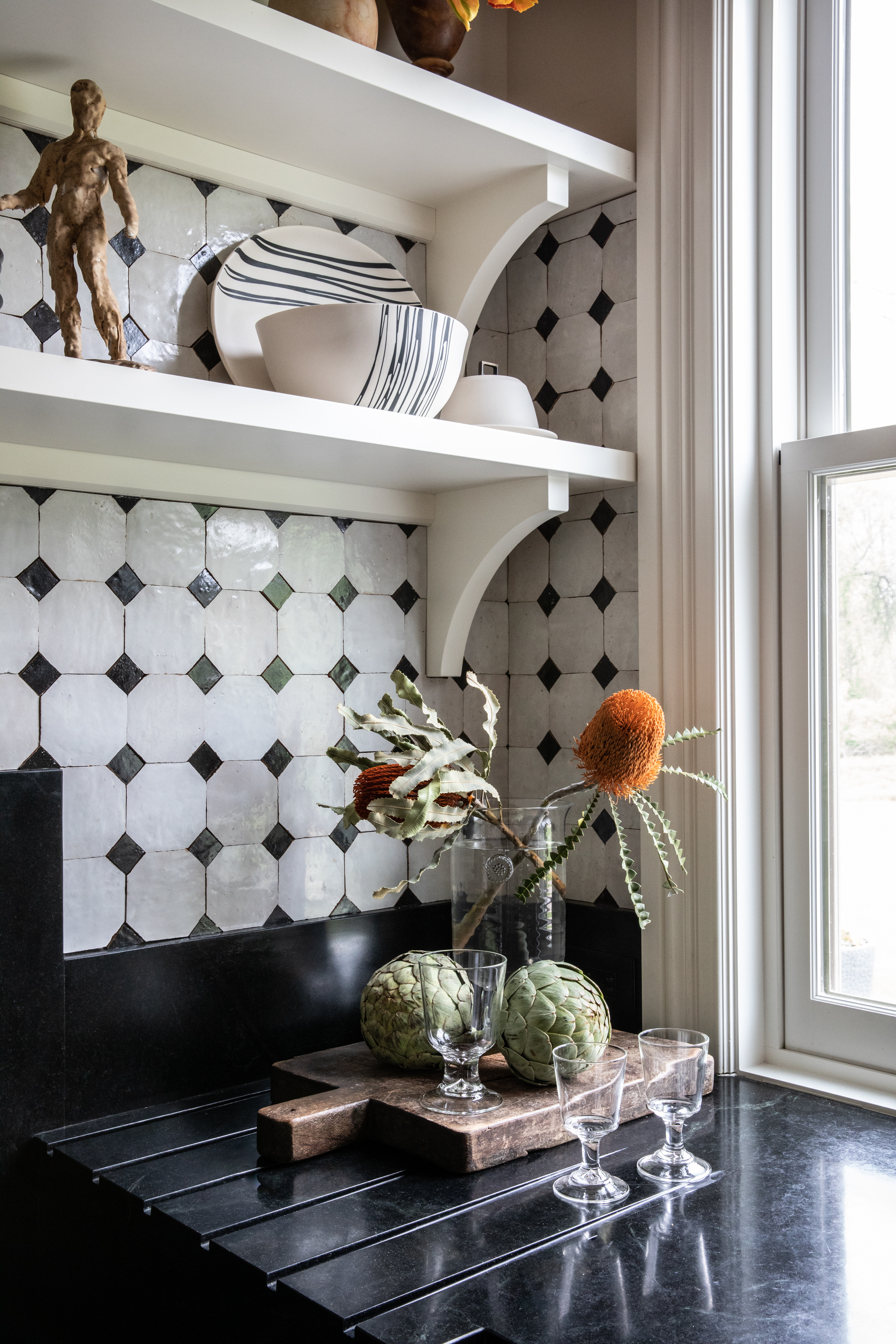
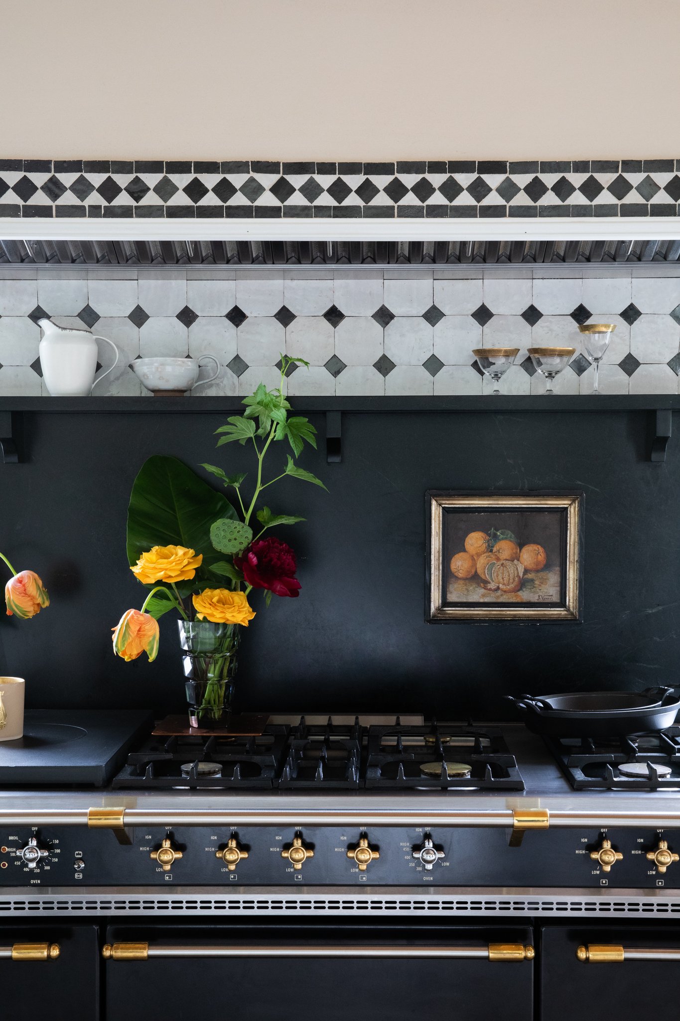
Through Clé’s Zellige tile, D’Argenzio discovered a material that was simple yet embodied both history and craft. These elements paired perfectly with his love of historical architecture and natural materials. Built to last, the brand new Zio Zellige + Clé collection is a classic yet simple design,” D’Argenzio says. “It was inspired by the Old World and driven by handcrafted texture that’s increasingly harder to find.”
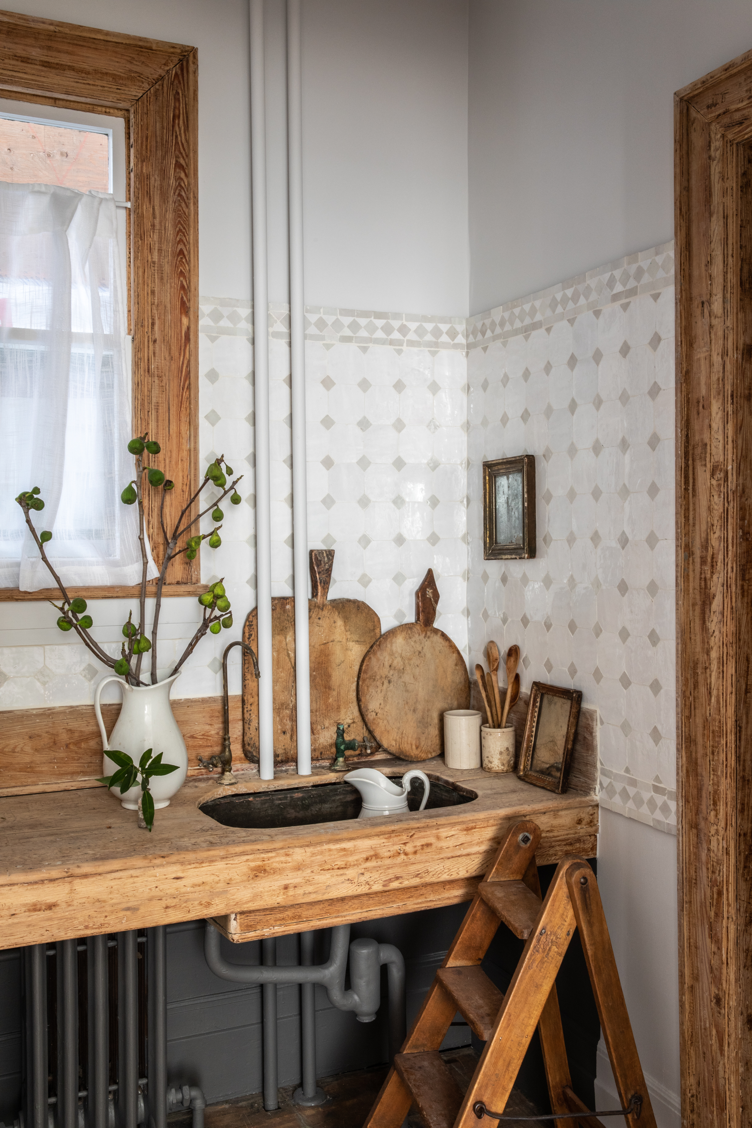
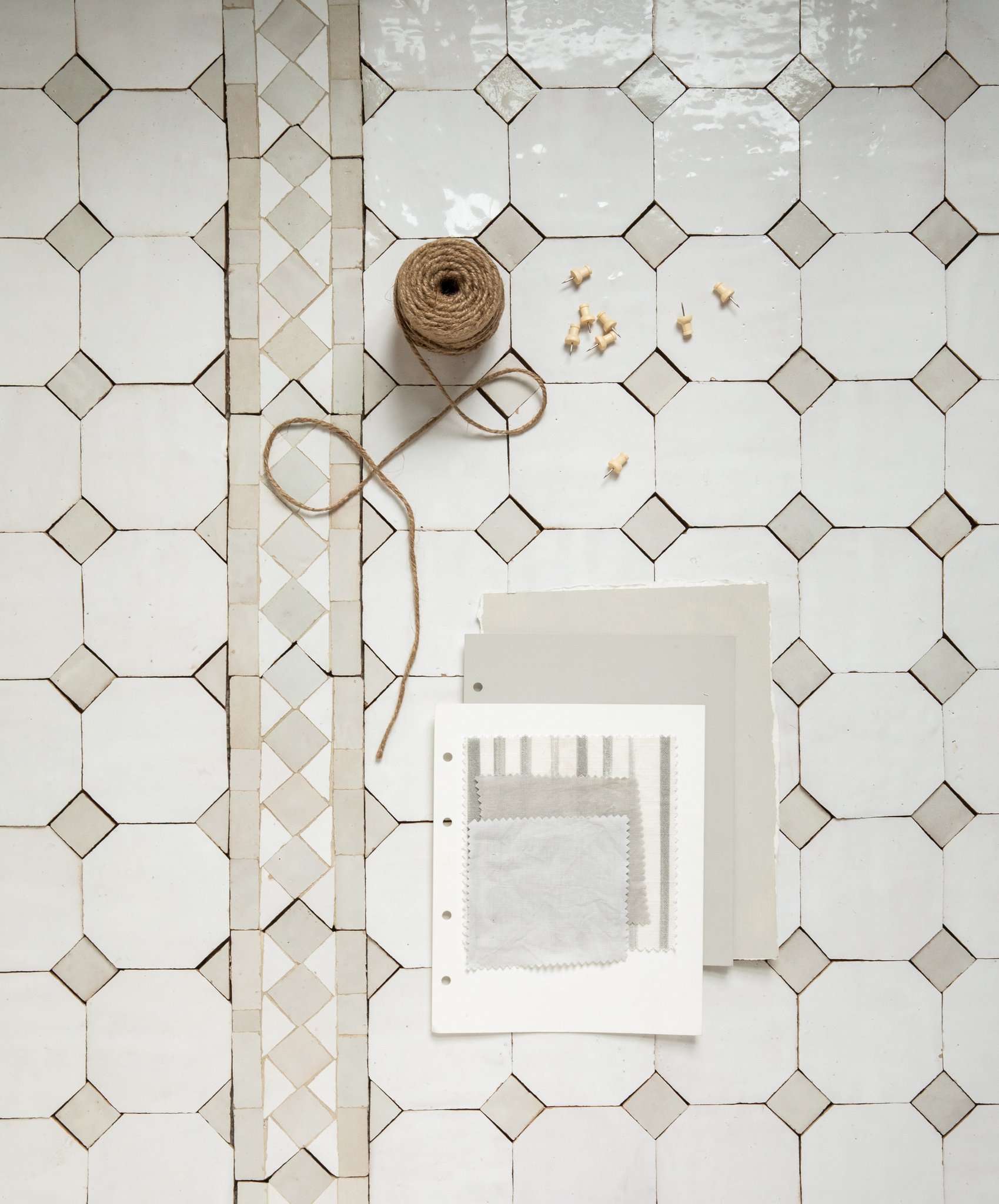
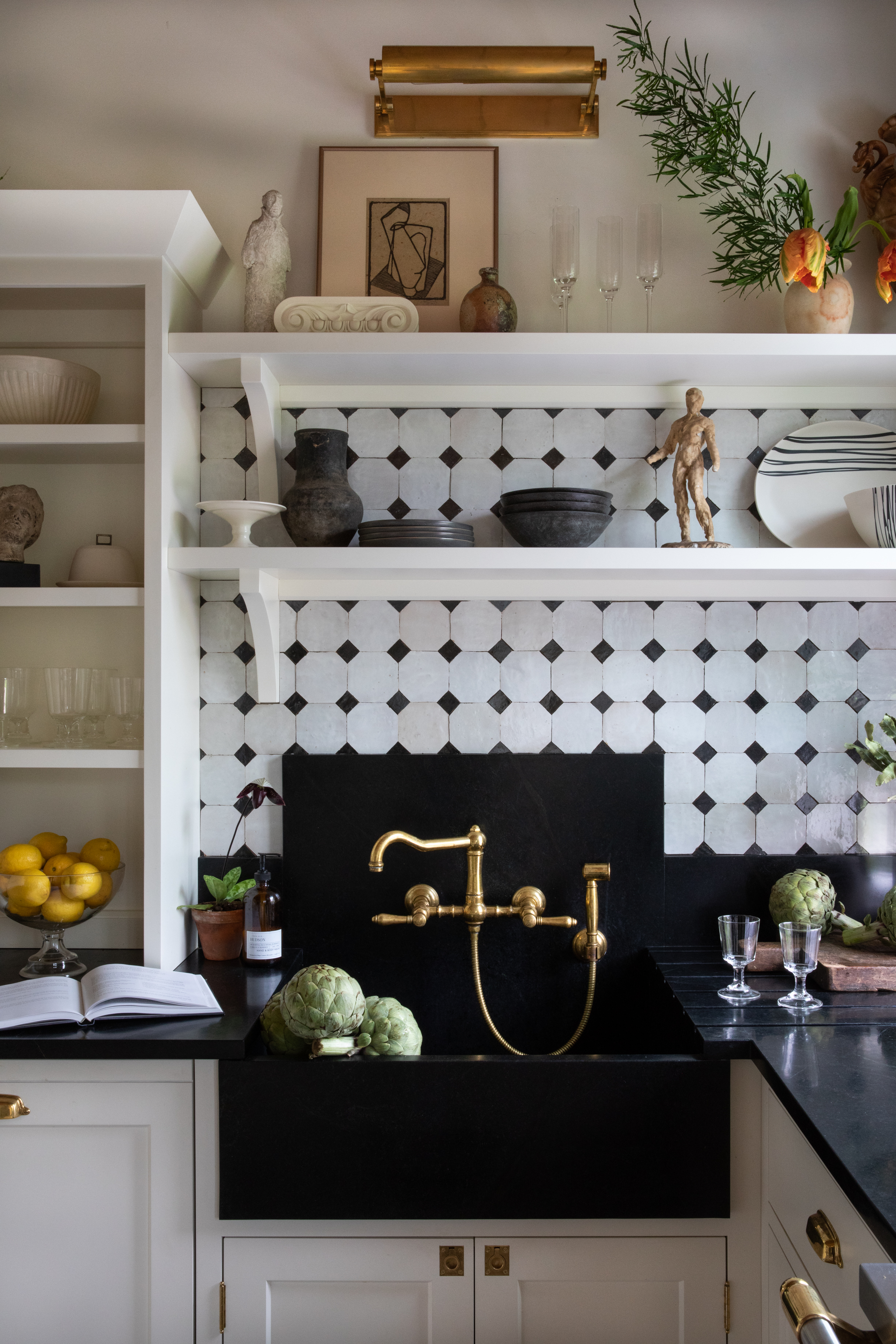
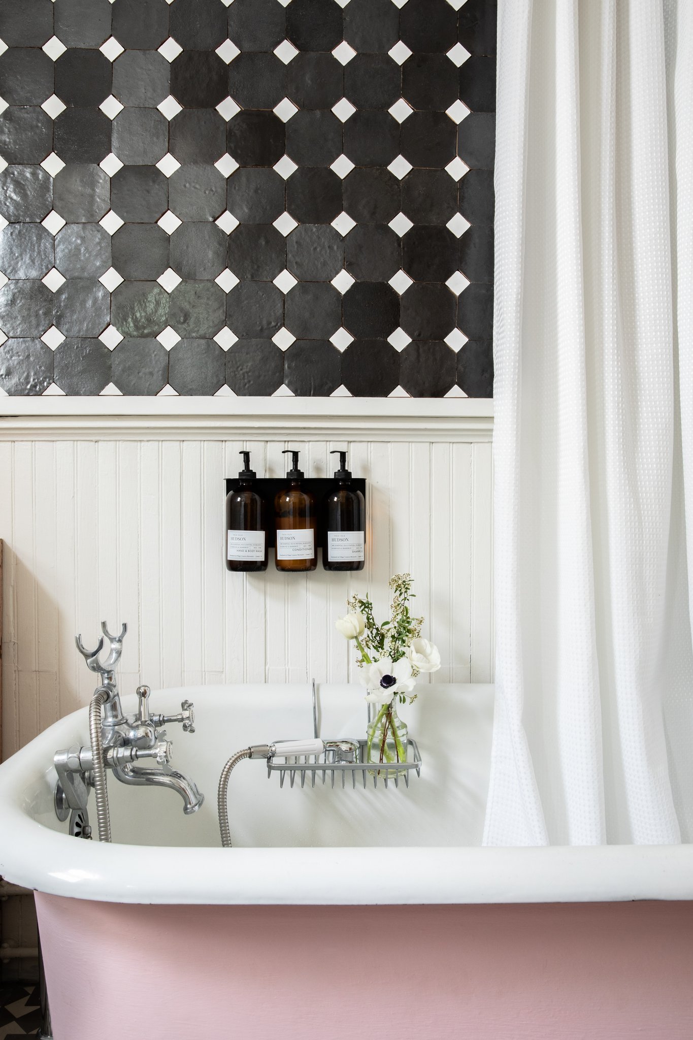
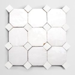
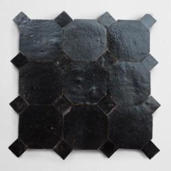
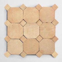
Drawn upon the rich mosaic patterns of Moroccan design and working alongside Clé, D’Argenzio created an offering of two simple
shapes in four neutral shades: 4”octagons and 1” square “dots” (known as a bouchon). You can apply your own personal tastes and creativity to set a vibe all your own.
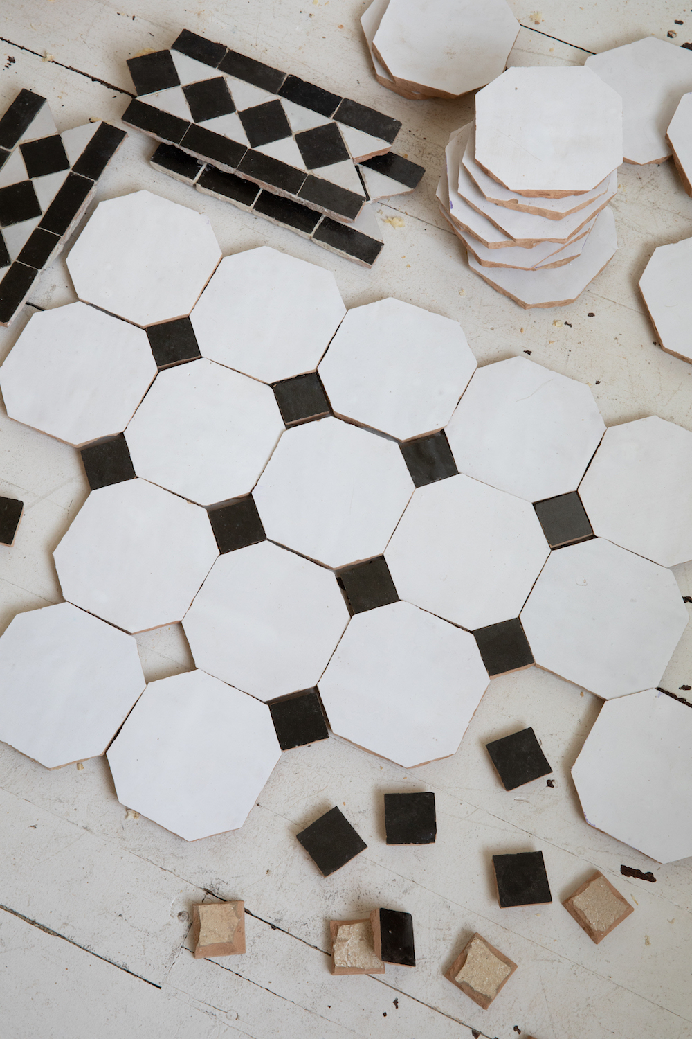
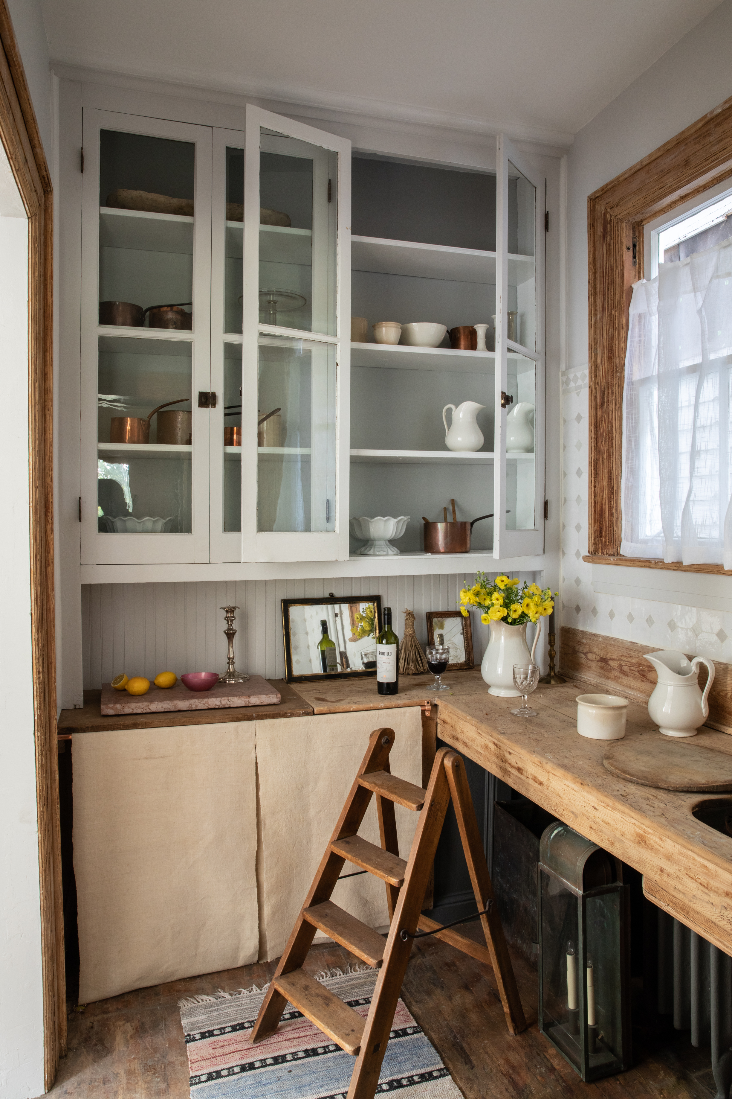
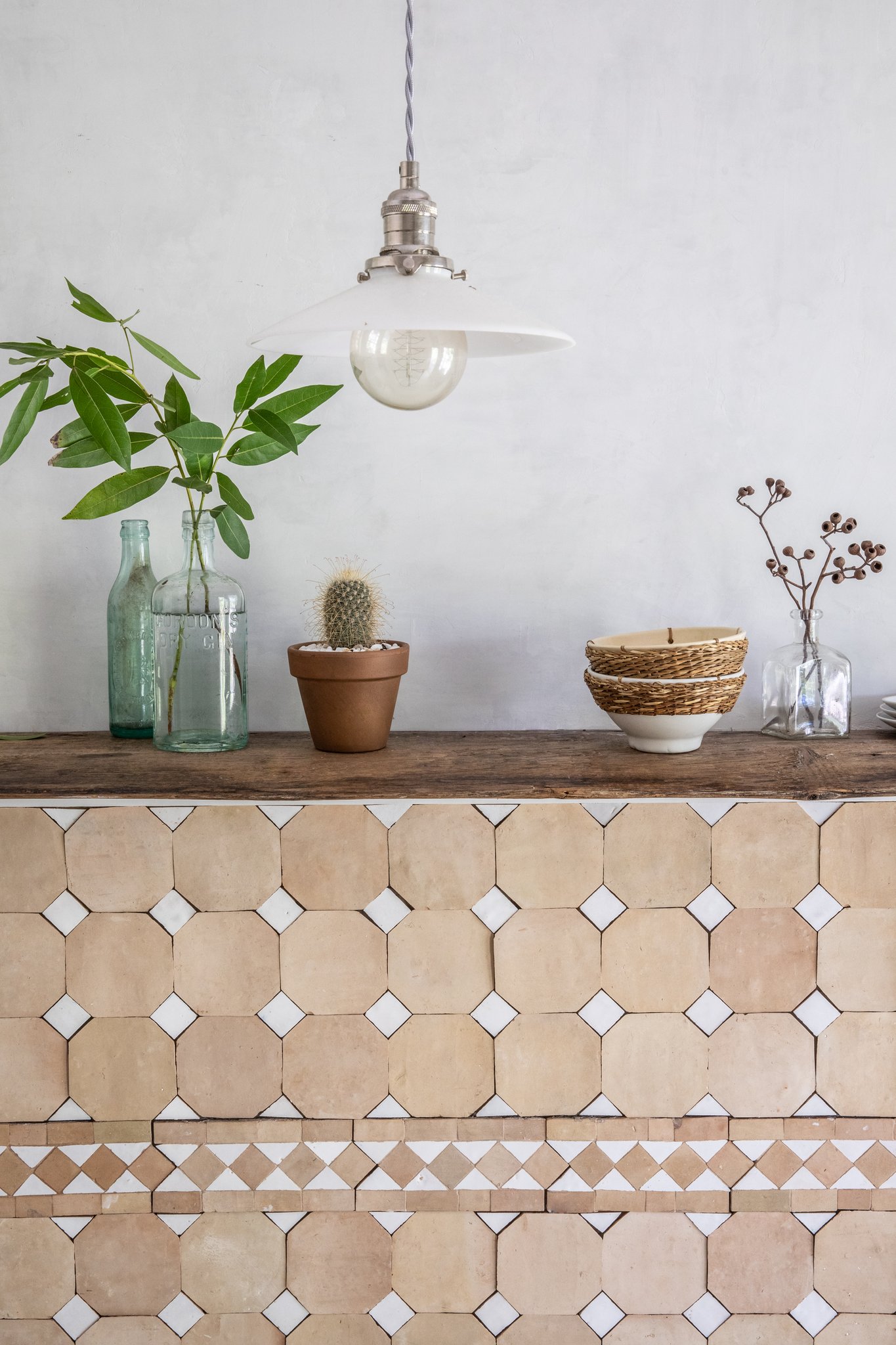
I asked Anthony the three things he loves most about this collection.
- Versatility: The timeless color palette and pattern really make this product accessible to be really be used just about anywhere. Suitable for commercial and residential use. Storefronts, Pool, hotel accent walls, you name it!
- Texture and artisan feel – each tile is hand crafted and unique, adding a sense of old world soul to your space.
- A one of a kind mosaic, right out of the box. Saving your installer time (cutting) and you money.
- Bonus: I got to visit Morocco which was so inspiring and beyond beautiful. You can see a few snapshots from that inspiration trip here.
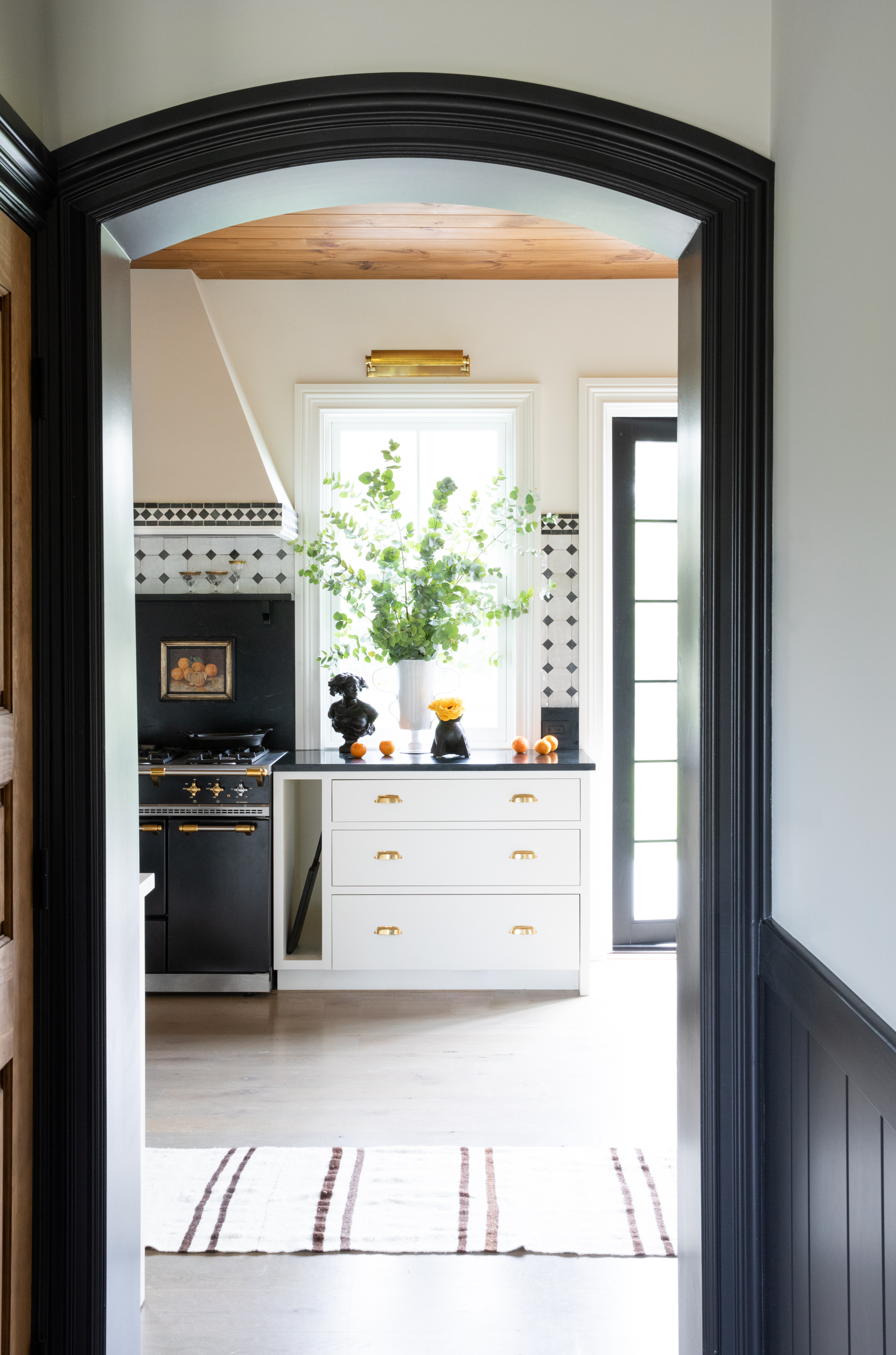
And when I asked Anthony about what he he learned from creating his first collaborative collection his three pieces of advice were spot on.
- This opened my eyes to the world of product/ material design. I want to create so many things now! We already have a few things brewing. (and I cannot wait to see what they are!)
- Patience! From design to development these take time. Expect delays.
- Stay true to yourself, style and brand. No one else can replicate that!
Tile offers such an easy opportunity add major personality and personalization to your space. Break out of the white subway rut and try something truly unique, artisanal and timeless. I’m already plotting the next place I can put in some tile. Deets on that project coming to you soon!


I used to love mosaics as a child, and spent hours colouring them in! This post has taken me back to my youth.
Absolutely elegant! Timeless.
There is NO grout am I correct. That’s what I love most. Looks stacked????