Designing a nursery is one of the many exciting parts of welcoming a tiny human into the world. Nesting instincts and all. It certainly was one of things I was SO looking forward to. But to say the design process for our son’s nursery was atypical is a major understatement. You see, we got the order of things a little out of whack. We bought what we were turning into our dream house with plans to start our family there, but our family starting growing much faster than our renovation timeline! So instead we wound up becoming a family of 3 (plus 2 dogs) in 1,000sq feet. For an entire year. And while I loved the mini nursery I carved out in our loft, now that we’re actually in said dream house, it has proven to be an interesting exercise to design a “nursery” for a little guy who is hurtling down the road to toddlerhood (lawd help me).
When it came to my kiddo’s room, I set out to create a space that would meet all the needs of a bebe, but would also grow with him seamlessly. I’m rather pleased with the final design and am thrilled to partner with Minted to share a little sneak peek with you today.

I was so excited for our little guy to finally have his own room – and not just because I wanted more than three feet separating us at night. I also remember just loving my room as a kid. It was s such a special place for me – to have my own little space and I was excited to create that for my son. But since he’s not really conscious of choices like furniture placement or wall colors yet, I also wanted to create a space that I really enjoy being in everyday!
There are SO many different directions you can go with nurseries these days. There really are no rules. But I wanted to accomplish three specific things:
1. Not have to change anything anytime soon. And by soon I mean in the next five years. We’re just now completing what’s turned into a two year renovation. I’m done making design decisions. So when it came to the nursery, this meant I had to say no to things like really cool nursery wallpapers, murals or stencils that are adorable for those fresh newborns but are maybe less appealing for you (or your littles!) when they’re four. I also didn’t want to pick a theme because what if you pick trains but then they end up being really into animals?
2. Pick versatile pieces. I wanted to select furnishings that I liked, but that an older kid might also be apt to think are cool too. Everything in this room could work well into the teen years, save the crib obviously. I also wanted pieces that should the kid no longer like them, they could be repurposed elsewhere in the house. I could easily swap the rug into another room for example.
3. Add sophisticated whimsy. I wanted to create a room that fosters play, but didn’t feel like a pre-school playroom. He’ll be in plenty of other environments like that. I wanted his room to have a distinct, design-focused aesthetic. I accomplished this through the muted color palate, unique rug choice and selecting pieces that weren’t actually designed for nurseries!
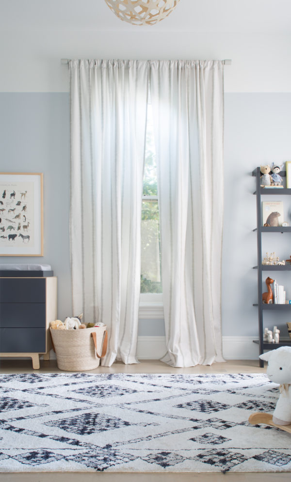
The final result? I call it eclectic modern classic. The Moroccan rug adds an unexpected boho touch while the slate gray furniture adds classic sophistication. Combined with birch accents, it still feels young and playful.

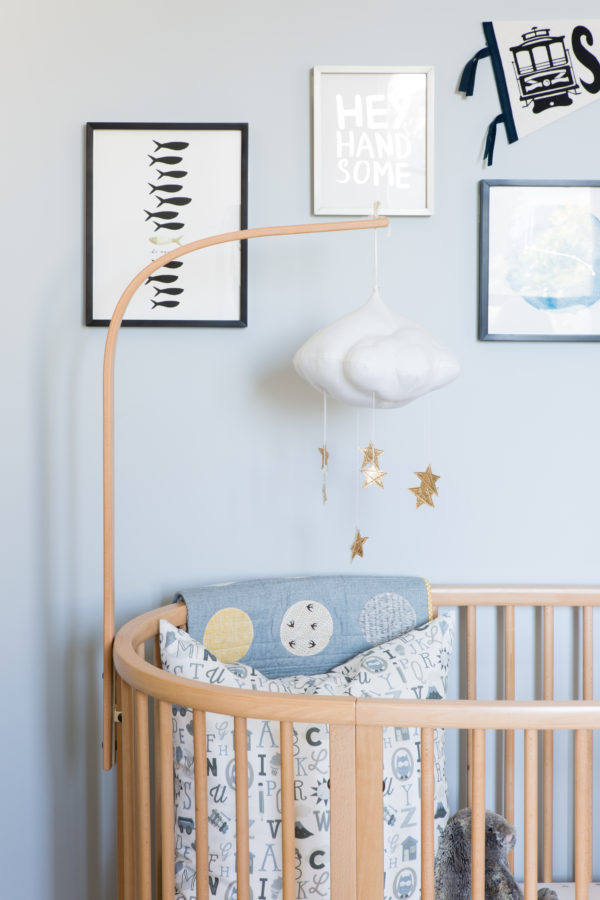
I was so excited to finally create a gallery wall for Carter. He loves to look at things on his walls – we talk about the pictures and what’s in them. Genius distraction technique for diaper changing time. But there’s no rule that kids’ art can’t be appealing to you too! I found so many great options for art at Minted. I ended up selecting a monochromatic palette focusing on black, white, gray, touches of blue and pops of gold foil. I love the fishy print that says Be Unique and who can resist the Hello Handsome?! I also incorporated a gorgeous depiction of his Zodiac sign.
I took a very laissez-faire approach to my gallery wall placement. I simply laid out all the pieces on my bed, quickly tested a few arrangement options and then adhered each frame to the wall free hand. Some people really like to measure or make perfect grids, but I was going for more of a collected, eclectic vibe. Pro tip – I used those adhesive strips instead of nails so it’s easy to rearrange should I change my mind (which is likely!).

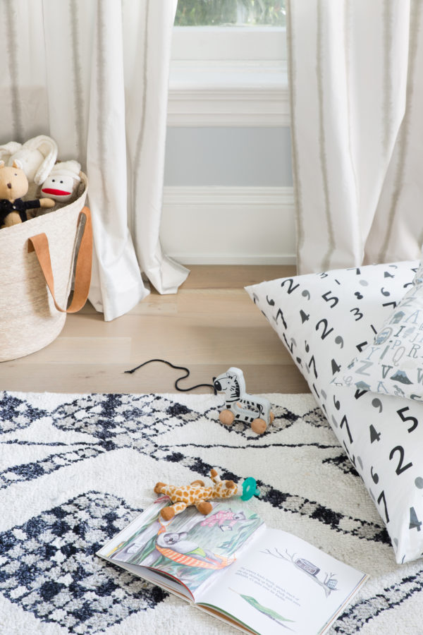
I was so excited to learn that Minted now offers their artists’ designs in print-on-demand fabrics. I had both curtains and oversized pillows made that I use as floor cushions.
We’re lucky to have 12ft ceilings so I selected Minted’s 120″ length for our curtains (they offer six options). Conventional wisdom says hang curtains 1/2 inch from the floor, but I’m into the slight puddle effect in this space. And Carter loves to play peek-a-boo in them (cue heart melting).
Now complete, the room feels cozy, inviting and a like a fun space to hang out, play or relax. I certainly love being in it and I think Carter does too. While I’d love to show you even more, I am keeping the brakes on until my full home tour is ready. Sadly, after an 18-month renovation process, finishing touches are rather slow going. But it’s ok. I want to design this house right, not quickly and now that Carter has a wonderful space all his own, I can stand being surrounded by boxes in every other (empty!) room of the house.
I’ve included all the resources for our nursery below. And you can shop all of my Minted selections plus more of my favorites in my Minted Curated Boutique right here.
ROOM RESOURCES
Minted Drapes in Gray Shibori Stripe // Minted Art print 1, print 2, print 3 // Minted pillow in Gray Alphabet Soup fabric // Minted pillow in Black Number Crunch fabric // Stokke Convertible Sleepi Crib //Baby Jives mobile // Oeuf Merlin Sparrow dresser & changing tray // Crate & Barrel leaning bookshelf // Coral Pendant at DWR // Safavieh rug c/o PlushRugs.com // The Citizenry Mercado Basket // Hazel Village dolls from Noble Carriage // Pottery Barn Kids Lamb Plush Rocker // West Elm curtain rod // walls are Whitestone Gray & White Whisp by Benjamin Moore
photography by suzanna scott
This post is sponsored by Minted. All thoughts and opinions are 100% my own. Thanks for supporting collaborations I’m excited about and that have kept apartment34’s doors open.


I think 1K square feet sounds not big but OK, but if it was a loft without a bedroom for a child, that’s difficult. I think something neutral is more respectful of the child, who will start to express his own preferences. Also, you will find things like artwork, along the way that you’ll want to add. It should be allowed to evolve.
And beware that anything “baby” will suddenly be out at various points growing up, because the definition of “baby” will keep shifting.
–francetaste.wordpress.com
Wow — great post and images. The room turned out really well, and that soft light is beautiful!
Just lovely! That rug is so beautiful and I really love those curtain panels. A great twist to a basic stripe. Looking forward to watching your home come together.
Beautiful room! So soft and whimsical…better make sure that book shelf is bolted to the wall! 🙂 Nicole
Your nursery is so so lovely! Sophisticated, yet still a child’s room, which I think is so important! I only wish you would have shown as a few more pictures! I can’t quite imagine what the room looks like as a whole. But well done on designing this space. Can’t wait for the rest of the house tours!!
Love this!!! Where did you find the mobile arm? We have the same cloud mobile but I can’t find an arm I love.
Ours came with the crib!