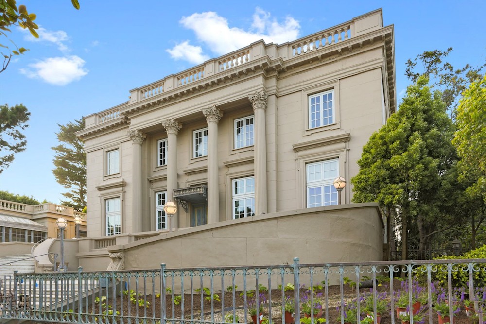
It’s one of my favorite times of year – the San Francisco Decorator’s Showcase is here. If you’re not familiar, this annual event takes a home – let’s be real – an insane mansion, usually in the picturesque Pacific Heights neighborhood, and as many as 30 designers completely transform it, room by room. This year’s showcase is particularly spectacular. The house itself was completed in 1904 and is a replica of Le Petit Trianon, Marie Antionette’s chateau on the grounds of the Palace of Versailles. The home is over 18,000 square feet, features 14 bedrooms and 11 bathrooms, two kitchens, an elevator and a full ballroom. No biggie. Needless to say there was a lot for this year’s designers to work with (side note, the house was also abandoned for nearly a decade so it was also in total disrepair).
There is so much to see in this Showcase. Each designer has the liberty to put a highly personal spin on their assigned room. There were many a stand out space in this year’s house but I’ve rounded up a few of my favorite highlights for you.
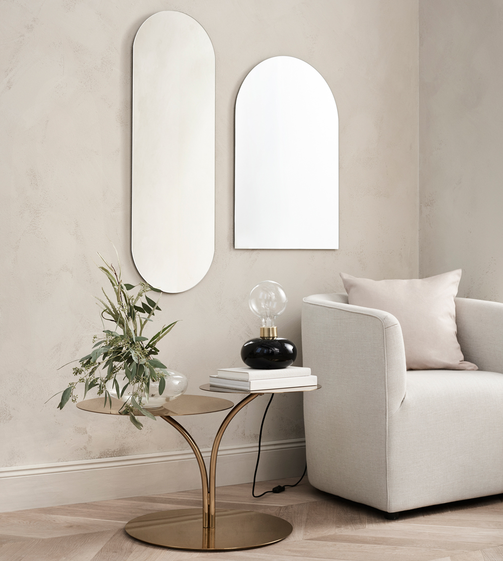
NEUTRAL TERRITORY
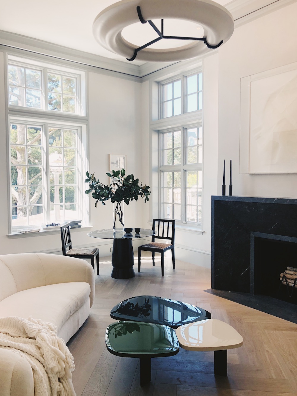
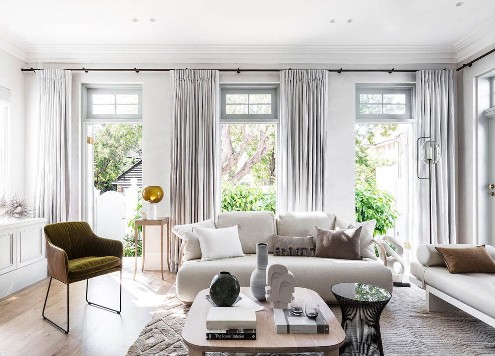
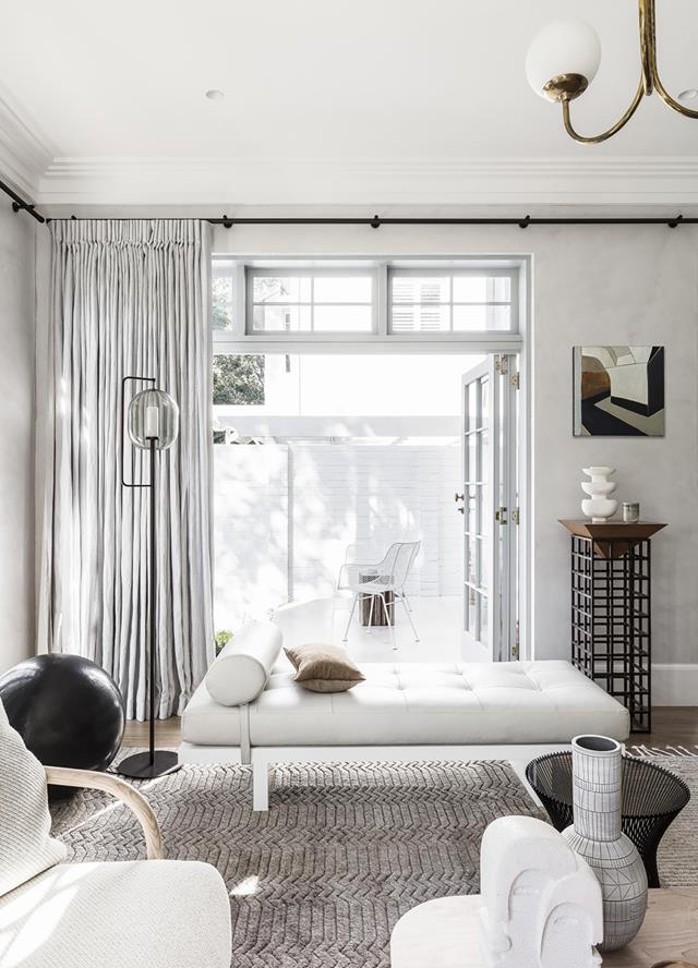
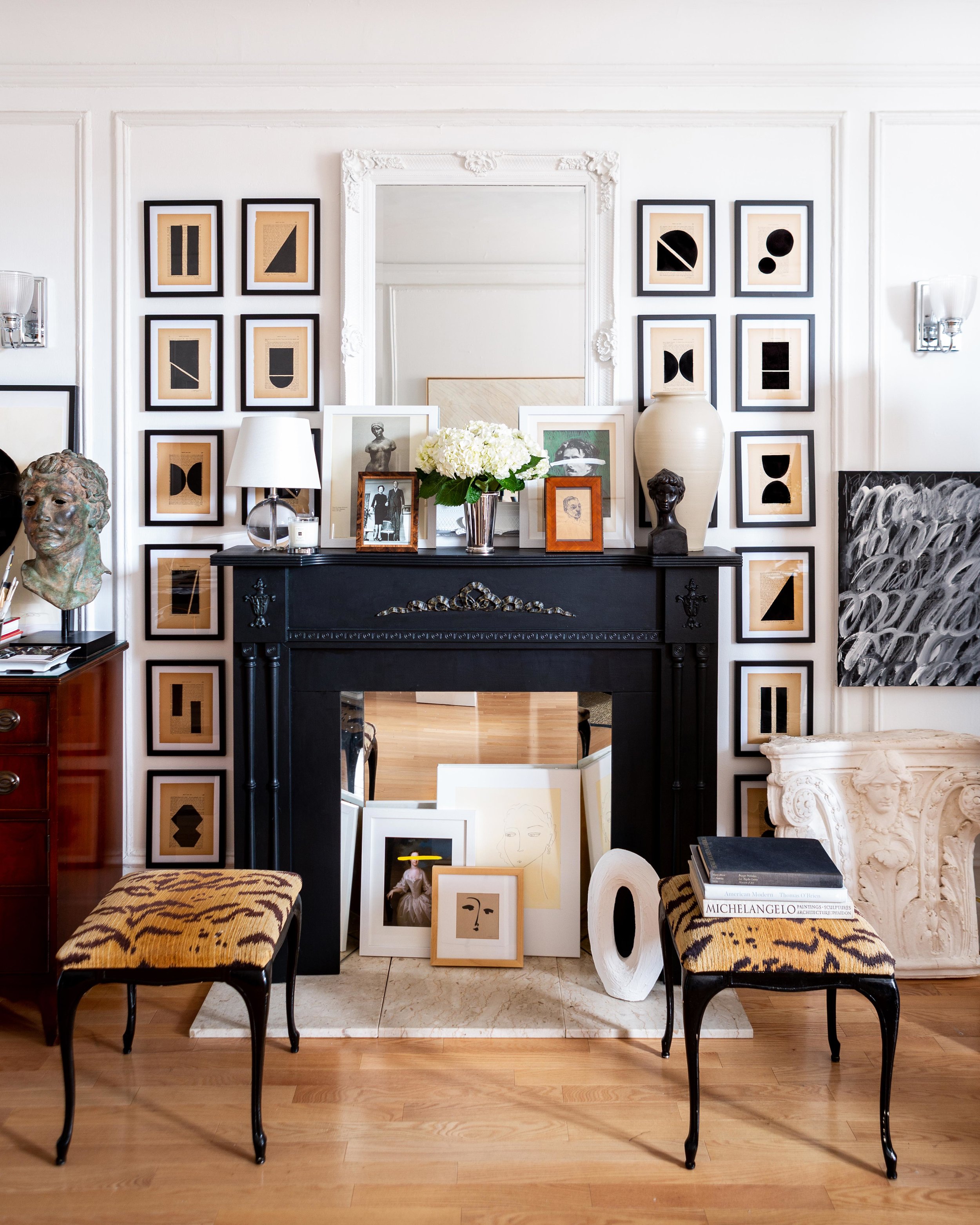
living room by heather hilliard design
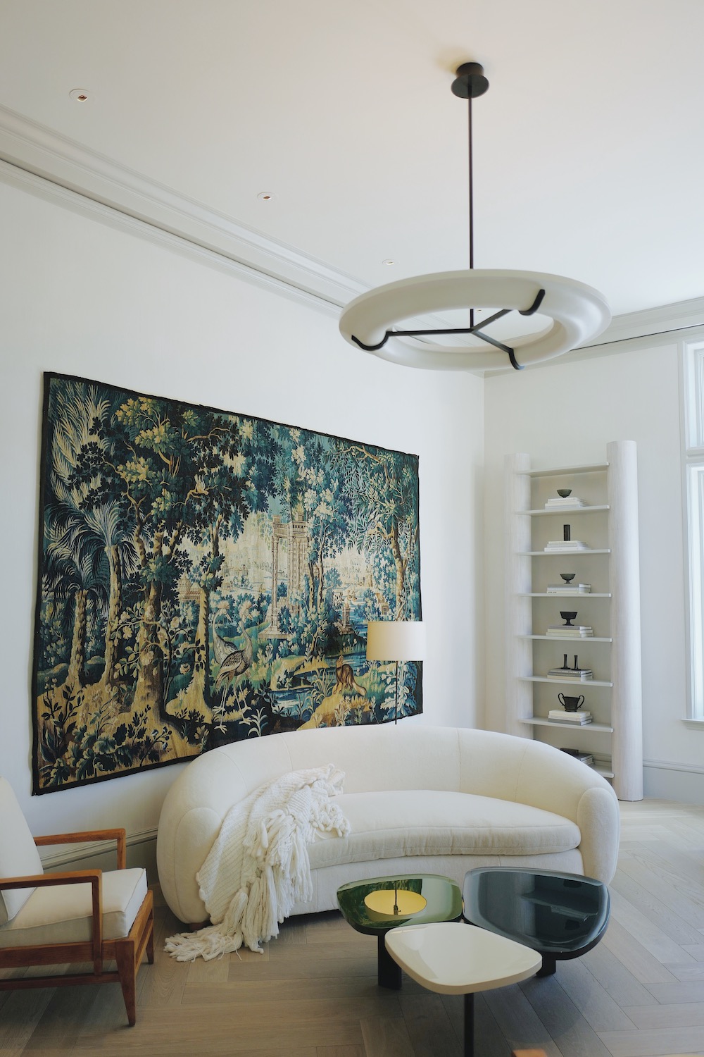
Probably no surprise, but I was immediately drawn to all of the spaces with neutral designs. The living room, by Heather Hilliard, was a nod to modern Parisian apartment. It features a mix of classic vintage, contemporary pieces and the first look at one of the many rooms featuring curved lines. Keep your eyes peeled. You’re going to see a lot of soft lines.
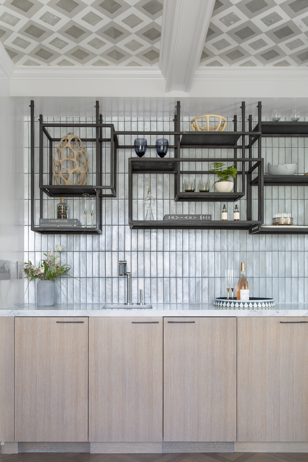
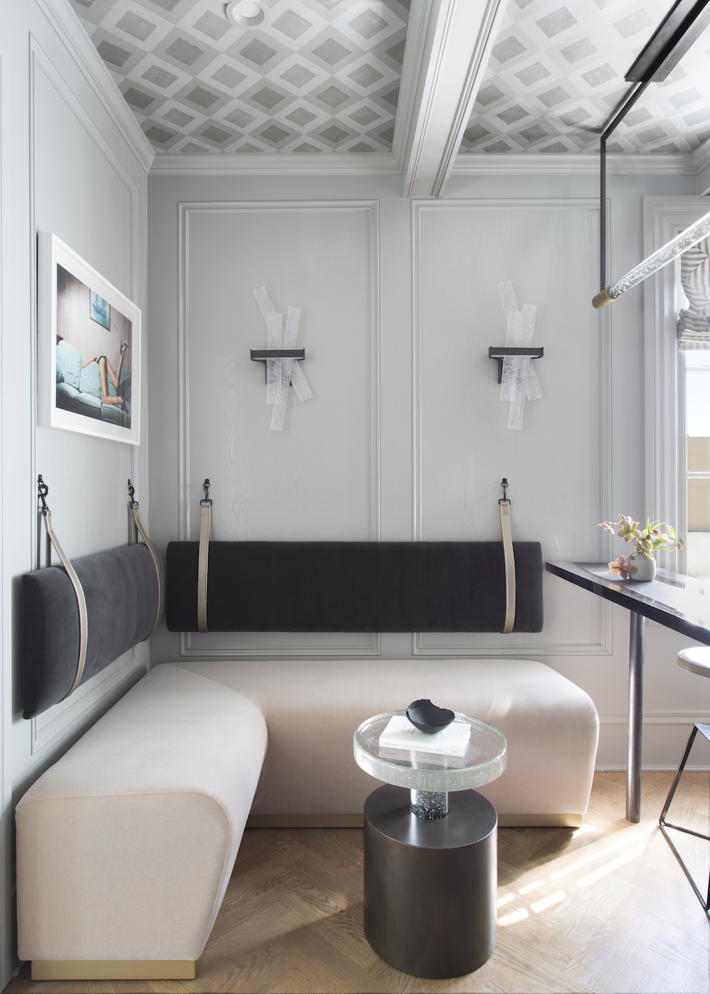
the oak room by sindhu peruri
In the Oak Room – or essentially the in-home bar and lounge – designer Sindhu Peruri gives us a built-in banquette, another of my favorite design trends, along with stunning custom cabinetry and geometric shelving. Also love the vertical tile backsplash in this space.
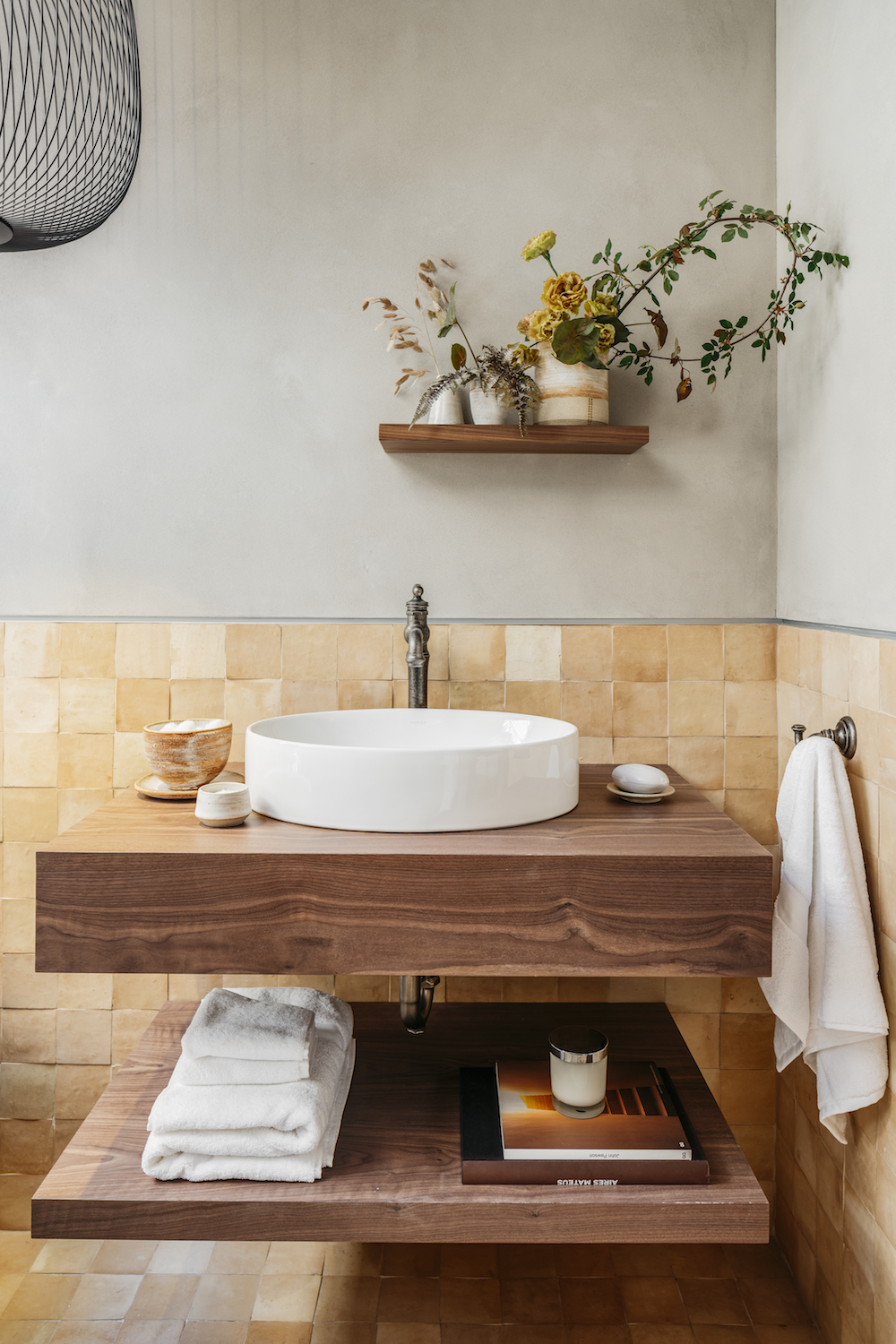
wabi sabi soak room by clara bulfoni, geddes ulinskas architects
And in the Wabi Sabi Soak Room (aka a bathroom sans toilet) by Clara Bulfoni, you get a beautiful breath of fresh air with warm woods, stunning handmade Cle tile (I used them on my fireplace and am obsessed) and yummy textured plaster walls. It has movement, it has tons of natural elements and is the perfect calming retreat.
PRINT AND PATTERN
Recital Room by martin korbus design
Classically Modern vestibule by scott robert design
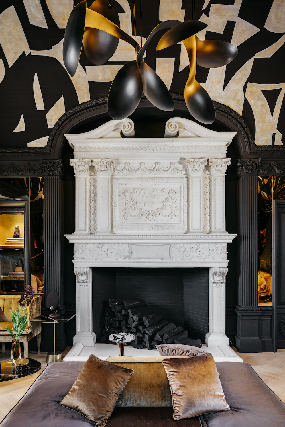
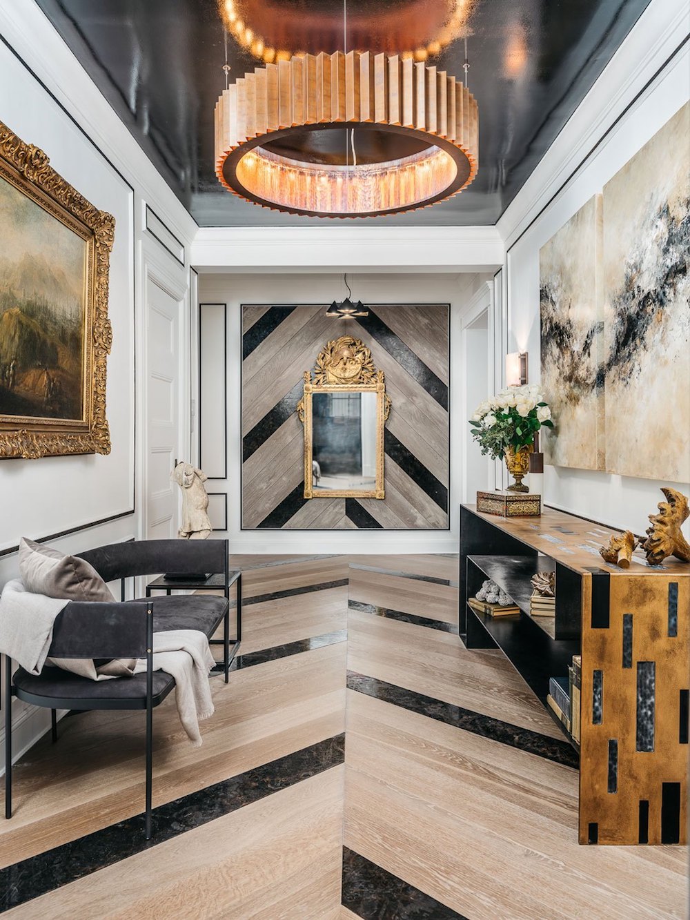
While white walls might be my personal mainstay, the Showcase is always all about drama. This year is no different. Everywhere you looked walls (and ceilings!) were papered, hand painted, lacquered or in the case of the downstairs hallway – adorned with flooring. It’s a great reminder to think outside the box.
GREEN WITH ENVY
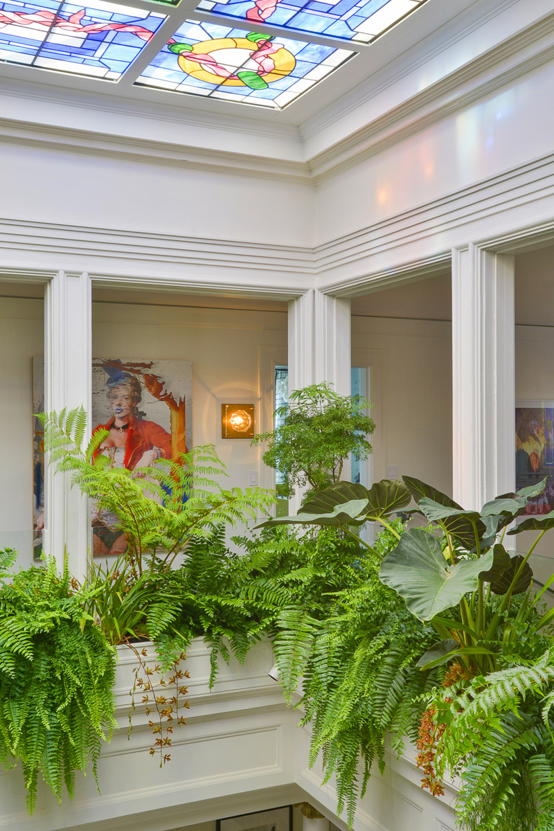
Balcony Garden by brandon pruett design
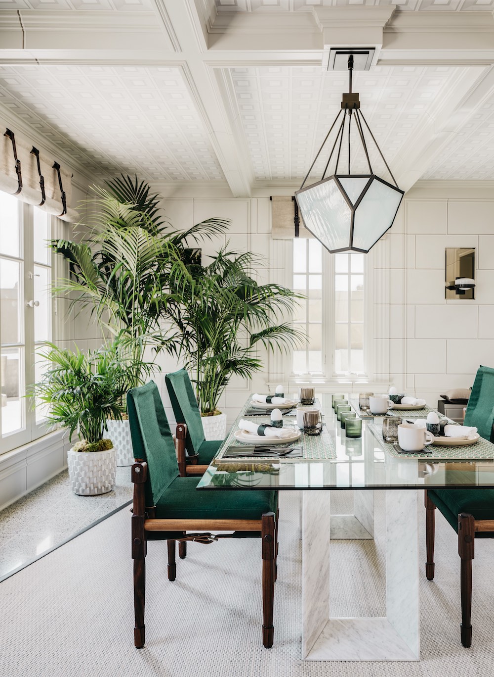
breakfast room by eche martinez
Whether it was an entryway, atrium or balcony full of plants or a room’s accent color, green is having a good moment in this house. I think the green safari chair needs to become a thing.
POWERFUL PINK
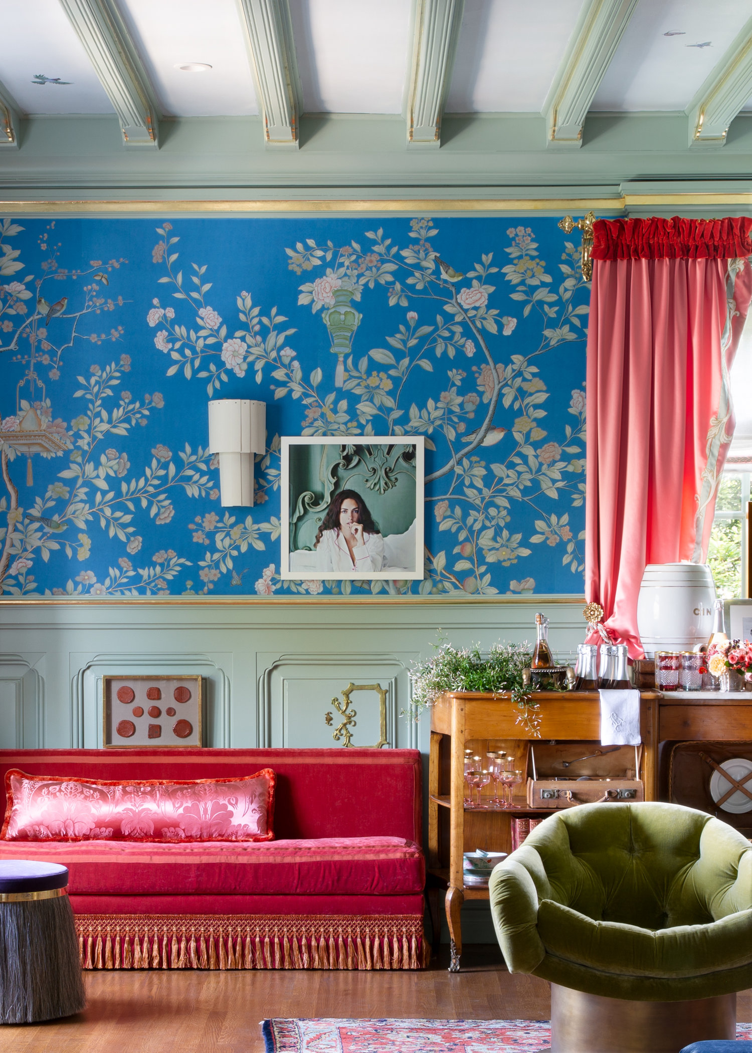
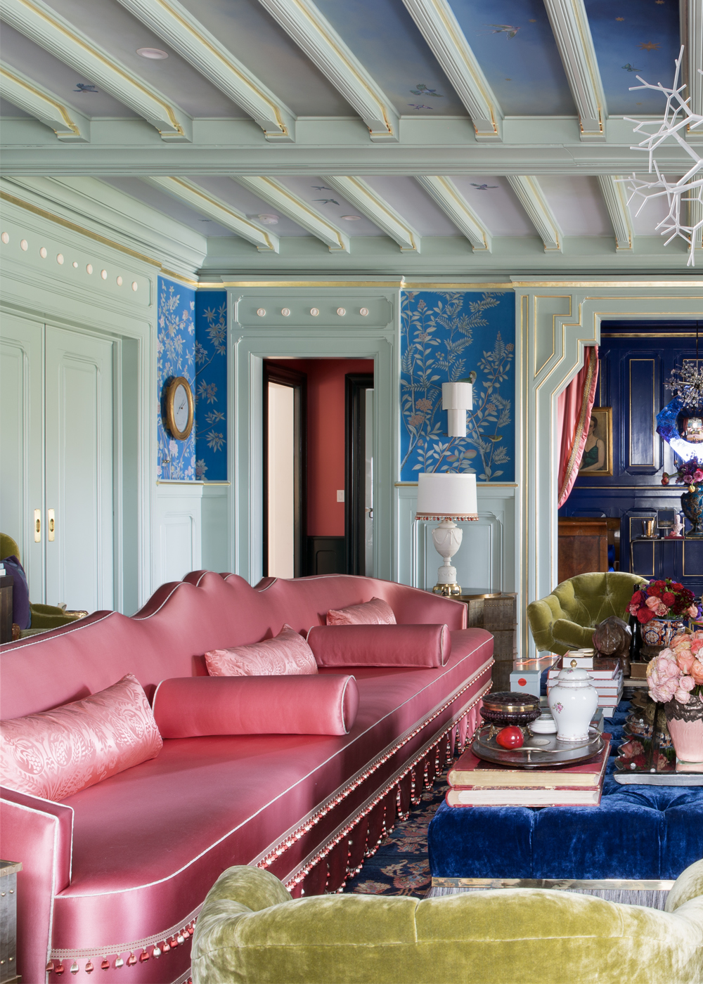
Houghton Hall Reimagined Entertainment Room by jonathan rachman
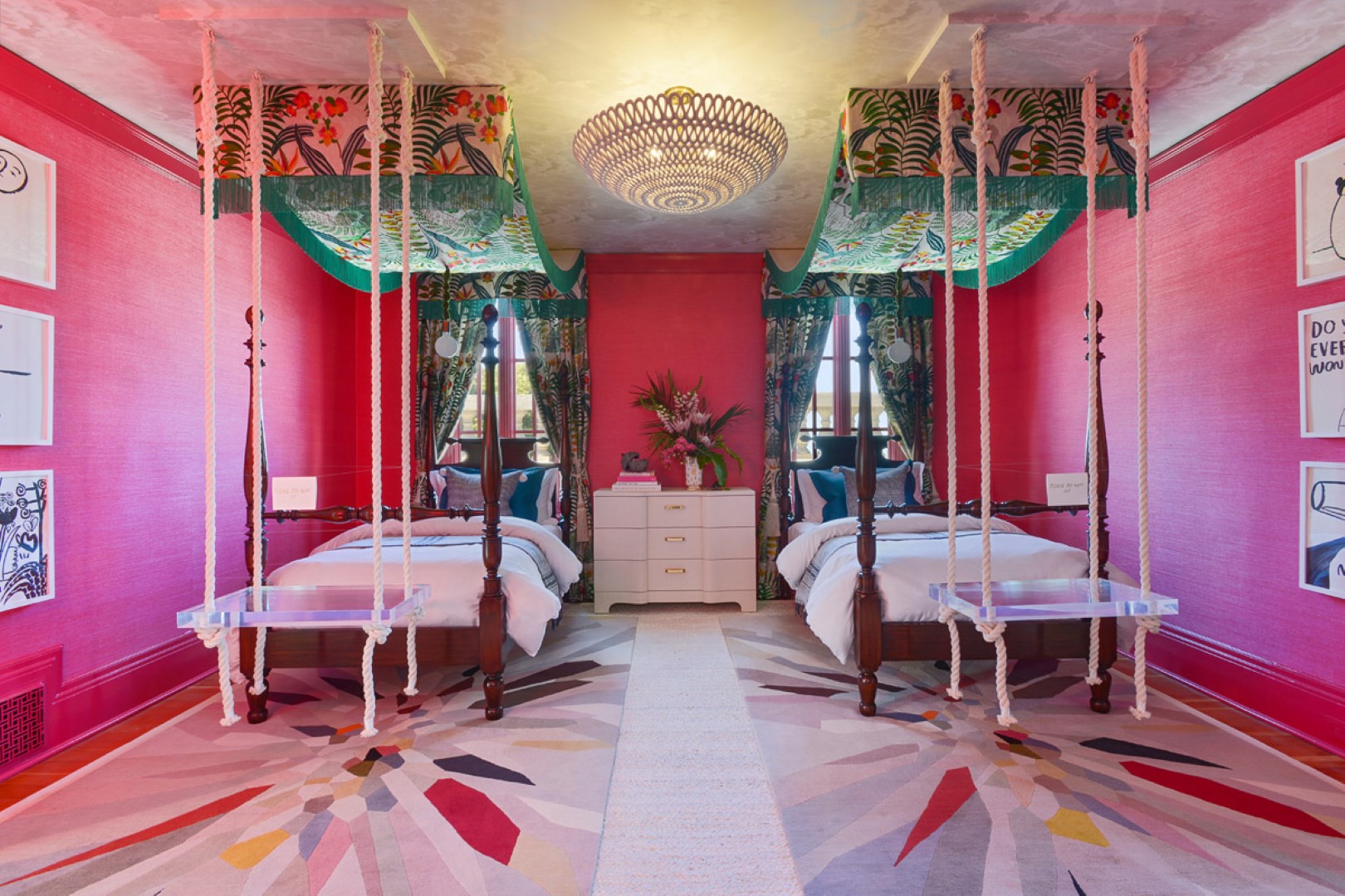
Daydream Believin girls bedroom by studioHeimat
Deep raspberry is another color de jour in this year’s Showcase. Ironic given it was the color I so desperately tried to get rid of in the original Apt34, but I love it in these bold concepts.
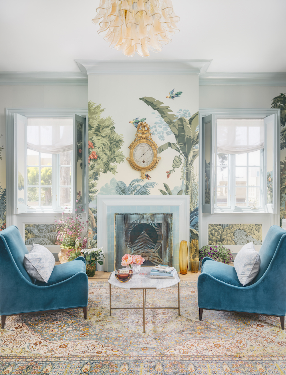
PAINTERLY WALLS
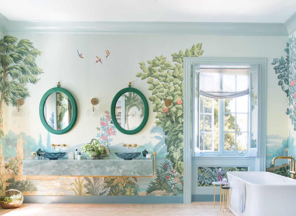
master bath suite by alexis humiston
Houghton Hall Reimagined Entertainment Room by jonathan rachman
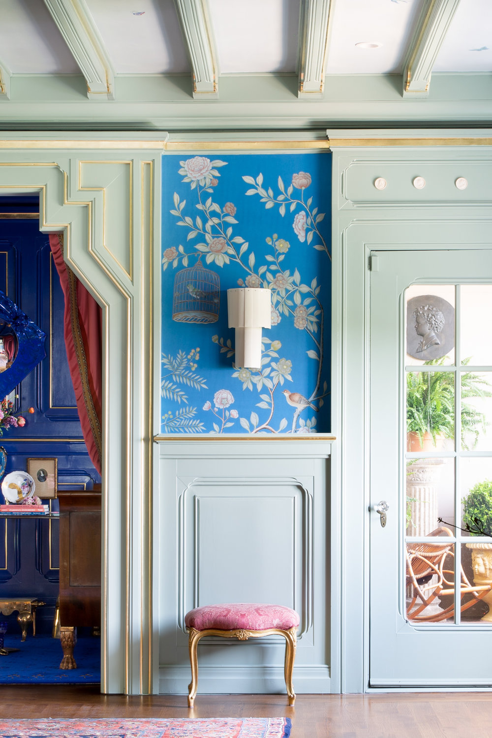
Major statement wallpaper is biggest trends seen throughout this year’s Showcase. A number of designers partnered with De Gournay to create custom, hand painted wallpaper to compliment their designs. While I’m usually not a wallpaper person, I could certainly appreciate the ultra lush look.
While rooms in the Showcase might feel totally over the top or completely unattainable, that’s kind of the point. I love visiting to search for 90-bits of inspiration that I can translate in a more accessible, daily life kind of way. If you can get yourself to Washington Street before the end of May, I highly recommend it.
Btw, it’s also now for sale for a cool $30 million!!
The San Francisco Decorator Showcase runs until May 27. Tickets cost $35-$40 and proceeds benefit University High School.
images via decorator showcase and by Daniel Lunghi, Lunghi Media
Group for Town and Country