Blue has long been a dominant color in interior design. That’s certainly nothing new. Indigo has seemed to reign supreme in recent years, but I think there’s a bit of a sea change coming. A set of softer, more subtle, more sensuous blues are cropping up and I’m quite into them.
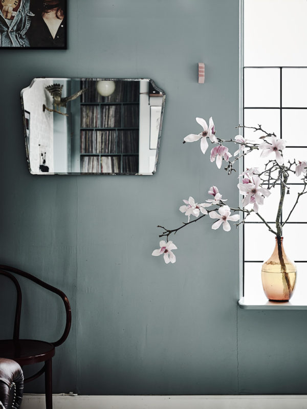
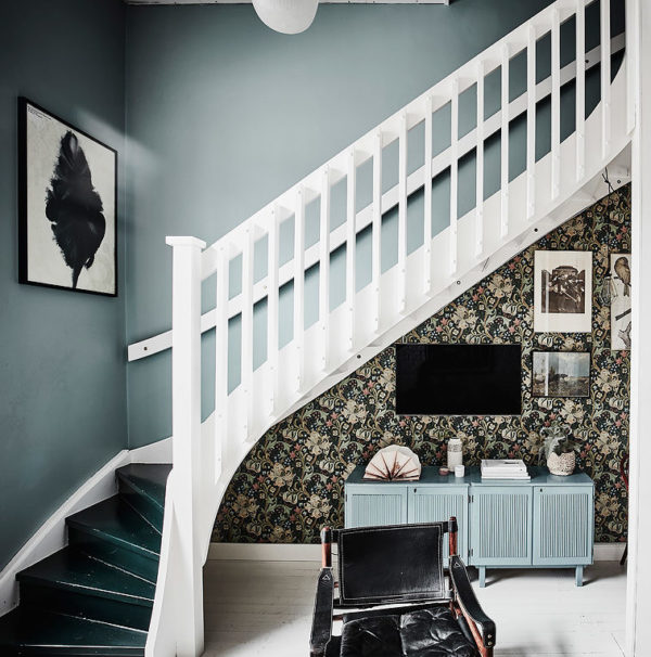
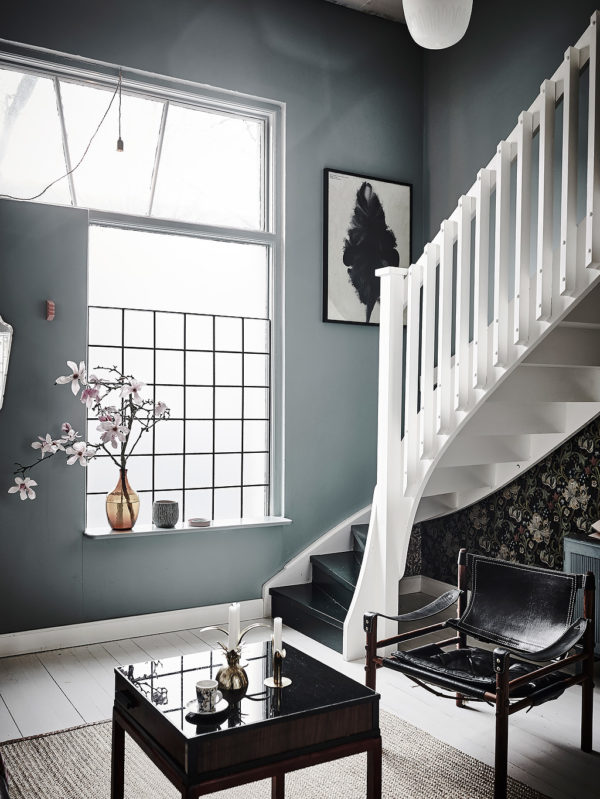
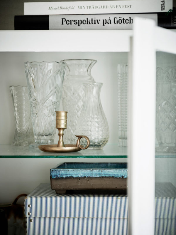
These gray-blues hues are much more nuanced than your straight forward indigo. Dusty gray versions with a green undertone make a perfect wall color. They feel soft and approachable. You can ground these blues with darker grays, rich browns and sultry blacks. I love the way a touch of blush just pops against them. If you’re looking for a blue that works like a neutral, Benjamin Moore’s Sea Star and Knoxville Gray are gorgeous options.
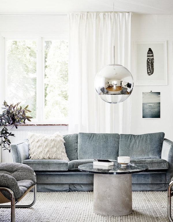
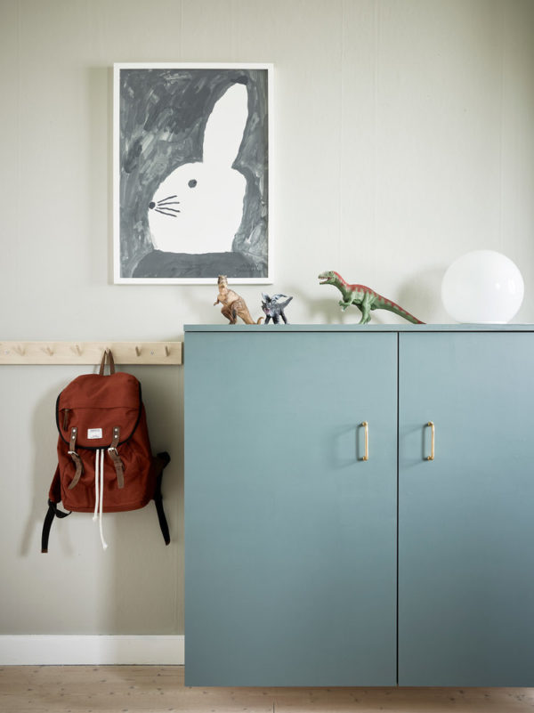
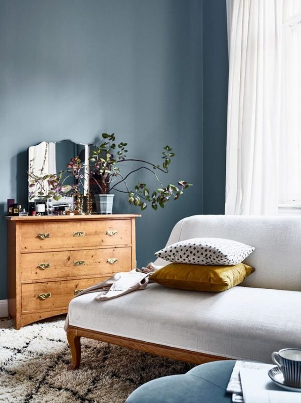
If you’re still a bit hesitant about committing to a wall color, blue furniture evokes a soft, subtle vibe. Less stark that white pieces, more playful than a stained wood, a dusty blue sofa or a gray-blue credenza creates a relaxed, easy feel.
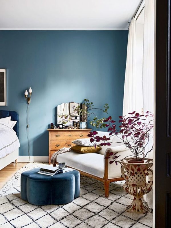
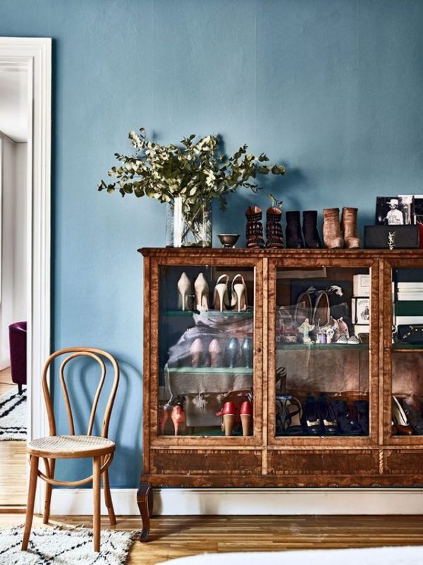
If you’re ready to be a bit more bold, a blue with a red undertone packs a bit more of a punch, but still feels approachable. This bedroom is painted in Farrow & Ball Stone Blue. The shade’s warm base pairs well with the golden woods and touches of red in this space. But again the color still isn’t in your face.
While I will likely stick to my color-phobic ways in our house, I do find myself drawn to a lot more color recently (as my Pinterest feed attests). If I were to pull the trigger on a saturated hue somewhere in the Victorian, I think a smokey blue just might do the trick.
What do you think? Are you feeling these moody blues?
For more color inspiration, CLICK HERE.
house 1 via entrance / house 2 styling by elin odnegard, photography by joans berg for plaza interior / house 3 andrea papini for elle decoration
There is everything to love about how this grayish-blue hues inspired apartment looks! I know a girlfriend who wouldn’t mind living in such a stylish apartment for a long time(:
With love from Singapore,
Iann Ethel
Artelounge.net | An Online Space for Travel + Inspiration
So glad I spotted this article as I am about to paint my sons room blue but I didn’t just want to go with a soft baby blue and I don’t want to go too harsh with some of the beautiful deep dark blues out there so this has helped me decide! I love the blues here with an almost gray bluish tinge to them. Great post! Thank you for this 🙂
Marie.
Paint It White..