This installment of Designer Files is just creamy goodness. If you’re looking for an example of a style-focused kitchen that is as functional as it stunning – cuz I know you just googled exactly that – well look no further. You’re going to want to move into this space immediately. I know I did.
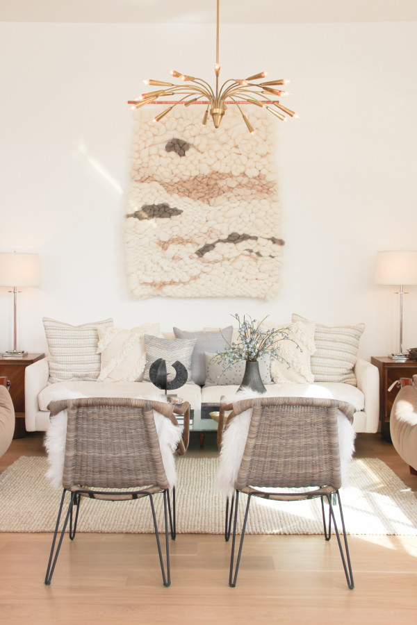
This modern eat-in kitchen / family room is picture perfect (obviously!). I love every single choice – from the color palette to the hardware, the fixtures to the furniture. It’s comfortable cozy, functional and overflowing with style. The layers, luscious textures and use of mixed materials dotted throughout the space make you want to sink right into the creamy-white goodness.
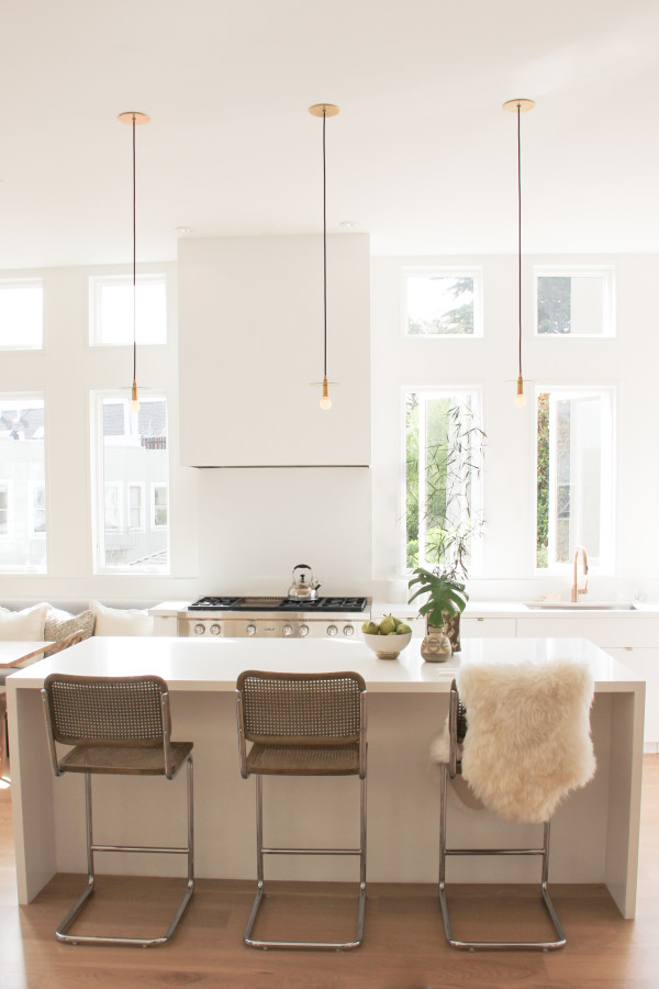
The kitchen’s island is a true thing of beauty. You would have easily had me with the waterfall countertops but those those simple pendants by Workstead are simply chic.
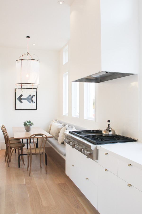
I’m also in love with that custom hood. It’s a refreshing alternative to the typical stainless steel. (I have a thing for eye-catching hoods).
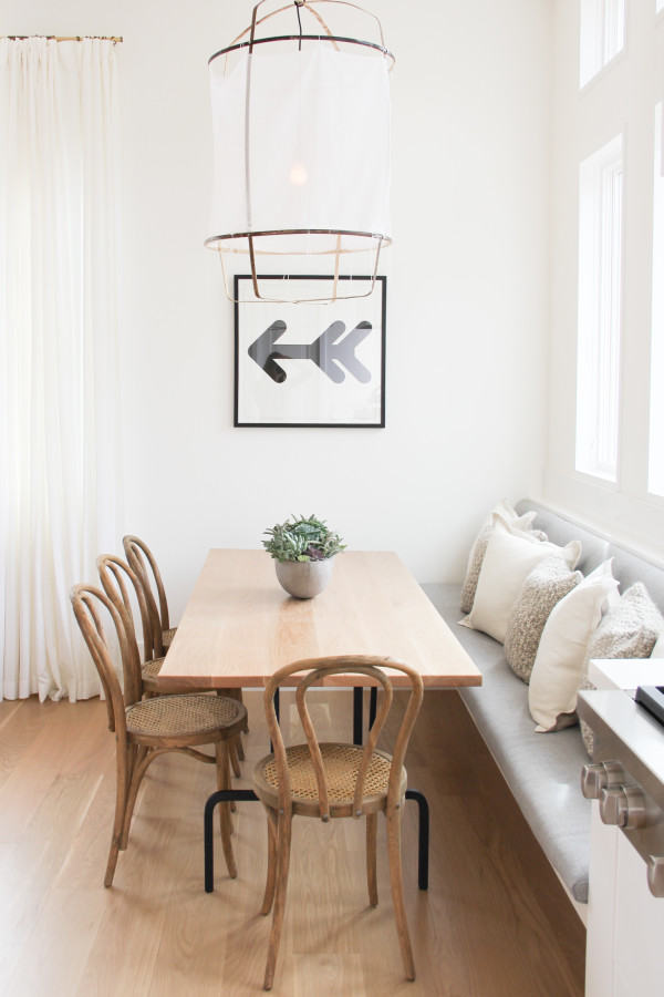
I’ve been obsessed with koushi pendants since our trip to Australia a couple of years back. Their rustic texture has a bit of beachy vibe and feels perfect over the casual kitchen table. Digging the built-in bench too.
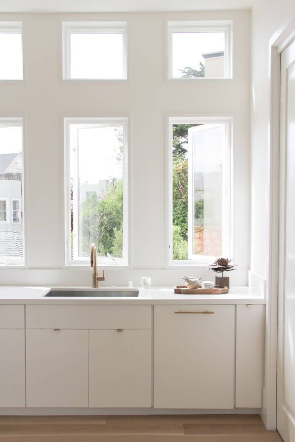
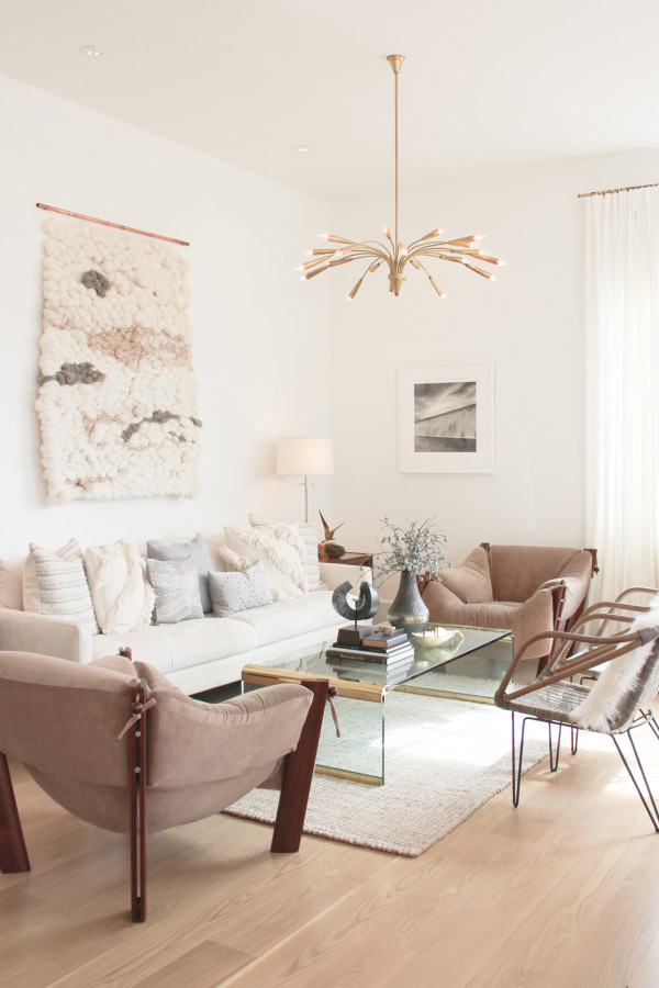
But the family room’s seating area is a real thing of beauty. It mixes periods and styles seamlessly. I thought I was over the weaving trend until I saw that massive piece over the couch. Everything in here feels comfortable but selected with such a discerning eye for design. #lifegoals
This kitchen is actually part of the amazingness that is Decorist founder Gretchen Hansen’s San Francisco home and was digitally designed by LA based firm 30 Collins. I was lucky enough to get to walk through this space in person and can attest, these gorgeous photos don’t even do it justice. And I’ve been day-dreaming about those vintage easy chairs ever since. They’d look so lovely in our house. I wonder if Gretchen might ever want to let them go…
For more stunning home tours click here!
project by 30 Collins for decorist


What do you think?