When Mondays come barreling in all frantic and intense, wouldn’t it be nice to retreat to a brilliant all-white office? There’s something about a clean slate – both figuratively and quite literally – that can help organize your thoughts. This bright white workspace is the physical manifestation of a fresh start.

bright white workspace bright white workspacebright white workspacebright white workspacebright white workspacebright white workspace

Like in your closet, a little minimalism in your workspace can go a long way. A pared-down desk, bright white – well everything – and pale floors combine to create a calming, distraction-free environment. While I typically love my shelfies, this office exemplifies how closed storage can help keep the clutter at bay – both in the room and in your mind.

The pops of warm camel brown (all the way down to the camera strap) keep the room from feeling clinical. Hits of black scattered here and there (from the chair legs, to the tea pot and desk lamp) feel modern and cool. And the Serge Mouille wall sconce is perfect. No matter where you put one, they always are. The greenery softens everything with a few organic lines. But this feels like a space where you can breathe. And think. It’s certainly everything I need to clear my mind and get down to business.

And what’s more, this super cool look can in fact be obtained. That chic white desk, the conference table, those sleek storage cabinets on adorable white wheels – you can get it all at the Finnish Design Shop. Yes – this is a Scandi space. Of course that’s why it’s so picture perfect.

For more home office inspiration, CLICK HERE.


Styling and Photography by Riikka Kantinkoski

After a long winter of record setting gray in San Francisco (and over a week of being stuck in bed sick), I’m so excited to see March arrive, to see the sun return and to see the days get perceptively longer (light past 6pm, what?!). Anyone else as ready for spring as I am? These beautiful pastel interiors embody the light, bright, optimistic energy of the new season.

spring colors   spring colorsspring colorsspring colors spring colors

I love the muted, slightly rustic air of this color palette. The icy blue shade is a lovely alternative to a classic gray. Its cool elegance has a serene depth that pairs well with neutrals and warm brass accents. The deep eggplant purple in a luxe velvet ground the rest of the airy tones. And the fresh greenery has me ready for a trip to the nursery. I love me some neutrals, but I just might have to slip a pastel or two into the house.

I hope you have a light, bright and beautiful weekend!

 images via tine k home

As I’ve made it rather clear over the years, I’m all about minimally styled interiors – less is more when you seek to curate a space that feels fresh and airy. But while sparse spaces photograph beautifully, monochromatic rooms can sometimes feel a bit stark in real life. I don’t know if it’s the fact that Valentine’s Day is tomorrow, or that all those pops of blush showing up on Pinterest have finally seared themselves into my brain – but either way – I have fallen in love with the peachy, dusty, blush pink in this nordic apartment.

apt34-peachy-keenapt34-peachy-keen-6SFDE5852A40D2734702AF9AE96C23F53FB2_2000xSFDA8FB8766FD424EDC944A4699BFB3CC31_2000xapt34-peachy-keen-3  SFDA44E41F818DA40AE9C7E3AE67BA251AF_2000x

Peach accents can break up a monochromatic scheme, adding warmth and playfulness to the space without detracting from an otherwise neutral interior. You might be surprised to learn that the rest of this apartment is essentially black and white. But just like I decided our house needed a room with bold color, this apartment shows you can maintain that modern chic feel, even with pink! You can take your apartment to the next level by incorporating a peach accent wall. Or if you want just dip your toe in this rosy water, start with some smaller statement pieces placed throughout your home. Any of the lovelies below will do!

apt34-get-the-look-peachy-keen

SHOP THE LOOK: bowl / pendant light / poster / notebook / pillows / throw / chair


For more home tours, CLICK HERE

home tour courtesy of fantastic frank

If you love bright white spaces, it doesn’t get any more brilliant than this.

apt34-white-out-1Studio8A-Rye-London_6-1333x2000Studio8A-Rye-London_3-1333x2000apt34-white-out-3280A2588-1333x2000apt34-white-out-2apt34-white-out-4

Like floor to extremely high ceiling, light and bright brilliant. Even the concrete kitchen countertops feel airy. Copper hardware, a few well-placed cutting boards and a fiddle leaf add warmth. Now, I’ll give that this isn’t the most practical color palette for daily life. That this space is, in fact, a photo studio makes a lot more sense. But that doesn’t mean it offer a little inspiration. If you’re not going to paint floor to ceiling anytime soon, a bright white piece or two will brighten up your winter.

apt34-white-out-look

SHOP THE LOOK: candles / stool / chair / table lamp / sconce / media stand / table / lamp

photography via rye london 

After nearly 10 years of blogging, one of the biggest challenges is coming up with ideas! It can start to feel like you’ve talked about everything there is to talk about. And you keep seeing the same images on Pinterest. And everyone has already written everything there is to say about the Pantone Color of the Year. What’s left?!

When creative roadblocks strike, I like head out – as far away from the depths of the internet as I can get. One of my favorite places to go for new ideas are the streets of San Francisco. Sure, I could run to the new MOMA, head to the design district or wander past the architectural wonders of Pacific Heights, but there are in fact, hidden pockets of inspiration everywhere you look. You just have to be able to find them. So I thought I’d take you along on one my inspiration hunts – and have a little fun while out and about.

apt34_designinspiration

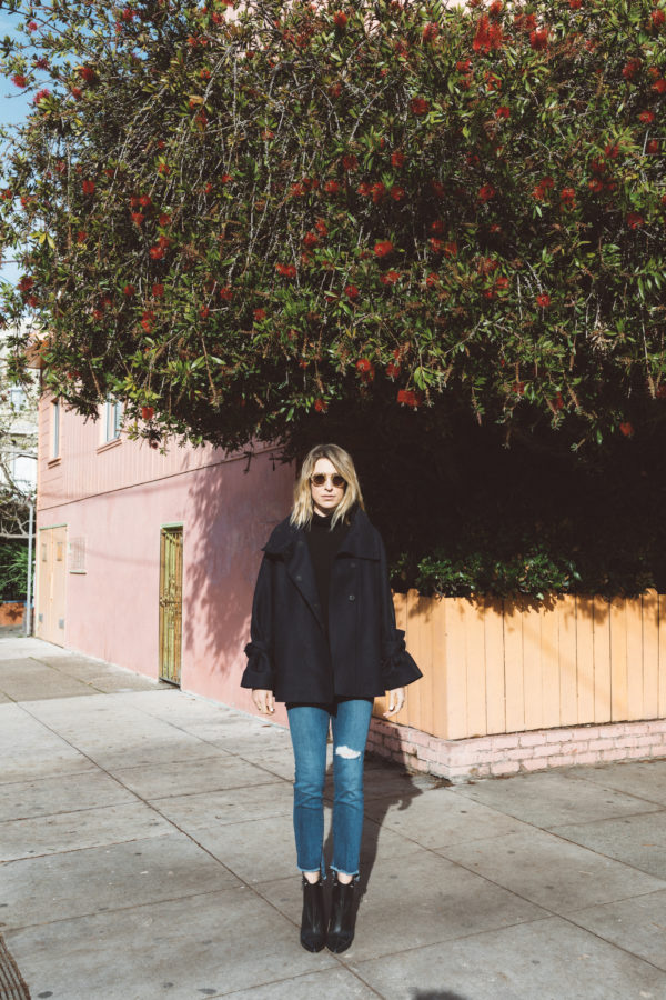
San Francisco is full of inspiration; colors, textures, art, architecture. But when you’re stuck behind the wheel of your car, it can be hard to keep your eyes open for hidden gems.

apt34_designinspirationapt34_ab2-3860

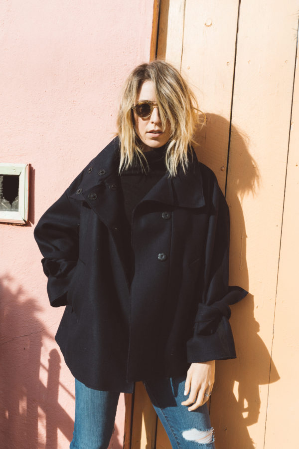
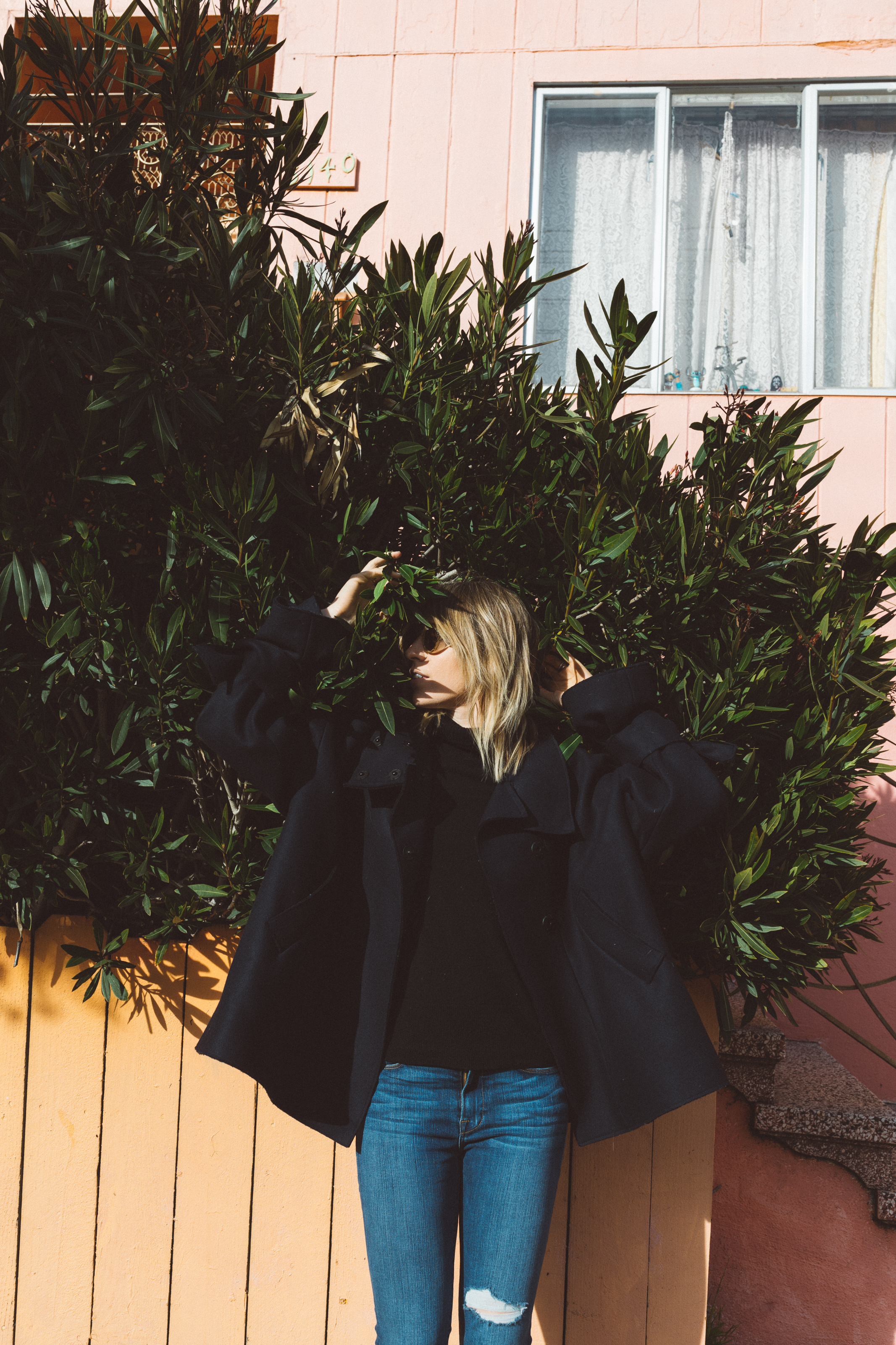
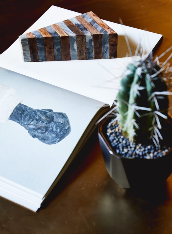
It was while wandering around the Mission that I spied this pretty little corner. The sherbet hues and that rich luscious greenery caught my eye and got my brain whirring with fresh color palette ideas. It also inspired me to get up close and personal with plants – that I can’t explain quite as easily. But I digress.

apt34_ab2-3911apt34_ab-3903

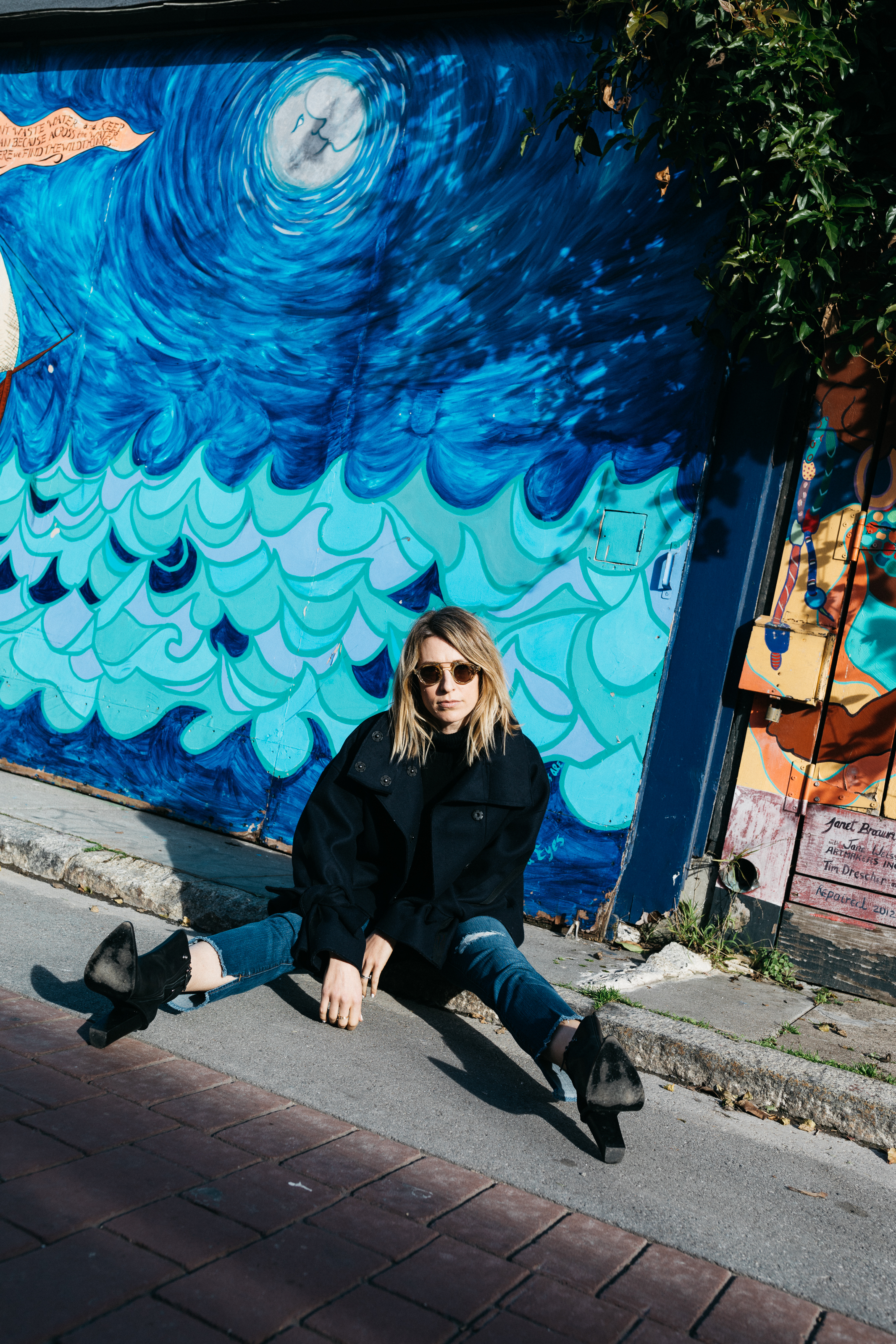
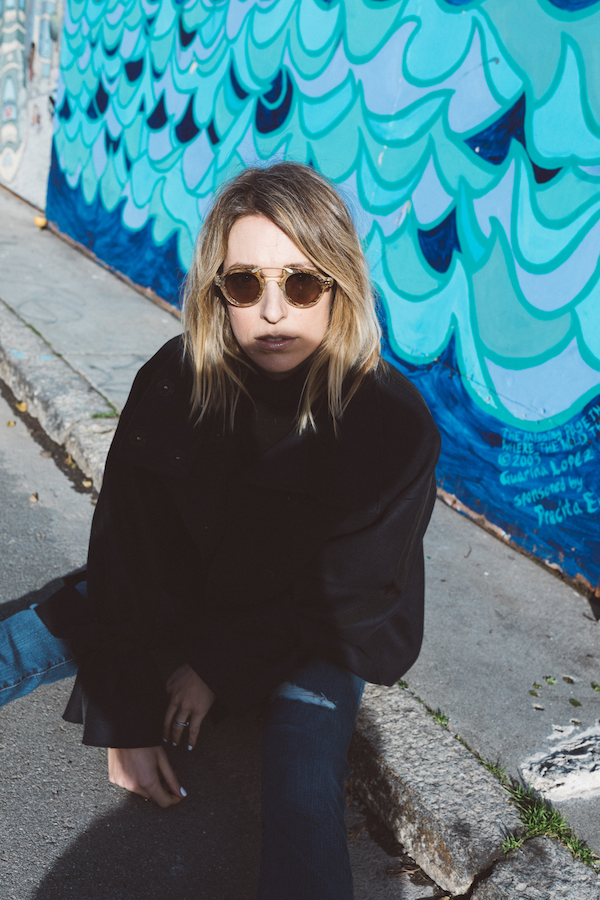
Then there’s Balmy Alley – one you’re almost certain to miss unless you have the luxury of keeping an eye out. The block long alley is the best place to see the most concentrated collection of murals in San Francisco. Each building along this carless gem is filled with community art. The murals began in the mid-80’s. Some murals offer political messages, some depict moments in history, others are just simple bursts of beauty. But a stroll down this tiny street reminds you to search for the unexpected and appreciate self-expression. The alley reminded me to look at things from new perspectives. Simply examining a problem from an unexpected angle can reveal solutions you’ve never considered.

apt34_designinspiration3apt34_designinspiration2apt34_designinspiration

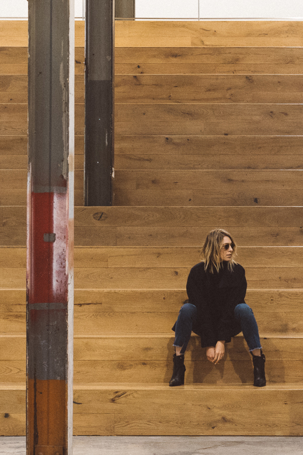
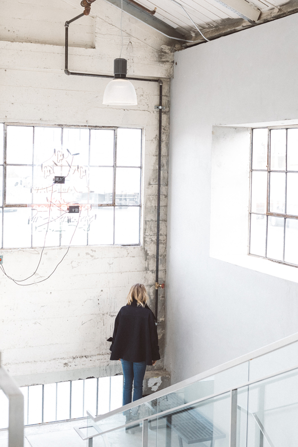
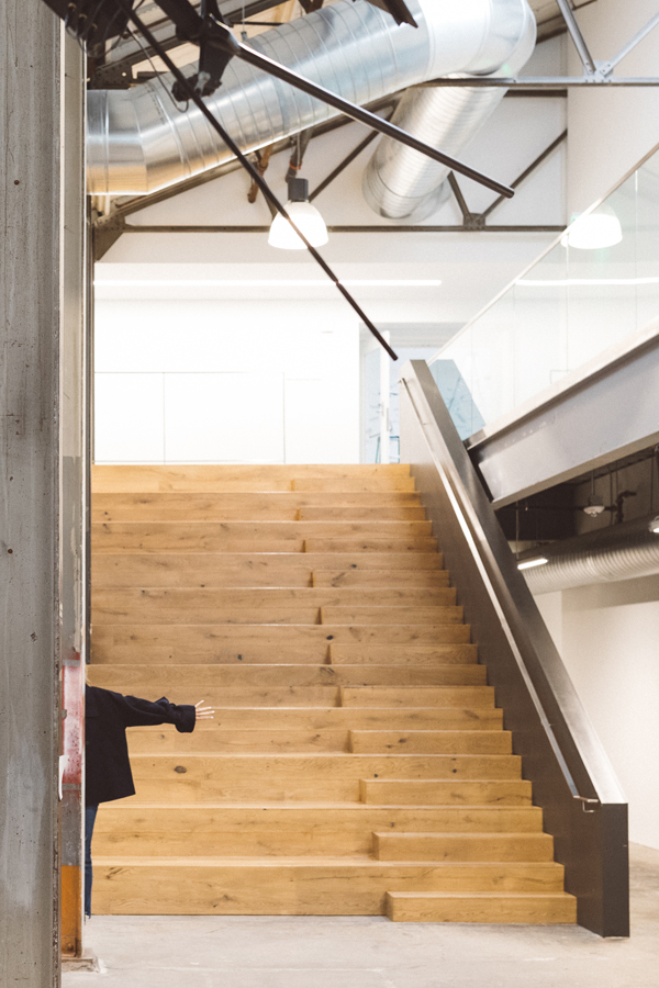
A new favorite inspiration destination is the Minnesota Street Project. Recently opened in San Francisco’s historic Dogpatch district, Minnesota Street Project offers affordable and economically sustainable spaces for art galleries, artists and related nonprofits. But you don’t even have to step foot into one of the spaces’s 10 galleries (which are open to the public and totally free) to be inspired. 1275 Minnesota Street features a massive open plan atrium that includes exposed steel beams, polished concrete floors and oak bleacher seating. And crazy good light. Did I mention that? I love simply taking a stroll through the vast open space. It’s like the opposite of Balmy Alley. Devoid of color. Minimal, striped down to the essentials. A visit often reminds me to not over complicate things.

apt34_ab-4019

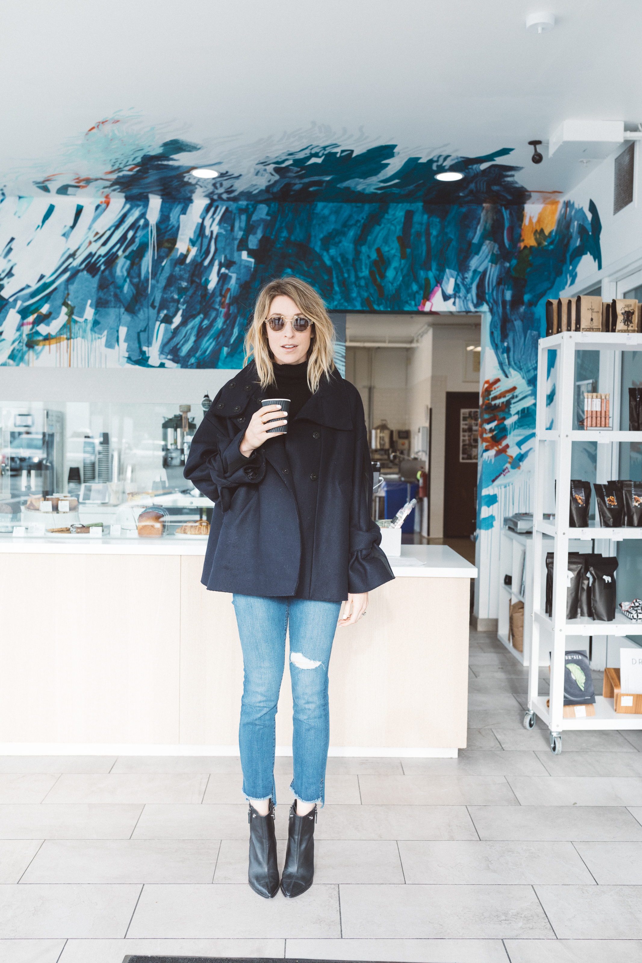
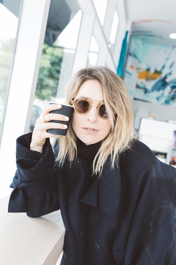
A day spent soaking up fresh inspiration requires sufficient caffeination. It’s helpful that my favorite little coffee shop offers design inspiration unto itself. Tucked a short jaunt away from Minnesota Street Project, in an even lesser-known part of San Francisco sits The Den. The corner cafe is in fact attached to famed San Francisco bakery Craftsmen & Wolves’ commercial baking space. But I love that CAW has chosen to make its tiniest space into a precious jewel. Artist (and friend!) Heather Day took her art large scale with a stunning mural that stretches from wall to wall and up onto the ceiling. It’s the perfect place to grab a jolt of inspiration, a damn fine cappuccino and a Rebel Within (if you don’t what that is, you need to find out immediately).

apt34_ab-4030

When I spend an afternoon away from my computer and out in the city, the limited world view served up on places like Pinterest and Instagram become the furthest things from my mind. Instead, I find myself clearer headed, more energized and excited to sit back down to my keyboard, determined to share something new with you.

I’m curious, what do you like to do to break out of a rut?


For more of my favorite finds in San Francisco, CLICK HERE


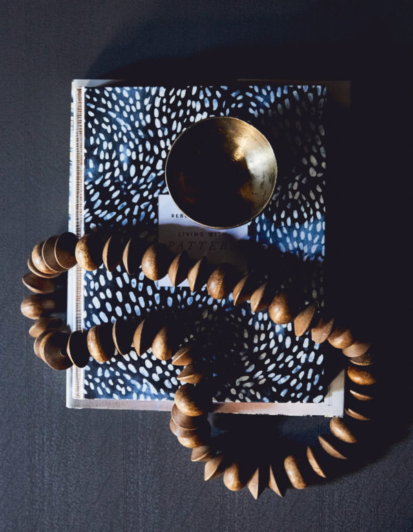
original photography for apartment 34 by ashley batz

Well, as much as I tried, I couldn’t stay away from here for the entire rest of the year. I just missed you all too much! And when these pictures of my completed media room came back, I also couldn’t stand waiting to share the final reveal. So without further ado, a 2016 bonus post – call it the year’s finale. Seems fitting that is should a room in my own home – this really has been my biggest project to date!

apt34_media_room

Now if you’ve been an Apt34 reader for awhile (and I hope some of you have been!) this space might look familiar. That’s not just because I gave a little sneak peek in my holiday cocktail post a couple of weeks back.

You might recognize this space as I actually featured it as part of the One Room Challenge in October 2015. Yes, I said 2015. Back then I still had renovation naiveté and actually thought there was a good chance of construction being complete in time to finish a room in six weeks. HA! It only took seven more months. Lesson learned. Since moving in earlier this year, it’s also taken a significant amount of time to make my original design vision come to life. Unlike with our lofts, I’ve been incredibly picky about every single piece that comes into this house. Thankfully, I discovered ATG Stores , a new online furnishings retailer that carries just about everything under the sun. I was able to find all the finishing touches I’d been waiting for that ultimately pulled this room together. And I think my patience has paid off. I managed to create a respite from what is otherwise a toddler play zone! What do you think?

apt34_media_room2

Being that this is our media room, I always knew I wanted this room to have a dramatic, dark color scheme with a very monochromatic palette. I’m obsessed with the black/blue that I found – it’s Benjamin Moore in Gravel Gray. We painted the entire space, including the crown molding and the ceiling in the same color with a flat finish. It gives the room the modern, masculine feel I was going for. Our light oak floors add just enough contrast to brighten the space. Having two oversized windows also flood the room with light so it feels chic rather than cave-like.

A point for the renovation geeks – I’m also obsessed with my outlets and light switches from the Adorne Collection by LeGrand – they come in a gray which compliments my color palette. Seriously awesome.

apt34_media_room8

Keeping accessories to a minimum helps give the space a calm feel.

apt34_media_room6 apt34_media_room9

I used brass accents to warm the room. I love the little cocktail table – perfect for resting my nightly glass of wine (or two!).

apt34_mediaroom7

A throw pillow with chartreuse and greens adds a touch of color to break up the monochromatic scheme.

apt34_media_room4apt34_media_room5

I can never resist having a few treasures sitting out that make me smile. A selection of my favorite design books, a little bowl I’ve had so long I can’t remember where it came from. A strand of wood beads from the flea market.

I’ve broken down how you can recreate this look shopping from ATG Stores below.

apt34_mediaroom_list

SHOP THE LOOK: cactus / pendant light / brass table lamps / black throw / sectional / coffee table / marble & wood bookend / pillow 1, pillow 2 / brass & marble cocktail table / wood tray


For all the design inspiration for this room CLICK HERE

For the latest about our renovations, CLICK HERE


original photography for apartment34 by aubrie pick

This post is in partnership with ATG Stores. All thoughts and opinions are 100% my own. Thanks for supporting collaborations that have kept apt34’s doors open!

I’m kicking off my first gift guide of the season with the design lover in mind. Self-serving perhaps? I call it strategic. I’m feeling a fresh, refined color palette for the holidays. Instead of decking your halls with the standard red and green, what if you tried a mix of white, gold and touches of warm gray instead?

2207001999_4_1_1colonial-living-room2307002999_4_1_1

The look is sophisticated, luxurious and refined. Using lots of white helps spaces feel open and airy – rather than overstuffed and cluttered. Touches of gold feel celebratory and festive. And warm gray tones add a bit of gravitas without being harsh.

I recently scoured Horchow and discovered a treasure trove of goodies at crazy good deals. The site features home decor, tableware, even gifts from some of my favorite lines, like Aerin, Palacek and of course Neiman Marcus (they’re part of the Neiman Marcus family of brands.) Starting tomorrow, you can save up to 40% off during their Finders Savers event.

I’d be thrilled if Santa put any of these pieces in his cart for me!

apt34_giftguide_goldgray

SHOP THE POST: 1 coasters / 2 vase / 3 pillow / 4 charger / 5 bowl / 6 tray / 7 candle / 8 vases

image 1 / image 2 / image 3

This post is in collaboration with Horchow. All thoughts and opinions are 100% my own. thanks for supporting partnerships I’m excited about and that have kept our doors open.

After this week, who is ready for an escape? While I’m not actually going anywhere (there’s too much to do here), I am going to take this weekend to fantasize about life in far away places. Like this Swedish apartment photographed by the incredible Jonas Ingerstedt.

This space takes you through a moody and muted journey. Each surface is adorned with collectables making you feel as though you are stepping into a museum. Every design detail serves a purpose, but feels casual enough to be livable. Tones of green so soft, make the backdrop feel neutral enough to layer in pops of color. Rich textures and unexpected details add warmth, comfort and a touch of whimsy.

juliahetta0228-668x1000juliahetta0294-667x1000juliahetta0246-668x1000juliahetta0316-667x1000

From an interior design standpoint, what makes this space so interesting is the way that the space is utilized from the floor to the ceiling. Each surface, even the lowest point in the room, is decorated. Art is placed on the floor instead of hung on the wall. A bookshelf starts at the lowest point and reaches to the top of the ceiling. A gallery wall fills up an entire room. Every surface from the coffee table, to the dining table, to the kitchen island is accessorized with such intention. From every object to each floral arrangement, you never question the purpose of so much detail in one small space. That in my opinion is design done right.

juliahetta0194-668x1000juliahetta0366-667x1000juliahetta0265-670x1000

This design proves that neutral does not have to be tones of white, but instead can be your favorite vibrant hue in a muted form. Different tones of green whisper from room to room, acting as the perfect contrast to the pops of red sprinkled throughout the space. I love how this space has an abundance of natural greenery and floral arrangements translating the muted green color palette into something much more tangible. While I’ve gone uber neutral in our house, I’m thinking a layer of this understated green might be the perfect addition.

apt34_scandichi

SHOP THE POST 1 Page Plant Hanger | 2 Mid Century Bamboo Rocker | 3 Agate 4 Book Ends |4 Wool Blend Throw | 5 Florence Sofa | 6 Cream Pillow | 7 Modern Candelabra | 8  Marble Coffee Table |9 Wide Armed Dining Chair | 10 Glass Cone Bottle

This space is the perfect example of how to push the limits of design, I hope you are inspired to run with a color palette that pushes your boundaries. After seeing this space, you won’t regret it!

For more inspiring home tours, CLICK HERE.

Apologies for being a little tardy today friends. I don’t know if you followed along on my Italian adventures last week, but I’m finally back home now and still battling major jetlag. But at the same time, I feel refreshed, energized and so ready for all that the new season brings. It’s always interesting how travel helps you look at things through a new light.

Right now, everything I see has a warm, golden glow. There’s something about the light in Italy that gives everything a beautiful patina. Colors appear more saturated, richer – they envelop you like a familiar hug. It has me craving a similar color palette this month.

apt34-september-mood

As much as I love the washed out Scandi whites and blues that have been dominating my Pinterest and Instagram feeds, I’m loving the earthy, grounded vibe of this palette. Carmely browns mix with deep black, touches of copper, hints of burnt sienna and just a pop or two of white to create an atmosphere that feels layered, endlessly interesting and deeply personal. You want to just burrow in and explore. That’s how I feel about September. I’m ready to dig deep – to invest in what and who I love, in what fuels me, in what I hope to offer you. While summer is often the season to reinvigorate your spirit, fall is the season to reinvigorate your soul.

Care to join me?

For more color palette inspiration CLICK HERE

image 1 figr / image 2 canellevanille / image 3, 7 st frank / image 4 luisa brimble / image 5 tracie cheng / image 6 burberry prossum / image 8 vogue living

Older posts
Gimme More