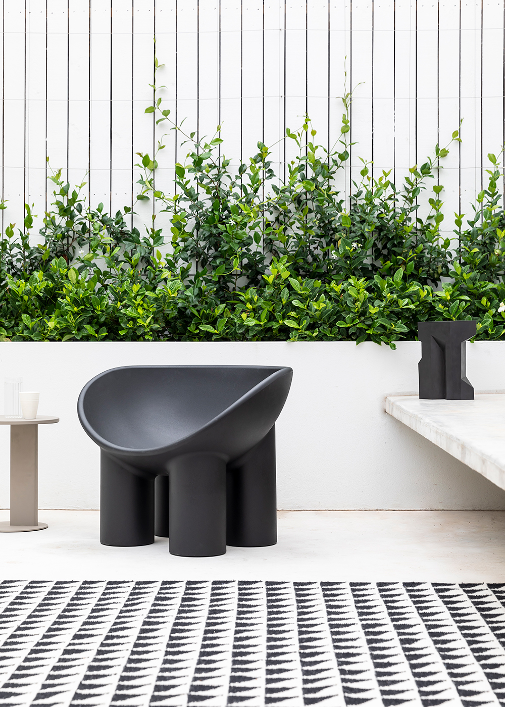
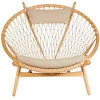
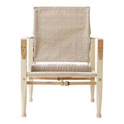
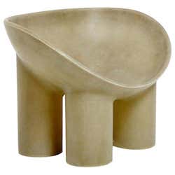
I’ve been an uber-fan of Dutch designer Faye Toogood for such a long time. Interiors, furniture, fashion – there’s nothing she touches that doesn’t turn to beautiful. Her Roly Poly chair is on the tippy top of my wishlist for the Hood Canal Cottage.

As I was internet rabbit holing looking for inspiration for the cottage over the weekend, I stumbled across this apartment on the real estate site The Modern House and was immediately stopped in my tracks. And of course it was designed by Toogood (interesting side note, the co-founder of The Modern House is Toogood’s husband!).

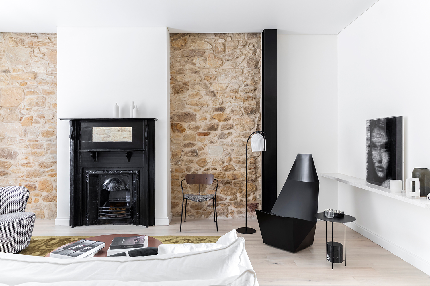
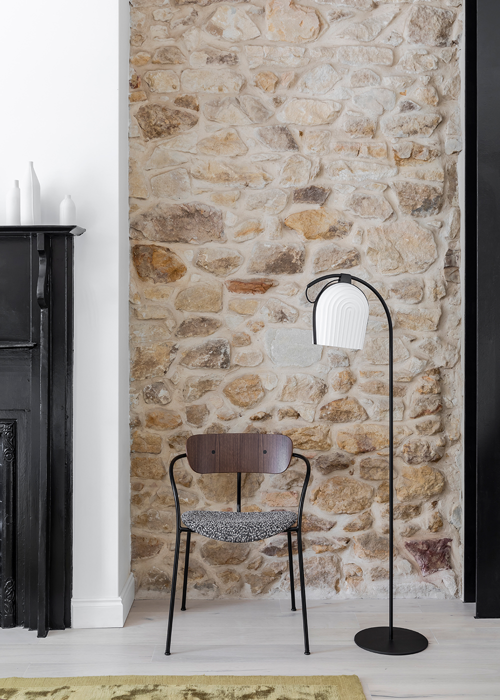
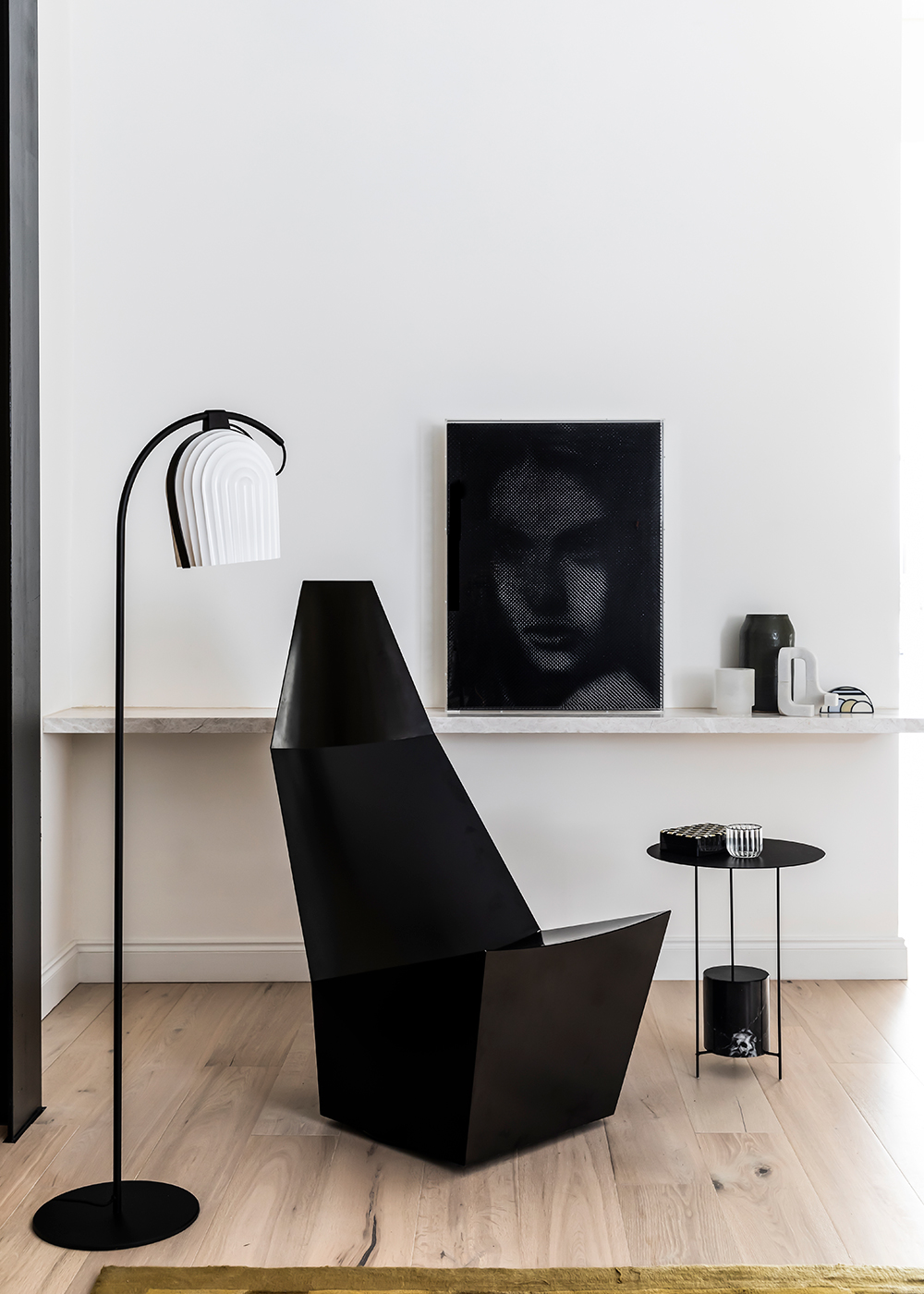
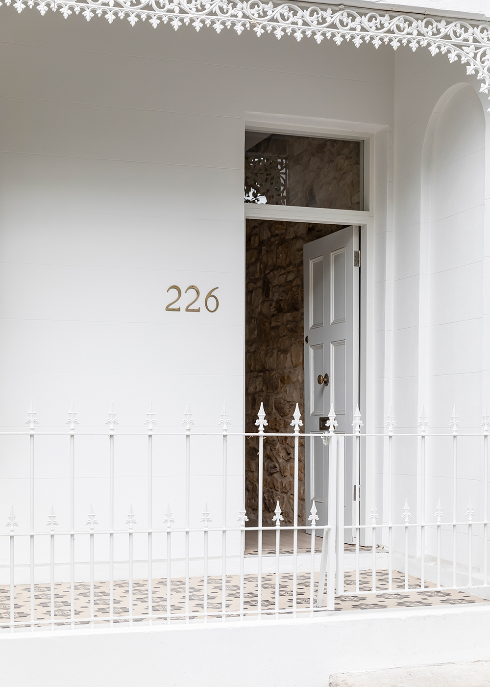
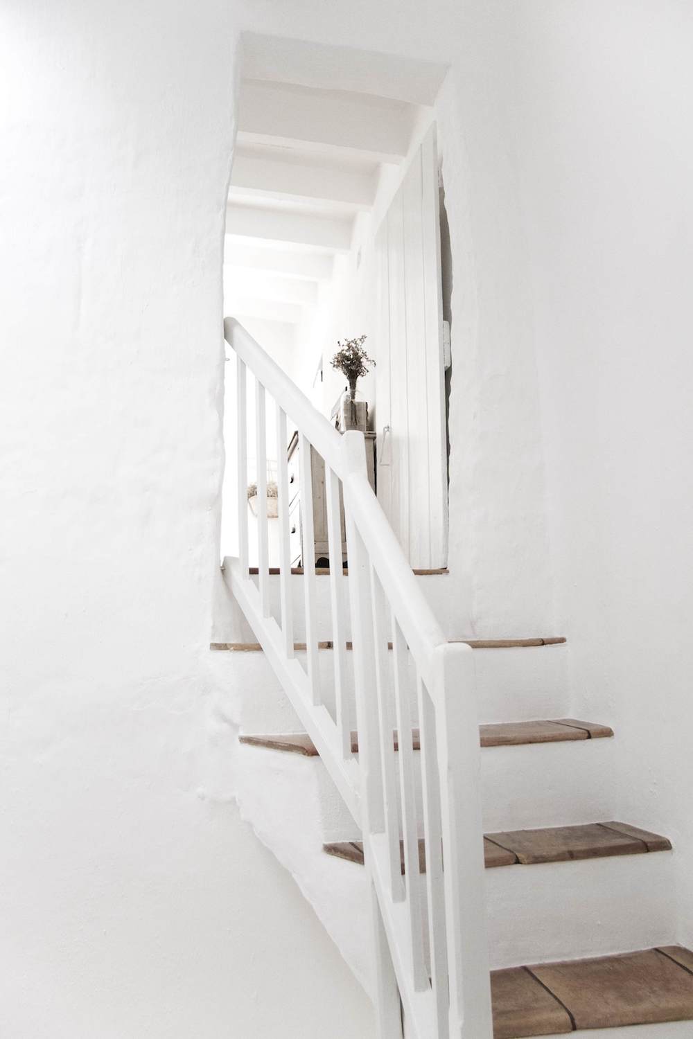
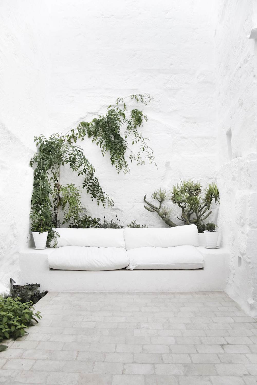
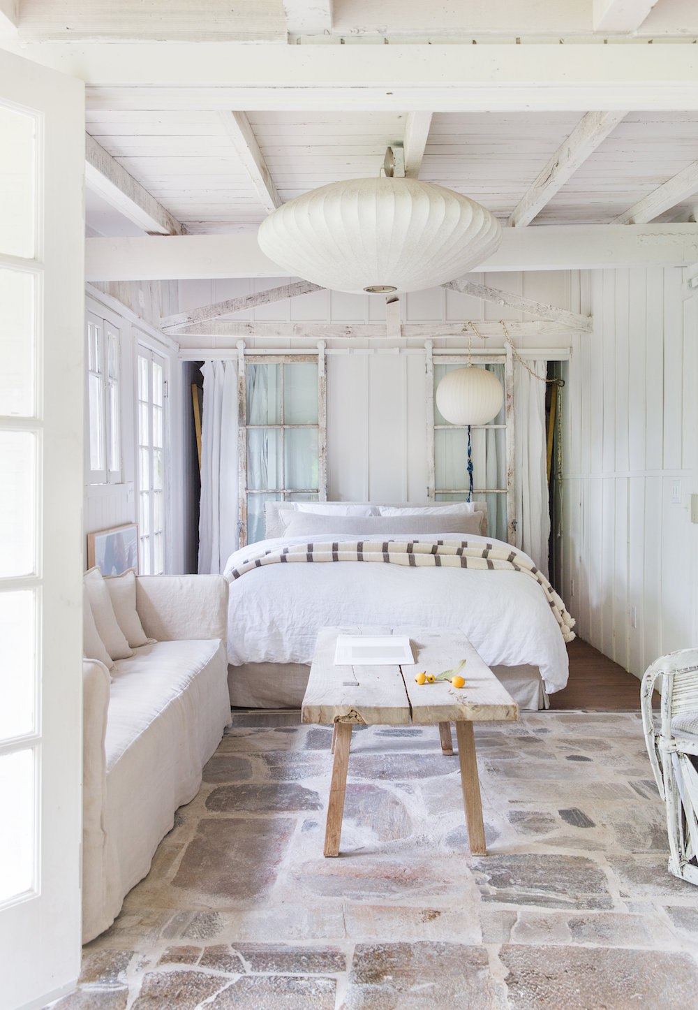
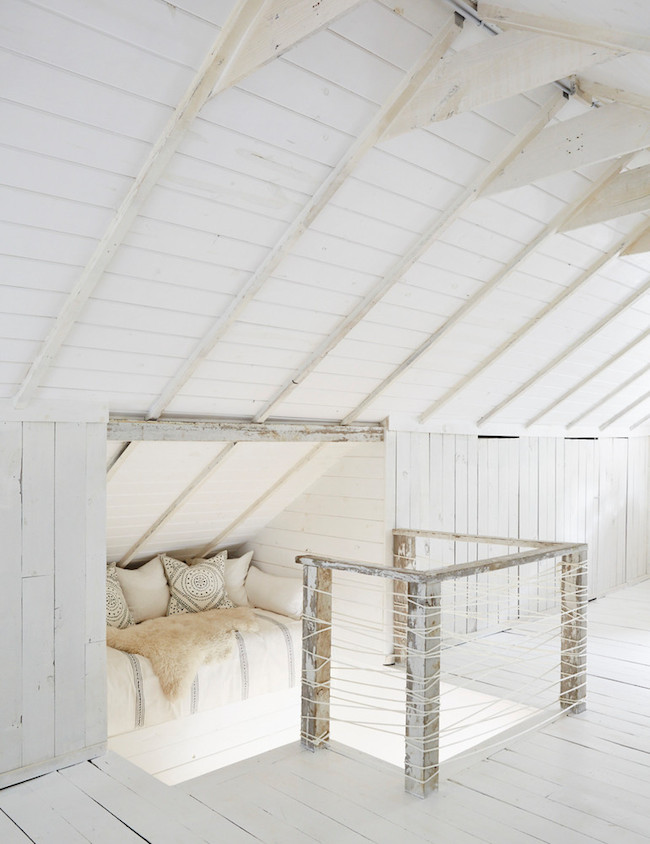
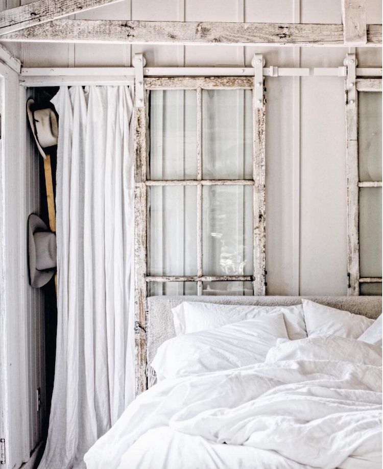
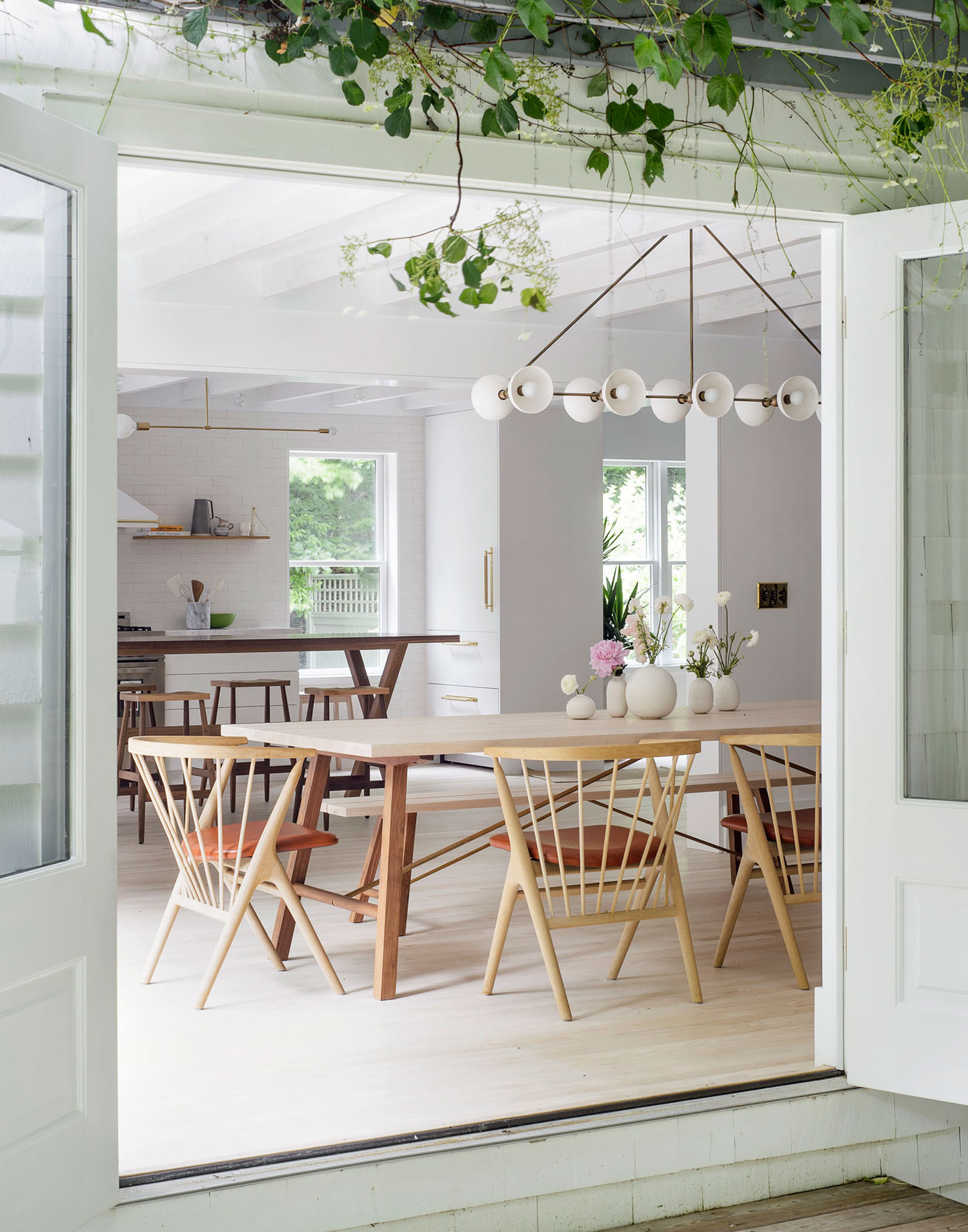
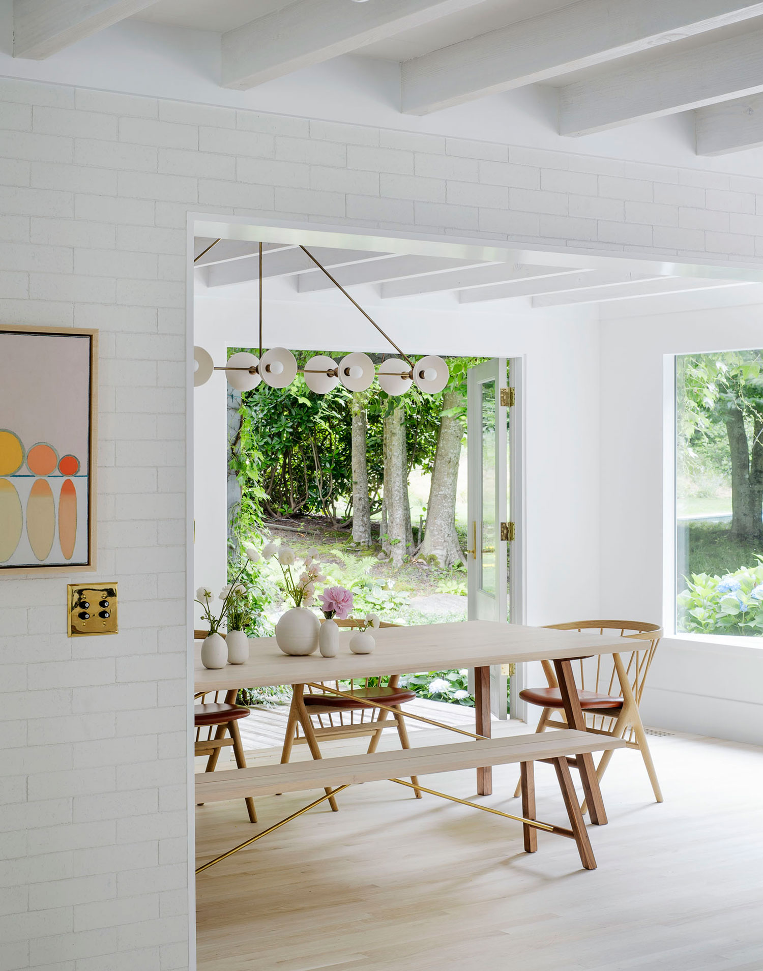
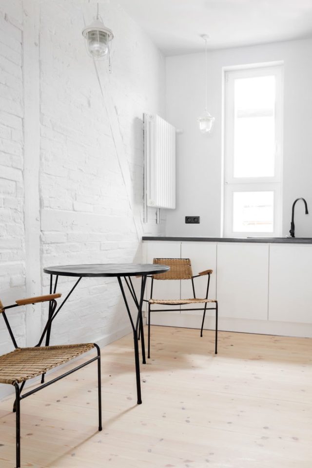
This apartment resides in Winchester, a hamlet toward the UK’s coast. The apartment resides on the ground floor of a historic Victorian building in the heart of this lovely town. The entire apartment is a major mood.

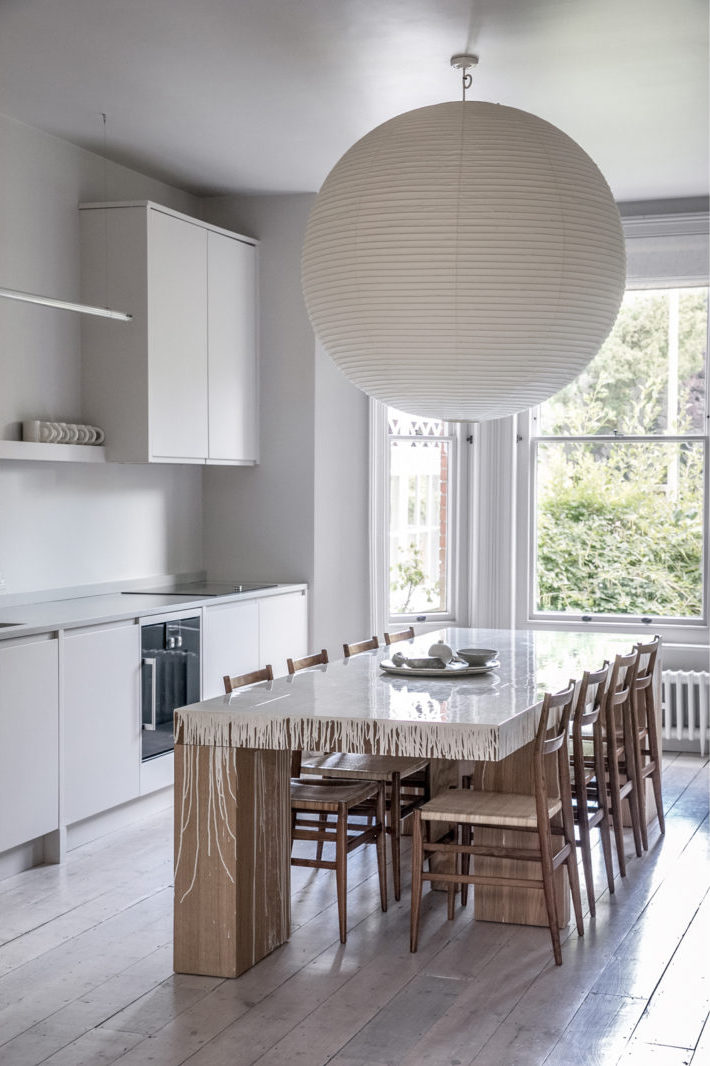
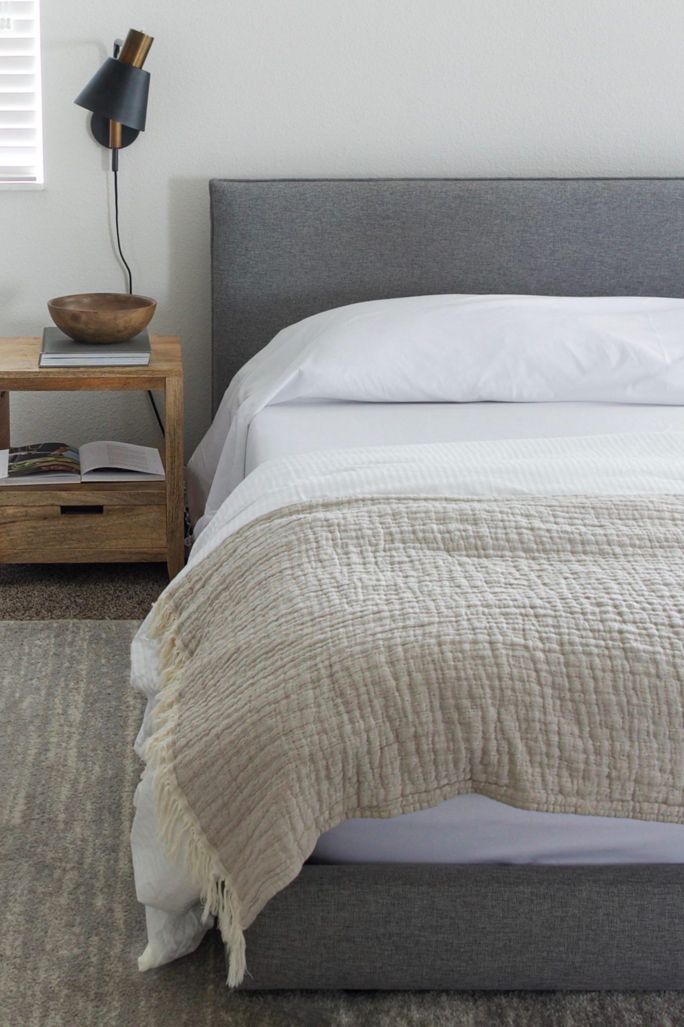
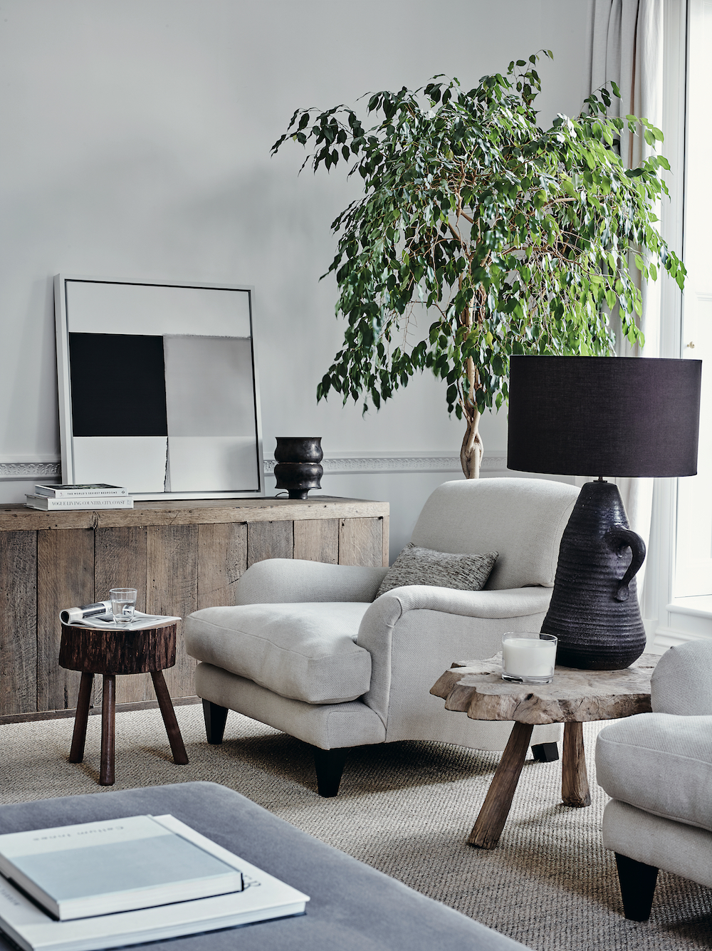
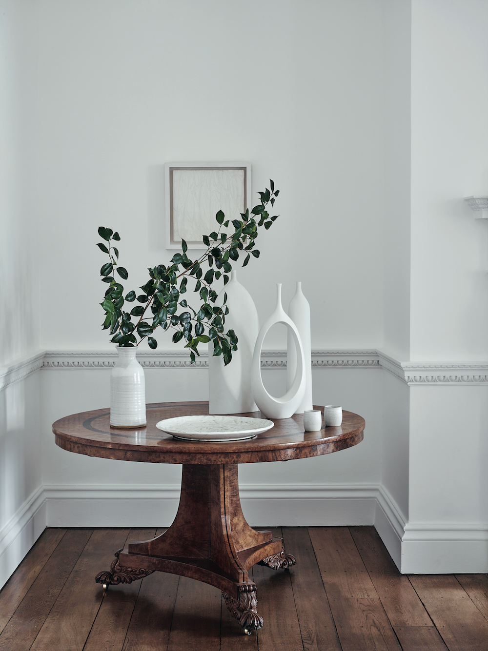
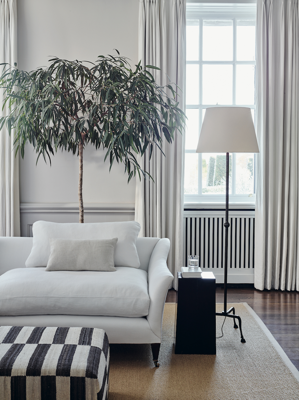
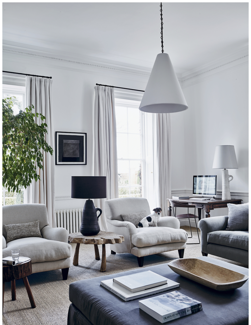
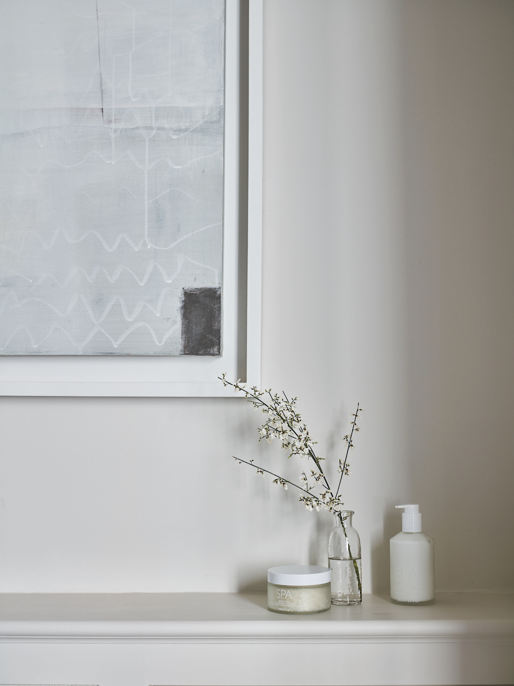
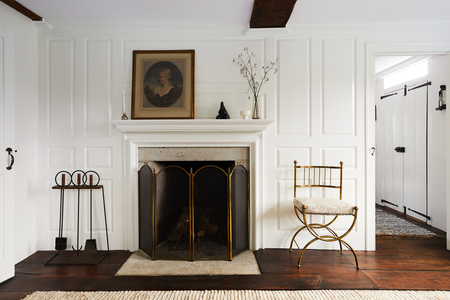
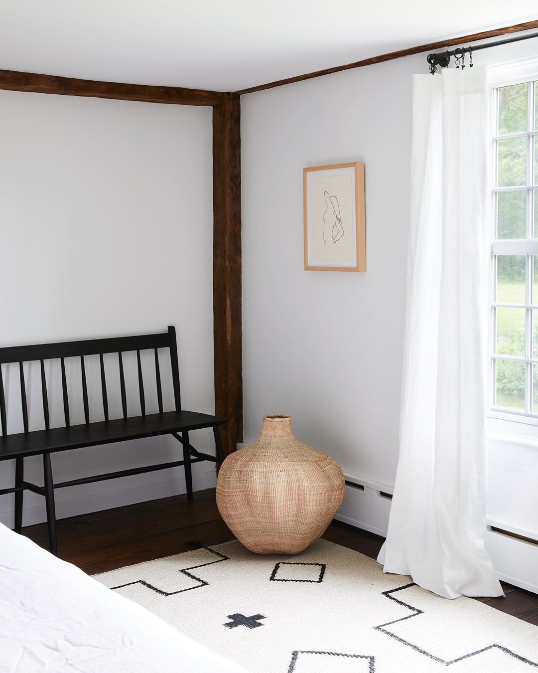
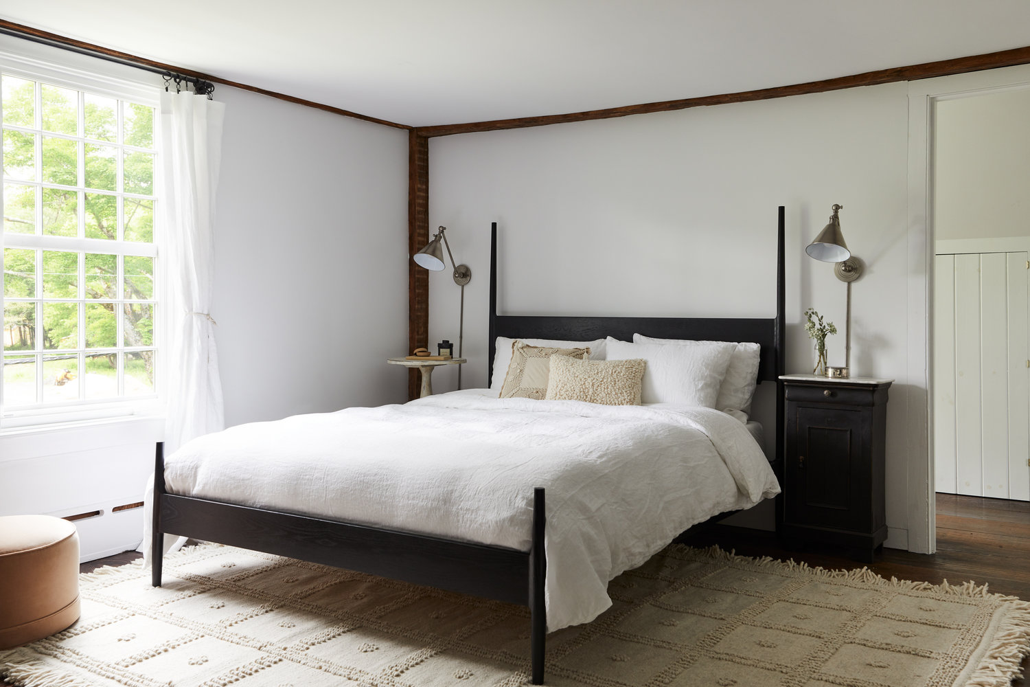
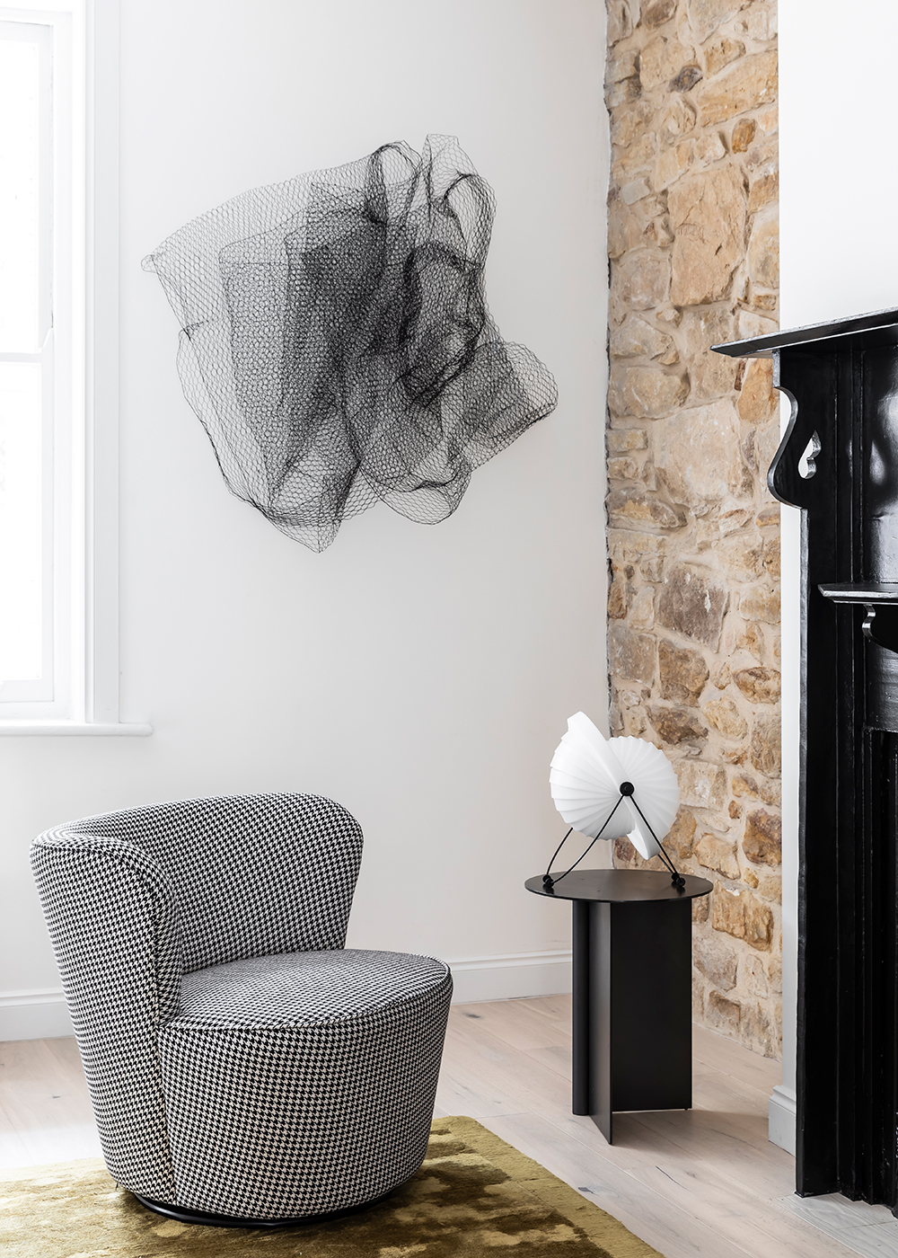
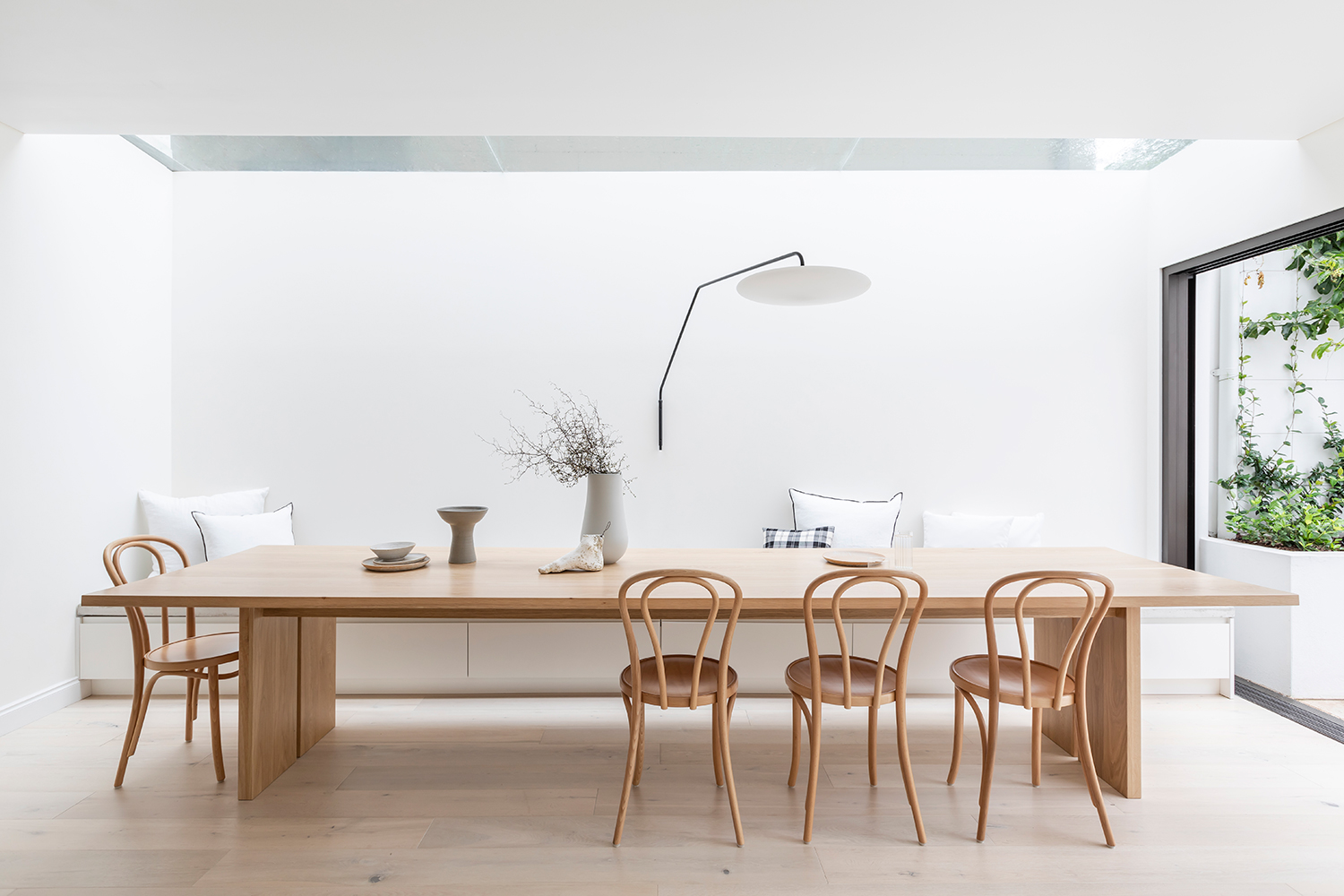
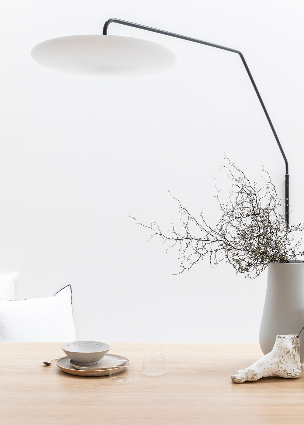
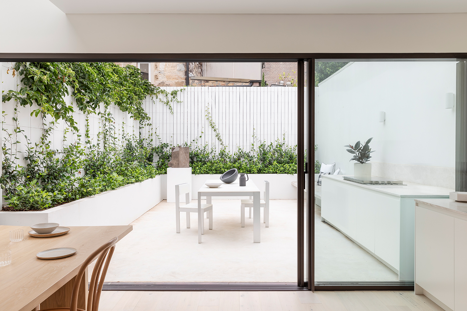
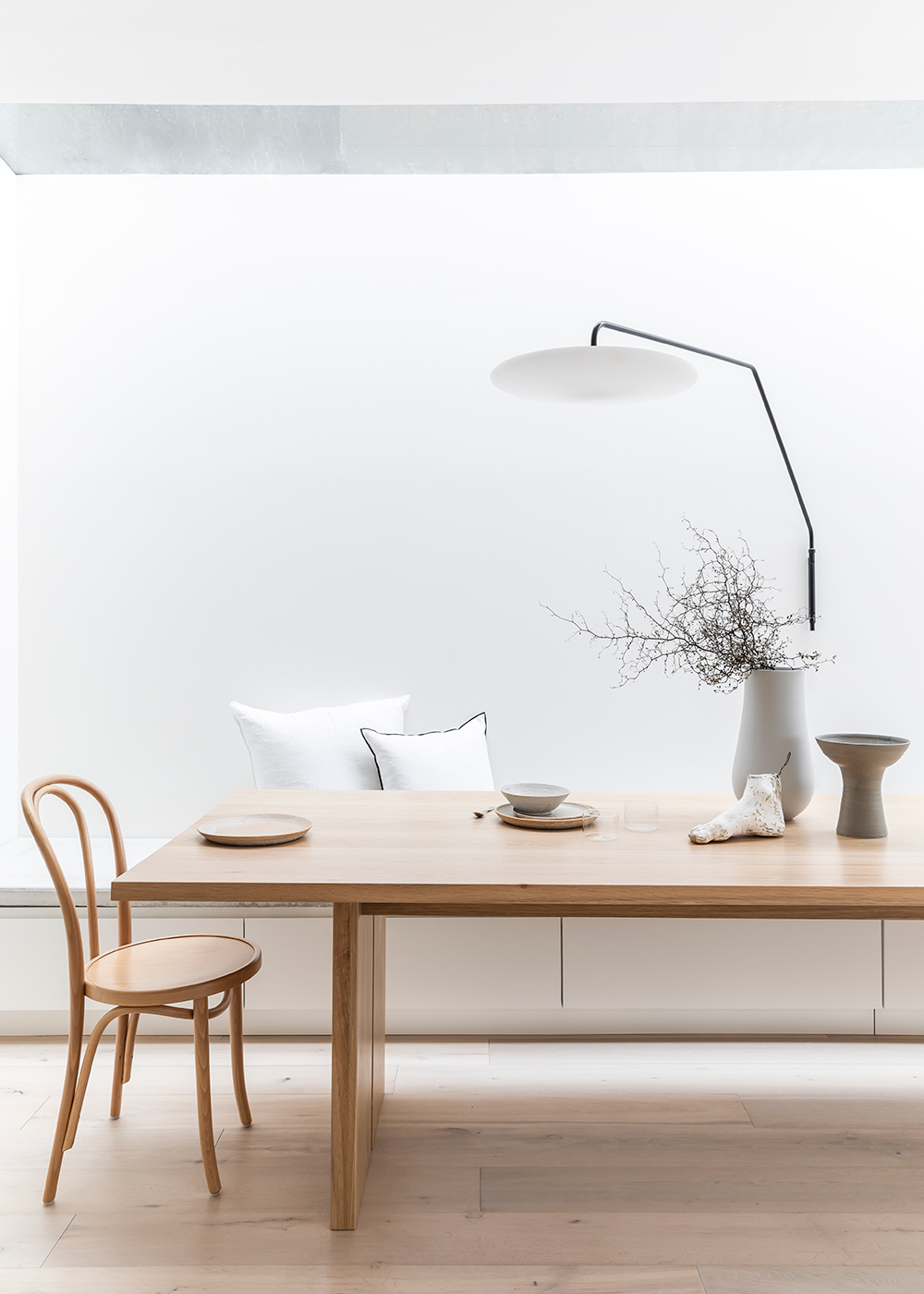
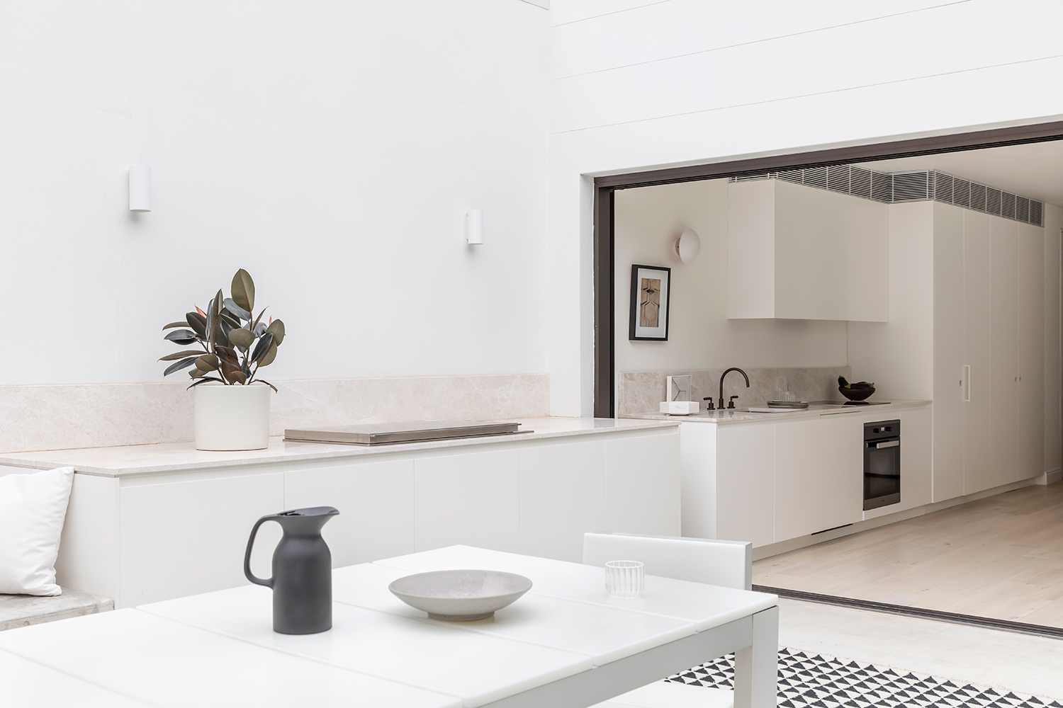
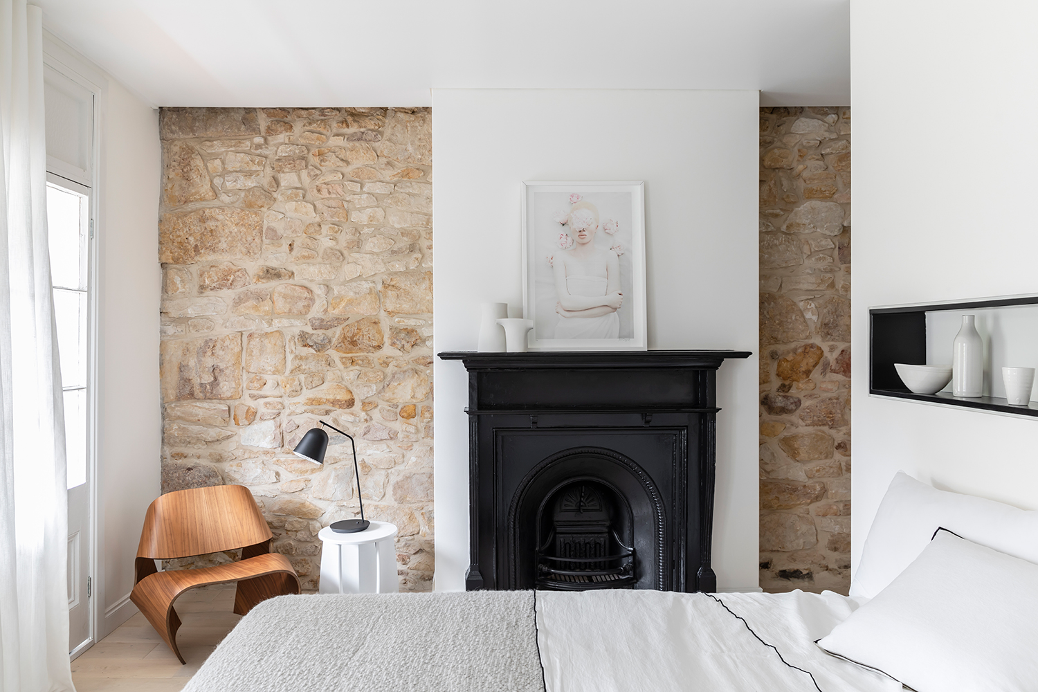
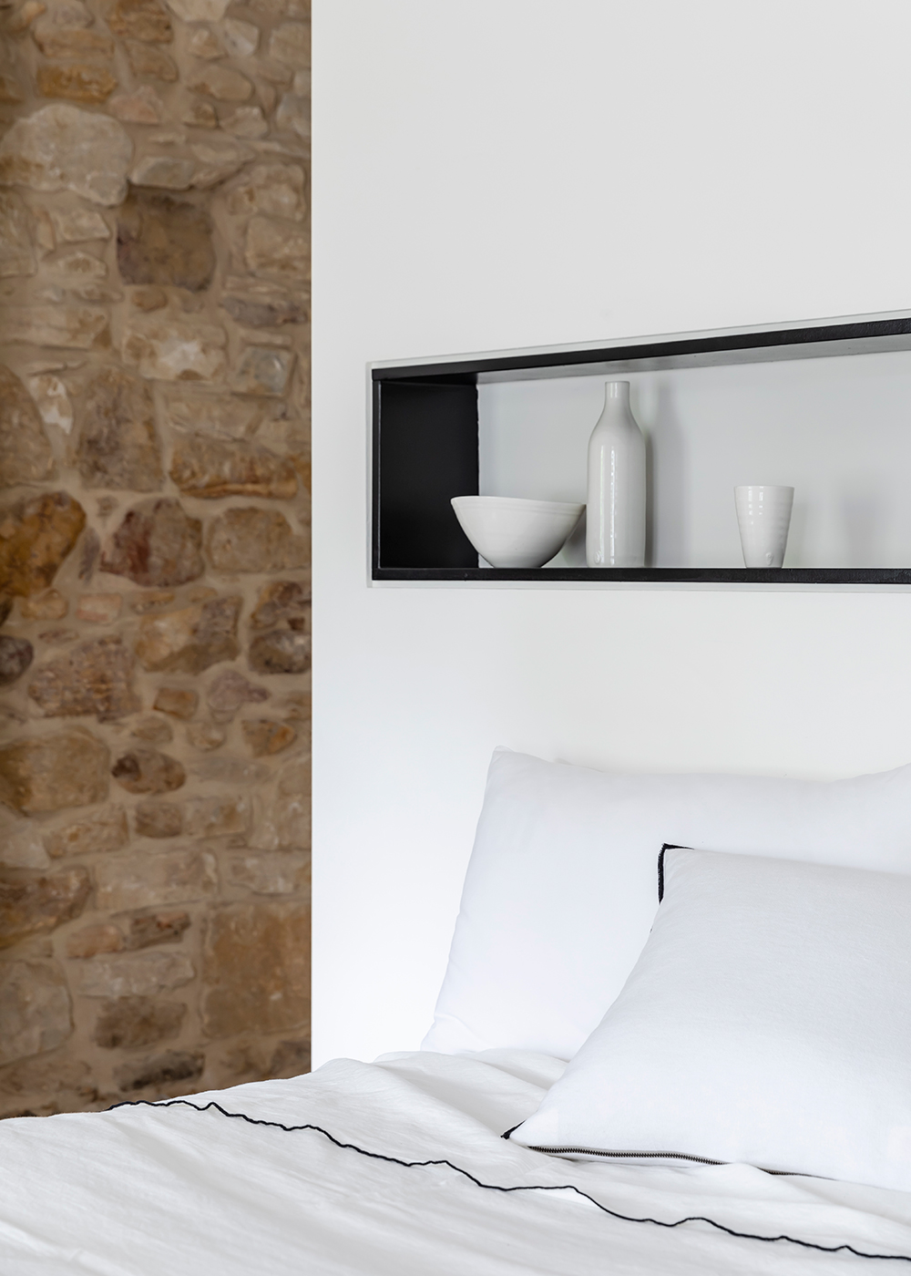
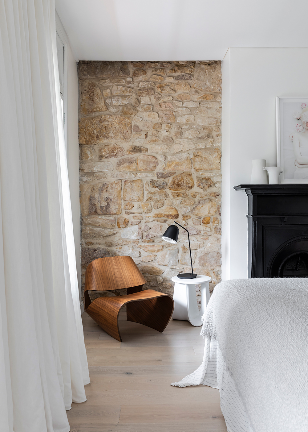
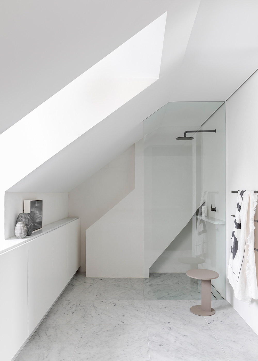
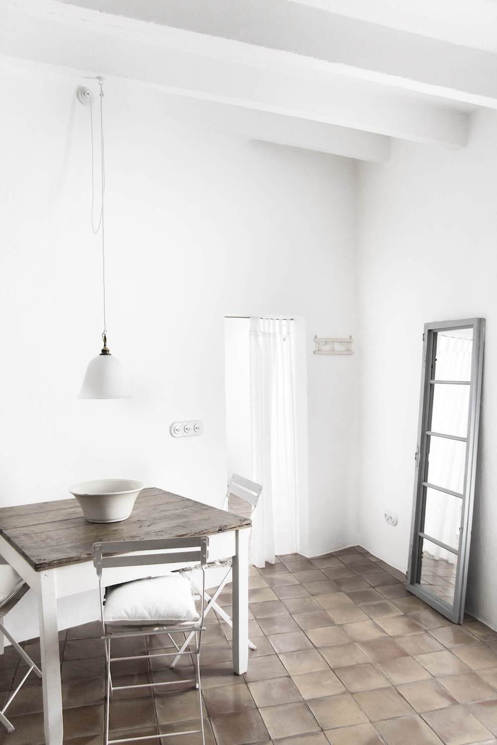
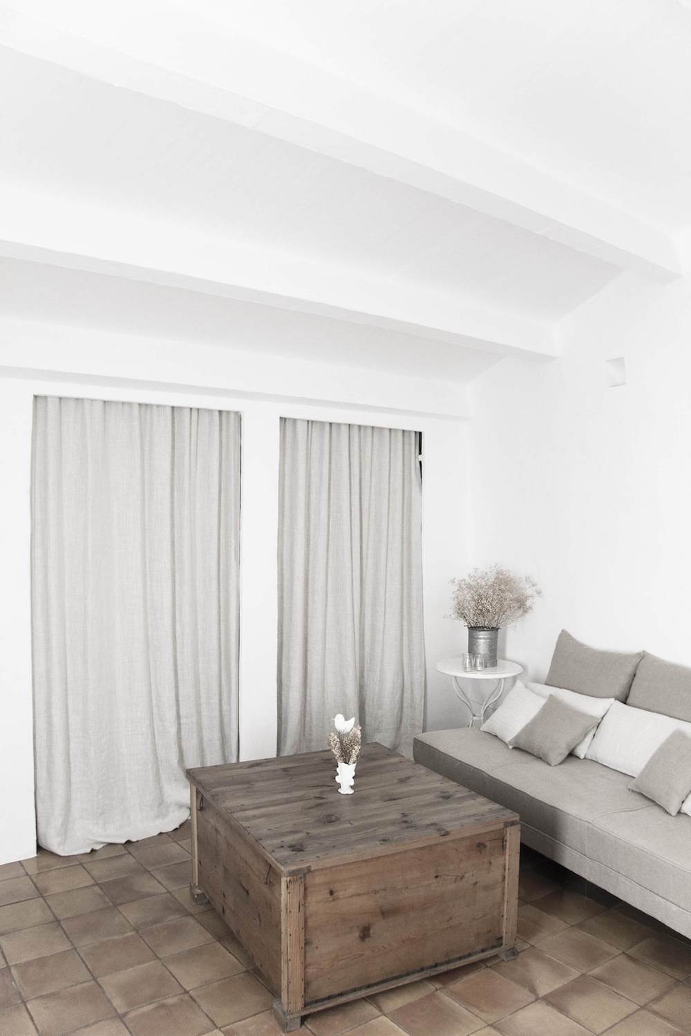
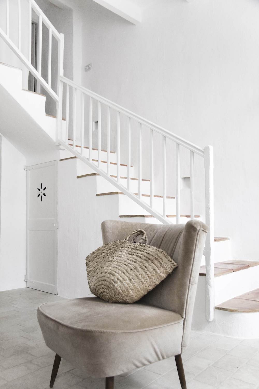
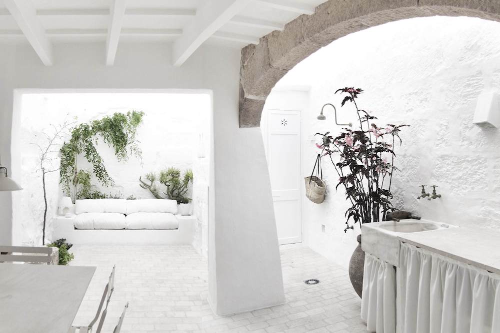
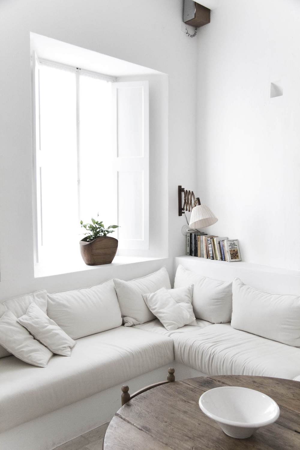
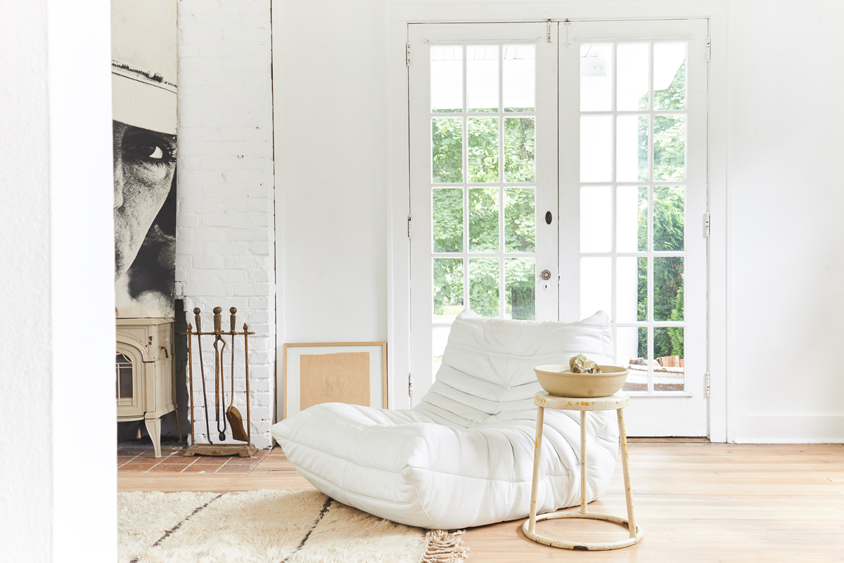
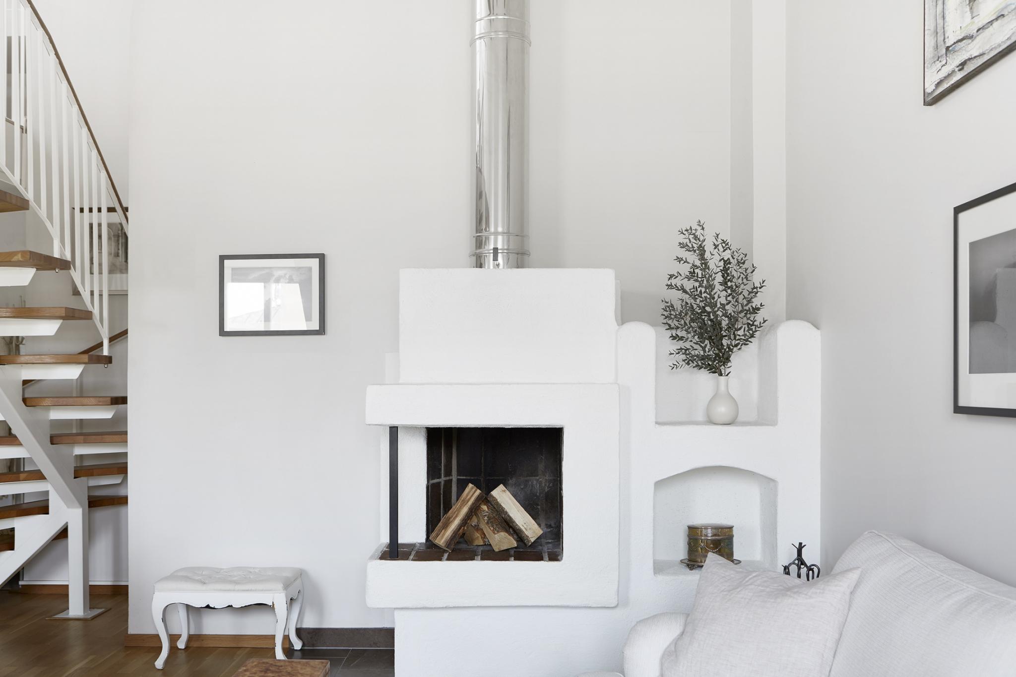
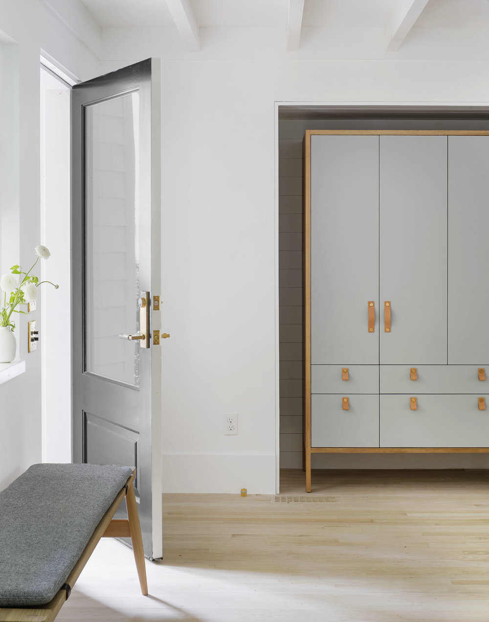
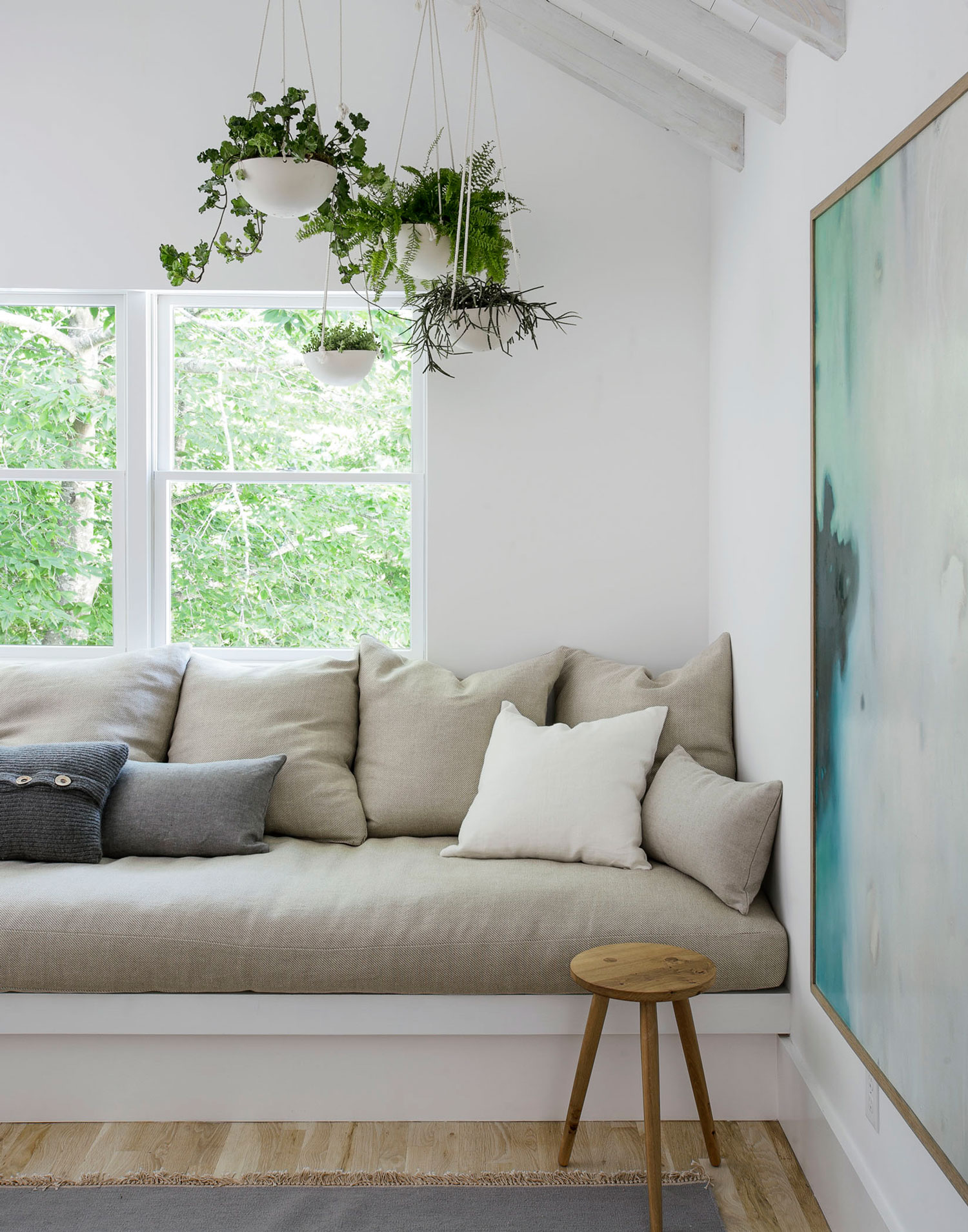
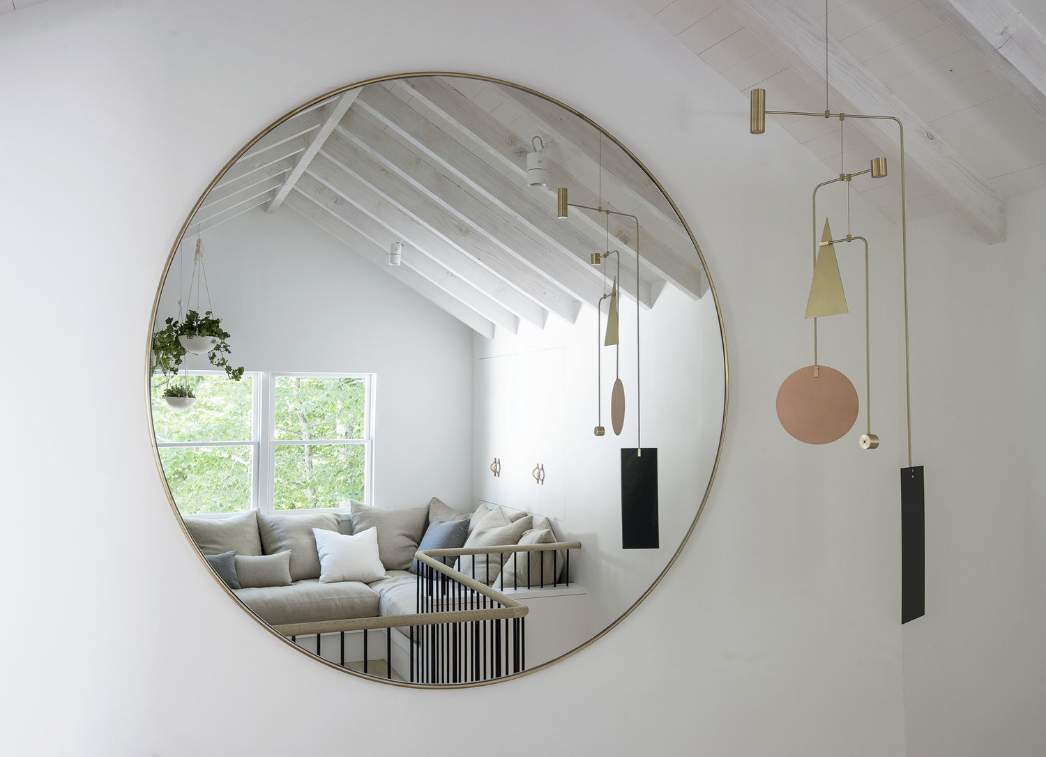
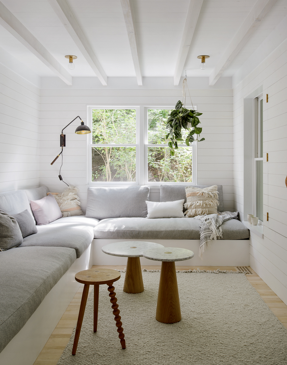
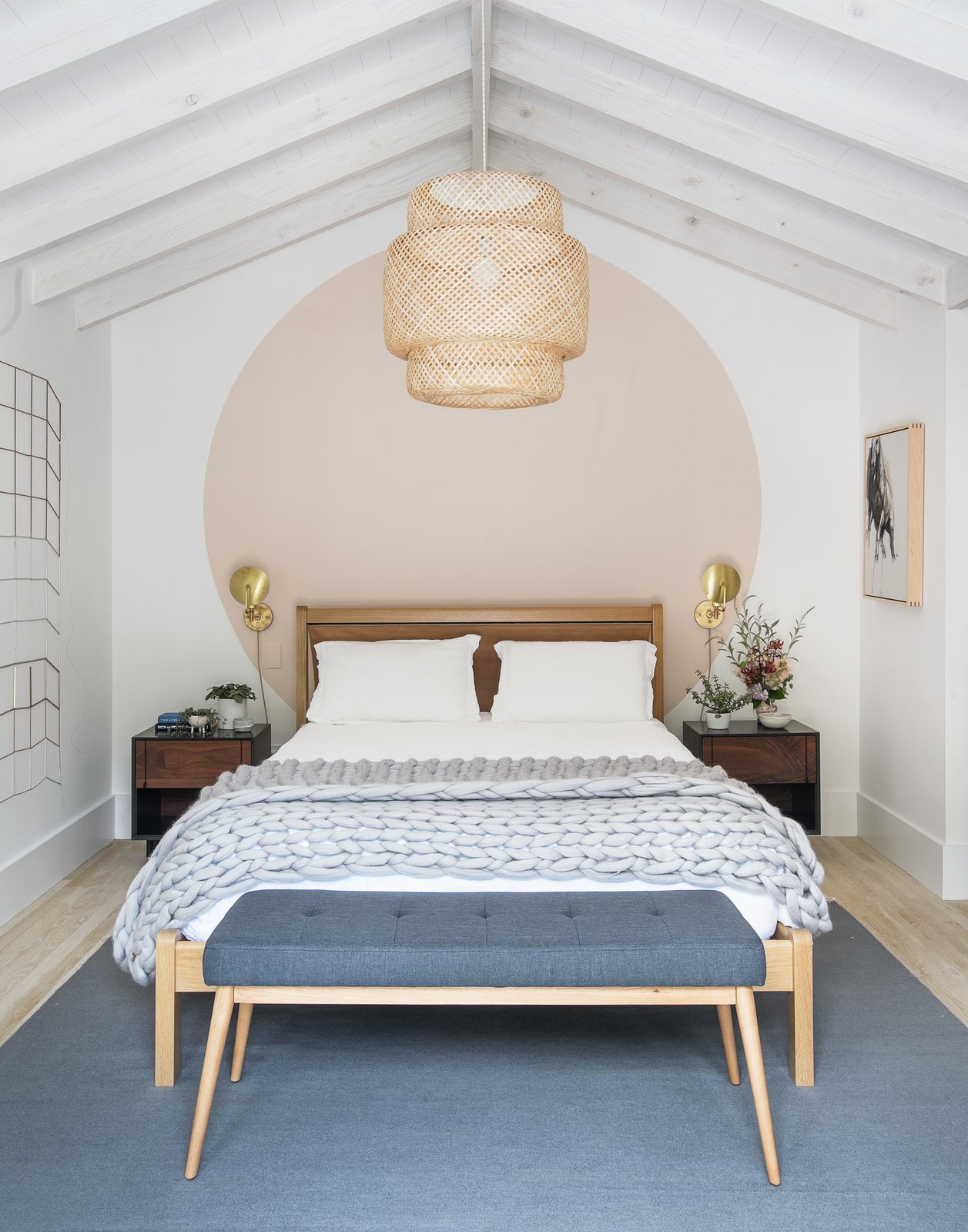
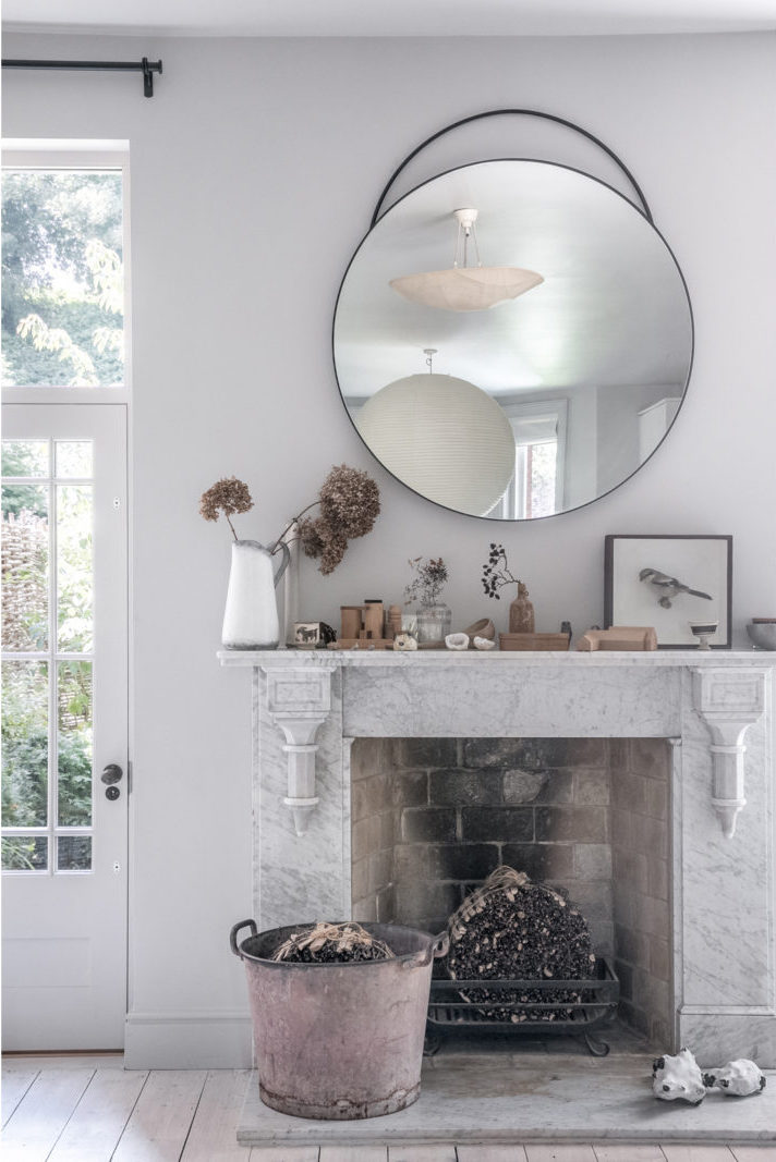
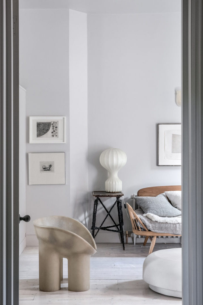
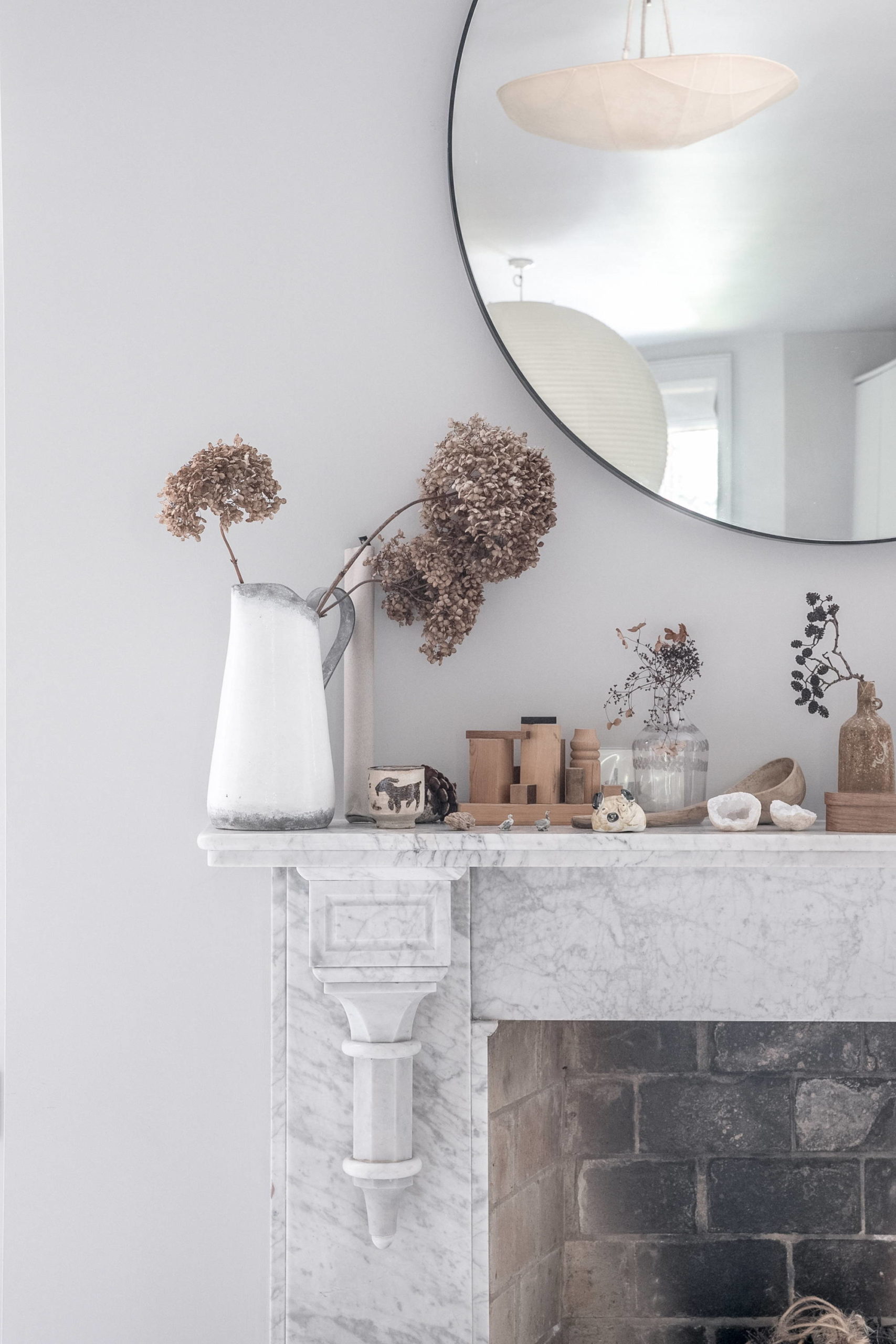
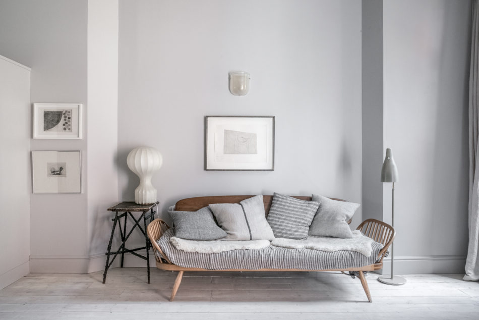
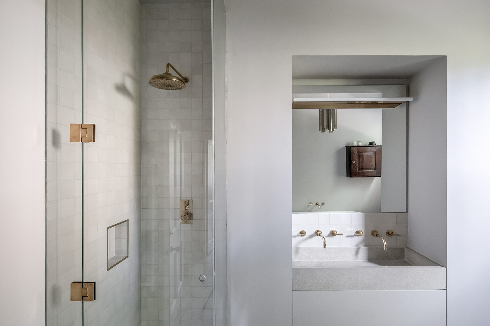
The project is such a great example of using consistency in your design to create an incredibly distinct point of view. I was immediately taken by the super consistent monochromatic color palette of cool whites and light grays used throughout the apartment. That sea of greige is punctuated by wood, little hits of black and touches of patinaed brass for punches of contrast.

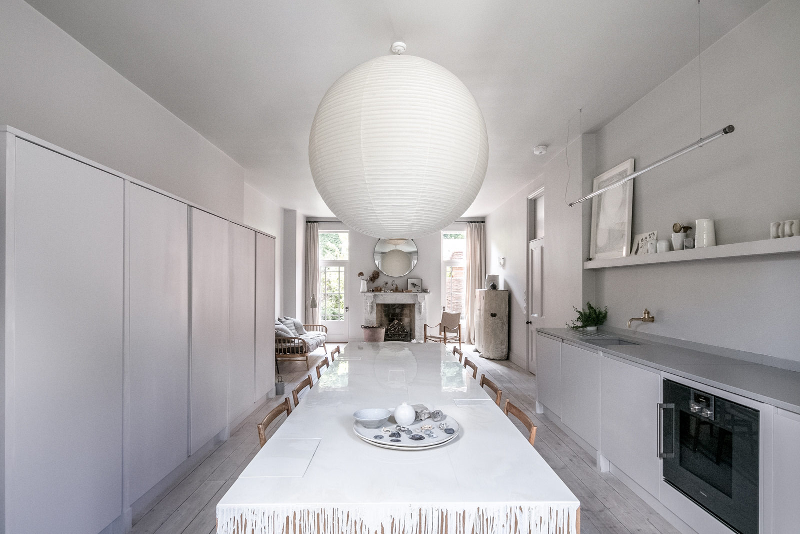
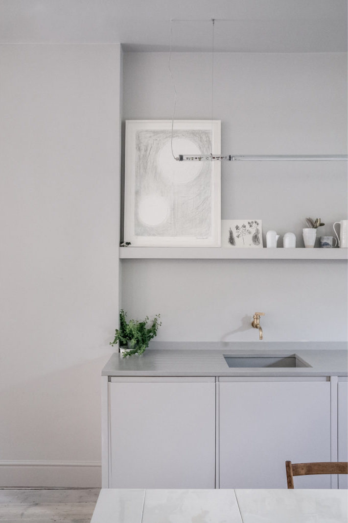
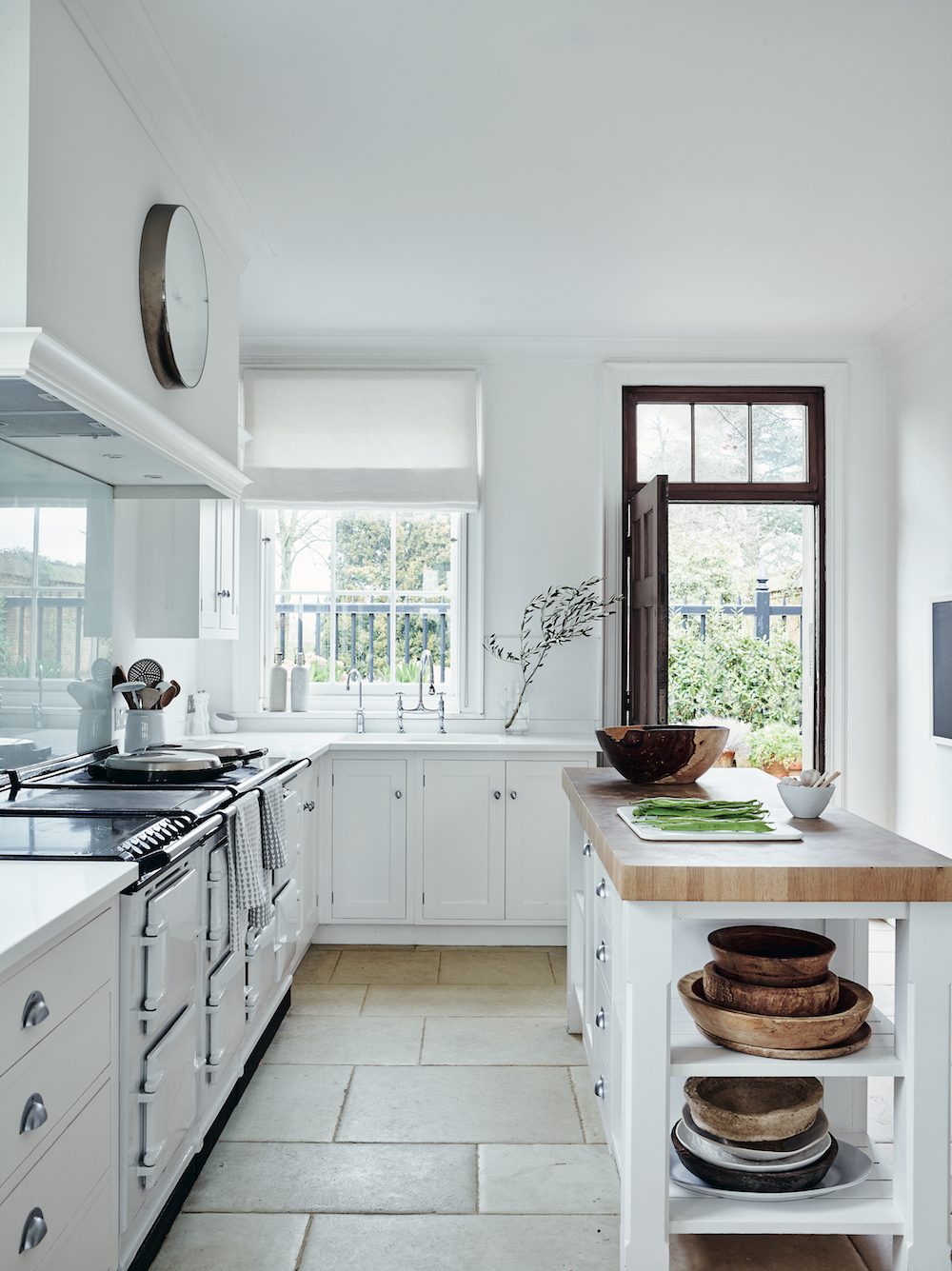
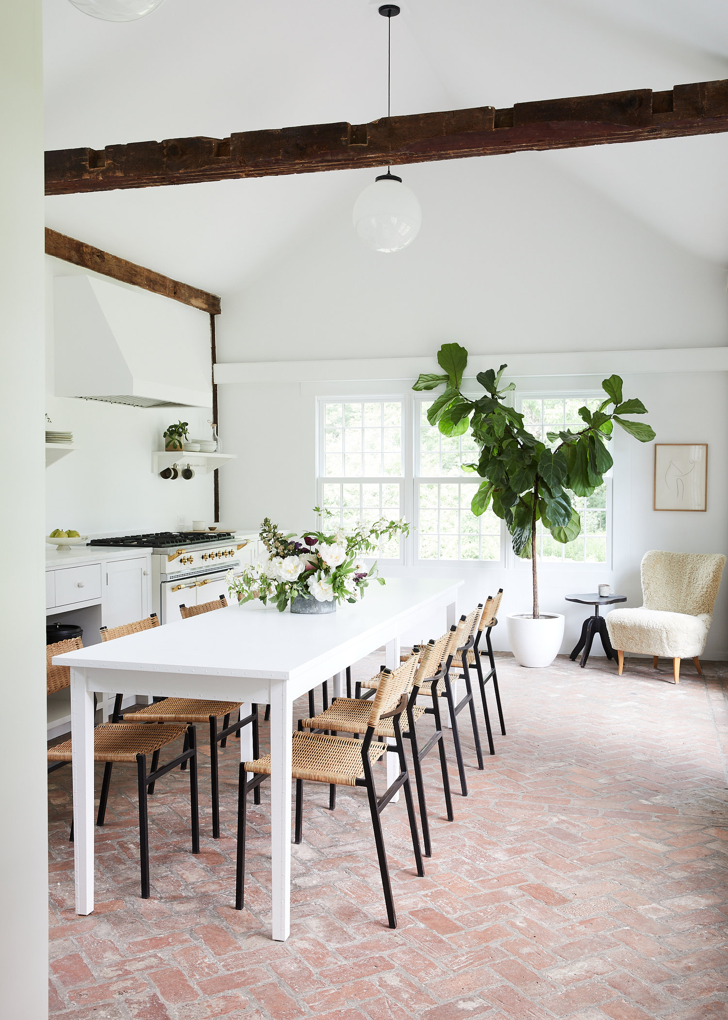
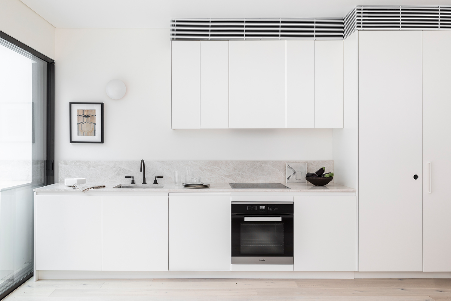
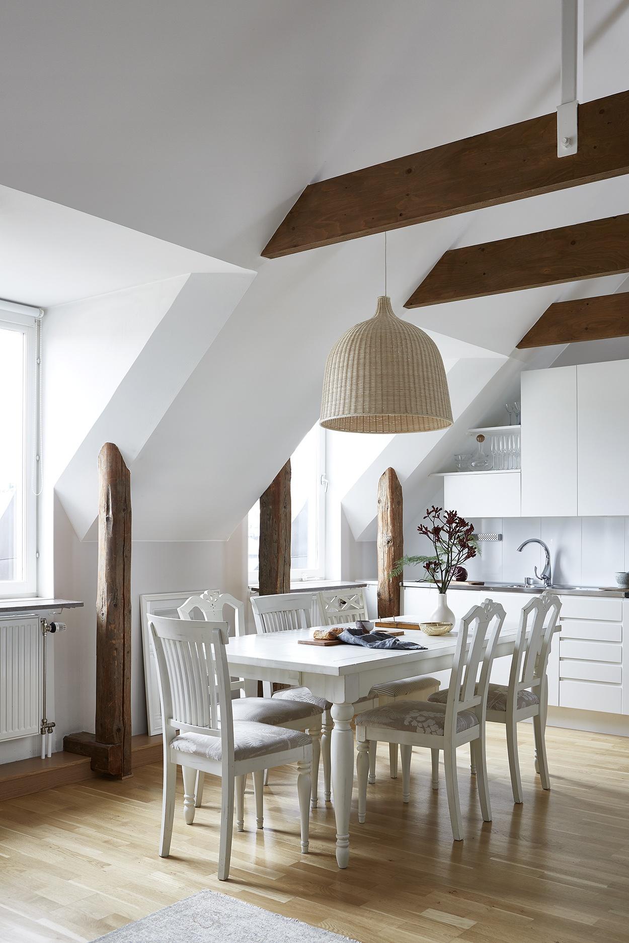
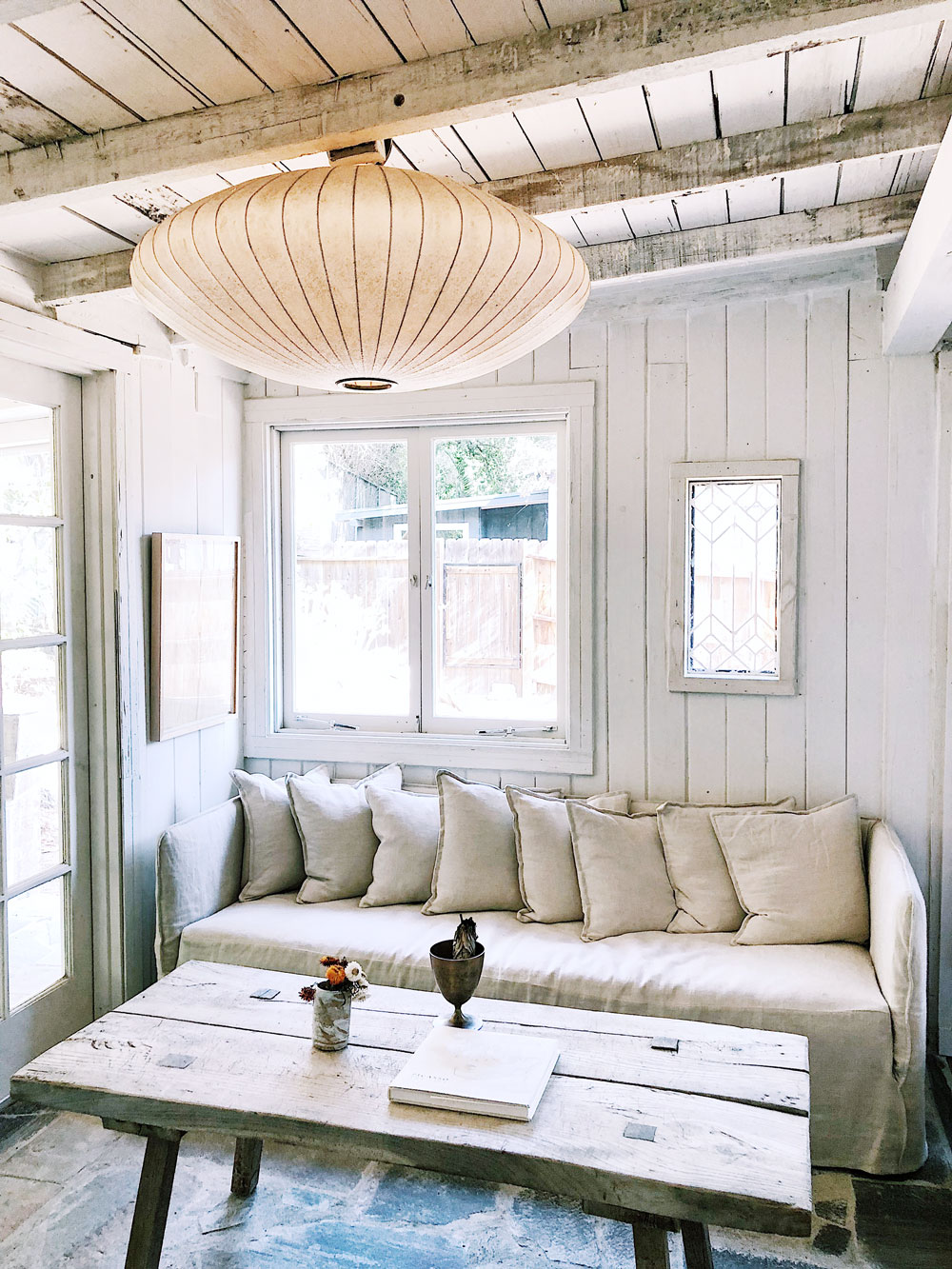
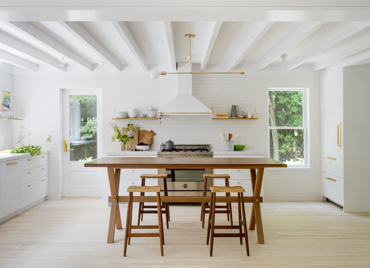
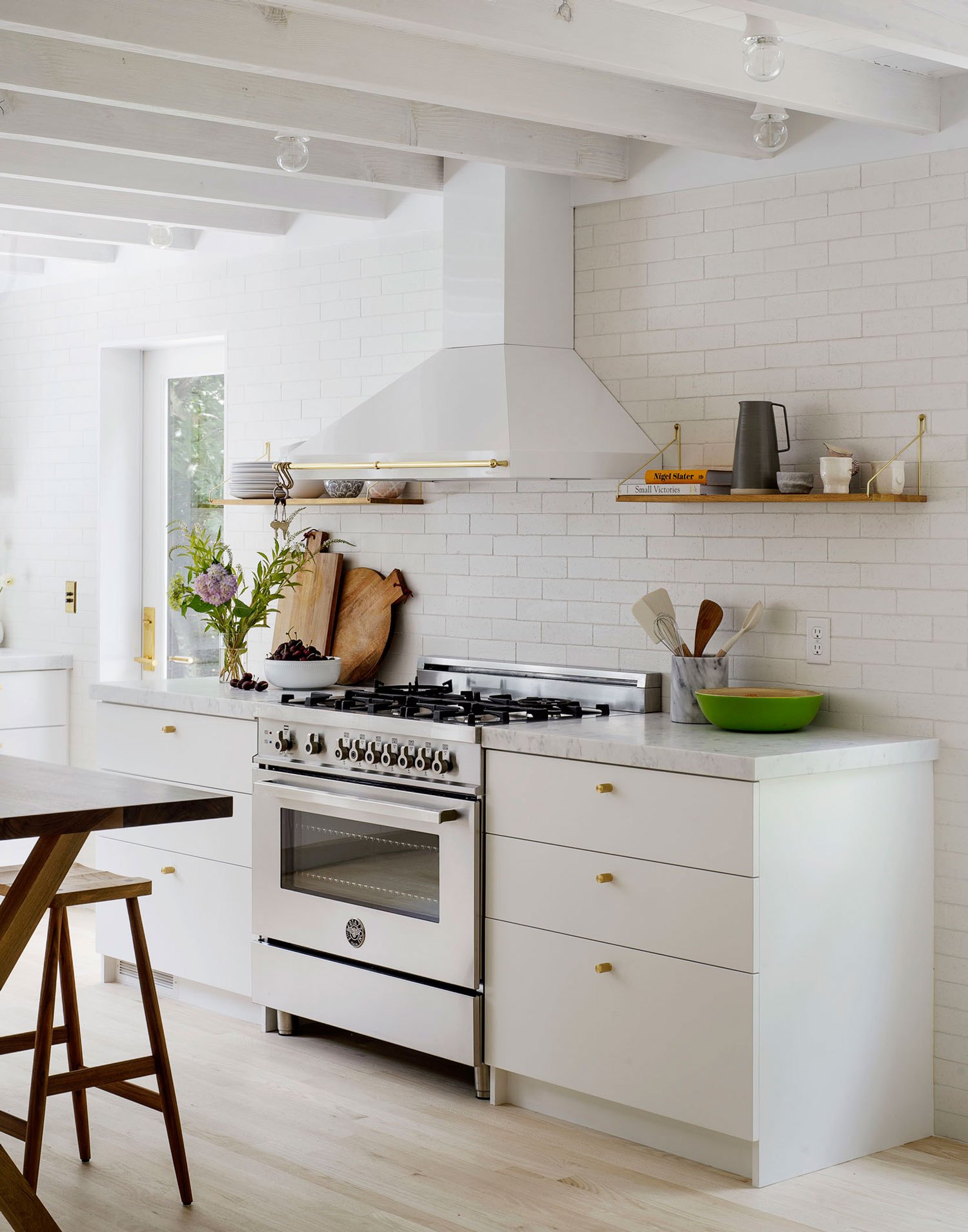
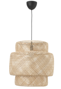
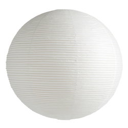
A couple of things I really like about this kitchen – the single open self (I was just having a debate on Instagram this week about the status of the open shelving trend), the simple flat front cabinets (yay for no hardware-I did that in our kitchen too!) and the jumbo paper lantern pendant. I’m putting one in at Hood Canal and cannot wait to see it.

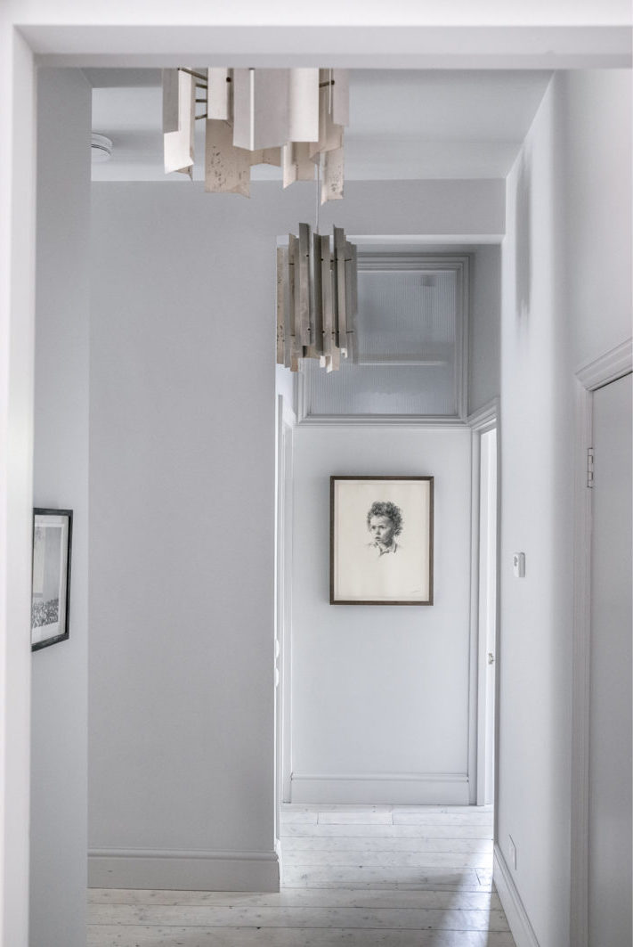
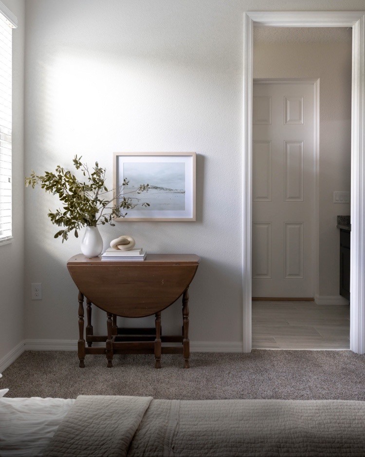
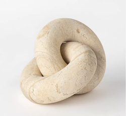
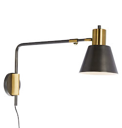
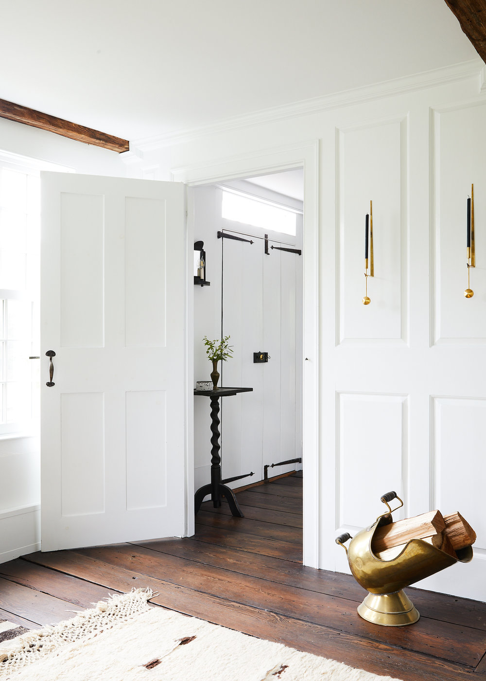
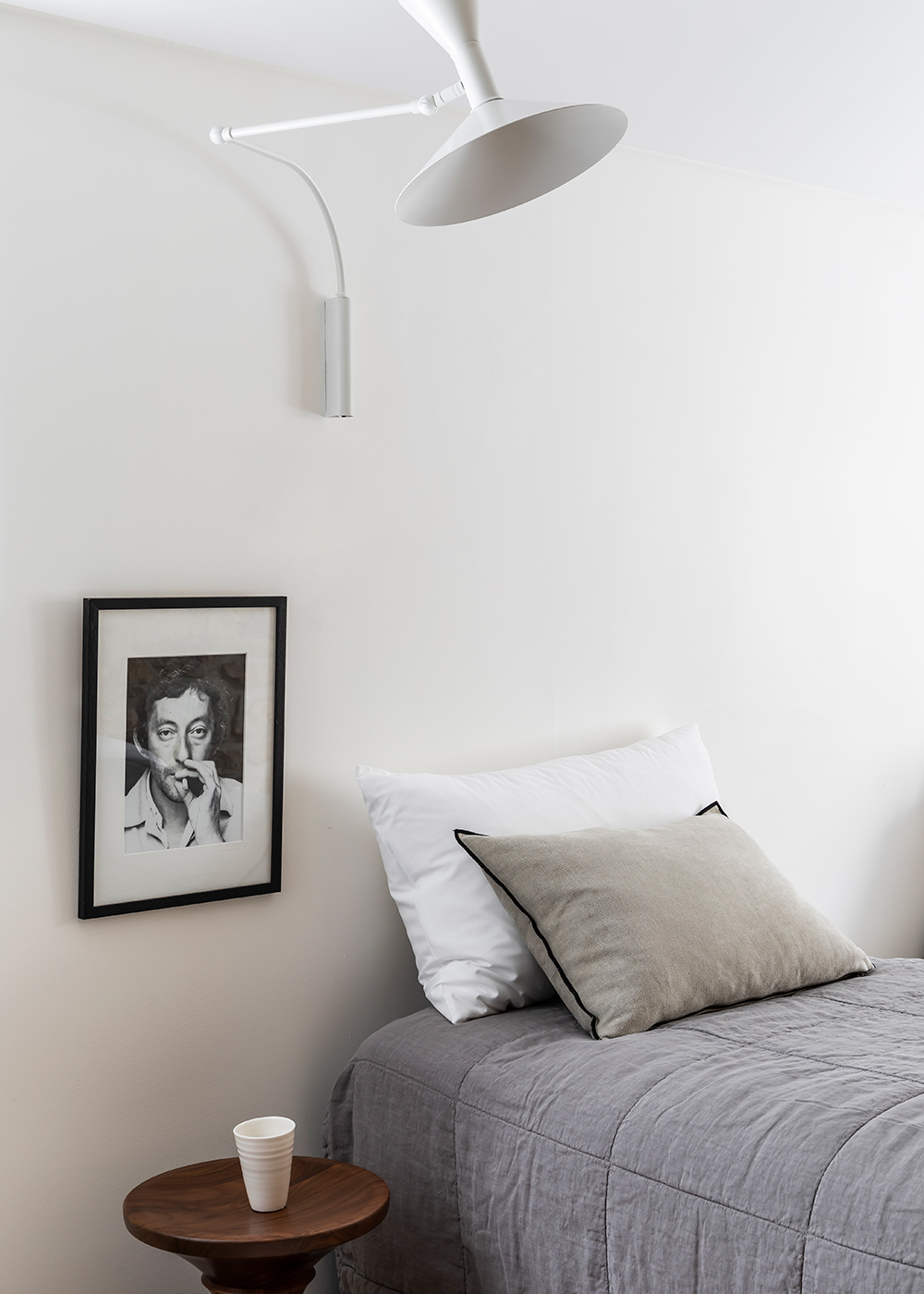
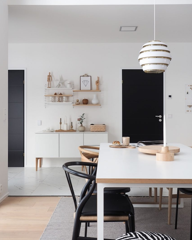
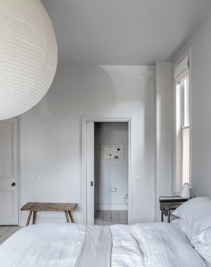
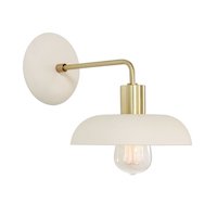
Vintage art is always a wonderful way to punctuate an otherwise plain hallway. So are those incredible light fixtures.

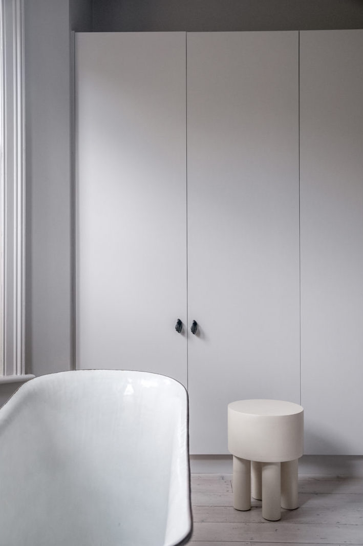
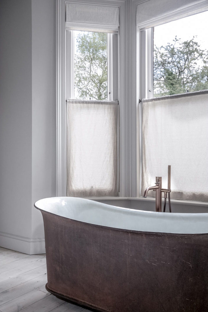
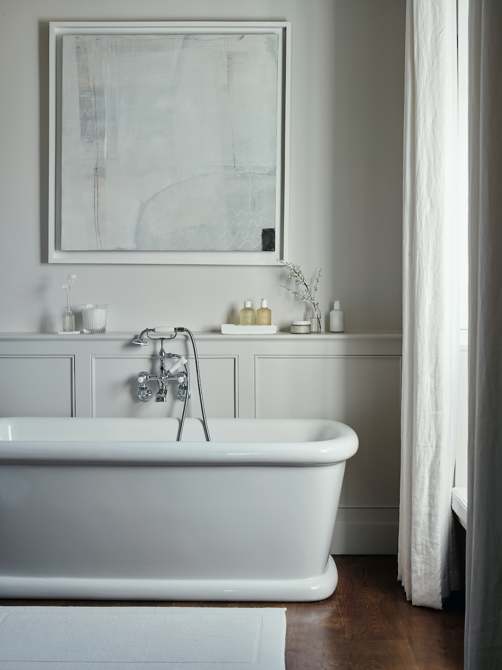
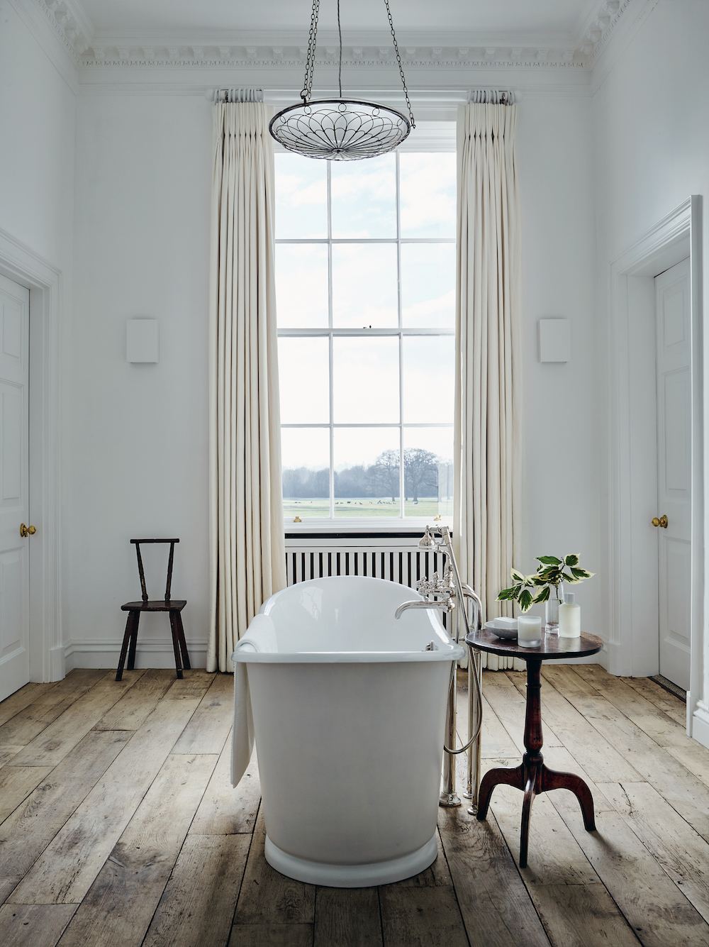
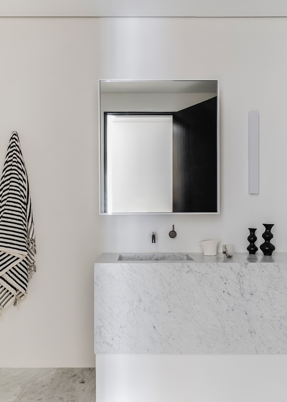
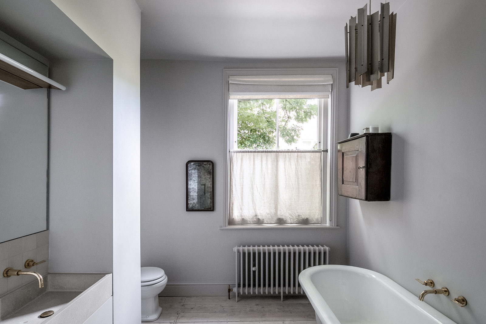
This cast-iron tub in the primary bedroom is truly spectacular. I love a tub in a bedroom.

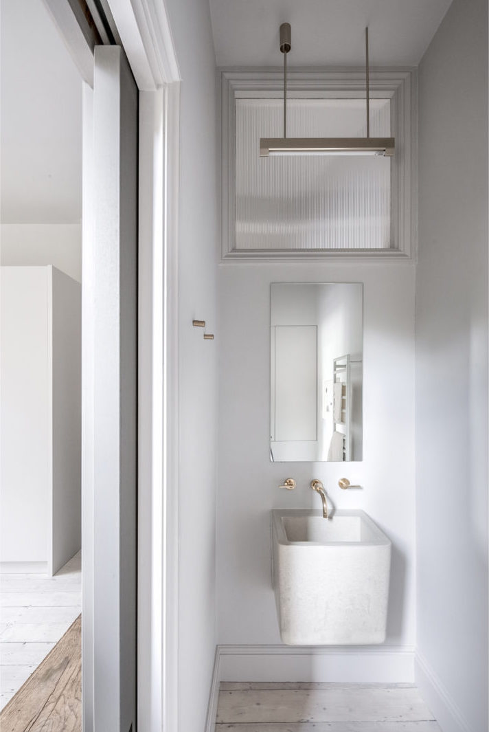
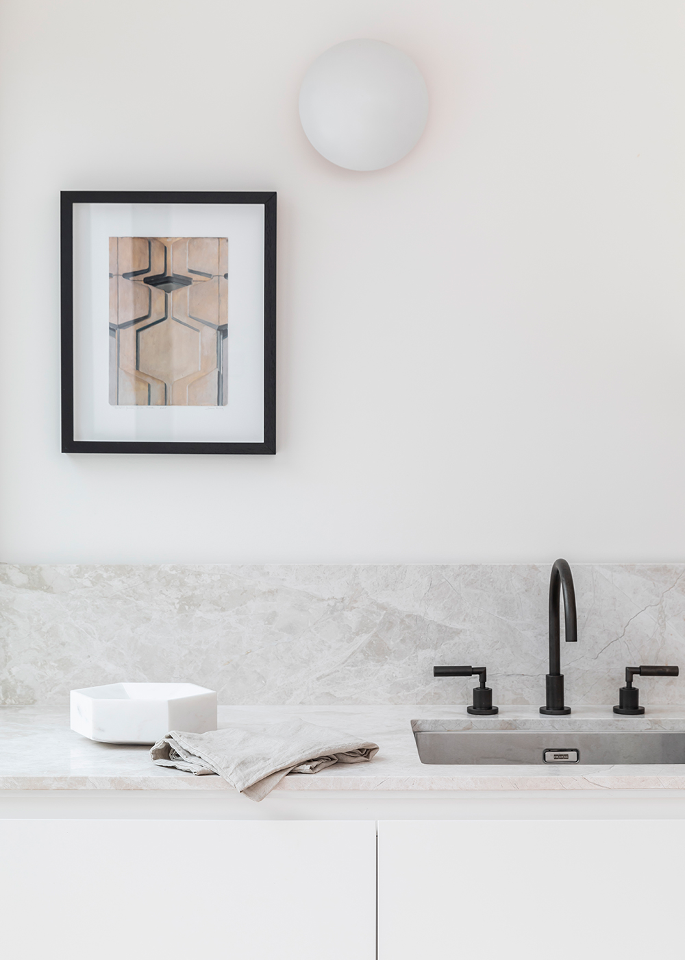
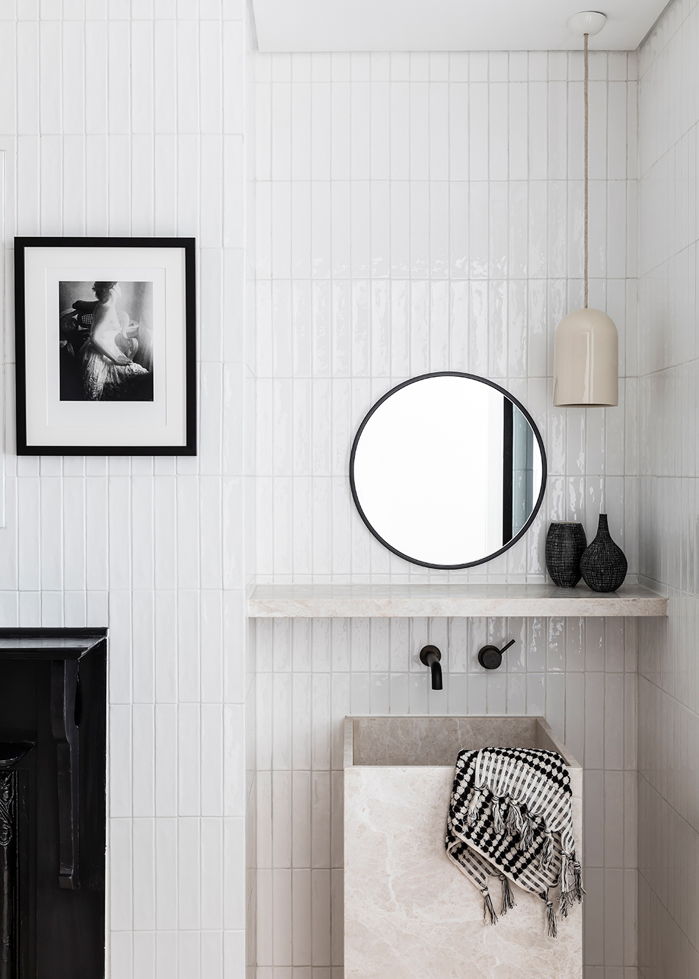
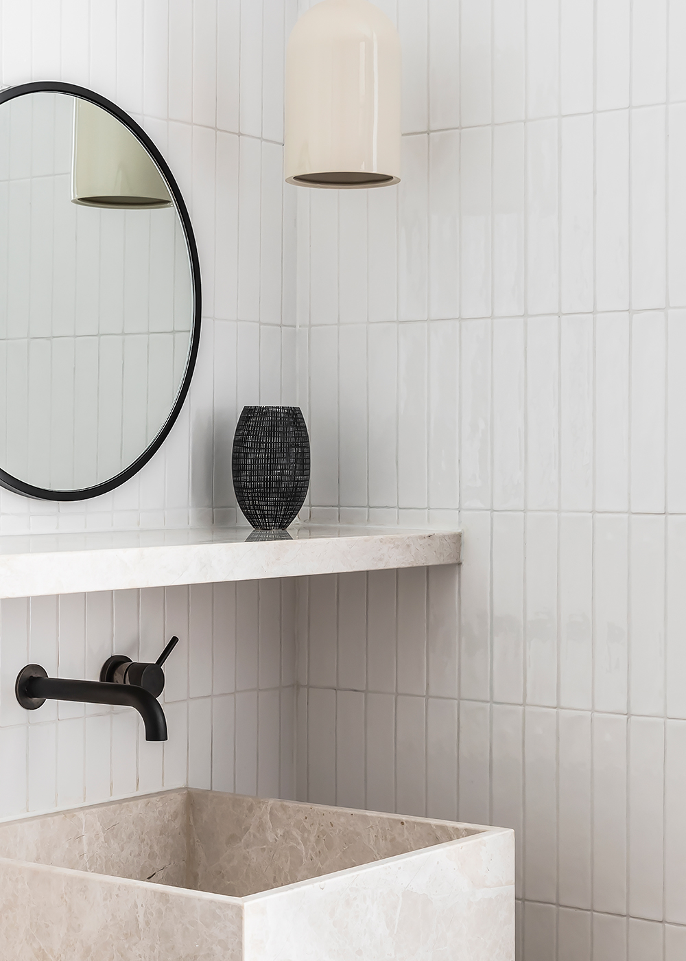
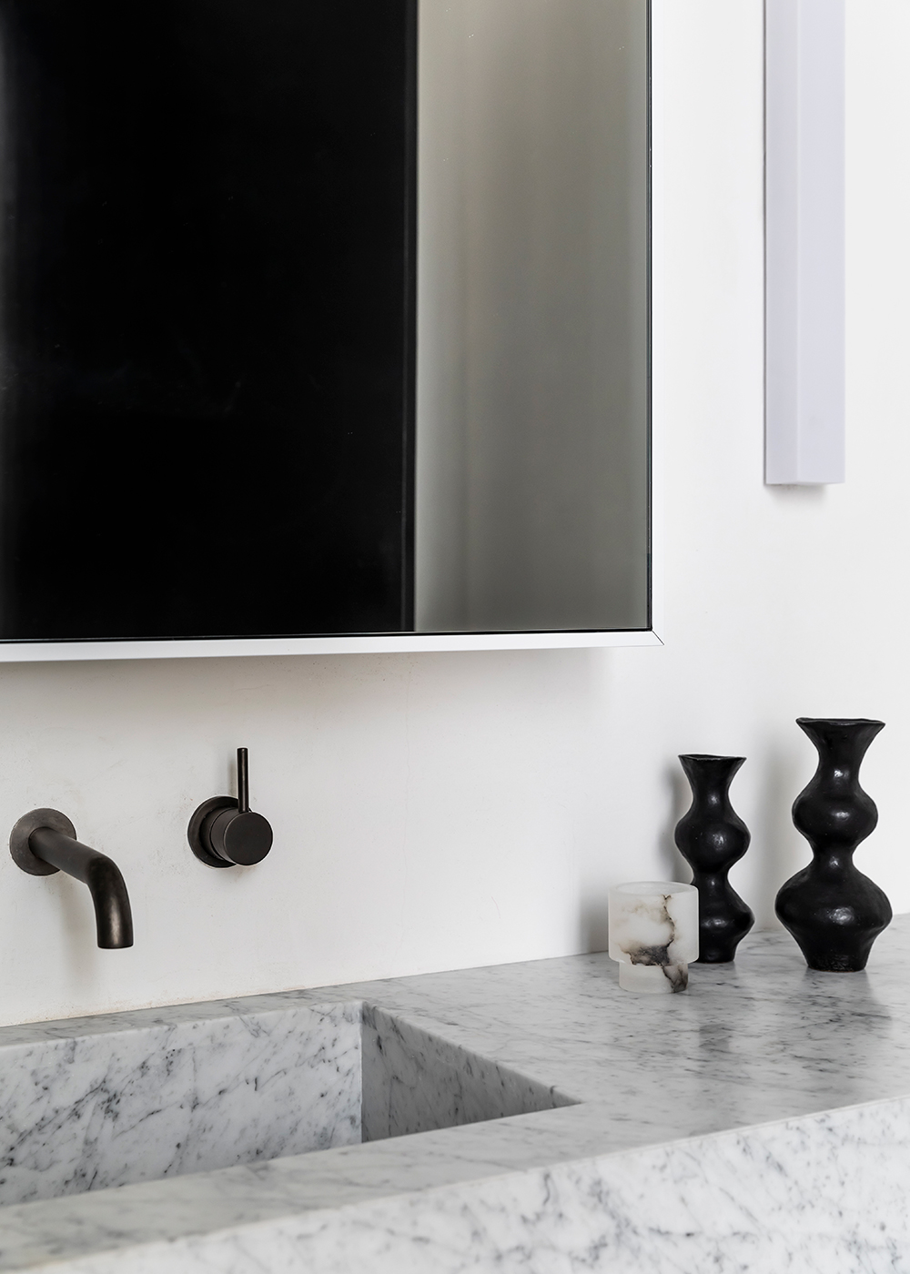
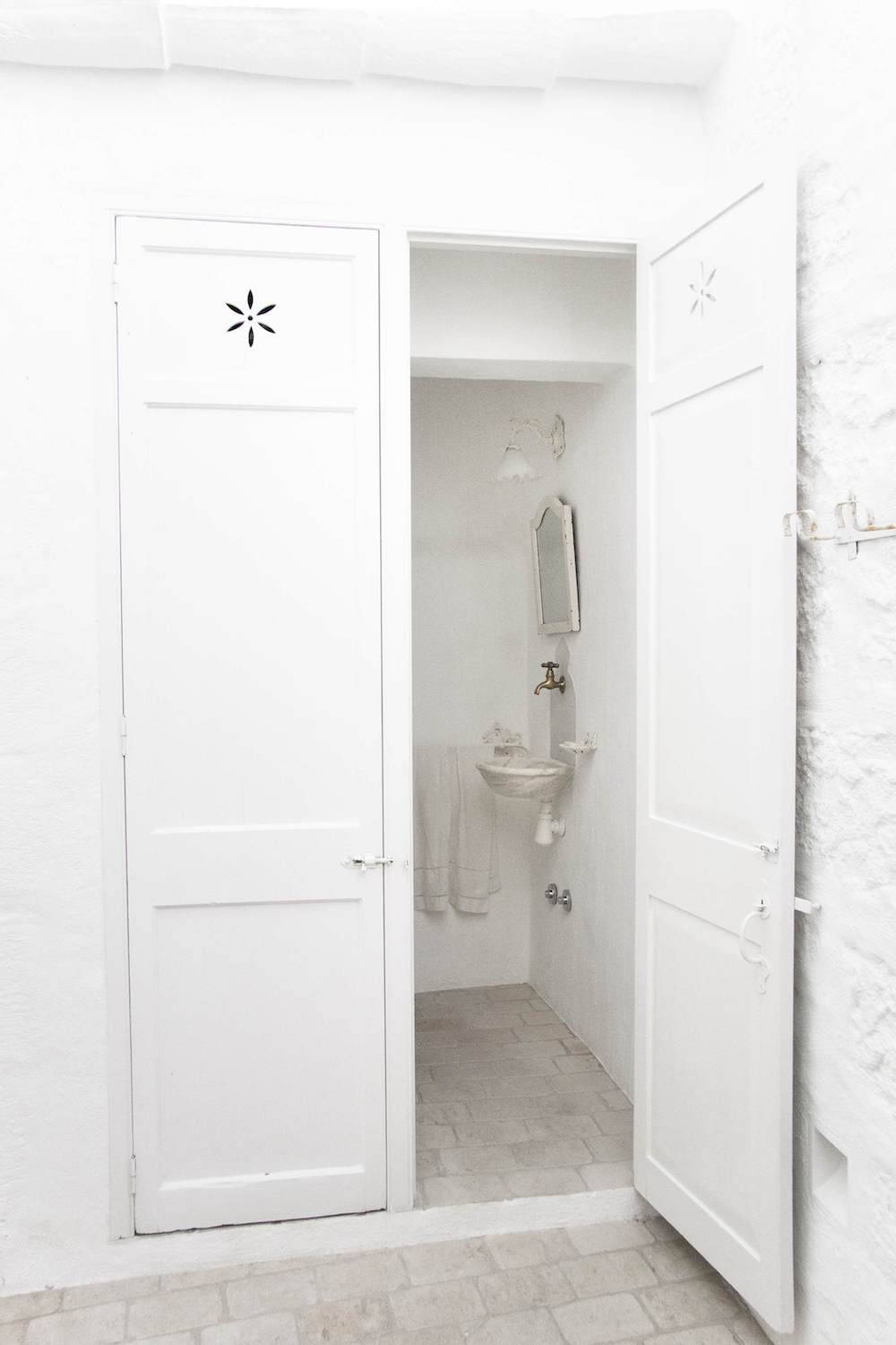
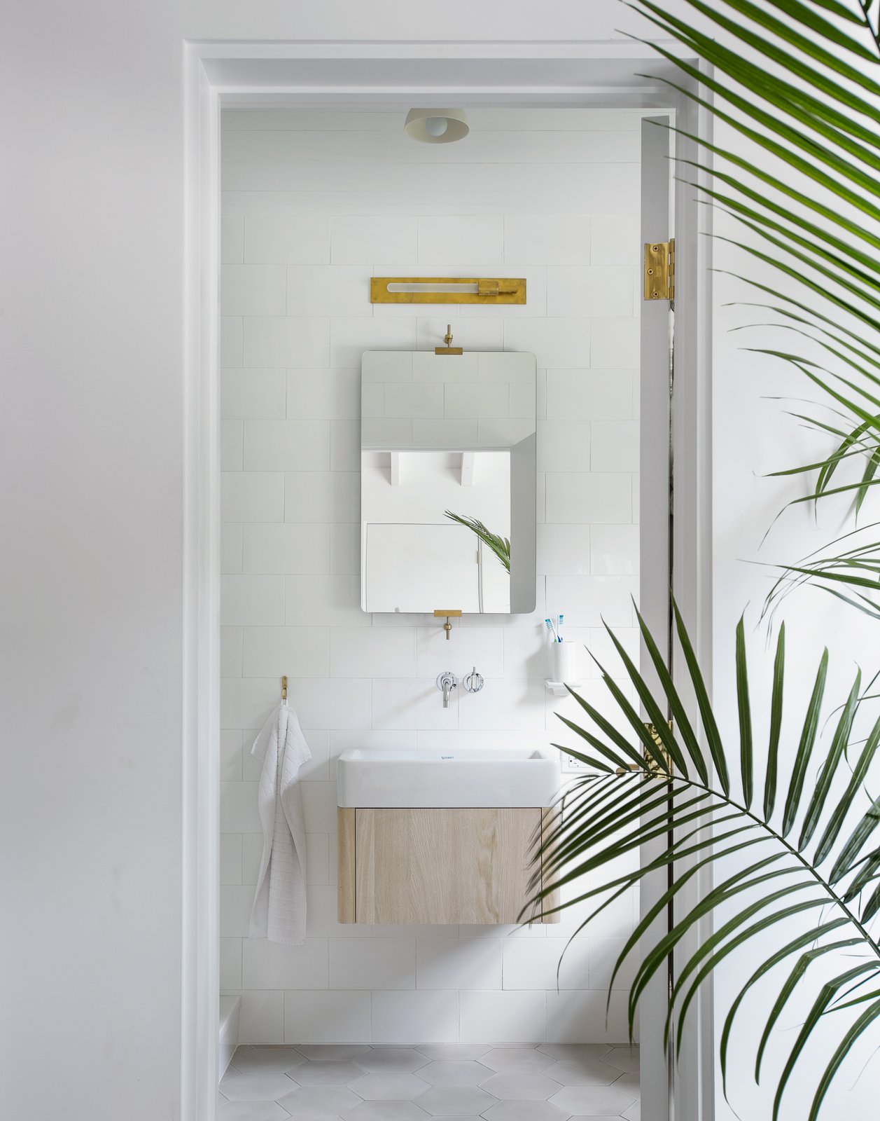
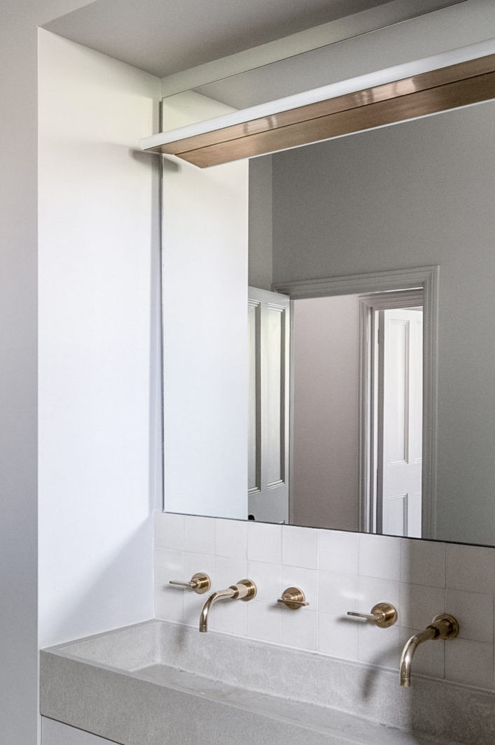
That cast-concrete sink in the primary bedroom’s attached WC is just gorgeous and of course keeps within the approved color palette.

Designing a room – not to mention an entire home – can feel like a desperately overwhelming task as there are literally an infinite number of choices that can be made. But, if you give yourself parameters within which you must work, like a tightly honed color palette, so many decisions – from picking paint colors, to your family of light fixtures, to the final bedding selections -suddenly become that much easier.

As I work to determine the final finishes for Hood Canal, I’m going to come back to this project as a constant reminder to rein it in. When it comes to design, setting limitations is actually incredibly freeing.
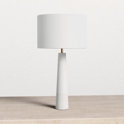
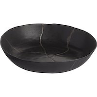
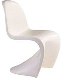
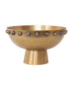
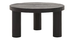
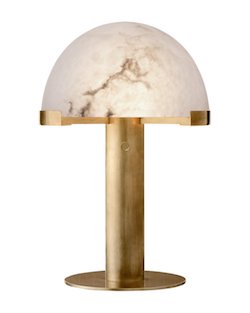
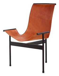
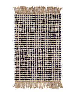
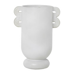
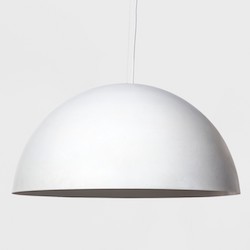
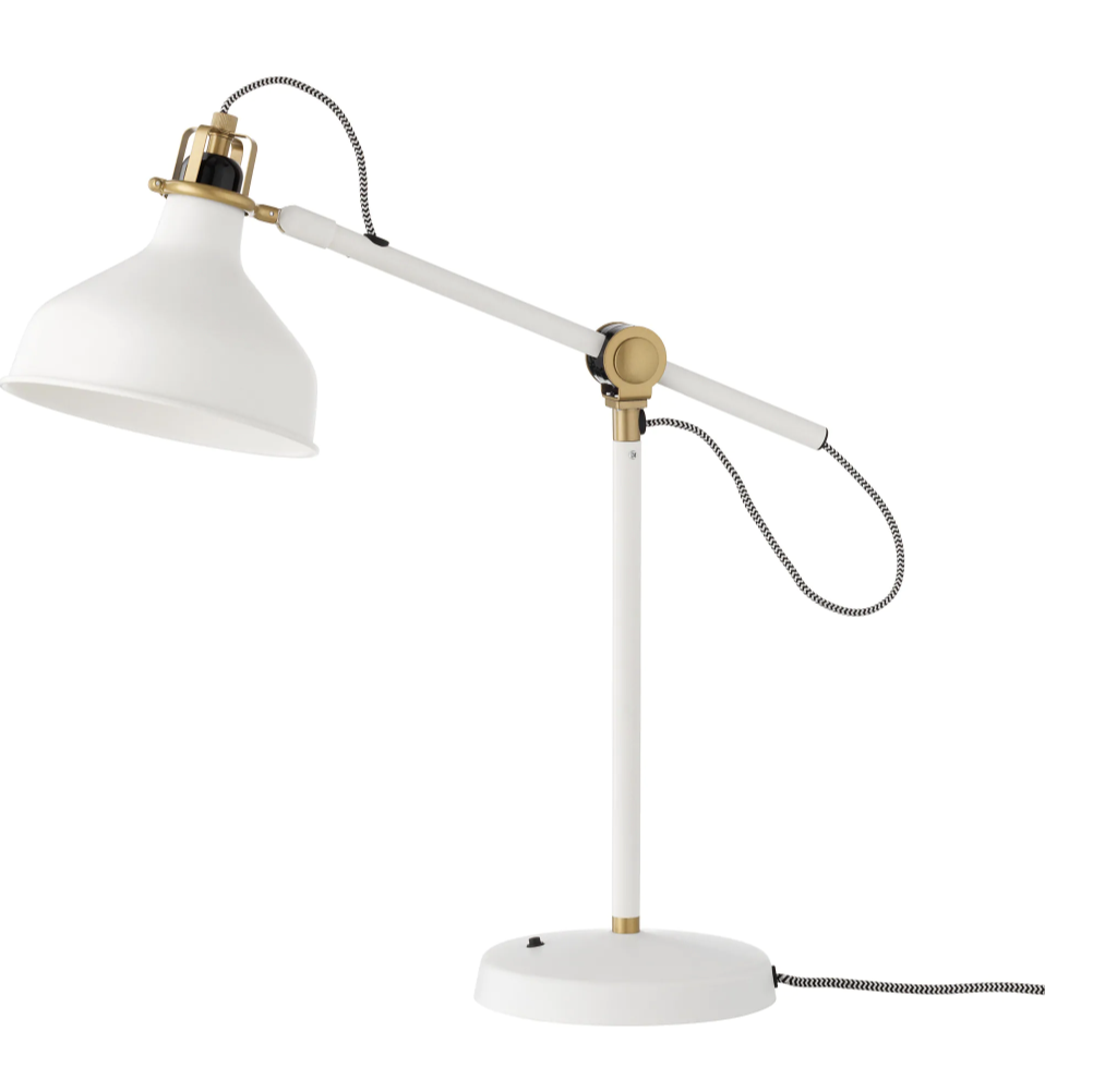
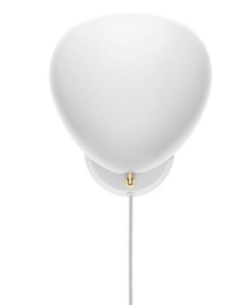
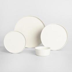
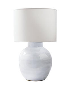
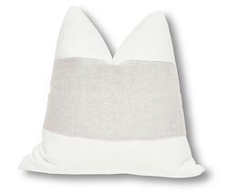
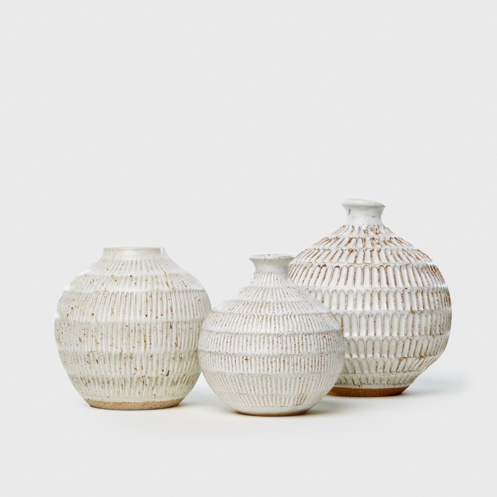
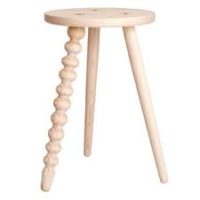
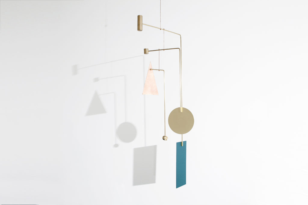
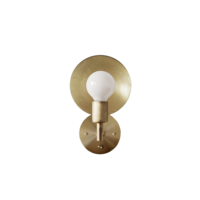
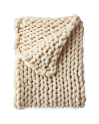
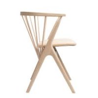
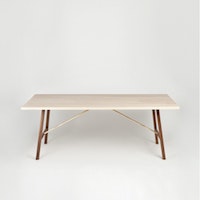
 

images via the modern house

I have always loved finding gorgeous homes to share with you. Someone’s home tour, ie how others are actually living, is always one of the best ways to find inspiration for your own space. However, I’ve come to realize that I have done a terrible job taking conscious action to share work by BIPOC designers, makers and artists. This stops today.

As I’ve been listening and learning these past few weeks, I’ve discovered a bevy of designers whose work is speaking to me – and I think they’d speak to you too. For the next week I’m going to sharing some of my favorite finds. Today, I am thrilled to introduce you to Kelly-Ann Baptiste of Pure Collected Living. Her vibe; calm, restrained and elevated is so soothing and exactly what I’m gravitating to at the moment.

Pure Collected Living

Fun fact about Kelly, she’s a four-time Olympic athlete for her native country of Tobago! While she now resides in Florida, you can see how her global travels competing all around the world influenced her style, creating an appreciate for the perfect balance of modern and vintage. In fact, Kelly has sourced a vast majority of the pieces in her own home from thrift stores!

Kelly uses one of my favorite juxtaposition techniques, combing a classic Saarinen-style table and chairs with a traditional hutch. The effect is warm but minimal at the same time.

Pure Collected LivingPure Collected Living

I spy more foraging! You really can never go wrong with a lovely branch in an equally striking vessel. I’m also obsessed with Kelly’s pleated lampshade. I’ve been searching for options for our bedroom, but I strongly suspect this one was thrifted along with that amazing lamp.

Kelly’s consistent color palette brings cohesiveness to her whole house. It’s her mix of natural materials, wools, ceramics, linen, glass, wood and metal that keep everything from feeling too monotone.

Styling tip: do you notice how Kelly’s art is off-center above her console table? This asymmetrical design allows her to create balance with the vase of branches. I also love how the round side of the folding table mimics the round shape of the rings that sit atop it.

You know I’m obsessed with different ways to make a bed. I love the Euro look Kelly used here. The duvet folded back and the simple crisp sheet is so inviting. But what I really love about Kelly is her insightful advice she’s sharing on her site Pure Collected Home. Her posts include great tips, inspiration images and round ups of her go-to products. She regularly champions the mix of high and low, traditional and modern, vintage and new. I think she’s created the perfect combo of all of the above in her own space. I highly recommend you give her a follow!

Some people say all-white design is boring. Or easy. But I beg to differ. Using white as your primary color palette actually requires the utmost expertise – so much so that there’s a beautiful new design book dedicated to working with a (nearly) all white palette. And I, for one, am here for it.

I highly doubt you’re bored by neutral interiors either, otherwise you wouldn’t have been able to stick around Apt34 for this long, but this new design tome, FOR THE LOVE OF WHITE: THE WHITE AND NEUTRAL HOME by Chrissie Rucker, founder of UK favorite, The White Company, captures pitch perfect use all my favorite soothing hues.

The secret to a compelling neutral interior is contrast. And there is stunning use of that throughout these homes. Deeply hued hardwoods pop against beautiful white walls.

White on white works when you use dramatic proportions. I love how everything in these homes feels big and eye catching – no bright colors required. Note to self, always add a dog that matches your interior.

Yes, I’ve hated on all-white kitchens in the past, but there is a reason why they’ll never go out of style. I do understand their classic appeal.

I love the mix of materials in this dining room. Modern, clean lined chairs mix with a farm style table and a stunning traditional built-in hutch. Definite display goals with that one.

A freestanding tub is also always timeless. This space is truly elegant.

But in my next dream house, I’d like a room dedicated entirely to my tub, thank you very much.

This is only one of the many gorgeous design books that have debuted this fall. I’m going to share sneak peeks of all of my faves through the month of November, just in case you have another design lover on your gift list!

Photography by Chris Everard, © The White Company.

“FOR THE LOVE OF WHITE: THE WHITE AND NEUTRAL HOME by Chrissie Rucker, founder of The White Company, is available now from HarperDesign, an imprint of HarperCollins Publishers. For more information, visit hc.com

At first glance, you might not immediately realize today’s home tour is nearly 220 years old. The beautiful mix of contemporary furniture, elevated vintage and exquisitely unique pieces are likely to capture your eye first. Because it is all crazy good.

But has you look a little closer, you’ll notice how the historic details of the home – a cottage originally built in 1790 by a Revolutionary War veteran – are an integral part of the home’s overall aesthetic. To stunning effect. Scroll to see how you can can make something old wondrously new again.

After five years of renovating This Old Victorian, I’m sucker for any home that highlights its historic architectural features. In restoring this cottage, the design team took great pains to refurbish the raw wood beams that originally graced the walls and ceilings. That age and patina are the perfect foil to the the contemporary feel of furnishings.

I also love that there’s also a sense of ease and comfort in this home. The chaise sofa and simple two-tiered coffee table above are relaxed, while the side table, vintage wall-mounted sconces and those stunning layered rugs add major interest. The warm palette of neutrals offer high contrast without in your face color.

All dogs should be color-coded to your house if you ask me.

My head keeps turning at tall the incredible details in this house! Do you spy those incredible feet on that sofa? Or your perhaps you can’t pull your eyes off that marble side table. Or that exceptional lamp? The yummy rug? It’s hard to decide what is the most pitch perfect choice.

Vintage moments add to the cottage’s charm – from that amazing firewood box to the lovely candles and door hardware – these are the details that truly honor the home’s restoration.

The dining room mixes styles to a tee. The massive fireplace, skirted dining table and shaker chairs all speak to the traditional east coast roots of this home, while the oversized art both mirrors the fireplace but also offers a modern touch.

A herringbone brick floor is a textural rustic moment in the otherwise sleek white kitchen.

Mixing textures, print and materials offer visual interest everywhere you turn.

A wicker chair painted black modernizes the vintage vibe in a bedroom. A sophisticated modern lamp further balances this vignette.

This home is a clinic in honoring a home’s historic bones while breathing in new life that meets the needs of how we live today. My friend Sheena, the founder of Nune Studio is behind all these beautiful choices while Branca & Co managed the restoration. I should have reached out to both five years ago!

photography by nicole franzen, interior design by nune studio, restoration by branca & co

Happy Monday friends! Today I have a home tour for you that helps put last week’s black and white inspiration in context. While the color palette of this Australian home (I just can’t quit design from down under right now) is timeless, the design is bold, dramatic and thoroughly modern. It’s no wonder this apartment is nominated for the 2019 Australian Interior Design Awards. Scroll and you’ll see why.

This three-story townhouse located in Sydney’s Darlinghurst neighborhood was stripped down to expose the building’s original stone walls which were transformed into the primary design feature. As designer Tom Mark Henry explains this house focuses on “the interplay of texture, combining hard and soft finishes, contrasting matt and gloss surfaces, and light and dark to create intrigue and depth in an otherwise monochromatic palette. These quiet juxtapositions are an exercise in restraint, and the ultimate pursuit of balance and simplicity.”

Nothing in this house is generic. Every piece is selected as its own individual statement maker, but the uniform color palette keep the modern edge from feeling overdone.

Unique lines, dramatic angles, bold fabrics and one of kind art add continual interest in what is actually a sparsely decorated home.

This dining table, with its mix of a built-in bench and Thonet chairs is major goals.

As is this gorgeous pendant light!

The outdoor area connects with the kitchen and dining room seamlessly.

The kitchen is clean, minimal and understated, punctuated with simple, hardware free cabinetry. Black accents are brought in with the hardware, oven and countertop accessories.

I love the rich, muted texture of this stone.

The stunning stone walls carry through into the master bedroom. A unique piece of art adds a little whimsy to to the space while the curved lines of the side chair and side table, as well as all the textiles soften the room.

I shared this bathroom a few weeks ago for its square sink, but I also love this room’s vertical stacked tile, the gorgeous stonework and unique lighting. And do I spy a fireplace in the bathroom?? Swoon!

I spy another square sink in the second bathroom.

This home might be a little more sparse than I’m actually capable of pulling off, but it’s certainly something to aspire to. It’s also a reminder to look for pieces for your home that are filled with personality. Life is too short to be surrounded the generic.

For our home tour archive CLICK HERE.

design by tom mark henry

Leanne Ford might be known for her love of white spaces, but this home on the island of Menorca is giving her a run for her money. If you’re looking for inspiration to really pare down your life and give your magic easer a major workout, this monochromatic masterpiece is the home for you.

A Master Class in Monochromatic Design on apartment 34A Master Class in Monochromatic Design on apartment 34A Master Class in Monochromatic Design on apartment 34A Master Class in Monochromatic Design on apartment 34

While white on white on white might not be the most practical color scheme for day-to-day family living, there are design lessons here that you can apply to any space, regardless of its color palette.

The first is the power of texture. Yes, this home is all about monochromatic design, but a variety of elements, from rough plaster walls to wood beamed ceilings, muted tile floors, and floor skimming linen window treatments all make this home feel very tactile. This isn’t a boring, sterile white box. Rather you want to run your hand along the wall or wander up the turning staircase to see where it might lead you.

A Master Class in Monochromatic Design on apartment 34A Master Class in Monochromatic Design on apartment 34 A Master Class in Monochromatic Design on apartment 34

The second less is the power of contrast. When you stick to a single white color palette, you can inject bold moments that really make an impact. Greenery around your built-in courtyard seating pops. A single dark wooden basket placed in a window is a scene stealer. One small piece of art or wall sconce grabs the eye. Each object takes on a much larger significance against the stark backdrop. It’s a wonderful reminder how less can truly be more.

A Master Class in Monochromatic Design on apartment 34 A Master Class in Monochromatic Design on apartment 34

While I cringe a bit thinking about dirty dog feet and sticky pre-schooler hands all over that built-in white sofa (trend spotting alert!), I am just sucked into the simplicity and earthiness of this place. We often think this type of aesthetic can only be enjoyed on vacation, but why? Who says you can’t recreate this feeling in your home – no island destination required. This home certainly feels like a wonderful place to escape from the stresses of daily life.

What do you think? Could you live in a monochromatic space like this every day?

For our home tour archive, CLICK HERE.

design & photography by marina senabre

While all-white interiors are a stalwart of Scandinavian design, as I sit in 20-something degree weather in Seattle, I’m finding myself drawn to cozier, more rustic versions of winter whites on white on white on white. I’m curious to see if you’re feeling this look too.

Color Coded: Winter Whites on apartment 34Color Coded: Winter Whites on apartment 34Color Coded: Winter Whites on apartment 34Color Coded: Winter Whites on apartment 34

While there’s a bit of wabi-sabi to this look, key decisions keep the look from going to shabby chic. Modern light fixtures make a ton of difference. A classic Nelson saucer pendant lamp or maybe a vintage Noguchi (investment alert!) help keep the look current.

Color Coded: Winter Whites on apartment 34Color Coded: Winter Whites on apartment 34

Clean modern lines juxtaposed with more traditional pieces mix for the perfect cozy, rather than sterile feel.

Color Coded: Winter Whites on apartment 34

And all kinds of texture – knits, wools, linens, woods, hides, paneling, painted brick, exposed beams, they all combine to give you that nest-like feel.

Color Coded: Winter Whites on apartment 34Color Coded: Winter Whites on apartment 34

People often lament that white furniture is highly impractical, but I actually beg to differ. With the invention of Oxyclean, you can get rid of just about any spill quickly and keep your whites bright for the long term.

For more color inspiration, CLICK HERE.

interiors by leanne ford / fantastic frank / the design villa

‘Tis the season to dream. Dream of white sandy beaches, dream of rosé, dream of cool summer breezes and the perfect setting from which to enjoy them. And I think I’ve officially found my dream setting, though sadly it belongs to someone else. But I can certainly drool over this seriously stunning and picture perfectly neutral home from afar (as well as add this to my future vacation house muse file).

neutral dream escape in the hamptons on apartment 34

This light and bright abode has all the things. The perfect amount of Scandi-inspired design. I know we’re supposed to move passed it and embrace color and terrazzo and print and pattern and drama and I just can’t! I can visit those space and appreciate those spaces but this is the home I want to live in. Monochromatic, calm, soothing, serene.

neutral dream escape in the hamptons on apartment 34

But it’s certainly not boring. Do you see those beams on the ceiling (added during renovations by the design genius behind this project, Jessica Helgerson Interior Design). Danish design classics like the PP130 Circle Chair and Sibast No. 8 chairs in the dining room mix with pieces from leading modern design houses and take pride of place. Apparatus Studio trapeze sconces dots many a wall and hangs in the dining room. Swoon. There is texture, there is warmth and there is interest through out this home thanks to a mix of wood tones, painted wood, marble, brass and handmade tile. Rustic leathers, linen and chunky knits soften the look. Each room feels inviting and comfortable, no color required.

neutral dream escape in the hamptons on apartment 34neutral dream escape in the hamptons on apartment 34

That dining room table and matching benches are particularly special. Is anyone else catching the brass detail on the cross bars?

neutral dream escape in the hamptons on apartment 34

The all-white kitchen is anything but boring thanks to the warm wood island, brass hardware, subway tile wall and beamed ceilings. Even though it’s a renovation – this was once a covered porch that was converted into usable indoor space – it feels as if the kitchen was just always this way.

neutral dream escape in the hamptons on apartment 34

Could I get away with a single shelf of storage in the kitchen…well maybe in a vacation house I could…taking notes.

neutral dream escape in the hamptons on apartment 34

Custom storage in the entry is so good.

neutral dream escape in the hamptons on apartment 34

As is built in seating. I couldn’t find a way to fit it into our house, but I think a built in section will be a requirement in my future dream vacation house. The more times I type my dream vacation house the more likely it is to actually happen, right?!

neutral dream escape in the hamptons on apartment 34neutral dream escape in the hamptons on apartment 34

A staircase that just seems to float in mid-air? Don’t mind if I do.

neutral dream escape in the hamptons on apartment 34

Do I spy shiplap done in an exceeding modern way? The brass sconce and ceiling lights, the clean lined coffee tables, and built in seating keeps this room from going too country. Instead it takes on a modern, beachy feel. I’m certainly feelin’ it.

neutral dream escape in the hamptons on apartment 34

A bedroom with all the hygge vibes for the win. Also note that pendant light is from Ikea. Proof positive that you can definitely go with a high low mix. I’m also into that circle effect behind the bed. It’s an easy way to create the feeling of a massive headboard and some fun visual interest (how I applied a similar idea in my son’s room is here).

This lovely space is proof that you don’t need to get overly fancy in the bathroom. Also I really wish I knew the source for that awesome sconce. And I wishing I’d tiled my backsplash. Maybe it’s not too late…

neutral dream escape in the hamptons on apartment 34

Only thing I’m not sure I’m loving is the tree mural in this guest bedroom. A little too literal for my taste. Are you into it?

neutral dream escape in the hamptons on apartment 34

But I definitely need an ivy covered pergola and outdoor dining area in my future. Wait, I have that at least for the next 6 days! Don’t forget to check in on Instagram as I’ll be giving sneak peeks of my current wine country stay-cation situation. It’s not as totally perfect as this house, but I’ll take it!

For more of my favorite home tours, CLICK HERE.

design by jessica helgerson, photography by mathew williams 

I know this is supposed to be the year of big bold color. I’ve even espoused being brave with color a couple of times myself. I’ve been pinning a ton of color too. But as much as I love a courageous design decision, there’s something about a timeless palette that will always look of the moment. Case in point, the combination of black, white and wood that I just cannot quit.

timeless color palette on apartment 34timeless color palette on apartment 34timeless color palette on apartment 34timeless color palette on apartment 34timeless color palette on apartment 34timeless color palette on apartment 34

This classic color palette is a calm, cool and refreshing respite from life’s noise. It offers the space for your day-to-day to add the color rather than objects that surround you. But this palette isn’t one note. There’s actually a ton of variety to play with.

You can decide between cool whites or warm. You can mix and match a huge range of wood tones. For example, walnuts feel rich and sophisticated. Light maple feels airy and bright. Wood floors add warmth to all white walls. I’m obsessed with the patterned floor above although herringbone is always a good choice too. It’s a lovely old world look. But I also love the modern vibe of a white floor too.

It’s the hits of black that modernize – a black focal wall adds drama, pops of black like a light fixture or faucet offer places for your eye to land and black furniture feels chic. Black will always elevate with its sleek edginess. I recommend putting something black in virtually any room.

So while I try to conduct a bit of a spring purge, I’m looking to both pare back the colorful clutter, and instead, add just a few subtle layers to my world. Any of the 18 black, white or wood objects below would definitely do the trick!

shop a black, white and wood color palette on apartment 34

SHOP: 1 / 2 / 3 / 4 / 5 / 6 / 7 / 8 / 9 / 10 / 11 / 12 / 13 / 14 / 15 / 16 /17 /18


What do you think? Do these subtle yet striking rooms speak to you as much as they do to me?

For more color palette ideas, CLICK HERE.


SHOP THE POST

[show_shopthepost_widget id=”3102451″]


images 1 / 2 / 3 / 4 / 5 / 6

Older posts
Gimme More