If you missed last week’s announcement, I’ve been working with my friend Chloe to whip her recently-purchased San Francisco bungalow into shape. It’s a charming classic San Franciscan home, but was left with the…shall we say “less-informed” design decisions of its previous octogenarian owner. We’re on a mission to unearth the coolness that this home could embody.
One of the quickest and easiest ways to do that is with your paint color. It doesn’t require breaking into walls or a crazy financial investment. If an industrious mood strikes, you can in fact do it yourself! If there’s one thing that will immediately improve a place (even if you rent!), it’s paint.
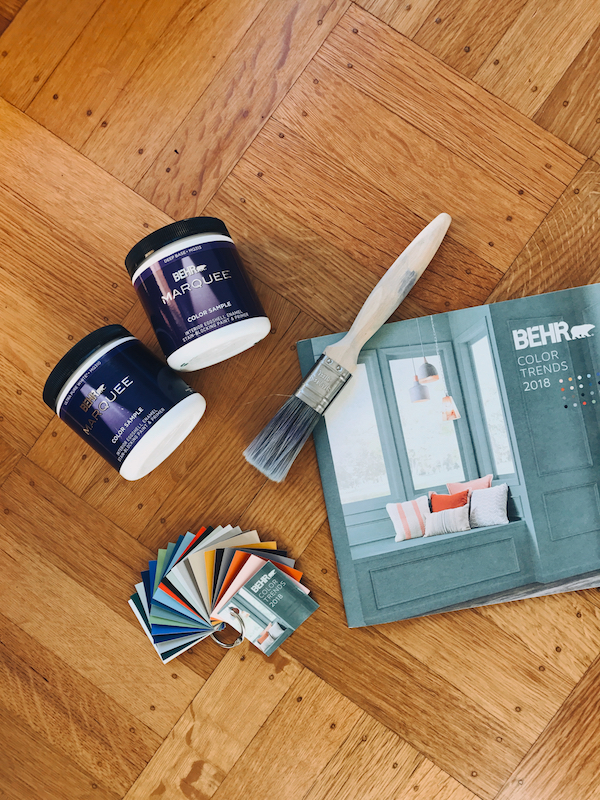
In case you didn’t catch our design board for Chloe’s home, we’re going in a northern-California inspired direction with her color palette. Think bright and airy white mixed with pops of earthy greens, a bit of ocean-inspired blue and sandy neutrals. Thankfully, Behr Paint is helping us to bring our paint color vision to life. Behr’s collection of 2018 Color Trends offer a gorgeous palette that makes injecting a little color into your home so easy.
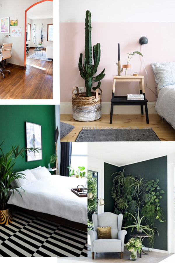
While we have the bulk of our paint colors selected, we also have a couple out of the box ideas in our back pocket. We want to have a little fun with unexpected color placement. Ideas like half walls, solid blocks of color and painting unusual places. Here’s a quick inspiration board to give you a better sense of our vision:
And while we have most of our color palette picked, we did want to get your thoughts on one of our more creative ideas! Keep scrolling for a major sneak preview and please weigh in with your opinion.
BEFORE
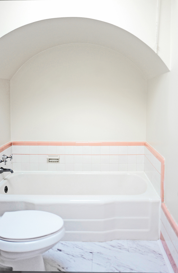
Chloe’s home features a charming bathroom. While small, it’s flooded with natural light thanks to an amazing skylight. But the piece de reistancé is the cutest little nook for Chole’s bathtub. The space feature’s the bathroom’s original 194o’s pink and white tile (which both Chloe and I still love). It also has an amazing archway over the tub that just cocoons you. This is where we want to highlight a major pop of color.
OPTION 1
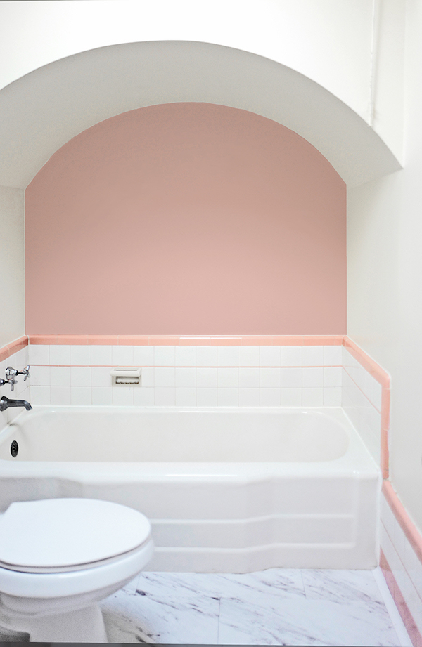
Our first option is Behr’s 2018 Color Trend hue, Positively Pink T18-01. This is a sweet, virtually matching option. It would amplify the room’s feminine vibe.
OPTION 2
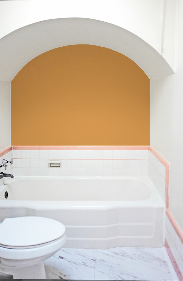
Option two is a really bold moment featuring Behr’s 2018 Color Trend hue Life is Good T18-05. The orange-gold adds some major warmth and would be a bright and sunny addition to the space.
What say you? Are you feeling the pink? Or are you into the bold gold? We’d love for you to weigh in! And do stay tuned as the final design will be revealed in the coming weeks!
This post is in partnership with Behr. All thoughts are 100% my own. Thanks for supporting posts that have kept apartment 34’s doors open.


Pink! But, just a thought, maybe something with pattern? Stencil?
My vote is for the pink definitely! Though in the photograph at least the shade is bluer and darker than the pink tiles so you might need a better match.
Most definitely the pink! I wonder how it would look on the nook ceiling rather than the wall? It would still emphasize the arch and feel even more cocooning.
We’re actually considering the ceiling too Kim…stay tuned for the final result!
Since it is a smallish bathroom, I say Pink for sure. It is more calming for bath tubbing.
Option #2 is fun! We used to have the old yellow and black tile in our house, similar to the pink style and I loved it.
Pink definitely, but a closer match to the tile.
PINK
The gold. Maybe a teal. But the gold is very good.
pink! although the yellow is yummy too, imagine the bubble baths in that lovely pink corner.
Pink
I like both colors. My vote however is for Option 1••••• it doesn’t read feminine to me, the color is an earthy “pink” and there’s enough of a contrast with the pink tile trim to make a statement that says this doesn’t match on purpose.
Lastly, it’s a more sophisticated option and look.