I would certainly never call myself a traditionalist, but I would say there’s an influx of modern style that will redefine what traditional looks like in 20 years. This San Francisco home designed by JDP Interiors is the perfect example – timelessness, classic, elevated but approachable. I’m all in.

This family home sits atop San Francisco’s iconic Russian Hill neighborhood, affording the space sweeping views of the Bay, the Golden Gate Bridge and Alcatraz. The goal was to focus the design around this spectacular view. A custom sectional upholstered in a luxe nubby wool dominates the living spaces. Everything is kept low profile to maximize the view. The muted yet warm color palette is right in my wheelhouse.

The open concept plan maximizes the views from the kitchen straight through to the living area. The stunning travertine dining room table is a custom design by Bananas & Hammocks, the genius designers behind my custom steel doors!

I love how this home’s kitchen blends seamlessly with the rest of the decor. It’s mix of black, white and bleached oak adds interest and keeps thing from being too one note. Brass pendants from Lawson-Fenning & Workstead.

The built-in banquet seating trend is not going anywhere anytime soon and I’m not sad about it. Especially when it involves cushy velvet.

The main suite echos the dining area with a plush built-in headboard and maximization of the epic views. All of the choices in this home are elegant, refined and what I hope traditional will look like for years to come.

For more home tours, CLICK HERE.

design by jdp interiors / photography by bess friday

Today I have a very special reveal for you, 10 months in the making. Considering the renovation of This Old Victorian took five years to reveal, this is progress. Our house is obviously a special find in and of itself, but it was actually the yard that really drew us to the property. It is so rare to find any kind of outdoor space in San Francisco – or any major city for that matter. Having found it, we wanted to maximize every square inch. For nearly two years we’ve worked on a complete dream yard redesign and I get to finally share the full tour of the completed space with you NOW! Buckle up, this is an in-depth tour. I do hope you enjoy it.

The best way to get a picture of the yard’s Before status is to CLICK HERE. But I’ve included a pic or two below to give you a sense of the vibe. Think mish-mash jungle with very little truly usable space. It was akin to a secret garden, but sadly not a functional one, particularly for small children.

How We Designed Our Dream Yard on Apartment 34 How We Designed Our Dream Yard on Apartment 34How We Designed Our Dream Yard on Apartment 34
In the built-in seating area surrounding the gas fire pit, pillows are clad in my only source for outdoor fabrics, Sunbrella. Sunbrella offers an amazing array of outdoor fabrics that allow you to get the style you want without sacrificing the durability you need.

The After is a complete 180!!!

The objective for this yard makeover was three-fold: maximize the usable outdoor space, create a feeling of seamless indoor-outdoor living, and add the maximum number of usable elements we can enjoy daily.

I think we achieved all of these goals and then some. We did that by packing as many different functional components into the design as we could, including outdoor dining, built-in seating, a fire pit, grill, hot tub, vegetable garden, office space and off-street parking. I’m thrilled to say that we accomplished our primary goals without having to make any major design sacrifices. It was a feat that took patience and painstaking work, but in the end, I think it’s all worth it.

Let’s take a closer look.

How We Designed Our Dream Yard on Apartment 34
Outdoor pillows from Room & Board clad in Sunbrella fabric offer a soft spot to relax around the Bol fire pit from Paloform. The planter beds behind the retaining wall are filled with Mediterranean-inspired choices including rosemary, olive, and fig trees. 

Creating an outdoor space that looks like this was a massive undertaking. With a project of this scale, I knew immediately that we had to call in professional help. This was not a do-it-yourself type of situation. Thankfully, I found Beth Mullins of Growsgreen Design to execute our vision.

One of Beth’s key design decisions was to work with the existing elevations in our yard – of which there are many – rather than fight against them. While working with the existing levels still required massive excavation and then reconstruction of the space, the decision allowed Beth to create distinct zones throughout the yard that flow beautifully from one to the next. A uniform color palette of black, untreated wood (a yellow cedar that will naturally patina to a light gray), concrete, and greenery keeps everything feeling connected.

How We Designed Our Dream Yard on Apartment 34How We Designed Our Dream Yard on Apartment 34

Sunbrella has been my go-to for outdoor textiles to create a comfortable, welcoming feel to each moment in our yard. Sunbrella is the gold standard for high-performance outdoor fabrics – but I love that they don’t sacrifice style. I was thrilled to partner with Sunbrella on this project. Adding Sunbrella to your yard is easy. You can find Sunbrella everywhere from Room & Board to Serena & Lily and even small designers. I recently discovered the small woman-owned Sien +Co and love the added dimension their gorgeous handmade Sunbrella-clad pillows add to our yard.

Having added the bevy of outdoor-friendly cushions, the cantilevered wraparound bench is what I call our sit back and chill area. The bench serves as both seat and table, allowing for spots to play games, enjoy a drink, or even cat nap! But I’m getting ahead of myself.

Let’s back this renovation train up a bit.

How We Designed Our Dream Yard on Apartment 34

There were so many technical elements that needed to be addressed with this dream yard renovation. The grade changes of course, but also irrigation and drainage, engineering, electrical, let alone all the demo and structural work that took place. Did I forget to mention a giant palm hand to be craned in over the top of our house?! Yeah, that happened – successfully thank goodness. The challenges were endless.

The image above is a perfect example of how complicated this yard design really is. It combines multiple elevations, an in-ground cedar soaking tub, gorgeous concrete and woodwork, a second cantilevered seating area, and design choices to create a connection to the grilling and hang-out space above. Every decision you see here was intentional and meticulously considered, from the angle of the decking boards to the raw treatment on the concrete, down to the placement of the lights and hot tub control panel. I just love how all the different lines and angles play with one another.

Let’s also pause to have a convo about our opaque fence! It’s definitely one of the major design moments in the yard. It was inspired by the original fence we were replacing. It was an old, yellowed corrugated plastic that was completely gross, but I loved that it allowed light through. It always brought a beautiful glow into the space that I didn’t want to lose. Thankfully, I had a major moment of inspiration when I visited the design studio of my friend Tina Frey. She used an amazing opaque material to separate spaces in her studio. So I knew it existed! After a lot of searching, Beth found a product most often used in greenhouses and that is what she used to create our fence. I love how the shadows of the trees dance in the mornings. It’s truly unique.

How We Designed Our Dream Yard on Apartment 34

Now let’s discuss this project’s timeline. After the initial design phase, where we finalized all the schematics and selected a lot of the design elements, demolition began in August 2019. Demo took nearly two months. I cannot even tell you the amount of dirt, rock, brick, and hardscape that was yanked out of here. I’ve included a couple of in-process shots below just to give you a sense. I basically lived in a mud pit for four+ months.

How We Designed Our Dream Yard on Apartment 34How We Designed Our Dream Yard on Apartment 34

After demo was finally complete, the structural work slowly began. This included framing and pouring the reams of concrete retaining walls, the undergirding for the decking, a climate-sensitive irrigation system, running electrical, and more. Planting was done in stages so some of the plants have had nearly six months to establish.

How We Designed Our Dream Yard on Apartment 34

Once the rebuilding began, it took nearly six months before the yard really looked like it was put back together – and of course, Coronavirus slowed work down even more. Thankfully we were able to button up the majority of the finish work in the nick of time.

How We Designed Our Dream Yard on Apartment 34How We Designed Our Dream Yard on Apartment 34

To create an Apartment 34 studio space, Beth brought in Modern Spaces & Sheds to create a mini 10ft x 10ft office I get to call my own. I love the Shou Sugi Ban detailing on the building’s exterior – I’ll be sharing video of how it was done on Instagram. A full studio tour is also in the works – as soon as I finally finish the inside! Sadly, that design work has also been significantly slowed due to Coronavirus. But to have a space I can retreat to for work has been the biggest gift during this difficult time. Now if it only came with invisibility built in….but I digress.

That gorgeous chaise you see in the image above is from Room & Board and it offers the perfect place to lay black and relax with a glass of rosé at the end of a long workday. Or at lunch. Or really whenever. We’re quarantined for goodness sake!

How We Designed Our Dream Yard on Apartment 34

I fought really hard to put in the cedar soaking tub and I couldn’t be happier that we did. It’s the most incredible way to unwind at the end of the day.

How We Designed Our Dream Yard on Apartment 34

All of the built-in seating allows us to keep the need for additional furniture to a minimum. A super comfy bench pad with Sunbrella fabrics creates the perfect spot to lay back while keeping an eye on my son playing in the soaking tub. I wasn’t afraid to go with a white pad because Sunbrella fabrics are so durable and so easy to clean. Just a little soap and water gets out most stains. We’ve put this yard to heavy use since SIP started and I haven’t even had to clean the Sunbrella cushions yet!

How We Designed Our Dream Yard on Apartment 34

We tapped into existing plumbing to add an outdoor shower to the exterior of the office space. A hidden french drain below the decking handles all the drainage issues. The beds are planted with native grasses, dwarf olive trees, and creeping rosemary that will eventually fill in and cascade over the concrete retaining walls.

How We Designed Our Dream Yard on Apartment 34

We also added potted trees to create even more dimension and interest around the decking. These pictures were taken just after my gorgeous dogwood tree finished its spring bloom.

I’ve always loved a good Adirondack chair, so I was a sucker for the modern Emmet Rocker from Room & Board. I added seat pads in black Sunbrella fabric but I think I also want to get a second set of Sunbrella seat cushions in white. It’s nice to have a contrast, but I’m also a big fan of white on white. This seat is a favorite spot to enjoy a morning coffee or late afternoon cocktail. I kept the look of the outdoor furnishing modern to complement the modern meets historic vibe I used on the house’s interior.

A fresh concrete pad will eventually become a little mini-basketball court for our son to practice his free throws as he gets older. It’s currently a great place for chalk drawings and zooming around toy cars. We opted to forgo any lawn in our yard to limit water consumption and maintenance. Eventually, we will add in some flowering plants but the goal is to keep the space fairly monochromatic. Beth recommended we layer slowly over time.

How We Designed Our Dream Yard on Apartment 34

As you move to the front along the side of the house, we added built-in raised garden beds, painted to match the fencing. It’s been so fun to have our own mini-vegetable patch. Carter selected everything we’re currently growing. Built-in drip irrigation means our veggies actually have a shot at surviving! The grasses, rosemary, and palms planted along the perimeter of the yard will continue to fill in over the years.

How We Designed Our Dream Yard on Apartment 34

The design of our yard makes me smile on a daily basis, but what I love most about this outdoor space is how much we use it. All of it. That is the hallmark of truly good design. We want to be in this space. It works incredibly well for us. I’m sad we’re not currently able to share it with friends and family as was the original intention, but having an outdoor oasis has been our primary survival mechanism during Shelter In Place. And with no end real end to this pandemic in sight, we will be relying on this space for months to come.

How We Designed Our Dream Yard on Apartment 34

The Skagerak Fuori Trolley above is another favorite entertaining accessory. Even if I’m only entertaining myself. It’s the perfect serving cart and adds to my modern vibe. Since it’s made of teak and powder-coated metal it’s also meant to stand up to the elements.

How We Designed Our Dream Yard on Apartment 34

This pea, mint and burrata salad is going to be a go-to all summer long! Recipe coming soon.

How We Designed Our Dream Yard on Apartment 34

I am fully aware how insanely lucky we are to have this outdoor space to help us ride out this crazy time. I had never worked on an outdoor project before and it brought an even deeper appreciation for the art of landscape design and has introduced me to another world of outdoor furniture and accessories. I’m certainly not in a rush to do another yard project of this scale – instead, I plan to cherish our dream yard every single day.

I so hope you enjoyed this tour. If you have additional questions feel free to hit me up in comments!

For all our posts about my yard redesign, CLICK HERE.


landscape designer beth mullins growsgreen / photography by seth smoot / styling by kendra smoot

This post is in partnership with Sunbrella. Thanks for supporting posts that have kept Apartment 34’s doors open. If you’re interested in collaborating with us, please CLICK HERE.

Tour this house filled with Hollywood history on apartment 34

I remember bookmarking Brigette Romanek’s house after I spied the climbing wall she built in her daughters’ room in Arch Digest. Thankfully, I never showed it to my son because I know that’s all he’d beg for till the end of time. While Brigette’s home is actually a piece of major Hollywood rock n’ roll history (apparently it was a recording studio at one point and every musician you could possibly name has once partied here), it’s the first place Romanek put her unique design perspective to work and it launched her business, Romanek Design Studio.

That’s why it doesn’t surprise me that this self-taught designer’s business is flourishing. In less than two years, Romanek has been name to the AD100 List and is currently juggling more than a dozen projects across residential, commercial and hospitality. She designed the first LA boutique for clothing brand The Great and Chef Ludo’s restaurant Petit Trois and even a home for Queen Bey and JayZ, among many other projects.

Tour this house filled with Hollywood history on apartment 34

But I’m particularly enamored with Brigette’s own abode. It’s another amazing example of how you don’t have to let your space’s architecture limit your style. You might think a house this grand has to be traditional, formal and stuffy. Instead, Romanek has created a perfect mix of vintage and contemporary design pieces – think Jean Royère, Apparatus Studio, Pierre Jeannert, Knoll, Faye Toogoode and more all mashed together with modern art and functional pieces that can really be lived in.

The sunroom is a beautiful bright space to enjoy breakfast.

Tour this house filled with Hollywood history on apartment 34 

A relaxed sectional, vintage rug and Apparatus table lamp are a great mix of casual and elevated styles.

Tour this house filled with Hollywood history on apartment 34

I also love how Romanek uses color in subtle, yet striking ways. Her book collection is the means to add vibrancy to this otherwise neutral library. The pops of blue and pink mimic the colors you see in the artwork dotted throughout the rest of the house.

Like the colorful vintage abstract painting serving as the focal point in her formal dining room.

Tour this house filled with Hollywood history on apartment 34

There’s an art to Romanek’s mixing that could end up jumbled and too disconnected in the wrong hands, but she does an amazing job connecting tones, lines and textures that pull disparate pieces together.

Tour this house filled with Hollywood history on apartment 34

But what I really love about Romanek is that she’s self-taught. Less than 7% of all interior design degrees are going to Black Americans, but Romanek did not let that stop her. Instead, she pursued a passion and champions constant learning and self-improvement. Too often women use a lack of experience or formal education hold them back from starting their own businesses – a concern that doesn’t seem to hinder men nearly as much. Brigette is a wonderful example of simply jumping in and trying – obviously to great success. This is a great article about her journey.

Tour this house filled with Hollywood history on apartment 34

I’m certainly getting a ton of inspiration from this house – from wanting to add a more eclectic mix of art to This Old Victorian, coveting an impressive indoor tree and considering starting my own jumbo crystal collection!

I’m excited to watch where Romanek Design Studio goes from here.

For out entire Home Tour archive, CLICK HERE.


images by nicki sebastian for jenni kayne

I have always loved finding gorgeous homes to share with you. Someone’s home tour, ie how others are actually living, is always one of the best ways to find inspiration for your own space. However, I’ve come to realize that I have done a terrible job taking conscious action to share work by BIPOC designers, makers and artists. This stops today.

As I’ve been listening and learning these past few weeks, I’ve discovered a bevy of designers whose work is speaking to me – and I think they’d speak to you too. For the next week I’m going to sharing some of my favorite finds. Today, I am thrilled to introduce you to Kelly-Ann Baptiste of Pure Collected Living. Her vibe; calm, restrained and elevated is so soothing and exactly what I’m gravitating to at the moment.

Pure Collected Living

Fun fact about Kelly, she’s a four-time Olympic athlete for her native country of Tobago! While she now resides in Florida, you can see how her global travels competing all around the world influenced her style, creating an appreciate for the perfect balance of modern and vintage. In fact, Kelly has sourced a vast majority of the pieces in her own home from thrift stores!

Kelly uses one of my favorite juxtaposition techniques, combing a classic Saarinen-style table and chairs with a traditional hutch. The effect is warm but minimal at the same time.

Pure Collected LivingPure Collected Living

I spy more foraging! You really can never go wrong with a lovely branch in an equally striking vessel. I’m also obsessed with Kelly’s pleated lampshade. I’ve been searching for options for our bedroom, but I strongly suspect this one was thrifted along with that amazing lamp.

Kelly’s consistent color palette brings cohesiveness to her whole house. It’s her mix of natural materials, wools, ceramics, linen, glass, wood and metal that keep everything from feeling too monotone.

Styling tip: do you notice how Kelly’s art is off-center above her console table? This asymmetrical design allows her to create balance with the vase of branches. I also love how the round side of the folding table mimics the round shape of the rings that sit atop it.

You know I’m obsessed with different ways to make a bed. I love the Euro look Kelly used here. The duvet folded back and the simple crisp sheet is so inviting. But what I really love about Kelly is her insightful advice she’s sharing on her site Pure Collected Home. Her posts include great tips, inspiration images and round ups of her go-to products. She regularly champions the mix of high and low, traditional and modern, vintage and new. I think she’s created the perfect combo of all of the above in her own space. I highly recommend you give her a follow!

Finally, finally the full reveal of the before, design and after of the upstairs floor of This Old Victorian is here! Finishing the second floor – specifically our master bedroom – really marked the culmination of this crazy five year renovation project. And I couldn’t be happier with the final result. I can’t wait to hear what you think.

Ahhhh, there’s the grown up master bedroom I’ve been dreaming about – basically for an entire decade. But let’s back up and start from the very beginning. Because it’s a very good place to start!

We actually did the more dramatic and extensive renovation of our upper floor, (as compared to the ground floor), if you can believe that. While the original layout featured four bedrooms, it actually left a tremendous amount of wasted space. And with only one teeny tiny totally insufficient bathroom, it really was not practical for how we live today. So we went to work. Nearly 24 months of work to be exact. The original floor plan for our upper level is on your left, the remodel on your right.

As you can see from the plans above, we accomplished three major things with our overhaul of the upstairs:

  • Removed the second set of stairs, reclaiming a significant amount of usable floor space
  • Created an entire new kid’s bath using the fainting room off the front bedroom
  • Built a master suite, connecting unused hallways, the original bathroom & the fourth bedroom

While our new layout did result in losing a bedroom, now there is not a single square foot of wasted space and I have the master of my dreams. So everyone wins! Now for those oh so glamorous Before shots.

This space was once…scary and then became our soothing guest room.

Our master bedroom had an auspicious beginning. We filled in that archway, created a second closet and obviously that fireplace (and the pink ceiling!) had to go!

There was nothing really masterful about the original “master bath.” But it made a great walk-in closet for me!

What is now my son’s room started off the same color as the original Apt 34. How’s that for full circle?

Can you imagine a lovely vanity against that left wall and a deep soaking tub under that window?? Nope, I can hardly envision it either. But keep scrolling to see how we got there.

Here is a peek at the 2nd floor in process.

Demo of what was to become my master closet and master bath. As I mentioned in the post about our first floor, we had to take everything down to the studs to replace all of the knob and tube wiring, add in modern plumbing, add insulation (the entire house wasn’t insulated) fix rot in the framing and floors…we discovered more problems as we went of course. A renovation is often like a pandora’s box of problems!

This view looks from the stairwell back into what would become the second upstairs bathroom.

We made sure to preserve original 1860s architectural details like the arched hallway transitions and the glass transoms above each door.

What lath and plaster looks like when scraped back to its bare bones. I actually think it’s quite lovely. I’m so thrilled we were able to save the original molding and window trim.

It’s alway a good idea to lay out your floor tile pattern as a test run before the gluing begins.

Once the new floors went in, I thought we were so close. And yet we were still so far.

My master bedroom looked like this 1.0 version for the better part of two years.

And here is the complete(ish) tour of our second floor!!

As you ascend the stairs from our entry, you turn right to find two doors facing one another. One leads to our son’s room, the other to our master. This bedroom was the last space completed as its design challenges plagued me for quite some time. You can see my documentation of my master bedroom saga here.

Figuring out this bedroom is where I ran up against my design novice limitations. The layout and scale of the space just stumped me. I finally realized I needed yet another custom piece to deal with the room’s unconventional window placement so enter Lauren Nelson Design. Lauren and her team’s custom bed & amazing custom fireplace finally helped me realize the bedroom of my dreams! Lauren also sourced the exceptional, pendant light, vintage rug and an amazing refinished dresser (which you can see here) to complete the space. While I never thought I’d put a bed below a window – supposedly it’s a no no – but that is exactly what this room requires and it lives so well now. I just lay in bed and gaze lovingly at that fireplace. Swoon.

Reno tip: know your limits – Learning by trial & error is both too time consuming and $$$. You’ll save yourself time, money & marital drama if you just hire a pro when you need one.

As you move from our bedroom area, you enter a short hallway en route to the master bath. There you encounter two more doors. On one side sits a pocket door for our WC. The other pocket door leads to what was the original upstairs bath (see the before above) and is now my walk-in closet!

dream closet on apartment 34  dream closet on apartment 34

I worked with California Closets to create my custom dream closet. You can see the entire story about designing my closet right here.

The end of the passthrough leads to our master bath. I won’t sugar coat it. A master bath the size of a bedroom is luxurious for sure. Two full vanities, a soaking tub and a massive walk in shower offer that spa like feel that I should probably work to appreciate more than I ever take the time to do. I think I over compensated for living in 800 sq feet with a baby and two dogs.

If you’ve been following along all this time, you’ll already know that my master bath was another ride on the struggle bus. Lighting is both my crowning jewel for this house, but also my nemesis. After multiple attempts, I think I finally got it right. You can see the story all about my major rookie lighting mistakes in our bedroom and master bath right here.

My son’s bedroom , while shoebox-shaped and smallish, still offers plenty of room for fun. Two windows allow natural light to spill in all day long. Wall-mounted shelving and a darling toddler bed from the Netherlands maximize the floor space to ensure there’s plenty of room to play – and keep the space whimsical!

The room’s curved wall long served as yet another major design conundrum, but Carter’s love of outer space finally sparked an idea. I found a set of constellation decals on Etsy and simply colored over the stars with a glow-in-the-dark marker. Now he has his own starry sky to admire as he falls asleep every night.

You can see Carter’s entire toddler room design (and his original nursery) by clicking right here.

Finally, there is our kid bathroom. I was rather disappointed that this bathroom did not make the cut for Domino, so I had to be sure to share it here. I so love this space. The floors, one of my first major design decisions for the renovation, are hexagon handmade tile by Fireclay set in an ombre pattern. They start dark at the doorway and transition to white as you hit the bathtub. While a touch difficult to see in this image, the tub is also surrounded by Fireclay tile, this time running in a vertical stacked pattern all the way to the ceiling to create a clean, modern look. The floating vanity really lets you appreciate the tile floor and helps the room feel a bit bigger. I intentionally did not install a backsplash for an extra clean, modern look. Three years in and the walls still look great. If I had to do it over I would do a thicker countertop slab though. Overall I just love this bright and happy space. This room is playful and young, but has the classic bones that will grow along with our four year old.

The only other upstairs space you do not see here is our guest room. In an ideal world every single corner of This Old Victorian would have been picture perfect for Domino, but real life often gets in the way. So instead the guest room served as my photo staging area – aka where I hid all my crap –  hence why it is absent in the feature. You can see our guest room here though. Although I’m now about to completely redo it. Cuz a blogger’s work is never done.

And there you have it. I hope this gives you a (more) complete picture of this epic renovation saga. There were many additional mishaps along the way. Like when our crawl space flooded and submerged our brand new furnace. Or the winter we had major rains and discovered some of the house’s windows still leaked when there was water running down our kitchen walls. I suspect such adventures are likely to never end. It comes with the 150 year old house territory.

I hope I’ve given you a realistic view into what a true restoration entails. I’ve certainly learned more than my fair share about all things interior architecture, renovation, restoration and figuring out how to turn a house into a home. I’ve leaned it’s not a quick and easy process, but really it isn’t supposed to be. Building a home that reflects both who you are and who you want to be takes time, commitment and a whole lot of patience.

But the end result is worth the wait.

For the complete tour of the first first floor of This Old Victorian,  CLICK HERE.

For the online feature in Domino magazine, CLICK HERE.

For the entire five year history of this renovation saga, CLICK HERE.

For my newest project – a complete redo of our yard CLICK HERE.

RESOURCES

Master Bedroom
custom bed lauren nelson design /  bedding rough linen / lumbar pillow custom lauren nelson design / custom fireplace lauren nelson design / vintage rug tony kitz gallery / vintage bedside lamps almond & co / georg stool skagerakthe Marset ginger pendant ylighting / curtains the shade store / walls roman clay by portola paints /

Master Bath
tub & tub filler kohler / dancing pendant menu ylighting / walls white wisp benjamin moore / stool elsie green / tray skagerak / towel parachute / art cristina coral / 

Carter’s Room
LampsPlus Tides Pendant / Bitte Wooden Toys / Farrow & Ball Hague Blue Paint / PomPom at Home Pillow / Ferm Living blanket / Toddler Bed / Sloth print / eSale Striped Rug /  Woopsy Desk Lamp from LampsPlus / Pehr Designs Alphabet Bin / Overstock Wing Chair / Sutro Tower / Overstock Woven Basket / Room & Board dresser / Room & Board end table / Calico Corners Roman Shades  / Minted Art Print / Stacked Bookcase from Sourced By Good / Birch Coat Rack / Jennifer Ament print / custom framing Framed & Matted / Windy Chien Helix Light / Cork Globe / Throw Pillow / Lego Storage

Kid’s Bathroom
swing lamp / fireclay floor and shower tile / kohler tub and faucet / silestone counter top / custom vanity / ikea mirror  serena & lily dip dyed stool /

photography by seth smoot for domino magazine 
produced by kate berry
styled by rosy fridman

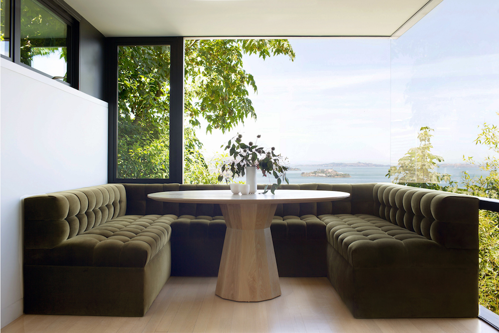
I have been waiting so long to finally get to “tour” you through This Old Victorian. However, doing said tour in blog post form is a bit more challenging than I thought. Hence it’s taken me more than a week to get this all together! Remember Instagram was barely a thing and Stories, Snapchat and TikTok didn’t exist when we bought our house in 2014 so I have ZERO videos of our reno. Seems crazy, right? Therefore, I feel an Instagram video tour series coming on! For now, I want to  share the dramatic before and afters of each space, give you a bit of a behind the scenes peek at our renovation and share a few (of the million!) things I learned about tackling a renovation of this scale.

This Old Victorian Reveal: 1st Floor Before, Design & After

To recap for those who haven’t followed since day one, we purchased a Victorian in San Francisco – an Italianate to be exact – five years ago. It was an exhaustive two year search, but finally found a gem. It just happened to be a diamond in the rough. It estimated build date is the 1850’s, but the exact year is unknown. The home is on the national historic register and the previous owner, who was approaching 90 years of age, had owned the home for more than 45 years.

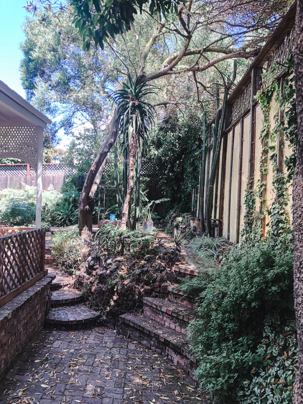
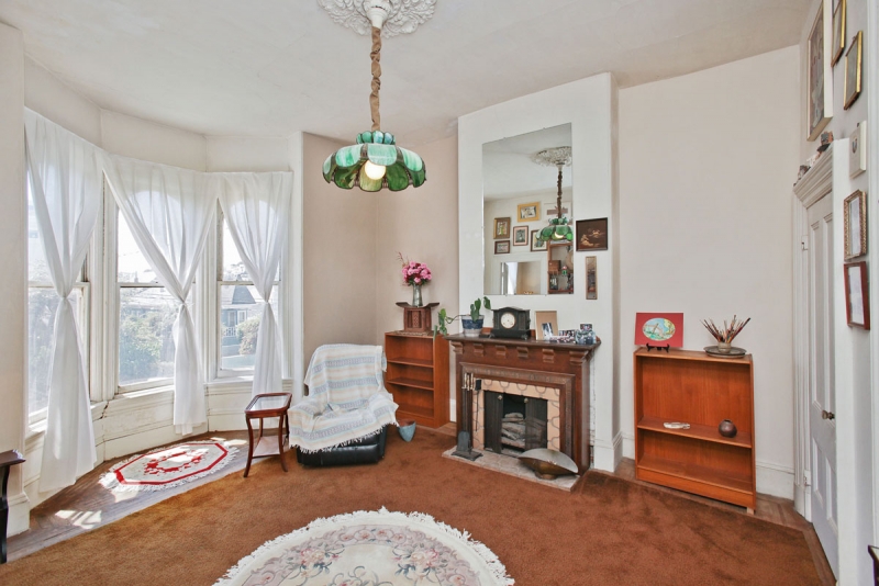
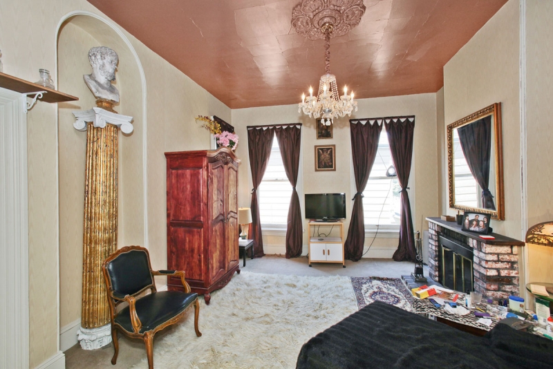
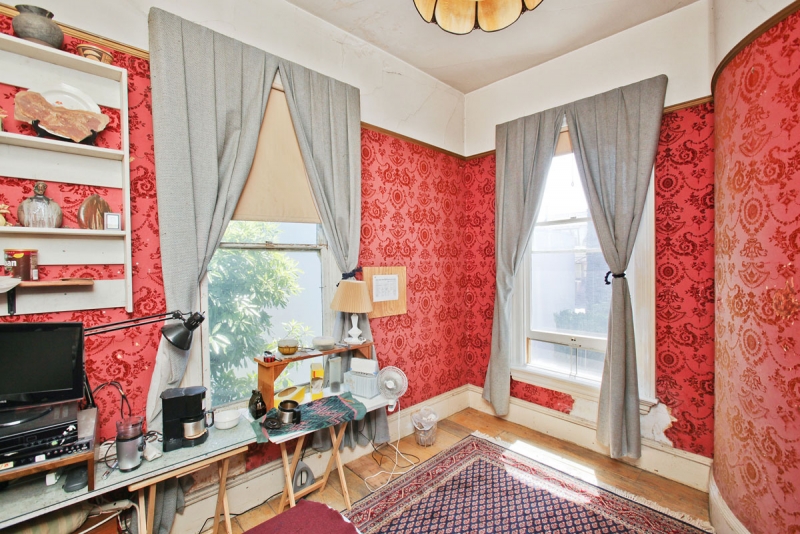
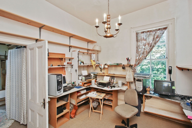
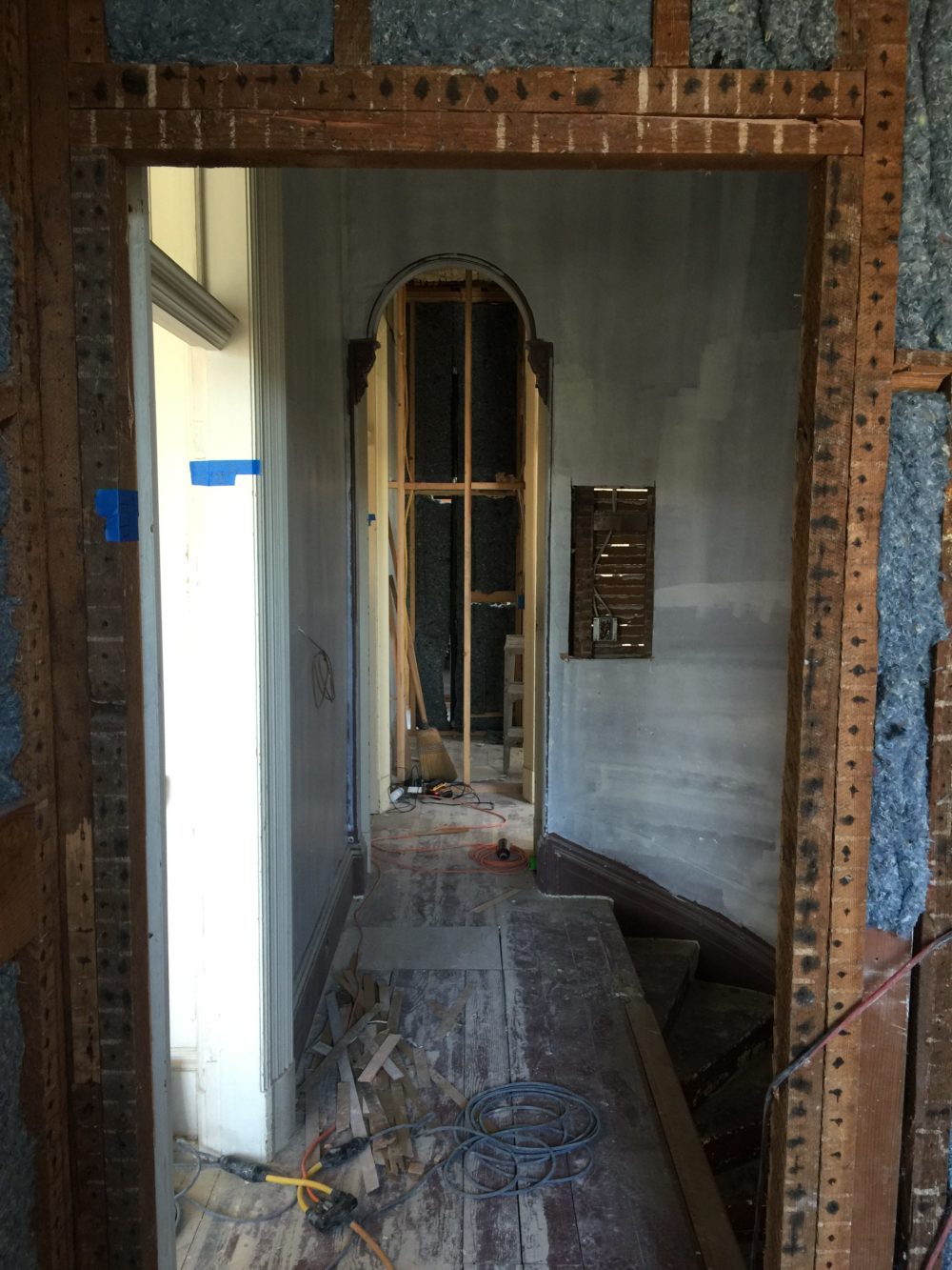
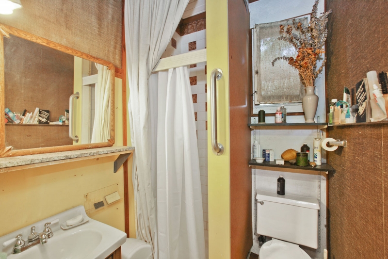
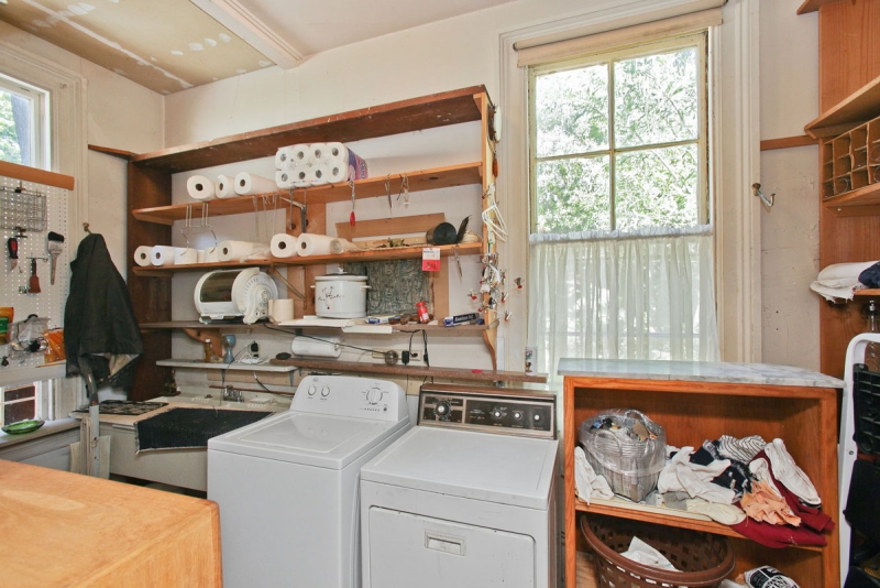
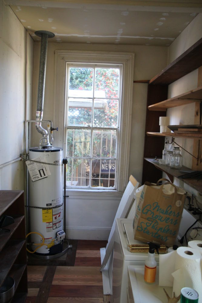
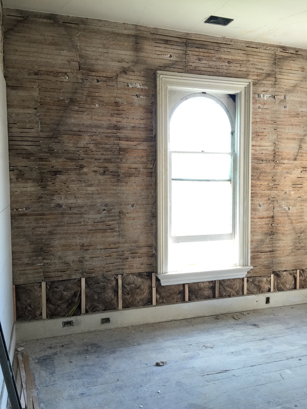
Let’s take a tour of the first floor before we touched it, shall we? You needed a little vision to see its potential.

This Old Victorian Reveal: 1st Floor Before, Design & AfterThis Old Victorian Reveal: 1st Floor Before, Design & AfterThis Old Victorian Reveal: 1st Floor Before, Design & AfterThis Old Victorian Reveal: 1st Floor Before, Design & AfterThis Old Victorian Reveal: 1st Floor Before, Design & After This Old Victorian Reveal: 1st Floor Before, Design & AfterThis Old Victorian Reveal: 1st Floor Before, Design & AfterThis Old Victorian Reveal: 1st Floor Before, Design & After

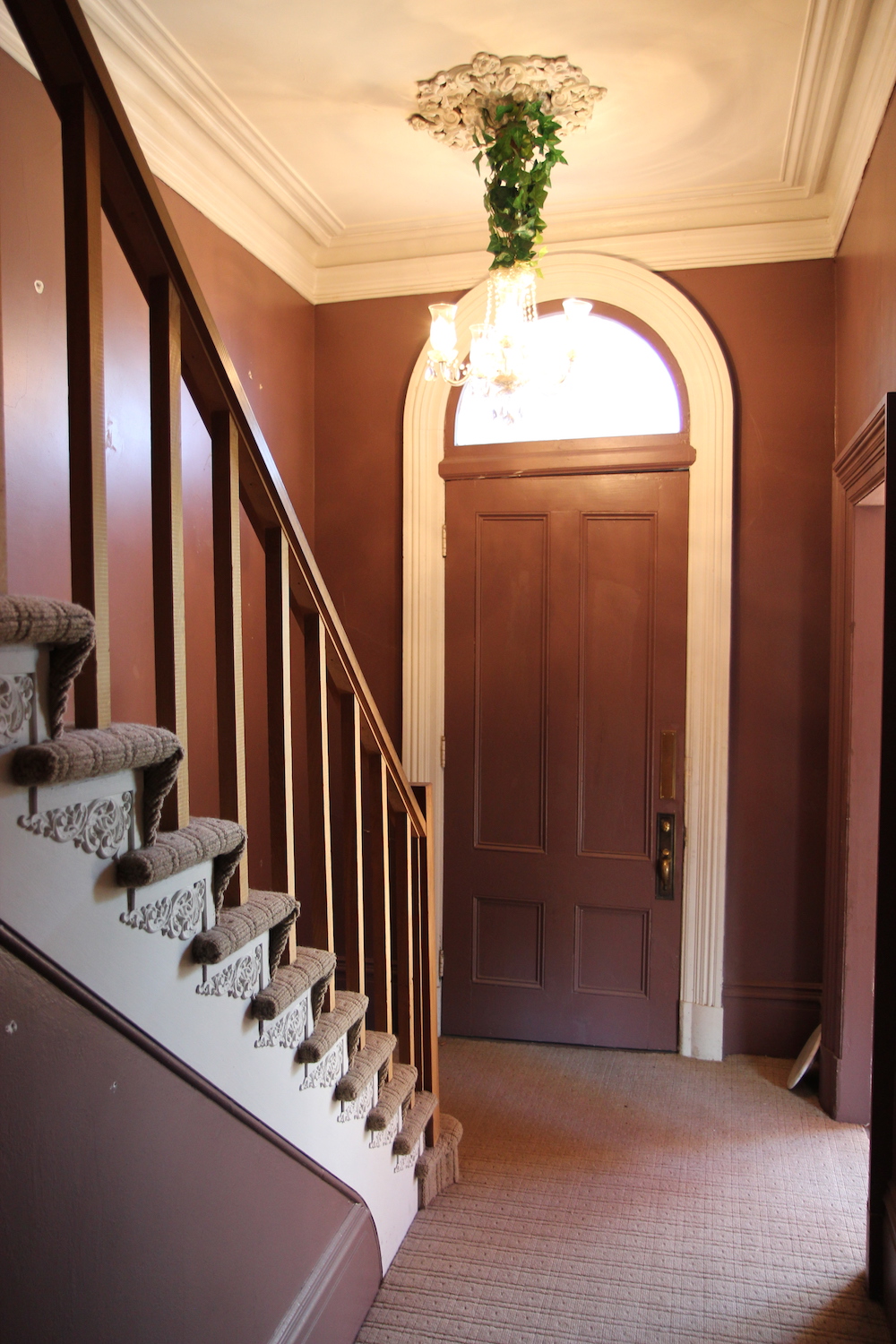
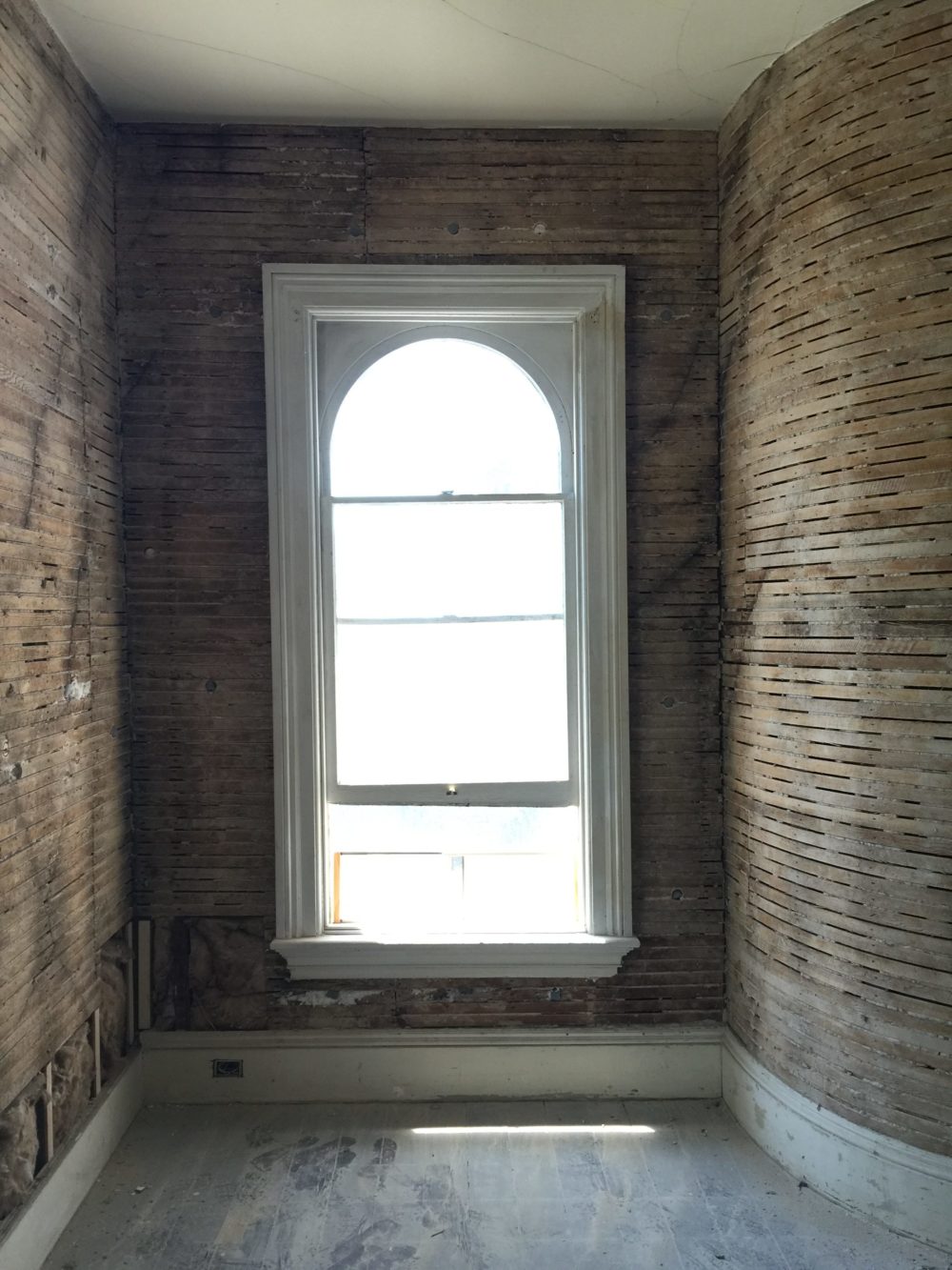
I knew as soon as we got the house (and looked past all the garish colors, the wall to wall carpeting and reams and reams of…stuff oh and the smell!), that I wanted to preserve the home’s amazing original historic details – original windows, crown molding, arched doorways, plaster walls and transoms to name just a few.

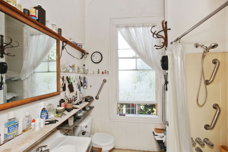
I was also clear that Victorian-era design – ie small closed-off rooms, no closets, zero storage, tiny bathrooms – was not conducive to modern day family life. I knew from the start that if we were going to create our forever home, we were going to have to make major layout changes. Enter our amazing architect Seth BrookshireWhile I thought I had tons of crazy amazing ideas to optimize our space, he had much better ones – and they were also structurally sound – ha!

Renovation lesson one: surround yourself with very talented experts.

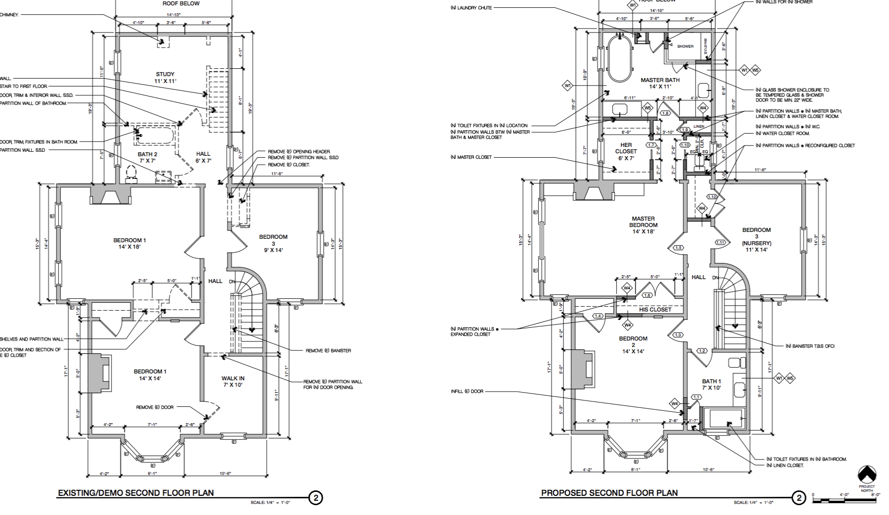
Here is a peek into how Seth proposed we rearrange the ground floor’s layout.

This Old Victorian Reveal: 1st Floor Before, Design & After

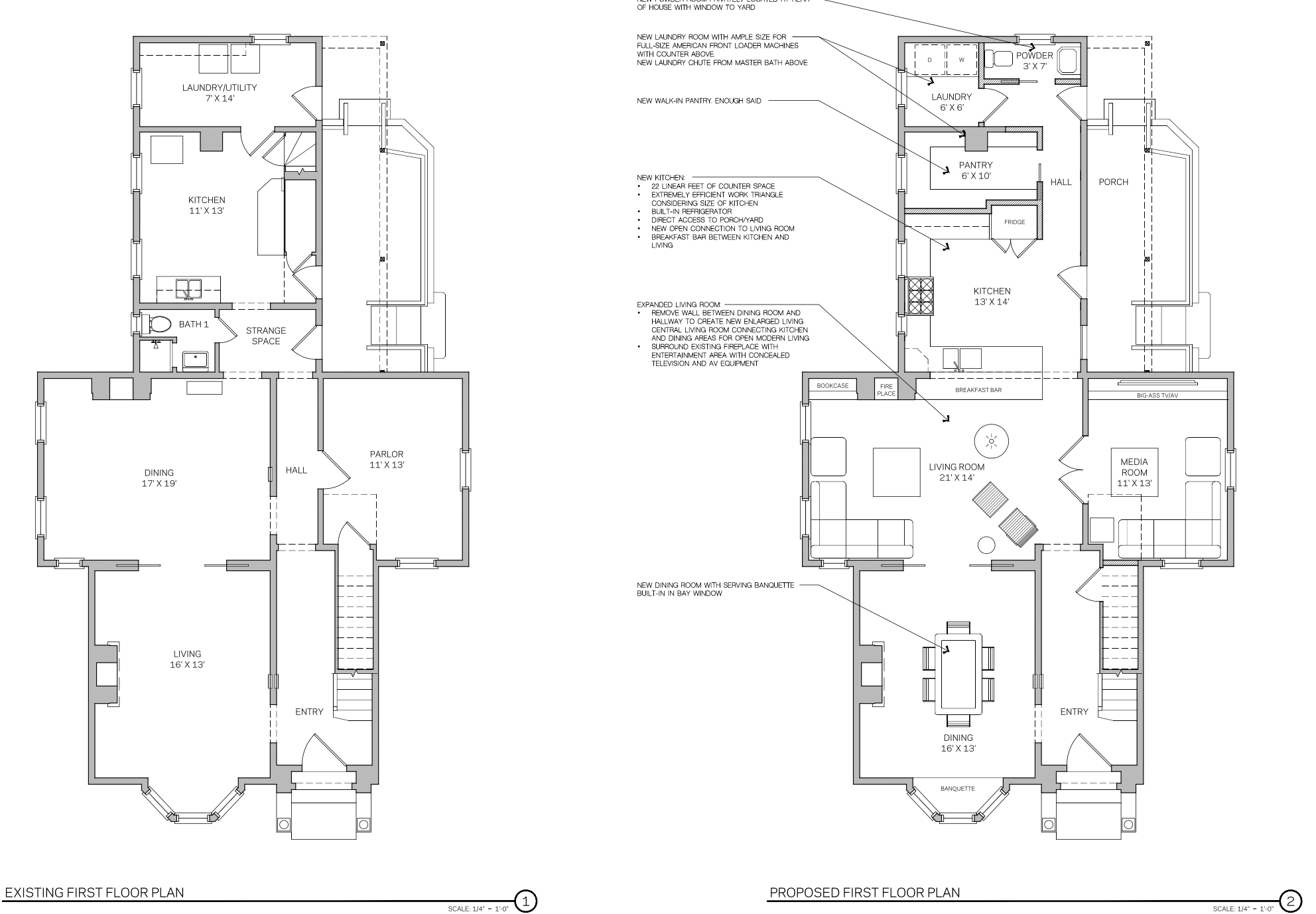
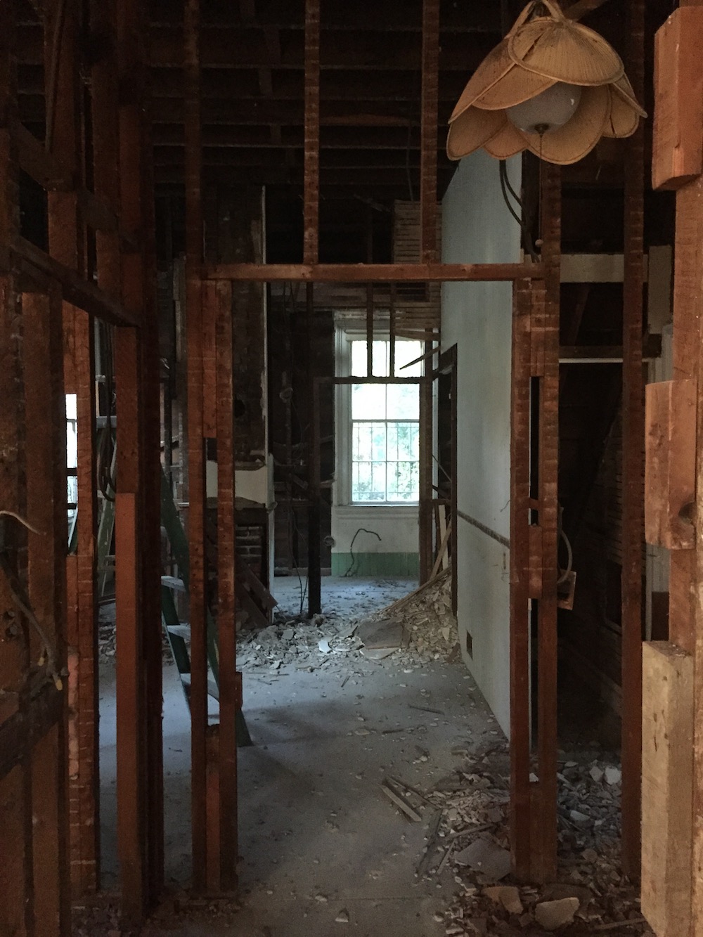
We actually changed very little structure at the front of the house. The entry and dining room retain all their original elements. We simply did our best to restore them. But as we moved deeper, the changes got much more substantial.

Our biggest structural change was the choice to remove two major walls to create an open concept living room and kitchen. This choice eliminated the long dark hallway and allowed the natural light from our 8′ tall windows to spill from one side of the house to the other. It also ensures that each room flows from one to the next.

Another significant architectural change was the elimination of an unnecessary back staircase. Removing the stairs allowed us to connect the house straight from the front door all the way back and made way for a large custom kitchen, adding a walk-in pantry, building out a dedicated laundry room and adding a powder room.

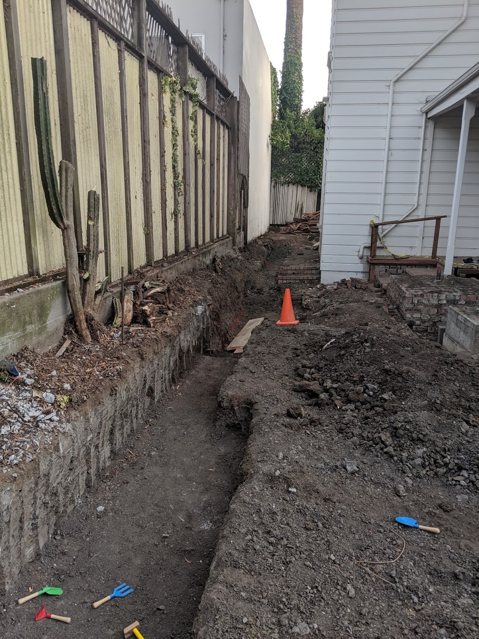
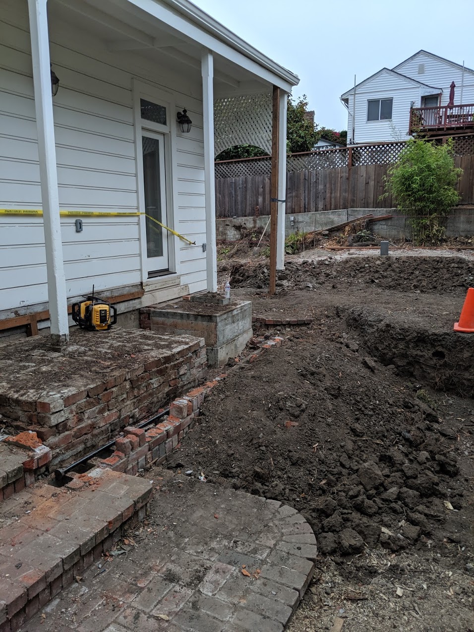
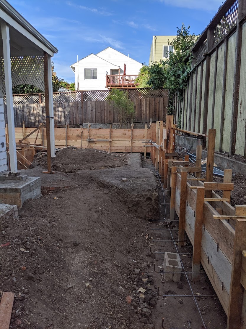
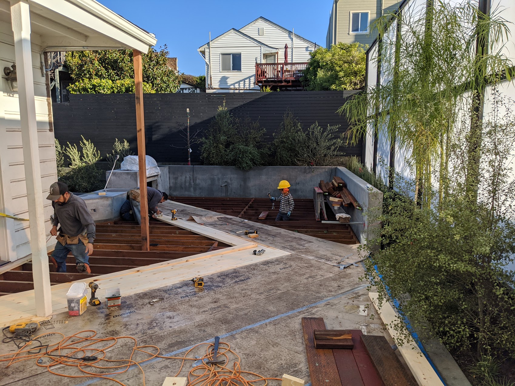
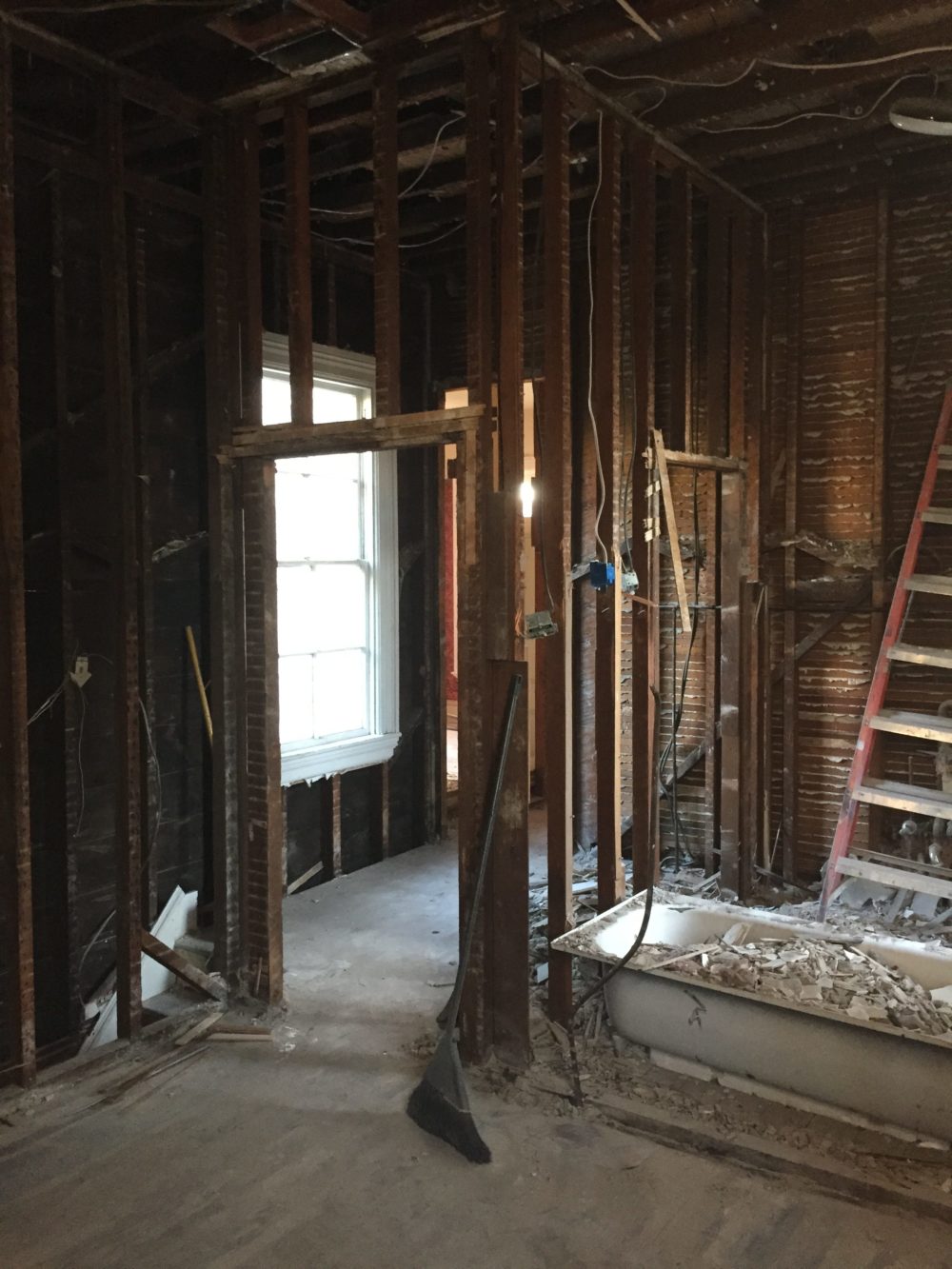
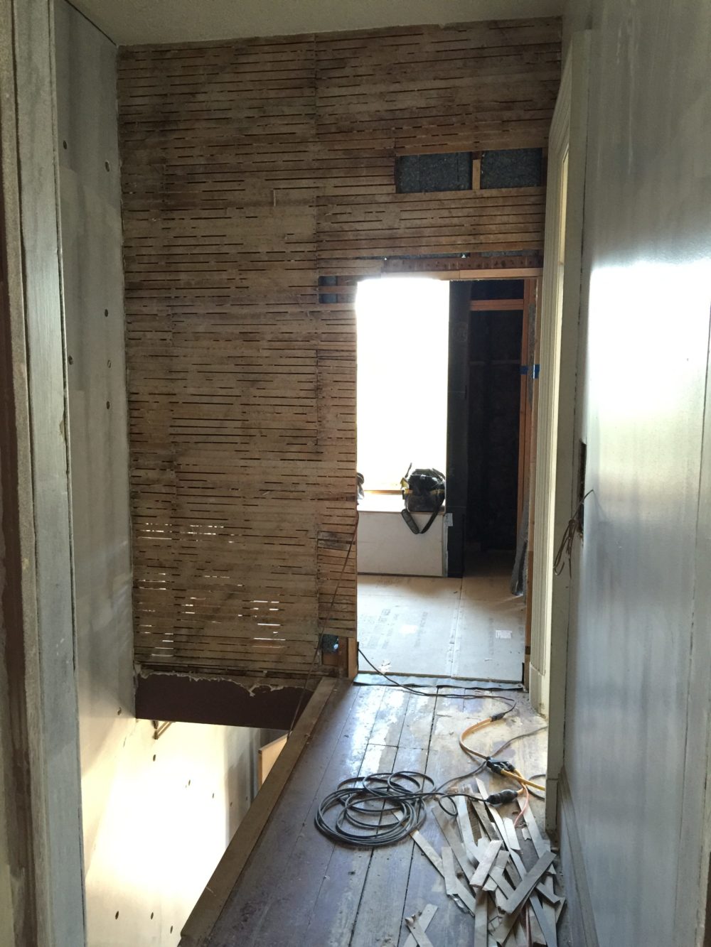
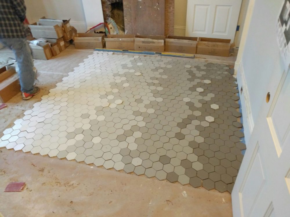
While it’s easy to summarize all this in writing, it certainly undersells the time, effort and insane amount of work and this reno required. Here’s a glimpse.

This Old Victorian Reveal: 1st Floor Before, Design & AfterThis Old Victorian Reveal: 1st Floor Before, Design & AfterThis Old Victorian Reveal: 1st Floor Before, Design & AfterThis Old Victorian Reveal: 1st Floor Before, Design & AfterThis Old Victorian Reveal: 1st Floor Before, Design & AfterThis Old Victorian Reveal: 1st Floor Before, Design & AfterThis Old Victorian Reveal: 1st Floor Before, Design & AfterThis Old Victorian Reveal: 1st Floor Before, Design & After

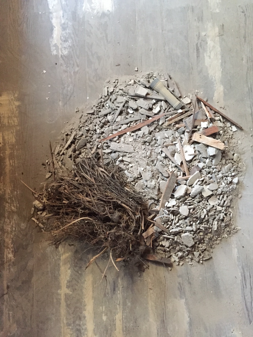
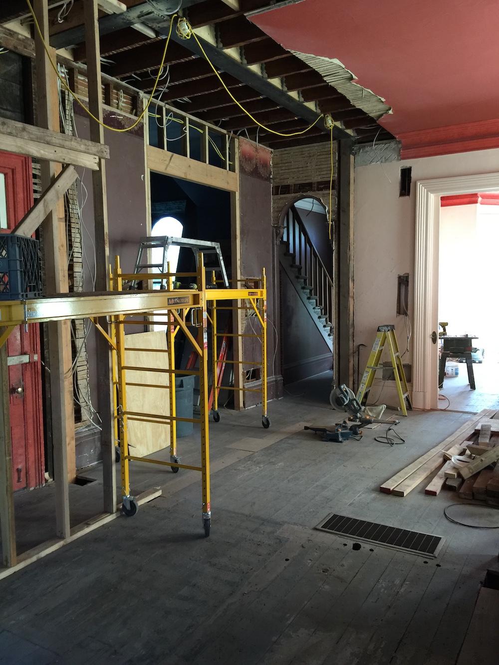
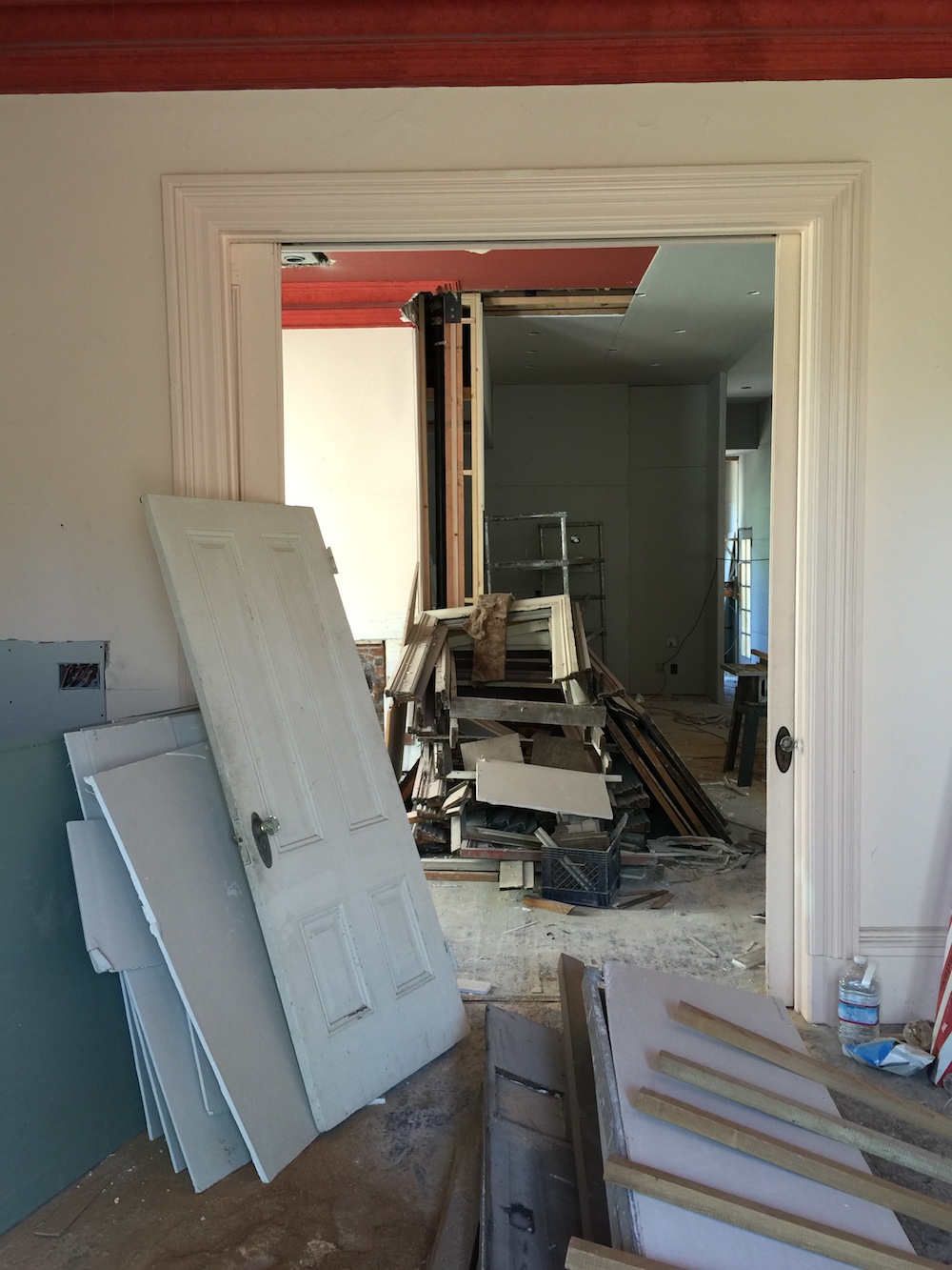
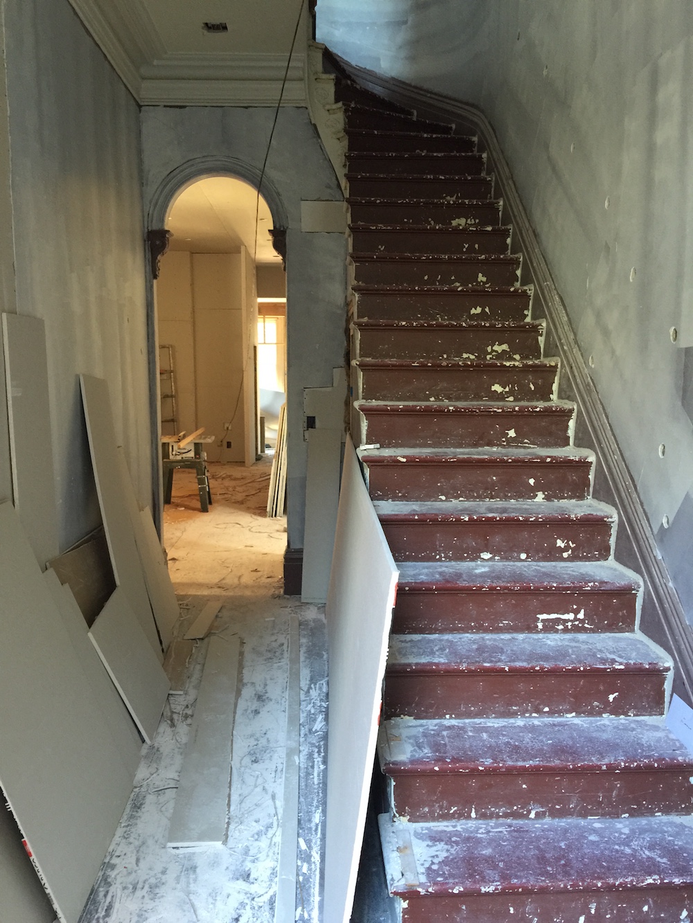
As the pictures above illustrate, nothing about our renovation was small. A sampling of the renovation and restoration punch list included:

  • Replacing all electrical
  • Replacing all plumbing
  • Insulating whole house
  • Repairing rot and and leaks
  • New roof
  • New floors
  • New windows
  • New heating and hot water systems
  • Restoring plaster
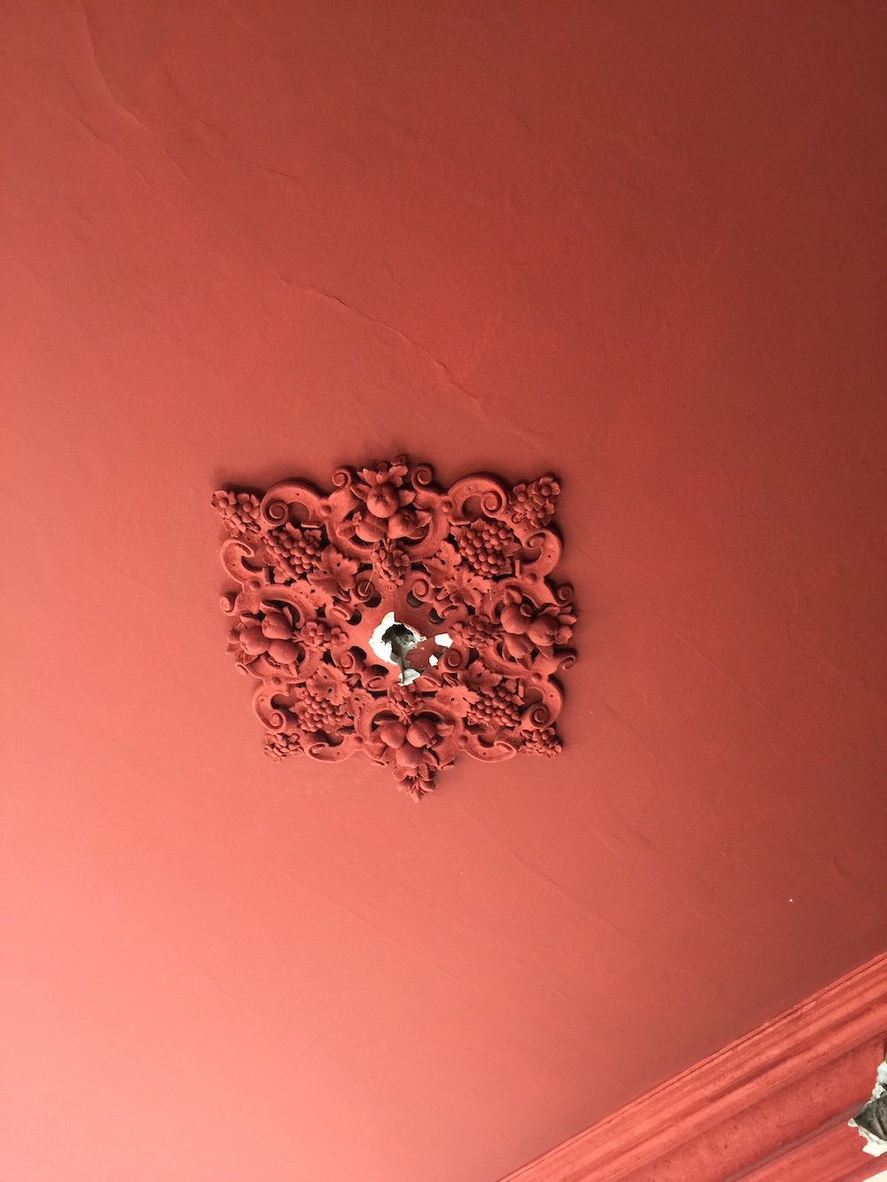
  • Restoring staircase, four fireplaces, ceiling medallions

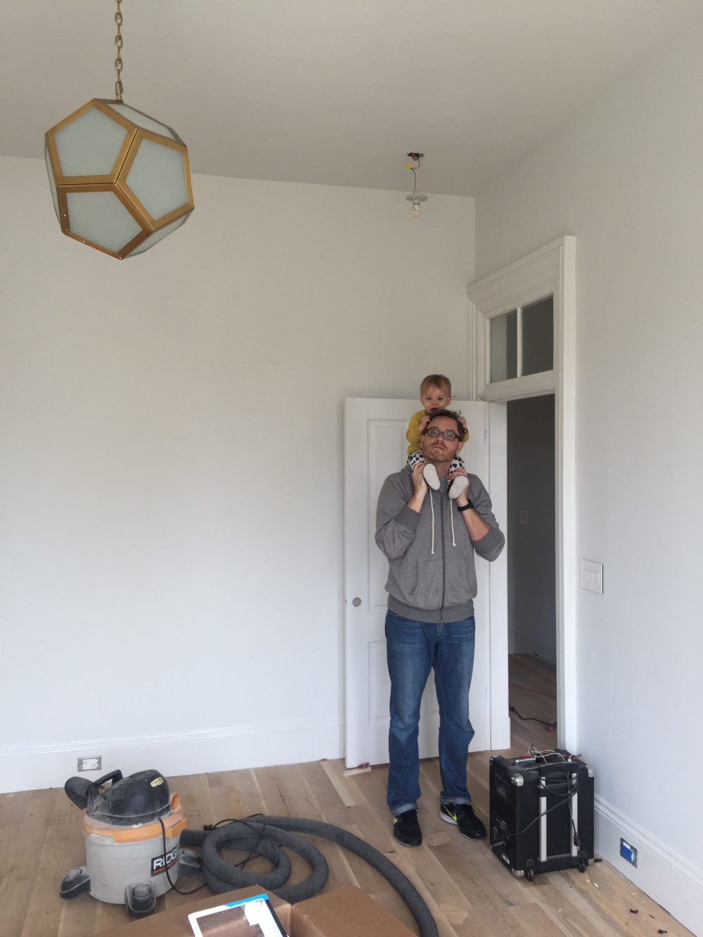
And then there were the actual major structural changes! We added three bathrooms, opened up the ground floor and created a kitchen from scratch. And while we had an amazing architect and builder, we did not have have a general contractor, leaving the procurement of materials, the management of schedules and the coordination of trades up to us. Having never undertaken a renovation of this scale, that was definitely a steep learning curve. And did I mention that I had a baby right in the middle of all this? I had to pick every single light fixture and outlet placement six weeks postpartum. I do not recommend this.

When it was all said and done, renovations took 20 months to get the house to a point where we could move in. But don’t mistake livable for done! We moved in with maybe 80% of the work complete. We quickly learned that the old adage is indeed true. Once you move in, the work slows down to a snails pace. Life gets in the way of construction.

While on the one hand the slow down was maddening, it also gave me time to take decorating deliberately. Intentionally. And with a lot of thoughtful consideration. When we moved in I made the commitment to hold out for the right thing, not just the expedient thing. Because when you put in a placeholder, be it a sofa, dresser or even a light fixture, it’s likely to stay for years. I’m sure this has happened to you too. I did not way to fall prey to that trap. Instead, rooms sat nearly empty for months (to years!) on end while I slowly but surely figured out what both the home and we really needed.

I would like to say my patience paid off. I hope you think it did too. Here is the official after tour of our ground floor!

This Old Victorian Reveal: 1st Floor Before, Design & After

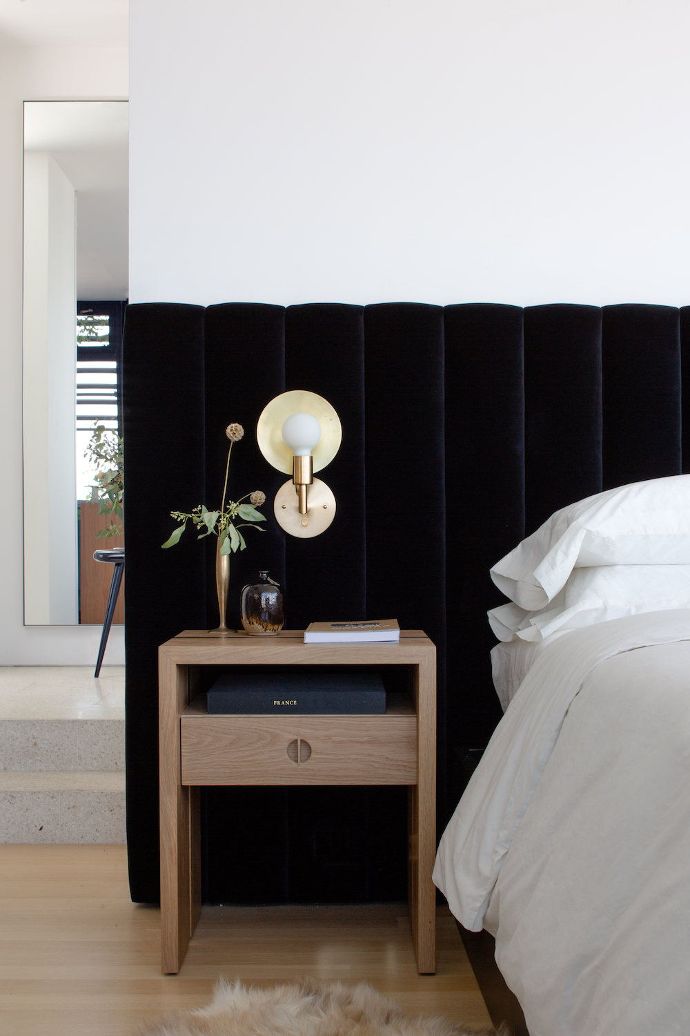
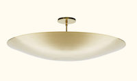
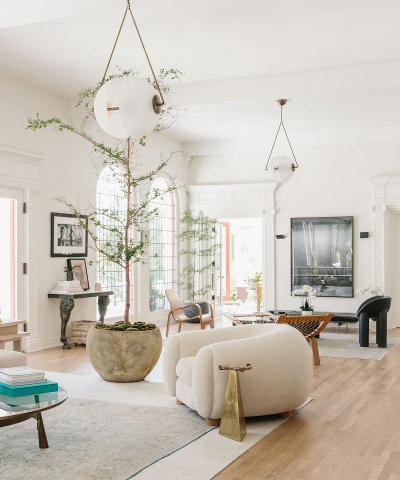
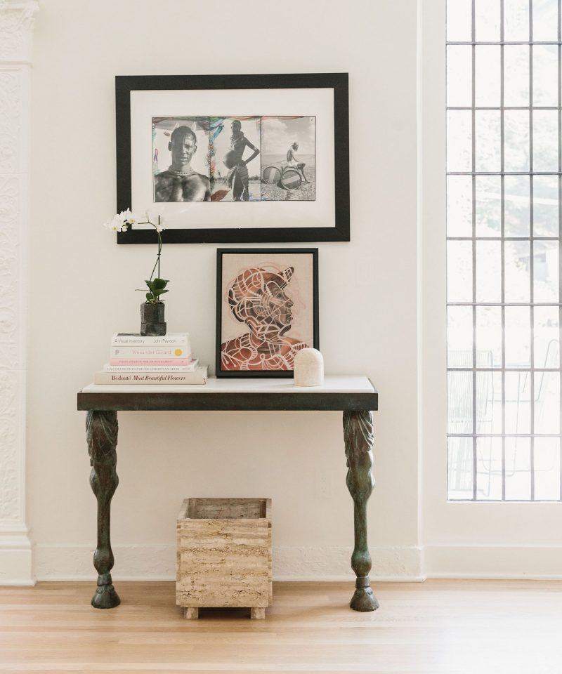
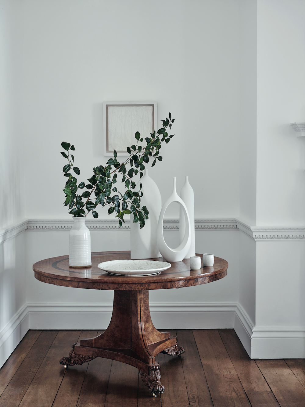
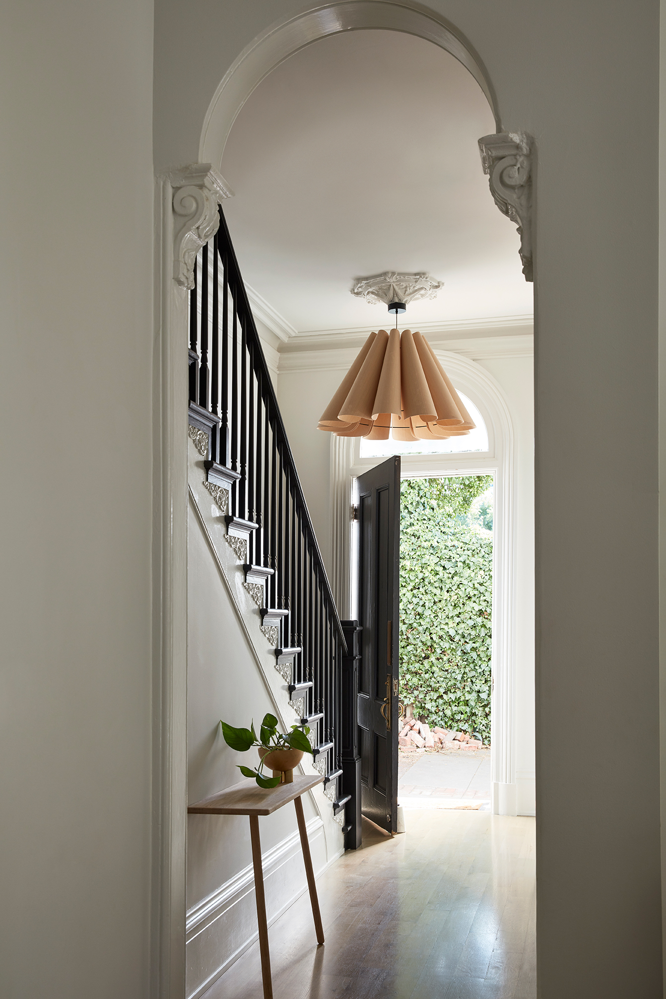
A clean black and white palette greets you as you as the enter the front door. We had to restore the staircase, recreating a period appropriate newel post and bannister as well as recreating a historically accurate plaster ceiling medallion. The oversized pendant by WEP (which I stalked for years after seeing it in an 2012 issue of LivingEtc) offers the air of grandeur this house demands. The leaning console by Skagerak creates the perfect unobtrusive place to drop keys and mail. The arched transition is original and one of my favorite details.

This Old Victorian Reveal: 1st Floor Before, Design & After This Old Victorian Reveal: 1st Floor Before, Design & After

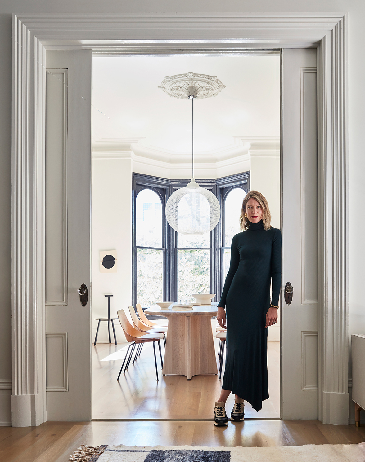
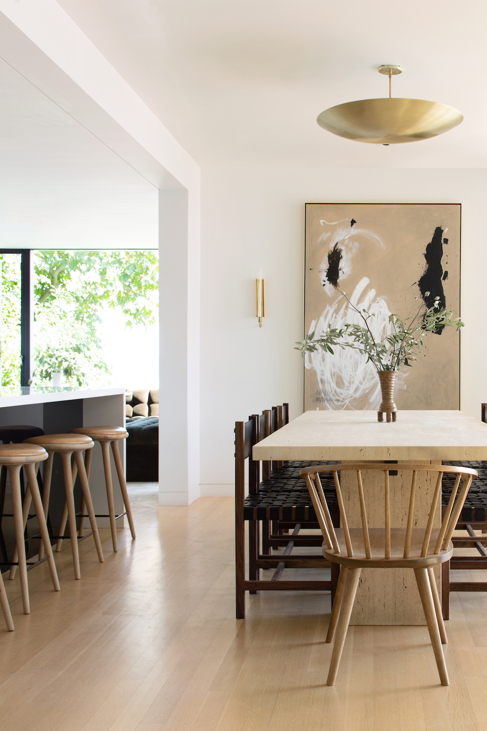
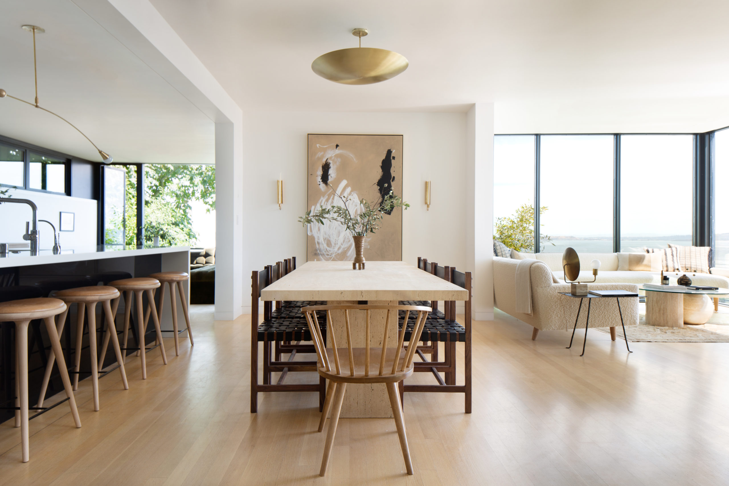
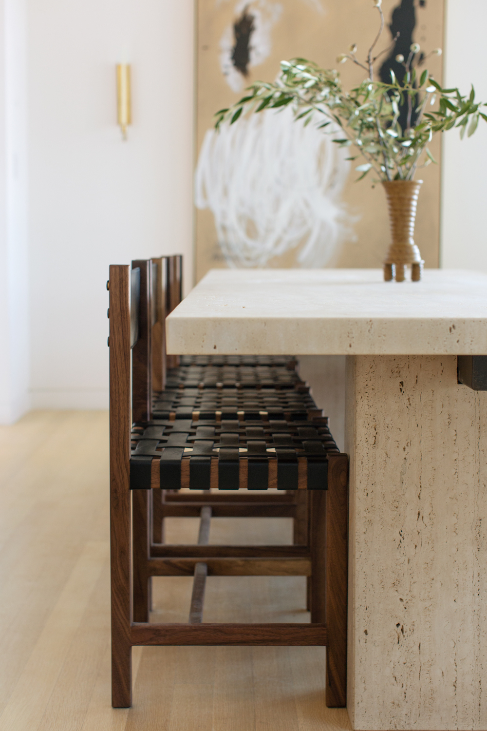
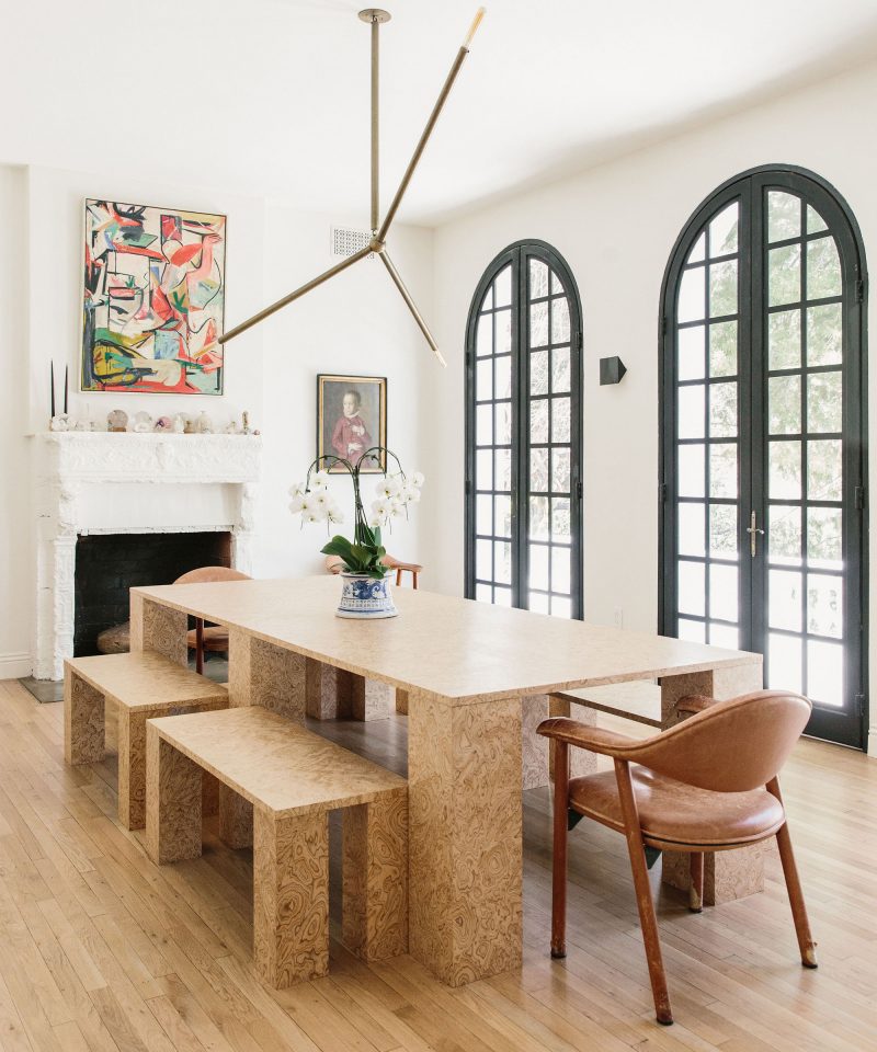
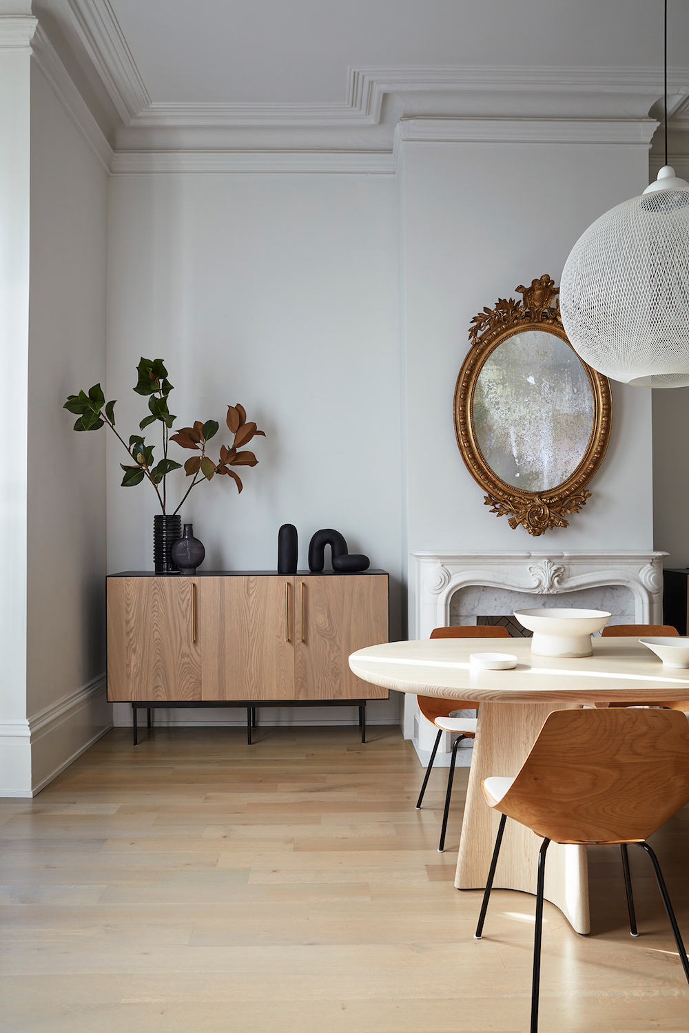
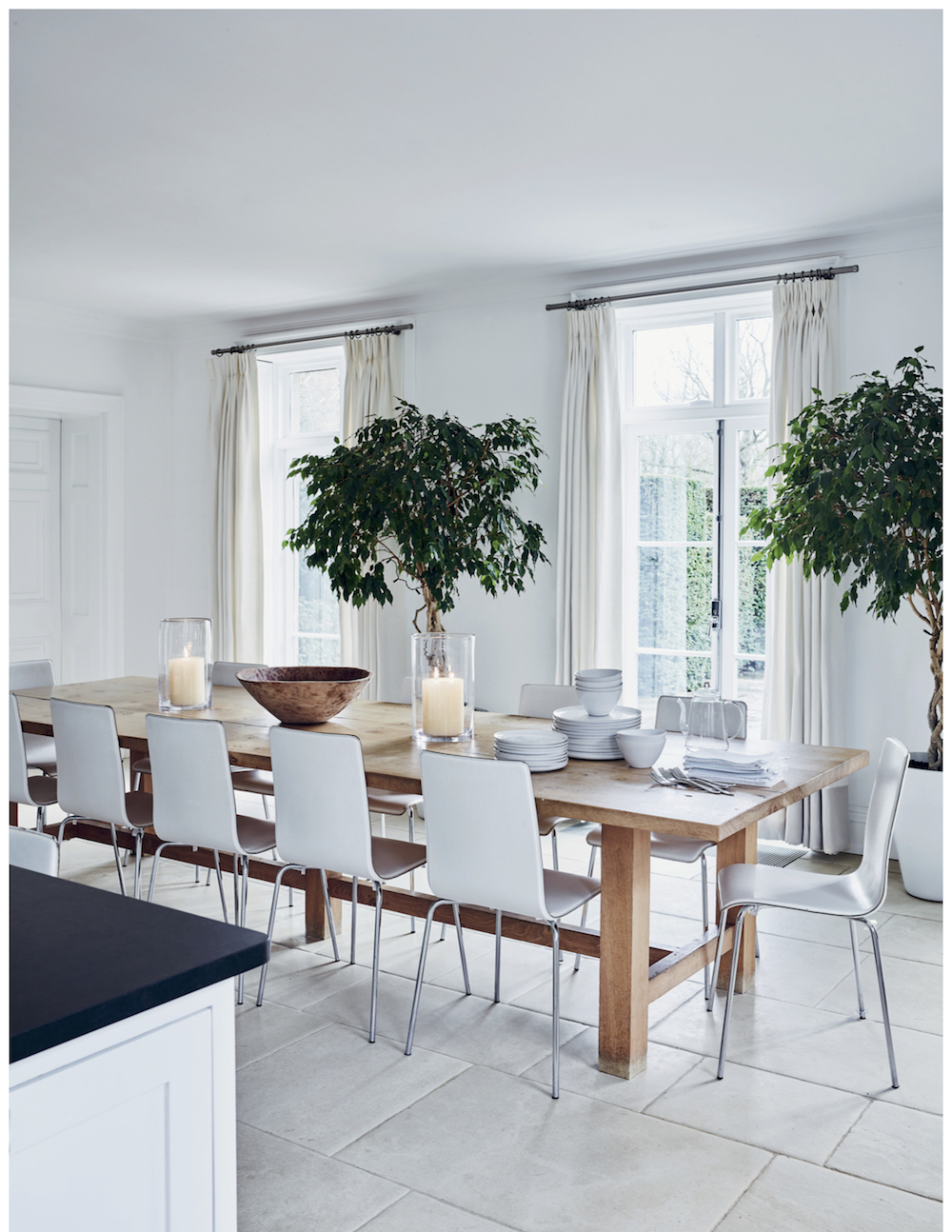
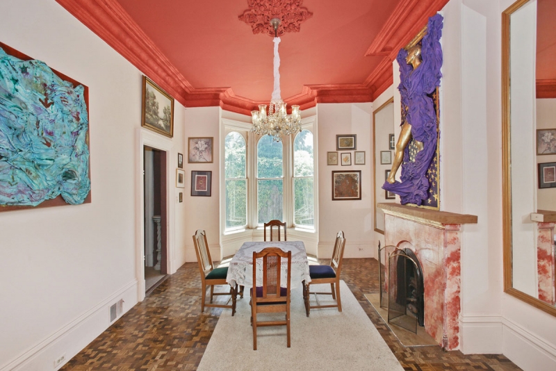
The dining room really showcases some of the home’s original architectural gems that makes my design loving heart smile. The layers of crown, the ceiling medallions, the fireplace and bank of bay windows are all built in design elements I’m lucky enough to get to play with. I wanted to create a design aesthetic that both matched that grandeur of the house’s scale, but was also allowed for comfortable family life. I would describe my final design for this house as old world European meets easy California living. The lines and details are refined and pared back, but also warm, inviting and livable. The dining room really embodies the old world European feel.

Custom credenzas by Lauren Nelson Design flank the fireplace and offer the storage and functionality I needed, with beautiful modern design I love. It took some time, but I finally realized that the dining room’s dimensions required a custom dining table. Thanks to Instagram, I found a local woodworker with whom I worked to design a custom racetrack table in a stunning bleached oak. It took over two years of scouring 1stdibs to find the oval antique mirror that now resides over the fireplace (which we restored to a historically accurate Victorian style using a Chesneys mantel).

This room may appear elegant and formal, but because it connects directly to the living room it is in fact fully integrated into the rest of the house and we eat dinner here nightly.

This Old Victorian Reveal: 1st Floor Before, Design & After

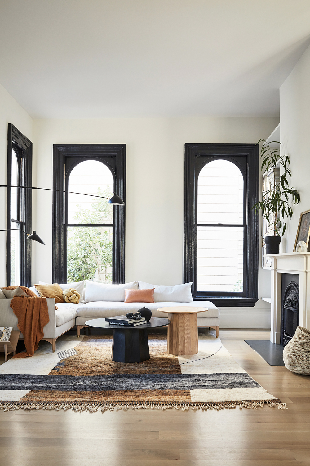
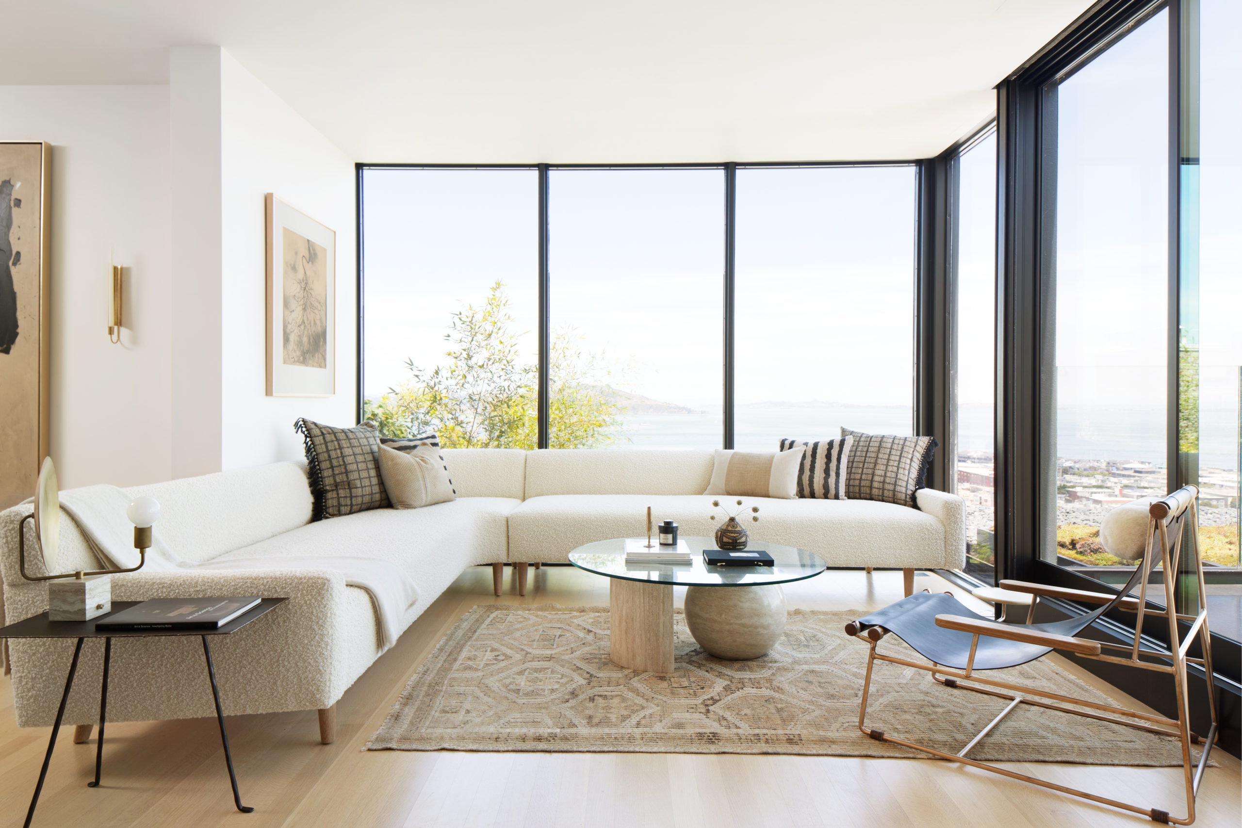
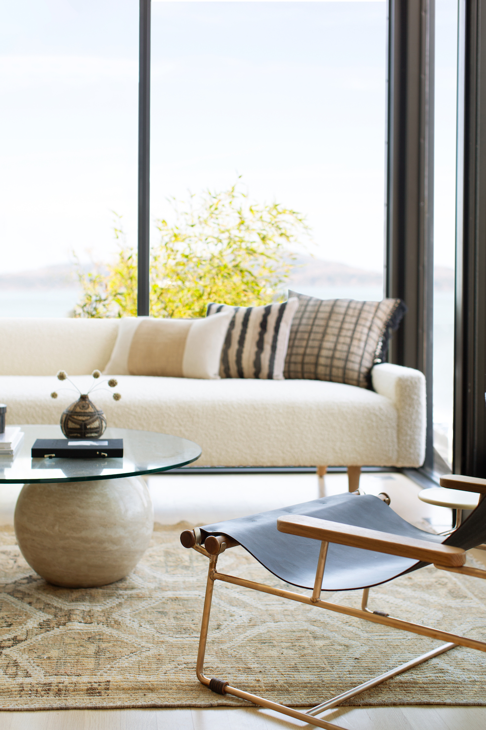
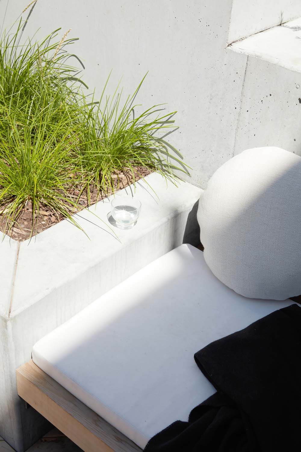
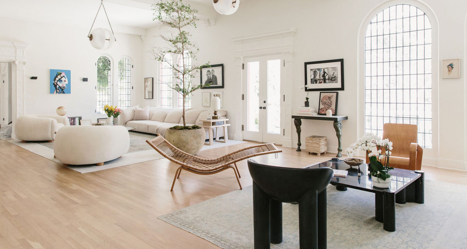
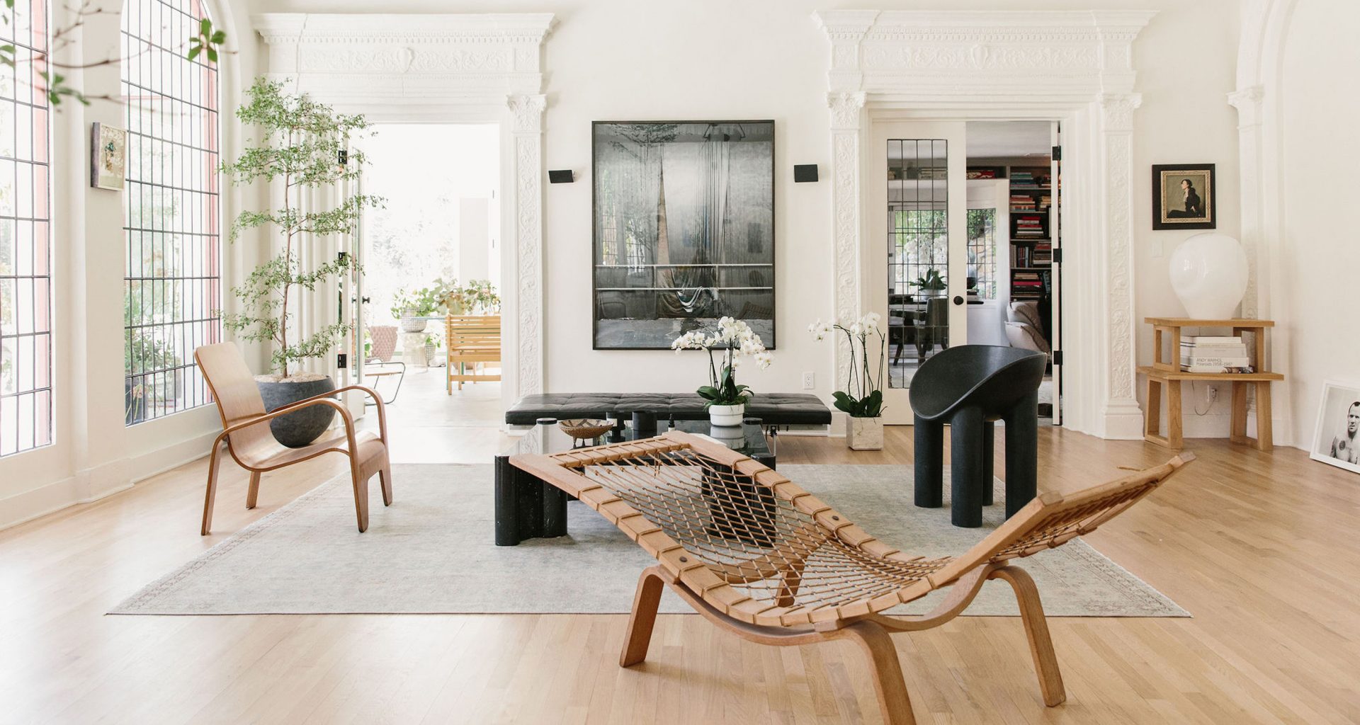
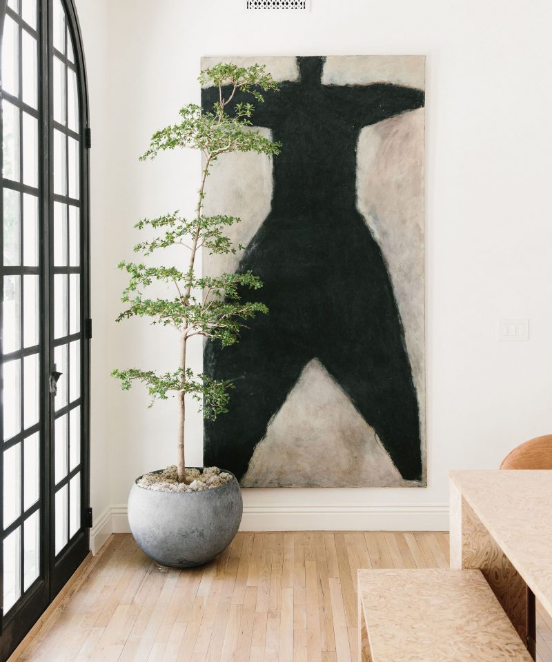
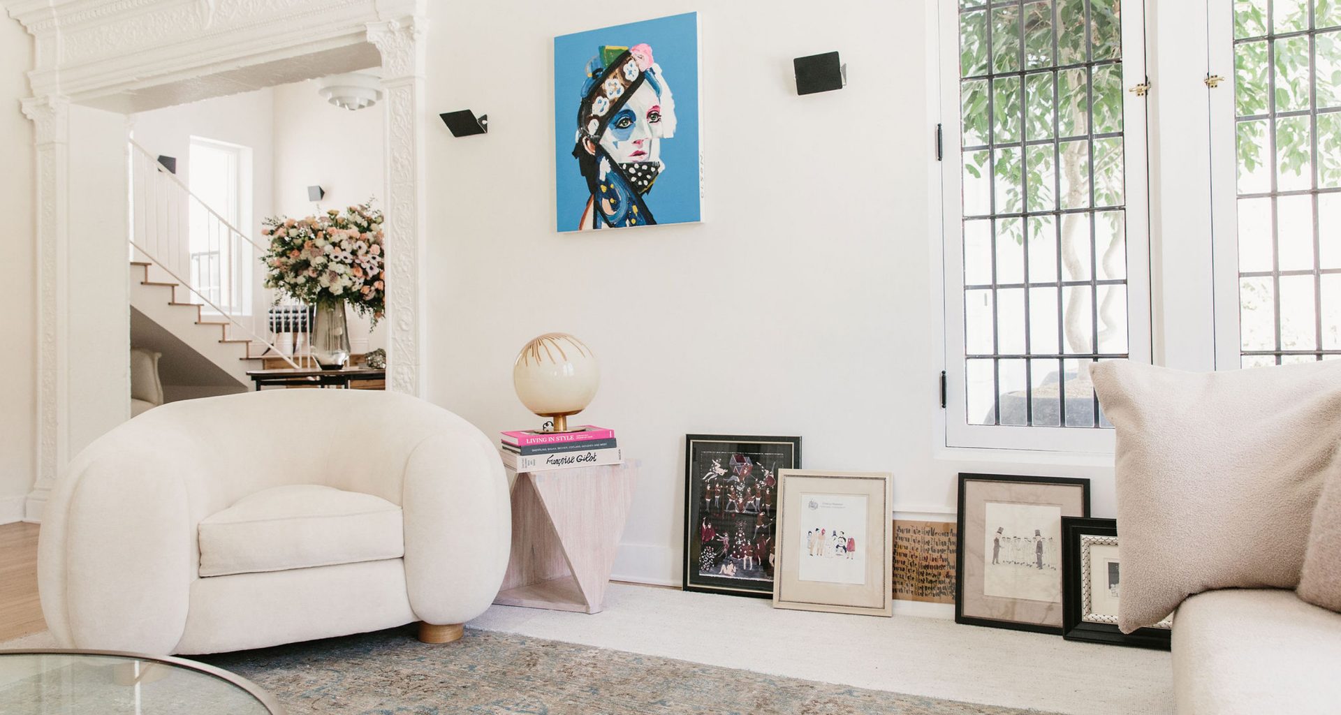
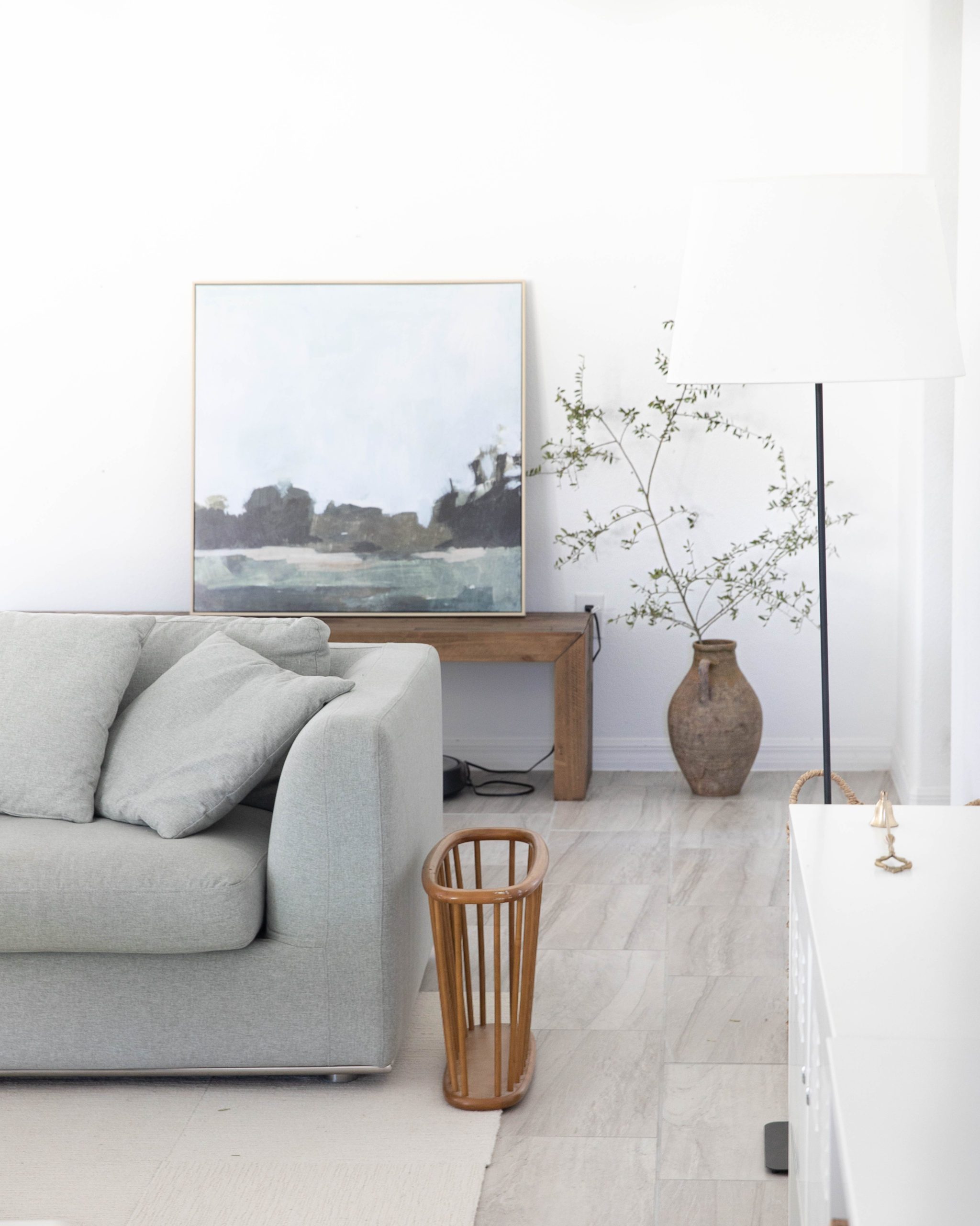
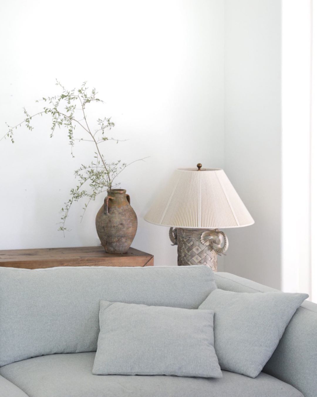
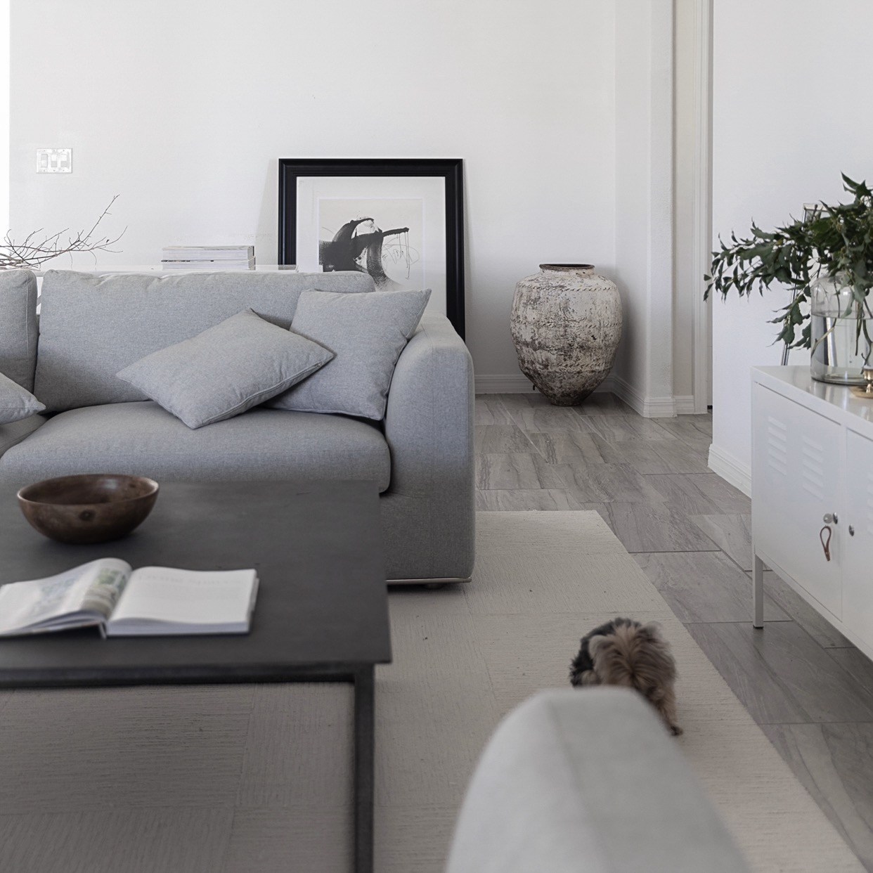
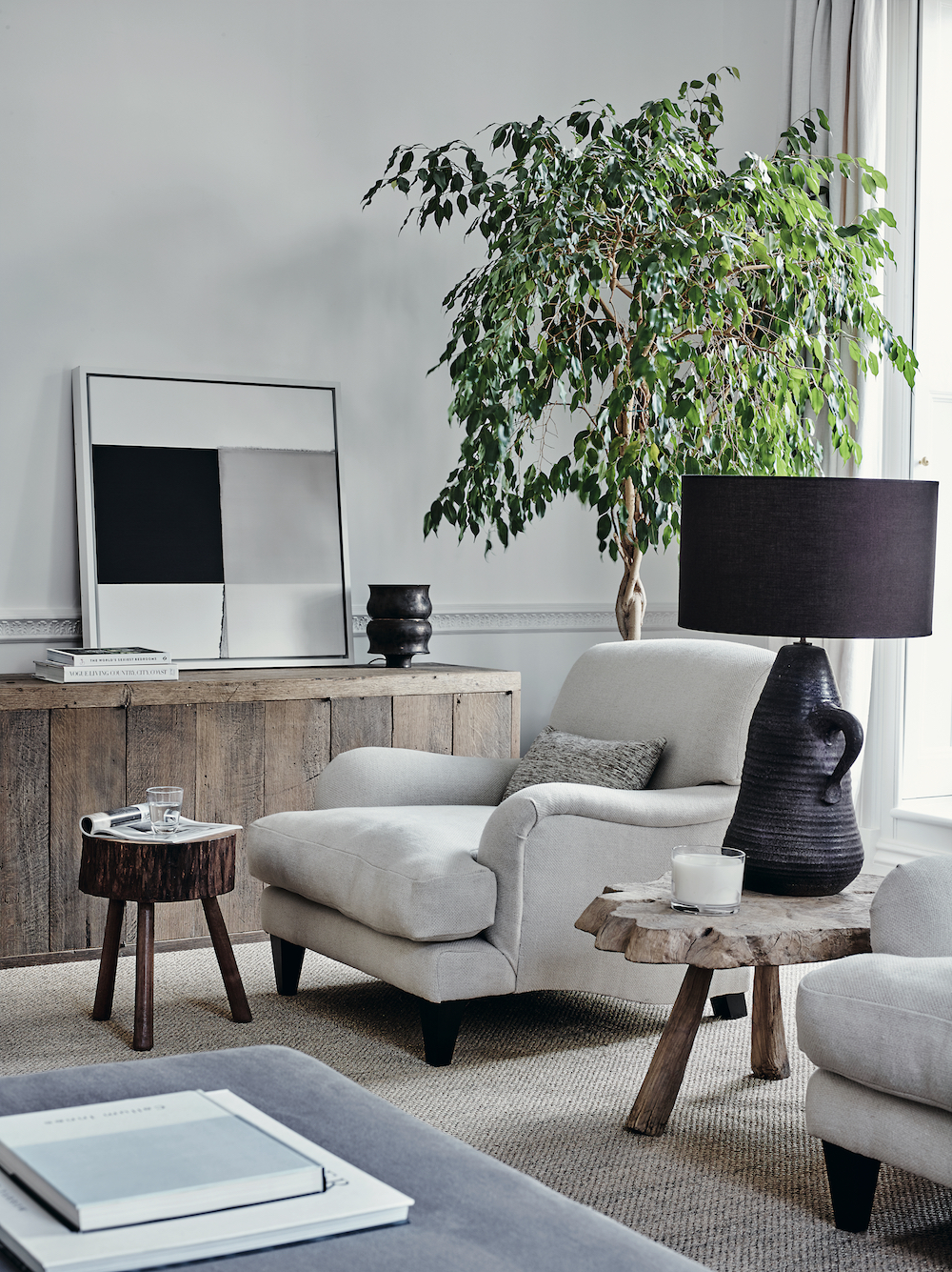
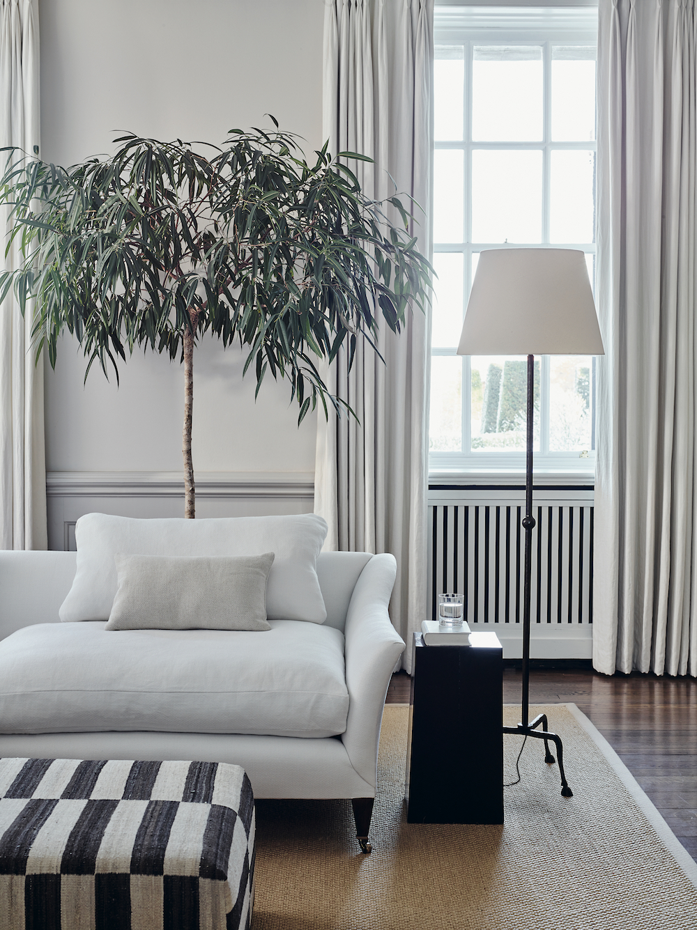
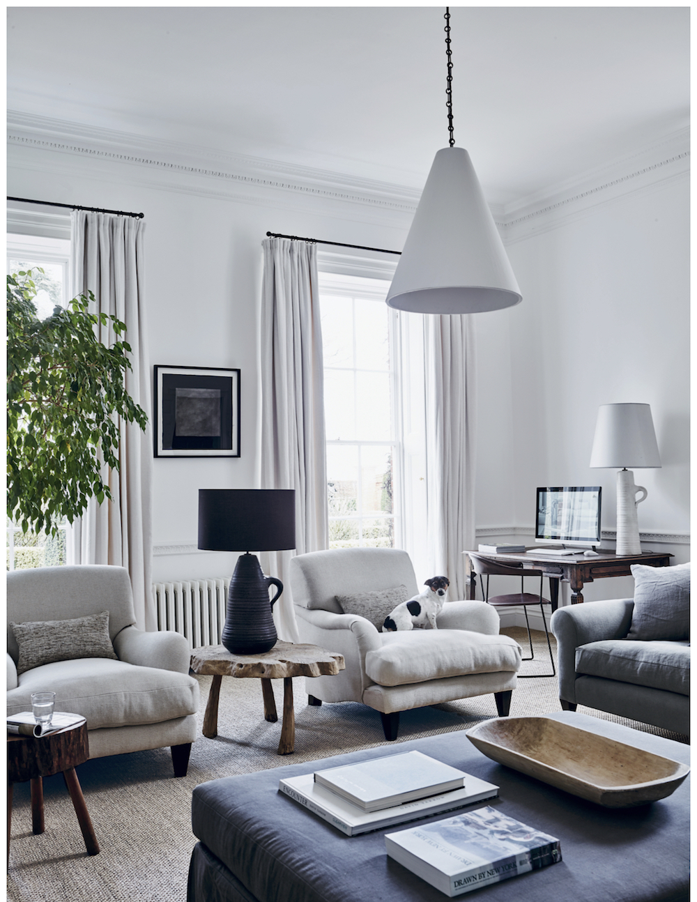
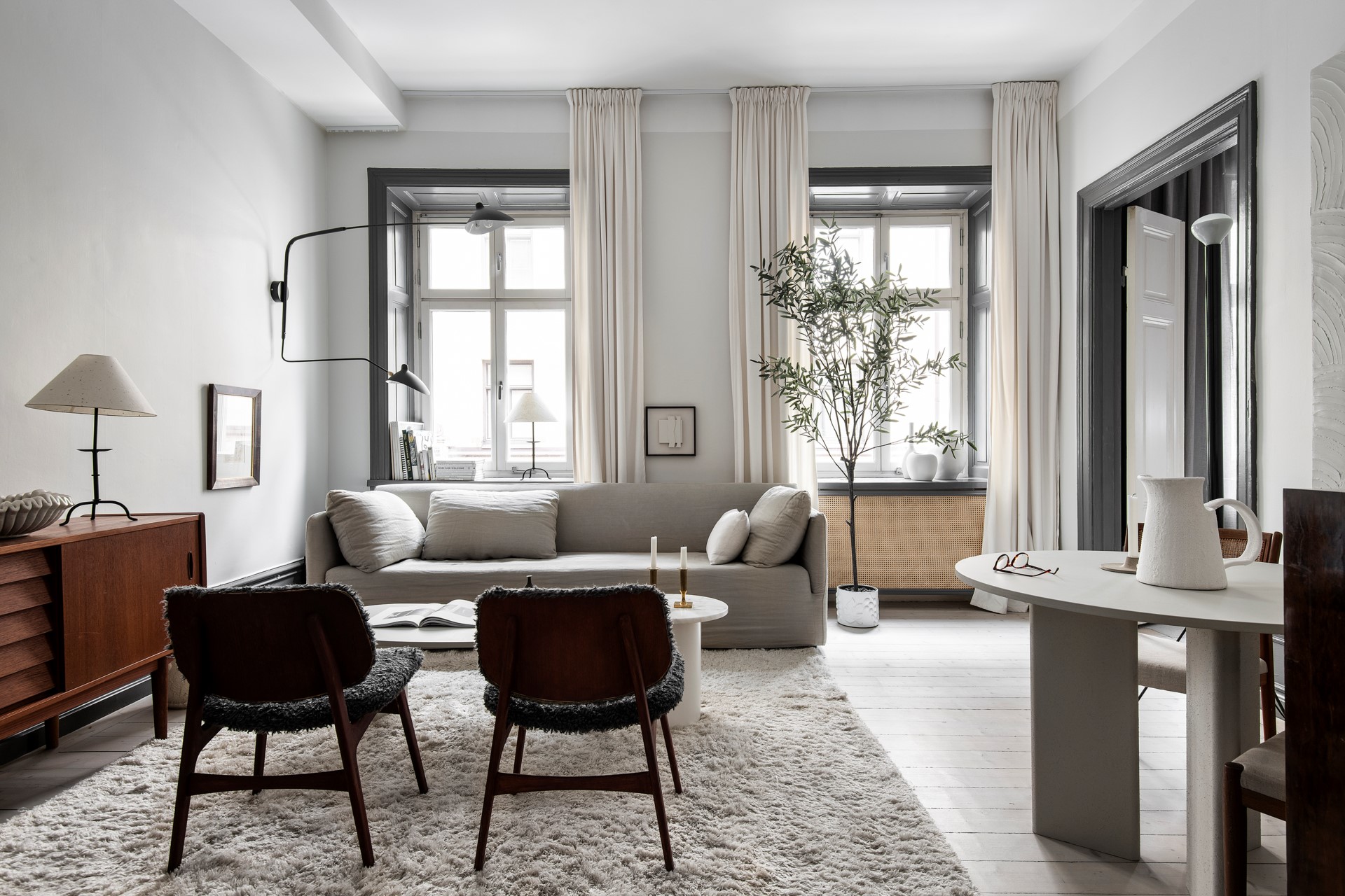
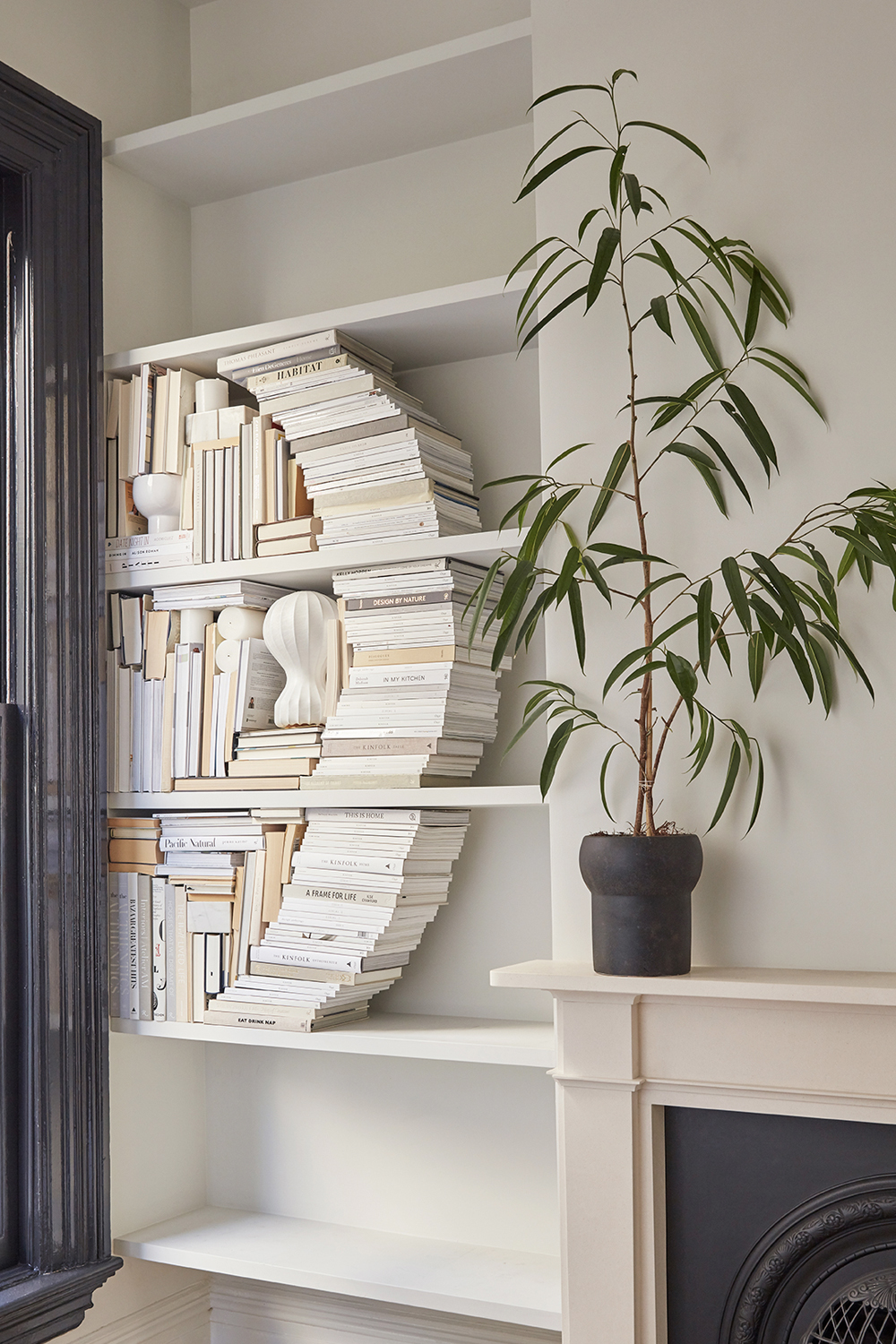
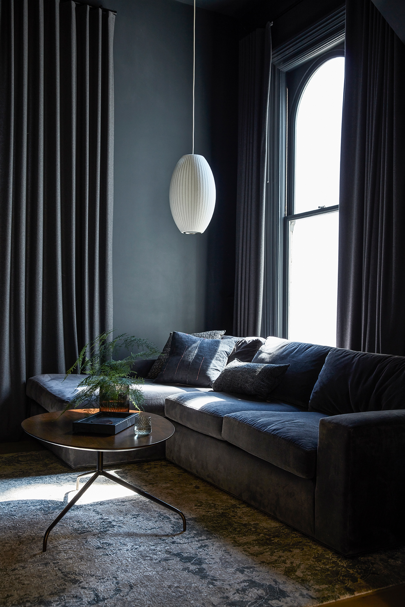
The easy California living side of my aesthetic couldn’t be more evident in our living room. While the original windows and restored fireplace are the architectural stars of the show, I finally figured out that I needed a custom seating area that allowed us to maximize the use of this room. That’s where I abutted my design limits. Thankfully, I turned to my friend, and design spirit animal Lauren Nelson to help me by designing more custom pieces that address the scale and spacing challenges of this room. She designed both the sectional and the stunning fluted coffee tables. Do you spy the brass feet on that sofa?? So much goodness.

Renovation lesson two: Don’t try to force a round peg in a square hole. Sometimes investing in a custom design that is made specifically for your home’s needs is going to last you much longer and make you much happier than any off-the-shelf option that only leaves you disappointed.

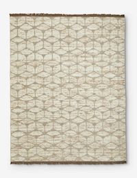
The one-of-a-kind Moroccan berber rug from Mehraban’s Atlas collection pulls everything together in an easy, cosy way. There’s nothing I love more than curling on that sofa which a good book (or let’s be real, Instagram) in hand.

This Old Victorian Reveal: 1st Floor Before, Design & AfterThis Old Victorian Reveal: 1st Floor Before, Design & After

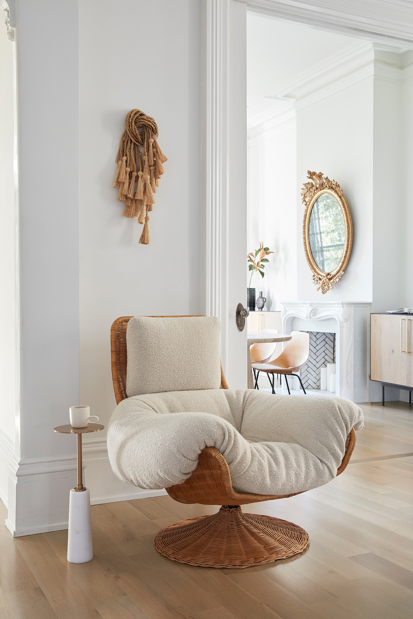
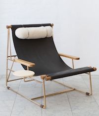
One of the best ways to help a newly decorated space feel lived in is to use vintage pieces to add patina and history. I spied this dramatic woven lounge chair on Pinterest and finally tracked it down at Amsterdam Modern. Lauren helped me get custom cushions made to mimic the chair’s original design, but in a more of-the-moment nubby fabric. It’s my happy place.

This Old Victorian Reveal: 1st Floor Before, Design & AfterThis Old Victorian Reveal: 1st Floor Before, Design & After

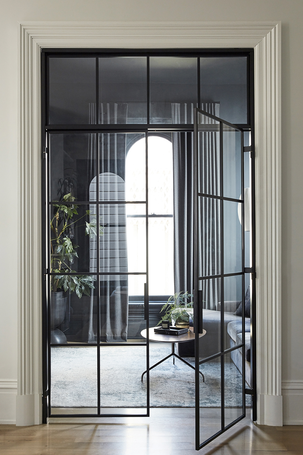
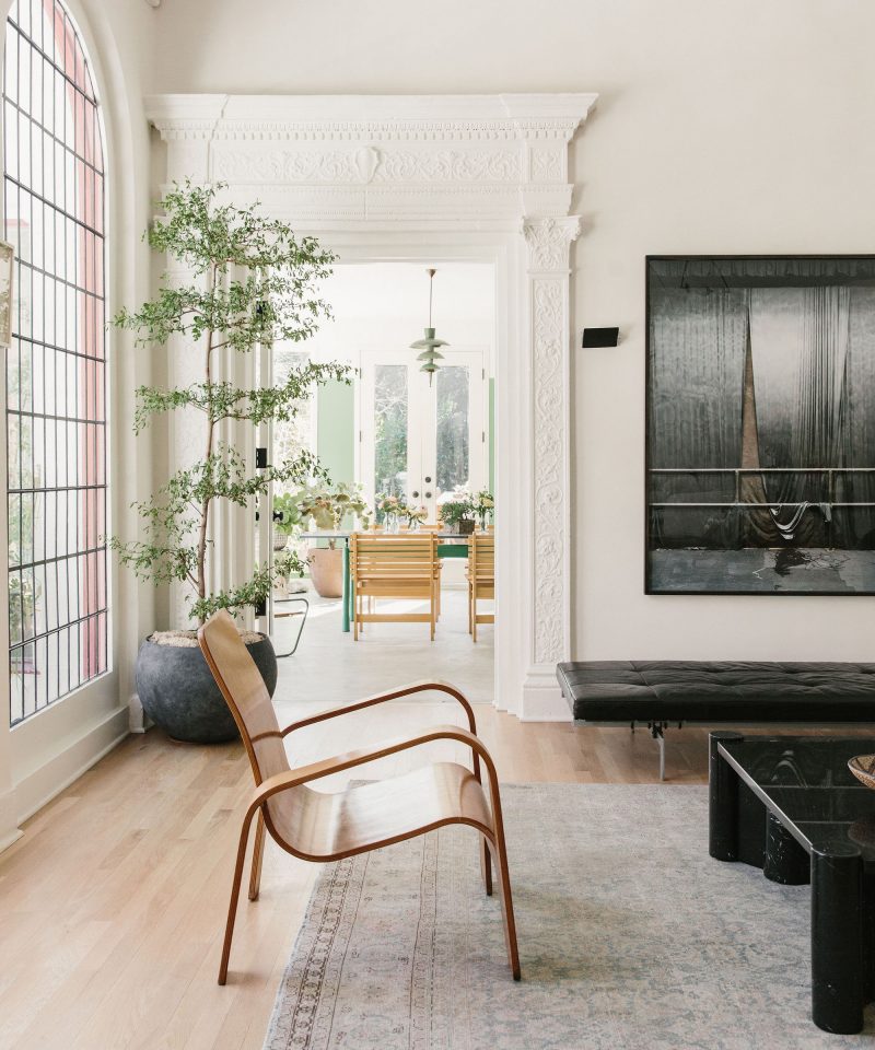
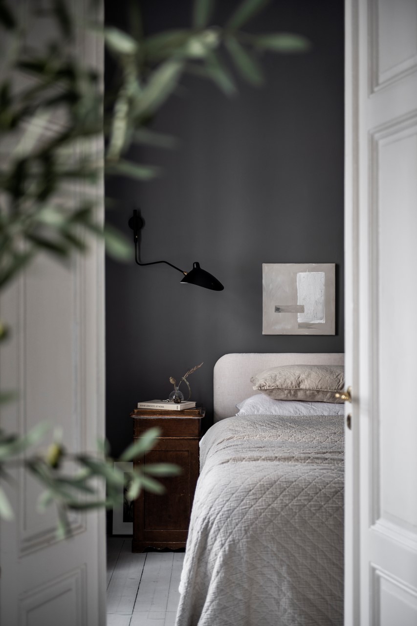
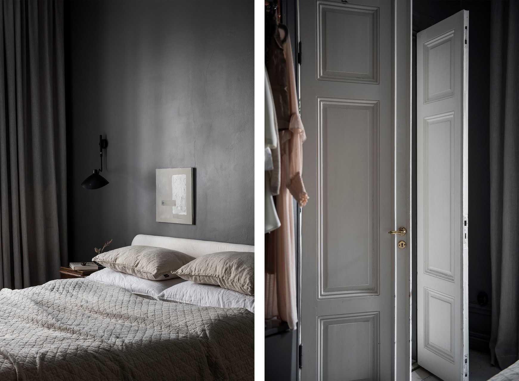
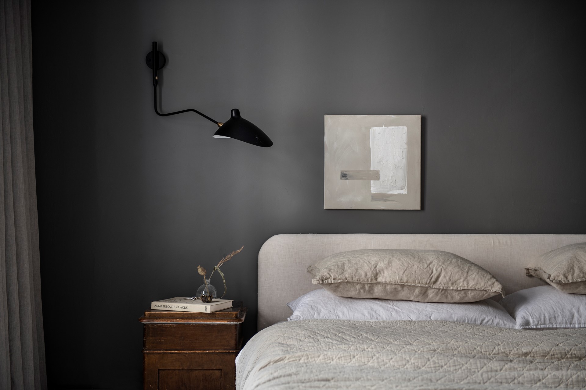
Directly across from the living room sits the opening to our den. I probably had the most specific vision for this room, which is why I was able to “complete” it before many of the others. I always wanted this room to envelop you in a dark, cozy vibe with tone on tone walls and furniture. The pièce de résistance of this space however, took nearly three years to complete.

I knew from the get go that I wanted steel and glass french doors to enclose this room from the rest of our living spaces. This room houses our TV and so I wanted to create a separate space for movie nights and Marvelous Mrs. Maisel binge sessions with doors to buffer the sound. But I also envisioned these french doors as the perfect book end to the black framed windows that sit exactly opposite.

Yet the oversized opening we cut during the renovation sat vacant as we saved up the budget and I hunted endlessly for perfect partner to design this custom piece. I finally found Bananas and Hammocks (on Instagram of course!). The husband and wife design and fabricator duo based in Ventura, CA fashioned an amazing set of custom doors with a matching transom. Even the brass inlayed hinges are one of a kind. When those doors finally went in this summer, I finally felt like my original vision for the house was realized.

This Old Victorian Reveal: 1st Floor Before, Design & After

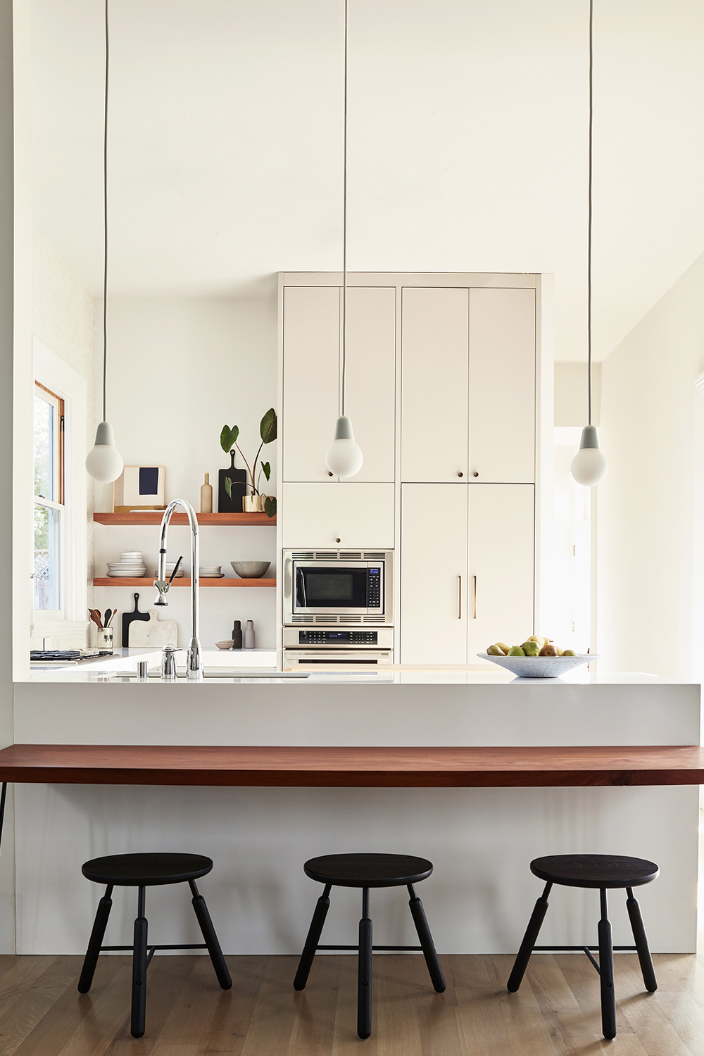
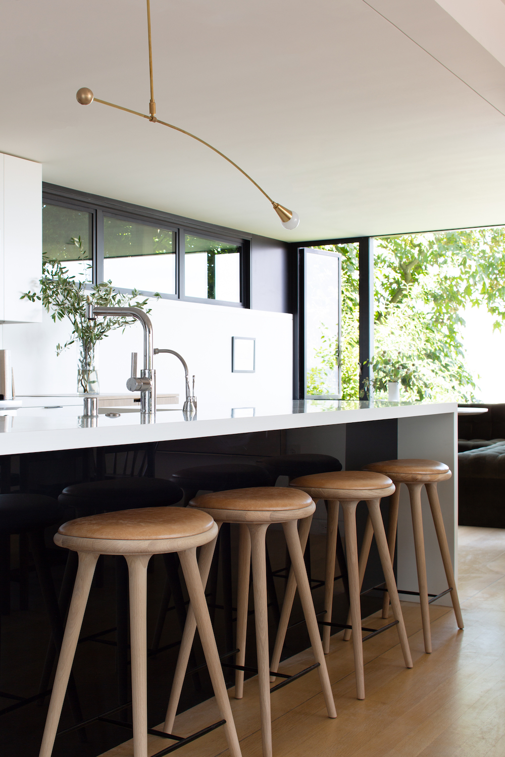
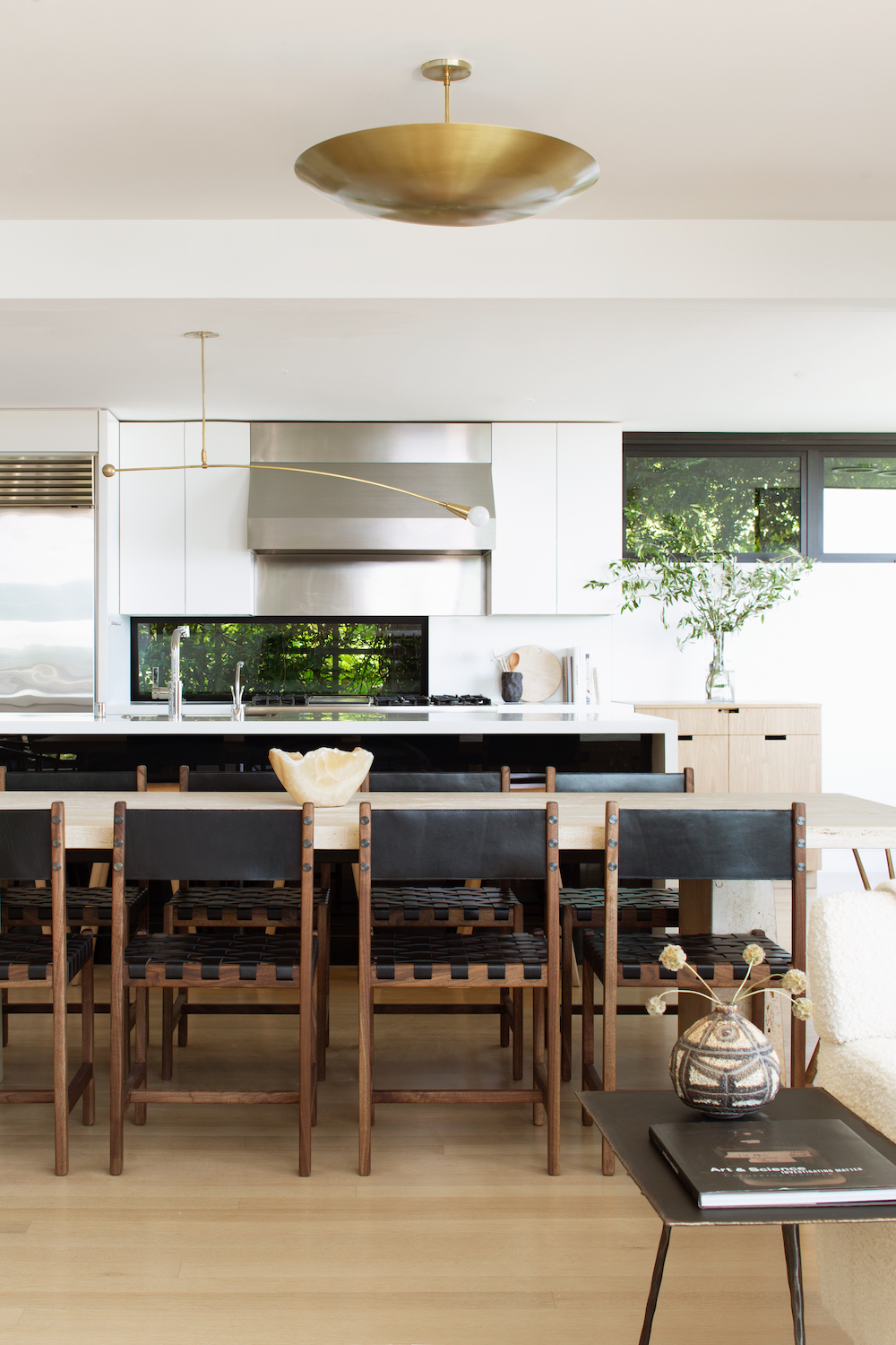
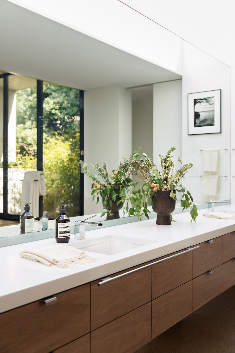
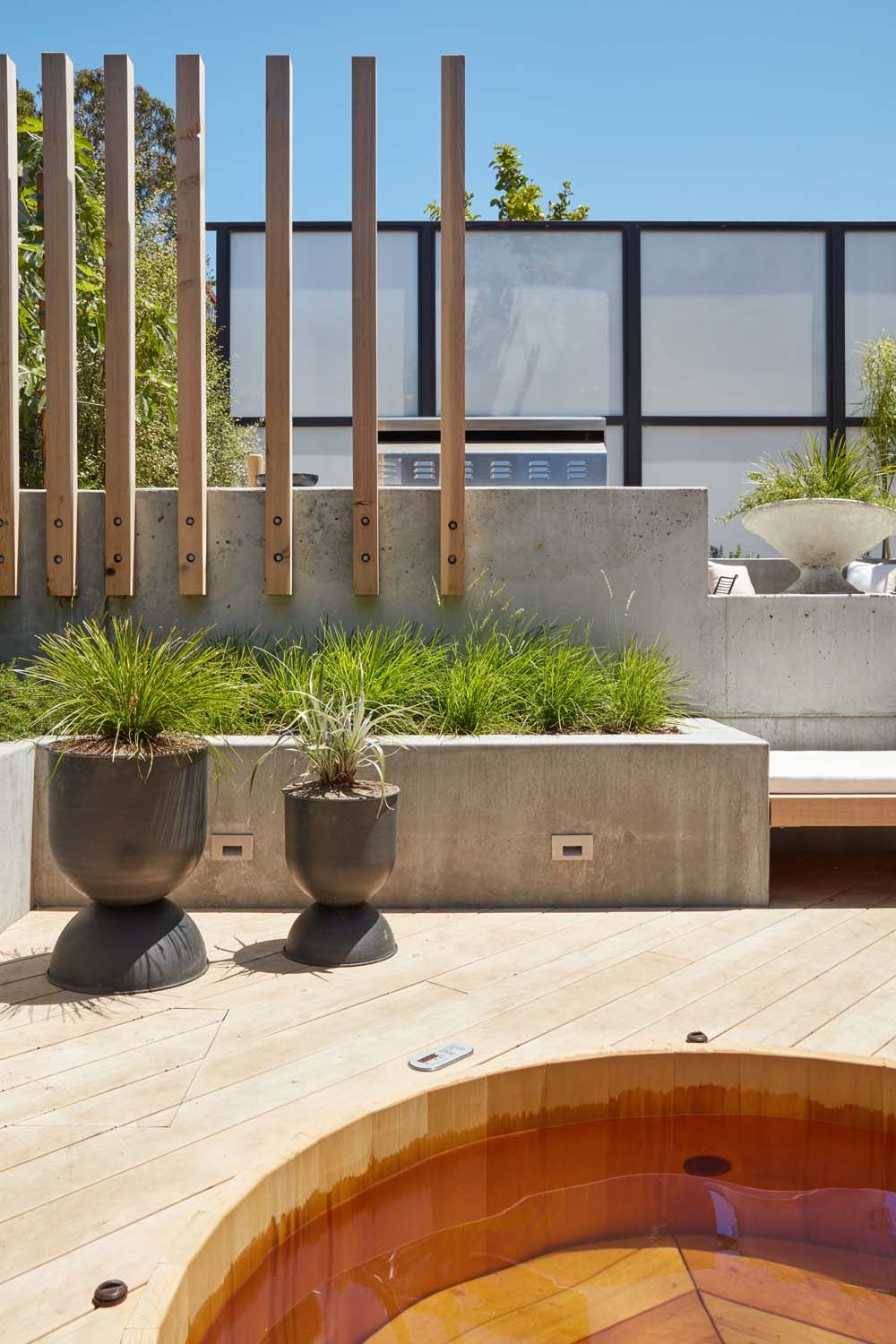
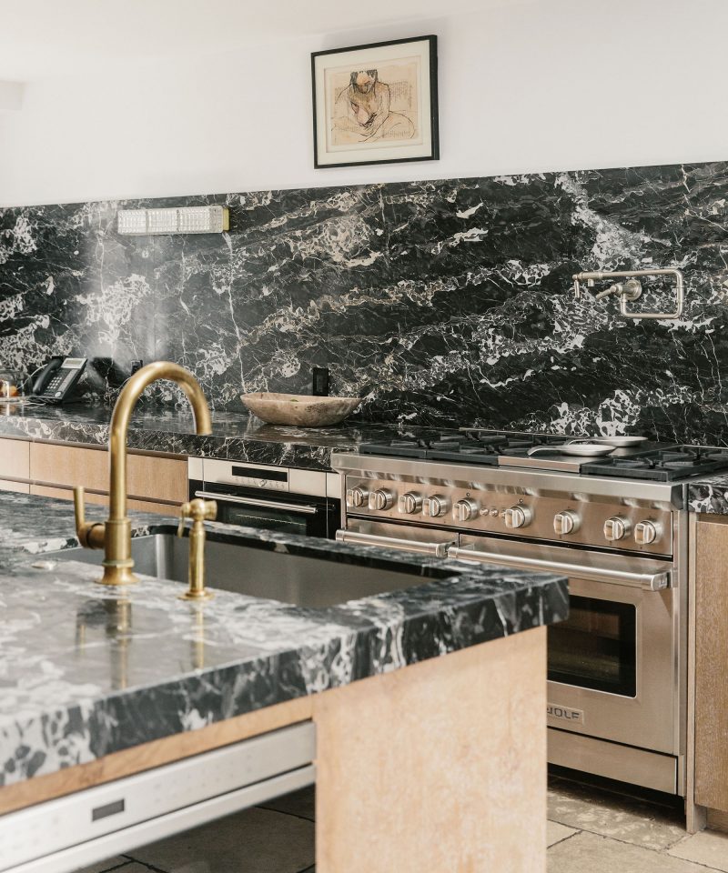
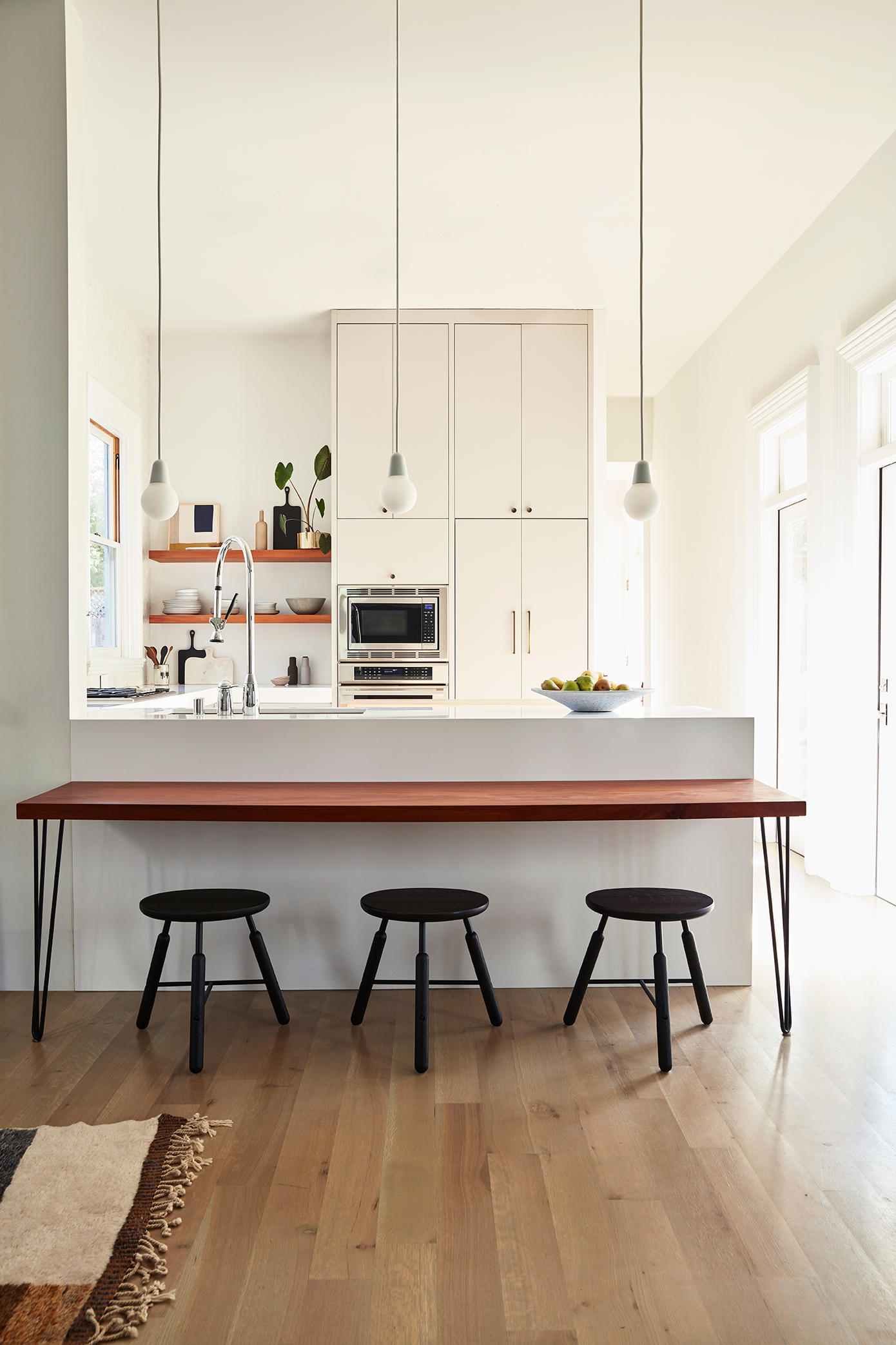
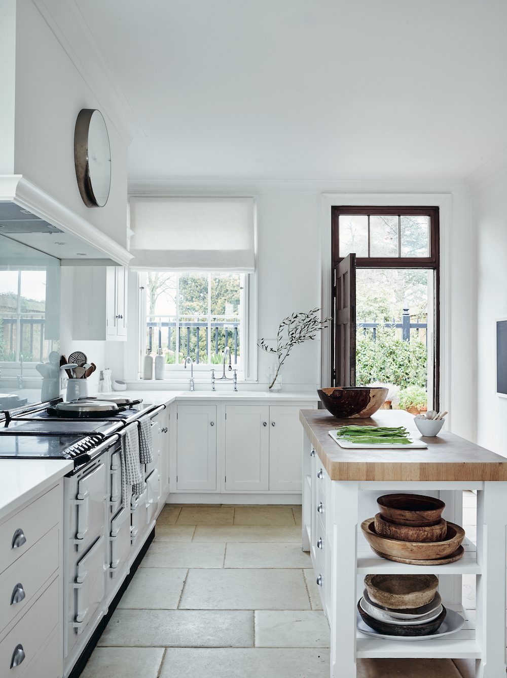
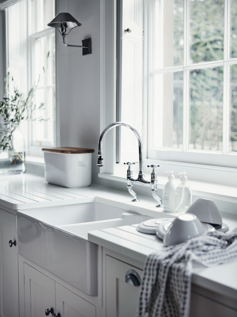
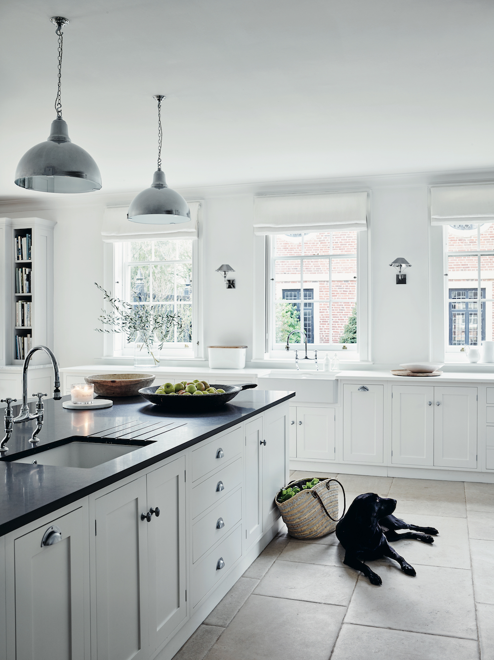
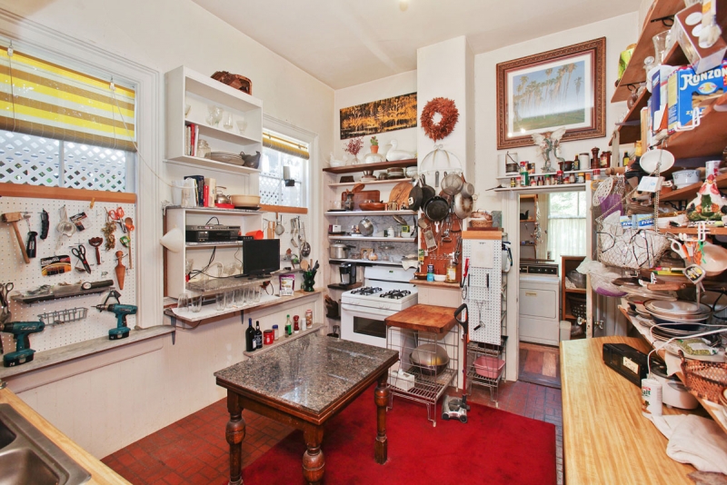
Our kitchen reflects my more modern design inclinations. I wanted to create a clean, relatively clutter free space. We have almost no upper cabinets. A single stack houses both my oven suite from Theramdor as well as our hidden refrigerator. I love incognito appliances. I couldn’t resist open shelving at the time, but as I look back now (by nearly four years) if I had to do it over again, I might even eliminate those. Sadly you can’t see my big drama moment in this pic, but we installed a stone wall from counter to ceiling behind the range. It offers subtle texture and movement.

A desk height “breakfast bar” connects the kitchen to the living room and offers a great spot for our son to do crafts or someday homework while I’m in the kitchen. If the counters look odd, that is because we chose to make them 39″ high. We come from a line of very tall people!

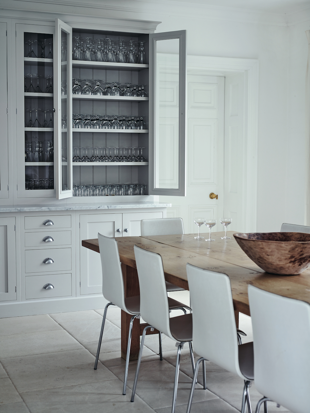
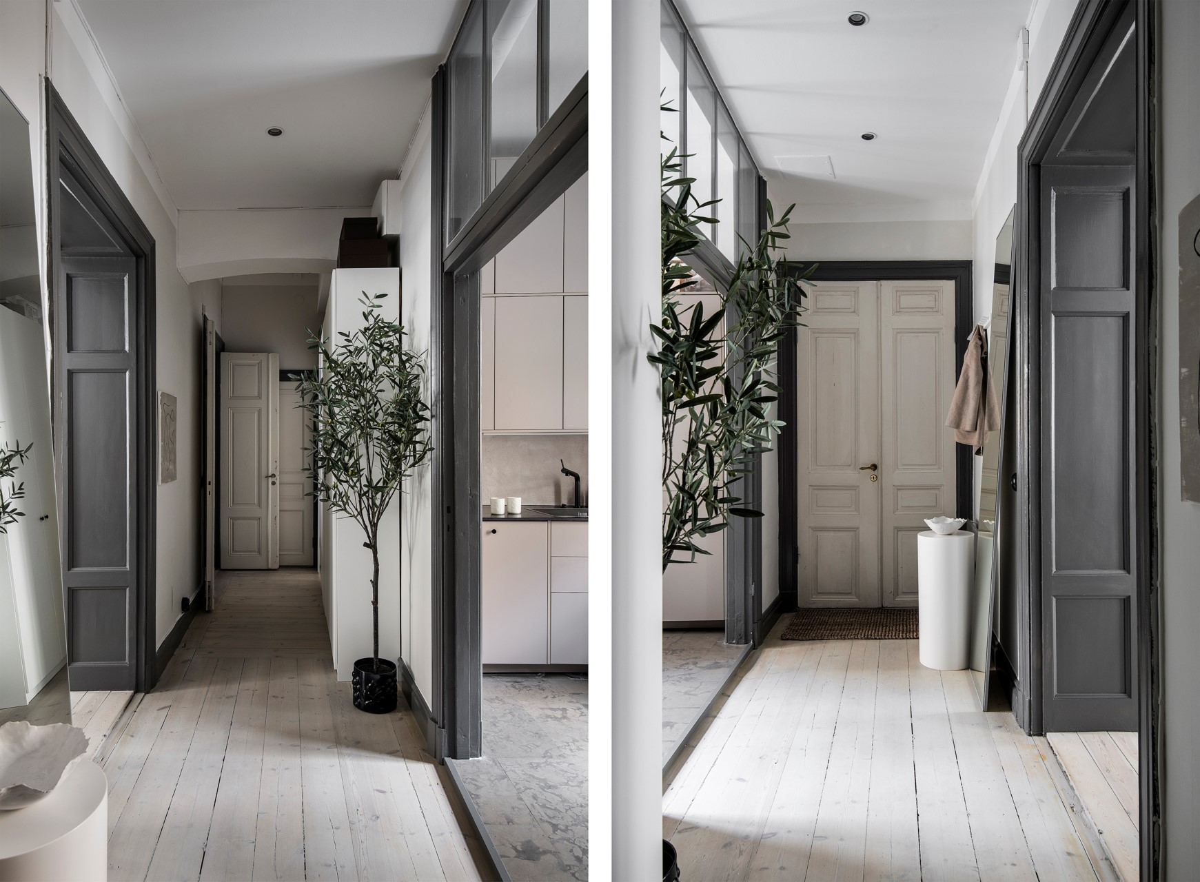
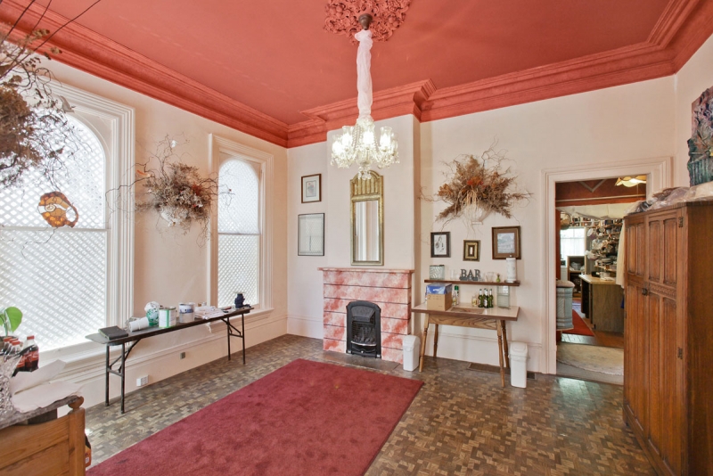
To complete the tour of our first floor, you move down the hall past the kitchen, and there you’ll find our walk-in pantry (which is quite dreamy if I do say so myself), our laundry room and a powder room. I’m happy to report that we make use of every single space on this floor every single day.

I hope this 2000 world monologue has helped shed light into our renovation at least a little. If I were to impart one point, it would be this – creating a dream home isn’t necessarily quick, cheap and easy as much as HGTV and the like would lead us to believe. While sometimes a fixer can be tackled slowly, project by project and in DIY fashion, some home’s needs are so large scale that they take on a life of their own. Our house certainly resides in that latter category. Did I make many a design mistake that likely cost us both time and budget? For sure. Would I do somethings differently if I had to do it over? You bet. Did I learn so much along the way? Absolutely.

Does our house make me smile everyday? Yes. Is it a great home for my son? Most definitely. And that is really the point.

Hope you’re excited for my next 2,000 words touring our second floor! Hopefully I’ll have that done before Christmas.

If you can’t wait for that though, be sure to check out Domino’s online feature HERE! Have you picked up Domino’s winter Renovation issue yet?? There are SO many good home tours in there.

photography by seth smoot for domino magazine 
produced by kate berry
styled by rosy fridman

RESOURCES

Entry
lora pendant lamp by wep lights ylighting / georg console table skagerak / steven bukowski planter

Dining Room
custom credenzas lauren nelson design / custom dining table godar furniture / paint white wisp, black 01 by benajmin moore / antiqued french crested mirror 1stdibs / ceramic vessel by ANK spartan shop / arch totem and seed sculptures by tina frey designs / la rochelle mantel chesneys new york / tonneau chiars by pierre guariche via almond & co / stick shelving system menu design / art print by seth smoot / large white vase march sf /  bubl vase 101cph / vintage vessel elsie green

Living Room
custom sectional lauren nelson design / custom coffee tables lauren nelson design / serge mouille two arm wall sconce dwr / knot pillow dwr / crinkled cotton throw h&m / pampas lumbar pillow the citizenry / moroccan middle atlas tribe berber rug / fireplace chesneys / basket zara home / vintage portrait elsie green / bow marble candle holder ferm living / upholstered swivel lounge chair by gerard van den berg amsterdam modern / straw rope hanging by sarah simon / paint white wisp & black 01 benjamin moore

Den
custom french doors bananas & hammocks / sectional room & board / george nelson cigar bubble pendant / paint gravel gray benjamin moore / wool curtains the shade store / coffee table west elm / black marble tray the citizenry / fluted glass vase h&m 

Kitchen
bulb fiction pendant lamps fritz hansen / norm na3 stools by &Tradition / promaster faucet kohler / silestone countertop in ariel / mid-century knobs and pulls school house / appliances thermador / art tappan collective

While I’d usually be regaling you with gift guides, party ideas and more holiday decor then you can handle right now, I’ve got a different kind of gift for you this year. After nearly five full years since our demo day, the official before and after reveal of This Old Victorian is here! I’m thrilled to announce that our home has been published in the first-ever Renovation Issue of Domino Magazine and it hits newsstands & stores today!

non random light by moooi from ylighting | custom dining table godar furniture | tonneau dining chairs by Pierre Guariche almond & company | tableware carole neilson ceramics | footed bowl march sf | faye toogood rubber spade chair from march sf | art untitled by vanha lam from tappan collective | dress kamperett | sneakers by malene birger / atlas rug mehraban rugs 

It feels almost surreal – I wonder if any of you reading this actually read the post about when we bought the house?? Don’t worry – if you missed it, it was 2014!

Over the next few days, I’m going to take you behind the scenes of our renovation saga, fill you in on all my decor dilemmas and share every before and after that I’ve had to hold back for SO many years now. I hope I can impart a few helpful lessons, a little design inspiration, but mostly, I want to raise the curtain on what it really takes to create your dream home. Everything from HGTV, to this blog right here leads one to believe that design and decorating should be quick, easy and cheap, but most of the time that is so far from the truth.

I’m sure you’re asking, why oh why has this house taken you SO long? Well trust, I’ve asked myself that question a million times too. But there are actually a few very legitimate reasons this process was painstakingly slow.

The first is that we bought a historic home. As in, the house can be found on the historic register and therefore has a number of restrictions on what you can and cannot do in a remodel. Those hoops can take quite a while to jump through.

non random light by moooi from ylighting | custom dining table godar furniture | tonneau dining chairs by Pierre Guariche almond & company | tableware carole neilson ceramics | footed bowl march sf | vintage mirror 1stdibs | custom credenza lauren nelson design / ceramic vessel by ank from spartan shop | arch, totem and seed sculptures by tina frey designs / chesneys la rochelle mantel / paint white wisp by benjamin moore 

We also wanted to do more than simply remodel the home – just tearing everything down to start with a blank slate would have been easy. Instead, we really wanted restore the house to its original grandeur. A historic Victorian is such a gem. I just happened upon a diamond in the rough. Our house had not been well cared for over the years. In fact, it stood abandoned for a good chunk of the 70’s! Lath and plaster from the 1860’s, leaking windows, rotted out framing, falling down chimneys, original plumbing and nob & tube electrical – we had it all. Don’t worry, as we dig into all the befores you’ll understand the hot mess with which we started.

While our focus was on restoration of the home, we did make major architectural changes. The house was originally four bedrooms, one bath and is now three bedrooms, two and a quarter baths. There wasn’t actually a real kitchen of any kind, so we had to build one from scratch. I also wanted to open up the postage stamp sized rooms to create a more modern, open living concept. That required removing load baring walls, taking out a second staircase – we basically reshuffled the entire layout of both floors. All that to say, renovating required major focus on everything that you’ll never actually see – plumbing, electrical, architectural structure – you know, the extra sexy stuff (that tends to be rather spendy).

bulb fiction pendant lamps by kibisi for fritz hansen ylighting / norm na3 stools by &tradition / promaster faucet kohler / range, oven, hidden fridge, dishwasher thermador / silestone countertop in ariel / concrete saucer the vintage rug shop / cabinet hardware school house / custom cabinetry / art tappan collective / dishware heath ceramics / atlas rug mehraban rugs 

bath tub kohler / hardware kohler / art cristina coral / dancing pendant by menu via ylighting / norr tray skagerak / vintage stool elsie green / rug anthropologie / paint white wisp benjamin moore 

Oh, and did I forget to mention that I had a baby less than three months after demo started? I’d be the first to warn that first-time motherhood and major renovations don’t mix particularly well.

But in the end, it was all more than worth it, because 12 years after I started this site to chronicle the remodel of 250sq ft condo I thought was going to be my dream house (oh hello 27 year old self), I’m thrilled to have a dream home for my son to grow up in.

I do hope you’ll pick up the new issue of Domino to see the full tour. If you need a few more sneak peeks and just cannot wait until you get your issue, you can see the online story here.

But come back tomorrow – I’ll be digging into how we figured out our new floor plans and the full reveal of the first floor!

To catch up on the This Old Victorian journey, CLICK HERE.

photography by seth smoot for domino magazine | produced by kate berry | styling by rosy friedman 

Some people say all-white design is boring. Or easy. But I beg to differ. Using white as your primary color palette actually requires the utmost expertise – so much so that there’s a beautiful new design book dedicated to working with a (nearly) all white palette. And I, for one, am here for it.

I highly doubt you’re bored by neutral interiors either, otherwise you wouldn’t have been able to stick around Apt34 for this long, but this new design tome, FOR THE LOVE OF WHITE: THE WHITE AND NEUTRAL HOME by Chrissie Rucker, founder of UK favorite, The White Company, captures pitch perfect use all my favorite soothing hues.

The secret to a compelling neutral interior is contrast. And there is stunning use of that throughout these homes. Deeply hued hardwoods pop against beautiful white walls.

White on white works when you use dramatic proportions. I love how everything in these homes feels big and eye catching – no bright colors required. Note to self, always add a dog that matches your interior.

Yes, I’ve hated on all-white kitchens in the past, but there is a reason why they’ll never go out of style. I do understand their classic appeal.

I love the mix of materials in this dining room. Modern, clean lined chairs mix with a farm style table and a stunning traditional built-in hutch. Definite display goals with that one.

A freestanding tub is also always timeless. This space is truly elegant.

But in my next dream house, I’d like a room dedicated entirely to my tub, thank you very much.

This is only one of the many gorgeous design books that have debuted this fall. I’m going to share sneak peeks of all of my faves through the month of November, just in case you have another design lover on your gift list!

Photography by Chris Everard, © The White Company.

“FOR THE LOVE OF WHITE: THE WHITE AND NEUTRAL HOME by Chrissie Rucker, founder of The White Company, is available now from HarperDesign, an imprint of HarperCollins Publishers. For more information, visit hc.com

After two trips to Sweden this year, I have become totally smitten with their unique design perspective. And I’m not referring to the stereotypical Scandinavian minimalism nor the typical “hygge” look that’s been massively appropriated into American design of late. Those styles are certainly present in many a Swedish residence, but they also feature a mix that includes old-world and modern, clean-lined and cozy, restrained yet perfectly layered.

Home Tour: Elevated and Elegant Fall Vibe in StockholmHome Tour: Elevated and Elegant Fall Vibe in Stockholm

This apartment, belonging to interior designer Lovisa Håger is a perfect example. At first glance, you might not immediately realize it is in Stockholm. The mix of furniture styles, the use of classic designs that aren’t Scandinavian, like Serge Mouille and Atollo lamps and the moody color palette make this home seem as if it could be in Paris or Brussels.

Home Tour: Elevated and Elegant Fall Vibe in Stockholm

But as your eye devours this decidedly stunning space, you do spy some tell-tale hygge signs, like those mid-century chairs upholstered in fuzzy lambswool or the classic Scandinavian midcentury credenza.

But I love that there isn’t a piece of blonde wood in sight here. Instead, deep warm wood pieces offer lovely contrast. I’m similarly obsessed with the choice to paint the molding throughout the house a sultry gray, bucking the all-white -everything Scandinavian look.

Home Tour: Elevated and Elegant Fall Vibe in Stockholm  Home Tour: Elevated and Elegant Fall Vibe in Stockholm

The kitchen also continues to buck the traditional color stereotypes, using dusty rose, dark countertops, more of that yummy dark gray molding.

Do you spy the split door at the end of the hallway – it’s one of my favorite things about European apartments.

Home Tour: Elevated and Elegant Fall Vibe in Stockholm

Natural light is indeed critical for those long Swedish winters and thanks to a plethora of large windows this apartment has lovely light in spades. I also really appreciate the deep windowsills. They become little little extra pieces of furniture where you can keep a few favorite books or display a vignette of ceramics. The floor to ceiling curtains in this room help accentuate the ceiling height.

The traditional corner-mounted fireplace does place this apartment smack dab in Sweden. But I’m not mad about it. Swedish fireplaces are so stunning. I also love a tone-on-tone dark room. The bedroom is a perfect spot to create an extra cozy retreat.

This apartment feels warm and collected, yet not overly cluttered or fussy. Of course it benefits from amazing interior architecture, but it’s the lovely mix of textures, design styles and timeless accessorizing that makes this house feel like a home.

And bonus, it’s for sale! Maybe my little relocate-to-Sweden-pipe-dream could in fact come true. Details about the apartment are here.

images via nomad makleri

Older posts
Gimme More