Hi Friends! I should probably start off with an apology for my unplanned extended hiatus here. Life has taken many unexpected twists and turns in the face of the pandemic – as I’m sure you can relate. This space has become completely neglected. I’m hopeful that is going to shift in the coming weeks and months, as I do really miss showing up here.
But I’m thrilled to finally debut the completed Hood Canal Cottage. I certainly didn’t think it would take more than 16 months to get here. I always go into renovations with the utmost optimism. After five+ years of This Old Victorian, You’d think I’d have learned my reno lesson by now. But a good renovation before-and-after story is never without some drama. So let’s dive into this roller coaster of a renovation saga.
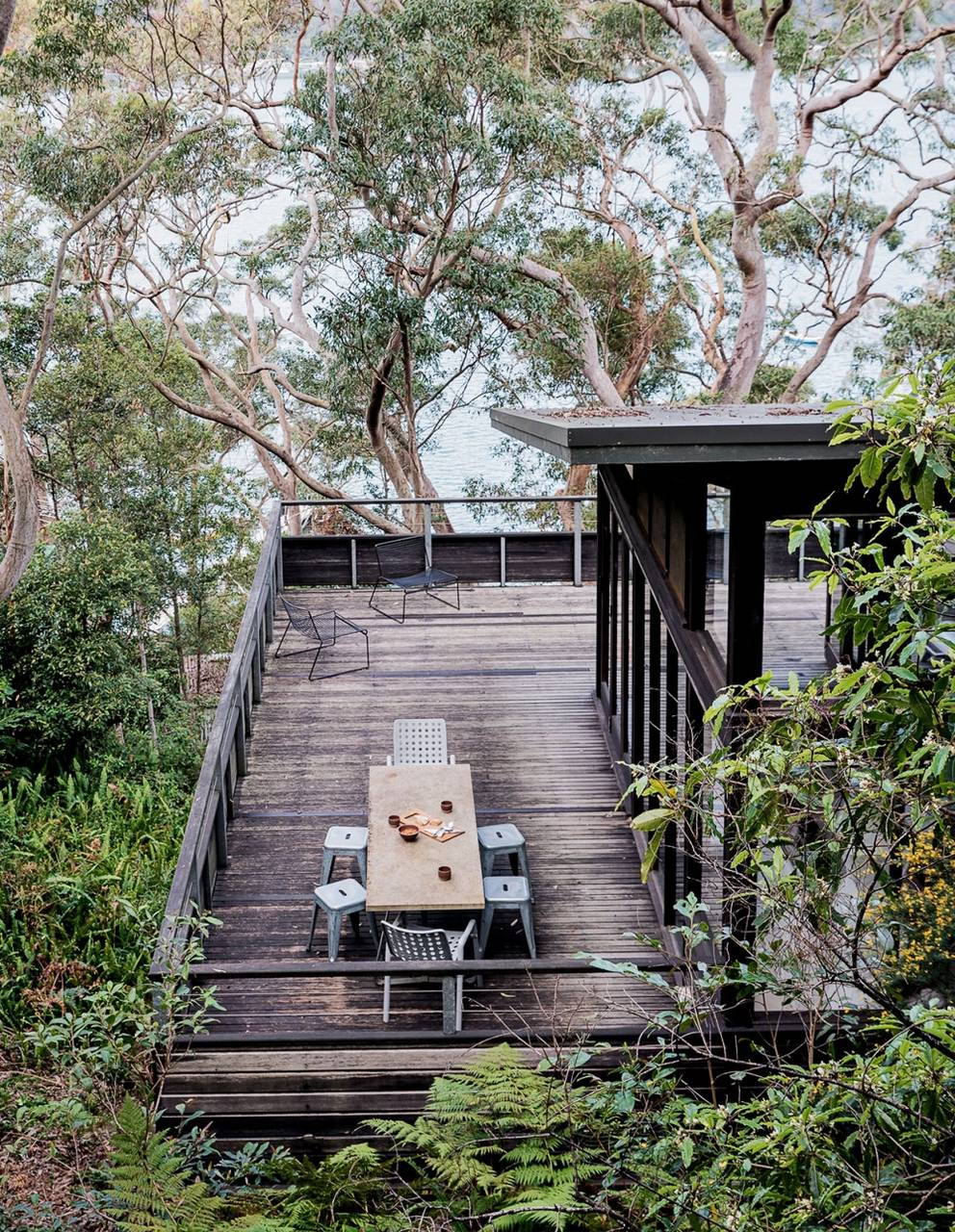
If you remember, as the pandemic raged in mid-2020 we happened upon a listing in an idyllic setting in the Pacific Northwest just an hour outside of Seattle. Not only was the property in a beautiful far flung corner of the world, but it was also a particularly meaningful spot for me. The house sits a stone’s throw from a hidden Puget Sound beach that I grew up combing with my mother and grandmother when I was small. I was thrilled by the thought of getting to share this undiscovered area with my six-year-old and bring my family back to place that meant so much to my childhood. With the future so uncertain, we also wanted a spot to be closer to our immediate family, so we dove in head first, like I shared all those months ago, I thought we’d undergo a quick three-month spruce-up to ride out the rest of lockdown with our nearest and dearest. The bad juju of 2020 had other plans in store.
Just as we were about to get started, the property suffered major water damage from a faulty dishwasher hookup. Floors and walls throughout the kitchen and living room as well as the rooms in the basement below suffered severe damage that was not salvageable. Suddenly, this project took a whole new turn. We were left with the only option of doing a much bigger makeover. Needless to say, our three month “spruce up” was blown wide open. Thankfully this isn’t my first rodeo. This Old Victorian had me well prepped to tackle this turn of events. There were certainly more uncharted challenges ahead though. I thought you’d be interested in some of the other Covid related obstacles this project faced:
– We only had 20 minutes to walk the property before deciding whether or not to put in an offer.
– I got to see it one more time for 45 mins before I needed to start on the design process
– The entire project was designed and managed remotely as I couldn’t travel from San Francisco. Yay for Facetime.
– Continual supply chain issues pushed many furniture and final finish deliveries back 12-20 weeks longer than expected
We also had to do so many unfun things like replace the roof, put in new drywall, insulate and fix a lot of disrepair. While my contractor and his crew were demoing water damaged floors, I was stuck in my house 1200 miles away, attempting to run zoom kindergarten, figuring out if I could get yeast to make a sourdough starter and selecting finishes and furnishings once everyone else in the family was asleep. So strange to think I made all these design choices more than a year and half ago already. Aw, the Covid time warp is a trip.
So let’s go back to the beginning.
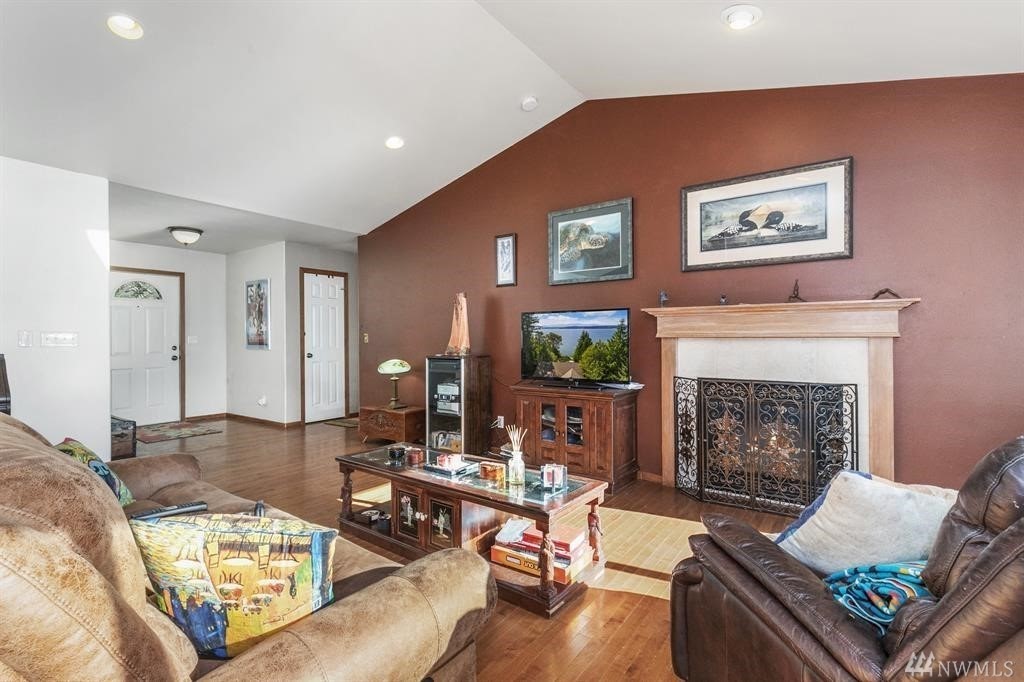
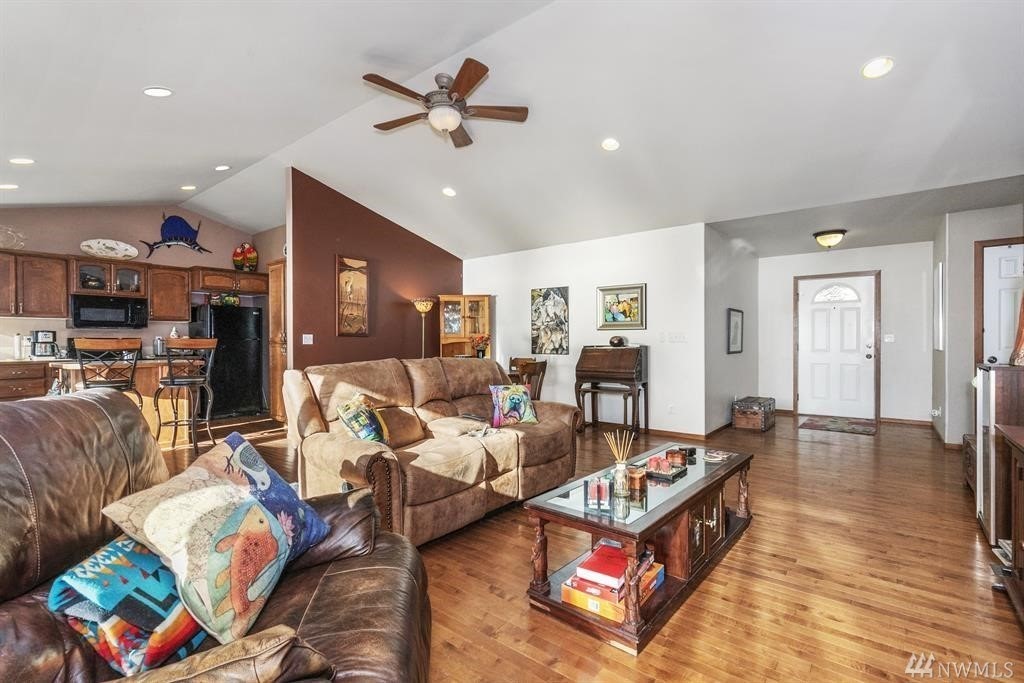
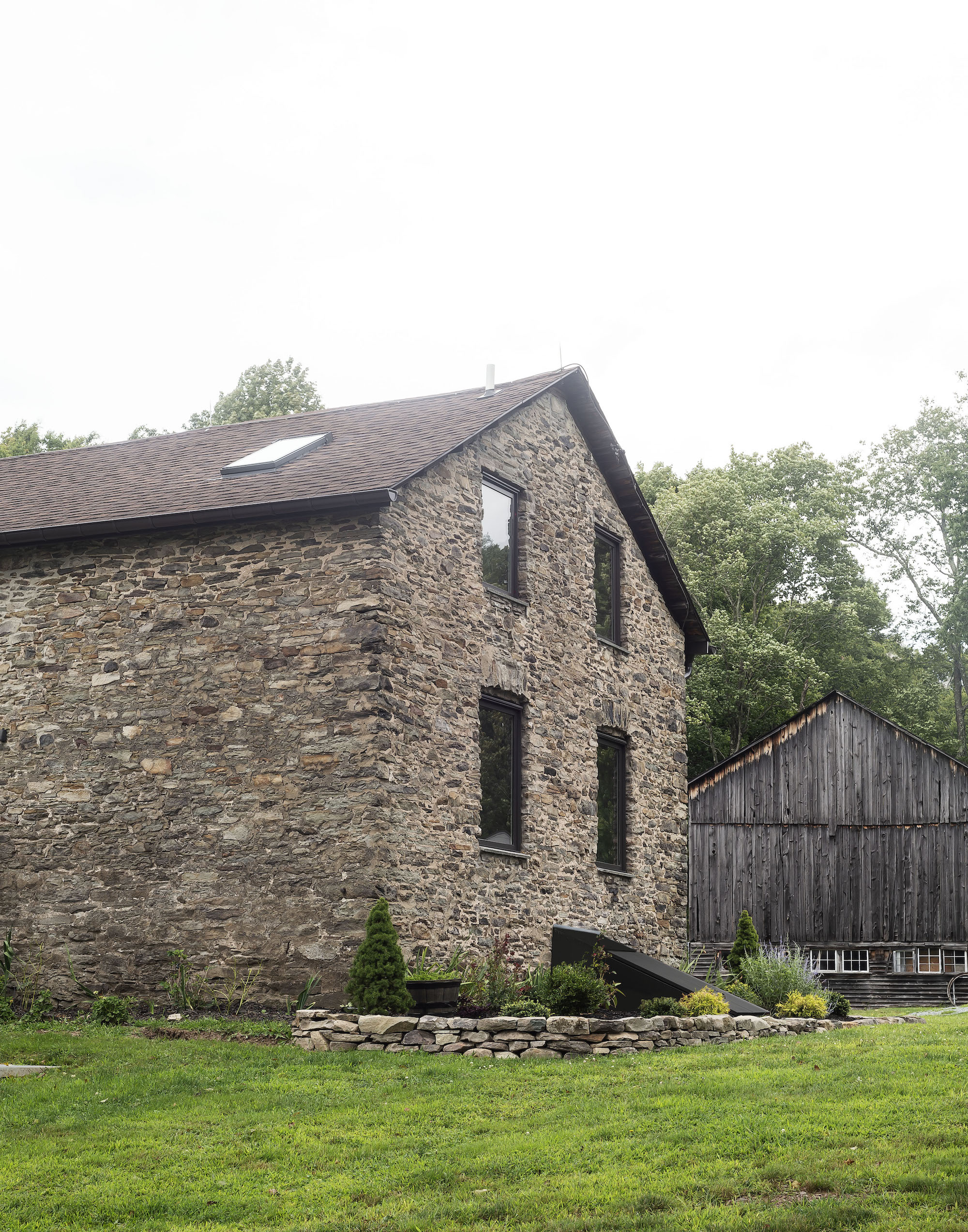
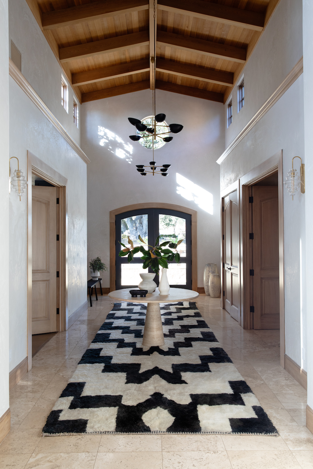
While (what we lovingly now call the Hood Canal Cottage) has a truly stunning location – the ultimate spot to unwind and appreciate the area’s beautiful surroundings – the house’s architecture itself offered little in the way of design inspiration. The architectural style is your typical late-1990’s American builder grade construction- luckily plopped within a little slice of heaven. My mission: help this stereotypical suburban style home’s inside match the splendor you enjoy out her windows.
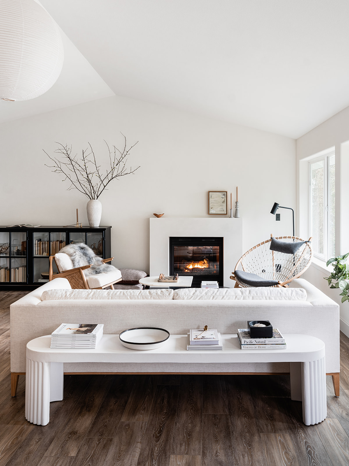
Ta-da! What do you think??
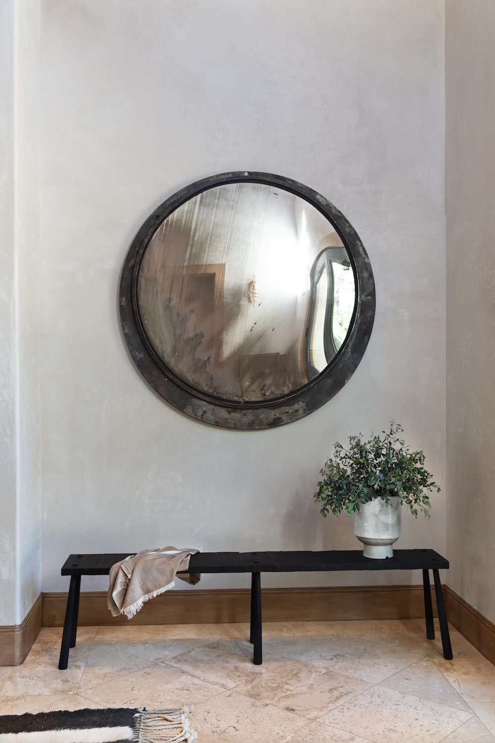
Redesigning this house was an endless balancing act as we weren’t in the market to make any major architectural changes – as much as I may have wanted to. Instead, I needed to figure out how to work with the existing spaces, but change the vibe entirely. Since the house sits right on beautiful beaches of the Hood Canal, it would make sense to define her as a beach house, but I did not want to fall into that cliche. Instead, I wanted to show how you can imbue your own personal style and design aesthetic into any type of space – rather than feel forced into a tired design theme. I set out to achieve what I’m calling Elevated Coastal Chic. If you remember, this was my design moodboard. I wanted to hone in on a Scandinavian, design-forward influence with perhaps a touch of coastal charm. I can’t wait to hear if you think I succeeded.
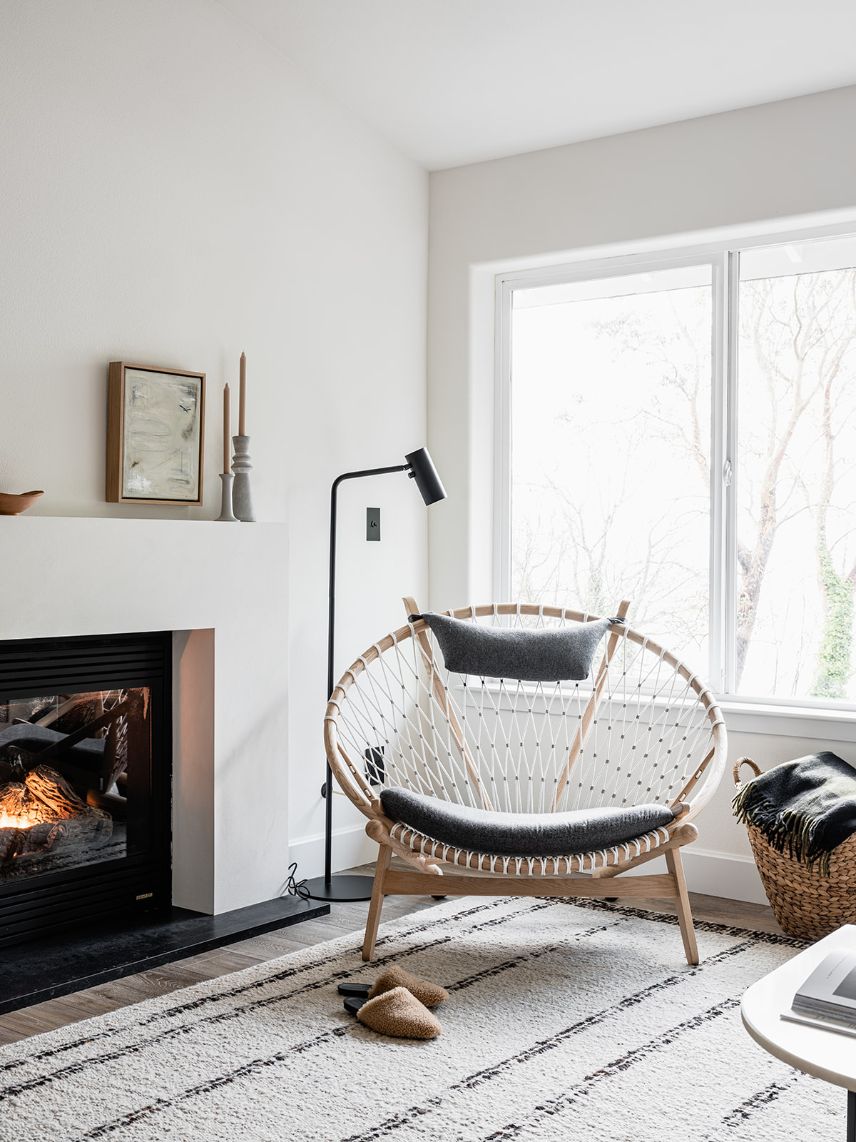
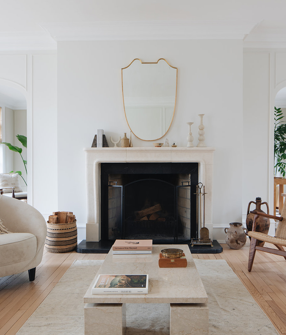
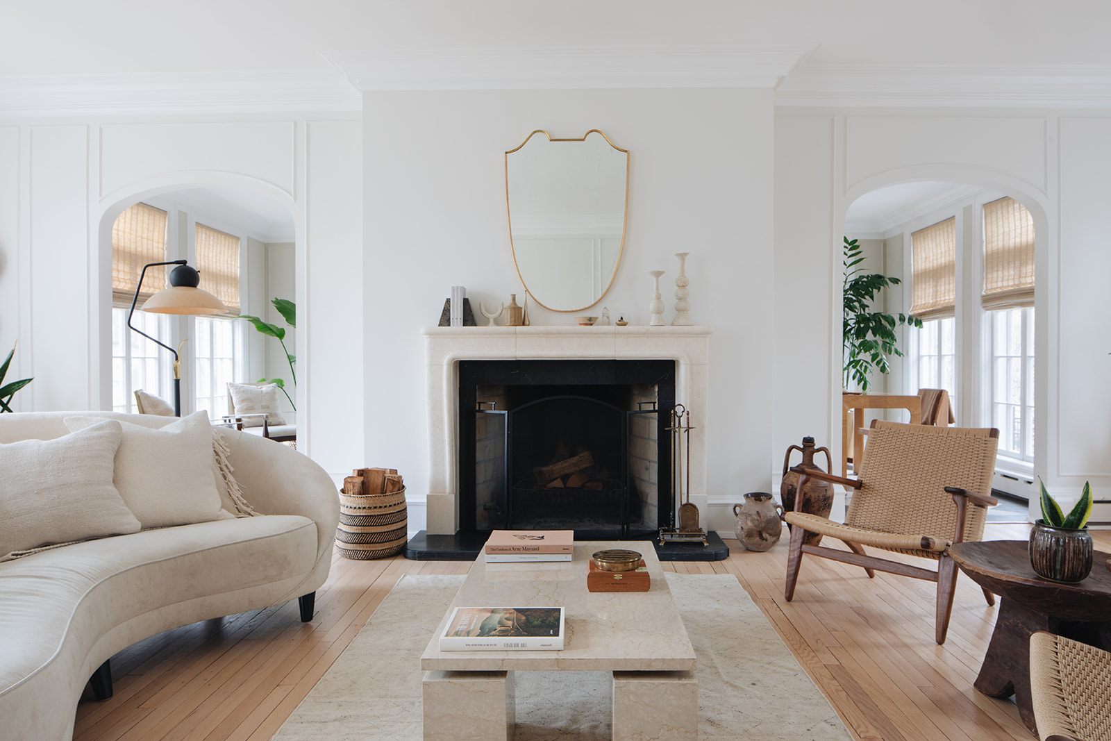
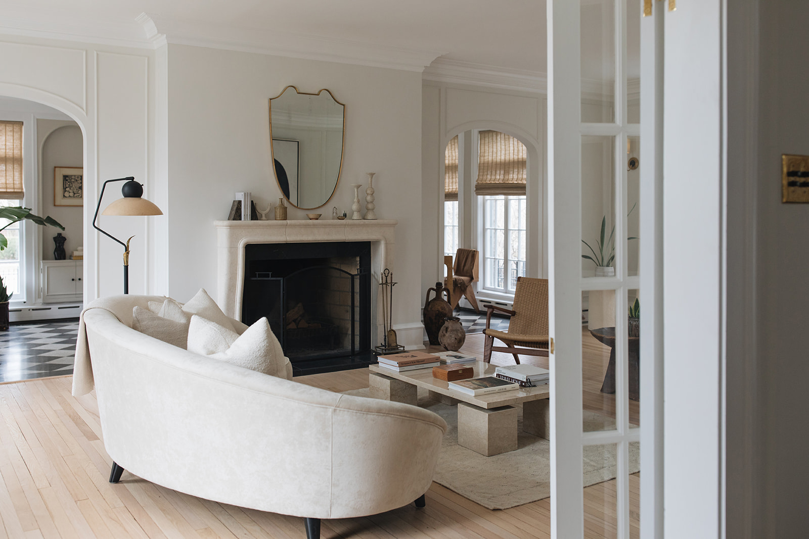
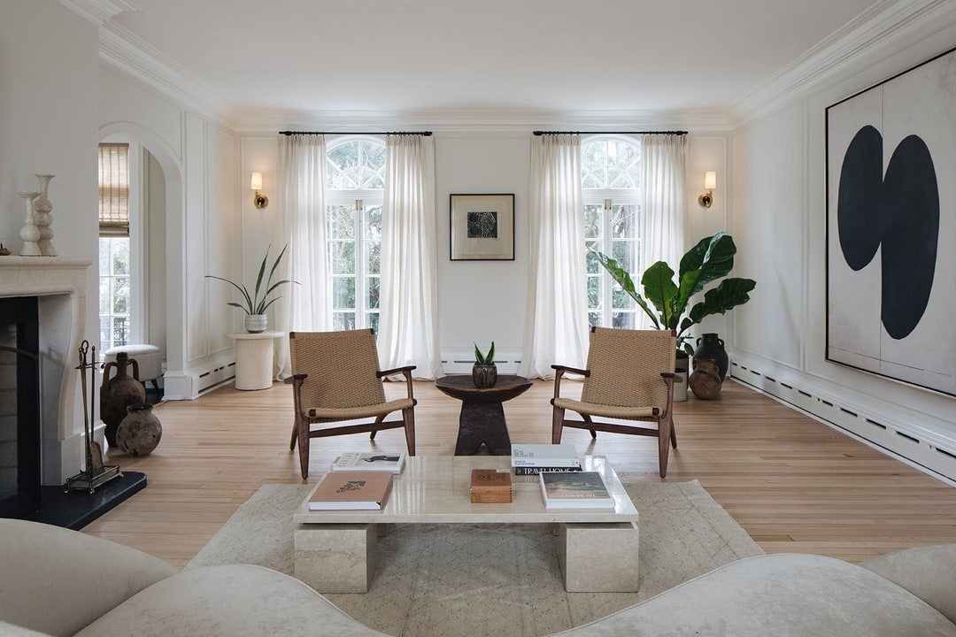
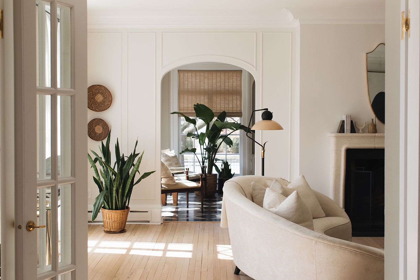
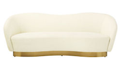
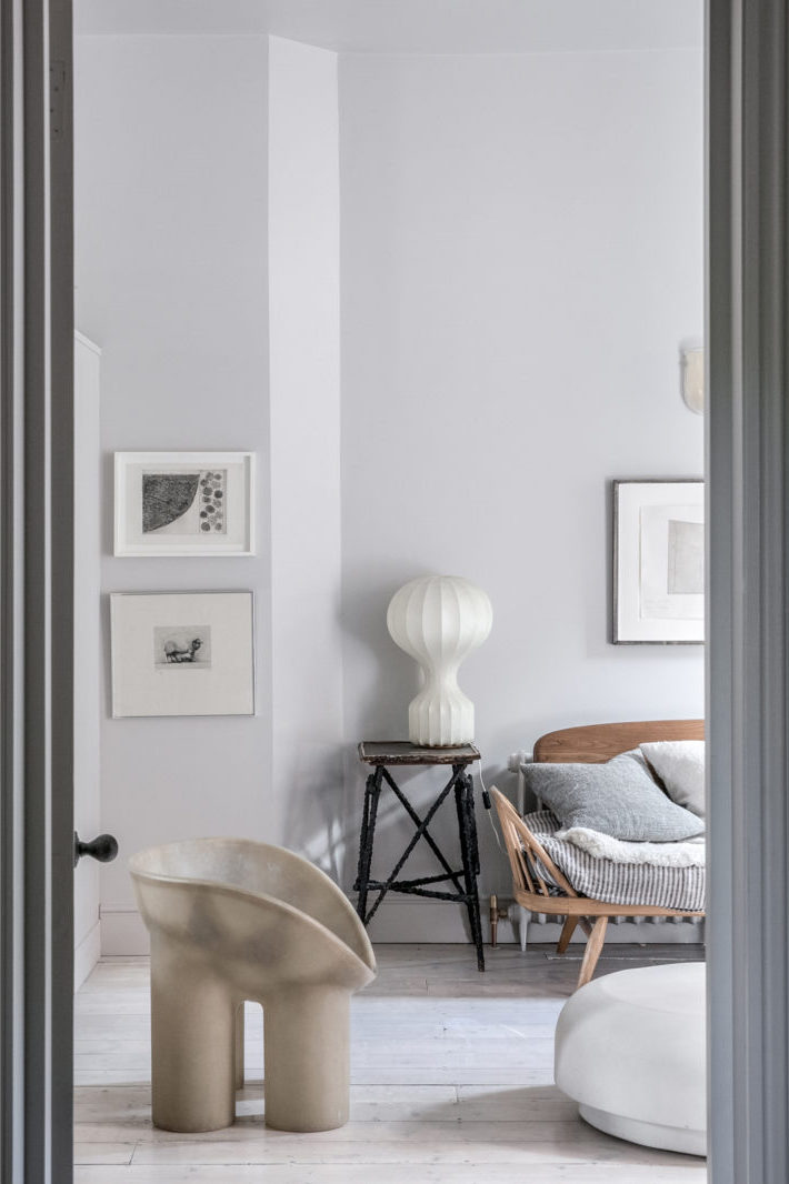
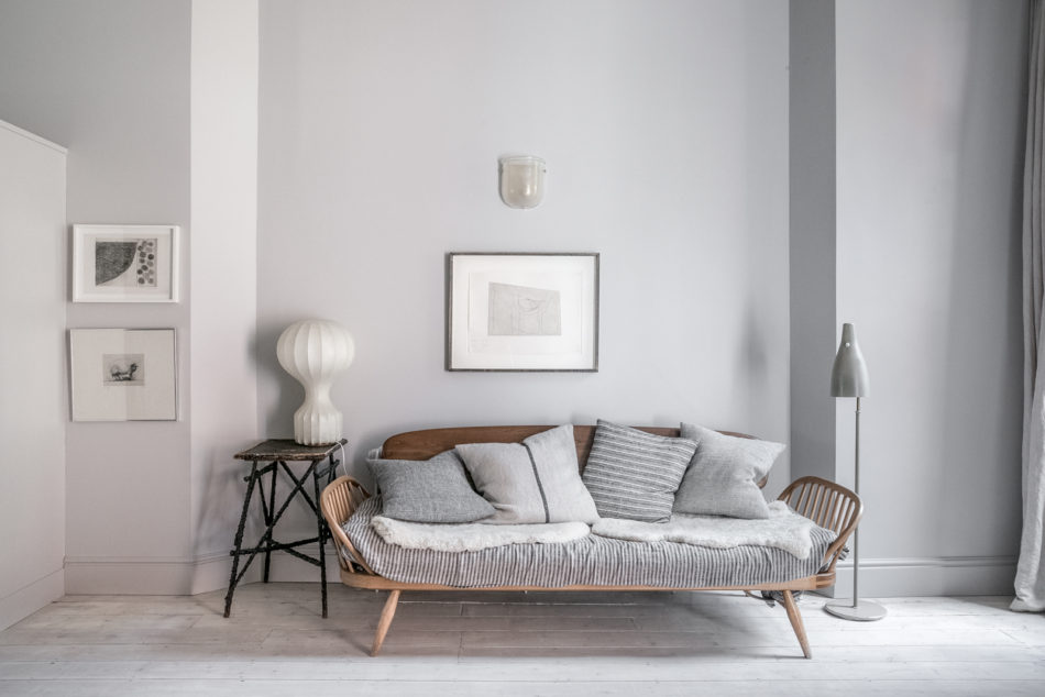
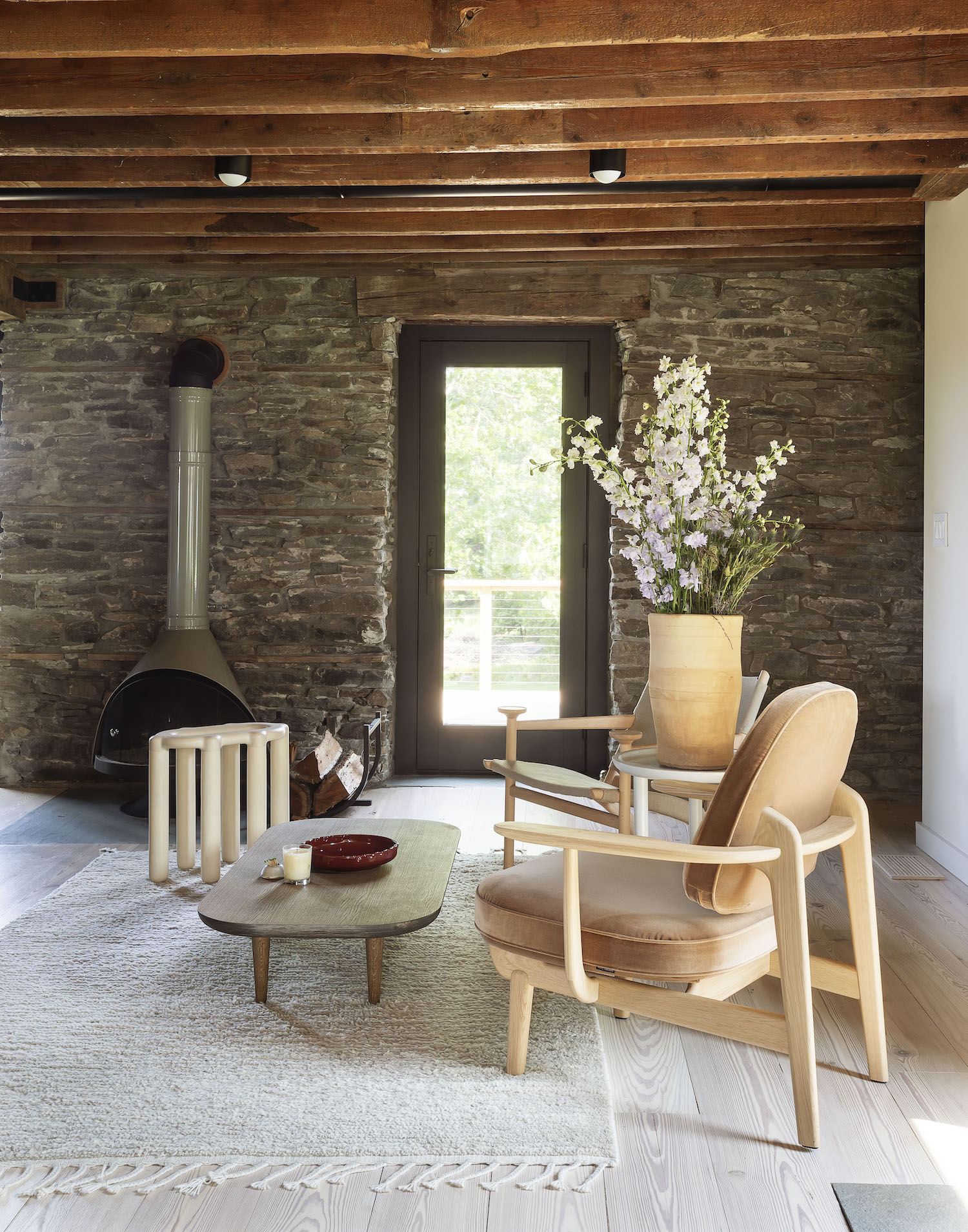
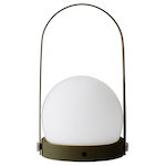
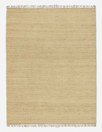
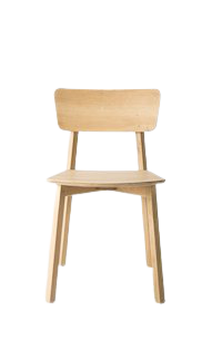
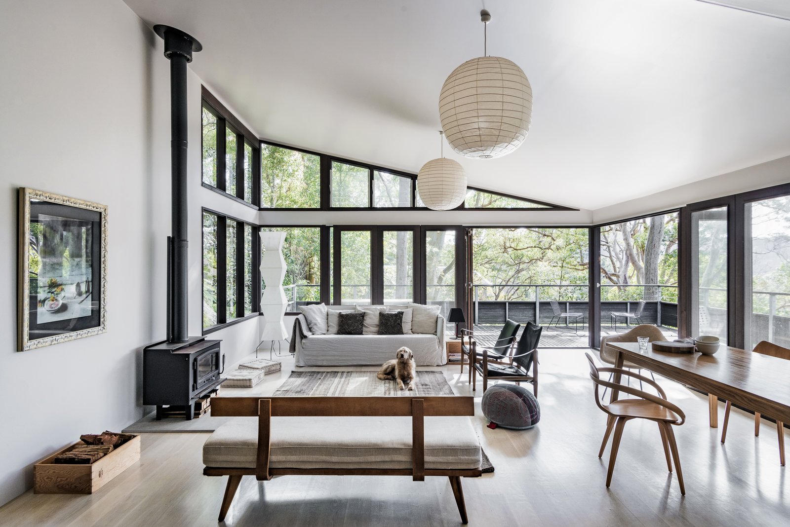
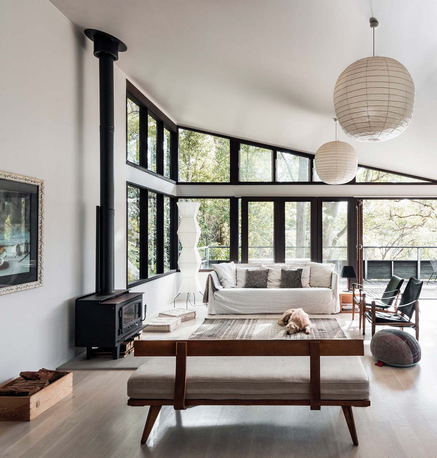
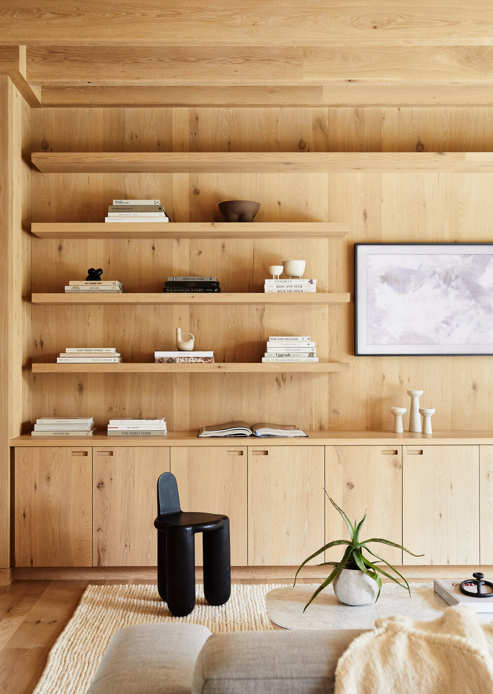
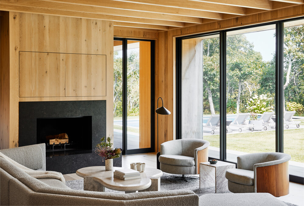
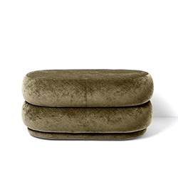
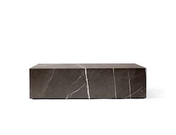
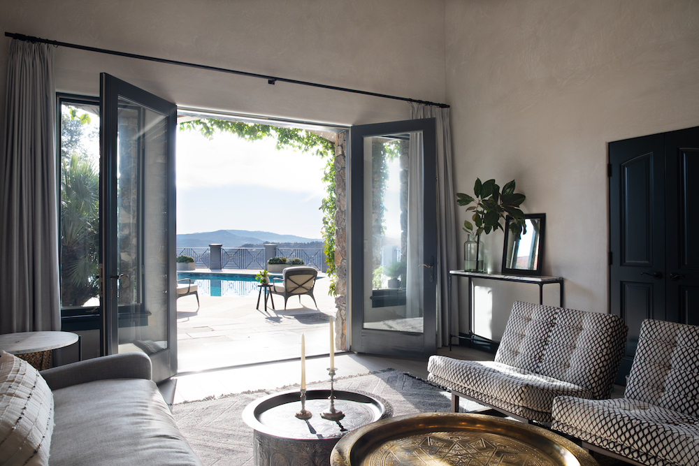
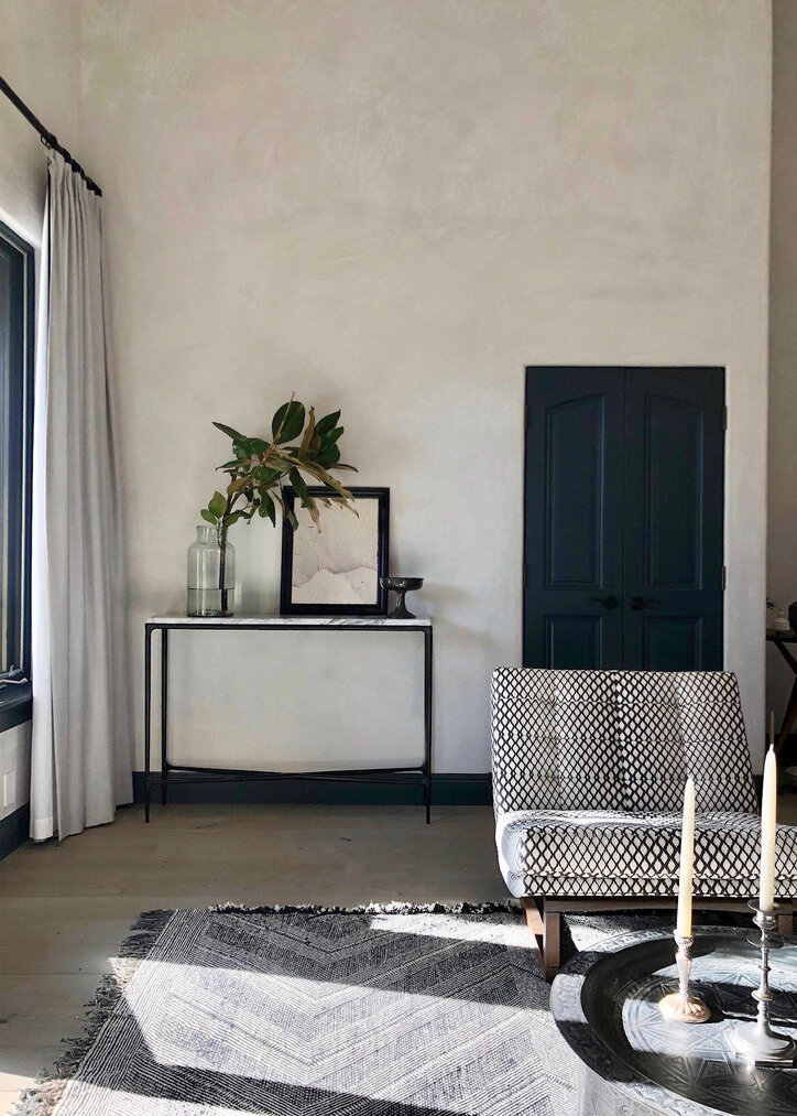
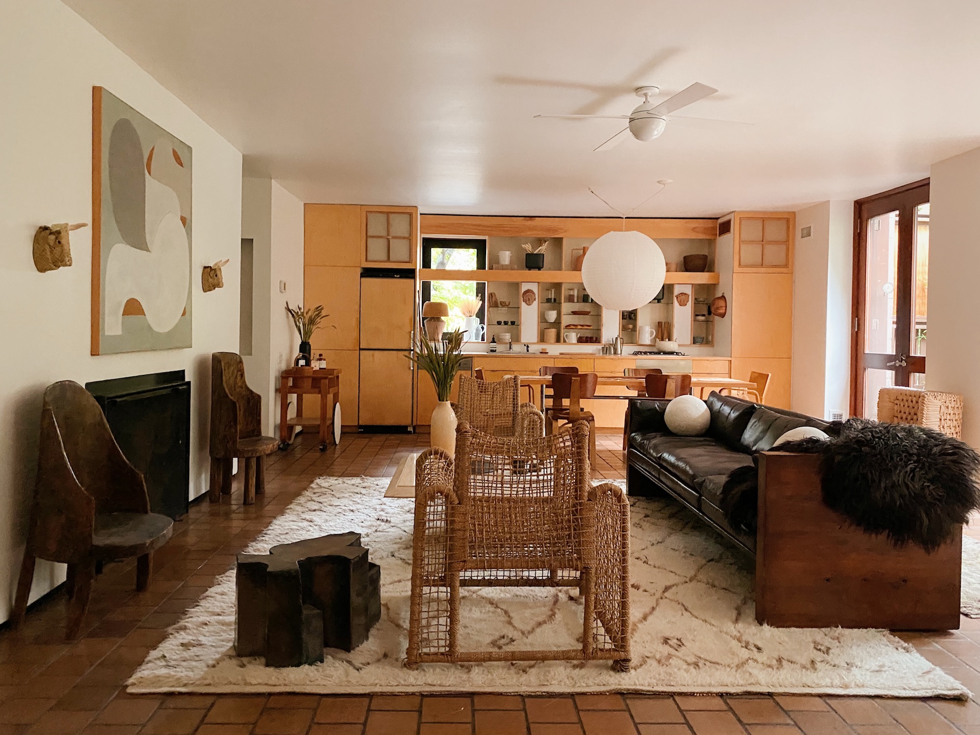
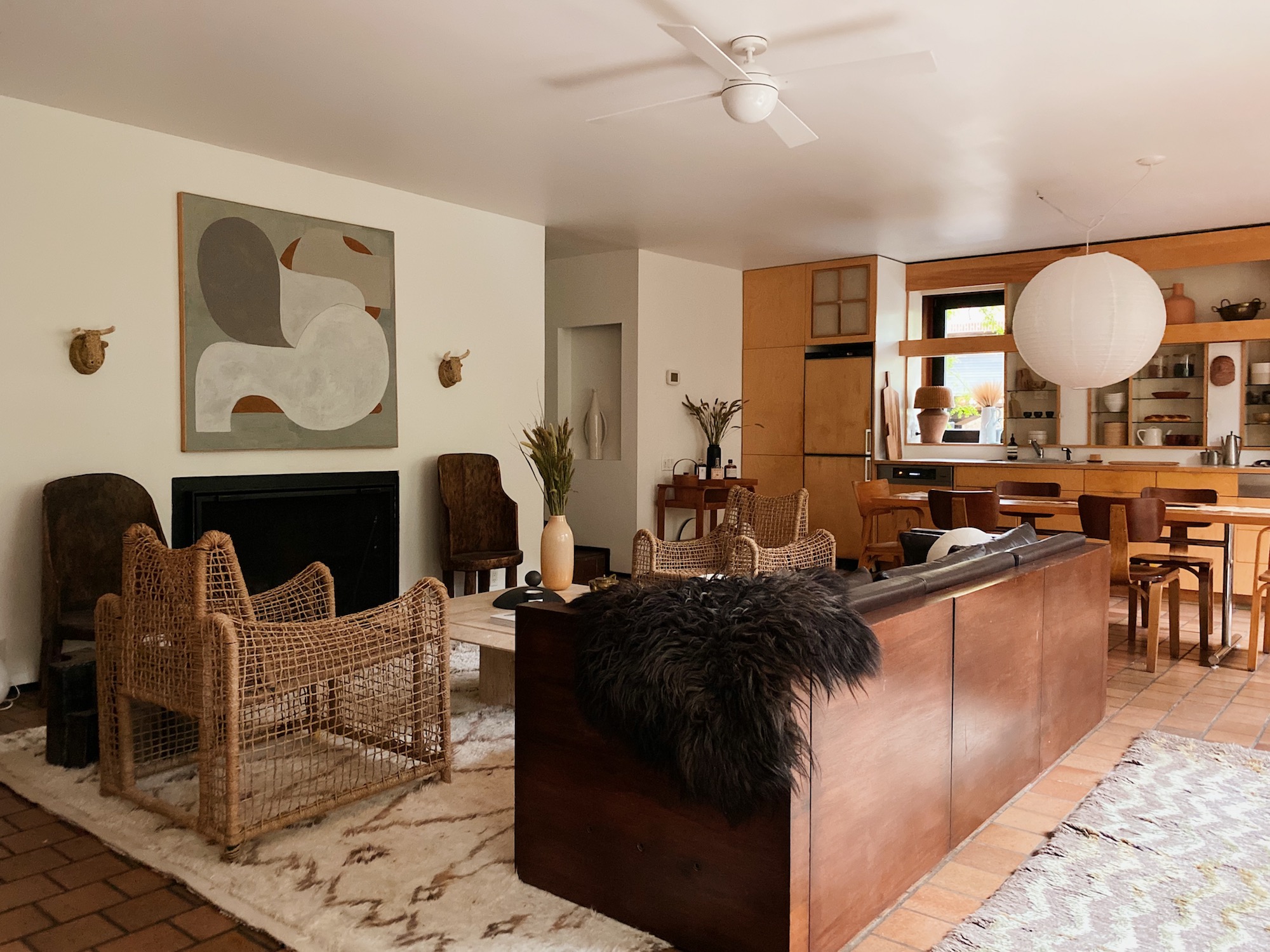
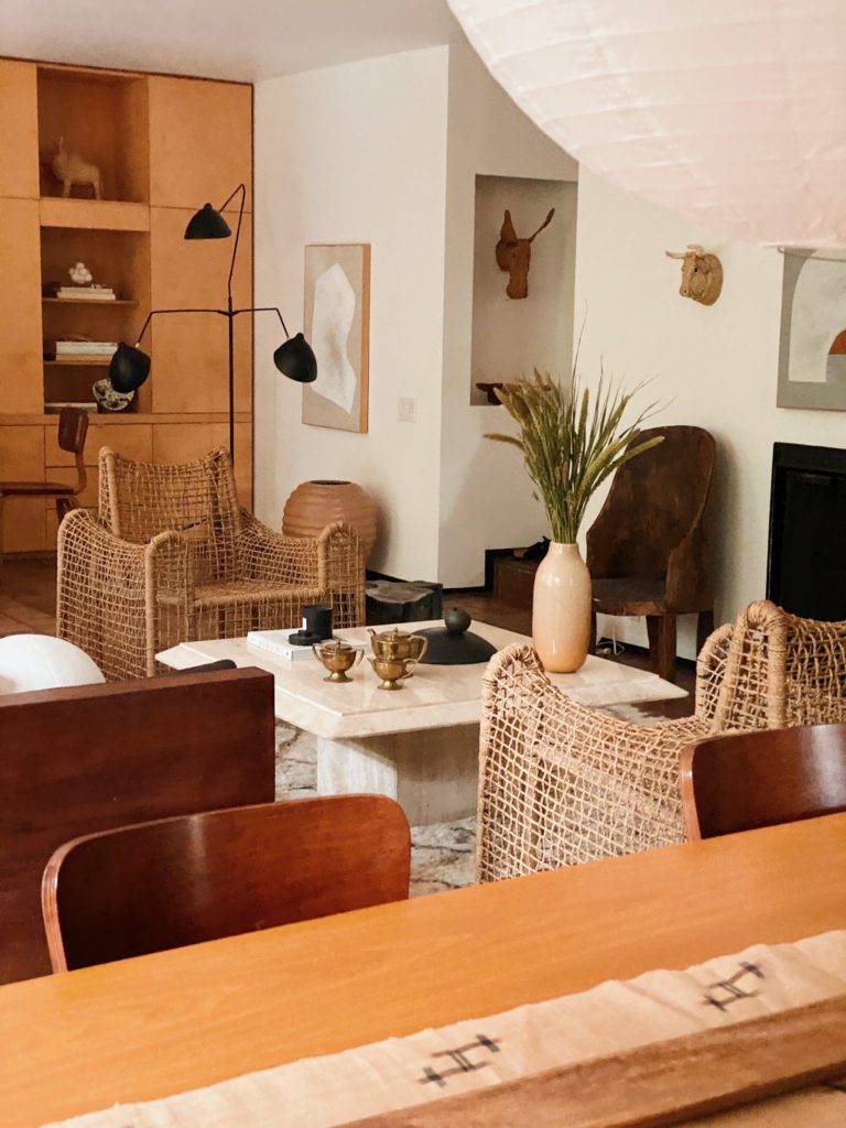
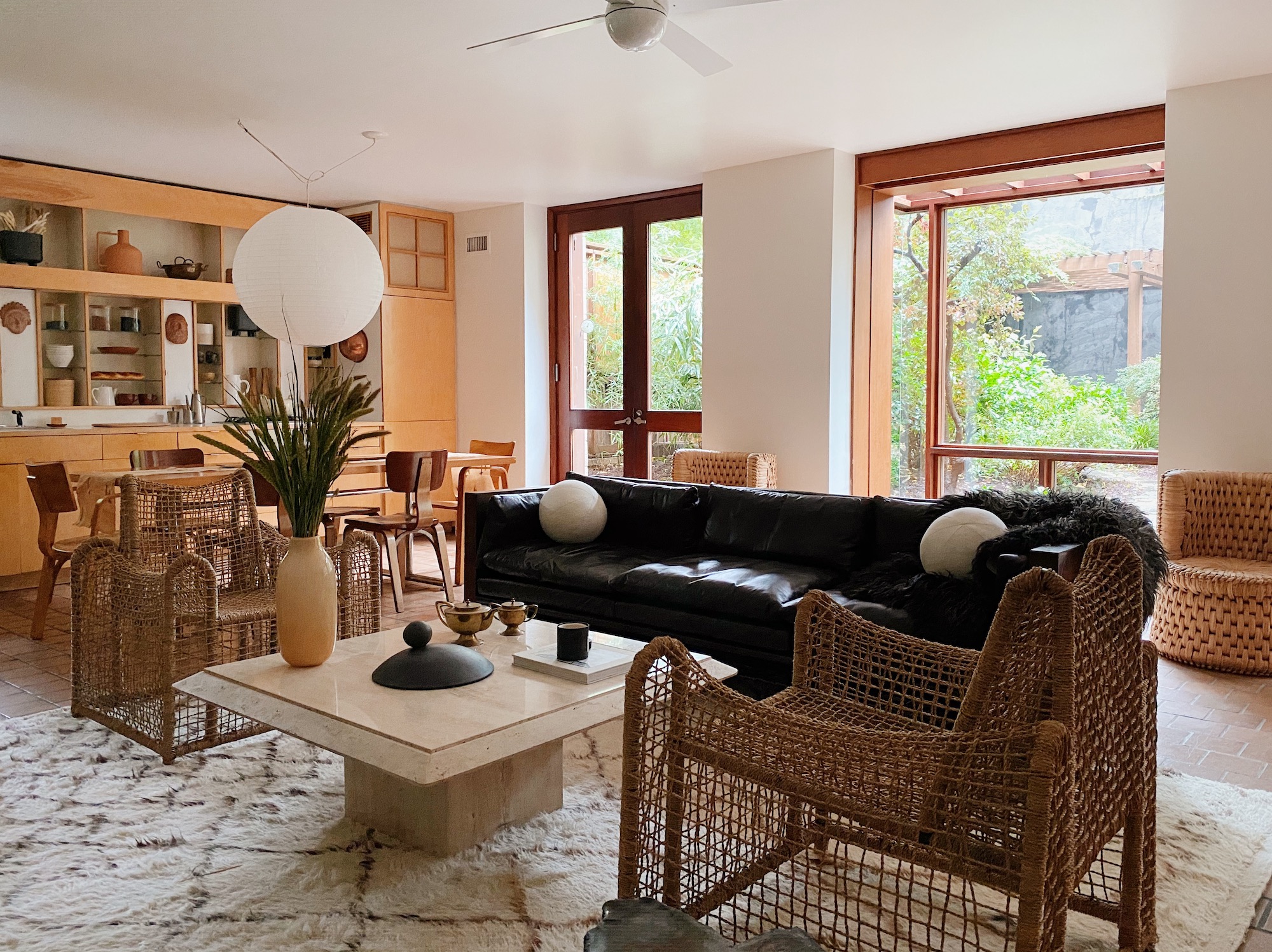
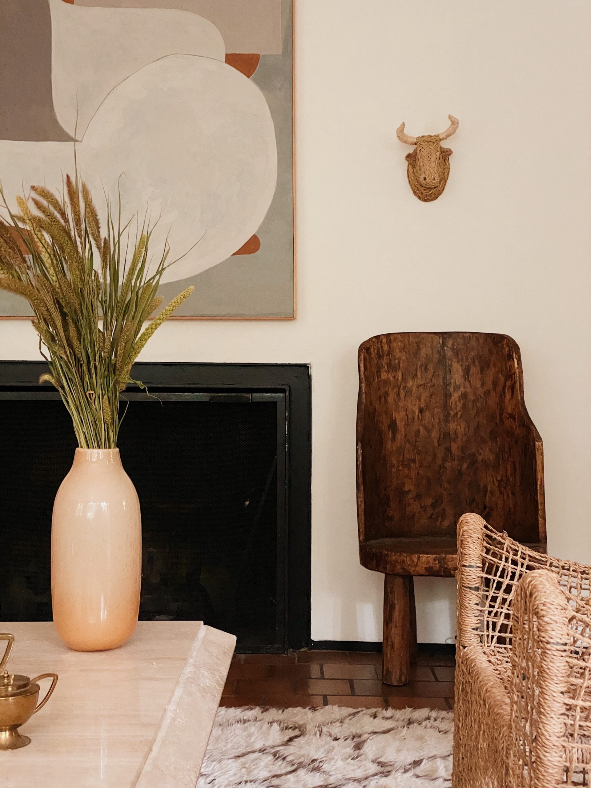
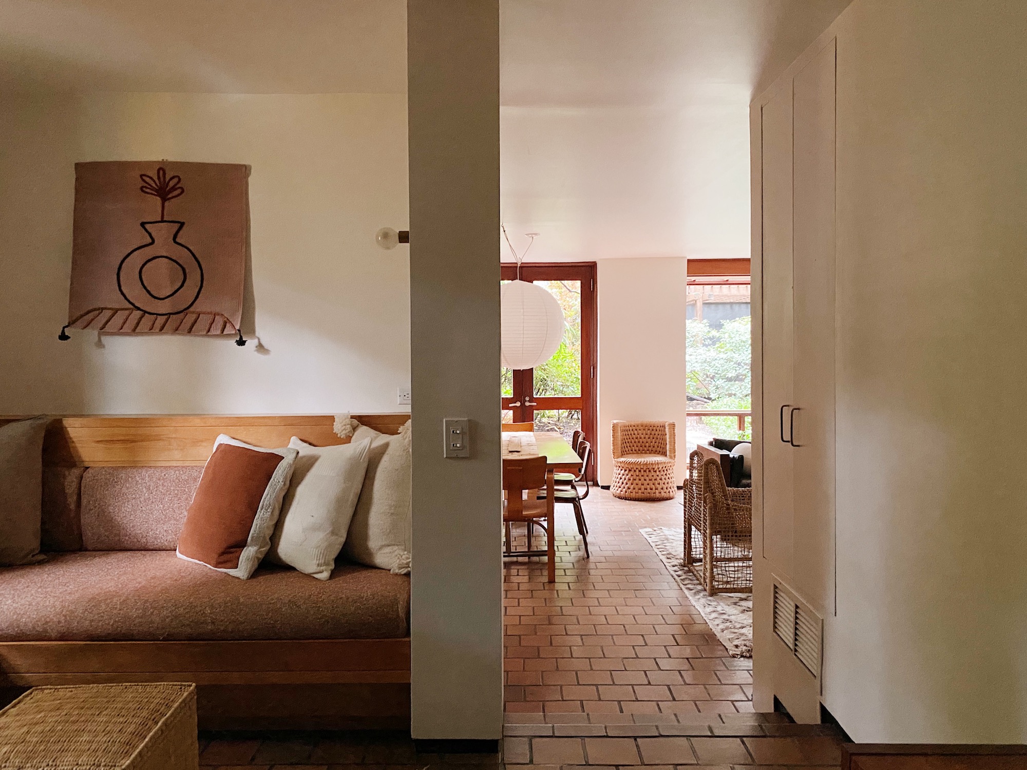
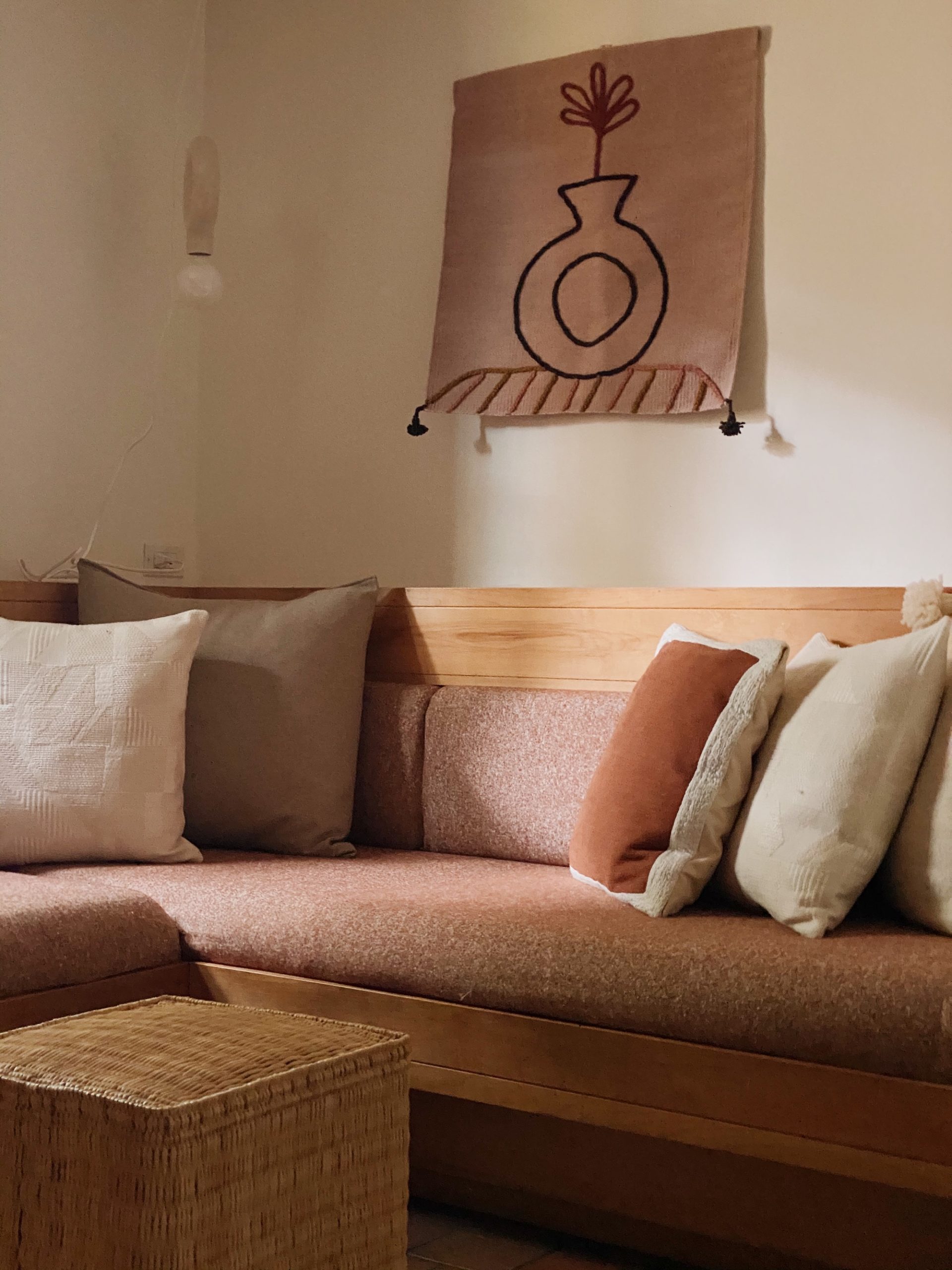
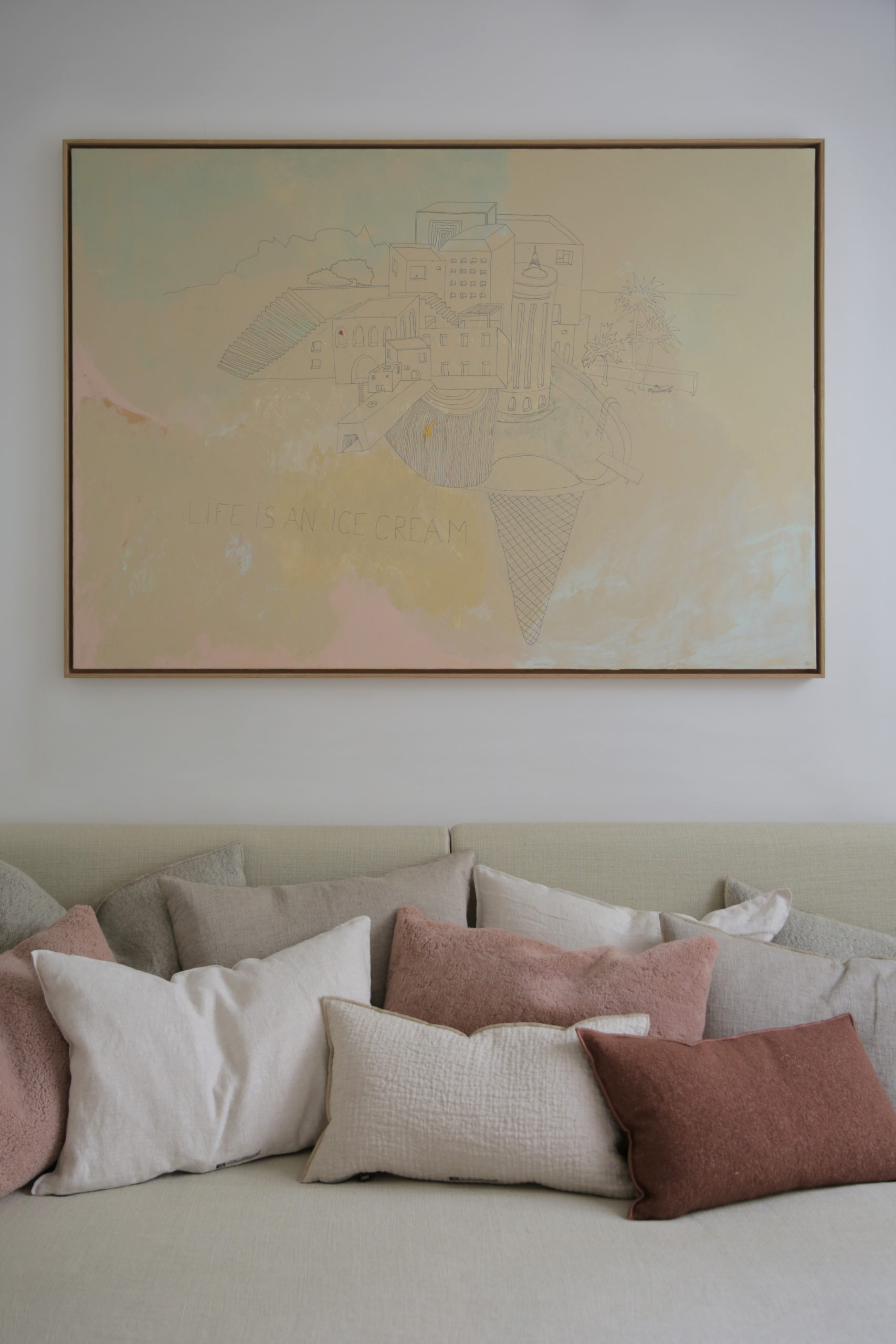
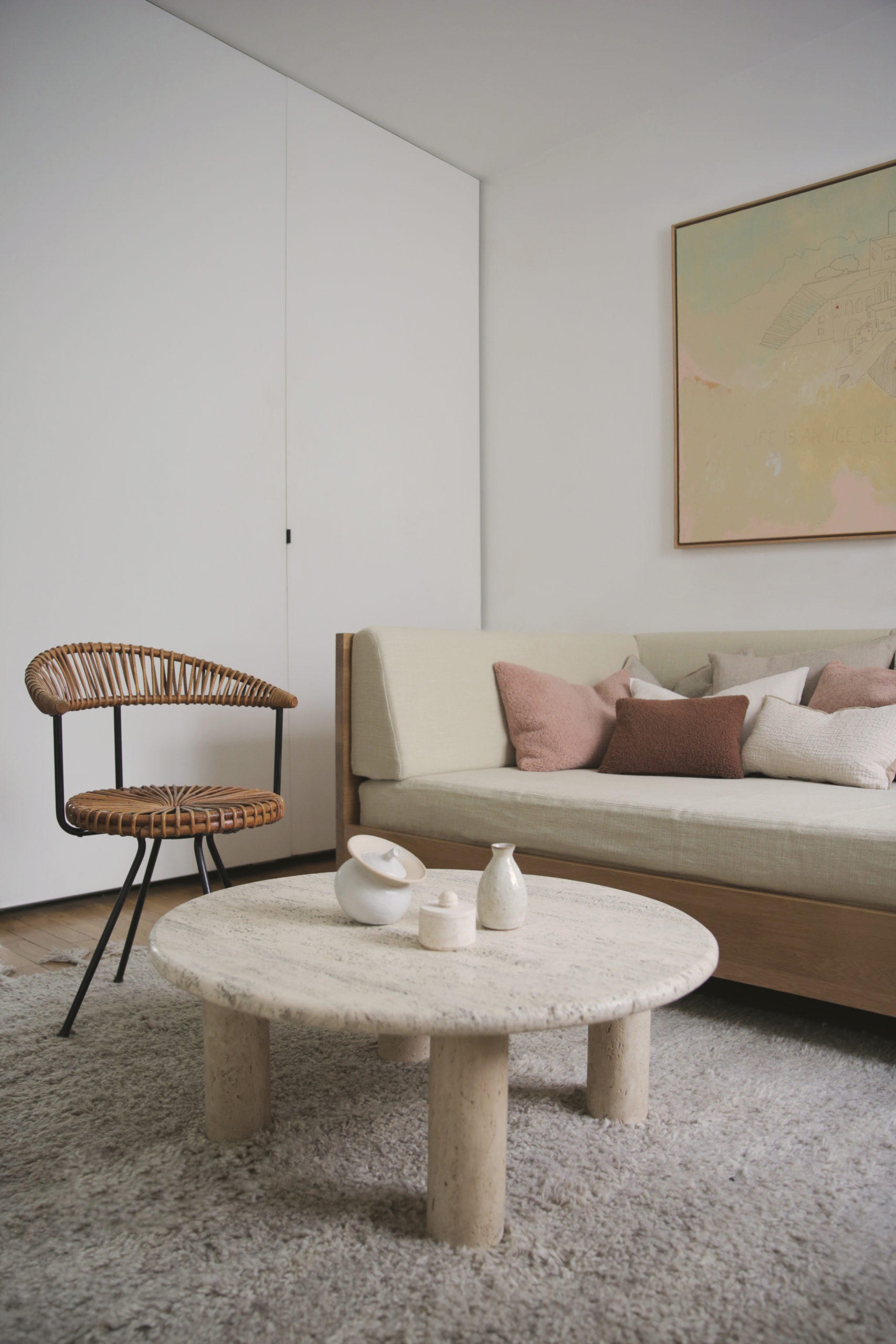
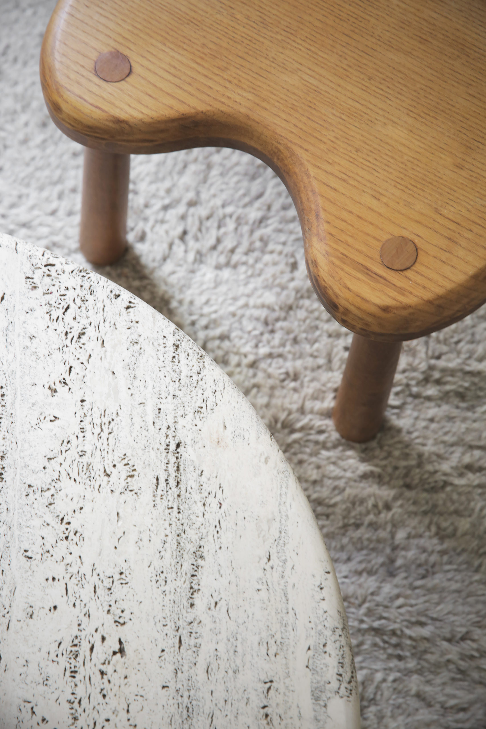
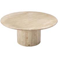
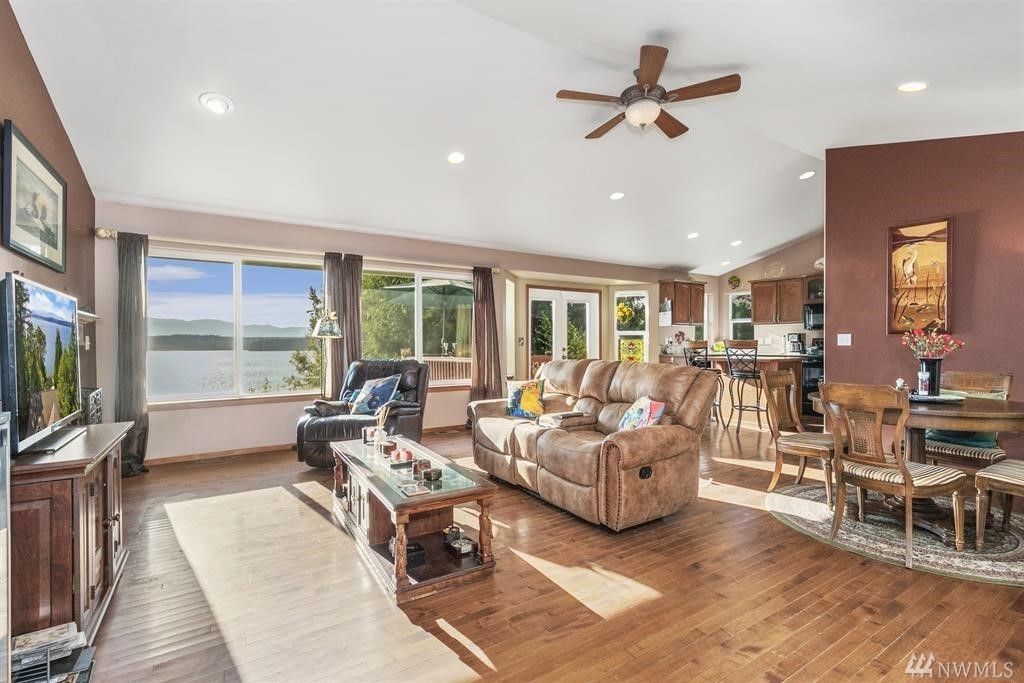
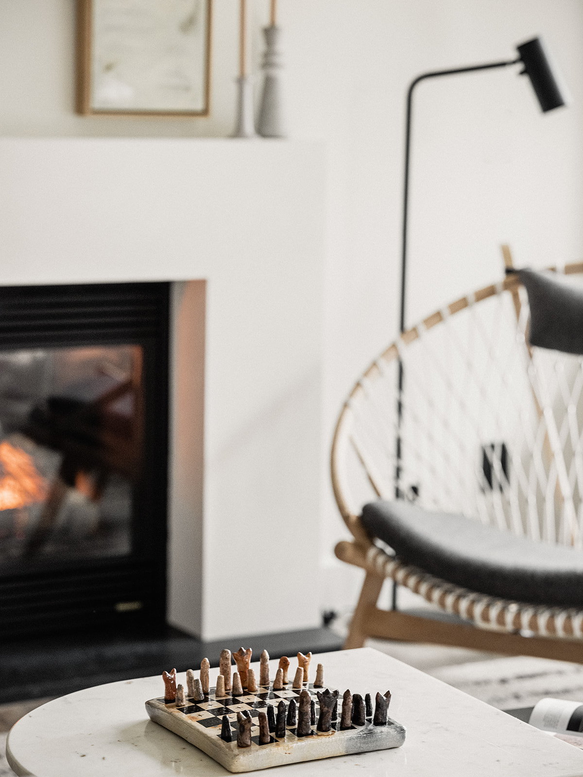
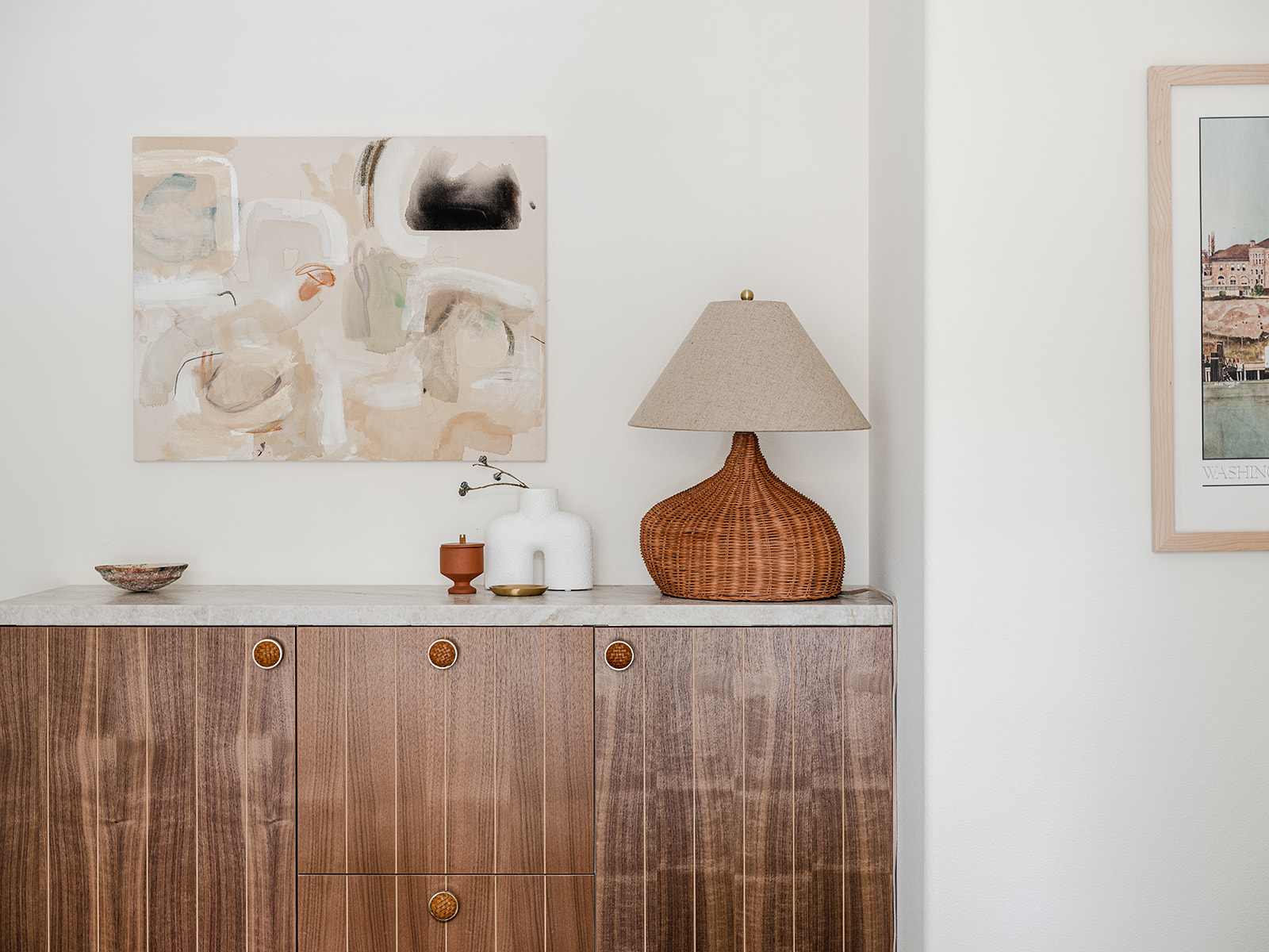
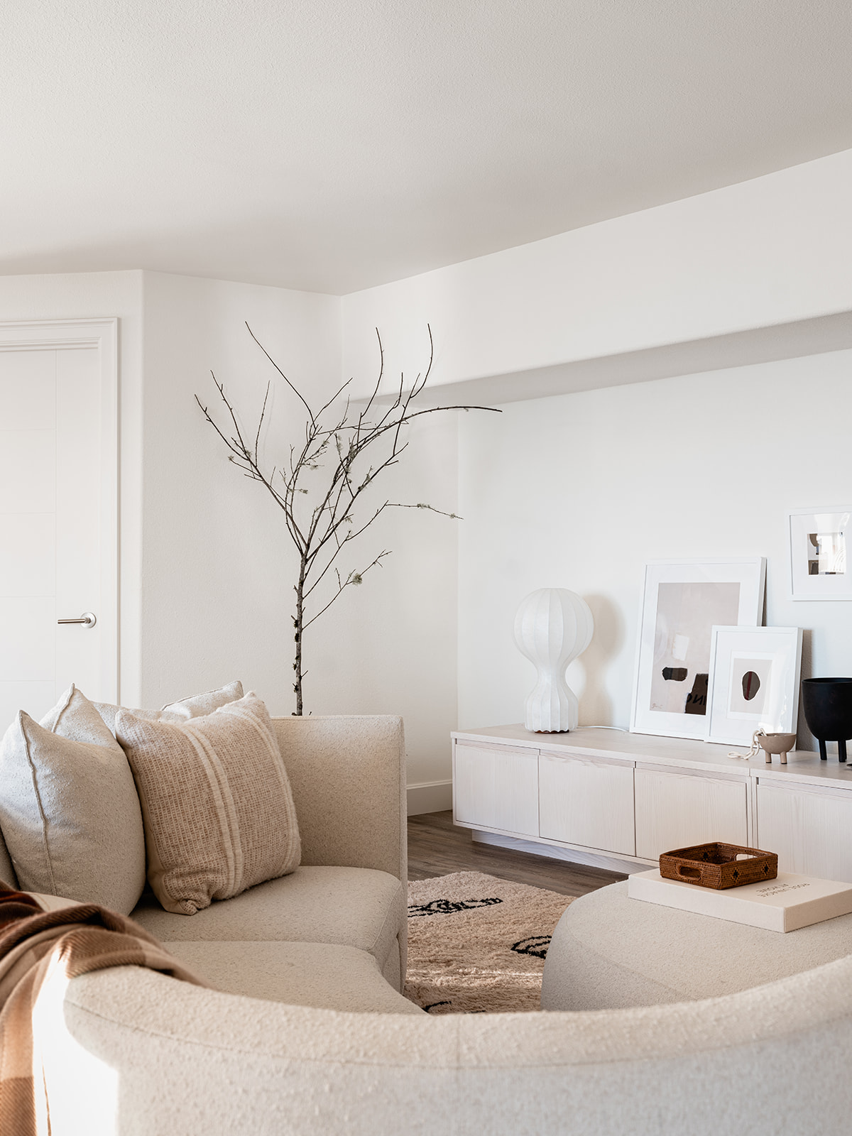
The Hood Canal Cottage living room is meant for enjoying the view – however you prefer to do that. Sitting by the fire, watching the sun set behind the Olympic mountains, burying your nose in a good book or enjoying your favorite glass of wine. I wanted this room to wrap you in a sense of serenity. I tapped one of my go-to resources to achieve the look – the couch, rug, coffee table and sideboard are all from Lulu & Georgia. You can always head there and find a gem.
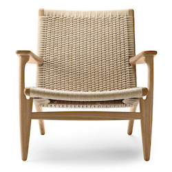
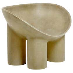
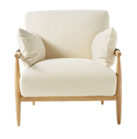
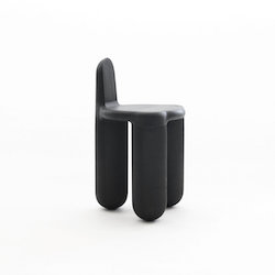
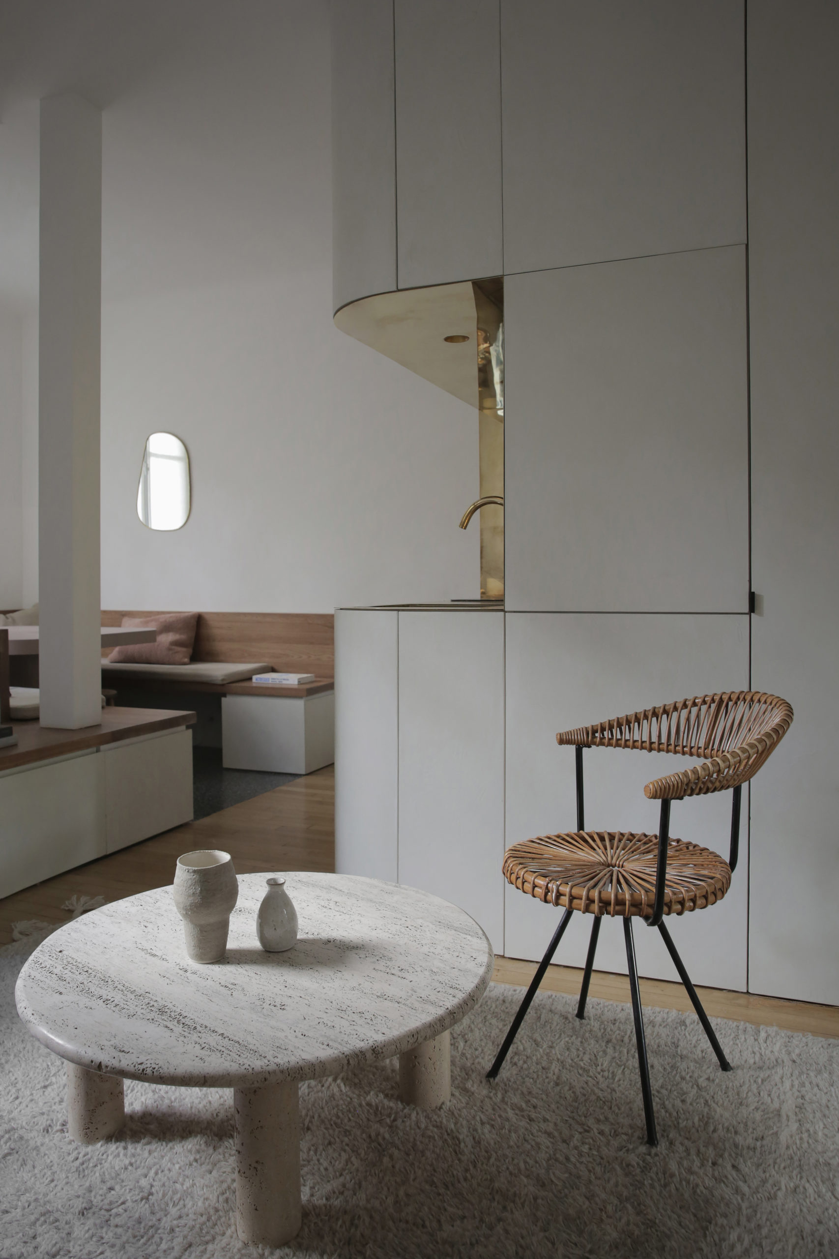
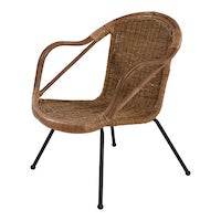
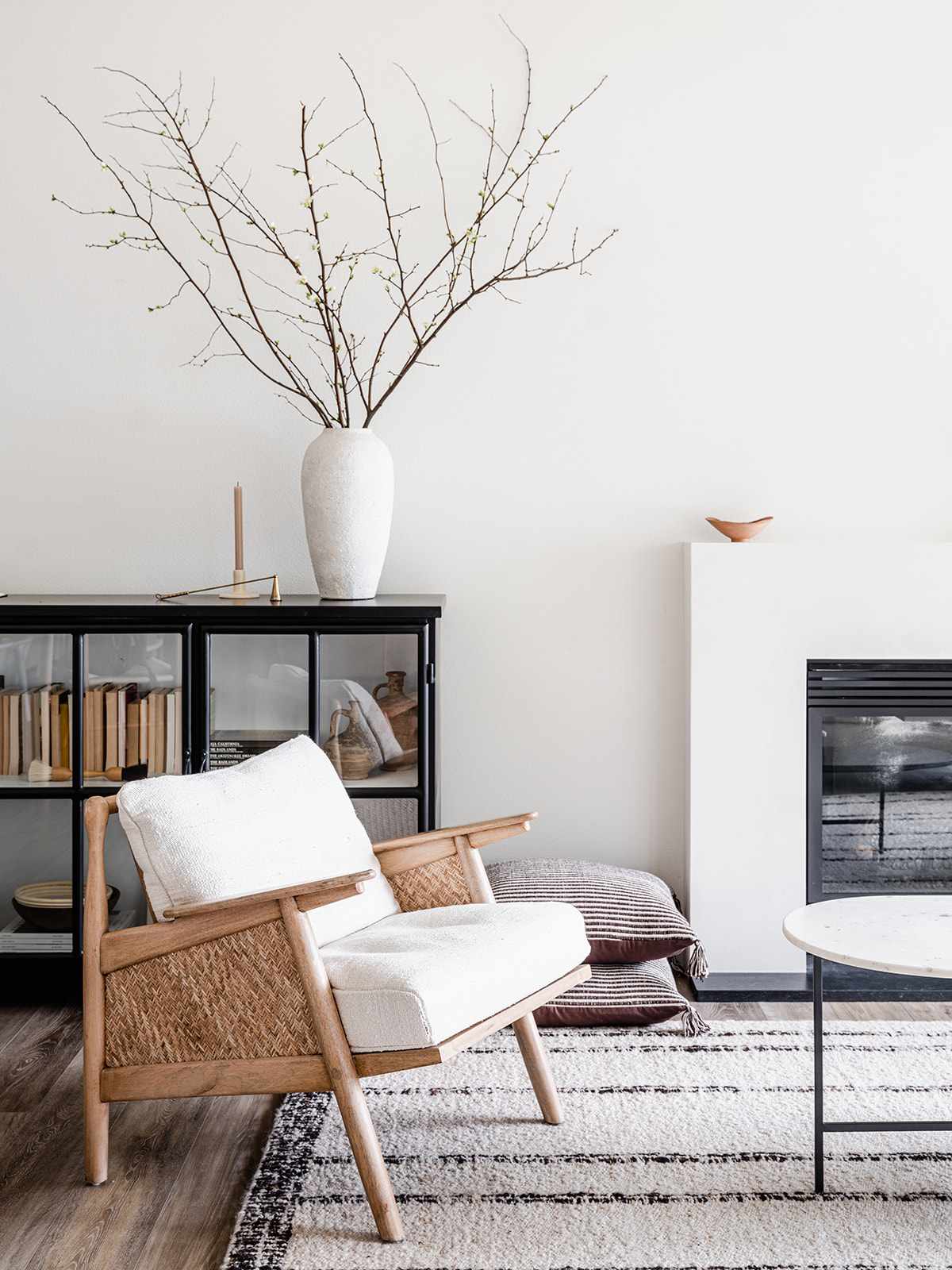
I’m also always a sucker for really good chairs – I see them as the jewelry for a room and the Circle Chair from Eternity Modern is certainly that for this space. It was actually the first piece of furniture I selected for the entire room – the rest of my design was really built around the Circle chair.
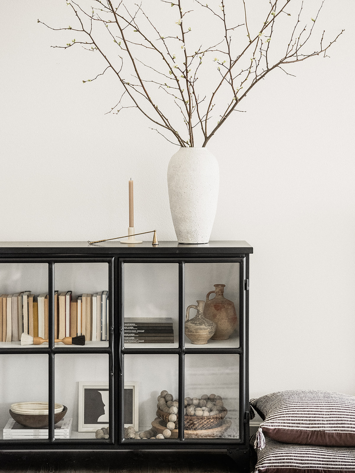
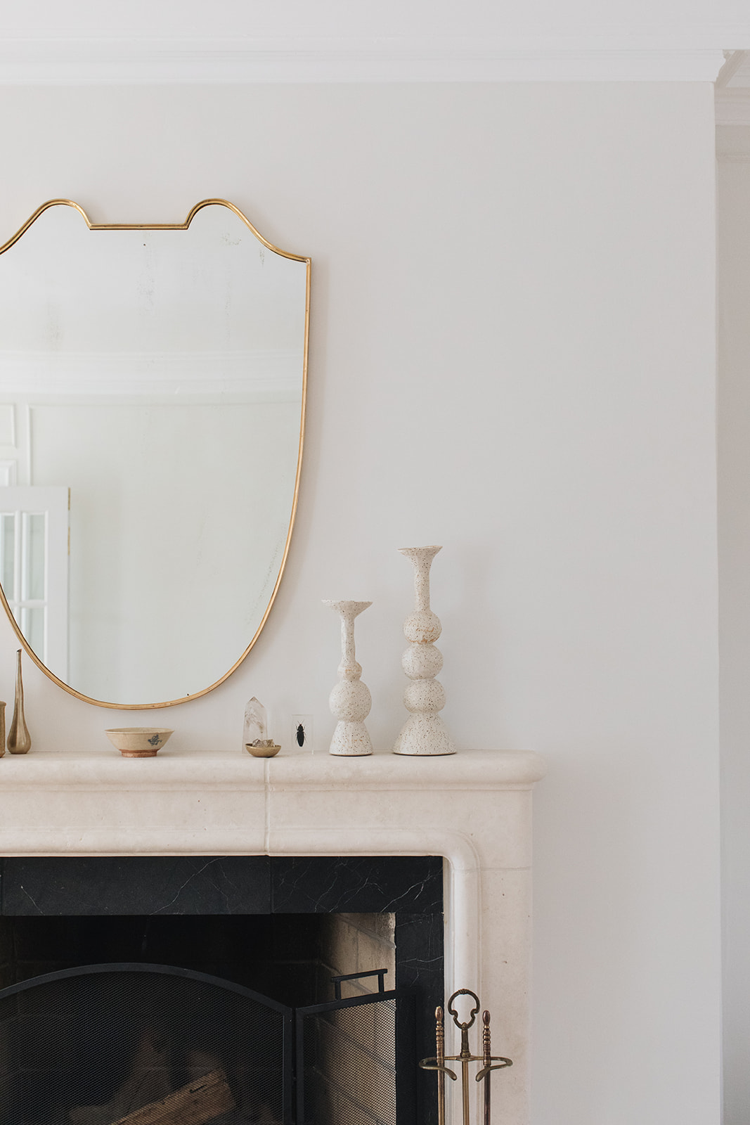
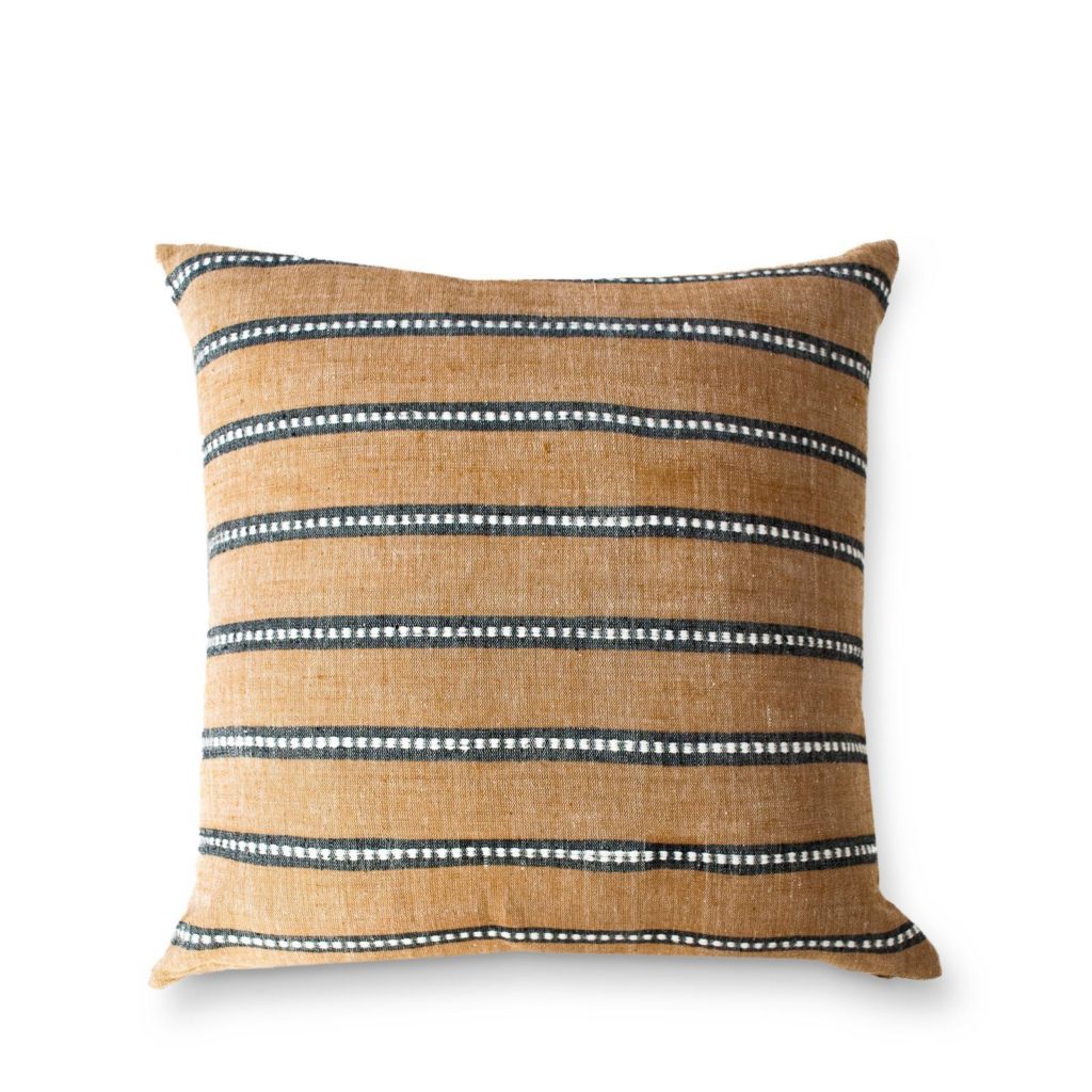
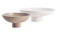
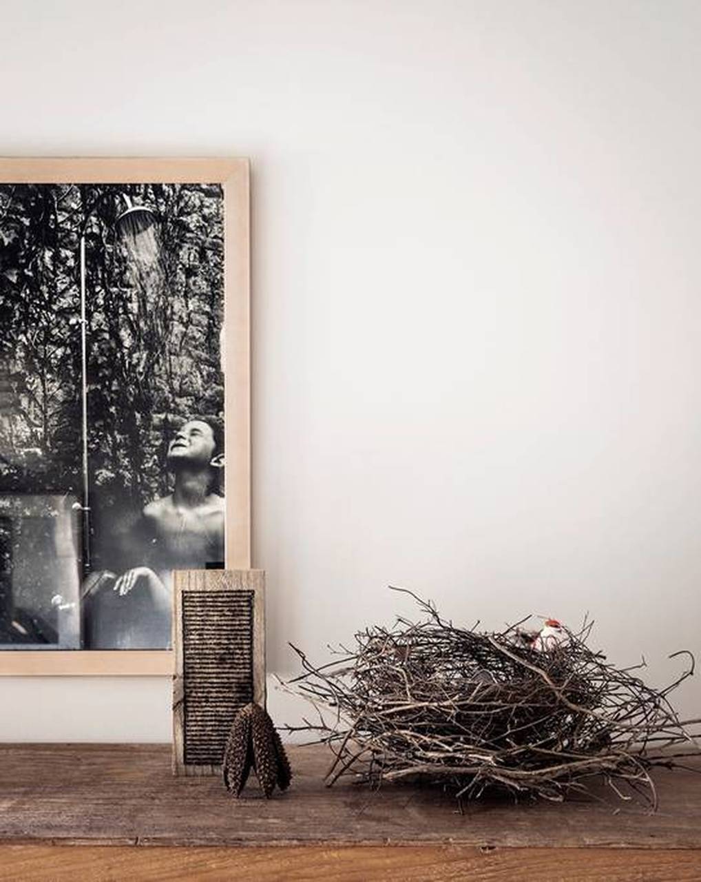
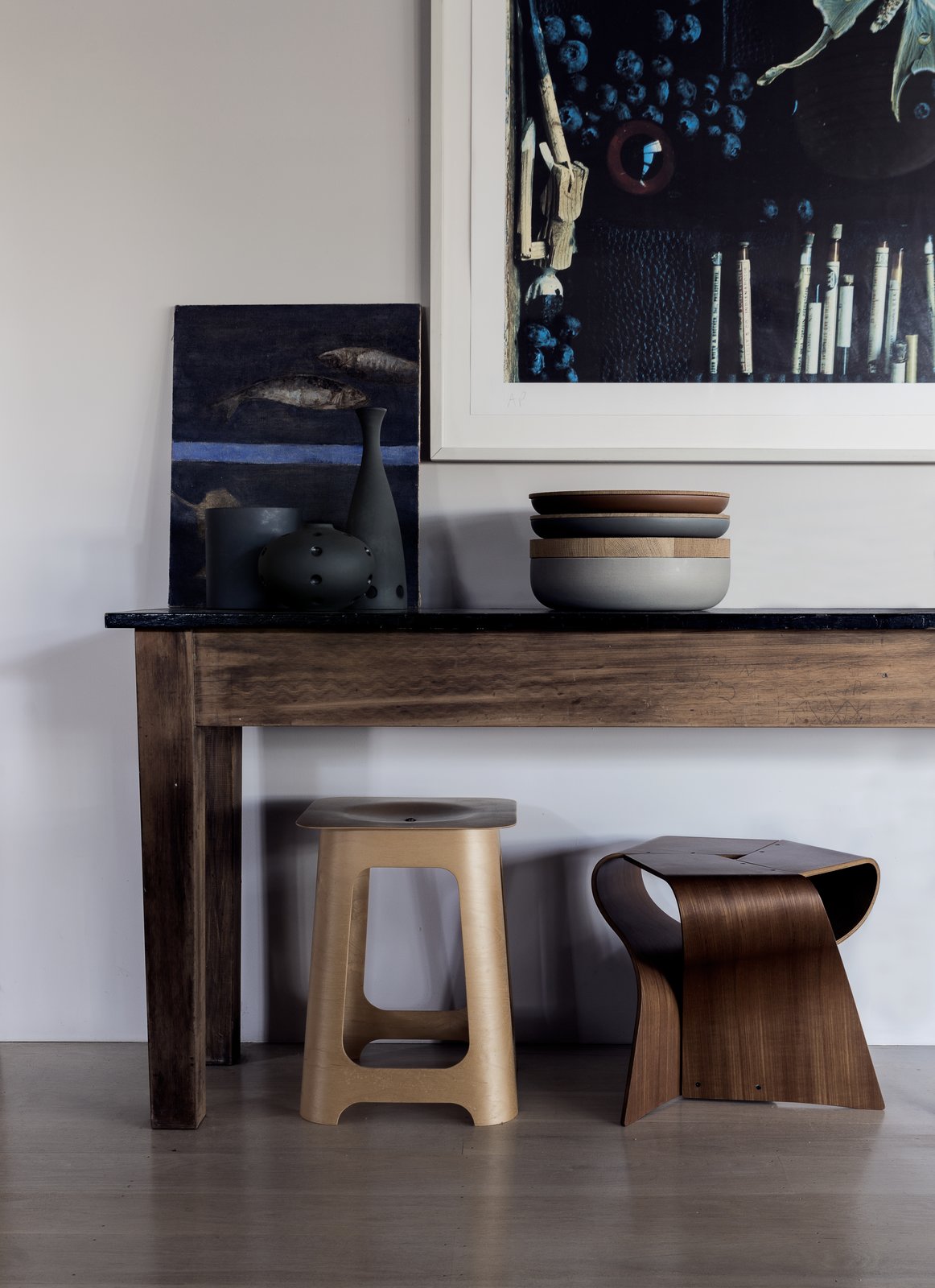
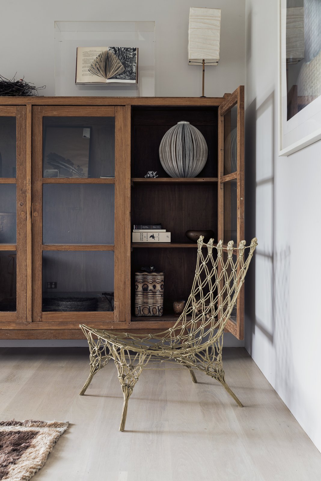
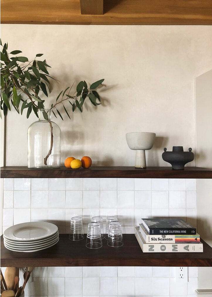
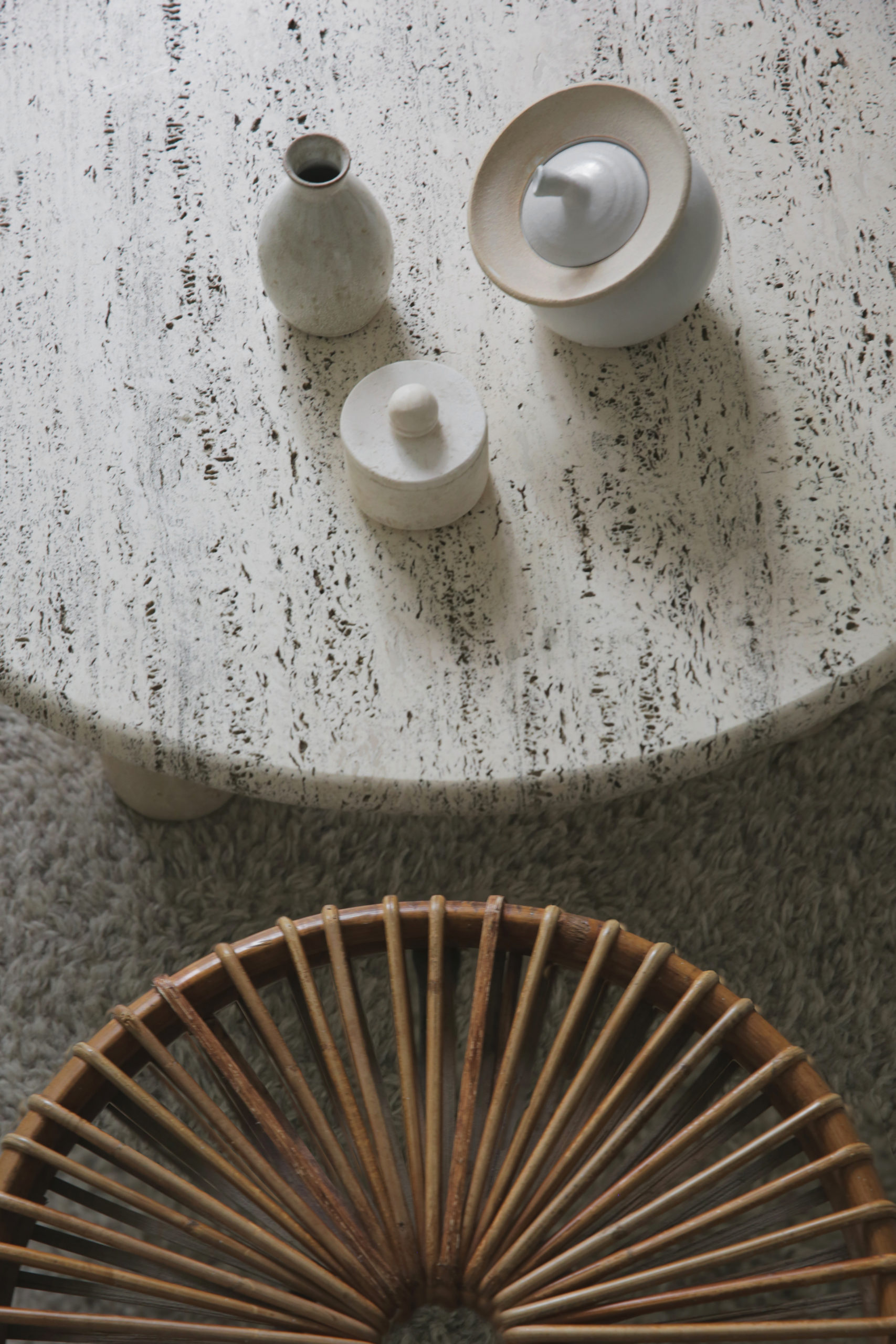
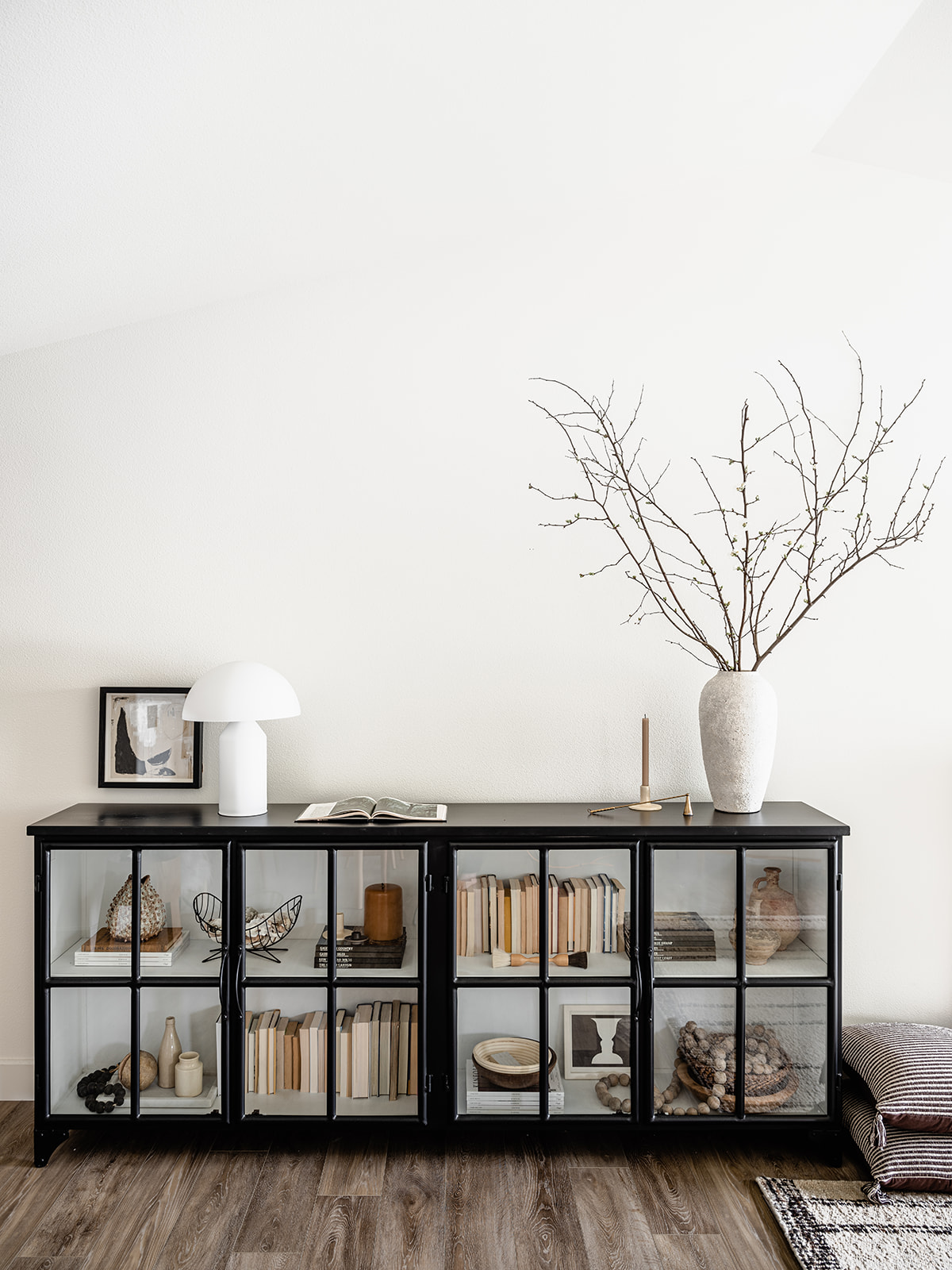
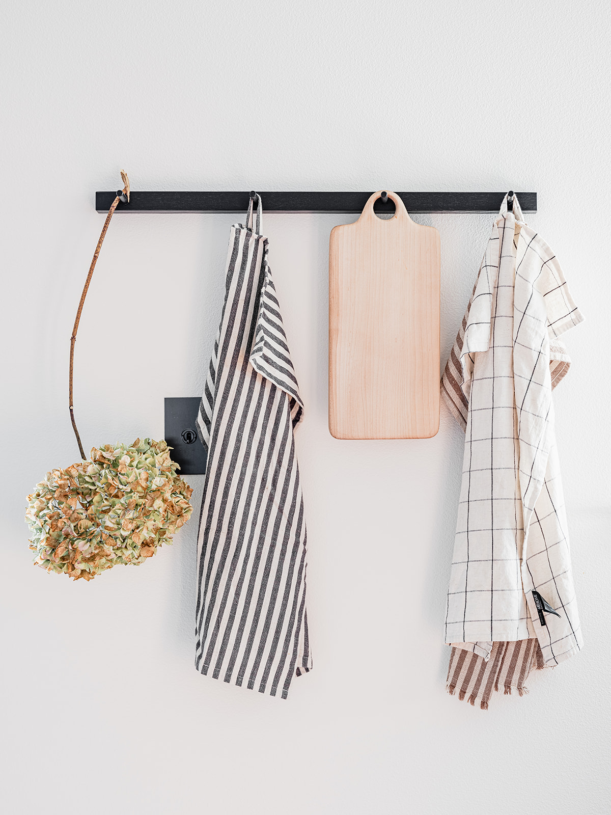
Accessories in the living room were kept monochromatic and to a minimum intentionally. The joy of being away from your day-to-day environment is to forget about the stuff – literal or figurative – that crams itself into our lives, so I really worked to keep this look as minimalistic as possible without skewing too modern. Stacks of my favorite design tomes and choice decorative pieces from friends, local shops like Shop Coco Kelley and Casa Patina, or artisans I work with regularly, help the space feel curated but also personal. The sideboard is full of used travel books and vintage bits and bobs I’ve collected over the years. I edited everything to stick to a singular color palette.
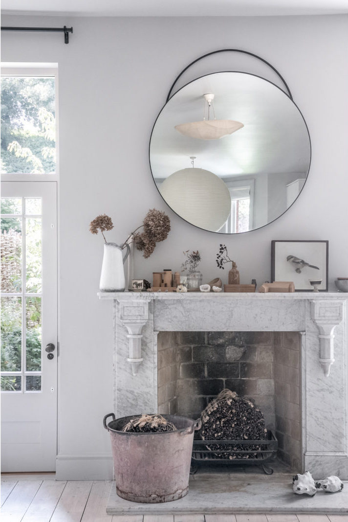
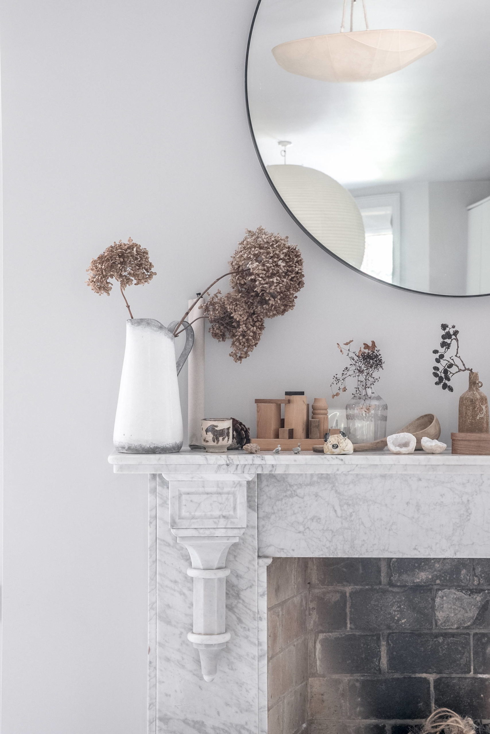
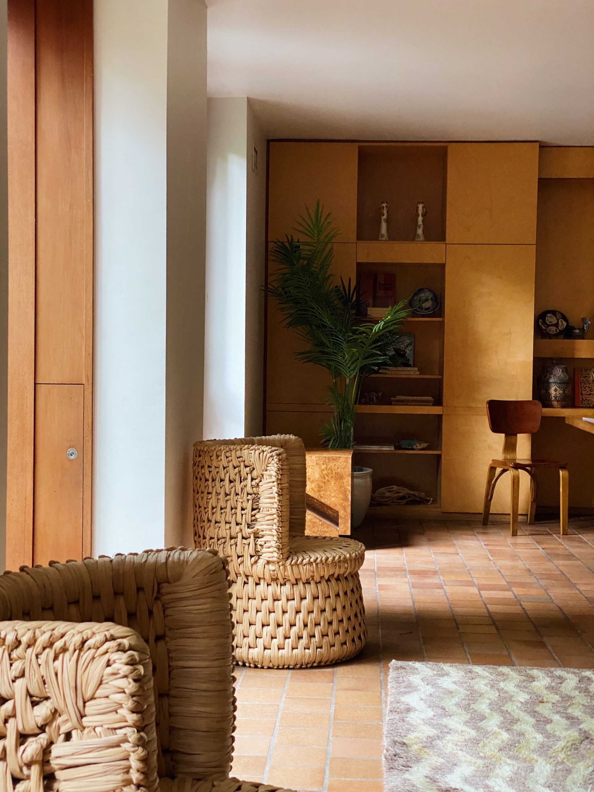
A few other details to call out – the whole room (and actually the entire house) is enveloped with Benjamin Moore’s Simply White on the walls, ceiling and trim in a nod to bright white Scandinavian homes. It’s also an antidote to the Seattle gray – it’s a thing. The idea for the house’s wide plank floors also came from my love of Scandinavian design. I was really happy with the warm wood tone. The flooring really grounds the space and helps play up the other natural wood elements dotted throughout the room.
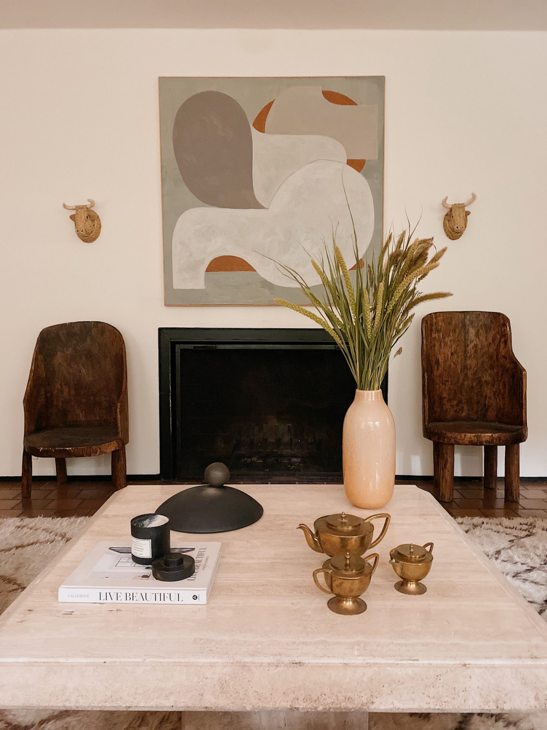
I even did a DIY in the living room! The fireplace mantel was a quick fix. I simply had my contractor build a box surround that I then lime washed with a lovely hue from Color Atelier to give it a little more depth and texture. The hearth is a remnant piece of countertop left over from the kitchen! Love little simple design wins like that.
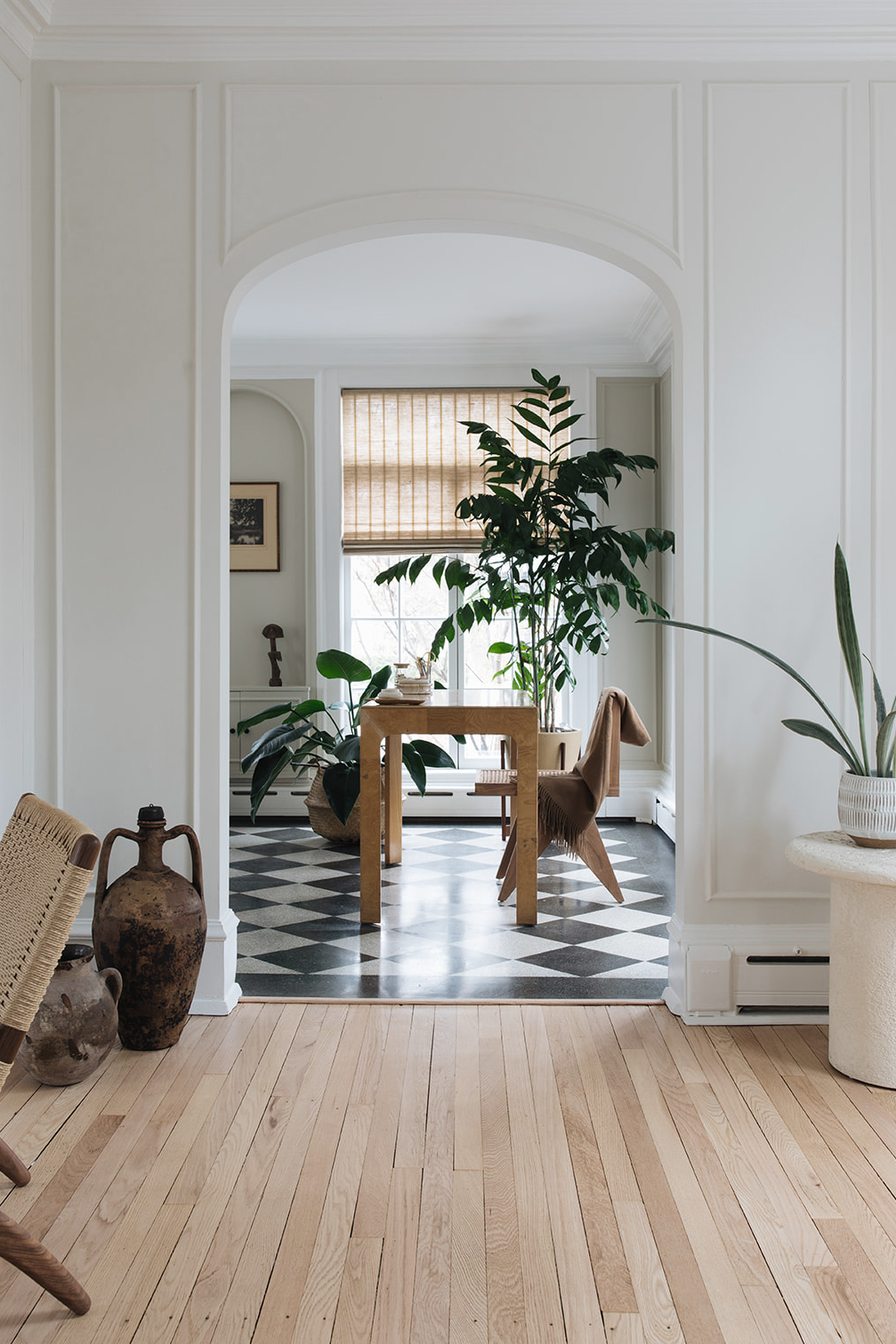
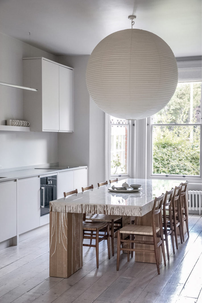
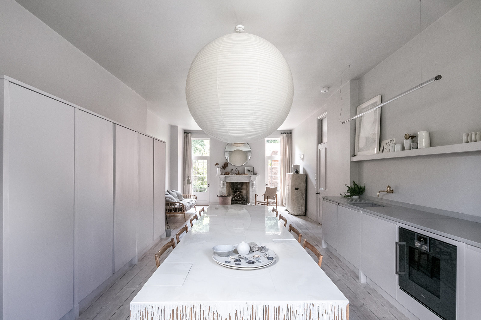
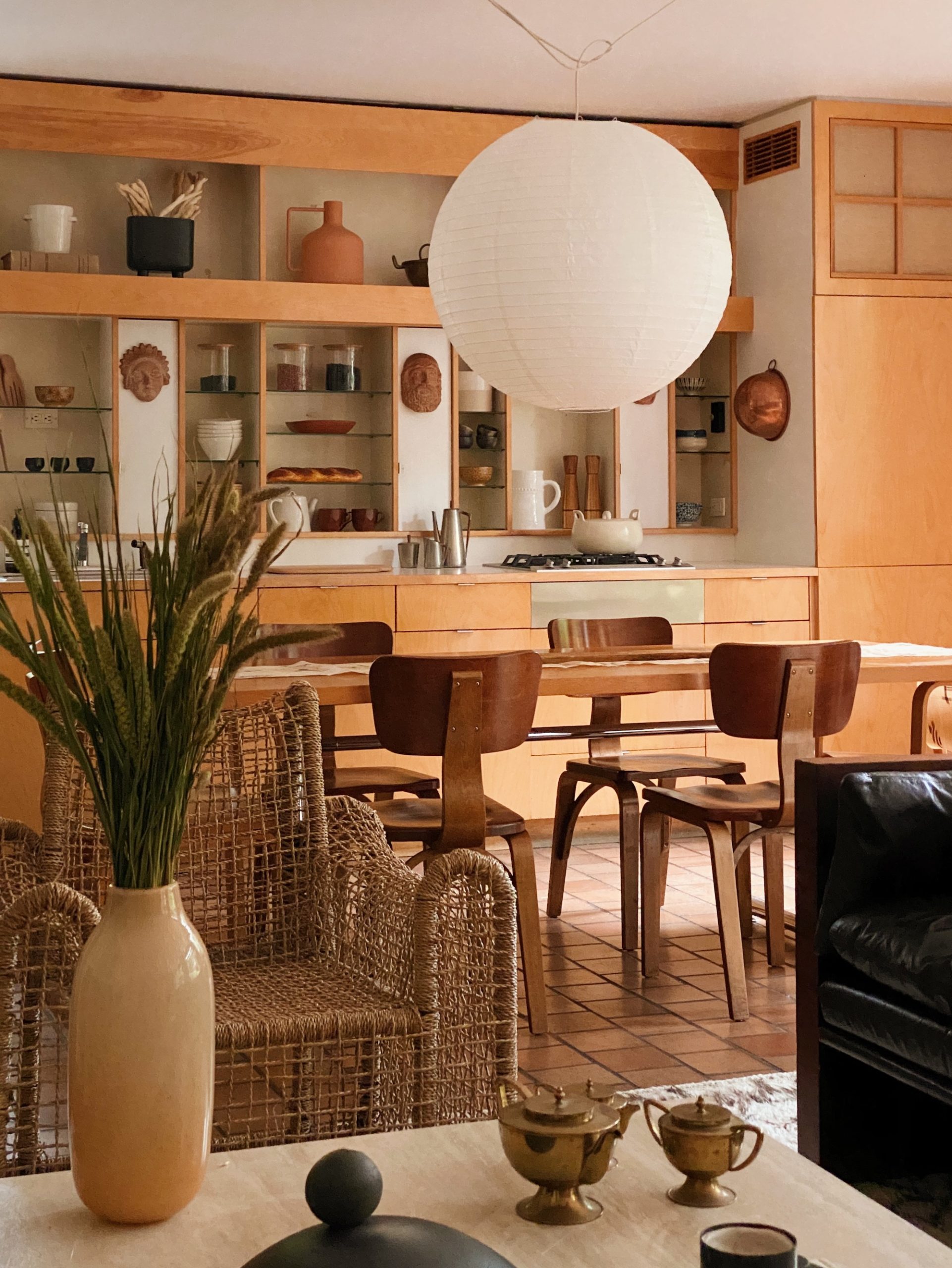
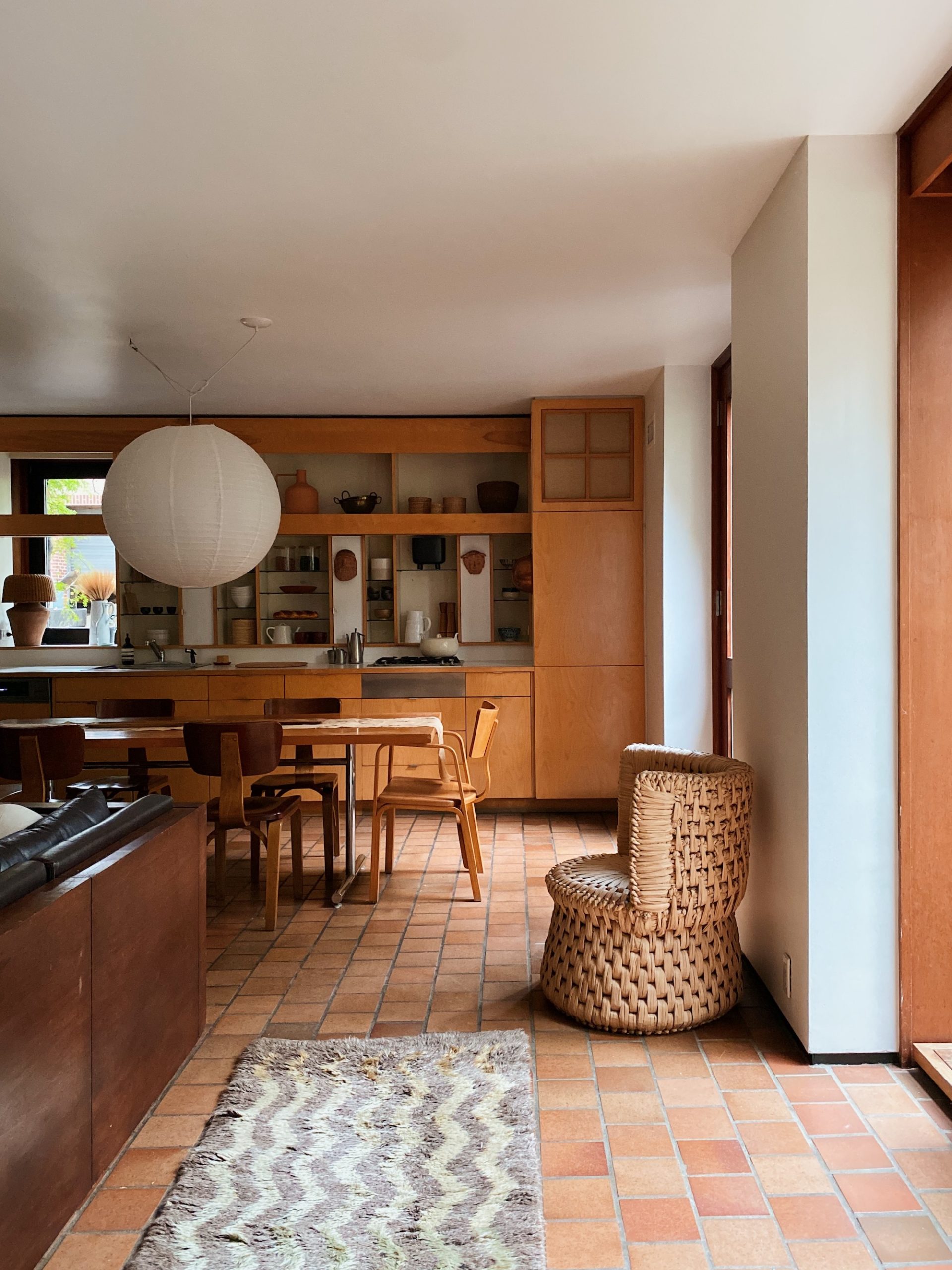
Now let’s turn our attention to the kitchen, shall we. If you’re standing in the living room and turn 180 degrees you look right at the house’s kitchen- which is a complete 180 from where the space began!
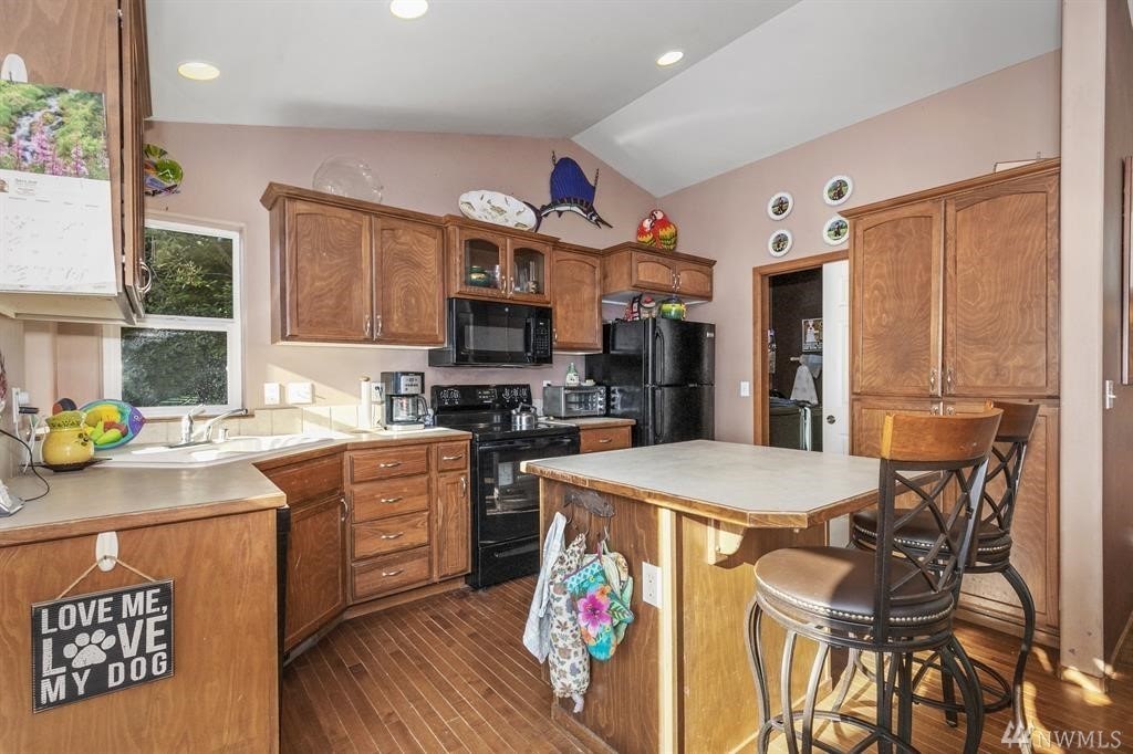
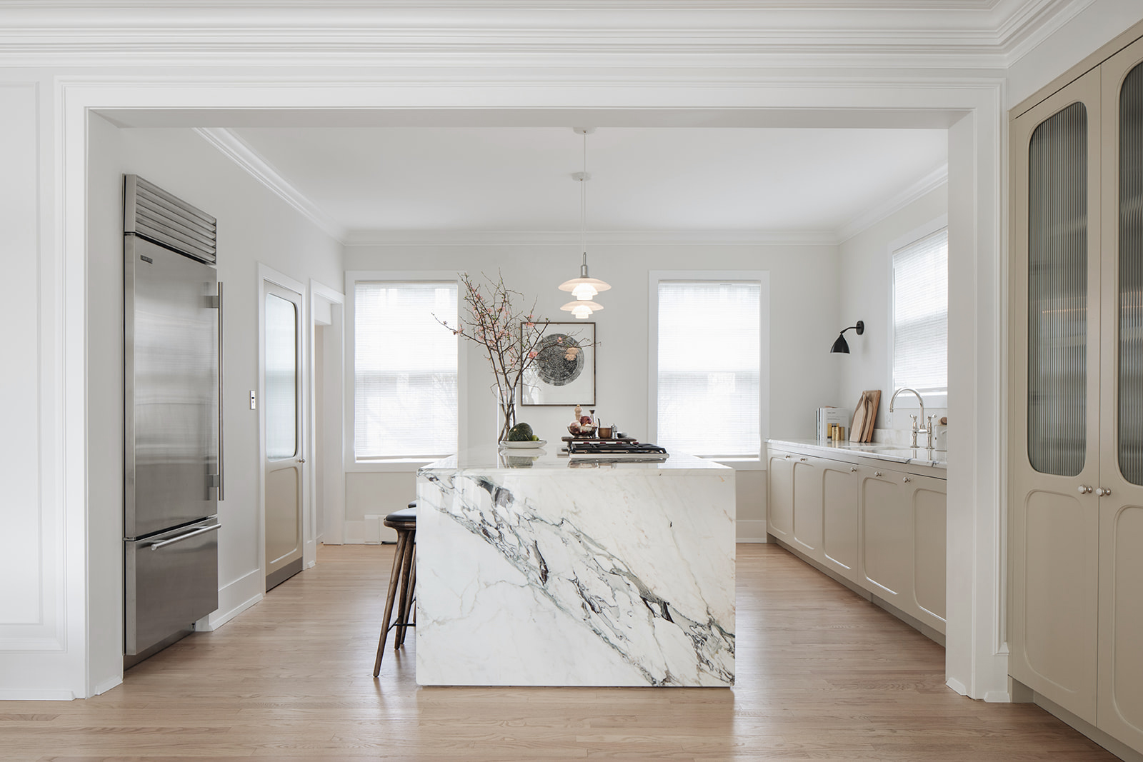
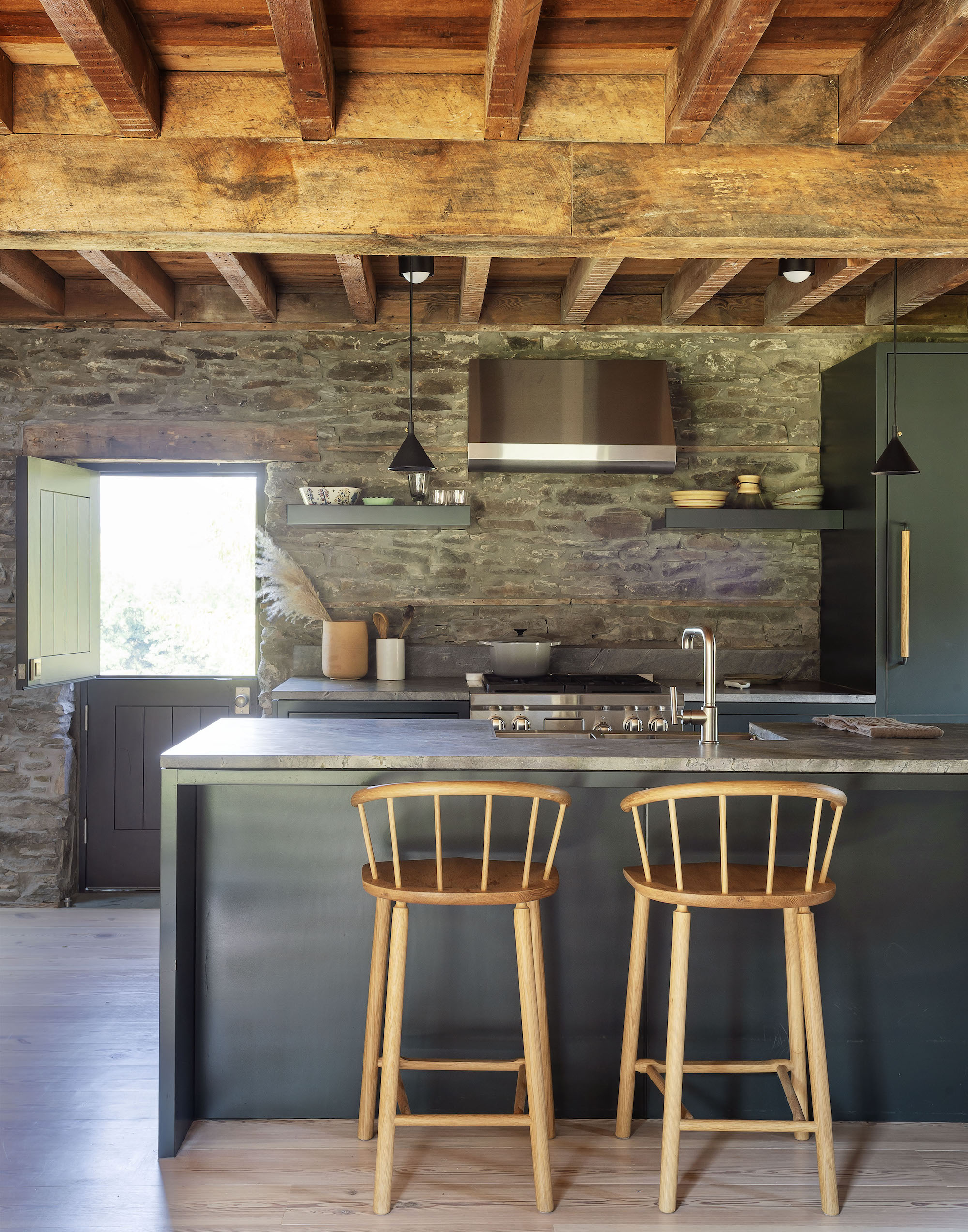
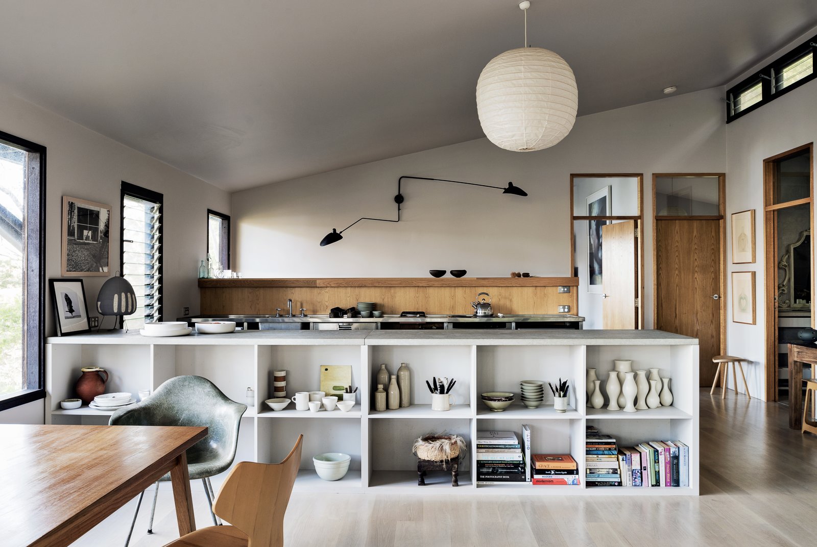
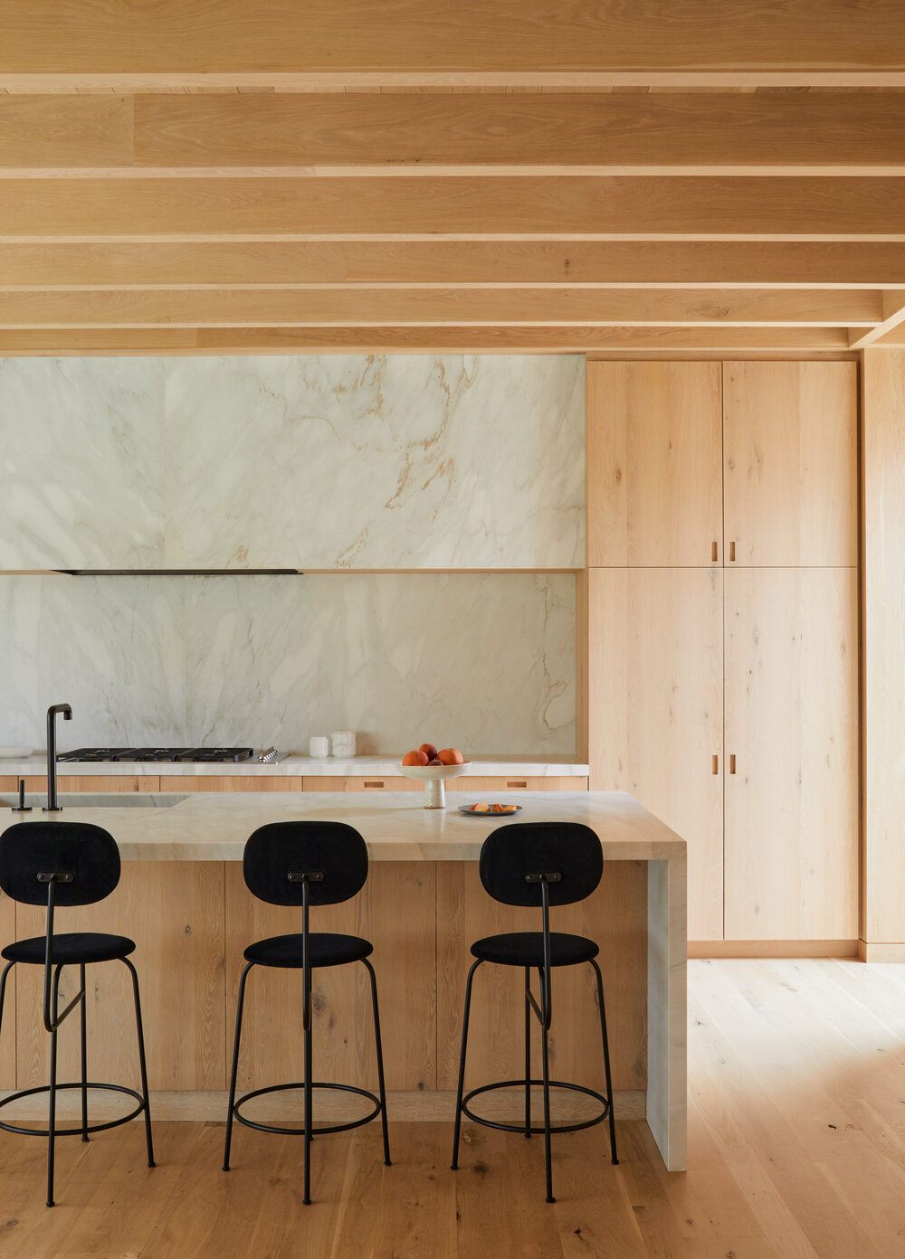
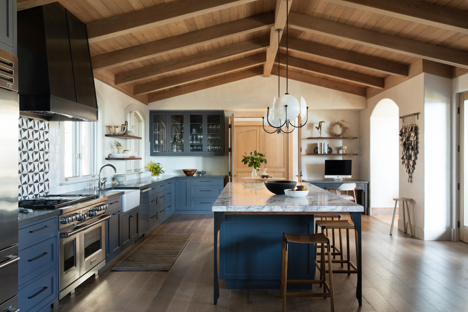
I have a major kitchen obsession – I mean, don’t we all – and I really wanted to see my dream vision come to life in this space. The kitchen area was the one spot where I actually took down walls during the renovation. If you look closely at the before pictures you’ll notice that the original kitchen was much smaller. There was actually a 6’x6’ enclosed space in the right-hand corner of the room that housed the laundry, a sink and some random storage. But it took up serious real estate and also broke up the only interesting architectural detail of the whole house – the vaulted ceiling that runs the length of the main living area. As soon as I got confirmation those walls weren’t load bearing out they went – opening up a fully contiguous living, dining and kitchen space.
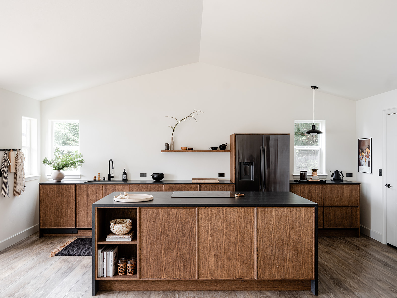
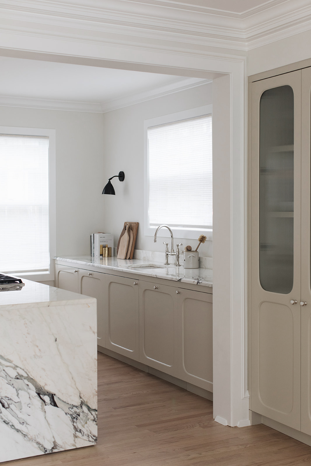
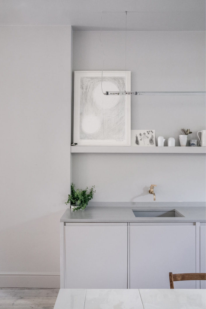
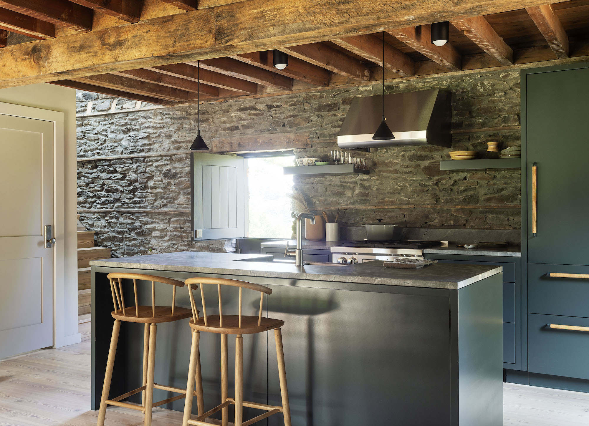
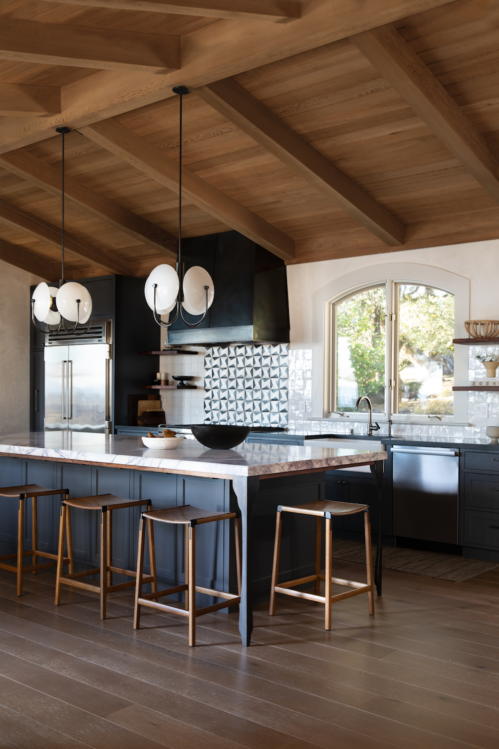
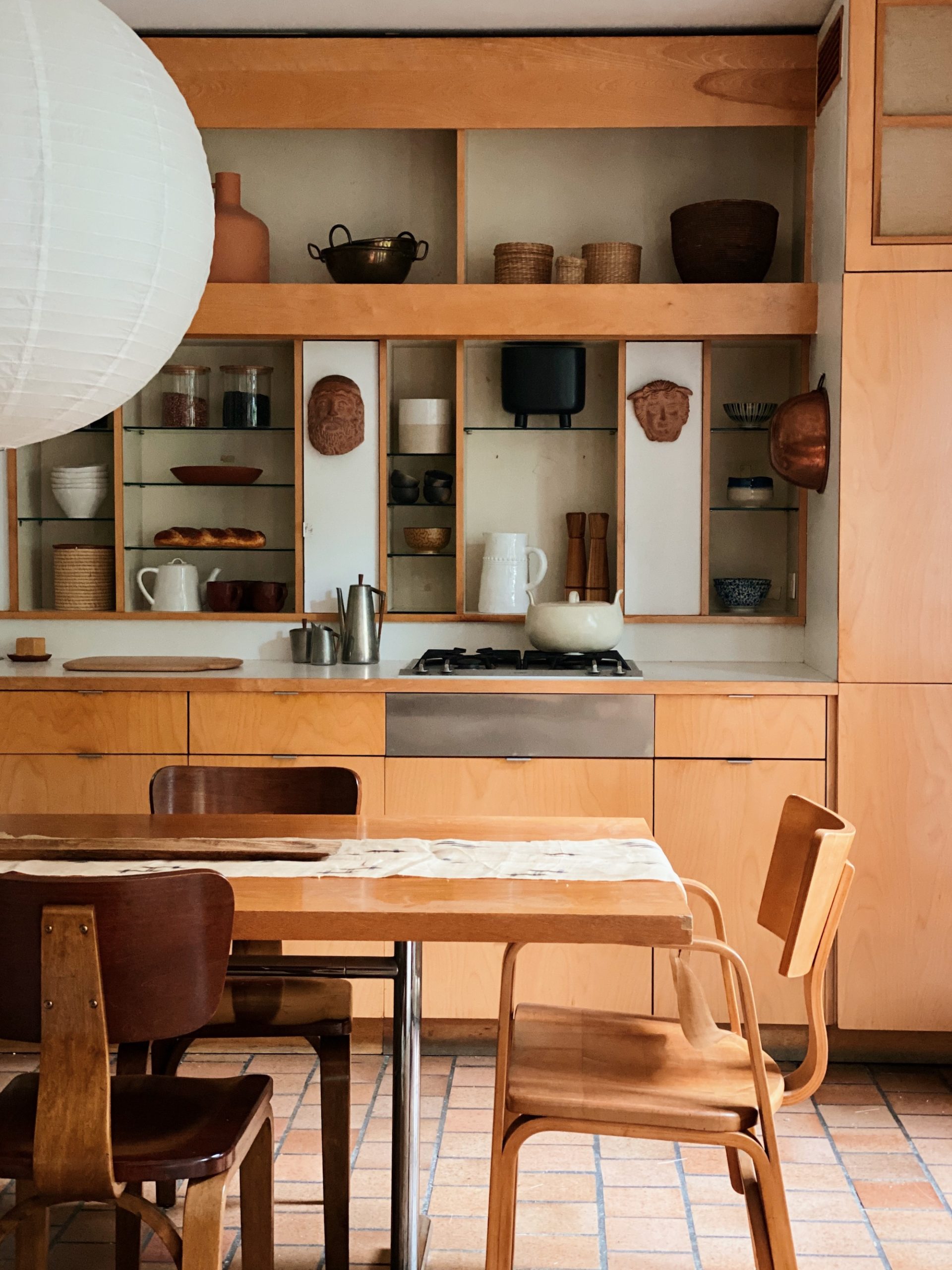
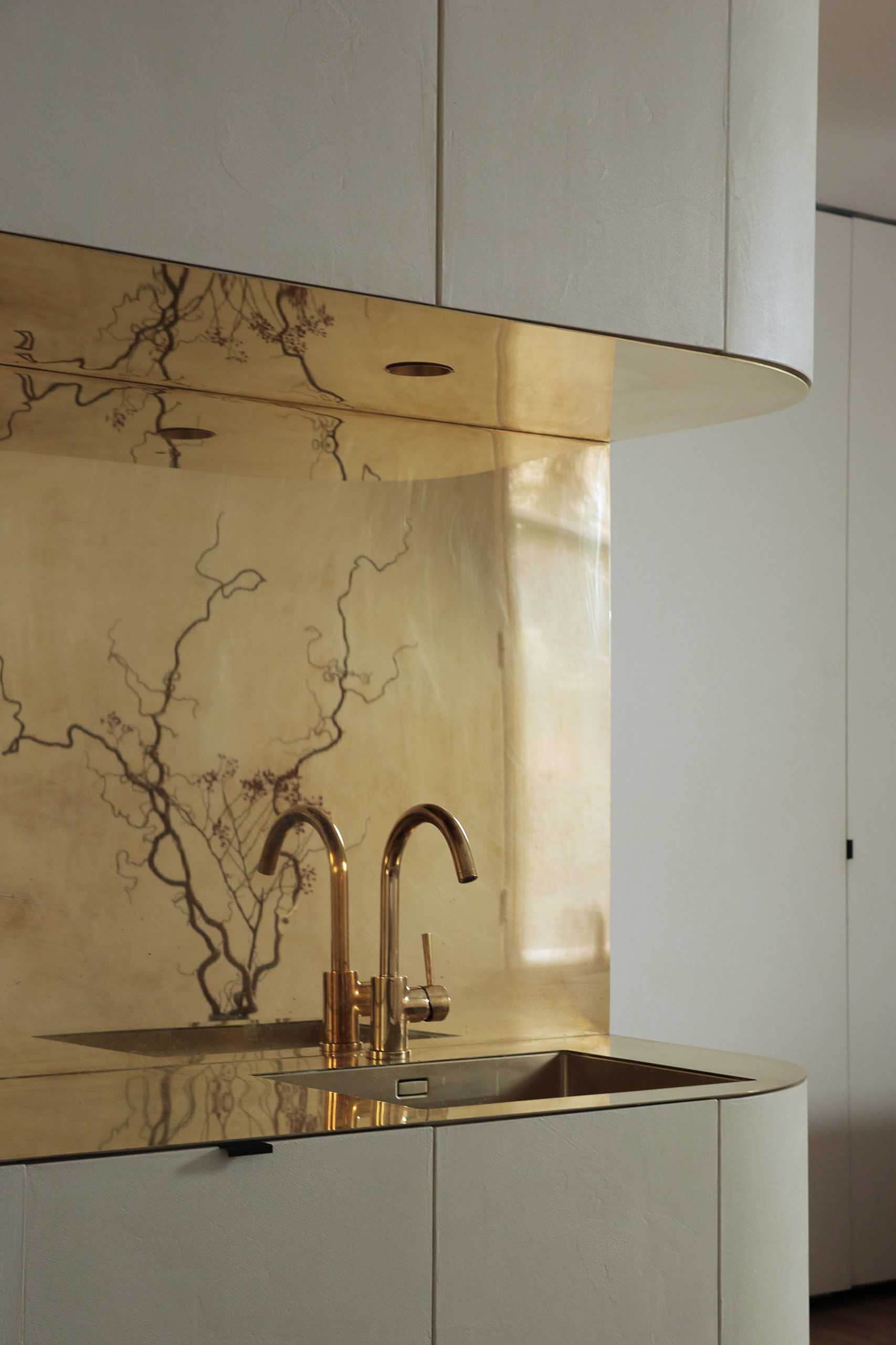
 Opening up the kitchen was the game changer and it allowed me to live out my dream – putting a Reform kitchen into a project! I had been fan-girling over Reform for years. They’re a kitchen company out of Denmark that started out making custom fronts for Ikea kitchen boxes. I love their elevated but minimal aesthetic. In the last couple of years Reform made the jump across the pond with showrooms in New York and LA. I’ve long been smitten with their Frame line of cabinets, designed by Note Design Studio – another favorite Scandinavian design house. That’s the kitchen cabinetry you see here. This collection is a set of Reform’s own entirely prefab kitchen cabinets and they are extraordinary. The quality is divine and my contractor could not stop raving about how easy they were to assemble and install.
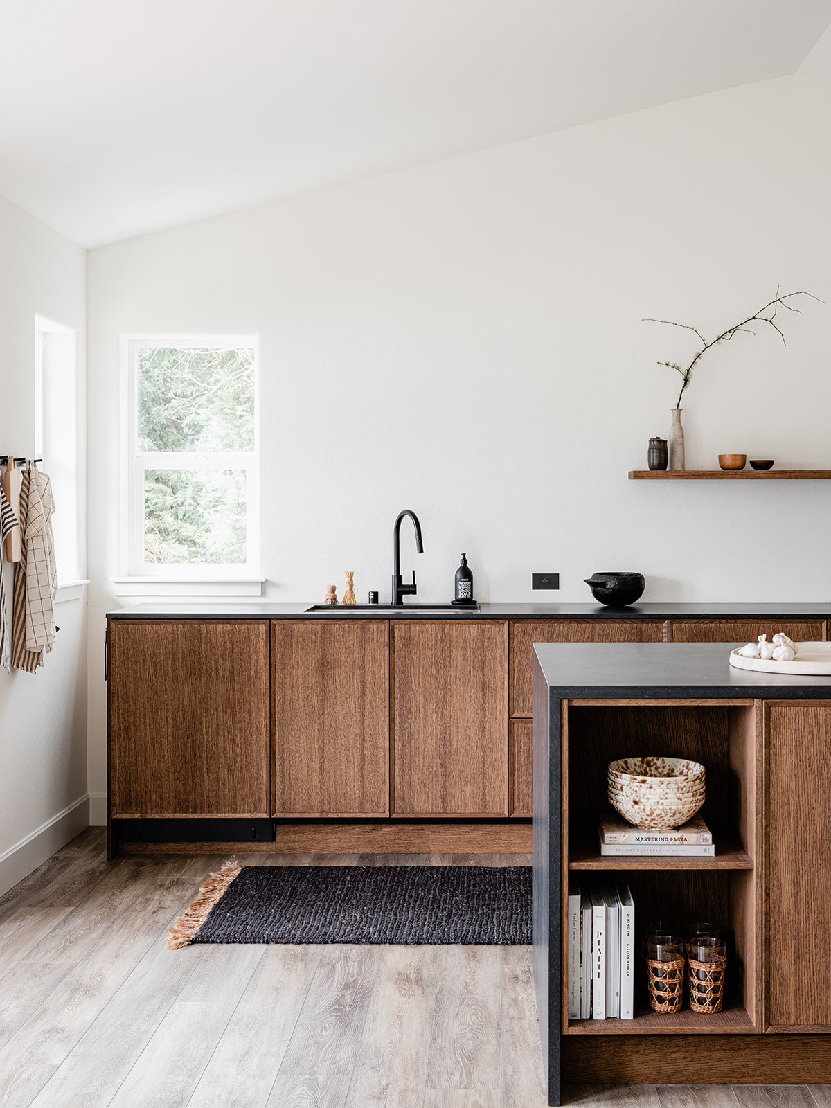
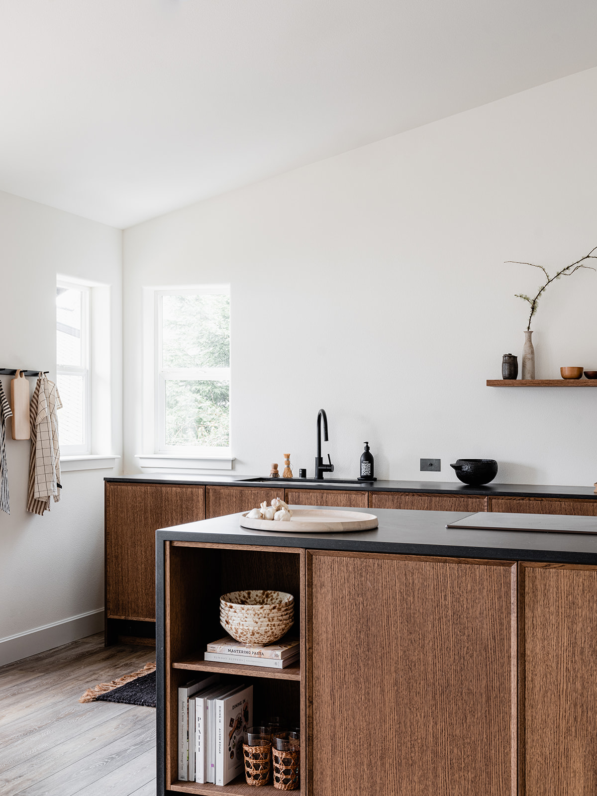
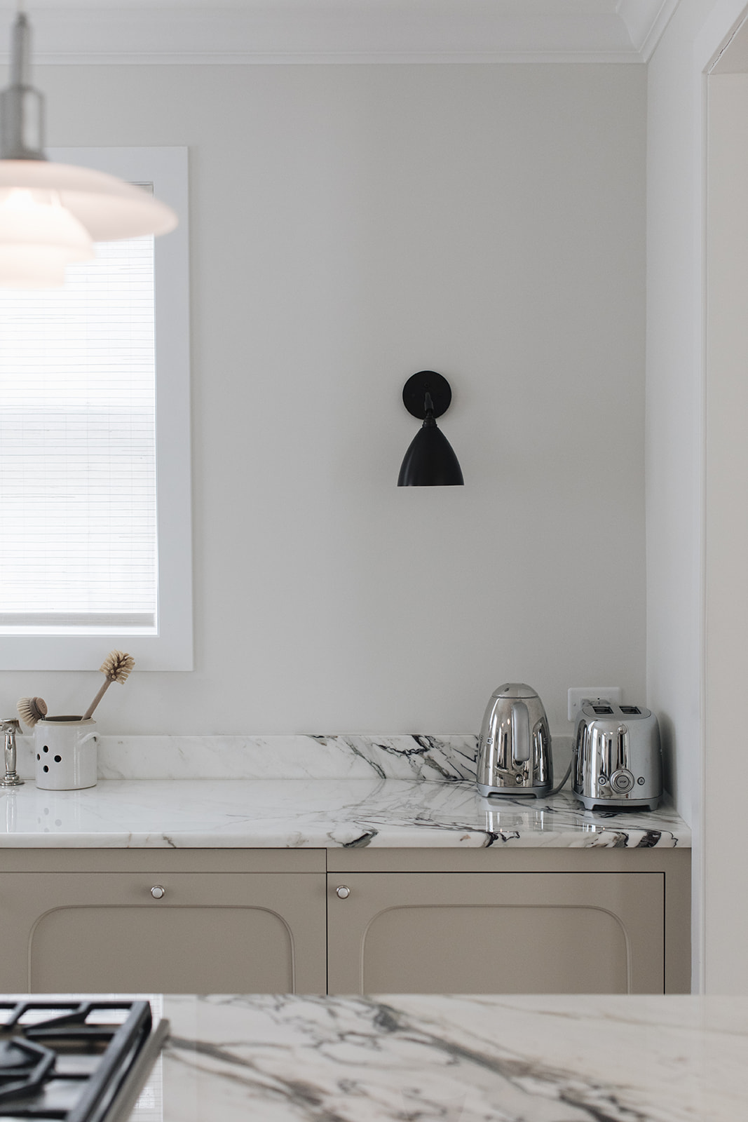
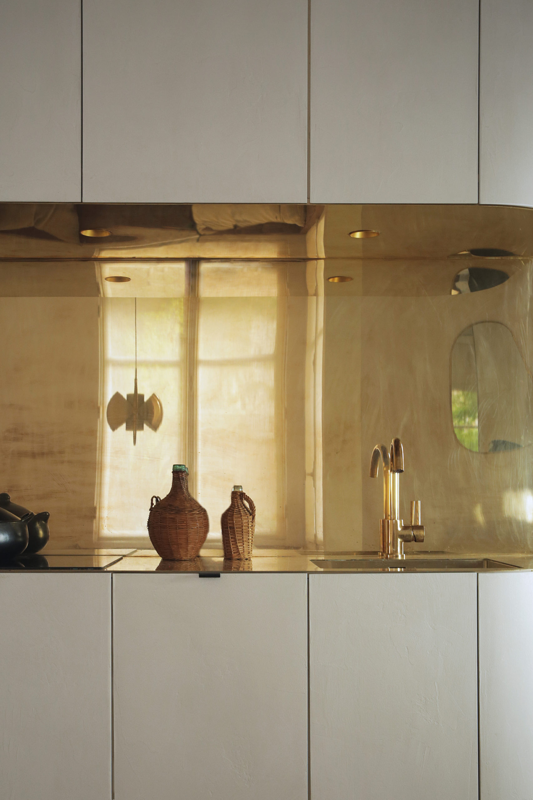
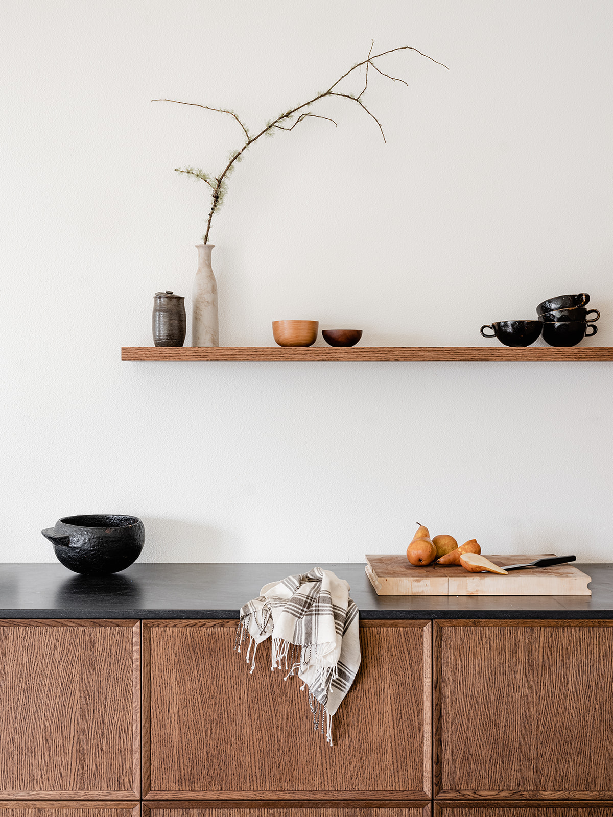
I wanted this kitchen to feel like it was made out of pieces of furniture which is why there are no uppers and the back row actually floats off the wall on both ends. There is ample storage however, as all the back cabinets are actually double drawers and the entire island is wrapped with additional storage. The induction range sits atop the island with the oven tucked underneath, keeping the sight lines clean. I was a bit nervous about switching to induction but I really like it! I custom designed one set of open shelving in the island to offer a little styling moment and to mimic the display of the floating wall shelf I had custom built by Seattle-based studio Walnut+Oak. The black countertops are actually quartz – Black Tempal made by Caesarstone – but they look and feel just like soapstone – one of my all time favorite materials. I really could sit and stare at this kitchen all day, I love her so much. I so hope you do too.
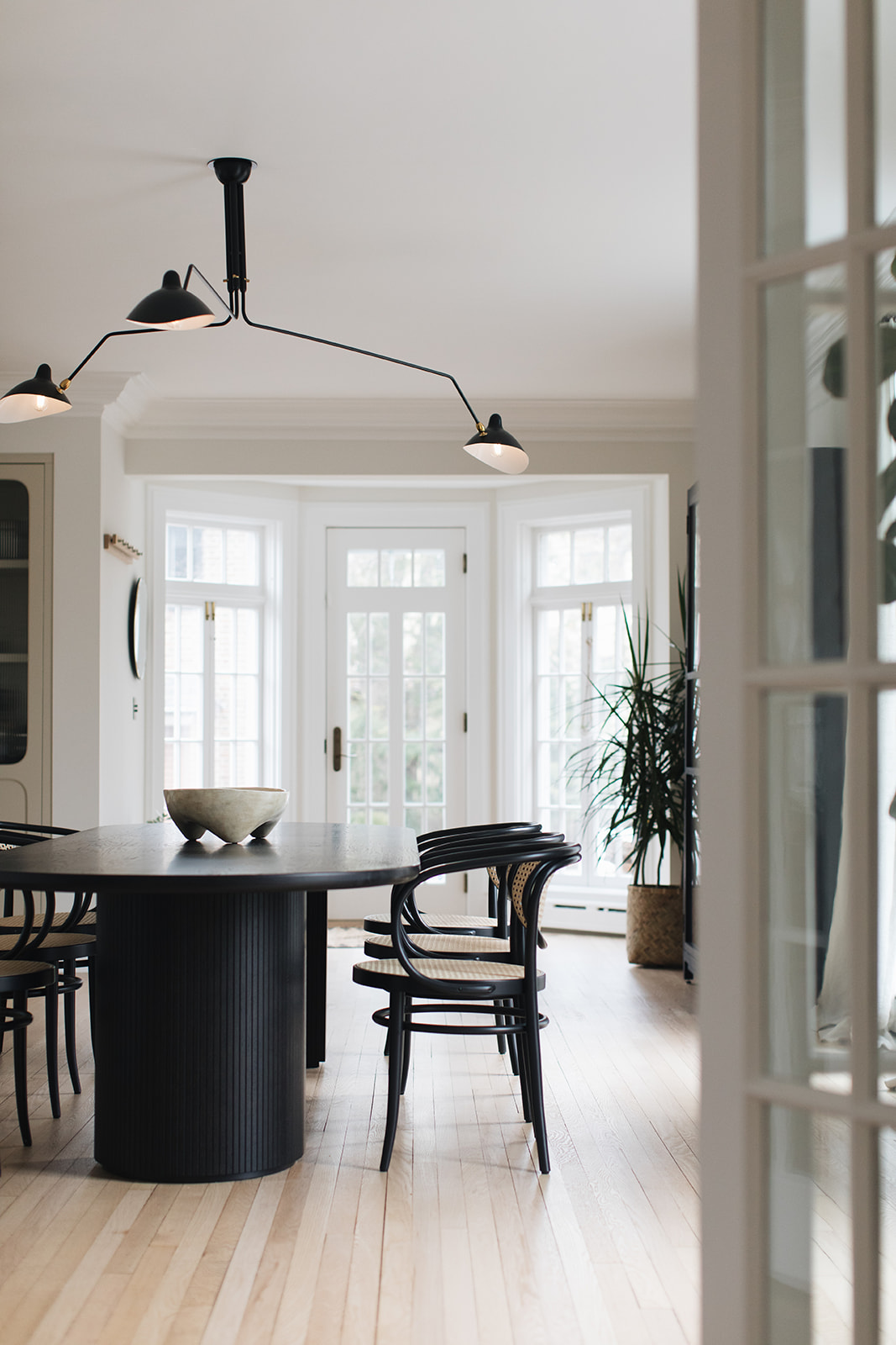
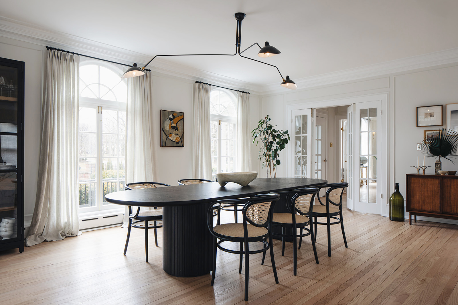
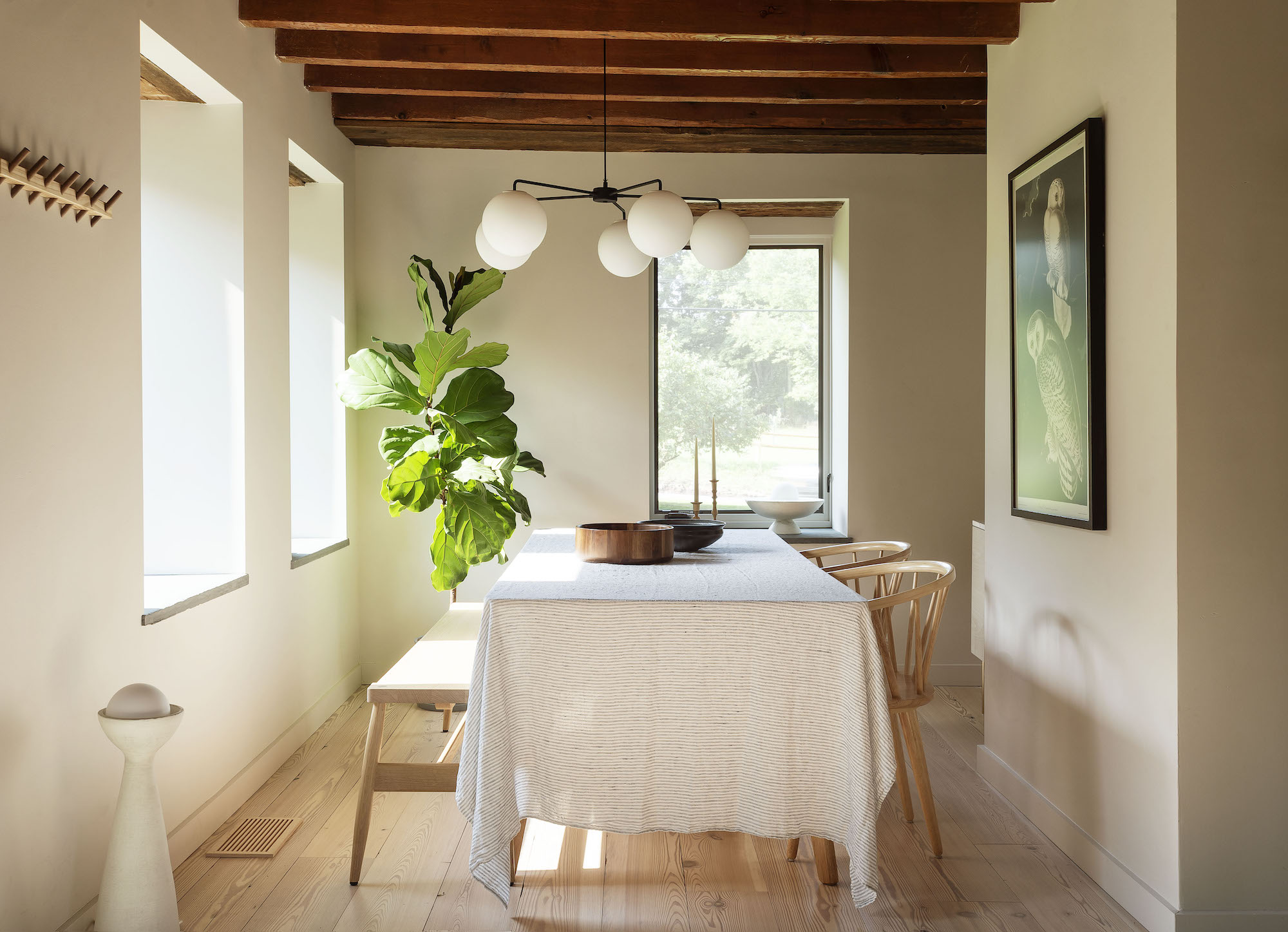
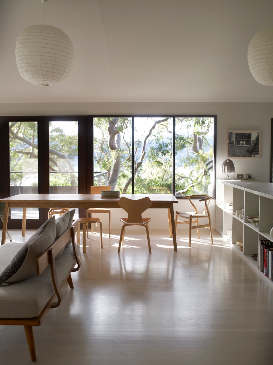
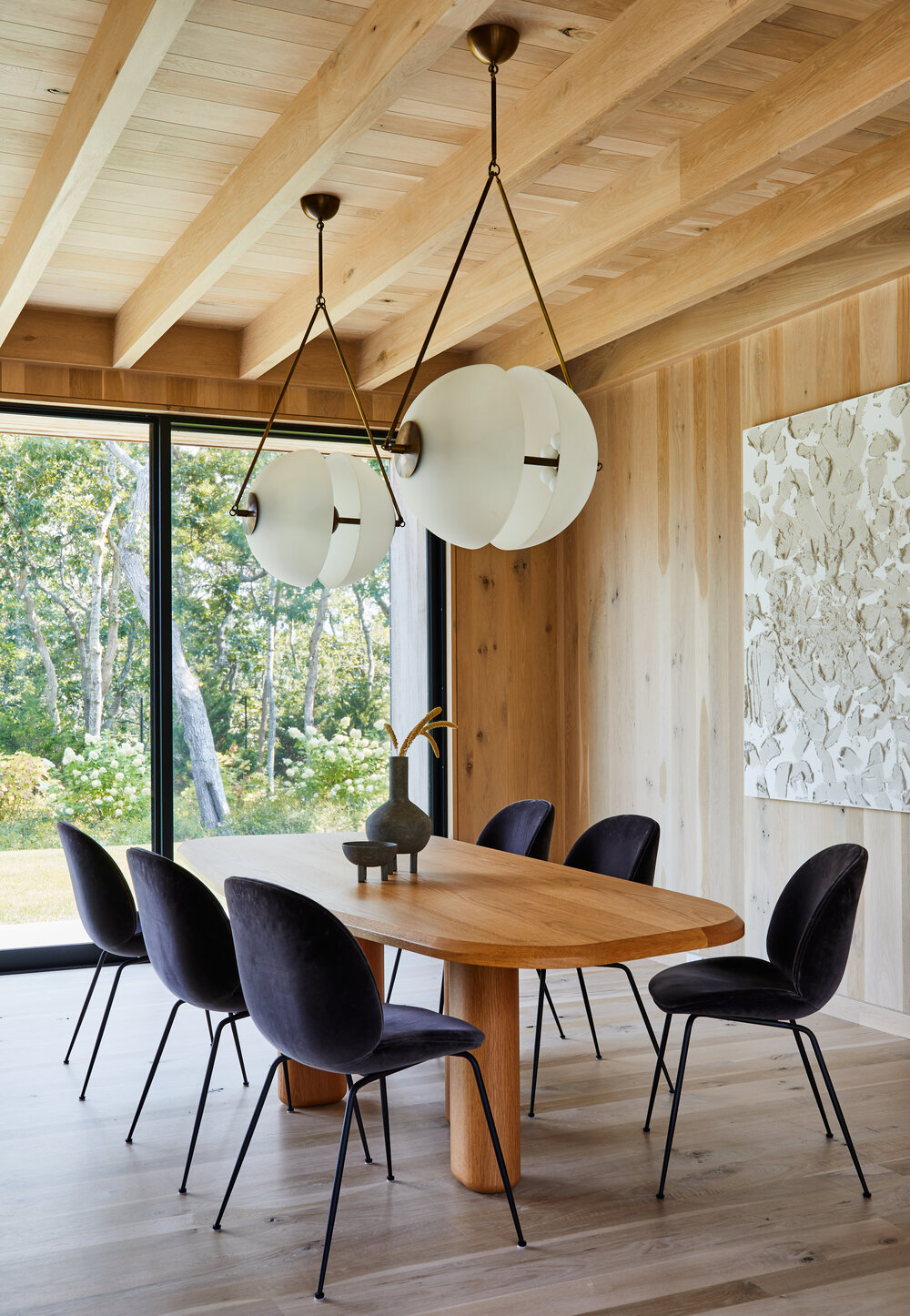
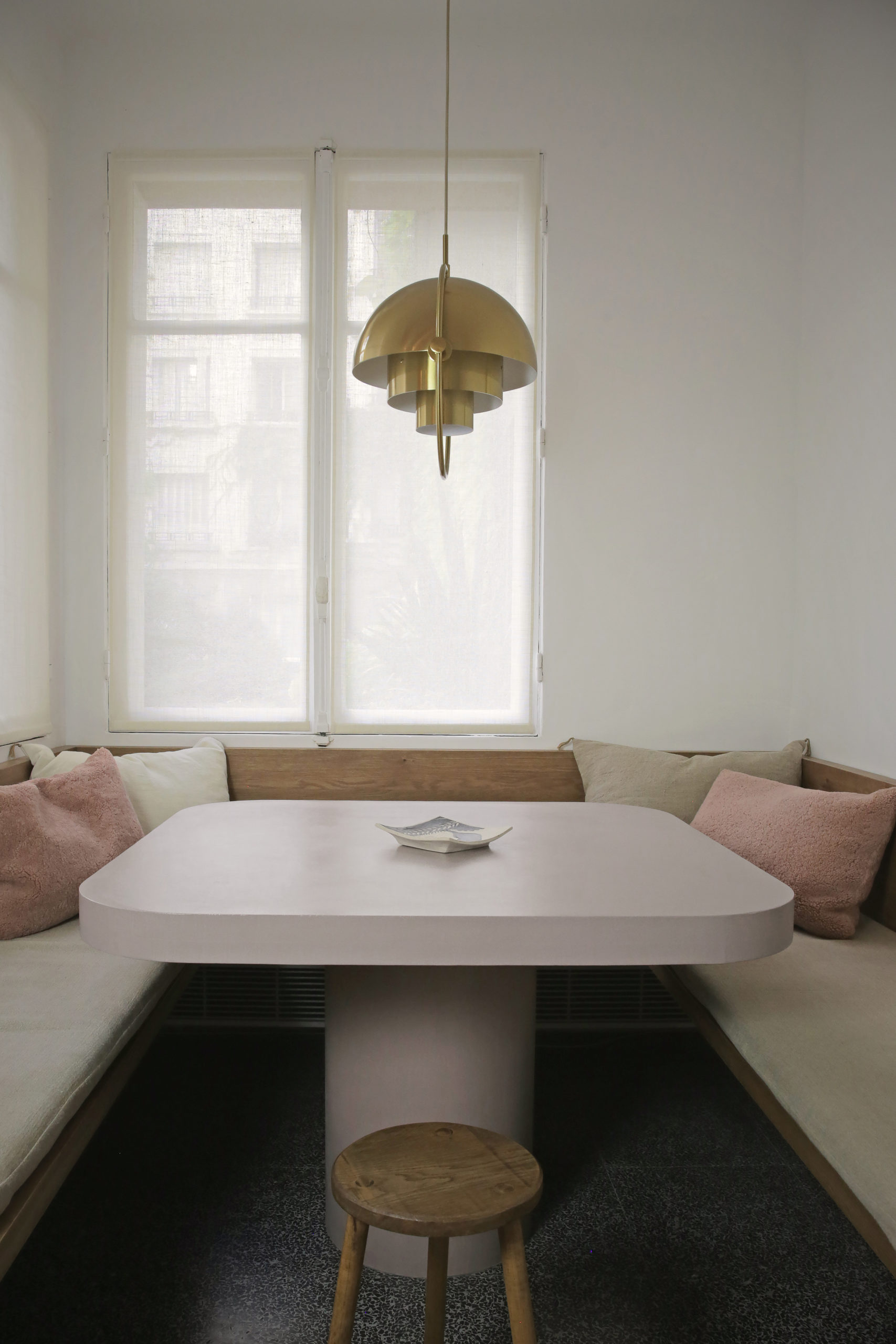
Before you ask why there isn’t bar seating at the kitchen island, that was a very intentional choice. I decided to focus on storage in the kitchen area rather than seating because the dining table is right next to it! When I took out the laundry room, I opened up a lovely long blank wall that now houses the dining area.(image that brown wall in the pic above disappearing).
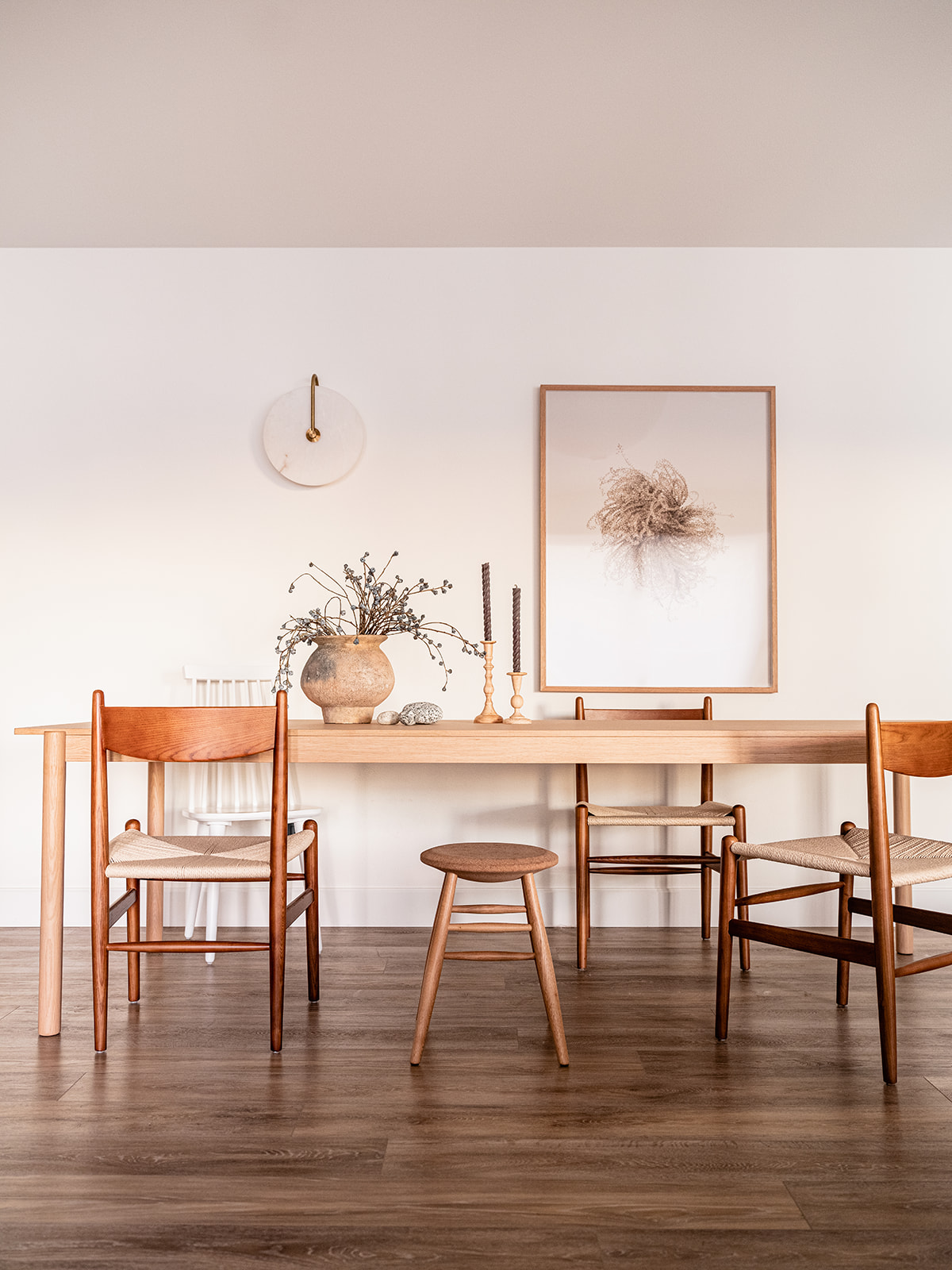
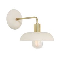
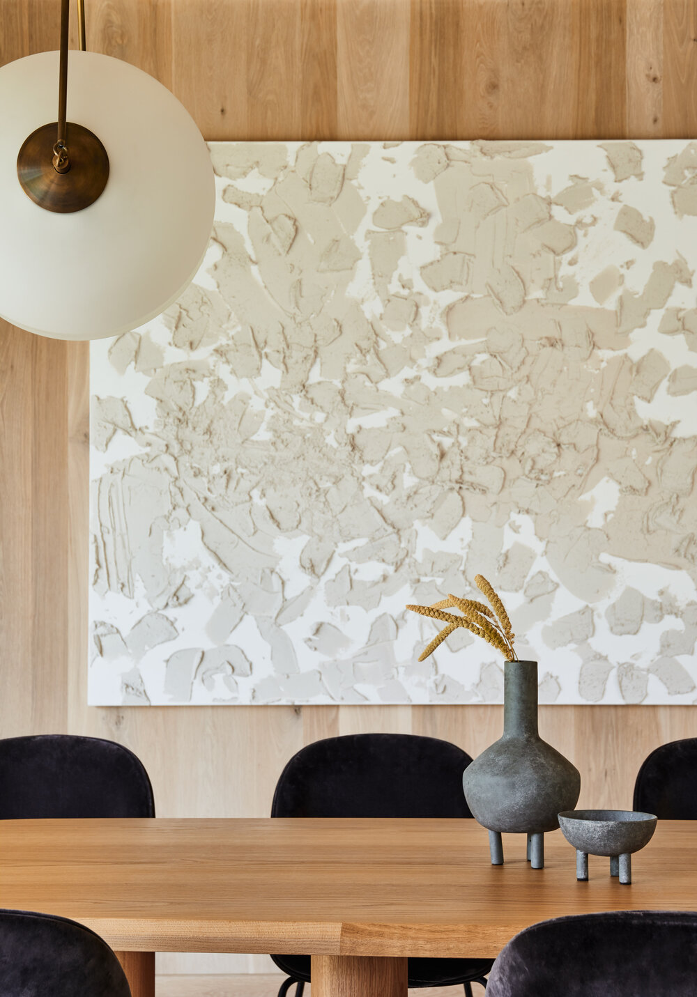
I demarcated the dining space with a stunning sconce by Allied Maker and an equally amazing art piece I’d long coveted from Canadian fine artist Anna Church. It’s the perfect to enjoy a leisurely breakfast or host Thanksgiving dinner!
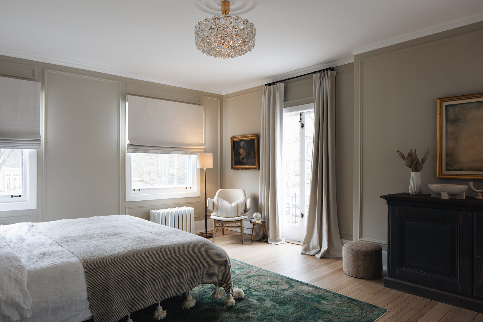
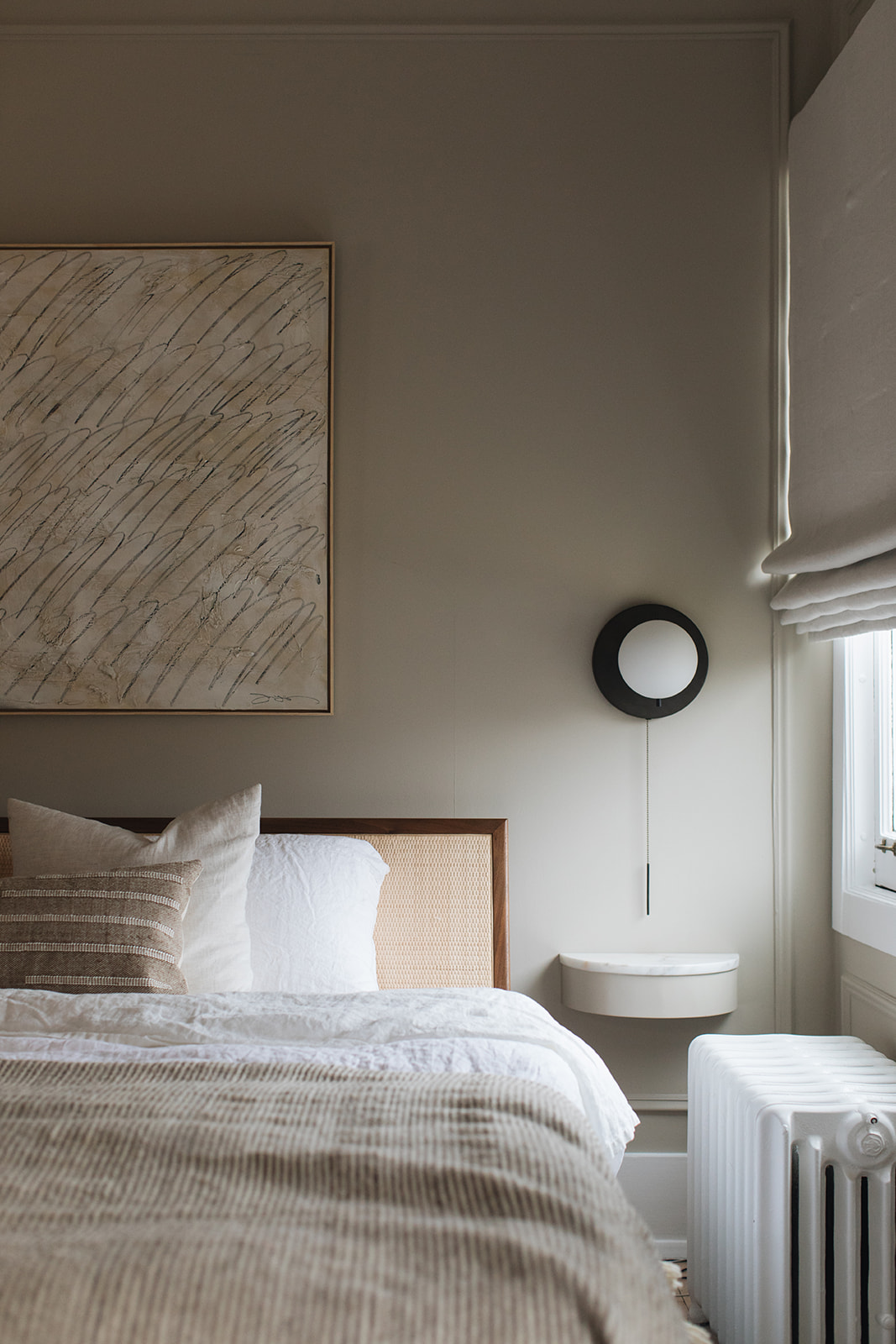
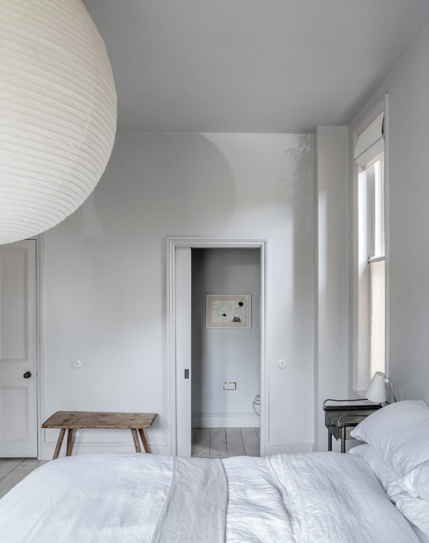
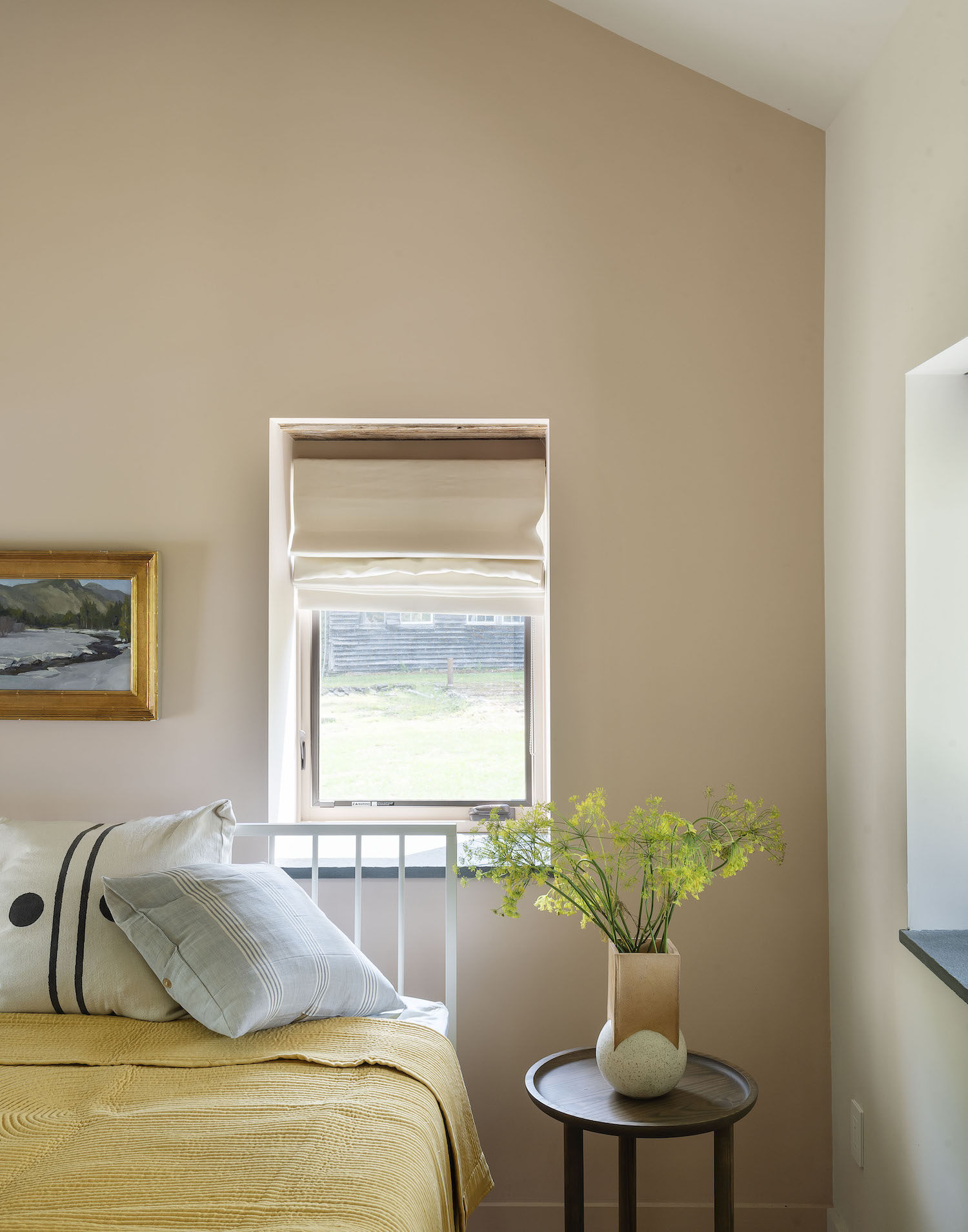
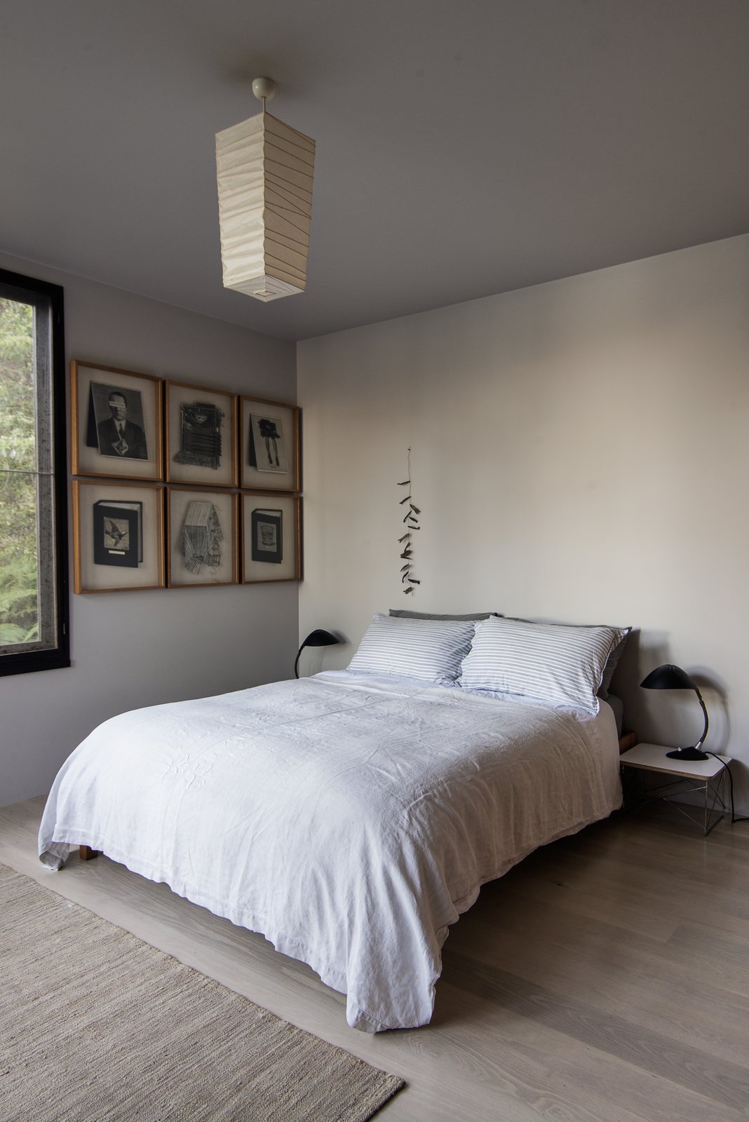
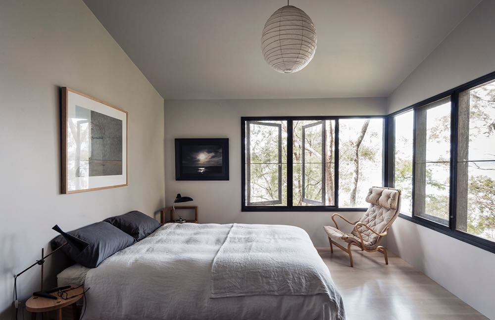
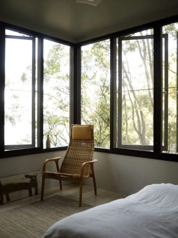
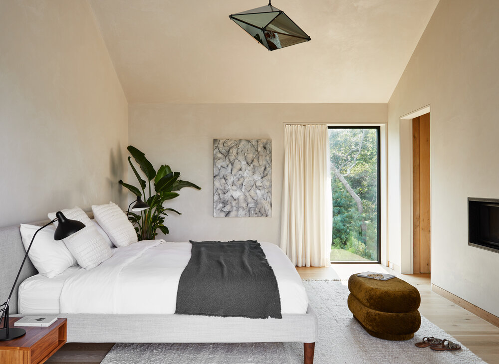
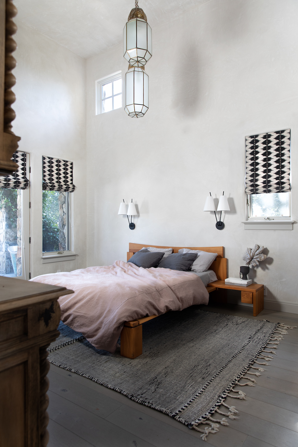
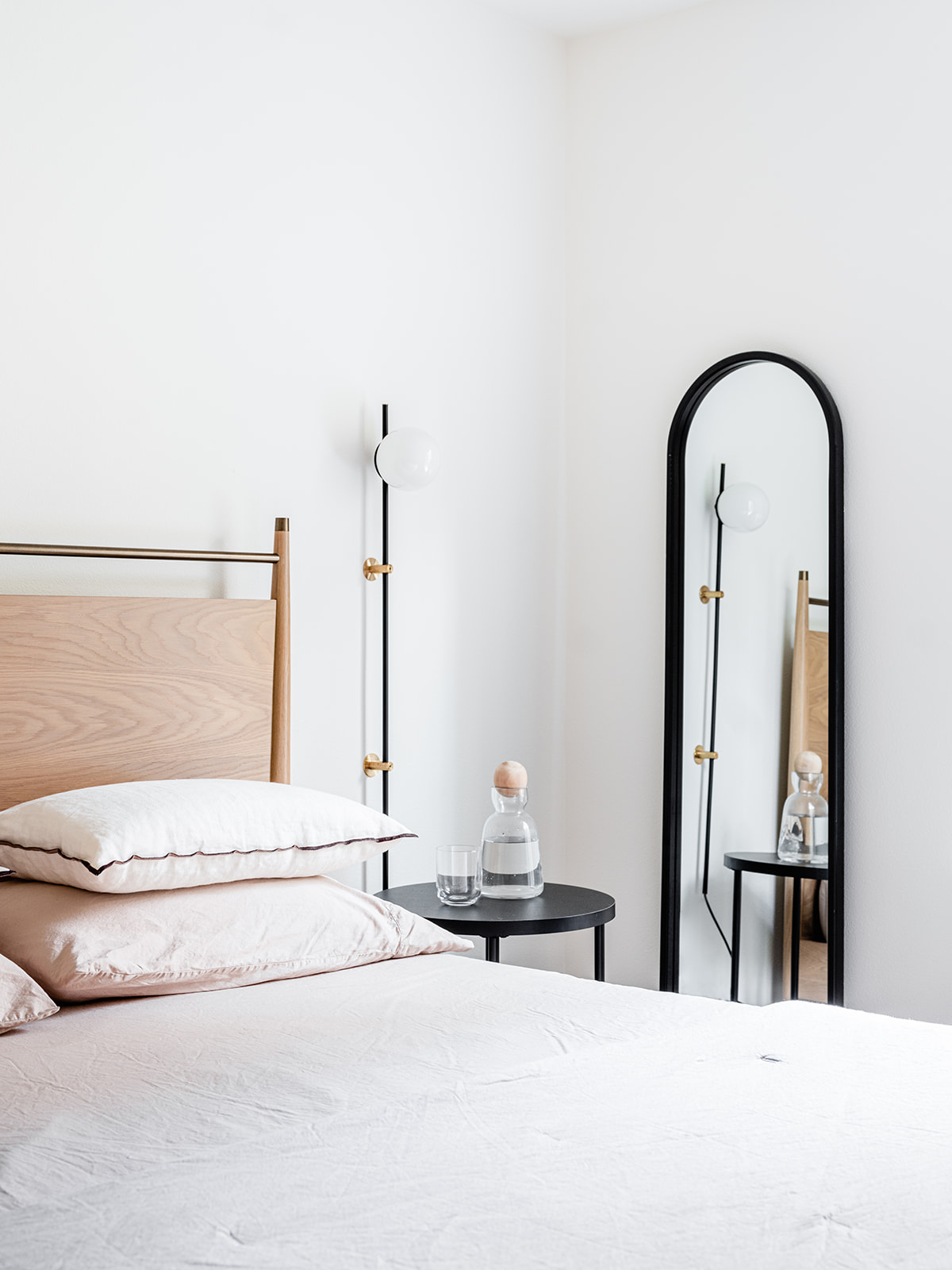
Now let’s turn to the bedrooms! Luckily these spaces simply required fresh coats of paint and well curated furnishings to create that elevated Nordic vibe I was going for. I wanted each room to evoke a sense of calming serenity.
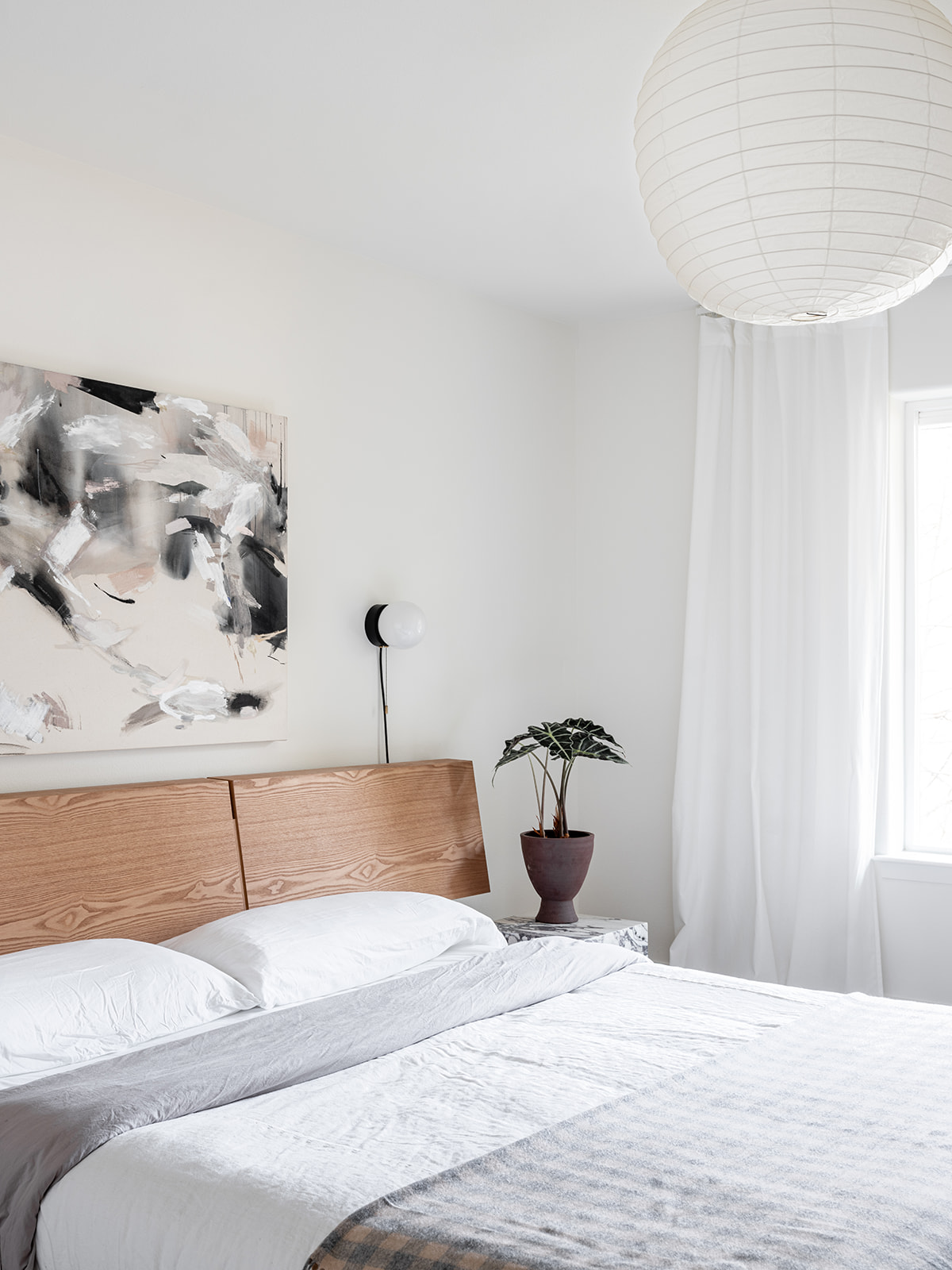
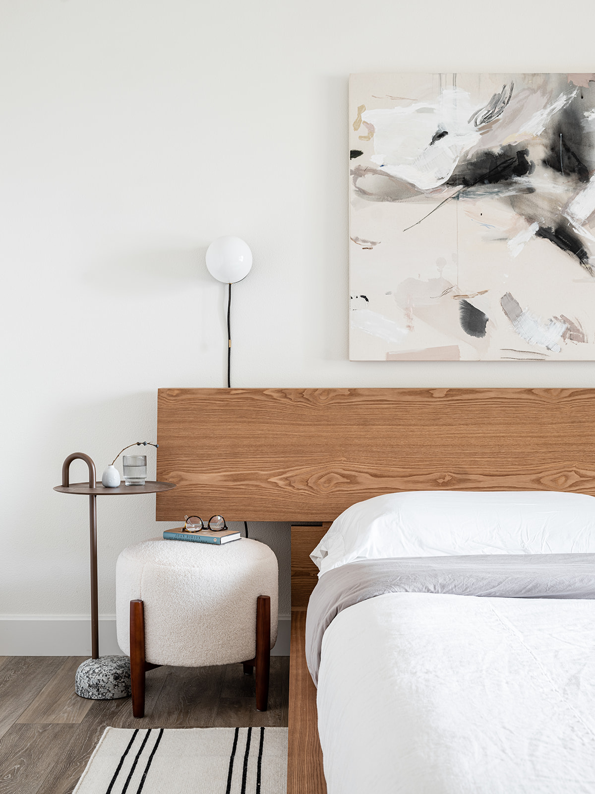
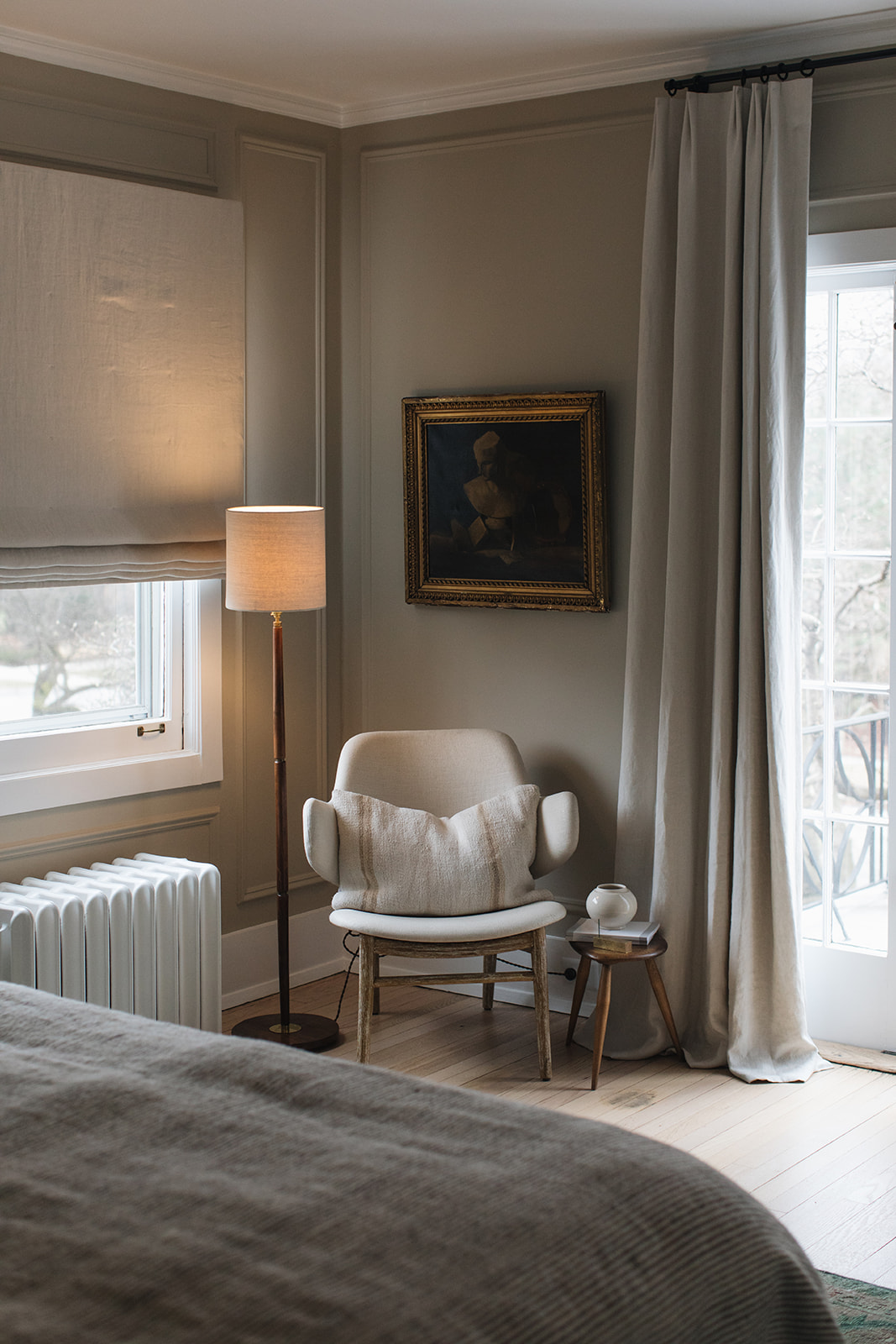
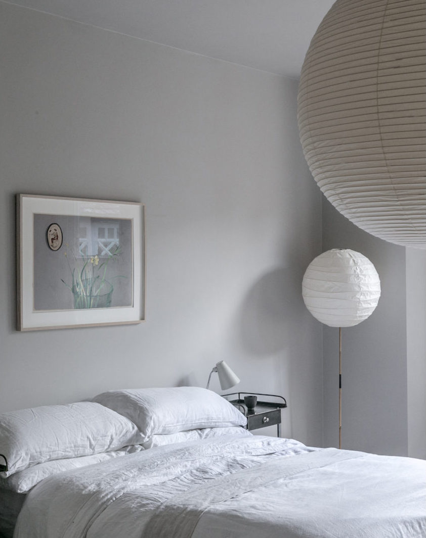
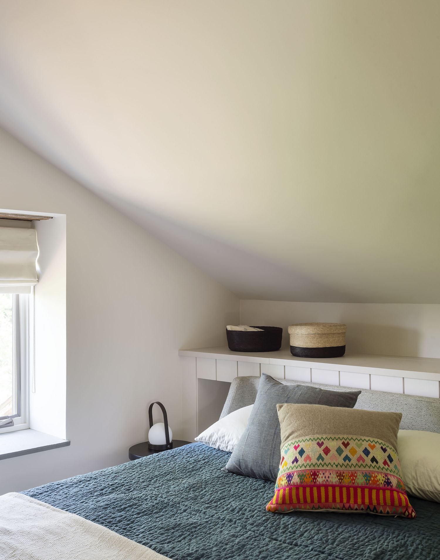
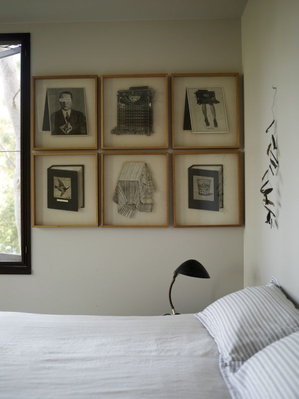
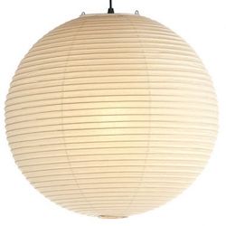
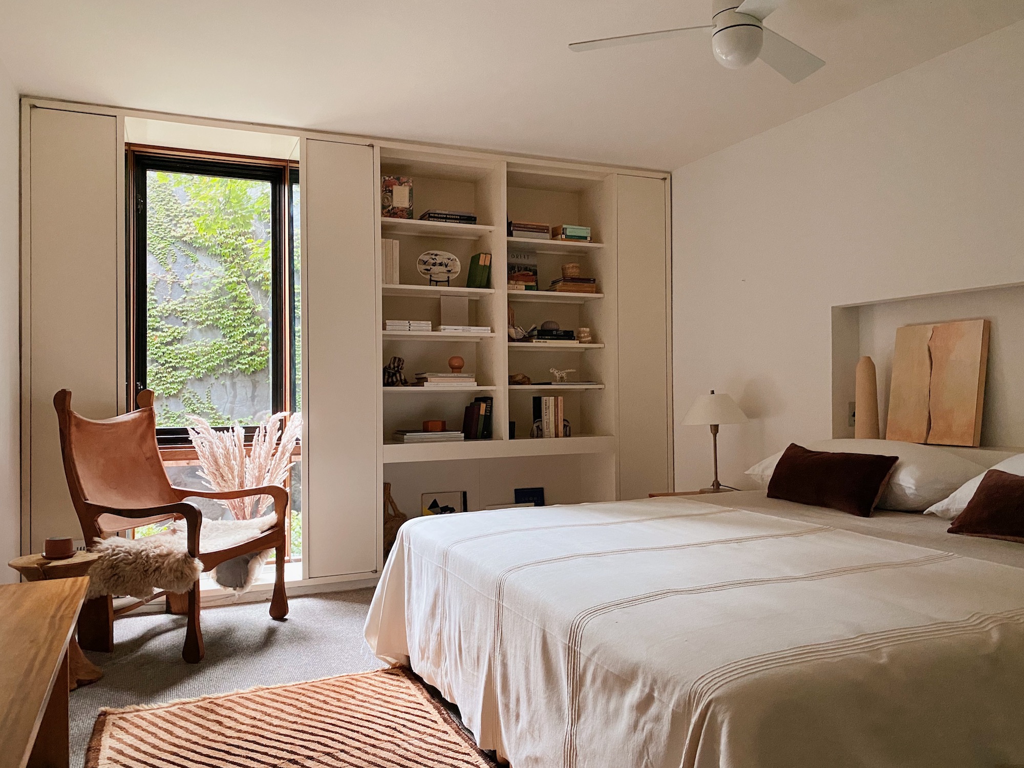
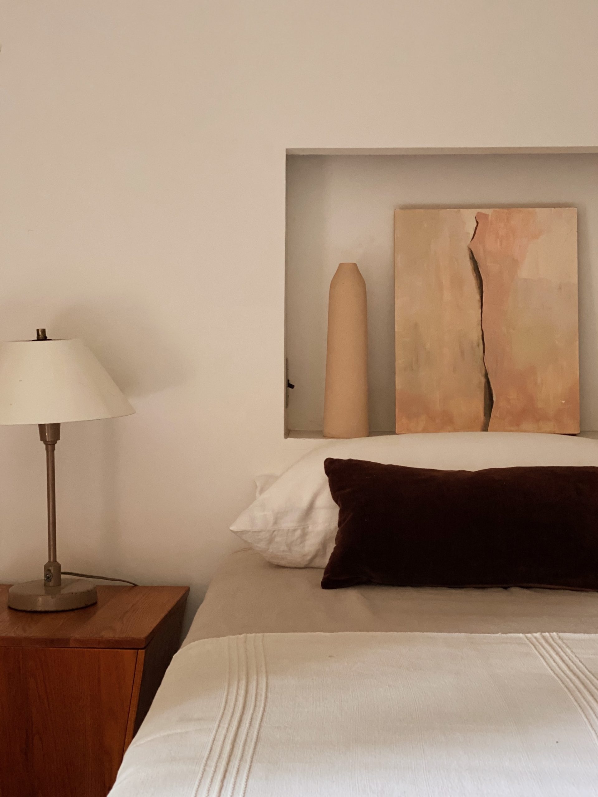
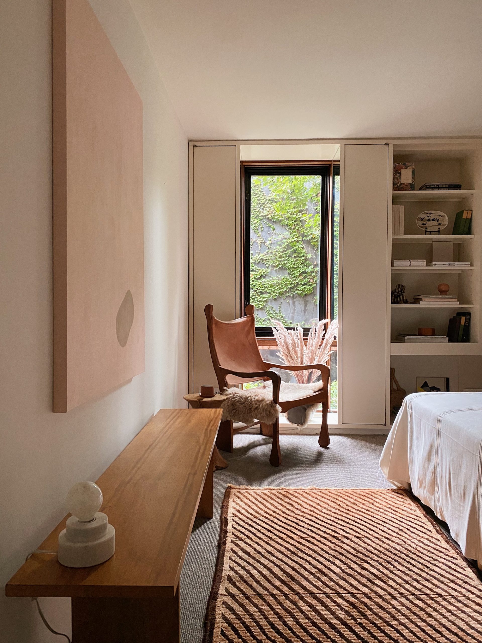
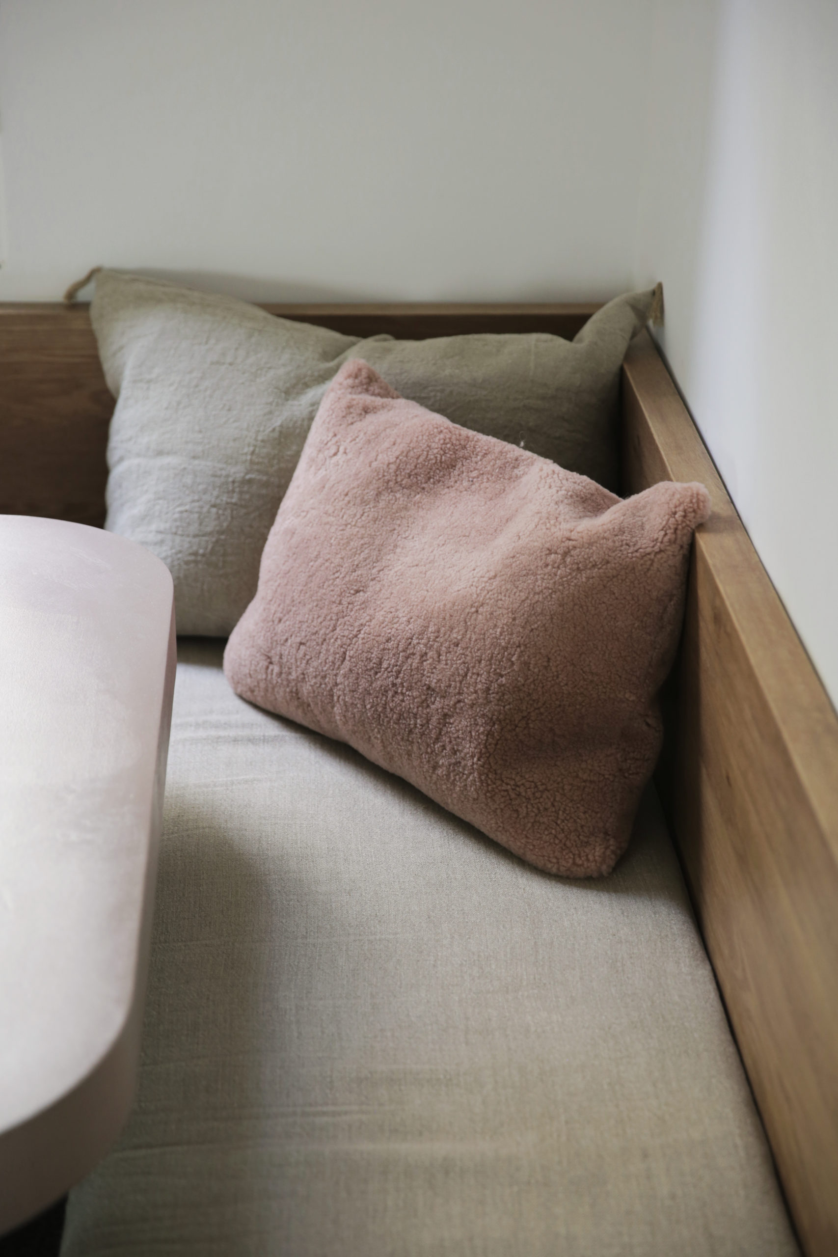
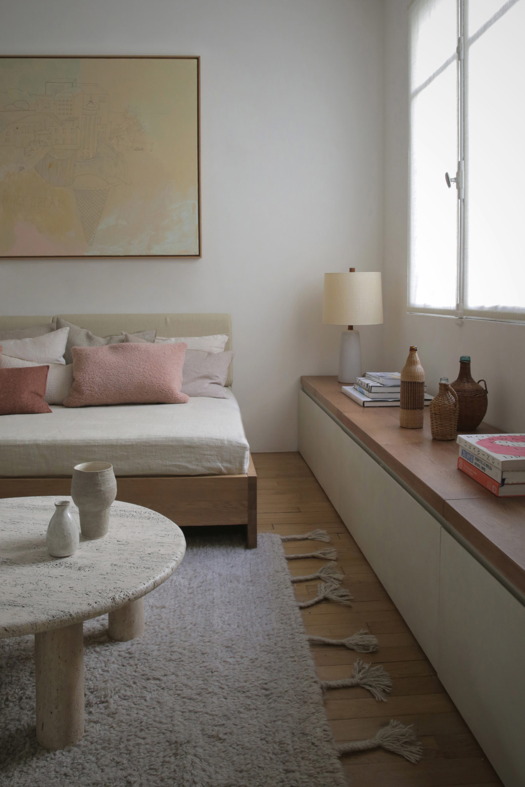
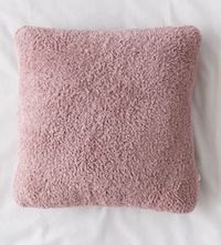
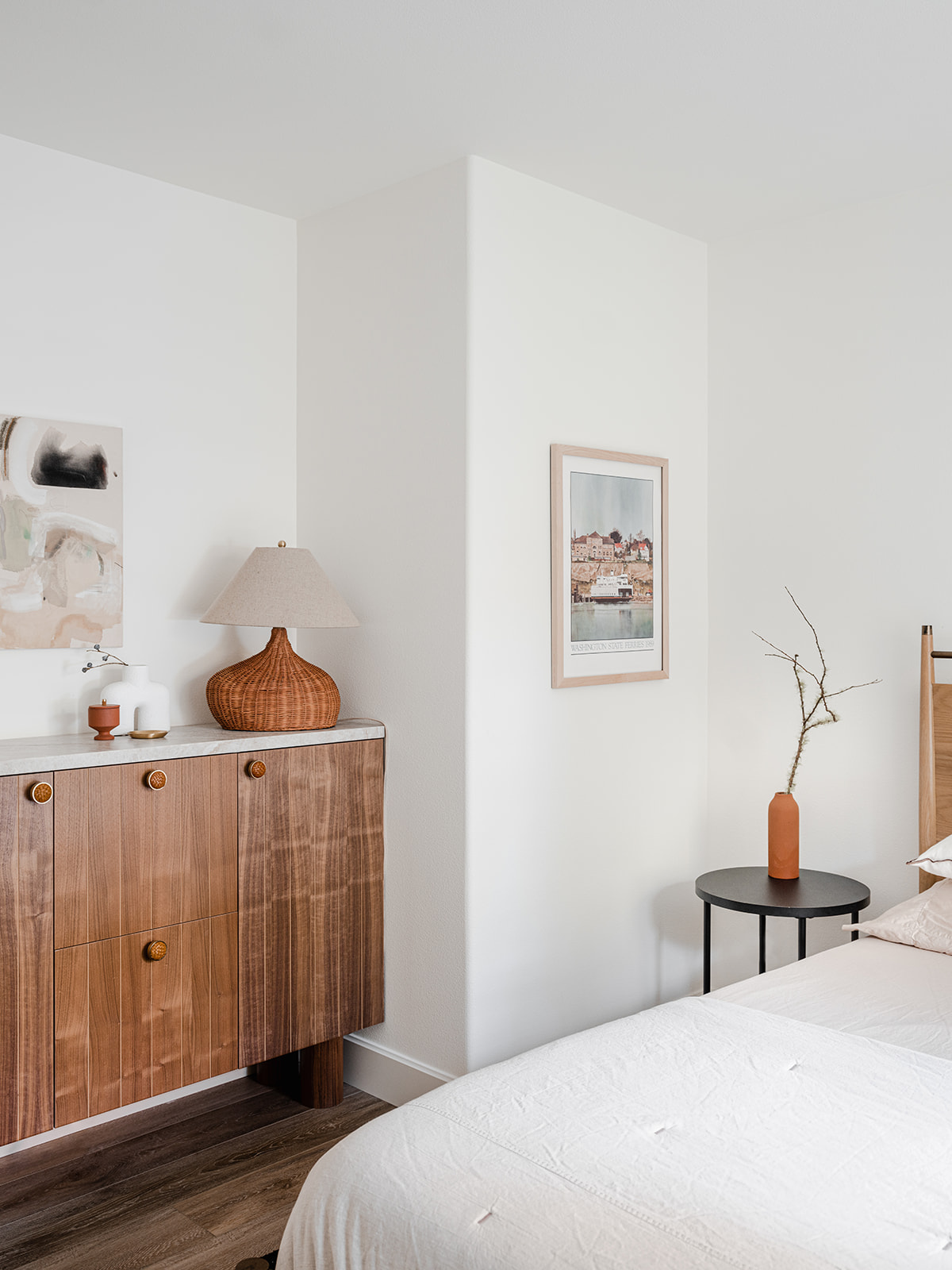
To achieve that I designed the primary bedroom with a mix of natural materials and textures in complementary hues. Think a lovely wool rug from Nordic Knots, linen bedding from Rough Linen, a Noghuci paper lantern and marble and stone side tables from Hay Design and Norm Architects all play beautifully together. I also love my little sherpa cutie from Target! I turned to Seattle Art Source for the gorgeous Jennifer Gauthier painting above the Rove Concepts platform bed.
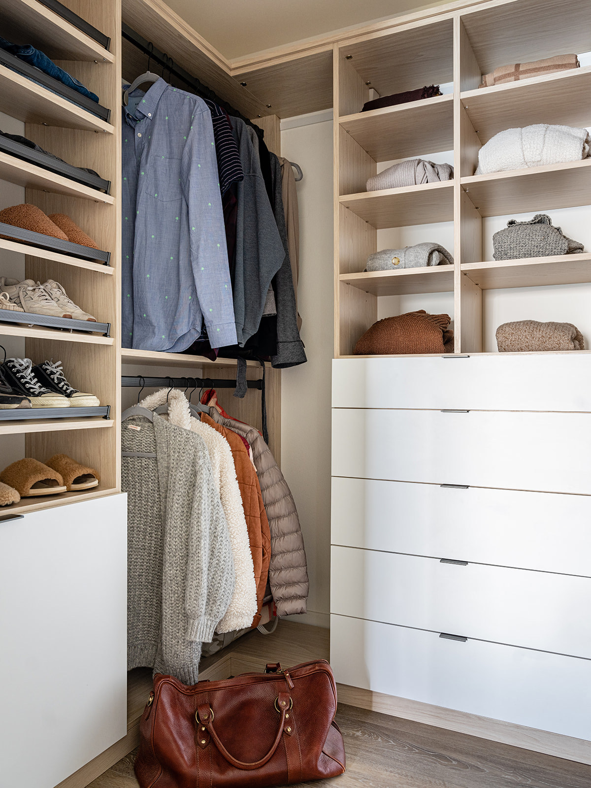
The one nice thing about working with house built in the 1990’s is all the built in storage! Historic homes don’t have so much of that. The primary bedroom had a walk-in closet, but I wanted to make sure I fully optimized the space, so I worked with California Closets to design the ideal spot to keep all your weekender gear organized. I for one love to immediately unpack and make myself at home anytime I stay somewhere – and this closet definitely makes sure you can do that. There’s plenty of space to stash away suitcases and I can even lock the drawers if I want to keep some of our own things private.
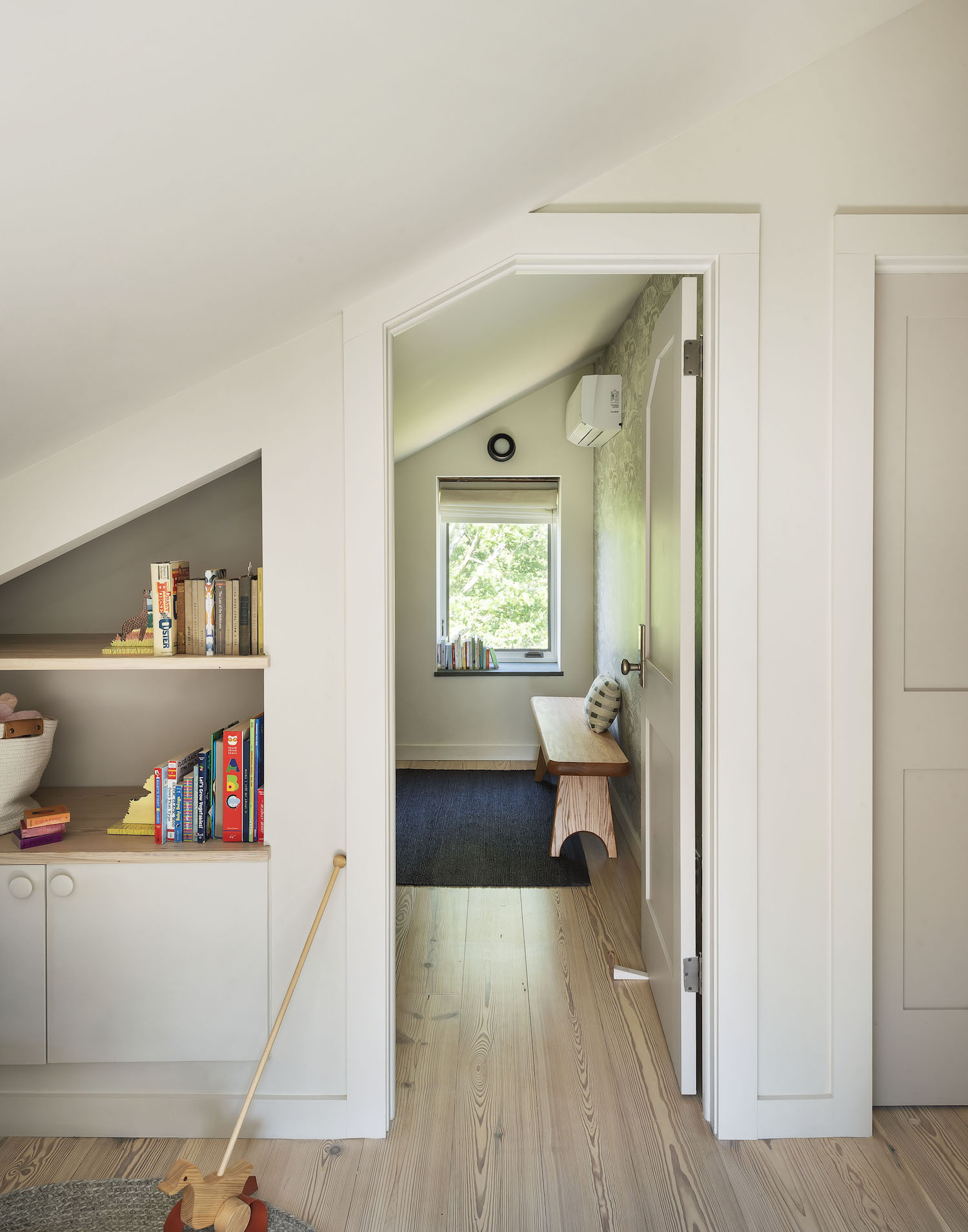
Ironically, I eliminated the closet in the cottage’s second bedroom. The room was already quite small. Putting in a queen sized bed was going to make it feel very cramped so I decided to demo the reach-in closet and design a custom credenza to sit in its place. Seattle-based design shop Walnut+Oak built out my vision perfectly – it gives the room a fun punch of personality and guests ample storage. Another Nordic Knots rug, this time in a bold checkered pattern and a long-coveted Faye Toogood Roly Poly chair add a fun tension between modern and more traditional pieces. I’ve had nothing but rave reviews from our guests about this room thus far.
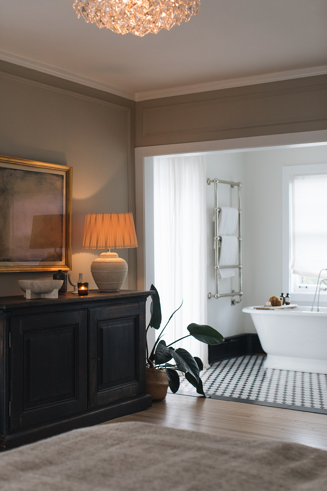
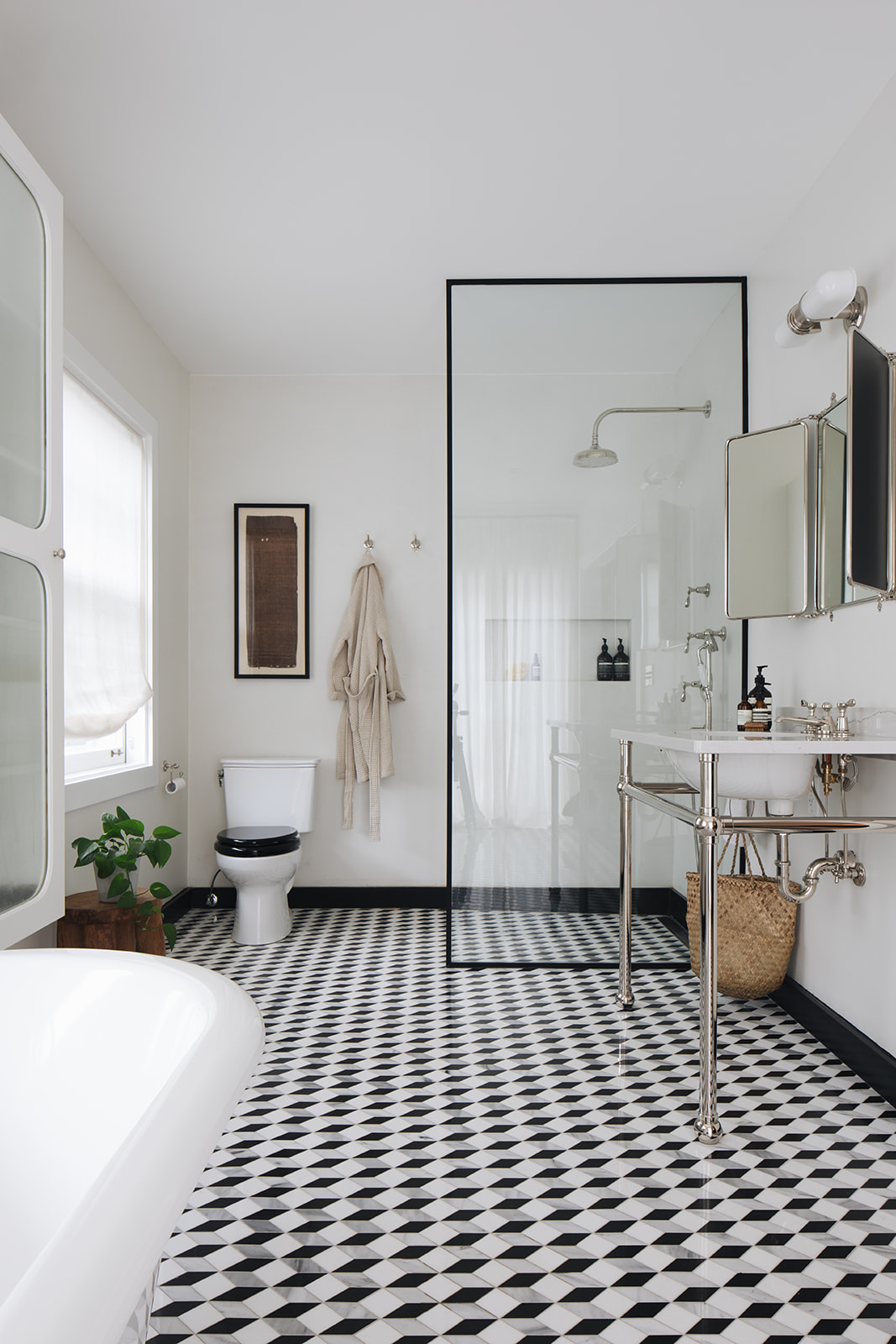
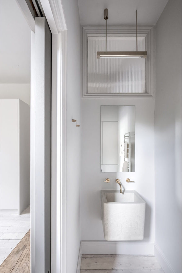
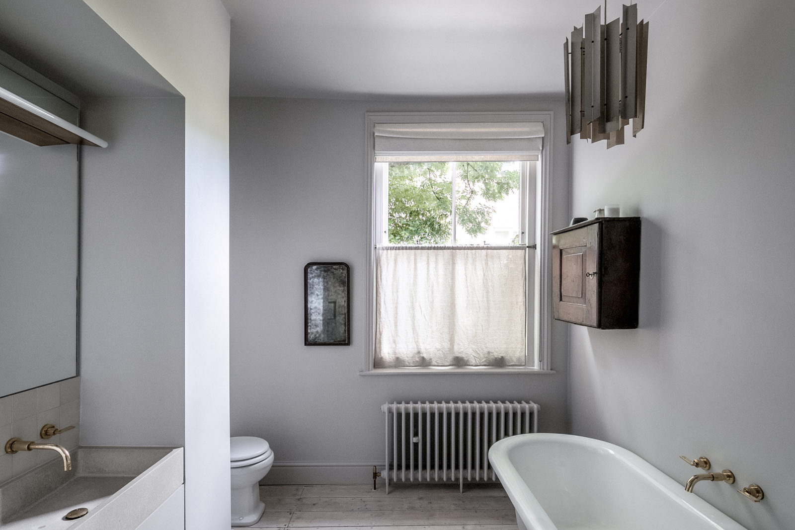
Now let’s chat bathrooms. Bathrooms can be as overwhelming to design as a kitchen. So many options – so many choices! The only choice I had with the bathrooms in this house was to start over.
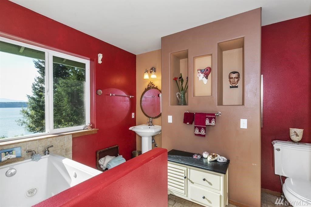
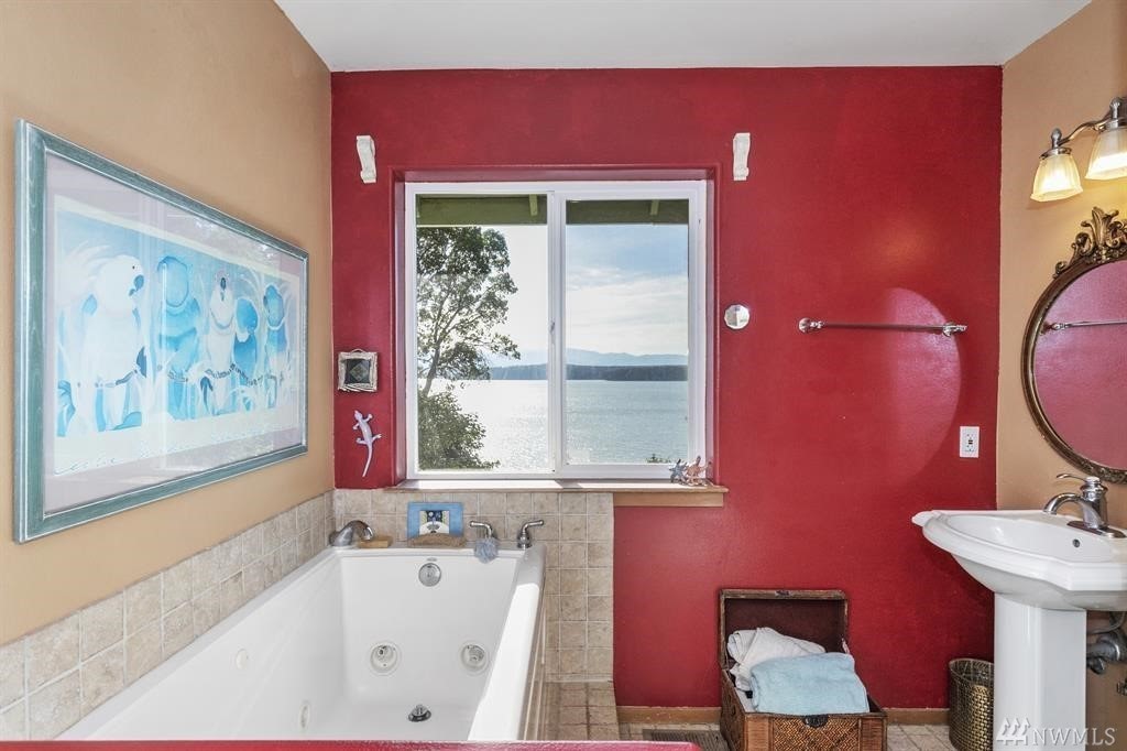
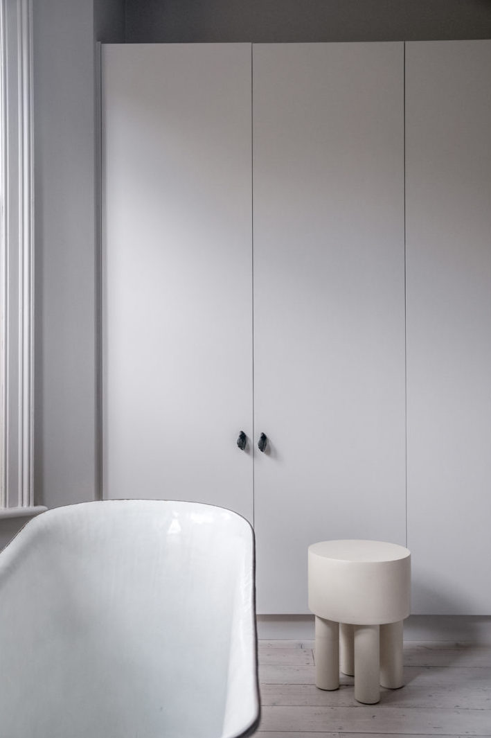
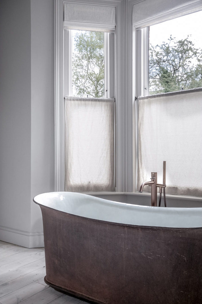
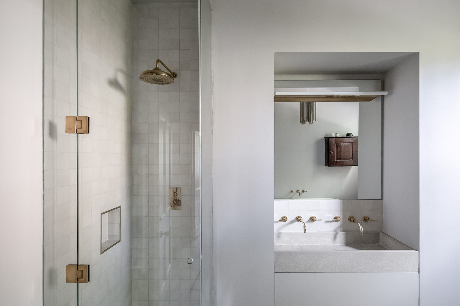
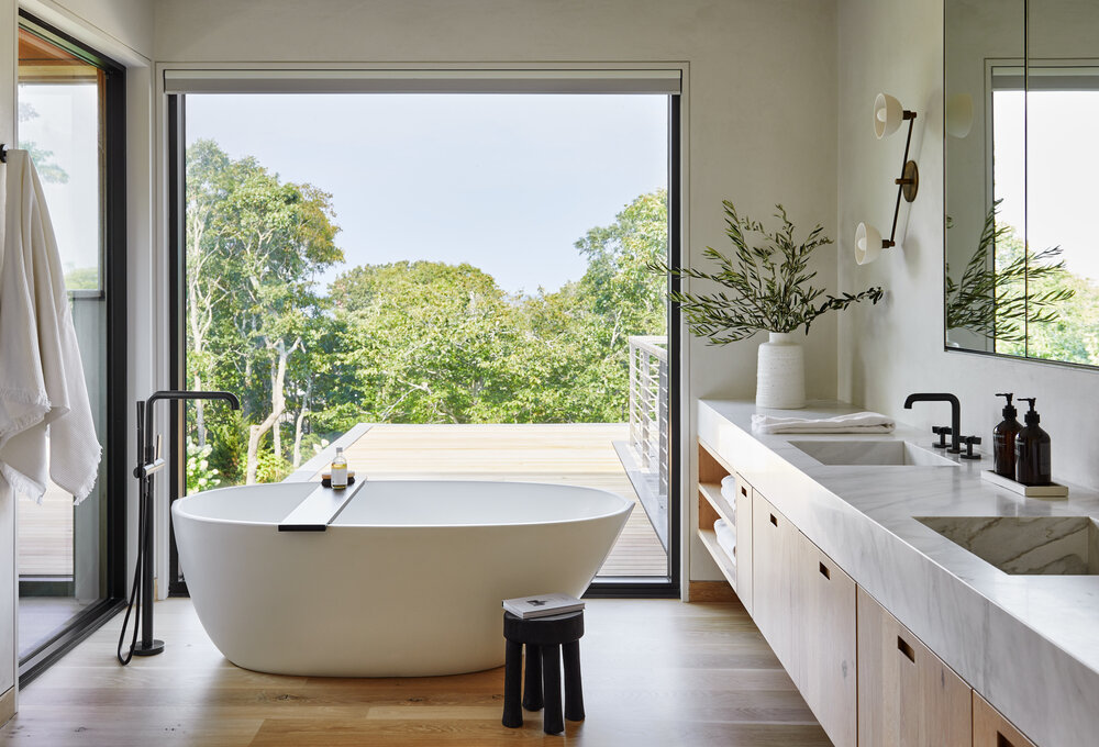
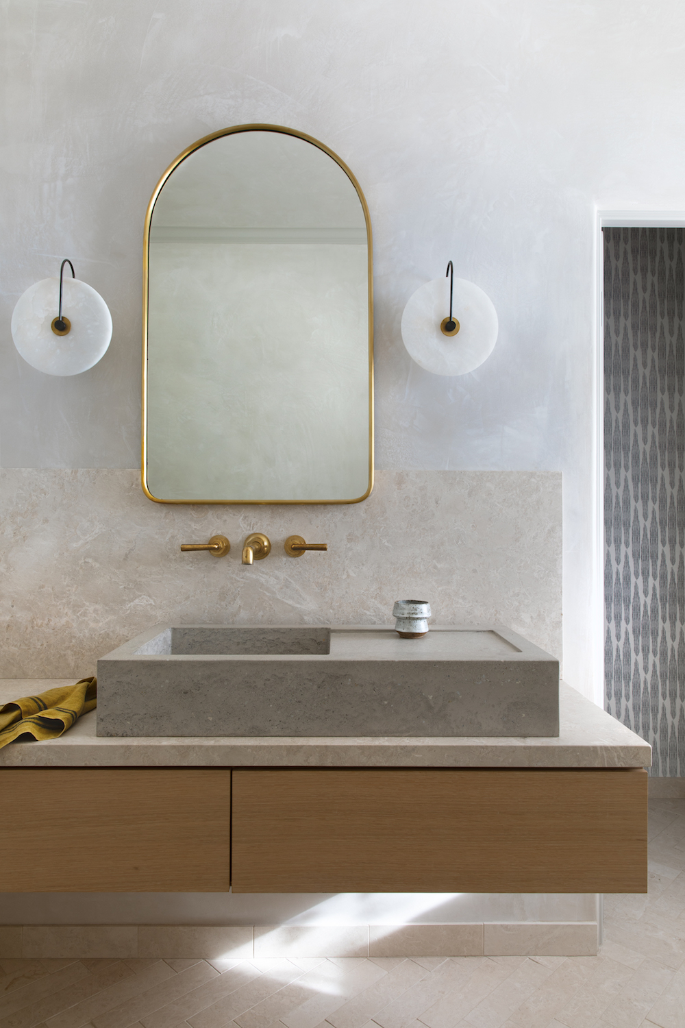
The primary bathroom proved to be a big game of tetris. Its existing layout of a tiny tub, itty bitty fiberglass stand up shower and weird cubbies smack dab in the middle of the room certainly could not stay. But it turned out the fireplace chase from the living room was actually hidden behind those cubbies – I only wish I knew why – so I had to figure out how to work around that.
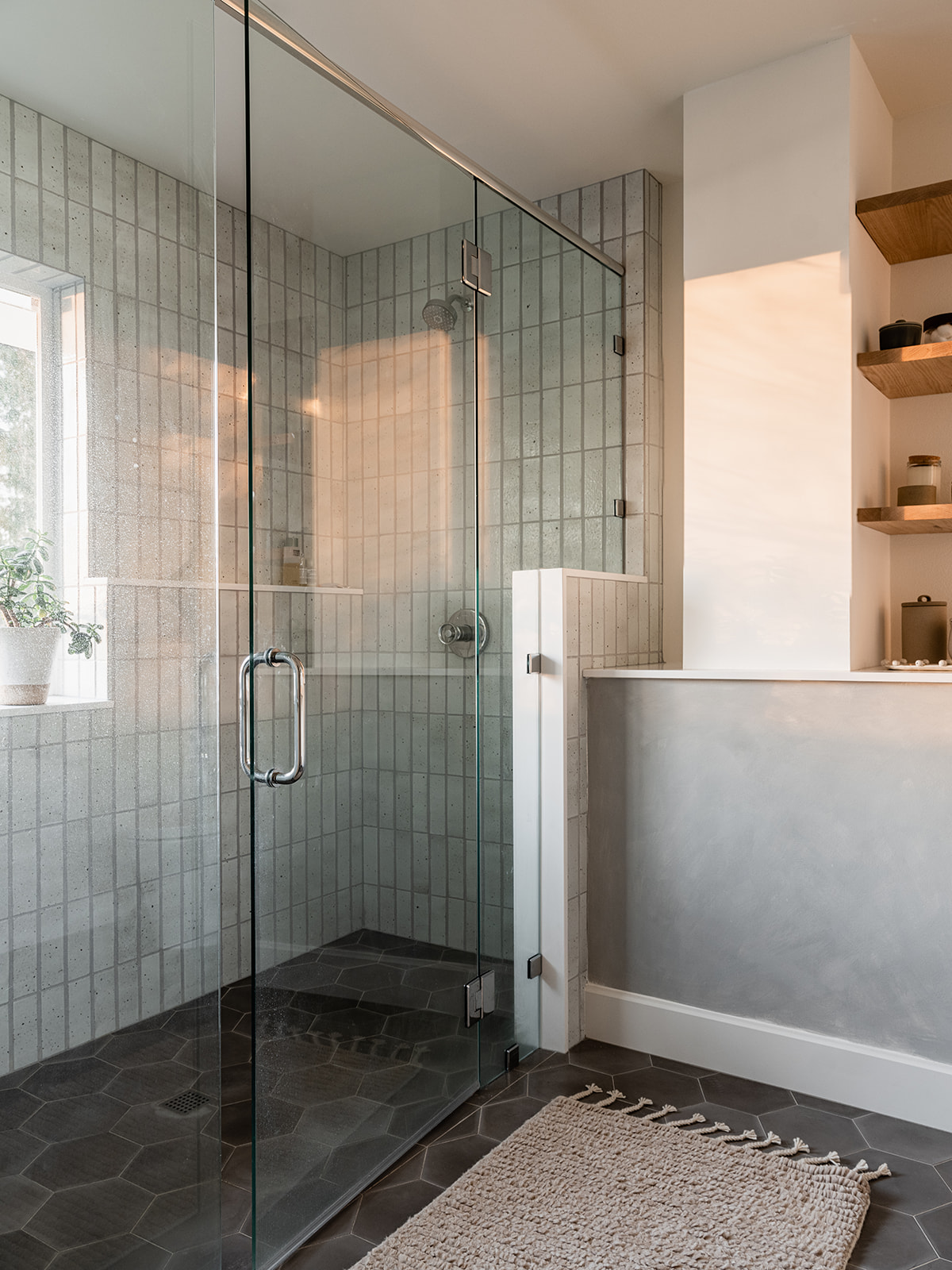
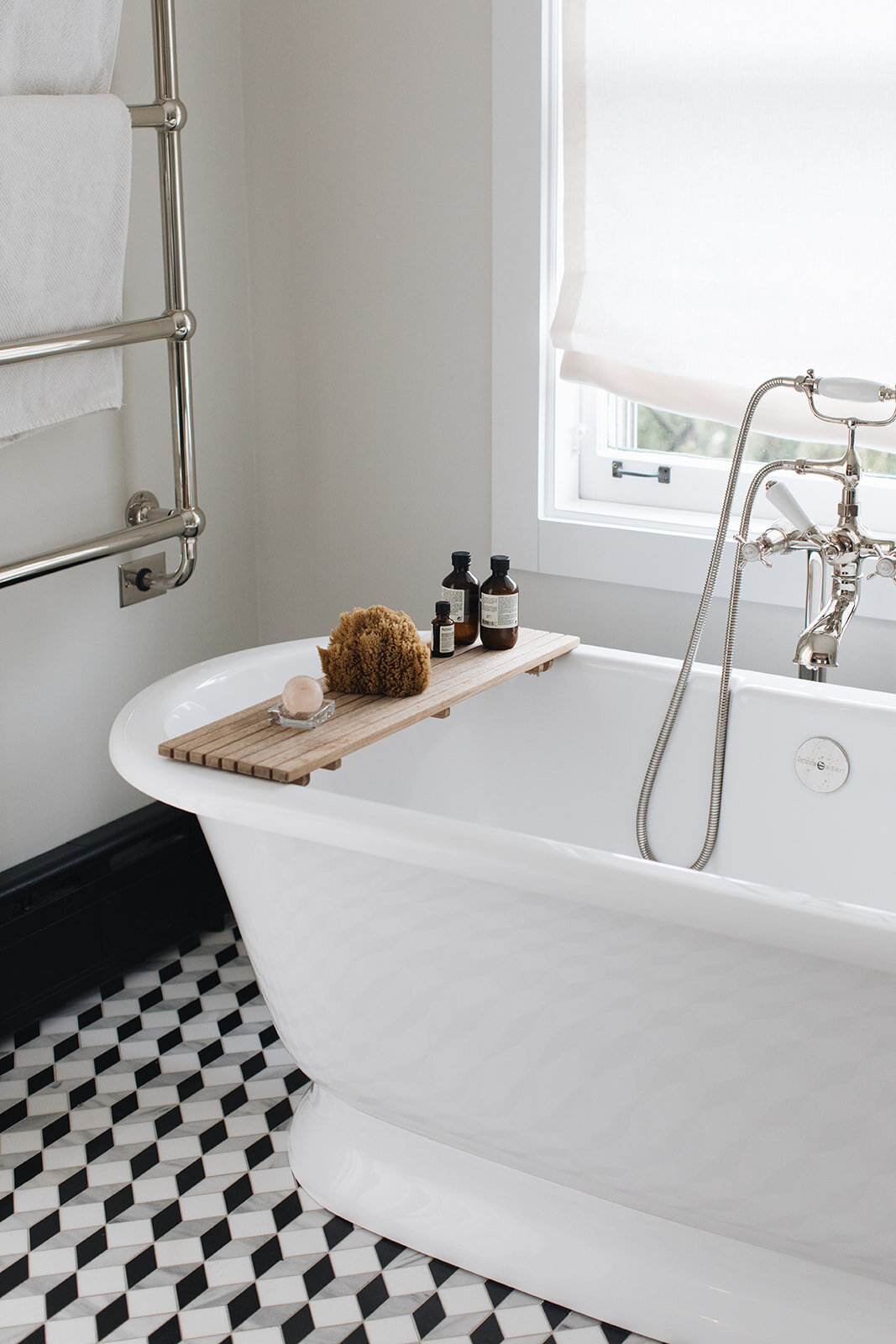
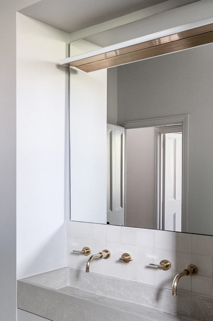
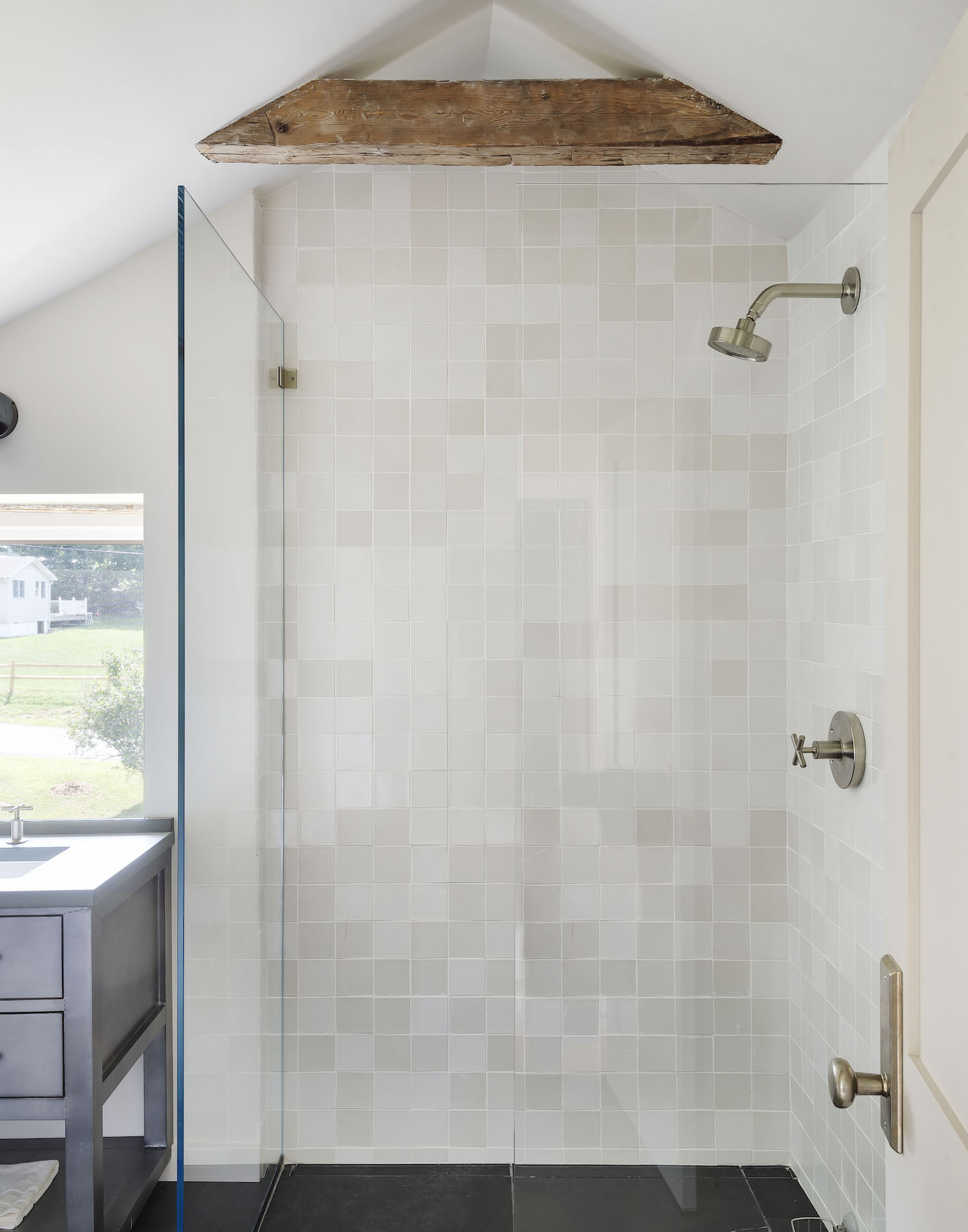
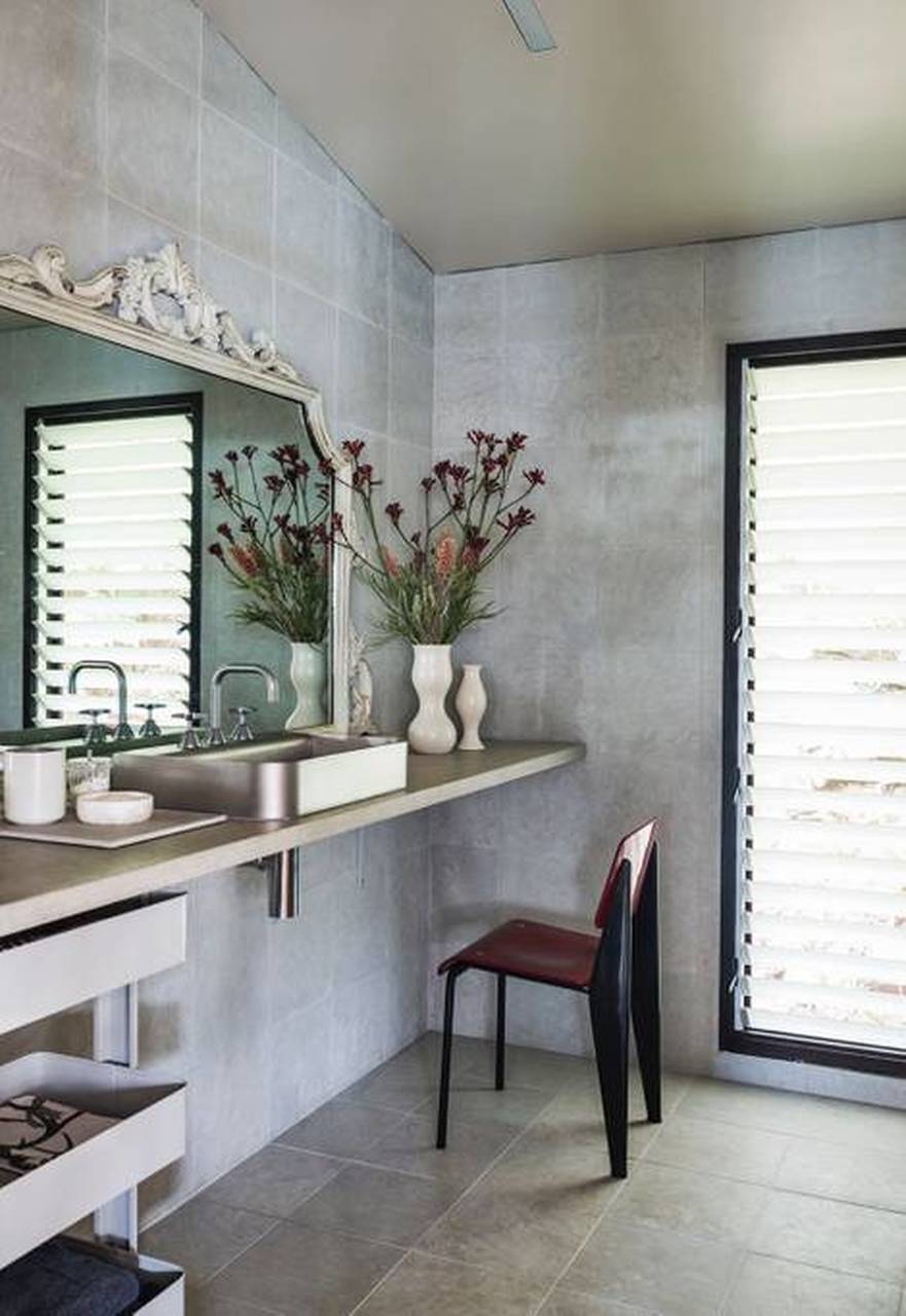
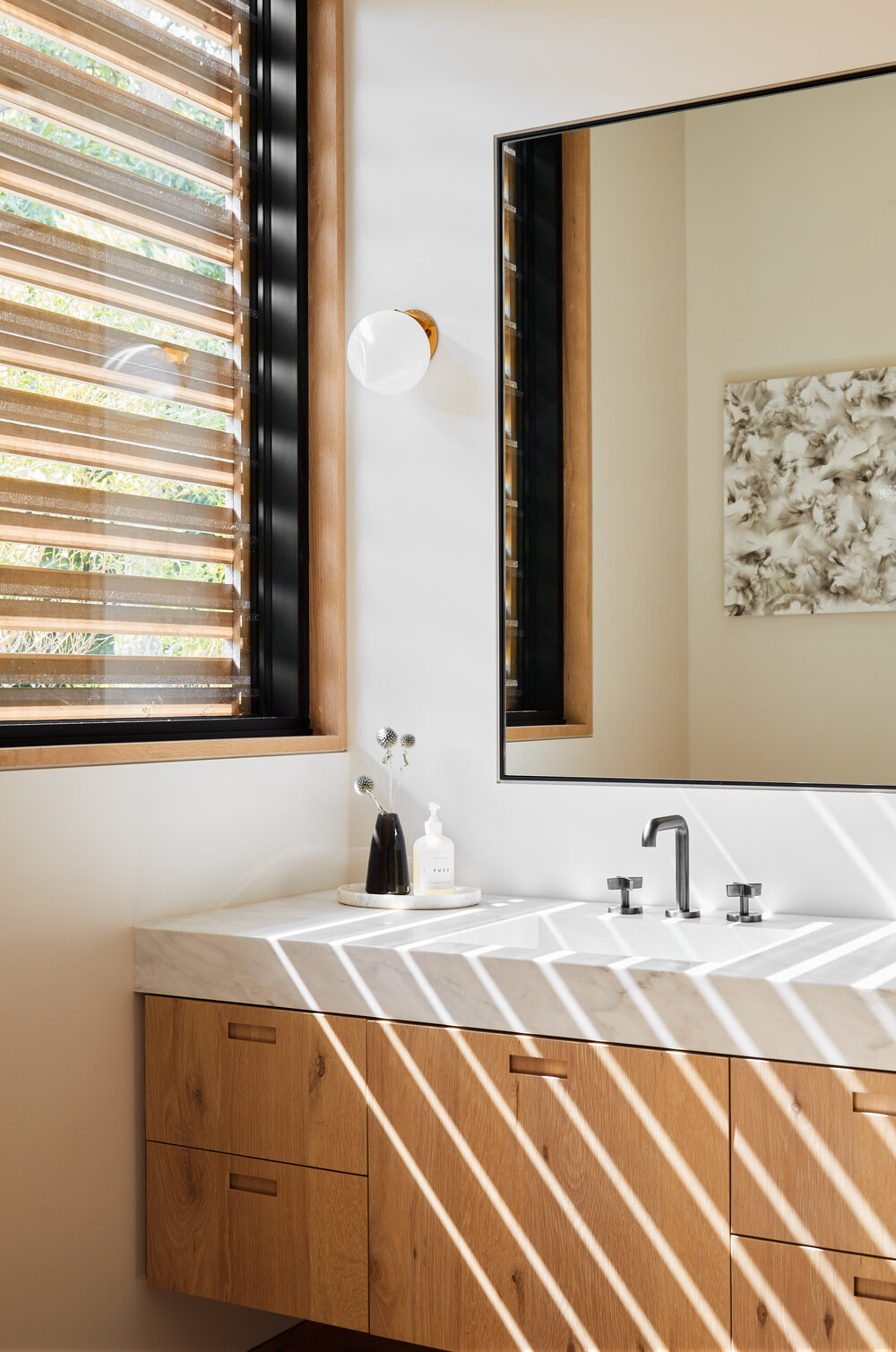
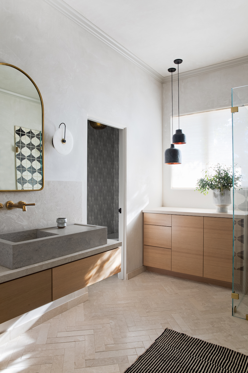
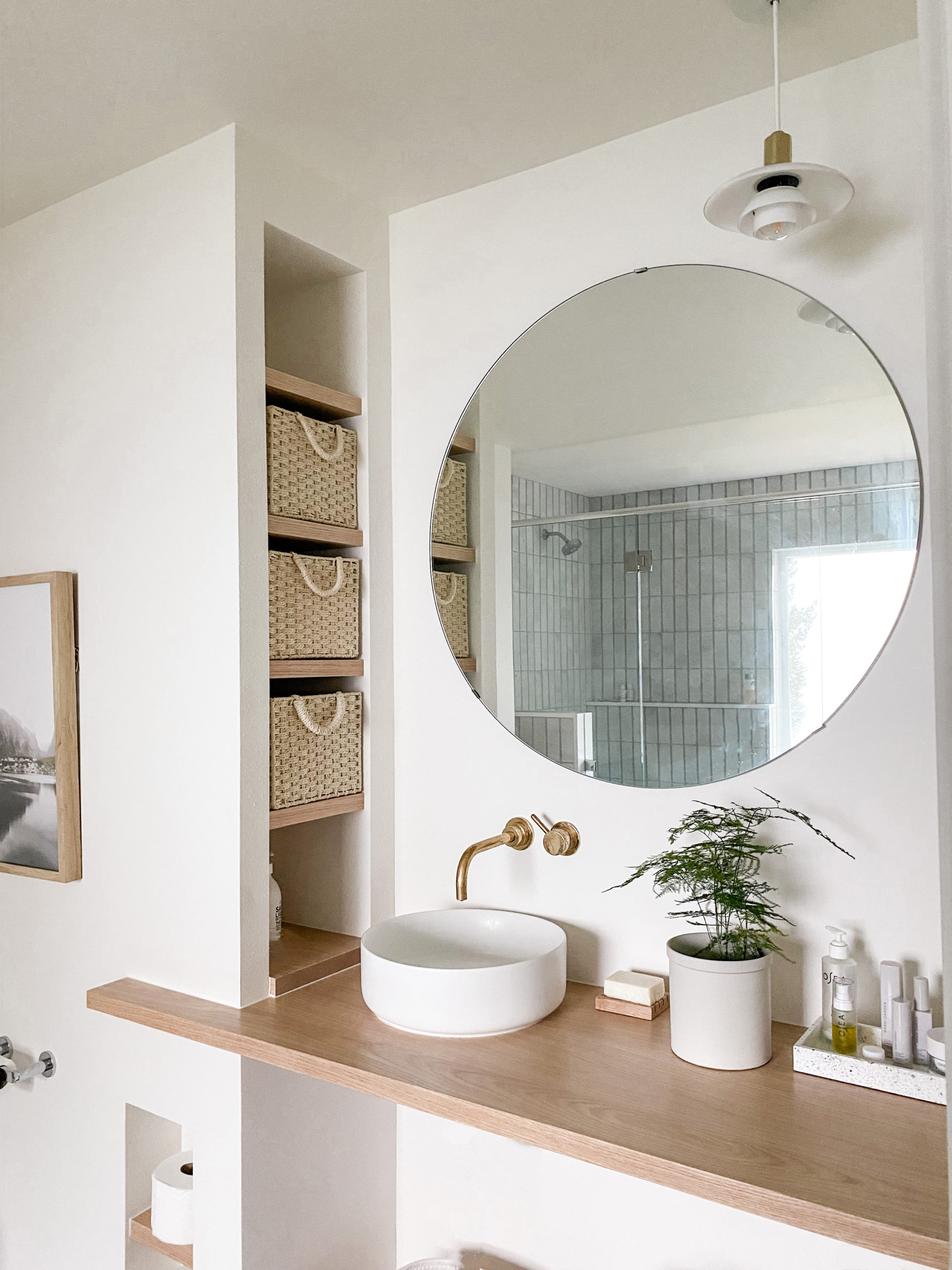
And here’s how it turned out! I created an extra long double shower clad entirely in amazing handmade tile from Clé. Now you get to enjoy stunning views out the west facing window while you lather up. The floating white oak vanity sits on the opposite wall where the fiberglass shower once was – the round mirror reflecting the views of the water and mountains back at you while you brush your teeth.
I used a concrete hexagon tile also from Clé across the seamless floor. As for that fireplace chase? I had my contractor encase the lower half and put a Caesarstone counter on top to serve as another surface for storage. Small simple floating shelves create a spot to display some pretties.
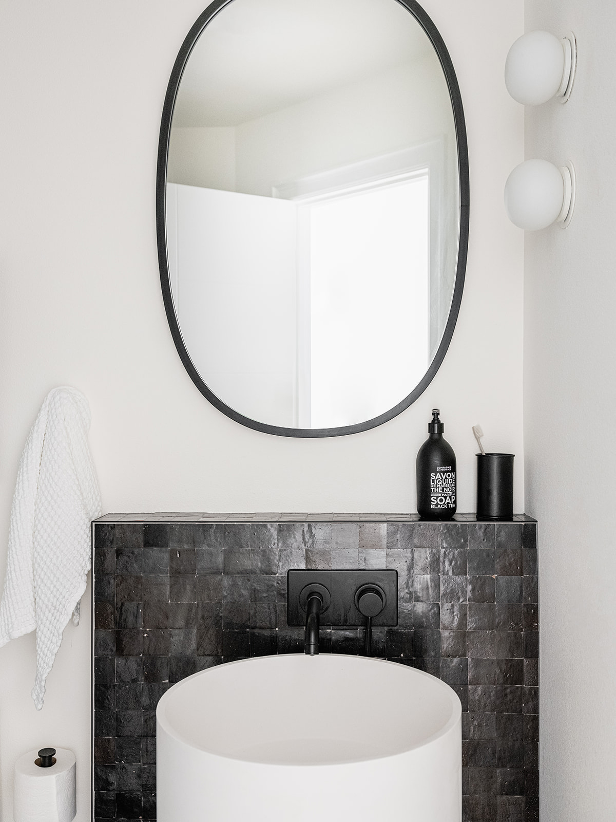
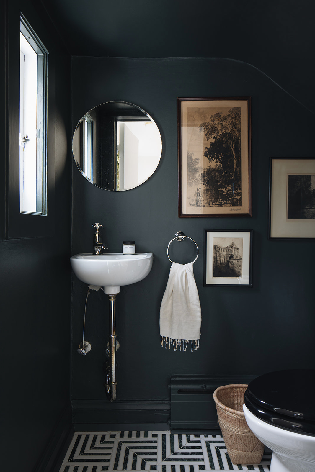
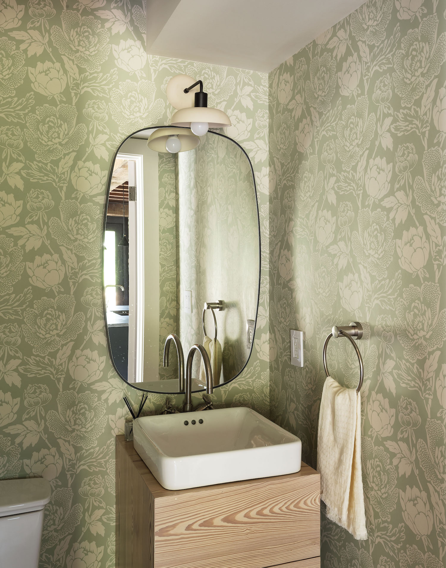
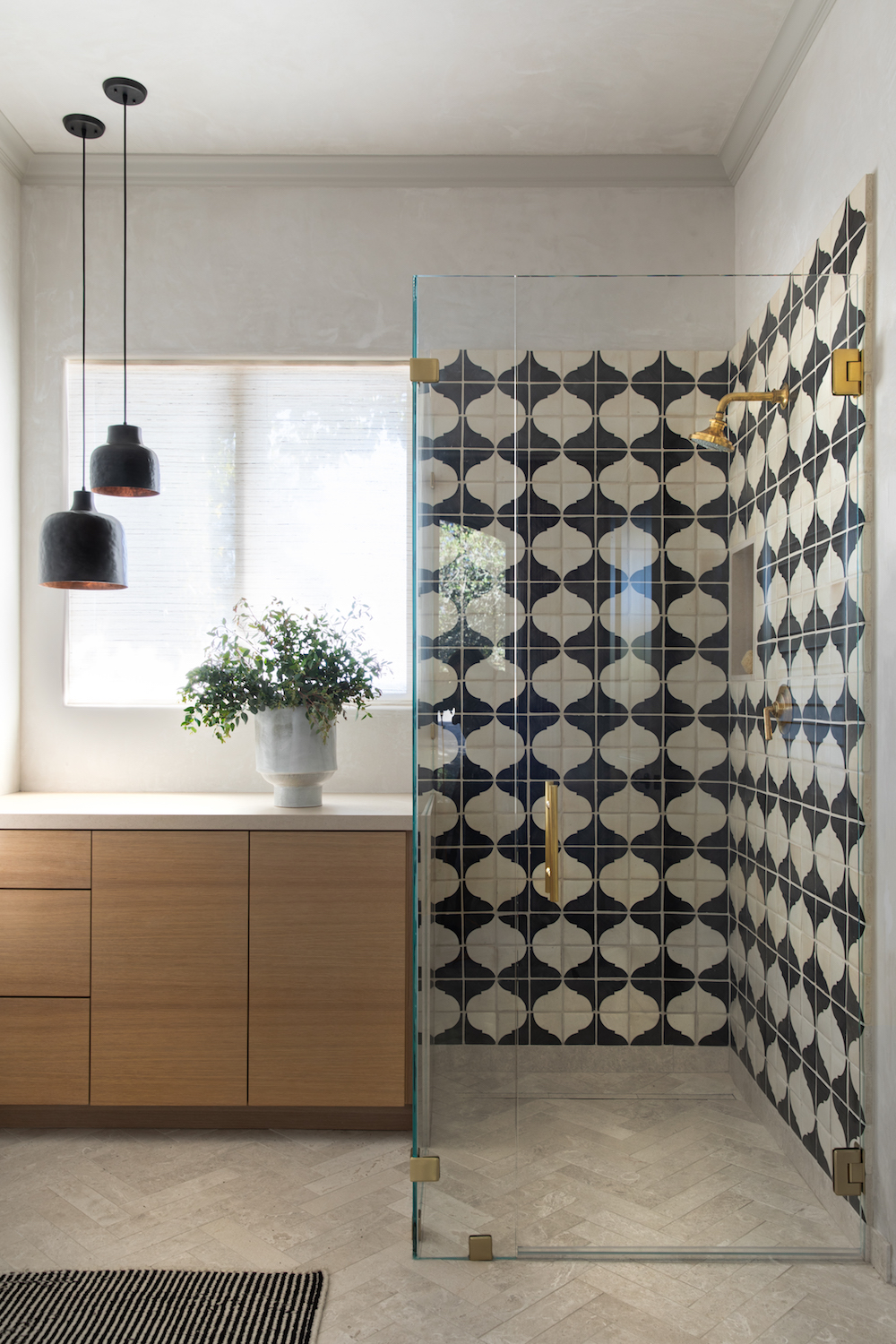
I took a slightly different approach in the guest bath. The layout stayed exactly the same here. It was such a small space it didn’t make any sense to try to switch things up. Instead, I simply made a massive upgrade on all the surfaces – and a total departure from the vibe in the primary bathroom.
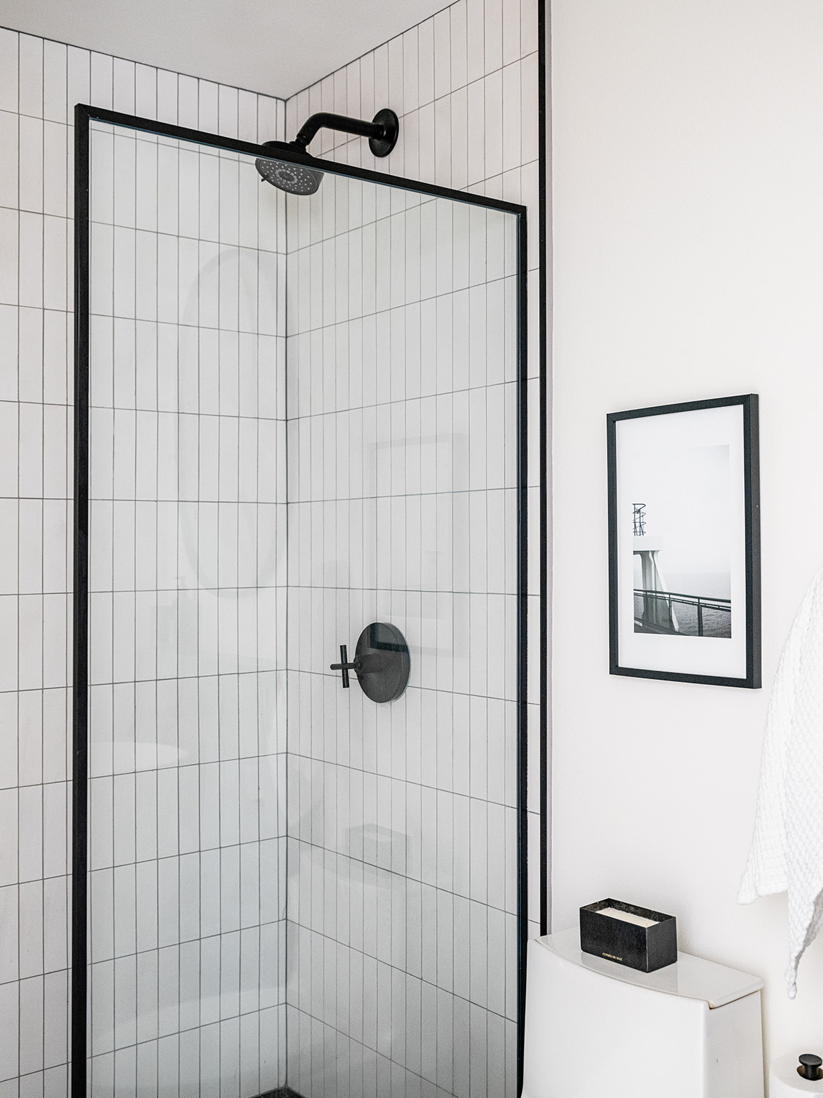
Since the guest bath was already small and windowless, I wanted the design to feel really dramatic and bold. To achieve that end, I stuck to a very graphic black and white color palette. Dark zellige tiles from Clé span the floor and run up the wall to cover an existing bump-out. Stacked cement brick tiles from Clé run up the shower walls to help it feel a bit taller. An off-the-shelf glass shower partition by Vigo from Build by Ferguson was a budget friendly solution for finishing off the shower in style. To soften all the angles and strong lines in this little space, I chose a really fun free-standing cylindrical sink, an oval mirror and two globe lights from Flos. The hall bath may be small, but she gives a mighty big style punch.
Now let’s turn to kid’s spaces!
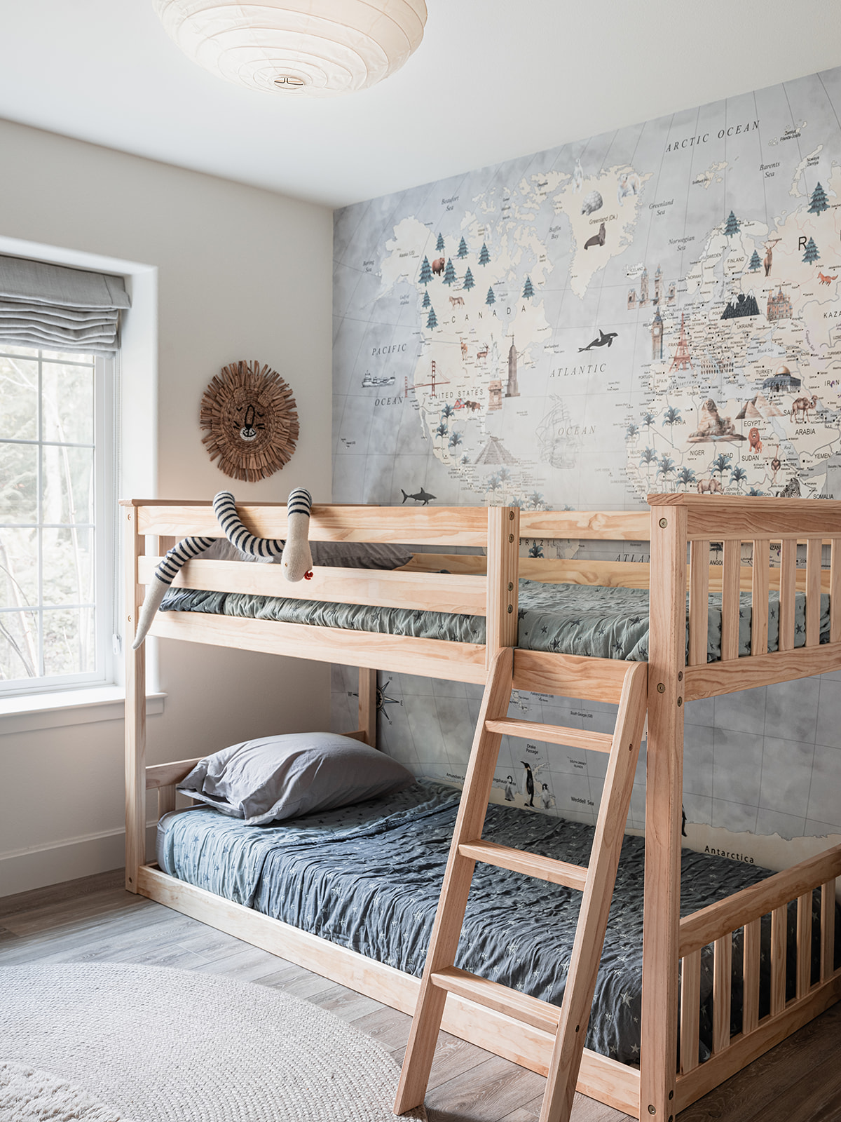
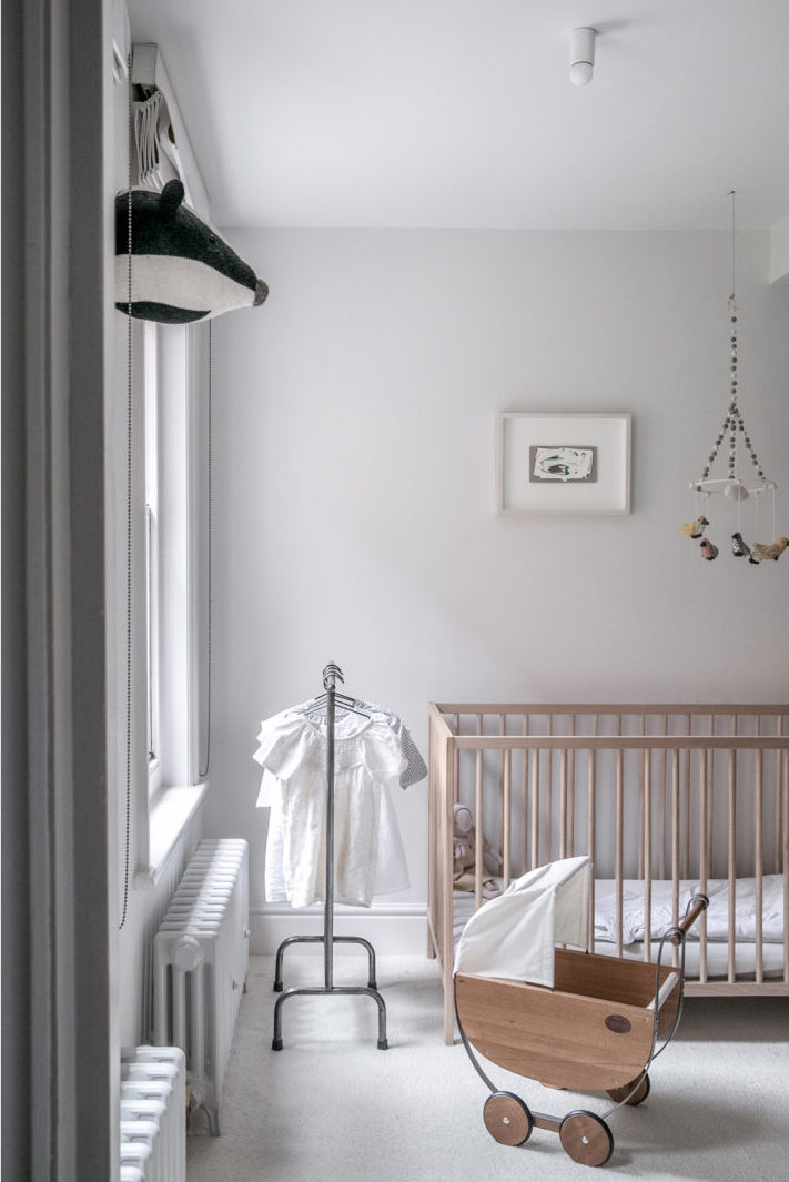
I turned the cottage’s third bedroom into a haven for the littles. As the mother of a seven-year-old myself, I was certainly designing this room with him in mind, but also thinking of all of my friends who have younger children in tow. A simple pine bunk bed (which I may still paint someday. On the fence about that one) allows for sleepovers or siblings to bunk up together A custom (removable!) world map wallpaper lines the room’s entire back wall, creating fun storytelling opportunities at bedtime. On the opposite wall, a Mini Library shelf from my go-to children’s furniture line Oeuf NYC displays books and choice toys.

A cozy braided rug from Armadillo softens the floor. My son runs into this room with the biggest on his face and I truly hope other kids will too.
You might think we’ve reached the end of our tour, but I have a surprise for you. While I call this house a cottage, that moniker is more about how the house feels than its actual square footage. Turns out the house had a daylight basement with a bevy of (sometimes random!) spaces that I set out to maximize by creating a great room, a play space, a home office/fourth bedroom and a couple of random spaces that I found some pretty fun uses for – so let’s head downstairs!
I’ve never lived in a house with a great room or family den before, so I was excited to create a cozy little haven for movie nights and family hangout time. Above is where things started.
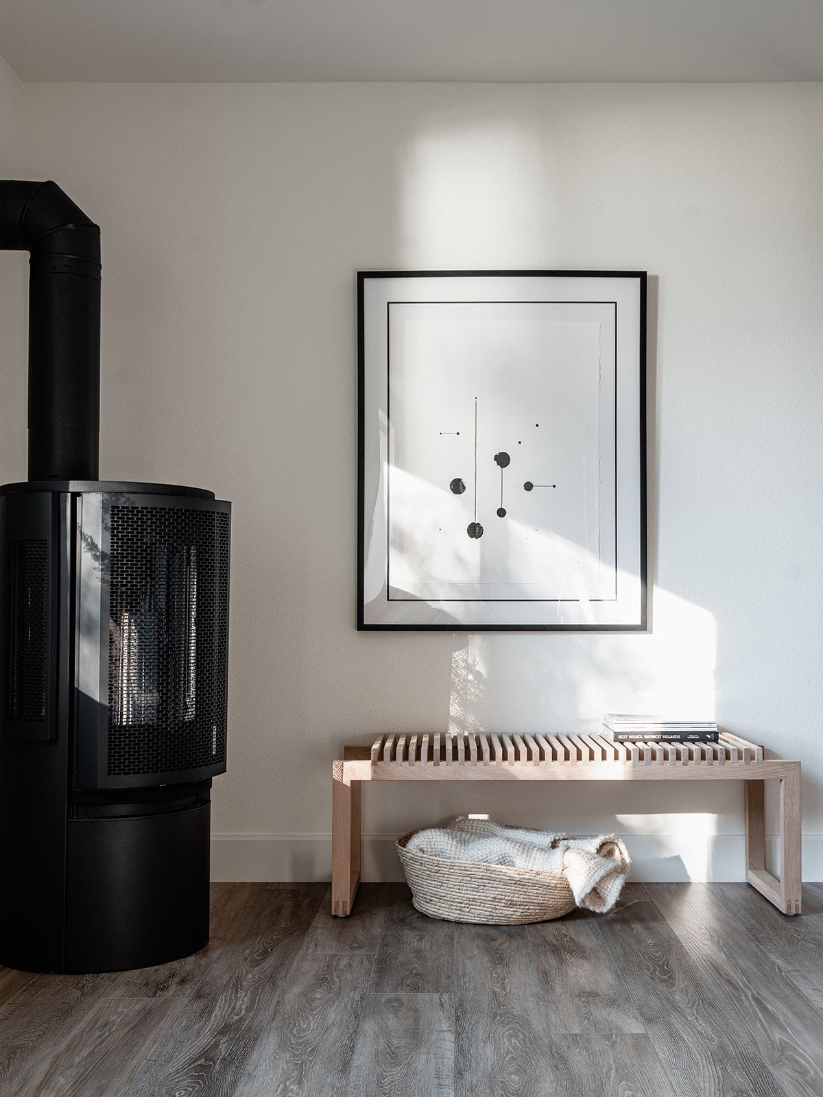
Thankfully, after a little spit and polish, I now have the sanctuary from the hectic world that I was looking for. To achieve this, I turned to more of my favorite sources, including Scandinavian designers like Skagerak and Nordic Knots rugs, but also one of my favorite American furniture makers, Room & Board. A curved sectional upholstered in a nubby cream boucle from Room & Board offers the ideal spot for snuggling up in front of the TV. My son also likes to bounce off the matching ottomans. The media console is actually a series of three Keaton media cabinets in ash that I installed edge to edge along the wall as a way to mirror the soffit above. It has the added bonus of offering ample storage for games, AV equipment and even our turntable and a little vinyl collection. The great room is warmed to an extra cozy degree by a gas stove in the corner that also features a Skagerak Cutter Bench and an original print by Skye Schuchman. I look forward to hanging out in this space after putting my son to bed every single evening.
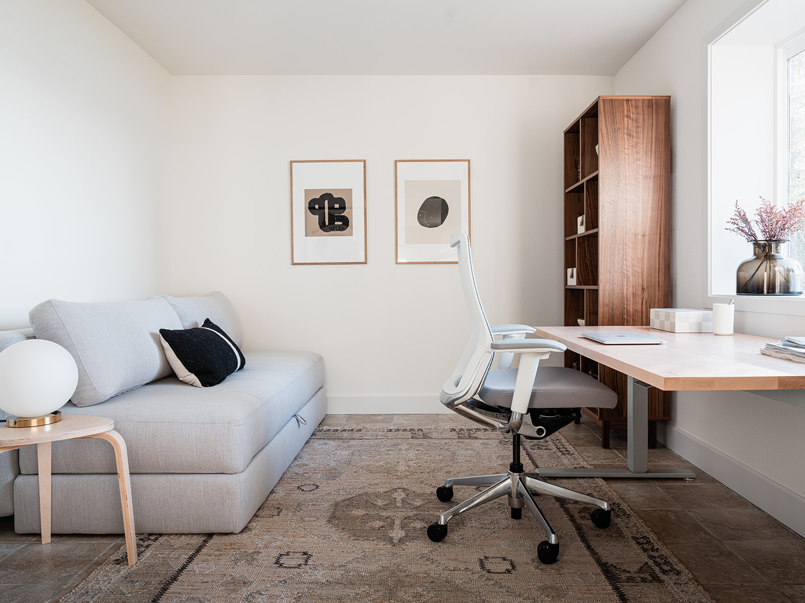
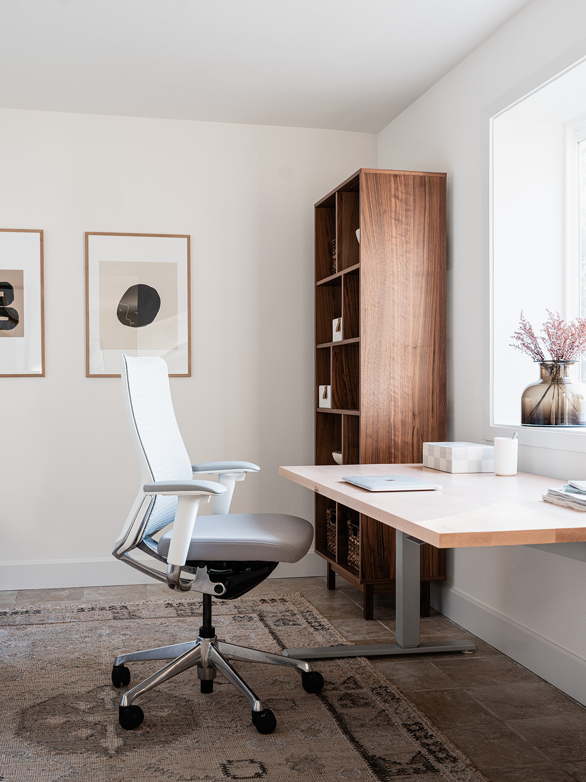
There are some dedicated spaces for kids and grownups alike in the basement. Since so many people can work from anywhere these days I turned a fourth bedroom into a dedicated home office with a pullout sofa to accommodate extra overnight guests. The desk faces the waterfront views though so I can’t promise you’ll be particularly productive.
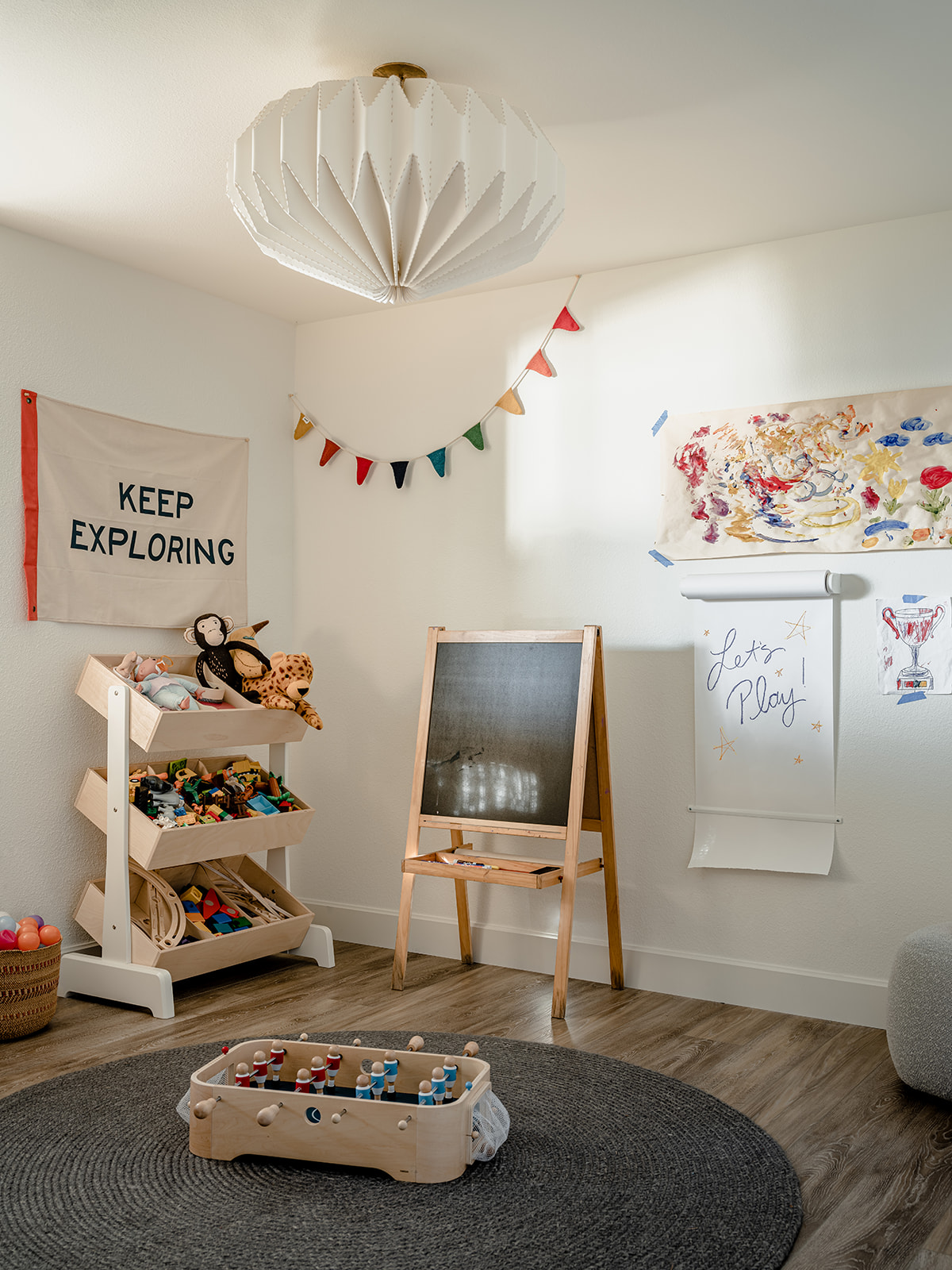
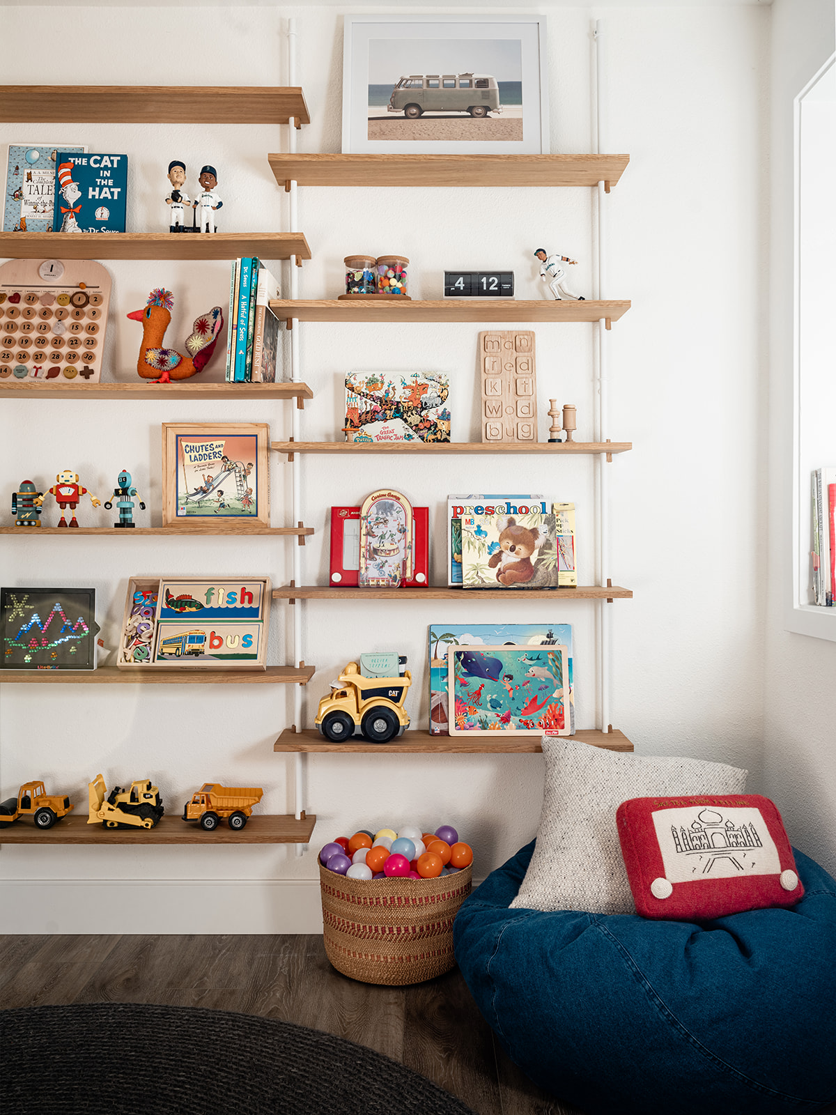
On the opposite side of the basement there was a strange doorless alcove of a room that I decided to turn into a dedicated play space. I immediately knew I wanted wall mounted shelves for storage in this room as it’s a well known fact kids only play with the things they can see. I had my heart set on a particular set of shelves from Ikea but in the midst of the pandemic supply chain issues, they went out of stock, never to return. Thankfully, I discovered yet another amazing Scandinavian design studio, Moebe CPH based in Copenhagen after they reached out to me on Instagram. Their Wall Shelving system was exactly what I’d been hunting for. I couldn’t be happier with how that wall turned out. Kids can grab puzzles, blocks and vintage games from the shelves. On the opposite side of the room I used the Oeuf NYC Toy Store to corral legos, marble run pieces, musical instruments and other fun odds and ends that kids of all ages and stages could easily dig through, while an easel and art station creates a dedicated zone for creativity. Another Armadillo braided rug adds the perfect soft spot to sit and play during a rainy afternoon.
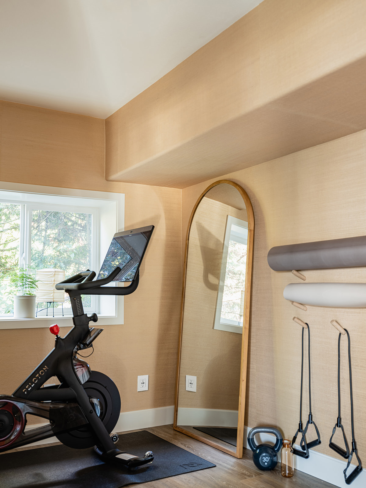
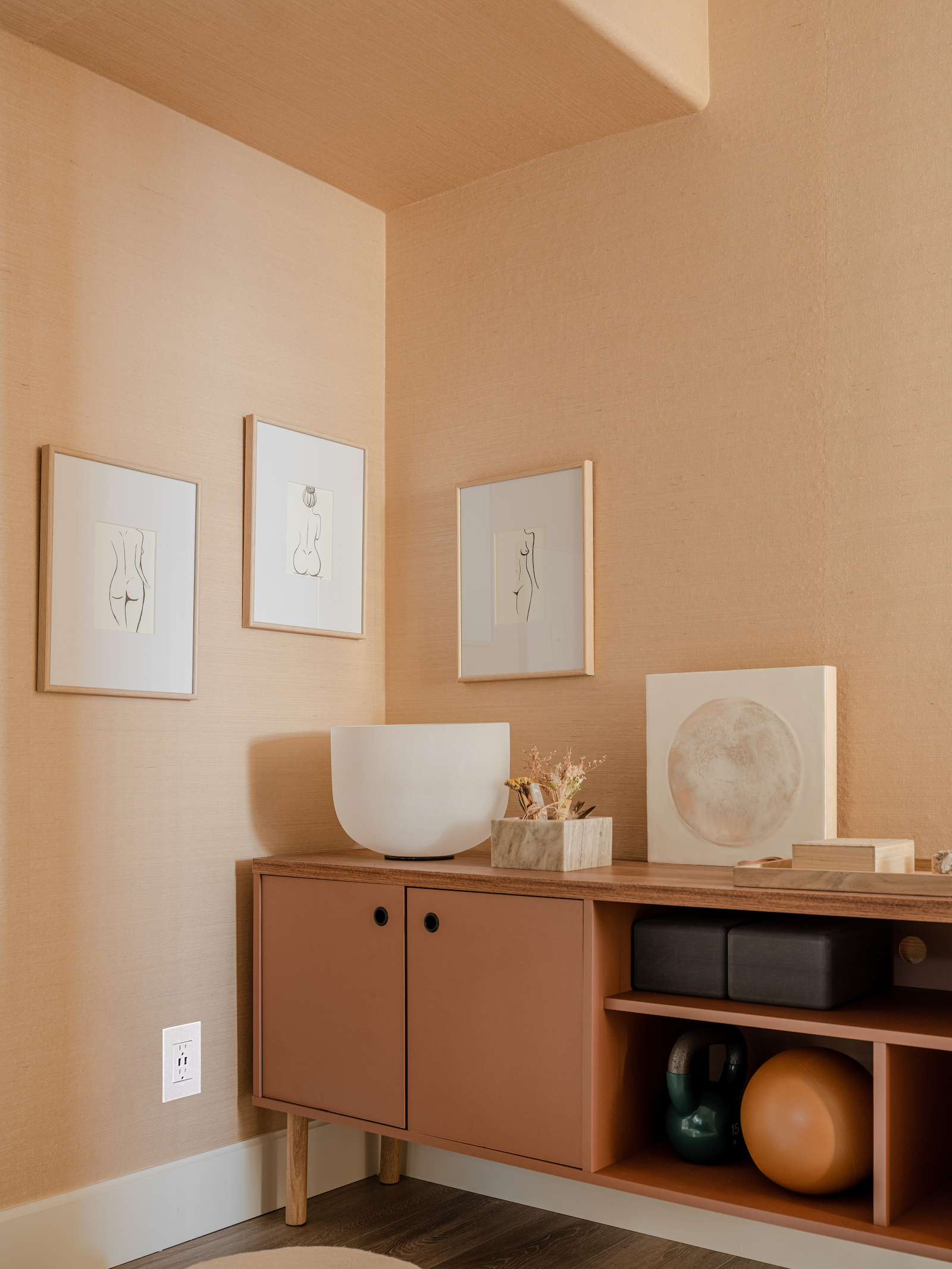
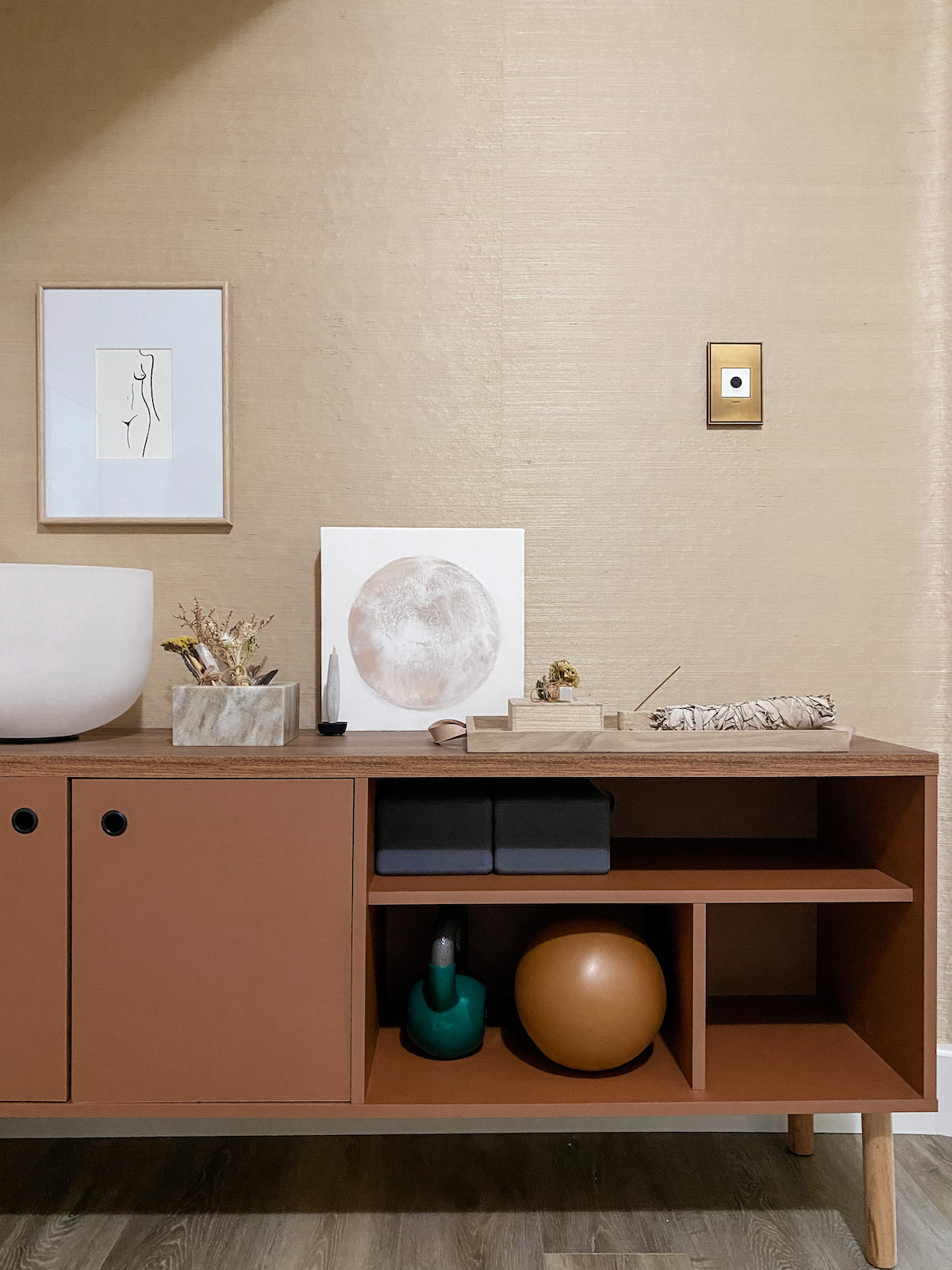
But don’t think I let the kids have all the fun! There was yet another, slightly odd, fairly tiny space in the basement that was crammed floor to ceiling with junk when we originally took possession. But as an avid yogi and a newly minted Peloton enthusiast, I immediately saw an opportunity to carve out a space dedicated to wellness. I worked with Legrand to add designer outlets and switches (which we also used throughout This Old Victorian) and York Wall Coverings to envelope the entire room in a gorgeous grasscloth. I set up my ode to all things “woo-woo” in one corner and also stocked up on some more traditional fitness equipment. I have to tell you, having a room within your own house where you can close a door and workout feels ah-mazing. A room of one’s own, right? After more than a year of doing Zoom yoga in the middle of the living room, I love having this special space.
Finally, I also took over a very weirdly sized closet in the basement to create a larder with California Closets – a spot where we can store the holiday cooking tools, those extra bags of flour we all keep around these days.
Phew. Well there you have it. She might not technically be an actual cottage, but the Hood Canal Cottage is most certainly a special little escape. She sheltered us wonderfully during this incredibly hard time. And this past winter family and dear friends were able to finally gather around her dining table for holiday celebrations. I see so many more of those get-togethers in her future. And we’ve decided that the Hood Canal Cottage should be a guest rental – it needs to be shared with others who appreciate hidden gems.
I’m particularly excited to share the Hood Canal Cottage with other design-loving travelers later this summer. For now, be sure to follow @hoodcanalcottage on Instagram to be the first to learn when our booking waitlist will open. And do come follow along at @apartment_34 too! I will be sharing many more behind the scenes stories for this entire renovation process and I’m always happy to answer any questions you may have. All the sources I could think of are listed below but be sure to ask me if you need more!
photography by Kara Mercer
styling by Cassandra LaValle
design by Apartment 34 Designs
SOURCES
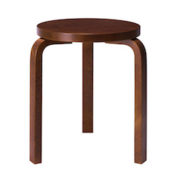
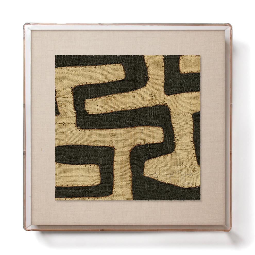
LIVING ROOM
Coffee table Lulu & Georgia Similar
Casa Patina painting
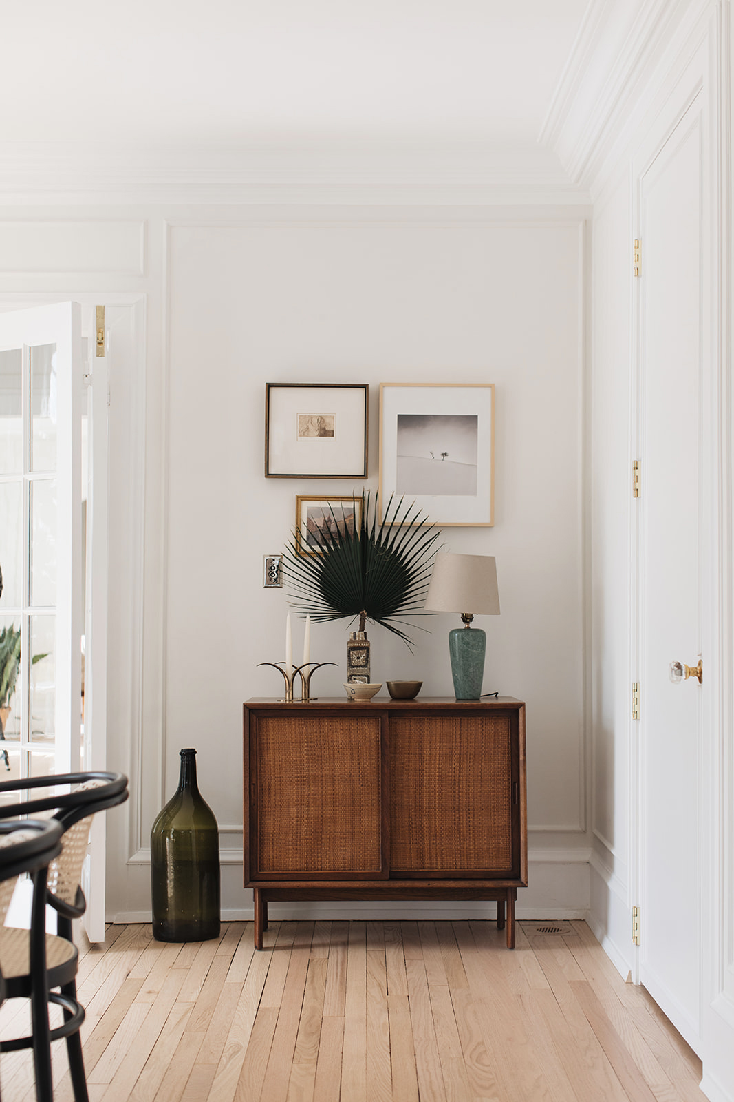
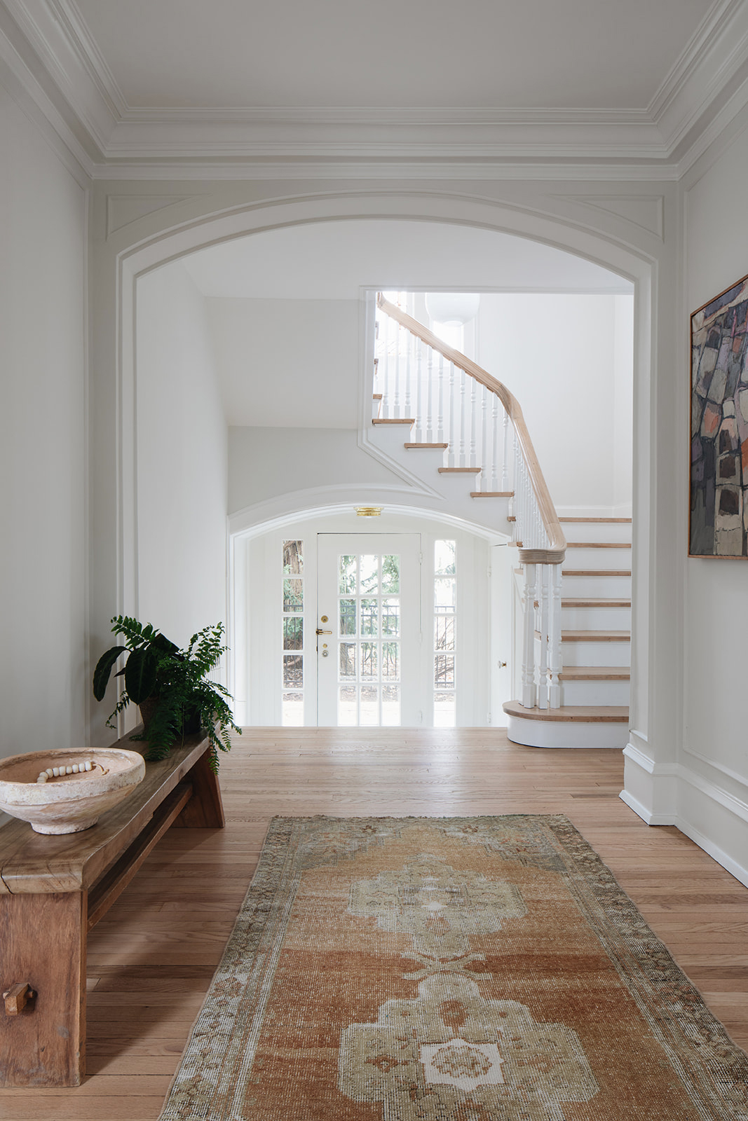
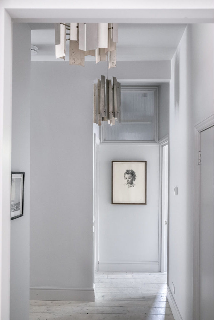
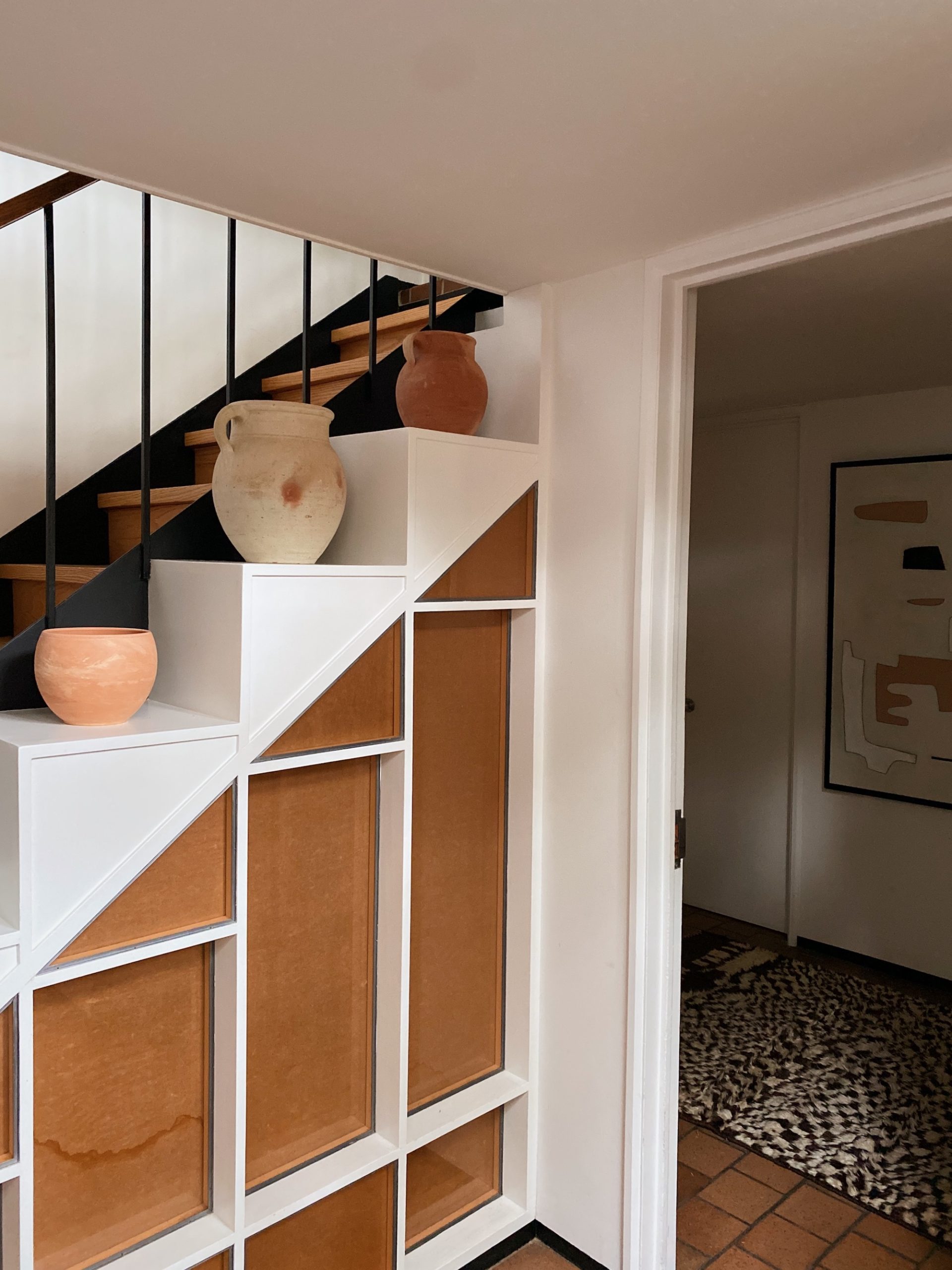
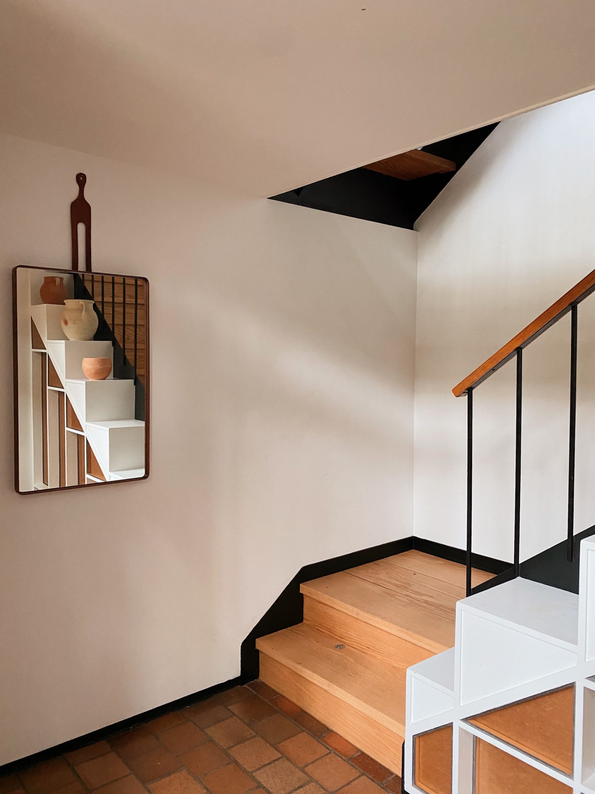
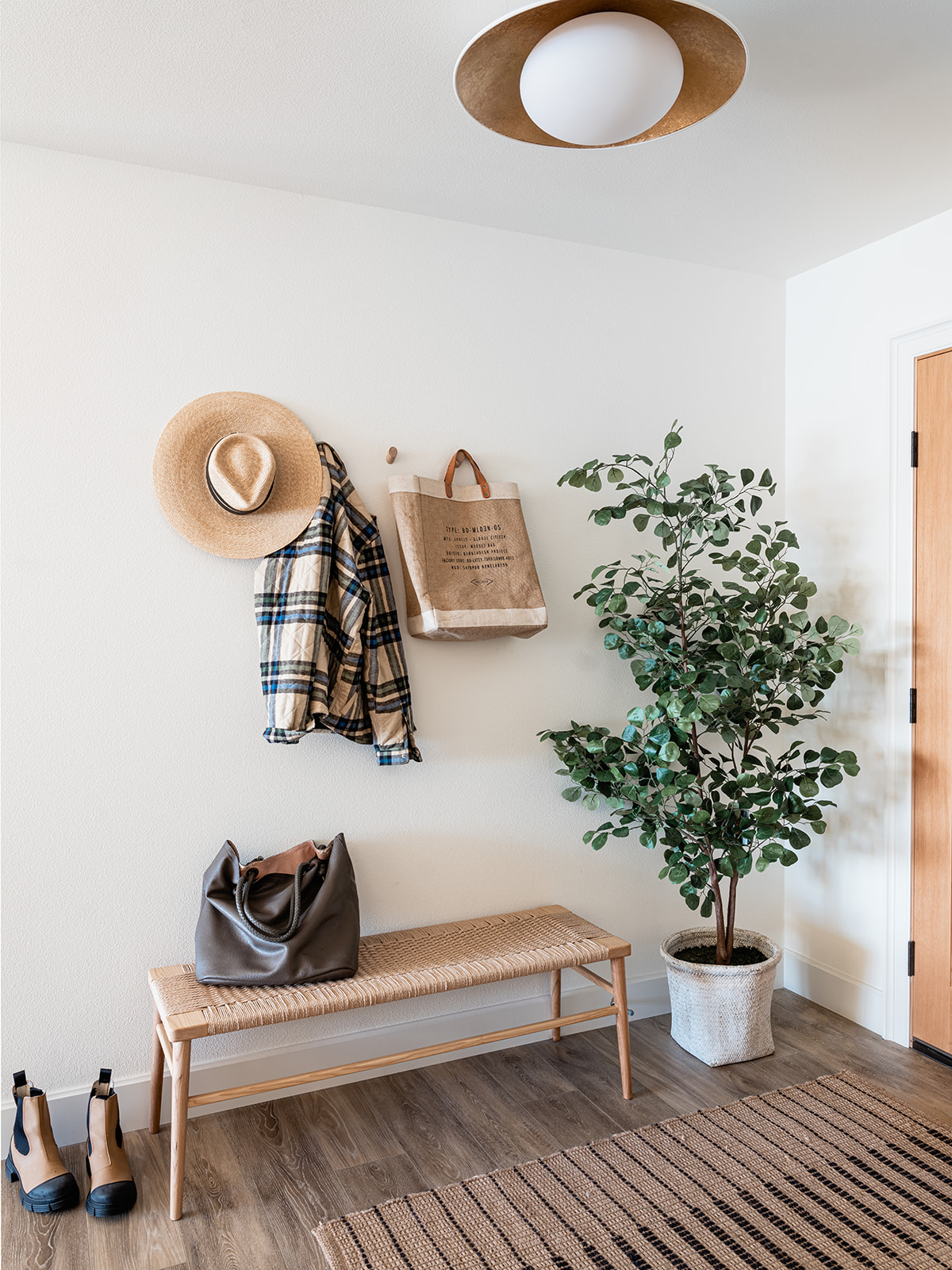
ENTRY
KITCHEN
DINING AREA
PRIMARY BEDROOM
GUEST BEDROOM
HALL BATH
KIDS’ ROOM
FAMILY ROOM
PLAYROOM
ZEN DEN
OFFICE