mid-summer moodboard on apartment 34

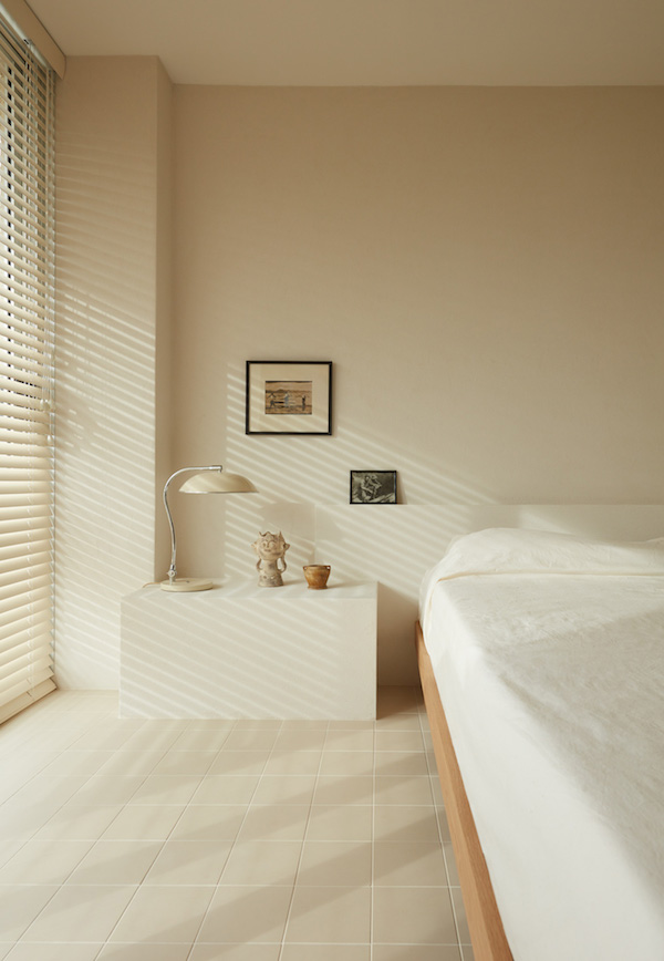
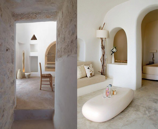
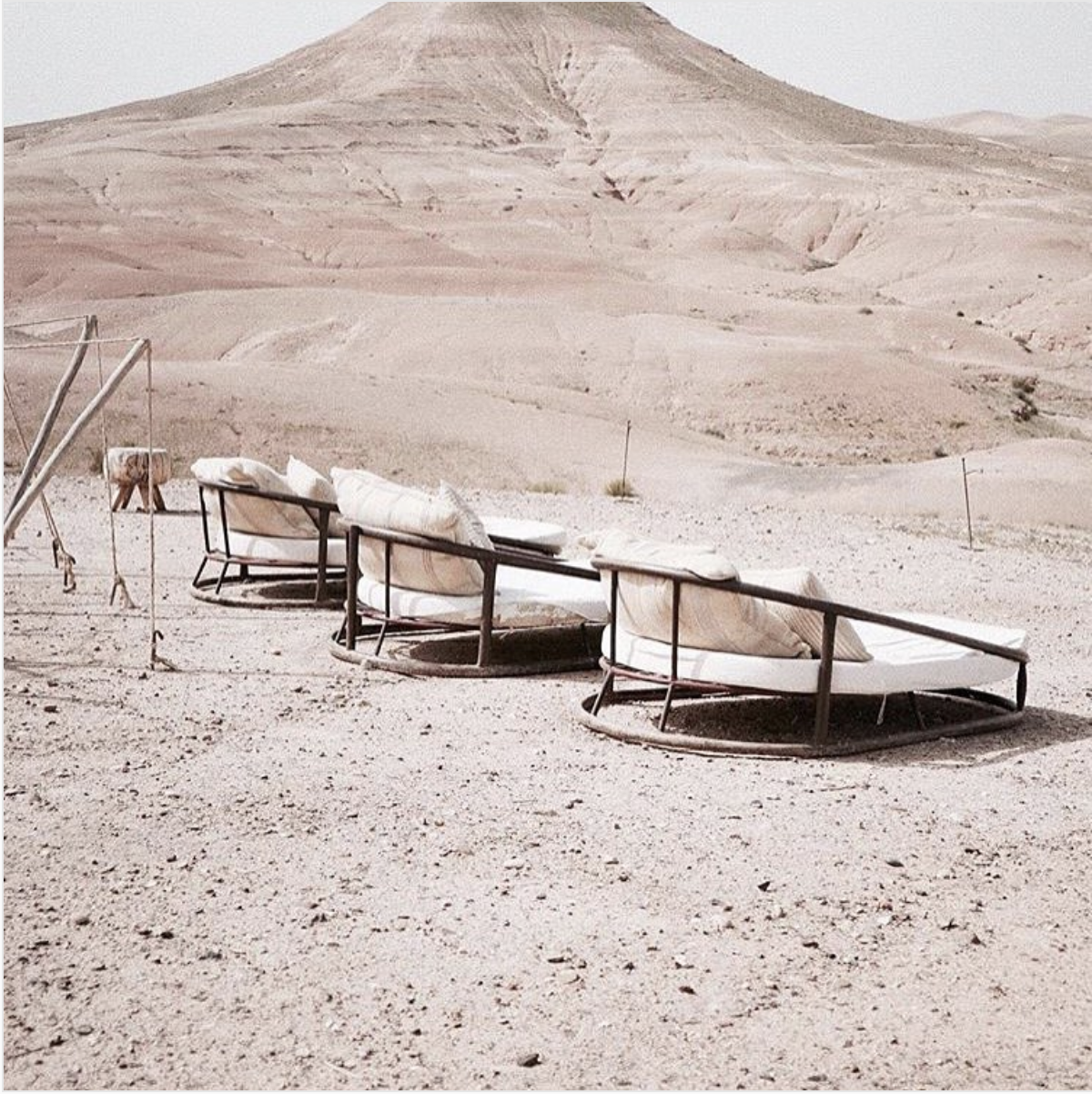
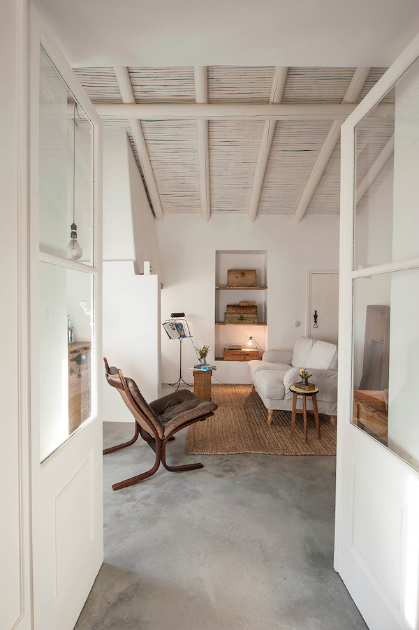
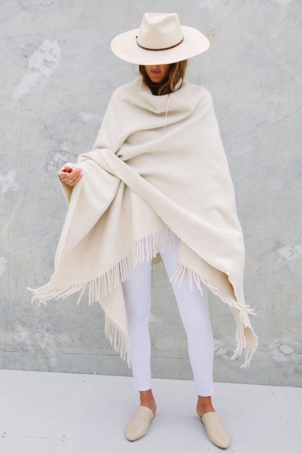
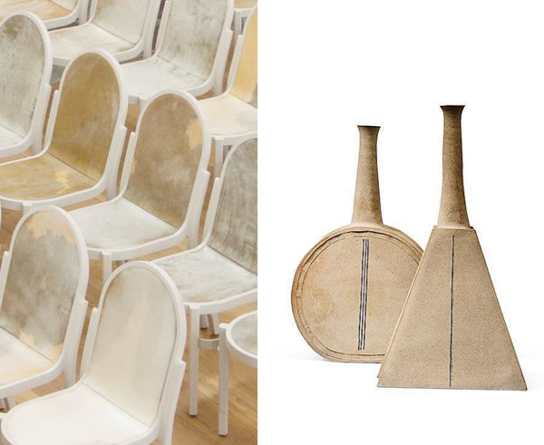
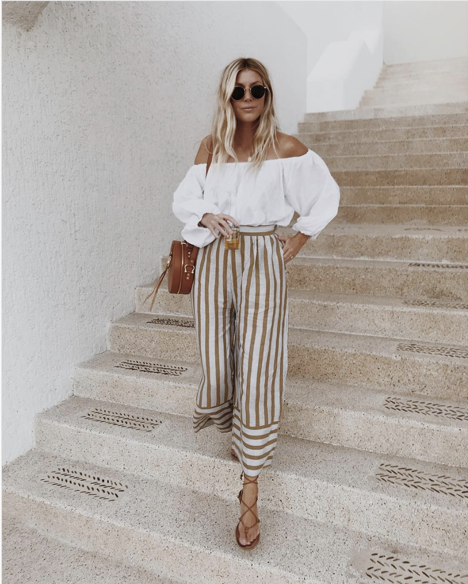
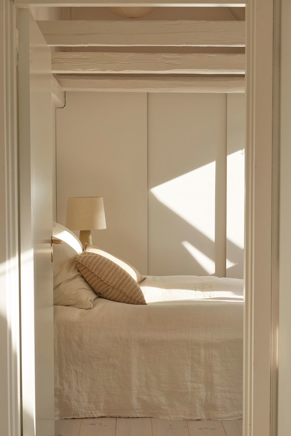
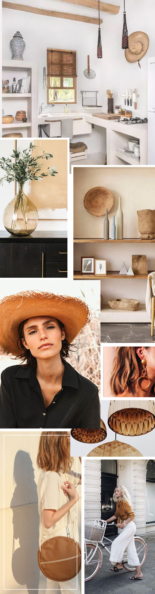
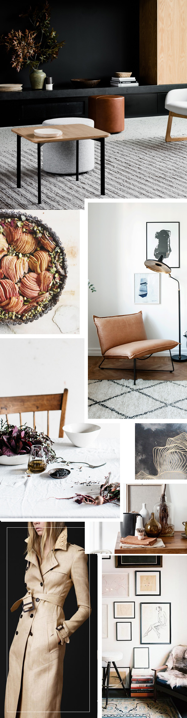
After a weekend of soaking up summer fun, friends and family, I feel like I’m emanating a warm, creamy glow. So rather than jump head first into Monday, I’d prefer to ease in, with dreams of golden sandy beaches, sun-washed destinations (like Puglia – seriously considering a trip next year!) and vacation vibes warming my bones. There’s something about a rustic pueblo look, a bit of Georgia O’Keefe in the desert mixed with seaside breeze that feels so delicious. While I’ve yet to finish my own house – though I’m trying desperately people – I promise – I now have a dream vacation home percolating in the back of my mind. Would you care to join in my daydream? Continue to scroll!

mid-summer moodboard on apartment 34mid-summer moodboard on apartment 34mid-summer moodboard on apartment 34mid-summer moodboard on apartment 34mid-summer moodboard on apartment 34a home full of subtle style on apartment 34

For more moodboard inspiration, CLICK HERE.

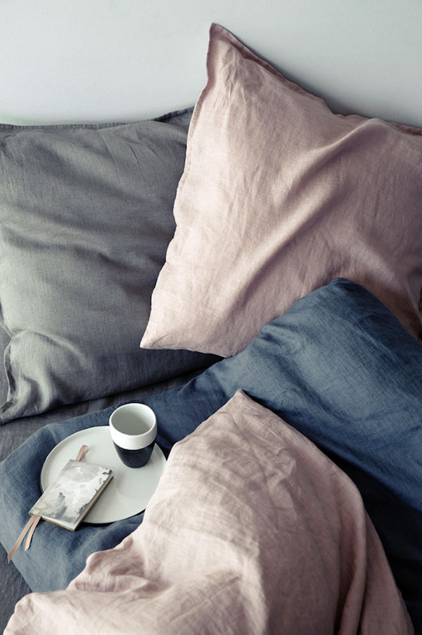
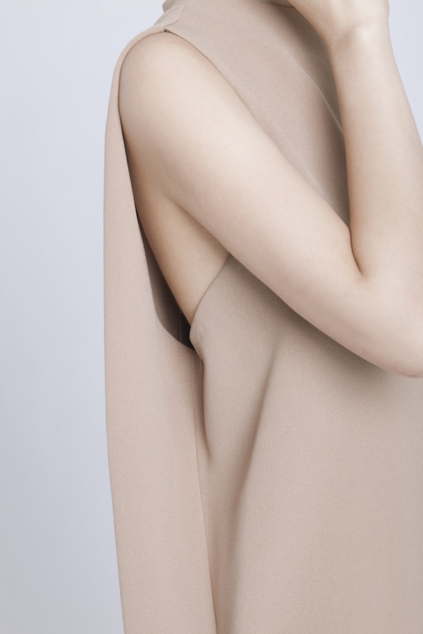
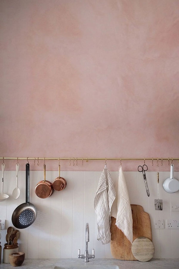
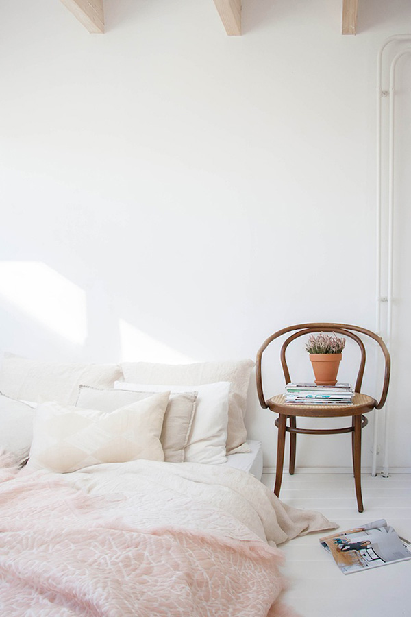
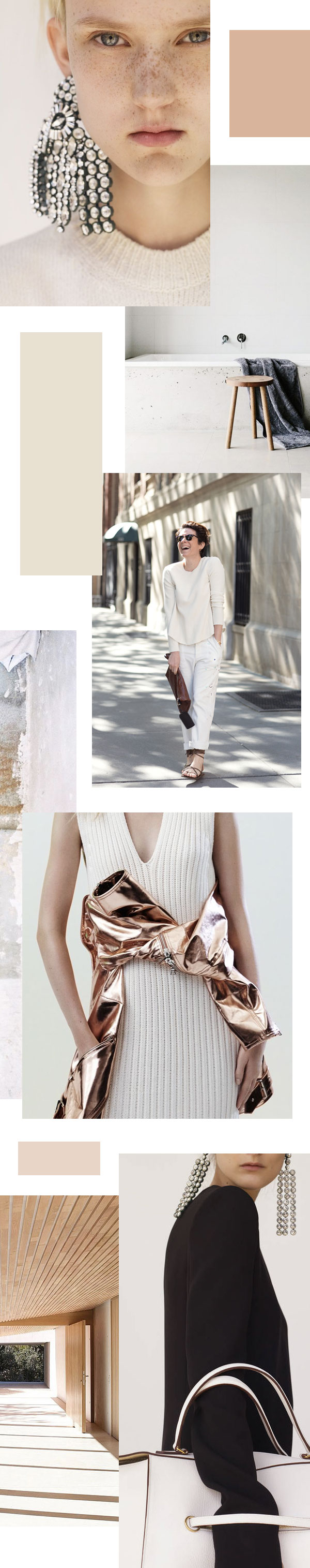
images 1 / 2 / 3 / 4 / 5 / 6 / 7 / 8 / 9 / 10 / 11 / 12 / 13 

It’s official. We’ve turned the corner into the heart of summer. Can you feel it? The light is golden and endless –warm-weather-tinged hues are coming in strong – the air is thick and sultry and buildings seem to glow in the late afternoon heat. I’m in the mood to do little more than bask in the sun, sip on rosé, take a refreshing dip or knock off an hour (or two!) early for happy hour during the day’s best light. That’s why all things golden are catching my eye at the moment.

summer mood on apartment 34

I’m loving all of these golden camel tones. When mixed with an accent of bright white and anchored with black, the warm look cools down just enough. It reminds me of sun-soaked islands, miles of deserted beach and a perfect inspirational palette to take us through the season’s dog days. Summer always seems to go by too quickly, so I’m going to savor its lazy, languid effect as much as I possibly can. Care to join me??

For more color-combo inspiration, CLICK HERE

SHOP THE POST

[show_shopthepost_widget id=”2734539″]

Apologies for being a little tardy today friends. I don’t know if you followed along on my Italian adventures last week, but I’m finally back home now and still battling major jetlag. But at the same time, I feel refreshed, energized and so ready for all that the new season brings. It’s always interesting how travel helps you look at things through a new light.

Right now, everything I see has a warm, golden glow. There’s something about the light in Italy that gives everything a beautiful patina. Colors appear more saturated, richer – they envelop you like a familiar hug. It has me craving a similar color palette this month.

apt34-september-mood

As much as I love the washed out Scandi whites and blues that have been dominating my Pinterest and Instagram feeds, I’m loving the earthy, grounded vibe of this palette. Carmely browns mix with deep black, touches of copper, hints of burnt sienna and just a pop or two of white to create an atmosphere that feels layered, endlessly interesting and deeply personal. You want to just burrow in and explore. That’s how I feel about September. I’m ready to dig deep – to invest in what and who I love, in what fuels me, in what I hope to offer you. While summer is often the season to reinvigorate your spirit, fall is the season to reinvigorate your soul.

Care to join me?

For more color palette inspiration CLICK HERE

image 1 figr / image 2 canellevanille / image 3, 7 st frank / image 4 luisa brimble / image 5 tracie cheng / image 6 burberry prossum / image 8 vogue living

If last week was all about being green, everything is coming up roses today. Rosy-pink that is.

apt 34 pink 6apt 34 pink 5apt 34 pink 4 apt34 pink 3tumblr_o0n9e4Fwwi1r6do47o1_1280

Yes, I realize it’s the Pantone color of the year and all, but pink doesn’t usually catch my eye. I usually dismiss it as too girlie. Too soft. But a touch of pale, dusty pink feels so right right now. Maybe it’s because I can’t stop staring at the lovely bouquet of pink tulips I picked up this weekend or the fact that it’s officially spring (wha!!). Whatever the reason, I like the idea of adding a hit of pink to an otherwise neutral color palette. It pairs particularly well with charcoal gray. Perhaps some rose-colored bedding will be in the cards for the new house? Or a sweet pink table lamp

But what say you? Would you let a little pink sneak into your world this season?


image 1 / 2/ 3 / 4 / 5

I don’t know about you, but after the overload of red and green during the holiday season, my eyes are ready for some serious downtime. I’m craving soothing neutrals, soft nudes and creamy whites. They’re fresh and ready for whatever the new year has to bring. They feel cozy but light all at the same time.

color-palette

It’s official. We’ve turned the corner into the heart of fall. Can you feel it? The light is changing – blue, cold-weather-tinged hues are coming in strong – the air is turning crisp and the leaves have proceeded to show off their autumnal spirit. All of these November changes have us in the mood to hunker down, sip on tea, sneak some extra seconds in bed under worn-in linen covers and cozy up our style with layers of texture and our favorite color of the month – silver!

apt34-november-mood

We’re loving all of these greige tones with a monochromatic pop of silver. It feels cooly fresh and modern {who’s ready to shy away from gold or brass this season?} and a perfect inspirational palette to take us deeper into the holiday months. We’re going to savor its calming and cozy effect as we prepare for the craze ahead!

images left to right: 1, 4 + 6 via Linkdeco // 2 via Canelle et Vanille // 3 via Collage Vintage // 5 via Tracie Cheng // 7 via // 8 via My Paradissi

Winter – you’ve been so fickle this year – slamming so many of us day after day, refusing to let go of your icy grip. And while we’re very excited about the prospect of spring, this seemingly endless hibernation has done one thing: caused us to finally give in and embrace a cozy, reflective, slower pace.

If we had to limit ourselves to pictures and a few words to describe it, our current mood would look a little something like this:

monthly-mood-board

And we’ve decided it’s a good thing! Something about deep shades of blue balanced against lighter grays, warm winter whites and hearty browns make us feel grounded. Secure. Steady. And we’re really liking that!

Sure, we’ll shake off a layer or two once spring finally rolls into town, but we’re going to do our best to keep this calmer feeling top of mind even as the next season arrives.

What about you? Have you made piece with this year’s winter or are you ready for your wilder and brighter side to break through?

Images top to bottom, left to right: 1 via @ifitwags // 2 via Trendenser // 3 Suivi Sur Le Vif // 4 & 8 via Minakani Lab // 5 via Emily Andrews // 6 & 10 via Modern Hepburn // 7 via // 9 via // 11 via Jake Curtis

I have always been a fan of monochromatic interiors, particularly seen in a lot of Scandinavian design. I love the way that you can play with a singular palette by layering texture on texture. Of late, it seems like Pinterest has been on the same wave length – love for the monochromatic look is gaining ground!

Excited about the amount of Scandinavian inspired pins popping up, I rounded up some of my favorite interiors that have come across my feed for this edition of This is Very Pinteresting!

Scandinavian-Design-This-is-Very-PinterestingScandinavian-Design-This-is-Very-Pinteresting-2Scandinavian-Design-This-is-Very-Pinteresting-6Scandinavian-Design-This-is-Very-Pinteresting-4Scandinavian-Design-This-is-Very-Pinteresting-5Scandinavian-Design-This-is-Very-Pinteresting-3

If you haven’t started a monochrome interiors Pinterest board, I strongly urge you to do so! You’d be surprised by how much a lack of “color” can inspire amazing design. If you have a board already, I’m dying to see it – please, do share. I think I have a couple of hours in between meetings this afternoon to drool over some fabulous pins!

While you’re there you can check out what inspires me on Pinterest here! 

image 1 via // 2 via // 3 via // 4 via // 5 via // 6 via // 7 via // 8 via