Earlier this week, you got a full tour of the living room and dining room in the Sunset Bungalow. Today we’d like to invite you into the master bedroom. You may have spied the sneak peek we shared when discussing the room’s paint job, but now you get to see the complete picture.

Chloe’s bedroom makes me feel like I’m sleeping on a cloud. We stuck to a purely neutral color palette that feels airy and open. The bed just seems to float against that soft blue-gray backdrop of our wall color. All of the texture in the room, from the linen bedding by Primary Goods to the custom weaving created by Bay Area artist Meghan Shimek, to the cashmere throw feels fluffy and light.

And while I’m usually a big proponent to mixing up the pieces in a bedroom (bedroom sets are so 1986), we kept all of the wood tones in this space very similar. The custom-made bed created by Oakland-based wood worker Ben Winslow is oak, the bedside tables are ash while the gorgeous Room & Board dresser is maple. The cohesiveness of the look maintains that serene, soothing feel.

All of the materials in the bedroom are natural – matte ceramic lamps from Room & Board feel clean and modern. We replaced the horrid boob flush mount with a timeless paper lantern pendant. The ceramic planter and woven laundry hamper from Overstock offer additional texture. The oversized Room & Board round mirror helps reflect even more light around the space. iI also love how it reflects the half-wall adding to that floating in sky (or ocean) effect.

Chloe needed a lot of clothes storage as closets in 1940’s homes are teeny tiny, so a second, smaller dresser offers more room and a home for more of her beautiful original art we had framed by Framebridge along with a few more pieces from her vintage collection. The full length mirror is a must-have in any master bedroom. You gotta be able to assess a full outfit!

I’m obsessed with Chloe’s lamp – it’s an original mid-century piece with a cork base that she scored at an estate sale! Also be treasure hunting friends. Always be treasure hunting. The addition of vintage pieces keeps the space from feeling too shiny and new.


As a creative director, Chloe looks at color and busy images all day everyday, so I really wanted her bedroom to be a respite from the noise. In this space she can completely unplug, relax and enjoy the view out to the Pacific Ocean that she’s lucky enough to have from her bedroom window. I wonder if she’d ever need a house sitter.

SHOP THE ROOM: Ben Winslow Design custom bed / Room & Board bedside lamps / Room & Board dressers / Room & Board table lamp / Room & Board round mirror / Room & Board full length mirror  / Capsule Home nightstandsMeghan Shimek weaving / Maxim pendant light / Primary Goods bedding / Overstock ceramic planter / Overstock hamper / Creativity Explored art / throw pillow / throw blanket / Behr 2018 Color Trend paint color in Quiet Time 


original photography for apartment 34 by andrea posadas

For my home tour fans out there, this is your week. You’ve gotten a little taste of our makeover of the sunset bungalow my friend Chloe’s house here in San Francisco, but this week we’re bringing you the full tour! We’re kicking things off today with the living and dining rooms. It is very hard for me to pick a favorite out of our made-over spaces, but these two rooms are making a very strong case. I’m eager to hear if you agree.

Above are before shots. Chloe’s living room started out very bland and a little dull. We wanted to brighten and enliven the room. And while we did consider painting her small-ish dining room a bold color to really make it pop, we went in a very different direction and I couldn’t be happier with the final result. Check it out below.

sunset bungalow dining room on apartment 34

The after is just a breath of fresh air, don’t you think?! I’m really not sure if I could love Chloe’s dining room more. We wanted to create a beautiful, modern, yet beach inspired space. Hence all the woven materials. Our entire inspiration was born by Chloe and my shared obsession with Cesca chairs. There really is nothing better, but vintage ones are gonna cost ya. Thankfully, we found brand new, beautiful Cesca chairs at Oversock and they became the jumping off point for the rest of the room.

This room was another primary inspiration for Chloe’s space – we just needed to work on a smaller scale. We totally achieved our desired effect by adding a woven pendant above the dining table and placing a clean, modern credenza in an ash finish against the back wall. It really anchors the room. A credenza is great for offering much-needed storage and serves as the perfect display area – or spot to serve food or drinks when you’re hosting a dinner party! A classic Saarinen-style tulip table was perfect for the petite space.

sunset bungalow dining room on apartment 34

A sweet trio of an Atollo-inspired lamp and a mix of ceramics hold court on one of the credenza’s corners.

sunset bungalow dining room on apartment 34

While Chloe has many a collection, we kept the accessorizing of her dining space really minimal. I love the white on white effect with the clean modern ceramic bowls on her dining table. Her only job is to keep both the credenza and table from getting piled high with stuff, bu all the storage in there should help with that.

sunset bungalow dining room on apartment 34sunset bungalow dining room on apartment 34

The stunning original artwork by local Bay Area art studio Mineral Workshop really draws you into this room and invites you to stay awhile. The diptych is actually made of hand-dyed fabric stretched over the frames. Swoon.

sunset bungalow living room on apartment 34

And then there’s the living room. You saw our feature fireplace wall in this post, but today I wanted to share the rest of the room! While not particularly large, Chloe’s living room needed to be able to accommodate friends, offer a cozy place to chill out and let’s be real – as any freelancer knows, you’ll be working from your couch more often than not.

The Noah Sectional from Rove Concepts helps us accomplish all of that beautifully. There’s plenty of room to spread out on that thing. We balanced the oversized sofa with more clean-lined, mid-century inspired accent pieces, including the glass and wood coffee table and swing arm wall lamp. They offer a refined counterpoint to the sectional.

The big bold moment in the room is the oversized original painting we commissioned from artist Nicole Mueller. Our studio tour with Nicole will be coming soon, but you can check out pieces she has for sale from this series right here. We pulled the colors from Nicole’s piece down onto the couch and added some cozy texture with a set of woolen pillows.

sunset bungalow living room on apartment 34sunset bungalow living room on apartment 34

To offer a little more seating, a wing chair and grasshopper lamp sit aside our living wall, aka the fireplace. Another of the many pieces of Chloe’s personal art collection brings the blue tone of the couch across to this corner of the room.

sunset bungalow living room on apartment 34

To pull color across the whole room we created a place to display more art against the wall directly across from the couch (with a peek-a-boo view into the dining room). I love the effect of leaning and layering art. It adds dimension and texture. It also lets you swap out pieces to your heart’s content.

The white storage bench offered a neutral base for our display. We used a more mellow, pastel-inspired color palette for this collection. I couldn’t help but add that bold yellow and little pop of pink though! Chloe really does embrace color and I got into playing out of my comfort zone. The plants offer height and add more life throughout the room. We got all of ours from Leon & George in San Francisco.

sunset bungalow living room on apartment 34

You can find cool woven baskets to house large plants right here.

sunset bungalow living room on apartment 34

I love the acrylic plant stand from Overstock. It doesn’t take up more visual space and is quite cool.

sunset bungalow living room on apartment 34

I would gladly hang out in Chloe’s living and dining rooms. Combined they create the perfect space to entertain and the succeed in helping her 1940’s bungalow feel more young, modern and fun. Stay tuned as later this week you’re going to get the full tour of the master bedroom. She’s a beaut.

SHOP THE POST: dining chairs / credenza / pendant light / dining table / table lamp / sectional / throw pillowsNicole Mueller art / Mineral Workshop art / acrylic plant stand / woven basket / coffee table / wall lamp / grasshopper lamp / wing chair / storage bench / reclaimed wood side tableceramic bowls /  / Creativity Explored art

To see how we used color throughout #TheSunsetBungalow CLICK HERE.

original photography for Apt34 by Andrea Posadas

Hi friends, happy Monday! Last week you got a little preview of our Sunset Bungalow reveal, so today I wanted to dive into the details of the home’s color transformation. I can’t wait to hear what you think.home tour: bold color in a bungalow

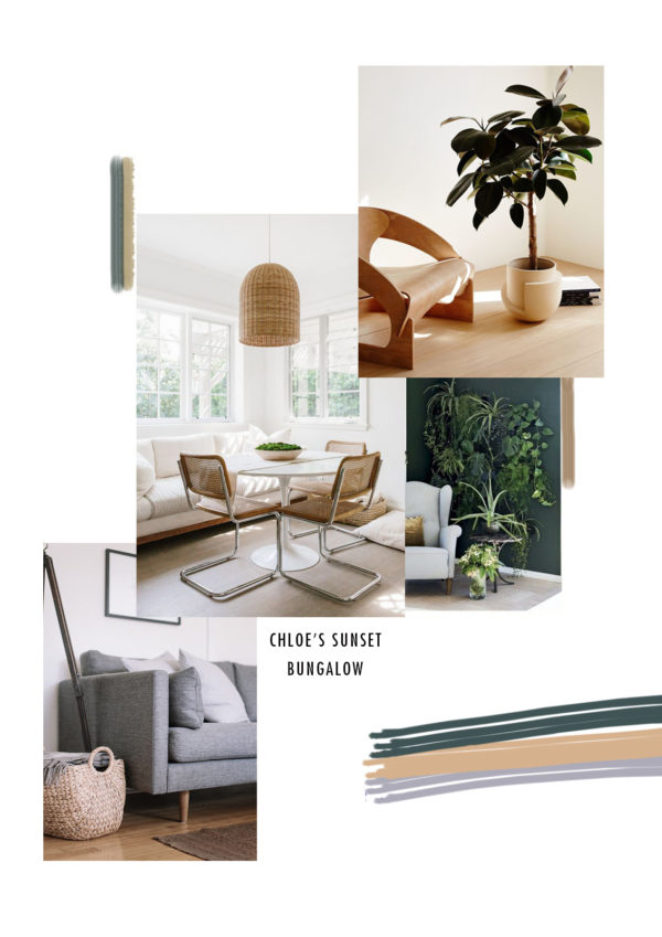
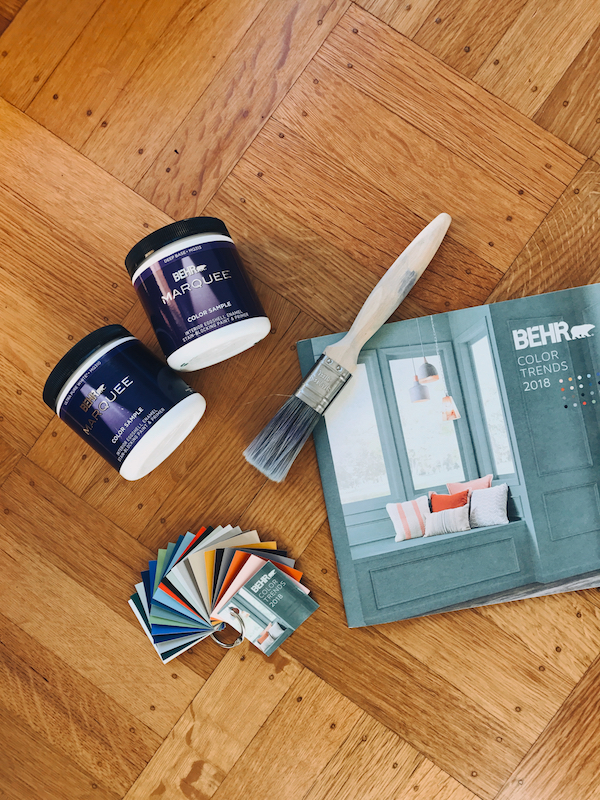
As a reminder, this was our original color palette moodboard. Color is personal to everyone and selecting the right color can greatly impact the mood of a space. I partnered with BEHR to paint Chloe’s San Francisco Bungalow with the BEHR 2018 Color Trends to change the feeling of her home and create a northern California-inspired vibe. I’m a big fan of the BEHR 2018 Color Trends palette and would recommend this collection of unique, new, trend-forward hues to any DIYer looking for color inspiration.

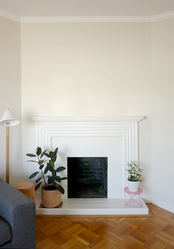
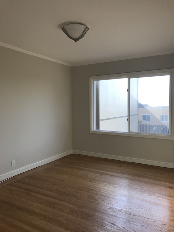
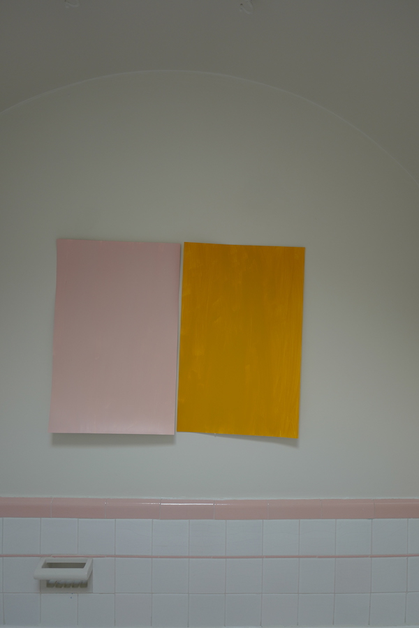
Through a cool mix of color using the BEHR 2018 Color Trends palette, we were able to transform Chloe’s house from dated and dull into a fresh, bright and modern feel, applicable to how people live today. Below are a couple of before shots to give you a better idea of where we started!

home tour: bold color in a bungalowhome tour: bold color in a bungalow

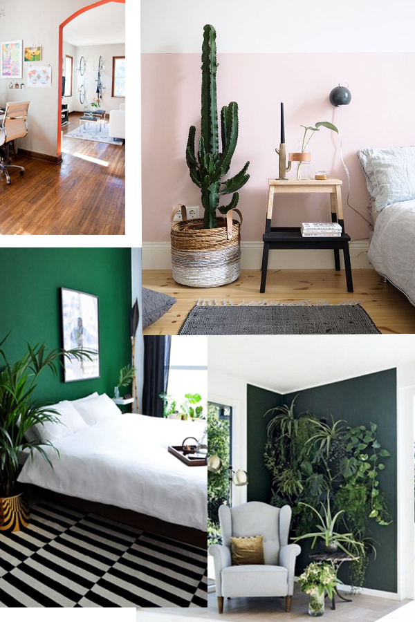
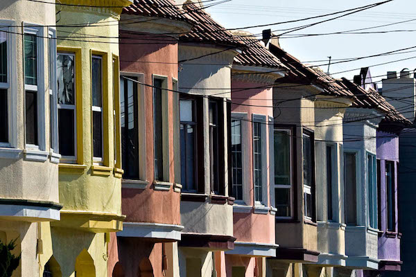
The 1940’s 2-bedroom bungalow is in San Francisco’s iconic Outer Sunset neighborhood, just blocks from the Pacific Ocean. We took our primary color palette inspiration from the home’s beach-side location. We decided to use blue-gray hues in combination with natural wood tones to pay homage to the colors of the sand and sea. But we also added a few unexpected pops of bold color with a deep saturated green reminiscent of the cypress trees that dot the coastline as well as a soft green that reminds us of the wild grasses that cover the sand dunes.

It can often be very foggy in the Outer Sunset so everything else in her home sits against a white backdrop – I wanted to make sure Chloe’s home always felt bright  – even when the sun is nowhere to be seen.

home tour: bold color in a bungalowhome tour: bold color in a bungalow

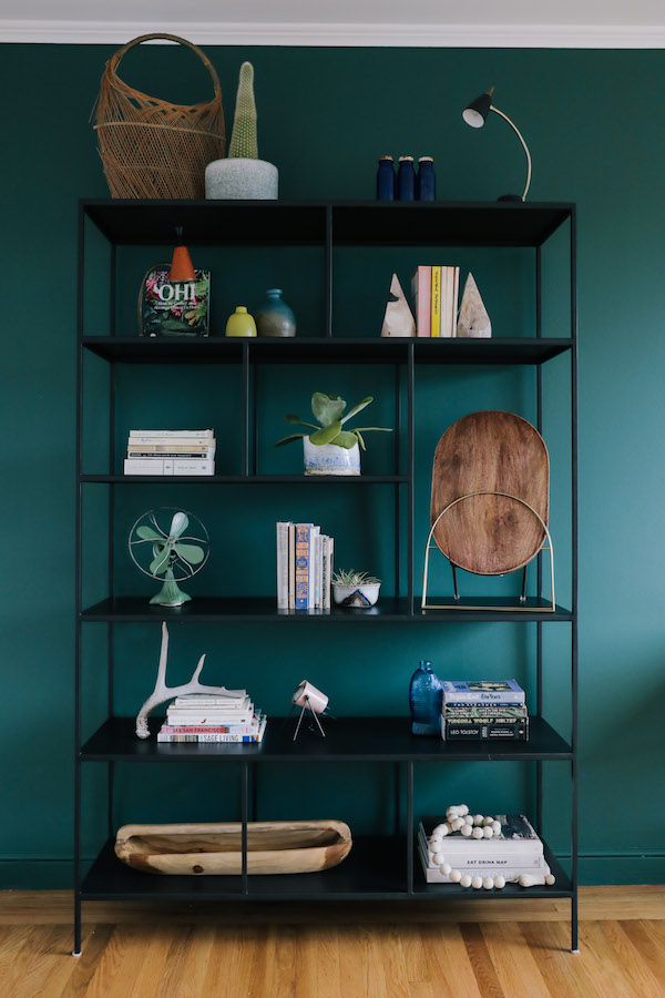
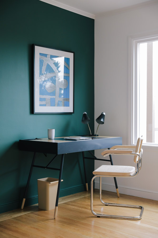
Chloe’s office really shows how you can use deep saturated color in your home. We created an accent wall using BEHR’s 2018 Color Trends Equilibrium T18-20 to ground Chloe’s work area. It’s a rich, warm green that offers deep drama but is still fresh. I’m obsessed.

home tour: bold color in a bungalow

As a freelance social marketer, Chloe works from home, so I really wanted to differentiate her office space from the rest of the house. The dark wall serves as an anchor for the dark shelving unit and desk that we added to the space. The hue also helps Chloe’s display of personal items really pop.

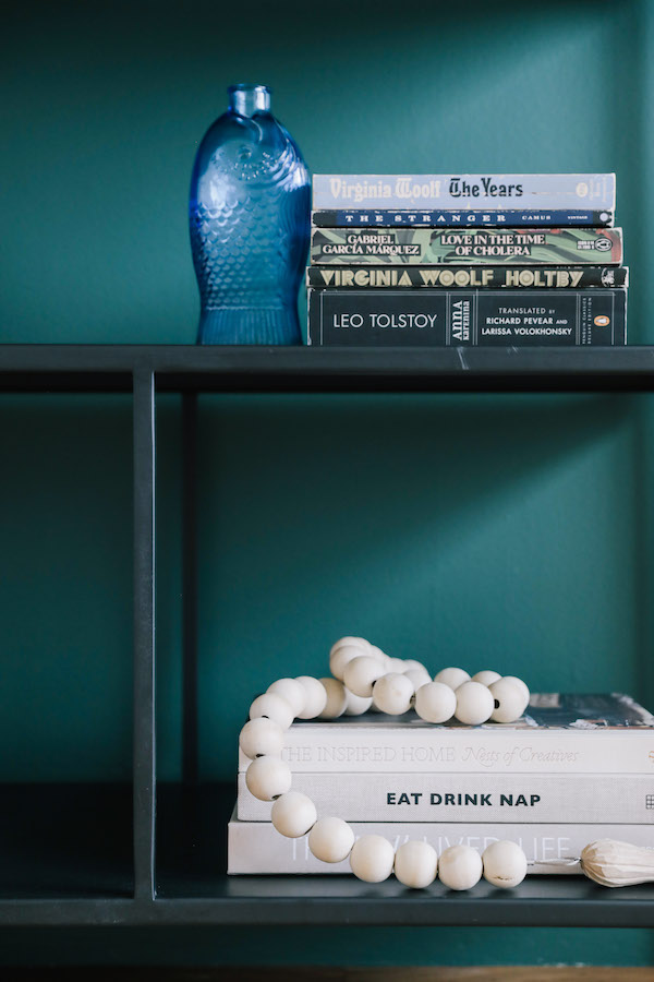
The multi-tiered open shelving unit was the perfect place to house Chloe’s collection of vintage pieces as well as display books by her favorite female authors including her collection of design books written by friends and the works of Virginia Woolf. The bookshelf and desk are accented with warm wood elements to echo the floors and add an organic feel. Succulents potted in pieces from Chloe’s ceramic collection add life.

home tour: bold color in a bungalowhome tour: bold color in a bungalow

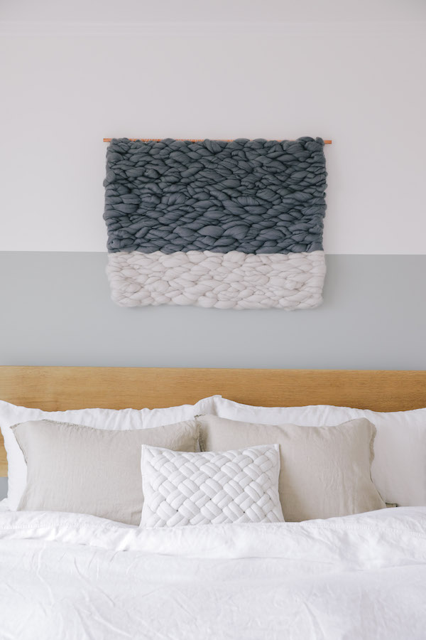
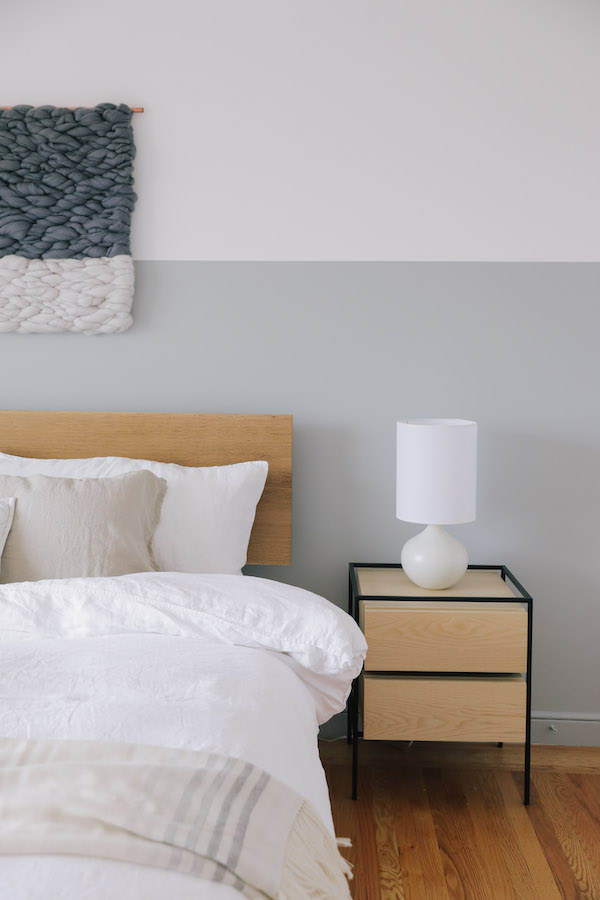
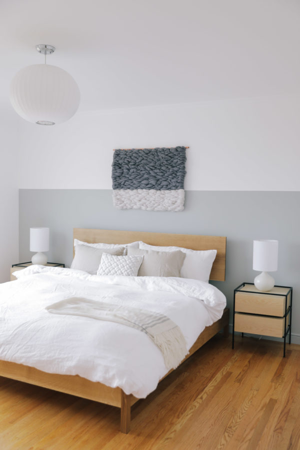
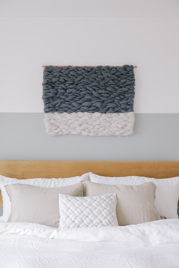
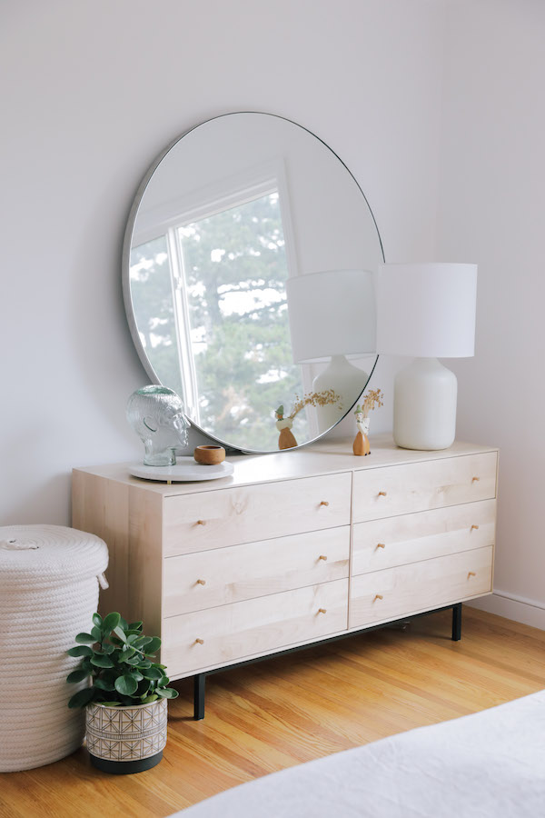
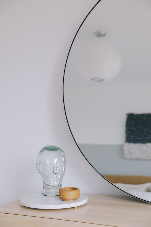
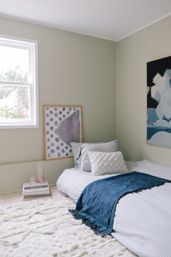
While they share a wall, Chloe’s bedroom couldn’t be a bigger contrast to her office. I wanted to make Chloe’s master a tranquil oasis. The BEHR 2018 Color Trend paint color was a great place to start. Inspired by the ocean, we decided to paint a two-toned wall in the soft light blue-gray – it felt like the sea on a still overcast day. And the BEHR paint color is literally called Quiet Time. Also of note: painting a wall part way up is a little trick if you have a slightly lower ceiling. It helps give the appearance of height.

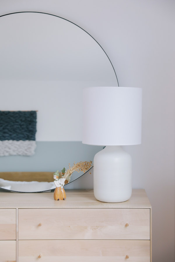
The bedroom features more natural wood elements including a beautiful custom oak bed made by Bay Area woodworker Ben Winslow. Clean side tables in ash accented in powder coated steel and simple ceramic bedside lamps add to the organic vibe. Linen bedding and a custom cashmere throw add soft organic texture. To further highlight the two-toned feature wall, we had Oakland-based artist Meghan Shimek create a custom weaving that inverted the white and gray. I love how the movement of her piece evokes ocean waves.

home tour: bold color in a bungalowhome tour: bold color in a bungalowhome tour: bold color in a bungalow

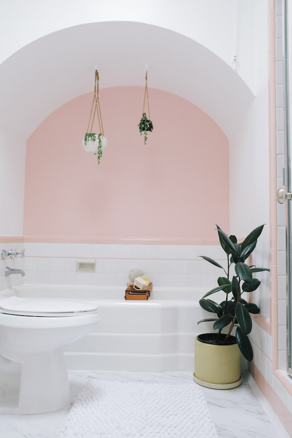
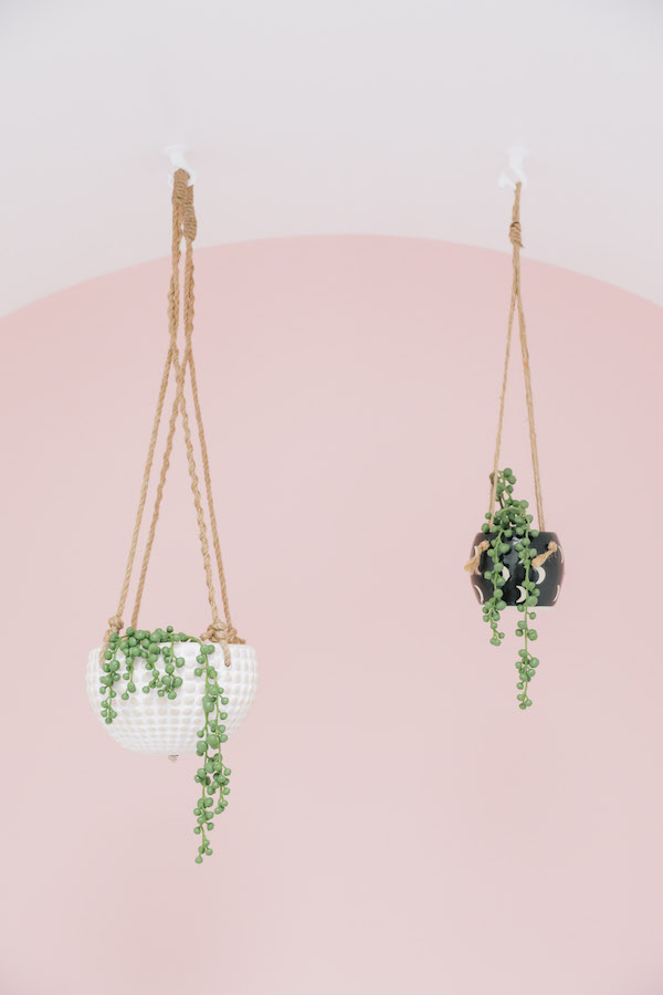
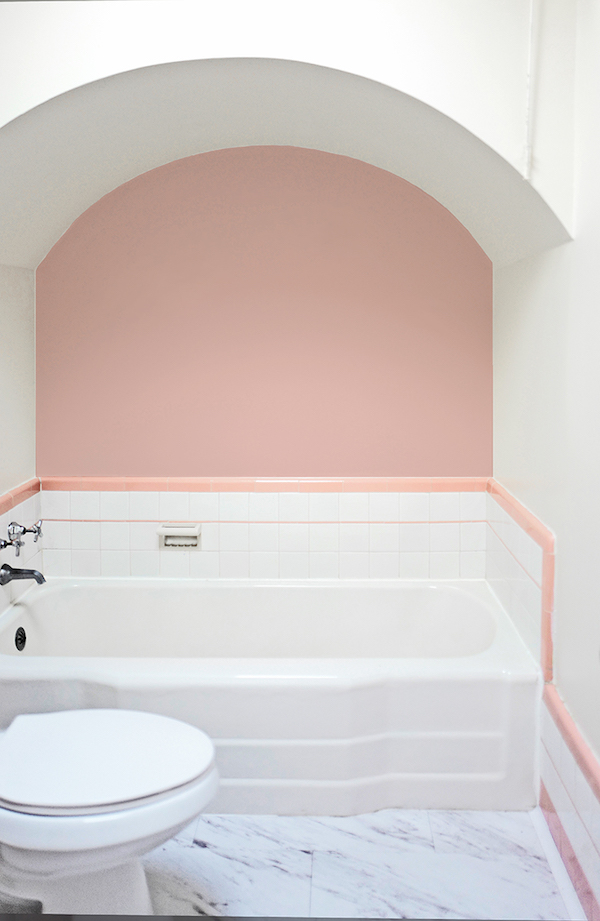
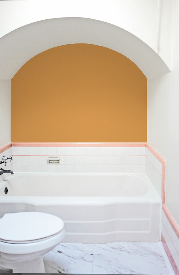
In contrast to the rest of the house, we decided to amp up, rather than tone down, the retro side of Chloe’s bathroom. Her tub features an arched ceiling as well as the original pink and white tile surround, so I thought why not highlight it! While we initially debated what BEHR paint color to use, the BEHR 2018 Color Trends hue Positively Pink was a perfect fit. A few plants in ceramic vases along with a good bath bench add texture and more interest. And now Chloe has a fun respite from her day.

home tour: bold color in a bungalow

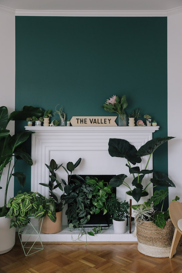
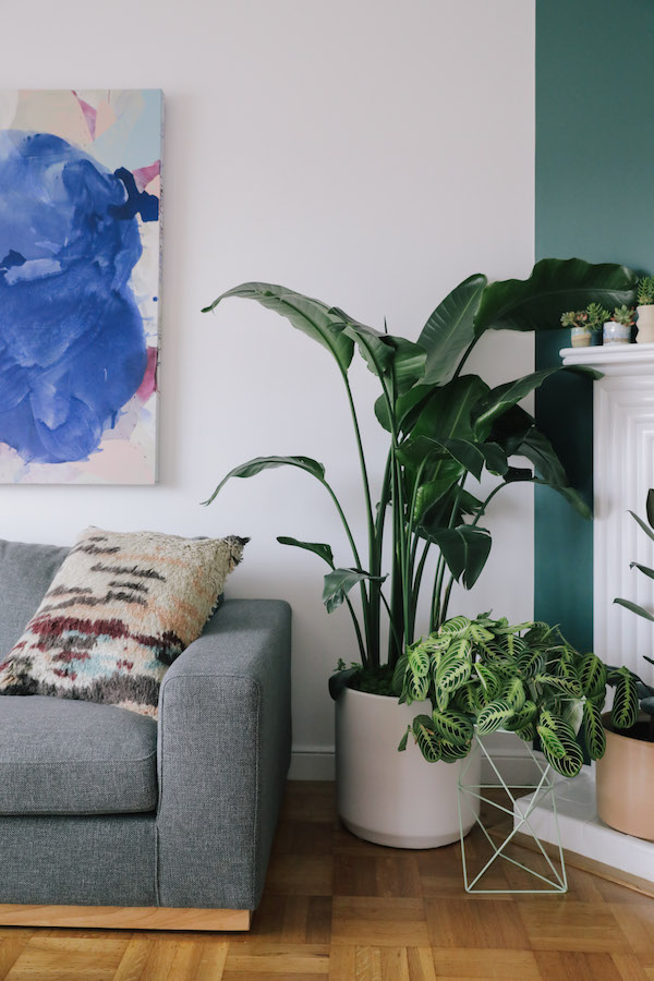
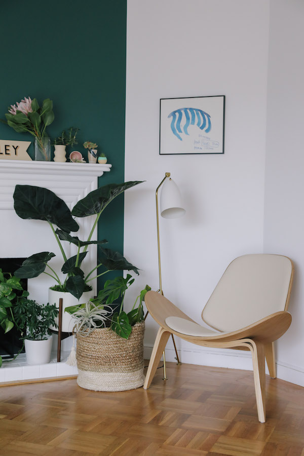
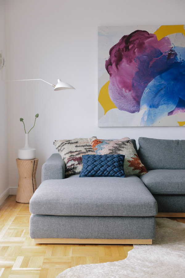
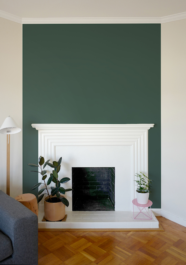
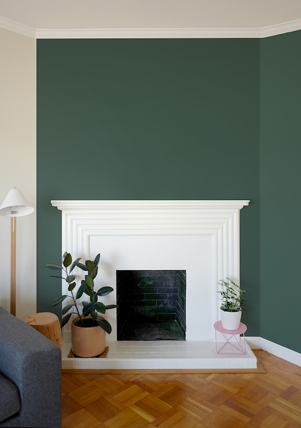
We also decided to play with color in Chloe’s main living space. The art deco fireplace in her living room is one of the home’s original details. The fireplace is no longer functioning so it offered the opportunity to do something purely decorative. Chloe grew up on the island of Kauai and really loves lush greenery so we decided to turn the fireplace into a pseudo-living wall. I pulled in the yummy deep green we used in the office to create a major focal point in this room.

home tour: bold color in a bungalow

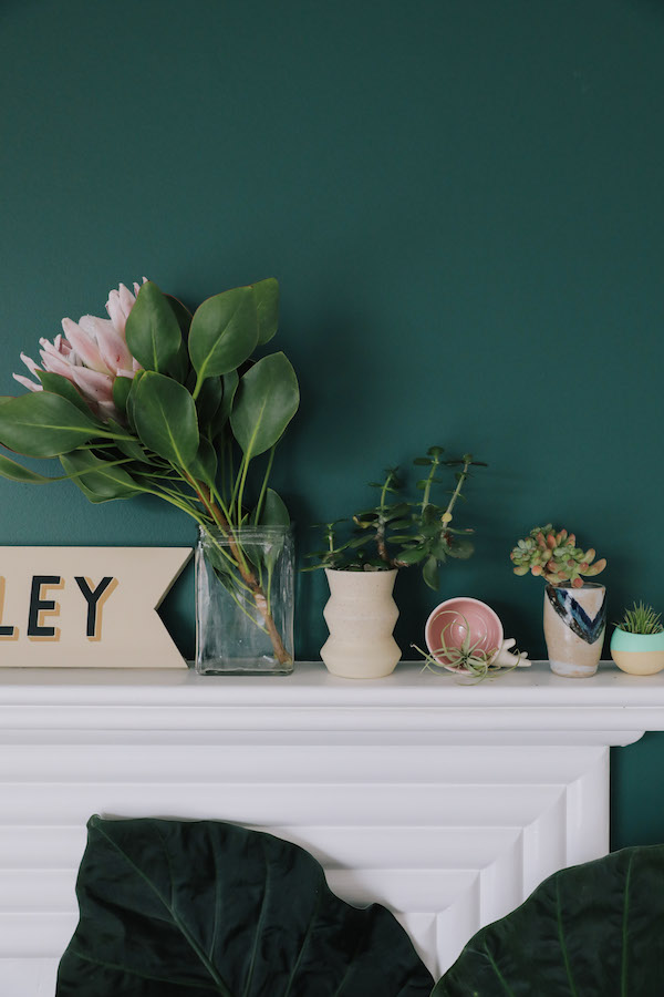
We then layered plants atop that gorgeous green backdrop. Large, small, tropical, desert, we mixed all styles, sizes and looks from Leon and George. For planters, we used a mix of ceramics, metal and even a woven basket to add in a mix of tones and textures. Succulents and air plants dot the mantel and Chloe can add even more life with hanging or wall mounted plants over time if she chooses! I also love that by pulling BEHR’s 2018 Color Trend Equilibrium T18-20 into the living room, we brought further continuity to the house.

home tour: bold color in a bungalowhome tour: bold color in a bungalow

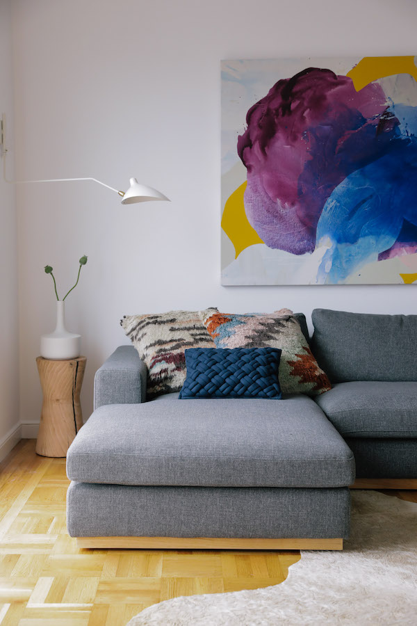
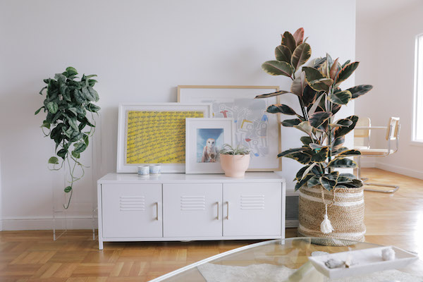
We also decided this room needed an oversized piece of art to anchor Chloe’s couch. A galley wall would have felt too busy with all the action already happening around the fireplace.

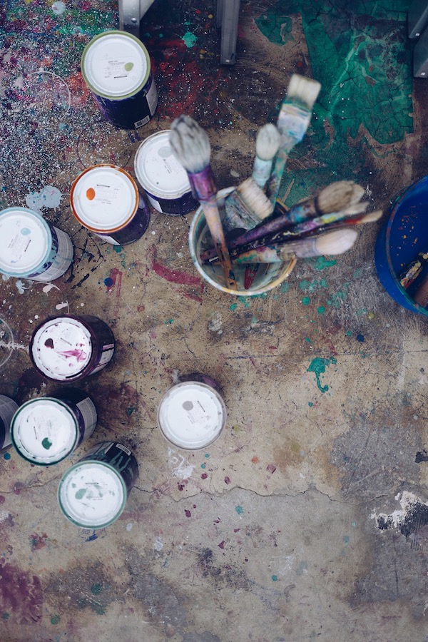
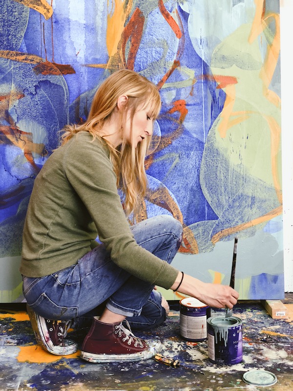
Rather than simply find something online, we instead turned to Bay Area artist Nicole Mueller who painted a stunning original piece – using BEHR’s 2018 Color Trend palette! We’re going to be bringing you a complete studio tour with Nicole, but I had to share a little sneak peek of her and her work. Her techniques are so cool. You should definitely give her a follow on Instagram.

Chloe also has a small studio space in her basement that she could use as an Airbnb rental (or as a crash pad for friends!). I wanted to create a really relaxed, beach house vibe for this space. Behr recently introduced its first-ever Color of the Year, In The Moment, a cool and tranquil coalescence of gray-green. While we fell in love with this color, we chose to go with a Wabi Sabi for this room, an easy-going, versatile green, also from Behr’s 2018 Color Trends palette.” Wabi Sabi was the perfect chill color for this room.

home tour: bold color in a bungalow

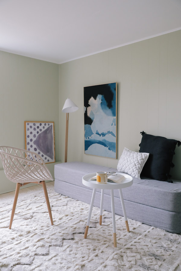
The Wabi-Sabi color pulls in the greens of the sea grass found in sand dunes in Chloe’s neighborhood. The fresh, comfortable shade evokes a sense of sanctuary and relaxation amid our busy, always-on lives. 

home tour: bold color in a bungalowhome tour: bold color in a bungalow

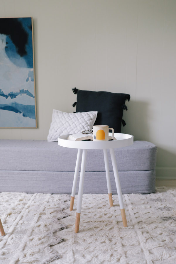
Since the studio is rather small, I turned to multi-functional furniture to optimize space. We found a cool piece the doubles as both an upholstered bench and folds out into a bed. I consider it a modern-day version of a futon – it’s both economical and space saving. This solution allowed us to create a nice seating area where a visitor could enjoy a cup of coffee in the morning and easily create a bed when needed. It was the perfect way to offer a tranquil place to sleep when space is at a premium. Modern, mid-century inspired pieces (from Home Depot no less!), a Moroccan inspired rug and modern art in soft hues by Mineral Workshop add to the laid-back beachy-boho feel. It’s a calm, welcoming spot for a visitor to stay.

home tour: bold color in a bungalow

So there you have it. You can, in fact, incorporate a variety of color into your home, make it all work together an make it feel like you. I’m thrilled with how Chloe’s paint colors turned out? What do you think?? I’d love to know.

And be sure to stay tuned. We have a lot more reveals coming up.


This post is in partnership with BEHR. All thoughts are 100% my own. Thanks for supporting posts that have kept Apartment 34’s doors open.

original photographer for apartment 34 by andrea posadas creative 

This post is in partnership with Behr. All thoughts are 100% my own. Thanks for supporting posts that have kept Apartment 34’s doors open.

how to have fun with paint color on apartment 34

Guys, I’m super excited to share an update about the #thesunsetbungalow with you today. In case you’ve forgotten (or in case you missed it), I’ve been helping my friend Chloe (if you don’t follow her on Instagram, you should!), do some updates to her recently purchased bungalow in San Francisco’s Outer Sunset. A few weeks back I was polling you, dear readers, on paint color inspiration from BEHR’s 2018 Color Trends. I so appreciate everyone who weighed in.

We’ve gone ahead and made our final paint choices and the big reveal is currently on Domino!

how to have fun with paint color on apartment 34how to have fun with paint color on apartment 34

These are only a couple of juicy sneak peeks at how Chloe’s home turned out. Head over to Domino right here to see the rest! And don’t worry, more details about the makeover will be headed your way next week.


photography by andrea posadas creative 

If you checked in on our Sunset Bungalow update last week, you saw our first paint color dilemma in the bathroom. The overwhelming majority of you voiced your support for painting the back wall of Chloe’s bath with the color Positively Pink T18-01 from my partner Behr paint’s 2018 Color Trend palette. While we’re going to wait to reveal our final design decisions until the entire house is complete, the vote went so well we wanted to get your opinion yet again! Today we’re talking fireplaces.

Chloe is lucky enough to have a fireplace with a gorgeous deco-inspired mantel in her living room. I’m obsessed. But the fireplace is also a bit of a difficult design element. It sits on an odd angled wall tucked into the corner of the living room’s west side. You can’t center furniture around it. You wouldn’t put a TV over it. Instead, it has to be treated more like an art installation rather than a place to congregate. So we’re going to run with that.

As I worked on the living room design, I realized this was another great opportunity to insert innovative use of paint. When we fell in love with Behr’s 2018 Color Trend hue Equilibrium T18-20, we immediately wanted to add the deep, rich green to this spot. The image below is our current design inspiration.

Since Chloe’s fireplace isn’t functional, we decided it’s the perfect place to showcase her love of plants, as in the image above. Grounding the fireplace in Behr’s deep, sophisticated green will make a perfect backdrop for a mini urban jungle. But we would love your thoughts on one key choice.

OPTION ONE

Our first option is to simply highlight the chimney chase with Equilibrium T18-20. This options feels a bit more traditional and classic.

OPTION TWO

However, we’re seriously considering the idea of turning the corner with the paint color. By adding a second wall (per your questions in the comments, this wall is actually about 3 feet wide and abuts a doorframe), the effect is more graphic. It feels influenced by modern cubism. And like the inspiration image, it will create a little corner that can house both plants and possibly a little chair or stool.

So what say you? Are you feeling the bolder look of Option Two? Or are you more drawn to the traditional look option one. Please weigh in by commenting on this post as we would love to know!

For all the details about the Sunset Bungalow Project RIGHT HERE.

This post is in partnership with Behr. All thoughts are 100% my own. Thanks for supporting posts that have kept apartment 34’s doors open.

If you missed last week’s announcement, I’ve been working with my friend Chloe to whip her recently-purchased San Francisco bungalow into shape. It’s a charming classic San Franciscan home, but was left with the…shall we say “less-informed” design decisions of its previous octogenarian owner. We’re on a mission to unearth the coolness that this home could embody.

One of the quickest and easiest ways to do that is with your paint color. It doesn’t require breaking into walls or a crazy financial investment. If an industrious mood strikes, you can in fact do it yourself! If there’s one thing that will immediately improve a place (even if you rent!), it’s paint.

In case you didn’t catch our design board for Chloe’s home, we’re going in a northern-California inspired direction with her color palette. Think bright and airy white mixed with pops of earthy greens, a bit of ocean-inspired blue and sandy neutrals. Thankfully, Behr Paint is helping us to bring our paint color vision to life. Behr’s collection of 2018 Color Trends offer a gorgeous palette that makes injecting a little color into your home so easy.

picking paint color on apartment 34

While we have the bulk of our paint colors selected, we also have a couple out of the box ideas in our back pocket. We want to have a little fun with unexpected color placement. Ideas like half walls, solid blocks of color and painting unusual places.  Here’s a quick inspiration board to give you a better sense of our vision:

picking paint color on apartment 34

And while we have most of our color palette picked, we did want to get your thoughts on one of our more creative ideas! Keep scrolling for a major sneak preview and please weigh in with your opinion.

BEFORE

picking paint color on apartment 34

Chloe’s home features a charming bathroom. While small, it’s flooded with natural light thanks to an amazing skylight. But the piece de reistancé is the cutest little nook for Chole’s bathtub. The space feature’s the bathroom’s original 194o’s pink and white tile (which both Chloe and I still love). It also has an amazing archway over the tub that just cocoons you. This is where we want to highlight a major pop of color.

OPTION 1

picking paint color on apartment 34

Our first option is Behr’s 2018 Color Trend hue, Positively Pink T18-01. This is a sweet, virtually matching option. It would amplify the room’s feminine vibe.

OPTION 2

picking paint color on apartment 34

Option two is a really bold moment featuring Behr’s 2018 Color Trend hue Life is Good T18-05. The orange-gold adds some major warmth and would be a bright and sunny addition to the space.

What say you? Are you feeling the pink? Or are you into the bold gold? We’d love for you to weigh in! And do stay tuned as the final design will be revealed in the coming weeks!

This post is in partnership with Behr. All thoughts are 100% my own. Thanks for supporting posts that have kept apartment 34’s doors open.

Even though I’m continuing to put (never ending!) finishing touches on my house, I thought you might be tired of seeing my guest room for the tenth time so I have an exciting new project for you today! It’s also nice to switch up your design focus every once in awhile. And I love helping out a friend. So when the lovely Chloe Roth asked if I might help her pull together her newly purchased San Francisco bungalow, I gladly jumped in. And we thought we ought to take you along on our design journey!

sunset bungalow on apartment 34

Chloe snagged the cutest little two-bedroom house in San Francisco’s Outer Sunset neighborhood. Just blocks from the Pacific Ocean, the Sunset is well known for its rows upon rows of candy-colored houses built in the 1930s (check out a fascinating article about San Francisco architecture here). If you’re lucky, you can snag one of these houses with their charming period features still intact. While I’m thrilled we have some fun details like arched doorways and huge picture windows to play with, there is also plenty of late-90’s lighting, a builder-grade kitchen and really bad beige paint everywhere. It is definitely is feeling a bit drab.

As a creative director, Chloe has a very discerning eye and a clear aesthetic (her previous apartment was even featured in an interior design book), but it can be hard to look at the blank slate of an entire house and figure out where to begin. Thankfully, I’ve now had some major practice with that! We’ve been working to apply Chloe’s modern, minimalist style to this new beach setting and I love where we’re headed. With any project it’s always super helpful to create a mood board. It helps keep you focused and keep everyone on the same page. Below is our mood board for Chloe’s main living spaces (ie her living room, dining room, bedroom and office).
sunset bungalow on apartment 34
We’re going for a theme of soothing and serene. We’re playing with a color palette inspired by the beach: a combo of grays and natural wood tones that play homage to the color of sand and a few unexpected pops of deep saturated greens reminiscent of the cypress trees that dot the coastline. This will all sit against a bright white backdrop. There will be a mix of some yummy textures to offset minimal clean lines. Chloe is also a plant whisperer so we’re working on creative ways to incorporate living elements throughout the house. I cannot wait to share some of our best solutions!

Over the coming weeks you’ll get to see more of our inspirations, our best DIY projects, the paint color selection process and of course, the final before and afters. Be sure to follow @thechloeroth’s #thesunsetbungalow on the Instagram for all the updates. We’re going to have some fun!

For more interior design inspiration, CLICK HERE.