With modern and bohemian trends being so prominent in the design industry these days, it has been refreshing seeing some of our favorite lines bringing back the traditional aesthetic.

apt34-new-traditionalapt34-new-traditionalapt34-new-traditional

Kate Spade New York’s new fall home collection has done this impeccably. The collection mixes glamorous materials with traditional patterns keeping things looking classic without being too stuffy. There is also still an air of whimsy which is the Kate Spade trademark. We especially love the new collection’s classic black, white and gold pieces that promise to keep your home timeless regardless of the rest of the design trends du jour that are continually circulating.

We love the look in spaces that feature classic design details like crown molding, parquet floors or wainscoting. But a traditional piece can also add that traditional style if your home is lacking those timeless bones.

We’ve gathered our favorite pieces to help you achieve the new traditional look in your home. A classic stripe, a stately couch and a few fun accessories like a glamorous table lamp or marble-topped coffee table will add the extra touch of personality that a room needs to feel special.

apt34-new traditionalapt34-new-traditional

apt34-new-traditional

 Dickinson Large Pendant / Downing Sofa / Double Stripe Pillow  / Keaton Bouquet Table Lamp / Duncan Side Table / Syrie Coffee Table / Norwhich Chair /  Color Block Throw / Daisy Plate


SHOP THE POST

[show_shopthepost_widget id=”2034083″]

image 1 / image 2 / image 3

This post is in partnership with Kate Spade New York. All thoughts and opinions are 100% our own. Thanks for supporting posts that have kept Apartment 34’s doors open.

The difference between good design and great design? The details. It’s the little moments that someone might not even notice at first glance, but actually take the most time and forethought, that give a space its heart. Case in point, this crazy cool loft. At a cursory glance, you can immediately see it’s a chic space. But it takes a second look to discover the details that take the design to the next level.

apt34-elevate6apt34-elevate2apt34-elevate4apt34-elevate

Because this loft is actually designed with a specific goal in mind – turning accents into statements. The concept is rather genius. Earlier this year, six well known accent brands came together to form the Elevate Design Collective and collaborate to renovate a loft in Soho that was recently revealed during NYC Design Week. Schlage, Jeld Wen Windows & Door, Formica Corporation, KitchenAid, Hunter and Delta were tasked with the same challenge: to integrate a custom Pantone color, developed exclusively for this space, into their product. So cool.

Pantone created Single Malt, a rich, earthy copper-y hue that the designers used to add warmth to the loft’s urban, modern vibe. I love the way the color was incorporated into the open concept kitchen. For example, Formica Corporation, known for their innovative surfacing products, created a custom Bourbon Trail laminate in a marble design for the kitchen’s countertops. The brand’s 180fx® large-scale laminate line recreates real, true-to-scale stone and granite patterns and was able to incorporate Single Malt in the veining, helping the kitchen to take on a more approachable warm feel. But there are more subtle details as well.

Did you spot all the places Single Malt color popped up throughout the space? Creating this look in your own kitchen would be very easy. With a base of classic black & white, you can add pops of warmth to create a timeless space.

apt34-elevatekitcheninspo3

single malt pantone color / pendant light / cake stand / kitchenaid mixer / delta faucet / salad tongs / black bar stool / formica / white subway tile / bread board / serving bowl / dutch oven / JELD-WEN doors

If you didn’t know to look, you might miss them. The Single Malt-tinged edging on the pantry doors by JELD WEN Windows & Door, the accents on the Delta Trinsic® Pro faucet, a chic-looking high-tech faucet that turns on with just a touch via the Touch20® Technology. The brand added a special arm to hold the faucet head in place for that Single Malt touch. You have to look closely to spy the pop of color on the ends of the KitchenAid refrigerator pulls! All of the details are understated, chic and inspiring. They’re what will make you stop and say wow, I wish I had thought of something like that.

This is such a great reminder as I work to put the finishing touches on our renovation. Sure, any room can look pulled together, but when you put in that little extra thought or creative idea it makes a room personal and truly unique. I don’t have my own custom Pantone color, but I’m going to do my best.

You can enter to win a $500 gift card for your own project courtesy of the ELEVATE Design Collective. They’ll be choosing three winners, so be sure to enter here between now and September 16th!

To catch up on all our renovations and my design ideas, CLICK HERE!

For our home tour archive CLICK HERE.


This post is sponsored by the ELEVATE Design Collective. All thoughts and opinions are 100% my own. Thanks for supporting posts that keep apartment 34’s doors open.

I know what you’re thinking. Isn’t IKEA reserved for college apartments or placeholder pieces while waiting for your actual furniture to show up. In many cases I would answer yes, but if you pay close attention you score some Swedish gems. Case in point, IKEA’s new limited edition capsule collection, Viktigt.

IKEA-VIKTIGT-collection

The collection was created in collaboration with award-winning Swedish designer Ingegerd Raman. The collection of seating, lighting, tableware and accessories are stripped down to their bare essentials to turn the ordinary into the exceptional. As Ingegerd describes her work; beautiful on their own, the pieces are all intended to work beautifully in your everyday life. Sounds right up my alley.

Ingegred Raman’s inspiration for this collection was to go back to the center, to the essence of things. The design are just that – pure, simple and functional. Ingegerd also incorporated a variety of materials into her designs. In addition to the ceramics and glass she typically works with, she added furniture and accessories that feature natural materials like water hyacinth, rattan, bamboo, and sea grass. These were all made by craftsmen in Vietnam who Ingegred worked with directly.

PH132755PH132753IKEA_VIKTIGT_Chair    IKEA-VIKTIGT-natural-fibres-aprilandmay-6-e1458568003666from-new-collection-called-VIKTIGT-from-IKEAikea-viktigt-collection-remodelista-8  IKEA-VIKTIGT-glas-aprilandmay-1-e1458565618567PH132723-webPH132717

I particularly love the neutral color palette (obvi), but also the woven baskets with their jumbo weaves, the striking angular shapes and bold patterns and the lovely use of black. I actually want one of her flat baskets (the one leaning against the wall in the pic below) to hang on the wall of the new house. And the bamboo cutting boards, with their thick cuts and beautifully angled edges? Love. I definitely could use a good basket or two as well. You can never have enough right?

apt34-ikea-viktigt-collection


I think I officially need to run, not walk to Ikea this weekend. Since everyone will be gone for Memorial Day, it won’t be crowded right? Yeah right.

But since this collection just launched this week it’s worth the risk. I don’t think it’s going to be around for very long! What do you think? Will you be snatching up a piece or two as well?

images via ikea

This installment of Designer Files is just creamy goodness. If you’re looking for an example of a style-focused kitchen that is as functional as it stunning – cuz I know you just googled exactly that – well look no further. You’re going to want to move into this space immediately. I know I did.

modern white kitchen

This modern eat-in kitchen / family room is picture perfect (obviously!). I love every single choice – from the color palette to the hardware, the fixtures to the furniture. It’s comfortable cozy, functional and overflowing with style. The layers, luscious textures and use of mixed materials dotted throughout the space make you want to sink right into the creamy-white goodness.

modern white kitchen

The kitchen’s island is a true thing of beauty. You would have easily had me with the waterfall countertops but those those simple pendants by Workstead are simply chic.

modern white kitchen

I’m also in love with that custom hood. It’s a refreshing alternative to the typical stainless steel. (I have a thing for eye-catching hoods).

modern white kitchen

I’ve been obsessed with koushi pendants since our trip to Australia a couple of years back. Their rustic texture has a bit of beachy vibe and feels perfect over the casual kitchen table. Digging the built-in bench too.

modern white kitchenmodern white kitchen

But the family room’s seating area is a real thing of beauty. It mixes periods and styles seamlessly. I thought I was over the weaving trend until I saw that massive piece over the couch. Everything in here feels comfortable but selected with such a discerning eye for design. #lifegoals

This kitchen is actually part of the amazingness that is Decorist founder Gretchen Hansen’s San Francisco home and was digitally designed by LA based firm 30 Collins. I was lucky enough to get to walk through this space in person and can attest, these gorgeous photos don’t even do it justice. And I’ve been day-dreaming about those vintage easy chairs ever since. They’d look so lovely in our house. I wonder if Gretchen might ever want to let them go…

For more stunning home tours click here!

project by 30 Collins for decorist

We all knew them. The new guy who’d show up at school and just somehow be cooler than everyone else. You couldn’t quite put a finger on it. Their style, the way they talked. There as just an air about them. It was like a moth to a flame. Well the same goes for the design world and everyone is elbowing to hang out with the new cool interior design team in town: Consort Design. It’s pretty easy to see why.

main.original.640x0c (5)downloadconsortdesign3OhhG6Wg02WLEB8A_8gJbHYcRZZD0E7Mrbqdju2tiTPMIGnqmn90obdbrnTyg8VSlmKsgzTD82OFCoNajw1oMCg-750x1110main.original.640x0c (3)

Founded by Domaine Creative Director Mat Sanders and Brandon Quattrone, the interior design studio has been piling up a list of high profile projects featuring some hot celebs. Consort has been feelin’ the love from the start (they’ve been featured here, here and here recently), but the frenzy really started when they opened their retail space in Los Angeles late last year. Thankfully for the rest of us, they also have an online shop but I’m still dying to check out their bricks & mortar space.

I was a bit surprised by how much I’m drawn to their work since Consort is not afraid to use color. Not typically my jam. They also mix print, pattern and texture like design magicians and incorporate witty uses of vintage. They have excellent taste in art. Check. Consort was even using the Pantone color of the year before it was the cool kid on the color palette block. So meta.

Every project has a layered depth that feels lived in rather than overly styled. While Mat & Brandon describe their big, bold aesthetic as “playfully chic,” I’m particularly attracted to their moments of restraint. Their use of neutrals still feels strong and sexy. I particularly love they way the mix tones of wood, add in creamy textiles and then make their standout statement with a bold light fixture. I also need to know who does their florals. Every use of botanicals in the shots above is damn genius. I officially have a new muse for our house.

Is Consort Design giving you the feels too?

images via domaine and consort design

This monochromatic Parisian apartment brings new meaning to the idea that your home should be your oasis. Decked in various shades of the same custom gray hue dubbed “craie,” is gorgeously soothing, sophisticated and full of fluidity and detail. This balance of making a modern space look cozy and inviting has been on the top of our must-master list for a long time. So when we got the chance to pick the designer, Guillaume Alan’s brain about transforming this apartment into a work of art – poetry even – we jumped on it. There are some great pointers in our interview, so get ready to take notes!

designer-files-1-apartment-34designer-files-apartment-34designer-files-4-apartment-34

About The Space 

For this particular project, it was really a meeting between the uniqueness and perfection of the homeowners and of the place and me, both trying to reach excellence while sharing a common passion for Asia. Two apartments were joined together and we did a complete renovation of the space to follow the light and sun during the day. Everything has been designed with a calm and relaxing [mood in mind] according to the owners’ needs.

Purity is a way of life. I think this is exactly what this project embodies. This space can be summed up in three words: luxurious, calm and poetic. It has a feeling of great simplicity and absolute purity. It’s austere yet there is no coldness, as we know how to add softness with a discreet range of tones and monochromatic shades. The architecture, as well as the decor, gives birth to a calm, pure space where luxury and rigor coexist without being ostentatious.

designer-files-2-apartment-34designer-files-3-apartment-34

His Favorite Element

I think [my favorite piece is] the Tamon ensemble. It’s a long dining table that has a monastic and very pure aspect about it and you can see that from several points of view. I was inspired by calligraphy drawings, so we started from a calligraphy piece – drawings with a fine brush that are very gentle and convey movement – and actually incorporated it by cutting it into the material. The result was that we managed to give this specific piece a nobility that is both vibrant and sophisticated though the use of the calligraphy, through the proportions of the table and through the mat satin finish. 

On Monochromatic Decor

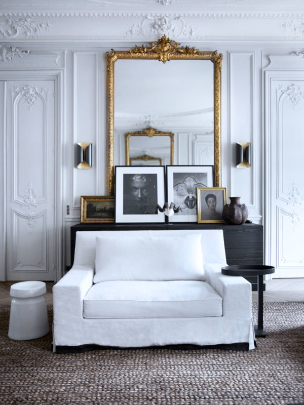
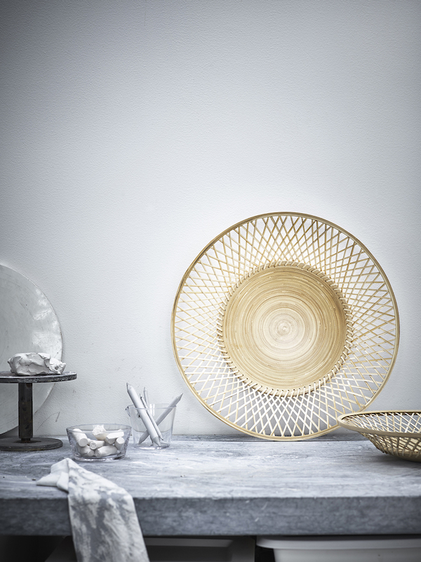
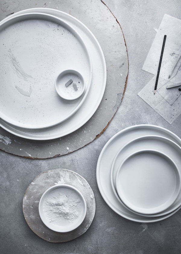
The tone in the whole space is a very light grey, we call “craie”, our very own bespoke color, which is represented in the entire apartment on different materials and textures (walls, ash wood, corian, silk curtains, wool, pattern fabric in wool and silk, linen rugs). It gives a very harmonious feeling to the space and a certain depth as each surface captures the light differently.

For example, the way the very “crunchy” curtains in silk capture the light creates a beautiful contrast in texture with the very modern Corian material of the dining table. The silk curtains are totally bespoke, handmade by a parisian seamstress who follows the same rules as Haute Couture manufacturing.

designer-files-5-apartment-34designer-files-6-apartment-34designer-files-7-apartment-34guillaume-interiors

Design Advice 

Remember 5 words:

Timeless: I am very attached to the tradition of French classicism, but I am trying to rewrite it using pure lines. When I launched my first collection, it was 18th century architecture and furniture with a 21st century style. I choose this aesthetic because I know it will never go out of style, it’s timeless.

Serenity: In a very quick world and when lives are very busy, it is so important to have havens of peace that are calming and pure. Think soft monochrome color palettes and degraded shades.

Elegance: This is fundamental to a beautiful home or apartment. I use it in all aspects of the design process: in lighting, in materials, in shapes, in colors. When decorating your home, always have elegance as your main focus.

Precision: Although in many ways simplicity is very hard to achieve, precise simplicity is what makes a stunning interior. Perfect and simple lines executed with precision. Incorporating hard-to-find pieces and working hand in hand with the most advanced craftsmen to select the wood and perfect finishes all tie back to a passion of precision.

Poetry: Just because forms are pure and structured and austere, doesn’t mean a space has to feel cold. It’s always about balance, alchemy. Try to bring softness and poetry in to arouse emotions. I think this is this stamp of our work and interiors.

So what do you think?? So good, right?! We’re literally keeping bits of Guillaume’s interview in plain view as daily decorating reminders. The idea that elegance should be a main focus in design really resonated with us. Personal style evolves and after going through more room facelifts that one wants to admit, I’ve noticed that the pieces that I keep all have a special and timeless quality to them. And while it can be really difficult to execute, curating with the precision Guillaume talks about is something we all could be more aware of when choosing a new piece for a space. It sure would save a lot of money over the years and help to create the oasis we’re all looking to come home to!

images c/o Guillaume Alan

Answer: without a single seashell! When interior designer Orlando Soria was tasked with decorating a sea-side home, complete with a beautiful view of the ocean, he didn’t find it hard to apply that inspiration to his design. But how exactly do you achieve beach-chic without literally bringing the beach inside? Buckets full of sand and found seashells on your shelves is only cool when you have braces in elementary school. Orlando figured out how. We’re taking notes:

orlando-soria-designer-files

We’ve long been fans of Orlando Soria ’round here. You may remember him from Secrets of a Stylist on HGTV with Emily Henderson?! From his incredibly good looks {he’s hot as summer, baby!} and his light hearted personality, to his hilarious hashtags on Instagram {we die over #victim} and super entertaining posts on his blog, Hommemaker, he always has us laughing out loud.

But our major crush goes beyond his handsome looks and self deprecating personality, Or-lahn-do is also super talented. These days he’s creative director of Homepolish, and we got the chance to pick his interior design focused brain after drooling over his latest project: a clean and polished beach home. All we can say is our own dream vacation home – or any home for that matter – would look a heck of a lot like this!

interior-design-orlando-soria-homme-maker-blogbeach-house-decor-apartment-34

Incorporating beach-inspired elements into the home in a non-traditional way is very important. As Orlando explains, “I tried to steer clear of any resources that were obviously beachy or nautical themed. [Instead] I tried to bring in as many colors from the outdoors as possible. The beautiful golden jute rugs to reference the color of the sand, concrete side tables to reflect the polished sea rocks on the shore, and ivory and beige keep everything feeling calm and relaxing.” With the view being so impressive, Orlando didn’t want the decor to be too ornate or distracting.

orlando-soria-beach-houseorlando-soria-apartment-34

Orlando worked with a lot of small vendors and makers for this project. We love how he always has a sophisticated mixture of high and low. Most of the lighting came from One Forty Three {we’re big fans- see our lamp here!}. The chandelier in the living room is from Etsy– an affordable place to keep in mind when decorating. Normally a piece that amazing would have been CRAZY expensive! It’s a testament to the fact that the most expensive pieces aren’t necessarily the show stoppers.

“The client for this project loves inventive, distinctive pieces so I knew I wanted to include some,” said Orlando. Additional innovative home furnishings included the geometric concrete bedside tables. Orlando counter balanced those pieces with more subdued ones. Orlando told us, “I had to so it didn’t turn into PeeWee’s playhouse,” but with his sophisticated taste we aren’t surprised that he was able to find a perfect balance. The sisal rugs, minimalist lounge chairs and the basic {but elegant!} marble coffee table all are simple and streamlined to allow the statement pieces to really shine!

orlando-soria-designorlando-soria-interior-design-apartment-34beach-style-bedroom-apartment-34

It’s easy to let our obsession of this crisp and clean style to get the best of us. But before we run to the store to redecorate our homes for warmer weather, we asked Orlando to give us some advice on decorating season to season. “I do think it’s a great idea to freshen up your home every season. You don’t have to go crazy, it can be swapping out accessories or changing art. But making a few changes here and there can really help maintain your appreciation for your space,” Orlando advised. “In summer, I love bringing in a lot of plants to enjoy the extra hours of sun that pour through the window. In cooler months, I like to add more wooden items to bring in more warmth {trays, candlesticks, etc}.”

We all agree that the best way to keep things fresh without spending too much is to invest in seasonal things you love and can store away and reuse the next year. If you want to give your home a bit of summer update, Orlando suggested looking at the work of his favorite designer, Robert Stilin. “He does beautiful, understated spaces that are somehow beachy and ridiculously sophisticated at the same time.”

Alright, at the end of this you either want to run to the nearest beach, turn your home upside down or drink up a tall glass of Orlando! Which ever option you pick, we’re just glad we could help. — Victor

photography by Tessa Neustadt

I rarely suffer from house wanderlust. The Loft has come together well, if I do say so myself. But when I spied this ah-mazing industrial loft on Remodelista I couldn’t keep my eyes from glowing a little green. And then I realized it’s owned by Joan, proprietress of my {only} fave LA haunt Joan’s on Third no less! That officially made it ten times cooler.

Joan-McNamara-LA-loft-kitchen-counter-ljoliet-RemodelistaJoan-McNamara-LA-loft-ljoliet Joan-McNamara-LA-loft-kitchen-sink-ljoliet-RemodelistaJoan-McNamara-LA-Loft-Cherner-chairs-ljoliet-RemodelistaJoan-McNamara-LA-loft-bedroom-ljoliet-Remodelista Joan-McNamara-LA-loft-living-area-ljoliet-RemodelistaJoan-McNamara-LA-loft-Eames-lounge-chair-ljoliet-Remodelista

The polished concrete floors, the rolling garage door window, the super cool ceilings….And do not even get me started on that picture perfect kitchen island. My dream come true. I also love that this space isn’t occupied by the stereotypical loft dweller – you know the profile. Upwardly mobile hipster with the too cool for school tech job and a disgusting collection of mid-century modern furniture. It just goes to show that you can live by your own style guidelines your whole life.

Sure, it’ll be awhile until we finally find a spot in San Francisco that will be our permanent home, but I definitely plan to live in a space this rad even into my golden years! For now, I’m just going to keep banking decor inspiration until our dream home emerges from the abyss {ps that’s all currently housed on my Loft Ideas and Interior Styling Pinterest boards!}.


images by Laure Joliet for Remodelista


Faye Toogood, a furniture and interiors designer and stylist out of London, has a laundry list of accomplished projects under her belt. Her resume includes design work for crazy-big names like Comme des Garcons and Alexander McQueen. Yet as impressive as that sounds, we can’t help but believe that Toogood’s home has to be her most spectacular achievement of all!

Recently featured in T Magazine, her London flat bridges modern and antique in perfect juxtaposition, making for an incredibly ethereal, airy and collected work of artful design. We’re excited to kick off the 2014 version of our Designer Files series with a space that is just too good to handle! Ha- get it?!

designer-filest-magazinet-magazine-4

Inside Toogood’s home light dances around the moody blue walls and shadows play against the washed out floors creating the perfect backdrop for her collection of antiques. I love how they never once seem overpowering or cluttered, right? In fact, these old pieces feel incredibly modern in her space and have found their place through what Toogood describes as much “trial and error.”

Toogod readily admits that her styling work is really a matter of arranging and rearranging. When she buys a new piece, what does she do? Rearranges again of course- a girl after our own heart, I’d say! {You can watch a fun time lapsed video of her figuring out a “final” styled look for her mantle here!}

t-magazine-3t-magazine-2t-magazine-7

One of our favorite elements in the home is the fluid use of blue. The color blends into the rest of the neutral palette, practically becoming a neutral itself! Despite its calming effect, Toogood has come up with an intriguing recipe of making the hue exciting by varying the shades of the color in each room. The teal painted wardrobe in the bedroom instantly brings an icy lake to mind and the deep blue in the bathroom shocks the senses, leaving no room for lack-of-color lethargy!

t-magazine-5

Despite our love for the blue, we’re dying {in a good way!} over the simplicity and modernity of the neutral kitchen. Oversized Mutto knobs, normally used to hang clothing and accessories, are reinvented as statement making hardware on Toogood’s Ikea cabinets and with an Ikea hack that good, the kitchen easily takes the cake as our favorite room in the home!

There’s no way we were going to leave looking over these images without feeling inspired by their beauty! The calming grays, creams, whites and blues, the mix of natural and hard edges, the modern and the new all had us dreaming up ways to achieve a similar look:

GetTheLookdesigner-files-roundup

get the look: 1 // 2 // 3 // 4 // 5 // 6 // 7 // 8 

First, you must start with those amazing Mutto knobs. Whether you choose to use them as cabinet pulls or not isn’t the point. They’re so impactful on their own and can just as easily make an artsy statement in an entry way or closet, housing your purse or necklaces. Second, the shapes, color and texture of Toogood’s ceramics play a big part in achieving that flea market meets fine china style so we say, stock up on pottery. And last but not least, have fun with different shades of blue from navy-black all the way to a muted grey. You’ll never tire of layering in more blue for that perfectly collected English vibe!

What do you think? A pretty unbelievable house tour, right? You can see Toogood’s entire interview, home, designs and video here.

images via T Magazine // photography by Henry Bourne 

Older posts
Gimme More