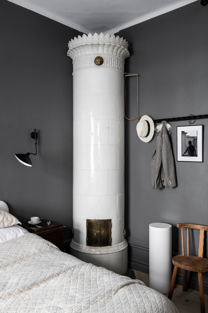
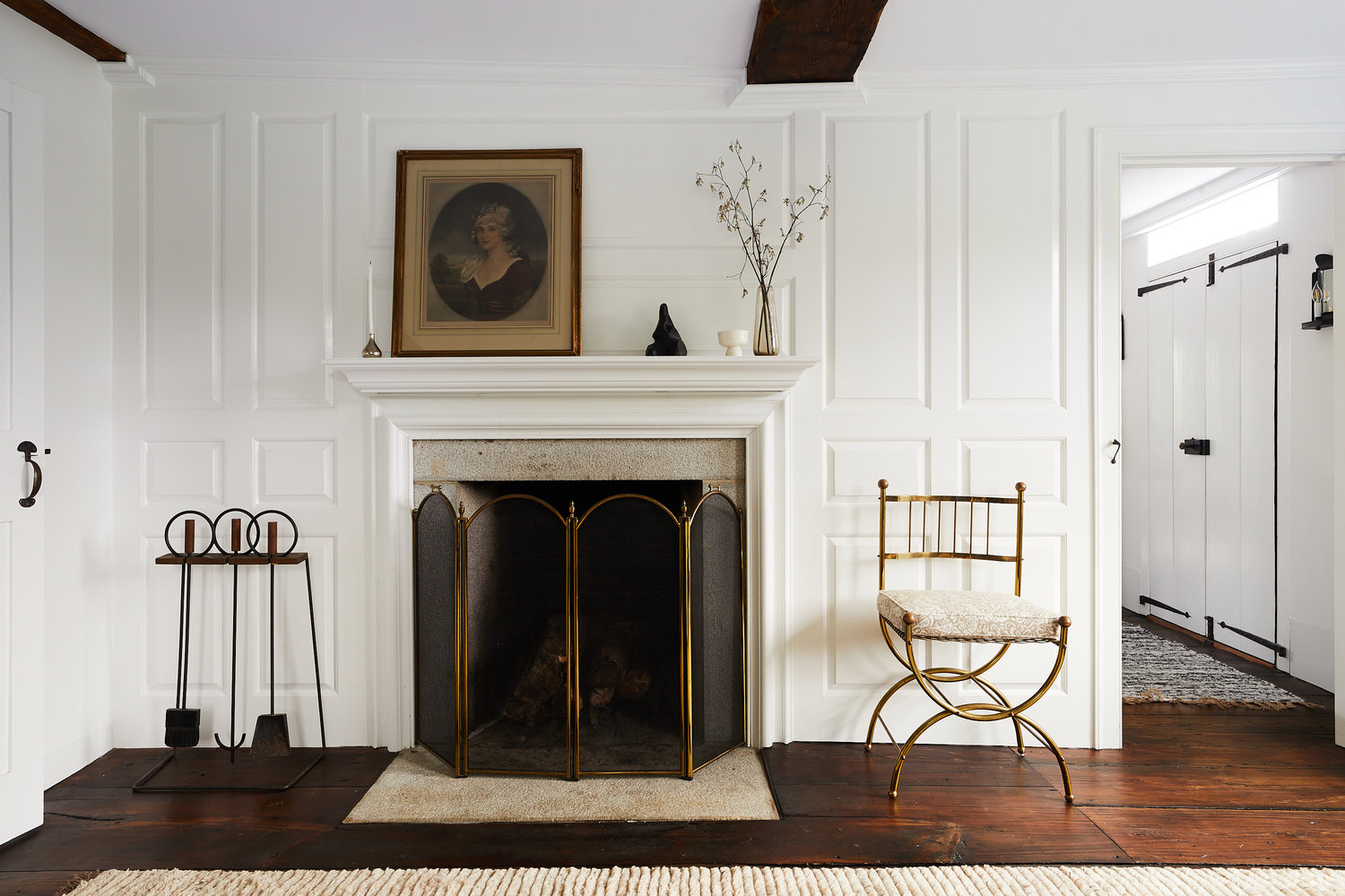
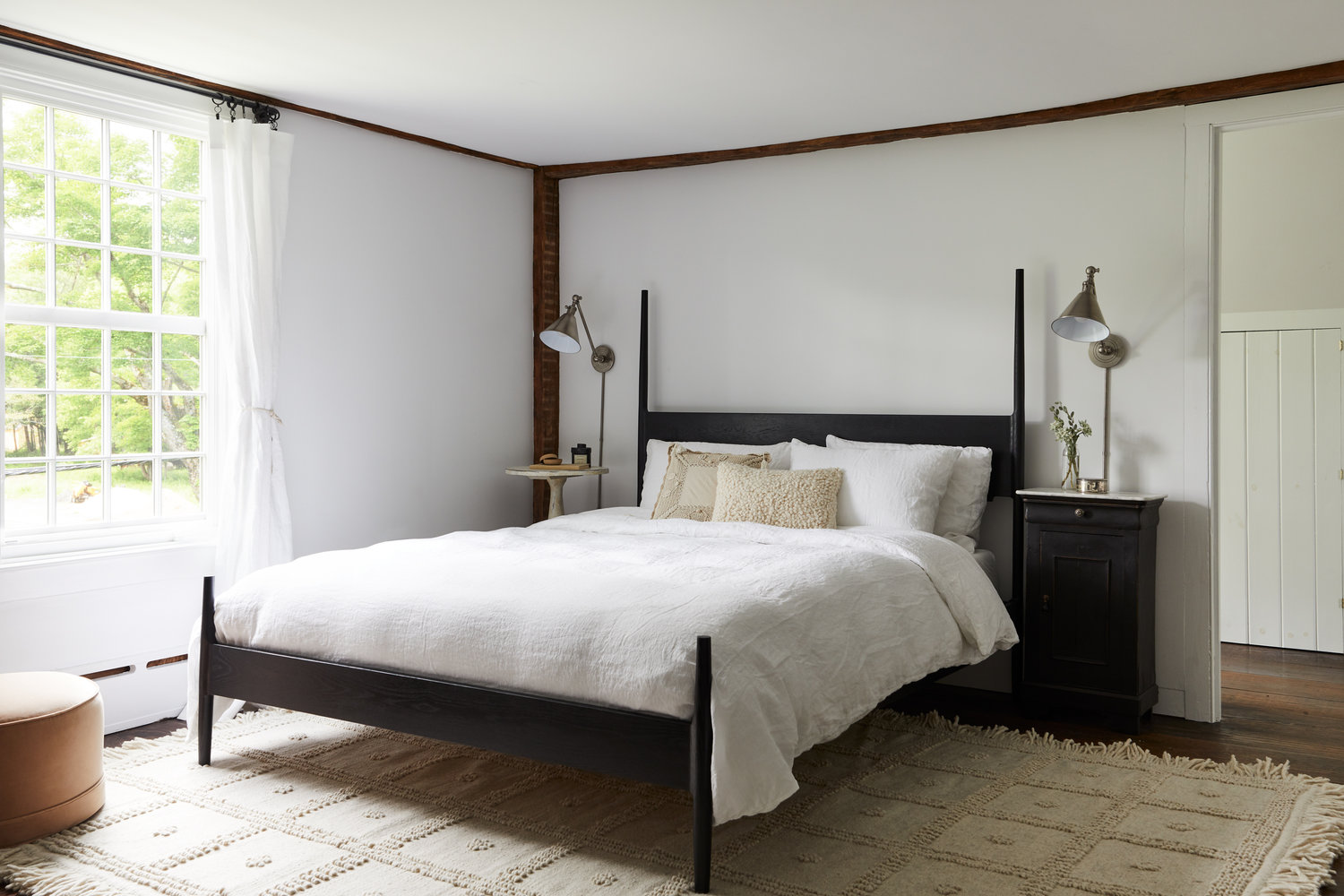
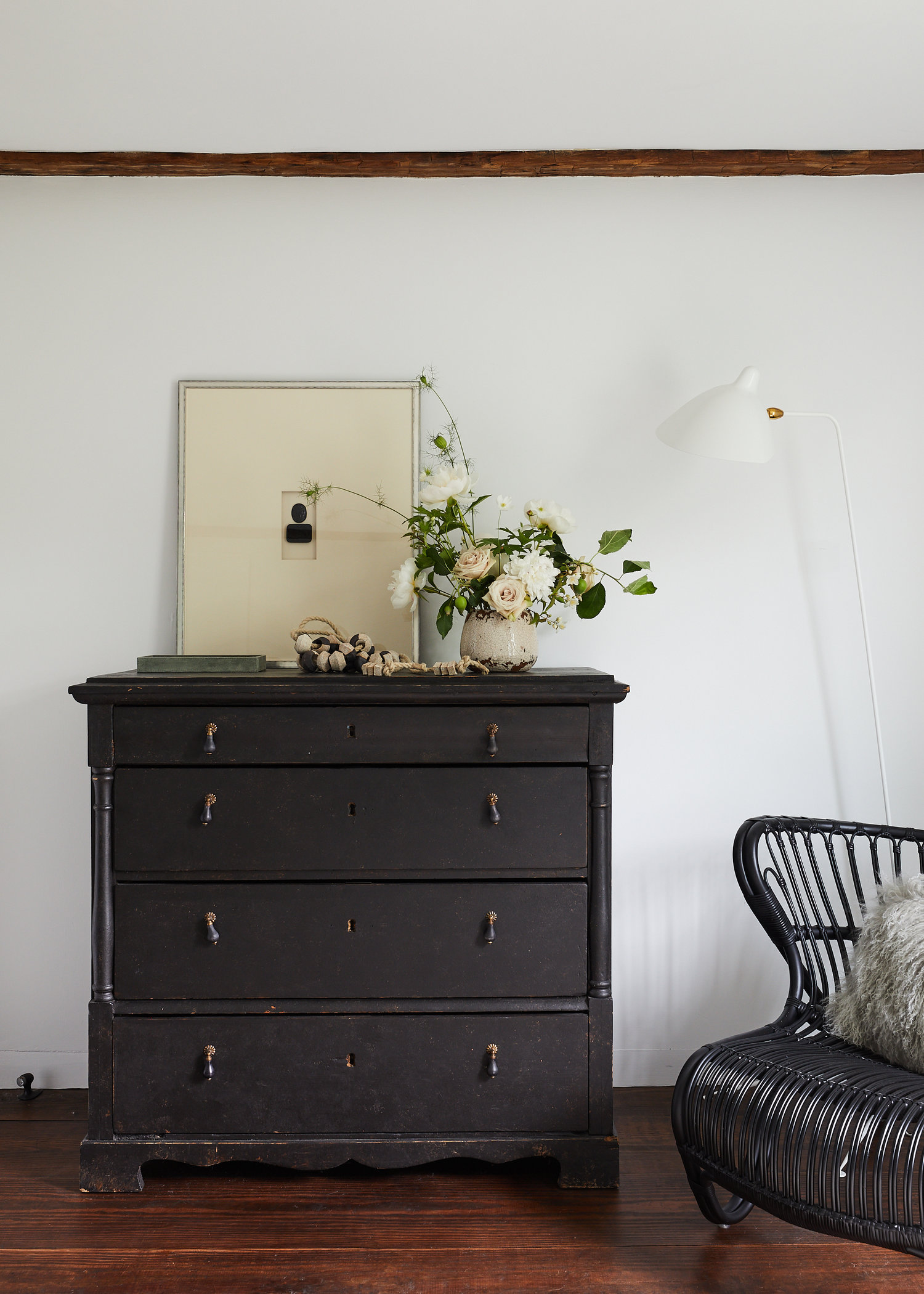
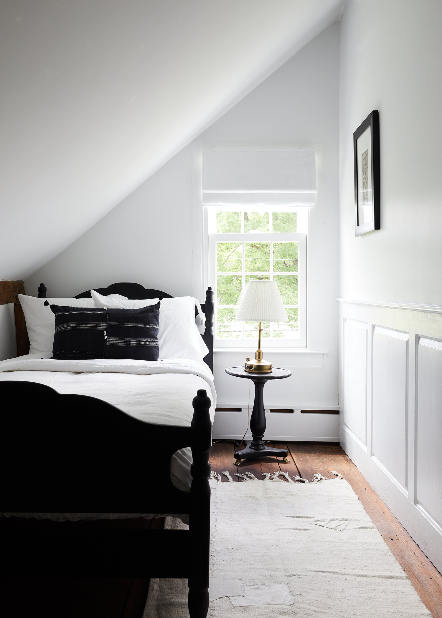
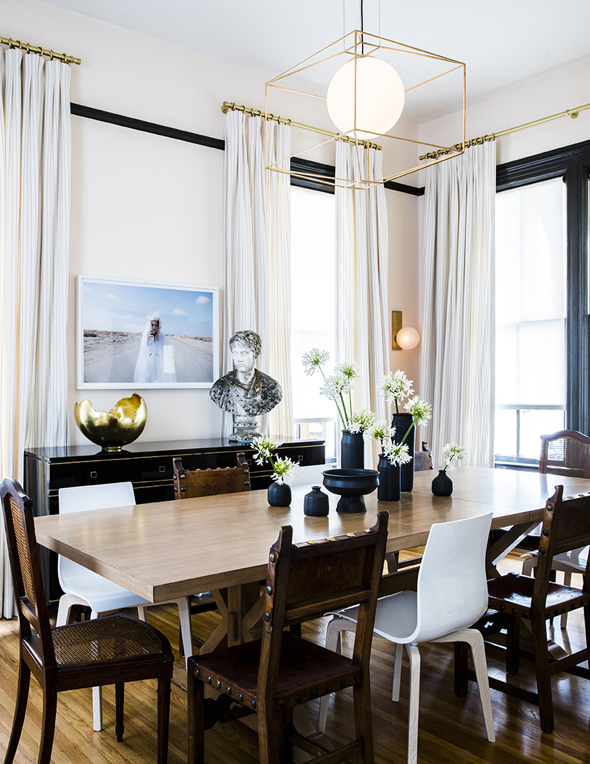
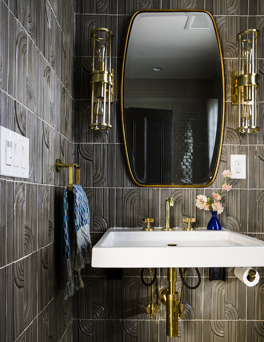
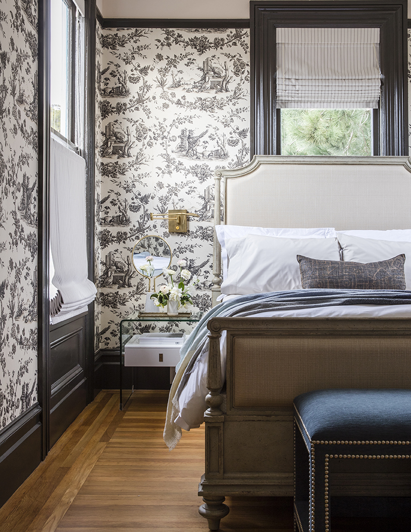
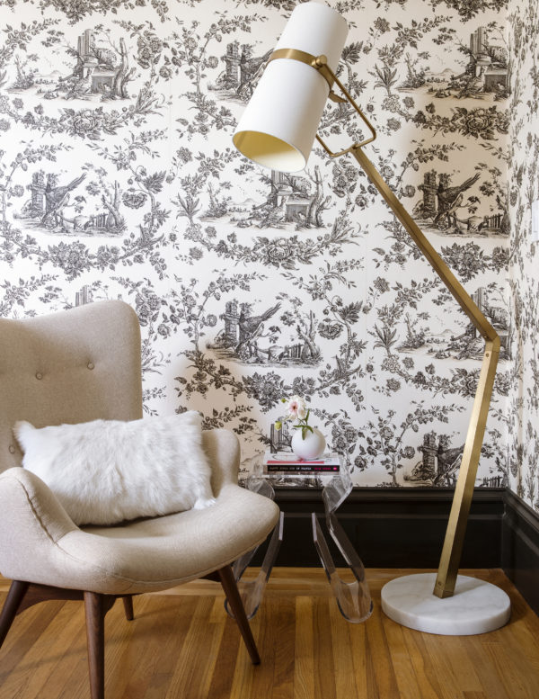
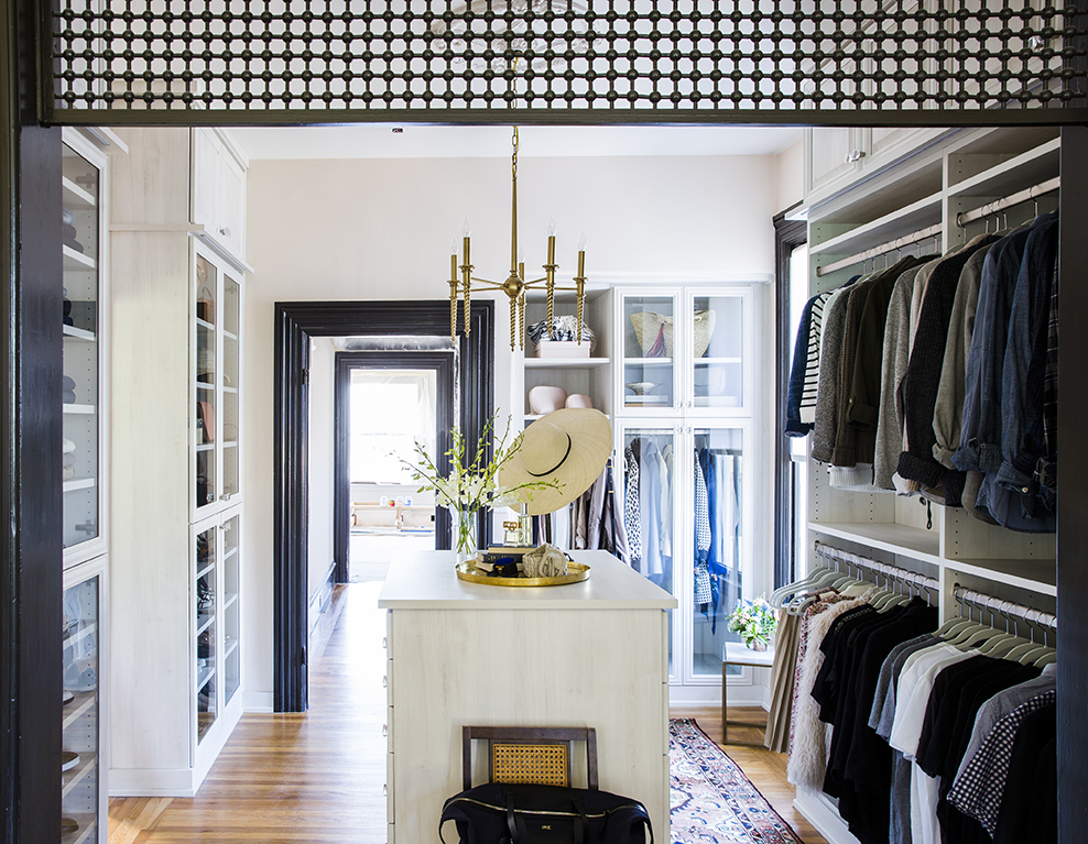
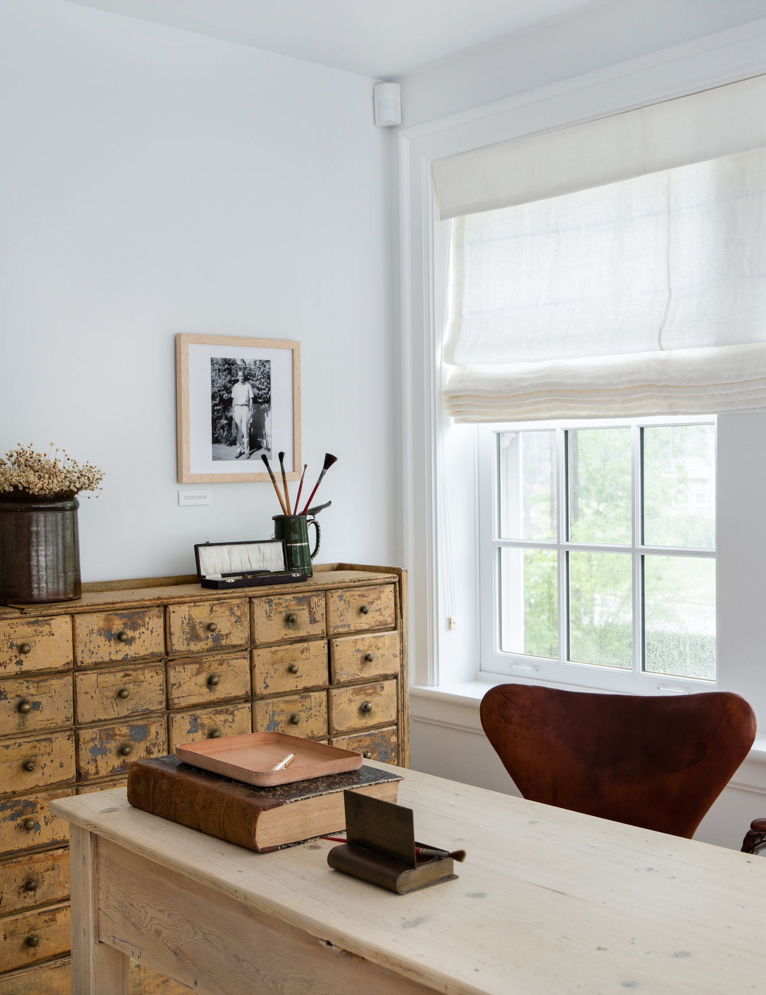
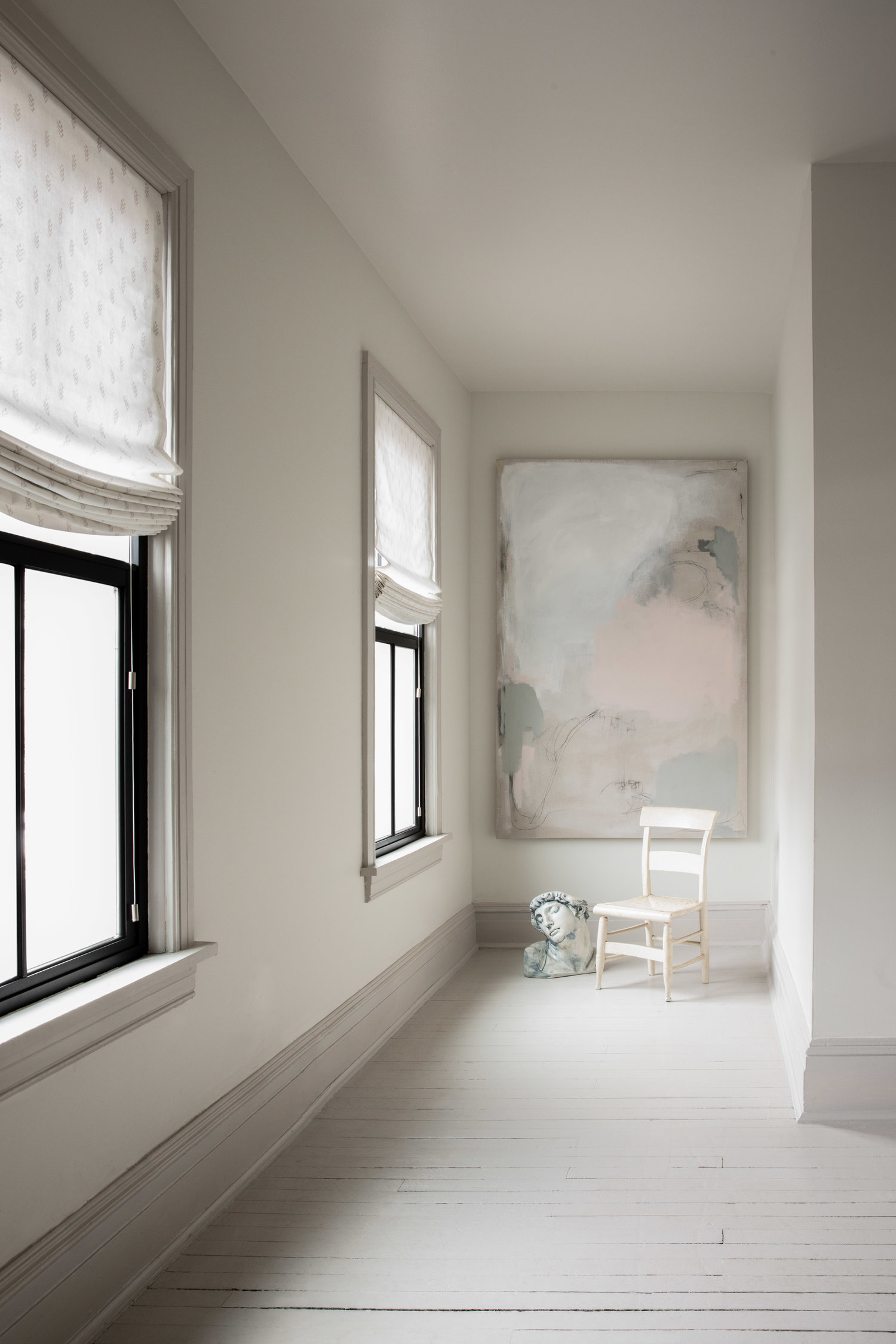
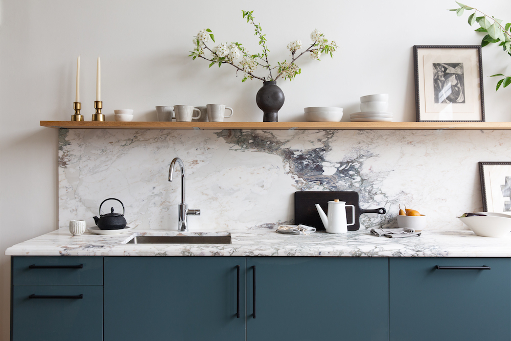
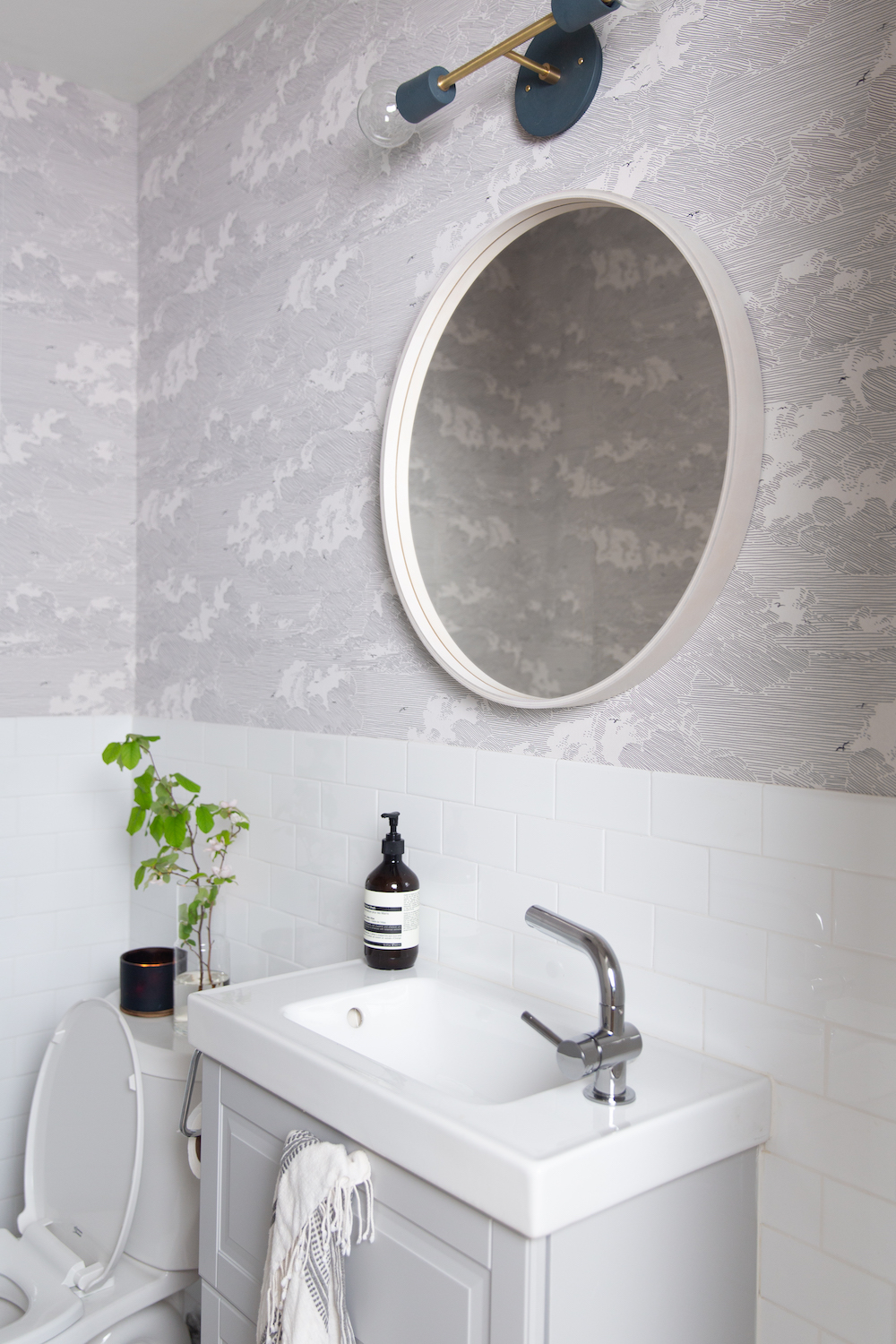
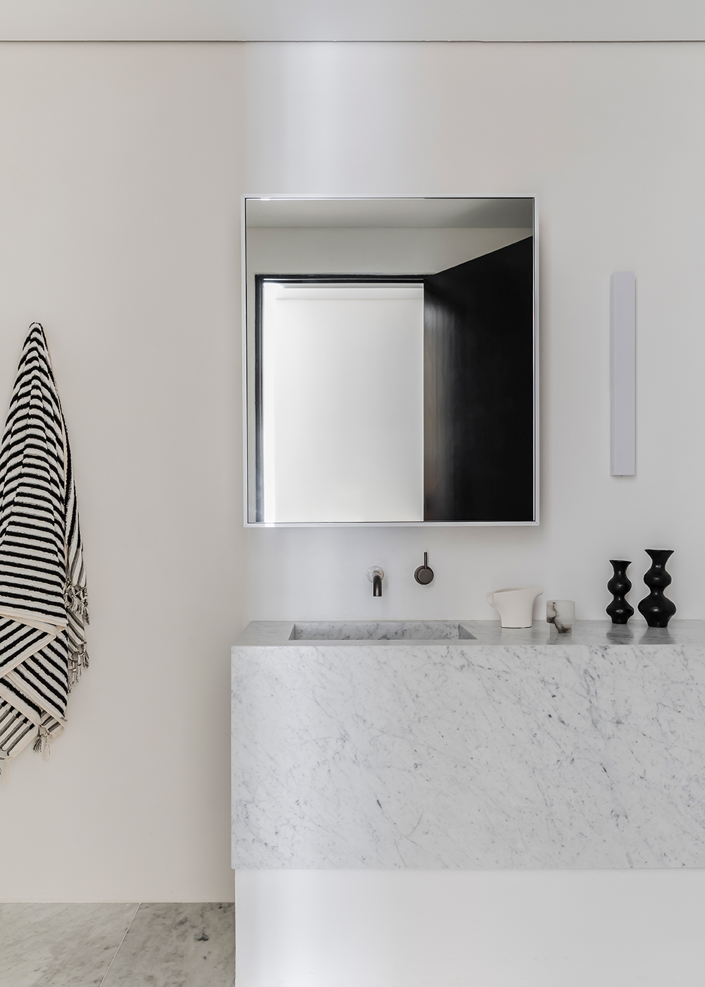
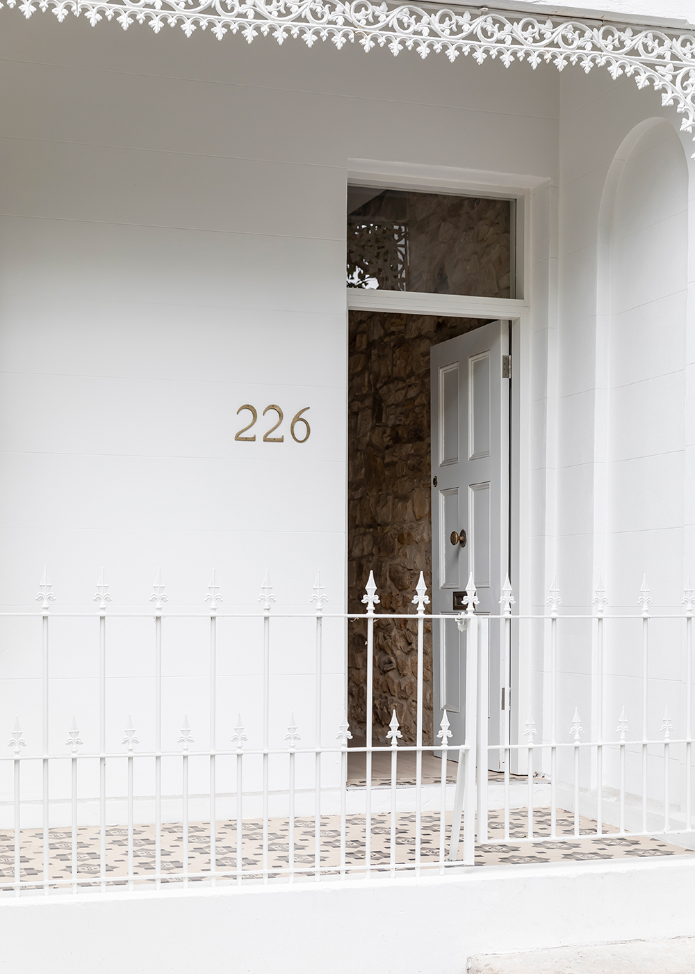
If you don’t follow Apartment 34 on Instagram, than you might have missed the exciting announcement that official This Old Victorian – aka my five year renovation saga – is about to come its close. Domino Magazine announced its first ever Renovation Issue and I’m thrilled to announce that office tour of our house is included. If you want your first sneak peak into the our before & afters (and they’re rather dramatic), click here.

But I think once you try your hand at renovations, you catch the bug. And so I’m already designing my fictional future dream house in my hand. And I think I already found my dream kitchen.

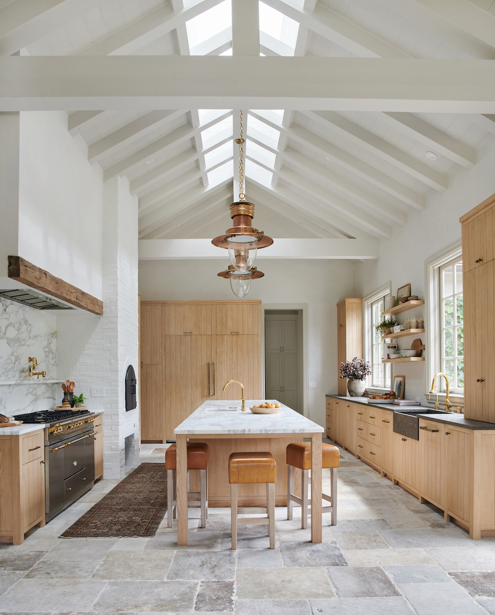
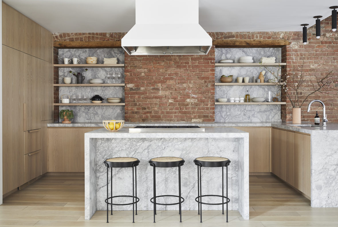
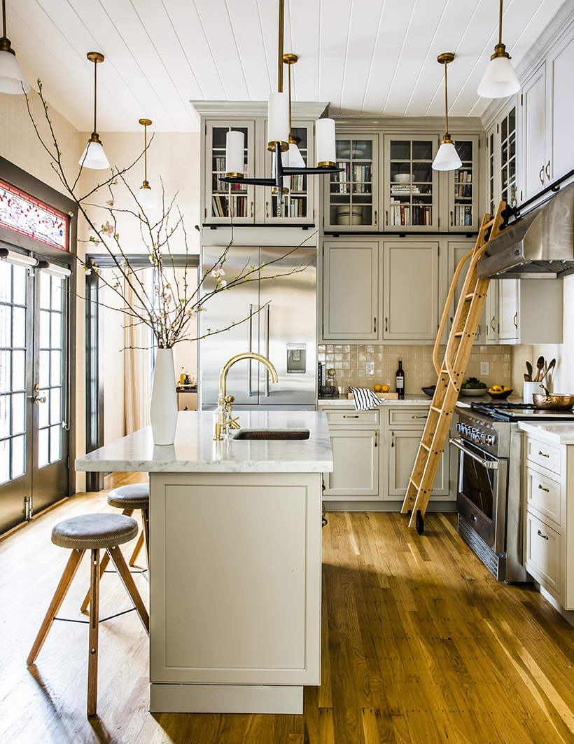
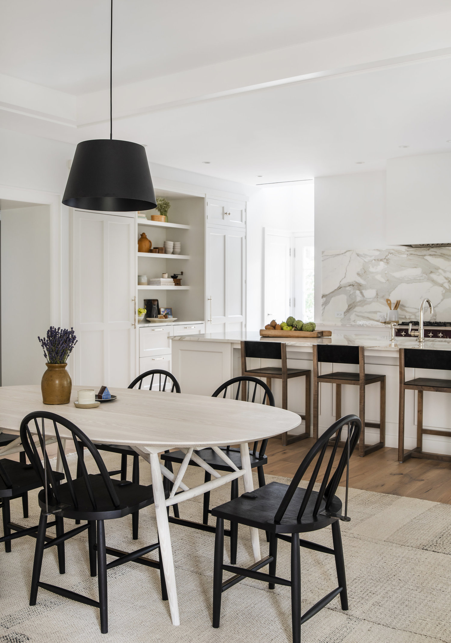
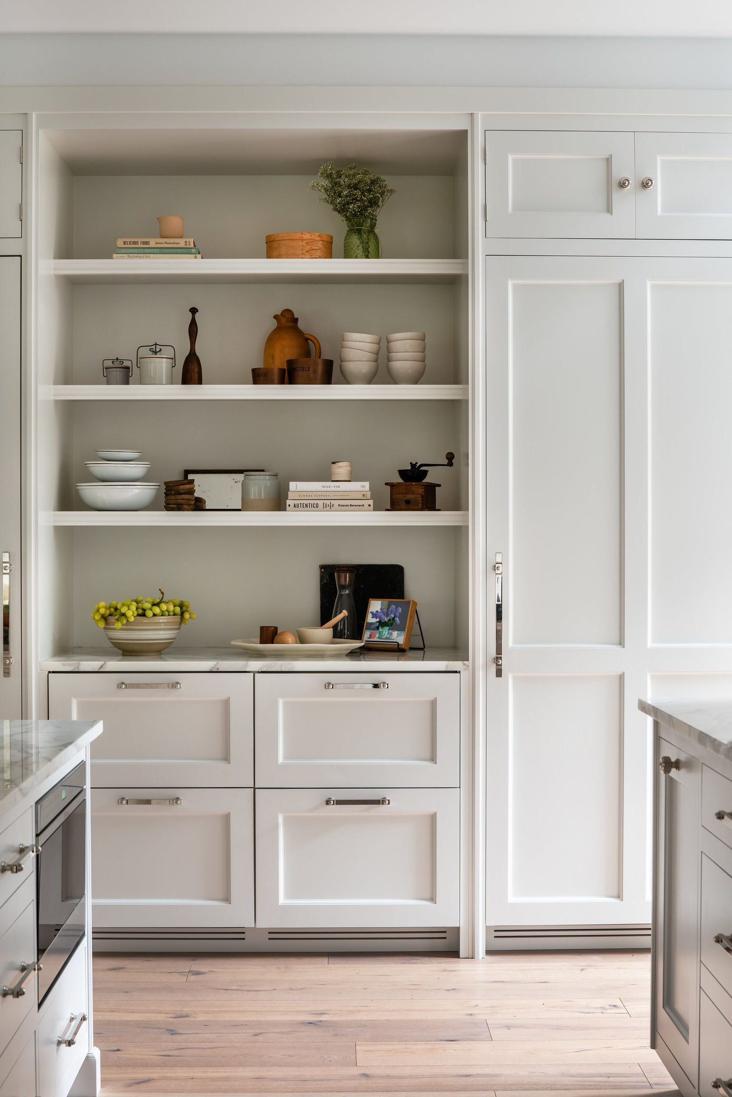
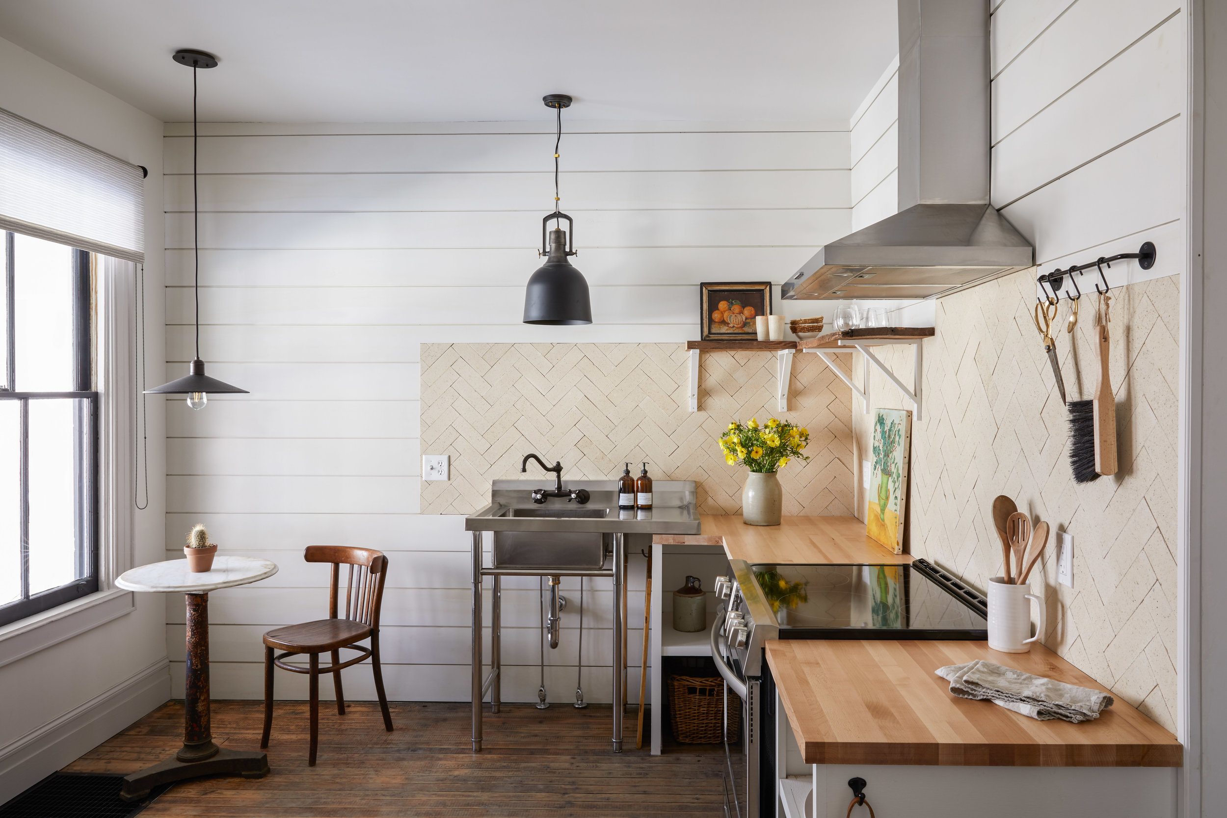
This epic kitchen is another product of design savant Amber Interiors. She has figured out the magic mix of California casual, old world grandeur, and what I like to call elevated rustic style that combine to create warm, welcoming but also dramatic spaces.

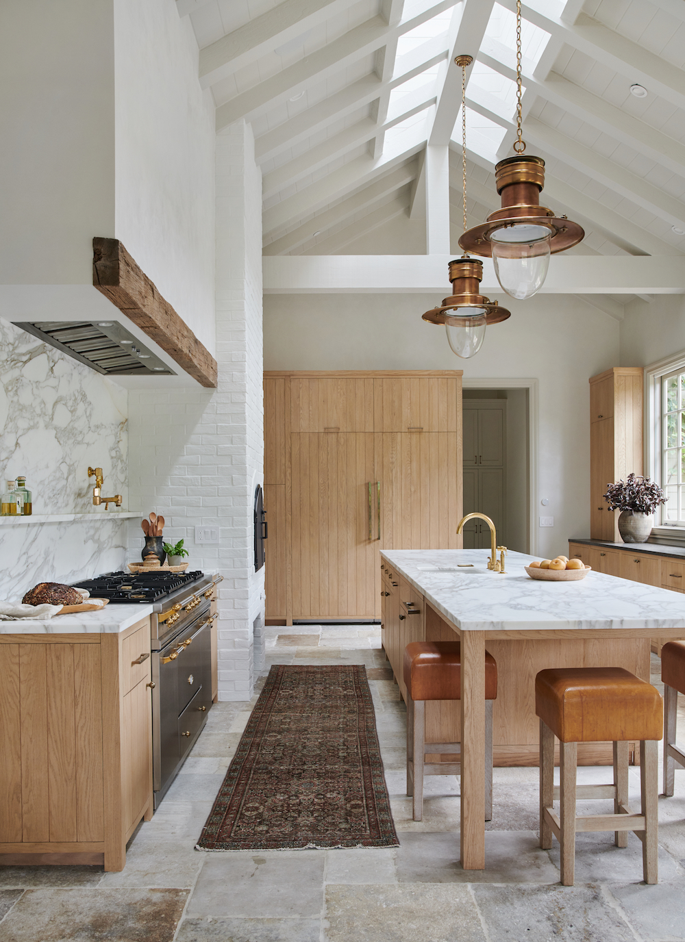
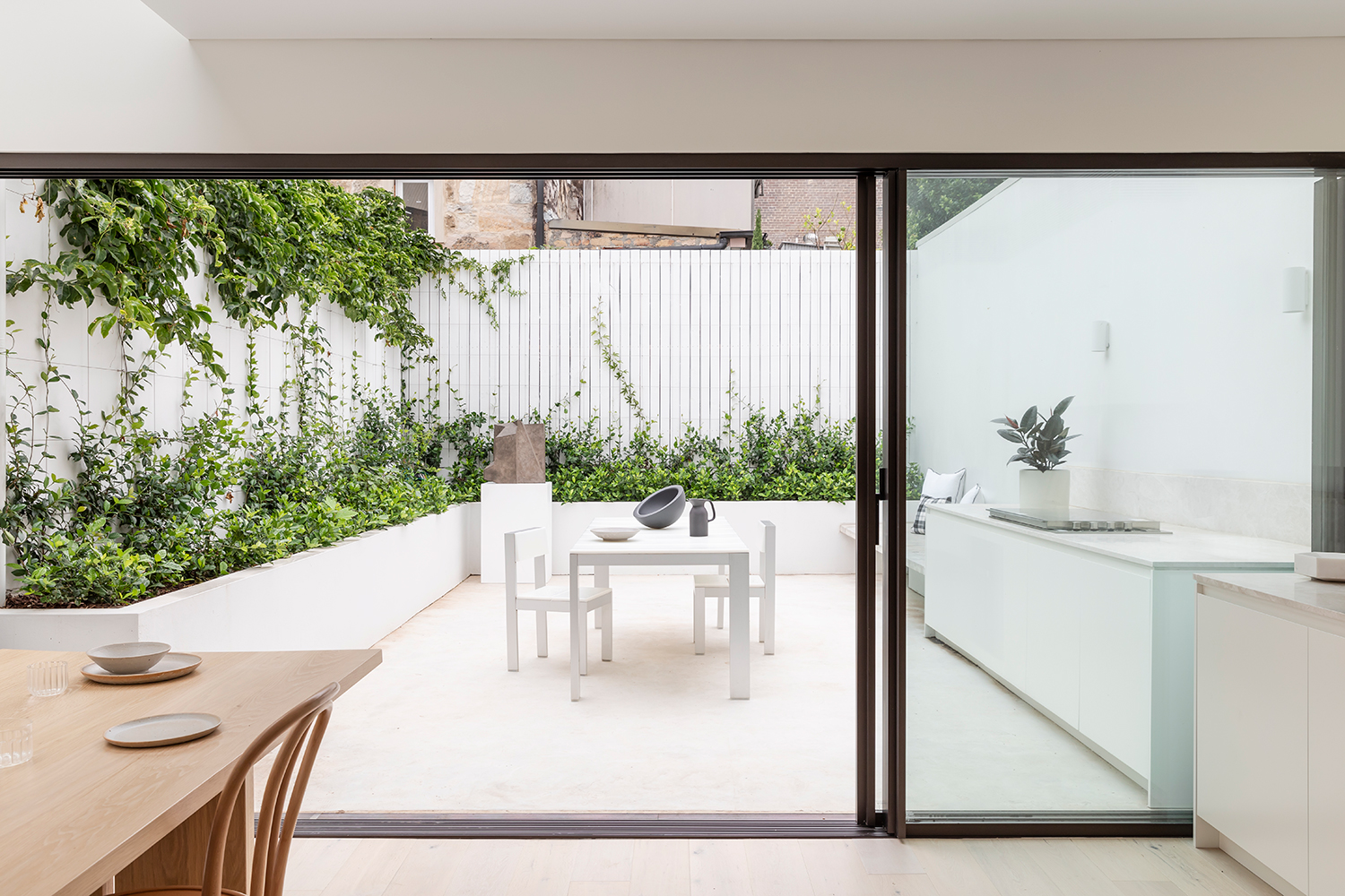
Obviously, the architecture of this space lends itself to its awesome dramatic feel, not to mention all that stunning natural light. But that is probably one of my biggest leanings from our renovation – that a space’s bones are everything. If you happen upon some a home with some good architecture, jump on it! You can be confident that even the ugliest of toads can be transformed.

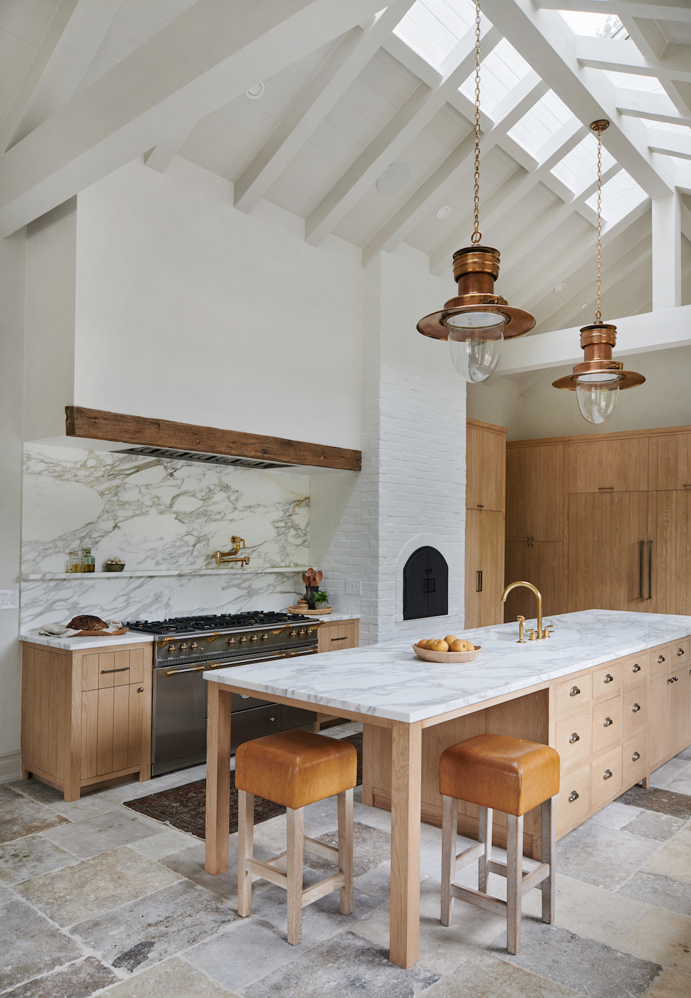
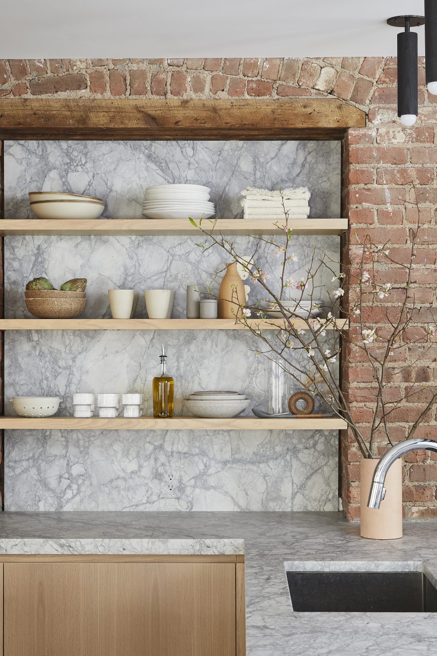
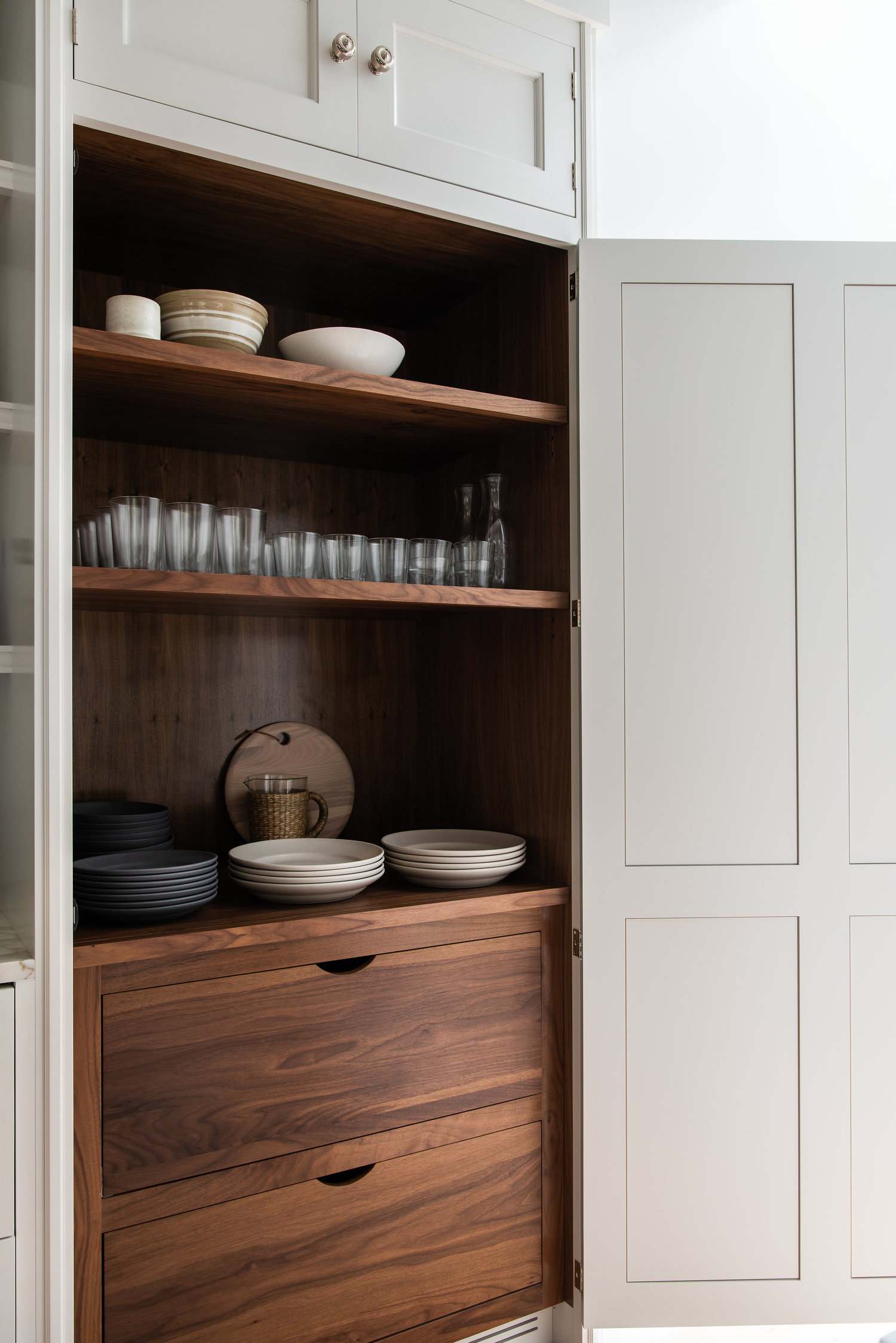
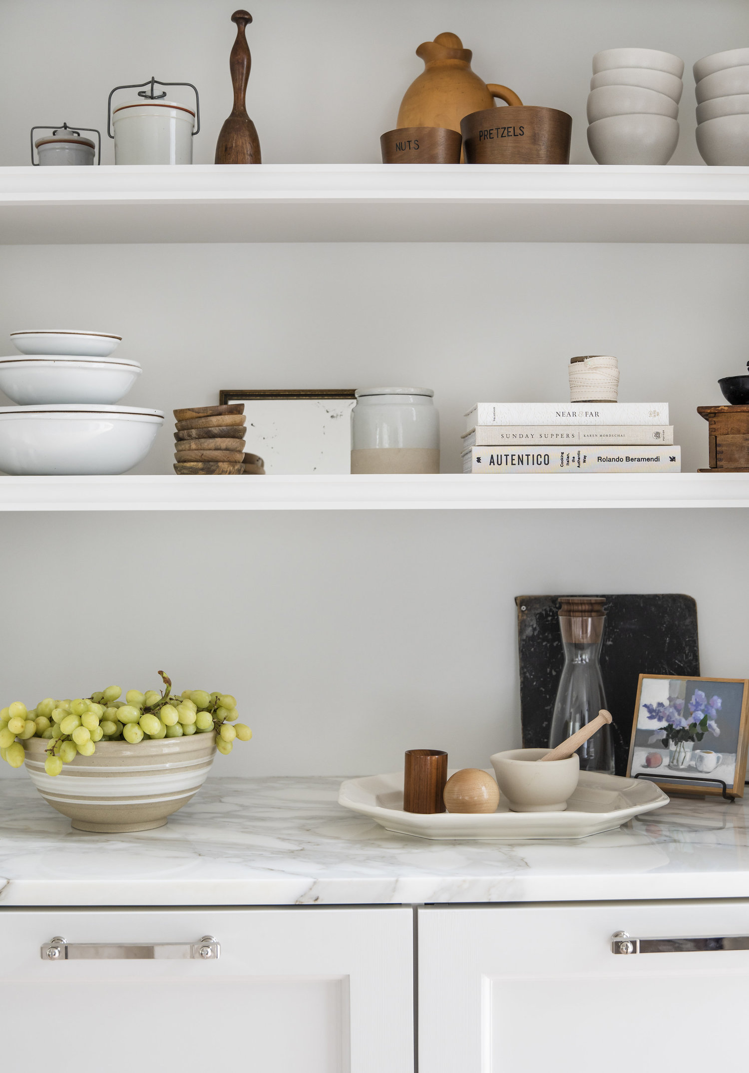
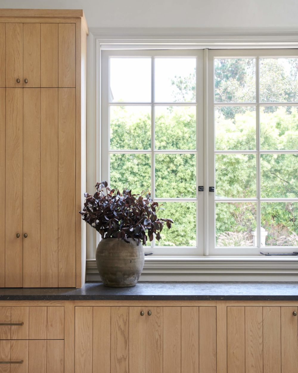
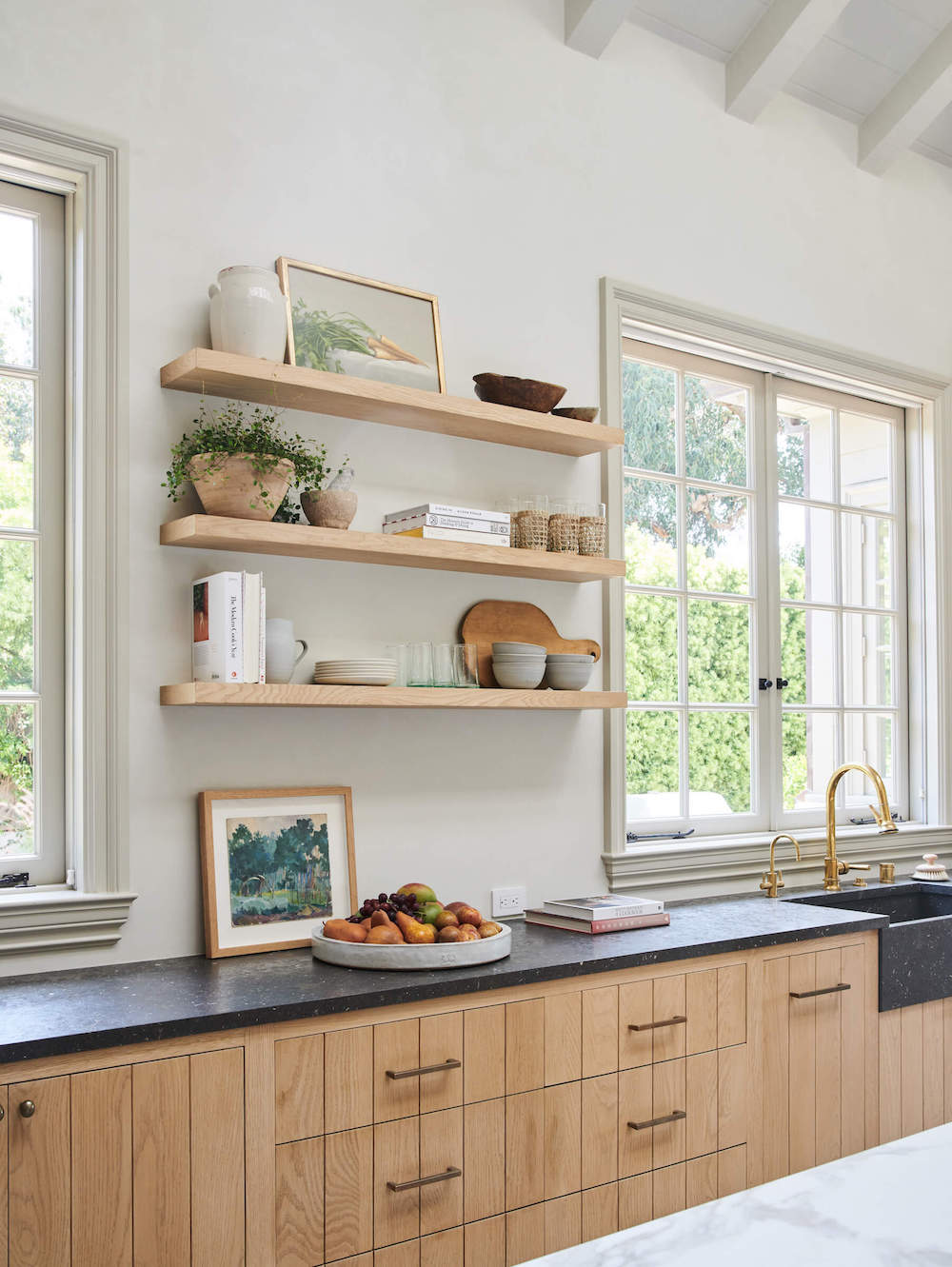
The use of various both refined and rustic materials offers really beautiful juxtaposition in this kitchen. Honed Calacatta marble counters and backsplash feel sleek and fancy. But then the reclaimed French limestone looks as if you could be in a farmhouse in Burgundy. The mix and match continues with smooth plasters walls abutting a white brick pizza oven. Brass hardware offsets the custom white oak cabinetry, but the cup drawer pulls reinforce the more country, rustic feel. Finally, a rustic beam holds residence above a sophisticated Lacance range. Yet it all works.

This space would feel fitting should it be in middle of wine country, in Europe or in downtown LA. In fact it resides in Malibu, CA but you certainly wouldn’t say it has a beachy feel.

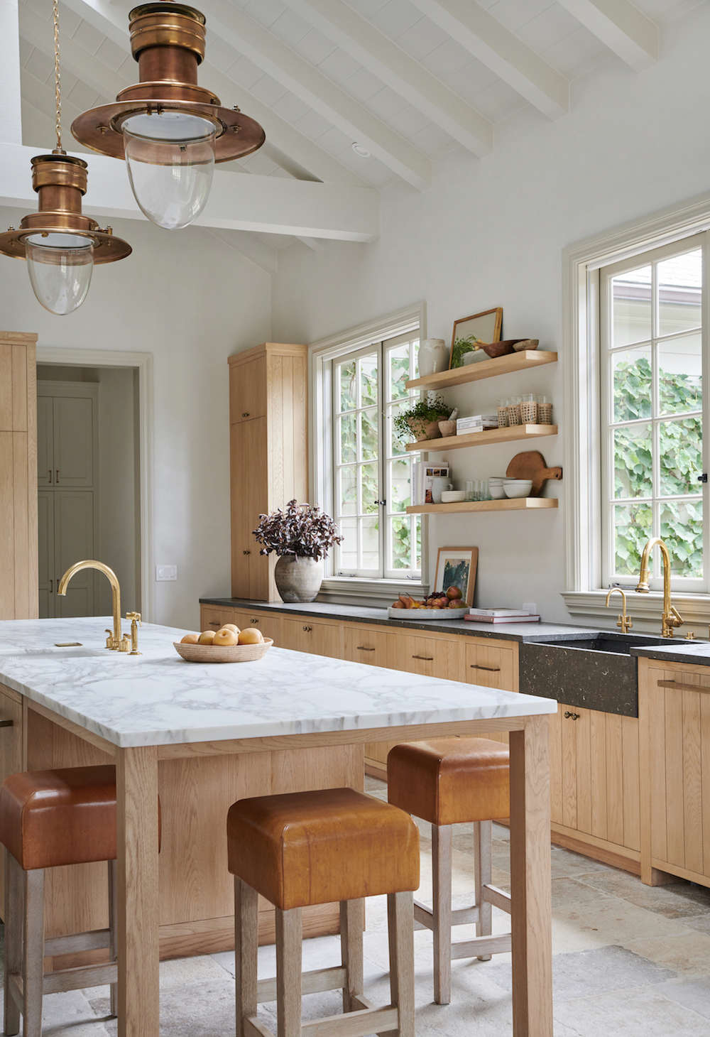
I love how Amber switched the far counter’s top to a dark limestone to anchor the space and mirror the dark range across the room.

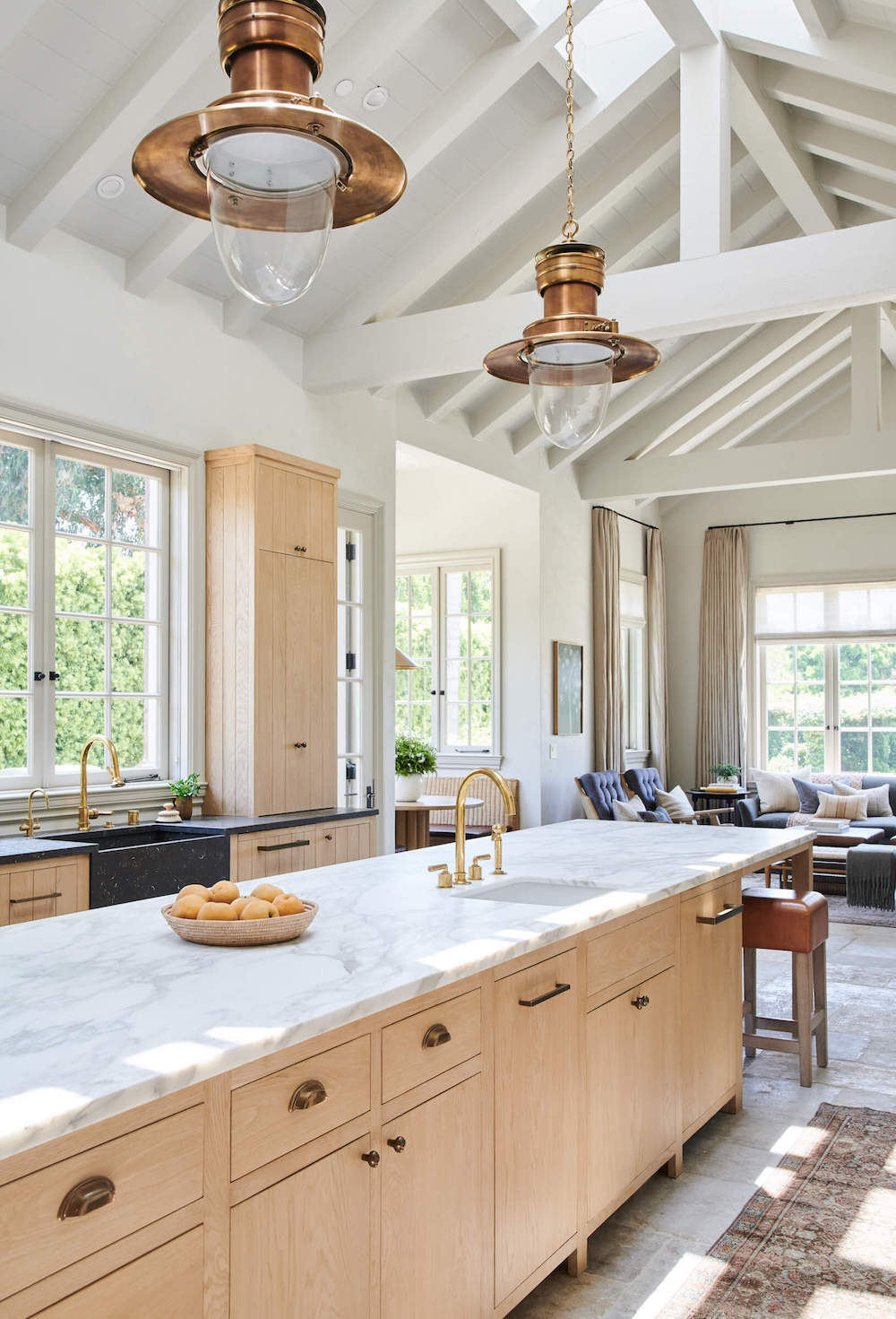
If I could get my hands on this space I might have thickened the countertops (I still love that fat look), selected more modern cabinetry hardware and swapped out the antique pendant lights for something more minimalist and refined. But that’s fun thing with renovating. Once you get to play with the details, you just want to play more and more and more and more.

Good thing I have my yard project to keep me busy at the moment, because I’d be rather tempted to start housing hunting again! Don’t tell my hubs.

design by amber interiors, photography by tess neustadt 

After two trips to Sweden this year, I have become totally smitten with their unique design perspective. And I’m not referring to the stereotypical Scandinavian minimalism nor the typical “hygge” look that’s been massively appropriated into American design of late. Those styles are certainly present in many a Swedish residence, but they also feature a mix that includes old-world and modern, clean-lined and cozy, restrained yet perfectly layered.

Home Tour: Elevated and Elegant Fall Vibe in StockholmHome Tour: Elevated and Elegant Fall Vibe in Stockholm

This apartment, belonging to interior designer Lovisa Håger is a perfect example. At first glance, you might not immediately realize it is in Stockholm. The mix of furniture styles, the use of classic designs that aren’t Scandinavian, like Serge Mouille and Atollo lamps and the moody color palette make this home seem as if it could be in Paris or Brussels.

Home Tour: Elevated and Elegant Fall Vibe in Stockholm

But as your eye devours this decidedly stunning space, you do spy some tell-tale hygge signs, like those mid-century chairs upholstered in fuzzy lambswool or the classic Scandinavian midcentury credenza.

But I love that there isn’t a piece of blonde wood in sight here. Instead, deep warm wood pieces offer lovely contrast. I’m similarly obsessed with the choice to paint the molding throughout the house a sultry gray, bucking the all-white -everything Scandinavian look.

Home Tour: Elevated and Elegant Fall Vibe in Stockholm  Home Tour: Elevated and Elegant Fall Vibe in Stockholm

The kitchen also continues to buck the traditional color stereotypes, using dusty rose, dark countertops, more of that yummy dark gray molding.

Do you spy the split door at the end of the hallway – it’s one of my favorite things about European apartments.

Home Tour: Elevated and Elegant Fall Vibe in Stockholm

Natural light is indeed critical for those long Swedish winters and thanks to a plethora of large windows this apartment has lovely light in spades. I also really appreciate the deep windowsills. They become little little extra pieces of furniture where you can keep a few favorite books or display a vignette of ceramics. The floor to ceiling curtains in this room help accentuate the ceiling height.

The traditional corner-mounted fireplace does place this apartment smack dab in Sweden. But I’m not mad about it. Swedish fireplaces are so stunning. I also love a tone-on-tone dark room. The bedroom is a perfect spot to create an extra cozy retreat.

This apartment feels warm and collected, yet not overly cluttered or fussy. Of course it benefits from amazing interior architecture, but it’s the lovely mix of textures, design styles and timeless accessorizing that makes this house feel like a home.

And bonus, it’s for sale! Maybe my little relocate-to-Sweden-pipe-dream could in fact come true. Details about the apartment are here.

images via nomad makleri

If there’s one thing I love, it’s a good industrial loft (did you follow our loft life from what feels like years ago??). But this loft in Soho (hello, second dream realized), designed by Tina Rich, combines classic downtown industrials details with a light, airy, dare I say California vibe.

home tour: stunning soho lofthome tour: stunning soho loft

Case in point, the epic kitchen. You might not immediately think you can combine exposed brick and rustic beams with bleached oak and a lovely light marble, but somehow it just works. The light tones brighten the space and neutralize any overly red moments in the exposed brick. A killer ceramics collection, including the season’s must-have fruit bowl, add more warmth and eclecticism.

home tour: stunning soho lofthome tour: stunning soho loft

The balance of warm and industrial continue to mix as you move into the seating area. A relaxed all-white chaise sofa feels incredibly laid back. Tones of blush, cream and natural materials soften things further. Sadly I don’t know the source of that amazing travertine and wood coffee table, but I’m determined to track it down!

home tour: stunning soho lofthome tour: stunning soho loft

The use of light oak carries into the dining area, where one of my favorite Apparatus Studio chandeliers (also seen in this stunning Hamptons home here) sits above a simple farmer’s style table. The pastel hues in the oversized art continue the softer color palette. I also spy vases by my new favorite ceramicist Simone Bodmer-Turner.

home tour: stunning soho loft

If you’ve read for awhile you know I have a love affair with steel and glass doors. They’re used here to create a lovely guest bedroom that can be flooded with natural light when the velvet curtains (in that yummy safe hue) are open. It also is the perfect incentive to make your bed.

home tour: stunning soho lofthome tour: stunning soho lofthome tour: stunning soho loft

When you have a jewel box of a bathroom to play with, you want to make every choice count. This bathroom does that perfectly. Tina mixed industrial materials to great effect. Concrete was used to create a built-in niche featuring steel shelves. Yet the floor and wall tile have softer textures that evokes textiles. The open sink helps the small space feel bigger. I also love using beautiful decorative objects in a bathroom. They help connect the design to the entire house.

home tour: stunning soho loft

I wouldn’t except these soft lines and natural materials in an urban loft but they work oh so well. And I spy one of my favorite discoveries from my recent travels in Scandinavia, the No.2 hanging lamp wall light by Valerie Objects.

home tour: stunning soho loft

In the master, clean lines but soft textures like an upholstered headboard makes this a room you just want to collapse into. With space at a premium in NYC, the wall-mounted side tables are a genius solution, while the leather hammocks hanging below offer a unique way to hold nighttime reading materials.

I don’t think I’d ever describe New York as relaxing, but I’d gladly take respite from the city that never sleeps in this beautiful space.

For our entire archive of inspiring homes, CLICK HERE.

design by Tina Rich, photography by christian torres

At first glance, you might not immediately realize today’s home tour is nearly 220 years old. The beautiful mix of contemporary furniture, elevated vintage and exquisitely unique pieces are likely to capture your eye first. Because it is all crazy good.

But has you look a little closer, you’ll notice how the historic details of the home – a cottage originally built in 1790 by a Revolutionary War veteran – are an integral part of the home’s overall aesthetic. To stunning effect. Scroll to see how you can can make something old wondrously new again.

After five years of renovating This Old Victorian, I’m sucker for any home that highlights its historic architectural features. In restoring this cottage, the design team took great pains to refurbish the raw wood beams that originally graced the walls and ceilings. That age and patina are the perfect foil to the the contemporary feel of furnishings.

I also love that there’s also a sense of ease and comfort in this home. The chaise sofa and simple two-tiered coffee table above are relaxed, while the side table, vintage wall-mounted sconces and those stunning layered rugs add major interest. The warm palette of neutrals offer high contrast without in your face color.

All dogs should be color-coded to your house if you ask me.

My head keeps turning at tall the incredible details in this house! Do you spy those incredible feet on that sofa? Or your perhaps you can’t pull your eyes off that marble side table. Or that exceptional lamp? The yummy rug? It’s hard to decide what is the most pitch perfect choice.

Vintage moments add to the cottage’s charm – from that amazing firewood box to the lovely candles and door hardware – these are the details that truly honor the home’s restoration.

The dining room mixes styles to a tee. The massive fireplace, skirted dining table and shaker chairs all speak to the traditional east coast roots of this home, while the oversized art both mirrors the fireplace but also offers a modern touch.

A herringbone brick floor is a textural rustic moment in the otherwise sleek white kitchen.

Mixing textures, print and materials offer visual interest everywhere you turn.

A wicker chair painted black modernizes the vintage vibe in a bedroom. A sophisticated modern lamp further balances this vignette.

This home is a clinic in honoring a home’s historic bones while breathing in new life that meets the needs of how we live today. My friend Sheena, the founder of Nune Studio is behind all these beautiful choices while Branca & Co managed the restoration. I should have reached out to both five years ago!

photography by nicole franzen, interior design by nune studio, restoration by branca & co

If you’ve come around these parts a time or two, then the house tour below might look familiar. It was actually one of our most popular tours of all time – and it’s rather easy to see why. A stunning historic Victorian located in the Bay Area’s Alameda neighborhood, the century-old abode marries historic detail, modern traditional design and eclectic touches to make this home truly one of a kind.

And now the house is for sale. Its owners are relocating to Copenhagen (my dream!) and they want their labor of love to go to highly appreciative hands. Could that be you?? If you need convincing, just scroll. If I didn’t love my house so much I’d seriously consider moving!

One of Our Most Popular Home Tours is Now FOR SALEOne of Our Most Popular Home Tours is Now FOR SALE

The home’s front room maximizes original details like gorgeous hardwood floors, brick fireplace and decorative moldings. Custom shelving, black accents and a modern pendant balance all the historic architectural elements.

One of Our Most Popular Home Tours is Now FOR SALE

I love seeing modern art mixed with vintage pieces. Can you believe that 1910 piano was found on Craigslist?!

One of Our Most Popular Home Tours is Now FOR SALE

The formal dining room is anything but stuffy. An oak trestle dining table is flanked by both vintage chairs (salvaged from the old Sunset Magazine offices!) and modern white options. More black pops up in the sideboard and ceramics. The floor-to-ceiling drapery softens the room, while the photographic print and the Troy Lighting Silhouette pendant add a modern pop.

One of Our Most Popular Home Tours is Now FOR SALE

This is the kitchen that broke Pinterest. Its scale, double height storage, statement lighting – this kitchen ticks all the design boxes.

tour sunset editor in chief's home on apartment 34

Dramatic 11-foot ceilings offer dizzying height and eye-catching storage (cookbook collection envy!) complete with a library ladder to access it all. There’s a beautiful mix of finishes and textures in the kitchen including glossy Fireclay Tile that wraps all the way around to the eating nook, open shelving that the owner DIY’d with pipe and pine boards, a shiplap ceiling, marble countertops and brass fixtures. The kitchen takes on a bit of craftsman feel, but it keeps an elegant yet eclectic vibe, connecting the space with the feel of the rest of the house.

Gotta love a glam powder room moment. The tile is Kelly Wearstler for Anne Saks.

Upstairs in this 2,400sq foot home, you’ll find four bedrooms and two of the house’s three baths.

tour sunset editor in chief's home on apartment 34

The love of print, pattern and texture extends into the master bedroom, where you’re enveloped by a modern toile wallpaper in black and white. The traditional feels is balanced with a mid-century accent chair, lucite side tables, and an oversized swing arm lamp.

One of Our Most Popular Home Tours is Now FOR SALE

But the piéce de résistance has to be the walk-in dressing room of every woman’s dreams! Designed using the TCS Closets from the Container Store, you will never fight over closet space again. The glass enclosed storage for shoes and pieces worn less often is just brilliant! No need to worry about dust on your shoes.

A day bed helps the guest room work double duty, while a window seat offers extra storage.

One of Our Most Popular Home Tours is Now FOR SALE

I love the mix of marble and tile in the family bath. The brass fixtures offer an eye-catching accent to the softer hues and contrasts perfectly with the sink that was salvaged from the downstairs bathroom.

tour sunset editor in chief's home on apartment 34 tour sunset editor in chief's home on apartment 34

The shared kid’s room offers plenty of space for everyone to spread out, with its own walk-in closet built out using a Container Store storage system to make sure there’s a place for everything and everything is in its place.

One of Our Most Popular Home Tours is Now FOR SALE

This house does a beautiful job paying homage to a classic Victorian’s historic details while making it feel completely functional for today’s family life. It’s also just a visual feast. I find myself going back and discovering some new detail in every single room. While I’ve loved (survived!) my own gut-renovation, the idea of a living in turnkey house, jam packed with personality, gorgeous finishes and crazy amazing detail is very very appealing.

Are you interesting in calling this beautiful specimen of a house your home?? Check out the listing RIGHT HERE.


photography by thomas j. story for sunset magazine


If I didn’t know, I would never believe this home sits on a university campus. This elevated, classic space features a beautiful mix of mid-century design icons, modern updates on traditional shapes and subtle art, all in a creamy neutral color palette that makes my heart melt.

This oversized living room is the perfect spot for large intellectual debates. This space also perfectly exemplifies how natural materials and a variety textiles can play oh so nicely together. Leather, stone, steel, linen, wool and wood all play harmoniously to create a tranquil, sophisticated seating area.

Eva chairs by Bruno Matthson add a cool vintage vibe to a seating area. The vintage elements also help balance out the modern gas fireplace.

Traditional elements, like a rolled arm sofa with caster feet, feels fresh when paired with the clean-lined set of four coffee tables and a minimalist leather bench.

Simple wood and leather hooks create a great landing place for coats.

The kitchen offers lovely contrast with a bleached oak table and pops of black accents.

I love a kitchen with a bit of open shelving. It’s your opportunity to inject personality into what can be a kind of ubiquitous space.

I don’t know if I’ve ever seen such lovely hidden storage. It’s almost a shame its behind a closed door!

Is that another black coffee table I spy? I’m telling you friends, this is a great way to make a bold statement. That BDDW credenza is also major goals.

The simplicity in this guest bedroom is pure genius. The tufted mattress and simple walnut bed frame are showstoppers in and of themselves. The art is bold and geometric but its cream and blush tones keep it from overwhelming the room.

More vintage and BDDW goodness elevate all the functional elements of a bedroom.

I spy an iconic Fritz Hansen Series 7 chair amidst an office full of found vintage treasures.

This bedroom features a traditional American craftsman pieces in a calm, minimal style.

This home is a perfect example of making wise investments. You don’t need to overwhelm a home with a ton of stuff. If you make the commitment to bring in timeless style, you won’t feel the need to swap things out nearly as often.

Ok, I’m off to go edit all the cheap sh** out of my house now. How about you?

For more inspirational home tours, CLICK HERE.

design by thea home, inc. , photography tessa neustadt 

Finding your personal design style can feel like an impossible task. Sure you can find those that fit into easily defined boxes, traditional, modern, minimalist, craftsman etc, but that is touch boring. I know my style has evolved over years into what I’m now loosely defining as modern European casual. It’s a thing right??

But do you ever find that as the seasons change, so does your preferred design aesthetic? I can always spot the shift happening in my Pinterest feed. I go from loving clean, crisp interiors to spaces that feel a little more relaxed and rustic. But a “rustic modern” design doesn’t mean it has to have any less intention or sophistication. Case in point, This Old Hudson.

Home Tour: A Picture Perfect Summer Escape

If you haven’t managed to spot This Old Hudson on Instagram yet, you’re in for real treat today. Designed by the crazy talented Anthony Dargenzio of Zio & Sons – whose tile collection for Clé I shared last weekThis Old Hudson in upstate New York is a series of rentals Anthony has created. The initial spaces are smaller apartments that often serve as photo shoot locations, but Anthony has outdone himself with the addition of This Old Hudson Residences. These 3-bedroom spaces created to be longer term rentals bring vintage chic to a whole new level.

Home Tour: A Picture Perfect Summer Escape

While the original details of the Residences’ historic 1915 building remain intact, the design has a decidedly modern feel. Hence why I’m obsessed. Many of the things you see is in this space are in fact vintage, but its minimalist placement, use of black and abundance of negative space makes the design fresh rather than dated or dingy.

Home Tour: A Picture Perfect Summer EscapeHome Tour: A Picture Perfect Summer EscapeHome Tour: A Picture Perfect Summer EscapeHome Tour: A Picture Perfect Summer Escape

While I certainly wouldn’t gravitate toward this look for my forever home, there’s something about a vacation that makes you want to step into another aesthetic. It really helps make the vacation feel like you’re in another world. Spending sometime in a design style substantially different than your own is also a great opportunity to gather inspiration and new design ideas that you might never thought to apply to your own home.

Home Tour: A Picture Perfect Summer Escape

Vintage chairs are never a bad idea. They add character and the perfect amount of patina to virtually any time of space. It’s the use of restraint and intention that makes these room’s eye-catching.

Home Tour: A Picture Perfect Summer EscapeHome Tour: A Picture Perfect Summer Escape

I spy more Clé tile! I love it placed against shiplap and a larger, more contemporary oversized hexagon tile. The mix of tones, textures and finishes makes the monochromatic bathroom feel anything but boring.

Home Tour: A Picture Perfect Summer Escape

I don’t know if I would have been brave enough to put boldly patterned cement tile in a bathroom with a turn of the century clawfoot tub, but I’m feeling it.

Home Tour: A Picture Perfect Summer Escape

Having officially hopped on board the “summering somewhere” train (are you currently tracking my adventures in Italy??) the idea of a future summer escape in the Hudson Valley certainly does sound tempting. Especially since the flight is much much shorter!

For details on how you can experience this gorgeous space for yourself, be sure to check out This Old Hudson.

For more awe inspiring home tours, CLICK HERE.

While #MondayMotivation is all the rage, there’s no reason to think it’s too late to get on the you-can-do-it bandwagon. Inspiration can strike at anytime and everyday presents the opportunity to be your best self. I’m certainly feeling like I need to get my sh** together after getting a peek into my friend Lauren Nelson’s newly finished interior design studio. As someone who either works from the couch or squeezed into a tiny desk in the corner of my guest room, I’m owning all the envy of her seriously gorgeous work space, recently featured on Lonny.

Equal parts functional and beautiful, this office has all the comforts of home, but a perfectly designed one. For example every workspace should come equipped with an elevated kitchen! You won’t find any microwaves crammed in into the corner of a dark room around here. That stone backsplah is next level and I love the injection of a dusty blue with the cabinetry. The wood shelf keeps the space from feeling too fancy, and makes your morning coffee all the more fabulous.

I will never tire of art leaned against walls. Black frames and black accents add a strong punch as does that piece of killer photographic art.

Lauren’s conference room uses two Blu Dot Strut tables and a mix of vintage chairs to create a a bright and airy space to walk through her team’s always stunning design ideas. Definitely need to improve my moodboard game!

A co-working desk allows for easy collaborative conversations.

A simply chic bathroom features another of my current favorite trends – a sideways sink!

I’ve long loved Lauren and her work. We’re currently cooking up some fun surprises related to This Old Victorian that I’ll be sharing with you quite soon!

To learn more about Lauren and her stunning workspace, check out the feature on Lonny here.

photography by bess friday

Happy Monday friends! Today I have a home tour for you that helps put last week’s black and white inspiration in context. While the color palette of this Australian home (I just can’t quit design from down under right now) is timeless, the design is bold, dramatic and thoroughly modern. It’s no wonder this apartment is nominated for the 2019 Australian Interior Design Awards. Scroll and you’ll see why.

This three-story townhouse located in Sydney’s Darlinghurst neighborhood was stripped down to expose the building’s original stone walls which were transformed into the primary design feature. As designer Tom Mark Henry explains this house focuses on “the interplay of texture, combining hard and soft finishes, contrasting matt and gloss surfaces, and light and dark to create intrigue and depth in an otherwise monochromatic palette. These quiet juxtapositions are an exercise in restraint, and the ultimate pursuit of balance and simplicity.”

Nothing in this house is generic. Every piece is selected as its own individual statement maker, but the uniform color palette keep the modern edge from feeling overdone.

Unique lines, dramatic angles, bold fabrics and one of kind art add continual interest in what is actually a sparsely decorated home.

This dining table, with its mix of a built-in bench and Thonet chairs is major goals.

As is this gorgeous pendant light!

The outdoor area connects with the kitchen and dining room seamlessly.

The kitchen is clean, minimal and understated, punctuated with simple, hardware free cabinetry. Black accents are brought in with the hardware, oven and countertop accessories.

I love the rich, muted texture of this stone.

The stunning stone walls carry through into the master bedroom. A unique piece of art adds a little whimsy to to the space while the curved lines of the side chair and side table, as well as all the textiles soften the room.

I shared this bathroom a few weeks ago for its square sink, but I also love this room’s vertical stacked tile, the gorgeous stonework and unique lighting. And do I spy a fireplace in the bathroom?? Swoon!

I spy another square sink in the second bathroom.

This home might be a little more sparse than I’m actually capable of pulling off, but it’s certainly something to aspire to. It’s also a reminder to look for pieces for your home that are filled with personality. Life is too short to be surrounded the generic.

For our home tour archive CLICK HERE.

design by tom mark henry

Older posts
Gimme More