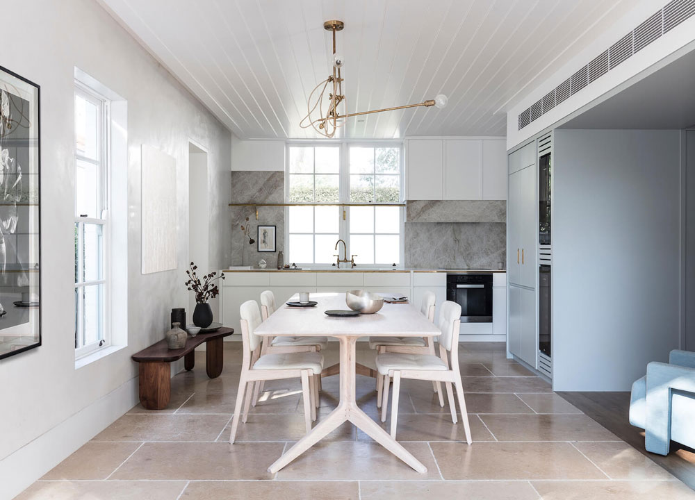
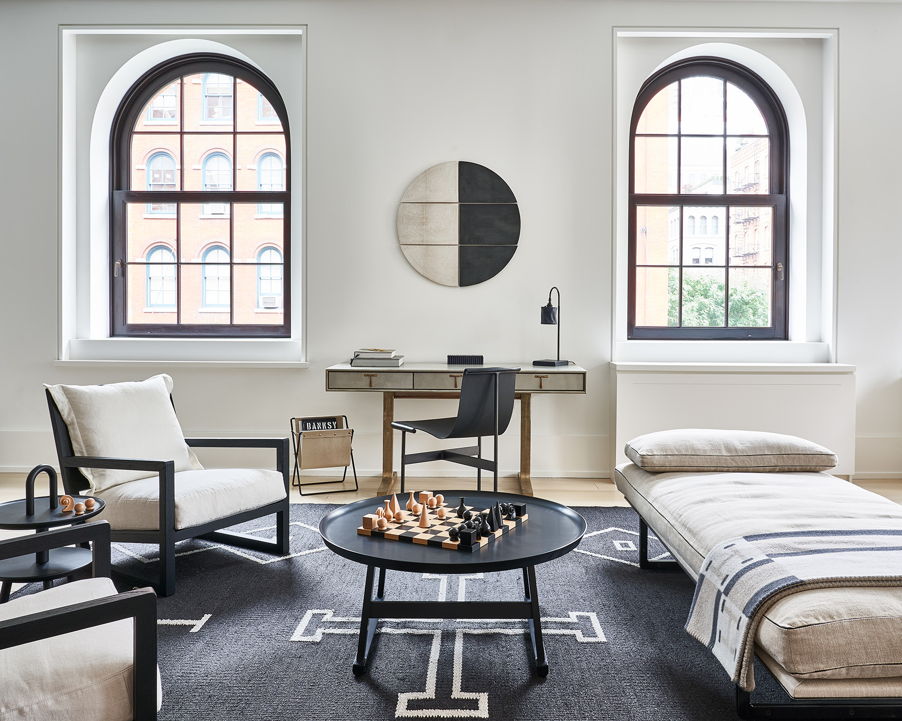
I know last week I was opining about the mystique of all-white monochromatic spaces, so I figured why not flip the script today and share a multifaceted space without a hint of white in sight. And I’m quite positive you’re going to love it because this room is just.so.good!

Home Tour: Gorgeous Kitchen in Gray Scale on apartment 34Home Tour: Gorgeous Kitchen in Gray Scale on apartment 34

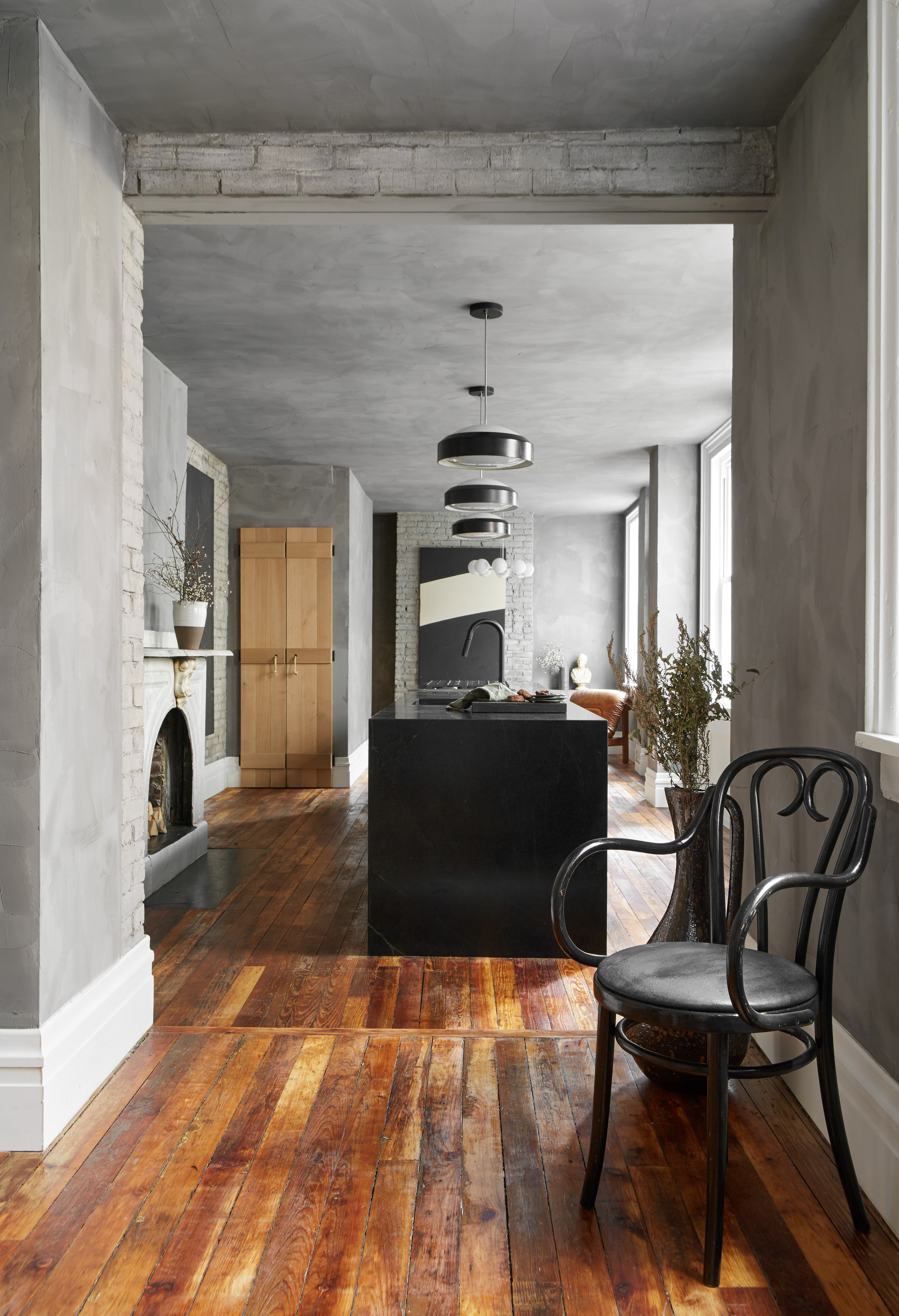
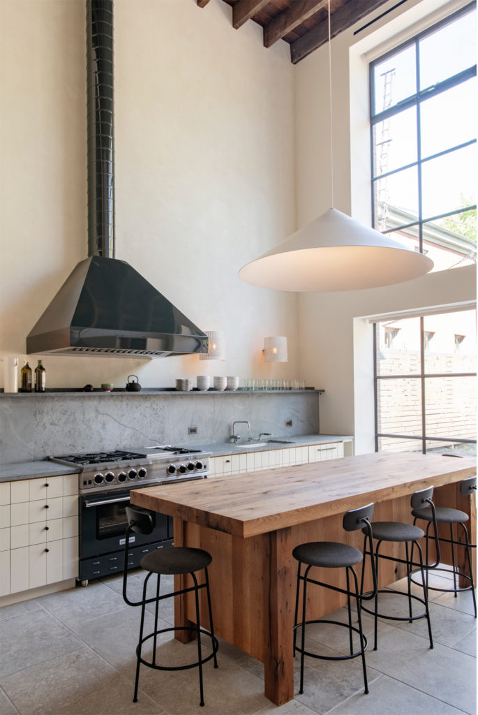
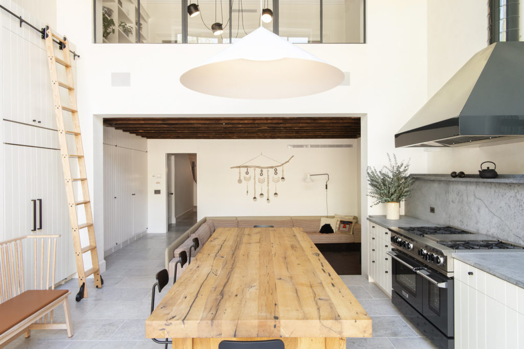
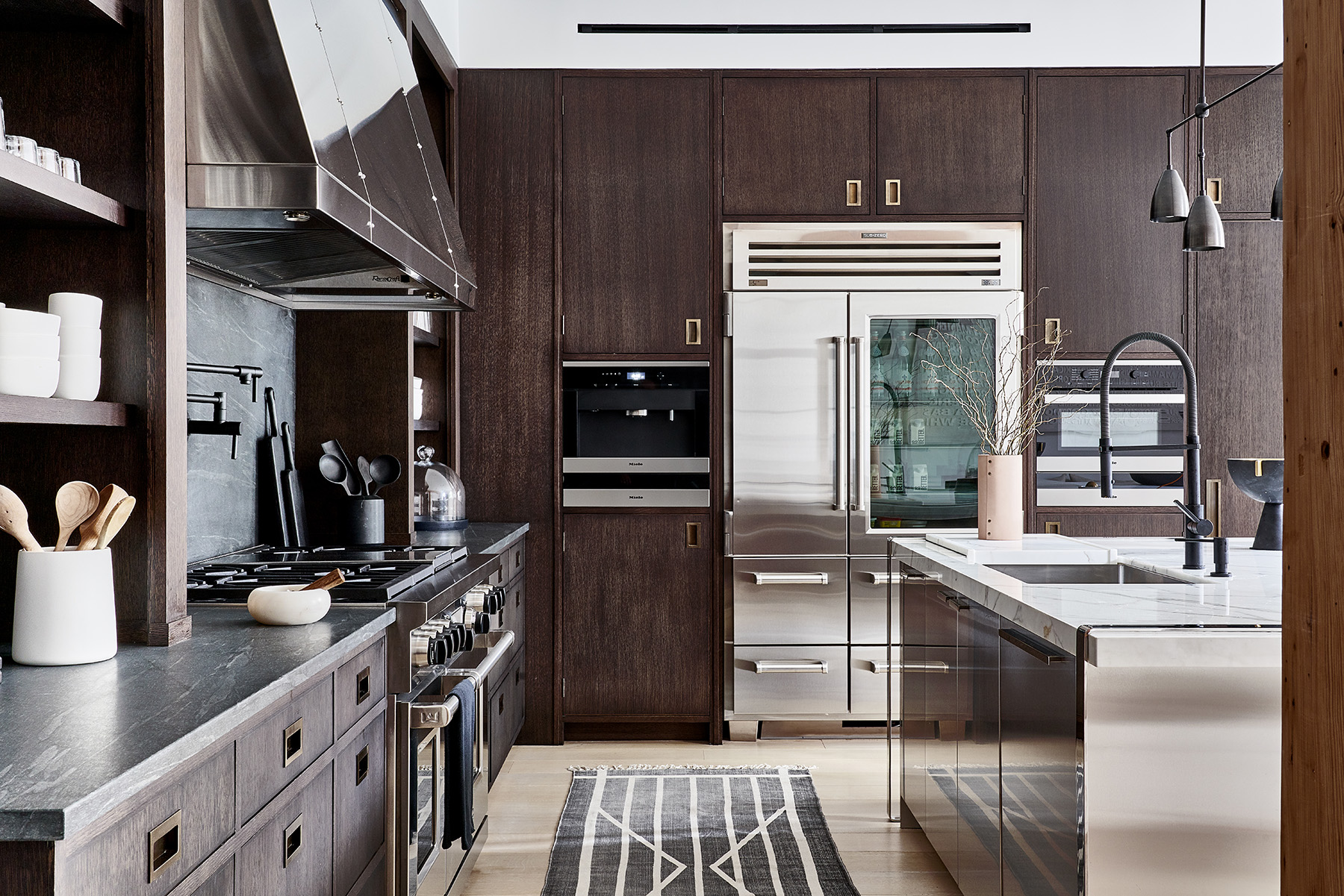
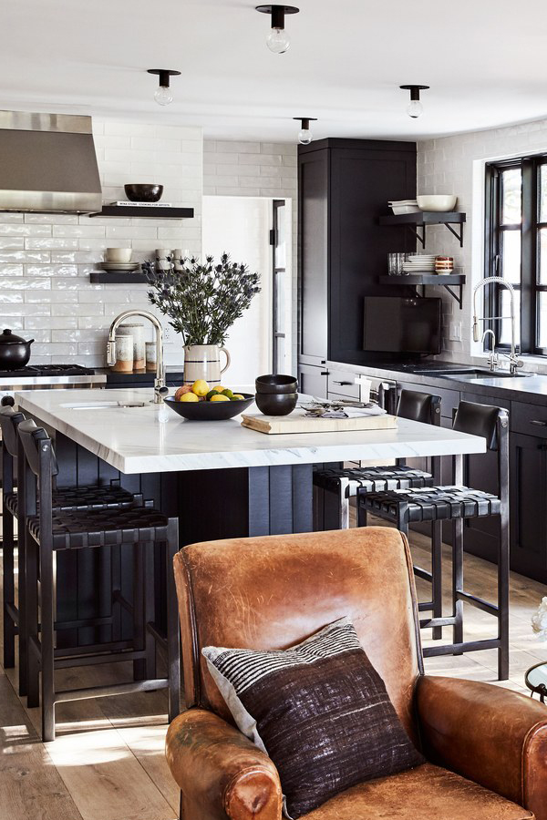
Designed by my girl-of-the-moment, Leanne Ford, this all gray kitchen resides in an 19th century row house in Pittsburg, but it takes a totally fresh take on the concept of a kitchen (it’s like she was reading my mind). Ford gutted a back addition of the house to extend the kitchen down the middle of the first floor and I am drunk in love!

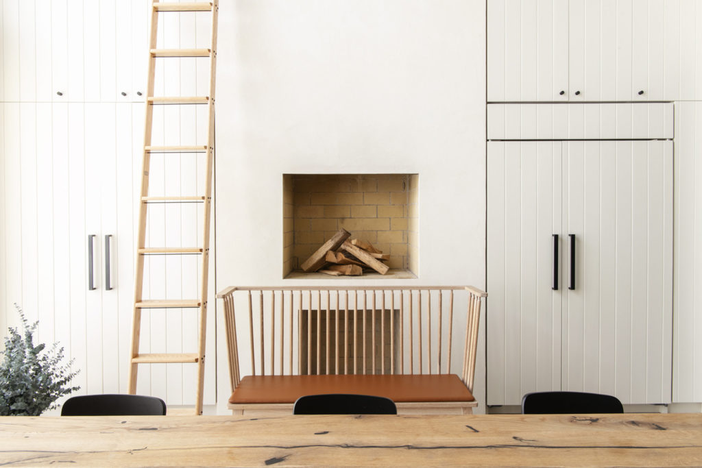
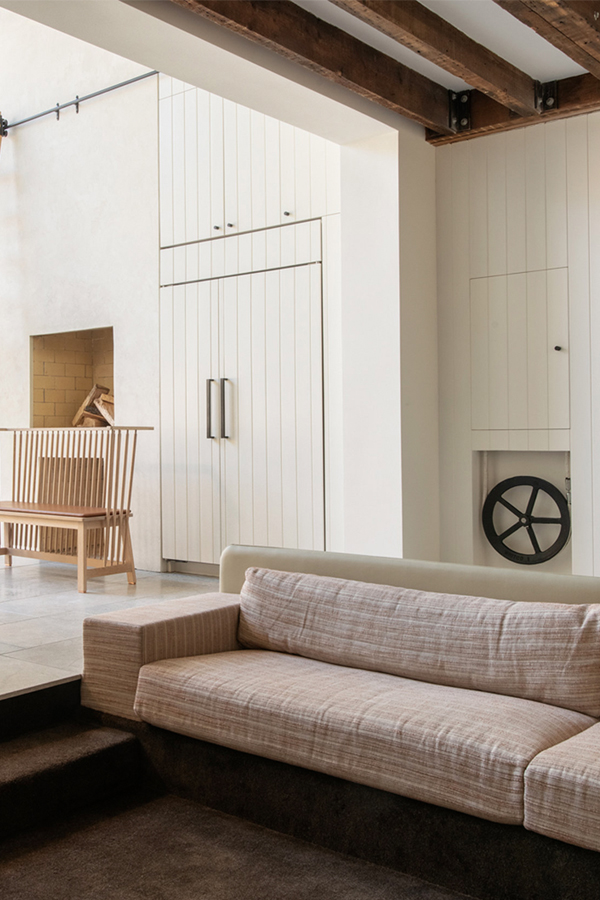
Reason number one: a fireplace in the kitchen! Swoon. You know how I love a good fireplace. The only other timeI think I’ve seen that is the Nancy Meyers set of Anne Hathaway’s in the movie The Intern. Google it – it’s a seriously good kitchen too.

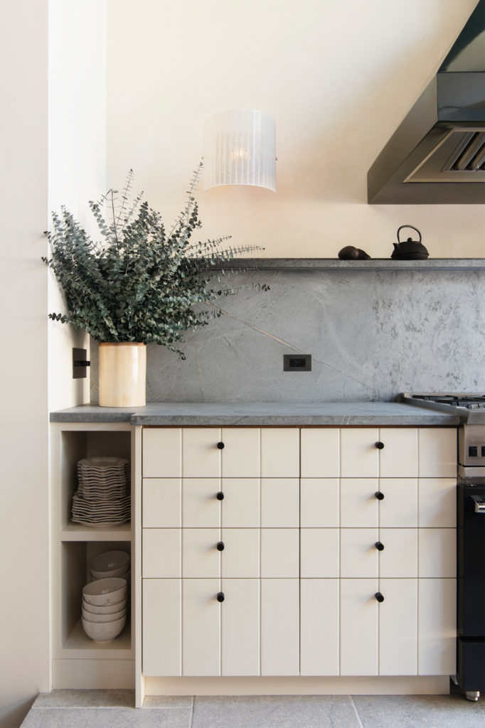
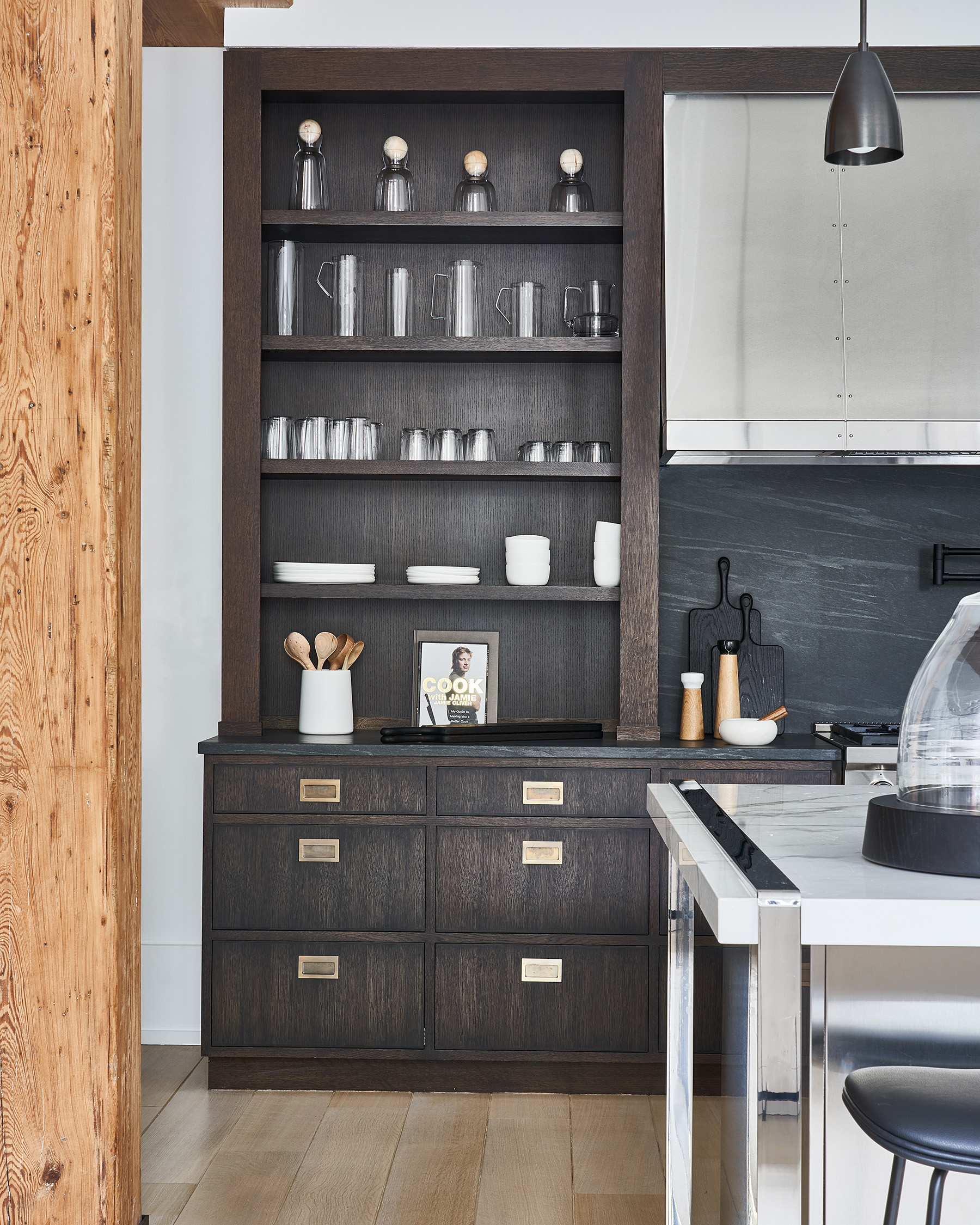
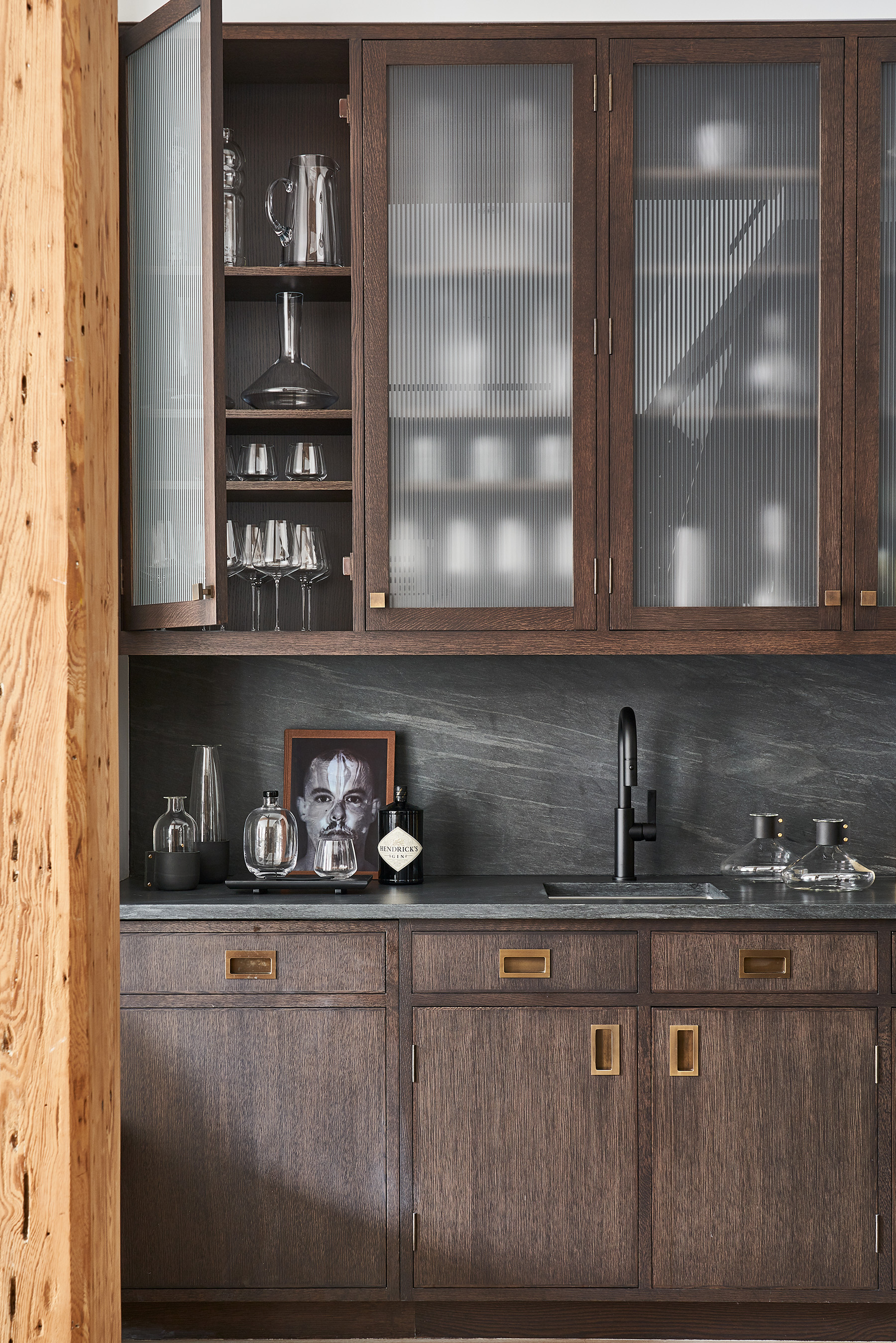
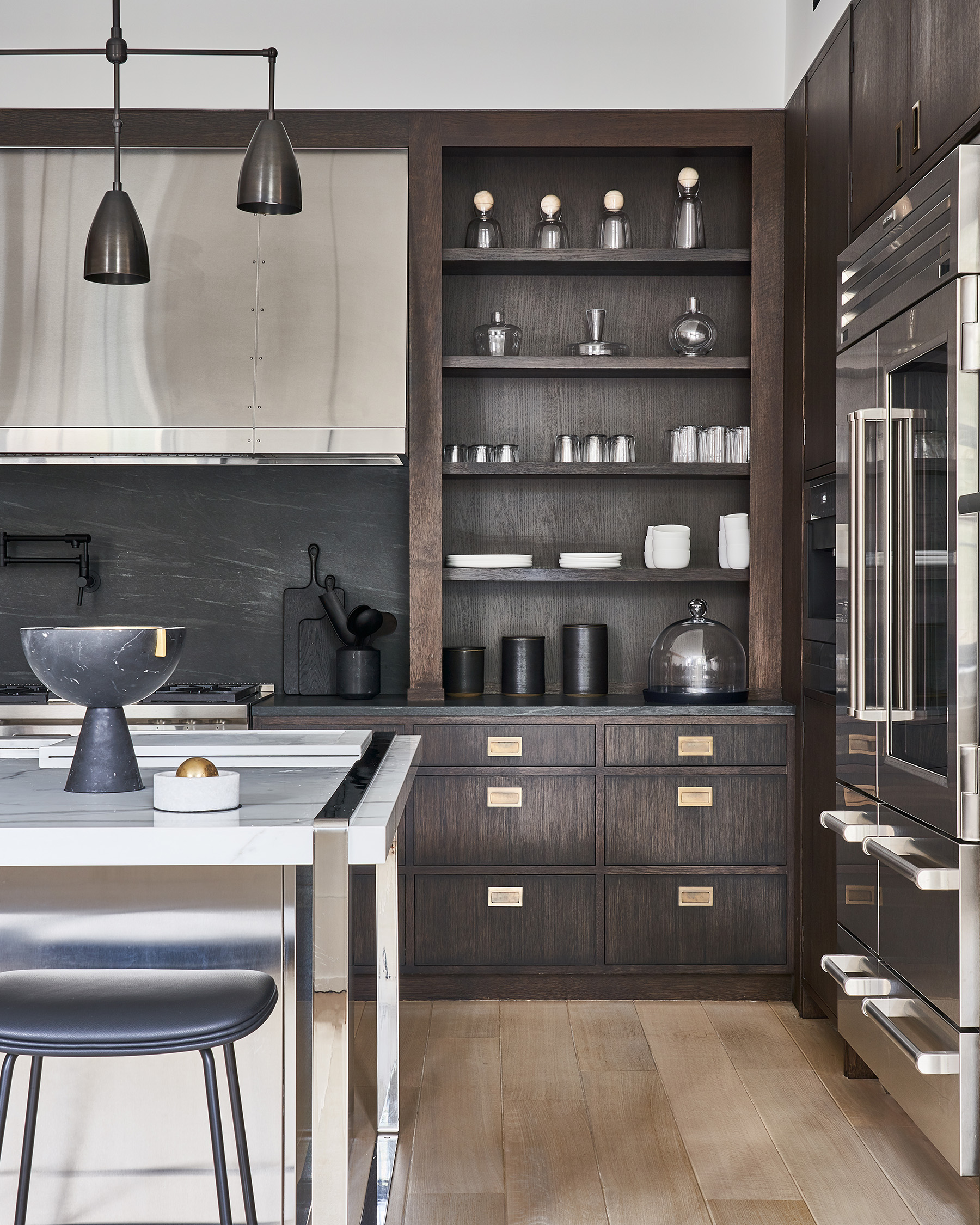
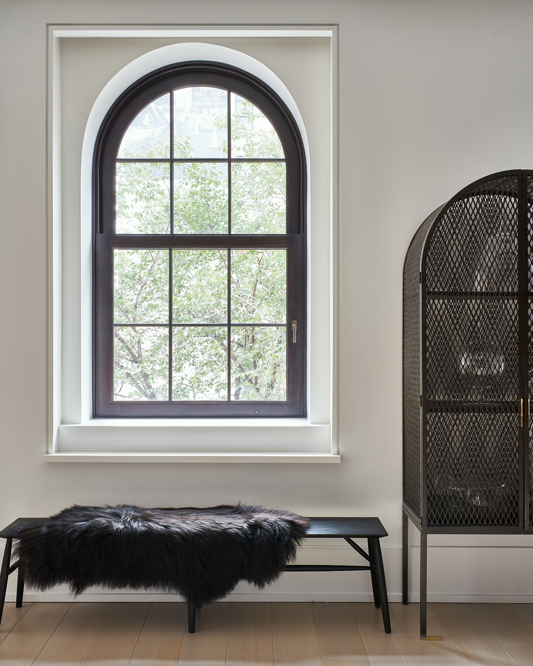
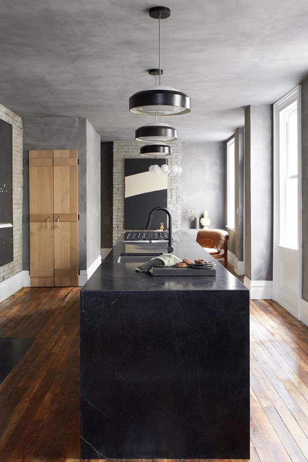
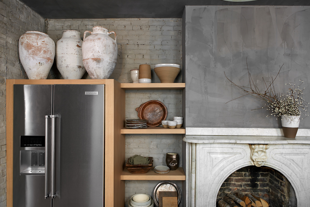
But of course the second reason I love this space is all the gray! Ford applied Portola Paint’s Roman Clay in Sasha to the walls and ceilings to give the space a really textured plateresque look (taking notes for a project I’ll be revealing to you later this week!). To ensure the room felt cohesive, Ford lime washed all the brick in a lighter gray to meld the two surfaces together. All of the oversized windows flood the space with natural light keeping it from feeling too cave-like.

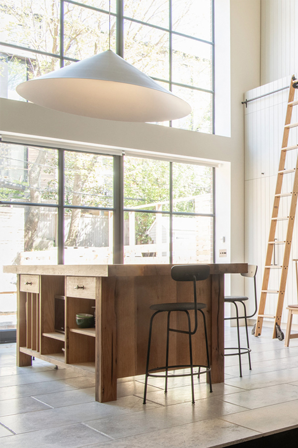
The third thing I really love about this kitchen is that epic island. Clad in cascading soap stone it houses all the kitchen’s essentials – sink, range and oven are all nicely tucked in there with ample counter space to spare. Vintage pendants with black accents draw the eye up.

Home Tour: Gorgeous Kitchen in Gray Scale on apartment 34Home Tour: Gorgeous Kitchen in Gray Scale on apartment 34

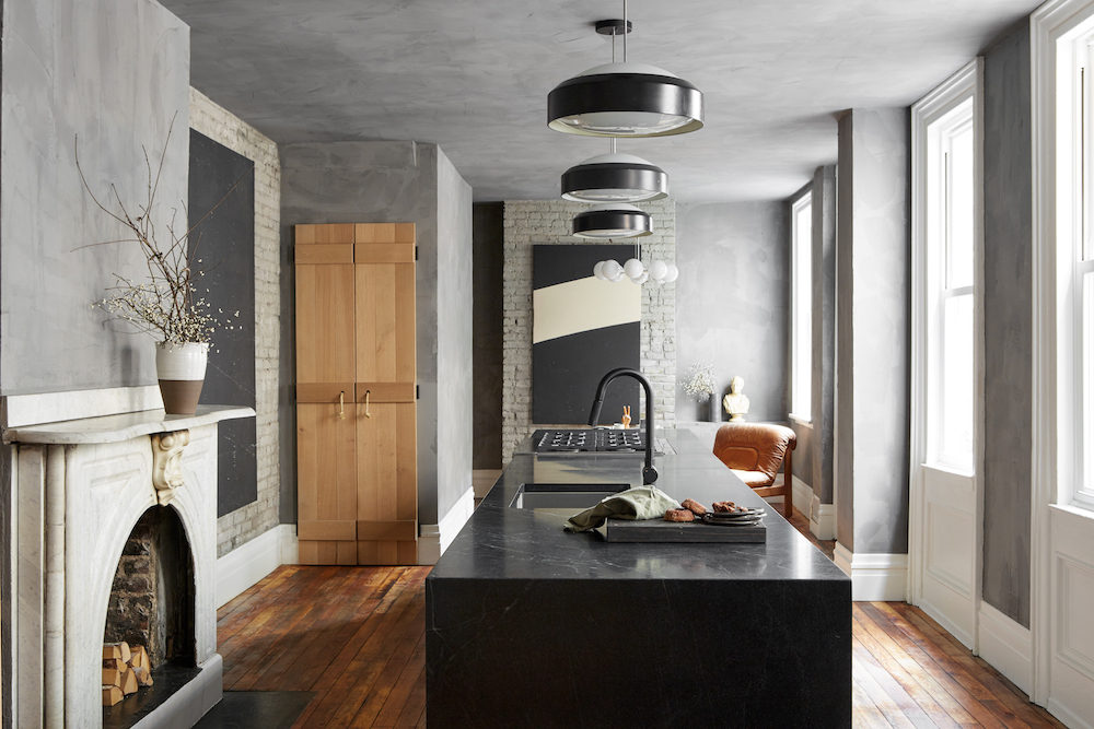
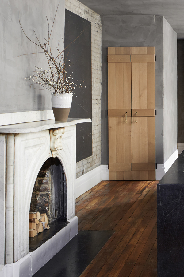
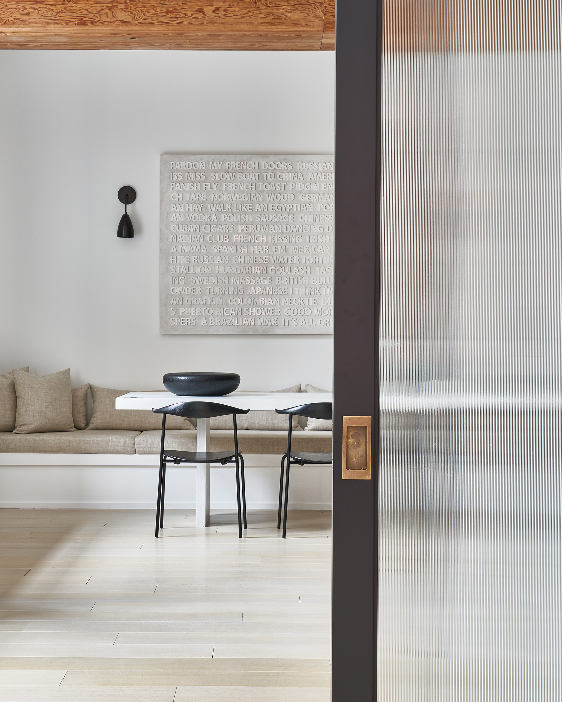
Wood elements dotted throughout the room soften and warm up all that gray. Salvage wood floors, oak shelving and even the logs styled in the fireplace add light, fresh accents.

Home Tour: Gorgeous Kitchen in Gray Scale on apartment 34Home Tour: Gorgeous Kitchen in Gray Scale on apartment 34

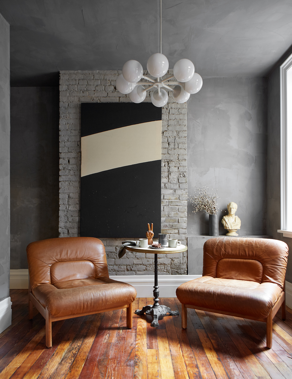
Since this kitchen was designed for couple who love to entertain, at the back of the kitchen Ford added a seating area rather than an eating took. It’s the perfect spot to enjoy a morning cup of coffee or hang out during a dinner party You know the action is always in the kitchen.

To play homage to the original structure’s age, all of the accent pieces from the club chairs to the art and accents are all vintage.

Home Tour: Gorgeous Kitchen in Gray Scale on apartment 34

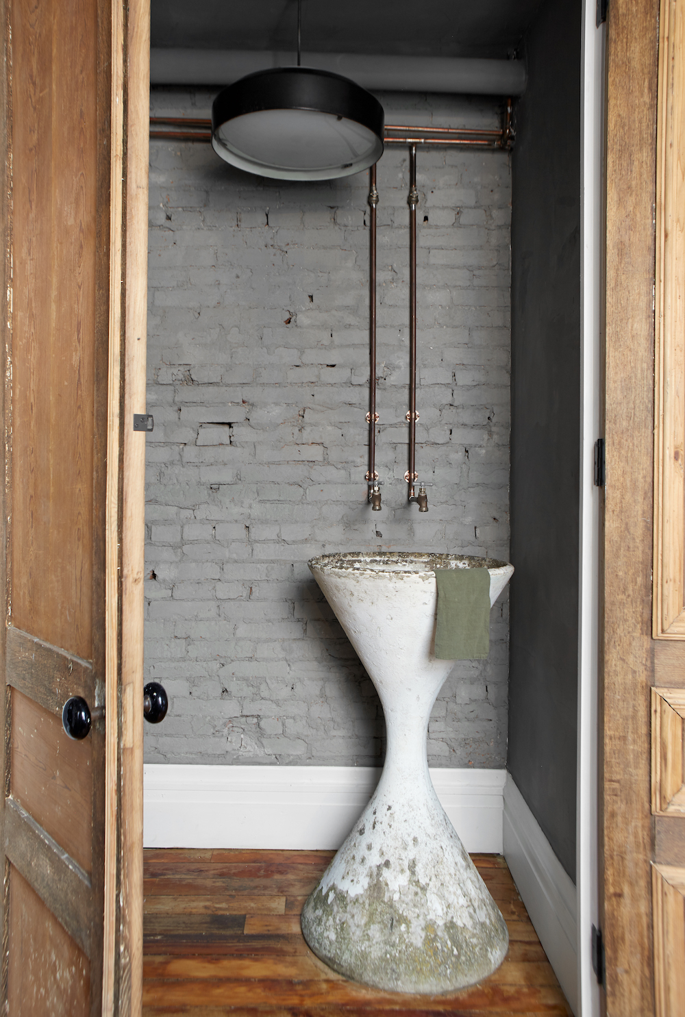
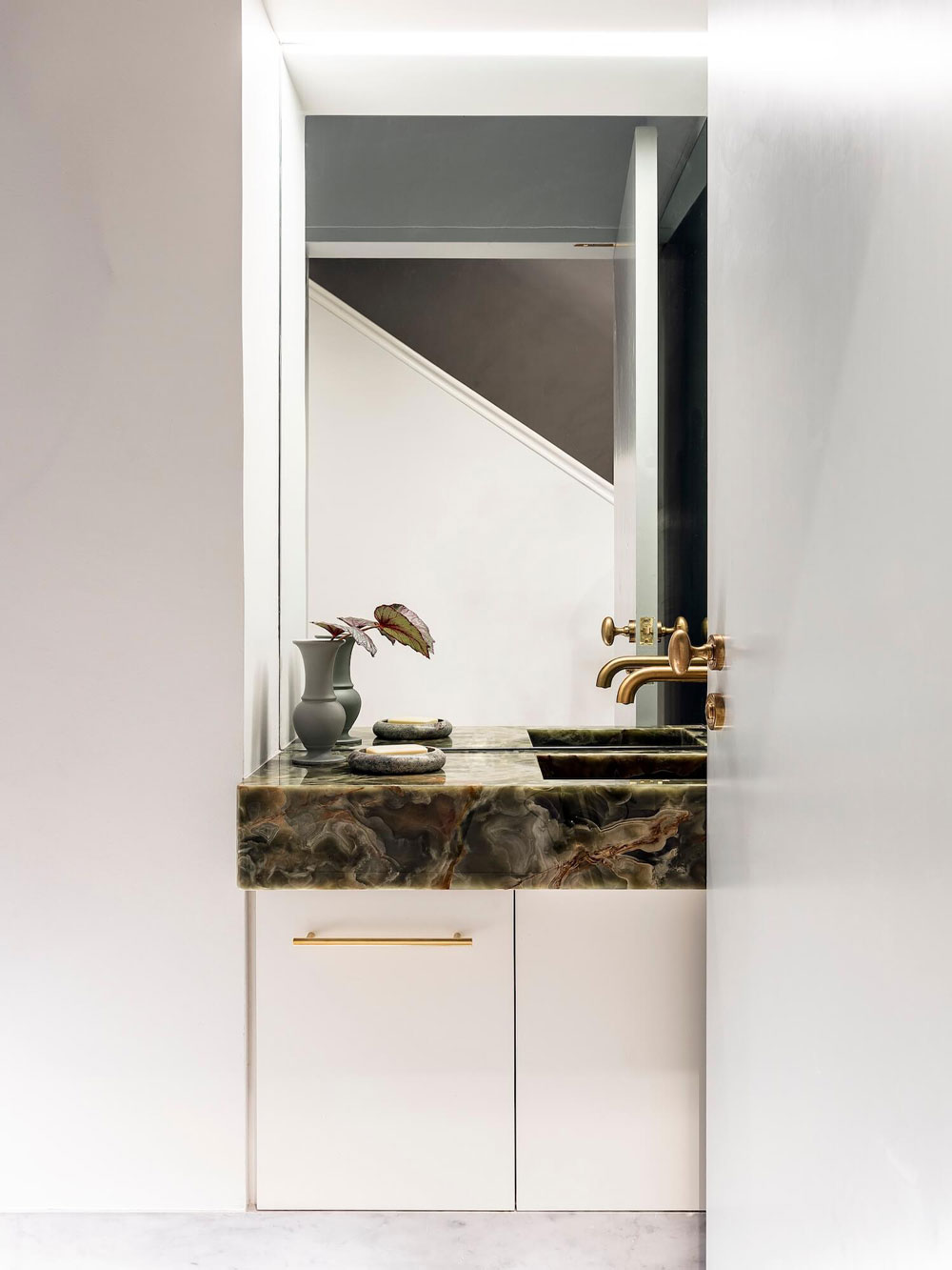
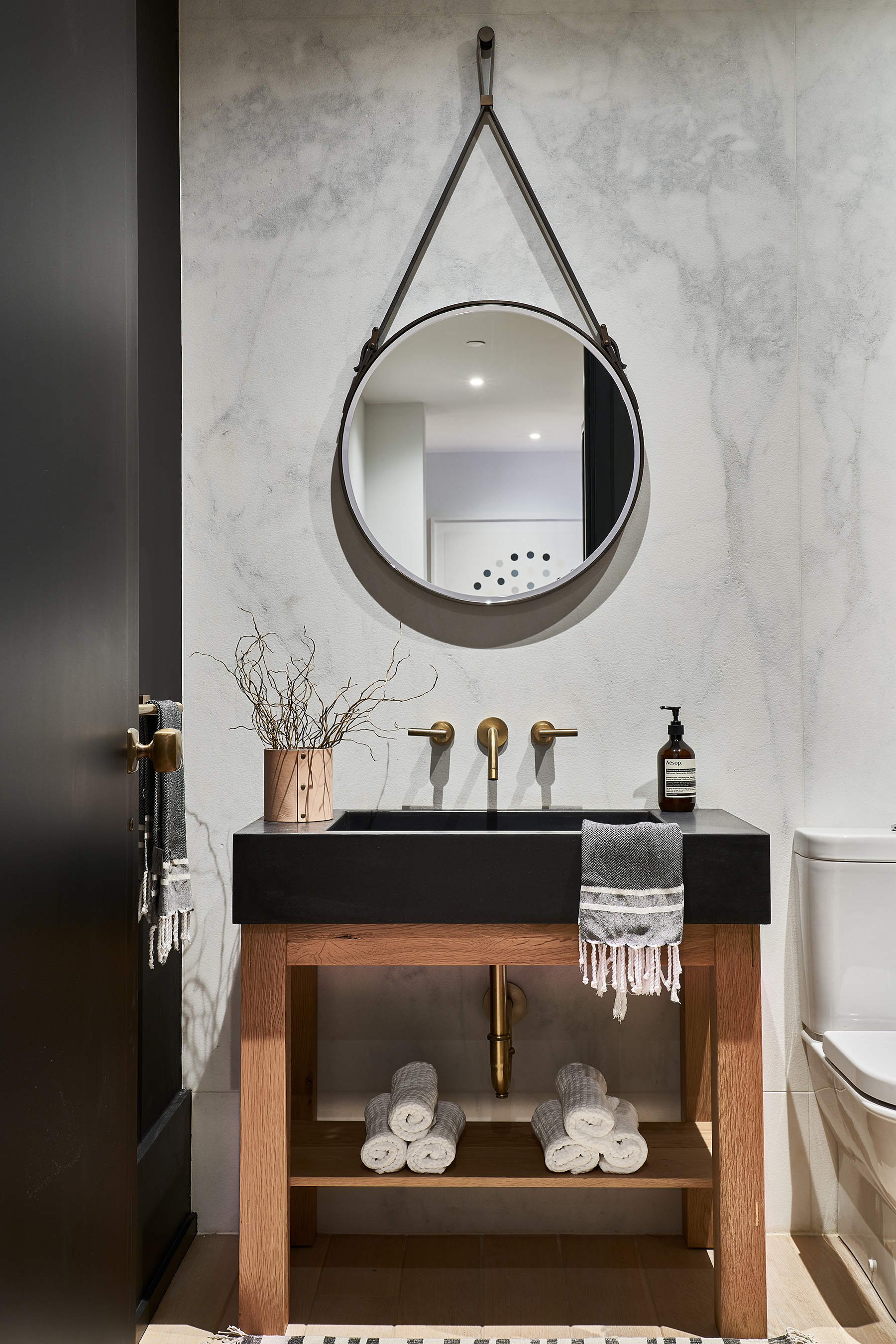
Another favorite moment, while technically not in the kitchen, is the powder room Ford created. She used a Willy Guhl Planter to create the coolest looking sink. To amp up the rustic vibe, the water source pipes were left exposed. I’m obsessed.

This kitchen is the ultimate example of something completely custom, personal and truly special. I’m very tempted to move to Pittsburg right now.

For more inventive kitchen ideas, CLICK HERE.

photography by reid rolls for leanne ford

Leanne Ford might be known for her love of white spaces, but this home on the island of Menorca is giving her a run for her money. If you’re looking for inspiration to really pare down your life and give your magic easer a major workout, this monochromatic masterpiece is the home for you.

A Master Class in Monochromatic Design on apartment 34A Master Class in Monochromatic Design on apartment 34A Master Class in Monochromatic Design on apartment 34A Master Class in Monochromatic Design on apartment 34

While white on white on white might not be the most practical color scheme for day-to-day family living, there are design lessons here that you can apply to any space, regardless of its color palette.

The first is the power of texture. Yes, this home is all about monochromatic design, but a variety of elements, from rough plaster walls to wood beamed ceilings, muted tile floors, and floor skimming linen window treatments all make this home feel very tactile. This isn’t a boring, sterile white box. Rather you want to run your hand along the wall or wander up the turning staircase to see where it might lead you.

A Master Class in Monochromatic Design on apartment 34A Master Class in Monochromatic Design on apartment 34 A Master Class in Monochromatic Design on apartment 34

The second less is the power of contrast. When you stick to a single white color palette, you can inject bold moments that really make an impact. Greenery around your built-in courtyard seating pops. A single dark wooden basket placed in a window is a scene stealer. One small piece of art or wall sconce grabs the eye. Each object takes on a much larger significance against the stark backdrop. It’s a wonderful reminder how less can truly be more.

A Master Class in Monochromatic Design on apartment 34 A Master Class in Monochromatic Design on apartment 34

While I cringe a bit thinking about dirty dog feet and sticky pre-schooler hands all over that built-in white sofa (trend spotting alert!), I am just sucked into the simplicity and earthiness of this place. We often think this type of aesthetic can only be enjoyed on vacation, but why? Who says you can’t recreate this feeling in your home – no island destination required. This home certainly feels like a wonderful place to escape from the stresses of daily life.

What do you think? Could you live in a monochromatic space like this every day?

For our home tour archive, CLICK HERE.

design & photography by marina senabre

I know, I know. I was espousing the need to minimize kitchen design just a couple of weeks back. And while I’m still feeling the paired down look, I’m also human. I will always be easily seduced by a stunning kitchen moment. 

The following example certainly qualifies.

A Major Kitchen Moment on apartment 34

You wouldn’t know it first glance, but this kitchen resides in a nearly 200 year old townhouse in Brooklyn. Part of a double height addition, this kitchen is oversized without being overly opulent.

A Major Kitchen Moment on apartment 34

I love how this kitchen has the Euro-influenced backsplash that features single open shelf (still realllyyy wish I’d done that in my kitchen but it wasn’t a thing in 2015!), but doing it with the Vermont soapstone is perfectly understated, rather than in your face. And its texture is so yummy, I just want to stand there and pet it. The bead-board cabinetry in a yummy subtle cream and oversized reclaimed oak island could read rather rustic, but the 20-foot steel clad windows and the huge modern pendant balance the look.

A Major Kitchen Moment on apartment 34

I love the wall to wall cabinets that hide appliances and storage creating a serene, clean look. This feels like elevated farmhouse at it’s very best – particularly since its in New York! The wall of cabinetry leads you into a sunken hangout area, creating a large contiguous communal space.

A Major Kitchen Moment on apartment 34

While everything in this kitchen is on a grand scale, there’s still an air of minimalism and restraint I really appreciate. So maybe I’ll hedge my bets on the minimal kitchen and say maybe we could all benefit from a little more restraint.

For more kitchen inspiration, CLICK HERE.

design by elizabeth roberts architecture & design

I’ve been on the interwebs oh so many years now and have been lucky enough to make “friends” all over the world. But as my husband likes to point out, virtual friends are very different than the ones you know in flesh and blood. Which is why I was so thrilled when I was lucky enough to meet Julie Van Daele, the crazy stylish designer behind Well Received, face to face and we discovered that actual real-life friendship vibes abound.

Today I’m thrilled to give you a peek into Julie’s seriously cool world. She sprinkles badass design dust over everything she touches and her own home is certainly evidence of that.

Home Tour: Black, White & Badass on apartment 34Home Tour: Black, White & Badass on apartment 34Home Tour: Black, White & Badass on apartment 34Home Tour: Black, White & Badass on apartment 34

I don’t know if I could love Julie’s kitchen any more. From that ceiling scraping stone – swoon! – to the chic black cabinets and gorgeous brass light fixture – every choice is spot on. I could happily camp out right here.

Home Tour: Black, White & Badass on apartment 34Home Tour: Black, White & Badass on apartment 34Home Tour: Black, White & Badass on apartment 34

But the rest of the house just as gorge! Pitch perfectly monochromatic, the all black and white color scheme doesn’t come off as austere. Rather, Julie cultivates a feeling of softness – perfect for her toddler son – with her use rugs and cozy, welcoming upholstered furniture. Every space is punctuated with structured, strong, pieces that will stand up to a kid’s wear and tear but doesn’t short change an ounce of style.

Home Tour: Black, White & Badass on apartment 34

I think the only way to do wall hangings is to go oversized.

Home Tour: Black, White & Badass on apartment 34Home Tour: Black, White & Badass on apartment 34Home Tour: Black, White & Badass on apartment 34Home Tour: Black, White & Badass on apartment 34Home Tour: Black, White & Badass on apartment 34Home Tour: Black, White & Badass on apartment 34

Black kitchens are all the rage, but I think black bathrooms need to be next!

Home Tour: Black, White & Badass on apartment 34

If you ever struggle with finding your aesthetic or keeping your design style consistent, then look no further than Julie for constant inspiration.

If you’re into her vibe as much as I am, be sure to check out Julie’s design and brand consulting services, HERE. You can follow her on Instagram HERE.

And for our home tour archive, CLICK HERE.

photography by monica wang and kelly bolton 

I don’t know what is in the water in Australia, but it makes for amazing interior design. I’ve profiled many an Australian designer around here over the years, but I think Alexander & Co might be the ultimate design unicorn. There is not a project of theirs that I do not absolutely adore. This Aussie home, also created by these architecture & design geniuses, was our most popular home tour of 2017.

Today’s tour is a strong contender to top it. Keep scrolling to see why.

Elegant and Elevated in this Aussie Home on apartment 34

This home is a modern reinvention of a classic Australian Victorian – a task to which I can intimately relate! I can only hope my final results are as cohesive, decidedly modern but also as timeless as this space.

Elegant and Elevated in this Aussie Home on apartment 34

While dotted with many a contemporary design icon (I see you Tom Dixon, Poliform & Knoll)  this home’s bones are what really caught my attention.

Elegant and Elevated in this Aussie Home on apartment 34

The walls are hand-finished plaster, the millwork is all custom, the hard surfaces – marbles, tile and woods – all work together harmoniously. The attention to detail is beautiful. Transoms above french doors, beautiful built-ins, all the little things that make a space next level are here. No matter how you choose to furnish this house, it is always going to serve as a classically stylish foundation.

Elegant and Elevated in this Aussie Home on apartment 34Elegant and Elevated in this Aussie Home on apartment 34

But the furnishing are pretty good too. I’m officially obsessed with this curved bench from Australian design treasure trove Spence & Lyda. Also, handmade ceramics dot many a surface, softening the tone of the home and giving the design a more collected feel. Remember to bring in your texture my friends.

Elegant and Elevated in this Aussie Home on apartment 34

More curves on that stairway. Hello sexy.

Elegant and Elevated in this Aussie Home on apartment 34

I’ve been seriously considering mix and match chairs for the final design of my dining room and this example is only helping my cause.

Elegant and Elevated in this Aussie Home on apartment 34

This home is filled with little vignettes of art, ceramics, lighting and accessories that make you want to pause and look more closely. Total #thisoldvictorian goals.

 Elegant and Elevated in this Aussie Home on apartment 34

The home’s kitchen & dining area are light and airy but combined, they hold much more interest than your typical all white kitchen. The stone on the kitchen backsplash has incredible movement. Brass accents, including brass trim on the countertops (swoon) has been left unvarnished so it will patina over time. The limestone floors add a warmer tone and wood clad ceiling further softens the space. It all just works. 

Elegant and Elevated in this Aussie Home on apartment 34Elegant and Elevated in this Aussie Home on apartment 34Elegant and Elevated in this Aussie Home on apartment 34Elegant and Elevated in this Aussie Home on apartment 34

Loving the leather tufted headboard and soft woodsy color palette of the bedroom.

Elegant and Elevated in this Aussie Home on apartment 34

Serious stone goals and also another sideways sink (2019 trend coming on) in a powder room.

This home is reminding me of both the big and little things left to check off my personal design list:

Invest in some seriously beautiful art, ceramics and a really good table lamp or two.

Don’t be afraid to mix and match materials – stones, woods, linen, velvet, brass, bronze, black and a touch of color. When done with restraint and a little bit of balance it all just works beautifully.

Possibly gut my kitchen. Nah…won’t go that far but I am looking for a few more ways to switch things up. This home is going to offer me inspiration for days. I hope it does for you too.

For our home tour archive, CLICK HERE.

design by alexander & co / images via belle magazine 

Life is typically far from perfect. The milk gets spilled. The kids throw up. The dog has to go to the emergency vet at 4am. You may have forgotten the last time you showered (all of this might have happened to me in the last 72 hours). I think that’s why amazingly beautiful spaces has such appeal. They offer the dream that maybe, one day, your life will look just as put together.

The cold truth is that’s highly unlikely, but we all need a goal for which to strive. My current design goal is attempting to mimic this stunning NYC apartment designed by Sissy & Marley.

A Picture Perfect Space in NYC on apartment 34 A Picture Perfect Space in NYC on apartment 34 A Picture Perfect Space in NYC on apartment 34A Picture Perfect Space in NYC on apartment 34

This space oozes order, structure and luxurious comfort thanks to its uniform black & white color palette (my fave), repeated use of geometric patterns, and strong architectural lines throughout – and I’m here for it all.

A Picture Perfect Space in NYC on apartment 34 A Picture Perfect Space in NYC on apartment 34

Obsessed with the variety of textures in this entryway vignette. Marble, wood, sheepskin, leather, steel and glass all mix to keep a monochromatic color palette from becoming too one note. Also squiggly branches in a vase have never looked so good. Perfect mid-winter decorating idea.

A Picture Perfect Space in NYC on apartment 34

And then there’s this sumptuous kitchen! It’s ditching the white kitchen trend – woot. And I spy more graphic patterns with that throw rug. But I’m really swooning over the details – all black spoons and cutting boards. The counter balance of a white marble island and honed black marble counters. Brass, black and stainless steel mix and match. All kinds of contrasts are at play in this space and it really really works.

A Picture Perfect Space in NYC on apartment 34A Picture Perfect Space in NYC on apartment 34A Picture Perfect Space in NYC on apartment 34A Picture Perfect Space in NYC on apartment 34

I don’t know what I love more – the Sawkille Co bench or that amazing steel mesh curiosity cabinet!

A Picture Perfect Space in NYC on apartment 34A Picture Perfect Space in NYC on apartment 34

The eat-in kitchen nook (if you can call a full-sized dining table a nook) is all kinds of gorgeous. Loving the oversized art in this space. Going to hunt down those sconces – anyone know the brand off hand?

A Picture Perfect Space in NYC on apartment 34A Picture Perfect Space in NYC on apartment 34A Picture Perfect Space in NYC on apartment 34

Although the formal dining area is equally as stunning as the breakfast nook. It’s a light and airy juxtaposition to the moodiness of the kitchen.

A Picture Perfect Space in NYC on apartment 34

The beautiful attention to detail, the use of standout statement making pieces and the uniform color palette continue into the sophisticated master bedroom.

A Picture Perfect Space in NYC on apartment 34

This little mini work area is pure genius.

Subtle textures and luxe materials continue straight into the bathroom. Really loving the heft of that sink.

And if all that weren’t enough, the kids’ bedroom and play area is next level cool.

Now let’s be real. This home features many a high end piece. Everything from Apparatus Studio lighting and accessories to classic Carl Hansen dining chairs, case pieces by BBDW, one-of-kind vintage scores down to Hermes throw blankets. A resource list like that certainly makes it much easier to make a space look ultra pulled together.

But if you look beyond the high priced items, this home is also a lesson in continuity. In doing more with few things – making sure every piece of furniture, light fixture and accessory is there to be noticed. Only bring home things that are the highest quality you can afford.

When our lives get chaotic it can be really easy to get mired in the mess. But just remember, this too shall pass and you can bring back order and calm again.

Or just come back and stare at this home tour. I know I will be.

For our entire archive of gorgeous homes, CLICK HERE.

After recently taking my first excursion to a snow-covered Lake Tahoe, I was reminded of how much I  love the look of a wintery cabin – when done well. Case in point, Scribner’s Lodge in the Catskills. Once a kitschy 1960’s motor inn, the space has been completely reimagined into a alpine-inspired cool kids hangout.

Modern Cabin Vibes in Upstate New York on apartment 34Modern Cabin Vibes in Upstate New York on apartment 34

A modern cabin looks relies on the simplest of elements. Pine. Whitewashed walls. Strong injections of black. But there’s nothing overly complicated. Utilitarian comforts are all you need, but there’s also no need to sacrifice style.

Modern Cabin Vibes in Upstate New York on apartment 34Modern Cabin Vibes in Upstate New York on apartment 34Modern Cabin Vibes in Upstate New York on apartment 34Modern Cabin Vibes in Upstate New York on apartment 34

While we probably can’t live this simply all the time, it’s such a relief – a breath of fresh mountain air- when we do for even a few days. As I make my way through the Marie Kondo show on Netflix, I’m going to being taking a good look at what is absolutely necessary to have around.

Modern Cabin Vibes in Upstate New York on apartment 34Modern Cabin Vibes in Upstate New York on apartment 34Modern Cabin Vibes in Upstate New York on apartment 34Modern Cabin Vibes in Upstate New York on apartment 34

So while your inbox may be inundated by brands who want you to think spring has arrived two months early, I say escape to a cozy cabin while you can still can. I’m making my reservation right now.

For more design inspiration, CLICK HERE.

images via nicole franzen, colin king, remodelista, and north, the cuff

Today’s home tour caught me mid-Pinning. Yes, it’s a black, white and wood color palette (my fave), yes, it features a timeless mix of antiques. There’s an air of California casual-comfort combined with an old-world sensibility. While it combines elements I’ve long loved, it does so fully fleshed out, comprehensive way that elevates it to the next level. This home has a cool grown-up feel and I’m all in.

This particular home belongs to Who What Wear co-founder & CEO, Katherine Power. (I’ve had a style-crush for a while now). While it resides in Los Angeles, for a moment you might think you’ve dropped into the English countryside or perhaps the south of France. But a few classically American details give it away. The oversized linen sofa. A bright white subway tile in the kitchen. A pair of timeless vintage club chairs. I can immediately see this home in a classic Nora Ephron movie (do you have a favorite location – I think mine is Diane Keaton’s house in Something’s Gotta Give). But I’d really like to get my house to this level of done. 2019 goal set.


design by jake arnold / photography by justin coit for architectural digest

While I’ve been taking some much needed time to rest, recharge and unearth fresh inspiration over the holiday break, I just can’t help but share a few of my discoveries with you before next week.

It’s always good to go into the new year with a clean slate – beautifully designed of course. This home, the Napa Valley retreat of Minted founder & CEO Miriam Naficy, is in the current issue of Domino magazine and it is the perfect inspiration for a fresh perspective for 2019.

Home Tour: A Fresh & Bright Space to Inspire a New Year on apartment 34

Naficy’s wine country abode is open and airy, yet also cozy and inviting – kind of the perfect design goals for any space. Take her family room above. The classic ben ourain rug, textured woolen throw blanket and swath of muted throw pillows  – not to mention the oversized cloud-like weaving by Bay Area artist Meghan Shimek –  make you want to sink right in and stay awhile.

Home Tour: A Fresh & Bright Space to Inspire a New Year on apartment 34

Cushy textures offer depth and tactile interest even while the color palette throughout the rest of the home remains serenely muted. I’m obsessed with the record collection display and that vertical record player in the pic above! Naficy talks about collecting through her world travels that have brought her to Morocco, Tanzania, Paris and Scandinavia, but she maintains a highly curatorial eye, choosing to switch favored objects in and out rather than cover ever available inch with stuff. Take notes friends. This is an excellent technique.

Home Tour: A Fresh & Bright Space to Inspire a New Year on apartment 34

Her kitchen is another beautiful example of using tone on tone to create a soothing space but the punctuations of black – the faucet, the bar stools, pendant light and even pour over coffee pot add a modern urban edge that keeps the space from feeling blah. As I flipped through each page of this home in the current Domino issue my adoration (and envy!) only grew.

This home is inspiring me to both do a major edit of the objects I have around This Old Victorian, and to also start the year with some serious treasure hunting. The perfect vintage chair. A stunning piece of art. The pieces that will make me smile every time I look at them, rather than the ones I simply want to get rid of. I know I will becoming back to this home for inspiration time and again.

I wonder if Naficy might ever need a house sitter?! Be sure to check out the entire tour on Domino’s site.

And you’re looking for more New Year’s design inspiration check out my favorite home tours HERE.

photography by thayer gowdy c/o domino magazine

Older posts
Gimme More