Hi Friends! I should probably start off with an apology for my unplanned extended hiatus here. Life has taken many unexpected twists and turns in the face of the pandemic – as I’m sure you can relate. This space has become completely neglected. I’m hopeful that is going to shift in the coming weeks and months, as I do really miss showing up here.

But I’m thrilled to finally debut the completed Hood Canal Cottage. I certainly didn’t think it would take more than 16 months to get here. I always go into renovations with the utmost optimism. After five+ years of This Old Victorian, You’d think I’d have learned my reno lesson by now. But a good renovation before-and-after story is never without some drama. So let’s dive into this roller coaster of a renovation saga.

If you remember, as the pandemic raged in mid-2020 we happened upon a listing in an idyllic setting in the Pacific Northwest just an hour outside of Seattle. Not only was the property in a beautiful far flung corner of the world, but it was also a particularly meaningful spot for me. The house sits a stone’s throw from a hidden Puget Sound beach that I grew up combing with my mother and grandmother when I was small. I was thrilled by the thought of getting to share this undiscovered area with my six-year-old and bring my family back to place that meant so much to my childhood. With the future so uncertain, we also wanted a spot to be closer to our immediate family, so we dove in head first, like I shared all those months ago, I thought we’d undergo a quick three-month spruce-up to ride out the rest of lockdown with our nearest and dearest. The bad juju of 2020 had other plans in store.

Just as we were about to get started, the property suffered major water damage from a faulty dishwasher hookup. Floors and walls throughout the kitchen and living room as well as the rooms in the basement below suffered severe damage that was not salvageable. Suddenly, this project took a whole new turn. We were left with the only option of doing a much bigger makeover. Needless to say, our three month “spruce up” was blown wide open. Thankfully this isn’t my first rodeo. This Old Victorian had me well prepped to tackle this turn of events. There were certainly more uncharted challenges ahead though. I thought you’d be interested in some of the other Covid related obstacles this project faced:
– We only had 20 minutes to walk the property before deciding whether or not to put in an offer.
– I got to see it one more time for 45 mins before I needed to start on the design process
– The entire project was designed and managed remotely as I couldn’t travel from San Francisco. Yay for Facetime.
– Continual supply chain issues pushed many furniture and final finish deliveries back 12-20 weeks longer than expected

We also had to do so many unfun things like replace the roof, put in new drywall, insulate and fix a lot of disrepair. While my contractor and his crew were demoing water damaged floors, I was stuck in my house 1200 miles away, attempting to run zoom kindergarten, figuring out if I could get yeast to make a sourdough starter and selecting finishes and furnishings once everyone else in the family was asleep. So strange to think I made all these design choices more than a year and half ago already. Aw, the Covid time warp is a trip.

So let’s go back to the beginning.
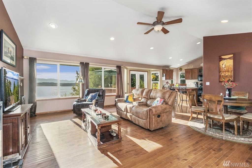
While (what we lovingly now call the Hood Canal Cottage) has a truly stunning location – the ultimate spot to unwind and appreciate the area’s beautiful surroundings – the house’s architecture itself offered little in the way of design inspiration. The architectural style is your typical late-1990’s American builder grade construction- luckily plopped within a little slice of heaven. My mission: help this stereotypical suburban style home’s inside match the splendor you enjoy out her windows.
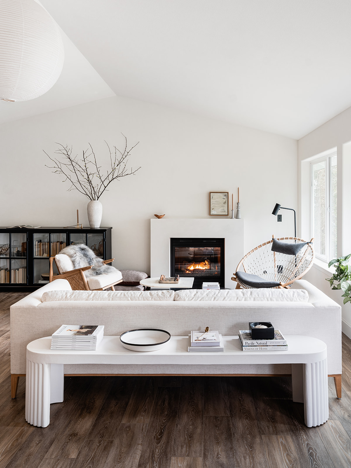
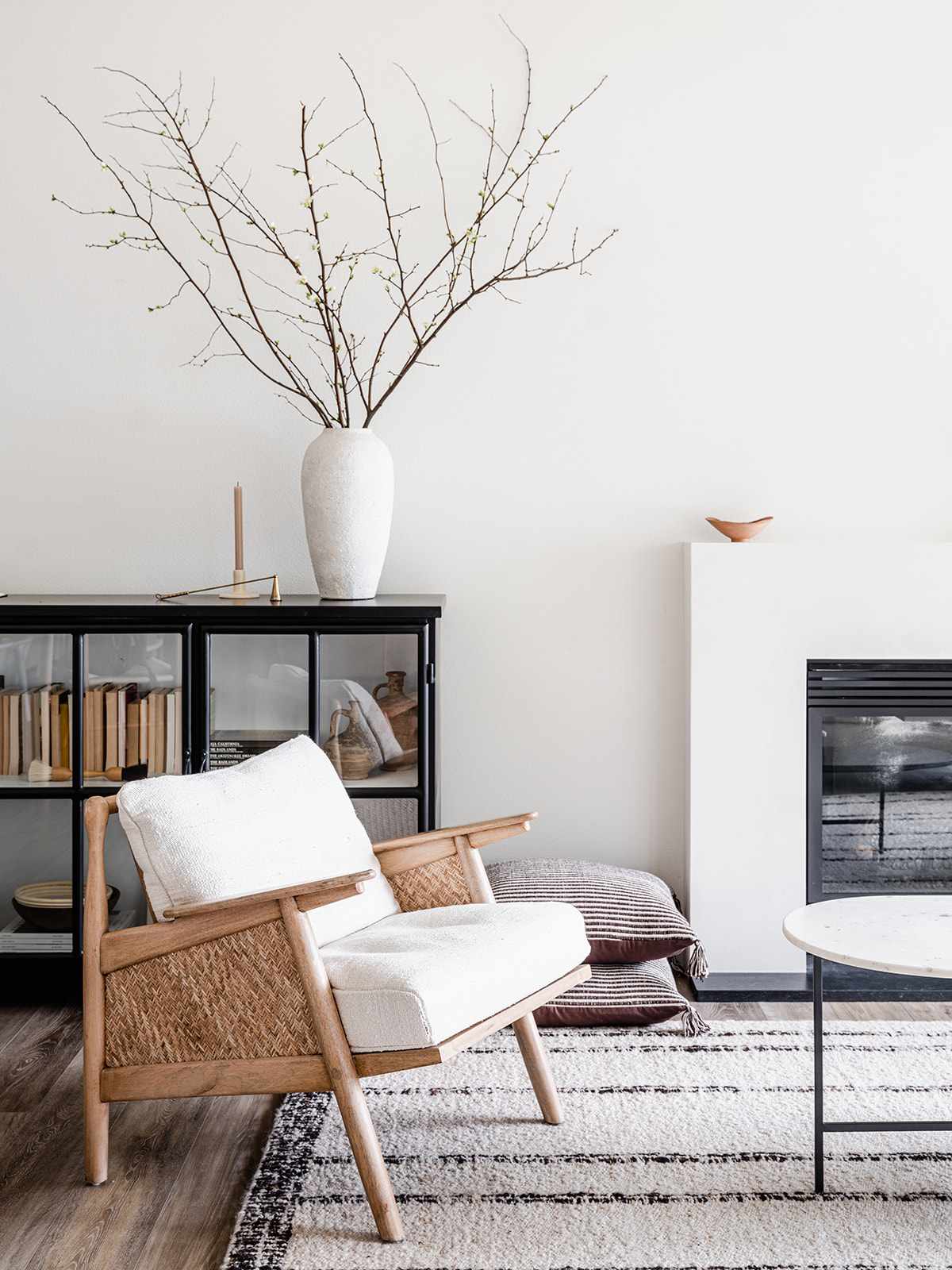
 

Ta-da! What do you think??

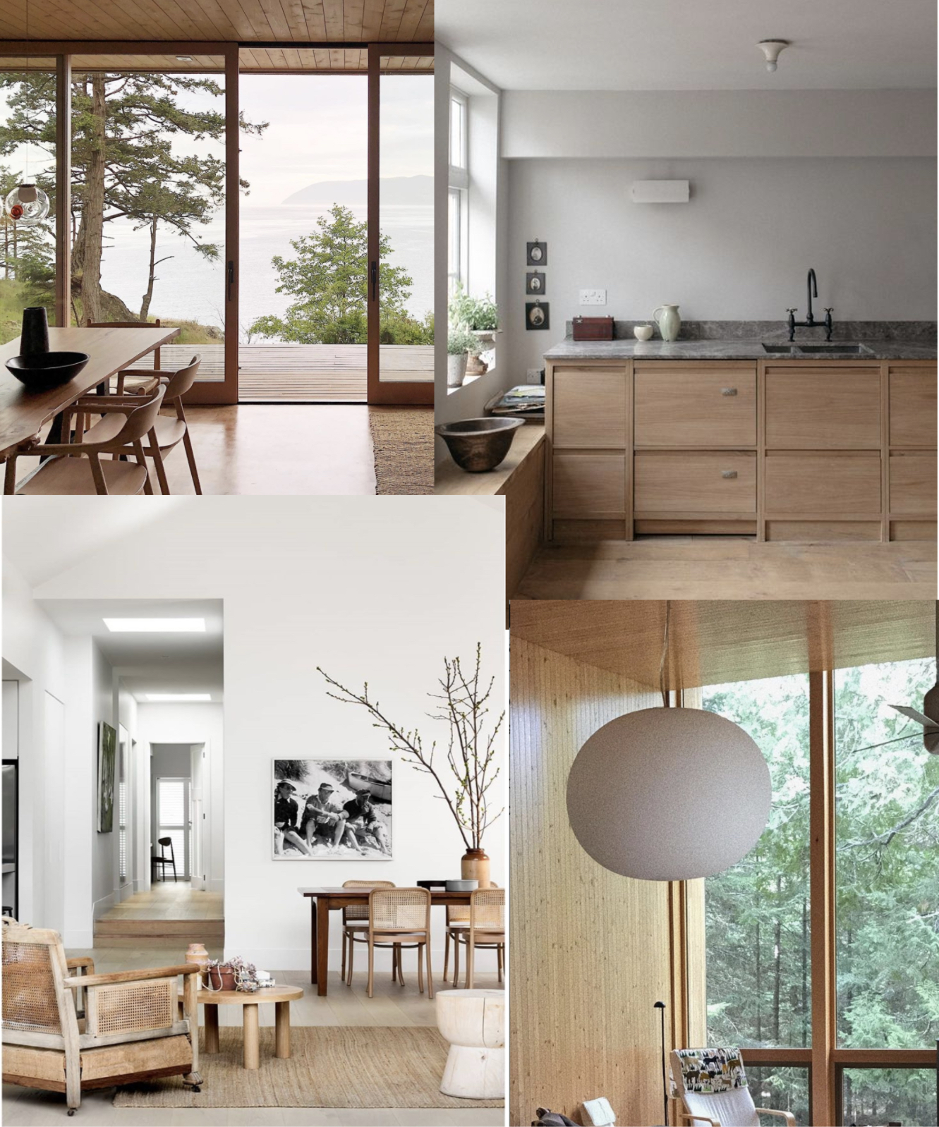
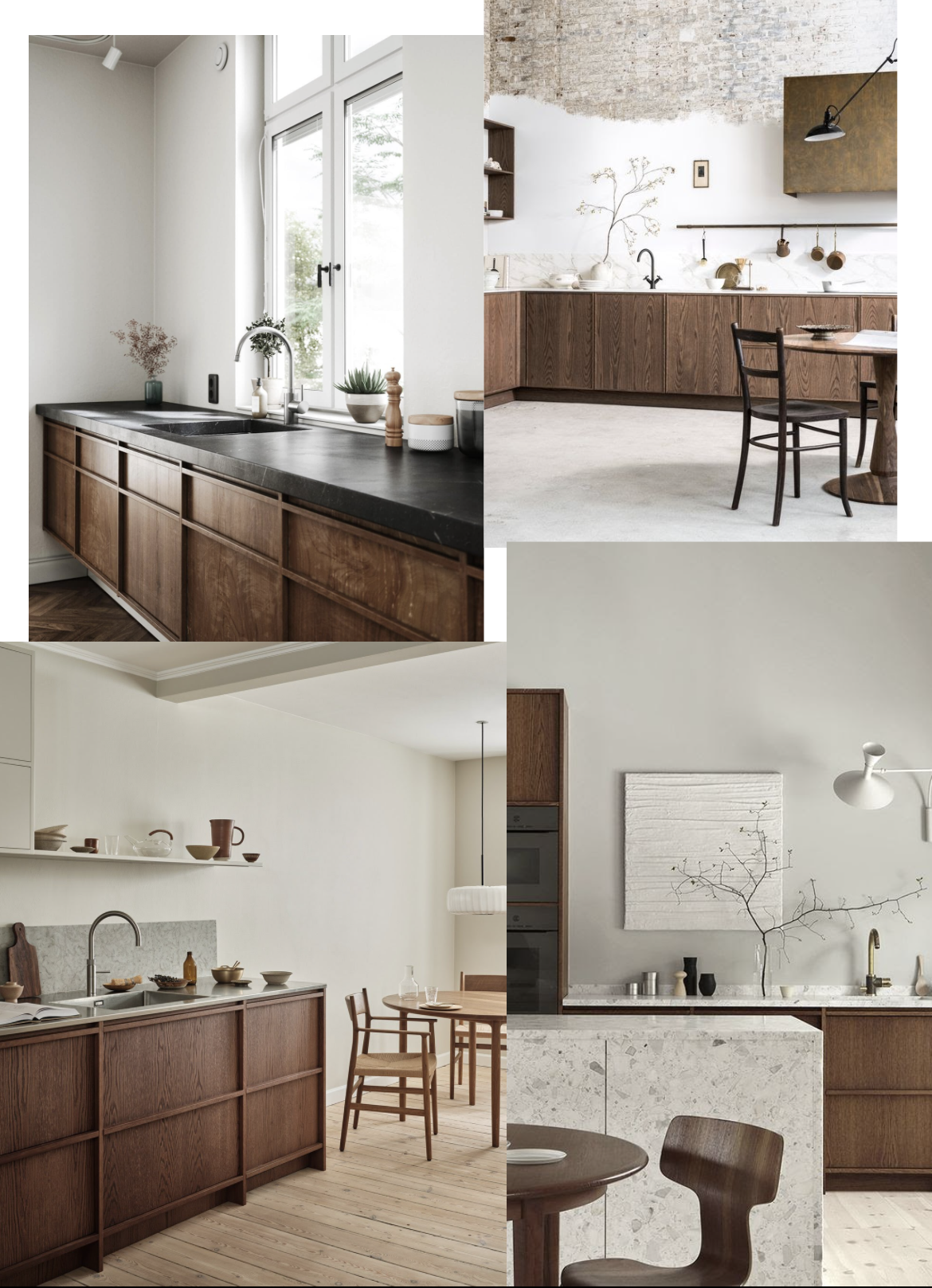
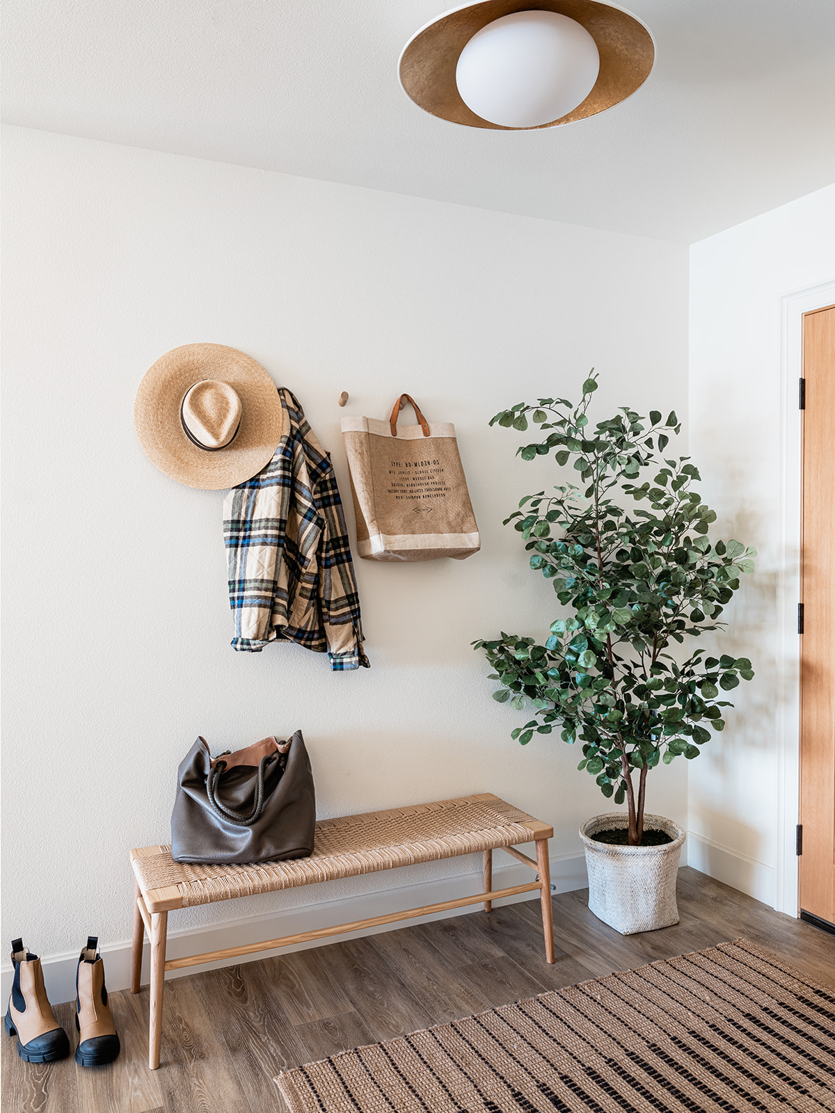
Redesigning this house was an endless balancing act as we weren’t in the market to make any major architectural changes – as much as I may have wanted to. Instead, I needed to figure out how to work with the existing spaces, but change the vibe entirely. Since the house sits right on beautiful beaches of the Hood Canal, it would make sense to define her as a beach house, but I did not want to fall into that cliche. Instead, I wanted to show how you can imbue your own personal style and design aesthetic into any type of space – rather than feel forced into a tired design theme. I set out to achieve what I’m calling Elevated Coastal Chic. If you remember, this was my design moodboard. I wanted to hone in on a Scandinavian, design-forward influence with perhaps a touch of coastal charm. I can’t wait to hear if you think I succeeded.
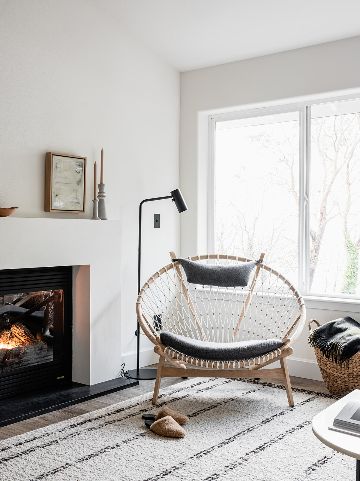
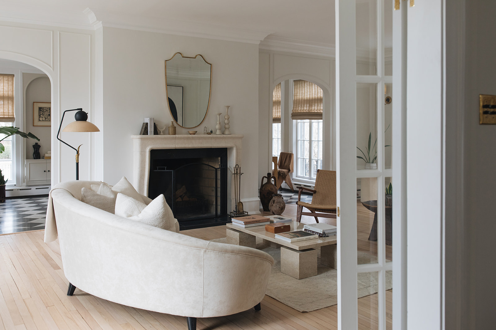
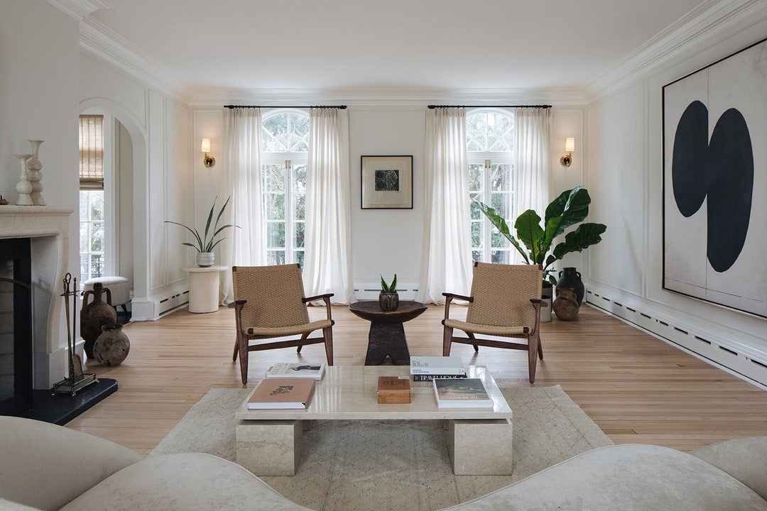
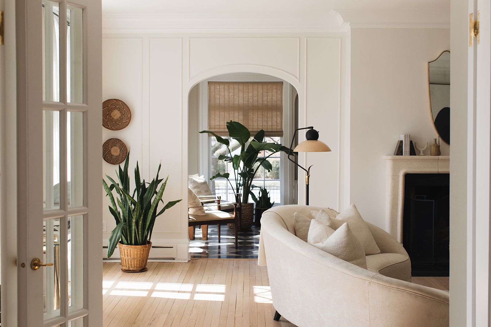
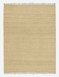
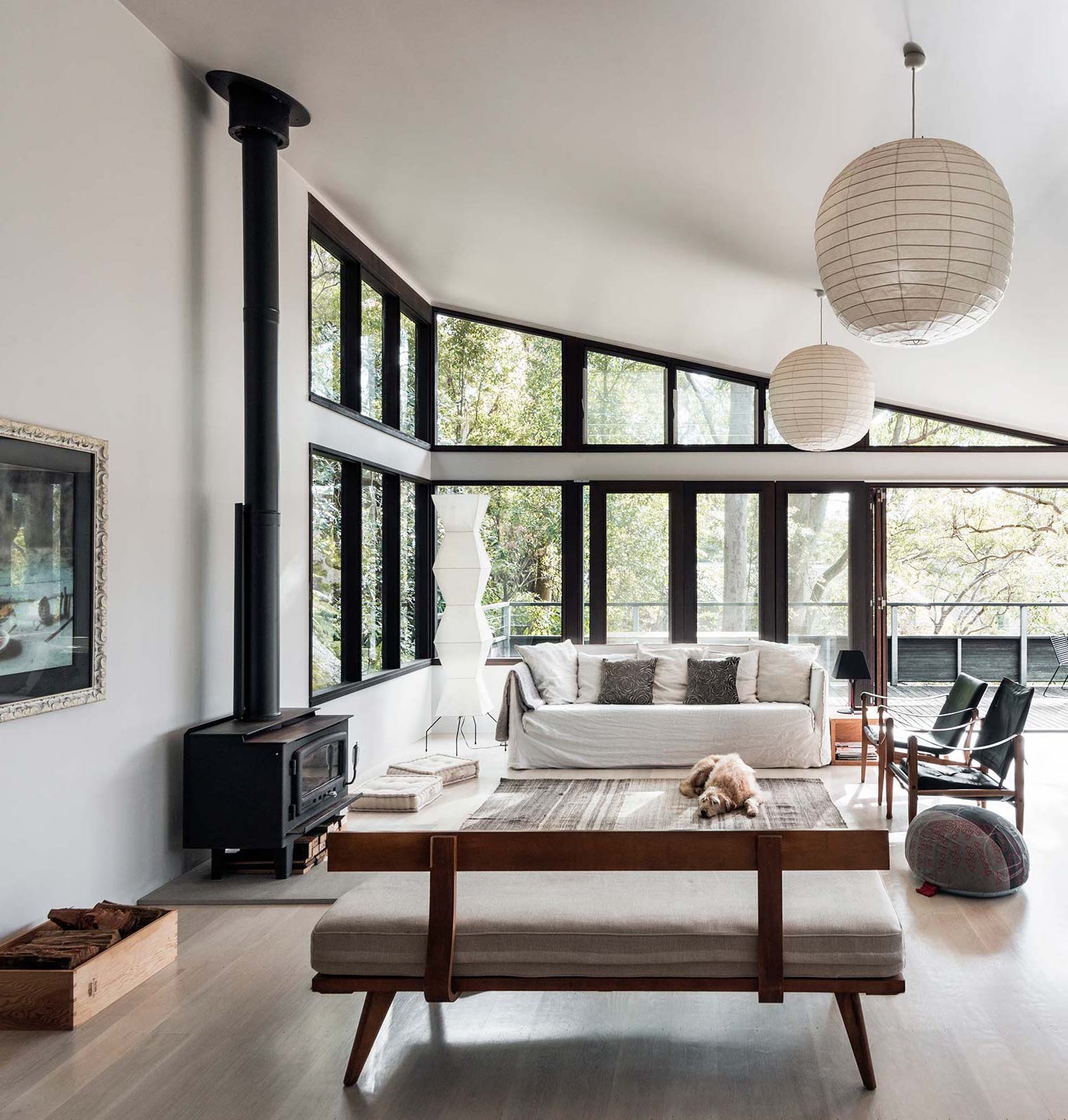
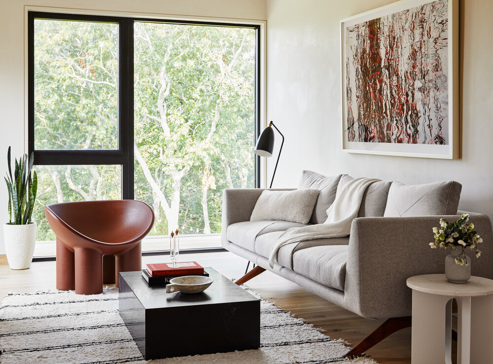
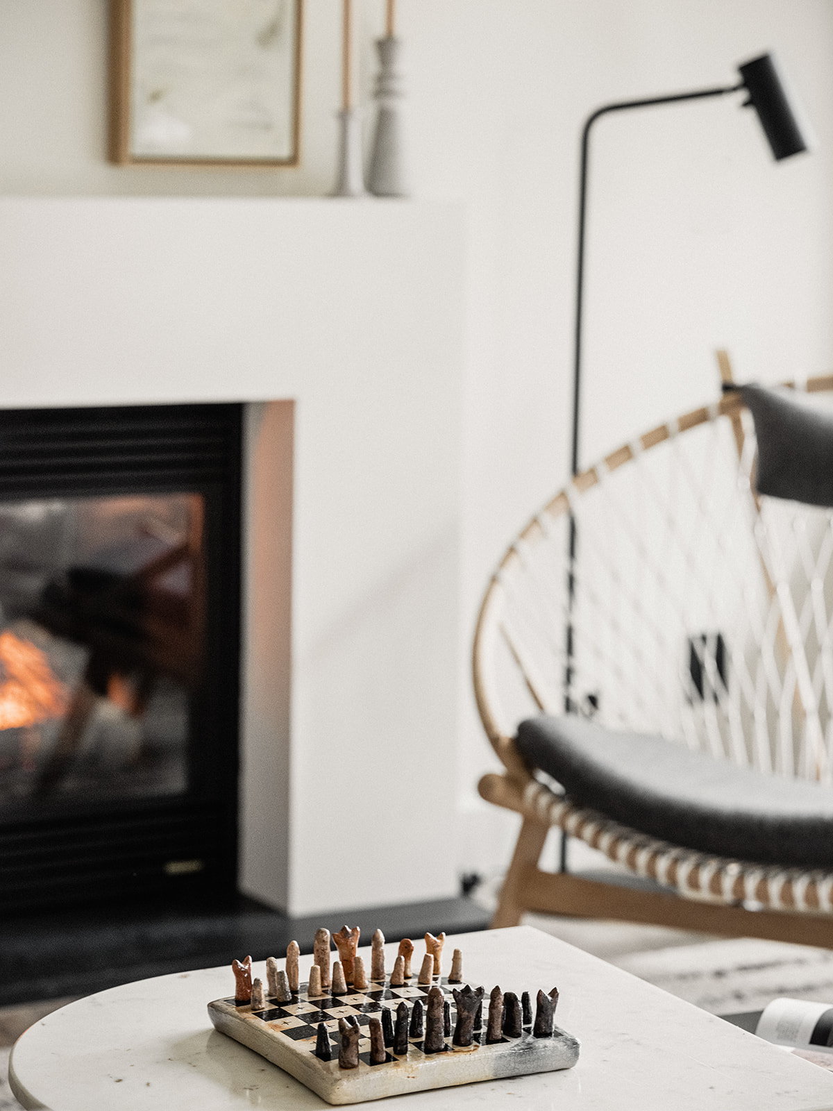
The Hood Canal Cottage living room is meant for enjoying the view – however you prefer to do that. Sitting by the fire, watching the sun set behind the Olympic mountains, burying your nose in a good book or enjoying your favorite glass of wine. I wanted this room to wrap you in a sense of serenity. I tapped one of my go-to resources to achieve the look – the couch, rug, coffee table and sideboard are all from Lulu & Georgia. You can always head there and find a gem.

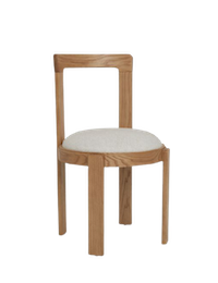
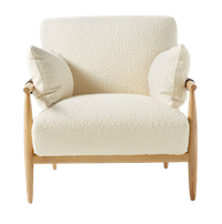
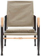
I’m also always a sucker for really good chairs – I see them as the jewelry for a room and the Circle Chair from Eternity Modern is certainly that for this space. It was actually the first piece of furniture I selected for the entire room – the rest of my design was really built around the Circle chair.
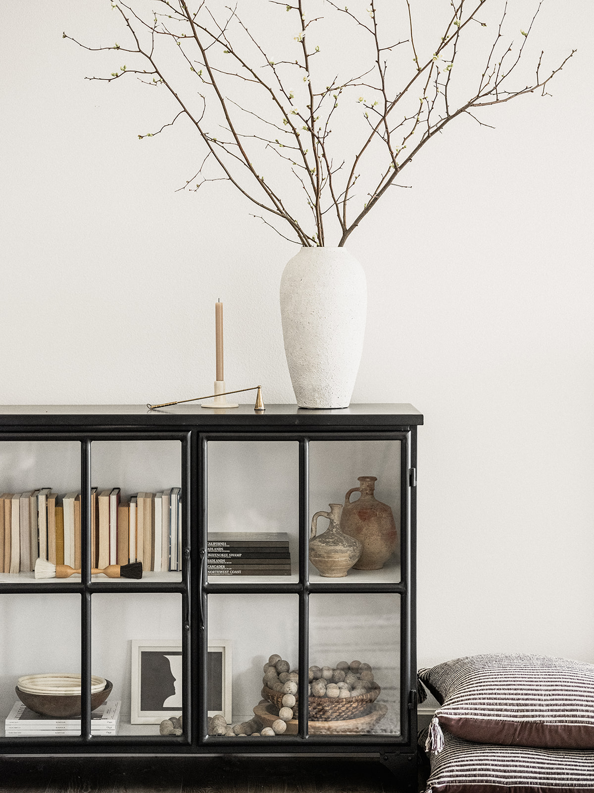
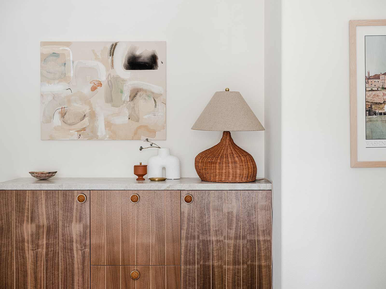
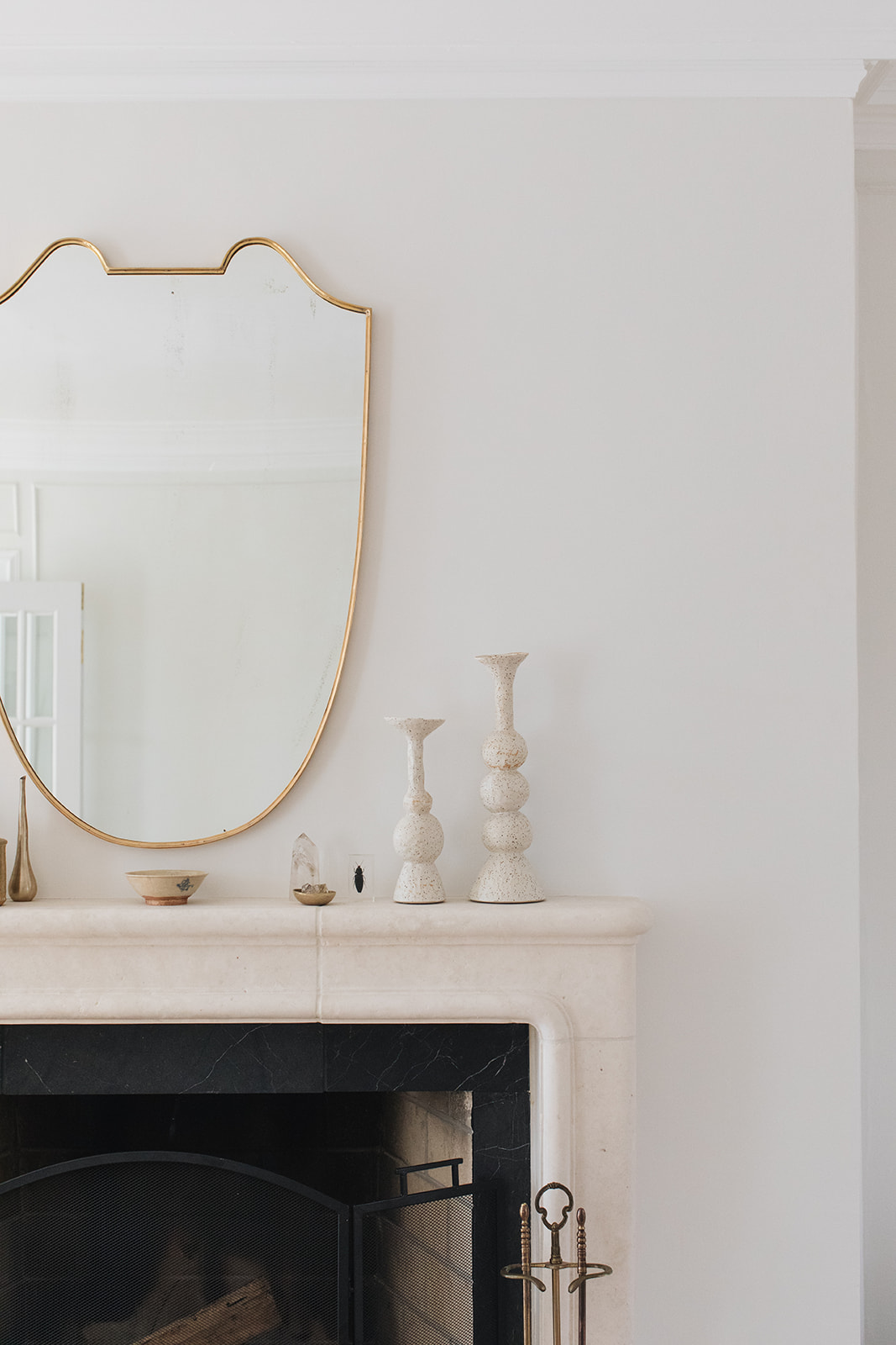
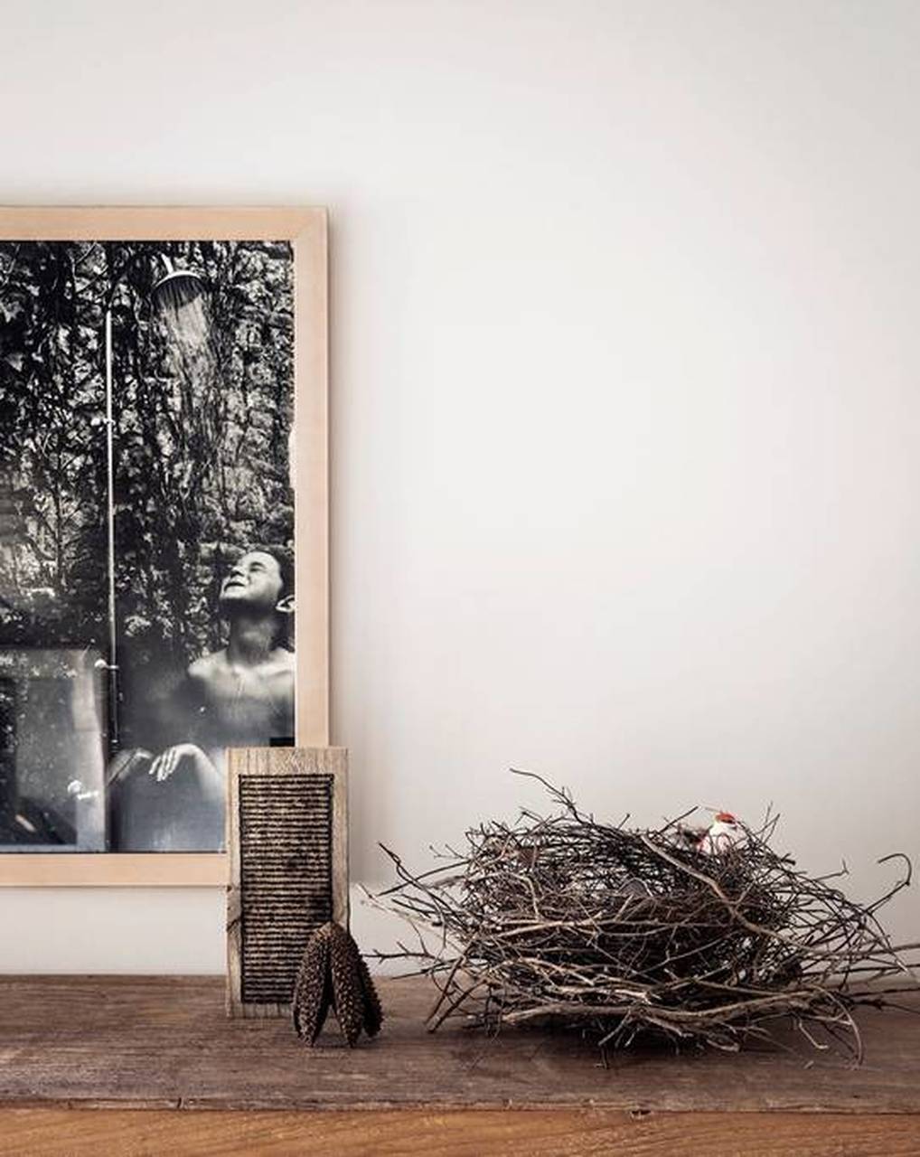
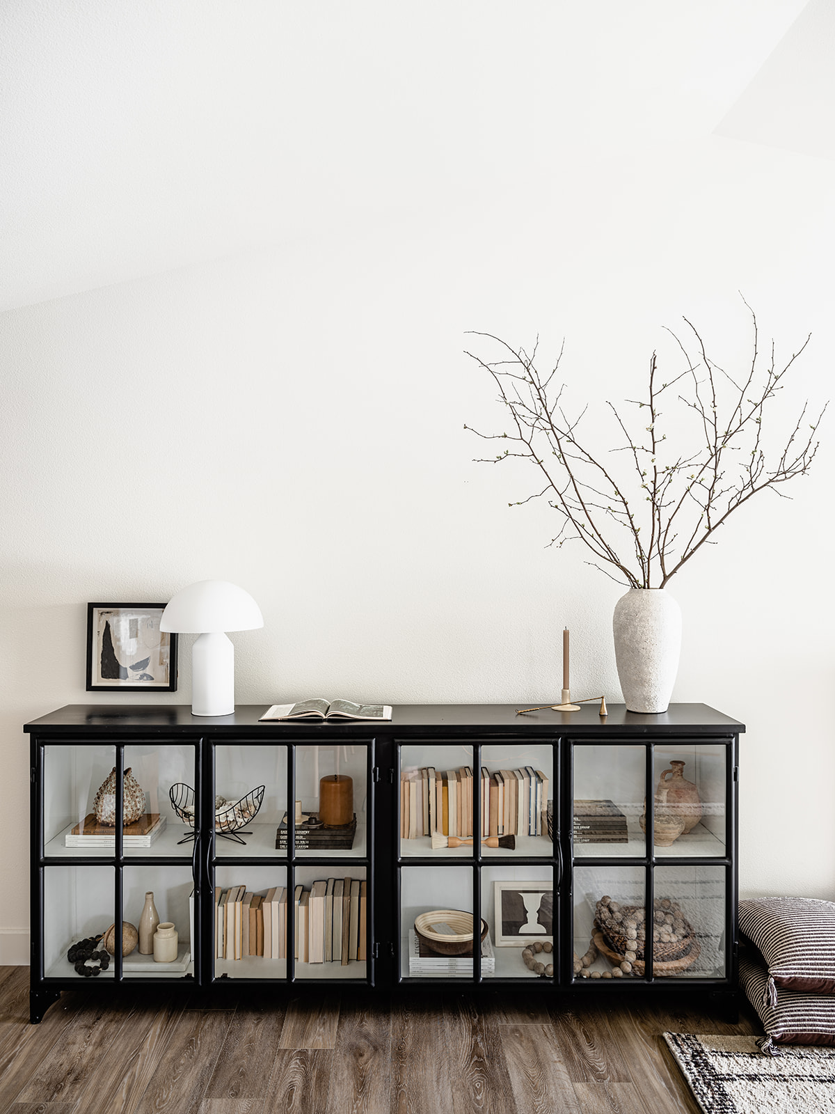
Accessories in the living room were kept monochromatic and to a minimum intentionally. The joy of being away from your day-to-day environment is to forget about the stuff – literal or figurative – that crams itself into our lives, so I really worked to keep this look as minimalistic as possible without skewing too modern. Stacks of my favorite design tomes and choice decorative pieces from friends, local shops like Shop Coco Kelley and Casa Patina, or artisans I work with regularly, help the space feel curated but also personal. The sideboard is full of used travel books and vintage bits and bobs I’ve collected over the years. I edited everything to stick to a singular color palette.

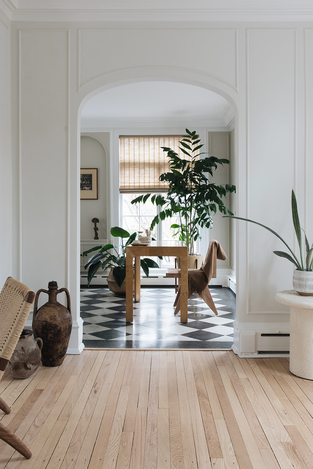
A few other details to call out – the whole room (and actually the entire house) is enveloped with Benjamin Moore’s Simply White on the walls, ceiling and trim in a nod to bright white Scandinavian homes. It’s also an antidote to the Seattle gray – it’s a thing. The idea for the house’s wide plank floors also came from my love of Scandinavian design. I was really happy with the warm wood tone. The flooring really grounds the space and helps play up the other natural wood elements dotted throughout the room.

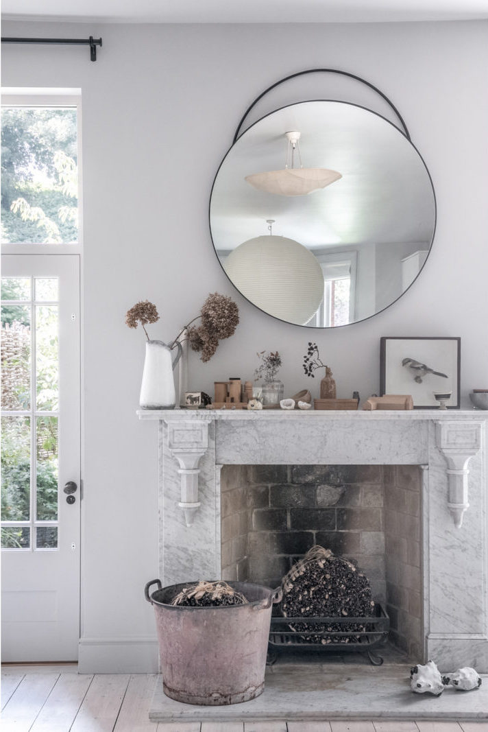
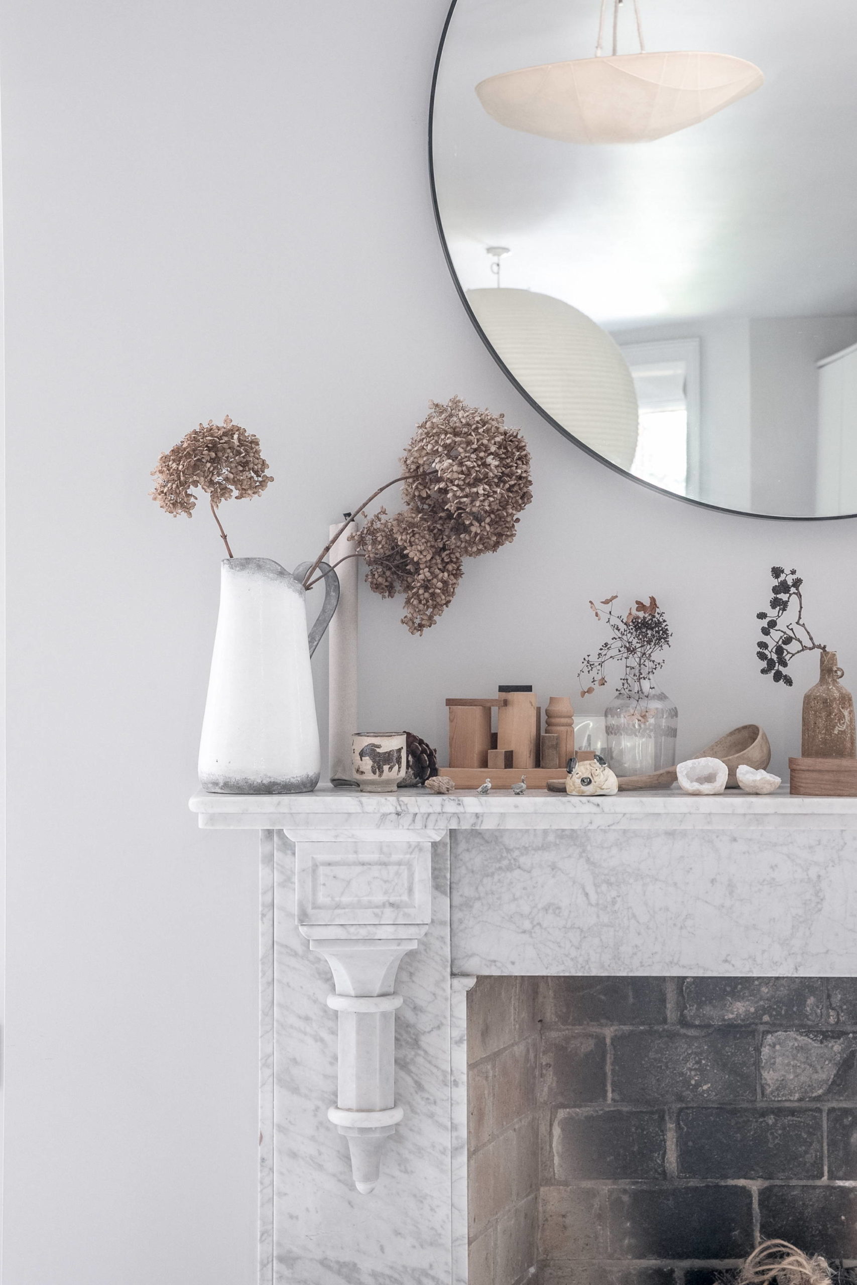
I even did a DIY in the living room! The fireplace mantel was a quick fix. I simply had my contractor build a box surround that I then lime washed with a lovely hue from Color Atelier to give it a little more depth and texture. The hearth is a remnant piece of countertop left over from the kitchen! Love little simple design wins like that.

Now let’s turn our attention to the kitchen, shall we. If you’re standing in the living room and turn 180 degrees you look right at the house’s kitchen- which is a complete 180 from where the space began!
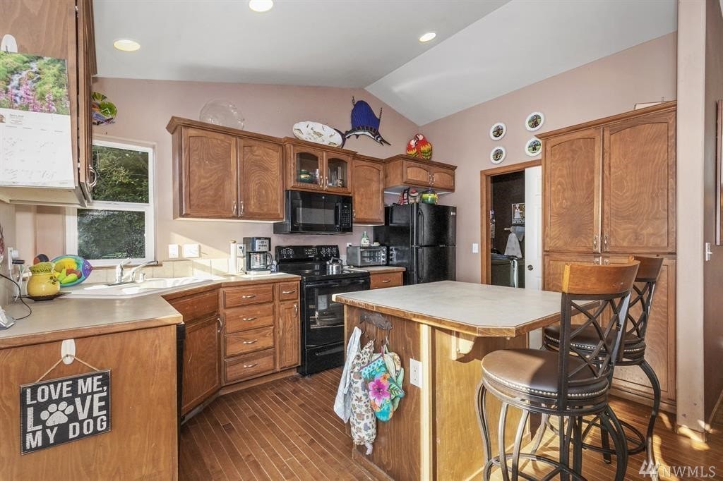
I have a major kitchen obsession – I mean, don’t we all – and I really wanted to see my dream vision come to life in this space. The kitchen area was the one spot where I actually took down walls during the renovation. If you look closely at the before pictures you’ll notice that the original kitchen was much smaller. There was actually a 6’x6’ enclosed space in the right-hand corner of the room that housed the laundry, a sink and some random storage. But it took up serious real estate and also broke up the only interesting architectural detail of the whole house – the vaulted ceiling that runs the length of the main living area. As soon as I got confirmation those walls weren’t load bearing out they went – opening up a fully contiguous living, dining and kitchen space.
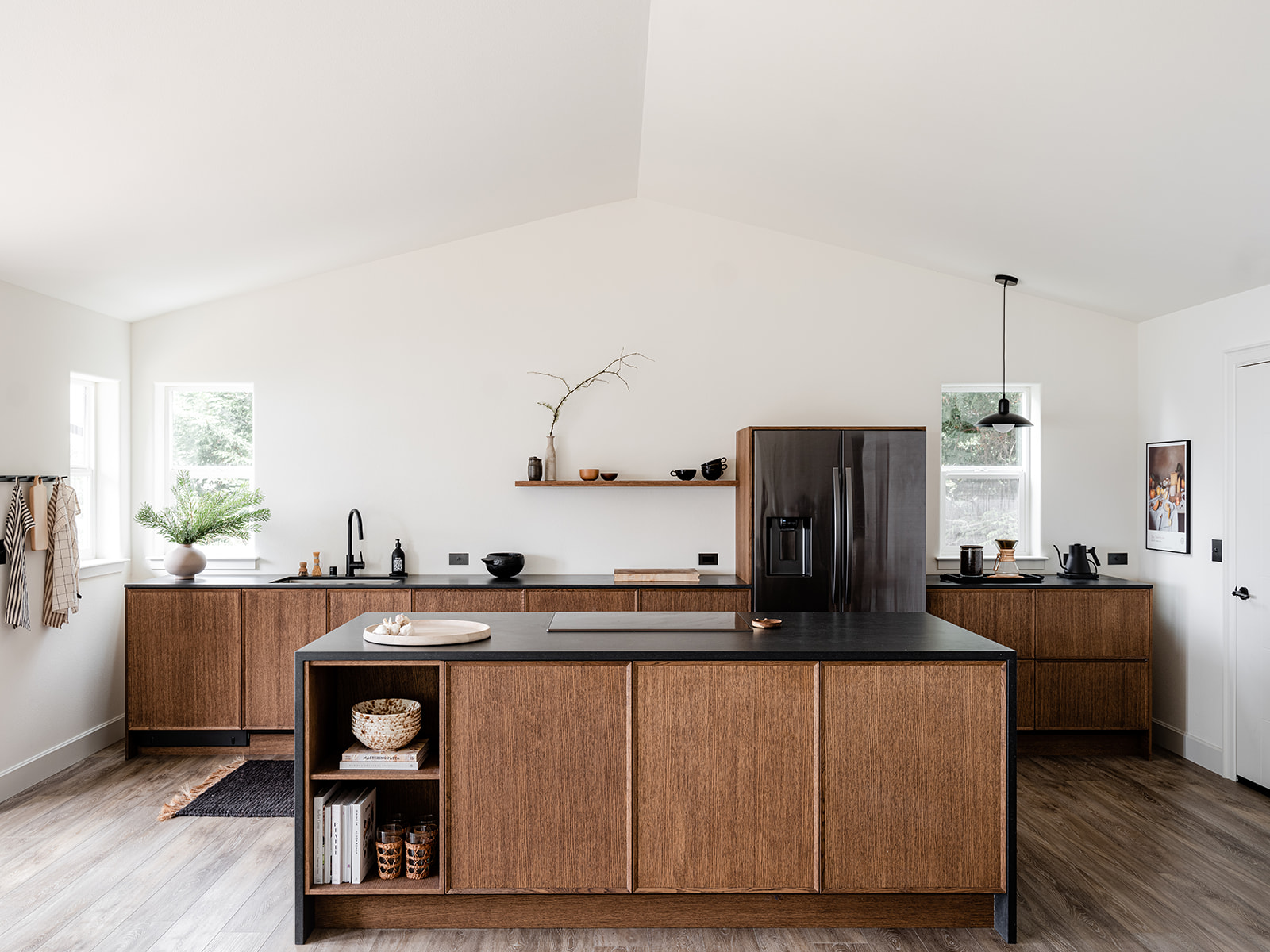
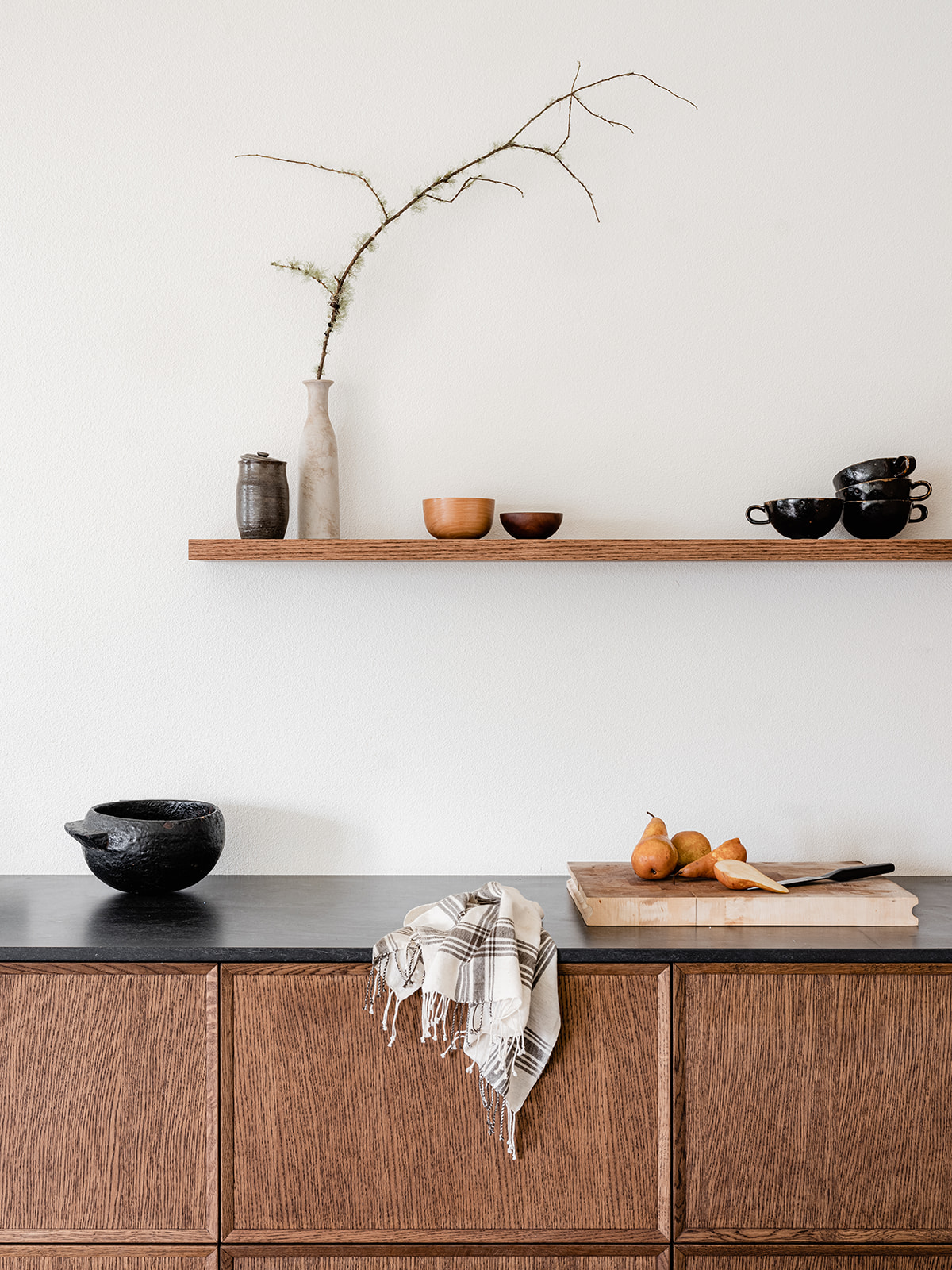
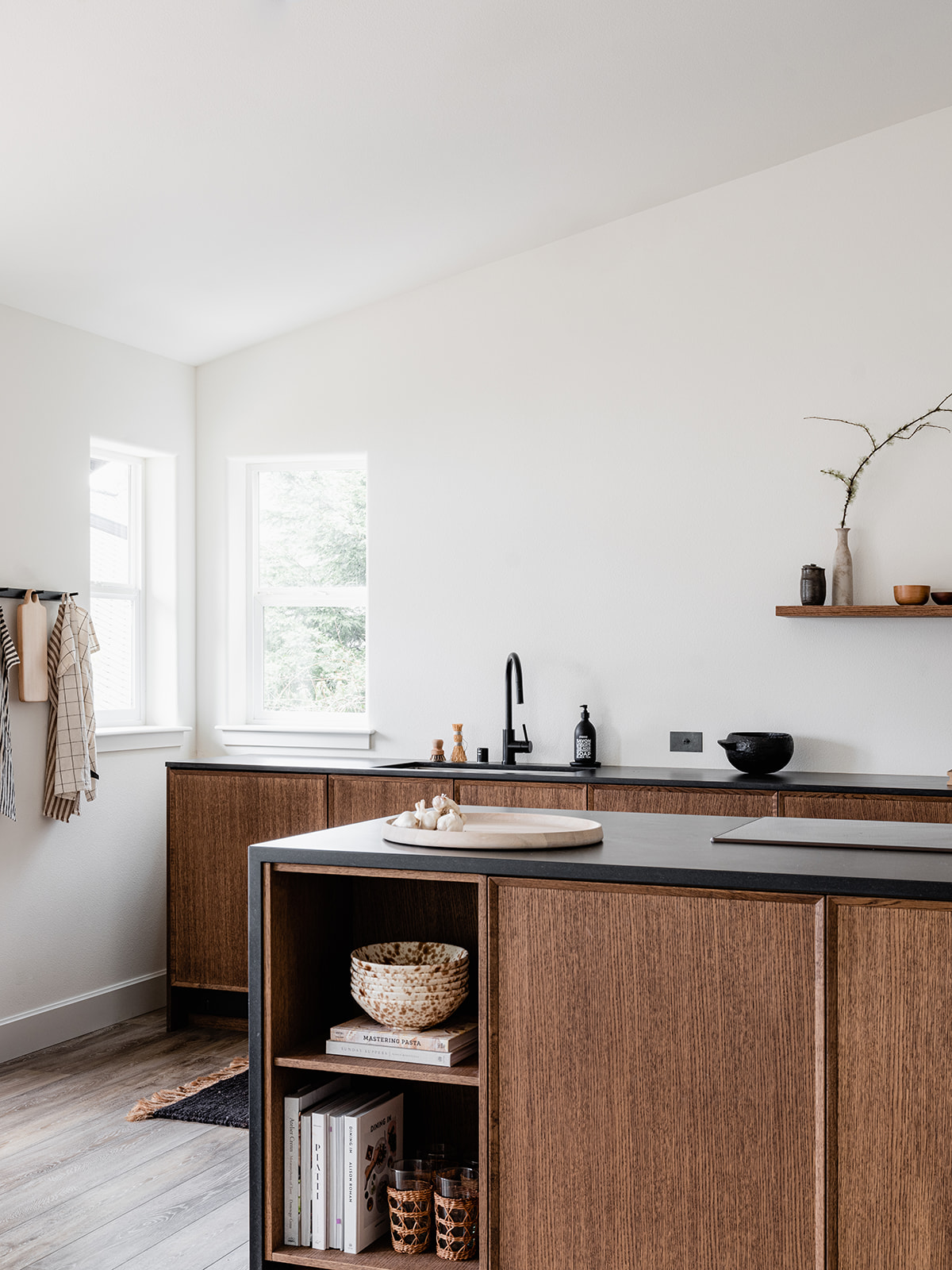
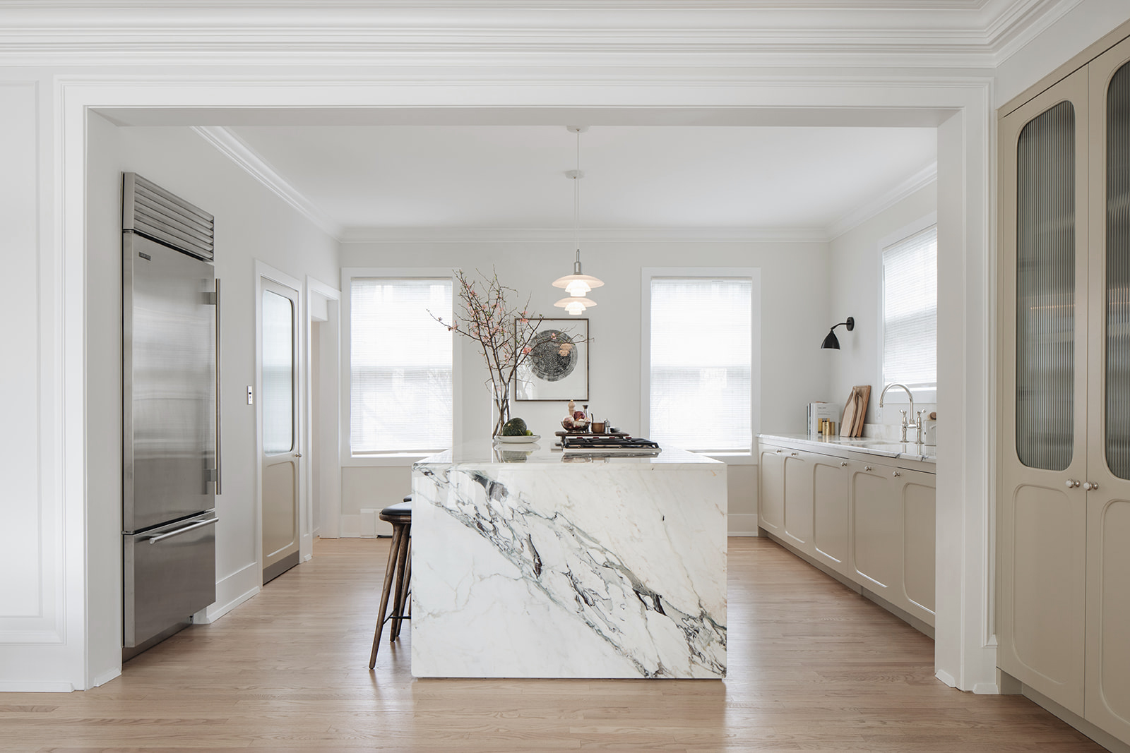
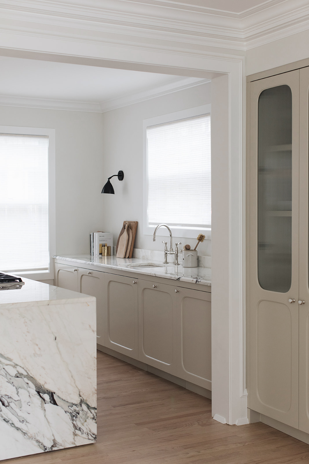
Opening up the kitchen was the game changer and it allowed me to live out my dream – putting a Reform kitchen into a project! I had been fan-girling over Reform for years. They’re a kitchen company out of Denmark that started out making custom fronts for Ikea kitchen boxes. I love their elevated but minimal aesthetic. In the last couple of years Reform made the jump across the pond with showrooms in New York and LA. I’ve long been smitten with their Frame line of cabinets, designed by Note Design Studio – another favorite Scandinavian design house. That’s the kitchen cabinetry you see here. This collection is a set of Reform’s own entirely prefab kitchen cabinets and they are extraordinary. The quality is divine and my contractor could not stop raving about how easy they were to assemble and install.
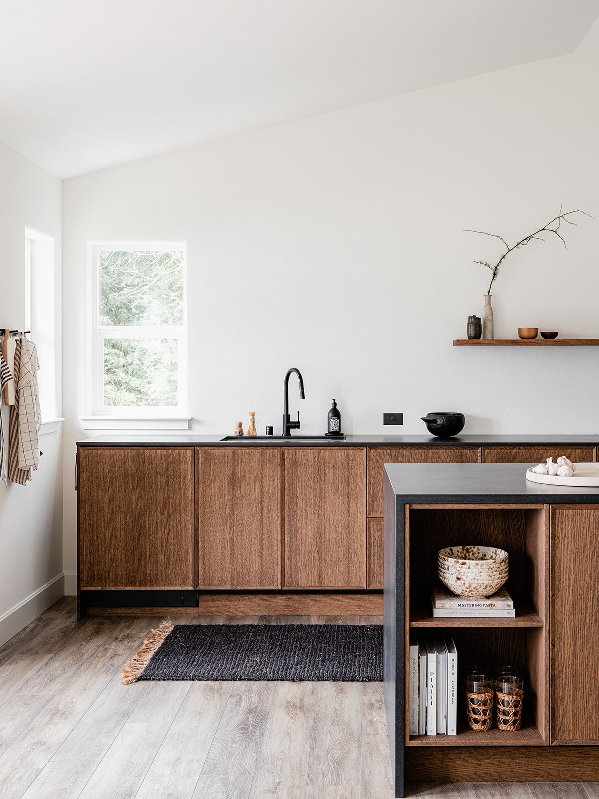
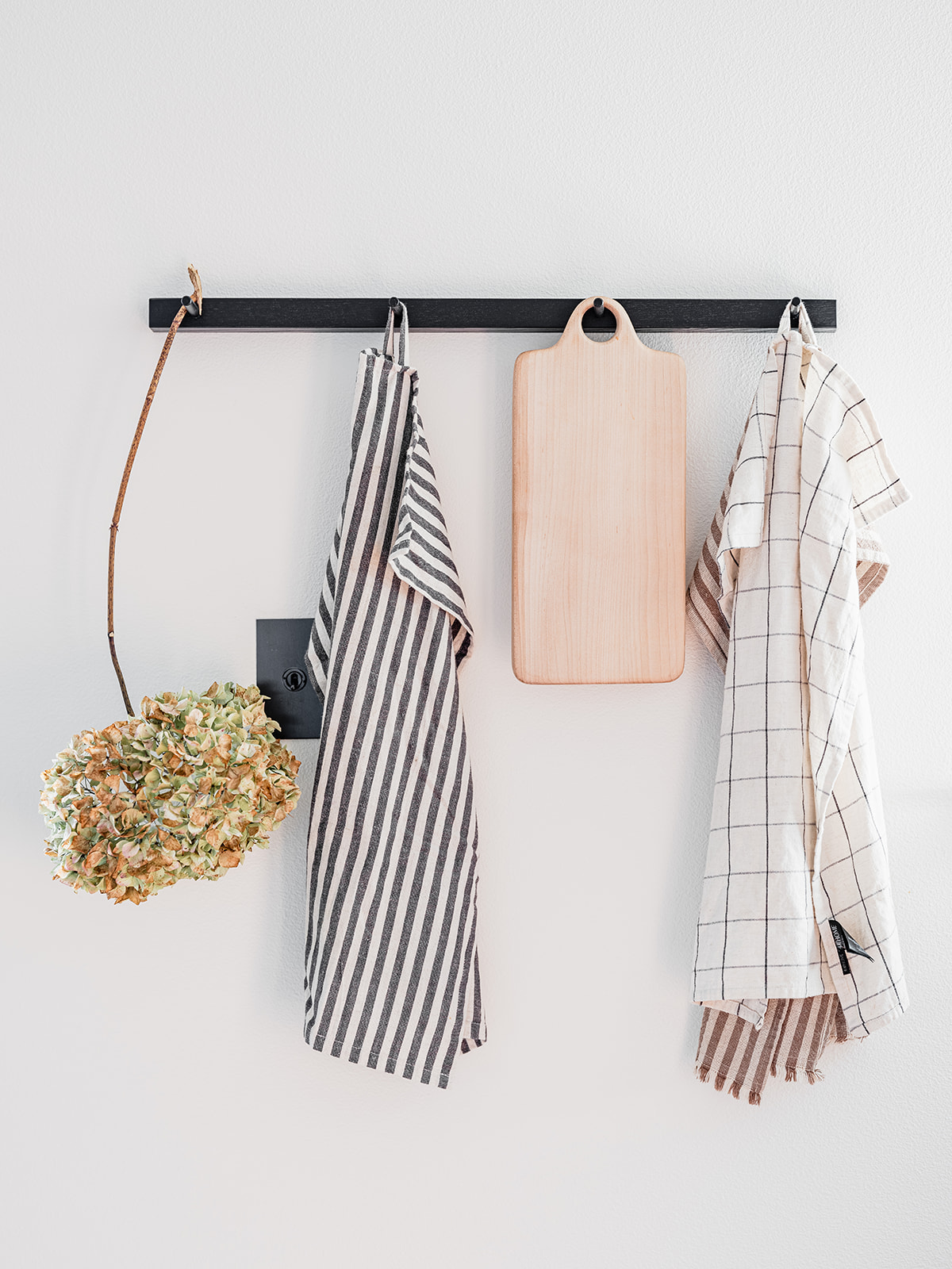
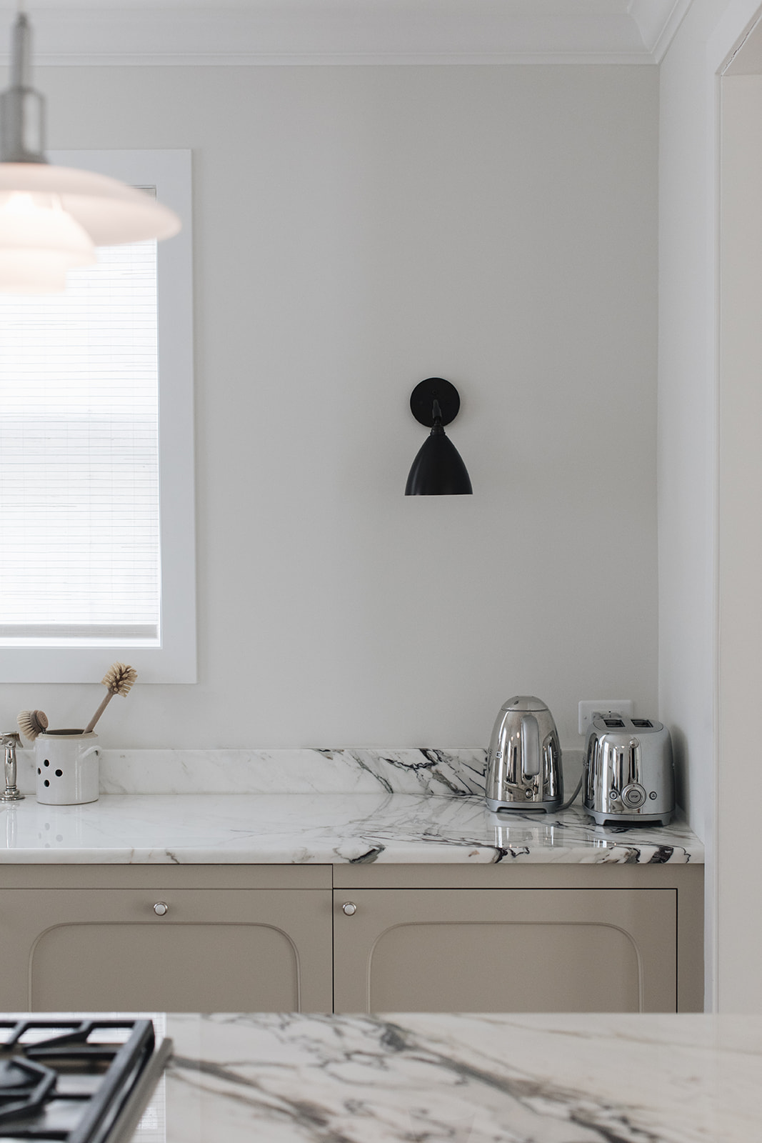
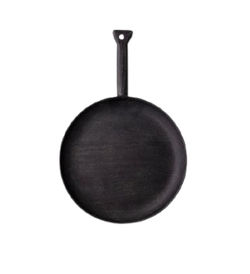
I wanted this kitchen to feel like it was made out of pieces of furniture which is why there are no uppers and the back row actually floats off the wall on both ends. There is ample storage however, as all the back cabinets are actually double drawers and the entire island is wrapped with additional storage. The induction range sits atop the island with the oven tucked underneath, keeping the sight lines clean. I was a bit nervous about switching to induction but I really like it! I custom designed one set of open shelving in the island to offer a little styling moment and to mimic the display of the floating wall shelf I had custom built by Seattle-based studio Walnut+Oak. The black countertops are actually quartz – Black Tempal made by Caesarstone – but they look and feel just like soapstone – one of my all time favorite materials. I really could sit and stare at this kitchen all day, I love her so much. I so hope you do too.
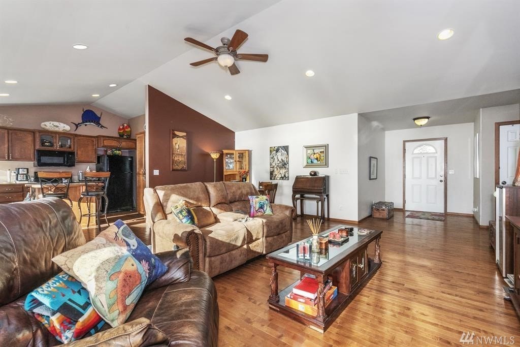
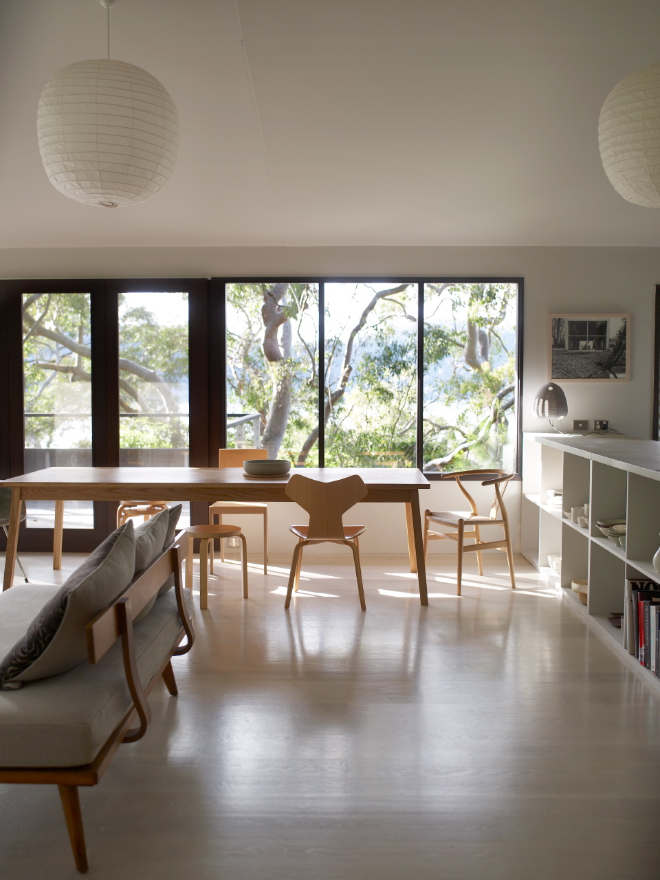
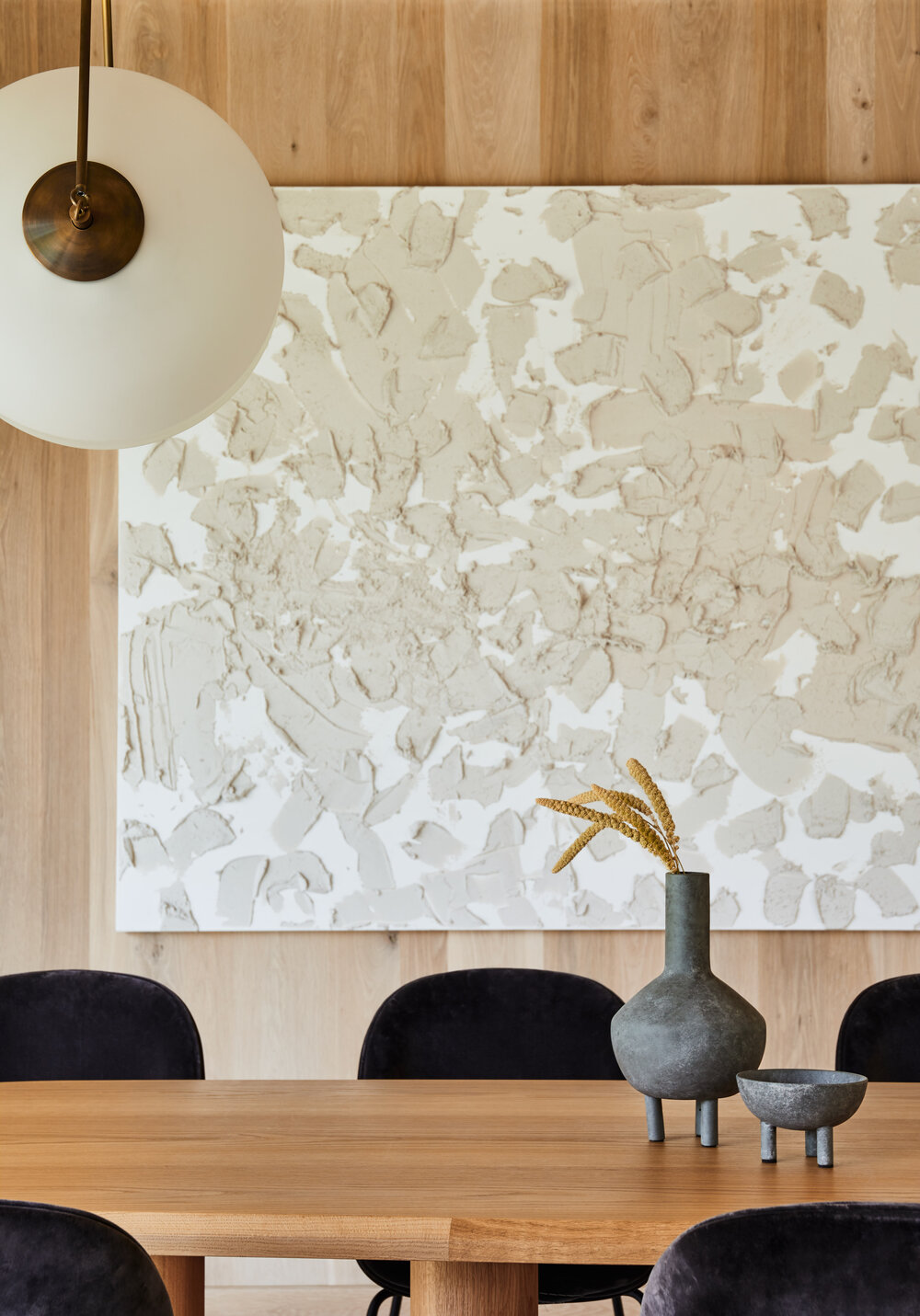
Before you ask why there isn’t bar seating at the kitchen island, that was a very intentional choice. I decided to focus on storage in the kitchen area rather than seating because the dining table is right next to it! When I took out the laundry room, I opened up a lovely long blank wall that now houses the dining area.(image that brown wall in the pic above disappearing).
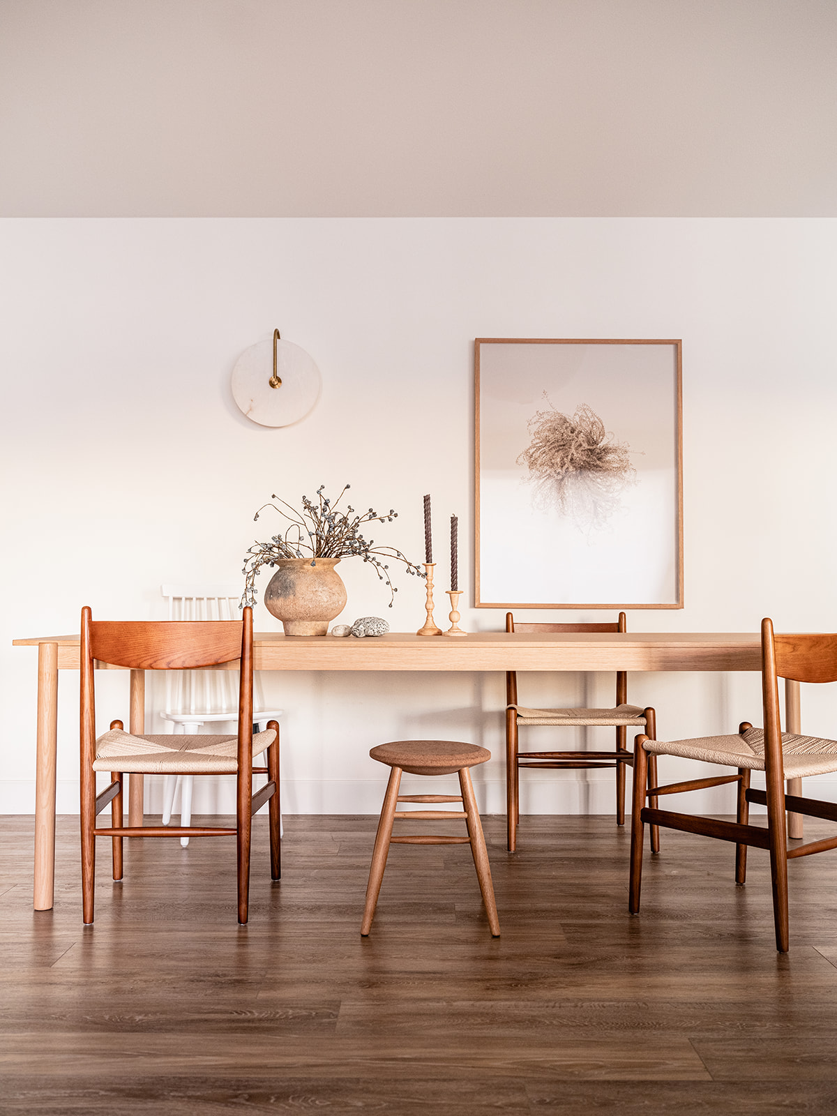
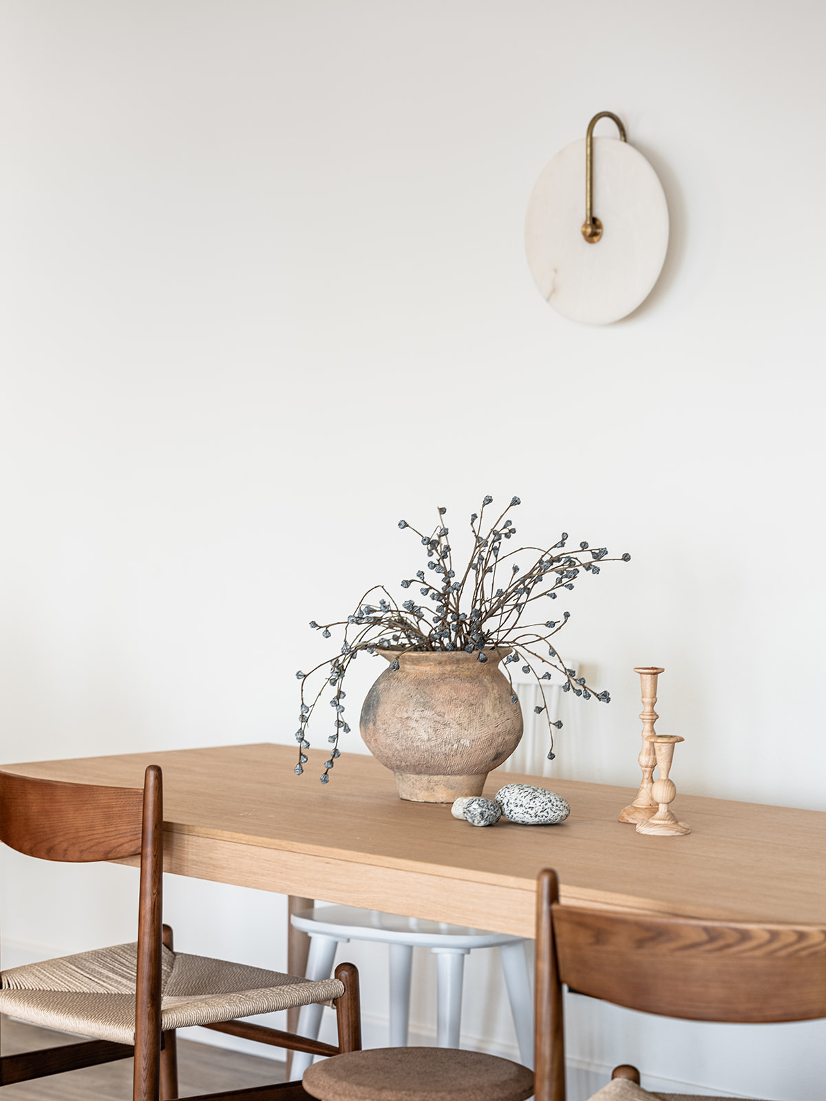
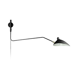
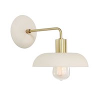
I demarcated the dining space with a stunning sconce by Allied Maker and an equally amazing art piece I’d long coveted from Canadian fine artist Anna Church. It’s the perfect to enjoy a leisurely breakfast or host Thanksgiving dinner!
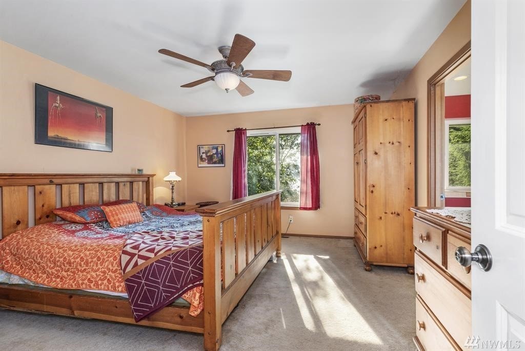
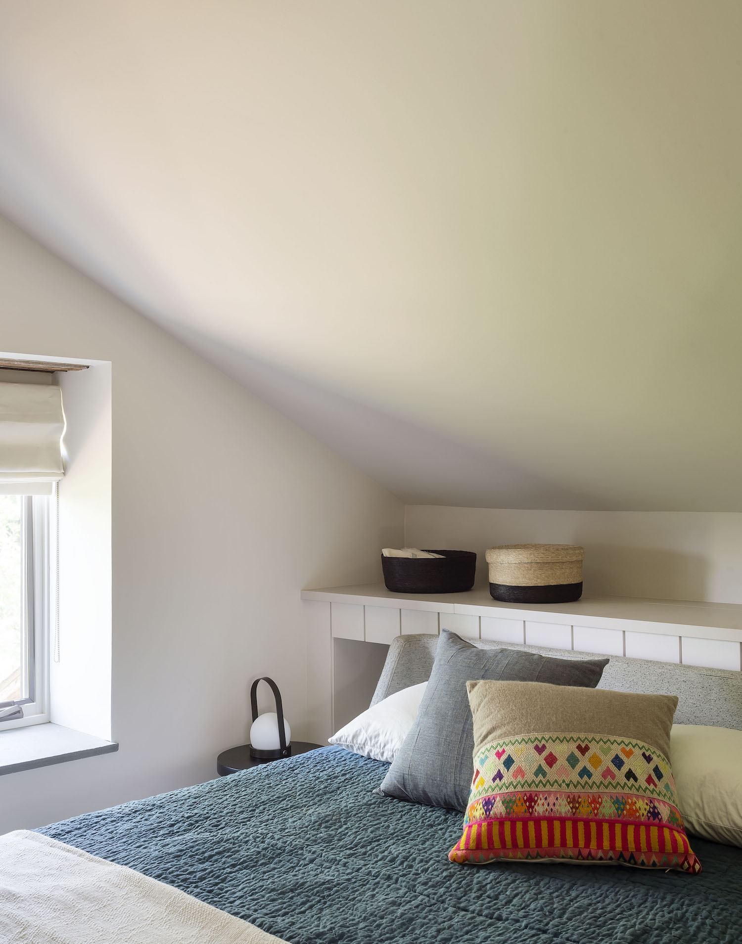
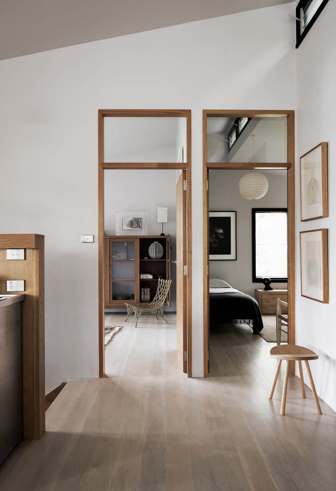
Now let’s turn to the bedrooms! Luckily these spaces simply required fresh coats of paint and well curated furnishings to create that elevated Nordic vibe I was going for. I wanted each room to evoke a sense of calming serenity.
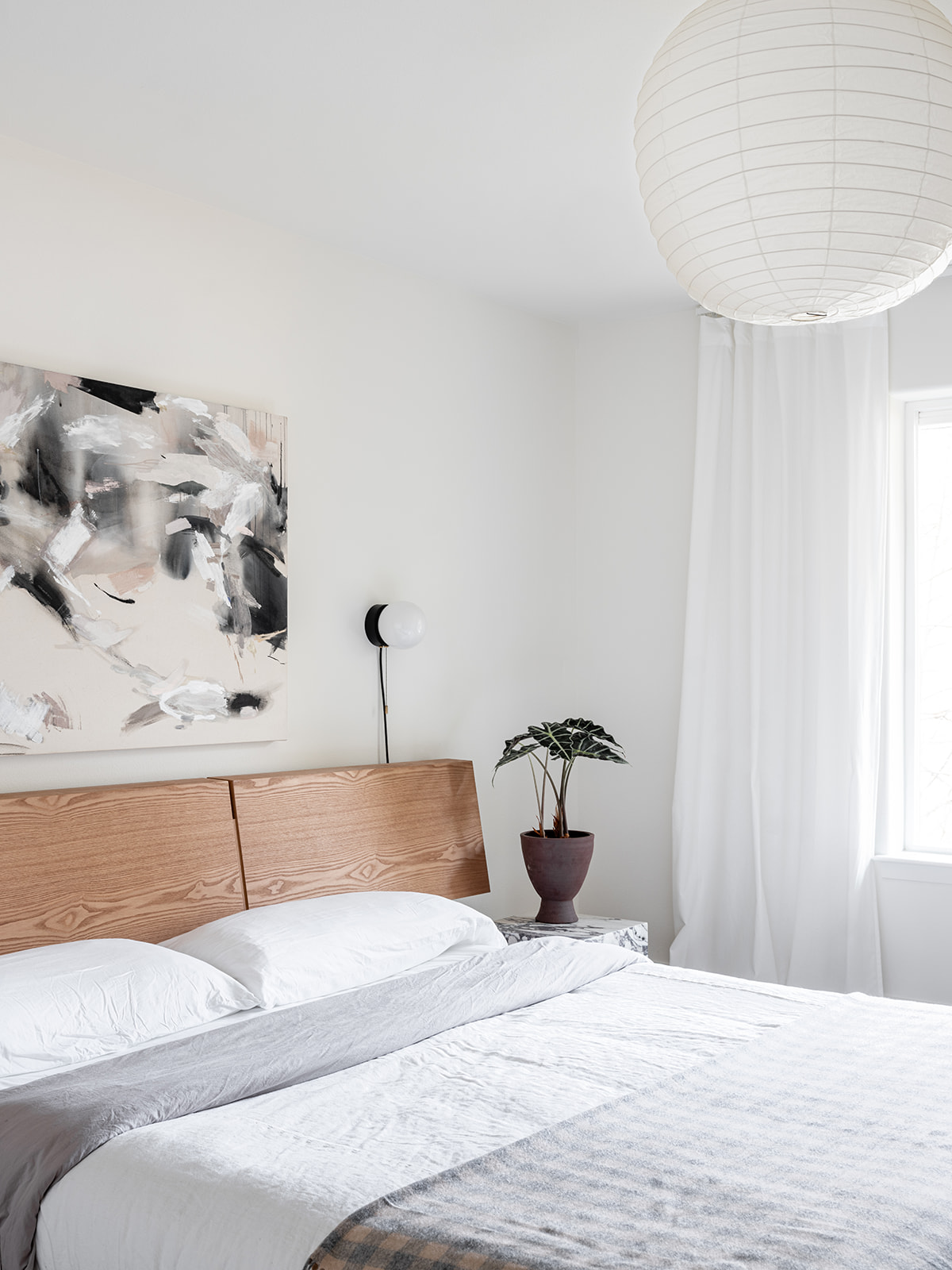
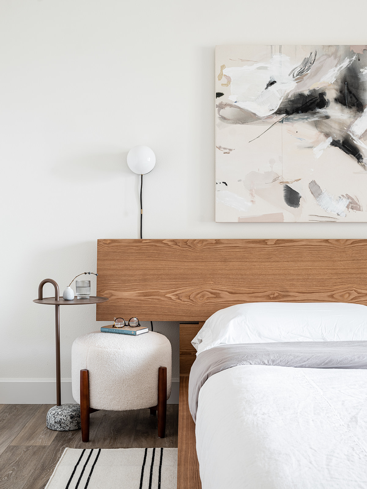
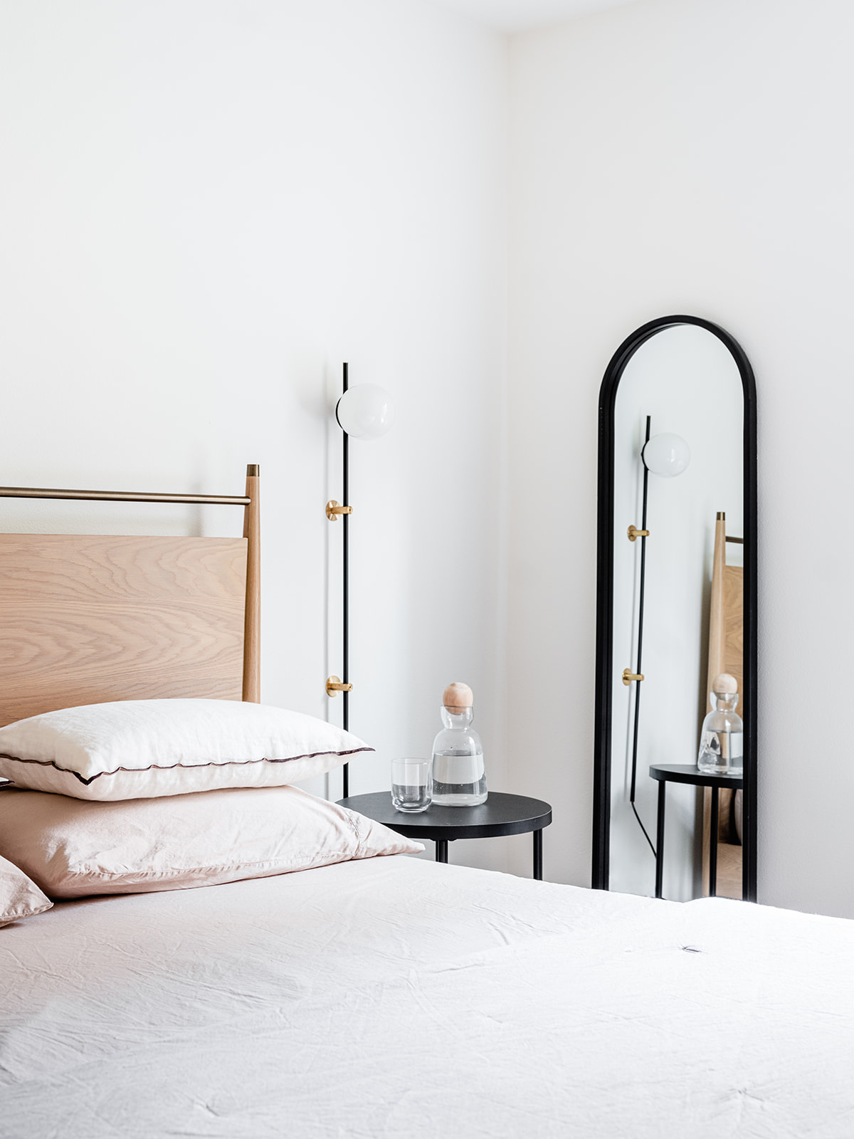
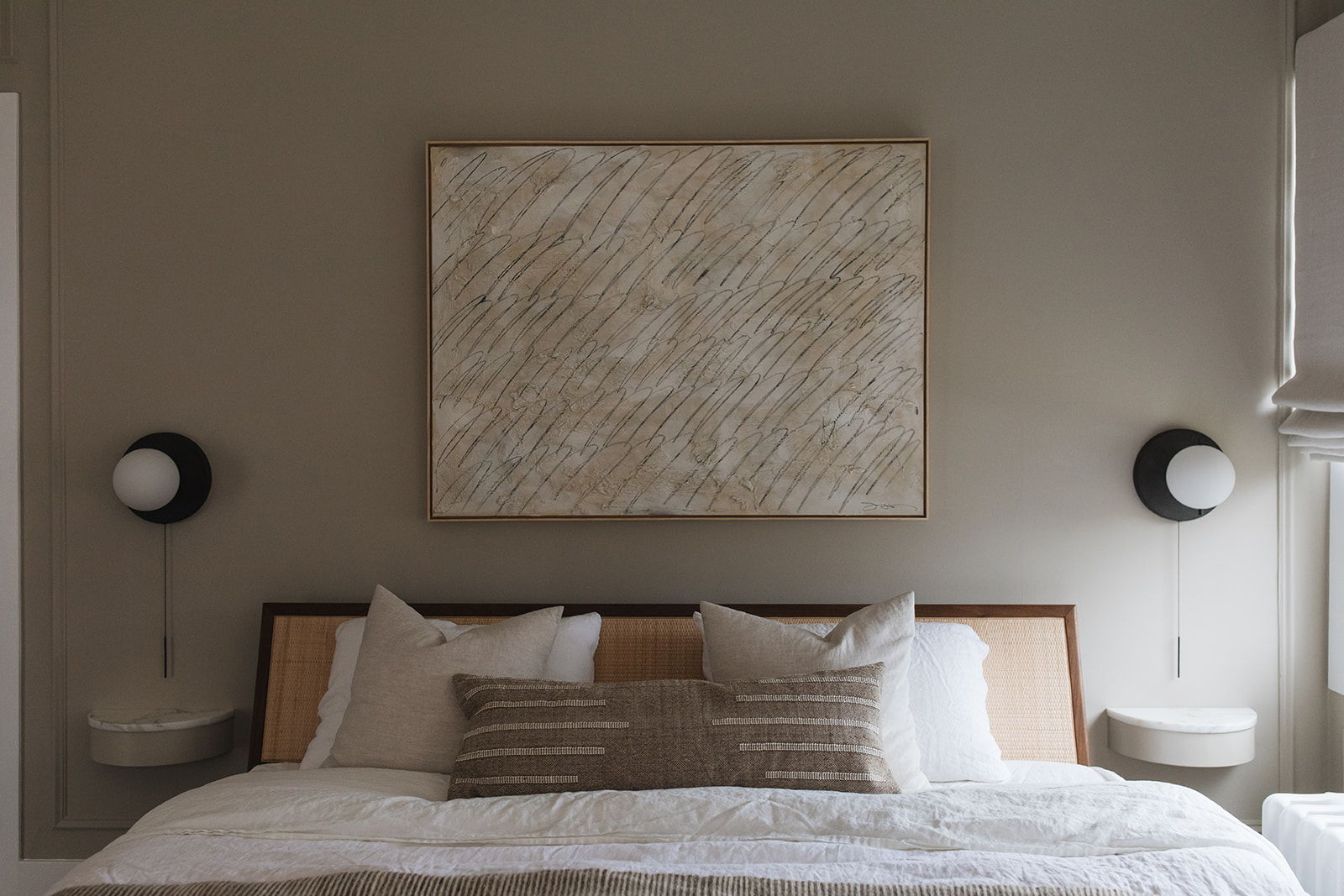
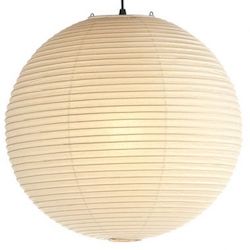
To achieve that I designed the primary bedroom with a mix of natural materials and textures in complementary hues. Think a lovely wool rug from Nordic Knots, linen bedding from Rough Linen, a Noghuci paper lantern and marble and stone side tables from Hay Design and Norm Architects all play beautifully together. I also love my little sherpa cutie from Target! I turned to Seattle Art Source for the gorgeous Jennifer Gauthier painting above the Rove Concepts platform bed.
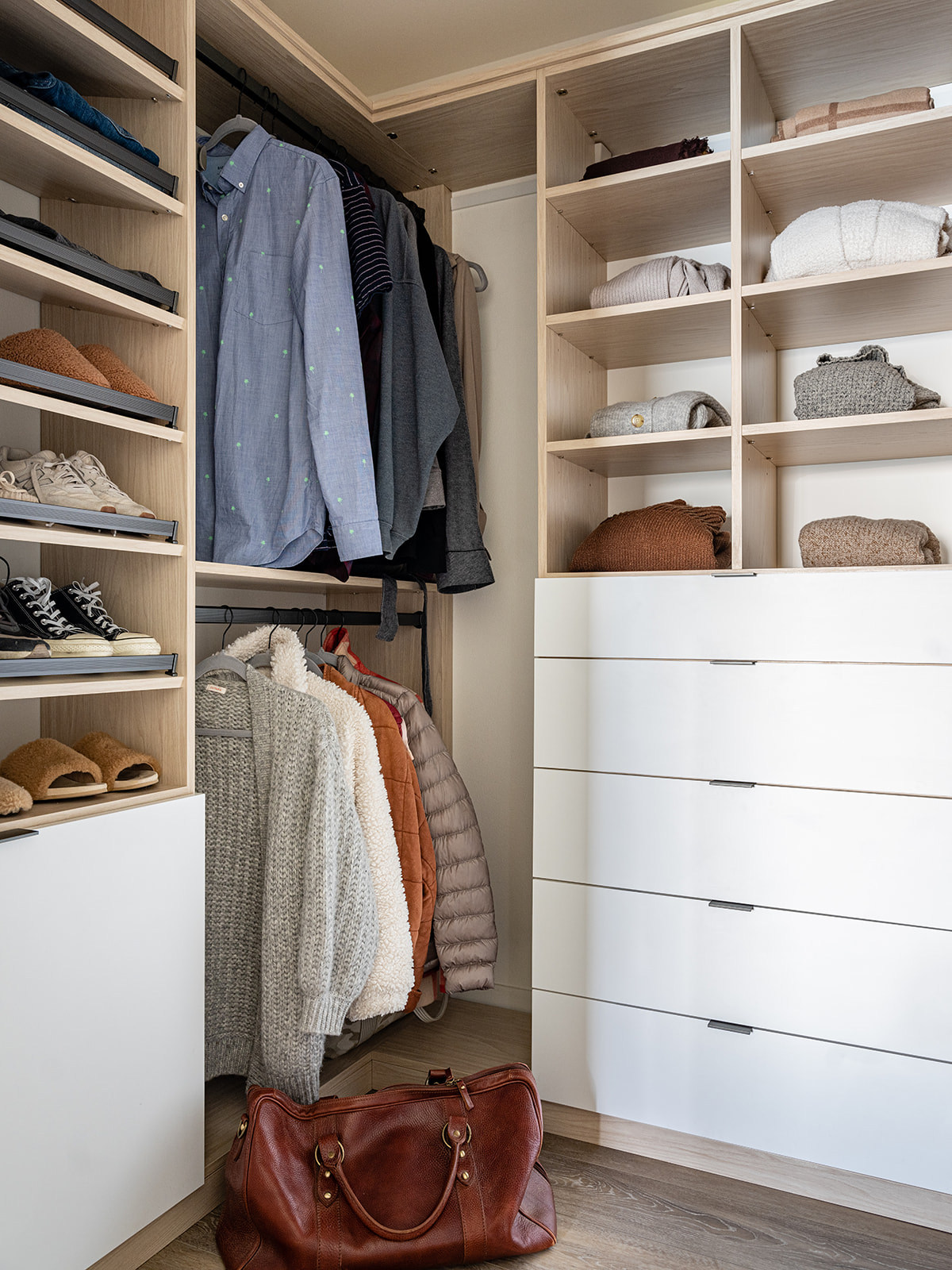
The one nice thing about working with house built in the 1990’s is all the built in storage! Historic homes don’t have so much of that. The primary bedroom had a walk-in closet, but I wanted to make sure I fully optimized the space, so I worked with California Closets to design the ideal spot to keep all your weekender gear organized. I for one love to immediately unpack and make myself at home anytime I stay somewhere – and this closet definitely makes sure you can do that. There’s plenty of space to stash away suitcases and I can even lock the drawers if I want to keep some of our own things private.
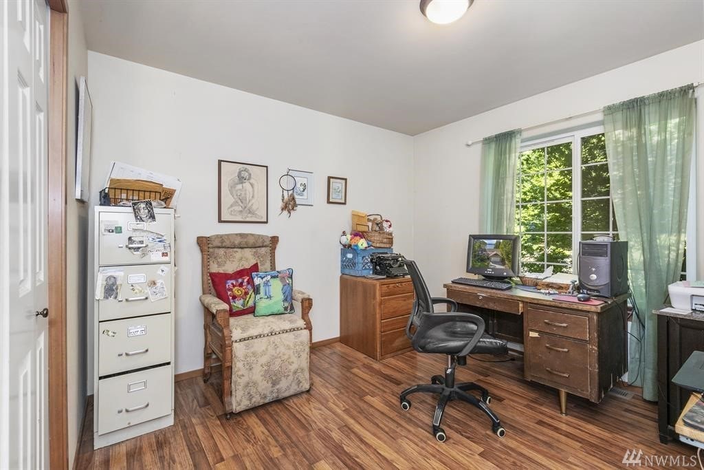
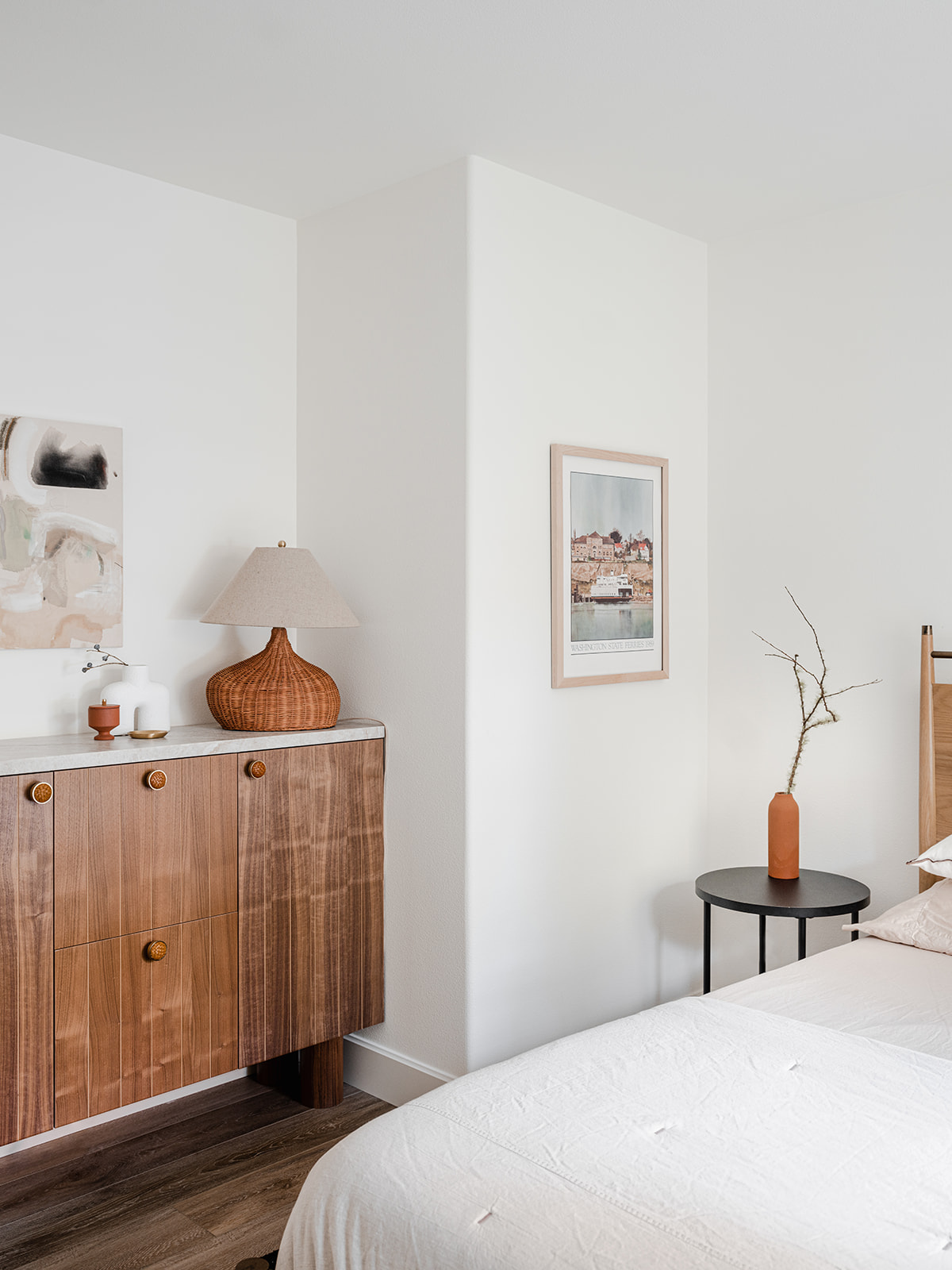
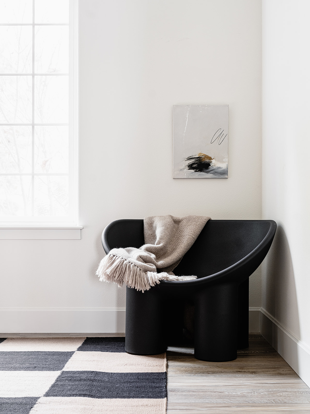
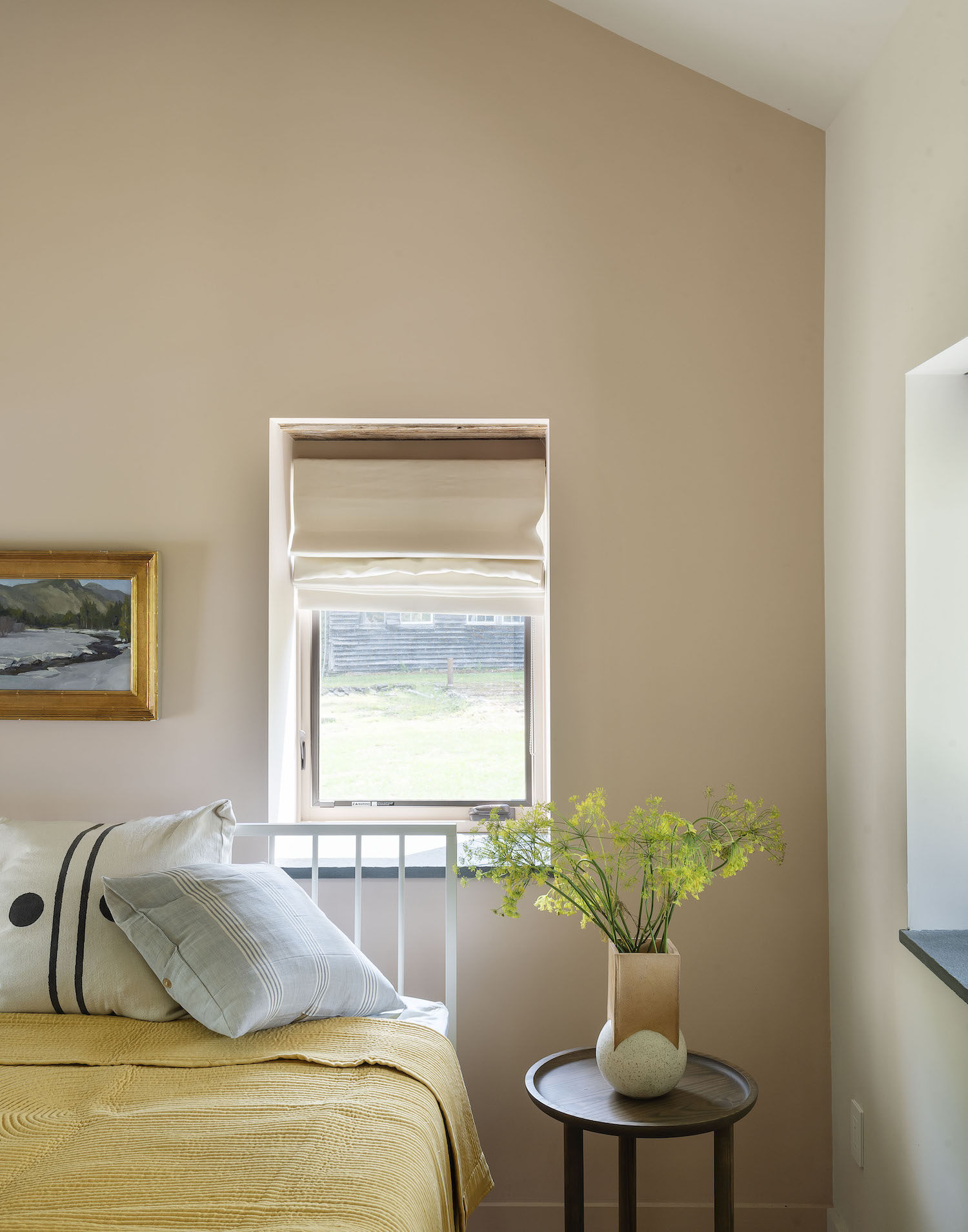
Ironically, I eliminated the closet in the cottage’s second bedroom. The room was already quite small. Putting in a queen sized bed was going to make it feel very cramped so I decided to demo the reach-in closet and design a custom credenza to sit in its place. Seattle-based design shop Walnut+Oak built out my vision perfectly – it gives the room a fun punch of personality and guests ample storage. Another Nordic Knots rug, this time in a bold checkered pattern and a long-coveted Faye Toogood Roly Poly chair add a fun tension between modern and more traditional pieces. I’ve had nothing but rave reviews from our guests about this room thus far.

Now let’s chat bathrooms. Bathrooms can be as overwhelming to design as a kitchen. So many options – so many choices! The only choice I had with the bathrooms in this house was to start over.
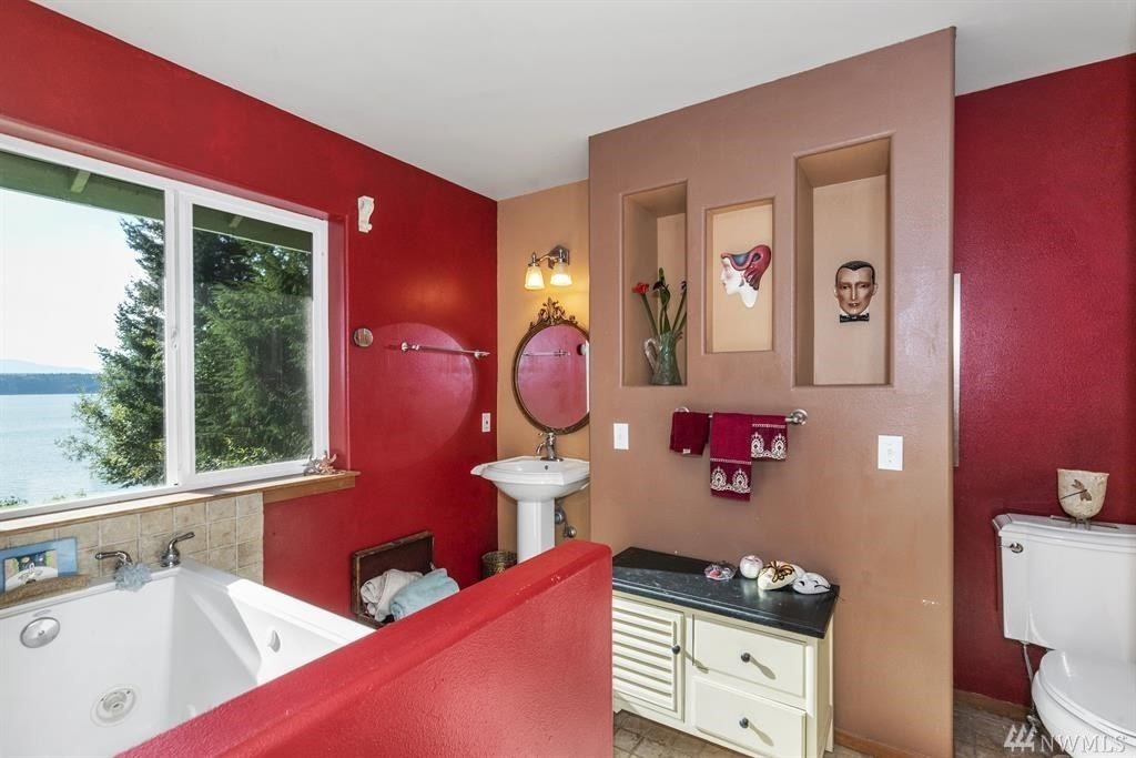
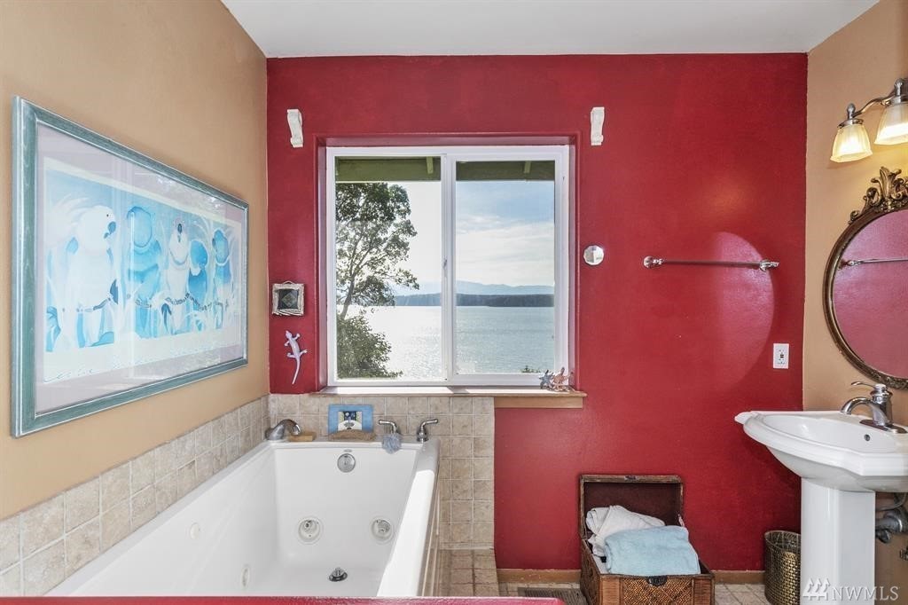
The primary bathroom proved to be a big game of tetris. Its existing layout of a tiny tub, itty bitty fiberglass stand up shower and weird cubbies smack dab in the middle of the room certainly could not stay. But it turned out the fireplace chase from the living room was actually hidden behind those cubbies – I only wish I knew why – so I had to figure out how to work around that.
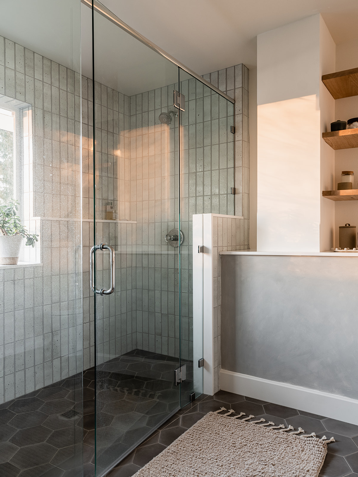
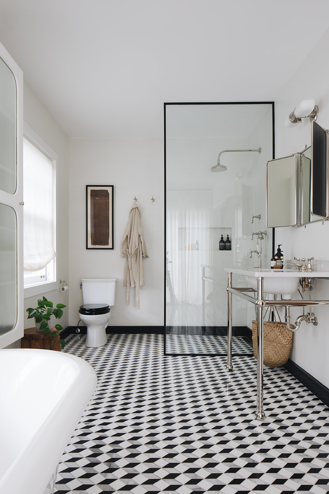
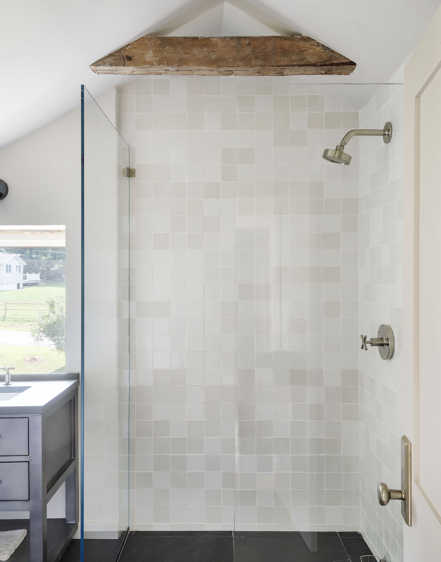
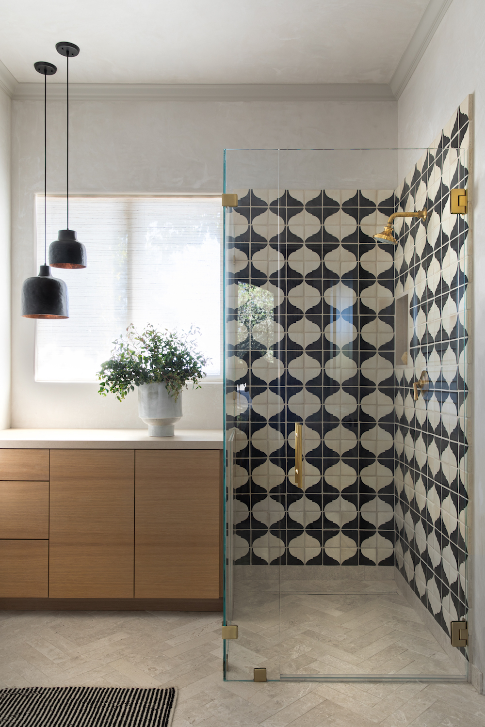
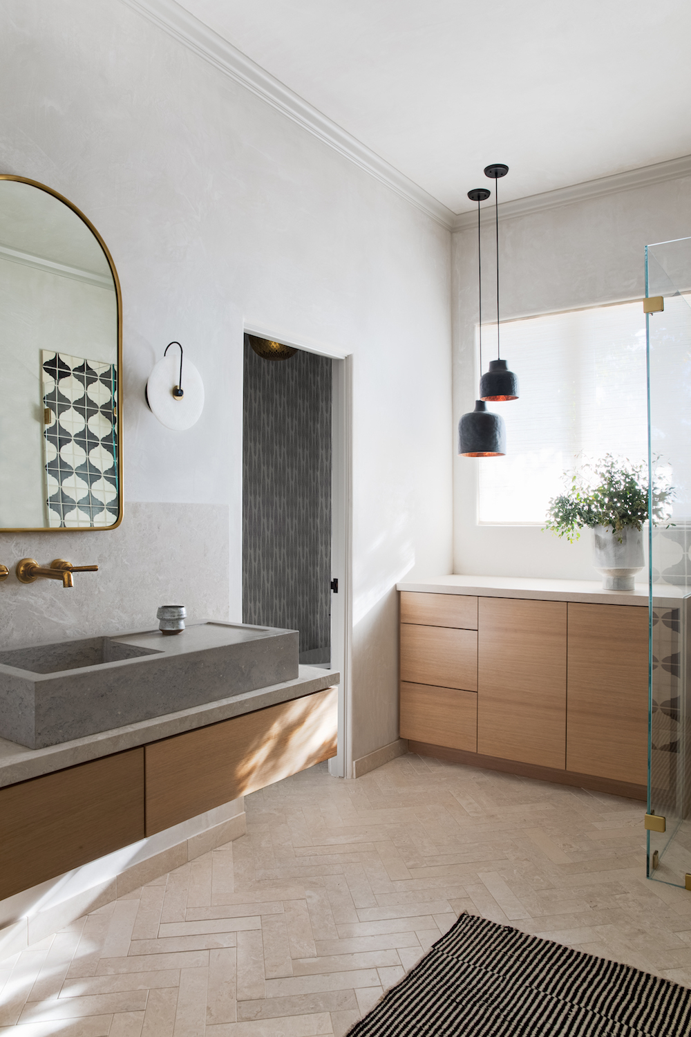
And here’s how it turned out! I created an extra long double shower clad entirely in amazing handmade tile from Clé. Now you get to enjoy stunning views out the west facing window while you lather up. The floating white oak vanity sits on the opposite wall where the fiberglass shower once was – the round mirror reflecting the views of the water and mountains back at you while you brush your teeth.
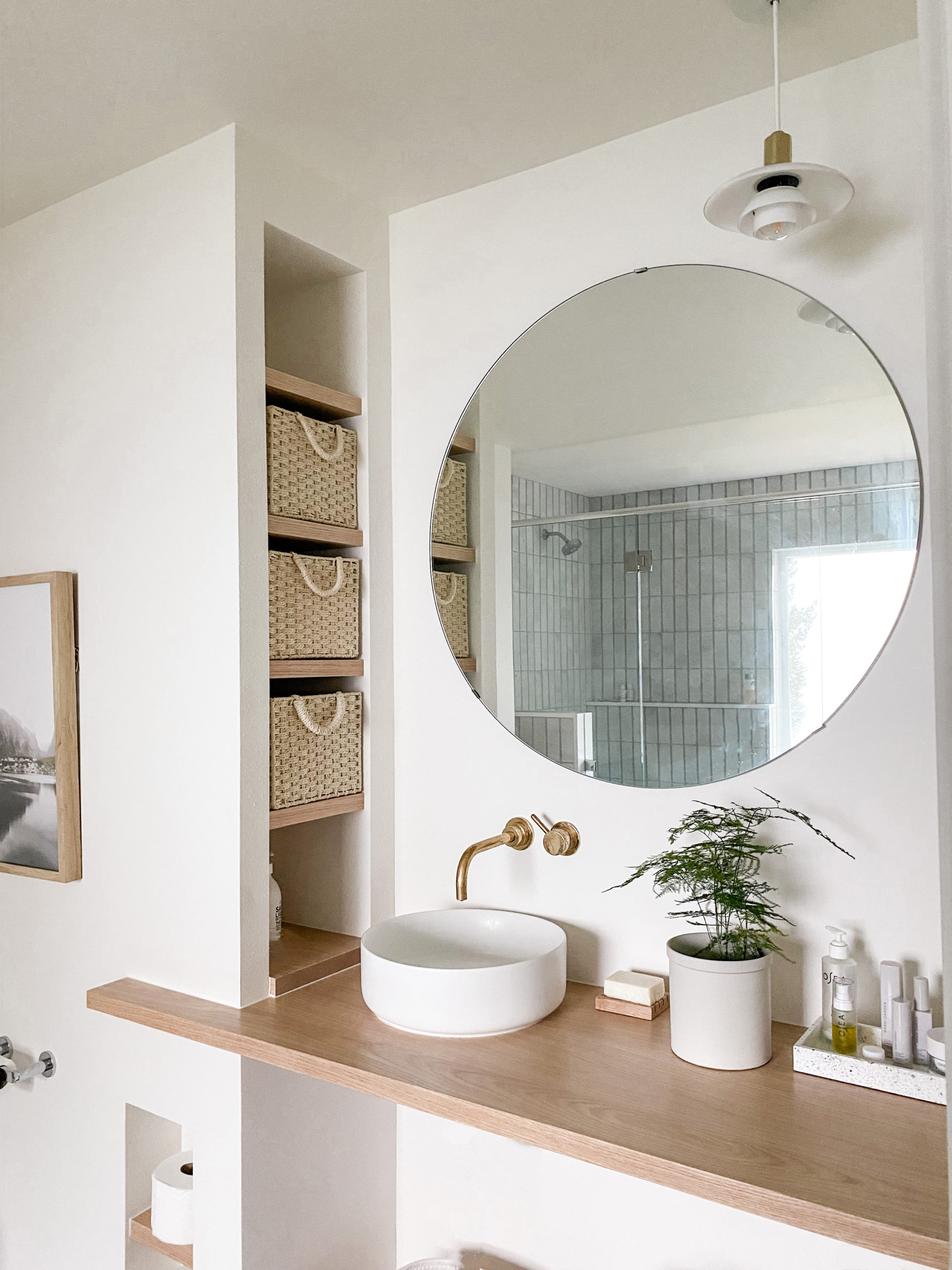
I used a concrete hexagon tile also from Clé across the seamless floor. As for that fireplace chase? I had my contractor encase the lower half and put a Caesarstone counter on top to serve as another surface for storage. Small simple floating shelves create a spot to display some pretties.
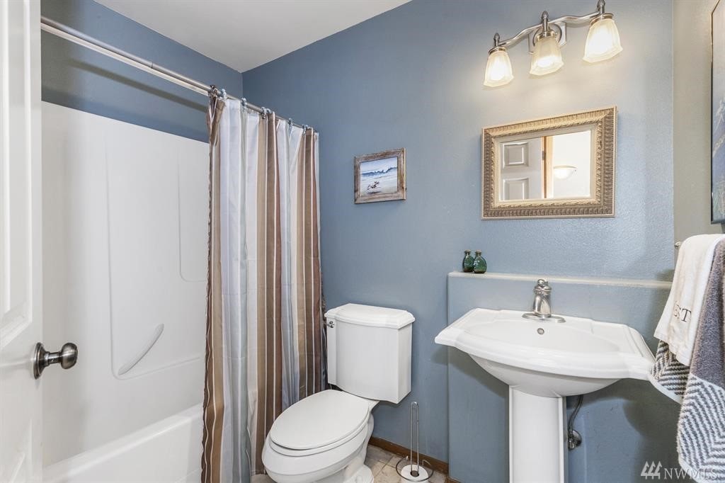
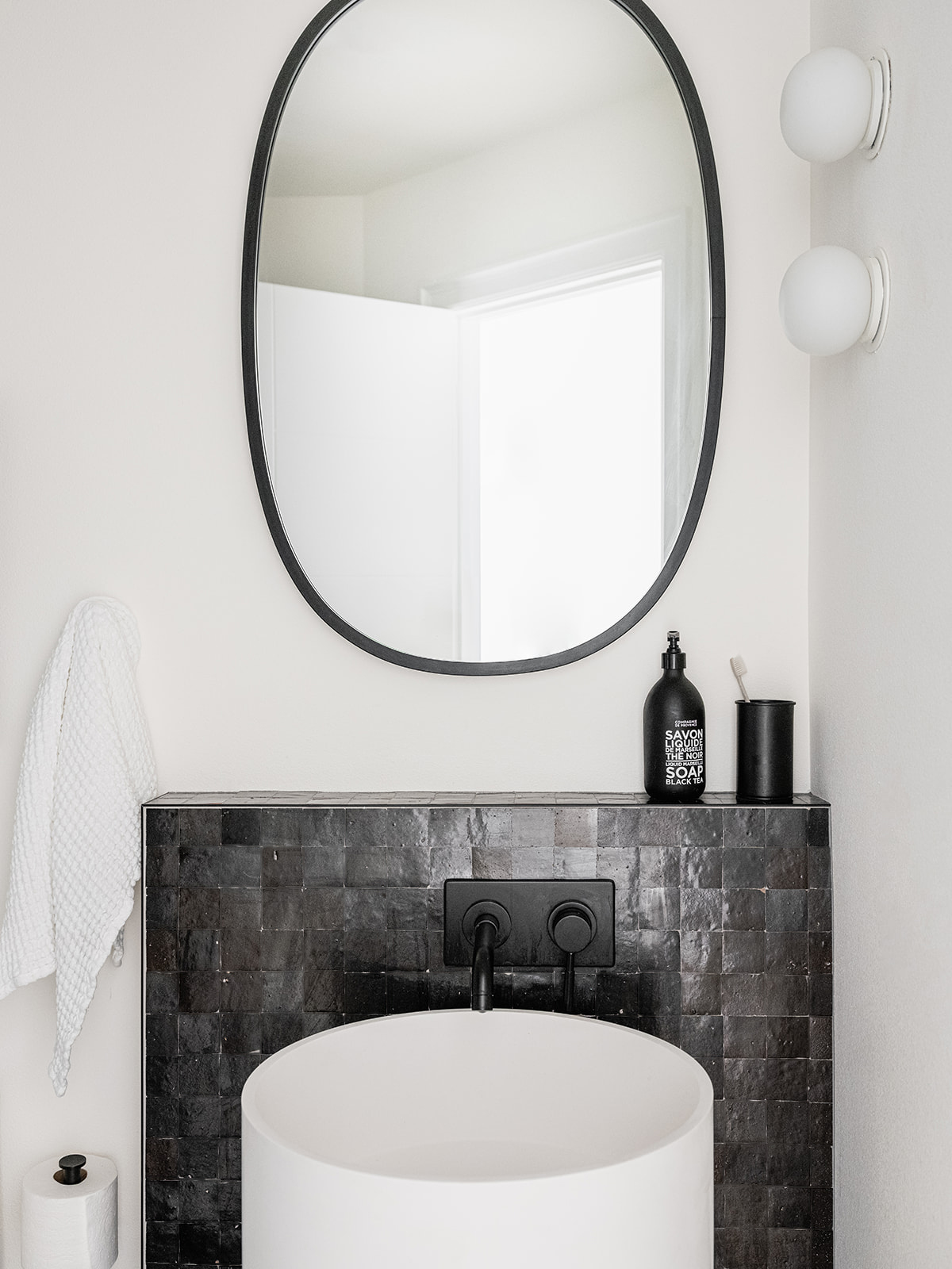
I took a slightly different approach in the guest bath. The layout stayed exactly the same here. It was such a small space it didn’t make any sense to try to switch things up. Instead, I simply made a massive upgrade on all the surfaces – and a total departure from the vibe in the primary bathroom.
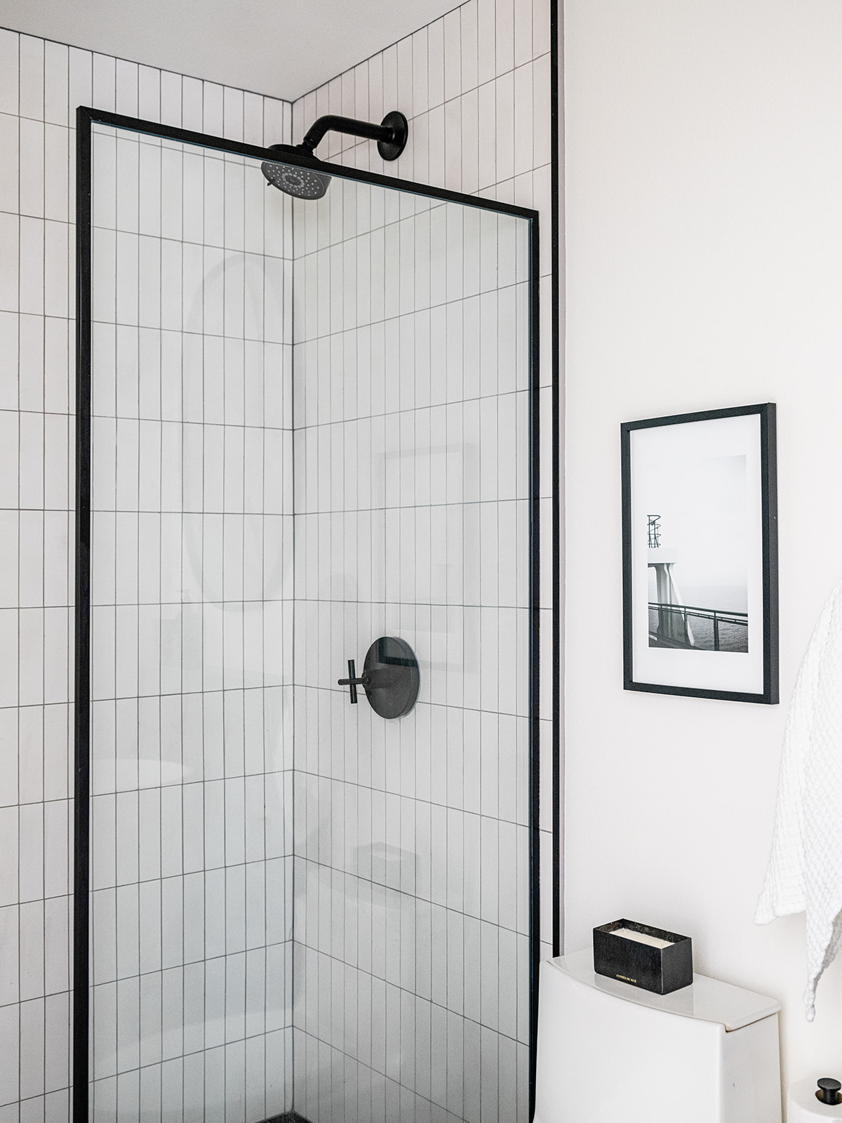
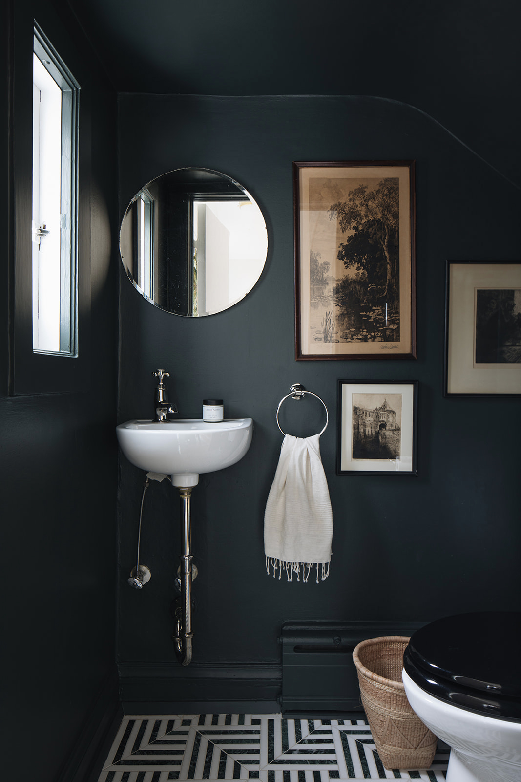
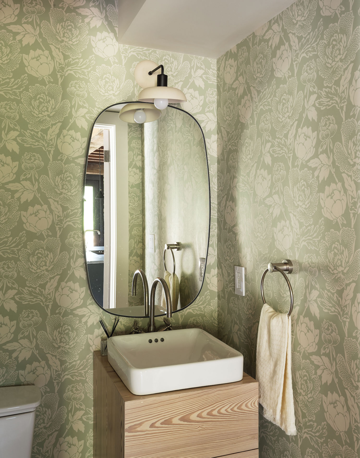
Since the guest bath was already small and windowless, I wanted the design to feel really dramatic and bold. To achieve that end, I stuck to a very graphic black and white color palette. Dark zellige tiles from Clé span the floor and run up the wall to cover an existing bump-out. Stacked cement brick tiles from Clé run up the shower walls to help it feel a bit taller. An off-the-shelf glass shower partition by Vigo from Build by Ferguson was a budget friendly solution for finishing off the shower in style. To soften all the angles and strong lines in this little space, I chose a really fun free-standing cylindrical sink, an oval mirror and two globe lights from Flos. The hall bath may be small, but she gives a mighty big style punch.

Now let’s turn to kid’s spaces!
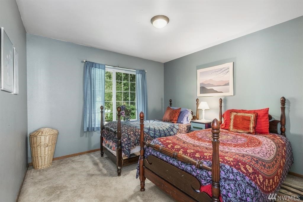
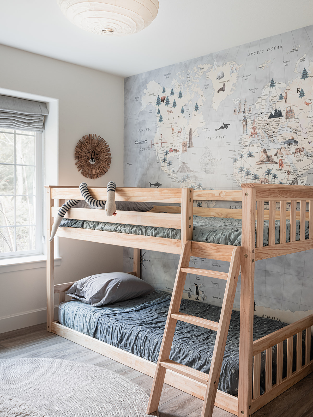
I turned the cottage’s third bedroom into a haven for the littles. As the mother of a seven-year-old myself, I was certainly designing this room with him in mind, but also thinking of all of my friends who have younger children in tow. A simple pine bunk bed (which I may still paint someday. On the fence about that one) allows for sleepovers or siblings to bunk up together A custom (removable!) world map wallpaper lines the room’s entire back wall, creating fun storytelling opportunities at bedtime. On the opposite wall, a Mini Library shelf from my go-to children’s furniture line Oeuf NYC displays books and choice toys.

A cozy braided rug from Armadillo softens the floor. My son runs into this room with the biggest on his face and I truly hope other kids will too.

You might think we’ve reached the end of our tour, but I have a surprise for you. While I call this house a cottage, that moniker is more about how the house feels than its actual square footage. Turns out the house had a daylight basement with a bevy of (sometimes random!) spaces that I set out to maximize by creating a great room, a play space, a home office/fourth bedroom and a couple of random spaces that I found some pretty fun uses for – so let’s head downstairs!
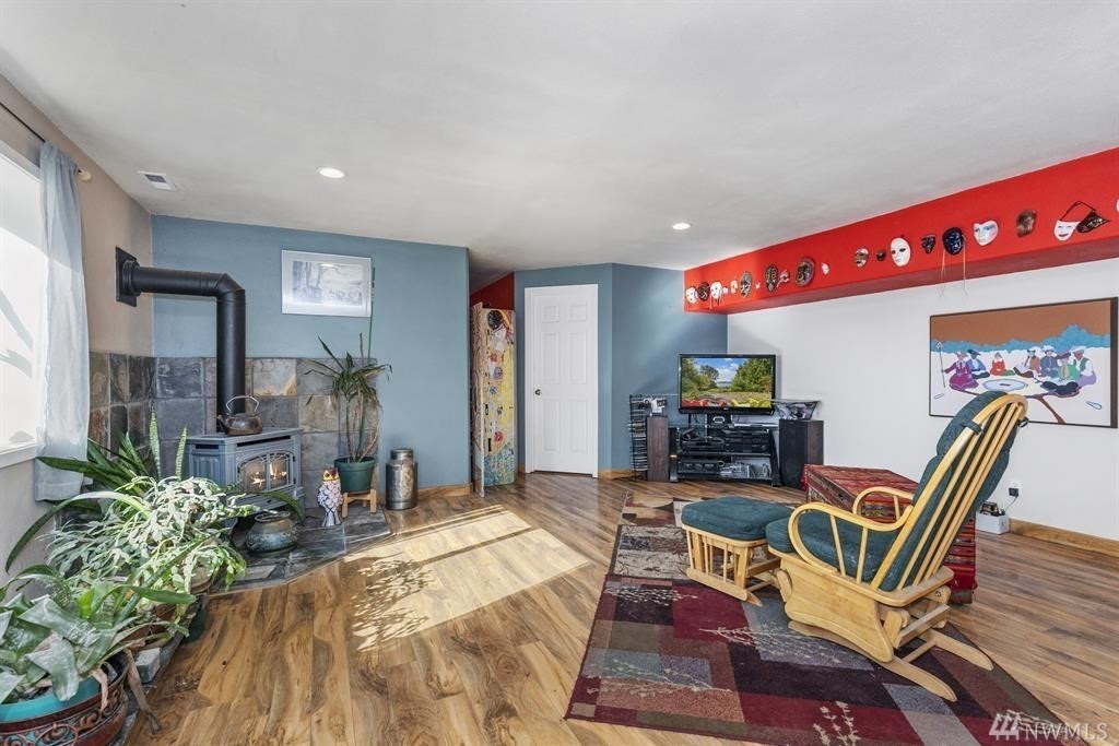
I’ve never lived in a house with a great room or family den before, so I was excited to create a cozy little haven for movie nights and family hangout time. Above is where things started.
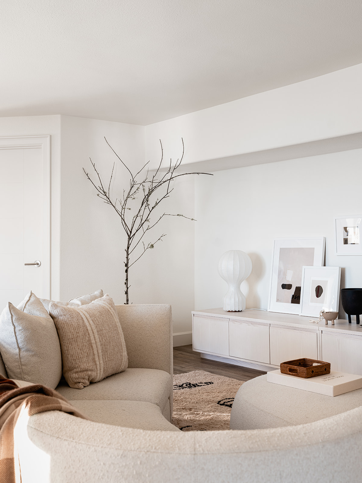
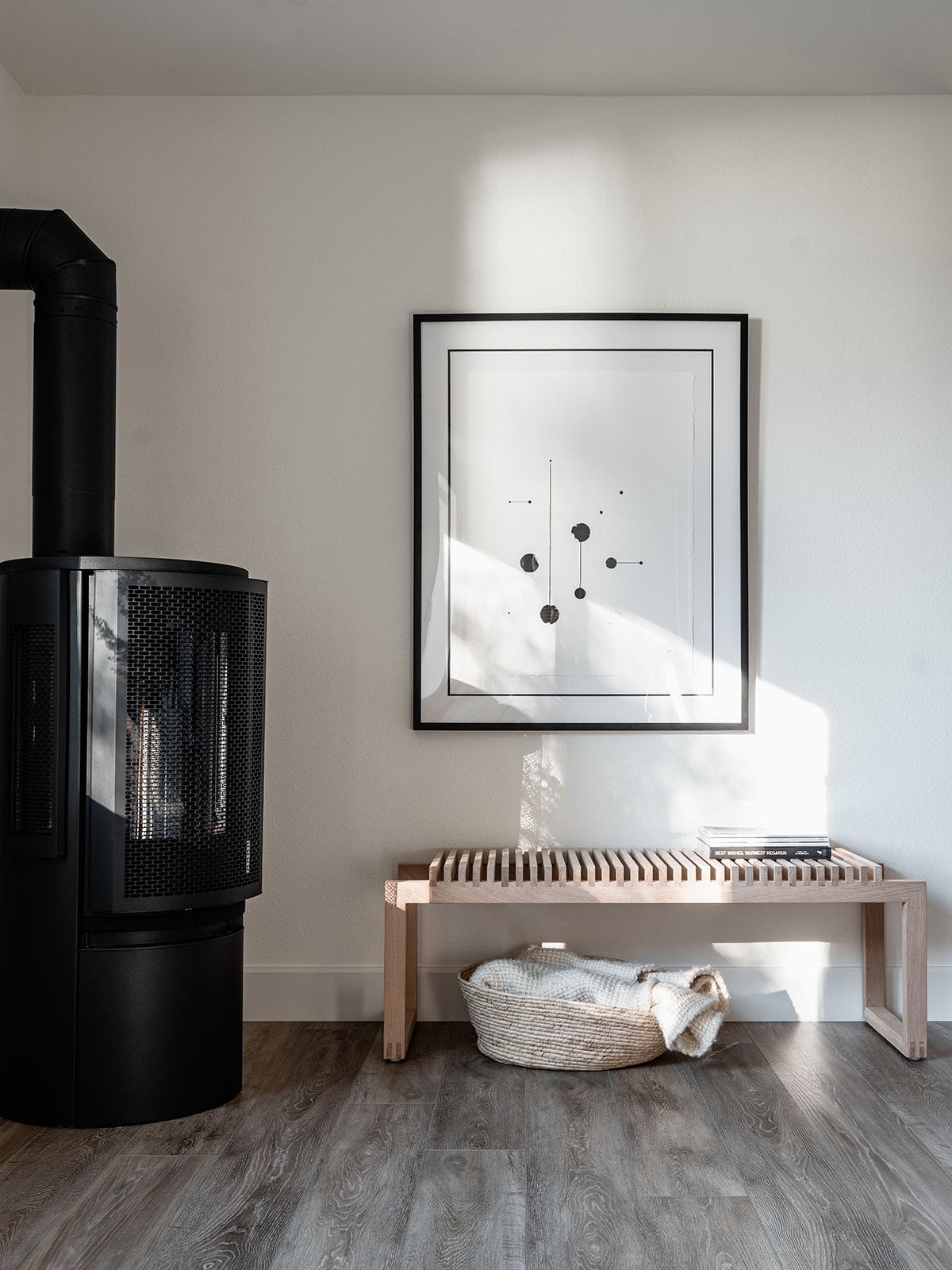
Thankfully, after a little spit and polish, I now have the sanctuary from the hectic world that I was looking for. To achieve this, I turned to more of my favorite sources, including Scandinavian designers like Skagerak and Nordic Knots rugs, but also one of my favorite American furniture makers, Room & Board. A curved sectional upholstered in a nubby cream boucle from Room & Board offers the ideal spot for snuggling up in front of the TV. My son also likes to bounce off the matching ottomans. The media console is actually a series of three Keaton media cabinets in ash that I installed edge to edge along the wall as a way to mirror the soffit above. It has the added bonus of offering ample storage for games, AV equipment and even our turntable and a little vinyl collection. The great room is warmed to an extra cozy degree by a gas stove in the corner that also features a Skagerak Cutter Bench and an original print by Skye Schuchman. I look forward to hanging out in this space after putting my son to bed every single evening.
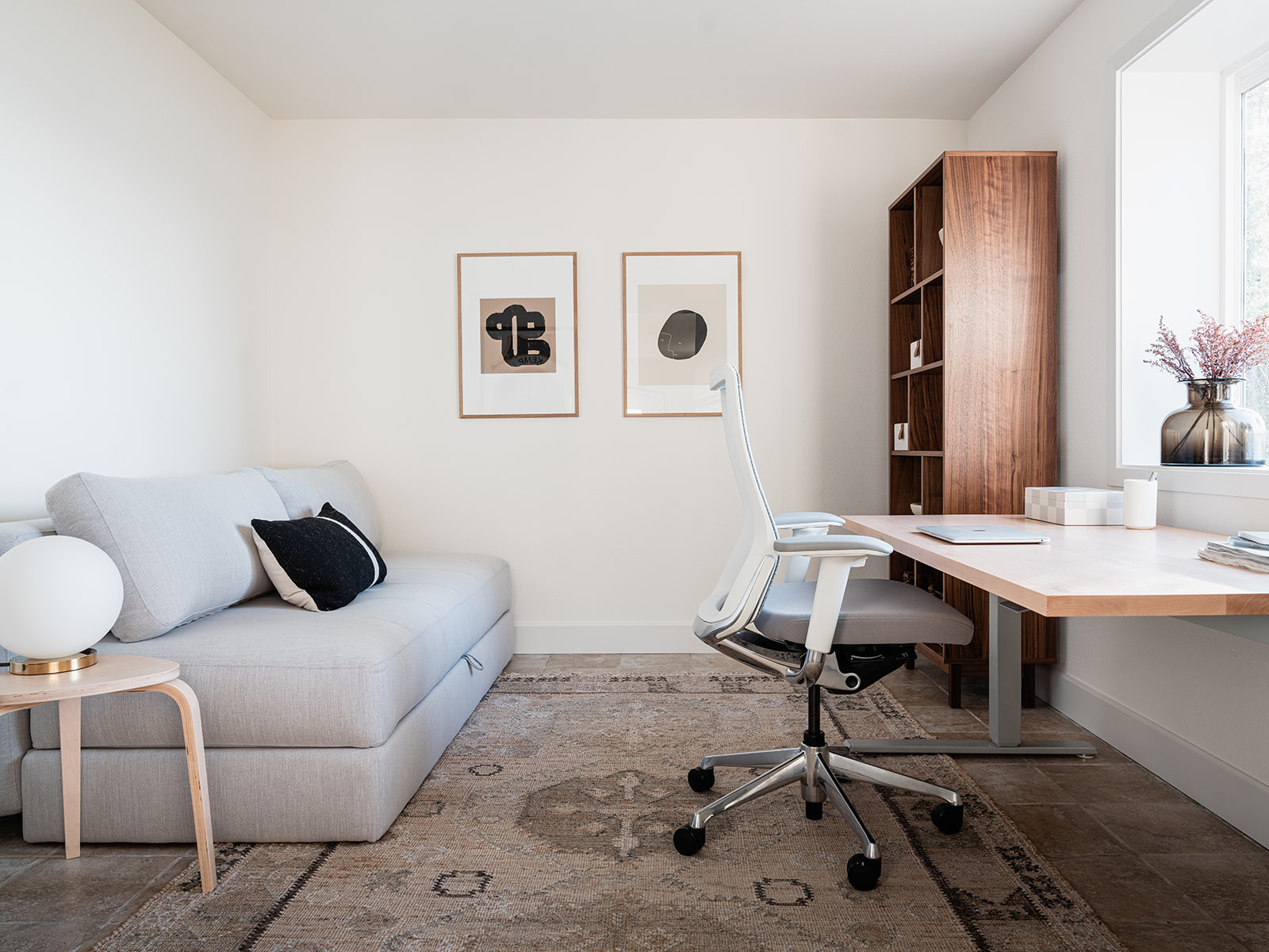
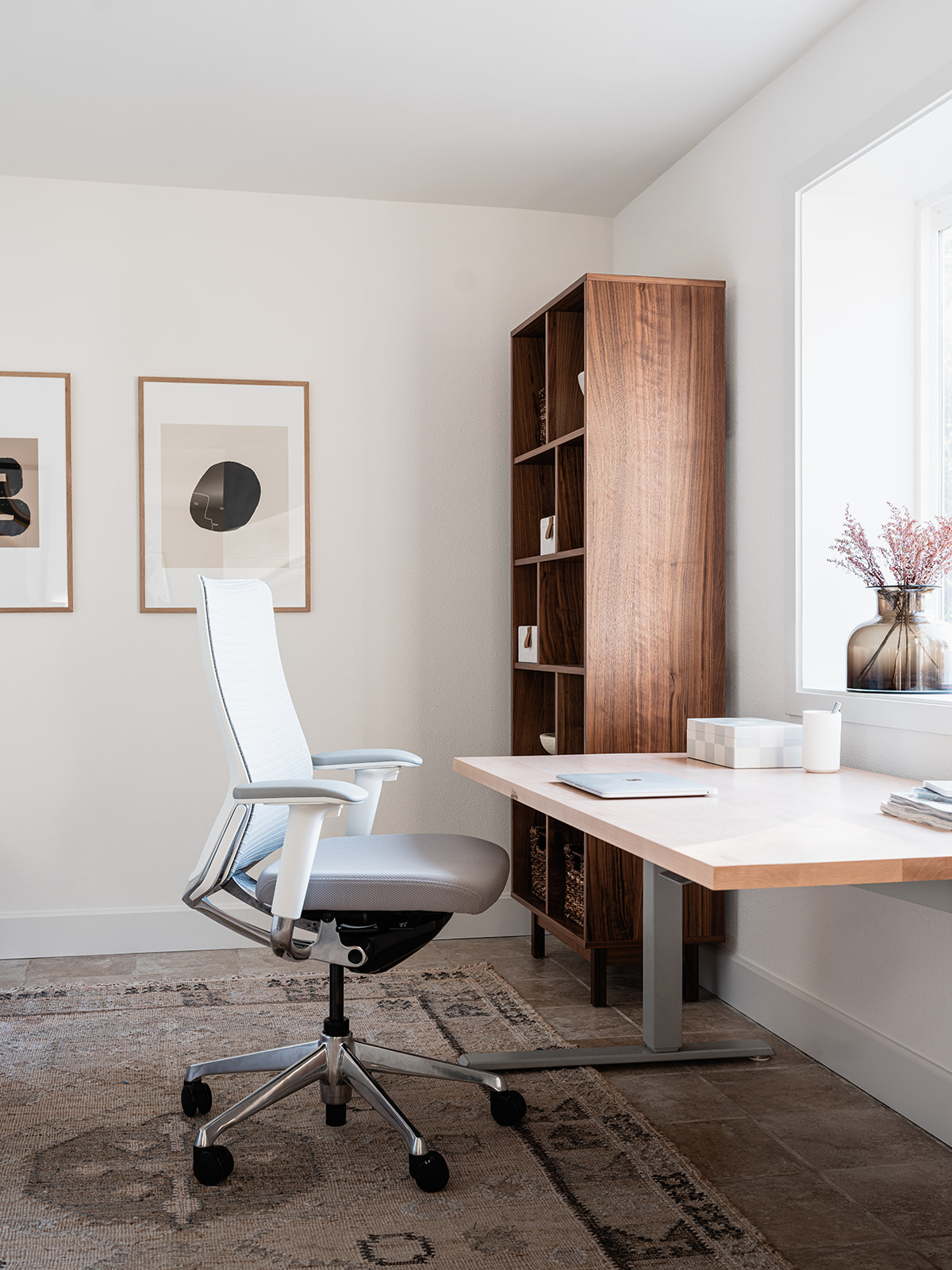
There are some dedicated spaces for kids and grownups alike in the basement. Since so many people can work from anywhere these days I turned a fourth bedroom into a dedicated home office with a pullout sofa to accommodate extra overnight guests. The desk faces the waterfront views though so I can’t promise you’ll be particularly productive.
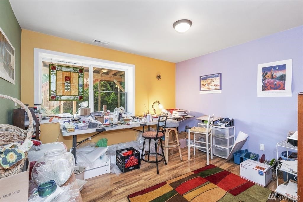
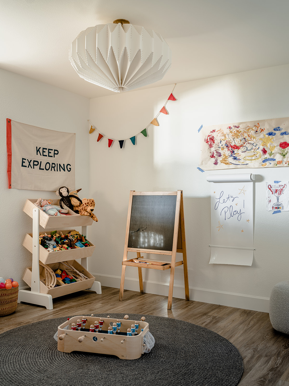
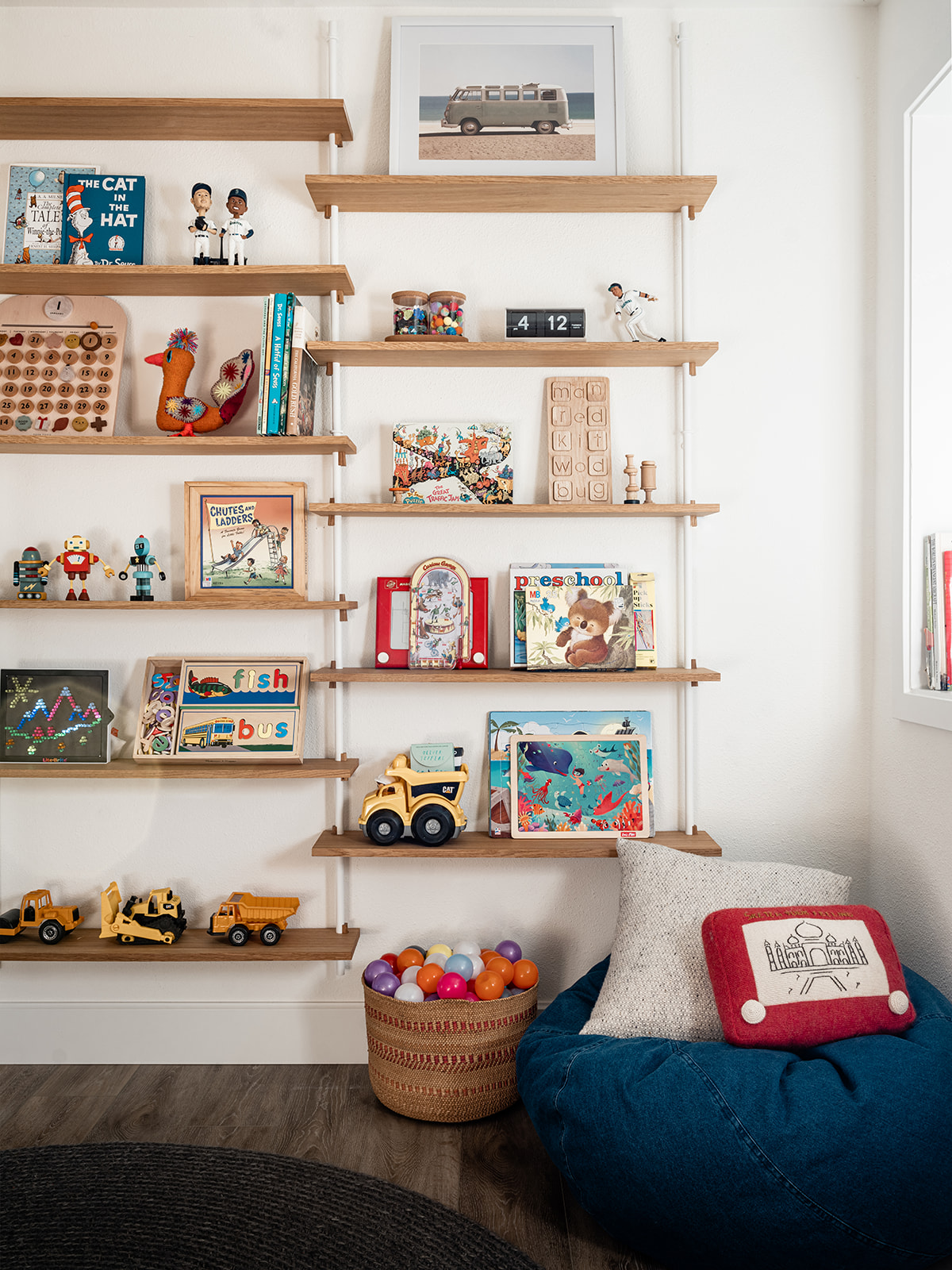
On the opposite side of the basement there was a strange doorless alcove of a room that I decided to turn into a dedicated play space. I immediately knew I wanted wall mounted shelves for storage in this room as it’s a well known fact kids only play with the things they can see. I had my heart set on a particular set of shelves from Ikea but in the midst of the pandemic supply chain issues, they went out of stock, never to return. Thankfully, I discovered yet another amazing Scandinavian design studio, Moebe CPH based in Copenhagen after they reached out to me on Instagram. Their Wall Shelving system was exactly what I’d been hunting for. I couldn’t be happier with how that wall turned out. Kids can grab puzzles, blocks and vintage games from the shelves. On the opposite side of the room I used the Oeuf NYC Toy Store to corral legos, marble run pieces, musical instruments and other fun odds and ends that kids of all ages and stages could easily dig through, while an easel and art station creates a dedicated zone for creativity. Another Armadillo braided rug adds the perfect soft spot to sit and play during a rainy afternoon.
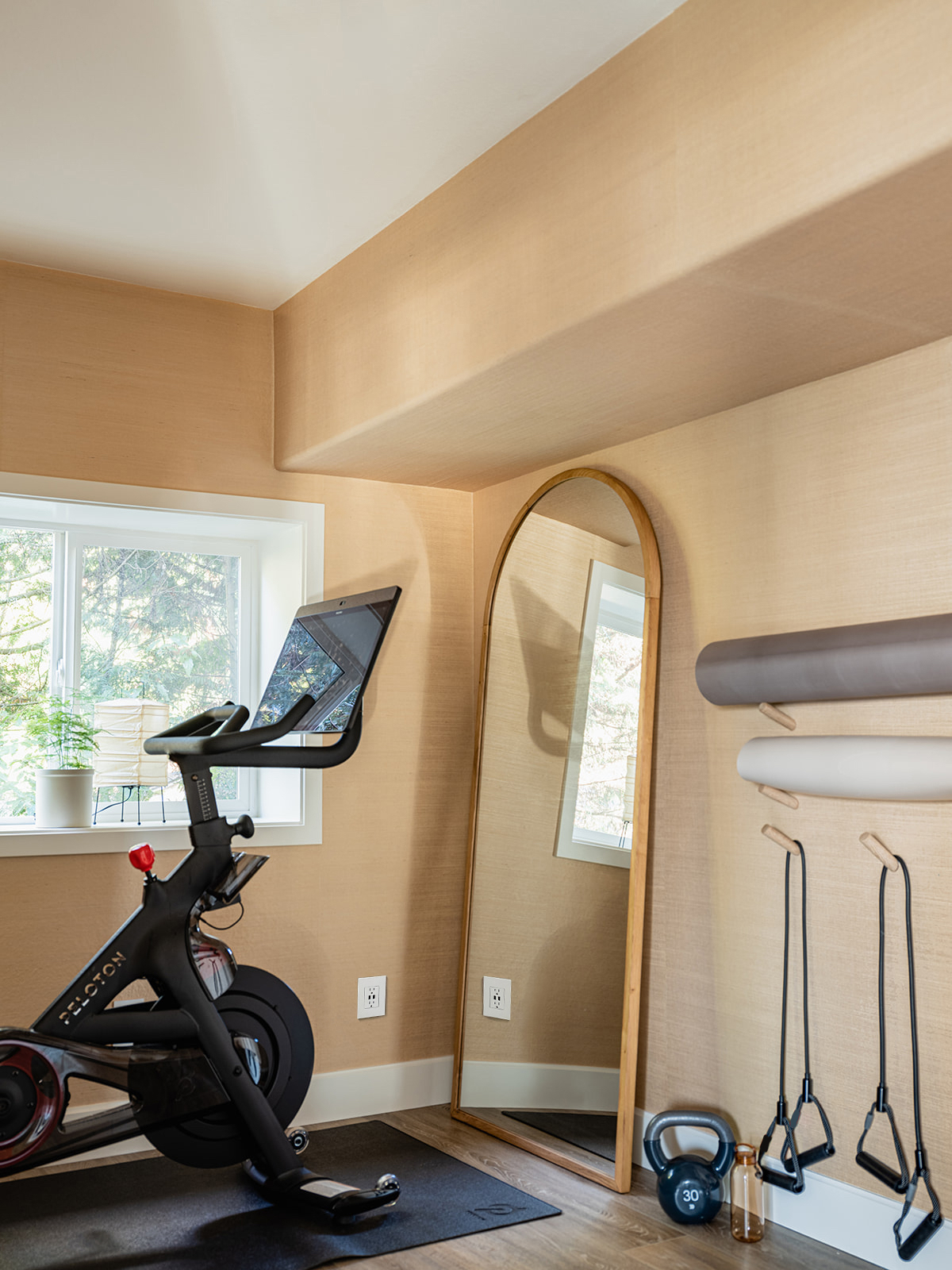
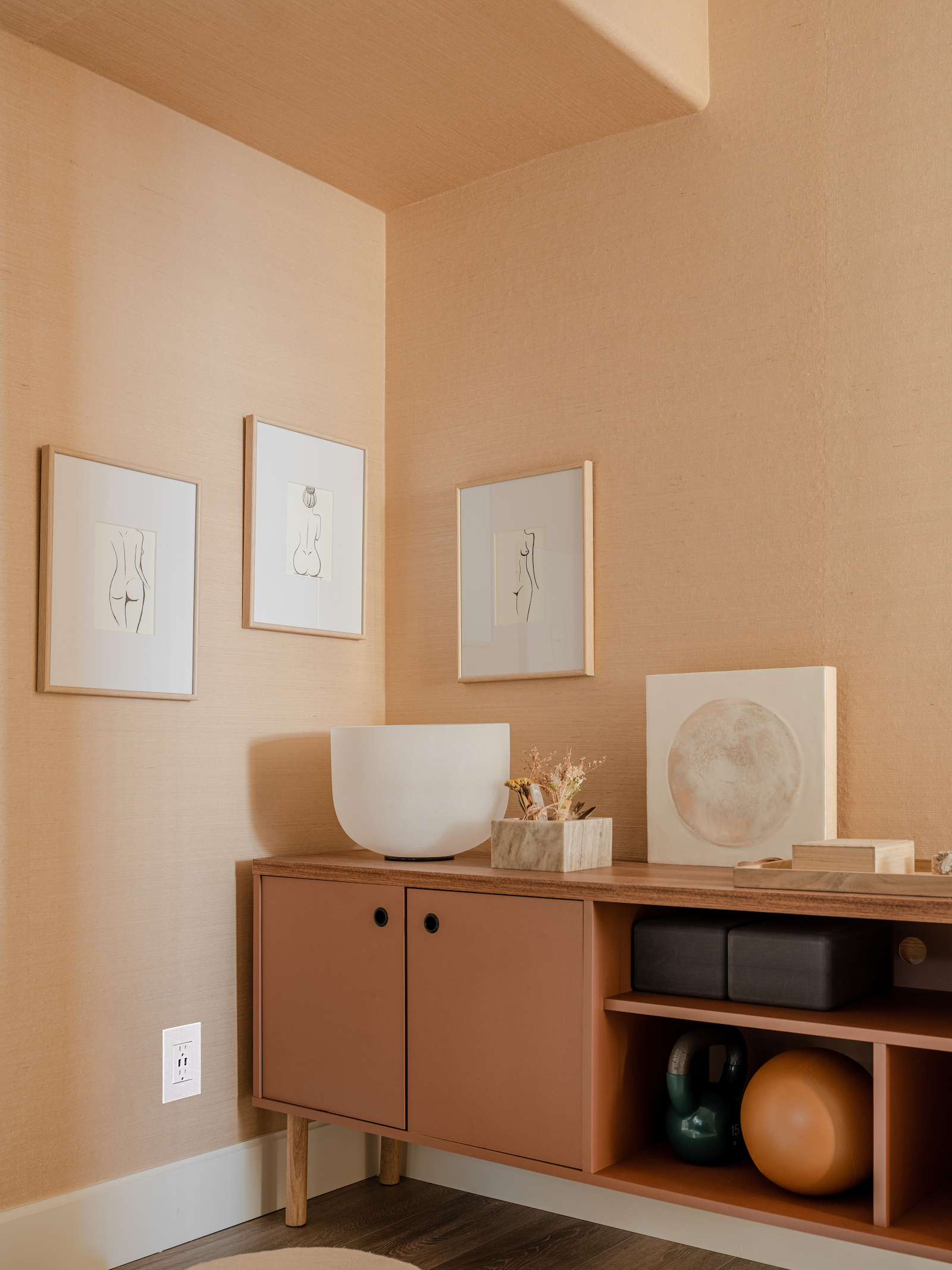
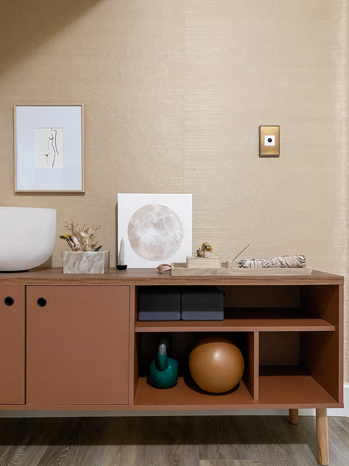
But don’t think I let the kids have all the fun! There was yet another, slightly odd, fairly tiny space in the basement that was crammed floor to ceiling with junk when we originally took possession. But as an avid yogi and a newly minted Peloton enthusiast, I immediately saw an opportunity to carve out a space dedicated to wellness. I worked with Legrand to add designer outlets and switches (which we also used throughout This Old Victorian) and York Wall Coverings to envelope the entire room in a gorgeous grasscloth. I set up my ode to all things “woo-woo” in one corner and also stocked up on some more traditional fitness equipment. I have to tell you, having a room within your own house where you can close a door and workout feels ah-mazing. A room of one’s own, right? After more than a year of doing Zoom yoga in the middle of the living room, I love having this special space.
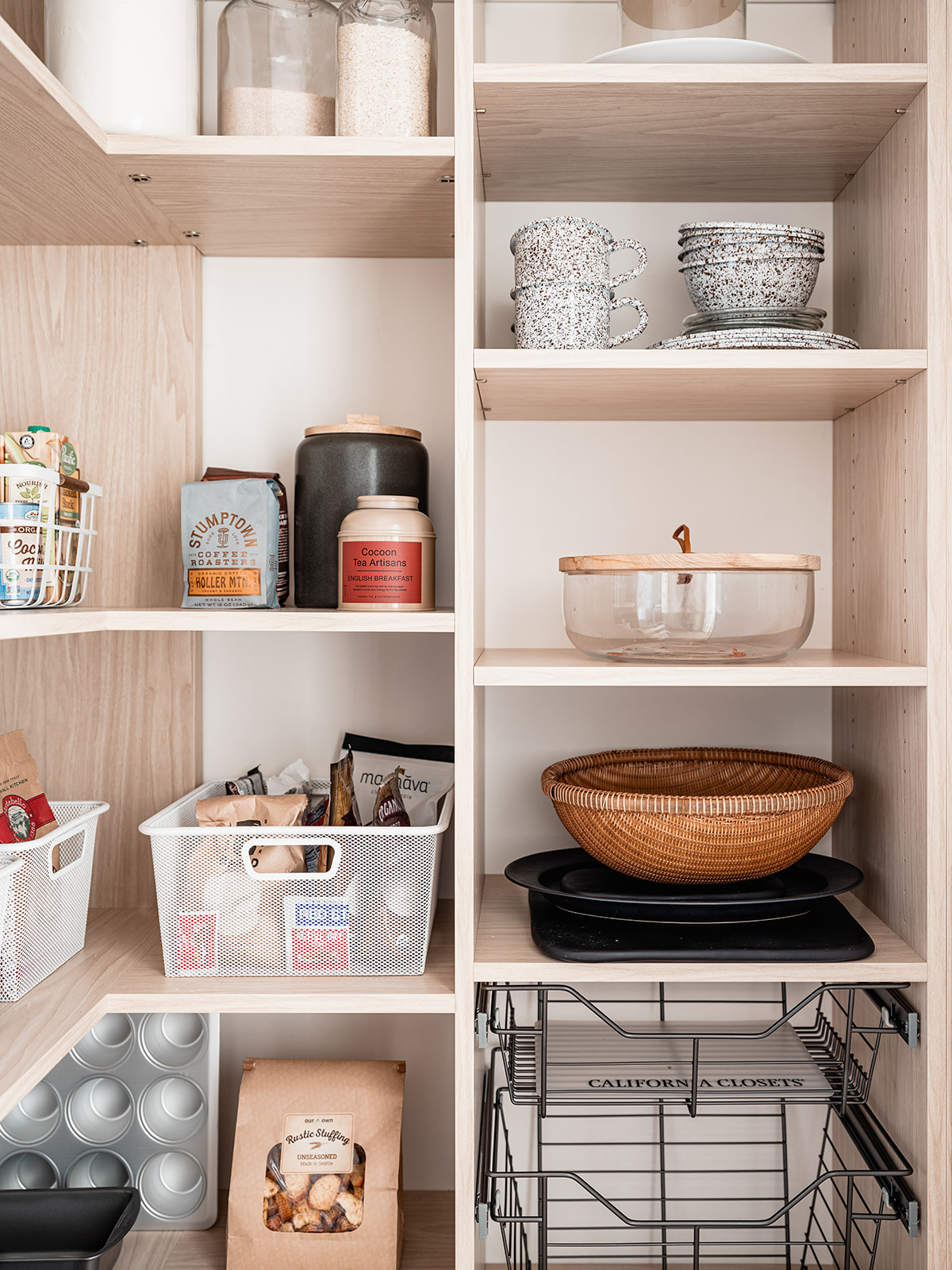
Finally, I also took over a very weirdly sized closet in the basement to create a larder with California Closets – a spot where we can store the holiday cooking tools, those extra bags of flour we all keep around these days.

Phew. Well there you have it. She might not technically be an actual cottage, but the Hood Canal Cottage is most certainly a special little escape. She sheltered us wonderfully during this incredibly hard time. And this past winter family and dear friends were able to finally gather around her dining table for holiday celebrations. I see so many more of those get-togethers in her future. And we’ve decided that the Hood Canal Cottage should be a guest rental – it needs to be shared with others who appreciate hidden gems.

I’m particularly excited to share the Hood Canal Cottage with other design-loving travelers later this summer. For now, be sure to follow @hoodcanalcottage on Instagram to be the first to learn when our booking waitlist will open. And do come follow along at @apartment_34 too! I will be sharing many more behind the scenes stories for this entire renovation process and I’m always happy to answer any questions you may have.  All the sources I could think of are listed below but be sure to ask me if you need more!


photography by Kara Mercer

styling by Cassandra LaValle

design by Apartment 34 Designs


SOURCES

LIVING ROOM

Rug Lulu & Georgia Similar

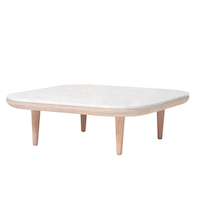
Coffee table Lulu & Georgia Similar

Couch 

Sideboard Lulu & Georgia 

Circle Chair

Side Chair Similar 

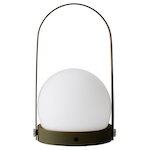
Floor lamp

Atollo lamp

Casa Patina painting

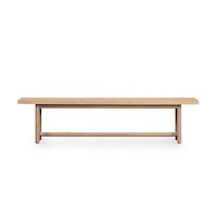
Bench


ENTRY

Wicker Bench 

Flush Mount Similar


KITCHEN

Cabinets

Countertops

Tray

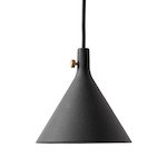
Pendant light

Art print

Floating shelf

Peg Rail


DINING AREA

Similar Dining Table

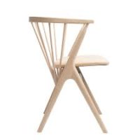
White Chairs

Brown chairs

Sconce 

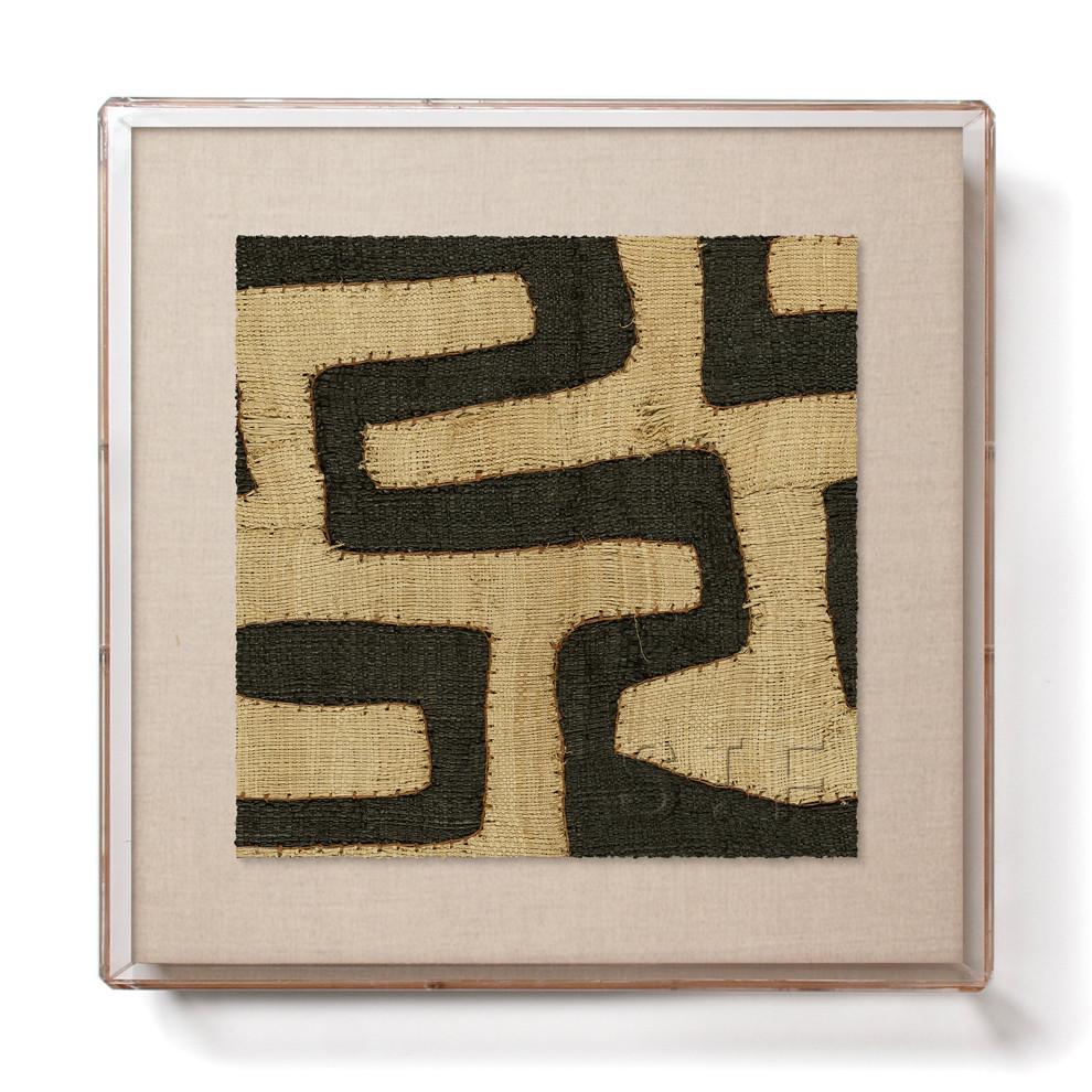
Art

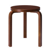
Stool

Casa Patina Vase


PRIMARY BEDROOM

Bed

Rug

Side table 1

Side table 2

Side table 3

Sconces

Pendant light


GUEST BEDROOM

Bed

Credenza custom

Rug

Bedside light

Roly Poly chair

Cashmere throw

White vase

Art 


HALL BATH

Vigo Shower Glass

Tile

Globe lights

Mirror

Art


KIDS’ ROOM

Book shelf

Wallpaper

Pendant light 

Rug


FAMILY ROOM

Sectional

Ottomans

Media storage

Bench

Chair

Mirror

Art

Rug

Lamp


PLAYROOM

Shelving

Toy storage

Garland

Rug

Pendant 


ZEN DEN

Wallpaper

Outlets and Switches 

Wall hooks


OFFICE 
Desk

Bookcase

Office Chair 

Rug

Art

Hi Friends. Well look at that – we’re halfway through April. Turns out, I’m not so great at designing an entire house from top to bottom (and doing it all from 1200 miles away) and blogging about it simultaneously, especially when you toss in pandemic parenting, the continuation of endless cooking and cleaning and attempting to take care of myself on occasion. There just aren’t enough hours in the day and I cannot burn the midnight oil the way I once did (thanks 40’s). As a result, this little ole blog is just getting neglected. For that, I ask your forgiveness.

To make it up to you, I’m bringing you an insane amount of design inspiration over the coming days with a series of home tours and interviews that have been informing my design choices at the Hood Canal Cottage (and admittedly making me want to switch a bunch up at This Old Victorian as well).

For those dying for Hood Canal Cottage updates, I am sharing a bunch of major sneak peeks on Instagram this week. Even though I have a love/hate/love relationship with Instagram these days, for some reason, it just feels easier to give quick updates there – so if you don’t already follow, please do pop over to Instagram if you want to see the Hood Canal Cottage mid-construction.

Now, let’s dive into a truly stunning home tour as a little palette cleanser for your week.

This home is designed by Pernille Lind, one of my favorite design studios. Based in London, Pernille expertly combines modern and traditional styles to create warm, inviting spaces that just draw you in. This project is a perfect example. At first glance, you might make you think this is a stately home somewhere in the UK, but it’s actually a Colonial Revival home in Chicago. The beautiful mix of design styles and materials immediately caught my eye. It shows how you don’t have to stick to a “modern” or bohemian or antique look, no matter the architectural style of your space.

Keep scrolling for a closer look and for my interview with Pernille about her process!

What was the project scope and how long did it take?

I flew over to see the house just when the client had gotten the keys in May 2018. We then found a local architect to help with the planning permissions and a contractor for the renovations. The construction crew started on site in October 2018. I regularly went over to attend meetings to appoint local cabinet makers for our bespoke kitchen and joinery, as well as oversee some of the build process and key material selections with the client. The client could then move in August 2019, where I flew over to install all of the main furniture, as well as sourcing smaller items, such as unique vintage pieces and art. These we spent a while finding in local shops and markets. We added in an additional trip beginning of 2020, as some items still needed sourcing and we could then photograph the project.

What sources do you use for inspiration?

For every project, I always look at the architecture of the building and interior spaces, its character, light, and period features. This informs the direction of the interior experience and the key notes to play on. Generally, I’ll look for inspiration through a variety of artistic mediums, however, materiality and color seem to be the first steps I take when getting to grips with the concept of a new project.

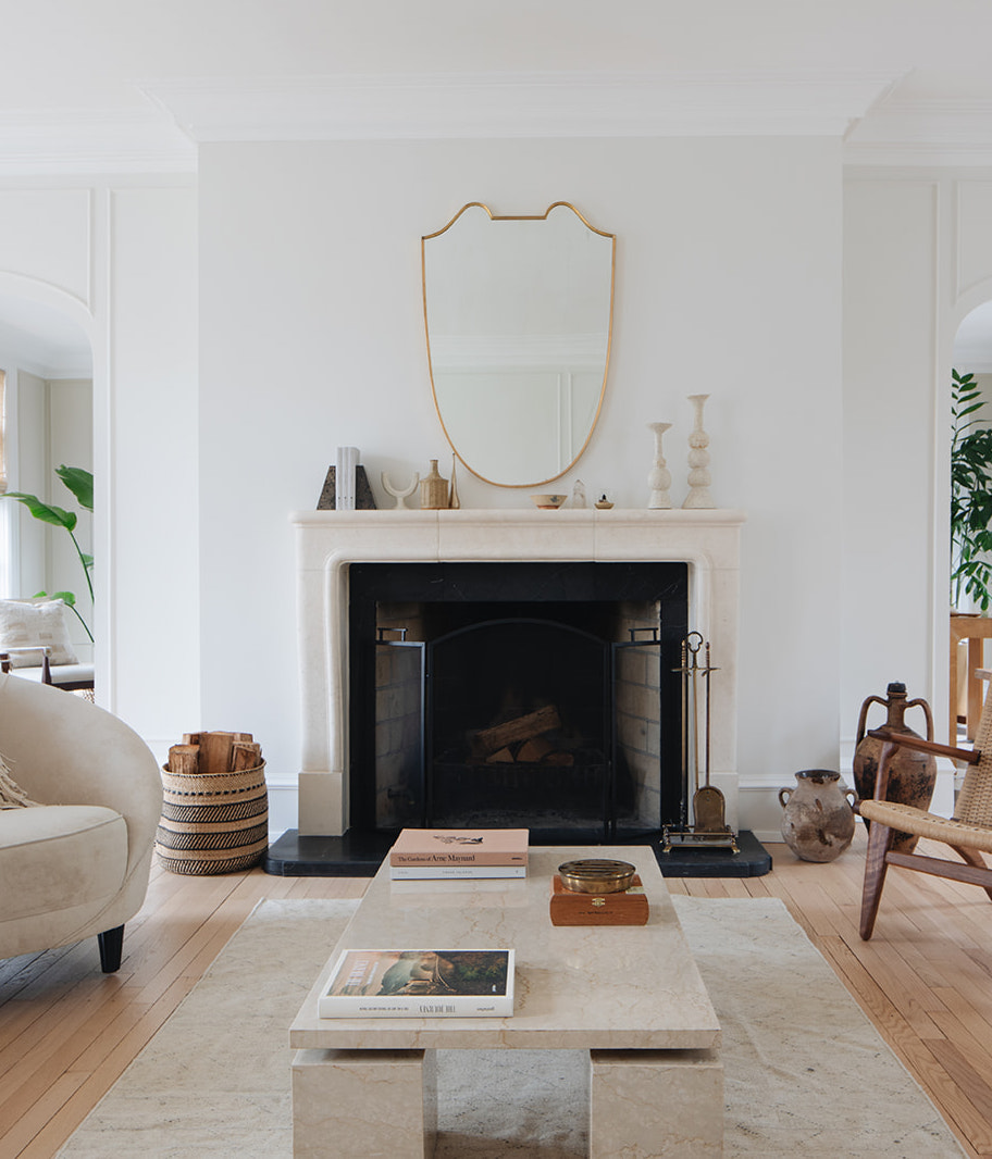
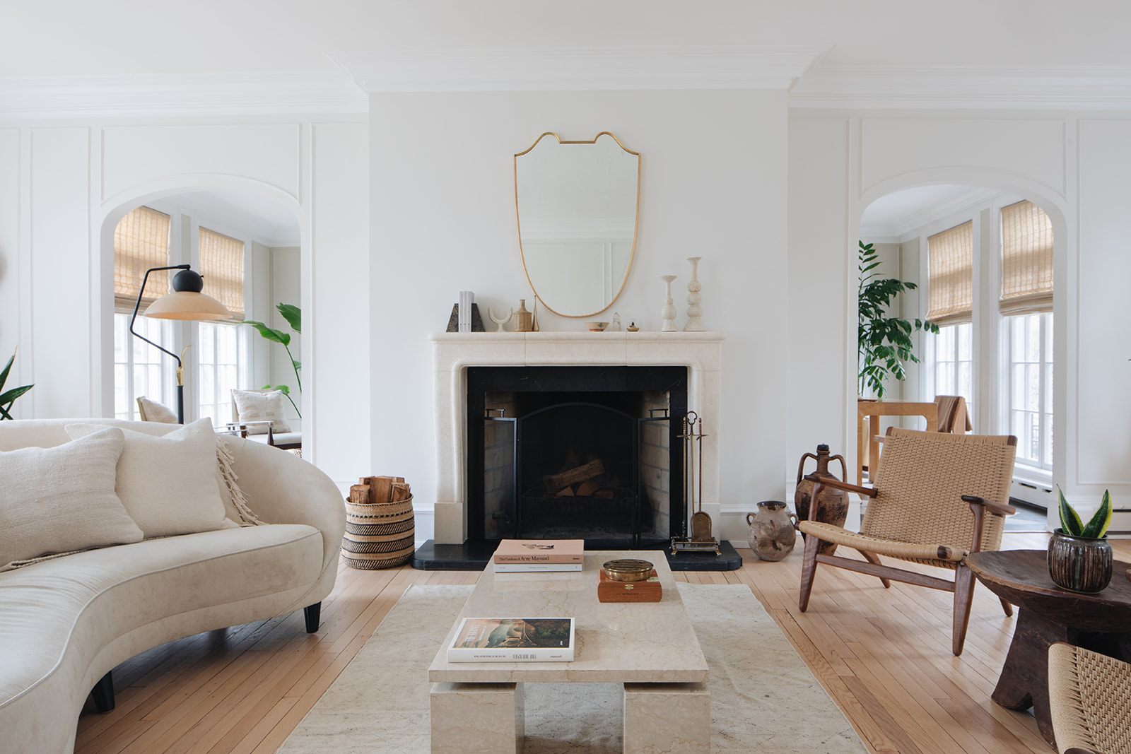
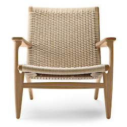
In the living room, we have a curved sofa from Eichholtz and two Carl Hansen CH25 armchairs in oiled walnut and natural cord. We found a striking vintage Italian travertine marble table from local antique shop South Loop Loft along with the brass Italian mirror over the fireplace. The black metal and fiberglass floor lamp is also from a local vintage store ‘Salvage One’. This piece really steals the show in the room, and unfortunately, the seller didn’t have much information about the origins of the light, I would expect it’s 1950’s.

The living room is the home’s gem. Late in the afternoon, the sun light reflects the long shadows of the palladium windows across the floor. It’s very dramatic and creates this additional visual layer to the room.

In the sunroom office, we sourced a desk chair from Jayson Home in oak and cane, paired with a vintage Scene Two olive burl-wood Parsons-style desk from Henredon. The wall colour is Farrow & Ball 201 ‘Shaded White.’

How did you work with the client on creating the vision?

The client’s brief was to create calm and natural surroundings, as well as incorporate an essence of their many years of living in Europe and world travels. Moreover, they were looking for a considered approach to creating a functional home for a modern family with a love of entertaining and having friends and family over.

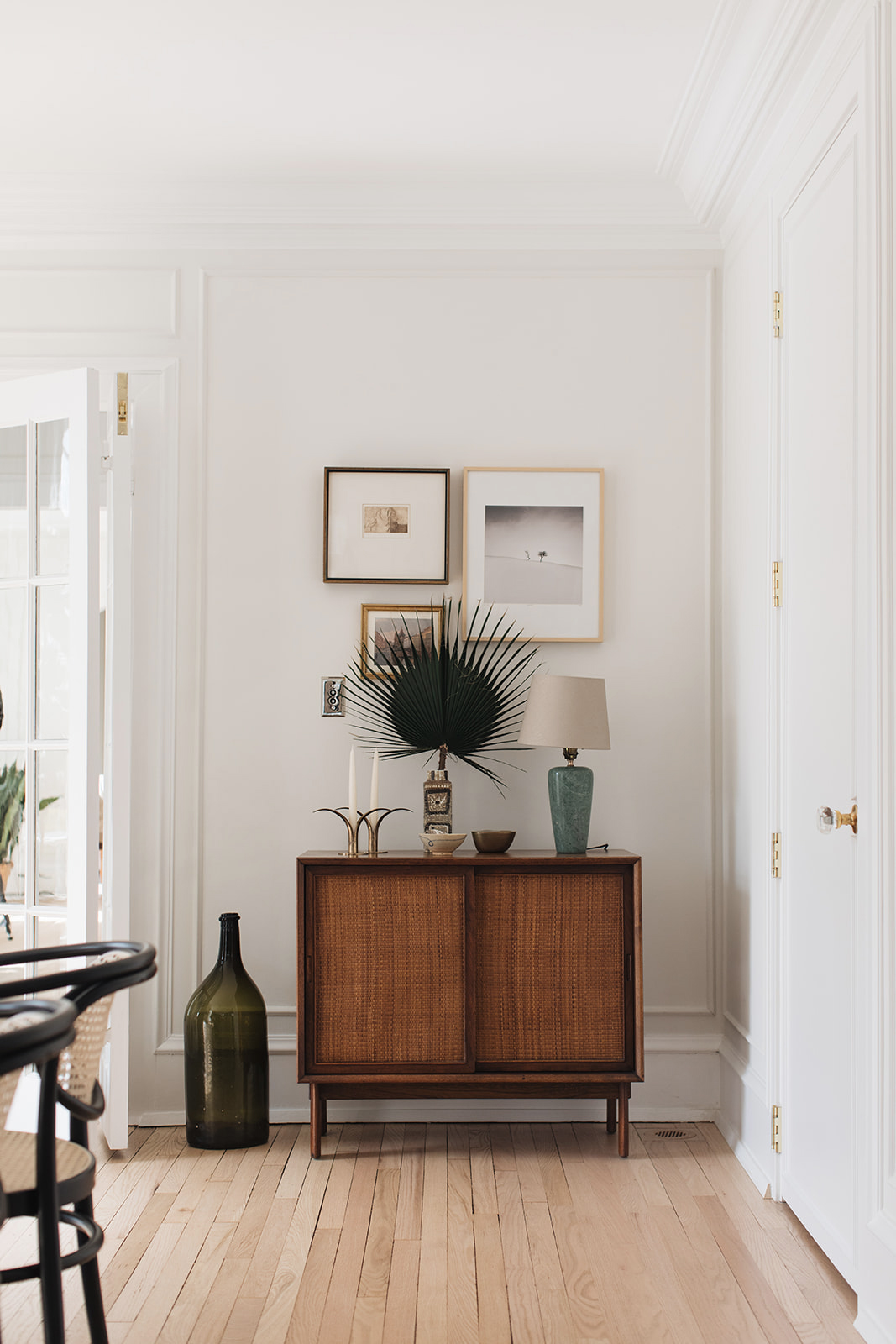
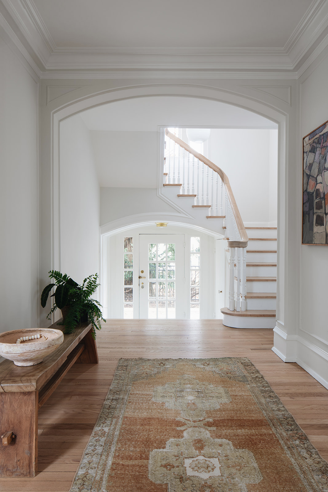
The house has abundant daylight and great period features, such as the arched palladium windows, frame molding and European style cornicing. I, therefore, kept the color palette muted and soft, in order to let the architectural features be the main heroes of the spaces, and key to the clients brief – achieve a calm atmosphere only punctuated by a few contrasting furniture pieces, such as the black stained dining table and dark wood vintage pieces.

To achieve a more modern living style, I opened up the kitchen and dining spaces on the ground floor, and further created a luxurious master bedroom en-suite, by converting a walk-in wardrobe with an existing bathroom. I then located the dressing room within an adjacent bedroom and added a connecting door to the master bedroom.

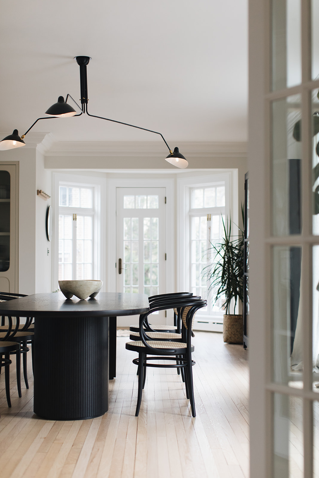
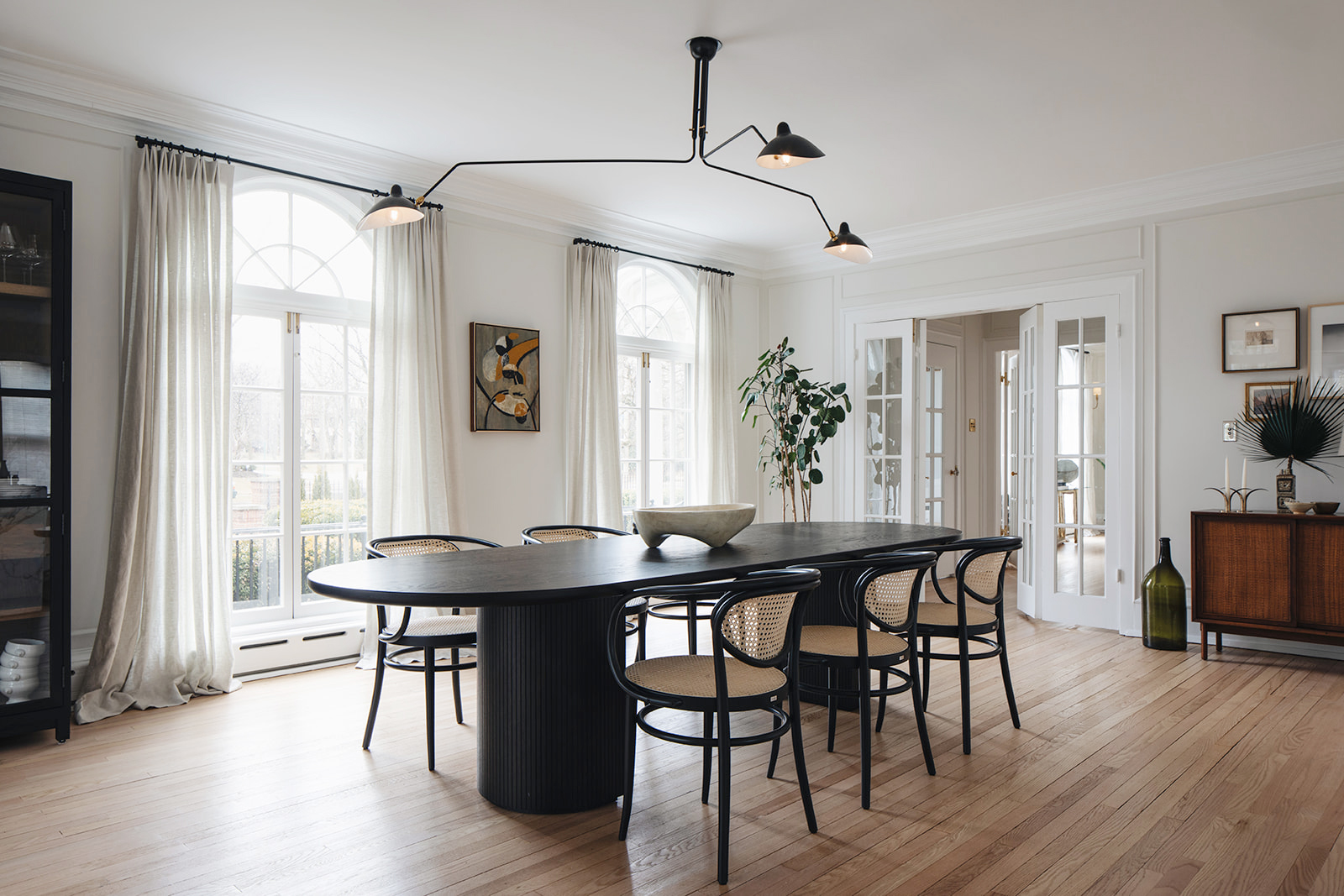
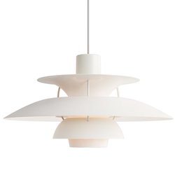
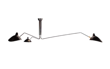
In the kitchen and dining area, the dining table is from Gubi called ‘Moon’ table with wicker and black painted bentwood dining chairs from Thonet. The pendant is a new production 3-arm Serge Mouille light. Over in the kitchen island, we chose PH 3/2 Pendant lamps by Louis Poulsen over the island and Bestlite BL7 wall lights by Gubi over the kitchen counter.

Renovating old homes always comes with surprises. Where there any in this project? 

The house has only had 4 owners in its lifetime. The current owners are the 5th. In the process of the renovation, they came across many interesting relics. As they were replacing some damaged floorboards in the attic level, they uncovered a metal plate (secured with brass tacks) that was patching a hole. Upon closer look, the plate was an old cracker tin that had been cut and flattened out – it read “National Biscuit Company.” The company is today known as Nabisco, and they think the tin dates back to sometime before 1928.

They also uncovered interesting historical features in the home such as a basement coal chute and coal room with a slanted floor, a root cellar that stays cool all year round (it was converted to a wine storage space), and a separate maids’ stairwell and maids’ quarters.

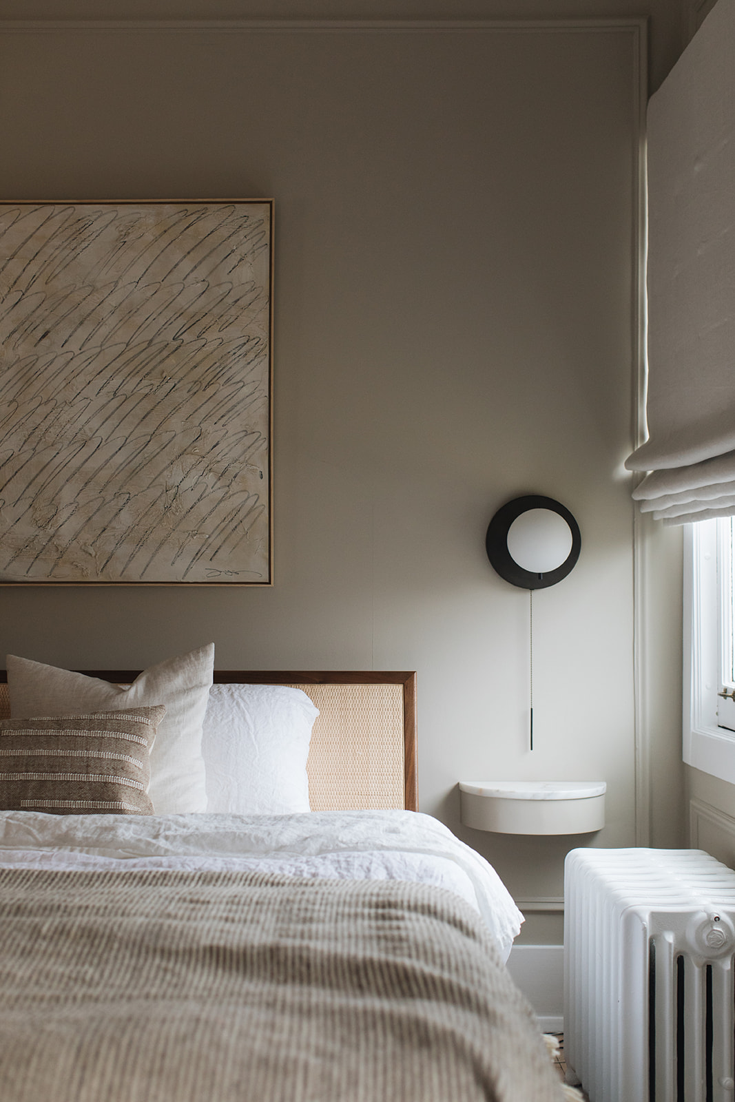
In the master bedroom, the bed is the Nelson Thin Edge Bed by Herman Miller with a vintage four-tiered, gold-plated Kinkeldey chandelier from the 1960s. The artwork above the bed is by Josh Yöung. The bedside wall lights are Signal Sconce in bronze, by Workstead. The wall color is Farrow & Ball 211 ‘Stony Ground.’

To see more home tours, CLICK HERE.


design by pernille lind studio, photography by john and maura stoffer

I’ve been an uber-fan of Dutch designer Faye Toogood for such a long time. Interiors, furniture, fashion – there’s nothing she touches that doesn’t turn to beautiful. Her Roly Poly chair is on the tippy top of my wishlist for the Hood Canal Cottage.

As I was internet rabbit holing looking for inspiration for the cottage over the weekend, I stumbled across this apartment on the real estate site The Modern House and was immediately stopped in my tracks. And of course it was designed by Toogood (interesting side note, the co-founder of The Modern House is Toogood’s husband!).

This apartment resides in Winchester, a hamlet toward the UK’s coast. The apartment resides on the ground floor of a historic Victorian building in the heart of this lovely town. The entire apartment is a major mood.

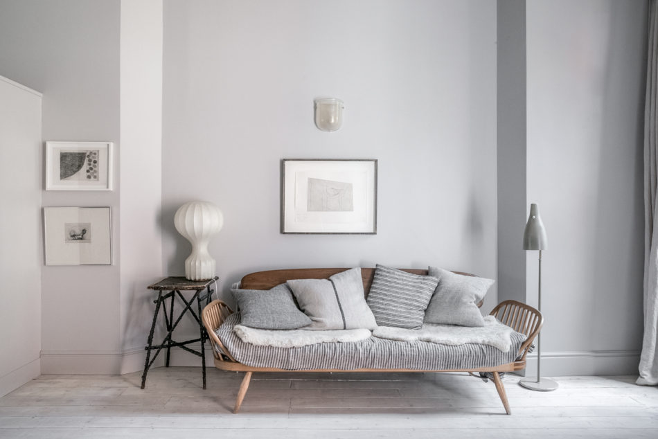
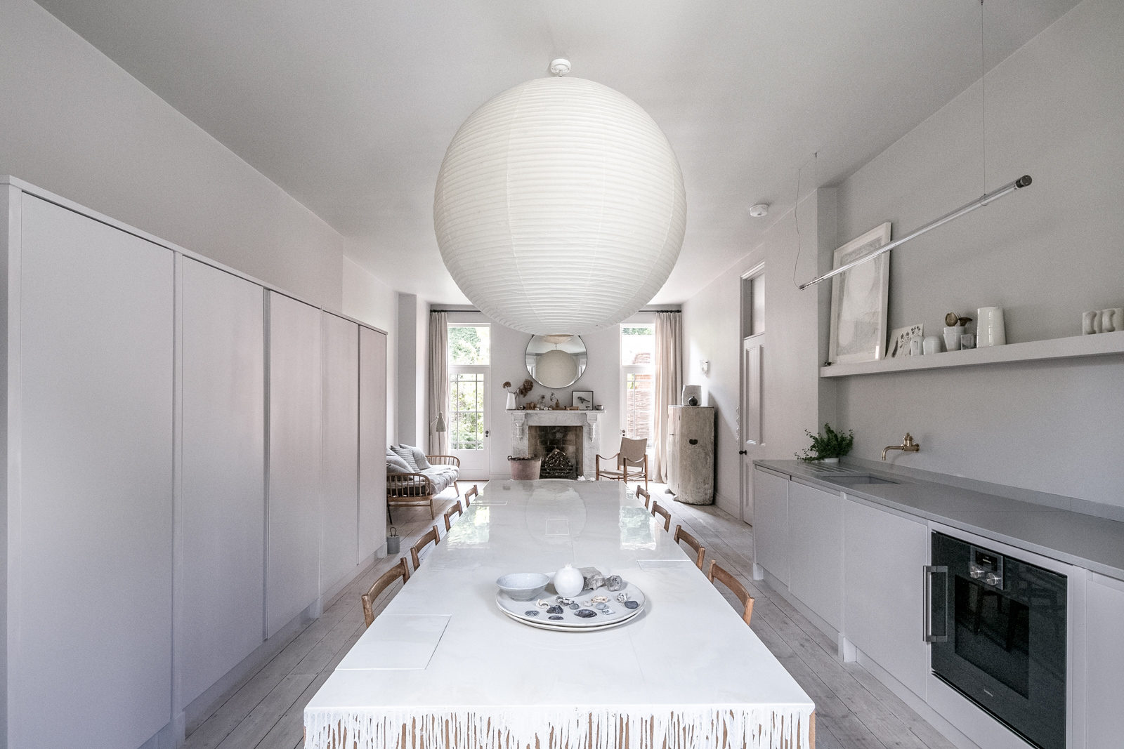
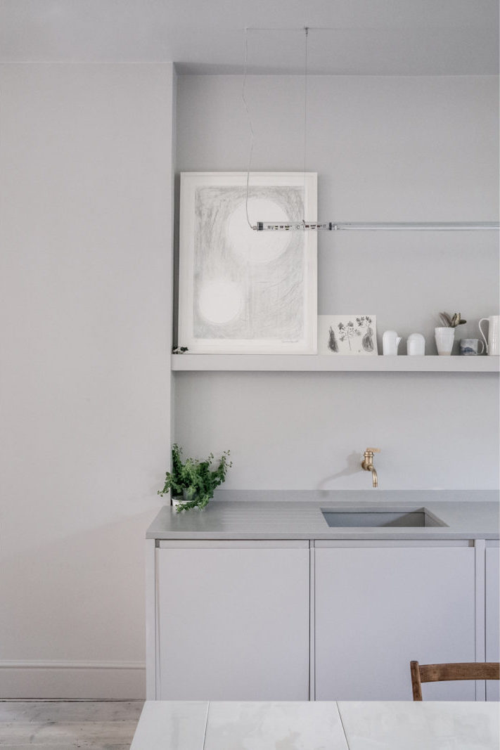
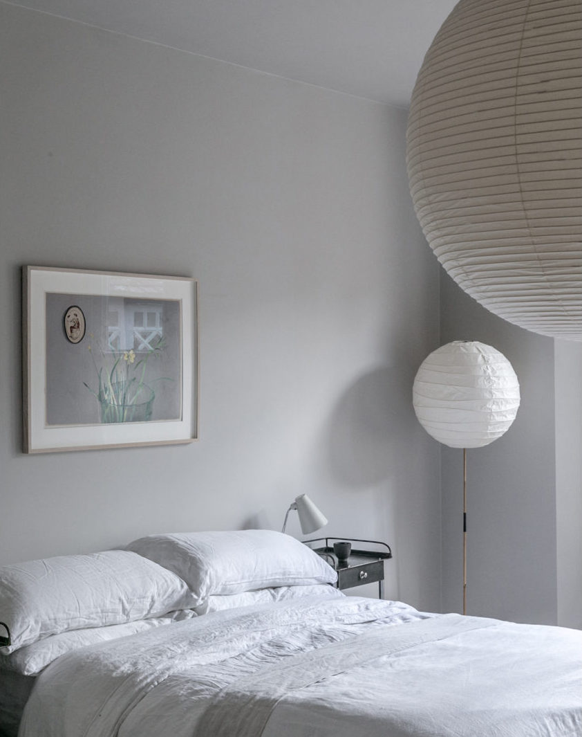
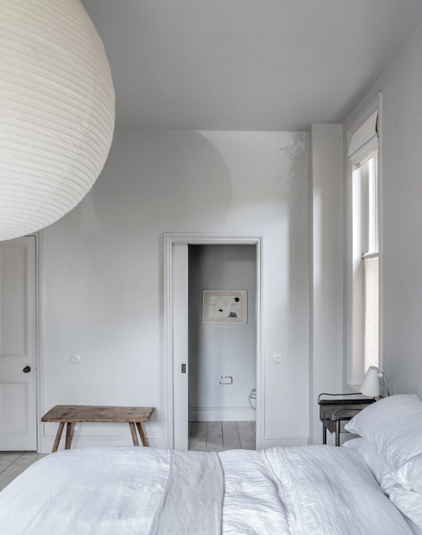
The project is such a great example of using consistency in your design to create an incredibly distinct point of view. I was immediately taken by the super consistent monochromatic color palette of cool whites and light grays used throughout the apartment. That sea of greige is punctuated by wood, little hits of black and touches of patinaed brass for punches of contrast.

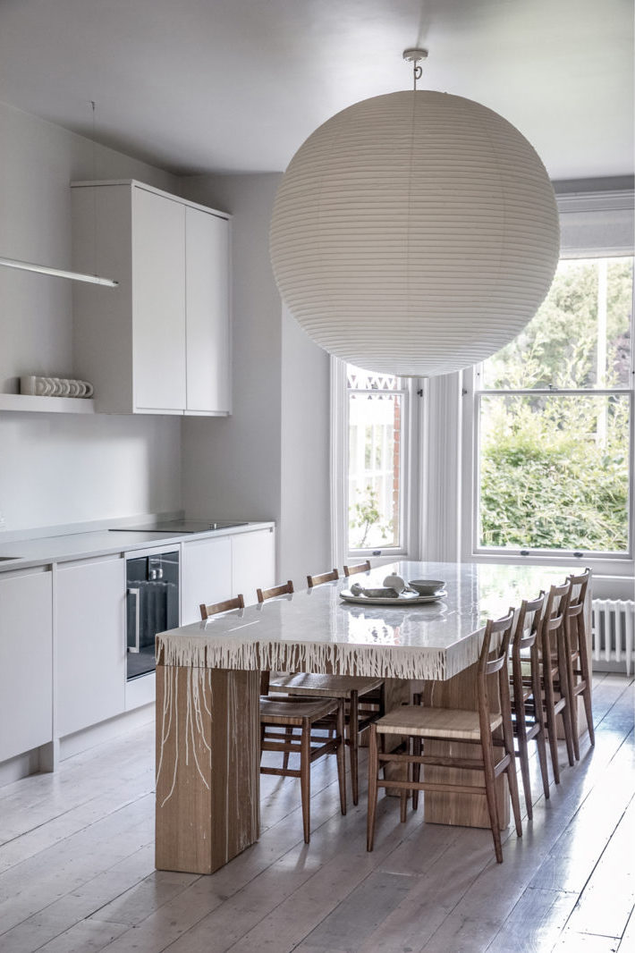
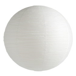
A couple of things I really like about this kitchen – the single open self (I was just having a debate on Instagram this week about the status of the open shelving trend), the simple flat front cabinets (yay for no hardware-I did that in our kitchen too!) and the jumbo paper lantern pendant. I’m putting one in at Hood Canal and cannot wait to see it.

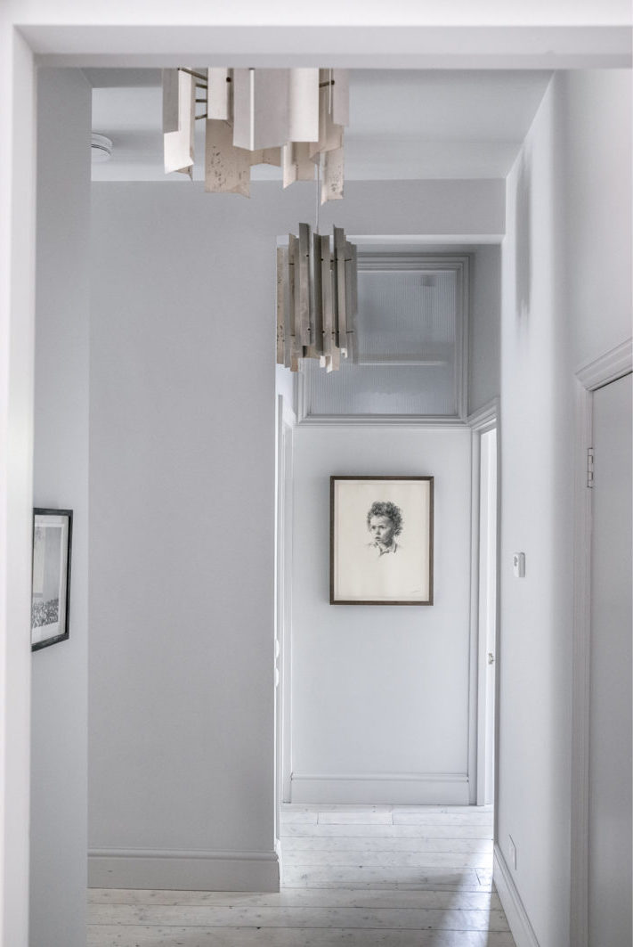
Vintage art is always a wonderful way to punctuate an otherwise plain hallway. So are those incredible light fixtures.

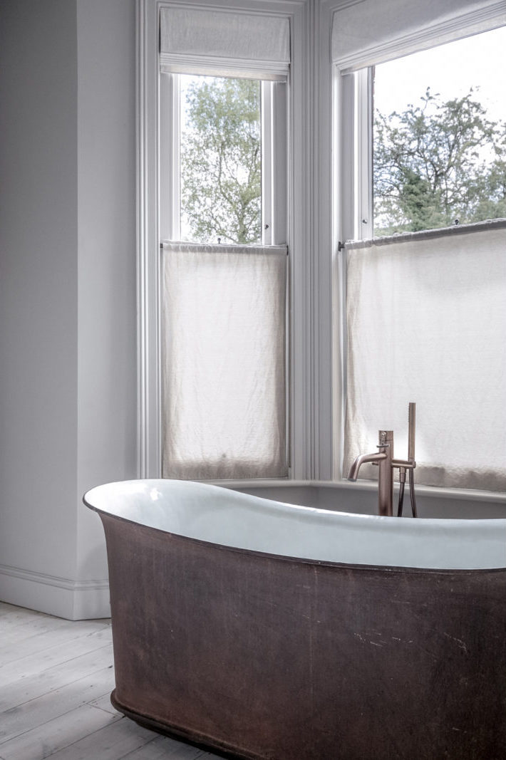
This cast-iron tub in the primary bedroom is truly spectacular. I love a tub in a bedroom.

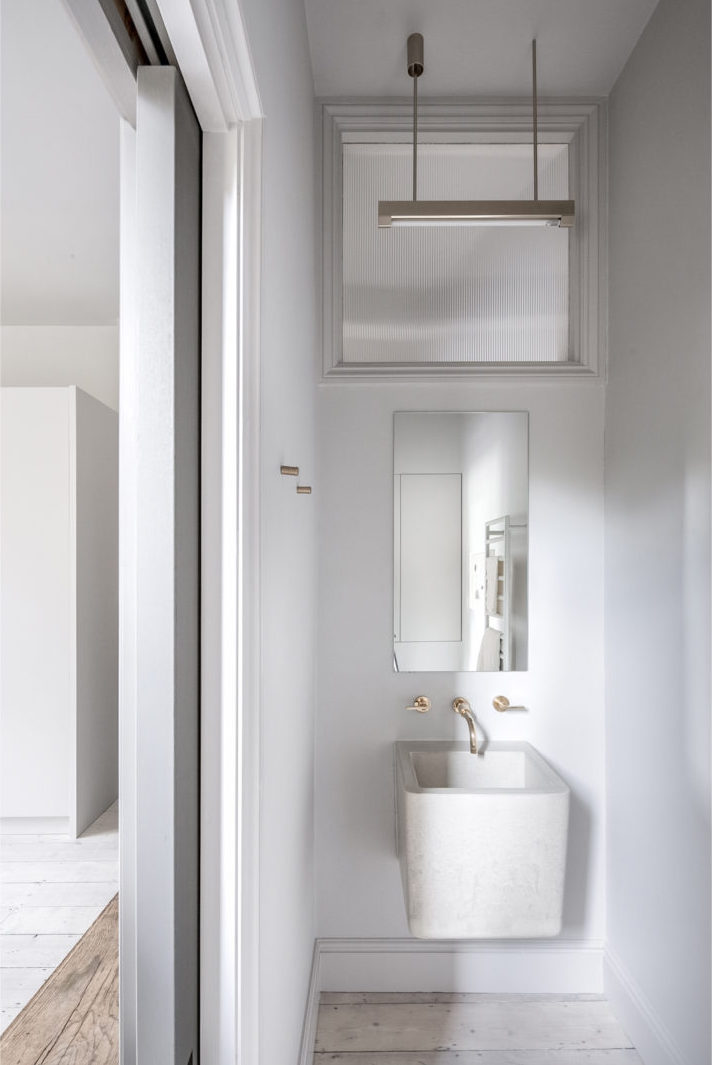
That cast-concrete sink in the primary bedroom’s attached WC is just gorgeous and of course keeps within the approved color palette.

Designing a room – not to mention an entire home – can feel like a desperately overwhelming task as there are literally an infinite number of choices that can be made. But, if you give yourself parameters within which you must work, like a tightly honed color palette, so many decisions – from picking paint colors, to your family of light fixtures, to the final bedding selections -suddenly become that much easier.

As I work to determine the final finishes for Hood Canal, I’m going to come back to this project as a constant reminder to rein it in. When it comes to design, setting limitations is actually incredibly freeing.


images via the modern house

As we dive head first into March (or is that tentatively tiptoe past the PTSD – it can go either way). I, for one, am dreaming of the long-awaited day when I can actually escape my house for a long stretch. Sadly, the #HoodCanalCottage is far behind schedule (and not just because it took me a month to find the perfect bathroom faucet. We also had to replace the roof!). For now, I just have to bide my time daydreaming about bucolic rural destinations. Thankfully, this stunning cottage in upstate New York, restored and redesigned by General Assembly, is helping me do just that.

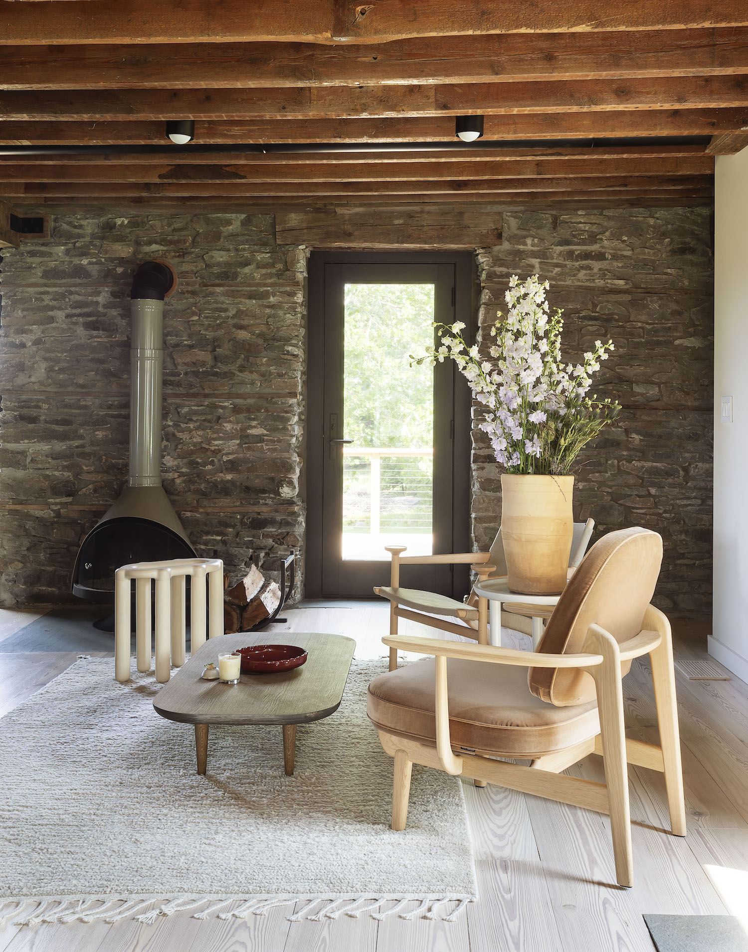
As a tried and true modern lover and (aspiring) minimalist, I never thought I would be attracted to the cottage chic trend, but I think after nearly a year of Covid lockdown the idea of escapism has really taken hold. It helps that General Assembly dusted this 240+ year-old stone cottage with just the right amount of modern touches and the perfect level of restraint – transforming it into a stunning contemporary retreat that balances both modern and traditional styles quite nicely. You feel like you might be staying in what was once grannie’s cottage, but she doesn’t live here anymore!

Located on 4.5 acres on the New York/Pennsylvania state line, the Callicoon property is the charming vacation home of a young family who share their time between Manhattan and upstate NY. The house was built in 1780 and was updated with a second structure in 1877! And here I thought This Old Victorian was old.

General Assembly was contracted to handle all aspects of this renovation project from interior architecture to interior design, furniture sourcing and styling – with the specific request to provide more bedroom space. By rearranging most of the existing floor plans and moving the stairs that connect the two levels, the studio was able to turn the home into a comfortable 3 bedroom and 2.5 bathroom respite from Manhattan’s hustle and bustle (and/or lock down).

As it often is the case when working on a historic site, the overall goal for this project was to honor the building’s history and expose its existing structure and General Assembly certainly did just that. General Assembly’s sensitive approach treated the renovation as another chapter in the building’s life. From the get-go, the stone building was full of character and gave a lot of great elements to work with – from the thickness of the walls to the materials and the colors needed to balance the heavy stone, as well as the orientation of the natural light across the spaces. General Assembly did a wonderful job juxtaposing those architectural elements with a bevy of classic Scandinavian designs from iconic brands like Menu, &Tradition, and Fritz Hansen

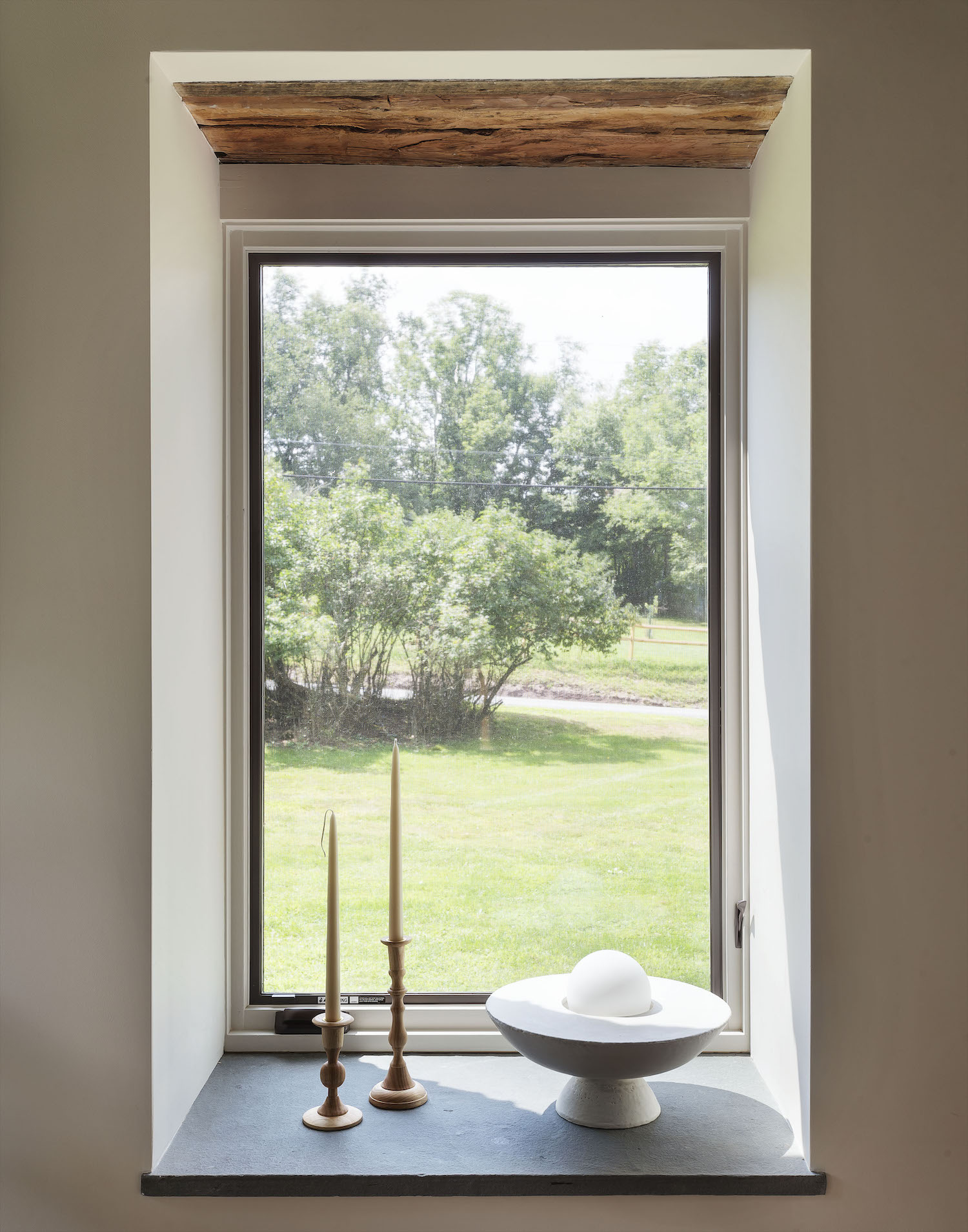
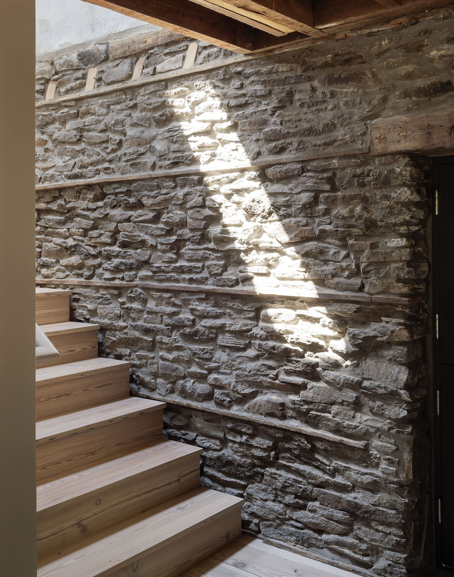
Throughout the completed project, the home’s new architectural elements sit within the original stone shell – a clear line between what is new and old. With its visible smooth vs rough contrast, the original exposed header detail is a great example of how General Assembly made it a point to preserve and highlight what was already existing in the house. The staircase is also intentionally set off the stone wall to create another contrast of straight vs jagged and highlight the historic structure.

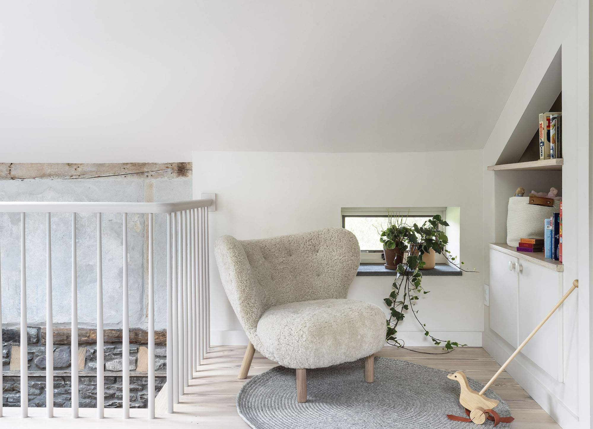
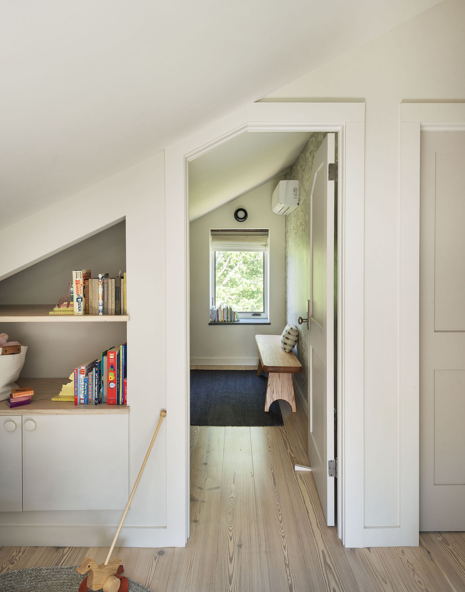
As you shift to the cottage’s upstairs living quarters the use of current materials comes into play, yet cottage vibes are maintained with the wide plank hardwood floors and simple, clean-lined furnishing and the consistent use of natural materials.

A sweet bathroom uses simple natural materials, a ceramic Cedar & Moss sconce and a floral wallpaper to add the cottage chic touch.

I love how the rustic header was preserved in this shower! This project is giving me so many ideas to cozy up the Hood Canal Cottage. While I don’t have any 200-year-old architectural elements to work with, it’s designs like this one that remind; the right layers and perfectly chosen pieces can infuse a deep sense of style and personality into any type of space.

I hope you find as much inspiration in this home as I do! For even more home tours click here.


photography by mathew williams courtesy of general assembly

Hi Friend. I certainly didn’t mean to step away from here for such a long stretch. There’s been many a thing keeping me busy lately, from hybrid homeschooling to madly designing the #HoodCanalCottage, not to mention national political near-catastrophe, environmental disaster, and of course this nagging pandemic. The world’s larger turmoil made sharing here feel rather small. Insignificant. Insufficient. We’re all dealing with A. LOT. Carrying so much. It’s been weighing on me.

Is it weighing on you too?

But I had a shift last week. As I sat with feeling really sad about all we’ve lost in the last year, I started thinking about the pockets in daily life where we can still find joy. Design can certainly be one of those places. So many other adult forms of inspiration, play and fun have been stripped from us – live theater, music, in-person art. Even the simple pleasure of eating a beautiful meal outside your home – gone. Moments of pure joy can feel few and far between. It is in that vacuum that design can take on even more importance as it’s an art form you live in.

Design can directly impact your mental and physical wellbeing. Design changes the way you interact with your environment and all the things that are in it. Design can offer pleasure and joy, but it can also improve your quality of life. I certainly found that to be the case as we finished our house. And then our yard. And then my office. Each piece of intentional design elevated my daily life – alleviating the grind and instead offering reprieve. Restoration. Maybe even healing – if only momentary. I can say for sure that design has helped my family maintain a semblance of mental and physical health as we perpetually shelter in place.

There have been so many days I feel like I can offer so little to help you weather these trying times, but I hope design inspiration I share here can offer you a bright spot, spark an idea, or might even inspire you to fully reimagine your home so that it becomes a space that nurtures you – mind, body and spirit. It’s hard, if not impossible, to go outside our spaces to nuture ourselves right now. So we might as well turn within.

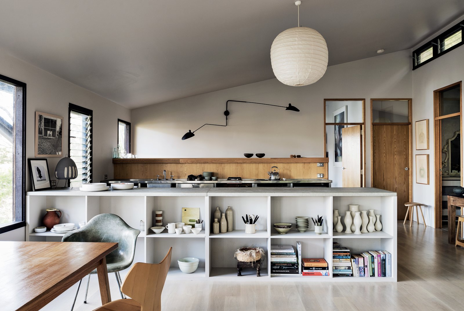
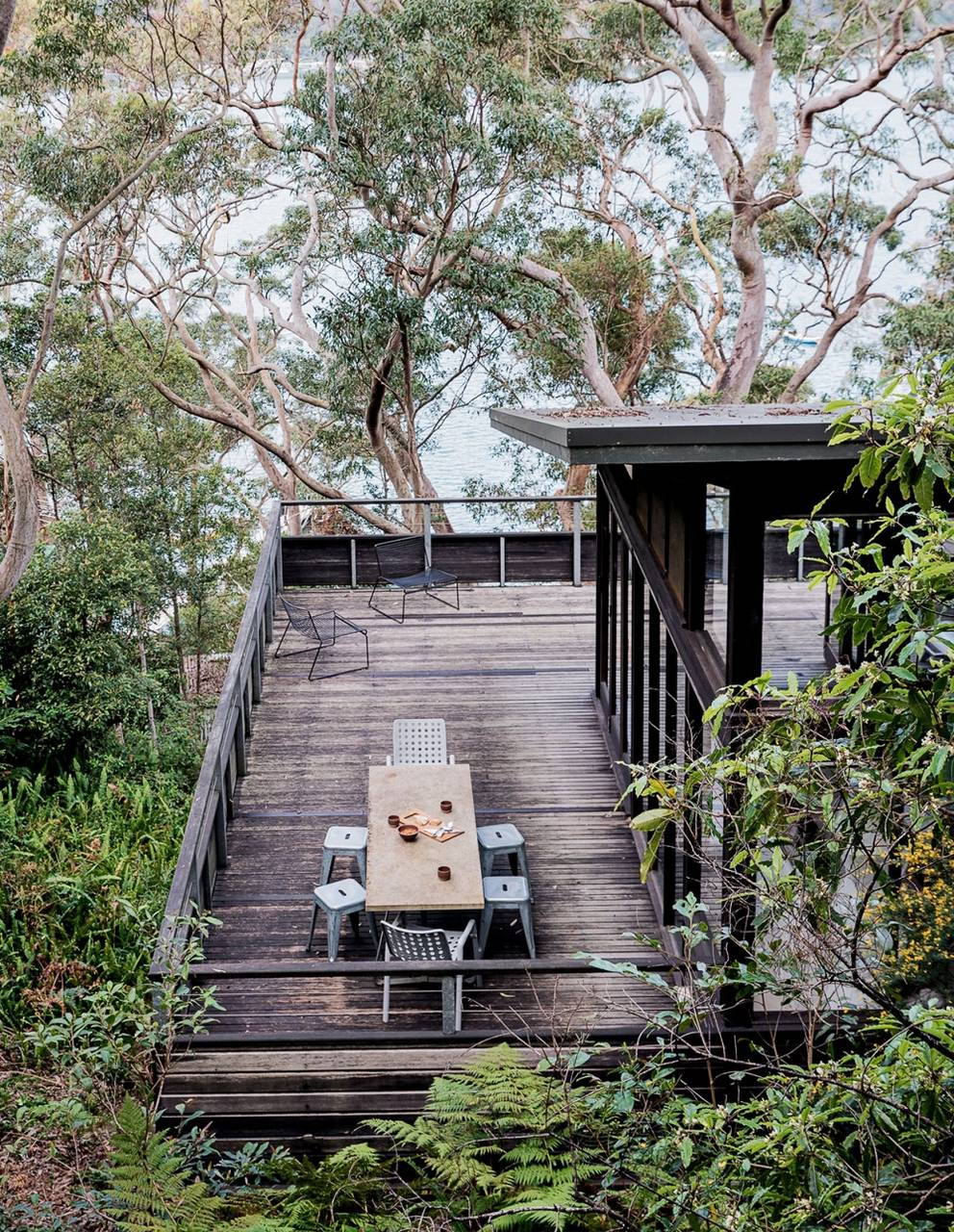
This space – called the Dangar Island House is a current source of major inspiration for me as I work on the Hood Canal Cottage – I’m going to be sharing a HUGE update on my design progress in the next couple of days. But for now, please feast your eyes on this gorgeous Australian weekend escape.
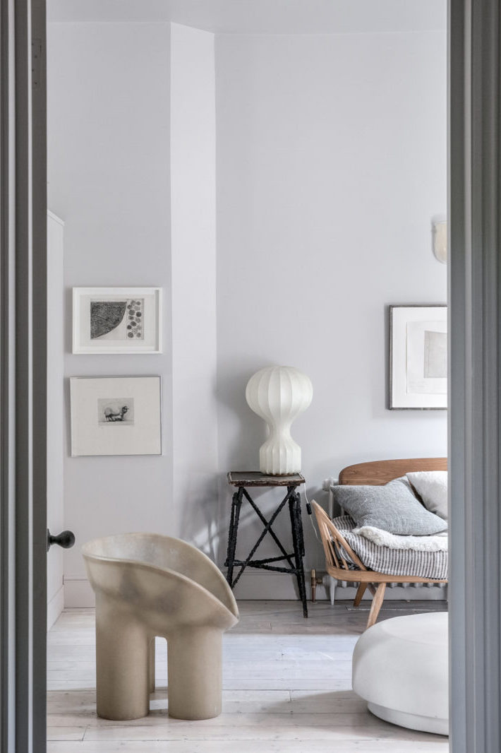
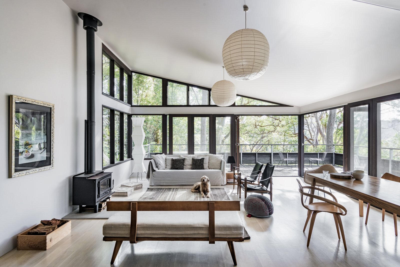
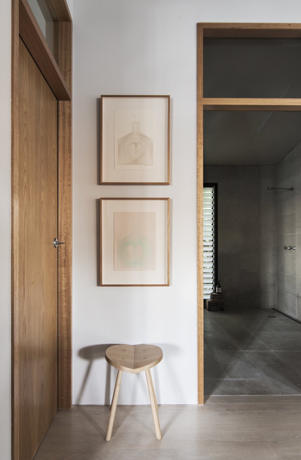
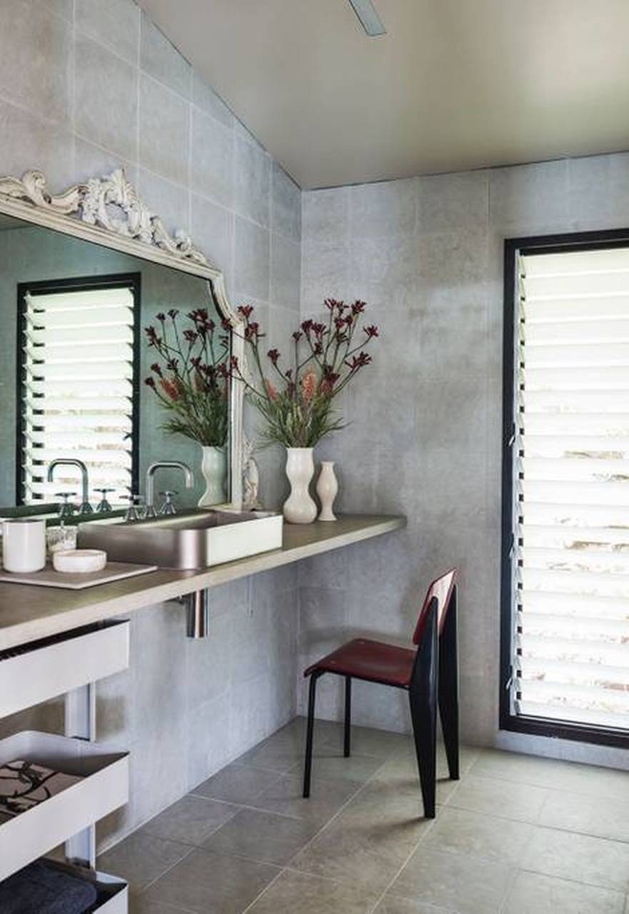
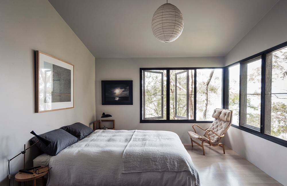
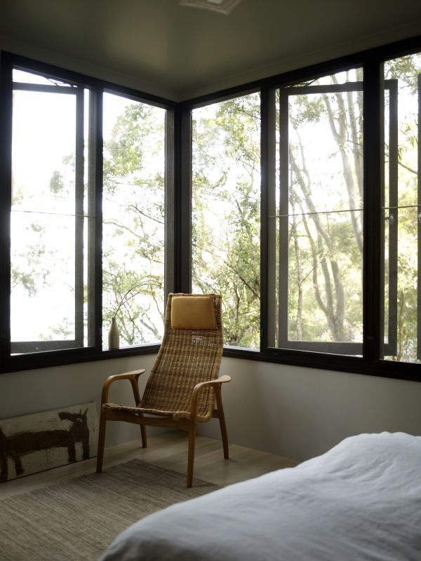
Originally owned and designed by renowned design expert Karen McCartney (author of one of my favorite design tomes – The Alchemy of Things), this gem of a vacation house is perched among the trees on a small island about an hour north of Sydney. This three-bedroom, two-bathroom home is a study in simplicity. But the absence of bells and whistles is not a detraction. Instead, the pared-back design, clean lines and minimal decorative architectural details make every intentional decorating choice stand out. The local woods used to frame doorways. The bleached American oak floors. The strong black accents. Each choice stands on its own but also plays beautifully with everything around it.

The home’s open living space is dotted with iconic design classics including wishbone dining chairs, Noguchi lamps, Carl Hansen safari chairs and Serge Mouille wall lights. The clean lines and lack of clutter draw your eye to each one of them, their lines, curves and natural materials melding seamlessly with the surroundings.

The house’s serene feel is also thanks to the use of an extremely consistent color palette and beautifully curated mix of curiosities, art, and lamps. McCartney talked about how she intentionally designed all the house’s storage to be open, ensuring anything brought into the house had to be either useful or beautiful. That might not always be possible in the homes we occupy on a daily basis, as day-to-day life is often messy and trends towards efficiency over form. But what if we focused more on aesthetic pleasure rather than saving that extra five minutes? What might we gain?

As I return to this stunning home again and again (and again!), I just keep reminding myself to stick to essentials in my own design choices. Rather than try to overfill or over-design, you want to give key pieces space to breathe. And so often less is more – particularly in a space designed for escape. No one wants to be reminded of day-to-day clutter (or the mental to-do lists!).

The Dangar Island House was recently on the market. I’m not sure I could ever walk away from a gem of a spot like this. It’s actually not entirely clear whether or not it sold – if it did, I hope the new owners have a deep appreciation for the special qualities of this home. And I hope I can achieve that same level of exceptionalism with the Hood Canal Cottage.

Only time will tell!

images via modern house and boutique homes

If you missed the announcement that earlier this fall I jumped headfirst into a new project – a cottage on the edge of Hood Canal in Washington state, don’t worry, you haven’t missed much. If the fact that we made the decision to take on another major renovation project amidst a global pandemic didn’t seem crazy enough – well everything that could go wrong with the house did. It’s all very 2020.

I won’t bore you with the very long story, but in a nutshell on the day before we were set to close the house flooded almost thwarting the entire thing. In the end, we did end up with the house and the need for all new floors (among other unanticipated fixes). But after six years of working on a renovation this almost felt like a drop in the bucket.

Before I break for the holidays, I just had to share the cottage’s before tour and give you a little peek into my design plans. I’ll be pausing through the rest of the year (save for updates to the The Apt34 Shop!) in the hopes of getting all the design locked. I keep thinking if I’m organized enough there’s a chance we might be able to be in there in time for the mid-winter break. Even after the most disastrous of years, I somehow still believe in miracles.

For now, let’s dive in into what I’m starting with. If you thought This Old Victorian’s before pics were dramatic – buckle up.

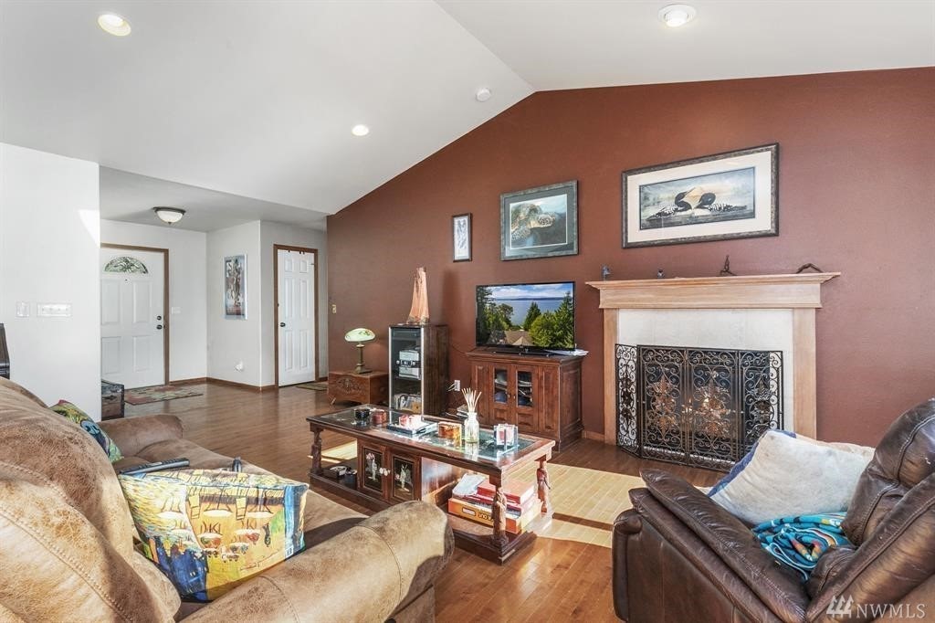
We shall begin in the house’s living room. This is the space you enter as you step through the front door. I’m going to admit upfront it was not the house that attracted me to this project – it was that view out the windows. The house itself offers very little in the way of charm. Even though it was built in 2004, it held over every bad trend and builder grade detail from the late 1990s. Blech. I don’t have the advantage of built-in architectural interest with this bad boy. This is more of a lipstick on a pig situation.

Well, that’s not entirely true. I do have a vaulted ceiling to work with! A bit of saving grace. The ceiling inspired me to rip out the wall you see in the back corner of the above picture, creating one contiguous living, dining and kitchen space with the vaulted ceiling running end to end. The goal is to flip the vibe from late 90s basic suburban to…

to this – the ultimate Pacific Northwest coastal retreat – aka the anthesis of where things are at right now. I cannot wait.

The existing kitchen is not doing me any favors in that endeavor. Small with poor space planning and virtually no counter space, I’ll be starting with a blank slate in here. That’s where the flooded dishwasher actually did me a favor. We had to rip everything out. The kitchen design is actually the furthest along right now, but I’m going to save that for my next update post so we can really dig into the details. For now, know that everything you see here, goes (including the existing walls!).

Ok, I can’t help myself. Here’s a little sneak peek of the kitchen’s design direction. I’m working with Reform – the tippity top of my favorite kitchen lines to create my dream space. I am counting down the days until I stand in this kitchen and just oogle it all.day.long.

As we move into the bedrooms, the upstairs boasts three that will get a facelift for now. There will be a main bedroom, a guest bedroom and a kids room. Fresh paint, new floors and thoughtfully curated design details, from saying buh-bye to the boob lights to select furnishings  and maybe even wallpaper (whhhhaaaat) will breathe fresh life into each room. This is where I typically lie awake at night agonizing over design choices. The kid’s room is plaguing me right now. How over the top do I go? But that too is for another post.

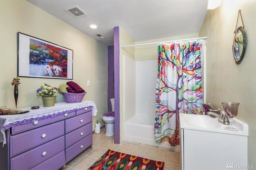
The house’s bathrooms are another real treat – an homage to a totally different time. And really bold paint choices. But not in a good way. Again, we won’t be gutting the bathrooms for now – we have to prioritize, but I’m hoping to show you how swapping out key details and a few smart design choices can enliven even though most dated of spaces, all without breaking the bank. Wish me luck.

Downstairs we have a great room to play with along with an office and little playroom area. I’m particularly excited to transform this room into a cozy vacation oasis.  I see family movie nights and girls getaways cozied up with wine around the wood stove. The amount of hours I’ve already lost researching modern wood stoves would blow your mind. But I know the final result is going to be worth it.

So there you have it. This project is already an allegory of 2020, reminding me we are not in control, things you want often take much longer than you anticipate or desire, but in the end, hard work and perseverance pays off. Well, here’s hoping anyway.

Let me know in comments what you want to see as this project goes along. Spoiler alert, demo has started!


If you haven’t checked out the brand new Apt34 Shop – CLICK HERE!

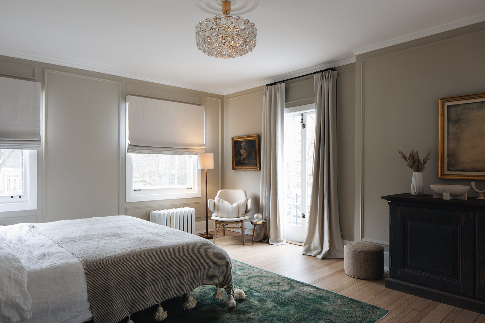
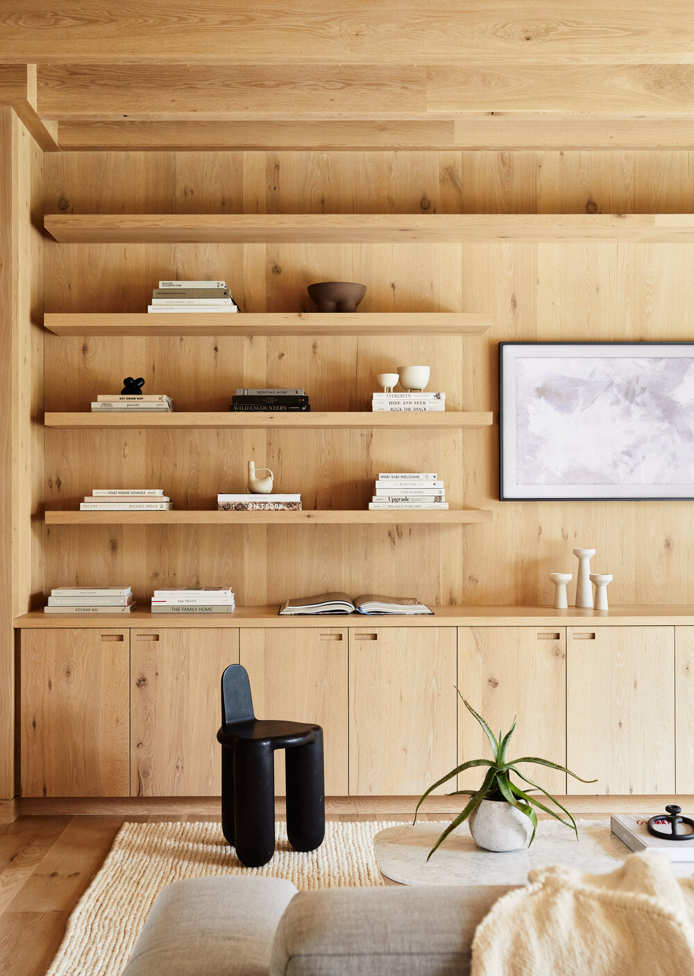
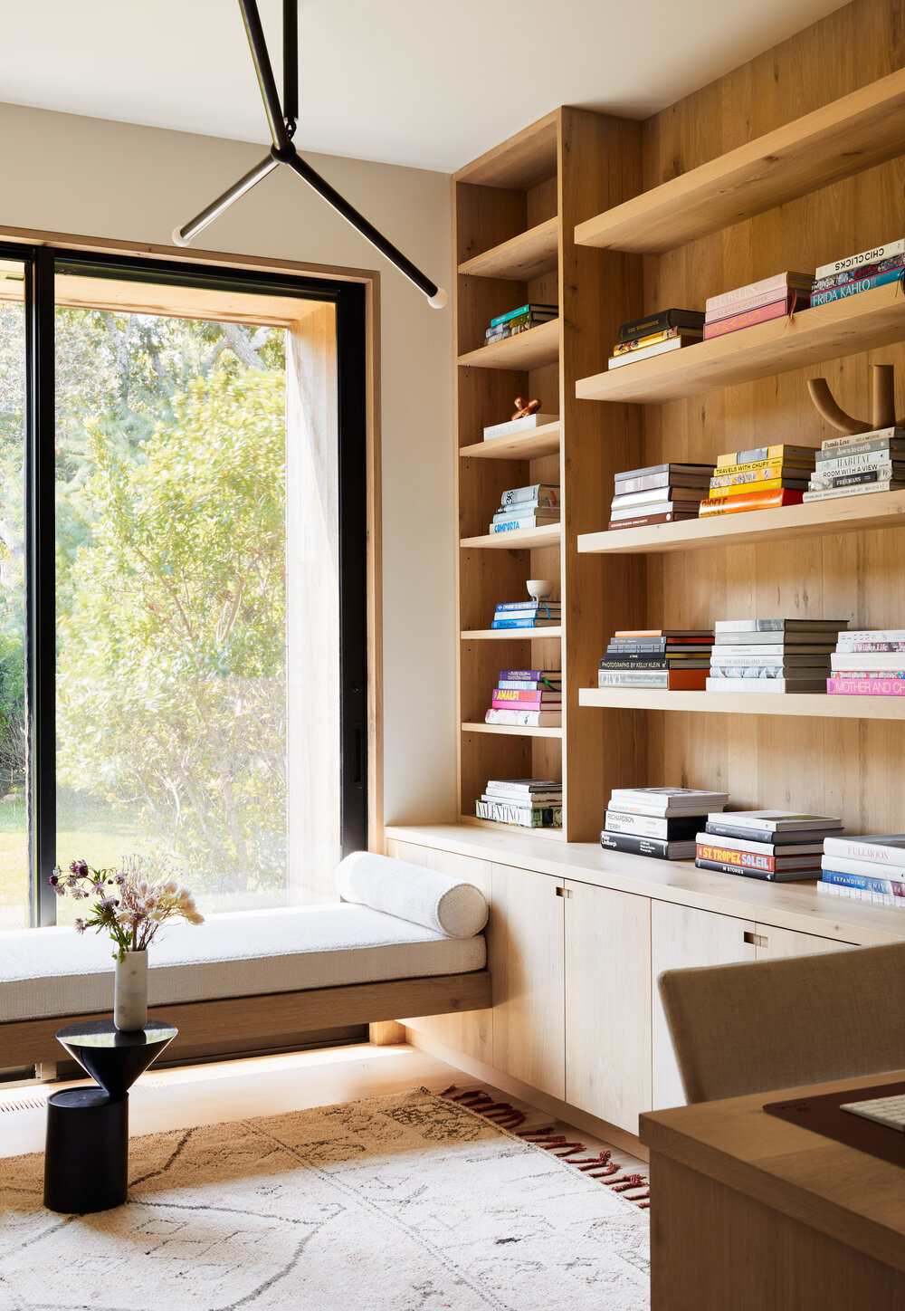
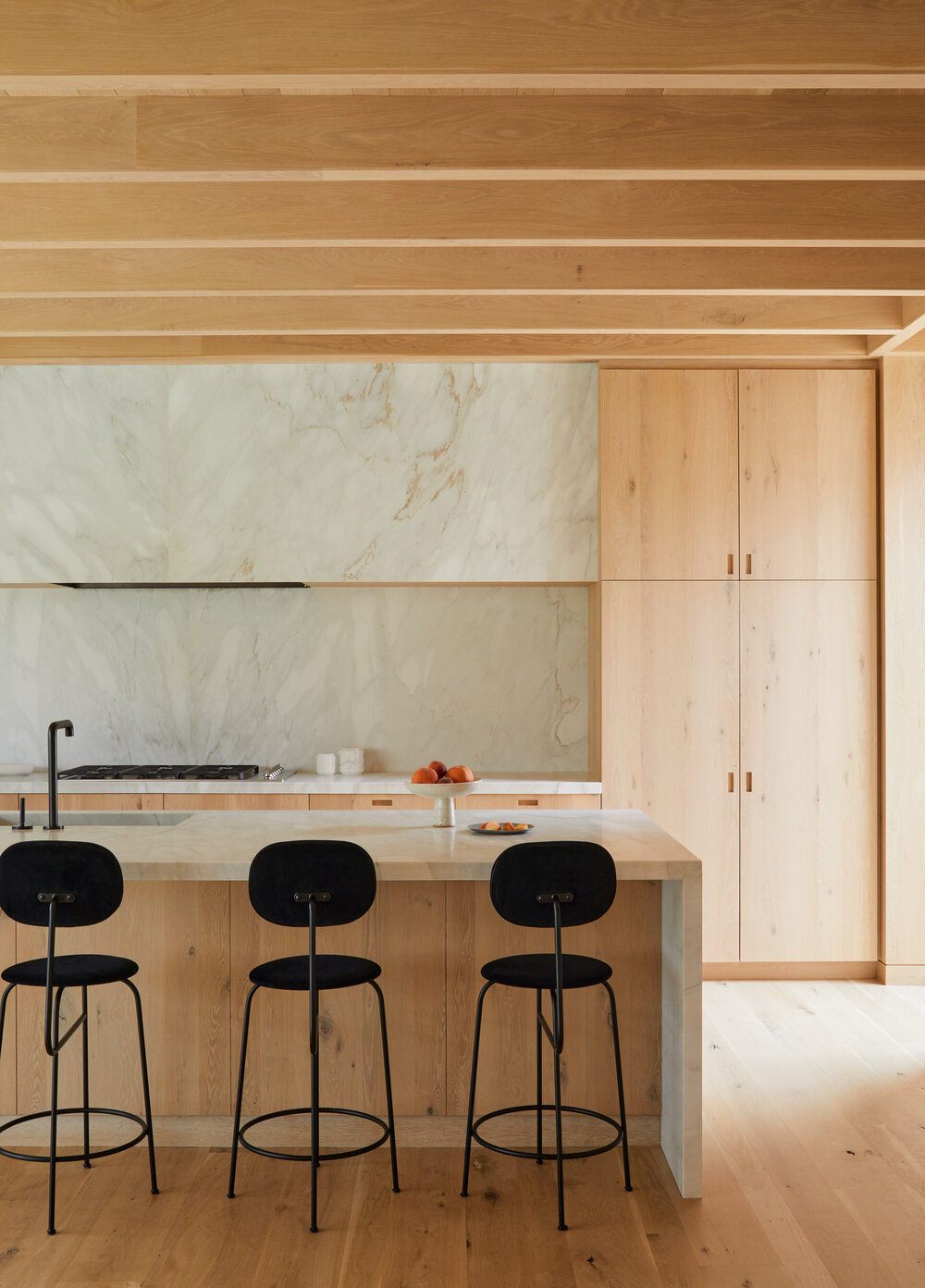
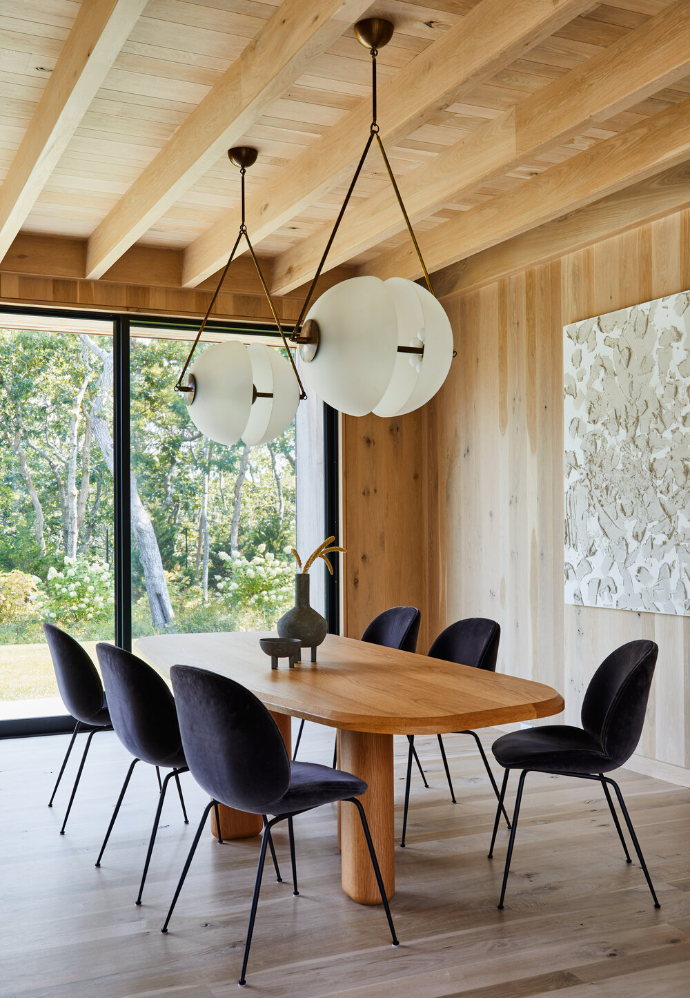
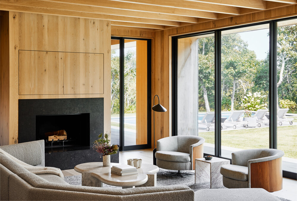
After years of living in bright white spaces – which I always have and always will adore – I’m finding myself drawn to warmer, more textural homes – just like this one designed by Crystalyn Hummel. I don’t know if it’s working on the Hood Canal Cottage, the pending arrival of winter, or simply the desire to try something new, but give me all the wood-wrapped spaces right now! I am SO into it.

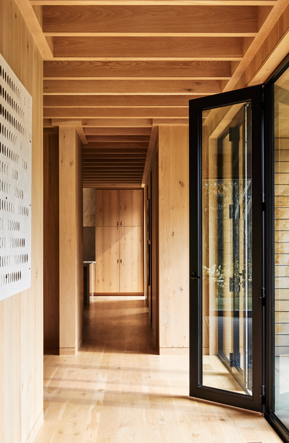
Selecting a beautiful honey-toned white oak keeps this home feeling open and airy instead of dark and closed in. Adding clean, minimal, and modern accents – from the stone selected for the kitchen to the lighting (virtually all Apparatus Studio here) adds a distinctly elevated feel to each room.

You know I’m a huge fan of the extra-wide plank floors. I’m putting something similar into the Hood Canal Cottage and I cannot wait.

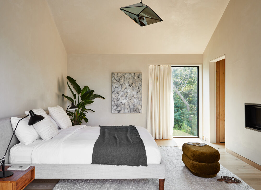
The bedrooms and casual spaces in the house continue to use wood, but more as an accent, balancing it with matte white walls to give the house a cleansing beat. Iconic modern furniture from Faye Toogood, Menu, Gubi and others are dotted throughout add ing timeless style that will last for years to come.

Adding yummy texture through Moroccan rugs and nubby pillows help create a sense of cozy comfort in the sea of hard surfaces.

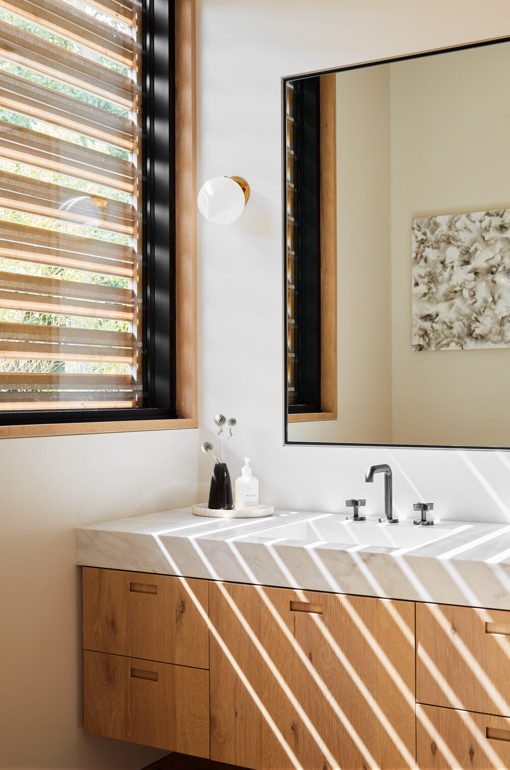
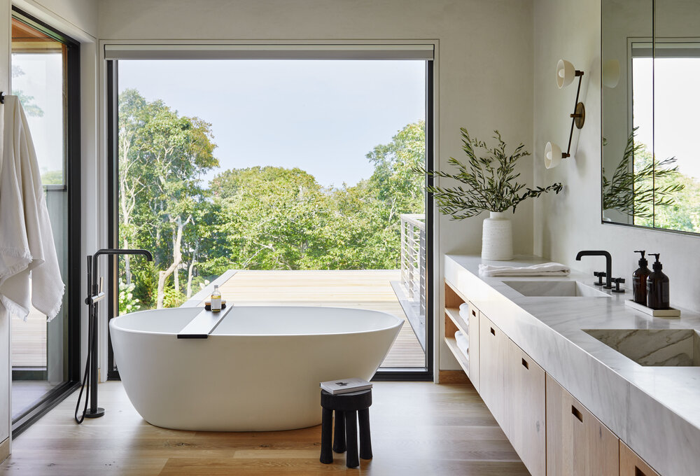
The picture window for the bathtub in the house’s main bathroom is a dream. And I’m still very enamored with the extra thick bathroom counters – especially when they come with yummy contiguous stone sinks. The clean lines flow so beautifully. Do you love it too?

This home is a perfect example of how restraint, consistency, and curation can create a minimal yet warm and welcoming design. This is a huge inspiration for me right now. I hope it is for you too!


photography by read mckendree courtesy of crystalyn hummel

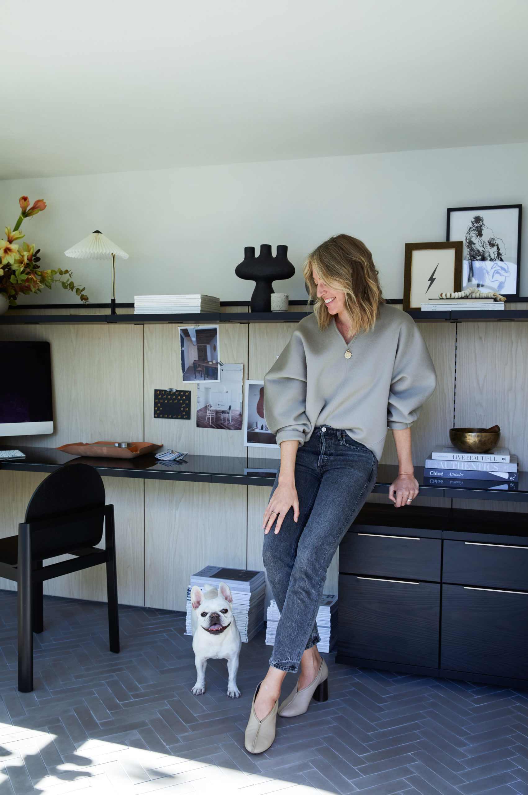
I have worked from home since long before it became a public health requirement, so while it’s nothing new for me, I know first hand how important it is to have a functional and aesthetically pleasing place to work. The couch or the bed just really don’t cut it when you’re doing 9-5 without leaving the house. I’ve had many a home-office iteration over my blogging years. You can see examples of those home offices here, here and here. With no end to our WFH life in sight, I am so excited to finally share my newly completed home office with you. I hope it offers some inspiration for your own workspace.

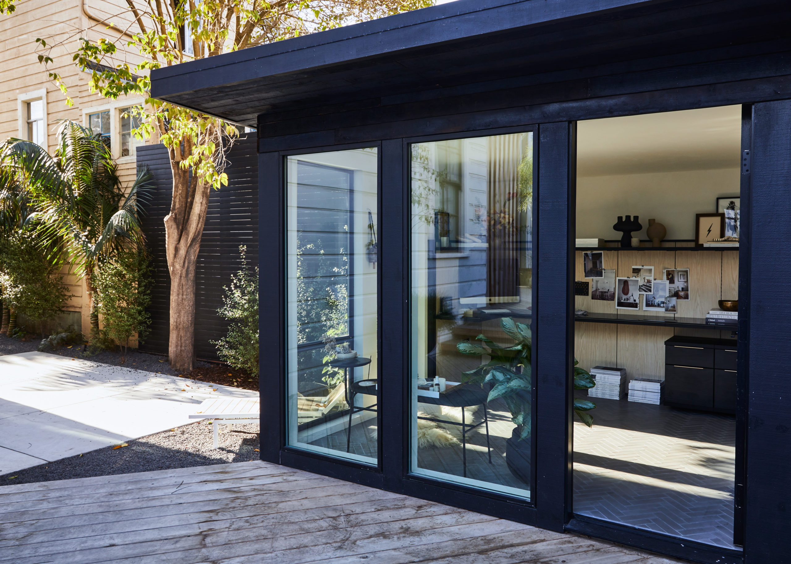
Thankfully, long before the pandemic took over our lives, I’d planned to create the ultimate work-from-home space as part of our backyard makeover, building a little free-standing structure in the yard’s back corner. Just don’t call it a She-Shed! The pandemic put the brakes on finishing up the design for a few months, but now all the pieces have finally come together and I couldn’t feel luckier to have this little escape.

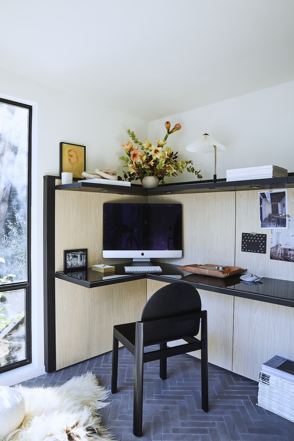
I worked with California-based Modern Spaces and Sheds to create the pre-fab structure. Even though the building is only a 10’x10′ space,  I’m so happy to have all of the natural light flood in – it makes the office feel much larger than it is. A slightly upward-sloping ceiling also gives the illusion of more space.

But what really took the office design to the next level was working with California Closets. If you’ve followed my renovation journey you know California Closets has been my go-to to both optimize storage in This Old Victorian and also get the gorgeous design I crave (you can see my dream closet here and my pantry here).

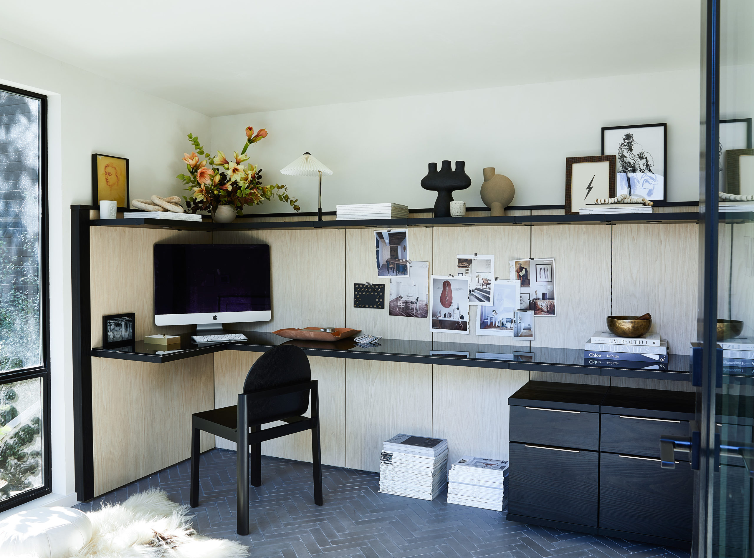
Since I was finally moving out of the corner of our guest room, I knew I wanted to put an expansive built-in desk into this office in order to optimize the shed’s footprint, but also to help elevate the feel. I was going for elegant, cool sophistication and I couldn’t be happier with the final result.

Over the course of the summer, I worked with my California Closets designer remotely and was able to finalize all of our choices online. Thank goodness for Zoom. She understood my vision immediately and was able to bring it to life. I love the mix of light wood with dramatic black accents. The black glass desktop adds a bit of sexiness.

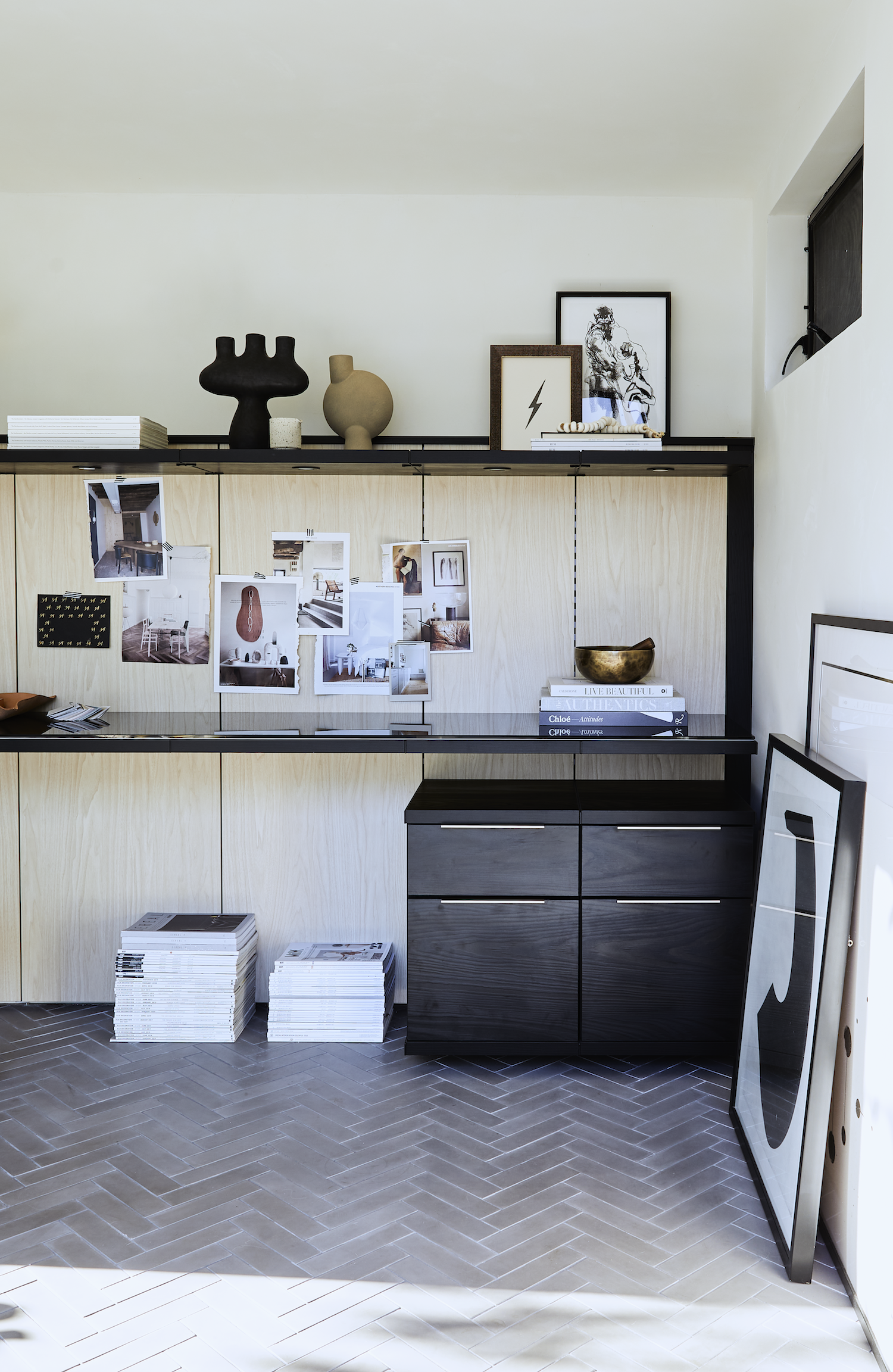
The upper shelf was also one of my must-haves and California Closets made it work. I knew a little display shelf would be my major decorating moment – allowing me to showcase pieces that inspire and add major personality to my work area. The shelf is also quite useful, as it features built-in LED lights, allowing me to skip the expense of wiring the shed for overhead lighting.

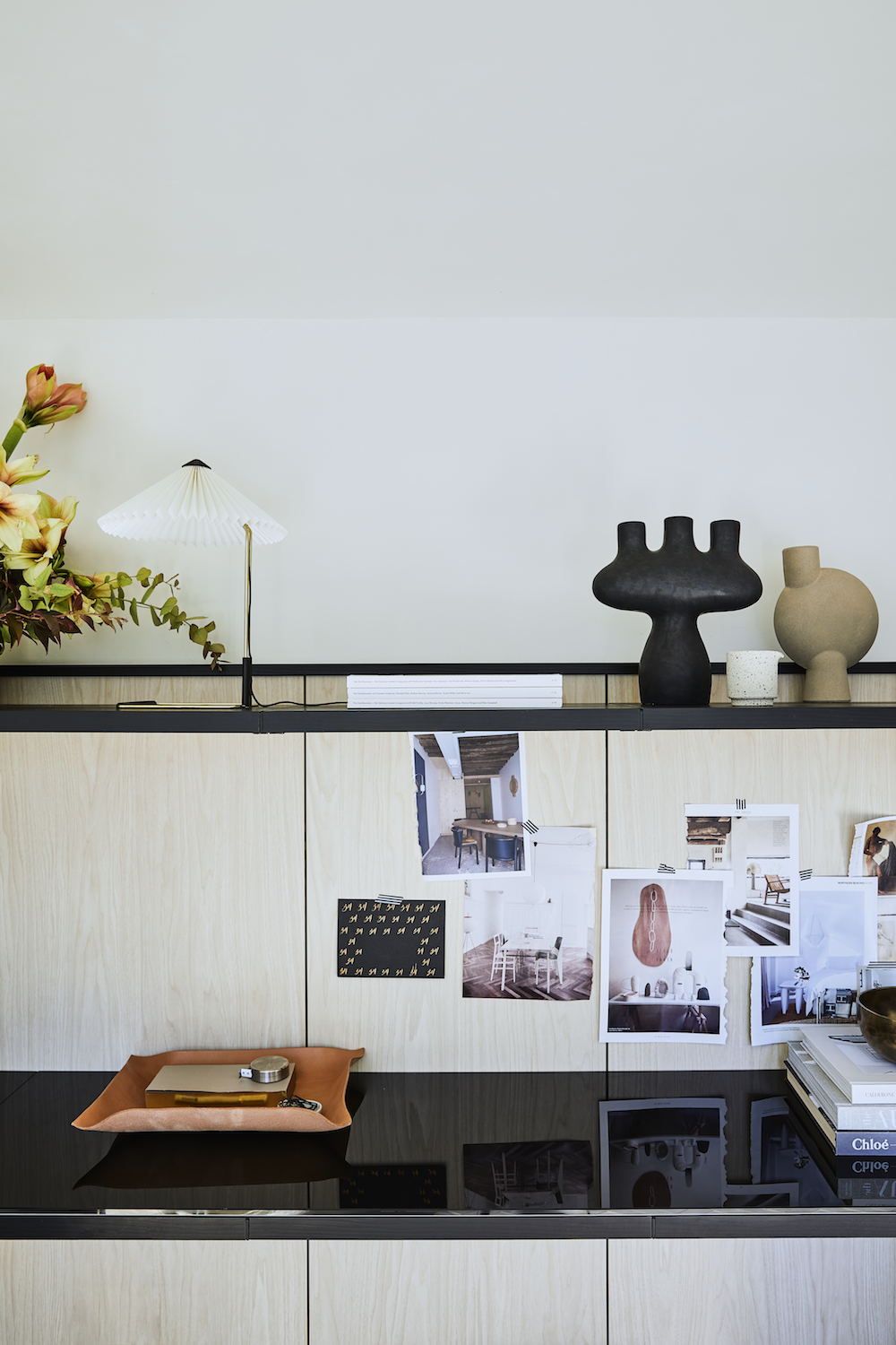
Let’s dig into some of the desing details. A physcial moodboard is always a requirement in my world – even if I’m not designing something. I just love having visual inspiration welcome me every day. I typically swap my tear-sheet mood boards out seasonally.

A simple, yet elegant leather tray from Bloomist’s new WFH Pro Gift Collection atop the desk corrals note pads, pens, and other office-y odds and ends.

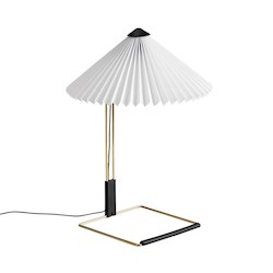
On the shelf above, I get to display some of my treasured pieces including the Matin Lamp from Hay Design, ceramics from Simone Bodmer-Turner, Frama and CPH 101, and framed art prints. I’m always a sucker for leaning art.

One of my first design decisions for the office was the flooring. I knew from the get-go that I wanted herringbone tile floors – and this beautiful concrete tile from Clé makes me oh so happy. It also is extremely durable. Radiant heat makes sure the space is always toasty. Luna certainly approves!

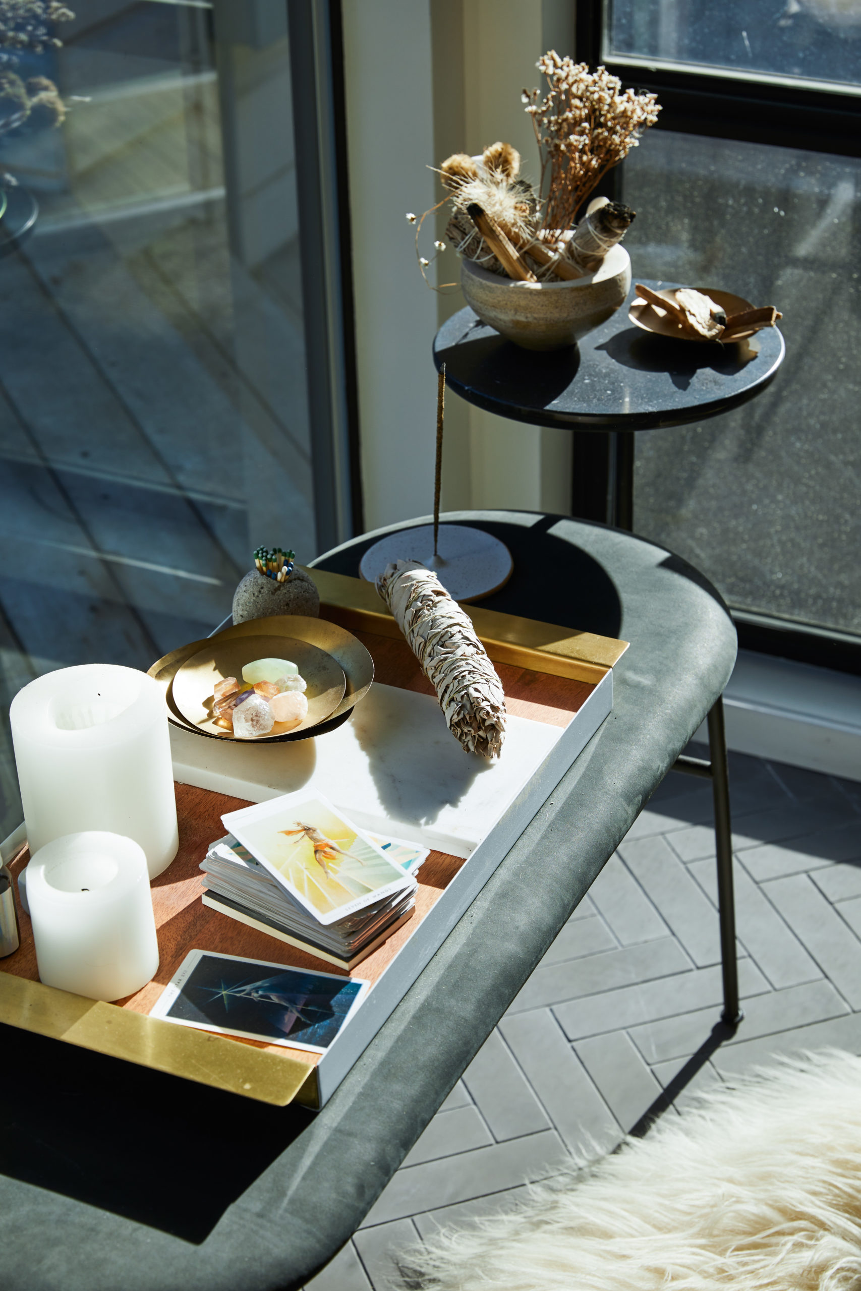
My office space also serves multiple functions. I have enough room to roll out my yoga mat and do Zoom classes. I also created my own private corner for self-care work including meditation and all my woo-woo ceremonies. I find daily or weekly rituals help ground me during this extremely chaotic time. Having an inviting set-up helps keep me motivated to invest the time to just sit and be still. If you know, you know.

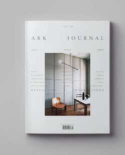
Anyone else still collect print magazines?? I just love having something physical to thumb through for inspiration. Having my collections – international titles like Ark Journal, Elle Decoration and Living Etc are favorites – right at my fingertips is also a great way to take a mental break during the day.

The two sets of floating drawers we added give me just enough closed storage to hide away less than pretty office supplies and organize files without accumulating too much crap. This year is all about minimizing the clutter.

A finishing touch for any workspace is something living! As we spend so much time at home now, houseplants are an amazing way to bring the outside in. They’re good for your mental health and also for your physical wellbeing too as they help cleanse the air. I worked with Leon and George, an awesome plant delivery service, to pick the ideal plant for my office – in this case, a Silver Evergreen. The Vayu planter from Light and Ladder is a truly stunning vessel. Love their designs!

I know I am incredibly lucky to have a dedicated space of my own to get through these tough times. If you can’t build a shed in your own backyard, there are tips and tricks for upgrading your own WFH space – even if it’s just tucked into the corner of the living room. Here are a few of my favorite tips:

  • Try to work where this is maximum natural light. As we head into the winter months, natural light is going to help boost your mood and your energy levels.
  • Surround yourself with beautiful things that you love, art, objét, or a stack of books and magazines. A little bit of inspiration can go a long way.
  • Add plants!
  • Invest in a few pretty pieces that help keep your workspace organized and pulled together. It’ll help you feel more pulled together too – even if you haven’t taken the time to shower (it me!).


photography by aubrie pick, florals by marigold SF

It feels extremely odd to focus on design this week, but I’m considering it a form of self-preservation today. We all need to do what calms us as we prepare for the inevitable storm ahead. Please tell me you’re voting today or tomorrow if you haven’t already. Click here to find your polling place. Every single vote matters – even if you think your vote won’t make a difference where you live – I promise you it will. Please please please vote.

While we all await our fate, please enjoy this stunning project designed by my go-to gal Lauren Nelson. It is incredibly soothing.

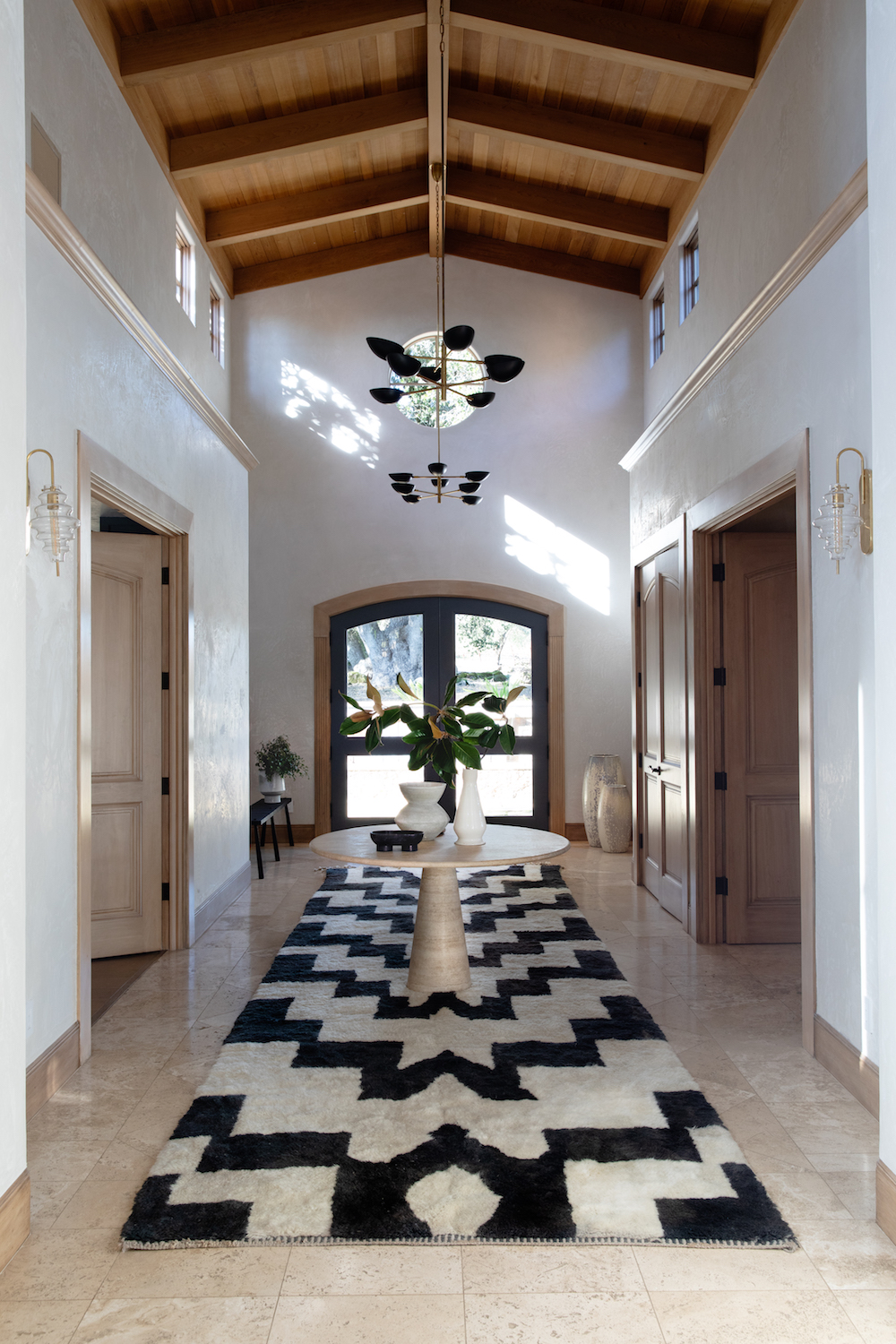
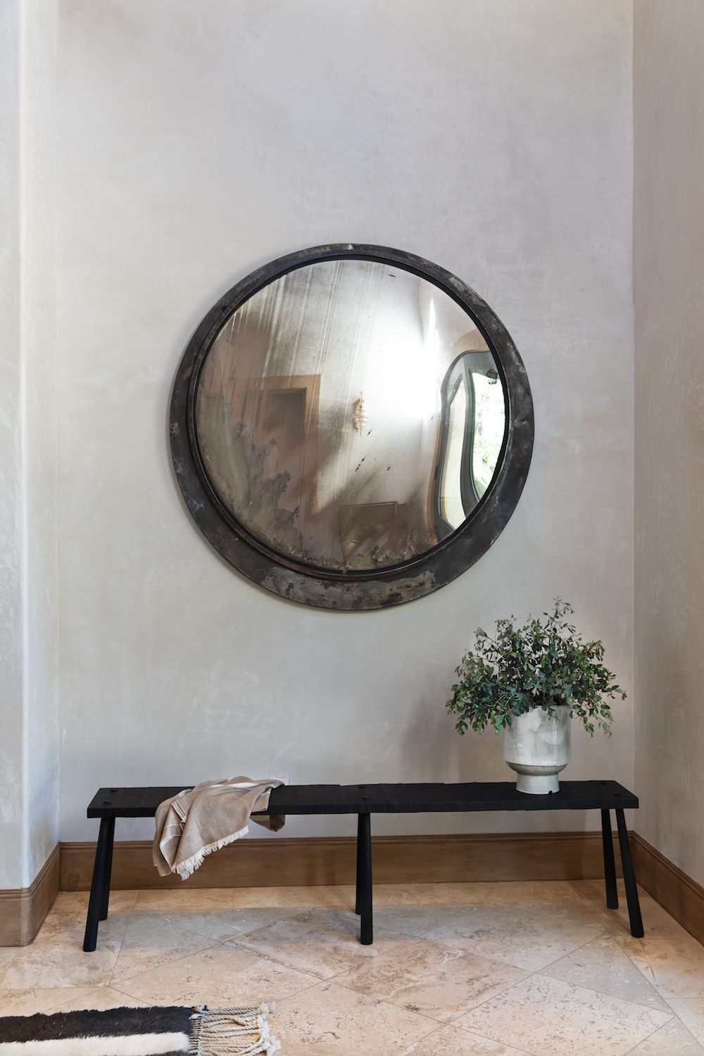
I have major entry envy.

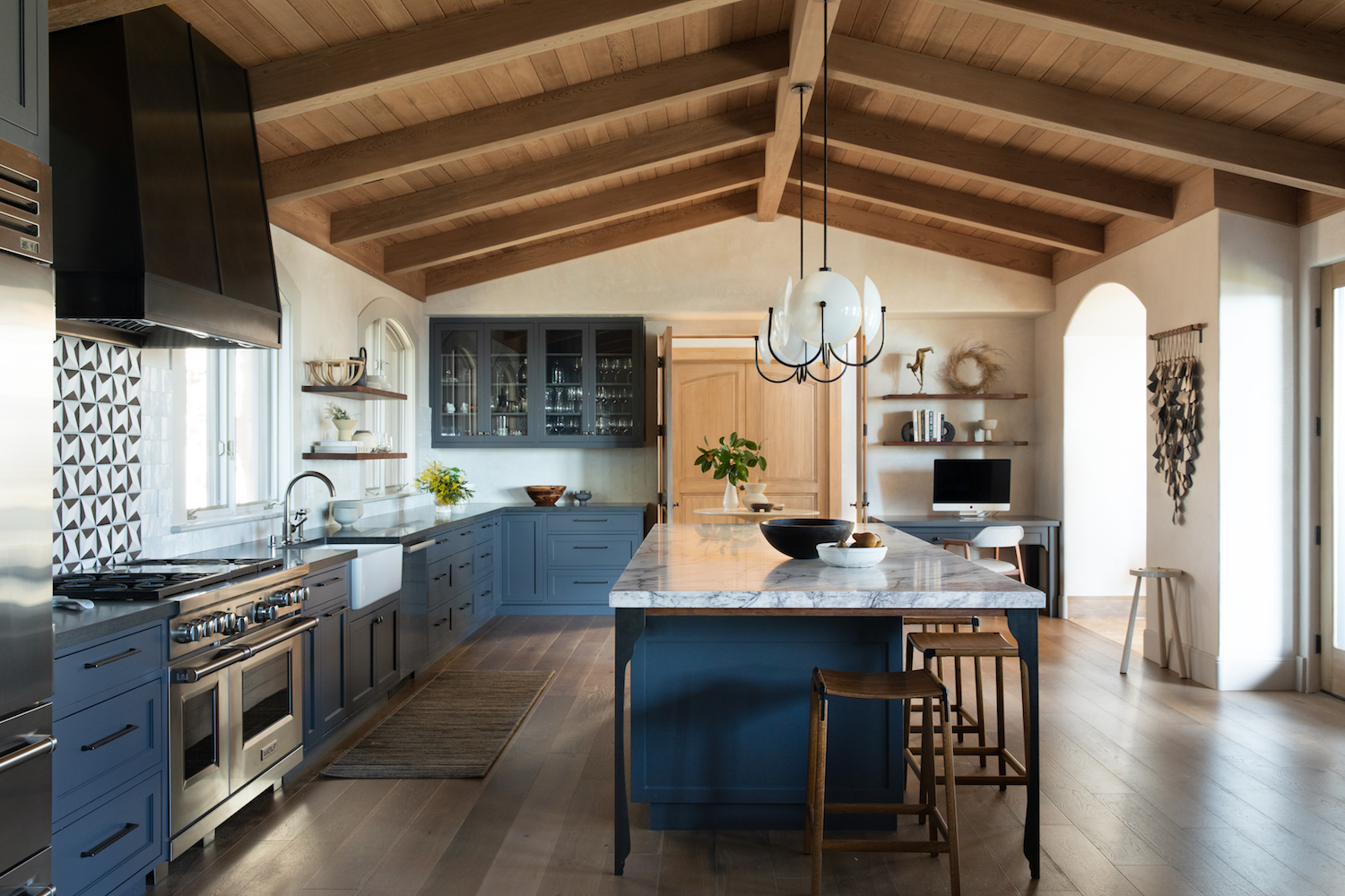
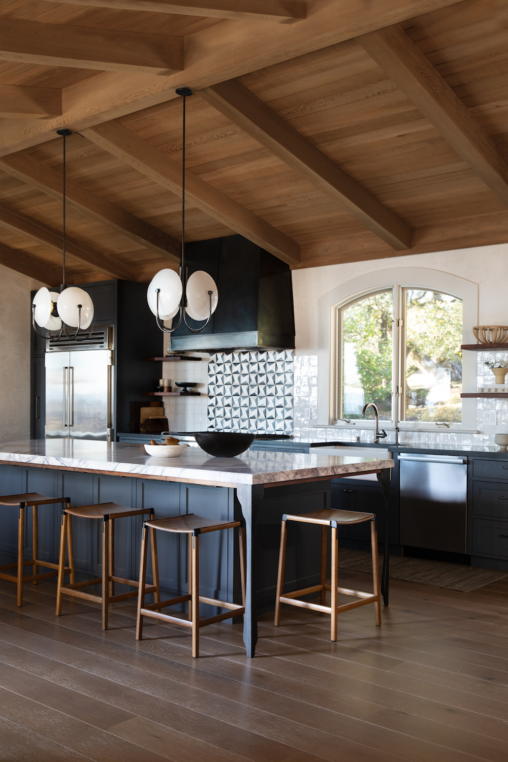
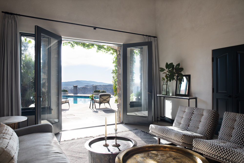
Both a guest house and private tasting room for Petrichor Vineyards in Santa Rosa, CA, Lauren put her magic touch of approachable sophistication mixed with laid-back elegance in every single space she touched. Subtle Morrocan vibes, classic well-made pieces, and a muted yet saturated color palette work beautifully. I particularly love the use of the deep, rich blue tones in the updated kitchen. All the natural light and vaulted ceilings keep the space feeling open and bright despite the darker hues.

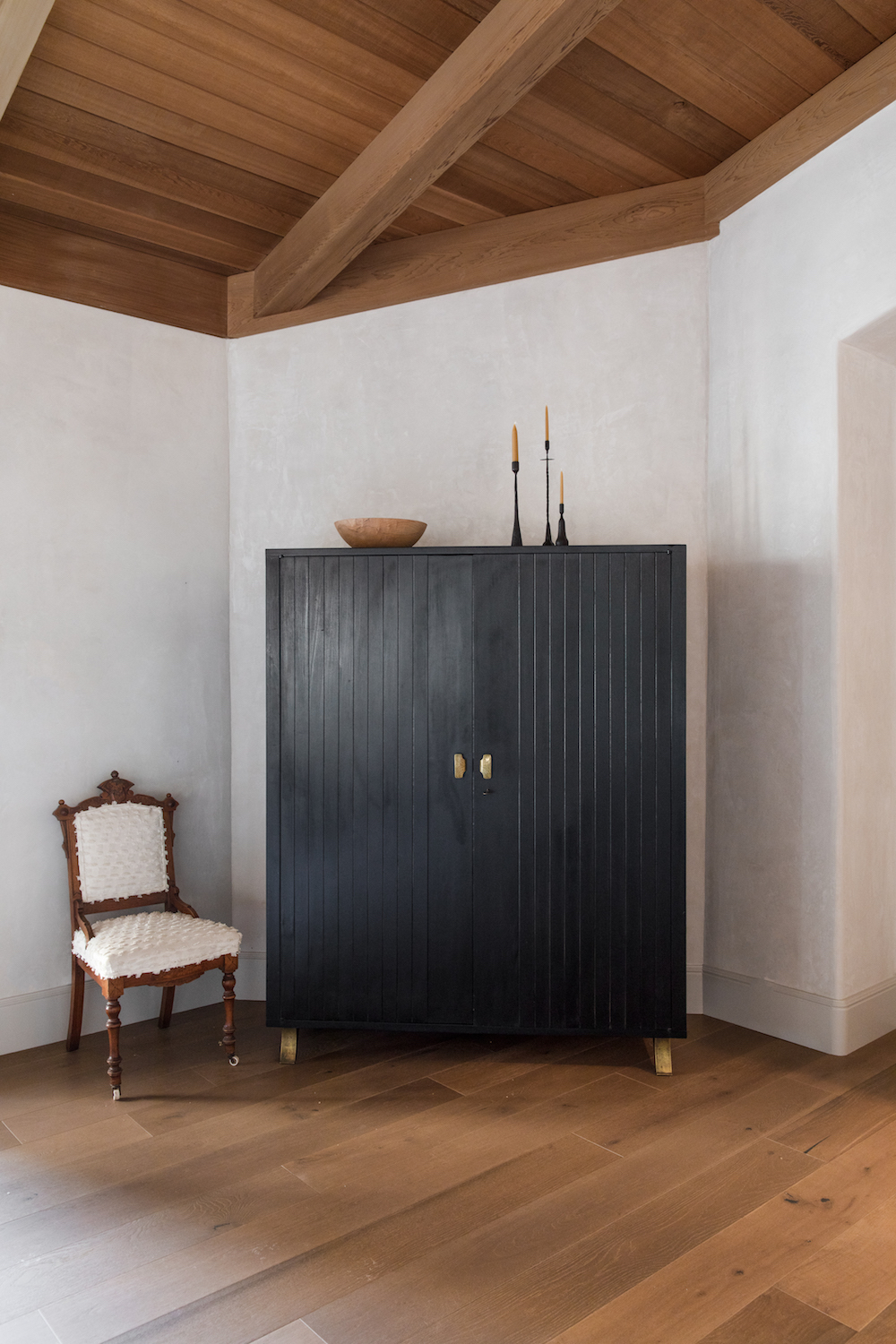
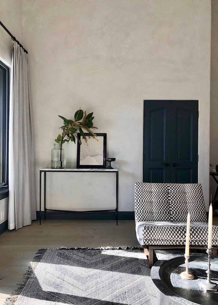
Lauren is the queen at beautifully impactful simple moments. This vintage chair and stunning cabinet make me feel like I’m somewhere in Italy.

Even though we’re in the heart of wine country, I am loving the Moroccan vibes peppered throughout the home.

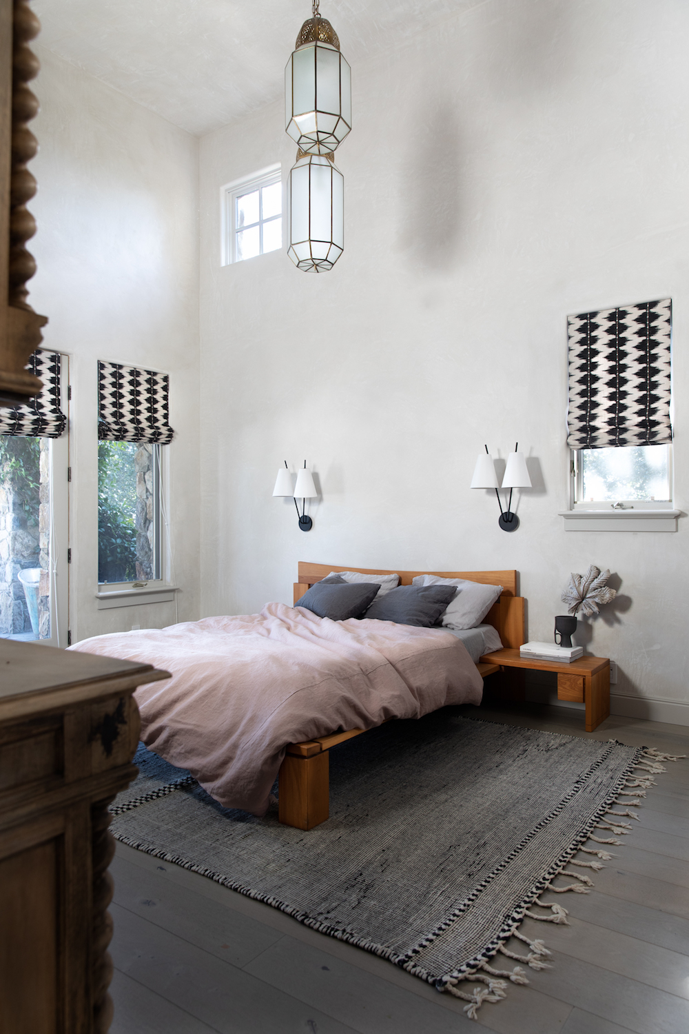
This bedroom has such a mix of textures and styles, yet everything, from the rug to the bed to the curtains to the sconces all play harmoniously.

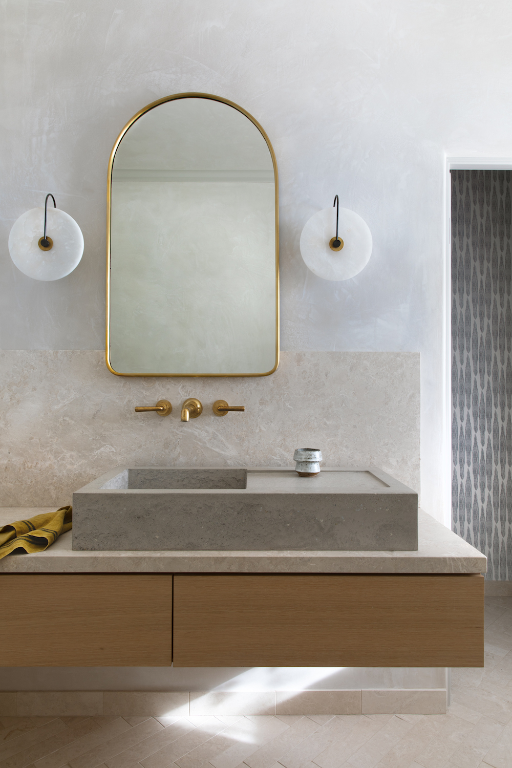
This officially might be my favorite bathroom vanity of all time. The counter top sink, the sconces, that faucet and yummy texture on the walls…it’s all delicious.

This space is going to serve as my moment of zen – I plan on revisiting it regularly between now and the end of the election day – whenever that may be. I hope this home tour brings you both some calm and some hope. I truly believe we have the capacity to bring ourselves back from the brink. We just have to show up and make our voices heard.


photos by bess friday courtesy of lauren nelson design

Older posts
Gimme More