Kitchens. They’re amazing spaces. They can be visually stunning. They must be total workhorses. They’re quite often the heart of the home. But they can also accumulate a lot of CRAP.

As I work to not only design but also fully outfit the kitchen for the Hood Canal Cottage, I’m starting completely from scratch. No hand-me-down casserole dishes, no knives I’ve carted around since college, no random herb scissors that I’ve never ever used. For once, I get to hand-select every tool and every object that comes into the space.

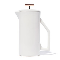
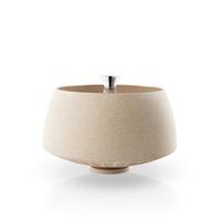
With that total blank slate, I find myself often thinking (ok, obsessing) about what I want this kitchen to have. As an avid cook, as we probably all are coming through Covid, I want kitchen tools that are really pretty, but also highly functional. And nothing else.

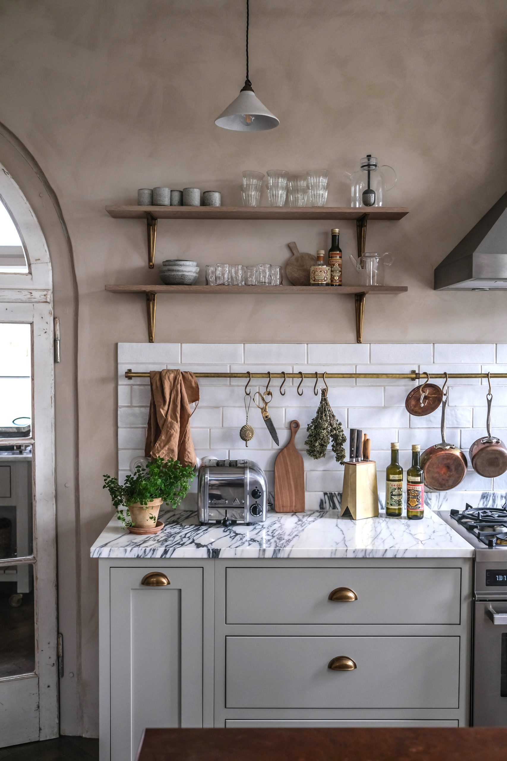
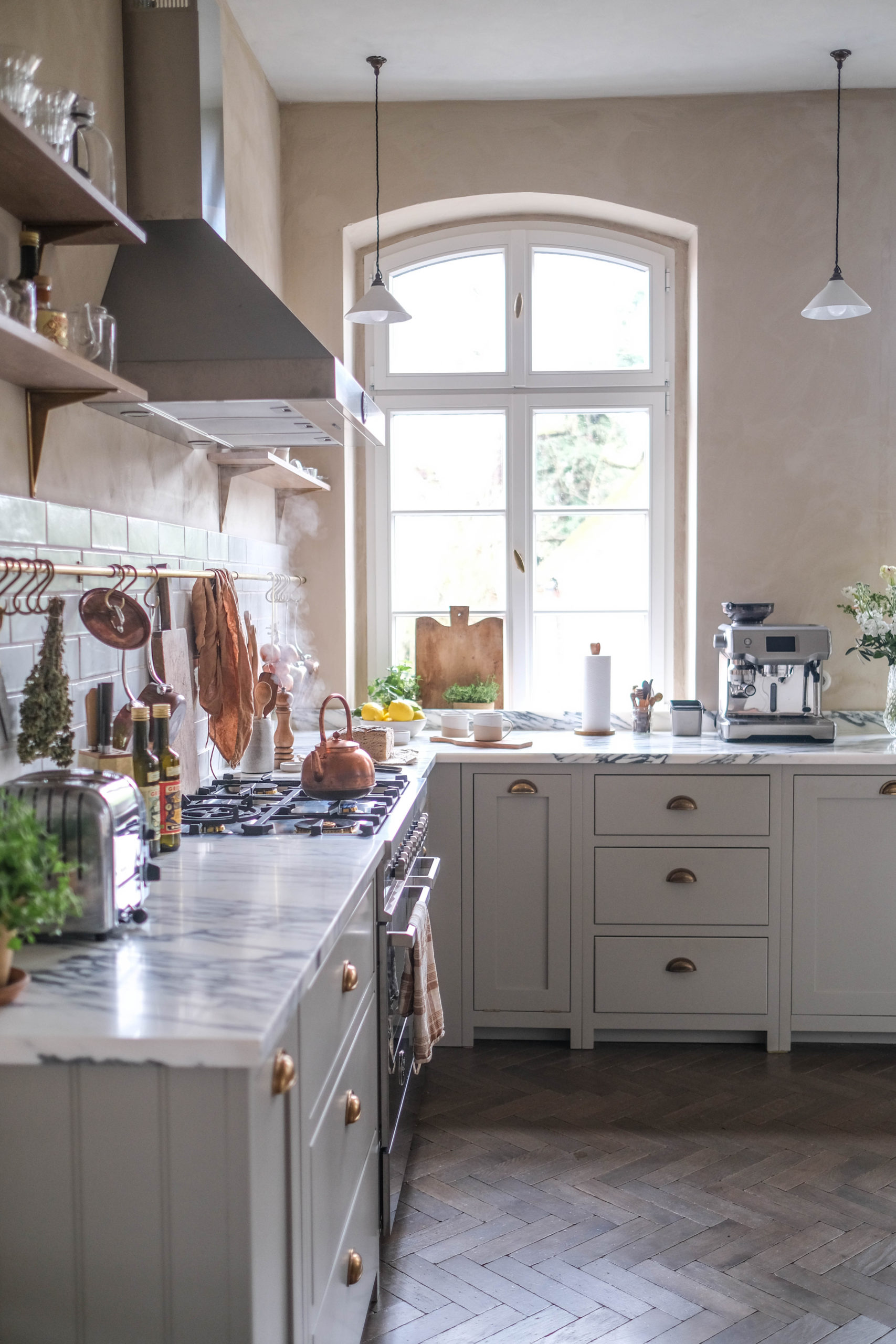
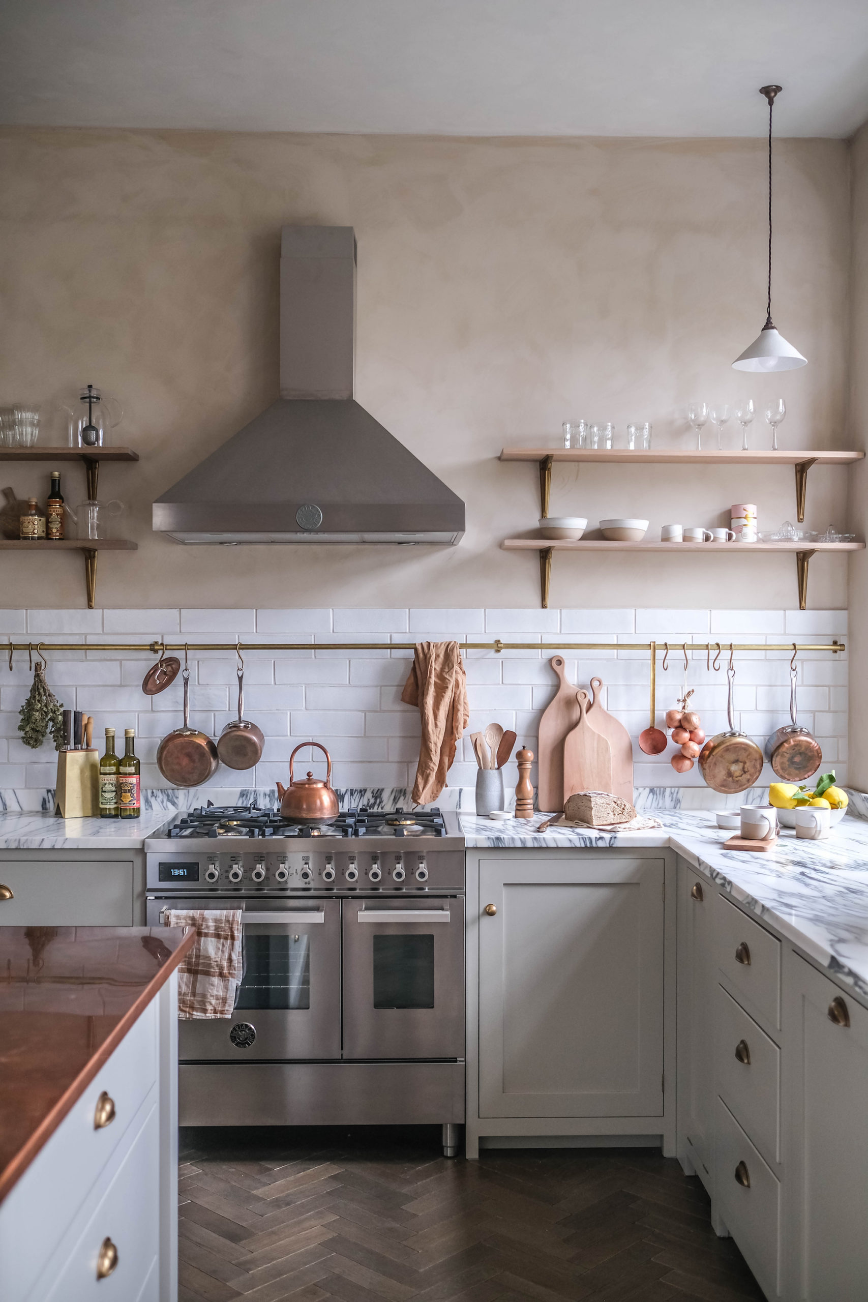
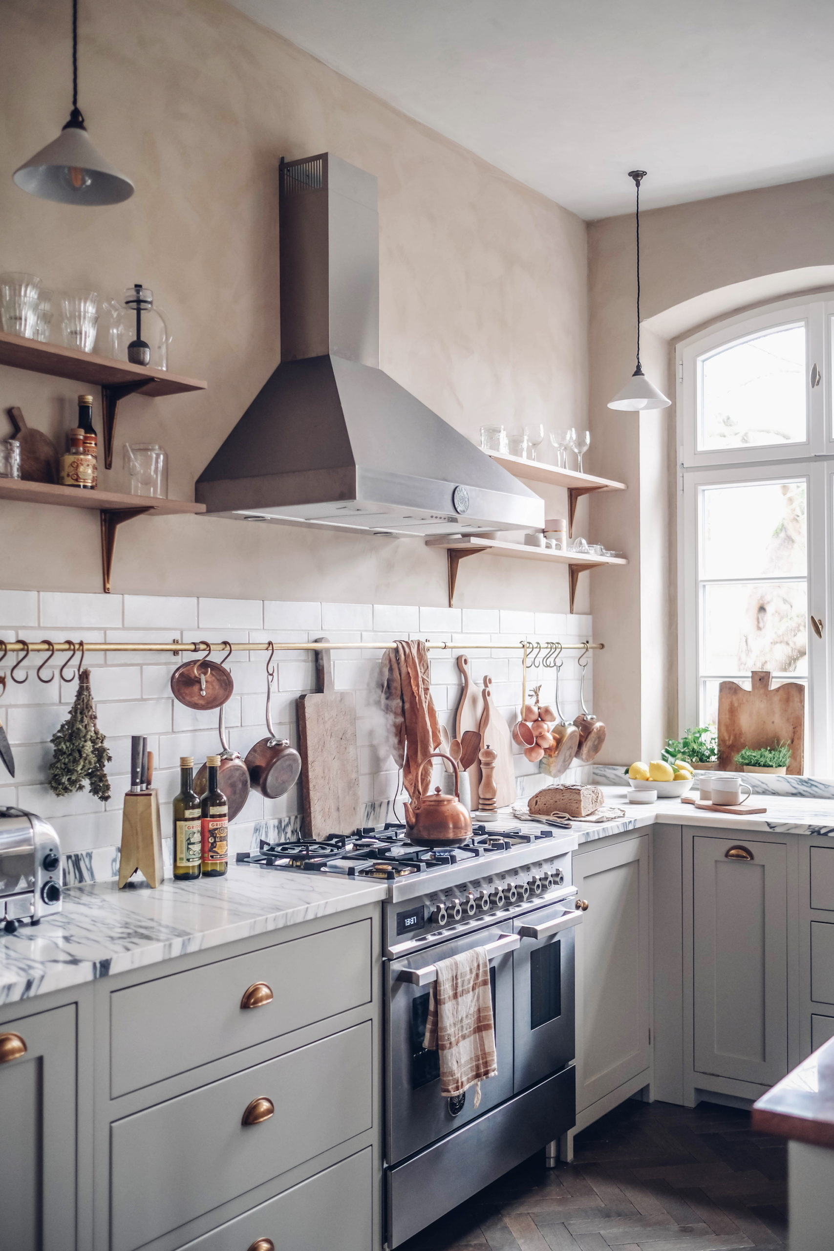
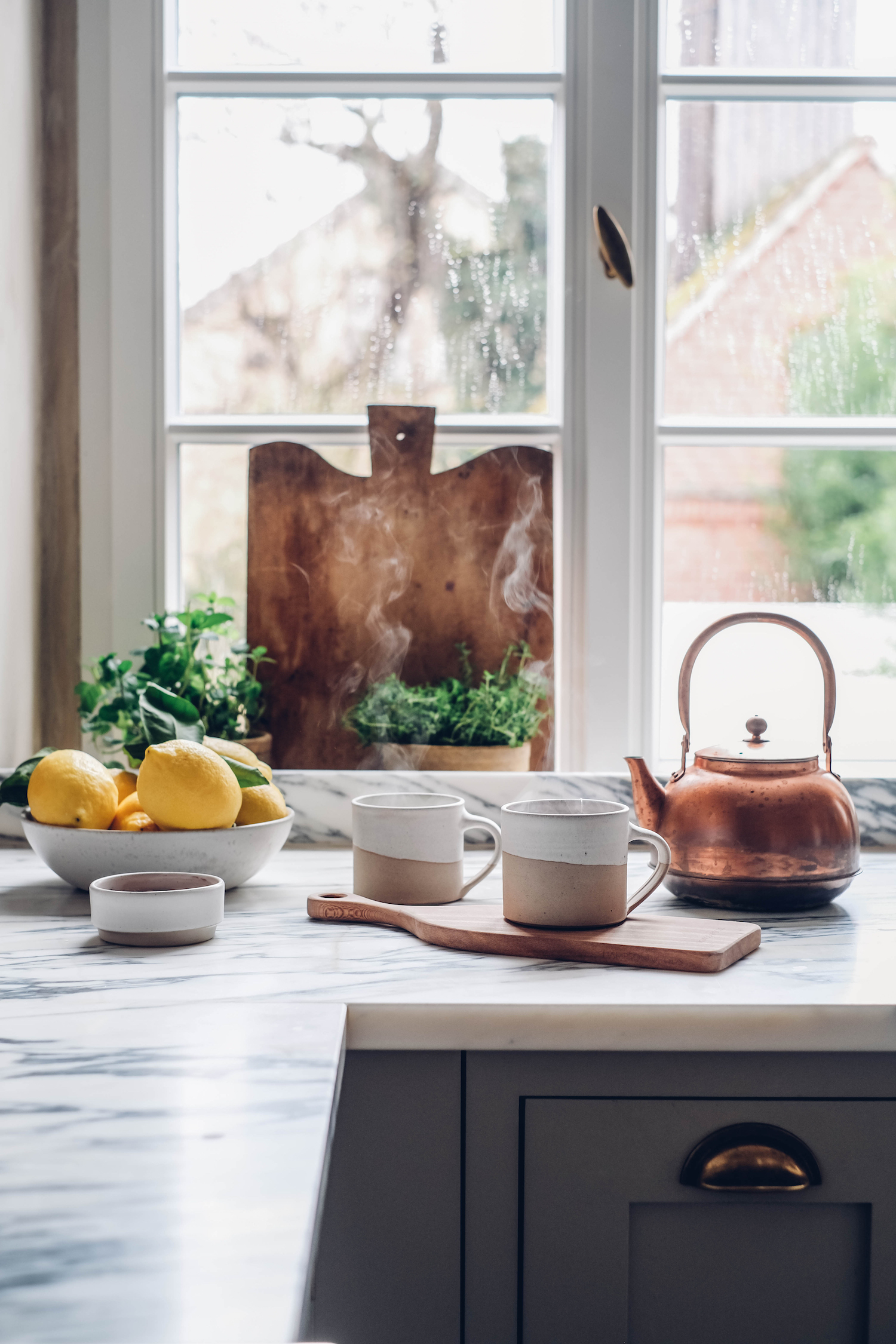
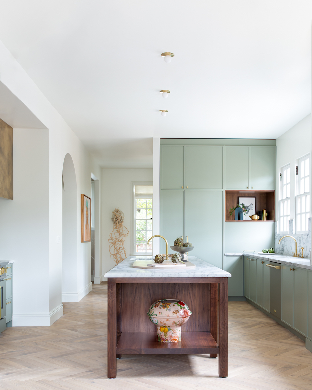
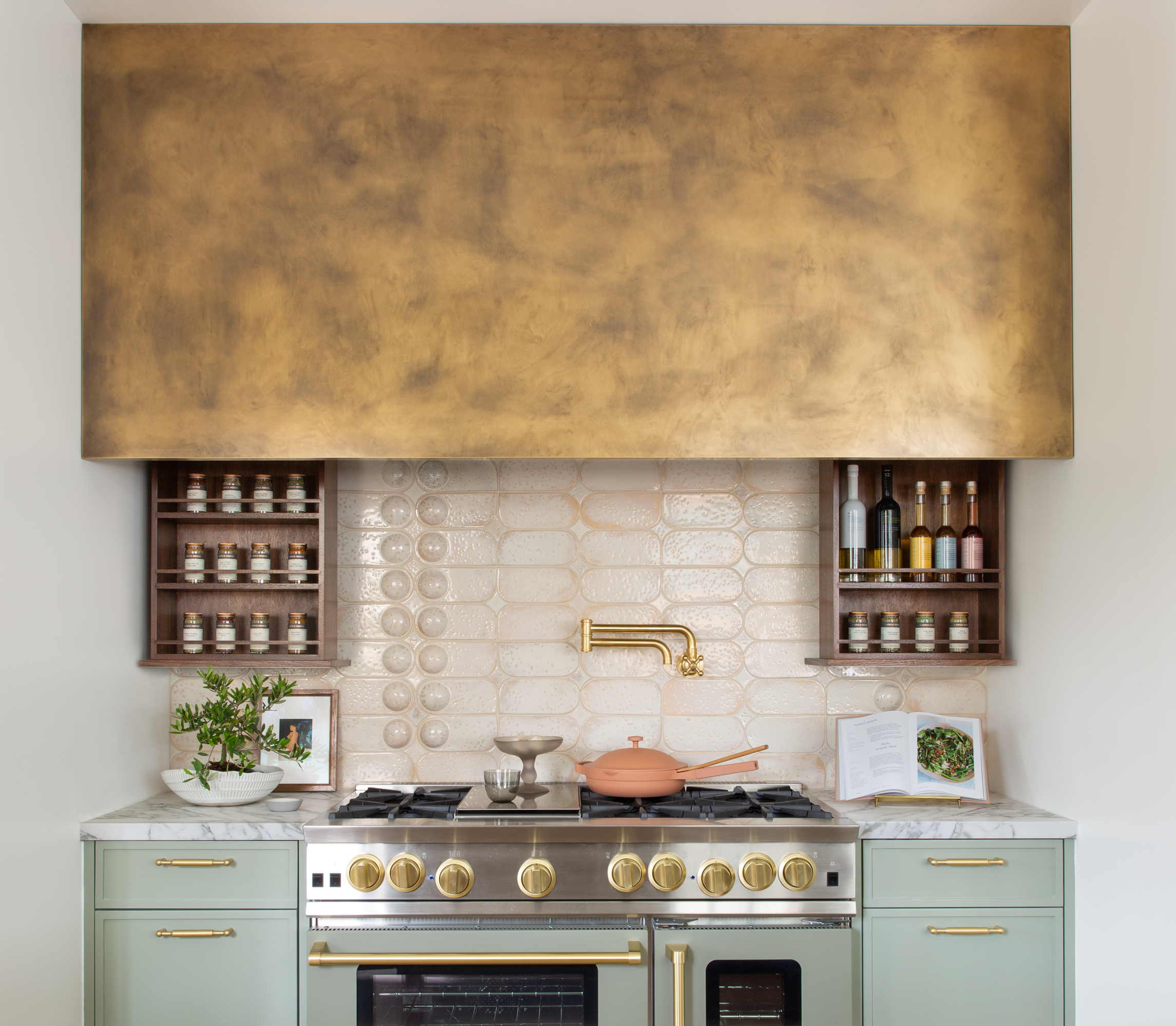
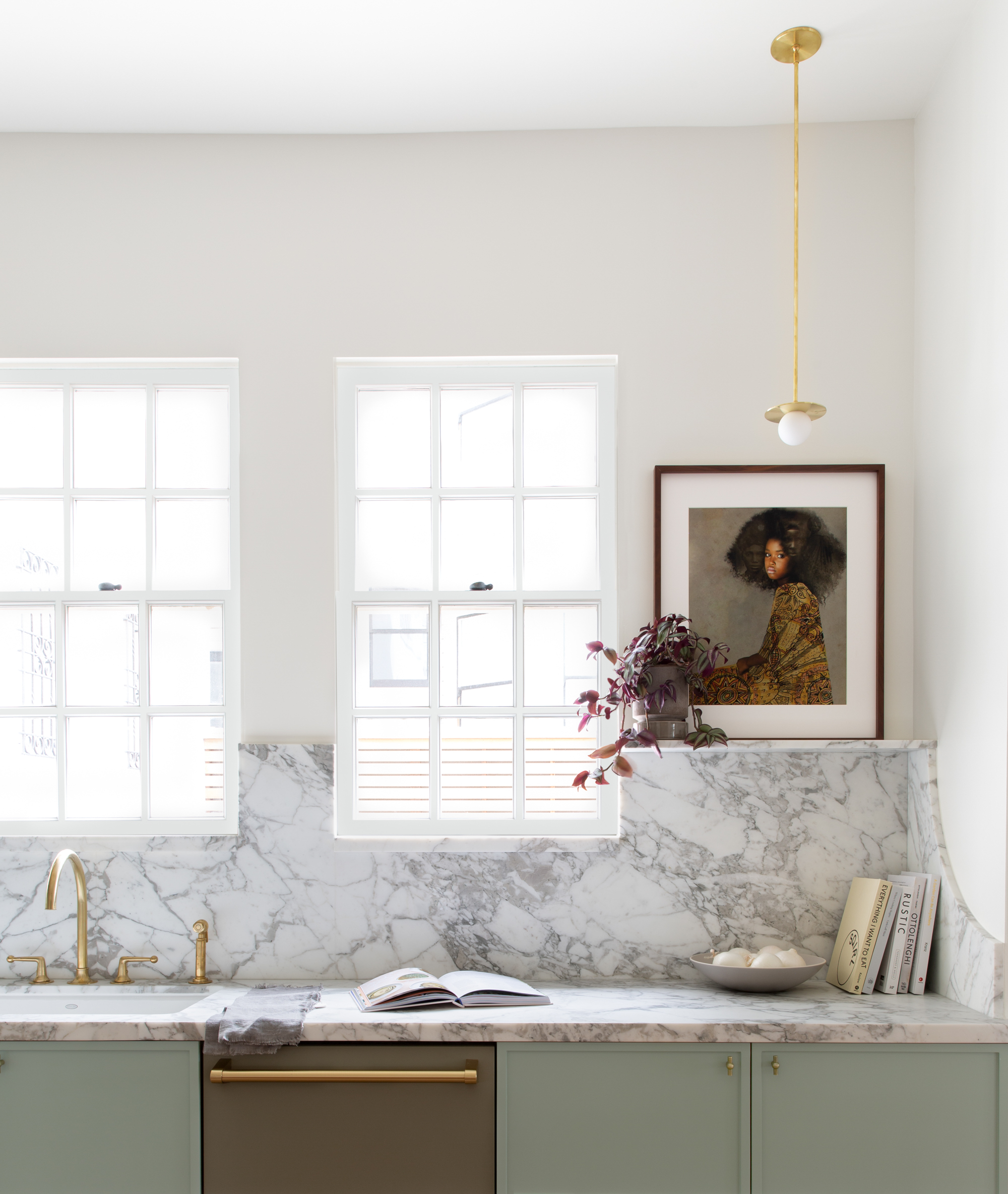
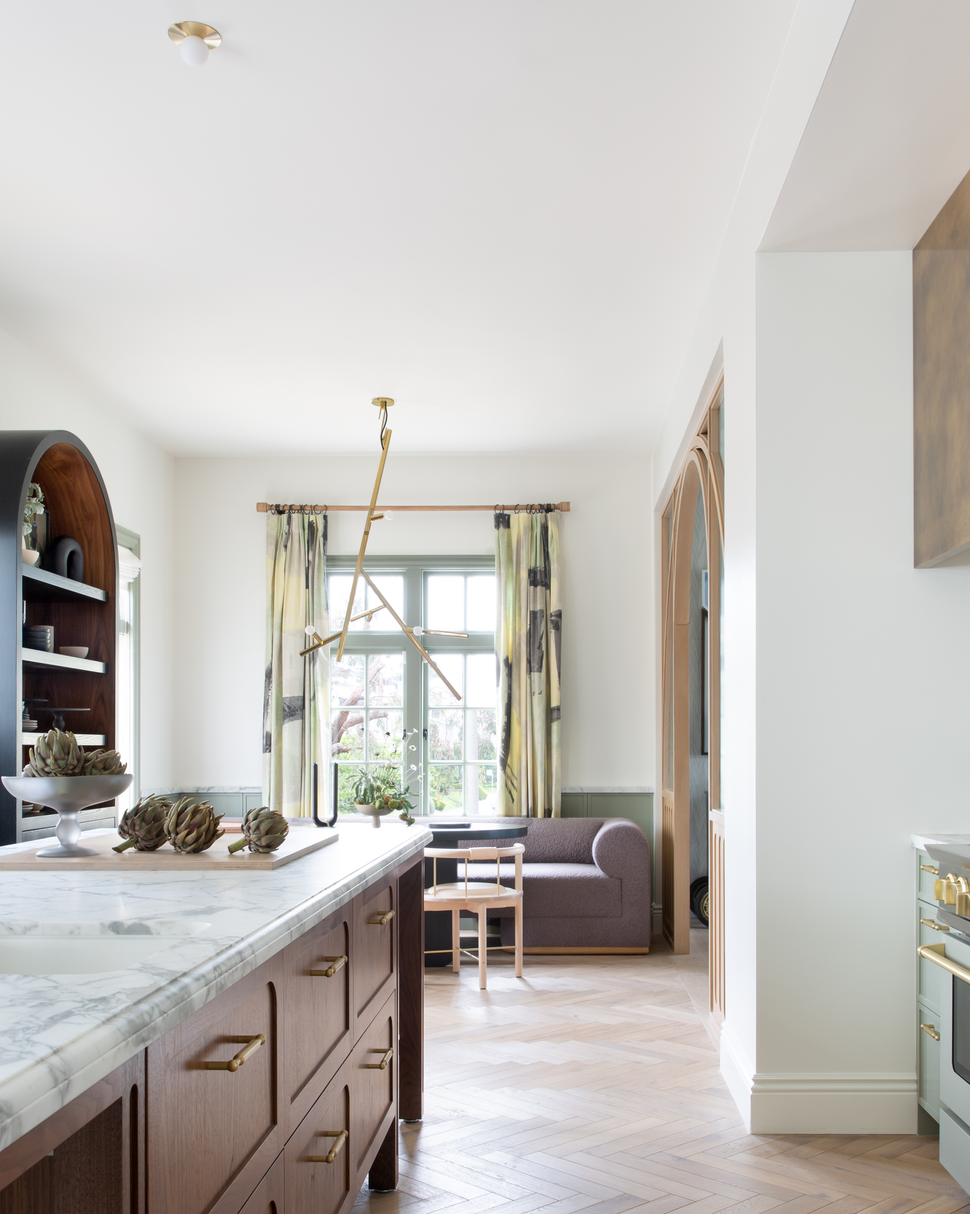
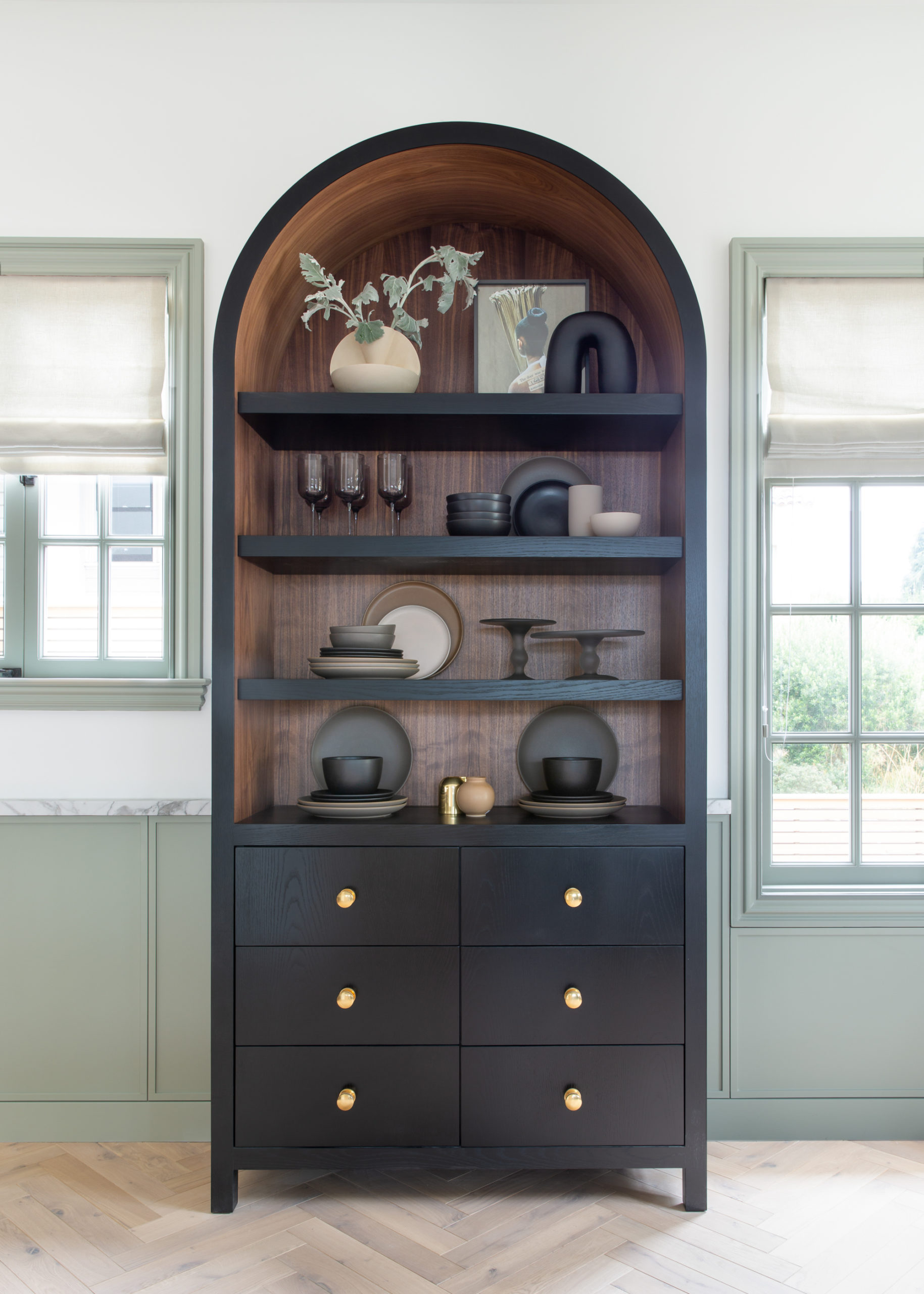
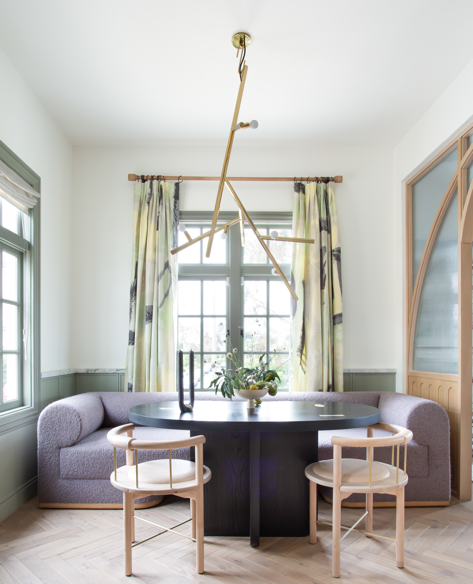
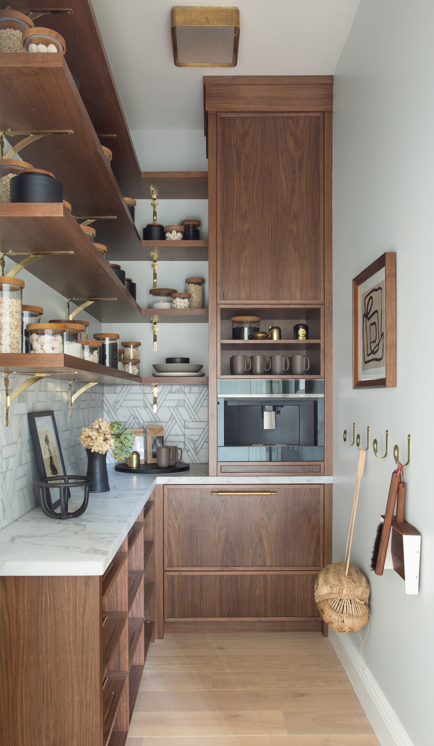
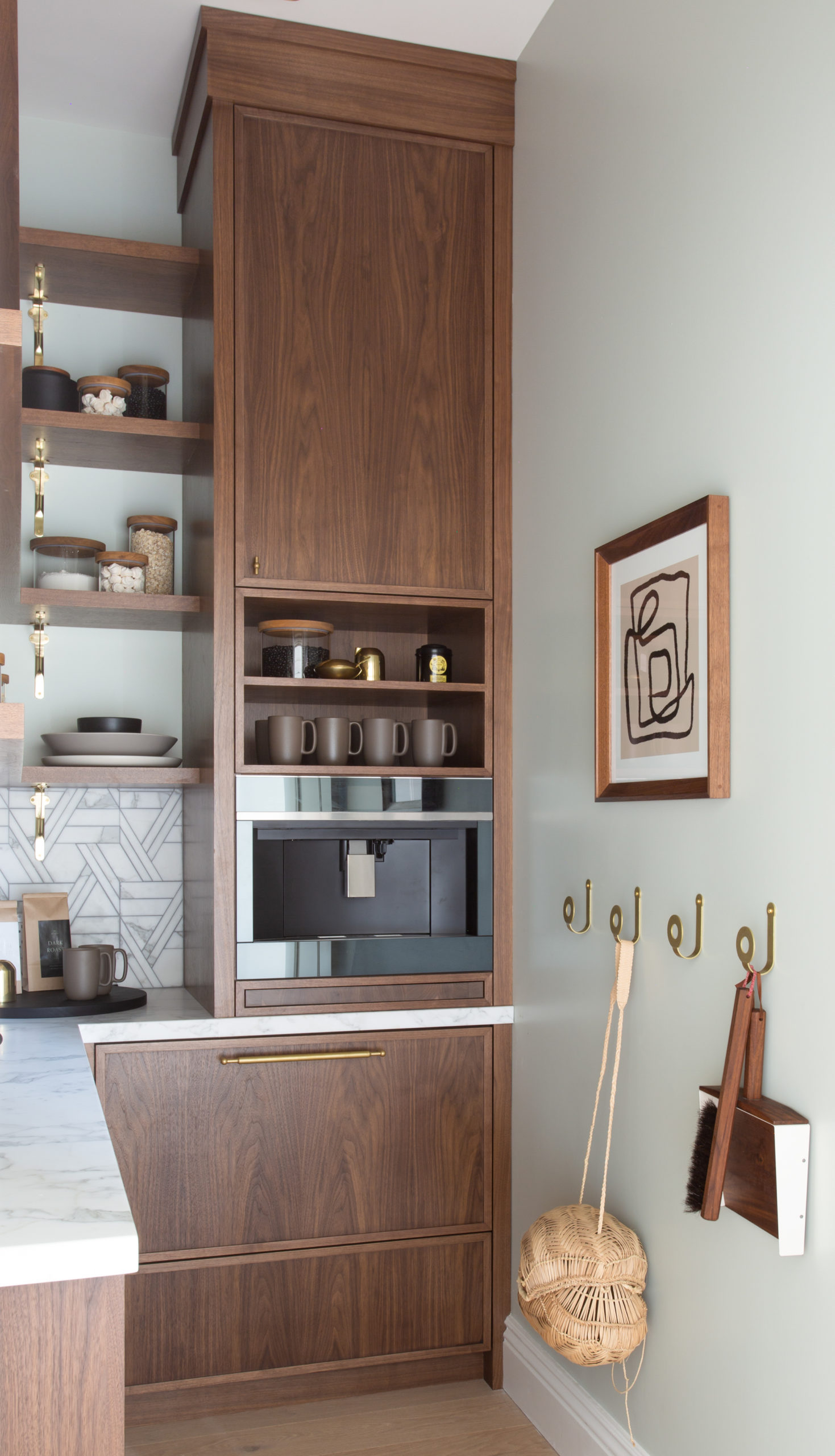
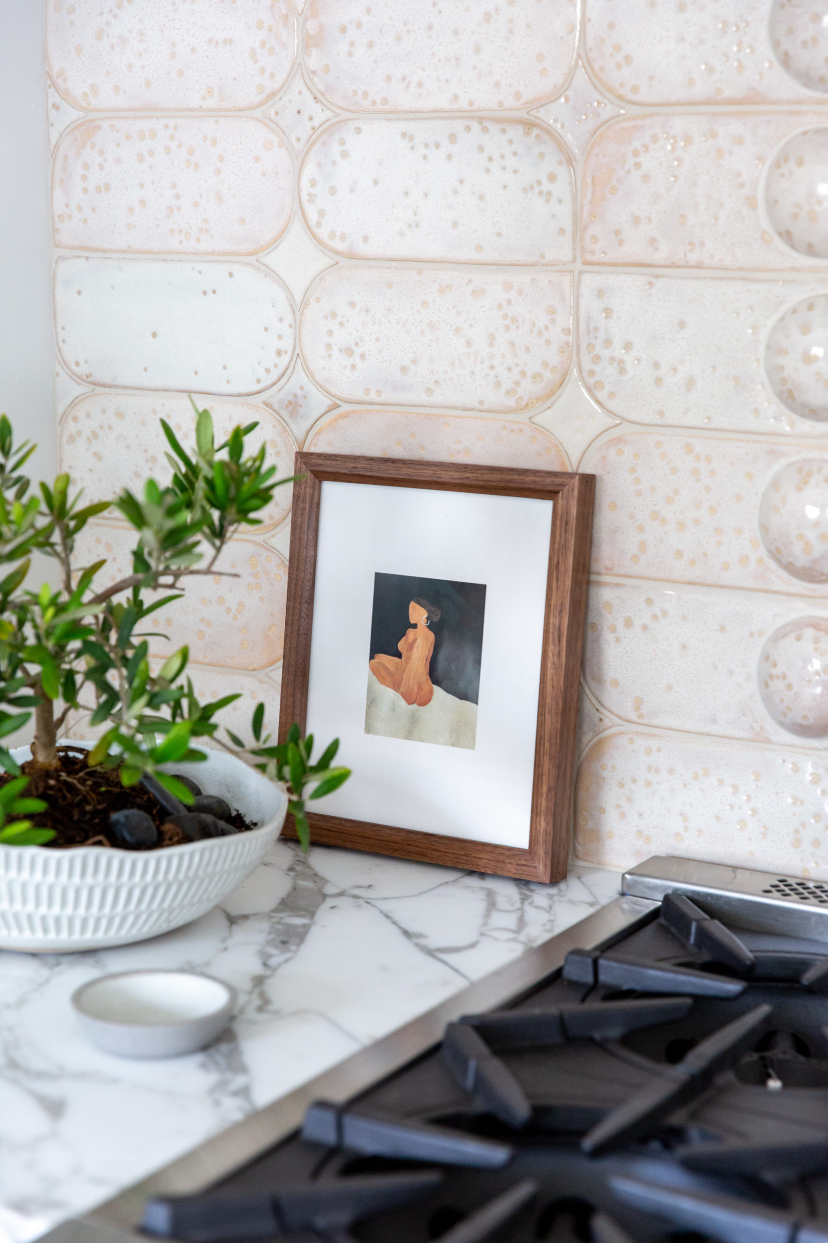
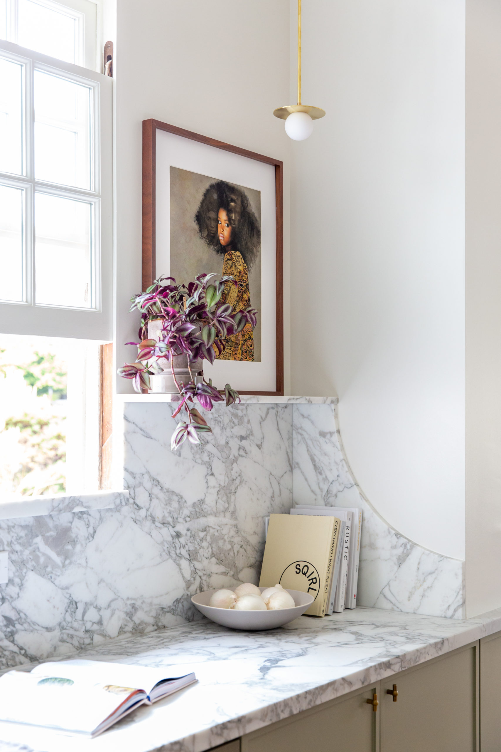
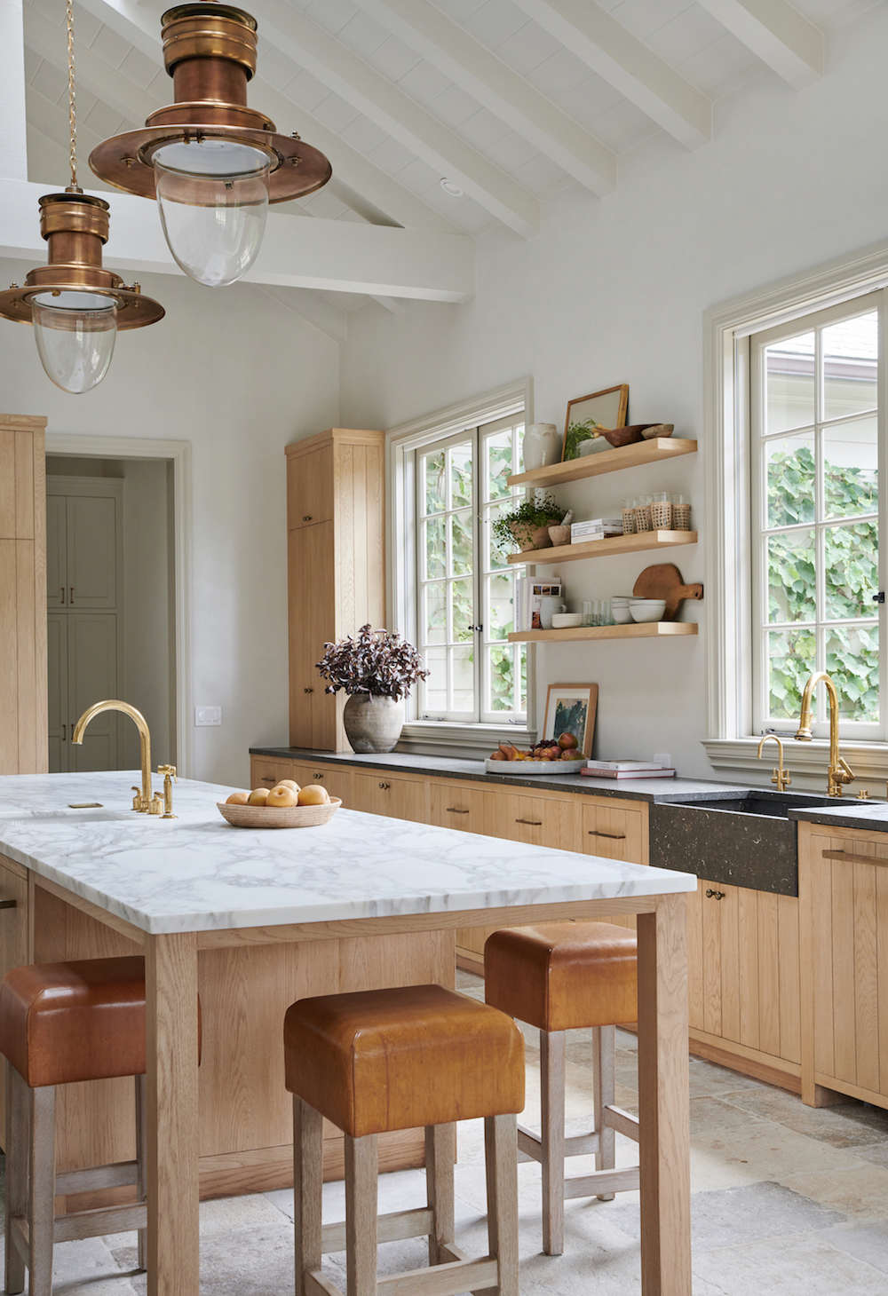
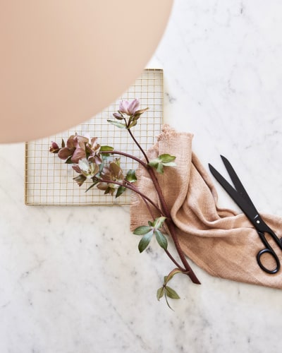
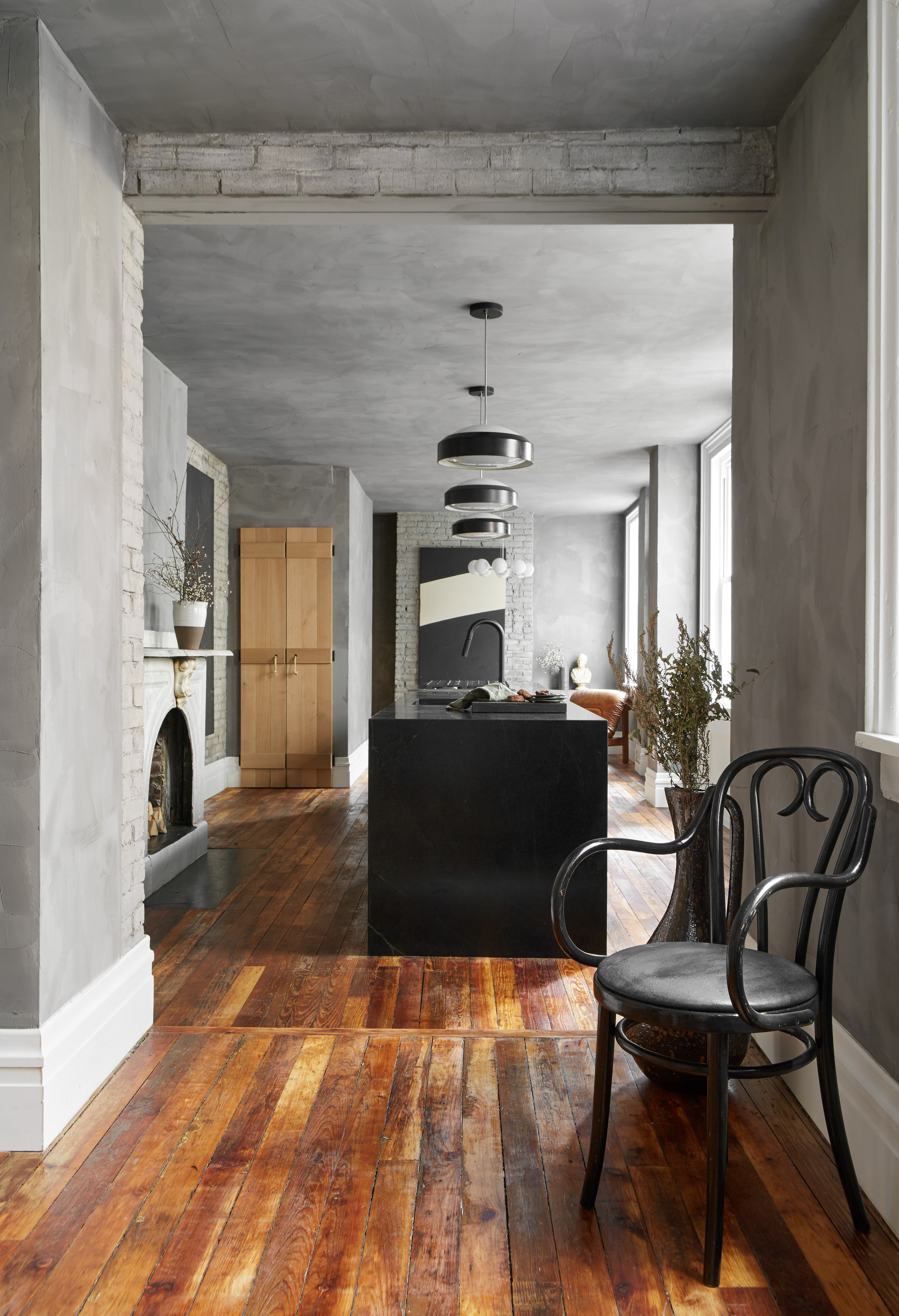
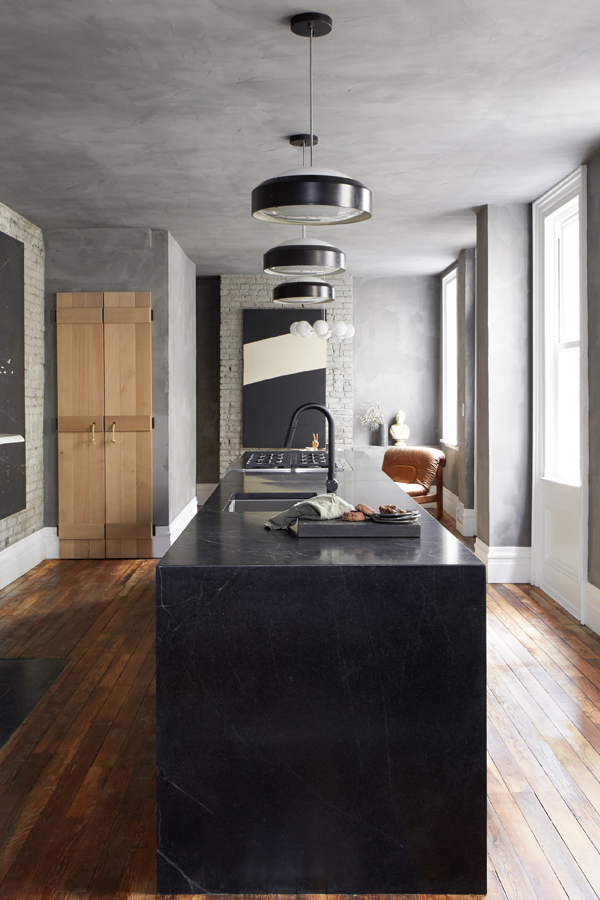
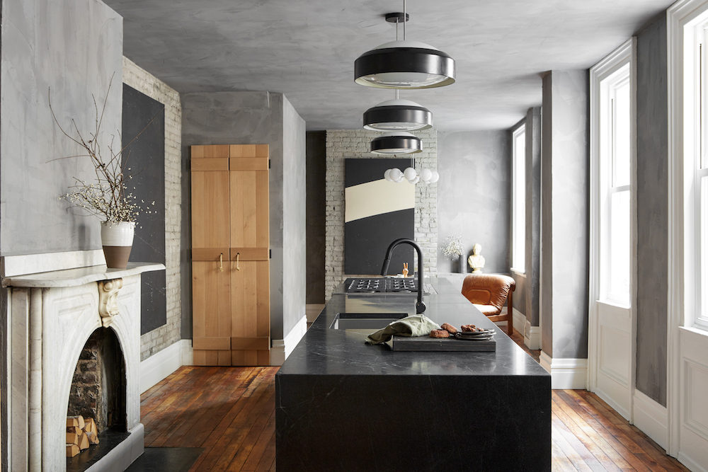
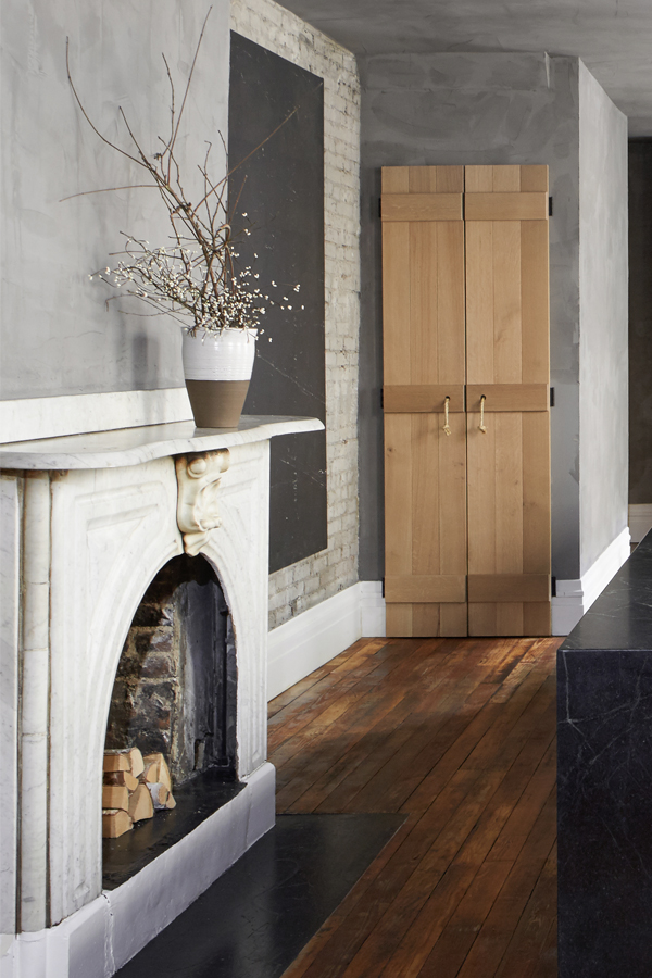
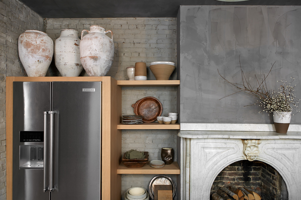
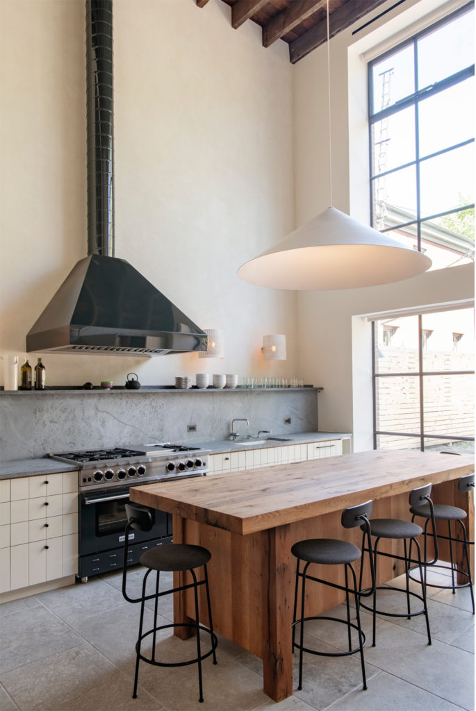
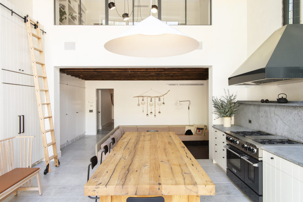
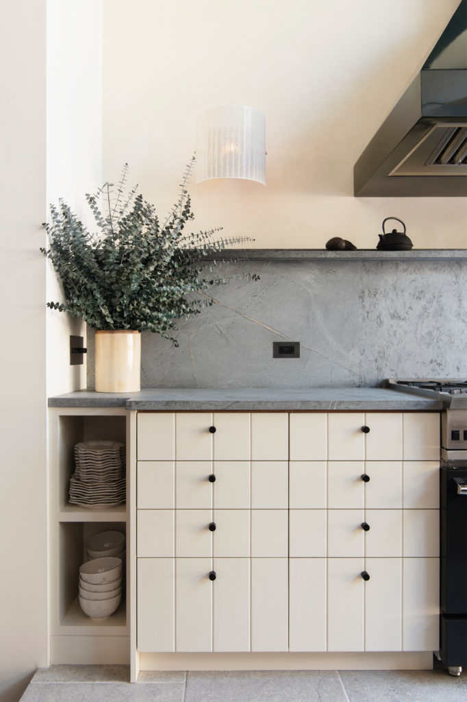
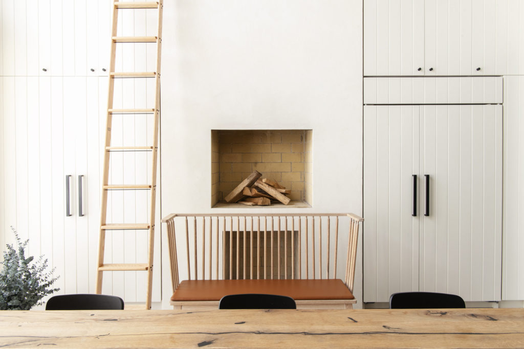
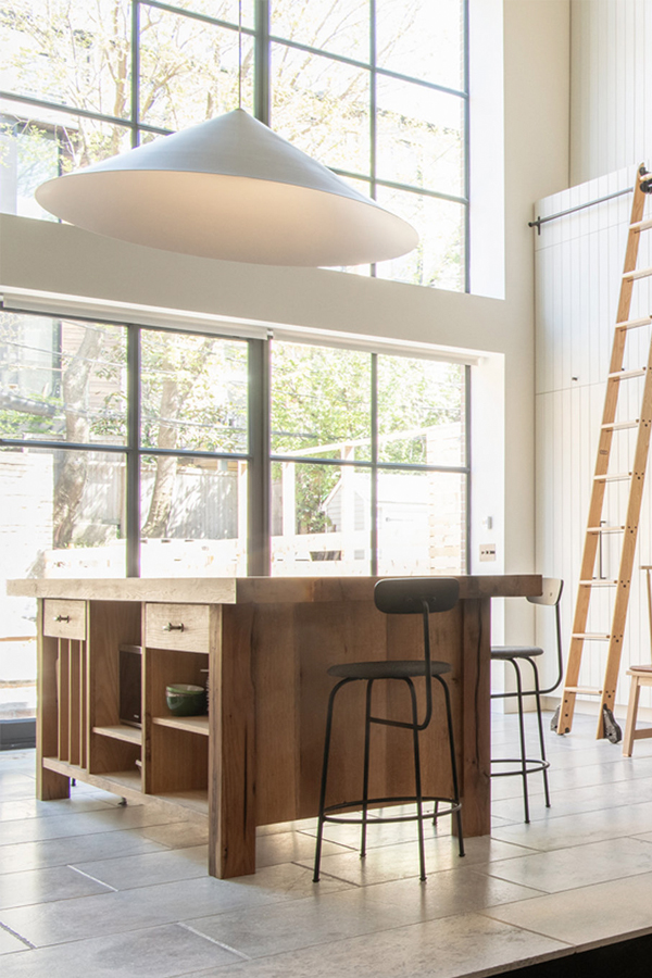
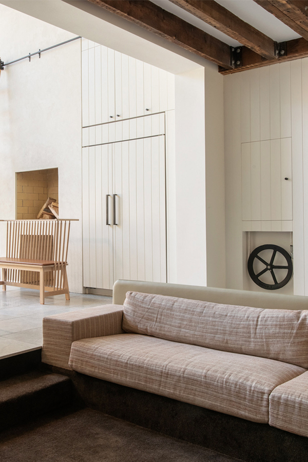
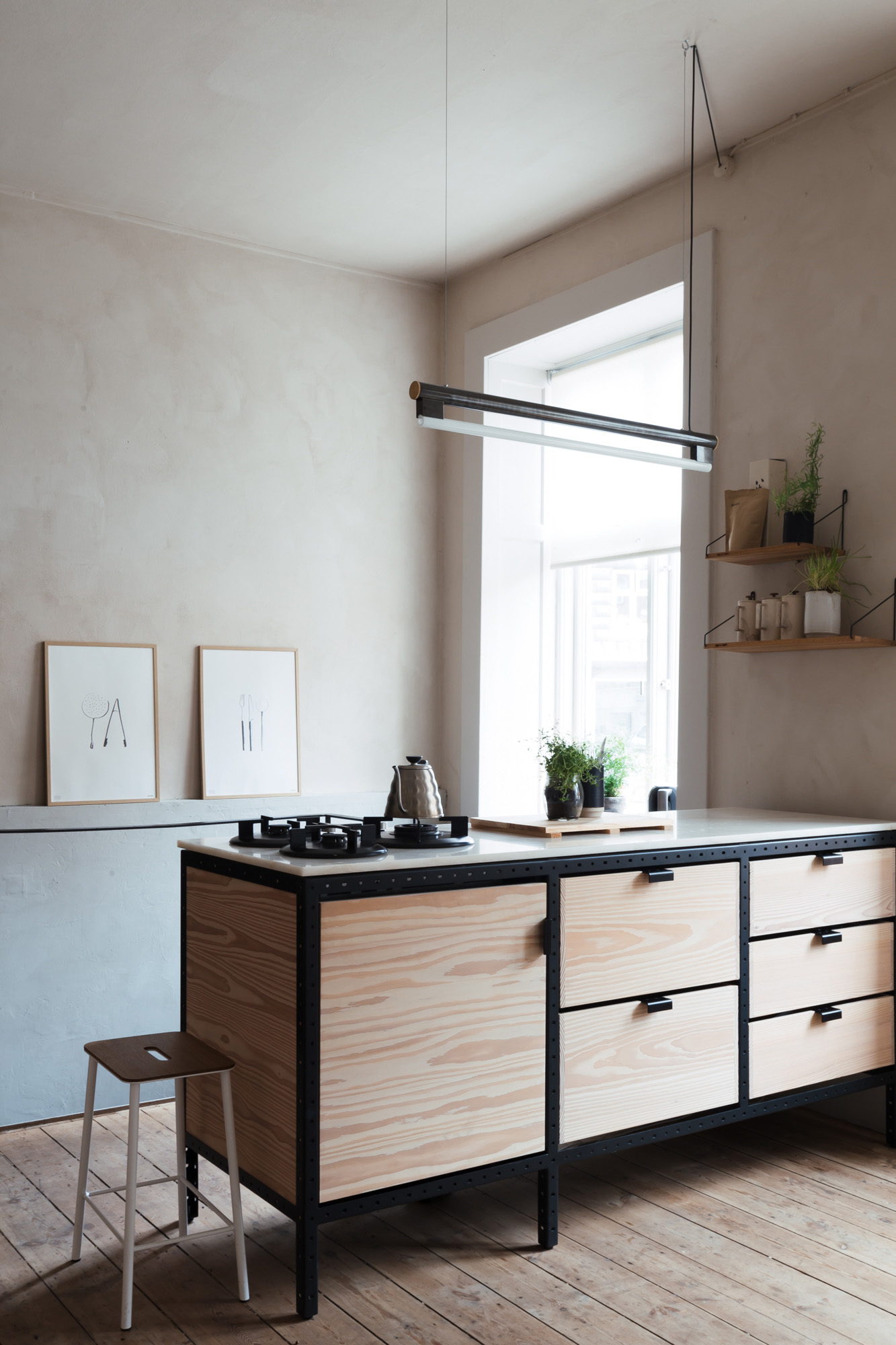
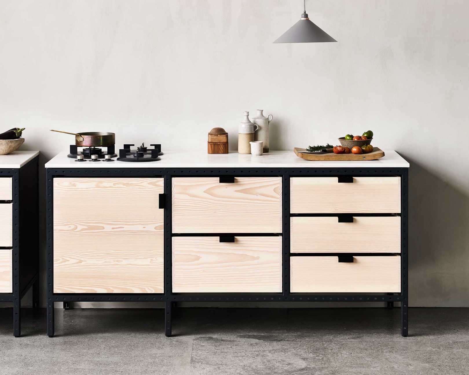
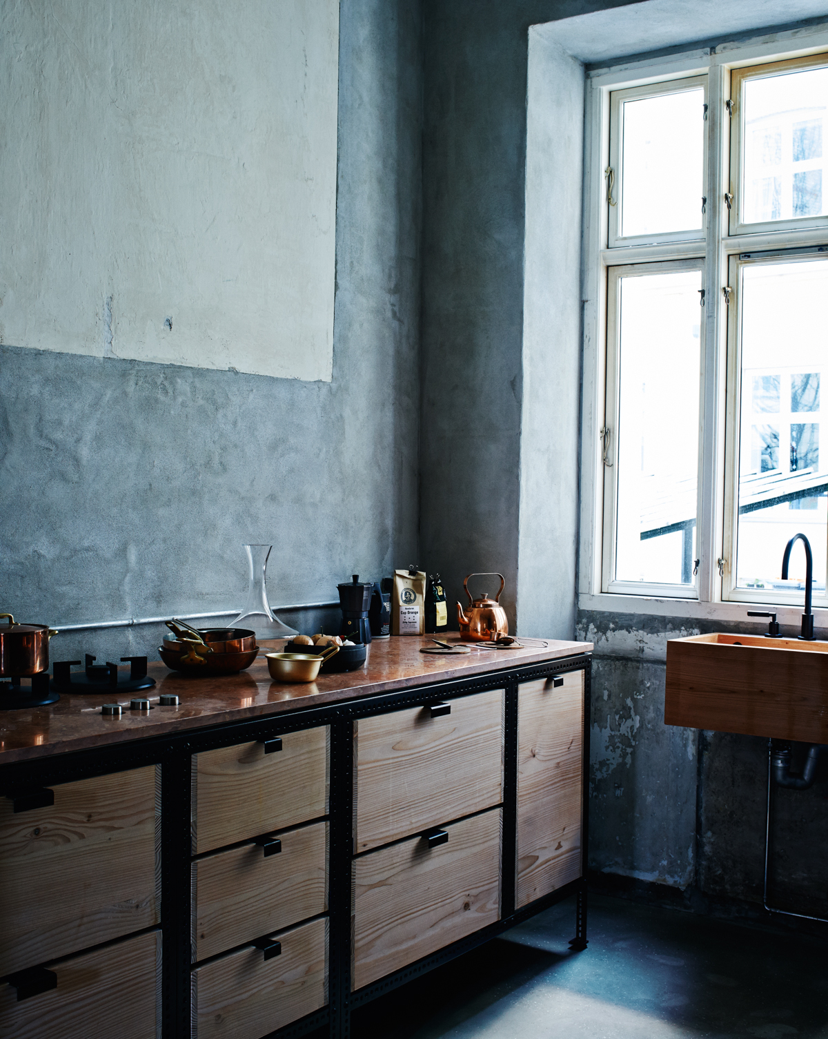
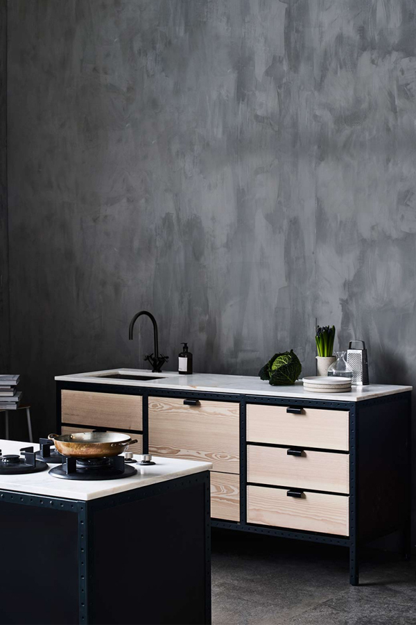
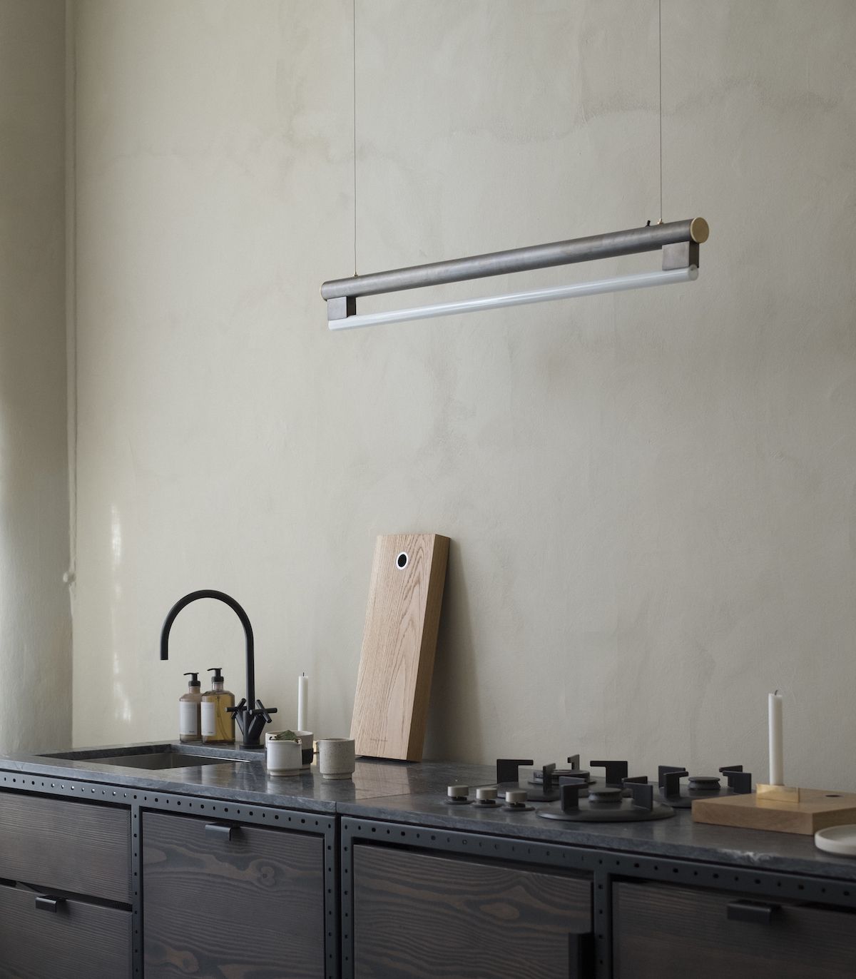
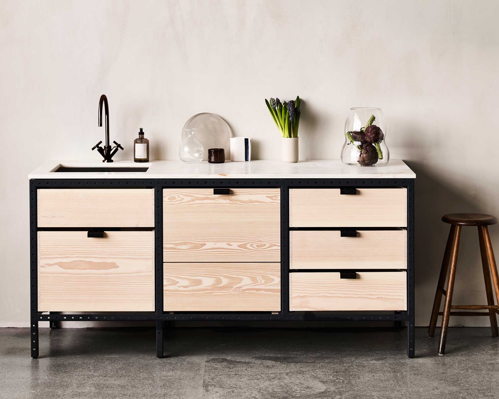
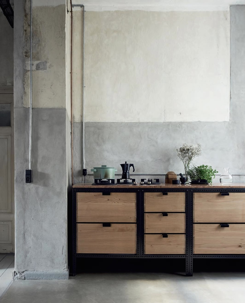
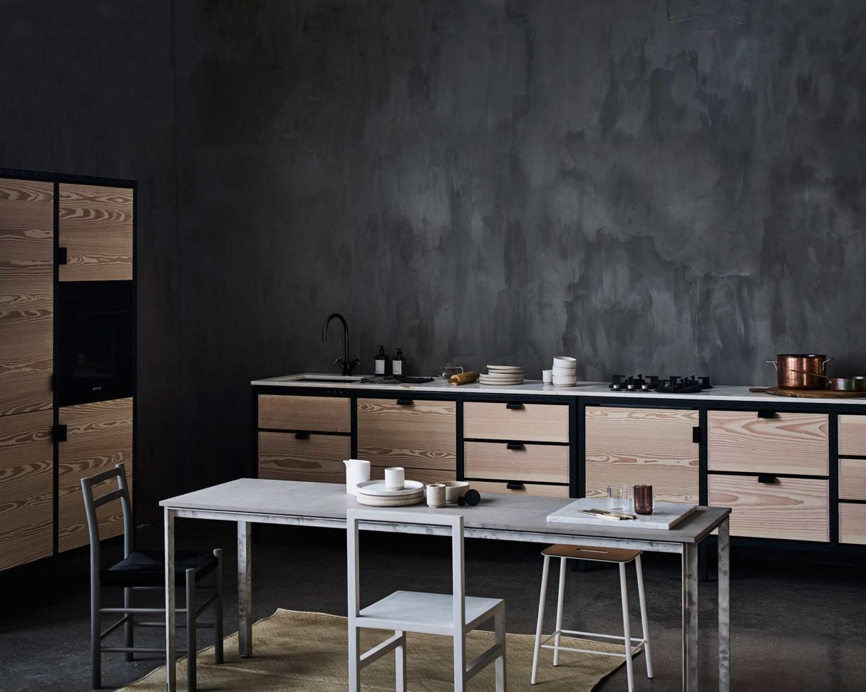
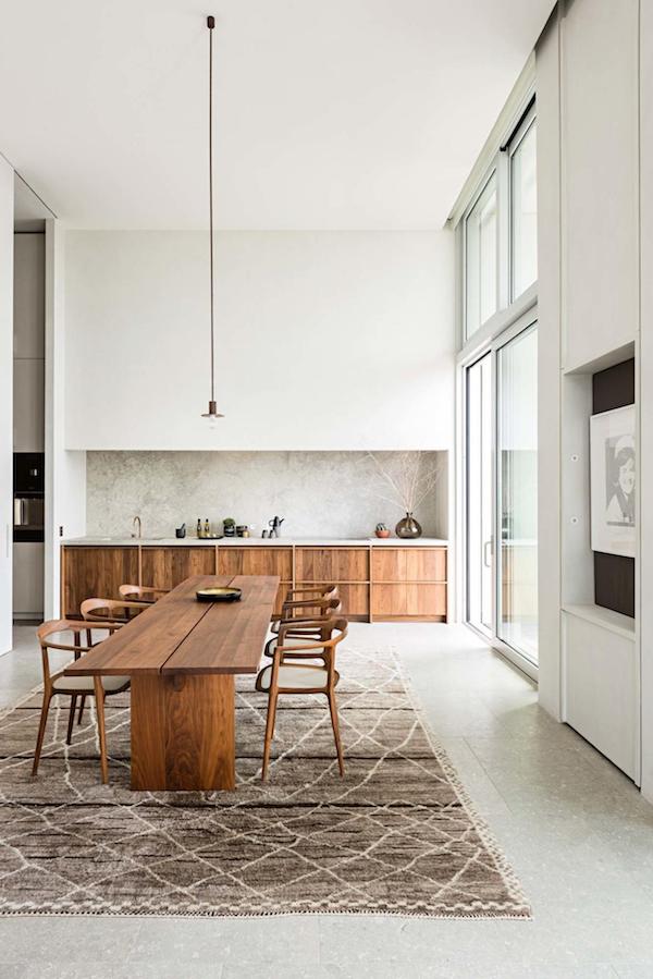
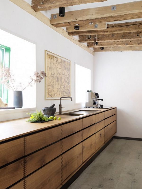
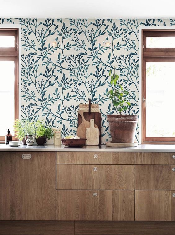
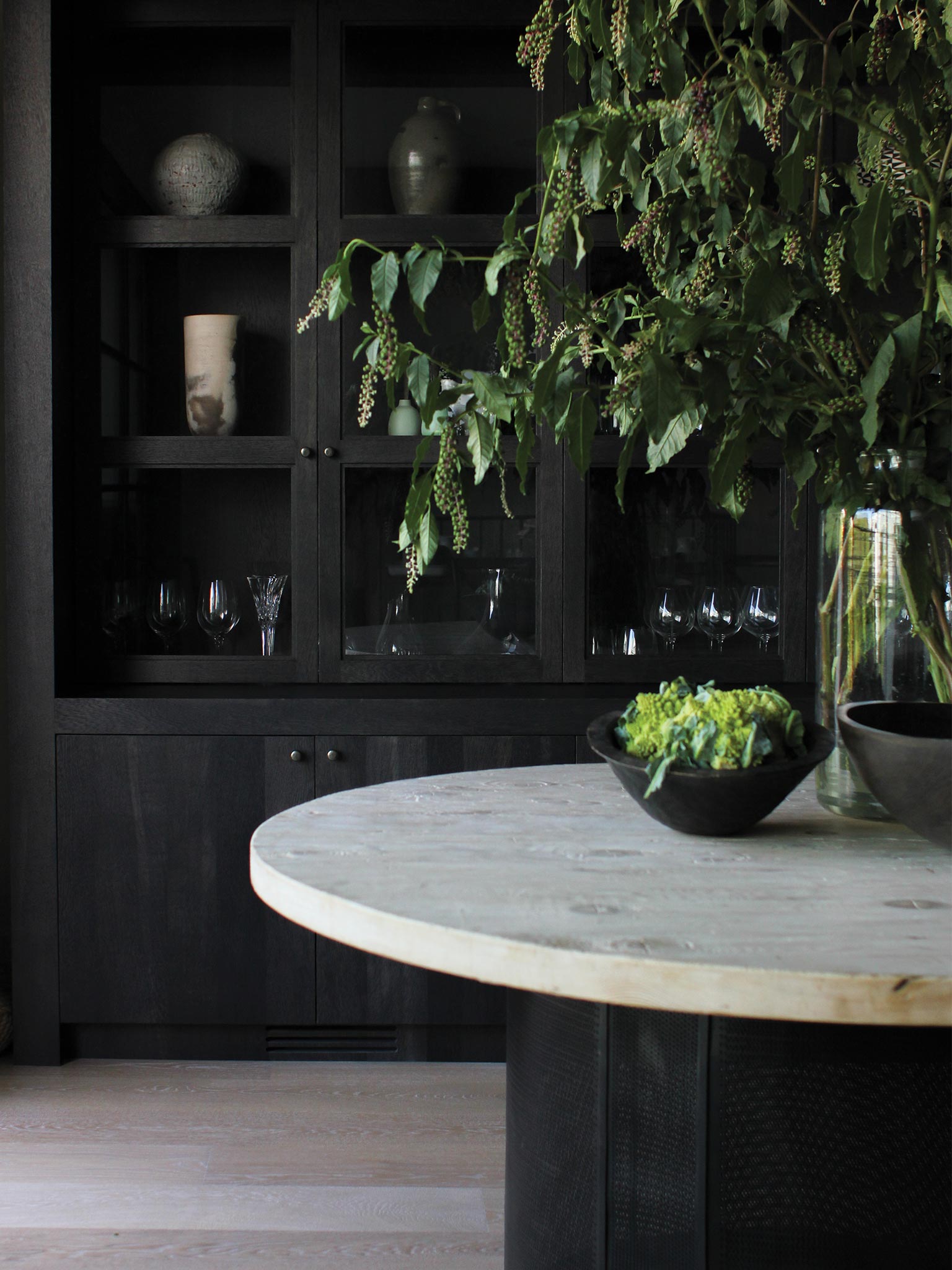
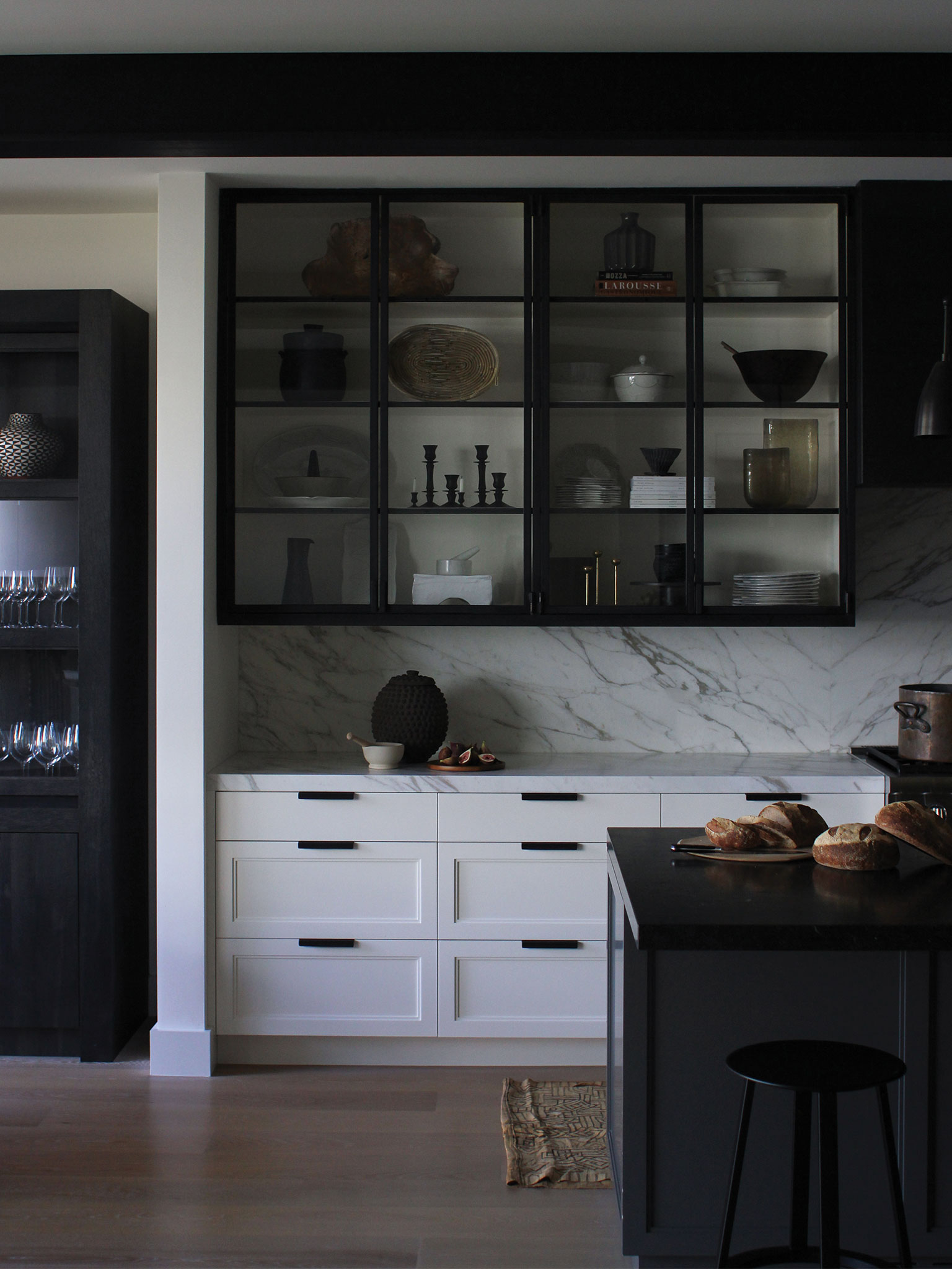
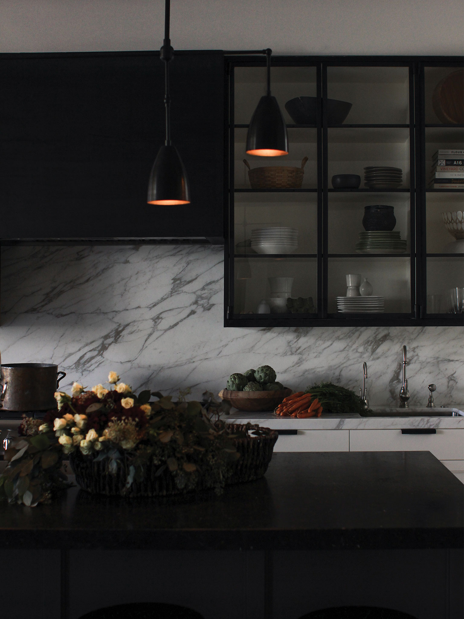
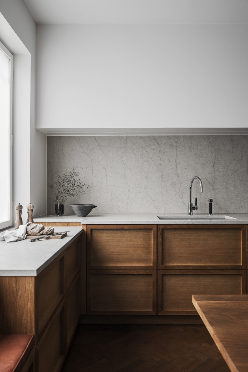
This kitchen, designed by Our Food Stories out of a refurbished old schoolhouse in the middle of the German countryside, is a total mood. Featuring deVol kitchen cupboards, tiles, shelves, light fixtures, hardware and more. This kitchen is certainly a showcase for the many of the pieces on my list of must-have kitchen tools – and of course, it does so beautifully.

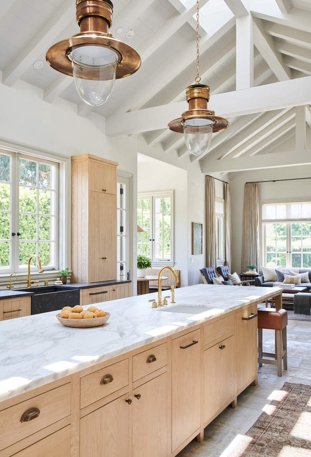
This space immediately transports you to an idyllic rural retreat. I imagine walking through overgrown gardens, picking fresh roses and making multi-course Sunday lunches here.

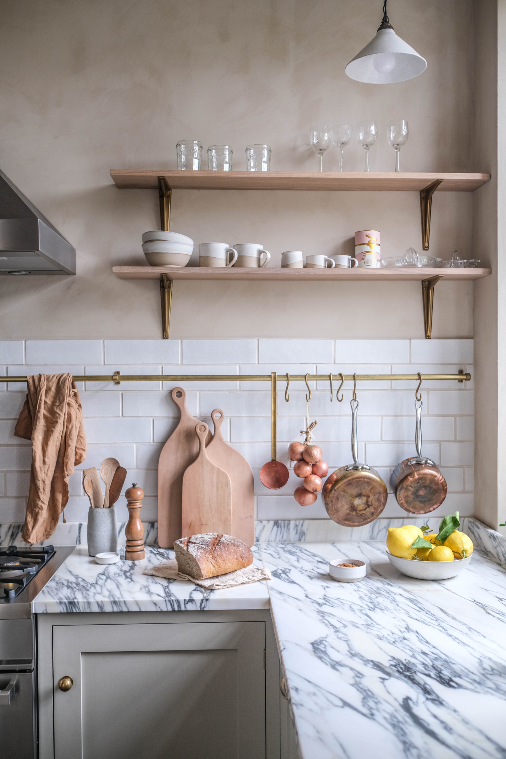
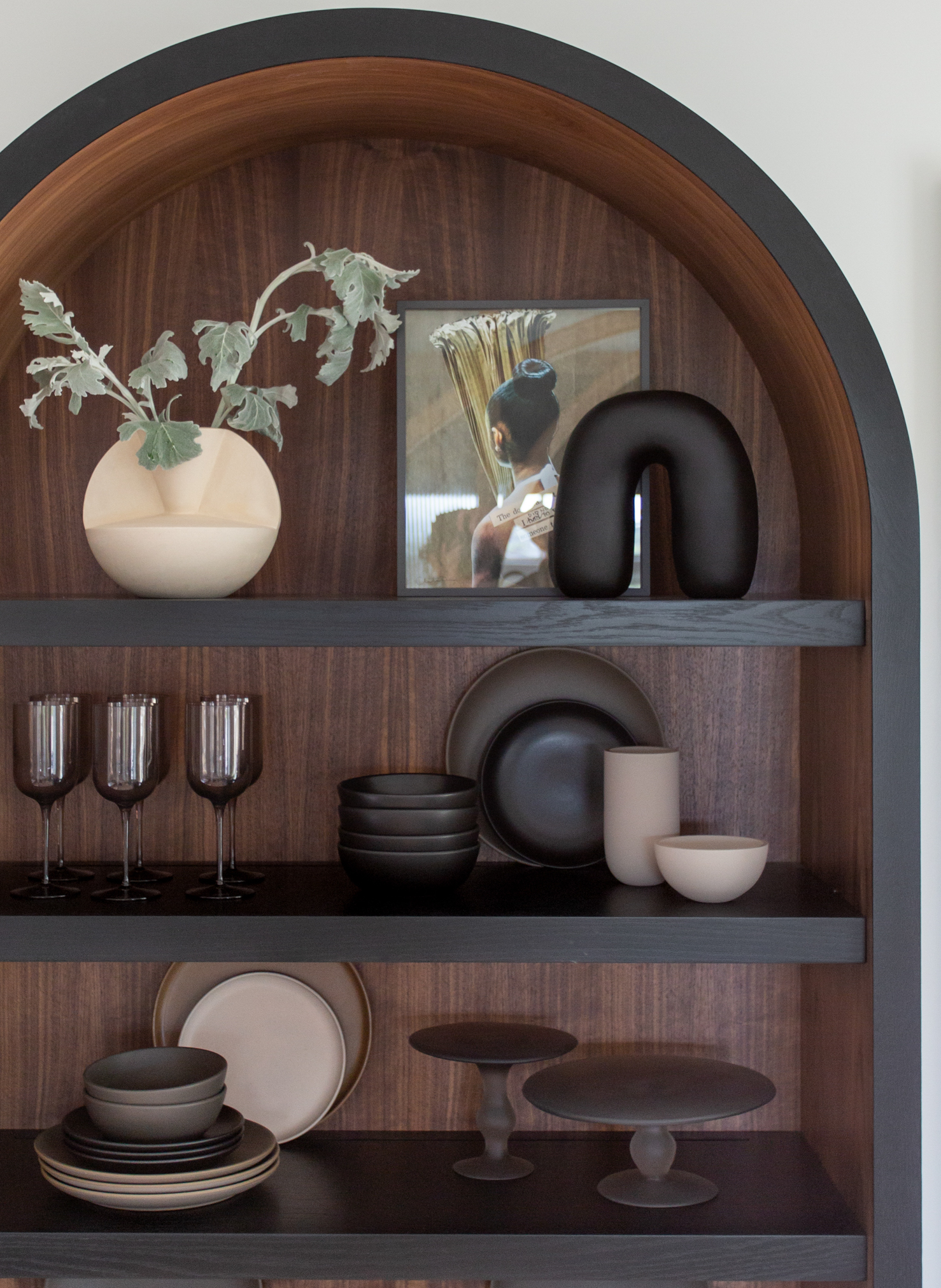
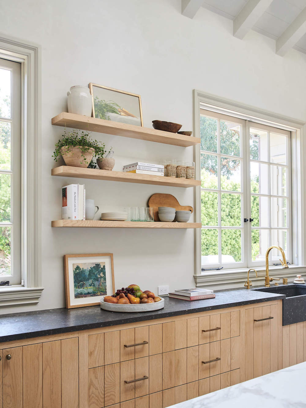
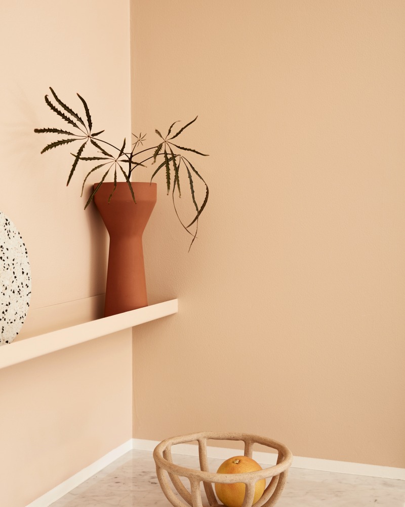
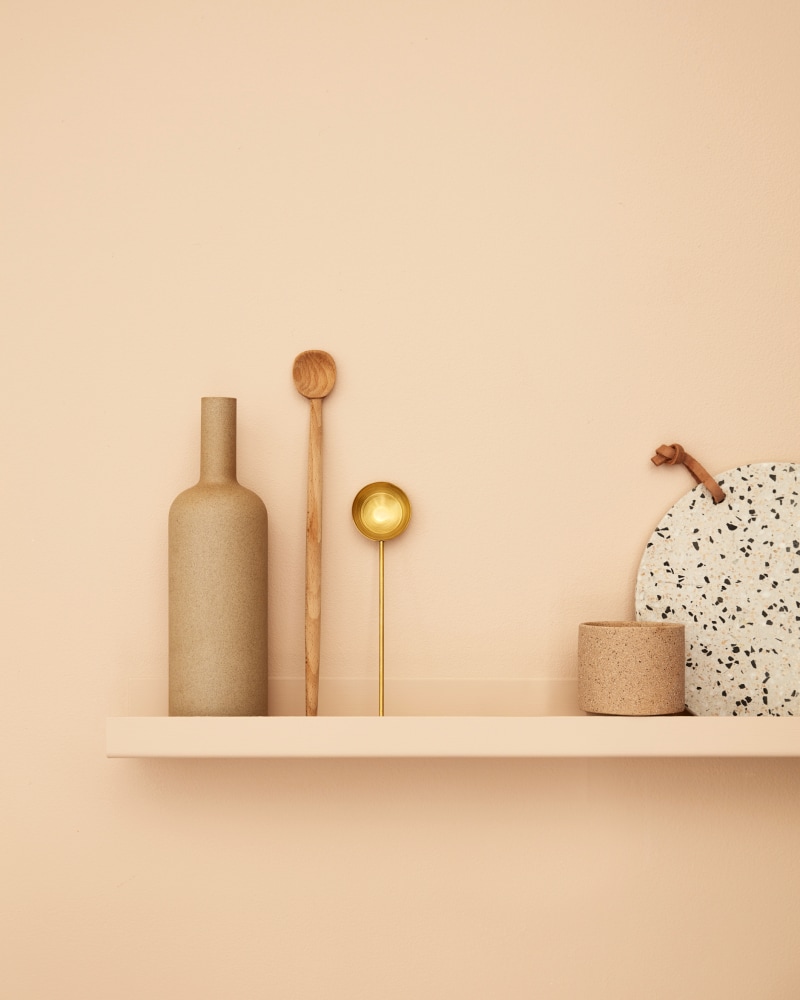
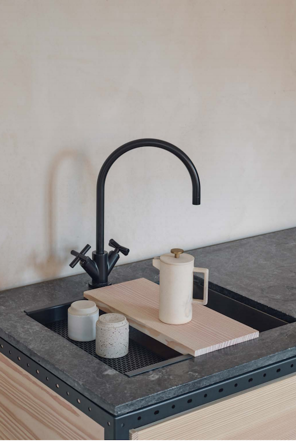
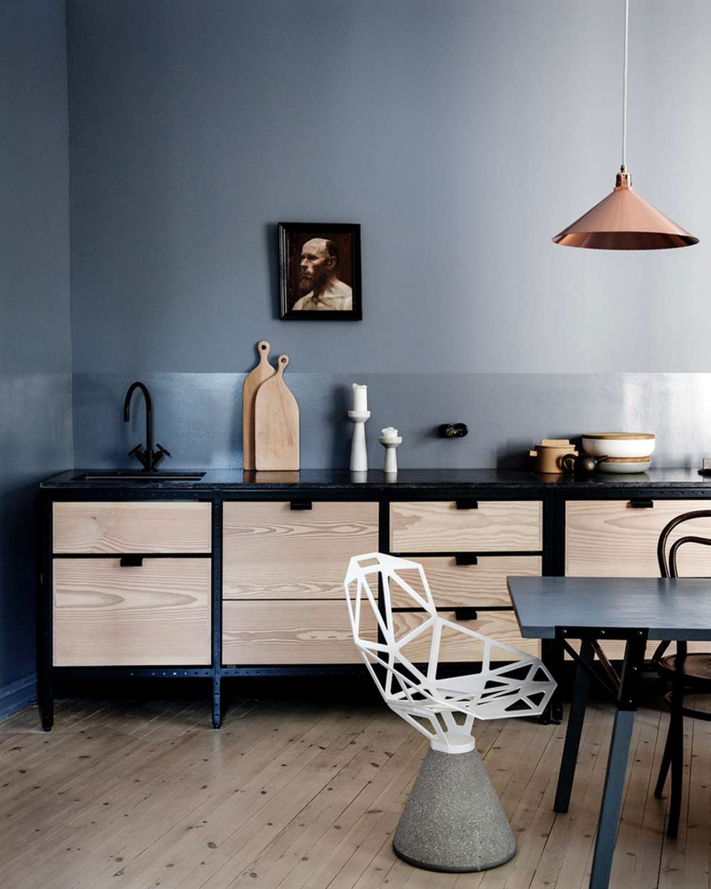
I love how this kitchen keeps so many key kitchen tools close at hand. While I might not be doing quite as many open shelves at Hood Canal, there is a lot to be said for having key tools within arms reach.

There’s nothing that drives me crazier than a poorly outfitted kitchen. But an overcrowded kitchen can be equally crazy-making. You have to strike that balance.

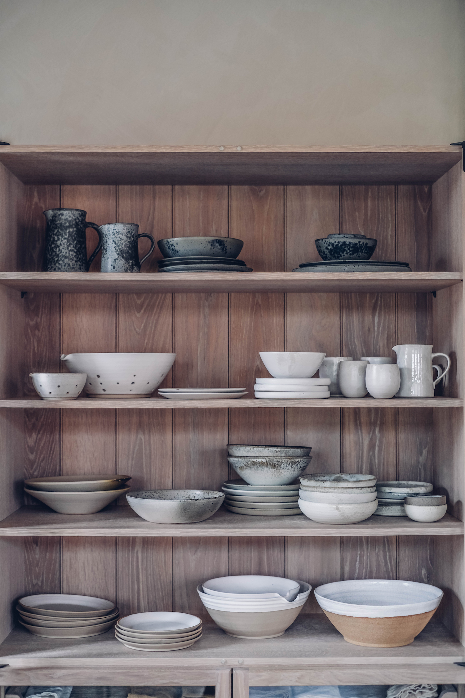
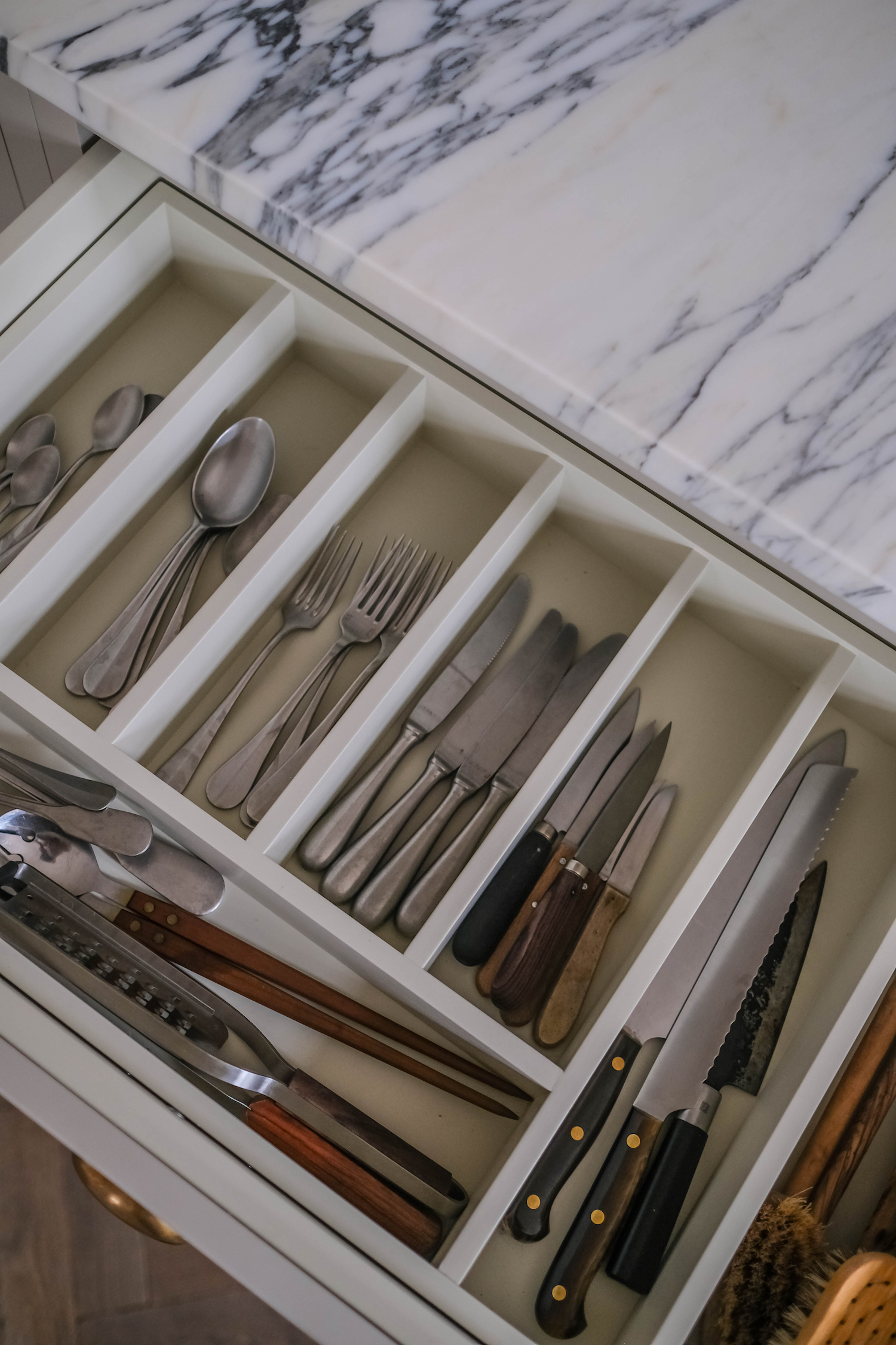
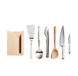
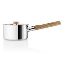
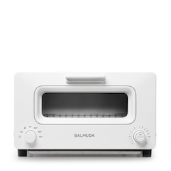
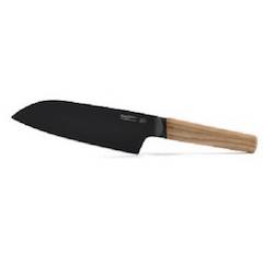
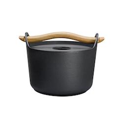
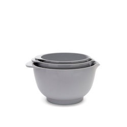
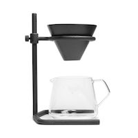
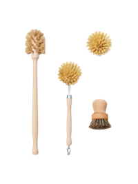
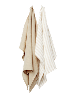
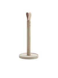
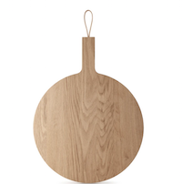
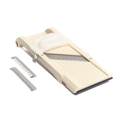
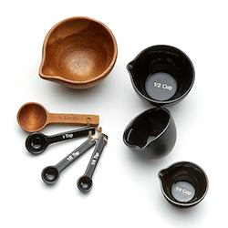
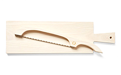
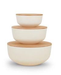
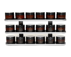
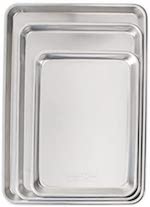
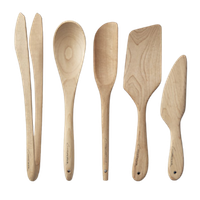
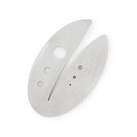
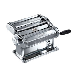
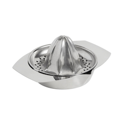
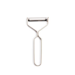
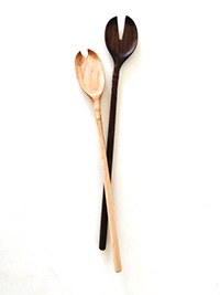
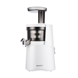
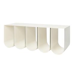
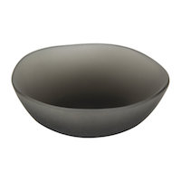
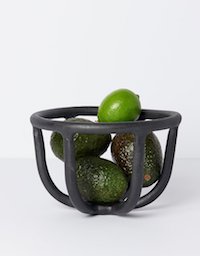
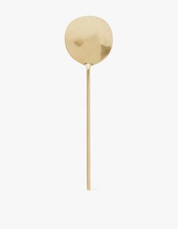
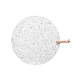
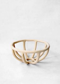
For me, the key kitchen tools I turn to time and again include one good set of pots and pans, a cast iron skillet, a good set of wooden spoons and spatulas, a top notch cutting board (or several) and then all those little tools that you need when you’re in the middle of pulling together a recipe – measuring cups, knives, peelers, strainers, graters, zesters – all the speciality things that let you add the finer components of a dish.

Those speciality tools are the kinds of things that far too many kitchens lack. Or they’re the big bulky OXOX ones you get at a grocery store that feel chunky in my hand and will just clog up my limited drawer space in the new kitchen. She gonna be cute, but she’s not going to be big.

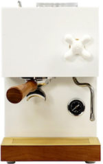
As the weeks have progressed, I’ve been slowly but surely amassing my ultimate kitchen wish-list. Each kitchen tool, appliance, or serving piece needs to have a very critical purpose and look damn good while doing it.

I thought I’d share my wishlist with you. It’s certainly not comprehensive. As I cook every evening some other thing in my San Francisco kitchen makes me think oh yes, I have to find the beautiful version of this for Hood Canal. But all the extraneous stuff I have in my SF kitchen also makes me want to pull my hair out. I’m constantly digging for my one favorite knife or pan or bowl.

I hope you find something below you’ve been searching for. If you spot a key kitchen tool that I’m still missing, please tell me in comments! I consider my ultimate quest to outfit the ideal kitchen.

I’m also regularly adding favorites for the kitchen in the Apartment 34 SHOP so be sure to check it out too!

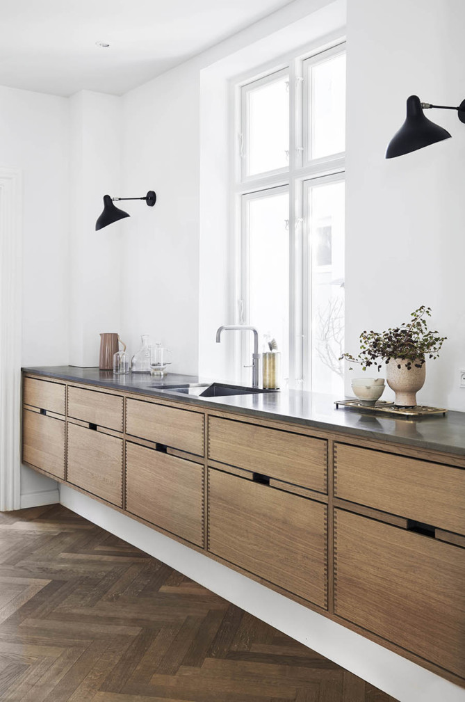
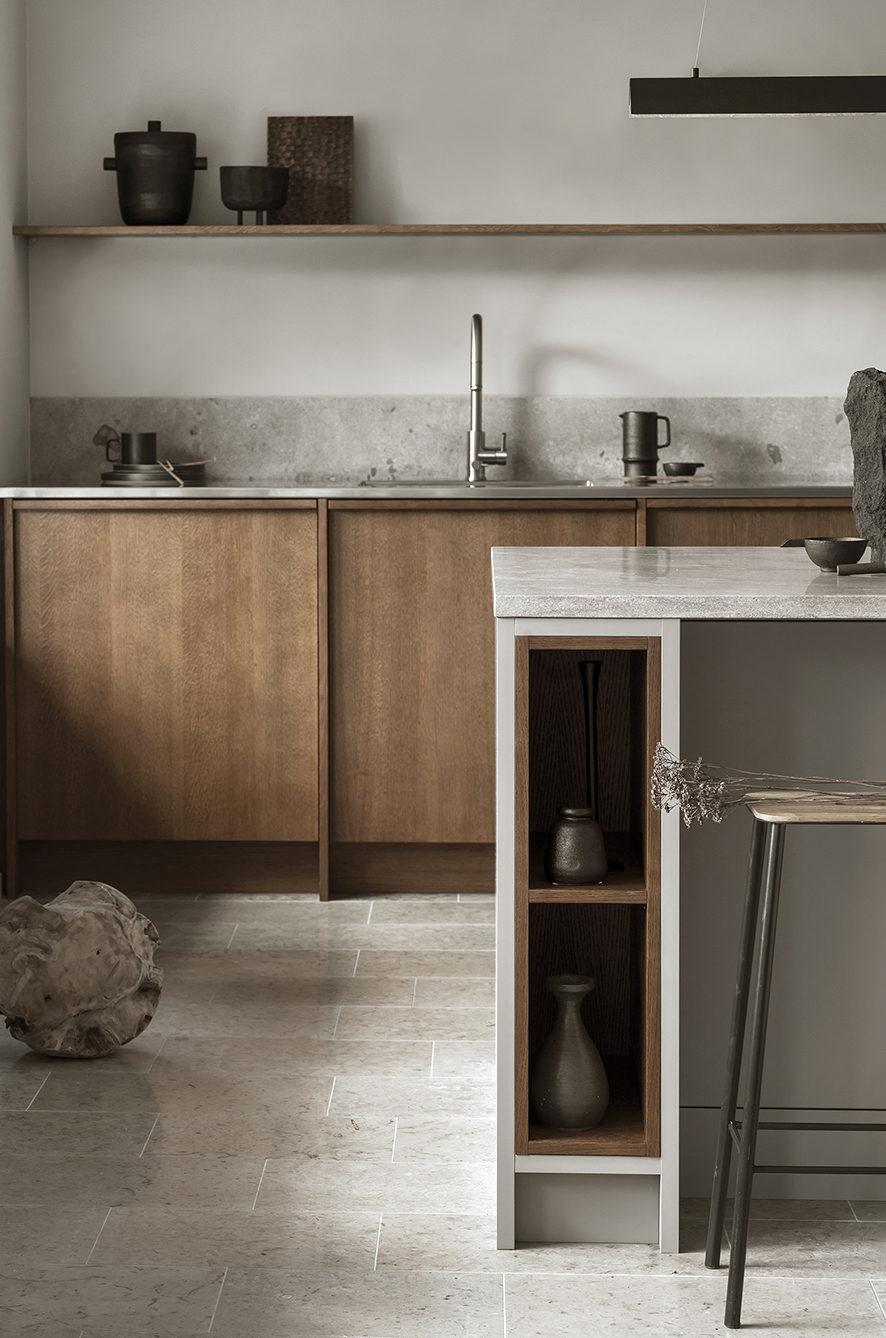
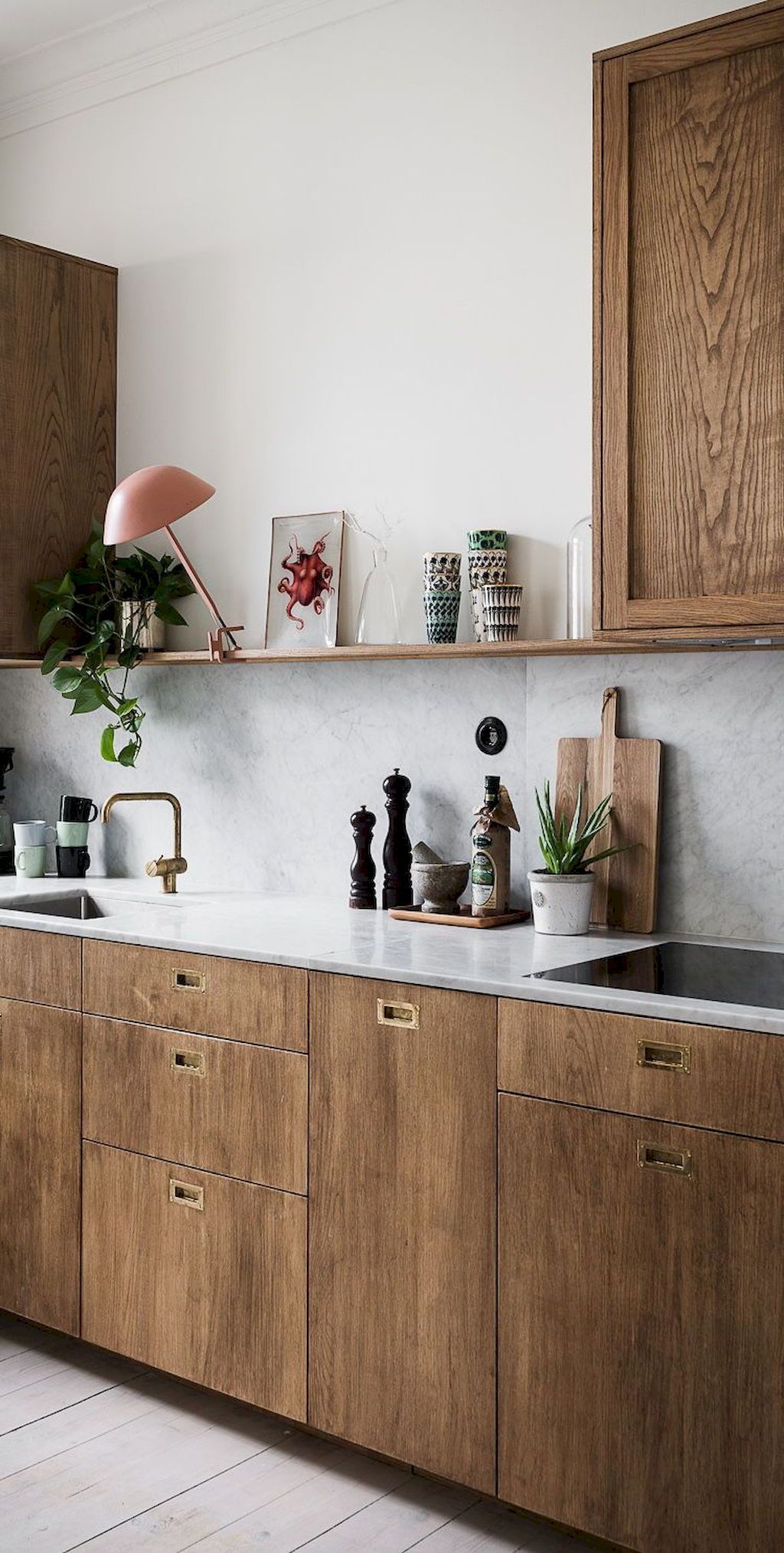
all images by Our Food Stories

How’s everyone doing out there? It’s been another hot minute. How are you holding up? So much is coming at us seemingly every second – it can be hard to keep the day of the week straight. I don’t know about you, but I’m grateful to design for being a welcome distraction when I just need a moment. Even if it takes me three weeks to finally write about it.

Case in point, the San Francisco Decorator’s Showcase. It is one of my favorite design events of the year. I mean what’s not to love? You get to tour a mega-mansion in the city’s famed Pacific Heights neighborhood that’s been newly transformed by extremely talented designers who heap reams of creativity into their rooms.

The Showcase house is a go-to source for major design mojo and truly over the top ideas. After a six month delay, the 2020 Showcase is happening right now – just entirely virtual! While it’s sad to not get to physically walk through the space, the bonus of an online Showcase is anyone can see it.

But I do wish I could experience this beautiful kitchen in person. Designed by Regan Baker, this room showcases a unique mix of color choice and contrasting materials to create a light, airy – dare I say cheerful – kitchen. We could all use a little cheerfulness these days!

As you move through the expansive kitchen – the complete space actually includes two entry points, a built-in breakfast nook and a walk-in pantry – there is a truly unique mix of materials that juxtaposes warm and cool, light and dark, raw and honed yet they all play nicely together.

One such moment of dramatic contrast is the range area you see above. Everything comes into play here from the marble countertops to the custom ceramic backsplash created by local Bay Area artist Linda Fahey (whose store Yonder Shop was one of my mainstays pre-pandemic). All that is mixed with deep warm cabinets displaying spices and oils, while the brass hardware acts like jewelry. The disparate elements balance one another nicely.

A second moment of dramatic contrast is the placement of this custom black hutch. The hutch’s curved top plays off of other curved lines you find in the room, from an arched entryway to the rounded back of the dining sofa and even the beveled edge of the counters. I’m a big fan of furniture pieces that incorporate both closed storage but also room to display prized pieces. I spy lots of Tina Frey and Heath Ceramics in this hutch!

The dining nook continues the juxtaposition theme – pairing multiple wood tones with a custom dining sofa clad in periwinkle boucle. The black table and my favorite U-candle from Glaze also in black add drama and tie in the black hutch. It’s a truly unique mix.

As you move into the pantry the vibe shifts slightly. Gone are any pastel hues. While this is still a very elevated space, it has a more utilitarian look sticking with a consistent palette of warm wood, brass and marble. A built-in coffee station with Heath Ceramic mugs is always a good choice.

Aware of the fact that people of color have long been under-represented in the design industry, Regan Baker Design committed to doing the work to being part of the change.

Regan chose to use her platform to highlight the work of Black female artists throughout her Showcase space. Through the process of discovery and curation, the artists whose work and stories resonated with Regan and her team were Christa David, Marie Alexander, Lauren Pearce, and Tawny Chatmon.

Showcasing different art styes from portraiture to collage, these pieces add another beautiful layer of storytelling to Regan’s already wonderfully layered space. Scroll to see their pieces and be sure to watch the video of interviews with the artists at the end of this post!


design by regan baker, photography by suzanna scott, styling rosy friedman

If you don’t follow Apartment 34 on Instagram, than you might have missed the exciting announcement that official This Old Victorian – aka my five year renovation saga – is about to come its close. Domino Magazine announced its first ever Renovation Issue and I’m thrilled to announce that office tour of our house is included. If you want your first sneak peak into the our before & afters (and they’re rather dramatic), click here.

But I think once you try your hand at renovations, you catch the bug. And so I’m already designing my fictional future dream house in my hand. And I think I already found my dream kitchen.

This epic kitchen is another product of design savant Amber Interiors. She has figured out the magic mix of California casual, old world grandeur, and what I like to call elevated rustic style that combine to create warm, welcoming but also dramatic spaces.

Obviously, the architecture of this space lends itself to its awesome dramatic feel, not to mention all that stunning natural light. But that is probably one of my biggest leanings from our renovation – that a space’s bones are everything. If you happen upon some a home with some good architecture, jump on it! You can be confident that even the ugliest of toads can be transformed.

The use of various both refined and rustic materials offers really beautiful juxtaposition in this kitchen. Honed Calacatta marble counters and backsplash feel sleek and fancy. But then the reclaimed French limestone looks as if you could be in a farmhouse in Burgundy. The mix and match continues with smooth plasters walls abutting a white brick pizza oven. Brass hardware offsets the custom white oak cabinetry, but the cup drawer pulls reinforce the more country, rustic feel. Finally, a rustic beam holds residence above a sophisticated Lacance range. Yet it all works.

This space would feel fitting should it be in middle of wine country, in Europe or in downtown LA. In fact it resides in Malibu, CA but you certainly wouldn’t say it has a beachy feel.

I love how Amber switched the far counter’s top to a dark limestone to anchor the space and mirror the dark range across the room.

If I could get my hands on this space I might have thickened the countertops (I still love that fat look), selected more modern cabinetry hardware and swapped out the antique pendant lights for something more minimalist and refined. But that’s fun thing with renovating. Once you get to play with the details, you just want to play more and more and more and more.

Good thing I have my yard project to keep me busy at the moment, because I’d be rather tempted to start housing hunting again! Don’t tell my hubs.

design by amber interiors, photography by tess neustadt 

I may be back in the office this week, but an overabundance of jet lag, emails, photos to edit and a general denial that my summer in Italy is over has made it a bit tough to get back on my blogging game. For that, I apologize. I’m determined to chip away and get eager to share all my Italy travel guides, the myriad of design updates I’m working away on and so much more. Sadly my brain works faster than fingers on the keyboard. So for now, I’m just going to keep chipping away, but then I spied this bright and cheery kitchen that stopped me in my tracks and made me smile, so I had to share immediately as I thought it might brighten your week too.

A Peach Kitchen on apartment 34

It just so happens that this lovely space belong to my amazingly talented friend Rosy, so it’s no wonder the design is picture perfect. I actually shared this kitchen in this post after I hosted this event in Rosy’s beautiful home. The change from this kitchen’s previous look is rather dramatic. As someone who very publicly eschews the use of color, I don’t know that I would ever think to paint my kitchen peach, but after seeing the affect of this amazing makeover I’m all for it.

A Peach Kitchen on apartment 34

The secret to success when using a hue like this, is to use it as a pop of color. I actually did something similar, albeit with a dark hue, in the Sunset Bungalow project. Using color as an accent gives a room an extra dimension and a jolt of interest. Imagine if the kitchen niche was simply white. You’d hardly even notice it at all. I also love the addition of shelf, painted in the same peach hueIt adds another layer of texture and it quite practical in a kitchen. You always want a (good looking) kitchen tool or two at the ready.

A Peach Kitchen on apartment 34

While certainly a touch feminine, the dark woods and mix of terracotta tones keep things from tipping too girlie.

 A Peach Kitchen on apartment 34

I spy the perfect amount of terrazzo with that nicely placed tray.

A Peach Kitchen on apartment 34A Peach Kitchen on apartment 34

I don’t know about you, but this is the midweek pick-me-up that I needed!

For more color inspo, CLICK HERE.

photography by seth smoot for domino magazine

I know last week I was opining about the mystique of all-white monochromatic spaces, so I figured why not flip the script today and share a multifaceted space without a hint of white in sight. And I’m quite positive you’re going to love it because this room is just.so.good!

Home Tour: Gorgeous Kitchen in Gray Scale on apartment 34Home Tour: Gorgeous Kitchen in Gray Scale on apartment 34

Designed by my girl-of-the-moment, Leanne Ford, this all gray kitchen resides in an 19th century row house in Pittsburg, but it takes a totally fresh take on the concept of a kitchen (it’s like she was reading my mind). Ford gutted a back addition of the house to extend the kitchen down the middle of the first floor and I am drunk in love!

Reason number one: a fireplace in the kitchen! Swoon. You know how I love a good fireplace. The only other timeI think I’ve seen that is the Nancy Meyers set of Anne Hathaway’s in the movie The Intern. Google it – it’s a seriously good kitchen too.

But of course the second reason I love this space is all the gray! Ford applied Portola Paint’s Roman Clay in Sasha to the walls and ceilings to give the space a really textured plateresque look (taking notes for a project I’ll be revealing to you later this week!). To ensure the room felt cohesive, Ford lime washed all the brick in a lighter gray to meld the two surfaces together. All of the oversized windows flood the space with natural light keeping it from feeling too cave-like.

The third thing I really love about this kitchen is that epic island. Clad in cascading soap stone it houses all the kitchen’s essentials – sink, range and oven are all nicely tucked in there with ample counter space to spare. Vintage pendants with black accents draw the eye up.

Home Tour: Gorgeous Kitchen in Gray Scale on apartment 34Home Tour: Gorgeous Kitchen in Gray Scale on apartment 34

Wood elements dotted throughout the room soften and warm up all that gray. Salvage wood floors, oak shelving and even the logs styled in the fireplace add light, fresh accents.

Home Tour: Gorgeous Kitchen in Gray Scale on apartment 34Home Tour: Gorgeous Kitchen in Gray Scale on apartment 34

Since this kitchen was designed for couple who love to entertain, at the back of the kitchen Ford added a seating area rather than an eating took. It’s the perfect spot to enjoy a morning cup of coffee or hang out during a dinner party You know the action is always in the kitchen.

To play homage to the original structure’s age, all of the accent pieces from the club chairs to the art and accents are all vintage.

Home Tour: Gorgeous Kitchen in Gray Scale on apartment 34

Another favorite moment, while technically not in the kitchen, is the powder room Ford created. She used a Willy Guhl Planter to create the coolest looking sink. To amp up the rustic vibe, the water source pipes were left exposed. I’m obsessed.

This kitchen is the ultimate example of something completely custom, personal and truly special. I’m very tempted to move to Pittsburg right now.

For more inventive kitchen ideas, CLICK HERE.

photography by reid rolls for leanne ford

I know, I know. I was espousing the need to minimize kitchen design just a couple of weeks back. And while I’m still feeling the paired down look, I’m also human. I will always be easily seduced by a stunning kitchen moment. 

The following example certainly qualifies.

A Major Kitchen Moment on apartment 34

You wouldn’t know it first glance, but this kitchen resides in a nearly 200 year old townhouse in Brooklyn. Part of a double height addition, this kitchen is oversized without being overly opulent.

A Major Kitchen Moment on apartment 34

I love how this kitchen has the Euro-influenced backsplash that features single open shelf (still realllyyy wish I’d done that in my kitchen but it wasn’t a thing in 2015!), but doing it with the Vermont soapstone is perfectly understated, rather than in your face. And its texture is so yummy, I just want to stand there and pet it. The bead-board cabinetry in a yummy subtle cream and oversized reclaimed oak island could read rather rustic, but the 20-foot steel clad windows and the huge modern pendant balance the look.

A Major Kitchen Moment on apartment 34

I love the wall to wall cabinets that hide appliances and storage creating a serene, clean look. This feels like elevated farmhouse at it’s very best – particularly since its in New York! The wall of cabinetry leads you into a sunken hangout area, creating a large contiguous communal space.

A Major Kitchen Moment on apartment 34

While everything in this kitchen is on a grand scale, there’s still an air of minimalism and restraint I really appreciate. So maybe I’ll hedge my bets on the minimal kitchen and say maybe we could all benefit from a little more restraint.

For more kitchen inspiration, CLICK HERE.

design by elizabeth roberts architecture & design

In typical American design, kitchens are the heart of the home. And said kitchens are typically big, bold and eye catching, crammed full of every design element under the sun. Think flashy ranges, huge custom hoods, major marble, open shelving upon open shelving, giant islands, chandeliers…it’s all just…a lot.

That’s why kitchen design in Scandinavia felt like such a breath of fresh air. I was so inspired by the understated, minimalist kitchens I saw while in Sweden and Denmark last week. Rather than wall-to-wall cabinets, miles of tile or crazy bells and whistles, what if our kitchens were quieter. Simpler. More like furniture?

What if we all had downsized kitchens?

Is it Time to Downsize the Kitchen? on apartment 34

I was lucky enough to visit the Frama showroom in Copenhagen and see the Frama Studio Kitchen. This design is the epitome of the minimal kitchen idea. The Frama Studio Kitchen is designed to be a free standing element in a space without mounting to any walls or floors. As the brand describes,

“The Frama Kitchen portrays the light expression of a piece of furniture within the kitchen environment. Every Frama Studio Kitchen is built upon a powder coated metal grid, providing an industrial but light approach. The free standing units encase top of the line appliances while retaining a low-tech and analogue expression.”

While this kitchen design has won major awards, I really love that this look takes out the ostentatiousness of kitchen design without taking out any style.

Is it Time to Downsize the Kitchen? on apartment 34Is it Time to Downsize the Kitchen? on apartment 34Is it Time to Downsize the Kitchen? on apartment 34Is it Time to Downsize the Kitchen? on apartment 34Is it Time to Downsize the Kitchen? on apartment 34Is it Time to Downsize the Kitchen? on apartment 34Is it Time to Downsize the Kitchen? on apartment 34Is it Time to Downsize the Kitchen? on apartment 34Is it Time to Downsize the Kitchen? on apartment 34Is it Time to Downsize the Kitchen? on apartment 34

Completely customizable, you can use different components to meet your storage needs. And this design also begs the question – how much stuff do we really need to cram into our kitchens?

This type of kitchen is perfect show off the architecture or other materials used in a home. While it seems an obvious choice for an industrial space, this look would also look minimalist and beautiful in a really refined home.

Is it Time to Downsize the Kitchen? on apartment 34Is it Time to Downsize the Kitchen? on apartment 34Is it Time to Downsize the Kitchen? on apartment 34

What would it be like to have a kitchen you could change around with relative ease? It could shift to meet the needs of a growing family or to satisfy someone’s design whims (hello!). And think about the cost savings you would enjoy if you aren’t dealing with built-in custom cabinetry, slabs of expensive stone or jumbo sized ranges.

I’m thinking I probably should have done my Scandinavia trip before finishing This Old Victorian. Maybe I just need another project!

For more kitchen design ideas, CLICK HERE.

images via frama / 1st dibsour food stories / residence mag / vogesparis / frenchrosa / ignant

In kitchen design’s recent history, the Magnolia Home-ification of the dominant kitchen trend has led to a swath of all white behemoths. Are they pretty? Sure. Will you still probably like them in 20 years? Highly likely. Am I SO sick of looking at all white kitchens? Abso-freakin-lutely.

I think that’s one of the reasons I’m just obsessed with the new kitchen trend I’ve caught percolating up through design magazines and on Pinterest – the return of warm wood cabinetry to a modern kitchen.

Is the All White Kitchen Trend Finally Over on apartment 34

Now to be clear – this is not the dark wood cabinetry of the 80’s. There’s not a shaker or builder grade cabinet to be found here. Rather, this new kitchen trend showcases beautifully warm, rich solid walnut cabinets. The look is flat front with minimalist hardware, but amazing craftsmanship. Think highly skilled joinery and refined detail. These are not rustic nor traditional. The look offers a truly modern, yet timeless style.

Is the All White Kitchen Trend Finally Over on apartment 34

To keep the look from being too overbearing and heavy you’ll notice there are few if no uppers used in these designs. That is what further modernizes these kitchens. In each of the looks, the gorgeous walnut anchors the room, while things are kept light and air up above. Perhaps you have a shelf for a bit of display or storage space. Or maybe there’s nothing at all, accentuating a minimal more Scandinavian style.

Some designs have stone or stainless steel counters and others continue with wood. Some designs feature a backsplash, some showcase a clean, naked wall.

Here’s an example of how you can in fact pair color with warm walnut cabinetry (gasp!).

While this look is more popular in a European context, I’m strongly advocating for American designers to adopt this style. It’s fresh, it’s warm and reminds that the kitchen is not a sterile showroom but instead the working heart of the home.

i’m not quite ready to gut my kitchen and start over to get this look…but I’m certainly tempted. Are you? Are you feeling this look??


For our latest favorite kitchen design ideas, CLICK HERE.

images 1 / 2 / 3 / 4 / 5 / 6 / 7 / 9 / 10

I think I might be one of the only people on the planet who really isn’t into Halloween. I know, I know. Even with a kid now I’m just not that jazzed on this holiday – not feeling pumpkins, don’t enjoy faux spiderwebs, really see no need to hang a skeleton from my front door. And I certainly have NO idea what I’m going to actually be on the big day (I will dress up as this is the first year my kid really gets it, but I have a feeling it’s going to be a very 11th a hour kind of thing).

All that said, that doesn’t mean I don’t appreciate some good (ahem) design inspired by the season.

Halloween Inspired Cook Here, Eat This on apartment 34Halloween Inspired Cook Here, Eat This on apartment 34Halloween Inspired Cook Here, Eat This on apartment 34

Case in point, this stunning (almost all) black kitchen. I’m obsessed with the dramatic contrast between the black upper cabinetry, the island and lowers with the deliciously veiny marble counters and backsplash. The moody lighting in simply gorgeous. Created by one of my favorite San Francisco based interior designers, Nicole Hollis, there’s a depth to this space that could teeter on foreboding and instead is just dramatic and practically perfect in every way. That round wood topped table with a blackened base is giving me life.

I certainly think this stunningly dark kitchen pairs perfectly with one of my long running favorite cocktails. If you have a Halloween party on the books, definitely consider serving up this nearly black libation. It’s ghoulish, but also delicious. A winning combo in my book – no ghosts or skeletons actually required for enjoyment.

Halloween Inspired Cook Here, Eat This on apartment 34

DRINK RECIPE: Pomegranate + Blackberry Lemondrop 

Ingredients:
6 blackberries
1/3 cup pomegranate juice
1 oz. lemon juice
1.5 oz. vodka

First, muddle blackberries and place in shaker with juices, vodka and ice. Shake for 20 seconds, strain into glass and garnish with blackberries on a pick.

This drink makes you pucker, in a good way! It’s perfectly sweet at first with a punch of sour towards the end. We love the idea of blackberries as a garnish, making the dark berry drink even more moody and monochromatic.

For our Cook Here, Eat this archive CLICK HERE.

interior design by nicole hollis / original cocktail photography for apartment 34 by Aubrie Pick / original drink recipe by craft and cocktails

Older posts
Gimme More