Today’s home tour caught me mid-Pinning. Yes, it’s a black, white and wood color palette (my fave), yes, it features a timeless mix of antiques. There’s an air of California casual-comfort combined with an old-world sensibility. While it combines elements I’ve long loved, it does so fully fleshed out, comprehensive way that elevates it to the next level. This home has a cool grown-up feel and I’m all in.

This particular home belongs to Who What Wear co-founder & CEO, Katherine Power. (I’ve had a style-crush for a while now). While it resides in Los Angeles, for a moment you might think you’ve dropped into the English countryside or perhaps the south of France. But a few classically American details give it away. The oversized linen sofa. A bright white subway tile in the kitchen. A pair of timeless vintage club chairs. I can immediately see this home in a classic Nora Ephron movie (do you have a favorite location – I think mine is Diane Keaton’s house in Something’s Gotta Give). But I’d really like to get my house to this level of done. 2019 goal set.


design by jake arnold / photography by justin coit for architectural digest

For my home tour fans out there, this is your week. You’ve gotten a little taste of our makeover of the sunset bungalow my friend Chloe’s house here in San Francisco, but this week we’re bringing you the full tour! We’re kicking things off today with the living and dining rooms. It is very hard for me to pick a favorite out of our made-over spaces, but these two rooms are making a very strong case. I’m eager to hear if you agree.

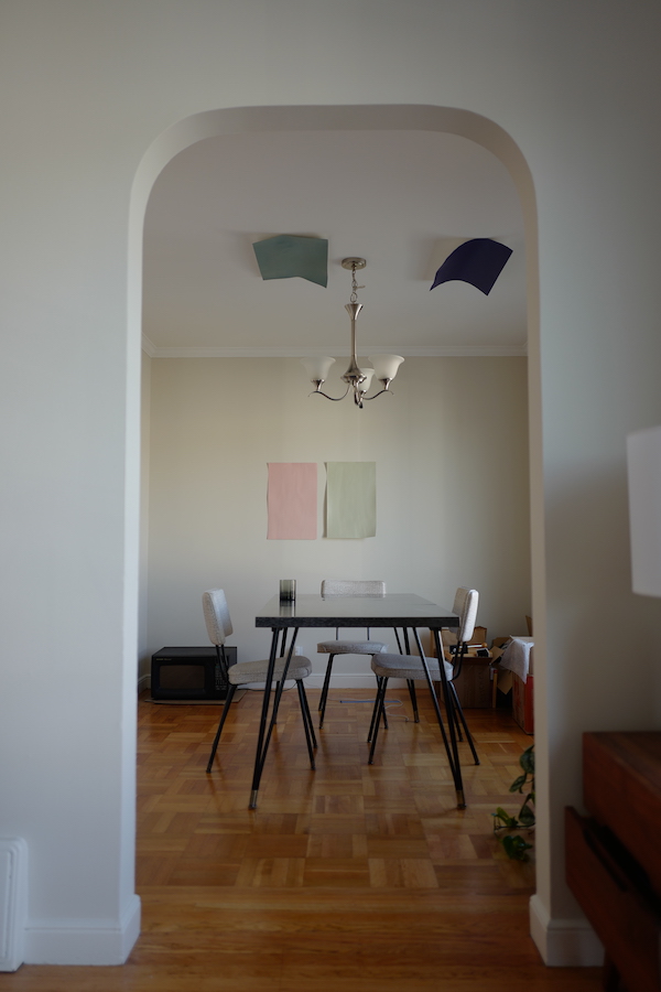
Above are before shots. Chloe’s living room started out very bland and a little dull. We wanted to brighten and enliven the room. And while we did consider painting her small-ish dining room a bold color to really make it pop, we went in a very different direction and I couldn’t be happier with the final result. Check it out below.

sunset bungalow dining room on apartment 34

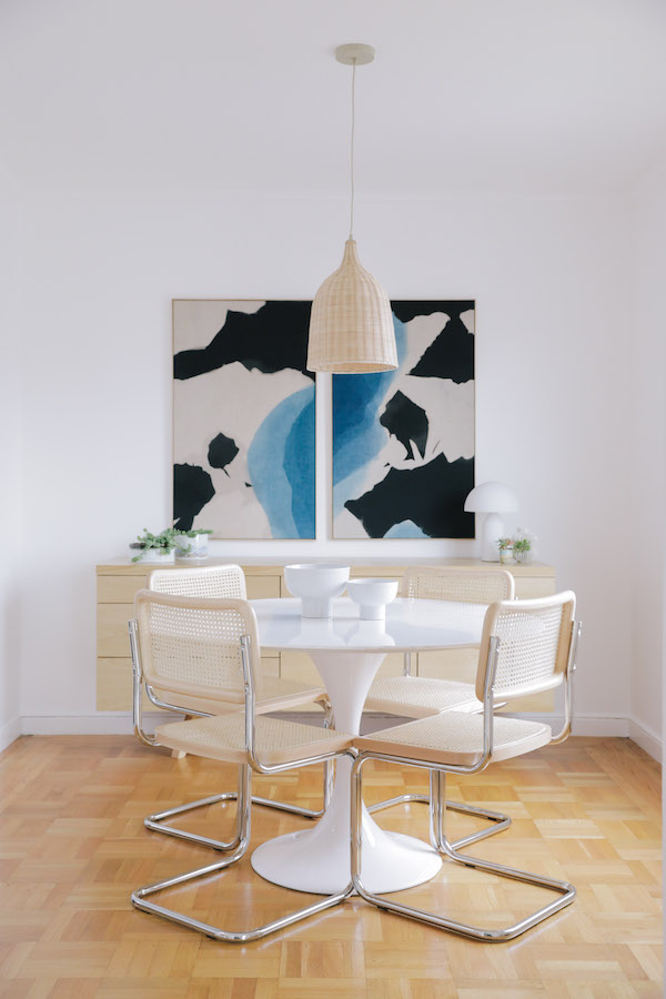
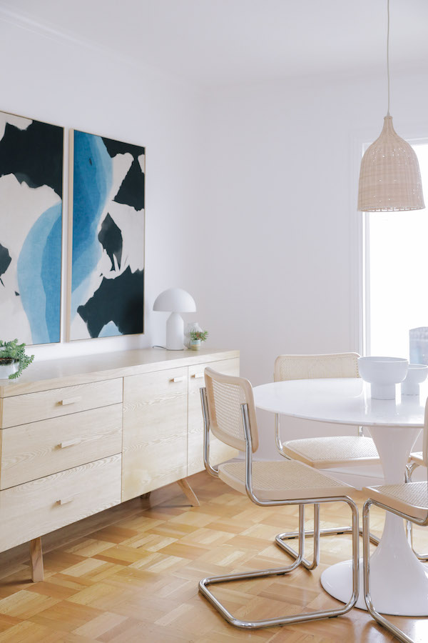
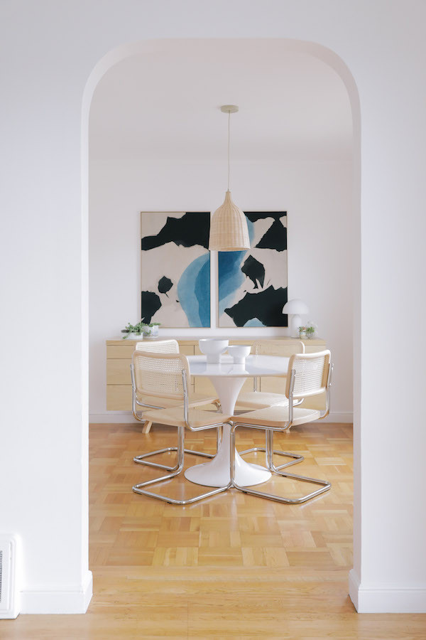
The after is just a breath of fresh air, don’t you think?! I’m really not sure if I could love Chloe’s dining room more. We wanted to create a beautiful, modern, yet beach inspired space. Hence all the woven materials. Our entire inspiration was born by Chloe and my shared obsession with Cesca chairs. There really is nothing better, but vintage ones are gonna cost ya. Thankfully, we found brand new, beautiful Cesca chairs at Oversock and they became the jumping off point for the rest of the room.

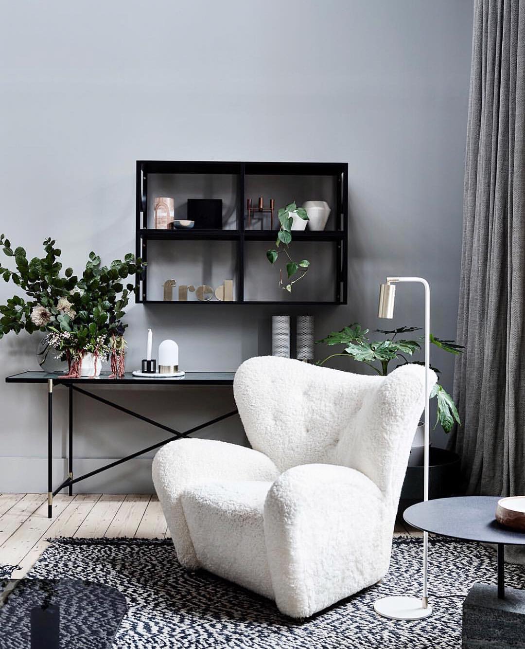
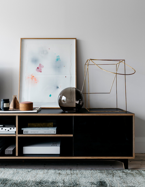
This room was another primary inspiration for Chloe’s space – we just needed to work on a smaller scale. We totally achieved our desired effect by adding a woven pendant above the dining table and placing a clean, modern credenza in an ash finish against the back wall. It really anchors the room. A credenza is great for offering much-needed storage and serves as the perfect display area – or spot to serve food or drinks when you’re hosting a dinner party! A classic Saarinen-style tulip table was perfect for the petite space.

sunset bungalow dining room on apartment 34

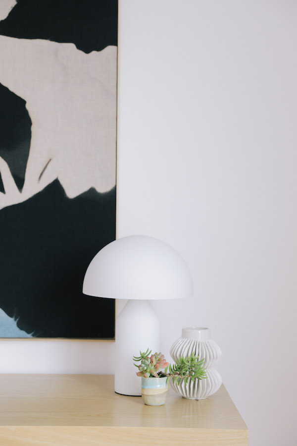
A sweet trio of an Atollo-inspired lamp and a mix of ceramics hold court on one of the credenza’s corners.

sunset bungalow dining room on apartment 34

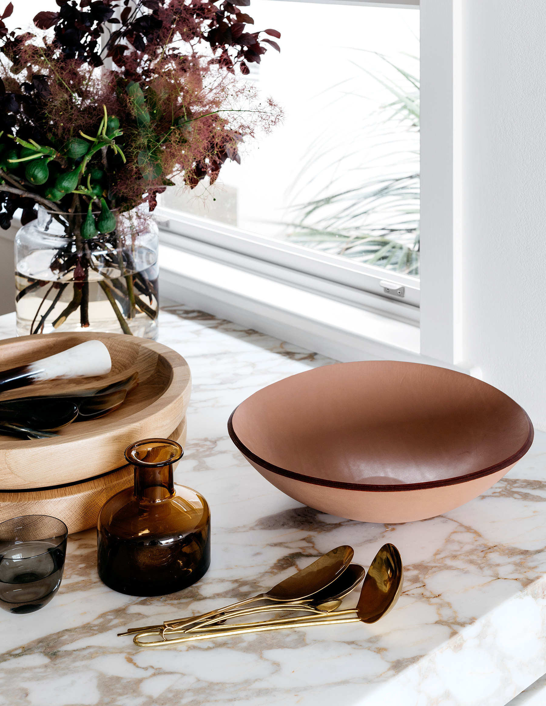
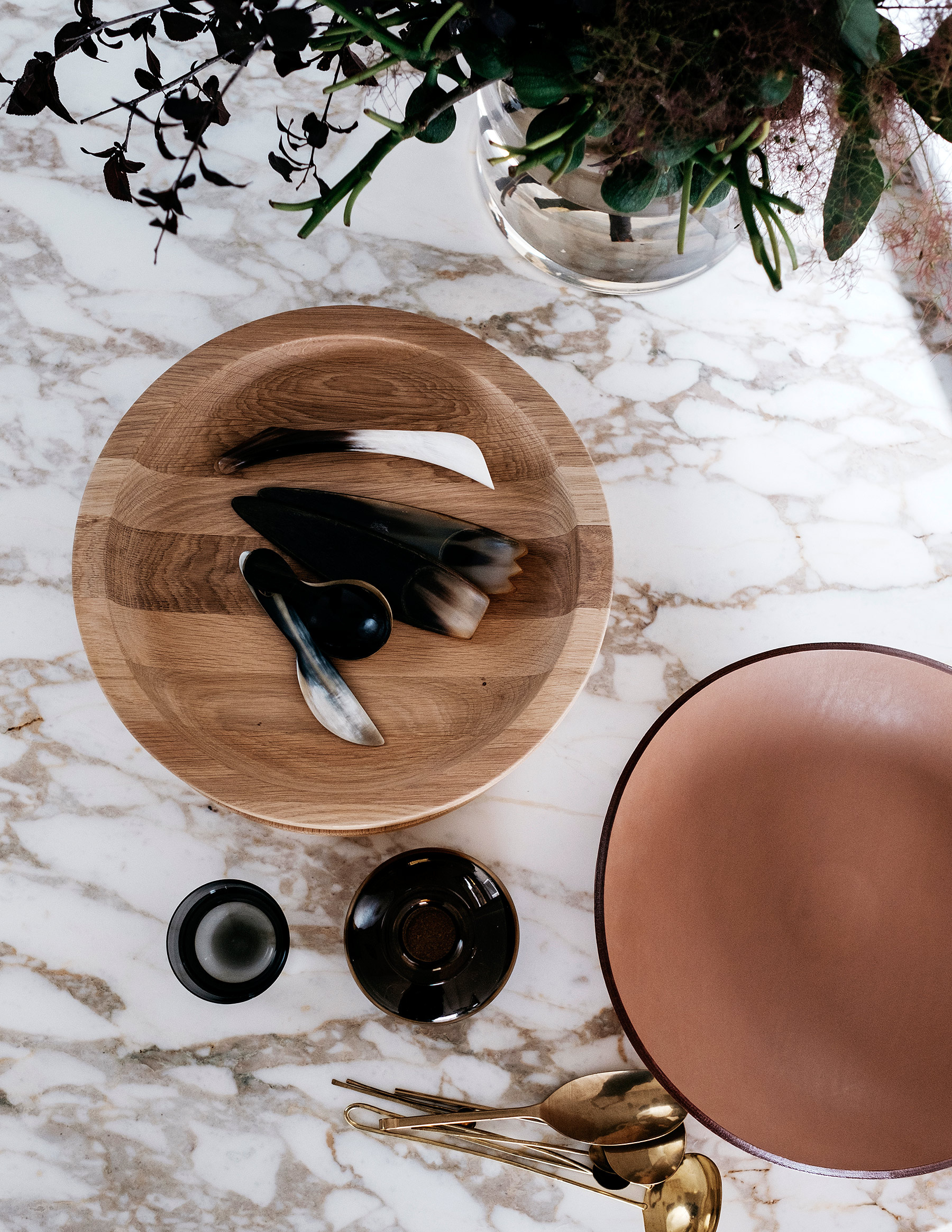
While Chloe has many a collection, we kept the accessorizing of her dining space really minimal. I love the white on white effect with the clean modern ceramic bowls on her dining table. Her only job is to keep both the credenza and table from getting piled high with stuff, bu all the storage in there should help with that.

sunset bungalow dining room on apartment 34sunset bungalow dining room on apartment 34

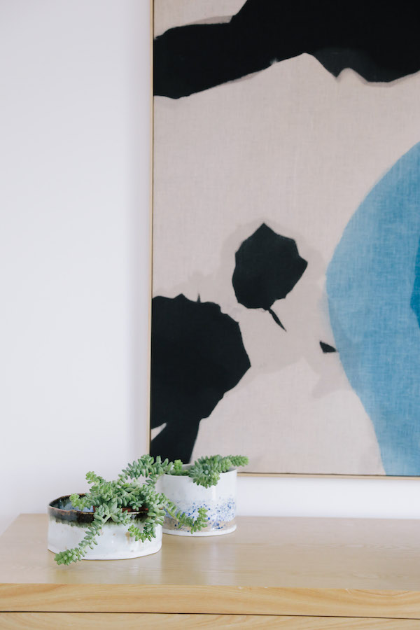
The stunning original artwork by local Bay Area art studio Mineral Workshop really draws you into this room and invites you to stay awhile. The diptych is actually made of hand-dyed fabric stretched over the frames. Swoon.

sunset bungalow living room on apartment 34

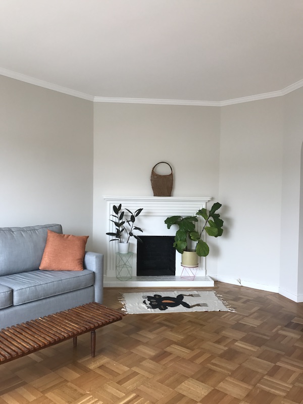
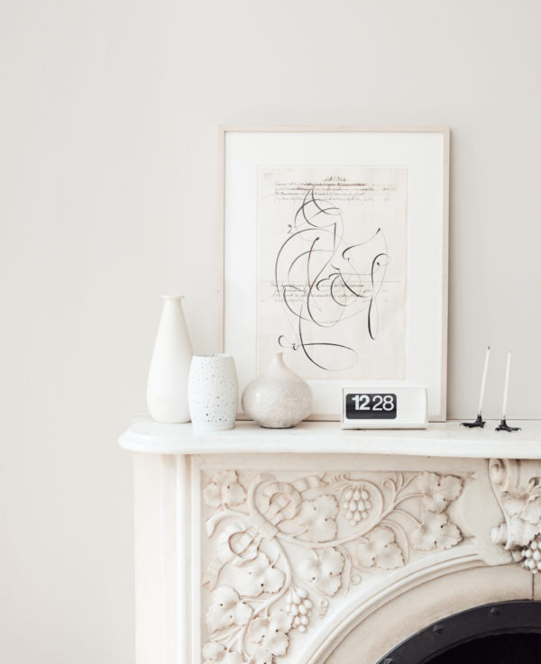
And then there’s the living room. You saw our feature fireplace wall in this post, but today I wanted to share the rest of the room! While not particularly large, Chloe’s living room needed to be able to accommodate friends, offer a cozy place to chill out and let’s be real – as any freelancer knows, you’ll be working from your couch more often than not.

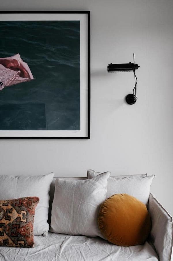
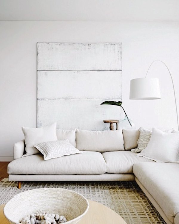
The Noah Sectional from Rove Concepts helps us accomplish all of that beautifully. There’s plenty of room to spread out on that thing. We balanced the oversized sofa with more clean-lined, mid-century inspired accent pieces, including the glass and wood coffee table and swing arm wall lamp. They offer a refined counterpoint to the sectional.

The big bold moment in the room is the oversized original painting we commissioned from artist Nicole Mueller. Our studio tour with Nicole will be coming soon, but you can check out pieces she has for sale from this series right here. We pulled the colors from Nicole’s piece down onto the couch and added some cozy texture with a set of woolen pillows.

sunset bungalow living room on apartment 34sunset bungalow living room on apartment 34

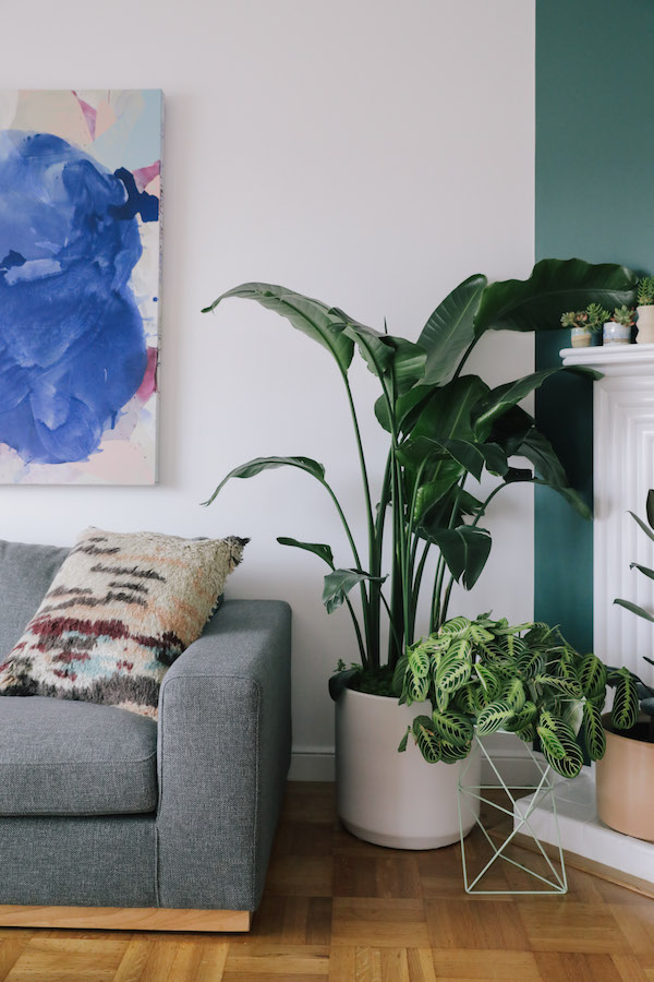
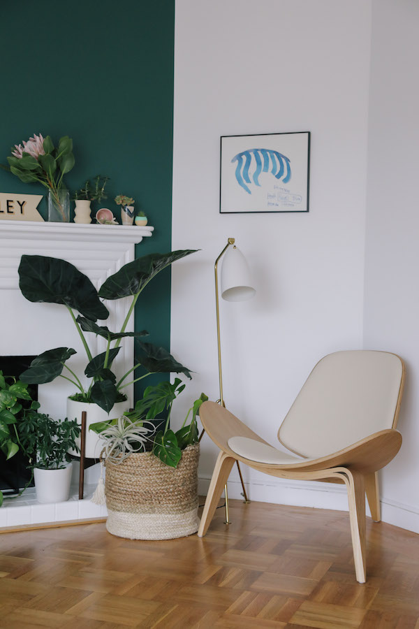
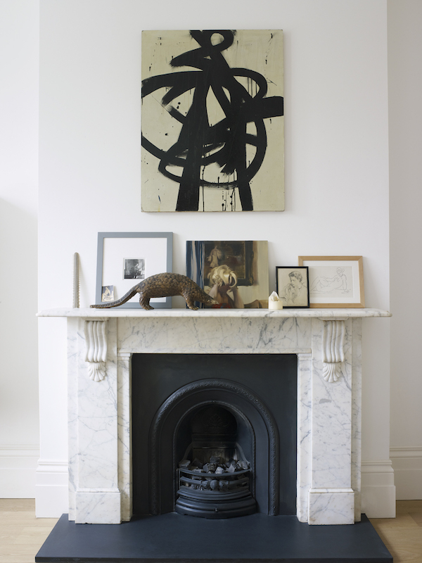
To offer a little more seating, a wing chair and grasshopper lamp sit aside our living wall, aka the fireplace. Another of the many pieces of Chloe’s personal art collection brings the blue tone of the couch across to this corner of the room.

sunset bungalow living room on apartment 34

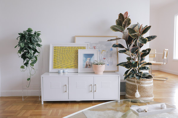
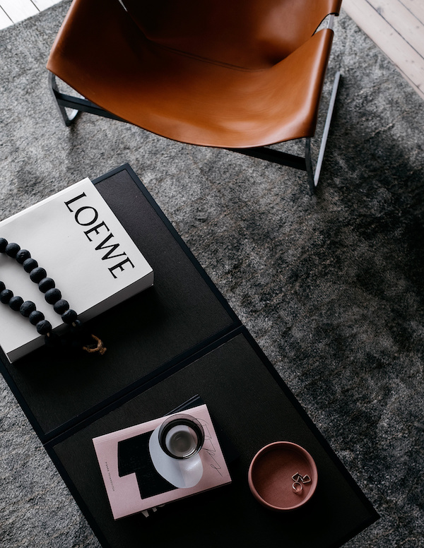
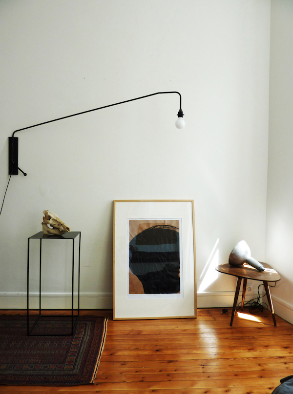
To pull color across the whole room we created a place to display more art against the wall directly across from the couch (with a peek-a-boo view into the dining room). I love the effect of leaning and layering art. It adds dimension and texture. It also lets you swap out pieces to your heart’s content.

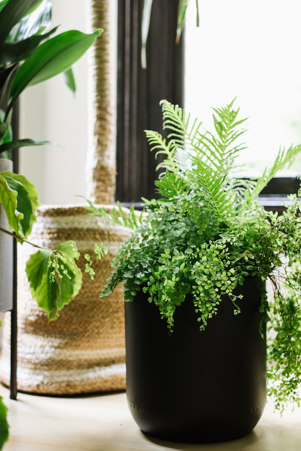
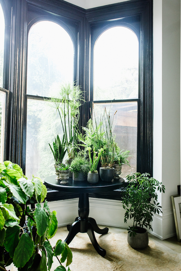
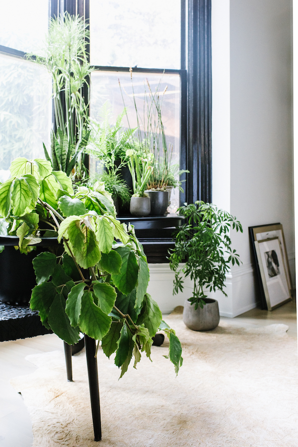
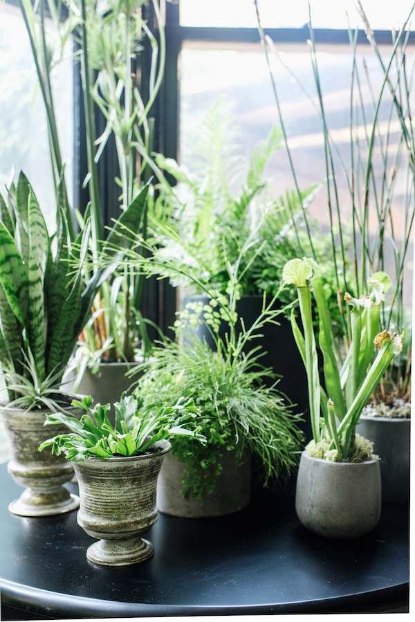
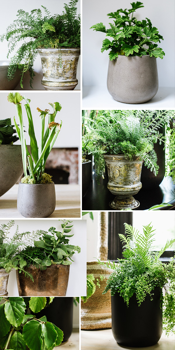
The white storage bench offered a neutral base for our display. We used a more mellow, pastel-inspired color palette for this collection. I couldn’t help but add that bold yellow and little pop of pink though! Chloe really does embrace color and I got into playing out of my comfort zone. The plants offer height and add more life throughout the room. We got all of ours from Leon & George in San Francisco.

sunset bungalow living room on apartment 34

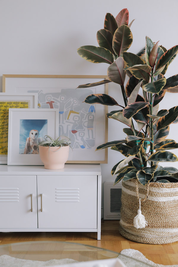
You can find cool woven baskets to house large plants right here.

sunset bungalow living room on apartment 34

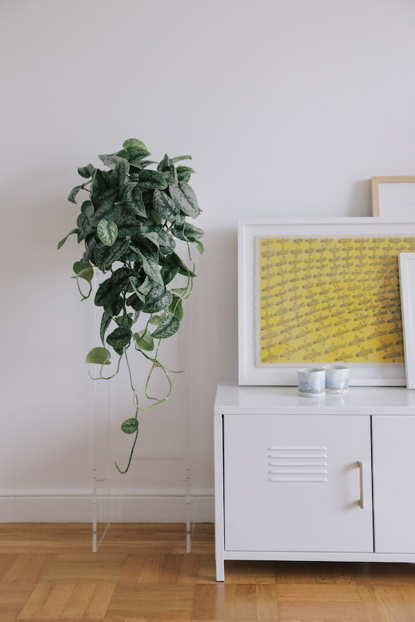
I love the acrylic plant stand from Overstock. It doesn’t take up more visual space and is quite cool.

sunset bungalow living room on apartment 34

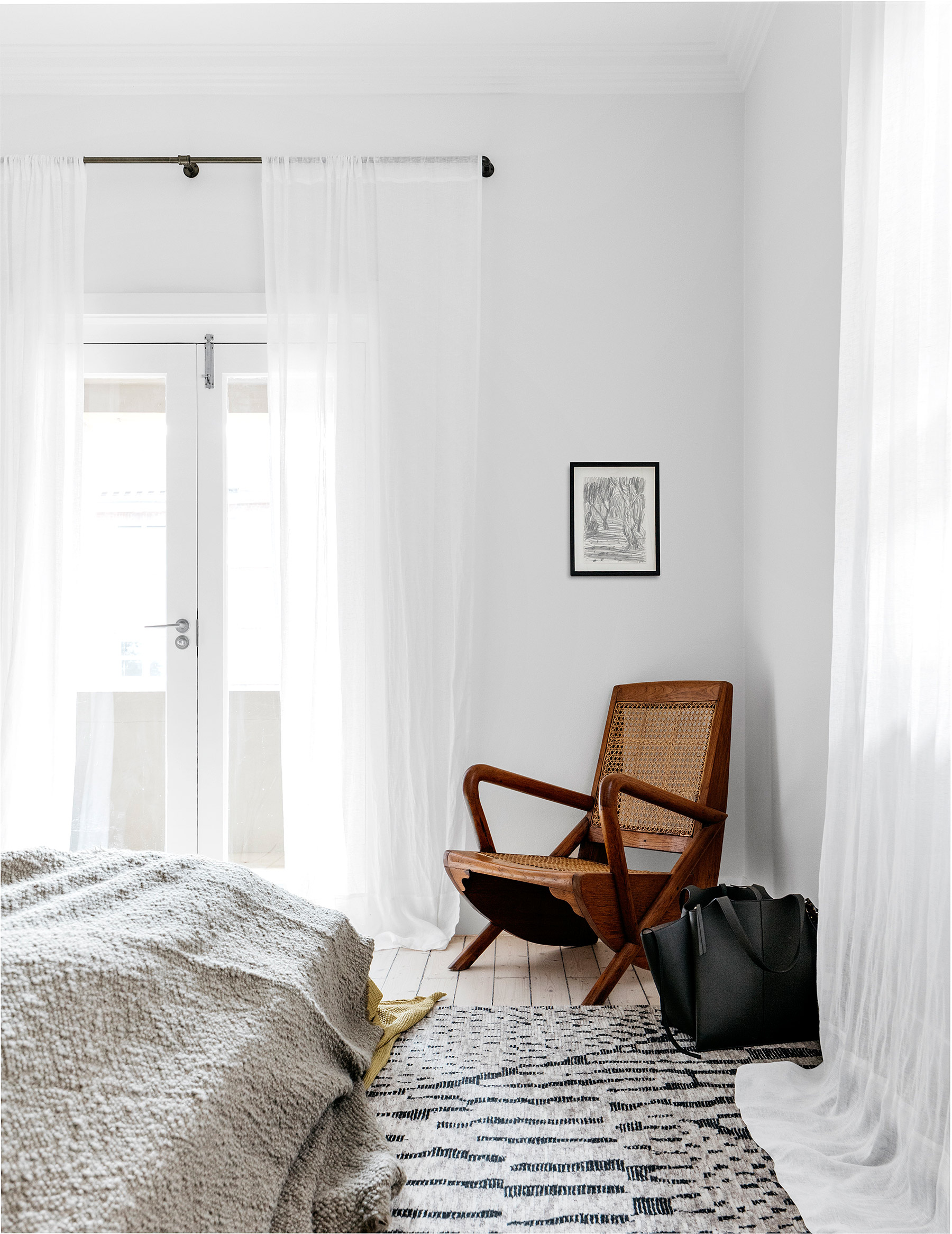
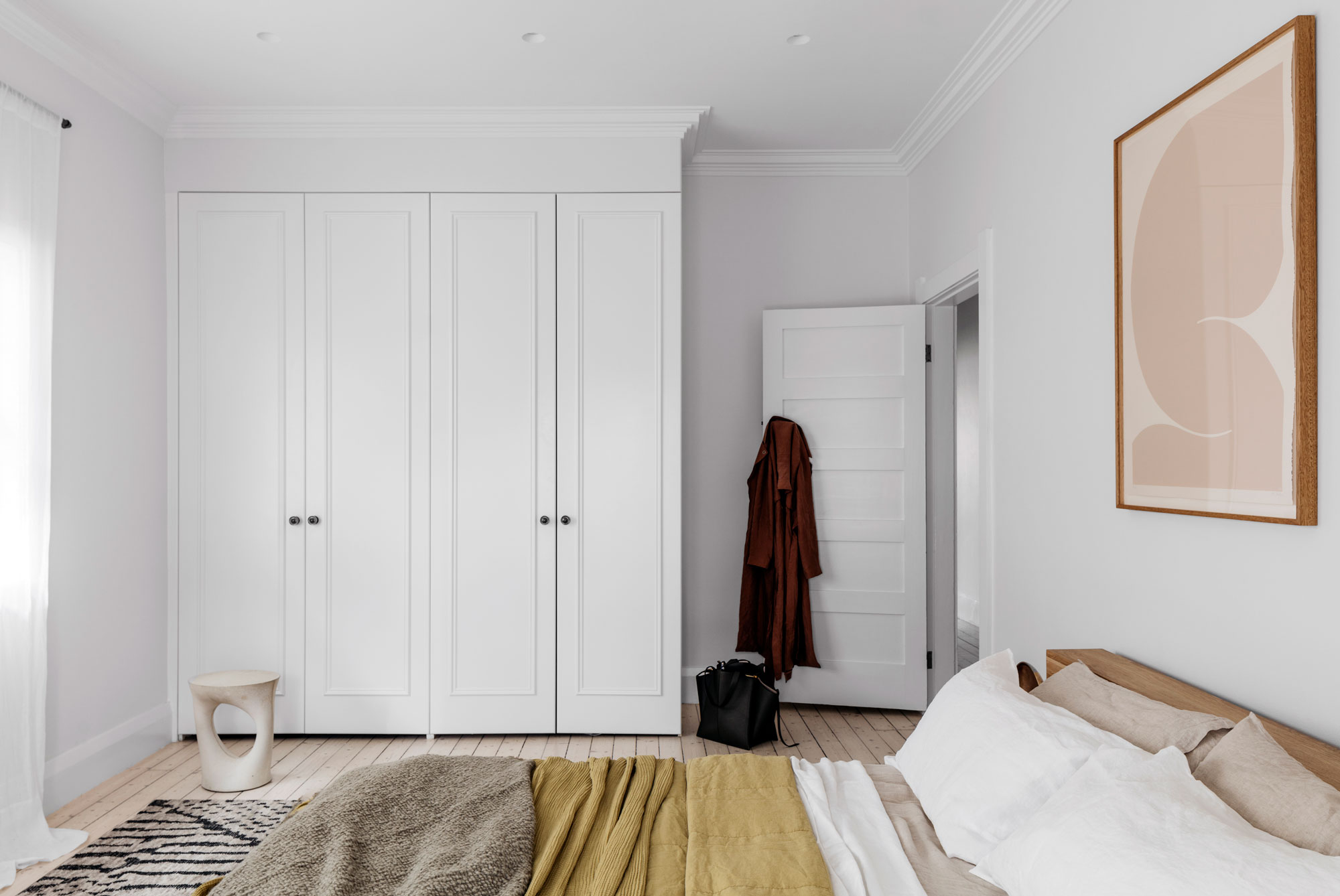
I would gladly hang out in Chloe’s living and dining rooms. Combined they create the perfect space to entertain and the succeed in helping her 1940’s bungalow feel more young, modern and fun. Stay tuned as later this week you’re going to get the full tour of the master bedroom. She’s a beaut.

SHOP THE POST: dining chairs / credenza / pendant light / dining table / table lamp / sectional / throw pillowsNicole Mueller art / Mineral Workshop art / acrylic plant stand / woven basket / coffee table / wall lamp / grasshopper lamp / wing chair / storage bench / reclaimed wood side tableceramic bowls /  / Creativity Explored art

To see how we used color throughout #TheSunsetBungalow CLICK HERE.

original photography for Apt34 by Andrea Posadas

You know the first time you see something unusual and you think oh no, that’s a crazy idea. And then you see it a little bit more and little bit more and it grows on you. That certainly happened with me and mom jeans (I’m praying it won’t happen with the skinny sunglasses thing). But it has also happened with the fuzzy chair trend. Have you seen these guys yet? I’m super curious what you think about them.

idea to steal: fuzzy chairs on apartment 34

I’m talking about the teddy bear-esque easy chairs that have been showing up all over my Pinterest and in virtually every design magazine you pick up of late. Covered in wooly sheepskin and usually curved like a cozy little nest, turns out this idea is not new. Of course, it is in fact mid-century modern.

idea to steal: fuzzy chairs on apartment 34

The most recognized fuzzy chair, called the Tired Man, was created by Danish furniture designer Flemming Lassen in the 1950s.  But the Tired Man chair is actually being produced again today (which is good since vintage ones on 1stdibs are running about $24,000). But the new ones come with hefty pricetags too.

idea to steal: fuzzy chairs on apartment 34

The newest version the scene are literally called the Papa Bear and Baby Bear armchairs by Pierre Yovanovitch. They’re a bit cutesy for my tasty but would be the most expensive chair for a kids room possibly in the world.

idea to steal: fuzzy chairs on apartment 34 idea to steal: fuzzy chairs on apartment 34idea to steal: fuzzy chairs on apartment 34 idea to steal: fuzzy chairs on apartment 34idea to steal: fuzzy chairs on apartment 34idea to steal: fuzzy chairs on apartment 34

A lot of peeps are simply finding cool, mid-century style armchairs and simply reupholstering them in the wooly sheepskin. I just love the texture the look adds to a room. In a house with wall to wall hardwood floors and stark white walls, I think a fuzzy chair would be the perfect way to soften a room. I’m seriously considering adding one to our dining room.

What say you? Are you feeling these fuzzy chairs? Or have I just been staring at them for too long?!

Check out our Idea to Steal archive RIGHT HERE.

images via vipp hotel / lassen / Pierre Yovanovitch / Vogue /Pierre Yovanovitch / 1stdibs / Pierre Yovanovitch / lassen / 1stdibs

Friends, I think I may have found my latest design soul sister and she comes in the form of this stunning Australian apartment. The space is actually owned by a well-known Australian fashion blogger, Carmen Hamilton, founder of Chronicles of Her, so she isn’t a stranger to good style, but Hamilton wisely asked Decus Interiors (if you don’t know them, now you know) to bring her luxe vision to life. They done good. Rurl Good. Go on now, scroll!

Home Tour: Seriously Luxe Style on apartment 34Home Tour: Seriously Luxe Style on apartment 34Home Tour: Seriously Luxe Style on apartment 34Home Tour: Seriously Luxe Style on apartment 34

This apartment was apparently built in the 1940’s but you’d never know by looking at it now. Decus actually removed dated cornices on the ceiling in the living room and kitchen and installed the stretch of white beams instead. I love their graphic punch. While the walls are bright white, refinished timber floors warm everything up. I love the juxtaposition of the living room vs. the kitchen. The living room is grounded with cool blue-gray-black tones – a slate gray rug, jet-black coffee table and off-white linen couch seem like a little homage to the ocean off in the distance. Pops of warmth are brought in by the vintage leather chair P444 by Pierre Paulin (fancy!), textured pillows (mix your velvets and your wools people!) and the bits of pink in the artwork.

In contrast to the living room, the kitchen is very warm. My favorite feature is the epic marble island with a warm golden vein. Such a refreshing change from your standard gray. A variety of wood tones are also mixed into the room, from the pine cabinetry to the maple Osso bar stools and the continuation of those super light wood floors. The black countertop, the mirrored backsplash, and black appliances mirror the black in the adjoining living space – both literally and figuratively. The effect is damn sexy.

Home Tour: Seriously Luxe Style on apartment 34Home Tour: Seriously Luxe Style on apartment 34Home Tour: Seriously Luxe Style on apartment 34

An archway leading from the kitchen down the hall is painted a metallic high gloss pink. Love the little bit of whimsy in the otherwise decidedly sophisticated vibe.

Home Tour: Seriously Luxe Style on apartment 34 Home Tour: Seriously Luxe Style on apartment 34

The bedroom is similarly simple but seriously elevated. Nothing is overly adorned, but the colors and tones just draw you in. The warm woods of the bed frame, side table and the killer vintage chair in the corner soften the space. I love the touch of ochre mixed with gray and blush hues on the bed. And that copper table lamp is giving me life. I have to figure out where that beauty is from!

This home is the perfect mix of refined (see – theme!) and comfortable. It’s incredibly stylish but also feels like real people can live in it too. The home has a few smart additions of recognizable designers but it isn’t over the top or in your face. And it’s just really pretty. I think I’m in love. Scroll below to see how to get this look in your house – hopefully without having to move to Australia, although that would be nice too.

Home Tour: Seriously Luxe Style on apartment 34

SHOP: tango pendant by paul matter / charlotte perriand sconce / osso bar stool / art / serving ware / pillow / Kreten concrete side table / bludot table lamp / vintage T loung chair


Check out our home tour archive RIGHT HERE!


design by decus interiors / photography by felix forest

If you caught last week’s No Makeup Home Tour, then you may have spied some major sneak peeks of my yet-to-be-finished living room. I’m embarrassed to say that my living room has sat stagnant since we moved into our house nearly 18-months ago. There are a multitude of reasons for that; prioritizing this room and this room and this room, budgetary limits (we’re renovating a 150-year-old house my friends – she’s got a lot of problems) and a bit of design paralysis are all contributing factors. But I won’t take all the blame! That’s primarily because we’ve also been waiting to complete the fireplace that is the main focal point of the living room space. But now, with the holidays and the arrival of many house guests looming, I’m in a race against the clock to get this room done. So I thought I ought to let you in on a little of my planning!

Here’s the floorplan for our living room layout.

apartment 34 living room design

The room opens onto the dining room to the south via two ah-mazing french doors (you can see here). It also is open to our kitchen (after the removal of some major walls) to the north. The door to the right opens onto our media room (which you may have spied here). The challenge is the living room’s long, relatively narrow rectangular shape. The ceilings also happen to be 12ft tall – I know, rough life – but it makes finding proper proportions very tough. We’ve finally landed on unifying the space with a large 10×14 rug – the final selection is in the works -, designing a custom sectional (more on that to come soon!), nesting three round coffee tables in front of the soon to be built fireplace and adding a lounge chair to the corner to create a little reading nook in the far corner. Phew. All that to get completed before my family descends for Thanksgiving. No stress.

I thought you might like seeing some of my inspiration images for the space.

living room design on apartment 34

This is our inspiration for the sectional. This being our living room, I want it to feel more formal than the TV room, but only slightly. I live in the birthplace of California casual living after all.

apartment 34 living room design

This is the primary inspiration for my fireplace design. Both the hearth and gas insert surround will be black and arched like you see above. The mantle will be shaped something like what you see above but in a travertine instead of marble. As you may recall from this post, bookshelves sit to the left which will be my primary place to house treasures and work on my never-ending quest for the perfect shelfie.

apartment 34 living room design

I also want to create a bit of an undone vibe, with singular accents and accessories that stand out like they were in a place of honor. We’ll see if I can succeed in keeping piles of legos at bay.

apartment 34 living room design

But where I find myself really struggling is the hunt for a good side chair. In the thousands upon thousands that are out there, it’s actually quite surprising how difficult it is to unearth a good one. Do I want something modern, something cozy, something unique or something vintage. I don’t want to fall into the trap of anything too trendy as I am not going to be to replace any furniture for quite a long time or the husband might kill me. But since it’s going to hold court in a corner all its own, I’d like the chair I pick to be a real conversation starter. You can just google that right?? Right. The struggle is real my friends, the struggle is real.

apartment 34 living room designapartment 34 living room designliving room design on apartment 34

So I’ve begun to round up some of of the best side chair options I’ve spied thus far. They range from the rattan trend (but can I convince myself it’d feel timeless in five years) to a bit art deco, to modern classics. I’d love to know which look you like best! Mama needs some advice.

living room design on apartment 34

shop the post: chair 1 / 2 / 3 / 4 / 5 / 6 / 7 / 8

Have a favorite? Or a chair you just love that I might not have seen? I’d love your advice.

And if you’d like to catch up on my entire renovation saga (yes, it’s been going on for nearly two years now) CLICK HERE.

image sources 1 / 2 / 3 / 4 / 5 / 6 / 7 / 8

Now that the season has turned, have you started looking for ways to update your house for fall?! I thought so (don’t worry, me too). Starting with a bookshelf is a no brainer. They’re the perfect place to express your personality – and you can continually switch them up depending on your mood – all in really affordable ways. But perfecting them does take a little time. Maybe you’re working to build a library or perhaps you’re compiling a collection of curated objects. A couple of weeks ago I partnered with Overstock to share how you can amp up your bookcase (and many other parts of your house) with plants, but what about everything else you need to really make your shelves stand out? Keep scrolling for a few styling tips and you’ll have the perfect #shelfie in no time.

how to style the perfect shelfie on Apartment 34

Find Your Vibe. Do you love tons of color? Do you gravitate toward an eclectic look? Are you a minimalist?  To keep you shelfie in check, figure out your style and then commit to it 100%. I went for a light, bright and paired back look above. I was in an open and airy mood all summer, but check out my inspiration for a more layered look in a black color palette below. I’m totally feeling this approach for fall.

Layer It Up. To give your shelves depth and texture, it’s time to layer. Trays, stacks of books or a piece of leaning art serve as a good base. From there, you can add in a candle holder, a decorative bowl, a sculpture, a little lamp – and of course a houseplant or two. You want your eye to travel both back and forth and up and down as you move from shelf to shelf.

Leave Room to Breathe. To keep a shelfie from feeling overstuffed, group objects together in threes. Also vary the heights of the items in your grouping. You want each piece to speak to one another in some way, but if they’re all the same height they won’t stand out. And remember to leave a little white space. That way, people will admire your handiwork rather than wonder if you’re a hoarder.

While the above are good shelfie guidelines, I’m the first to admit there are no hard and fast rules. Simply keep your eye out for things you truly love and you’re already halfway there. Below are a dozen pieces from Overstock I’d certainly love to add to my shelves this season!

how to style the perfect shelfie on Apartment 34

shop the post: art // black leather tray // metal wire ball set // concrete light // marble bookends // stone vases // bowl // plant // statue // candlesticks // plant // sheepskin throw rug


For more fall styling ideas, CLICK HERE.


photography for apartment 34 by delbarr moradi

This post is in partnership with Overstock.com. Thank you for supporting collaborations we’re excited about and that have kept apartment 34’s doors open.

If you’re looking to add a little life to a room, the addition of houseplants is a wonderful way to do it. But rather than just slap something green into a container from the corner big box store, you can go next level with chic vessels. This week I’m partnering with Overstock.com to show how you can add greenery to your house (using some sneak peeks of our decorating progress as examples!). You may have seen how I transformed my outdoor space with Overstock earlier this summer. But Overstock is a treasure trove of pieces for every part of your house – from sofas to side tables, to houseplants! You can really dress up any part of your house with plants.

Continue to scroll to see how to style plants in your kitchen, living room, dining room and entry! I have to say, I love what adding some serious greenery did for each space.

Case in point, your bookcase. Rather than simply pot a plant in something generic, if you select planters with a style all their own, you can create a really stunning look. On Overstock I found gorgeous options in rich golden tones in various heights, that I paired with a trio of tabletop urns with more of an antiqued look. The combination adds both warmth and and cool visual interest. When filled with unique, personality-filled leafy green plants, suddenly your shelfie is packed with personality.

how to add major style to your space with houseplants

I love the look of a dramatic grouping of plants in a living room. It’s a great alternative to a bunch of random tchotchkes. Potting a gorgeous palm in an indoor plant stand kept it off the floor and helped ensure everything below didn’t blend into a giant green mass. Clean, classic black planters are always a timeless choice.

If you’ve got the space and height, an indoor tree is another great way to draws the eye up. I love the above tree’s tropical vibe. It’s a refreshing alternative to the now ubiquitous fiddle leaf fig.

I put the potted tree inside an oversized woven storage basket I found on Overstock to soften the look. Baskets are best the home accessory. I can never have too many. They serve a million purposes – holding blankets, hiding toys, and in this case holding plants. Overstock has so many options – you’re guaranteed to find one you’ll love.

how to add major style to your space with houseplantshow to add major style to your space with houseplants

The kitchen is another great place to mix the style, tone and texture of both planters and plants to create an eclectic look. Mixing concrete planters with iron and stone options make everything feel collected and special. And unusual plant shapes, grasses and ferns adds all great texture and visual interest to open shelving. I’m loving the little plant party happening in my kitchen space.

There’s something amazing about a major grouping of plants. Juxtaposing a classic pedestal entry table with an overflow of life is awesome way to make a statement in an entry. I’d been hunting for the perfect table for our bay window forever and the black round pedestal table I found on Overstock is just perfect.

I warmed up the space with a gorgeous cow hide rug. They’re really durable so perfect for high traffic areas. The one I found on Overstock by NuLoom has really stunning gold threading in it (see my instagram today for a closeup). I’m obsessed.

how to add major style to your space with houseplants

I love the look of throwing all caution to the wind and mixing and matching plants and vessels to your heart’s content. It gave my entry a chic jungle vibe. Trust me – it’s a thing.

how to add major style to your space with houseplants

Houseplants a great option for dressing a dining table. Often the spot for cut flowers, why pick something you have to replace weekly? I love the look of these architectural, modern concrete planters filled with a variety of funky eye-catching greenery.

how to add major style to your space with houseplants

shop the looks: plant standseco concrete vases / mini iron urns / concrete planters / golden planter / black planters 

There are a few key things to consider when selecting houseplants to greatly increase the likelihood of keeping them alive!

  1. What kind of light does the plant require? Plants that flourish in indirect light are often the most brown-thumb friendly.
  2. How much watering do they need? Plants that are really sensitive to moisture levels are often difficult to maintain. You want to look for hearty plants that can withstand getting watered once a week or so (if you’re as likely to forget to water a plant as I am!).
  3. What kind of pot and soil does a plant need? Some plants do better with a lot of drainage. Some plants need to fully dry out before their next watering. Seem need to set deep roots while others can do well in shallow soil.

Take the time to go to your local nursery and have a conversation if you’re unsure about what could survive in your house but don’t be afraid of flexing your green thumb. Houseplants literally bring any room to life.


photography for apartment 34 by delbarr moradi, plants by the plant library

This post is in partnership with Overstock.com. Thank you for supporting collaborations we’re excited about and that have kept apartment 34’s doors open.

Open shelving and built-in bookcases have been having a heyday, well, for as long as I can possibly remember. But, I’m curious. Does anyone use curiosity cabinets anymore? As I’m working to find beautiful storage solutions for our house (how do you hide ever-growing lego collections anyway!!), I’m beginning to seriously consider a large display cabinet for our dining room.

curiosity cabinets on apartment 34curiosity cabinets on apartment 34
curiosity cabinets on apartment 34

Yes, I’m still aspiring to a minimalist vibe in our house (alla our media room) as much as I can, but there’s always just stuff. And my various addictions (namely ceramics and glassware) don’t really help my cause. But I think a display cabinet that would allow me to see some of my collections but keep them contained, just might be the perfect solution.

curiosity cabinets on apartment 34curiosity cabinets on apartment 34

The goal is to find a relatively modern option that feels simultaneously current, but timeless. It seems Scandinavians are very into the display cabinet game because every one of these images are from Scandinavian blogs or Ikea! I’m still a bit on the fence but I think a hunt is officially on for the perfect piece. I’ll be sure to keep you updated!

image  1 / 2 / 3 / 4 / 5  

Making a house feel like home is often daunting. It can feel so complicated. There’s an urge to add and add and add in order to make a room feel finished. I’m certainly struggling with that in our house right now. But what if you did the exact opposite? What if you used restraint and instead maintained a continuous purging of the things, honing your aesthetic down to either the truly essential or truly beloved? (Yes, the idea very Life Changing Art of Tidying Up.) This home, a townhouse in NYC’s Greenwich Village owned by designer and editor Tom Delavan, is a prime example of this approach.

Lifestyle blogger and design enthusiast Erin Hiemstra showcases a beautifully simple home tour on apartment 34Lifestyle blogger and design enthusiast Erin Hiemstra showcases a beautifully simple home tour on apartment 34Lifestyle blogger and design enthusiast Erin Hiemstra showcases a beautifully simple home tour on apartment 34

In this space, a simple color palette of white, black and rich warm woods doesn’t feel plain or boring, but instead bright, easy and welcoming. Obviously, with details like floor-to-ceiling bookcases, an ornate fireplace, epic crown molding and gorgeous french doors, this room had the design upper hand built in. But by using restraint – the simple dark drapery for contrast and the timeless pieces like linen covered sofas, a marble coffee table, and an oversized Noguchi pendant – the room is able to breathe. Each piece can stand on its own. Nothing is overlooked. The Moroccan rug, velvet side chair, woven basket and a cream throw add just enough texture to make the space feel warm and inviting rather than museum-like.

Lifestyle blogger and design enthusiast Erin Hiemstra showcases a beautifully simple home tour on apartment 34

The bar peeking in the corner helps too.

Lifestyle blogger and design enthusiast Erin Hiemstra showcases a beautifully simple home tour on apartment 34

The muted color palette continues into the kitchen. Love.

Lifestyle blogger and design enthusiast Erin Hiemstra showcases a beautifully simple home tour on apartment 34

A beautiful antique chair can serve as functional art.

Lifestyle blogger and design enthusiast Erin Hiemstra showcases a beautifully simple home tour on apartment 34

Those wonderful massive bookshelves house a collection of design tomes and an archive of magazines (Delavan is the design editor at T Magazine and was once the Editor at Large at Domino). The books add a touch of color that brings additional life to the space. I’m still stuck on the fireplace though. But that’s a different post.

Lifestyle blogger and design enthusiast Erin Hiemstra showcases a beautifully simple home tour on apartment 34

Every detail in this home feels considered and intentional. Sure, that can be incredibly hard to achieve with a toddler and a massive lego collection underfoot. But if I can carve out even one room in our house that I can maintain as a mama-oasis like this, I’ll consider that a win.

Here’s how you can recreate this simple timeless vibe in your home.

Lifestyle blogger and design enthusiast Erin Hiemstra showcases a beautifully simple home tour on apartment 34

SHOP: noguchi lantern / seagrass basket / vintage chair / marble coffee table / bronze candle sticks / moroccan rugchunky throw / vintage senufo stool / floor lamp


For a maximalist take on this style, CLICK HERE

For our entire home tour archive, CLICK HERE

images via tom delavan

Older posts
Gimme More