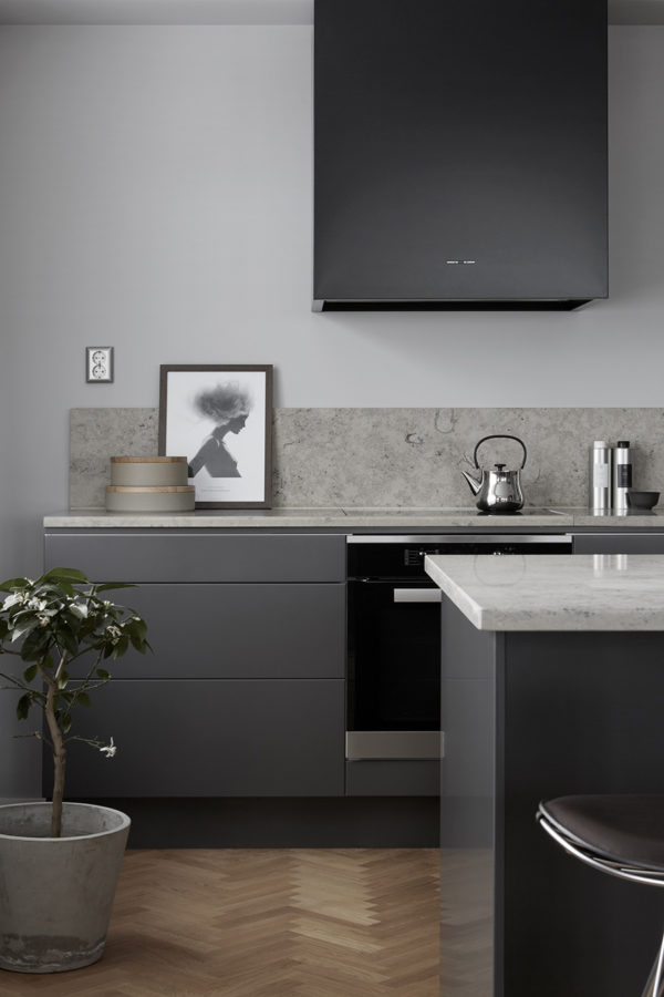
Gray kitchens have been having a moment, well…for much longer than a moment now. It’s about time some new kids come to town. And this is coming from someone who painted her dream kitchen gray. While black kitchens have been gaining ground and bright white kitchens remain the super safe bet, there’s a softer option for the color-phobes among us: I give you the clay kitchen.

clay is the new gray on apartment 34

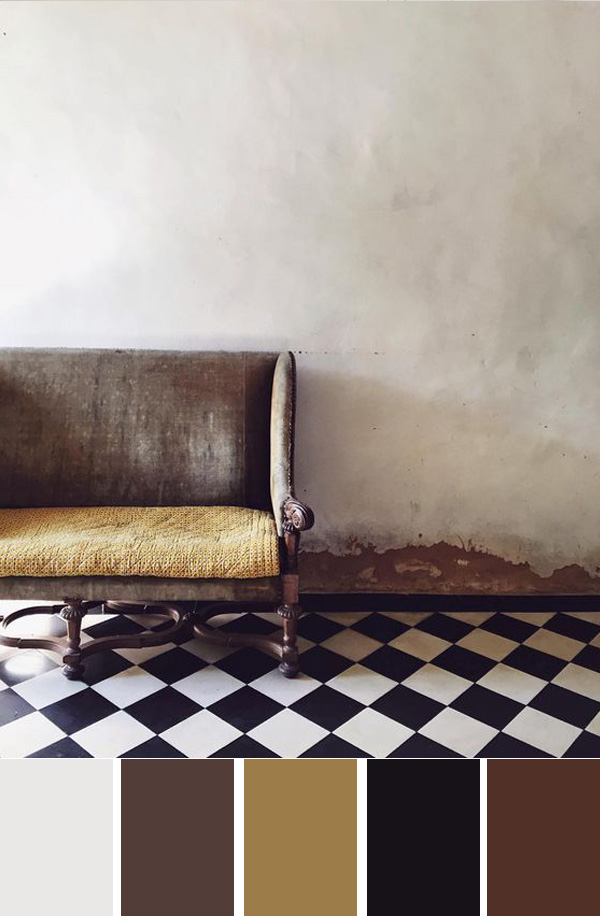
Think of clay as gray’s softer, warmer cousin. It creates a beautiful, neutral backdrop that envelopes you like a hug of an old friend, but the hue still feels sophisticated and refined.

clay is the new gray on apartment 34

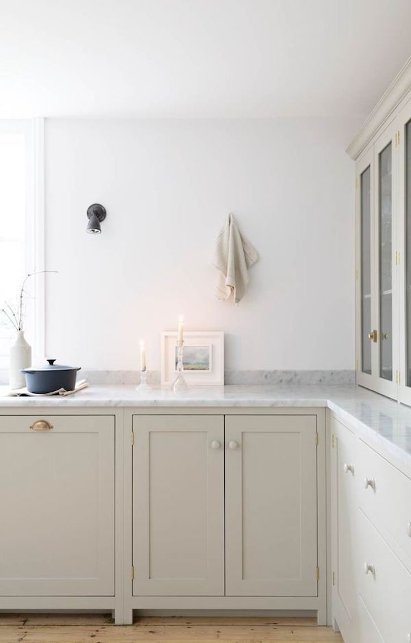
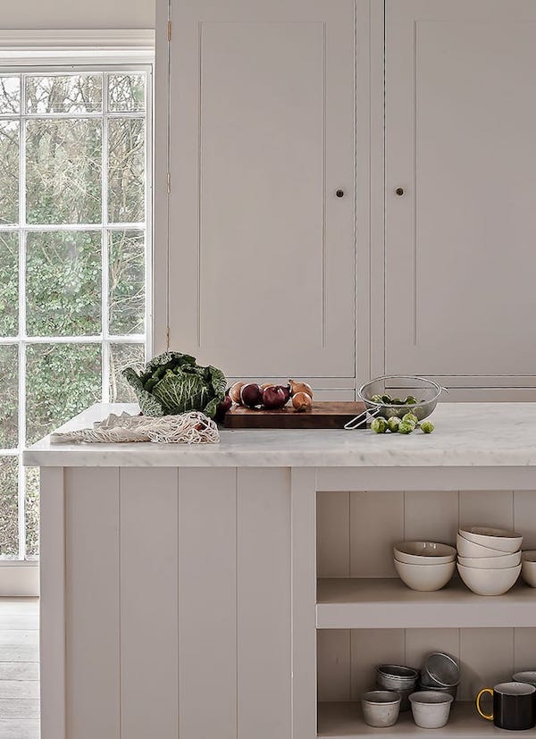
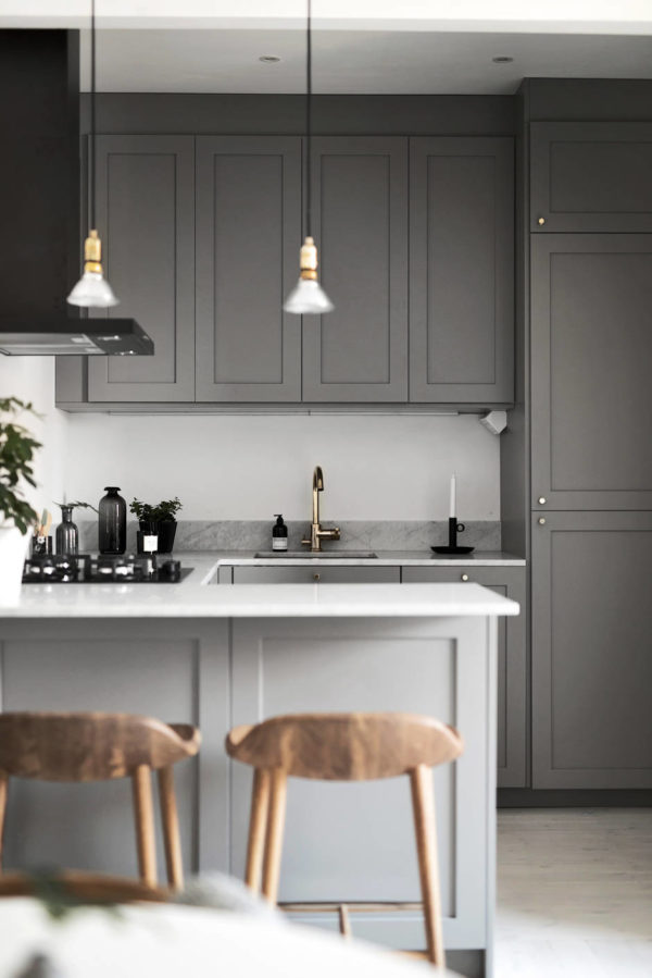
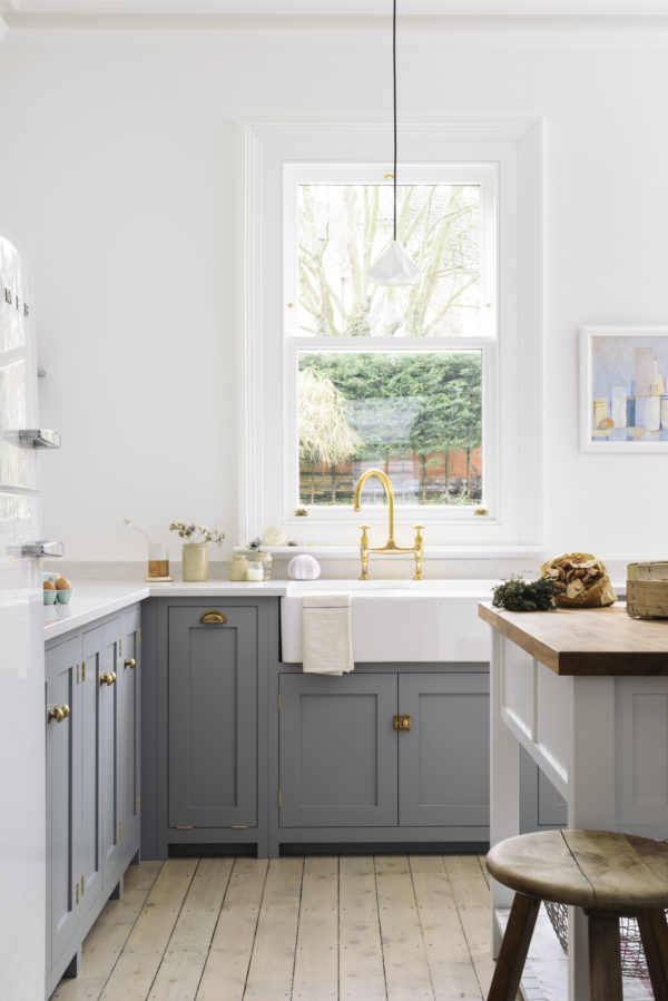
One of the great things about this color is its versatility. It can feel right at home in more rustic, country kitchens but also feels right at home in modern spaces. I love the look of clay lower cabinets contrasted against a lovely carrara counter and bright white walls in the kitchen above. The classic shaker style lends to a traditional feel, while the no-uppers is incredibly current. Little hits of dark in the sconce and staub pot are like drops of paint on a creamy canvas. It’s a gorgeous example of a kitchen design that will stand the test of time.

clay is the new gray on apartment 34

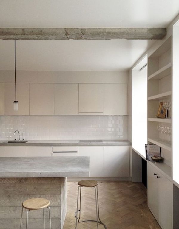
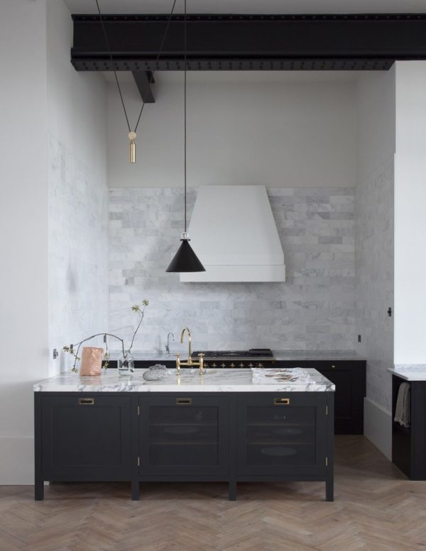
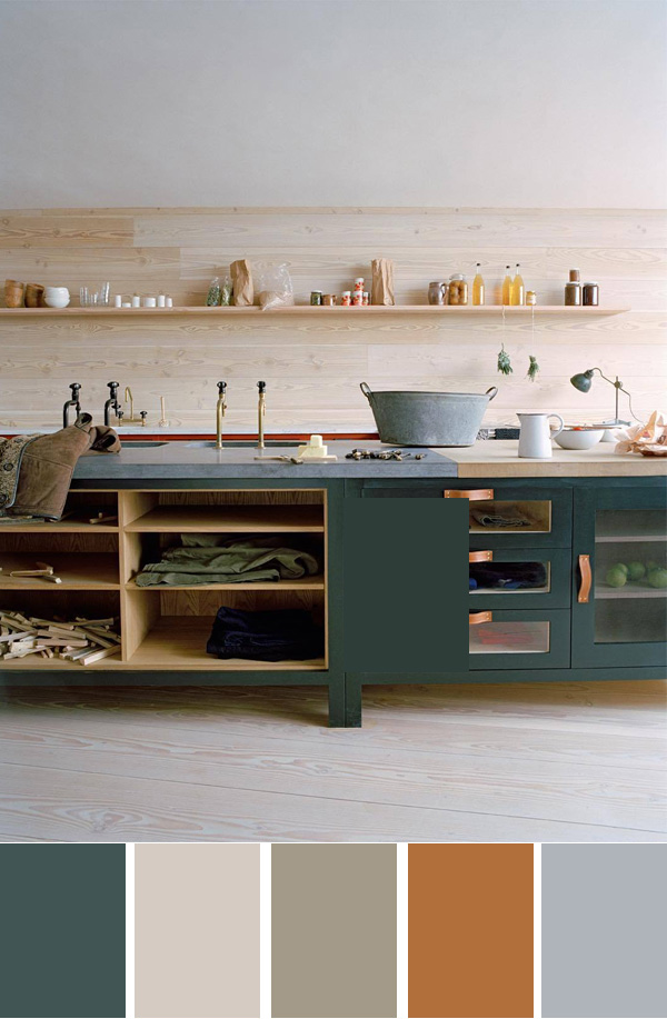
Clay looks just as gorgeous in an ultra modern setting. The tone on tone look of this kitchen is gorge. A concrete island and counters offer a cool contrast to the cabinets, warm wood floors and bar stools. A glossy white backsplash adds a little shine.

clay is the new gray on apartment 34

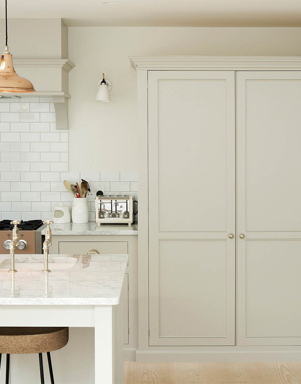
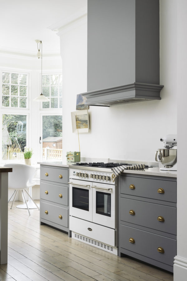
Floor to ceiling clay cabinets help the large scale of the piece blend in rather than feel overbearing.

clay is the new gray on apartment 34

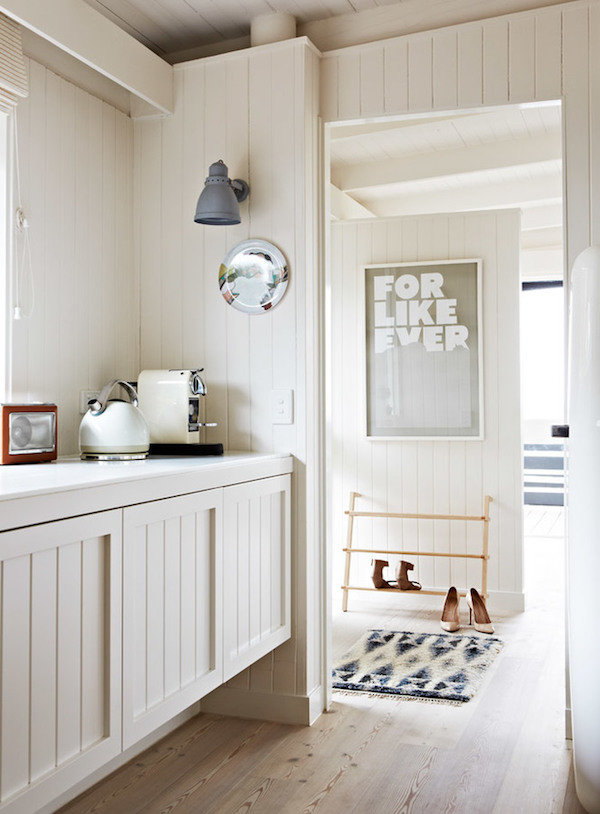
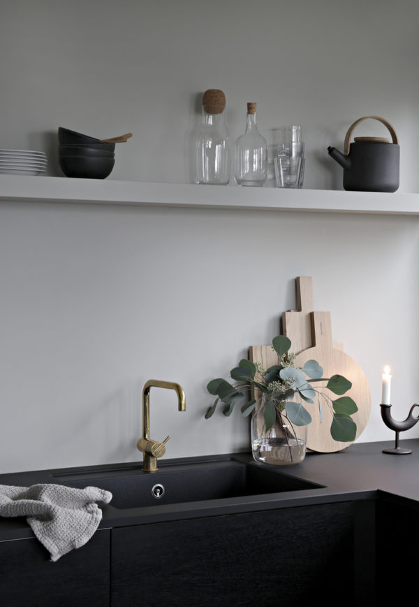
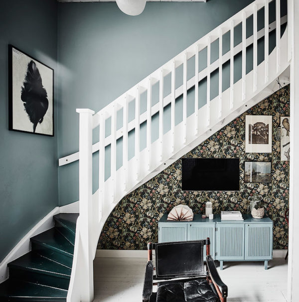
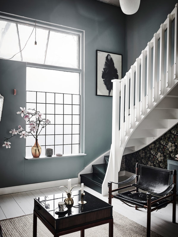
This house carries the warm clay from the kitchen to its entry with beautiful effect. While this could look very Scandi if it were all bright white, this color offers a soothing alternative.

clay is the new gray on apartment 34clay is the new gray on apartment 34

While I’m never going to stop loving gray kitchens, I’m certainly developing a new kitchen crush. What say you? Are you feeling the clay? I’d love to know your thoughts.

For even more kitchen design ideas, CLICK HERE.

image 1 / 2 / 3 / 4 / 5 / 6

Has January felt exceptionally long to anyone else? It’s an odd time of year. After the endorphin rush of the fresh start that the new year brings, energy can wane, leaving us wallowing in a bit of a mid-winter limbo. While thoughts of spring are just beginning their jig in the back of my mind, the temps are too cold to indulge in all the short-skirted and sleeveless pieces already hitting store shelves. And I’m a regular person so there is no jetsetting to tropical locations for me. Instead, I’m trying to don some rose colored glasses as we idle in this shoulder season. Scroll below to see what I mean.

mid-winter edit on apartment 34mid-winter edit on apartment 34mid-winter edit on apartment 34mid-winter edit on apartment 34mid-winter edit on apartment 34

While I realize pink has had its day, I’m feeling all the soft but warm tones to keep my spirits buoyant (see yesterday’s post for more evidence). While we’ve tipped back toward longer days the light is still soft and hazy, giving off a cool, languid vibe. The chilly temps still have me craving texture, be it cozy knits, beautiful ceramics or supple leathers. A mix of washed-out pieces in creams and taupe juxtapose with saturated earthy hues that perfectly balance winter’s hold with the promise of the spring that’s yet to come. This mid-winter edit satisfies my current cravings but also has me excited about what’s next.

mid-winter edit on apartment 34

SHOP THE POST: ceramic table lamp / rachel comey embroidered clutch / sneakerknit throw / wood block print / fanny pack / sunnies / signet ring / knit chloe sweater / throw pillow


For more of our favorite finds, CLICK HERE.

SHOP THE POST

[show_shopthepost_widget id=”3009575″]

image 1 / image 2 / image 3 / image 4 / image 5

adding color to your holiday table with apartment 34

Over the years I’ve taken a variety of approaches to holiday decorating. Over-the-top glam. Pops of black and white. Pseudo scandi. Every one creates a unique and distinctive feeling. So when CB2 approached me design a holiday table this season, I immediately said yes! This year I’m craving some change (in many forms) but for the holidays it is manifesting in a lush, bold and dare I saw it – colorful Christmas. I don’t know if it’s the return of velvet, the infiltration of millennial pink or my new addiction to pin to my color board, but as my mind began to swirl about a holiday tale, this is the moodboard that came forth. I made it my personal challenge to channel this vibe into a tablescape.

How do you think I did??

adding color to your holiday table with apartment 34adding color to your holiday table with apartment 34adding color to your holiday table with apartment 34adding color to your holiday table with apartment 34adding color to your holiday table with apartment 34adding color to your holiday table with apartment 34adding color to your holiday table with apartment 34

This table breaks all kinds of rules. Navy plates, teal trees, rose gold place settings all on one side and mix and match glassware. But it’s your party so why not have fun?!

If you haven’t quite figured out what you want your holiday table to look like this year, why not just use mine? Seriously – you can win the entire thing. Visit the CB2 in Berkeley, CA any time through Wednesday, November 29 to entire to win this tablescape for eight ($1,000 value!). Simply ask an associate how to enter.

Better yet, I’ll be at the Berkeley CB2 to celebrate the start of the season with you THIS Wednesday from 5-8pm! There will be more giveaways, flash sales, gift wrappers & personal shoppers to help you treasure hunt. And I’ll be recreating this entire table in person. I would so love to see you there.

If you’re not based in the East Bay you can also meet Caitlin Flemming in San Francisco, Meg Biram in Washington DC, Adrienne Raquel in NYC, Alaina Katz in Chicago, Kate Arends in Minneapolis, Whitney Leigh Morris in LA and Paola Mathe in Austin.

Let’s kick this season off in style, shall we friends?

SHOP THE POST


[show_shopthepost_widget id=”2929197″]


photography by andrea posadas / florals by natalie bowen designs 

This post is in partnership with CB2. All thoughts and opinions are 100% my own. Thanks for supporting collaborations that have kept Apartment 34’s doors open.

As we dive headlong into fall, I know the season is all about warm tones and tons of pumpkins, but this year I’m looking to create fall vibes without a gourd in sight (anyone else want to jump on this bandwagon? Just me??). Anywho, I will always, always come to back to gray interiors. They just make me happy. This is especially true in kitchens. Continue to scroll to see why.

gray kitchen on apartment 34  gray kitchen on apartment 34gray kitchen on apartment 34gray kitchen on apartment 34

We all want our kitchens to be stunning, fabulous spaces so we actually love spending all that time in them, right? If we spend a third of our lives asleep, we must spend at least a quarter in the kitchen. Or at least moms do. Regardless, while utilitarian in function, gray puts the sexy back in kitchen design. The examples above are proof positive gray is the way to go (sorry not sorry white kitchens).

Can kitchens be sexy? I dare say they can! A dark charcoal gray color creates a sober, yet glamorous chicness in a kitchen that I just love. That uber-dark gray is warmed up with brass hardware and fixtures, while lighter gray walls and marble counters further soften the look and keep the space from feeling too cave-like. If you really want to get in the mood add those herringbone floors. You’re sure to swoon every time you step on them.

gray kitchen on apartment 34gray kitchen on apartment 34

Now, if you feel like you only want to dip your toe into the gray kitchen pool, a lighter warmer gray on your cabinets is a good first step. When paired with bright white walls and soft wood floors you still maintain a light, bright feeling. You’re living near the edge – just not quite teetering over it.

What say you? You down to go gray this fall?

For more kitchen design ideas, CLICK HERE.

kitchens 1 // 2 // 3 // 4 // 5 // 6

While my personal style posts have been much fewer and farther between (thanks, motherhood and late 30s) this post from a few years back is a look I’d still gladly rock today (though I admit, the heels would probably be traded out for flats). But even years later, I’m loving this look and thinking I need to recreate this fall style when I’m back from Kauai!

As fall officially creeps up on us,  it’s time to break out your favorite cool-weather pieces. But as I sifted through my sea of dark jeans, black coats, and cream sweaters, things were looking a little too…shall I say predictable? Truth is, I’ve been dying to push my boundaries and try the new hot hue in town: oxblood.

Oxblood, maroon, wine, whatever you like to call it, it is technically not a neutral, but I’m here to convince you that it’s an incredibly wearable color that you’re going to want to get your hands on this season. I can attest, you’ll want to wear it with everything.

Old-Navy-October-1fall style on apartment 34

When looking to make my first wine-colored purchase, I was thrilled when I came across oxblood waxed skinny jeans. Talk about an upgrade from your basic denim. These have just the right amount of sheen and their extra stretch makes sure they hug in all of the right places, making a super chic foundation for a sophisticated fall look.

fall style on apartment 34

I liked the idea of pairing the oxblood with another great neutral: navy. The two dark colors together make a killer team. They have a similar depth of tone and a richness that really compliment each other well. There’s no harsh break for the eye, just one smooth color-blocked palette. And you know me, I love a good turtleneck.

fall style on apartment 34fall style on apartment 34

And of course, you have to top off the quintessential fall ensemble with a great coat. A classic peacoat shape, lush plaid pat, ern and fabric like tweed or harringbone will bring in texture and add a shot of sophistication to your style. Try the streetstyle du jour – draping it on your shoulders (no longer du jour, but I still do it all the time!) The architectural lines of a draped coat compliment the skinnies and make your stems appear to go on for days.

fall style on apartment 34fall style on apartment 34

get the look: oxblood skinny jeans // tweed coat // satchel // pointed toe d’orsay pump // navy turtleneck // sunglasses 

It’s official, oxblood is my new “neutral” this season. It’s totally breaking me out of my comfort zone and dare I say, I really like it! Who knew I would be turning my back on basic black and opting for a little punch of color this fall.

Now the question is, will you?


SHOP THE POST


[show_shopthepost_widget id=”2805909″]


original photography for apartment 34 by Aubrie Pick 

This weekend I could feel it. A slight shift in the season. The air turned crisp as a warm afternoon waned. I looked up and it was dark before 8:30pm. The smell of freshly sharpened pencils is filling the air. Well not quite, but you get where I’m going. While I’ve been craving nothing but light and bright interiors all summer long, fall is the perfect time to embrace some rich color palettes. If you’re looking for some fall inspiration, here are five fall color palettes catching my eye right now.

fall color palette inspiration on apartment 34

Teal is having a moment and this kitchen perfectly exemplifies why. It’s rich, it’s warm and very grounding. Pairing teal with those beautiful light floors and walls, brass accents and leather pulls is simply delicious.

fall color palette inspiration on apartment 34

Gold. Mustard. Marigold. Golden yellow hues in all forms are also catching my eye for fall. It’s the perfect accent in an otherwise timeless color palette of black, white and warm browns.

fall color palette inspiration on apartment 34

Pink is officially a neutral, but it doesn’t have to be reserved for the sunny seasons. When grounded in a sea of creamy neutrals, the girlie edge is taken off. I’m loving the addition of mauve and dusty purple to the mix for a lighter approach to the fall season.

fall color palette inspiration on apartment 34

A cool mix of deep navy, grays, and just hints of warm brown feel like a cozy fall hug. I think I would crawl into that bed and not get out until next spring!

fall color palette inspiration on apartment 34

While warm brown can overwhelm a room (bad catalog furniture sets come to mind), when you add touches of warm brown to white, bright spaces and balance it with creams, taupes and a touch of ice blue it feels inviting, welcoming and very relaxed.

What do you think? Is a color palette calling your name?

For even more color inspiration, CLICK HERE.


image 1 / 23 /4 / 5 /

It’s official. We’ve turned the corner into the heart of summer. Can you feel it? The light is golden and endless –warm-weather-tinged hues are coming in strong – the air is thick and sultry and buildings seem to glow in the late afternoon heat. I’m in the mood to do little more than bask in the sun, sip on rosé, take a refreshing dip or knock off an hour (or two!) early for happy hour during the day’s best light. That’s why all things golden are catching my eye at the moment.

summer mood on apartment 34

I’m loving all of these golden camel tones. When mixed with an accent of bright white and anchored with black, the warm look cools down just enough. It reminds me of sun-soaked islands, miles of deserted beach and a perfect inspirational palette to take us through the season’s dog days. Summer always seems to go by too quickly, so I’m going to savor its lazy, languid effect as much as I possibly can. Care to join me??

For more color-combo inspiration, CLICK HERE

SHOP THE POST

[show_shopthepost_widget id=”2734539″]

While I’m always partial to neutral interiors, there’s something striking about adding a bold hue into an otherwise mellow color palette.

Idea to Steal on apartment 34idea to steal on apartment 34

Right now I’m loving a punch of royal blue. Especially when it’s blue velvet. The color takes on a sultry, chic vibe in a luxe fabrication. When surrounded by creams, browns and touches of black, the pop of blue doesn’t feel too in your face. Instead, it contrasts beautifully with wood pieces or metallic finishes yet still feels almost like a neutral itself.

What say you? Are you into this blue idea?!

For our entire Idea to Steal archive, CLICK HERE.


image 1 via the design chaser, image 2 by aubrie pick for apartment 34

Blue has long been a dominant color in interior design. That’s certainly nothing new. Indigo has seemed to reign supreme in recent years, but I think there’s a bit of a sea change coming. A set of softer, more subtle, more sensuous blues are cropping up and I’m quite into them.

Lifestyle blogger Erin Hiemstra of Apartment 34 shares new color trend - moody bluesLifestyle blogger Erin Hiemstra of Apartment 34 shares new color trend - moody bluesLifestyle blogger Erin Hiemstra of Apartment 34 shares new color trend - moody blues

These gray-blues hues are much more nuanced than your straight forward indigo. Dusty gray versions with a green undertone make a perfect wall color. They feel soft and approachable. You can ground these blues with darker grays, rich browns and sultry blacks. I love the way a touch of blush just pops against them. If you’re looking for a blue that works like a neutral, Benjamin Moore’s Sea Star and Knoxville Gray are gorgeous options.

Lifestyle blogger Erin Hiemstra of Apartment 34 shares new color trend - moody bluesLifestyle blogger Erin Hiemstra of Apartment 34 shares new color trend - moody blues Lifestyle blogger Erin Hiemstra of Apartment 34 shares new color trend - moody blues

If you’re still a bit hesitant about committing to a wall color, blue furniture evokes a soft, subtle vibe. Less stark that white pieces, more playful than a stained wood, a dusty blue sofa or a gray-blue credenza creates a relaxed, easy feel.

Lifestyle blogger Erin Hiemstra of Apartment 34 shares new color trend - moody bluesLifestyle blogger Erin Hiemstra of Apartment 34 shares new color trend - moody bluesLifestyle blogger Erin Hiemstra of Apartment 34 shares new color trend - moody blues

If you’re ready to be a bit more bold, a blue with a red undertone packs a bit more of a punch, but still feels approachable. This bedroom is painted in Farrow & Ball Stone Blue. The shade’s warm base pairs well with the golden woods and touches of red in this space. But again the color still isn’t in your face.

While I will likely stick to my color-phobic ways in our house, I do find myself drawn to a lot more color recently (as my Pinterest feed attests). If I were to pull the trigger on a saturated hue somewhere in the Victorian, I think a smokey blue just might do the trick.

What do you think? Are you feeling these moody blues?


For more color inspiration, CLICK HERE.


house 1 via entrance / house 2 styling by elin odnegard, photography by joans berg for plaza interior / house 3 andrea papini for elle decoration 

Older posts
Gimme More